THINK Process Book
14
Think. A Global Warming Awareness Campaign
-
Upload
megan-charles -
Category
Design
-
view
95 -
download
2
Transcript of THINK Process Book

Think.A Global Warming Awareness Campaign

2 3
Organization
This globally-focused campaign was created by the World Wide Fund for Nature in November of 2015. WWF was established in 1961 by a small group of people concerned about the downward direction that our environment was headed. As of now, there are over 1300 conservation projects underway in various places around the world. These projects involve partnerships with local non-profits as well as other environmental organizations. Over time, WWF has gained the support of over 5 million people and has become active in over 100 countries across 5 continents. Originally, the goal of this organization involved saving specific species in individual communities. This goal has grown to include a strategy to salvage and preserve the delicate biodiversity of our planet as well as encourage sustainable practices across the globe.

4 5
Mission
The mission of this campaign is derived from the mission statement of WWF; “to stop the degradation of the planet’s natural environment and to build a future in which humans live in harmony with nature”. In order to achieve this, they work towards “conserving the world’s biological diversity”, “ensuring that the use of renewable natural resources is sustainable”, and “promoting the reduction of pollution and wasteful consumption”. This campaign works to make people stop and think about the causes of pollution in our environment by repeating these warning pictograms in as many public spaces as possible. The aim is that these symbols will eventually become recognizable warning symbols in our society. We want awareness about this issue to be much more relevant, and these pictograms are an avenue to get there.
6 7
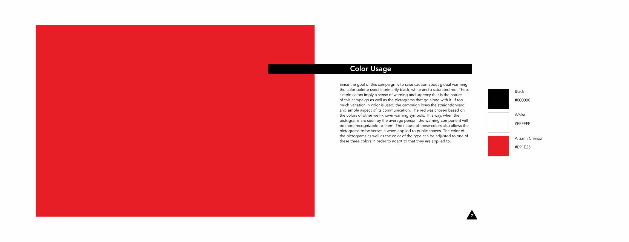
Color Usage
Since the goal of this campaign is to raise caution about global warming, the color palette used is primarily black, white and a saturated red. These simple colors imply a sense of warning and urgency that is the nature of this campaign as well as the pictograms that go along with it. If too much variation in color is used, the campaign loses the straightforward and simple aspect of its communication. The red was chosen based on the colors of other well-known warning symbols. This way, when the pictograms are seen by the average person, the warning component will be more recognizable to them. The nature of these colors also allows the pictograms to be versatile when applied to public spaces. The color of the pictograms as well as the color of the type can be adjusted to one of these three colors in order to adapt to that they are applied to.
Black
#000000
White
#FFFFFF
Alizarin Crimson
#E91E25
8 9
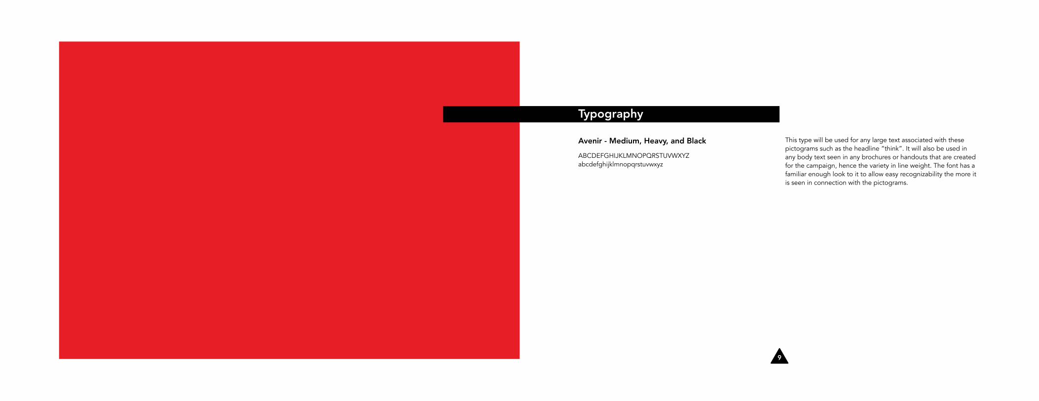
Avenir - Medium, Heavy, and Black
ABCDEFGHIJKLMNOPQRSTUVWXYZabcdefghijklmnopqrstuvwxyz
This type will be used for any large text associated with these pictograms such as the headline “think”. It will also be used in any body text seen in any brochures or handouts that are created for the campaign, hence the variety in line weight. The font has a familiar enough look to it to allow easy recognizability the more it is seen in connection with the pictograms.
Typography

10 11
Pictograms: Factory Emissons
In order to create the pictograms, ideas needed to be narrowed down to what causes would be best to highlight in showing this campaign to the world. In creating this type of cautionary campaign, the main goal is to make people stop to look at what is in front of them. The visual market of our world is largely oversaturated to the point of desensitization of peoples’ senses, especially when it comes to advertisements. The initial concepts were chosen based on how well they would be recognized after being translated into simplistic forms. Ultimately, the goal was to create something that would stand out.
Once the ideas had been nailed down, a system was created for the design of the pictograms. The solid shape of a triangle was chosen to contain the imagery based on the fact that this shape (with the rounded edges) is a very common symbol used in universal warning situations. As the main goal of this campaign is to warn, this shape is perfect.
The forms that bleed off the page are both very different. In one way, the smoke (or the handle of the axe) bleed off of the page to create solid forms in the space outside of the triangles. Other forms of the objects bleed off the page, but create open shapes in their wake and make the triangle’s edges open up. The contrast between the geometric shapes and organic shapes in each pictogram creates emphasis on each issue being communicated.
12 13
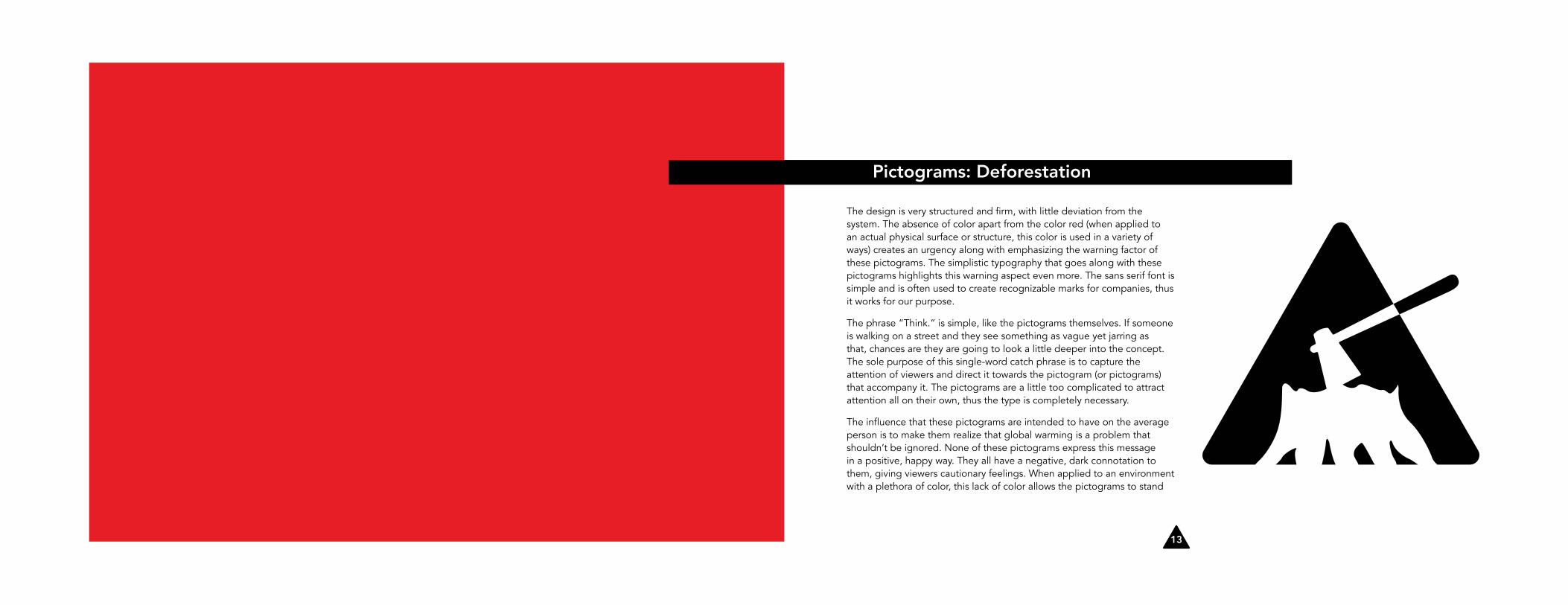
Pictograms: Deforestation
The design is very structured and firm, with little deviation from the system. The absence of color apart from the color red (when applied to an actual physical surface or structure, this color is used in a variety of ways) creates an urgency along with emphasizing the warning factor of these pictograms. The simplistic typography that goes along with these pictograms highlights this warning aspect even more. The sans serif font is simple and is often used to create recognizable marks for companies, thus it works for our purpose.
The phrase “Think.” is simple, like the pictograms themselves. If someone is walking on a street and they see something as vague yet jarring as that, chances are they are going to look a little deeper into the concept. The sole purpose of this single-word catch phrase is to capture the attention of viewers and direct it towards the pictogram (or pictograms) that accompany it. The pictograms are a little too complicated to attract attention all on their own, thus the type is completely necessary.
The influence that these pictograms are intended to have on the average person is to make them realize that global warming is a problem that shouldn’t be ignored. None of these pictograms express this message in a positive, happy way. They all have a negative, dark connotation to them, giving viewers cautionary feelings. When applied to an environment with a plethora of color, this lack of color allows the pictograms to stand

14 15
Pictograms: Automobile Emissions
out. Viewers are supposed to be abruptly halted by these designs and made to think about the issue more.
The desire for this system of pictograms is that it will become so universally well-known that it becomes as natural a part of our society as other warning symbols (such as the stop sign, the poison symbol, etc.). In doing this, global-warming awareness will become a natural part of our society as well.
Some rules that are broken with this system are the absence of smoke in the deforestation pictogram and the direction of the object bleeding off of the page. For the deforestation pictogram as well as for the smoke stacks, the objects bleed off the bottom of the page while the truck bleeds off of to the right of the triangle. Otherwise, these pictograms are pretty consistent with some mild deviations.

16 17
Application: Recycling
18 19
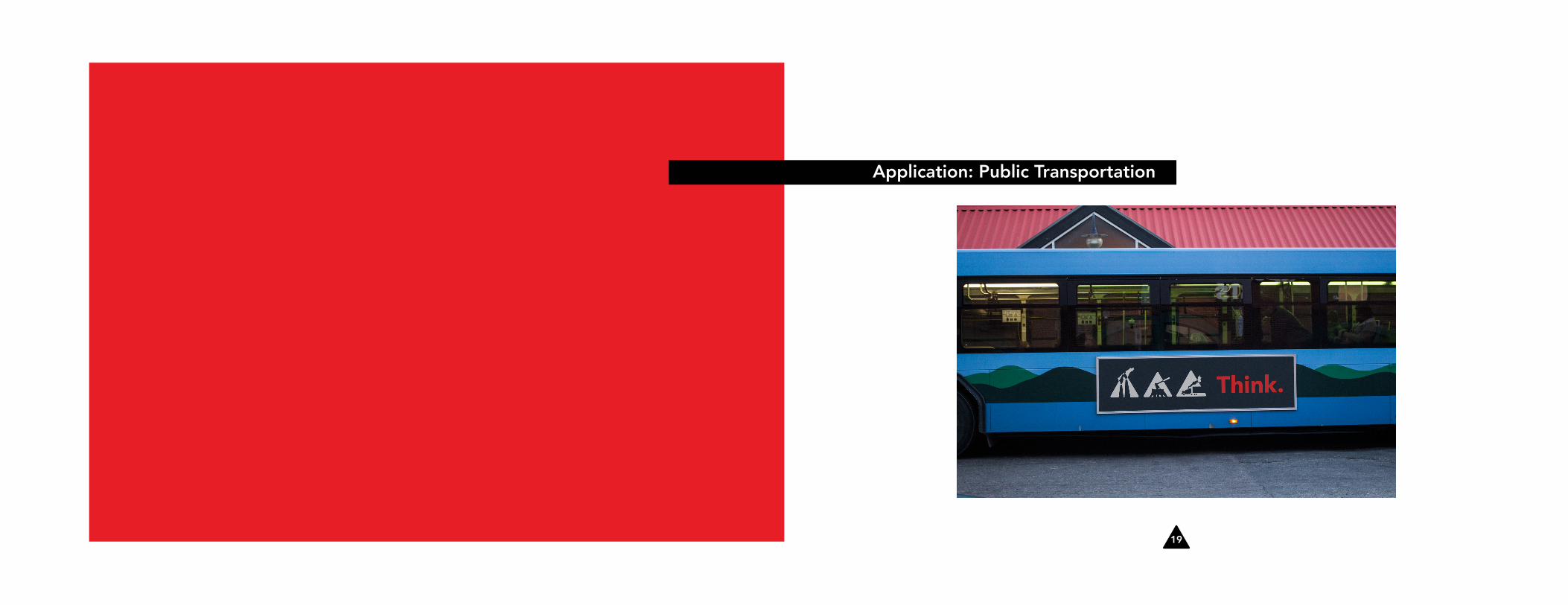
Application: Public Transportation

20 21
Application: Storefront

22 23
Application: Bus Stop/Billboards

24 25
Application: City Buildings
26 27
Sources
“What Does WWF Do?” WWF. World Wildlife Fund, 2015. Web. 14 Dec. 2015. <http://wwf.panda.org/what_we_do/>.
“Who We Are.” WWF. World Wildlife Fund, 2015. Web. 14 Dec. 2015. <http://wwf. panda.org/who_we_are/>.
Image:
<https://www.outdooradvertisingltd.co.uk/wp-content/gallery/bus-stop/Charities-use-Bus-Stop-Advertising.jpg>