The Supply Side of the Housing Boom and Bust of the 2000s
45
This paper presents preliminary findings and is being distributed to economists and other interested readers solely to stimulate discussion and elicit comments. The views expressed in this paper are those of the authors and are not necessar- ily reflective of views at the Federal Reserve Bank of New York or the Federal Reserve System. Any errors or omissions are the responsibility of the authors. Federal Reserve Bank of New York Staff Reports Staff Report No. 556 March 2012 Revised October 2012 Andrew Haughwout Richard W. Peach John Sporn Joseph Tracy The Supply Side of the Housing Boom and Bust of the 2000s REPORTS FRBNY Staff
Transcript of The Supply Side of the Housing Boom and Bust of the 2000s

This paper presents preliminary fi ndings and is being distributed to economists and other interested readers solely to stimulate discussion and elicit comments. The views expressed in this paper are those of the authors and are not necessar-ily refl ective of views at the Federal Reserve Bank of New York or the Federal Reserve System. Any errors or omissions are the responsibility of the authors.
Federal Reserve Bank of New YorkStaff Reports
Staff Report No. 556March 2012
Revised October 2012
Andrew HaughwoutRichard W. Peach
John SpornJoseph Tracy
The Supply Side of the Housing Boom and Bust of the 2000s
REPORTS
FRBNY
Staff

Haughwout, Peach, Sporn, Tracy: Federal Reserve Bank of New York (e-mail: [email protected], [email protected], [email protected], [email protected]). The authors thank David Crowe, Stephen Melman, and Elliot Eisenberg of the National Association of Home Builders for providing various data and suggestions. They also thank Dan Oppenheim of Credit Suisse, Nishu Sood of Deutsche Bank, and Joshua Pollard of Goldman Sachs for sharing their knowledge of the homebuilding sector. Sarah Stein provided expert assistance with the CoStar land sales data. The views expressed in this paper are those of the authors and do not necessarily refl ect the position of the Federal Reserve Bank of New York or the Federal Reserve System.
Abstract
The boom and subsequent bust of housing construction and prices over the 2000s is widely regarded as a principal contributor to the fi nancial panic of 2007 and the ensu-ing “Great Recession.” Much has been written about the demand side of this pronounced housing cycle, in particular the innovations in mortgage fi nance and the loosening of underwriting standards that greatly expanded the pool of potential homebuyers. In this paper, we take a closer look at developments on the supply side of the housing market, and bring prior theories and previous analysis of housing supply face-to-face with data from the 2000s cycle. We focus our discussion on four key issues. First, how much ex-cess housing production occurred during the boom phase of the cycle and how far along is the correction? Second, we look at trends in the characteristics of new single-family homes built prior to, during, and after the construction boom to assess what effect, if any, the boom may have had on those trends. Our third question is how the homebuilding industry changed as prices boomed during the 2000s. Finally, we address the important question of whether large developers reaped excess profi ts from the boom, or whether excess demand simply drove up land values in specifi c markets, enriching landowners.
Key words: housing supply, homebuilders
The Supply Side of the Housing Boom and Bust of the 2000sAndrew Haughwout, Richard W. Peach, John Sporn, and Joseph TracyFederal Reserve Bank of New York Staff Reports, no. 556March 2012; Revised October 2012JEL classifi cation: R30, R14, D40

- 1 -
Four Questions about Housing Supply over the 2000s Cycle
The boom and subsequent bust of housing construction and prices over the 2000s is
widely regarded as a principal contributor to the financial panic of 2007 and the ensuing “Great
Recession”. As of this writing, it appears that single-family housing starts are finally beginning
a gradual recovery roughly seven years after their previous peak in 2005Q3. Nonetheless, the
overall level of housing starts and sales remain at depressed levels as the economy slowly
resolves the legacy of excess supply and sharply lower prices. Based on the CoreLogic national
index, home prices have fallen 30 percent from their peak in early 2006, returning to levels that
prevailed in mid 2003. Roughly one in four homeowners with a mortgage has combined
mortgage loan balances that exceed the value of the property. Over 2.6 million foreclosures have
been completed since 2008 with 1.9 million foreclosures in process.1
Much has been written about the demand side of this pronounced housing cycle, in
particular the innovations in mortgage finance and loosening of underwriting standards that
greatly expanded the pool of potential home buyers. In this paper, we take a closer look at
developments on the supply side of the housing market, and bring prior theories and previous
analysis of housing supply face-to-face with data from the 2000s cycle. We focus our discussion
on four key issues.
Another 1.3 million loans
are currently 90 or more days delinquent and very likely to move into the foreclosure process.
First, how much excess housing production occurred during the boom phase of the cycle
and how far along is the correction? While it is now clear that too much housing was built in the
US in the boom phase, identifying how much and where overbuilding occurred remain important
issues. We also explore the issue of whether supply elasticity played a role in that geographic
dispersion. Our results suggest that 3 to 3.5 million excess housing units were produced during
the boom. Excess housing production was a national phenomenon, but excess supply is
positively related to housing supply elasticities.
1 See OCC & OTS Mortgage Metric Reports

- 2 -
Second, we look at trends in the characteristics of new single-family homes built prior to,
during, and after the construction boom to assess what effect, if any, the boom may have had on
those trends. The number of excess units put in place during the boom is only a partial measure
of its distortive effect on resource allocation; to be complete we must also understand the quality
of those units. The effect of booms on asset quality is ambiguous in theory, so evidence from the
housing market, where the quality of new construction compared to the existing stock is
relatively easy to measure, is valuable. We find that throughout the boom, the quality of new
units – both observable and unobservable – appears to have remained high.
Our third question is how the homebuilding industry changed as prices boomed during
the 2000s. We present new evidence regarding the restructuring of the industry that took place
from the mid 1990s to the mid 2000s and ask whether this restructuring may have contributed in
some way to the over building that took place. We find that a significant amount of consolidation
occurred in the industry over this period, as large builders got larger and increasingly relied on
the equity markets to finance their projects. These large builders appear to have been major
contributors to oversupply as they had projects in the pipeline even after prices began to fall, and
in spite of the fact that capital markets signaled this risk well before banks began to tighten
lending standards.
Finally, we address the important question of whether these large developers reaped
excess profits from the boom, or whether excess demand simply drove up land values in specific
markets, enriching landowners. We present new evidence on transaction volumes and prices for
vacant land during the boom and bust, and combine them with our estimates of excess returns in
the building industry. In addition, we examine whether large builders earned on average excess
returns over this period of consolidation. In addition, we explore whether any excess returns
were higher during the height of the housing boom. These data allow us to conclude that both
builders and landowners shared in the excess profits generated by the boom.

- 3 -
Literature Review
Among our four questions, the first – documenting excess supply and its sources – has
received the most attention in previous literature. There is considerable interest in evaluating the
efficiency of various asset markets, including housing. Case and Shiller (1989) report evidence
of serial correlation in quality-adjusted housing returns. If housing markets were fully efficient,
then future housing returns could not be predicted based on current information. There are
frictions on both the demand side and the supply side of the housing market that might lead to
imperfect arbitrage. On the demand side, housing is heterogeneous in a number of dimensions
and there are significant transaction costs associated with buying and selling property. On the
supply side, there are time frictions involved in the supply of new housing that limit how quickly
builders can respond to any mispricing. There may also be costs of adjustment in housing supply
that cause builders to spread any supply response out over time (Topel and Rosen (1988)). These
results imply that builders could get caught with excess supply in the pipeline if prices turn
quickly and unexpectedly.
Rosenthal (1999) tests for inefficiencies on the supply side taking into account that
builders cannot instantaneously supply new housing to the market. He uses data on single family
detached housing sales in Vancouver, BC from 1979 to 1989 to estimate a quality-adjusted price
of housing using hedonic regressions. An error correction model is estimated to determine how
quickly deviations in quality-adjusted prices from building costs are dissipated. The results for a
standard building indicate that 96 percent of a short-run price shock disappears within two
quarters. When estimates of these price shocks are added to a construction equation, they are not
significant. This is consistent with additional evidence that during this period builders required
two to three quarters to complete a construction project. Consequently, the observed price shocks
were on average too short-lived for builders to earn excess profits by adjusting their construction
activity in response to the shocks. Rosenthal concludes that any inefficiencies must originate in
the land markets.
Glaeser, Gyourko and Saiz (2008) explore the role of housing supply elasticity in how
possible housing bubbles would manifest themselves in different markets. Their model
predictions are that any irrational demand during a bubble will result in higher prices and a more

- 4 -
prolonged duration of the bubble in markets where housing is less elastically supplied. In
contrast, in markets with relatively elastic supply, bubbles should result in more new residential
investment and consequently less of a price response. This muted price response also makes it
likely that the bubble will be shorter in duration. They test these predictions using the proxy for
housing supply elasticity developed in Saiz (2008).2
While an elastic supply of housing can limit the price rise associated with a temporary
period of irrational exuberance in demand, given the durability of housing the larger supply
response during the boom means that prices may fall below their pre-boom levels once demand
again reflects fundamental factors.
Their estimates confirm that prices react
relatively more than quantities in housing markets with inelastic supply, and that as a
consequence periods of significantly high prices relative to replacement costs on average last
longer. However, they note that several of the markets that experienced the largest booms in the
recent cycle have high measured supply elasticities. These markets also demonstrated little
variability of prices relative to replacement costs prior to the recent cycle. While having an
elastic housing supply limits the likelihood of a serious housing bubble in a local market, it
clearly does not prevent one from happening.
3
This is illustrated in Figure 1 which contrasts two local housing markets – one with a
completely inelastic short-run housing supply curve, S(I), and one with an elastic short-run
supply curve, S(E). The replacement cost of housing is given by C and initially both markets
start out with prices equal to replacement cost at point A. A housing bubble develops which
shifts out housing demand in both markets from D0 to D1. There is no supply response in the
inelastic market so prices ration this irrational exuberance by increasing to P1(I) as indicated at
point C. In contrast, in the elastic supply market both prices and new housing supply react to the
outward shift in demand. As a consequence, prices adjust by less than in the inelastic market
Housing supply is nearly completely inelastic at the current
stock of housing for prices below replacement costs (Glaeser and Gyourko (2008)). This implies
that if housing demand reverts back to its pre-boom level when the bubble bursts, then prices
will overshoot to the down side in elastically supplied markets.
2 This proxy is the percent of land within a 50 kilometer radius area that has a slope of less than 15 degrees. 3 The tendency for house prices to “overshoot” on the down side will be magnified if lending standards are significantly tightened during the bust phase of the housing cycle and to the extent that the bursting of the housing bubble weakens fundamental housing demand due to higher rates of unemployment.

- 5 -
rising only to P1(E) as indicated at point B. When the bubble bursts, assume that demand reverts
back to D0. Prices in the inelastic market decline back to their pre-bubble level of P0. However,
due to the new housing supply added to the elastic market and the durable nature of housing,
prices in the elastic market overshoot on the downward side to P2(E) < P0.4
There is also an emerging literature on rational models of overbuilding. DeCoster and
Strange (2010) argue that rational overbuilding may occur in markets with uncertainty due to
herding behavior by builders. They explore statistical and reputational models of herding
behavior (see Banerjee (1992) and Welch (1992). In statistical herding, a builder may choose to
ignore a bad signal about future demand prospects in the market if this builder can infer that
other builders have received more positive signals. This tendency to ignore bad signals is more
pronounced if the market is characterized by leading builders who are perceived as having high
quality information regarding market conditions and who may act as “first movers” in the
market. In a market characterized by a few large builders and many small builders, statistical
herding is most likely to be exhibited by the small builders who are attempting to free ride on the
information gathered and acted upon by the large builders. Changes in market structure in the
building industry can impact the likelihood of overbuilding due to statistical herding. As a
market becomes more concentrated, there is a tradeoff between the increased likelihood that the
smaller builders will discount their signals and follow the market leaders and the possible greater
reliability of the signals received by the market leaders. Reputational herding may take place if
banks have imperfect information on the quality of developers. The likelihood that a bank will
cut off funding to a particular builder may be lower if that builder mimics the actions taken by
another builder. This type of herding adds noise to the signal that the bank uses to attempt to
discriminate between the builders.
As fundamental
demand begins to expand in the elastic supply market, prices will adjust upward but there will
initially be no new building activity. Once prices have recovered to the replacement cost, new
supply will again be added to the market. Overbuilding to the extent that it occurs has important
consequences for local housing markets.
4 If lending standards are tightened following the bust relative to the pre-boom period then the demand for housing will be contract even further magnifying the downward overshoot in prices. Also, if the burst of the housing bubble results in a recession increases unemployment then this will further put downward pressure on home prices.

- 6 -
How much over building occurred during the boom?
A question of interest is how much excess supply was created during the boom in housing
construction. To begin to answer that question, Figure 2 presents a half century time series of
housing starts per 1,000 people, broken out by single-family and multi-family units. From the
mid 1960s to the late 1980s, housing production expressed in these terms was quite volatile
around a downward trend. Then, from the early 1990s until 2005 a strong upward trend is
evident, particularly for single-family units. Following the peak in 2005, total housing starts fell
a cumulative 75% by 2009. A very gradual increase occurred in 2010 and 2011, particularly for
multifamily units, but the 2011 level of starts per 1000 people was still 72% below the 2005
level.
At first glance, the level of housing starts per 1000 people at the peak in 2005 does not
appear to be particularly high, especially when compared to what occurred in the 1960s and
1970s. However, the underlying demographic conditions of the country were fundamentally
different in these two periods. These underlying demographic dynamics can have important
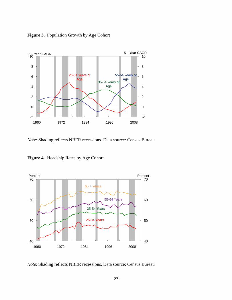
long-term impacts on the level of demand for housing (Mankiw and Weil (1989)). As shown in
Figure 3, up until the mid-1970s, the number of people in the 25 to 34 year age group (the post
WWII baby boom) was growing very rapidly. People at this stage of the life-cycle tend to
establish independent households for the first time such that the headship rate for this age group
is quite a bit higher than for people under 25 years of age (Figure 4). In the second half of the
1970s, the number of people in the 35 to 54 age group, whose headship rate makes another
distinct jump upward, began to increase rapidly. These age-specific population growth rates,
along with some increase in age specific headship rates, resulted in a rising aggregate headship
rate (Figure 5). This meant that the demographically driven number of households was rising
quite a bit faster than the underlying population.
In contrast, from the mid-1990s through the mid-2000s the number of people in the 25 to
34 year age group was actually declining, while the growth rate of those 35 to 54 years of age
was slowing sharply. At the same time, the number of people aged 55 to 64 was rising rapidly.
In addition, headship rates for individual age cohorts generally peaked in the 1980s and have
since been relatively stable to slightly declining. These factors combined to keep the overall
U.S. headship rate essentially flat since the mid-1980s. As a result, the underlying trend growth

- 7 -
of the number of households was limited to the growth of the population, which was slowing
rapidly from the mid-1990s onward. Thus, referring back to Figure 2, from a demographic
perspective, housing starts per 1000 people should have continued to trend gradually lower from
the mid 1990s onward. The order of magnitude of the resulting over building relative to
underlying demographic trends can be estimated in different ways with different data sources.
But as we shall see, the resulting estimates are roughly similar.
One approach is based on the Census Bureau’s Housing Vacancy Survey. This survey
provides quarterly estimates of the stock of housing and its occupancy status. Figure 6 presents
an aggregate vacancy rate for the US housing stock based on that data. To construct this vacancy
rate, the numerator is the number of units vacant for rent, vacant for sale, and units in the
category “held off the market for other reasons”. The number of units in this latter category has
historically been quite modest and usually reflected units in the probate process. However, the
number of units in this category has risen rapidly over the recent past, apparently reflecting units
that have been taken back by lenders (held in their real estate owned (REO) inventory) but not
yet offered for sale or rent. The denominator is the numerator plus all occupied units intended for
year-round use. A trend line fitted through the time series for the period from 1965 through 1999
suggests that there has been a slight secular uptrend in this vacancy rate. Since the early 2000s
the actual value has consistently been above the trend line, with the actual value peaking in
2010Q2 and moving slightly lower since then.
Figure 7, which is derived from this same housing vacancy data program, presents an
estimate of the number of “excess” housing units, meaning vacant units above a rough estimate
of normal or equilibrium vacancies. In this particular case, separate estimates of equilibrium
vacancy rates are derived for single- and multi-family units for sale, single- and multi-family
units for rent, and single- and multi-family units held off the market for other reasons. Excess
units are defined as units in each of these six categories above the number of units implied by the
equilibrium vacancy rates. The estimate of the number of excess units peaked at around 3
million in mid-2010, which provides a rough estimate of the amount of “overbuilding” of
housing that occurred during the boom. Since then the number of excess units has been
gradually declining, reaching around 2 1/4 million by mid 2012. The number of excess units for

- 8 -
sale and for rent has declined fairly sharply while the number of units held off the market has
continued to rise.
An alternative measure of the amount of over-building that occurred is the difference
between the cumulative sum of the number of housing units started relative to the amount of new
housing units needed to meet the trend rate of growth of the number of households. Figure 8
provides such an estimate. Based on the rate of growth of the population and its age structure,
we estimate that the trend rate of growth of households over the period since the mid 1990s is
about 1.17 million per year. Due to losses from the existing stock due to fires, floods, and
obsolescence, we estimate that about 1.4 million housing starts per year are needed to provide
housing for the 1.17 million new households. Starting from 1995 we cumulate the number of
housing starts minus 1.4 million (the blue curve) and the change in the number of households
minus 1.17 million (the green curve). The difference between the two curves is an estimate of
over production. Strictly from the stand point of production, the maximum overbuilding was
achieved in 2007Q2 at about 3.4 million units. However, likely due to the strength of the
economy and labor markets, household formations were running above trend at that point, so
relative to the actual number of households the peak excess production occurred in 2009Q1 at
around 3 ½ million units. In terms of both timing and number, this result is similar to that based
on the vacancy data.
Figure 8 also provides some insight into why this most recent housing downturn has been
so protracted. Since mid 2007, a period of five years, housing starts have been below the 1.4
million trend, such that as of mid 2012 the excess production that began in the mid to late 1990s
has been worked off. However, due to the weakness of the economy, the rate of household
formations has fallen well below trend. Thus, while from a pure production standpoint we no
longer have an excess supply, vacancy rates remain above their longer run equilibrium values.
Figure 9 provides addition insight into the issue of household formations. Not only are they
running well below the demographic trend, the growth that is occurring is more than accounted
for by renter households while owner households continue to decline. While still at relatively
low levels, over the past year there has been a considerably larger percentage increase of multi-
family housing starts than of single-family starts.

- 9 -
Figure 10 provides some regional detail on the measure of excess housing units based on
the Housing Vacancy Survey which provides annual data for the four major census regions that
corresponds to the national data that is provided on a quarterly basis. Using the same
methodology as employed in the construction of Figure 7, Figure 10 presents the regional
distribution of total excess housing units in 2009 and 2011 and compares it with the regional
distribution of total housing units. In 2009 the largest share of excess units was in the South
followed by the Midwest, where in both cases the share of excess units exceeded the
corresponding share of the housing stock. In contrast, in the Northeast the share of excess units
was roughly half its share of the total housing stock. By 2011 the picture had changed. The
West’s share of excess units declined significantly, the South’s share declined modestly, while
the shares of the Northeast and Midwest increased by about 4 and 5 ½ percentage points,
respectively. Of course, these changes reflect both trends in housing production and demographic
trends such as relative population growth rates.
To focus specifically on the issue of excess production and where it occurred, Figure 11
presents a scatter plot of combinations of population growth and housing starts per 1000 people
for each of the individual states. Each of the blue dots in the chart represents population growth
(expressed at a compound annual rate) over the period from 1990 to 2000 and the average level
of housing starts per 1,000 people over the same time period for each of the 50 states. Note the
fairly tight positive relationship indicated by the close clustering of the blue dots relative to the
regression line. Focusing on this period, the supply side of the housing market showed a
tremendous ability to scale production rates to a wide variation in local population growth rates.
There is no evidence that housing supply lagged population growth by any significant degree
even in the fastest growing states such as Arizona and Nevada.5
The red dots in Figure 11 represent the combinations of population growth rates and
housing starts per 1,000 people for each state over the period from 2000 to 2005. Note that
virtually all states moved to the right relative to the earlier decade, meaning an increase in
housing starts for a given population growth rate. That is, the housing boom from a supply
perspective was to a degree a national phenomenon. The magnitude of shift, however, tended to
5 If there were significant costs of adjustment to housing supply, this might show up as the blue dots associated with the fast growing markets tending to be to the left of the regression line.

- 10 -
be larger for those states that experienced above average population growth in the 1990s. This
can be seen for three of the four “sand states”.6 The population growth rate in Florida was fairly
constant relative to the 1990s, while the rate of housing supply per capita nearly doubled.
Arizona experienced a slight slowing in its population growth rate, but like Florida its rate of
housing supply per capita increased significantly, growing by roughly a third. Unlike the other
sand states, Nevada experienced a significant slowdown in its rate of population growth.
However, the rate of housing supply in Nevada in 2000-2005 did not respond to this slowdown,
resulting in Nevada’s red dot being significantly to the right of the regression line.7 Three other
states that stand out in Figure 11 in terms of a high rate of housing construction relative to
population growth are Georgia, North Carolina and South Carolina. The fact that housing supply
increased relatively the most in these three states as well as the sand states may reflect that home
builders were producing a product geared toward people at the later stages of their careers who
might be looking for a second home or a retirement home.8
Figure 12 addresses the issue of how these increases in housing production during the
2000 to 2005 period are related to available measures of the elasticity of supply of new housing.
On the horizontal axis of the chart we measure for each state the percentage distance of the 2000
to 2005 housing starts per 1000 people from the value predicted by the regression line of the
1990 to 2000 period given the 2000 to 2005 rate of population growth. On the vertical axis we
plot elasticities of supply as estimated by Saiz (2010), where all of the elasticities for the MSAs
in a state were averaged to provide a state estimate.
9
6 The “sand states” refer to Arizona, California, Florida and Nevada.
Also shown is a least squares regression
line fitted through the scatter diagram. While there is a great deal of dispersion around that line,
the upward slope is statistically significant (t statistic of 3.74). Similarly, Figure 13 presents the
relationship between that same estimate of supply elasticity and the cumulative percent change
of house prices over the period from 2002 to 2007. In this case the negative slope of the
regression line is statically significant. (t statistic of -3.33) .
7 California is the only sand state that did not have a population growth rate in the 1990s that exceed the national average. California’s rate of housing supply in the 1990s was not significantly higher than what would be predicted from the regression relationship. During the boom, California’s rate of housing supply did increase, but this increase only moved it to the regression line and not to the right of the regression line. 8 It should be noted, however, that housing starts are not necessarily the same as net additions to the stock of housing due to destruction and demolition of existing units. 9 Note that North Dakota was dropped from this diagram as it represented an extreme value for percentage difference from the regression line.

- 11 -
Trends in Size, Amenities, and Quality
New homes produced for sale have been getting larger, with more bedrooms, bathrooms, and
garages, for quite some time. Figure 14 presents the median size of new homes sold, measured in
square feet, for the period from 1978 through 2011.10
Of course, changes in physical characteristics such as square footage and number of
bathrooms do not capture changes in quality, such as the materials used and the level of skill and
care employed in construction. It is certainly conceivable that as demand for new homes
intensified the quality of new homes, defined in this manner, slipped somewhat. To shed some
light on this issue, we used American Housing Survey (AHS) data to estimate the percentage
premium than home buyers place on new homes versus existing homes. All else equal, a new
home is likely to command a premium as it is likely to require lower maintenance expenditures
over an expected holding period. By estimating that premium for AHS surveys before and during
the construction boom, we can observe how that premium changed over time.
A trend line was fitted through the series
for the period from 1978 through 1998, with that trend then extended from 1999 to 2011. While
the median square footage in 2005 is 3.3% above that trend, that represents just 1.2 standard
deviations of the residual of the estimated trend line, suggesting that the 2005 value is not
significantly above what would be suggested by the established trend. Figure 15 presents the
median size of the lot that the structure was build upon, also measured in square feet. Again, a
trend line was fitted through the data for the period from 1976 to 1998 and then extended over
the period from 1999 to 2011. Clearly, average lot size declined during the building boom years.
The median lot size in 2004 was 8.3% below the estimated trend. Combined the two trends
indicate that during the boom years of the 2000s builders were economizing on the amount of
land devoted to each unit, likely reflecting the fact that land prices were rising relatively rapidly.
However, due to the wide variation in the median lot size over the period from 1976 to 1998, that
8.3% represents just 1.2 standard deviations of the residual of the estimated trend line. Note that
the decline in median lot size from mid 1990s through the mid 2000s was due in part to a modest
increase of the share of units that were attached as opposed to detached. But the median lot size
of attached units declined in a similar fashion.
10 These data are from the “Characteristics of New Homes Sold”, which is part of the Census Bureau’s statistical program called New Residential Sales.
- 12 -
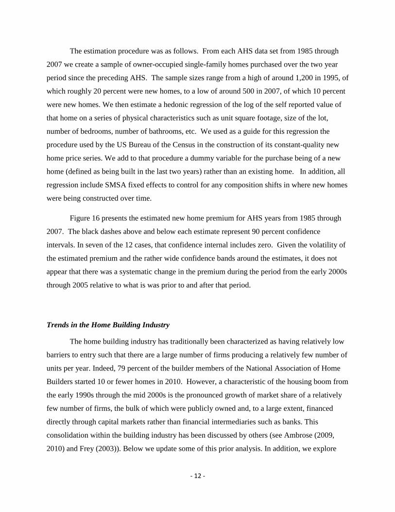
The estimation procedure was as follows. From each AHS data set from 1985 through
2007 we create a sample of owner-occupied single-family homes purchased over the two year
period since the preceding AHS. The sample sizes range from a high of around 1,200 in 1995, of
which roughly 20 percent were new homes, to a low of around 500 in 2007, of which 10 percent
were new homes. We then estimate a hedonic regression of the log of the self reported value of
that home on a series of physical characteristics such as unit square footage, size of the lot,
number of bedrooms, number of bathrooms, etc. We used as a guide for this regression the
procedure used by the US Bureau of the Census in the construction of its constant-quality new
home price series. We add to that procedure a dummy variable for the purchase being of a new
home (defined as being built in the last two years) rather than an existing home. In addition, all
regression include SMSA fixed effects to control for any composition shifts in where new homes
were being constructed over time.
Figure 16 presents the estimated new home premium for AHS years from 1985 through
2007. The black dashes above and below each estimate represent 90 percent confidence
intervals. In seven of the 12 cases, that confidence internal includes zero. Given the volatility of
the estimated premium and the rather wide confidence bands around the estimates, it does not
appear that there was a systematic change in the premium during the period from the early 2000s
through 2005 relative to what is was prior to and after that period.
Trends in the Home Building Industry
The home building industry has traditionally been characterized as having relatively low
barriers to entry such that there are a large number of firms producing a relatively few number of
units per year. Indeed, 79 percent of the builder members of the National Association of Home
Builders started 10 or fewer homes in 2010. However, a characteristic of the housing boom from
the early 1990s through the mid 2000s is the pronounced growth of market share of a relatively
few number of firms, the bulk of which were publicly owned and, to a large extent, financed
directly through capital markets rather than financial intermediaries such as banks. This
consolidation within the building industry has been discussed by others (see Ambrose (2009,
2010) and Frey (2003)). Below we update some of this prior analysis. In addition, we explore

- 13 -
Finally, we look at whether the capital markets provided more timely signals than the banking
industry for builders to start to reduce their activity levels.
Figure 17 provides a time series of the share of new home sales accounted for by the top
10 to top 60 builders by size. In 1990 the top 60 builders accounted for 20 percent of new home
sales (as defined by the Census Bureau) while the top 10 builders accounted for 9.4 percent.
Over the next 15 years there was steady consolidation in the industry, such that by 2005 the top
60 accounted for 36 percent and the top 10 for 22.6 percent. For this increase in share of the top
10 builders to occur, it means that these firms captured roughly one-third of the increase in sales
that occurred over that period. The top 60 largest firms accounted for nearly half of the increase.
It is also interesting to note that the 10 largest firms experienced additional large increases in
market share over the period from 2006 through 2008. However, this increase occurred when
overall sales and prices were declining, and reflected the fact that the large builders had
accumulated a large inventory of homes in their production pipelines.
This rapid growth by the largest builders reflected a mix of internal or “organic” growth
as well as growth through acquisitions. Table 1 shows the growth in closings by the top 10
builders over the period from 1993 to 2004, and the decomposition by organic versus acquisition.
For the group as a whole, 46 percent of their growth in closings over the 11 year period leading
up to the peak was due to acquisitions. As one might expect, there were multiple motivations for
these acquisitions. But in conversations with leading analysts of this industry, the prime
motivation appears to have been to obtain land and local expertise in promising markets.
There are several dimensions on which large and small builders differ. Small builders are
to a large extent reliant on bank financing. Their ability to launch new construction projects and
to continue building spec homes depends on the willingness of those banks to extend financing.
The scrutiny of the builder’s activities by the lender can be surprisingly intense. In contrast, large
builders are much less reliant on banks, obtaining the bulk of their financing through issuance of
debt and equity directly in capital markets. Thus, the ability of these large builders to expand
their balance sheet is determined by the willingness of markets to advance more funds.
A second distinction is that large builders are vertically integrated from land acquisition
and development, construction, marketing, and mortgage financing. This organization helps

- 14 -
these builders exploit scale economies involved in large development projects and to have a
broader source of revenues and potential profits. It is also possible that by being involved in
each segment of the production and distribution chain, large builders had an informational
advantage in the markets they operated in.
To shed light on these points, Figure 18 presents the balance sheet of Toll Brothers, a
well known publicly traded homebuilder, as of April of 2005, right around the peak of new home
construction. At that time assets totaled $5.4 billion, of which 80 percent was the firm’s
inventory of lots, homes under construction, and completed homes. Liabilities totaled $3.1
billion, of which notes issued in the capital markets represented 43 percent. Bank financing,
consisting of loans payable (the used portion of a credit line extended by a consortium of banks)
and the mortgage subsidiaries warehouse line of credit, represented just 17 percent of total
liabilities. The debt to equity ratio of the firm was 1.35.
Table 2 shows the building lot inventory data for the top 10 builders from 2002 to 2008.
The lot inventory is broken down into lots that were owned by the builders, lots where the
builders held options to purchase, and lots that were part of joint ventures. The last column
converts the total inventory into a year’s supply at the prevailing sales rate. The first thing to note
is that the inventory of lots grew quite rapidly over the period from 2002 to 2005, suggesting that
these builders remained quite optimistic about future sales prospects even as the market was
approaching its peak. Indeed, in terms of years supply the builders were substantially
lengthening their investment in land, from 5.4 years in 2003 to 6.8 in 2005.
As we know now, single-family housing starts peaked in 2005Q3 and home prices
peaked roughly one year later. It appears that the top 10 builders responded aggressively to this
turn of events. From 2005 to 2006, the largest builders reduced their lot inventory by 24 percent.
Almost all of this reduction, 97 percent, was through the lots that they held options on. Options
continued to be the dominant adjustment mechanism as well in 2007 with 67 percent of the
shrinkage accounted for by optioned lots. It is not until 2008 that the adjustment process is
roughly balanced between percentage reductions in owned and optioned lots. Note, however, that
lots are only one portion of a builder’s inventory. While we do not have data on homes either
under construction or completed for these large builders, the macro data indicate that it took
quite a bit longer to reduce inventories in those categories.

- 15 -
Another feature of the increase in housing production from the mid-1990s through the
mid-2000s was that an increasing share of single-family units was “built for sale” (Figure 19).
Built for sale, sometimes referred to as a “spec” or speculative start, refers to situations where the
land and structure are sold in one transaction. An example is when a home builder develops a
section of land, putting in roads and utilities, and then begins selling individual lots with
houses—either already completed, under construction, or not yet started. In contrast, contractor-
or owner-built units are cases in which an individual or firm already owns the land and either
hires a general contractor or acts as their own general contractor.11
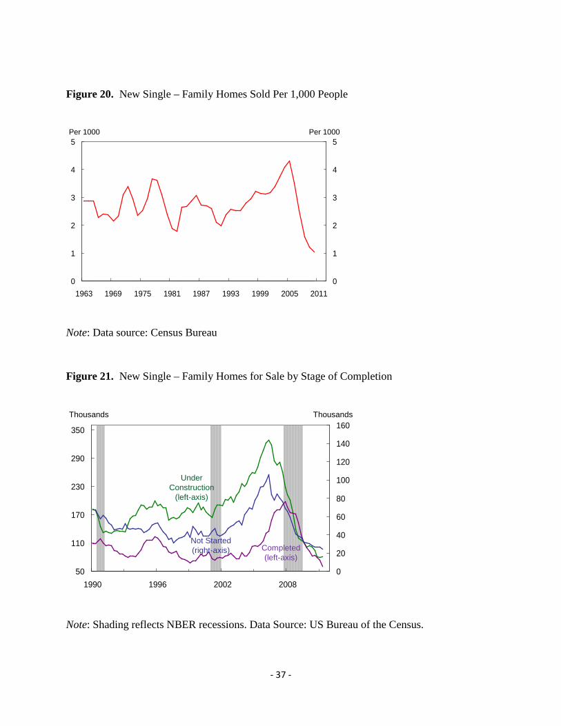
The shift toward more speculative building also meant that even though new housing
starts declined abruptly and remain quite low to this day, the home building industry ended up
with a large inventory of units in their production pipeline which took quite some time to
unwind. Figure 21 presents the inventory of new single-family homes for sale broken down into
the categories of not started, under construction, and completed. As house prices peaked in
many markets in early 2006, builders began to reduce their units not started and under
construction. The pace of contraction was faster in units under construction which may reflect
the continuing option value of keeping improved lots on hand in case markets stabilized.
Completed units did not reach their peak until late 2007, nearly a year and a half after the
slowdown was underway in units under construction. The inventory of completed units for sale
has only recently returned to levels that prevailed prior to the boom. A question that we will
return to is whether builders were too slow to respond to changing demand conditions in their
respective markets contributing to an excess of housing inventory.
Monthly data on sales of new
single-family homes refers only to sales of “spec” units, and the sale can occur at various
stages—completed, under construction, or even not started. Due to the shift toward construction
of single-family units, and the shift toward speculative units within the single-family market,
sales of new single-family homes per 1,000 people in 2005 reached the highest of the entire
period for which there is data (dating back to 1963) (Figure 20).
This review of the macro data and the data on individual firms in the home builder
industry suggests that one of the reasons the housing downturn has been so severe and so
11 It is also the case that an increasing share of multi-family starts were build for sale, likely as condominiums, as opposed to for the rental market.

- 16 -
prolonged is the industry, particularly the largest firms, built up such substantial inventories of
lots and homes at various stages of production. As these largest firms tend to obtain financing
from capital markets rather than banks, an interesting question is whether the capital markets
were providing any early indications that this inventory represented a significant downside risk
to their earning should demand turn out to be weaker than expected. In Figure 22 we compare a
fixed weighted index of the equity prices for six large home builders and the Federal Reserve’s
Senior Loan Officer Opinion Survey (SLOOS) data on lending standards for mortgage loans.12
For the SLOOS, values above (below) zero indicate that standards on net are reported to be
tighter (looser) since the prior survey. We can see that bank lending standards were being
loosened from 2004 to mid-2006. The SLOOS indicates that lending standards began to tighten
in the fourth quarter of 2006. In contrast, the home builder equity price index peaks in August
2005, more than a year earlier than the onset of tightening by banks. By the end of the third
quarter of 2006, the home builder equity price index had declined by 45 percent. Figure 23
summarizes analyst equity recommendations for the major builders. Again, we see a sharp drop-
off in “buy” recommendations in the third quarter of 2005 matched by a pickup in “sell”
recommendations. Finally, Figure 24 shows a market capitalization weighted average of short
interest in the major builders. This series picks up in second quarter of 2006. While the SLOOS
data is not a perfect measure of when banks would have been tightening their lending to small
builders, these comparisons suggests that the capital markets did provide the large builders with
a substantially earlier signal to pull back than the small builders likely received from their
banks.13
Land Markets during the Boom and Bust
12 In order to create the fixed weight equity index, we collected Bloomberg’s market capitalization and equity time series for a subset of homebuilders. Specifically, we selected homebuilders that had a large market presence before the housing bust and are still in operation today. The homebuilders in our equity index are: Toll Brothers Inc., Pulte Group Inc., Lennar Corp., DR Horton Inc., Hovnanian Enterprises Inc., and Beazer Homes USA Inc. Keeping the market capitalization fixed at Q12006, the quarter in which housing starts peaked, we then created a market capitalization weighted average of the quarterly equity prices of each homebuilder. The resulting series was then indexed to equal 100 for the first quarter of 2006. 13 It is interesting to note, however, that smaller builders apparently were not caught with such large inventories of homes under construction or already completed.

- 17 -
Builder’s use of vacant lot inventories, whether owned outright or optioned, suggests an
important role for vacant land as a potential driver of builder costs, and ultimately house prices.
In addition to the cost and access to capital discussed above, the cost of building a new home
consists of construction labor and material costs, along with the cost of developable land. Davis
and Heathcote (2009) and Davis and Palumbo (2008) estimate the value of residential land
nationally and in metropolitan areas, respectively, using a combination of the cost of
construction and the value of housing in place. Davis and his coauthors conclude that the value
of land rose sharply in the US during the housing boom, particularly in metro areas that
experienced the largest house price booms.
Given the prominent role that land inventories played on builders’ balance sheets during
the 2000s housing cycle, we supplement the Davis analysis with information from vacant land
transactions for select metropolitan areas. Vacant land may exhibit different dynamics from land
with a housing unit already in place, since the latter reflects the value of the particular structure
present, as we argued above and as shown in Figure 1. In addition, our data allow a parcel-level
analysis of the evolving prices and quantities as well as the features of vacant land that was
selling in the metro areas for which we have data.
Our land sales data come from the COMPS dataset produced by the CoStar Group.
Residential land sales – as opposed to other real estate transactions – are distinguished by the
buyer’s intention, as reported to CoStar, to use the land for construction of residential units,
rather than to build other types of projects or to use structures currently present. Figures 25 and
26 display the residential land price indexes and log number of acres sold in eight MSAs with
inelastic and elastic housing supplies, respectively, as estimated by Saiz (2010). For comparison
purposes, CoreLogic’s overall House Price Indexes for each MSA are reported as well.14
First is the amount of acreage transacted over time and space. In the figures, the bars
show the 4-quarter moving average of the natural log of acres sold.
Several
features of the land sales data are noteworthy.
15
14 In the case of South Florida, we use the Miami MSA HPI.
Perhaps unsurprisingly, the
great majority of land sold for residential development came from the more elastically-supplied
15We use natural logs because a few markets completely dominate the acreage calculations; plotting acreage itself with consistent axes yields figures that are hard to see in comparison with Atlanta and especially Phoenix.

- 18 -
MSAs (Figure 26). In those cities, particularly Atlanta and Phoenix, quarterly sales of 10,000-
20,000 acres of land for residential development were common throughout the boom. During
2005, CoStar reported average quarterly land transactions in Phoenix alone that exceeded 50,000
acres. In inelastically supplied cities like Chicago, peak land sales were closer to 3,000 acres a
quarter. Land sales volumes in all cities track house prices relatively closely and began to fall
quickly after the HPI peaks.
Also shown in Figures 25 and 26 are land price indexes. In order to abstract from changes
in the mix of properties being sold over time, we create a quarterly price index that controls for
such traits as location, presence of a structure, level of preparation for building, and
characteristics of the transaction. The index we employ here is interpretable as the price paid in a
standard arms-length transaction for an unimproved square foot of centrally-located residential
land relative to some benchmark period (2001Q4) for that city.16
Land prices exhibit some interesting dynamics in these cities. First, as expected given
relatively steady increases in building costs during the boom, raw land price increases frequently
outstripped house price increases. In constrained markets like New York, Seattle and South
Florida, vacant land prices tripled or quadrupled during the boom, as theory would predict.
However, perhaps as evidence of housing prices that were straying from fundamentals, even
elastic markets experienced rapid price appreciation during the housing boom. In Denver, for
example, raw land prices doubled between late 2001 and the end of 2006; in Las Vegas they
quintupled.
Land prices in elastic and inelastic markets are more distinguished by their tendencies
during the bust, from 2007-2010, as anticipated by our discussion of Figure 1. In cities with
elastic housing supplies (Figure 26) nominal prices reversed course soon, although not
immediately, after the housing market peak, and had generally reverted to their 2001 levels by
the end of 2010. In cities with inelastic supply, residential land prices fell after the house price
peak, but now seem to have firmed (again, in nominal terms) at levels 50-100% above their 2001
16 Haughwout, Orr and Bedoll (2008) describe the development of the land price index for one of the sample cities, New York; other cities’ indexes are constructed similarly. To control for the influence of outliers, the indexes are constructed from a trimmed sample, excluding the 1% of transactions with the highest and lowest actual prices per square foot. Indexes are smoothed using a 4-quarter moving average.

- 19 -
levels. South Florida, a victim of extreme overbuilding in spite of inelastic supply, is an
exception. There raw land prices are currently about where they were in 2001.
The price dynamics shown in Figures 25 and 26 control for property location, but, like
most other information on housing prices, are calculated at the MSA level, making it difficult to
determine the price dynamics at different points in the metropolitan landscape. Our data,
however, allow a finer look at the geography of the land boom and bust, and Table 5 reports
these results for 15 large cities. In each city, a measure of the center is created – typically the
tallest building - and land transactions are grouped according to whether they are among the 25%
(of plots sold) in closest proximity to the center, the 25% farthest from the center, or the middle
50%.
The mean figures, reported at the bottom of the table, reflect some general tendencies
across the cities: during the boom (2000-2006) prices rose in all parts of the average
metropolitan area; in the bust they fell in all parts. Generally speaking, the boom was the
strongest on the fringe, and the bust was weakest there as well. Thus the housing cycle of the
2000s was associated with a flattening of the price gradient in these metros.
But the overall data mask substantial heterogeneity, as the large standard deviations
indicate. In some cities – Atlanta, Denver, Phoenix, South Florida – the boom was noticeably
concentrated on the fringe. In others, particularly supply-constrained cities like New York, Los
Angeles and Seattle, land prices in the center more or less kept pace with price changes on the
fringe, leaving the gradient either unchanged or, in some cases, steeper.
Who Got the Profits—Builders or Land Owners
As noted earlier, the large builders likely benefited from scale economies in terms of
lower material costs, cheaper funding, and greater production efficiencies. An important question
is whether the combination of consolidation among the largest builders and a housing boom led
to large builders earning excess returns. To explore this question, we created a monthly equity
returns series for publicly traded builders. In each month, we calculate the market capitalization-
weighted average equity return by month. Our data runs from January 1990 to May 2012. We

- 20 -
then disaggregate this equity return series into a series for the top-10 builders based on market
capitalization in each month, and a series of the non-top-10 builders.17
The market model results are presented in Table 3. Specifications (1) and (2) report
results for the overall builder equity returns, while specifications (3) and (4) focus on the non-
top-10 builders and specifications (5) and (6) focus on the top-10 builders. Two things stand out
from specification (1). First, the building industry as a whole does not display any higher or
lower cyclicality than does the overall market. The estimated beta for the industry is equal to
one. Second, for the more than twenty years covered by the data the building industry earned an
average annual excess return of 20 percent.
We estimate simple
market models by regressing the builder monthly equity return on a market return. We use the
Russell 2000 as our market return.
18 Specification (2) checks to see if the excess returns
to the building industry changed during the height of the housing boom. The data indicate that
outside of the period from January 2000 to June 2005 the building industry earned on average an
annualized excess return of 13 percent.19
Both the large average excess returns overall and the significant increase in these excess
returns during the housing boom raise the question of to what extent these excess returns were
going to all publicly traded builders or only the largest of the firms. To explore this we turn to
our disaggregated return series. Specifications (3) and (4) report results for the non-top-10
builders. The data indicate that outside of the period of the housing boom, the non-top-10
builders did not earn on average any excess returns. However, during the housing boom, they
earned average excess returns of 43 percent. In addition, while the overall building industry has a
market beta of one, the non-top-10 builders have a market beta of 1.4 which is statistically higher
than one. In contrast, looking at specifications (5) and (6) which focus just on the returns for the
top-10 builders, the data indicate that they earned on average excess returns of 14 percent outside
of the housing boom period, and that these average excess returns increased to 48 percent during
the boom – only slightly higher than for the non-top-10 builders.
However, during the housing boom the average
annualized excess return increased significantly to 48 percent.
17 Over the period the top-10 builders accounted for between 80 to 95 percent of the total market capitalization of all publicly traded builders. 18 The annualized compound excess return is given by (1.01573)^12 - 1 19 June 2005 was the peak of the home builders sentiment series collected by the National Association of Home Builders.

- 21 -
Conclusion
Our description of the supply side of the housing boom and bust cycle of the 2000s
reveals many changes in the structure and costs of the homebuilding industry. Many of these
developments might have been expected to provide some cushion against the possibility that the
housing market would stray far above from fundamental valuations for an extended period. The
increased concentration of the industry in the decade leading up to the boom meant that large
shares of the market were held by large firms with substantial market information. In addition,
these firms’ reliance on deep public capital markets, rather than special arrangements with
individual financial intermediaries, brought with it close investor and analyst scrutiny of the
marketplace and firms’ positions and strategies. Smaller builders could easily observe the actions
taken by the large builders operating in their markets and to free ride on the market information
available to the larger builders. Furthermore, the use of land options by large builders allowed
them, if market conditions changed, to exit projects before purchasing land and embarking on
difficult-to-reverse building projects. The concentration of new building activity in fast-growing,
supply elastic markets in areas like Phoenix and Las Vegas meant that new housing should have
helped to limit and then to offset price increases that were originally driven by demand shifts.
Were a housing expert to be told only of these developments, without knowing what
actually transpired in the housing market during the 2000s, he might well have taken some
comfort that conditions were in place to discourage a market that strayed far from fundamentals.
Yet while many factors may have been expected to constrain price increases and make the
supply side of the market more responsive to market conditions, as a whole they were
insufficient to forestall both a bubble in prices and a significant oversupply of units. It is
impossible to determine how much worse things might have been absent these supply side
developments, but it seems clear in retrospect that on their own, favorable supply-side conditions
cannot be exclusively relied upon to restrain the effects of major, but temporary, demand shocks.

- 22 -
References
Ambrose, Brent W. "Housing After the Fall: Reassessing the Future of the American Dream." Working Paper. Pennsylvania State University, Institute for Real Estate Studies, February, 2009.
------. "The Homebuilding Industry: How Did we Get Here?" Institute for Real Estate Studies 2 (Spring 2010): 2-6.
------, and Joe Peek. "Credit Availability and the Structure of the Homebuilding Industry." Real Estate Economics 36 (Winter 2008): 659-692.
Banerjee, Abhijit V. "A Simple Model of Herd Behavior." Quarterly Journal of Economics 107 (August 1992): 797-817.
Case, Karl E., and Robert J. Shiller. "The Efficiency of the Market for Single-Family Homes." American Economic Review 79 (March 1989): 125-137.
Crowe, David. "Future Concentration in Home Building." Institute for Real Estate Research 2 (Spring 2010): 7-10.
DeCoster, Gregory P., and William C. Strange. "Developers, Herding, and Overbuilding." Working Paper. Bowdoin College, Department of Economics, May, 2010.
Frey, Elaine F. "Building Industry Consolidation." Housing Economics, August 2003, 7-12. Glaeser, Edward L., Joseph Gyourko, and Albert Saiz. "Housing Supply and Housing Bubbles."
Journal of Urban Economics 64 (September 2008): 198-217. Glaeser, Edward, and Joseph Gyourko. "Urban Decline and Durable Housing." Journal of
Political Economy 113, no. 2 (2005): 345-375. ------, and Joseph Gyourko. "Housing Dynamics." National Bureau of Economic Research
Working Paper No. 12787, December, 2006. ------, and Joseph Gyourko. "Arbitrage in Housing." In Housing and the Built Environment:
Access, Finance, Policy, edited by Edward Glaeser and John Quigley. Cambridge, MA, Lincoln Land Institute of Land Policy, 2008.
Grenadier, Steven R. "The Persistence of Real Estate Cycles." Journal of Real Estate Finance and Economics 10 (March 1995): 95-119.
------. "The Strategic Exercise of Options: Development Cascades and Overbuilding in Real Estate Markets." Journal of Finance 51 (December 1996): 1653-1679.
Hancock, Diana, and James A. Wilcox. "Bank Capital, Nonbank Finance, and Real Estate Activity." Journal of Housing Research 8, no. 1 (1997): 75-105.
Mankiw, Gregory N., and David N. Weil. "The Baby Boom, the Baby Bust, and the Housing Market." Regional Science and Urban Economics 19 (May 1989): 235-258.
Rosenthal, Stuart S. "Residential Buildings and the Cost of Construction: New Evidence on the Efficiency of the Housing Market." The Review of Economics and Statistics 81 (March 1999): 288-302.
Saiz, Albert. "On Local Housing Supply Elasticity." Working Paper. University of Pennsylvania, The Wharton School, 2008.
Topel, Robert, and Sherwin Rosen. "Housing Investment in the United States." Journal of Political Economy 96, no. 4 (1988): 718-740.
Wang, Ko, and Zhou Yuquing. "Overbuilding: A Game-Theoretic Approach." Real Estate Economics 28, no. 3 (2000): 493-522.
Welch, Ivo. "Sequential Sales, Learning, and Cascades." Journal of Finance 47 (June 1992): 695-732.

- 23 -
Table 1. Total Closings and Percentage Change from Mergers and Acquisitions
Company
1993
2004
Change 1993-2004
Percent through Acquisition/Merger
D.R. Horton 1,668 44,005 42,337 45.1 Pulte Homes 9,798 38,612 28,814 38.7 Lennar Corp. 4,634 36,204 31,570 55.7 Centex Corp. 11,685 32,896 21,211 15.6 KB Homes 5,982 26,937 20,955 63.2 Beazer Homes USA 2,496 16,437 15,921 72.9 The Ryland Group 8,319 15,101 6,782 19.9 Hovnanian Enterprises 3,671 14,586 10,915 105.8 M.D.C. Holding 3,344 13,876 10,532 20.5 NVR 4,248 12,749 8,501 7.0 Total 55,845 251,383 195,538 46.1 Source: Builder Magazine, Mergers Online and NHAB Economics
Table 2. Lot Inventory for Top 10 Builders
Inventory Percent Percent of Total Change Years Year Total Owned Optioned JV Change Owned Optioned JV Supply 2008 655,734 459,014 170,491 26,229 (33) (43) (44) (13) 4.0 2007 976,896 595,907 312,607 68,383 (35) (26) (67) ( 7) 4.6 2006 1,497,799 733,922 659,032 104,846 (24) ( 4) (93) ( 3) 5.1 2005 1,981,488 752,965 1,109,633 118,889 19 38 25 37 6.8 2004 1,659,661 630,671 1,028,990 0 13 38 62 0 6.6 2003 1,473,000 559,740 913,260 0 59 26 74 0 5.4 2002 928,719 417,924 510,795 0 4.8 Notes: JV indicates “joint-venture”. ( ) indicates negative changes. Source Builder magazine and NAHB.

- 24 -
Table 3. Market Model Estimates for Building Industry Stock Returns All
Public Builders Non Top-10
Builders Top-10
Builders (1) (2) (3) (4) (5) (6) Alpha 1.573**
(0.382) 0.996** (0.434)
0.747 (0.639)
–0.004 (0.730)
1.625** (0.392)
1.066** (0.446)
Alpha interaction (1/00-6/05)
2.346** (0.871)
3.058** (1.467)
2.278** (0.895)
Beta 1.001** (0.066)
1.004** (0.066)
1.399** (0.111)
1.404** (0.111)
0.979** (0.068)
0.982** (0.067)
Notes: Market model regresses the monthly capitalization weighted stock market returns for publicly traded builders (rbt) on the monthly returns for the Russell 2000 index (rmt ). The estimation period is from January 1990 to May 2012. A unit change is one percent. Coefficient estimates are given with standard errors in parentheses. Top-10 builders are based on market capitalization in each month. Market model reported in specifications (1), (3) and (5) is given by: mt tbtr rα β ε= + + , where εt is the excess return in month t. The expanded market model reported in specifications (2), (4) and (6) is given by:
1/00 6/05 mt tIbtr I rα α β ε−= + + + , where I1/00-6/05 is an indicator variable that takes a value of one over the period from January 2000 to June 2005. ** significant at the 5 percent level

- 25 -
Table 4. Residential Land Price Dynamics Across the Metropolitan Landscape
Boom, 2000-2006 Bust, 2007-2010
City Inner 25% Middle 50% Outer 25% Inner 25% Middle 50% Outer 25%
Atlanta 6.4% 13.4% 17.0% -14.1% -2.3% -10.8%
Chicago 7.9 8.6 11.6 0.1 4.3 -21.9
Denver 5.2 14.6 19.8 2.4 -4.8 4.0
LA Basin 21.5 18.4 19.5 -10.8 -17.2 -8.2
Las Vegas 26.2 31.3 28.5 -29.5 -28.7 -19.2
New York 22.9 24.9 22.2 -14.6 -13.7 -10.4
Orlando 17.7 21.8 11.2 -26.9 -8.2 26.0
Philadelphia 18.4 7.0 15.7 5.2 2.2 2.8
Phoenix 19.1 22.6 50.5 -11.7 -19.1 -27.3
Portland 17.7 9.9 16.9 -10.0 -5.0 -20.2
Seattle 12.4 18.6 13.2 -10.5 -7.5 -1.7
South Florida 20.5 25.9 29.3 -25.5 -16.2 -31.6
Tampa 26.4 26.4 24.3 -14.4 8.2 15.3
Tucson 15.6 16.7 20.6 -2.4 -4.0 -0.7
Washington 20.0 1.6 16.3 -13.9 19.4 19.4
Unwtd Mean Across Cities 17.2 17.4 21.1 -11.8 -6.2 -5.6
Unwtd Std Dev Across Cities 6.6 8.3 9.8 10.3 12.0 17.2
Source: CoStar Group; Authors’ calculations Notes: Figures in the table are compound average annual growth rates for the specified periods.

- 26 -
Figure 1. House Price Dynamics in Inelastic and Elastic Supply Markets
Figure 2. Single and Multi Family Housing Starts Over Total Population
0
2
4
6
8
10
12
1960 1970 1980 1990 2000 20100
2
4
6Per 1000 Persons Per 1000 Persons
Single Family
Multi Family
Total
Note: Shading reflects NBER recessions. Data source: Census Bureau
C
B
A
D
PH
P0=P2(I)= C
P1(E)
P1(I)
S(I)
S0(E)
H
S1(E)
D0
D1
H0=H1(I) H1(E)
P2(E)
- 27 -
Figure 3. Population Growth by Age Cohort
-2
0
2
4
6
8
10
1960 1972 1984 1996 2008-2
0
2
4
6
8
105 – Year CAGR 5 – Year CAGR
25-34 Years of Age
55-64 Years of Age
35-54 Years of Age
Note: Shading reflects NBER recessions. Data source: Census Bureau
Figure 4. Headship Rates by Age Cohort
40
50
60
70
1960 1972 1984 1996 200840
50
60
70Percent Percent
25-34 Years
55-64 Years
35-54 Years
65 + Years
Note: Shading reflects NBER recessions. Data source: Census Bureau

- 28 -
Figure 5. Aggregate Headship Rate
25
30
35
40
1960 1966 1972 1978 1984 1990 1996 2002 200825
30
35
40Percent Percent
Total
Note: Shading reflects NBER recessions. Data source: Census Bureau
Figure 6. Vacancies as a Percent of Total Housing Units (Excluding Seasonal Vacancies)
2
4
6
8
10
1965 1970 1975 1980 1985 1990 1995 2000 2005 20102
4
6
8
10
Percent Percent
Trend Line (1965-1999)

- 29 -
Note: Shading reflects NBER recessions. Data Source: US Bureau of the Census, Housing Vacancy Survey, and author’s calculations.
Figure 7. Excess Supply of Housing
-500
0
500
1000
1500
2000
2500
3000
3500
1997 1999 2001 2003 2005 2007 2009 2011-500
0
500
1000
1500
2000
2500
3000
3500
Owner (For Sale)
Held Off Market
Renter (For Rent)
Excess Units: Total
Thousands of Units Thousands of Units
Note: Shading reflects NBER recessions. Data Source: US Bureau of the Census, Housing Vacancy Survey, and author’s calculations.

- 30 -
Figure 8. Cumulative Housing Production and Household Formations Relative to Trend
-3000
-2000
-1000
0
1000
2000
3000
4000
1995 1997 1999 2001 2003 2005 2007 2009 2011-3000
-2000
-1000
0
1000
2000
3000
4000
Thousands Thousands
Cumulative Housing Starts Relative to 1.4 million per year trend
Cumulative Household Formations Relative to
1.17 million per year trend
Note: Shading reflects NBER recessions. Data Source: US Bureau of the Census and author’s calculations.
Figure 9. Household Formations by Type
-1000
-500
0
500
1000
1500
2000
2003 2005 2007 2009 2011-1000
-500
0
500
1000
1500
2000
2 Year Avg. Change 2 Year Avg. Change
Total
Owner Occupied
Renter Occupied
Note: Shading reflects NBER recessions. Data Source: US Bureau of the Census and author’s calculations.

- 31 -
Share of Share of Share of Share ofStock Excess Units Stock Excess Units
Northeast 18.0 9.4 17.9 13.3
Midwest 22.4 26.1 22.3 31.5
South 37.9 43.9 38.0 42.0
West 21.7 20.6 21.7 13.2
Total 100.0 100.0 100.0 100.0
Source: Authors' calculations based on Housing Vacancy Survey data.
2009 2011
Figure 10: Shares of Excess HousingVacancies by Region
Figure 11. Population Growth Versus Housing Starts
-1
0
1
2
3
4
5
6
-1
0
1
2
3
4
5
6
0 5 10 15 20
State Population(CAGR)
Housing Starts Per 1000
Nevada
NevadaArizona
Arizona
Blue= 1990-2000Red= 2000-2005
Idaho
FloridaGeorgiaUtah
North Carolina
South Carolina
Colorado
FloridaIdaho
North CarolinaCaliforniaCalifornia
Michigan
Michigan
Indiana
Indiana
Ohio
Ohio

- 32 -
Figure 12. Elasticity vs. Percent Distance from 1990-200 Trend
y = 0.0086x + 1.8723R² = 0.1758
0
1
2
3
4
5
6
0
1
2
3
4
5
6
-50 0 50 100 150 200 250
Elasticity
% Change of Distance
Florida
Arizona
NevadaCalifornia
Missouri
Note: North Dakota excluded as outlier.

- 33 -
Figure 13. Elasticity vs. Change in Home Prices
y = -0.0239x + 3.5994R² = 0.1941
0
1
2
3
4
5
6
0
1
2
3
4
5
6
0 20 40 60 80 100
Elasticity
2002-2007 % Change in Home Prices
Florida
Arizona
Nevada
California
Missouri
Wyoming
Michigan
New Hampshire

- 34 -
Figure 14. Median Square Footage of New Homes Sold
1500
2000
2500
1978 1988 1998 20081500
2000
2500Sq. Ft Sq. Ft
Median Square Footage
Median Square Footage Detached
Trendline is through Median Sq Footage Series from 1978-1998
Note: Shading reflects NBER recessions. Data source: Census Bureau
Figure 15. Median Lot Size
8000
9000
10000
11000
1976 1986 1996 20068000
9000
10000
11000Sq. Ft Sq. Ft
Source: Census Bureau
The trend line is from 1976-1998
Note: Data source: Census Bureau

- 35 -
Figure 16. The Percent Premium for a New Home
0
0.1
0.2
0.3
0.4
0.5
0
0.1
0.2
0.3
0.4
0.5
Year
Note: Data sources: AHS
Figure 17. Share of New Home Sales by Size of Homebuilder
0%
5%
10%
15%
20%
25%
30%
1989
1990
1991
1992
1993
1994
1995
1996
1997
1998
1999
2000
2001
2002
2003
2004
2005
2006
2007
2008
2009
Top 10 Top 11-30 Top 31-60
Note: Data source: Builder Magazine, Census Bureau

- 36 -
Figure 18. Large Homebuilder Balance Sheet
Figure 19. Share of New Single –Family Homes Completed Built for Sale
0
10
20
30
40
50
60
70
80
90
100
1974 1980 1986 1992 1998 2004 20100
10
20
30
40
50
60
70
80
90
100Percent Percent
Built for Sale
Contractor + Owner Built
Note: Data source: Census Bureau
- 37 -
Figure 20. New Single – Family Homes Sold Per 1,000 People
0
1
2
3
4
5
1963 1969 1975 1981 1987 1993 1999 2005 20110
1
2
3
4
5Per 1000 Per 1000
Note: Data source: Census Bureau
Figure 21. New Single – Family Homes for Sale by Stage of Completion
50
110
170
230
290
350
1990 1996 2002 20080
20
40
60
80
100
120
140
160Thousands Thousands
Completed (left-axis)
Not Started (right-axis)
Under Construction
(left-axis)
Note: Shading reflects NBER recessions. Data Source: US Bureau of the Census.

- 38 -
Figure 22. Equity Price Index and Various Measures of the SLOOS
-40
-10
20
50
80
110
140
2000 2002 2004 2006 2008 2010-40
-10
20
50
80
110
140Index
Market Cap Weighted Equity Price Index
Senior Loan Officer Survey Reporting Tightening Standards for Mortgage Loans
Senior Loan Officer Survey Reporting Tightening Standards for Commercial Real
Estate Loans
Index
Note: Shading reflects NBER recessions. The weight used in the equity price index is the market capitalization at the peak of the housing starts series for each security in the index. Data Source: WRDS, Bloomberg, and author’s calculations.
Figure 23. Equally Weighted Analyst Equity Recommendations
0
10
20
30
40
50
60
70
80
90
0
10
20
30
40
50
60
70
80
90
1/1/
1999
9/1/
1999
5/1/
2000
1/1/
2001
9/1/
2001
5/1/
2002
1/1/
2003
9/1/
2003
5/1/
2004
1/1/
2005
9/1/
2005
5/1/
2006
1/1/
2007
9/1/
2007
5/1/
2008
1/1/
2009
9/1/
2009
5/1/
2010
1/1/
2011
BUYSELL HOLD
Peak of Housing Starts January 2006Percent Percent
Note: Data Source: WRDS

- 39 -
Figure 24. Market Capitalization Weighted Homebuilder Short Interest
Figure 25: Market Capitalization Weighted Homebuilder Short Interest Index = 100 at the peak of housing starts (Q12006)
0
50
100
150
200
250
300
350
400
3/1/
2000
7/1/
2000
11/1
/200
03/
1/20
017/
1/20
0111
/1/2
001
3/1/
2002
7/1/
2002
11/1
/200
23/
1/20
037/
1/20
0311
/1/2
003
3/1/
2004
7/1/
2004
11/1
/200
43/
1/20
057/
1/20
0511
/1/2
005
3/1/
2006
7/1/
2006
11/1
/200
63/
1/20
077/
1/20
0711
/1/2
007
3/1/
2008
7/1/
2008
11/1
/200
83/
1/20
097/
1/20
0911
/1/2
009
3/1/
2010
7/1/
2010
11/1
/201
03/
1/20
11
Note: Index=100 at the peak of housing starts Q1 2006. Market capitalizations are contemporaneous to the short interest data. Data Source: Bloomberg, and author’s calculations.

- 40 -
Figure 25: Land Prices in Select Markets with Relatively Inelastic Supply
Notes: Acreage: right scale; land and house price indexes left. Data Sources: CoreLogic, CoStar, authors’ calculations. Elasticity estimates from Saiz 2010). South Florida comprises the Miami, Fort Lauderdale and West Palm Beach MSAs.

- 41 -
Figure 26: Land Prices in Select Markets with Relatively Elastic Supply
Notes: Acreage: right scale; land and house price indexes left. Data Sources: CoreLogic, CoStar, authors’ calculations. Elasticity estimates from Saiz 2010).

- 42 -
Appendix: Sources and Definitions of Data
The US Census Bureau is the primary source of data on both the stock of existing housing and the production of new housing. The information presented in this paper is derived from several different Census housing data programs. The following summarizes those sources and some key definitions.
Housing Units Authorized (Building Permits):
Monthly data on building permits for single- and multi-family housing units are released as part of the “New Residential Construction” release. The building permits data are derived from the “Building Permits Survey” (BPC) which is a representative sample of permit-issuing authorities.
New Privately-Owned Housing Units Started (Housing Starts):
Monthly data on single- and multi-family housing starts, units under construction, and units completed are also released as part of the “New Residential Construction” release. A housing unit is considered to be started “…when excavation begins for the footings or foundation of a building.” A housing unit is considered to be completed “…when all finished flooring has been installed.” These data are generated by the “Survey of Construction” (SOC) which begins with a sample of individual building permits. On a monthly basis, census field representatives contact the individual or firm to whom the permit was issued to determine dates of starts and completions as well as physical characteristics of the units. If the unit is for sale, the eventual sales date and price are obtained while if the unit is for rent the eventual date of occupancy (absorption) and rent are obtained.
New Residential Sales (New Home Sales):
Monthly data on new single-family homes sold, for sale, and median and average sales prices are released in the “New Residential Sales” release, the information for which is also derived from the SOC. In this data set, new single-family homes sold or for sale are defined as units “built for sale”, sometimes referred to as a “spec” or speculative sale, in which the land and structure are sold in one transaction. In contrast, contractor- or owner-built units are cases in which an individual or firm already owns the land and either hires a general contractor or acts as their own general contractor. Thus, new single-family homes sold are a subset of single-family housing starts and permits. A new single-family home is defined as sold “… with the signing of

- 43 -
a sales contract or the acceptance of a deposit." New single-family home sold and for sale can be in one of three categories, completed, under construction, or not started.
Included within the New Residential Sales data program is annual data on the characteristics of new homes sold. This information is also used to construct a quarterly Price Index for New One-Family Homes Sold Including Value of Lot which is a constant quality price index based on hedonic methods.
Housing Vacancies and Home Ownership:
Quarterly data on the housing stock of the US and its occupancy status are derived from the Housing Vacancy Survey (HVS). Housing units are occupied, by owners or renters, or are vacant. There are several categories of vacancies including for rent, for sale, rented or sold but not yet occupied, and other. Within the other category are units held for occasional use, units temporarily occupied by persons whose usual residence is elsewhere, and other, which includes units held for settlement of an estate. Finally, there is a category of vacant but for seasonal rather than year-round use.