The Invisible Ideology of White Light. Abstract This article explores ...
21
Kent Academic Repository Full text document (pdf) Copyright & reuse Content in the Kent Academic Repository is made available for research purposes. Unless otherwise stated all content is protected by copyright and in the absence of an open licence (eg Creative Commons), permissions for further reuse of content should be sought from the publisher, author or other copyright holder. Versions of research The version in the Kent Academic Repository may differ from the final published version. Users are advised to check http://kar.kent.ac.uk for the status of the paper. Users should always cite the published version of record. Enquiries For any further enquiries regarding the licence status of this document, please contact: [email protected] If you believe this document infringes copyright then please contact the KAR admin team with the take-down information provided at http://kar.kent.ac.uk/contact.html Citation for published version Misek, Richard (2010) The invisible ideology of white light. New Review of Film and Television Studies, 8 (2). pp. 125-143. ISSN 1740-0309. DOI https://doi.org/10.1080/17400301003700160 Link to record in KAR http://kar.kent.ac.uk/35717/ Document Version UNSPECIFIED
Transcript of The Invisible Ideology of White Light. Abstract This article explores ...
Kent Academic RepositoryFull text document (pdf)
Copyright & reuse
Content in the Kent Academic Repository is made available for research purposes. Unless otherwise stated all
content is protected by copyright and in the absence of an open licence (eg Creative Commons), permissions
for further reuse of content should be sought from the publisher, author or other copyright holder.
Versions of research
The version in the Kent Academic Repository may differ from the final published version.
Users are advised to check http://kar.kent.ac.uk for the status of the paper. Users should always cite the
published version of record.
Enquiries
For any further enquiries regarding the licence status of this document, please contact:
If you believe this document infringes copyright then please contact the KAR admin team with the take-down
information provided at http://kar.kent.ac.uk/contact.html
Citation for published version
Misek, Richard (2010) The invisible ideology of white light. New Review of Film and TelevisionStudies, 8 (2). pp. 125-143. ISSN 1740-0309.
DOI
https://doi.org/10.1080/17400301003700160
Link to record in KAR
http://kar.kent.ac.uk/35717/
Document Version
UNSPECIFIED
The Invisible Ideology of White Light.
Abstract
This article explores the role of white light in film history. It argues that, though we live
our lives immersed in ‘white’ daylight, the historical hegemony of white light within
moving images has been far from inevitable. The article elaborates this claim by focusing
on how and why Technicolor Inc. predicated its infamous but influential ‘law of
emphasis’ on white balanced lighting, and by foregrounding ways in which subsequent
uses of and discourses about colour in film have assumed the presence of full-spectrum
light. Having drawn attention to this imperceptible – and so, until now, unnoticed – visual
ideology, the article then explores cinematic challenges to the hegemony of white light in
films including South Pacific, Querelle, and Chunkging Express.
Article
White balance
Can light be ideological? In this article, I suggest that (in film, at least) it can. I argue that
one form of light in particular has played a crucial role in the history of, and the
ideologies informing, film aesthetics. That light is white light. White light is natural and
pervasive; we live our lives under its daily dominion. Its source is the sun, and as such it
is an essential element of our existence. It is a visual default by means of which we
perceive the colour of things. It is also invisible – white light is only referred to as ‘white’
light because its presence allows white surfaces to appear to us as white. When Aristotle
hypothesised the presence of a ‘constitution and potency which [all bodies] have in
common’ and labelled it ‘the transparent’, he was at least in part taking his ontological
cue from the ‘white’ daylight that envelops us (Aristotle: De sensu ¶439a). Cinematically
too, white light appears integral to the common constitution of moving images, its
mediated invisibility seemingly an index of its perceptual invisibility. In fact, white light
has been an invisible and pervasive but not unavoidable presence throughout the history
of cinema. The presence of white light on screen is not the result of a neutral process of
representation. It is the result of decisions made behind the camera.
Different sources of white light (for example, sunlight, moonlight, and the various forms
of artificial light) have different colour temperatures. Colour temperature is based on the
changing colours of metal as it is heated: at about 3000 kelvins, metal glows yellow, at
about 5000K it glows white, and above 6000K it begins to glow slightly blue. A tungsten
lamp has a colour temperature of about 2800K, which means that, like metal heated to
2800K, it produces yellow light. Daylight has a colour temperature of between 5000K
and 6500K depending on atmospheric conditions, and so tends towards blue. We often do
not perceive the yellowness of candlelight or the blueness of daylight because, as Thomas
Young noted, our eyes automatically adjust to make the dominant light source in our
visual environment appear white (Mollon 1988: 184). We only perceive colour
temperature when different colour temperatures mix. For example, when daylight mixes
with tungsten light, our eyes adjust for daylight, and so tungsten light appears slightly
yellow.
Unlike our eyes, cameras do not adjust automatically to white light, so colour film and
video needs to be ‘white balanced’. White balance is the process of choosing which
colour temperature will appear on film or video as white. For example, when daylight and
tungsten light mix, a cinematographer must choose which to balance for. Balancing for
one colour temperature instead of another involves a choice, implemented on the basis of
a belief system. For much of cinema’s history, the invisible ideology of white light has
dictated that cameras must mimic the workings of our eyes and make the dominant colour
temperature in front of the lens appear white. Furthermore, the process of white balance
has typically involved balancing all white sources, not just dominant white sources, for
white (Holm et al. 1957: 76). This can be achieved by placing coloured filters (gels), in
front of artificial light sources or windows. By placing yellow gels over windows,
cinematographers can alter the colour temperature of daylight to that of artificial light. By
placing blue gels in front of lights, they can alter their colour temperature to that of
daylight. For each different type of artificial light source, there is an appropriate
‘neutralising’ gel. These gels are almost as essential a part of a cinematographer’s toolkit
as a camera.
There are thus several cinematographic stages involved in achieving full white balance,
including one that paradoxically involves using coloured filters to suppress colour. In this
article, I explore some of the historical factors behind the cinematic hegemony of white
light. I argue that the choices made whenever a cinematographer balances for white are
the result of an invisible, though far from transparent, chromatic ideology that dates back
at least to the 1930s. Having historically contextualised white light’s invisible ideology, I
then highlight a range of films from recent decades that suggest cinematography’s
potential for a more active engagement with optical colour.
‘Technicolor is natural color’
White light was not always the cinematographic default. Before the advent of ‘natural’
colour film, cinematographers freely mixed daylight and lights with different colour
temperatures, knowing that they would all appear on the negative as shades of grey.
Instead of balancing for white, cinematographers also often made creative use of
filtration. By using coloured lens filters or placing coloured gels over lights, they could
light a scene so that only a certain range of light frequencies was reproduced on the
black-and-white negative. Without filtration, the full spectrum of colours would be
translated into black-and-white, resulting in an image with a full range of tones. The use
of coloured filtration decreased the range of frequencies transcribed onto film: for
example, red filtration prevented all but the red wavelengths of the spectrum from
passing through the negative, so on the final film print, instead of showing up in shades
of grey, objects with red surfaces (which absorb red light) appeared as black. So popular
was the use of coloured lighting to influence black-and-white images that by the late
1910s several loose conventions were already in place. For example, white light was used
for comedies and blue-green light was used for what a contemporaneous commentator
referred to as ‘sad scenes, such as death-bed scenes’ (Mott 1919: 13).
The earliest examples of full-colour Technicolor also demonstrate extensive use of
coloured light. In a test for La Cucaracha (Lloyd Corrigan, 1933), the first full-colour
live action Technicolor short, ‘color designer’ Robert Edmond Jones got John Barrymore
to read the ghost scene from Hamlet in blue moonlight (Higgins 2007: 29). This then
changed to green light when the ghost appeared. Jones also used ‘mood lights’ to
emphasise characters’ emotions in the final film, notably red light to evoke anger
(Higgins 2007: 34). However, the liberal use of coloured light seen in La Cucaracha did
not last long. Already in 1935, an article in the Journal of the Society of Motion Picture
Engineers expressed its allegiance to white light by emphasising the need for lighting
units that approached the colour temperature of daylight (Handley 1935: 423). As Scott
Higgins points out, though Technicolor cinematographers of the mid- to late 1930s
frequently used light expressively, it was rarely coloured (Higgins 2007: 86). In
particular, scenes that included prominent directional ‘low-key’ lighting tended to mimic
the lighting effects of black-and-white cinematography. Early Technicolor films
including The Garden of Allah (Richard Boleslawski, 1936) and A Star is Born (William
Wellman, 1937) mixed ‘low-key’ quasi black-and-white cinematography and less
directional ‘high-key’ lighting in which colour appeared as a surface phenomenon. Often
these two tendencies are visible within a single shot – see, for example figure 1, taken
from Garden, which can be seen in colour in the PDF version of this article. Given the
profusion of overtly coloured light in the first examples of full-colour Technicolor, one
might reasonably ask why it disappeared within only a few years. The most significant
force driving this change was Technicolor itself. In order to understand how and why
Technicolor Inc. exerted this influence, it is worth pausing to provide a brief industrial
context.
As its technology was further advanced than that of its competitors, Technicolor Inc. was
effectively a monopoly supplier of colour to the ‘A-film’ market. Its only competition in
the 1930s and 1940s came from Cinecolor and Magnacolor, both inferior two-colour
processes that could only reproduce about two-thirds of the colour spectrum, and whose
core market comprised ‘B-films’ that could not afford full colour (Belton 2000). Herbert
Kalmus, co-founder and CEO of Technicolor Inc., exploited his company’s dominant
position to insist that producers wanting to use Technicolor needed to buy into an entire
package of products and services. They had to rent a Technicolor camera, hire a
Technicolor cameraman to work alongside the film’s cinematographer, use special
Eastman Kodak black-and-white film, use Technicolor make-up made by Max Factor, do
all processing and printing at Technicolor’s laboratories, and – from the mid-1930s
onwards – employ the services of Herbert’s ex-wife, Natalie Kalmus, as a ‘color
consultant’ (Haines 1993: 24).
At the same time, even as late as 1935, the company was still only a Hollywood hopeful.
Its three-colour process had only been used for one feature film, a few shorts, and a series
of Walt Disney cartoons. As Richard Neupert notes, in order to secure its economic
future, Technicolor still needed to integrate itself into classical Hollywood’s aesthetic
paradigms and demonstrate that it was ‘essential to the classical fiction film’ (Neupert
1990: 22). To this end, from the mid-1930s onwards, Natalie Kalmus began to assert the
infamous ‘law of emphasis’. The ‘law of emphasis’ stated that overt colour was only
allowable if, by drawing attention to itself, it drew attention to narrative elements of the
film, in particular the psychological state of its main characters. Phrased negatively, as
this was essentially a law aimed at constraining directors’ uses of colour: ‘nothing of
relative unimportance in a picture shall be emphasized’ (Kalmus 1935: 146). An area of
the frame could not be bright red unless its redness was narratively relevant; otherwise,
Kalmus claimed, the red might distract from other areas of the frame of greater narrative
relevance. Colour should, in short, not draw attention to itself, but rather fulfil an
imperceptible function. In its invisibility, it should function in a manner similar to other
Hollywood conventions of invisibility including continuity editing and character-led
camera movement. The ‘law of emphasis’ thus provided producers with a blueprint for
how to incorporate colour into the classical Hollywood style. By explaining colour in
terms of what David Bordwell refers to as ‘compositional motivation’, Technicolor
offered reasons for why producers should go to the extra expense of using its product
(Bordwell et al. 1985). Colour, it argued, helped Hollywood directors do what they were
already doing, namely using visual techniques to emphasise character psychology, only
better.
It would be difficult to contest Neupert’s view that the ‘law of emphasis’ was an attempt
by Technicolor to ensure that film-makers used colour for dramatic ends. In my view,
however, there are questions that this explanation only indirectly addresses. In particular,
why was Technicolor Inc. so averse to coloured light? Why, for example, did Technicolor
executives express unhappiness with Henry King’s 1942 swashbuckler, The Black Swan
(Douchet 1963: 34)? The film’s colours do not seem particularly extreme; its colourful
costumes are no more so than those in The Adventures of Robin Hood (Michael Curtiz,
1938), a film made in strict adherence to the ‘law of emphasis’. The only overtly
coloured light in King’s film occurs during a brief early morning scene bathed in yellow
light (fig. 2). The lighting is diegetically explainable by the fact that the scene takes place
at sunrise. It also seems to conform to the ‘law of emphasis’, inasmuch as its visual
intensity could be said to emphasise the intensifying romance between the film’s two
main characters, who have been sleeping chastely but suggestively near to each other. So
why should Technicolor have objected to the yellowness of the light?
I wish to suggest the presence of an additional agenda informing Technicolor’s actions.
In the mid- to late 1930s and throughout the 1940s a covert conflict took place in
Hollywood between Technicolor and its client studios. To put it in psychologically causal
terms, Technicolor wanted colour to become the industry norm. In order for this to
happen, colour needed to be realistically motivated. It needed to dislodge black-and-
white as the perceived index of reality, so that instead of requiring a reason to film in
colour, producers would require a reason not to film in colour. Unfortunately for
Technicolor, Hollywood producers and directors did not always share the company’s
desire to couple colour with ‘realism’. Vorticist painter Paul Nash aptly summarised the
approach of several first-time colour directors as follows: ‘They are like the children in
the nursery again. They have been given a box of paints and they are having a fine time
laying it on thick anywhere they can’ (Nash 1937: 121). Looking back to the 1930s,
veteran cinematographer Stanley Cortez noted that ‘everyone wanted to put more and
more colour in’ (Higham 1970: 98). Even more unfortunately for Technicolor, its early
‘natural’ colour process had an innate tendency towards excessive saturation. The
company was struggling not only against Hollywood practitioners but also against the
technological limitations of its own product. Steve Neale regards a Technicolor
advertisement declaring that ‘Technicolor is natural color’ as symptomatic of the
conventional Hollywood wisdom of the 1940s that colour should be used in a restrained
manner (Neale 1985: 147). To me, the advertisement suggests not an aesthetic consensus
but a supplier desperately trying to elbow its product into the market. If the Technicolor
process had indeed provided natural colours, then Technicolor would not have needed to
advertise the fact.
The alternative to realistic motivation was what Bordwell refers to as generic motivation
(Bordwell et al. 1985: 19). Genre made strong claim to be a deciding factor in whether or
not colour should be used for a film; colour could perhaps be seen to ‘suit’ some types of
film better than others. This was precisely what Technicolor did not want. If colour
became generically motivated then it would only be seen as an appropriate format for
some films, not all films. By the mid-1930s, there were already signs of generic
segregation. Producers faced with the expense of colour were understandably selective
about which films they made in Technicolor. In the early to mid-1930s, Technicolor was
used predominantly for musicals and cartoons. In the mid-1930s, the range of films made
in colour broadened slightly to include historical epics, fantasies and occasional westerns,
but not much further. The sensual, spectacular colour of Becky Sharp in particular sent
alarm bells ringing at Technicolor Inc. (Basten 1980: 66). So, to pre-empt generic
codification, Technicolor published ‘Colour Consciousness’.
Ostensibly written by Natalie Kalmus, and published in August 1935, in a trade journal
that every film practitioner in Hollywood read, ‘Color Consciousness’ was Technicolor’s
growth strategy. It was an ingenious piece of writing. The article argues that colour is the
culmination of cinema’s move towards perceptual realism, and ‘natural’ colour – namely,
Technicolor – is its destiny. At the same time, Kalmus (together with the various
Technicolor executives who would surely have been consulted about this important piece
of advertorial copy) was shrewd enough to realise that directors might not be satisfied
with mechanically reproducing natural colour. Given a new toy, they would want to play
with it. So, having said its piece about ‘realism’ and ‘natural’ colour, Technicolor then
used the article to establish a model for how directors could use colour if they wanted to
play with it. It did so by invoking principles taken from classical Hollywood’s already
well-established ideology of compositional motivation. Red could be used to indicate
anger, and so on. Technicolor thus furthered its realist agenda by providing Hollywood
practitioners with a compositional ‘law of emphasis’ that they were predisposed to
accept. It was a law that, by means of her direct involvement as ‘color consultant’ in
almost all major Technicolor productions, Natalie Kalmus spent over a decade and a half
attempting to enforce.
Coloured light posed a particular threat to Technicolor’s aspiration that its process be
used to augment realistic motivation. Coloured light provides an obstacle to the reality
effect in narrative film because it is obviously artificial. Ambient white light is invisible;
ambient coloured light is not – it appears as a visible diegetic presence. Thus, in most
narrative films, it is – to use cinematographers’ preferred word – ‘justified’. In other
words, it appears to emanate from diegetic sources: sunlight, streetlights, table lamps, and
so on. Unless our eyes can be fooled into believing that the light’s non-diegetic source is
in fact diegetic (for example, that the light coming from an overhead lighting grid in fact
comes from a ceiling lamp in a living room), coloured light draws attention to a film’s
means of production. This is typically allowable in documentaries and avant-garde films,
but not in films that partially conceal their mediation. White light retained, and continues
to retain, ideological power within narrative cinema in direct proportion to the extent that
codes of realism also continue to retain their ideological power.
Furthermore, even if motivated realistically, optical colour still disrupts and often
overrules the coloured pigments of objects’ surfaces. In order to manifest its own colour,
a coloured surface must be perceived under white light. White light is uniquely important
in colour reproduction because it is the combination of wavelengths under which all
colour is labelled; indigo, blue, and violet are only indigo, blue, and violet under white
light. When coloured light replaces white light, coloured surfaces lose their iconicity. As
Isaac Newton noted:
[A]ll white, grey, red, yellow, green, blue, violet Bodies, as Paper, Ashes, red lead,
Orpiment, Indigo, Bise, Gold, Silver, Copper, Grass, blue Flowers, Violets,
Bubbles of Water tinged with various Colours, Peacock’s Feathers, the Tincture of
Lignum Nephriticum, and such like, in red homogeneal Light appeared totally red,
in blue Light totally blue, in green Light totally green, and so of other Colours.
(Newton 1721: 107)
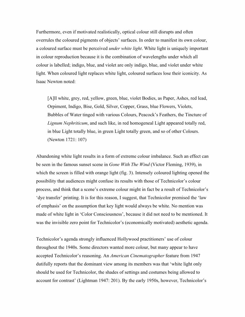
Abandoning white light results in a form of extreme colour imbalance. Such an effect can
be seen in the famous sunset scene in Gone With The Wind (Victor Fleming, 1939), in
which the screen is filled with orange light (fig. 3). Intensely coloured lighting opened the
possibility that audiences might confuse its results with those of Technicolor’s colour
process, and think that a scene’s extreme colour might in fact be a result of Technicolor’s
‘dye transfer’ printing. It is for this reason, I suggest, that Technicolor premised the ‘law
of emphasis’ on the assumption that key light would always be white. No mention was
made of white light in ‘Color Consciousness’, because it did not need to be mentioned. It
was the invisible zero point for Technicolor’s (economically motivated) aesthetic agenda.
Technicolor’s agenda strongly influenced Hollywood practitioners’ use of colour
throughout the 1940s. Some directors wanted more colour, but many appear to have
accepted Technicolor’s reasoning. An American Cinematographer feature from 1947
dutifully reports that the dominant view among its members was that ‘white light only
should be used for Technicolor, the shades of settings and costumes being allowed to
account for contrast’ (Lightman 1947: 201). By the early 1950s, however, Technicolor’s
power was waning. The early 1950s saw the release of a range of subtractive film stocks
by manufacturers including Eastman Kodak, Dupont, Fuji, Ferrania, and Gevaert; these
stocks allowed colour films to be made using conventional black-and-white cameras, thus
rendering Technicolor’s expensive proprietary process obsolete. Technicolor cameras
were last used on an American film in 1954 (Basten 1980: 157). But though Technicolor
lost its market, it won its argument. Its assertion that colour and light should be
realistically and narratively motivated remained unchallenged long after producers
stopped using its cameras.
Coded reminders of white light’s continued hegemony surface throughout a seminal 1957
publication in colour by the Society of Motion Picture and Television Engineers
(SMPTE). Reflecting the views of the influential industry body that prepared it, Elements
of Color in Professional Motion Pictures includes detailed guidelines on how to light in
colour, beginning with the proclamation that ‘the color quality of a light source should be
that for which the film is balanced’ (Holm et al. 1957: 76). Colour film stocks have
historically been manufactured in two versions: one balanced for daylight, and the other
for tungsten light. Daylight balanced film stock registers daylight as white, tungsten
balanced film stock registers tungsten light as white. By stipulating that daylight balanced
film should be used for daylight, and tungsten balanced film for tungsten light, Elements
of Color reasserts in coded technological terms that light should appear on screen as
white.
It is worth noting that the SMPTE did sanction a number of divergences from white light.
However, the conditions under which coloured light was allowable were so specific that
they only served to emphasise the extent of its suppression. For example, coloured light
could be used to ‘glamorize, or to create a striking effect for attention-getting purposes’
(Holm et al. 1957: 76). In other words, coloured light could be used as a brief
counterpoint to, and thus reassertion of, the hegemony of white light. Coloured light
could also be used to ‘alter or enrich the color of fabric backgrounds or drapes,
particularly in shadow areas. To give the effect of light being reflected from nearby
colored objects’ (Holm et al. 1957: 76). In other words, coloured light could augment and
mimic surface colours, thereby making itself invisible, and affectively transforming itself
into white light.
The only allowable context for extended and overt divergences from white light was that
of scenes set at night. Coloured light could be used, for example, to suggested moonlight,
firelight, or lamplight (Holm et al. 1957: 76). Unsurprisingly, sequences set after dark
were a key site of tension in 1950s Hollywood between coloured light and white light.
Films including Max Ophüls’ Lola Montès (1955) and Alfred Hitchcock’s Vertigo (1958)
challenged the pervasiveness of white light. Perhaps the most extreme challenge came
from the director-cinematographer partnership of Douglas Sirk and Russell Metty. For
example, the image of a doorway in the title sequence of Written on the Wind (1956)
includes pools of pale blue and orange light, even though it is meant to be daytime. In
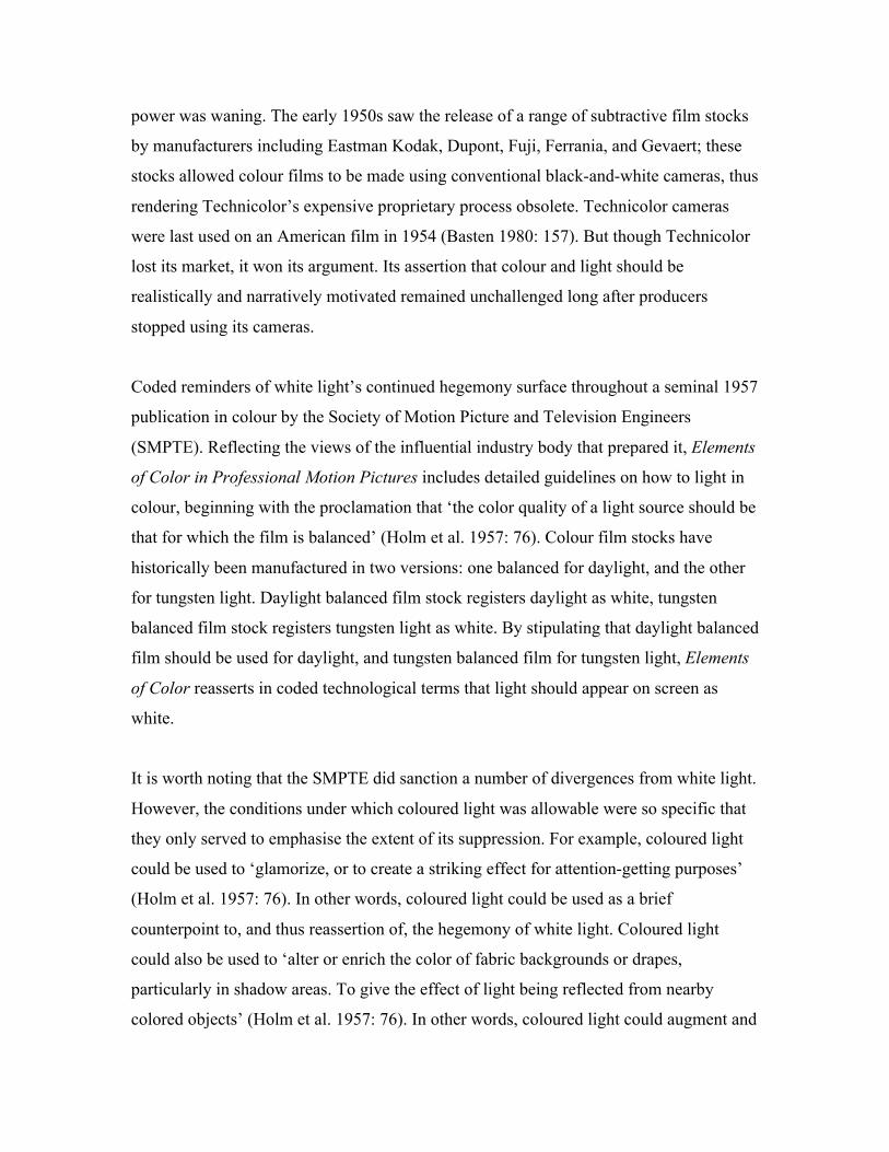
scenes set at night, Sirk and Metty used even more overtly coloured lighting. In a
particularly startling scene, Mitch Wayne (Rock Hudson) talks to Marylee Hadley
(Dorothy Malone) in an unlit room. The opening of the scene is illuminated solely by the
electric blue of artificial night, banding the room in black and blue. The effect is
astonishing, but Sirk and Metty are unable or unwilling to follow-through. After Mitch
and Marylee have exchanged a few lines, Marylee switches on a table lamp, illuminating
both their faces in white light (fig. 4). For the rest of the scene, the two characters remain
close to the white light, moth-like, unable to escape its pull.
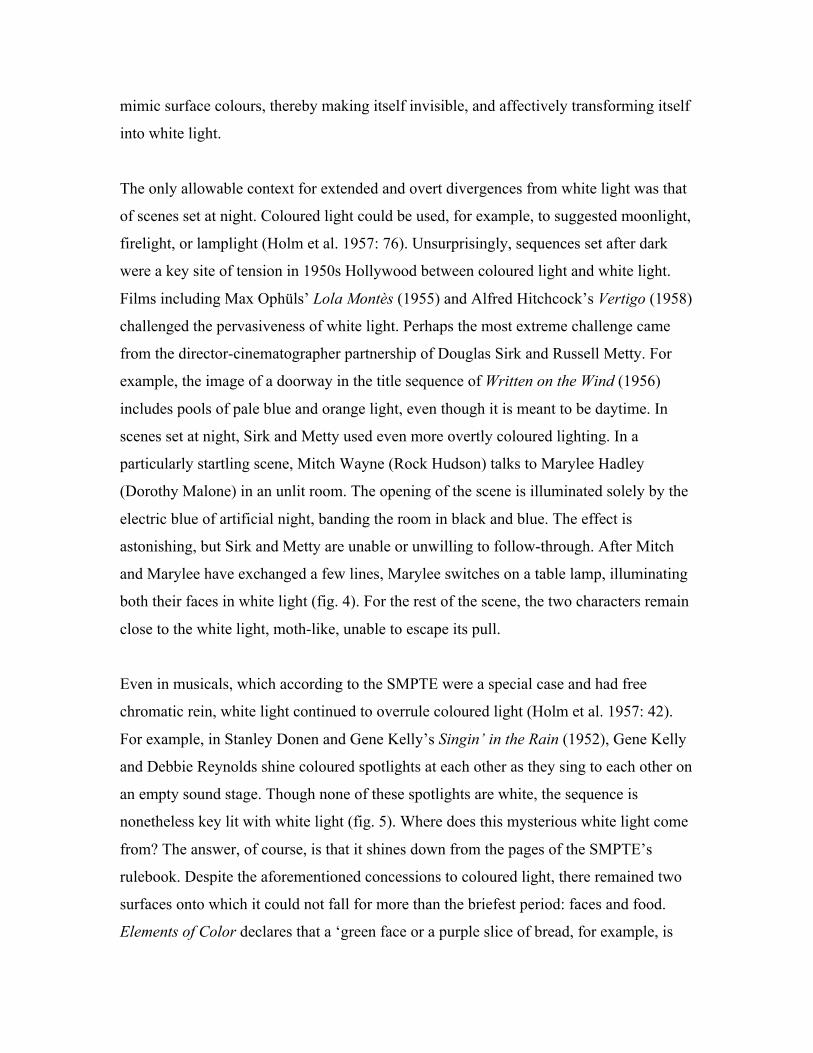
Even in musicals, which according to the SMPTE were a special case and had free
chromatic rein, white light continued to overrule coloured light (Holm et al. 1957: 42).
For example, in Stanley Donen and Gene Kelly’s Singin’ in the Rain (1952), Gene Kelly
and Debbie Reynolds shine coloured spotlights at each other as they sing to each other on
an empty sound stage. Though none of these spotlights are white, the sequence is
nonetheless key lit with white light (fig. 5). Where does this mysterious white light come
from? The answer, of course, is that it shines down from the pages of the SMPTE’s
rulebook. Despite the aforementioned concessions to coloured light, there remained two
surfaces onto which it could not fall for more than the briefest period: faces and food.
Elements of Color declares that a ‘green face or a purple slice of bread, for example, is
almost intolerable’ (Holm et al. 1957: 76). I have found only two examples of classical
Hollywood films that break this rule for an extended period of time. The first is Vincente
Minnelli’s An American in Paris (1951), in which a fantasy ballet sequence photographed
by veteran film noir cinematographer John Alton takes place in coloured key light. The
sequence is self-contained, with the beginning and end of the fantasy – and the optical
colour – clearly signalled. Figures remain in wide shot throughout, their individuality
subsumed to the overall design of the choreography and the lighting. Though Alton’s use
of coloured light is remarkable and beautiful, it is unthreatening.
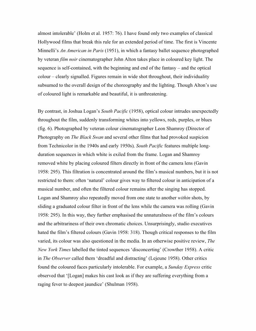
By contrast, in Joshua Logan’s South Pacific (1958), optical colour intrudes unexpectedly
throughout the film, suddenly transforming whites into yellows, reds, purples, or blues
(fig. 6). Photographed by veteran colour cinematographer Leon Shamroy (Director of
Photography on The Black Swan and several other films that had provoked suspicion
from Technicolor in the 1940s and early 1950s), South Pacific features multiple long-
duration sequences in which white is exiled from the frame. Logan and Shamroy
removed white by placing coloured filters directly in front of the camera lens (Gavin
1958: 295). This filtration is concentrated around the film’s musical numbers, but it is not
restricted to them: often ‘natural’ colour gives way to filtered colour in anticipation of a
musical number, and often the filtered colour remains after the singing has stopped.
Logan and Shamroy also repeatedly moved from one state to another within shots, by
sliding a graduated colour filter in front of the lens while the camera was rolling (Gavin
1958: 295). In this way, they further emphasised the unnaturalness of the film’s colours
and the arbitrariness of their own chromatic choices. Unsurprisingly, studio executives
hated the film’s filtered colours (Gavin 1958: 318). Though critical responses to the film
varied, its colour was also questioned in the media. In an otherwise positive review, The
New York Times labelled the tinted sequences ‘disconcerting’ (Crowther 1958). A critic
in The Observer called them ‘dreadful and distracting’ (Lejeune 1958). Other critics
found the coloured faces particularly intolerable. For example, a Sunday Express critic
observed that ‘[Logan] makes his cast look as if they are suffering everything from a
raging fever to deepest jaundice’ (Shulman 1958).
Nor was the institutional and cultural aversion to coloured light specific to classical
Hollywood. Even classical art cinema, which had a strong proclivity towards stylisation,
rarely escaped the hegemony of white light. Jacques Aumont observes that in 1960s and
1970s art cinema, as in classical Hollywood, putting coloured objects in front of the
camera was by far the most common means of exploiting colour (Aumont 1992: 18).
Though isolated instances of scenes lit by coloured light can be found in films as diverse
as Tokyo Drifter (Seijun Suzuki, 1967) and Last Tango in Paris (Bernardo Bertolucci,
1972), white light retained its hold as an aesthetic default throughout this period. Even
Jean-Luc Godard’s colour 1960s films relied on the coloured surfaces of objects for their
chromatic effect. Edward Branigan observes that Godard’s trademark reds, yellows, and
blues most often appear as blocks, shot head-on in diffused (white) light, resulting in
compositions dominated by flat planes of solid colour (Branigan 1976: 27). Except for
some prominent neons outside the apartment in Une Femme est une femme (1961) and a
short party sequence in Pierrot le fou (1967) featuring colour filtration, colour as light
played little part in Godard’s stylistic experiments.
Cinema’s Newtonian Optics
Coloured light makes its presence felt most emphatically at night, so it is no surprise that
it finally emerged from cinema’s shadows in conjunction with the rise in the 1980s of
what has been loosely labelled ‘neo-noir’. The after dark genre of neo-noir provided
many of the most prominent Hollywood film-makers of the time – including Ridley
Scott, Adrian Lyne, and Michael Mann – with the opportunity to use black, not white, as
a visual zero point. Typical, perhaps even prototypical, of colour cinema’s tonal inversion
is Blade Runner (Ridley Scott, 1982). Only one scene in the entire film, when Rick
Deckard (Harrison Ford) visits the penthouse of cybernetics magnate Eldon Tyrell (Joe
Turkell), is set in full daylight, though even this ‘daylight’ was simulated on a sound
stage. Otherwise, an atmospheric blackness engulfs the near future Los Angeles of the
film. The city is so polluted that daylight never makes it down to street level: black
pigments of pollution hang in the atmosphere, forcing the city’s population to live in
darkness, like the Cimmerians in Homer’s Odyssey (11.14). All light is artificial and
evanescent. Fluorescent lights flicker, neon lights flash, beams of light from passing air
traffic cut through the shadows of interior spaces and then move on. Even the daylight of
the penthouse only lasts for a few moments, before Deckard asks for the blinds to be
drawn so he can test to see if Tyrell’s assistant Rachel (Sean Young) is a replicant.
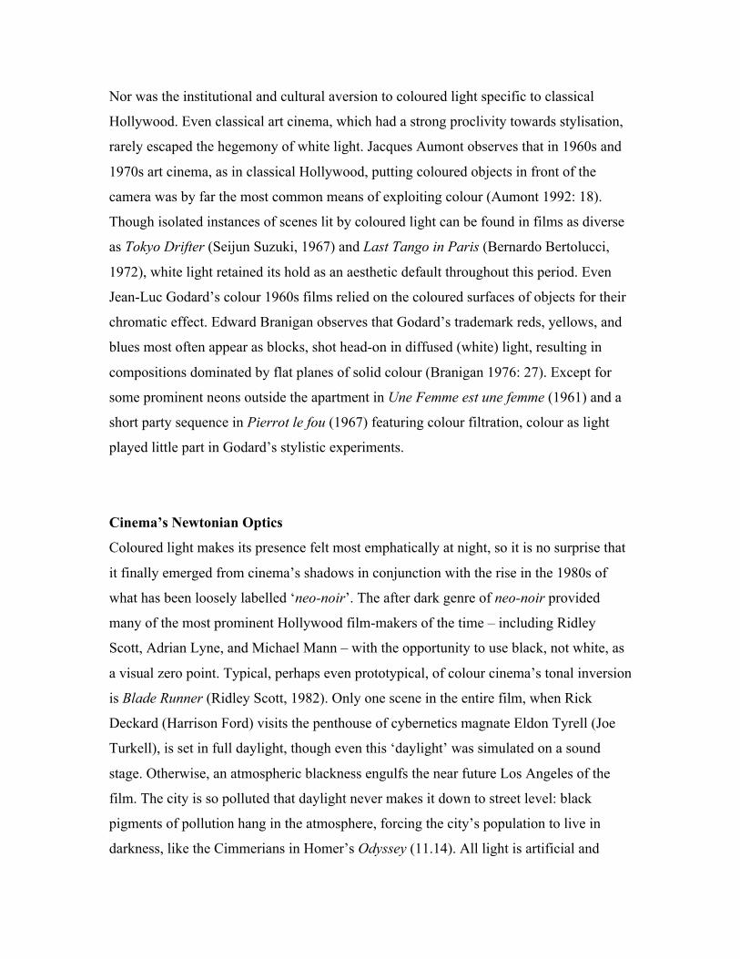
Deckard’s rejection of daylight reflects the priorities of the film-makers. In Blade
Runner, Ridley Scott and director of photography Jordan Cronenweth shot entirely at
night or in sound stages, allowing for a far more pronounced engagement with optical
colour than would have been possible in daylight. For example, a notable visual
characteristic of the film is neon signage; the streetscapes of Los Angeles are filled with
coloured light sources. This feature of the production design is augmented by the film’s
cinematography. Cronenweth notes that he lit off-camera neons at maximum
illumination, often allowing them to become the main source of light in a shot (Lightman
& Patterson 1982: 721). Yet, though prominent, optical colour is not dominant in Blade
Runner. Though the film’s interior spaces, shielded from the exterior by Venetian blinds,
provide an atmospheric darkness evocative of the study in which Newton discovered the
properties of optical colour, the rays of white light shining between the slats do not
refract into their constituent spectral colours (fig. 7). Newton’s discovery that white light
is the sum of all optical colours remains unacknowledged.
Clearly, as Blade Runner demonstrates, originating a film in Newtonian darkness makes
possible a range of techniques for decomposing and reconstituting white light, but it does
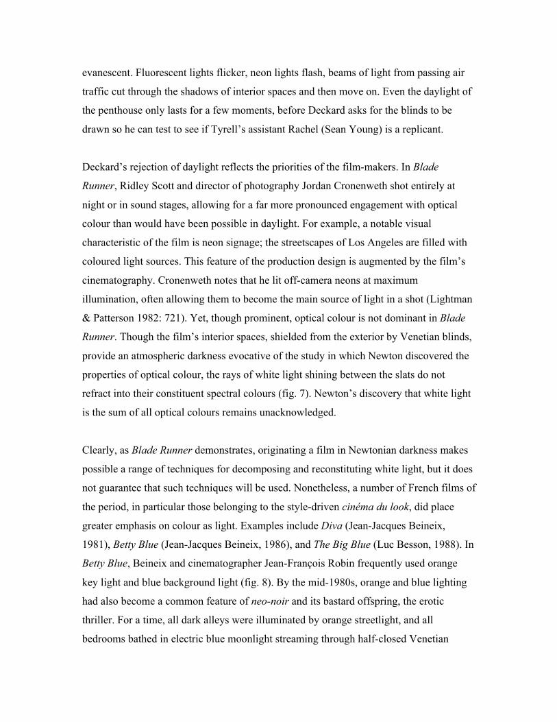
not guarantee that such techniques will be used. Nonetheless, a number of French films of
the period, in particular those belonging to the style-driven cinéma du look, did place
greater emphasis on colour as light. Examples include Diva (Jean-Jacques Beineix,
1981), Betty Blue (Jean-Jacques Beineix, 1986), and The Big Blue (Luc Besson, 1988). In
Betty Blue, Beineix and cinematographer Jean-François Robin frequently used orange
key light and blue background light (fig. 8). By the mid-1980s, orange and blue lighting
had also become a common feature of neo-noir and its bastard offspring, the erotic
thriller. For a time, all dark alleys were illuminated by orange streetlight, and all
bedrooms bathed in electric blue moonlight streaming through half-closed Venetian
blinds. Blue even became a prominent presence in the lexicon of neo-noir, finding a place
for itself in the titles of noir-influenced films including Blue Thunder (John Badham,
1983), Blue Velvet (David Lynch, 1986), and Blue Steel (Kathryn Bigelow, 1990), as well
as in blue movies.
The French cinéma du look and American neo-noir effected a partial reconciliation
between colour and light. Through them, colour cinematography began to assimilate
techniques of black-and-white cinematography (in particular, that of ‘hard’ directional
lighting), and to use these techniques to express colour’s optical nature. Mainstream
cinema at last began to move from an emphasis on surface colour to an engagement with
optical colour. To my mind, the apotheosis of this engagement occurred in Wong Kar
Wai’s loose trilogy: Chungking Express (1994), Fallen Angels (1995), and Happy
Together (1997). In these three groundbreaking collaborations with cinematographer
Chris Doyle, Wong moved beyond the blue blacks and orange whites of the 1980s, and
pressed against the visual limits of optical colour. Coloured light is common throughout
the three films. For example, a neon sign in a doorway in Fallen Angels provides Doyle
with the justification for flooding the frame with a mixture of orange and red light. Of
course, white light still plays a prominent role, but its presence is less a chromatic norm
than an unwelcome intrusion into Hong Kong’s spectral after dark colours. In contrast to
Douglas Sirk’s characters, Wong’s characters avoid white light. White light reveals all
frequencies of colour; coloured light is a suppression of certain frequencies in favour of
others. So Wong’s characters hold their most important discussions in neon lit bars and
doorways, their feelings coloured – and perhaps deliberately concealed – by their visual
environment.
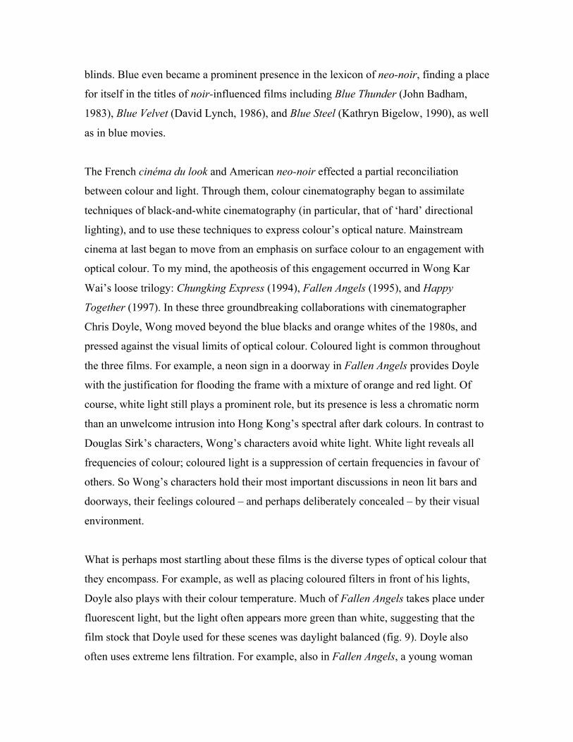
What is perhaps most startling about these films is the diverse types of optical colour that
they encompass. For example, as well as placing coloured filters in front of his lights,
Doyle also plays with their colour temperature. Much of Fallen Angels takes place under
fluorescent light, but the light often appears more green than white, suggesting that the
film stock that Doyle used for these scenes was daylight balanced (fig. 9). Doyle also
often uses extreme lens filtration. For example, also in Fallen Angels, a young woman
attempts to entertain a morose assassin eating a Happy Meal in a subterranean
McDonald’s. The whole scene is shot through a yellow filter, giving the image a
translucent surface of cheerfulness. In other scenes, coloured light sources, unbalanced
film stock, and lens filtration combine in ways impossible to classify. Yet though
immersive, the nocturnal neons of Wong’s films ultimately remain subservient to the
environmental hegemony of white light. White light can only be held at bay for so long;
as soon as Chungking Express moves to day in its second half, white light returns.
Unsurprisingly, given the difficulties that realist narrative conventions have with
coloured light, films in which white light has been held completely at bay have
historically been exceptionally rare and have tended to be restricted to the avant-garde
extremes of art cinema, where the reality effect is weaker or even completely absent.
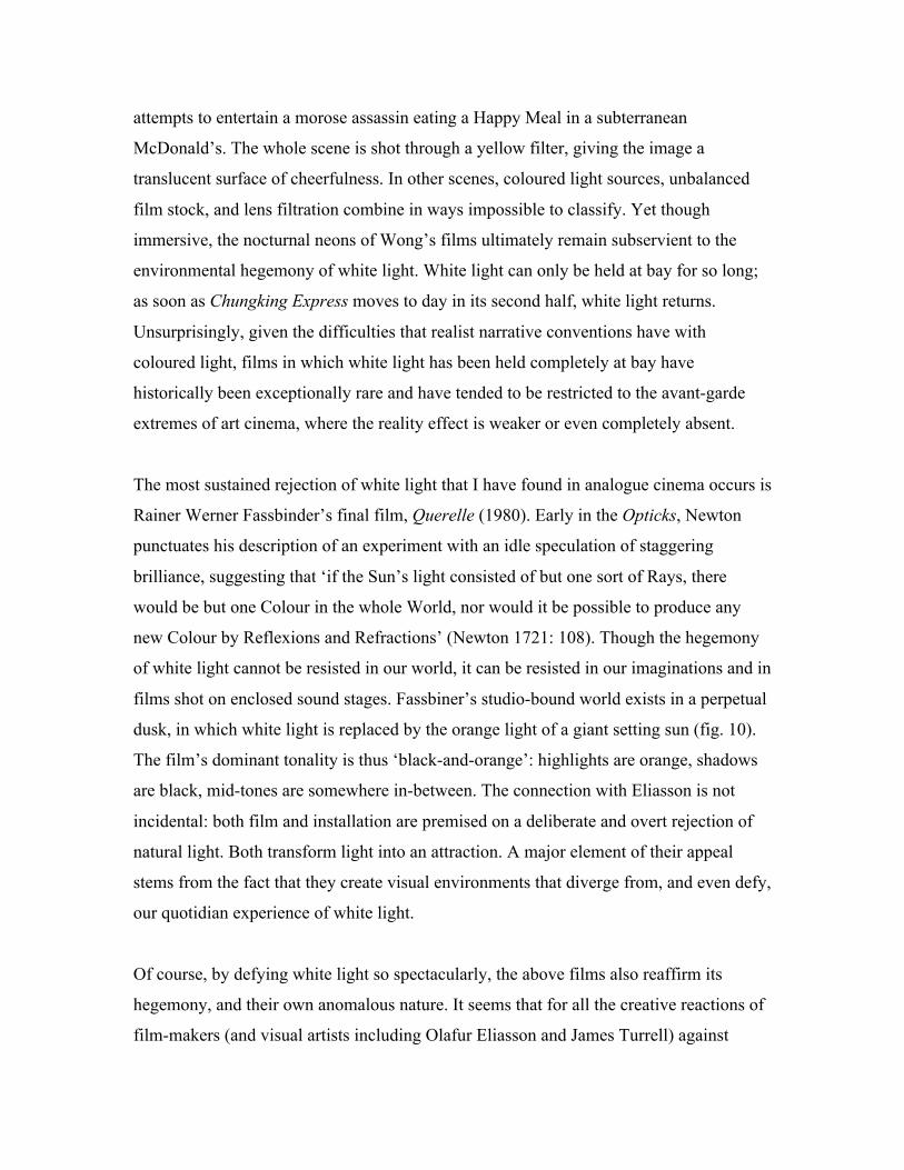
The most sustained rejection of white light that I have found in analogue cinema occurs is
Rainer Werner Fassbinder’s final film, Querelle (1980). Early in the Opticks, Newton
punctuates his description of an experiment with an idle speculation of staggering
brilliance, suggesting that ‘if the Sun’s light consisted of but one sort of Rays, there
would be but one Colour in the whole World, nor would it be possible to produce any
new Colour by Reflexions and Refractions’ (Newton 1721: 108). Though the hegemony
of white light cannot be resisted in our world, it can be resisted in our imaginations and in
films shot on enclosed sound stages. Fassbiner’s studio-bound world exists in a perpetual
dusk, in which white light is replaced by the orange light of a giant setting sun (fig. 10).
The film’s dominant tonality is thus ‘black-and-orange’: highlights are orange, shadows
are black, mid-tones are somewhere in-between. The connection with Eliasson is not
incidental: both film and installation are premised on a deliberate and overt rejection of
natural light. Both transform light into an attraction. A major element of their appeal
stems from the fact that they create visual environments that diverge from, and even defy,
our quotidian experience of white light.
Of course, by defying white light so spectacularly, the above films also reaffirm its
hegemony, and their own anomalous nature. It seems that for all the creative reactions of
film-makers (and visual artists including Olafur Eliasson and James Turrell) against
white light, resistance is ultimately futile. Even if a film or installation excludes white
light, we eventually emerge from the darkness of the cinema or gallery into daylight. To
avoid white light completely, one would need to take the extreme measures of Des
Essientes in Huysmans’ novel À Rebours, who wakes at night, and indulges his taste for
flamboyant lighting design behind permanently sealed shutters. Yet even then, our eyes
would contradict our wishes and adjust to make the dominant full-spectrum light source
in any artificially lit environment appear to us as white. In other words, to object to white
light’s environmental hegemony is pointless – there is no alternative in this world.
Nonetheless, in my view, works that defy white light are particularly fascinating because
they give us a glimpse of the alternative worlds that Newton hypothesised.i
Since the rise of digital colour grading in the mid-1990s, alternative chromatic worlds
have proliferated throughout screen media. As I have discussed digital colour at length
elsewhere, I restrict myself here to noting that contemporary post-production technology
has made ‘global’ colour adjustments relatively effortless – and so ubiquitous (Misek
2010). Colourists can – and routinely do – transform the overall saturation, brightness,
and hue of a shot in minutes or even seconds. The results of such transformative colour
alterations include the Matrix trilogy (Andy and Larry Wachowski, 1999-2000), in which
the greens of the computer-generated Matrix evoke 1970s VDU monitors, Amelie (Jean-
Pierre Jeunet, 2001), whose radiant yellows transform Paris into a perpetually autumnal
tourist fantasy, and thousands of steel blue car advertisements (see figures 11 and 12). In
these various screen worlds and others, full-spectrum colour gives way to a narrower
range of light frequencies. White light is no longer dominant.
So has the invisible ideology of white light finally been overcome? In my view, it has
not. Though many contemporary films diverge from full-spectrum light, this is only ever
a divergence. Despite the efforts of some of cinema’s most imaginative practitioners, and
the astonishing degree of chromatic control available in the colour-grading suite, white
light remains cinema’s chromatic default. I justify this claim, and conclude this article, by
returning to the process with which I began: white balance. Almost all video cameras
(from consumer camcorders to the Red Epic) have a ‘white balance’ button that allows
the camera to register the dominant colour temperature in front of the lens as white. A
camera operator will typically use this function whenever the camera is initially switched
on, and whenever the lighting conditions in front of the lens change. In this one very
specific and material sense, digital technology has actually reinforced the role of white
balanced light as a chromatic default. Through the white balance function, the invisible
ideology of white light has become physically assimilated into video hardware. The
implication of the white balance function is, as it was with white balancing for film, that
the process of adjusting the chromatic ‘perception’ of the camera results in ‘neutral’
images – ‘raw’ footage that registers ‘reality’ in its unprocessed state. The implication
(the lie) is, as it always has been, that the camera innocently reproduces what we see.
White light remains a visual default because it reinforces this lie.
Bibliography
Aristotle. 1906. De sensu and de memoria. Cambridge: Cambridge University Press.
Aumont, Jacques. 1992. La trace et sa couleur. Cinémathéque 2: 6-24.
Belton, John. 2000. Cinecolor. Film History 12, no. 4: 344-357.
Branigan, Edward. 1976. The articulation of color in a filmic system. Wide Angle 1, no.
3: 20-31.
Bordwell, David, Janet Staiger, and Krtistin Thompson. 1985. The classical Hollywood cinema:
film style & mode of production to 1960. New York: Columbia University Press.
Brewster, David. 1883. Letters on natural magic. London: Chatto & Windus.
Buscombe, Edward. 1985. Sound and colour. In Movies and Methods, Volume II, ed. B. Nichols,
83-91. Berkeley: University of California Press.
Crowther, Bosley. 1958. South Pacific. The New York Times, 20 March: 33.
Douchet, Jean. 1963. Rencontre avec Leon Shamroy. Cahiers du Cinéma 25, no. 147: 31-34.
Gavin, Arthur. 1958. 'South Pacific' New Concept in Color Photography. American
Cinematographer 39, no.5: 294-296, 318-9.
Haines, Richard W. 1993. Technicolor movies. Jefferson, North Carolina & London: McFarland
& Company, Inc., Publishers.
Manovich, Lev. What is digital cinema? Accessed 12 September, 2009.
http://www.manovich.net/TEXT/digital-cinema.html
Misek, Richard. 2010. Chromatic Cinema: A History of Screen Color. Malvern, MA: Wiley-
Blackwell.
Handley, C.W. 1935. Lighting for Technicolor motion pictures. Journal of the Society of Motion
Picture Engineers 25, no. 5: 423-431.
Higgins, Scott. 2007. Harnessing the Technicolor rainbow: color design in the 1930s. Austin:
University of Texas Press.
Higham, Charles. 1970. Hollywood cameramen: sources of light. London: Thames and Hudson.
Holm, William R. et al. 1957. Elements of color in professional motion pictures. New York:
Society of Motion Picture and Television Engineers.
Homer. 2004. The odyssey. Baltimore: Johns Hopkins University Press.
Kalmus, Natalie. 1935. Color consciousness. Journal of the Society of Motion Picture Engineers
25, no. 2: 139-47.
Lejeune, C. A. 1958. At the films: sound and fury. The Observer, 27th April: 9
Lightman, Herb A. 1947. Painting with Technicolor light. American Cinematographer 28, no. 6:
200-201.
Lightman, Herb A. and Richard Patterson. 1982. Blade Runner: production design and
photography. American Cinematographer 63, no. 7: 684-687, 715-724.
Mamoulian, Rouben. 1960. Color and light in films. Film Culture 21: 68-79.
Mollon, J.D. 1988. Colour vision and colour blindness. In The Senses, eds. H.B. Barlow and J.D.
Mollon, 165-191. Cambridge: Cambridge University Press.
Mott, Roy. 1919. White light for motion picture photography. Transactions of the Society of
Motion Picture Engineers 8: 7-41.
Neale, Stephen. 1985. Cinema and technology: image, sound, colour. London: Macmillan.
Neupert, Richard. 1990. Technicolor and Hollywood: exercising color restraint. Post Script 10,
no. 1: 21-29.
Newton, Isaac. 1721. Opticks: or, a treatise of the reflections, refractions, inflections and
colours of light. London: William and John Innys.
Shulman, Milton. 1958. At the cinema: Brando loses faith in his fuehrer. Sunday Express,
27 April, 17.
i A precursor to Fassbinder and Eliasson’s experiments is described in Letters on Natural Magic
by the early nineteenth century scientist and showman, Sir David Brewster. By adding salt to the flame of an oil lamp, Brewster created mono-frequency yellow light, and then transformed it into a parlour game: ‘The party which is witness to the experiment should be dressed in a diversity of the gayest colours; and the brightest coloured flowers and highly coloured drawings should be placed on the tables. The room being at first lighted with ordinary lights, the bright and gay colours of every thing that it contains will be finely displayed. If the white lights are now suddenly extinguished, and the yellow lamps lighted, the most appalling metamorphosis will be exhibited.’ (Brewster 1883: 111). Though Brewster describes this refutation of white light as ‘appalling’, the tone of his description strongly suggests that in fact – like the visitors who lay under Eliasson’s sun – he found it enthralling.