The Elements of Design are the language of the visual arts. This introduction focuses on the...
25
The Elements of Design are the language of the visual arts. This introduction focuses on the elements that are most relevant to two-dimensional (flat) art works. Elements of Design Elements of Design Line: Line: path of a point Shape: Shape: perceivable area Value: Value: relative light and darkness Color: Color: color theory basics Space: Space: (2D) height, width and the illusion of depth Texture: Texture: actual or simulated tactile quality
-
Upload
doreen-merritt -
Category
Documents
-
view
222 -
download
0
Transcript of The Elements of Design are the language of the visual arts. This introduction focuses on the...

The Elements of Design are the language of the visual arts. This introduction focuses on the elements that are most relevant to two-dimensional (flat) art works.
Elements of DesignElements of Design
Line:Line: path of a point
Shape:Shape: perceivable area
Value:Value: relative light and darkness
Color:Color: color theory basics
Space:Space: (2D) height, width and the illusion of depth
Texture:Texture: actual or simulated tactile quality

Leonardo da Vinci used a soft, sensitive soft line to create a graceful image.
Willem DeKooning created a very different feeling by using a heavy, gestural line.
The woman's face in the third image is created with a mechanical line creating an emotionally-detached feeling.
LineLine

Line - the path of a Line - the path of a point.point.
Although the subject matter is the same in Although the subject matter is the same in all three works, the differences in line all three works, the differences in line quality have created works with very quality have created works with very different impact. different impact.
How you use line is one of the most How you use line is one of the most important decisions to be made in creating important decisions to be made in creating a work of art a work of art
This is true whether you are using a pencil This is true whether you are using a pencil point or a cursor on a monitor.point or a cursor on a monitor.

The shapes in the image are clearly defined, creating a sense of orderliness and confidence.
By contrast, the ship's shape is barely discernable. This creates a sense of vulnerability and uncertainty.
ShapeShape
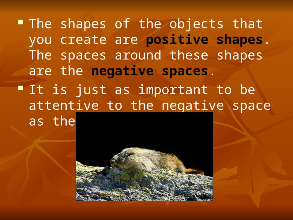
The shapes of the objects that you create are positive shapes. The spaces around these shapes are the negative spaces.
It is just as important to be attentive to the negative space as the positive shapes.

The overall lightness and lack of contrast in the image conveys a sense of spirituality and harmony between the tree and the circular sky.
The dramatic mood of this work by Gustave Dore is created, in large part, by the high contrast of light and dark.
Value - relative light and Value - relative light and darkness.darkness.

Color – basic color Color – basic color theorytheory
We response to color on many levels. We response to color on many levels. Color can be used simply to describe an Color can be used simply to describe an object. It can be used to show emotion.object. It can be used to show emotion.
Blue= sadness or spirituallyBlue= sadness or spirituallyRed= angerRed= anger
SymbolicallySymbolically (associated with a flag's (associated with a flag's color, corporation logo or sports team) color, corporation logo or sports team)
Also, psychologicallyAlso, psychologically..

The vocabulary of color includes:The vocabulary of color includes:
Hue: refers to the names of the primary colors, red, green and blue.
Value: lightness and darkness of the color - the amount of white or black added.
Intensity: the purity or saturation of the color
Monochromatic color: use of one color where only the value of the color changes
Analogous colors: colors that are adjacent to each other on the color wheel, e.g. yellow and green

Analogous colorsAnalogous colors next to each other on the color wheel "get along" and are referred to as being harmonious. Analogous colors are often used in visual design and have a soothing affect.

Complimentary colorsComplimentary colors exhibit more contrast when positioned adjacent to each other -for example yellow appears more intense when positioned on or beside blue or violet (see picture below).

Warm colors include:Warm colors include: yellows, red and orange are associated with blood, sun and fire
Sunrise behind a tree has a warm fire like feel to it.

Cool colors include:Cool colors include: violet, blue and green because of our association with snow and ice.
Banff Springs Hotel with light blue filter emphasizes the coldness of winter (Monochromatic color)

Phyllis Bramson has intense, complimentary colors that equate to strong conflicting emotions.
Alphonse Mucha uses subdued, analogous color to create a very different feeling.

Space in a two-dimensional drawing or painting refers to the arrangement of objects on the picture plane.
You can have a picture plane that is a crowded space with lots of objects or an empty space with very few objects in the picture plane.
A two-dimensional piece of art has heights and width but no depth.
The illusion of depth can be achieved by using perspective.
This is the technique used to have your picture look likes it is moving to the distance like a landscape or cityscape.
SpaceSpace

Nonlinear PerspectiveNonlinear Perspective is the method of showing depth that incorporates the following techniques.
o Position Position - Placing an object higher on the page makes it appear farther back then objects placed lower on the page.
o Overlapping Overlapping -When an object overlaps another object it appears closer to the viewer, and the object behind the object appears farther away.
o Size VariationSize Variation - Smaller objects look farther away in the distance. Larger objects look closer.
o ColorColor - Bright colors look like they are closer to you and neutral colors look like they are farther away. Warm colors appear closer and cool colors appear farther away.
o ValueValue - Lighter values look like they are farther back and darker value look like they are closer. For example in a landscape the mountains often look bluish and lighter then the trees or houses that are closer to you.

TextureTextureTexture refers to the surface quality or "feel" of an object - smooth, rough, soft, etc. Textures may be actual (felt with touch - tactile) or implied (suggested by the way an artist has created the work of art -visual).

Principles of Principles of DesignDesign
ScaleScale: : overall size ProportionProportion: : relative size within the work UnityUnity: repetition > rhythm > pattern > unity BalanceBalance: equalizing the visual weight of
elements DirectionDirection: visual path EmphasisEmphasis: focal point

ScaleScale - overall size
Much of the impact of monumental artwork such as Mount Rushmore is its sheer size.Lincoln's head is 70 ft. in height (taller than the entire figure of the Sphinx). A miniature of this carving simply would not have the same impact. A small work has a sense of intimacy - we need be close to the work to view it.
Scale, alone, can change the meaning of a work of art.

ProportionProportion - relative size of objects within the work of art.
Rene Magritte has created a surreal situation simply by manipulating the proportions of common objects. There are no clues that tell us if we are in a normal-sized room or a dollhouse.
Andrew Wyeth has used the proportion very differently - the small farmhouse against the largeness of the field created a sense of isolation.

Repetition of visual elements such as shapes or colors create a rhythm and pattern in an artwork - creating a sense of harmony and unity that pulls the picture together.
Unity-VarietyUnity-Variety
Artists, such as Andy Warhol, have emphasized repetition to make a statement about the prevalence of mass-production in our society.

Unity-VarietyUnity-Variety
The three-tined shape of the pitchfork in Grant Wood's painting is repeated exactly in the clothing. It is also repeated in the windows and vertical lines in the house. Curved shapes surround the woman's head - in the broach, curved edge of her dress and background trees. This repetition of shape unifies the painting, while the differences between the vertical and curved shapes give the painting a balancing sense of variety.

The cross is symmetrically (formally) balanced - one half mirrors the other. Religious and significant objects are often given a symmetrical balance.
The painting by Mary Cassatt, depicts an ordinary moment. It is asymmetrically balanced. The two women on one side are balanced by the large silver service and fireplace on the other -with the area of highest value contrast (the woman in dark with the near-white saucer and cup) only slightly off-set from the center.
BalanceBalance - equalizing the visual weight of elements.

Direction and EmphasisDirection and Emphasis
The Moulin Rouge is seen instantaneously. The whole work is revealed to us simultaneously. An artist needs to create an area of emphasis -a focal point that begins the path our eyes will follow as we take in the whole art work. In this painting, our eye is first drawn to the woman's face on the right edge. The artist, Toulouse-Lautrec, has heighten the value contrast, color intensity, color contrast (orange hair and bright red lips contrast with the green of her forehead), and proportion (she is the largest person). In addition, she is staring directly at us. We are first drawn to the area of greatest contrast. Our eye then sweeps across the canvas, taking in the other figures.
Direction is the visual path our eye will follow. Emphasis refers to the object or element which first catches our attention.

In summary, two works of art with similar subject matter will be compared. The first image was created by Paul Revere shortly before the American Revolution. It depicts an historic event, the Boston Massacre, in which British soldiers killed several colonialists. The second was painted by a Spanish artist, Francisco Goya, who describes another historical event - the execution of men by Napoleon's soldiers in Spain. Though both works tell a similar story, Goya's work is much more impacting. It's almost as if we are reading two accounts of war - one by a writer who unemotionally describes an event, the other by a writer who emotionally pulls you into the story and make you feel a sense of the horror of war. Goya accomplish this by using the principles of design to great effect.

ScaleScale -print is approximately 18" in height- somewhat hovering in the first work.
-enormous - the figures are life-sized, which gives the painting even greater impact.-almost as if we are actually there as we are standing at ground level
ProportionProportion - given the people and the town equal importance.
- the figures proportional larger than the town in the distance
Unity-VarietyUnity-Variety - There are elements of unity in Paul Revere's work - the buildings' windows and soldiers' feet - but this really doesn't add to the meaning of the work.
- used unity to make the soldiers and their rifles almost identical - giving them a machine-like, inhuman quality. To emphasis the fate of he man with his arms out-stretched, the dead man lying near him is in the same position.
Emphasis Emphasis
and Directionand Direction
-It is difficult to see a specific focal point as the piece has relatively the same contrast in value.
- The high contrast in value - the glowing shirt and lamp against the black of night - has given the painting a dramatic quality lacking in the first work. It also draws our eye to the man about to die. His out thrust arms gesture to the church spire and we follow his eyes across the rifle barrows.