
Special Publication • Special Publication -...
40
SPECIAL PUBLICATION Summer 1998 DATA “SANITY”: STATISTICAL THINKING APPLIED TO EVERYDAY DATA DAVIS BALESTRACCI HEALTHSYSTEM MINNESOTA 1.0 Introductory Thoughts Despite all the talk about “improvement” and “Statistical Thinking” and mad flurries of training activity (usually resembling The Inquisition), our everyday work environments are horribly contaminated with poor statistical practice (even if it is not formally called “statistics”). Whether or not people understand statistics, they are already using statistics— and with the best of intentions. People generally do not perceive that they need statistics—the need is to solve their problems. However, “statistics” is not merely a set of techniques to be used solely on projects. So, forget all the statistics you learned in school. The messy real world is quite different from the sanitized world of textbooks and academia. And the good news is that the statistical methods required for everyday work are much simpler than ever imagined...but initially quite counter-intuitive. Once grasped, however, you have a deceptively simple ability and understanding that will ensure better analysis, communication, and decision-making. 1.1 Current Realities of the Quality Improvement World Given the current rapid pace of change in the economic environment along with the “benchmarking,” “re-engineer- ing,” and “total customer satisfaction” crazes, there seems to be a new tendency for performance goals to be imposed from external sources, making improvement efforts flounder when • Results are presented in aggregated row and column formats complete with variances and rankings, • Perceived trends are acted upon to reward and punish, • Labels such as “above average” and “below average” get attached to individuals/institutions, • People are “outraged” by certain results and impose even “tougher” standards. Special Publication • Special Publication • Special Publication • Special Publication • Special Publication Special Publication • Special Publication • Special Publication • Special Publication • Special Publication Acknowledgment The Statistics Division would like to thank Davis Balestracci for his dedication in completing this publication. Anyone who has worked with Davis immediately feels his passion for this topic. That passion also exists in his book, Quality Improvement: Practical Applications for Medical Group Practice. (See Bibliography for more information.) Further thanks go to Stu Janis and Janice Shade who edited the publication. Additional copies of either this publication or the Statistical Thinking Publication are available through the Quality Information Center (QIC) by calling 1-800-248-1946. A nominal fee will be charged for printing, postage and handling. SPECIAL PUBLICATION ASQ Statistics Division ©
Transcript of Special Publication • Special Publication -...

SPECIAL PUBLICATION Summer 1998
DATA “SANITY”:
STATISTICAL THINKING
APPLIED TO EVERYDAY DATADAVIS BALESTRACCI
HEALTHSYSTEM MINNESOTA
1.0 Introductory ThoughtsDespite all the talk about “improvement” and “Statistical Thinking” and mad flurries of training activity (usuallyresembling The Inquisition), our everyday work environments are horribly contaminated with poor statistical practice(even if it is not formally called “statistics”). Whether or not people understand statistics, they are already using statistics—and with the best of intentions. People generally do not perceive that they need statistics—the need is to solve theirproblems.
However, “statistics” is not merely a set of techniques to be used solely on projects. So, forget all the statistics youlearned in school. The messy real world is quite different from the sanitized world of textbooks and academia. Andthe good news is that the statistical methods required for everyday work are much simpler than ever imagined...butinitially quite counter-intuitive. Once grasped, however, you have a deceptively simple ability and understanding thatwill ensure better analysis, communication, and decision-making.
1.1 Current Realities of the Quality Improvement World Given the current rapid pace of change in the economic environment along with the “benchmarking,” “re-engineer-ing,” and “total customer satisfaction” crazes, there seems to be a new tendency for performance goals to be imposedfrom external sources, making improvement efforts flounder when• Results are presented in aggregated row and column formats complete with variances and rankings,• Perceived trends are acted upon to reward and punish,• Labels such as “above average” and “below average” get attached to individuals/institutions,• People are “outraged” by certain results and impose even “tougher” standards.
Special Publication • Special Publication • Special Publication • Special Publication • Special Publication
Special Publication • Special Publication • Special Publication • Special Publication • Special Publication
AcknowledgmentThe Statistics Division would like to thank Davis Balestracci for his dedication in completing this publication. Anyone who hasworked with Davis immediately feels his passion for this topic. That passion also exists in his book, Quality Improvement:Practical Applications for Medical Group Practice. (See Bibliography for more information.) Further thanks go to Stu Janis andJanice Shade who edited the publication.
Additional copies of either this publication or the Statistical Thinking Publication are available through the Quality InformationCenter (QIC) by calling 1-800-248-1946. A nominal fee will be charged for printing, postage and handling.
SPECIAL
PUBLICATIONASQ Statistics Division
©
2 ASQ STATISTICS DIVISION SPECIAL PUBLICATION 1998
These are very well-meaning strategies that are simple, obvious,...and wrong! They also “reek” of statistical traps! Thepurpose of this publication is to expose eight common statistical “traps” that insidiously cloud decisions every day invirtually every work environment. It is my hope that this publication will: • Sensitize people to the fact that taking action to improve a situation is tantamount to using statistics,• Demonstrate that the use of data is a process,• Help expose the severe limitations of “traditional” statistics in real world settings,• Provide a much broader understanding of variation,• Give a knowledge base from which to ask the right questions in a given situation,• Create awareness of the unforeseen problems caused by the exclusive use of arbitrary numerical goals, “stretch”
goals, and “tougher” standards for driving improvement,• Demonstrate the futility of using heavily aggregated tables of numbers, variances from budgets, or bar graph
formats as vehicles for taking meaningful management action, and• Create proper awareness of the meaning of the words “trend,” “above average,” and “below average.”
1.2 Some Wisdom from Yogi BerraBefore getting to the eight traps, let’s review what seems to have evolved as the “traditional” use of statistics in mostwork cultures. It can be summarized by the acronym PARC. “PARC” can have several meanings: PracticalAccumulated Records Compilation; Passive Analysis by Regressions and Correlations (as taught in many courses).With today’s plethora of computers, it can also mean Profound Analysis Relying on Computers. And it only takes acursory glance at much of published “research” to see yet another meaning: Planning After the Research is Completed(also called “torturing the data until they confess”).
Maybe you are getting sick of hearing: “You can prove anything with statistics,” “Liars, damn liars, and statisticians,”etc., etc., and it is precisely because of PARC analysis that these sayings exist! Here’s the problem: Applying statisticsto a data set does not make it a statistical analysis. Similarly, a good statistical analysis of a bad set of data is a worth-less analysis. Why? Because any statistical analysis must be appropriate for the way the data were collected. Two questionsmust be asked when presented with any previously unseen data:• What was the objective of these data?• How were these data collected?Unless these questions can be answered, no meaningful analysis can take place. How many times are statisticians asked to“massage” data sets? These analyses usually result in wrong conclusions and wasted resources.
Yet, how many meetings do we attend where pages and pages of raw data are handed out…and everyone starts draw-ing little circles on their copies? These circles merely represent individuals’ own unique responses to the variation theyperceive in the situation, responses that are also influenced by the current “crisis du jour.” They are usually intuition-based and not necessarily based in statistical theory; hence, human variation rears its ugly head and compromises thequality of the ensuing discussion. There are as many interpretations as there are people in the room! The meeting thenbecomes a debate on the merits of each person’s circles. Decisions (based on the loudest or most powerful person’sidea of how to close the gap between the alleged variation and the ideal situation) get made that affect the organiza-tion’s people. As Heero Hacquebord once said, “When you mess with people’s minds, it makes them crazy!”
Returning to PARC, everyone knows that acronyms exist for a reason. Generally, when PARC analysis is applied to adata set, the result is an anagram of PARC, namely, PARC spelled backwards. (The “proof” is left to the reader!) Thisacronym also has several meanings, including Continuous Recording of Administrative Procedures (as in monthlyreports and financials--see above paragraph), and, in some cases, Constant Repetition of Anecdotal Perceptions (whichis yet another problem—anecdotal data!)
So, how does Yogi Berra fit into all this? He once said about baseball, “Ninety percent of this game is half mental,”which can be applied to statistics by saying, “Ninety percent of statistics is half planning.” In other words, if we have atheory, we can plan and execute an appropriate data collection to test the theory. And, before even one piece of data iscollected, the prospective analysis is already known and appropriate. Statistical theory will then be used to interpret thevariation summarized by the analysis.
So, statistics is hardly the “massaging” and “number crunching” of huge, vaguely defined data sets. In the qualityimprovement and Statistical Thinking mindsets, the proper use of statistics starts with the simple, efficient planningand collection of data. When an objective is focused within a context of process-oriented thinking, it is amazing howlittle data are needed to test a theory.
DATA “SANITY”

ASQSTATISTICS DIVISION SPECIAL PUBLICATION 1998 3
Too often, data exist that are vaguely defined at best. When a “vague” problem arises, people generally have no prob-lem using the vague data to obtain a vague solution—yielding a vague result. Another problem with data not necessarilycollected specifically for one’s purpose is that they can usually be “tortured” to confess to one’s “hidden agenda.”
2.0 How Data Are Viewed“Not me,” you say? Well, maybe not intentionally. But let’s look at six “mental models” about data and statistics. Thefirst is generally taught in school as the research model—data collected under highly controlled conditions. In thismodel, formally controlled conditions are created to keep “nuisance” variation at a minimum. Patients in a clinicaltrial are carefully screened and assigned to a control or treatment group. The method of treatment is very detailed,even to the point of explicitly defining specific pieces of equipment or types of medication. Measurement criteria arewell-defined, and strict criteria are used to declare a site a “treatment center.” Needless to say, this formal control ofundesirable variation is quite expensive, but it is also necessary so as to avoid misleading values and estimates of keydata. Once the research is completed and published, though, nuisance variation can rear its ugly head. Whenphysicians apply the results, their patients may not be screened with the same criteria. Variation will present itself aseach doctor performs the procedure slightly differently, and the physical set up and practice environments may differsignificantly from the treatment centers in the study.
Well-done formal research, through its design, is able to (implicitly) deny the existence of “nuisance” variation!However, poorly written research proposals don’t have a clue as to how to handle the non-trivial existence of lurkingvariation--rather than design a process to minimize it, they merely pretend that it doesn’t exist (like many “traditional”statistics courses on enumerative methods)! A formal process is necessary to anticipate, name, and tame lurkingvariation, and it cannot be 100 percent eliminated.
The next four mental models might seem a little more familiar: inspection (comparison/finger pointing); microman-agement (“from high on the mountain”); results (compared to arbitrary numerical goals); and outcomes (for bragging).Getting a little more uncomfortable? Finally, there is the mental model of improvement, which has resulted in a train-ing juggernaut in most organizations. But, wait a minute…aren’t inspection, micromanagement, results, and out-comes, when one comes right down to it, also improvement?…Maybe they’re dysfunctional manifestations of a desireto improve, but they hardly ever produce the real thing…“Whether or not people understand statistics…”
As you see, there is a lot more to statistics than techniques. In fact, if you read no further, the “Data InventoryConsiderations,” presented in Figure 2.1, should be used to evaluate the current data collections in your work culture.As the famous statistician, John Tukey, once said, “The more you know what is wrong with a figure, the more useful itbecomes.” These seemingly simple questions are going to make a lot of people uncomfortable. Yet, until they can beanswered, no useful statistical analysis of any kind can take place. Rather than accumulating huge databases, a mentalmodel of “data as the basis for action” should be used. Data should not be taken for museum purposes!
2.1 Operational DefinitionsItems 1, 3, 4, and 5 have already been alluded to, but Item 2 on operational definitions requires some specialexplanation. A statement by W. Edwards Deming that bothered me for quite a while was, “There is no true value ofanything.” (p. 113 of Henry Neave’s The Deming Dimension).
DATA “SANITY”
Figure 2.1“Data Inventory” Considerations
1. What is the objective of these data?
2. Is there an unambiguous operational definition to obtain a consistent numerical value for the process beingmeasured?Is it appropriate for the stated objective?
3. How are these data accumulated/collected?Is the collection appropriate for the stated objective?
4. How are the data currently being analyzed/displayed?Is the analysis/display appropriate, given the way the data were collected?
5. What action, if any, is currently being taken with these data?
Given the objective and action, is anything “wrong” with the current number?

One day, I suddenly “got” it. When it comes right down to it, one merely has a process for evaluating a situation and,through some type of measurement process, transforms a situational output into a physical piece of data—no way is100% right, no way is 100% wrong, and no way is 100% perfect. It depends on the objective, and even then, the peopleevaluating the situation must agree on how to numerically characterize the situation so that, regardless of who is putinto the situation, the same number would be obtained—whether the evaluator agrees with the chosen method or not.Otherwise, human variation in perception of what is being measured will hopelessly contaminate the data set before anystatistical methods can be used.
Have you run into a situation where any resemblance between what you designed as a data collection and what yougot back was purely coincidental? One of my favorite Dilbert cartoons shows Dilbert sitting with his girlfriend, and hesays, “Liz, I’m so lucky to be dating you. You’re at least an eight,” to which she replies, “You’re a ten.” The next frameshows them in complete silence, after which he asks, “Are we using the same scale?” to which she replies, “Ten is thenumber of seconds it would take to replace you.”
Example 1I attended a presentation of three competitive medical groups where mammogram rates were presented to potentialcustomers. After the presentation, a very astute customer stated that as a result of the way each group defined mam-mogram rates, it made it impossible for him to make a meaningful comparison among them. Furthermore, and hesmiled, he said that each group defined the rate in such a way that it was self-serving. So, for the objective of internalmonitoring, the three individual definitions were fine; however, for the objective of comparing the three groups, a dif-ferent, common definition was needed.
Example 2In looking at Cesarean section rates, there are situations, twins being an example, where one of the babies is deliveredvaginally while the other is delivered via Cesarean section. So, how does one define Cesarean section rate--As a per-cent of labors or as a percent of literal births? Do stillborns count? No way is perfect—the folks involved just need toagree! What best suits the objective or reason for collecting these data?
Example 3There was a meeting where an organizational goal to “reduce length of stay by eight percent” was discussed. Soundsgood…but, unfortunately, it meant something different to everyone in the room. Not only that, this hospital had six (!)published reports on “length of stay” that didn’t match—not by a long shot. When presented, everyone in the roomsaid, “I don’t understand it…they’re supposed to be the same!” My response was, “Well, they’re not, so can we kindlyget rid of five of these and agree on how length of stay should be measured for the purposes of this initiative?” AsTukey said, “The more you know what is wrong with a figure…”
Example 4 Here’s an example of the recent phenomenon of using “report cards” to inform consumers and motivate quality inhealth care. These numbers were published, but what does it mean? The three ranking systems give quite differentresults, particularly in the case of Hospital 119. Not only that, different people will have different motives for lookingat the data. Physicians will ask, “How am I doing?” Patients will ask, “What are my chances for survival?” Payerswill ask, “How much does it cost?” And society as a whole is interested in whether the resources are being spent effec-tively. Whose needs do these ranking systems address? Are some better than others? Are the operational definitionsclear? One data set does not “fit all.”
Hospital RankingsAdjusted Preoperative Mortality Rates
Hospital # System A System D System E104 9 8 7105 4 3 2107 3 6 4113 7 7 8115 5 4 9118 8 10 6119 10 2 3122 2 5 5123 6 9 10126 1 1 1
4 ASQSTATISTICS DIVISION SPECIAL PUBLICATION 1998
DATA “SANITY”
Risk Adjustment Strategies:
System A Stratified by Refined DRG Score (0-4)
System D Stratification by ASA-PS Score (2-5)
System E Logistic Regression Model includingASA-PS Score, gender, age, and diagno-sis with intracranial aneurysm, cancer,heart disease, chronic renal disease, andchronic liver disease.

ASQSTATISTICS DIVISION SPECIAL PUBLICATION 1998 5
2.2 The Use of Data as a ProcessIn line with the division’s emphasis on Statistical Thinking, I would like to present the use of data in this perspective.Statistics is not merely the science of analyzing data, but the art and science of collecting and analyzing data. Givenany improvement situation (including daily work), one must be able to: 1) Choose and define the problem in a process/systems context, 2) Design and manage a series of simple, efficient data collections,3) Use comprehensible methods presentable and understandable across all layers of the organization, virtually all
graphical and NO raw data or bar graphs (with the exception of a Pareto analysis), and4) Numerically assess the current state of an undesirable situation, assess the effects of interventions, and hold the
gains of any improvements made.
3.0 Process - Oriented ThinkingWhat is a process? All work is a process! Processes are sequences of tasks aimed at accomplishing a particular out-come. Everyone involved in the process has a role of supplier, processor or customer. A group of related processes iscalled a system. The key concepts of processes are:
• A process is any sequence of tasks that has inputs which undergo some type of conversion action to produce outputs.• The inputs come from both internal and external suppliers.• Outputs go to both internal and external customers.
Process-oriented thinking is built on the premise of:
• Understanding that all work is accomplished through a series of one or more processes, each of which ispotentially measurable.
• Using data collection and analysis to establish consistent, predictable work processes.• Reducing inappropriate and unintended variation by eliminating work procedures that do not add value
(i.e., only add cost with no payback to customers).
Process-oriented thinking can easily be applied to data collection. The use of data is really made up of four processes,each having “people, methods, machines, materials, measurements (data inputs via raw numbers), and environment”as inputs. (See Figure 3.1.) Any one of these six inputs can be a source of variation for any one of these four processes!
Think of any process as hav-ing an output that is trans-formed into a number via ameasurement process. If theobjectives are not understood,the six sources of variationwill compromise the quality ofthis measurement process (the“human variation” phenome-non--remember the length ofstay data?).
These measurements must beaccumulated into some type ofdata set, so they next pass to acollection process. If theobjectives are clear, thedesigned collection process iswell-defined. If not, the six
sources of variation will act to compromise the process (Actually, it is virtually guaranteed that the six sources willcompromise the collection process anyway!).
If the objectives are passive and reactive, eventually someone will extract the data and use a computer to “get the stats.”This, of course, is an analysis process (albeit not necessarily a good one) that also has the six sources of inputs as poten-tial sources of variation. Or, maybe more commonly, someone extracts the data and hands out tables of raw data andcursory summary analyses at a meeting that becomes the analysis process (which I call “Ouija boarding” the data).
DATA “SANITY”
Figure 3.1 – Use of Data as a ProcessPeople, Methods, Machines, Materials, Environment andMeasurements inputs can be a source of variation for any one ofthe measurement, collection, analysis or interpretation processes!
People
Methods
Machines
Materials
Environment
Measurements

6 ASQSTATISTICS DIVISION SPECIAL PUBLICATION 1998
Ultimately, however, it all boils down to interpreting the variation in the measurements. So, the interpretation process(with the same six sources of inputs) results in an action that is then fed back in to the original process.
Now, think back for a minute to the many meetings you attend. How do unclear objectives, inappropriate or misun-derstood operational definitions, unclear or inappropriate data collections, passive statistical “analyses,” and shoot-from-the-hip interpretations of variation influence the agendas and action? In fact, how many times are people merelyreacting to the variation in these elements of the DATA process --and making decisions that have NOTHING to do with theprocess being studied? So, if the data process itself is flawed, many hours are spent “spinning wheels” due to the cont-amination from the “human” variation factors inherent in the aforementioned processes—People make decisions andreact to their perceptions of the DATA process and NOT the process allegedly being improved!
Do not underestimate the factors lurking in the data process that will contaminate and invalidate statistical analyses.Objectives are crucial for properly defining a situation and determining how to collect the data for the appropriateanalysis. Statistical theory can interpret the variation exposed by the analysis. The rest of this publication will concen-trate on discussing the impact of “human variation” on common statistical analyses and displays, while teaching thesimple statistical theory needed for everyday work.
4.0 Eight Common Statistical “Traps”Organizations tend to have wide gaps in knowledge regarding the proper use, display and collection of data. Theseresult in a natural tendency to either react to anecdotal data or “tamper” due to the current data systems in place. Inthis section, we will discuss the most common errors in data use, display and collection. This is by no means anexhaustive list of the potential errors, but early recognition may help an organization keep efforts on track. Anoverview of the Eight Most Common Traps appears in Overview 4.0. The traps are discussed in detail below.
Overview 4.0Eight Common Traps
DATA “SANITY”
TRAP PROBLEM COMMENTTrap 1:Treating all observed variation in atime series data sequence as specialcause.
Most common form of“Tampering”—treating commoncause as special cause.
Given two numbers, one will be big-ger! Very commonly seen in tradi-tional monthly reports: Month-to-Month comparisons; Year-Over-Yearplotting and comparisons; Variancereporting; Comparisons to arbitrarynumerical goals.
Trap 2:Fitting inappropriate “trend” lines toa time series data sequence.
Another form of “Tampering”—attributing a specific type of specialcause (linear trend) to a set of datawhich contains only common cause.
Attributing an inappropriate specificspecial cause (linear trend) to a datatime series that contains a differentkind of special cause.
Typically occurs when people alwaysuse the “trend line” option in spread-sheet software to fit a line to datawith no statistical trends.
Improvement often takes place in“steps,” where a stable processmoves to a new level and remainsstable there. However, a regressionline will show statistical significance,implying that the process will contin-ually improve over time.
Trap 3:Unnecessary obsession with andincorrect application of the Normaldistribution.
A case of “reverse” tampering–treating special cause as commoncause.
Inappropriate routine testing of alldata sets for Normality.
Ignoring the time element in a dataset and inappropriately applyingenumerative techniques based on theNormal distribution can cause mis-leading estimates and inappropriatepredictions of process outputs.
Mis-applying Normal distributiontheory and enumerative calculationsto binomial or Poisson distributeddata.

ASQSTATISTICS DIVISION SPECIAL PUBLICATION 1998 7
4.1 Trap 1: Treating All Observed Variation in a Time Series Data Sequence as Special CauseThe Pareto Principle is alive and well: A disproportionate amount of the implicit (and unbeknownst) abuse of statistics(resulting in tampering) falls into this trap. It can also be referred to as the “two point trend” trap—If two numbers aredifferent, there HAS to be a reason (And smart people are very good at finding them)! Well, there usually is (“It’salways something…ya know!”)…but the deeper question has to go beyond the difference between the two numbers.The important question is, “Is the PROCESS that produced the second number different from the PROCESS thatproduced the first number?”
A favorite example of mine is to imagine yourself flipping a (fair) coin 50 times each day and counting the number ofheads. Of course, you will get exactly 25 every time…right? WHAT - YOU DIDN’T? WHY NOT?!?!? Good managerswant to know the reason!! Maybe the answer is simply, “Because.” In other words, the process itself really hasn’tchanged from day to day—You are just flipping a coin 50 times and counting the number of heads (honestly, I trust—but I wonder, what if your job depended on meeting a goal of 35? Hmmm…). On any given day you will obtain anumber between 14 and 36 (as demonstrated in the discussion of Trap 3), but the number you get merely representscommon cause variation around 25.
A trendy management style 10 years ago was MBWA (Management By Walking Around), but it will virtually neverreplace the universal style characterized by Trap 1—MBFC (Management By Flipping Coins). Once you understandStatistical Thinking, it is obvious that any set of numbers needs a context of variation within which to be interpreted. Given asequence of numbers from the coin flipping process, can you intuit how ludicrous it would be to calculate, say, percentdifferences from one day to the next or this Monday to last Monday? They are all, in essence, different manifestations of thesame number, i.e., the average of the process.
DATA “SANITY”
TRAP PROBLEM COMMENTTrap 4:Incorrect calculation of standarddeviation and “sigma” limits.
Since much improvement comesabout by exposing and addressingspecial cause opportunities, thetraditional calculation of standarddeviation typically yields a grosslyinflated variation estimate.
Because of this inflation, people havea tendency to arbitrarily change deci-sion limits to two (or even one!) stan-dard deviations from the average or“standard”. Using a three standarddeviation criterion with the correctlycalculated value of sigma givesapproximately an overall statisticalerror risk of 0.05.
Trap 5:Misreading special cause signalson a control chart.
Just because an observation is out-side the calculated three standarddeviation limits does not necessarilymean that the special cause occurredat that point.
A runs analysis is an extremely use-ful adjunct analysis preceding con-struction of any control chart.
Trap 6:Choosing arbitrary cutoffs for“above” average and “below”average.
There is actually a “dead band” ofcommon cause variation on eitherside of an average that is determinedfrom the data themselves.
Approximately half of a set of num-bers will naturally be either above orbelow average. Potential for tamper-ing appears again. Percentages areespecially deceptive in this regard.
Trap 7:Improving processes through theuse of arbitrary numerical goalsand standards.
Any process output has a natural,inherent capability within a commoncause range. It can perform only atthe level its inputs will allow.
Goals are merely wishes regardless ofwhether they are necessary for sur-vival or arbitrary. Data must be col-lected to assess a process’s naturalperformance relative to a goal.
Trap 8:Using statistical techniques on“rolling” or “moving” averages.
Another, hidden form of “tamper-ing”--attributing special cause toa set of data which could containonly common cause.
The “rolling” average technique cre-ates the appearance of special causeeven when the individual data ele-ments exhibit common cause only.
Eight Common Traps continued

8 ASQSTATISTICS DIVISION SPECIAL PUBLICATION 1998
Example 1 — “We Are Making People Accountable for Customer Satisfaction!”: The Survey DataA medical center interested in improving quality has a table with a sign saying “Tell Us How Your Visit Was.”Patients have the opportunity to rank the medical center on a 1 (worst) to 5 (best) basis in nine categories. Monthlyaverages are calculated, tabulated, and given to various clinic personnel with the expectation that the data will be usedfor improvement.
Nineteen monthly results are shown in Table 4.1 for “Overall Satisfaction” aswell as the summary “Stats” from a typical computer output. Managementalso thought it was helpful to show the percent change from the previousmonth, and they used a rule of thumb that a change of 5% indicated a needfor attention.
With the current buzz phrase of “full customer satisfaction” floating about,does this process of data collection and analysis seem familiar to you? Is thispresentation very useful? Is it ultimately used for customer satisfaction…ordo you think they might react defensively with an “inward” focus?
What about the process producing these data?
If you learn nothing else from this publication, the following technique willcause a quantum leap in the understanding of variation in your work culture.And the good news is that it is simple and very intuitive.
As I will try to convince you in the discussion of Trap 3, any data set has animplicit time element that allows one to assess the process producing it.Especially in this case where the time element is obvious, i.e., monthly data,one should develop a “statistical reflex” to produce at least a run chart: atime series plot of the data with the overall median drawn in.
Why the median and not the mean you may ask? Once again,this will be made clear in the discussion of Trap 3. Let’s justsay that it is a “privilege” to be able to calculate the averageof a data set, and a run chart analysis assesses the“stability” of a process to determine whether we have thatprivilege. Think back to the example of flipping a coin 50times—it averages 25 heads, but any given set of 50 flips willproduce between 14 and 36. A run chart analysis of a (non-cheating) series of results from 50 flips would probably allowone to conclude that the process was indeed stable, allowingcalculation of the average.
The median is the empirical midpoint of the data. As it turnsout, this allows us to use well-documented statistical theorybased on…flipping a fair coin! So, a run chart analysis allowsfolks to still use “MBFC,” but with a basis in statistical theory.In the current set of data, 4.31 is the median—note that wehave 19 numbers: eight are bigger than 4.31, two happen toequal 4.31, and nine are smaller.
Our “theory” is that overall satisfaction is “supposed” to be getting better. Remember (for a very brief moment!) the“null hypothesis” concept from your “Statistics from Hell 101” courses—in essence, “Innocent until proven guilty.”Plot the data on a run chart, as shown in Graph 4.1.1, assuming it all came from the same process. What are somepatterns that would allow us to conclude that things had indeed become better?
DATA “SANITY”
Table 4.1Month Ov_Sat % Change
1 4.29 *2 4.18 -2.63 4.08 -2.44 4.31 5.65 4.16 -3.56 4.33 4.17 4.27 -1.48 4.44 4.09 4.26 -4.1
10 4.49 5.411 4.51 0.512 4.49 -0.413 4.35 -3.114 4.21 -3.215 4.42 5.016 4.31 -2.517 4.36 1.218 4.27 -2.119 4.30 0.7
Mean Median Tr Mean StDev SE Mean Min Max Q1 Q34.3174 4.3100 4.3200 0.1168 0.0268 4.0800 4.5100 4.2600 4.4200
Graph 4.1.1

ASQ STATISTICS DIVISION SPECIAL PUBLICATION 1998 9
“Look for trends,” you say. However, the word “trend” is terribly overused and hardly understood. This will bethoroughly discussed in the Trap 2 section. For now, it is safe to conclude that there are no trends in these data.
Looking at the chart, think of it as 17 coin flips (two data points are on the median, so they don’t count). Think of apoint above the median as a “head” and a point below the median as a “tail.” The observed pattern is four tails (calleda “run of length 4 below the median” (remember to skip the point exactly on the median) followed by a head (called a“run of length 1 above the median”) followed by tail, head, tail, then four heads, a tail, then two heads followed by twotails. Could this pattern be obtained randomly? I think your intuition would say yes, and you would be right. But howabout some robust statistical rules so we don’t treat common cause as if it’s special cause?
Suppose our theory that this process had improved was correct? What might we observe? Well, let me ask you—howmany consecutive heads or consecutive tails would make you suspicious that a coin wasn’t fair? As it turns out, fromstatistical theory, a sequence of eight heads or tails in a row, i.e., eight consecutive points either all above the median orall below the median, allows us to conclude that the sequence of data observed did not come from one process. (A point exactly on the median neither breaks nor adds to the count.) In the case of our overall satisfaction data, ifour theory of improvement was correct, we might observe a sequence of eight consecutive observations below themedian early in the data and/or a sequence of eight consecutive observations above the median later in the data. Wesee neither.
Now imagine a situation illustrated by the run chartdepicted in Graph 4.1.2. This was a very important“sweat” index whose initial level was considered toohigh. Note that there are eight observations above themedian and eight observations below the median, bydefinition. An intervention was made after observation6. Did the subsequent behavior indicate process improve-ment? There could be as many interpretations as thereare people reading this. What does statistical theory say?
Observations 6-10 do not form a trend (to be explained inTrap 2). Applying the rule explained in the previousparagraph, the first “run” is length seven as is the nextrun. These are followed by two runs of length one. So,according to the given statistical “rules,” since neither ofthese are length eight, there is no evidence of improve-ment(!). What do you think?
There is one more test that is not well known, butextremely useful. Returning to the coin flipping analogy,do you expect to flip a coin 16 times and obtain a pattern
of seven heads followed by seven tails then a head then a tail. Our intuition seems to tell us “No”. Is there a statisticalway to prove it?
Table 4.2 tabulates the total number of runs expected from common cause variation if the data are plotted in a run chart.For example, the “sweat” index has a total of four “runs,” two above and two below the median. Looking in the tableunder “Number of Data Points” at 16 and reading across, we expect 5-12 runs from random variation. However, we didnot get what we expected; we got four. Hence, we can conclude that the special cause “created” after observation 6 didindeed work, i.e., we have evidence that points to “guilty.” Generally, a successful intervention will tend to create asmaller than the expected number of runs. It is relatively rare to obtain more than the expected number of runs and, inmy experience, this is due mostly to either a data sampling issue or…“fudged” data. In other words, the data are justtoo random.
DATA “SANITY”
Graph 4.1.2

10 ASQSTATISTICS DIVISION SPECIAL PUBLICATION 1998
There are nine runs in the overall satisfaction data. Since twopoints are on the median, these are ignored in using the table.So, with 17 (= 19 - 2) observations, we would expect 5-13 runs ifthe data are random—exactly what is observed. It seems to be acommon cause system.
Some of you may wonder what a control chart of the data lookslike. (If not, perhaps you should!) The calculations of the com-mon cause limits are discussed in Trap 4, and a control chart ofthe overall satisfaction data appears in Graph 4.1.3. If theprocess is stable, the data from a “typical month” will fall in therange (3.92 - 4.71).
The control chart is the final piece of the puzzle. The process hasbeen “stable” over the 19 months, and all of the months’ resultsare in the range of what one would expect. Would you haveintuited such a wide range? “It is what it is…and your process willtell you what it is!”
Oh, yes, how much difference between two months is too much?From the data, and as discussed in Trap 4, this is determined to be0.48. (For those of you familiar with Moving Range charts, thisis simply the upper control limit.) Note that this figure will vir-tually never correspond to an arbitrarily chosen percentage oramount such as 5 or 10 %—the data themselves will tell you! And itis usually more than your management’s “Ouija board” estimateof what it “should” be.
So, all this effort over 19 months and nothing’s changed.Actually, what is the current process as assessed by this data set?It seems to be processing a “biased” sample of data (based onwhich customers choose to turn in a card), exhorting the work-force according to “Ouija board,” and treating common cause asspecial cause. A number will be calculated at the end of themonth and will most likely be between 3.92 and 4.71. Normalvariation will allow one month to differ from the previousmonth by as much as 0.48(!) units.
The current survey process is perfectly designed to get theresults it is already getting! Are you saying, “But that’s not avery interesting process”? You’re right! So…why continue?
DATA “SANITY”
Number of Lower Limit for Upper Limit forData Points Number of Runs Number of Runs
10 3 811 3 912 3 1013 4 1014 4 1115 4 1216 5 1217 5 1318 6 1319 6 1420 6 1521 7 1522 7 1623 8 1624 8 1725 9 1726 9 1827 9 1928 10 1929 10 2030 11 2031 11 2132 11 2233 11 2234 12 2335 13 2336 13 2437 13 2538 14 2539 14 2640 15 2641 16 2642 16 2743 17 2744 17 2845 17 2946 17 3047 18 3048 18 3149 19 3150 19 3260 24 3770 28 4380 33 4890 37 54100 42 59110 46 65120 51 70 Graph 4.1.3
Table 4.2Tests for Number of Runs Above
and Below the Median

ASQSTATISTICS DIVISION SPECIAL PUBLICATION 1998 11
Example 2 — An Actual QA Report (But What dothe Data Say?)The data in Table 4.3 were used to create a qualityassurance report. The report was published, sentout, and people were expected to…???????? It wasobviously some type of mid-year report compar-ing the performance of two consecutive 12 monthperiods.. The monthly data were given as well asthe individual aggregate 12-month summaries.This was an emergency medicine environment,and the data set represented the process for deal-ing with cardiac arrests.
I have taken direct quotes from this report. (Fornon-healthcare readers, think about some of thequality assurance summary reports floatingaround your facility.)
“We are running a slightly higher number of car-diac arrests per month. The total amount of car-diac arrests has risen from a mean of 21.75 (June94- May 95), to 22.92 (June 95- May 96). This is anincrease in 14 cardiac arrests in the last 12months.”
Comment: You’re right…275 is a bigger number than 261, butwhat’s your point? Let’s use the “innocent untilproven guilty” approach and look at a run chart ofthe 24 months of data (Graph 4.1.4a). The graphshows no trends, no runs of length 8, eight runsobserved and 6-14 expected. Sounds like commoncause to me!
Table 4.3
Arrests Vfib ROSC %Vfib %ROSC Mo/Year
18 6 1 33.33 16.67 6/9417 8 1 47.06 12.50 7/9415 6 4 40.00 66.67 8/9419 6 1 31.58 16.67 9/9421 6 1 28.57 16.67 10/9421 8 1 38.10 12.50 11/9423 7 1 30.43 14.29 12/9425 7 1 28.00 14.29 1/9521 1 0 4.76 0.00 2/9530 2 30.00 22.22 3/9527 8 0 29.63 0.00 4/9524 9 3 37.50 33.33 5/9524 9 1 37.50 11.11 6/9519 2 0 10.53 0.00 7/9514 2 0 14.29 0.00 8/9521 7 2 33.33 28.57 9/9532 5 0 15.63 0.00 10/9519 4 1 21.05 25.00 11/9528 9 2 32.14 22.22 12/9528 10 1 35.71 10.00 1/9628 8 1 28.57 12.50 2/9617 5 2 29.41 40.00 3/9621 7 2 33.33 28.57 4/9624 3 1 12.50 33.33 5/96
Tot_Arr Tot_Vfib Tot_ROSC %Vfib %ROSC Period
261 81 16 31.03 19.75 6/94-5/95275 71 13 25.82 18.31 6/95-5/96
Note: Vfib is a term for ventricular fibrillationROSC stands for “Return Of Spontaneous Circulation.”
Why Not an “Xbar-R” Chart?Those of you familiar exclusively with the “Xbar-R” chart will probably notice its conspicuous absence in this publi-cation. Yes, it is intentional. The purpose of this publication is to expose the myriad unrecognized opportunities forstatistics in everyday work: mainly, the processes used to manage the basic products and services delivered to yourcustomers, as well as all relationships involved.
Many of you have used “classical” statistics (t-tests, designed experiments, regressions, etc.) to improve your organi-zation’s products and services themselves; however, this is only a “drop in the bucket” for the effective use ofStatistical Thinking and methods. In fact, recent experiences seem to support that greater appreciation for and useof Statistical Thinking within the context of your organization’s products and services will actually accelerate theappreciation and use of their power for improving the quality of these products and services. These are two separateissues, with the Statistical Thinking aspects of overall context going virtually unrecognized until relatively recently.The purpose here is to create awareness of this issue and convince you that it will create a beneficial synergy withyour current statistical usage.
Within this context, the “bread and butter” tool is the control chart for individuals (I-Chart, also called X-MR charts).Don Wheeler’s excellent book, Understanding Variation, also uses I-Charts exclusively to explain the concept of varia-tion to management. The “traps” explained in this publication take Wheeler’s situations several steps further.
One further aspect of using I-Charts is that, unlike Xbar-R charts, the control limits correspond to the natural limitsof the process itself. On an Xbar chart, the control limits represent the natural limits of subgroup averages, whichare rarely of interest other than for detecting special causes. Thus, when using I-charts, it makes sense to use thecontrol limits when talking about the “common cause range,” while it would be inappropriate on an Xbar chart.
DATA “SANITY”

12 ASQSTATISTICS DIVISION SPECIAL PUBLICATION 1998
Next to the run chart, in Graph 4.1.4b, is a “statistically correct” analysis of the data that compares the two years withina context of common cause. One would also conclude common cause, i.e., no difference between the two years,because both points are inside the outer lines. Now, don’t worry if you don’t understand that “funny looking”graph—that’s the point! You come to the same conclusion by doing a run chart that you come to by using a moresophisticated statistical analysis that isn’t exactly in a non-statistician’s “tool kit.”
Now, watch how treating the “difference” between the two years as special cause rears its ugly head in the next conclusion.
“Next we interpreted the data relating to Vfib Cardiac Arrests…This could be significant to our outcome, and directlyresulting in the decrease seen in ROSC over the last year. This indicates a need for more sophisticated statisticalanalysis. It was already shown that the number of cardiac arrests has increased by a mean of 1.17 per month. Nowwe are adding to that increase, a decrease of times we are seeing Vfib as the initial rhythm. From June 1994 to May1995 we arrived on scene to find Vfib as the initial rhythm with an overall mean of 6.75 times. That gave us a capturerate of 32.03%. This last year, June 1995 - May 1996, we are arriving to find Vfib as the initial rhythm with an overallmean of 5.92, and a capture rate of 25.81%. This obviously means that over the last year, we have responded to morecardiac arrests and found them in more advanced stages of arrest.”
Comment: Excuse me!…How about a run chart of the %Vfib response as shown in Graph 4.1.5a?
Let’s see—no trends, no runs of length 8, twelve runs observed and 8-17 runs expected--Common cause here, too.
The common cause conclusion is also confirmed by the “statistically correct” analysis in Graph 4.1.5b. This response isa percentage and this technique for percentages will be shown in discussion of Trap 6. But once again, who needs“fancy” statistics? The run chart analysis has told the story (and quite a different one from the report’s conclusion!).
Graph 4.1.4a Graph 4.1.4b
Graph 4.1.5a Graph 4.1.5b
DATA “SANITY”

ASQSTATISTICS DIVISION SPECIAL PUBLICATION 1998 13
“This shows us that in our first year of data, (June 94- May 95), we had a mean of 6.75 calls a month in which Vfib wasidentified as the initial rhythm. Of those 6.75 calls, 1.33 calls had some form of ROSC resulting in a 19.75% of ROSC.In our second year, (June 95- May 96), we had a mean of 5.92 calls a month in which Vfib was identified as the initialrhythm. Of those 5.92 calls, 1.08 calls had some form of ROSC, resulting in a 18.31% of ROSC.”
Comment: Is this correct?! How about a run chart?
Graph 4.1.6a shows—No trends, no runs of length 8, thirteen runs observed and 8-17 expected—Common cause. The“statistically correct” analysis, shown in Graph 4.1.6b, concurs with the run chart analysis—common cause.
4.2 Trap 2: Fitting Inappropriate “Trend” Lines to a Time Series Data Sequence.
Example 1 — The Use (Mostly Abuse!) of Linear Regression AnalysisA clinical CQI team was formed to study menopause. One task of the team was to reduce inappropriate ordering ofFSH testing for women 40-44 years old. (FSH stands for “follicle stimulating hormone,” which is sometimes used todetermine the onset of menopause.) The lab reported the total number of FSH tests performed each month. Guidelineswere issued in October ‘91 (Observation 12). Were they effective? Let’s look at the run chart in Graph 4.2.1.
From the discussion of Trap 1, we can see that the last run has length 8, which occurs right after the intervention. Wecan conclude that the intervention was indeed effective. (How does this analysis, using statistical theory to reduce“human variation,” compare to a meeting where the 20 numbers are presented in a tabular format, the data are “dis-cussed,” and the final conclusion is, “We need more data”?)
Fitting an Inappropriate Trend Line to the DataIt is not uncommon for data like these (especially financialindices) to be analyzed via “trend” analysis with linearregression. The result is shown graphically in Graph 4.2.2.From the p-value of 0.005, the regression is “obviously”significant.
Of course, people never plot the data to see whether the pic-ture makes sense because “the computer” told them that theregression is “significant.” Graph 4.2.2 shows the reason theregression is so significant: we are in essence fitting a line totwo points, i.e., the averages of the two individual processes!In bowing down to the “almighty p-value,” we have forgot-ten to ask the question, “Is a regression analysis appropriatefor the way these data were collected?” (Remember, the com-puter will do anything you want.) If a plot prior to theregression analysis doesn’t answer the question, then it needsto be answered via diagnostics generated from the regression
DATA “SANITY”
Graph 4.1.6a Graph 4.1.6b
Graph 4.2.1
14 ASQSTATISTICS DIVISION SPECIAL PUBLICATION 1998
analysis (residuals versus fits plot, lack-of-fit test, normalityplot of the residuals, and if possible, a time ordered plot ofthe residuals) — which this analysis would “flunk” miser-ably despite the “significant” p-value.
As if using regression analysis isn’t bad enough, I have seenincorrect models like these used to “predict” when, forexample, the number of inappropriate FSH tests will bezero (almost two years from the last data point)---Assumptions like these are not only wrong, but dangerous!Even good linear models can be notoriously misleadingwhen extrapolated.
Process-oriented thinking must be used to correctly inter-pret this situation. Here, someone merely changed aprocess, the intervention seems to have worked, and thenew process has settled in to its inherent level. The numberof FSH tests will not continue to decrease unless someonemakes additional changes. People don’t seem to realize thatmore changes occur in a “step” fashion than in lineartrends.
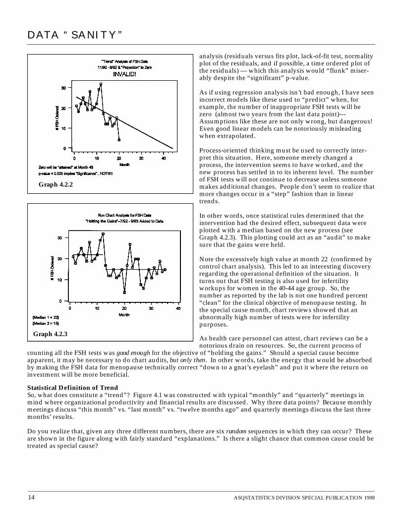
In other words, once statistical rules determined that theintervention had the desired effect, subsequent data wereplotted with a median based on the new process (seeGraph 4.2.3). This plotting could act as an “audit” to makesure that the gains were held.
Note the excessively high value at month 22 (confirmed bycontrol chart analysis). This led to an interesting discoveryregarding the operational definition of the situation. Itturns out that FSH testing is also used for infertilityworkups for women in the 40-44 age group. So, thenumber as reported by the lab is not one hundred percent“clean” for the clinical objective of menopause testing. Inthe special cause month, chart reviews showed that anabnormally high number of tests were for infertilitypurposes.
As health care personnel can attest, chart reviews can be anotorious drain on resources. So, the current process of
counting all the FSH tests was good enough for the objective of “holding the gains.” Should a special cause becomeapparent, it may be necessary to do chart audits, but only then. In other words, take the energy that would be absorbedby making the FSH data for menopause technically correct “down to a gnat’s eyelash” and put it where the return oninvestment will be more beneficial.
Statistical Definition of TrendSo, what does constitute a “trend”? Figure 4.1 was constructed with typical “monthly” and “quarterly” meetings inmind where organizational productivity and financial results are discussed. Why three data points? Because monthlymeetings discuss “this month” vs. “last month” vs. “twelve months ago” and quarterly meetings discuss the last threemonths’ results.
Do you realize that, given any three different numbers, there are six random sequences in which they can occur? Theseare shown in the figure along with fairly standard “explanations.” Is there a slight chance that common cause could betreated as special cause?
Graph 4.2.2
Graph 4.2.3
DATA “SANITY”

ASQ STATISTICS DIVISION SPECIAL PUBLICATION 1998 15
DATA “SANITY”
Figure 4.2Graphic Representation of a Trend
Special Cause – A sequence of SEVEN or more points continuously increasing or continuously decreasing –Indicates a trend in the process average.
Note 1: Omit entirely any points that repeat the preceding value. Such points neither add to the length of the runnor do they break it.
Note 2: If the total number of observations is 20 or less, SIX continuously increasing or decreasing points canbe used to declare a trend.
“Upward Trend” (?)
Time
“Downturn” (?)
Time
“Rebound” (?)
Time
“Setback” (?)
Time
Time Time
“Turnaround” (?)
Time
“Downward Trend” (?)
Upward Trend Downward Trend
Time
Figure 4.1Six Possible (& RANDOM) Sequences of Three Distinct Data Values
Now, it so happens that two patterns (the first and the last) fit a commonly held prejudice about the definition of a“trend.” However, these are two patterns out of just six possibilities. So, to arbitrarily declare three points a trendwithout knowledge of the process’s common cause variation results in a “2 out of 6” (or “1 out of 3”) chance oftreating common cause as special. Hardly odds worth taking without the context of a control chart to furtherinterpret the extent of the variation.
So, how many data points does it “statistically” take to declare a “trend” with a low level of risk? Extending theconcept presented above, it generally takes a run of length seven to declare a sequence a true trend. This is shownpictorially in Figure 4.2. Note that if the number of data points is 20 or less, a sequence of length six is sufficient.This could be useful when plotting the previous year’s monthly data with the current year-to-date monthly data.(By the way, should you ever have the luxury of having over 200 data points, you need a sequence of 8 (!) todeclare a trend.)

16 ASQSTATISTICS DIVISION SPECIAL PUBLICATION 1998
Example 2 — “How’s Our Safety Record in 1990 Compared to 1989? What’s the trend?”A manufacturing facility had 45 accidents in 1989. This was deemed unacceptable, and a goal of a 25% reduction wasset for 1990. 32 accidents occurred (28.9% reduction using the “Trap 1” approach). Time to celebrate…or is it?
Actually, an engineer was able to show that accidents had decreased even further. Using “trend” analysis (mostspreadsheet software offers an option of putting in a “trend line”—talk about “delighting” their customers!), he wasable to show that accidents had gone from 4.173 at January 1989 down to 2.243 by December 1990—a reduction of46.2%! (See Graph 4.2.4).
Now, here’s a case where the p-value isn’t significant at all, but it does indicate how clever frightened people can bewhen faced with an “aggressive” goal. What is the correct statistical application in this case?
Why not consider this as 24 months from a process, “plot the dots” in their time order, and apply runs analysis asshown in Graph 4.2.5? There are no trends, no runs of length eight, and 10 runs (6 to 14 expected). Therefore, thissystem demonstrates common cause behavior: Given two numbers, one was smaller--and it also happened tocoincidentally meet an aggressive goal.
A Common MisconceptionA very common misconception holds that if a process has only common cause variation, one is “stuck” with the cur-rent level of performance unless there is a major process redesign. I have a sneaking suspicion this is the reason peopleinappropriately use statistical methods to “torture a process until it confesses to some type of special cause explana-tion.” Major opportunities for improvement are missed because of this fallacy. All a common cause diagnosis meansis that little will be gained by investigating or reacting to individual data points. It allows us the “privilege,” if youwill, of aggregating the data, then “slicing and dicing” them via stratification by process inputs to look for major“pockets” of variation. Can we locate the 20% of the process causing 80% of the problem (Pareto Principle)? Only ifstratification did not expose hidden special causes do we need to consider a major process redesign.
These data on accidents actually have two interesting stories to tell. Suppose a safety committee met monthly toanalyze each accident of the past month and, after each analysis, put into effect a new policy of some kind. Think ofan accident as “undesirable variation.” (A process-oriented definition is: An accident is a hazardous situation that wasunsuccessfully avoided.) Isn’t looking at each accident individually treating them all as special causes? Yet ouranalysis showed that a common cause system is at work. Doesn’t the runs analysis demonstrate that the current processof analyzing each accident separately is not working because no special cause has been observed on the run chart?
Wouldn’t a higher yield strategy be to aggregate the 77 accidents from both years and use stratification criteria to lookfor the process’s overall tendencies (type of accident, time of day, machines involved, day of the week, productinvolved, department, etc.)? A month’s worth of three accidents does not yield such useful information, but the factthat the process is common cause allows one to use all the data from any “stable” period to identify “Murphy’s”pattern of chaos!
DATA “SANITY”
This is NOT a 46.2% Reduction in Accidents!
Correct analysis: NO CHANGE!Any one month: 0-9 Accidents
End of the year: 20-57 Accidents TotalNEED COMMON CAUSE STRATEGY!
Graph 4.2.4 Graph 4.2.5

ASQSTATISTICS DIVISION SPECIAL PUBLICATION 1998 17
Example 3 — Another Variation of “Plot the Dots!!!”Figure 4.3 displays plots from four famous data sets developed by F. J. Anscombe. They all have the identical regres-sion equation as well as all of the statistics of the regression analysis itself!
Yet, the only case where sub-sequent analysis would befruitful based on the regressionwould be the first plot. Theother three would “flunk” thediagnostics miserably.However, “plotting the dots”in the first place should dis-suade anyone from using thisregression analysis. Thecomputer will do anythingyou ask it to…
4.3 Trap 3: Unnecessary Obsession With and Incorrect Application of the Normal Distribution, or“Normal distribution?…I’ve never seen one!” (W. Edwards Deming (1993 Four-Day Seminar))
What is this obsession we seem to have with the Normal distribution? It seems to be the one thing everyone remem-bers from their “Statistics from Hell 101” course. Yet, it does not necessarily have the “universal” applicability that isperceived and “retrofitted” onto, it seems, virtually any situation where statistics is used.
For example, consider the data below (made up for the purposes of this example). It is not unusual to compare perfor-mances of individuals or institutions. Suppose, in this case, that a health care insurer desires to compare the perfor-mance of three hospitals’ “length of stay” (LOS) for a certain condition. Typically, data are taken “from the computer”and summarized via the “stats” as shown below.
Example 1 — “Statistical” Comparison of Three Hospitals’ Lengths of Stay
Given this summary, what questions should we ask? This usually results in a 1-2 hour meeting where the data are“discussed” (actually, people argue their individual interpretations of the three “Means”) and one of two conclusions isreached: Either “no difference” or “we need more data”.
DATA “SANITY”
Figure 4.3
Table 4.4
Variable N Mean Median Tr Mean StDev SE Mean Min Max Q1 Q3LOS_1 30 3.027 2.900 3.046 0.978 0.178 1.000 4.800 2.300 3.825
LOS_2 30 3.073 3.100 3.069 0.668 0.122 1.900 4.300 2.575 3.500
LOS_3 30 3.127 3.250 3.169 0.817 0.149 1.100 4.500 2.575 3.750
Regression PlotY = 3.00 + 0.50X
R-Sq = 66.7%
Regression PlotY = 3.00 + 0.50X
R-Sq = 66.6%
Regression PlotY = 3.00 + 0.50X
R-Sq = 66.7%
Regression PlotY = 3.00 + 0.50X
R-Sq = 66.6%

18 ASQSTATISTICS DIVISION SPECIAL PUBLICATION 1998
DATA “SANITY”
However, let’s suppose one insurer asks for the raw data used to generate this summary. It seems that they want their“in-house statistical expert” to do an analysis. From Table 4.4, we know there are 30 values. With some difficulty, theraw data were obtained and are shown for each hospital.
“Of course,” the first thing that must be done is test the data for Normality. A histogram as well as Normal plot(including Normality test) are shown below for each hospital. (See Graphs 4.3.1a - f).
The histograms appear to be“bell-shaped,” and each ofthe three data sets passesthe Normality test. So, this“allows” us to analyze thedata further using One-WayAnalysis of Variance (ANOVA).The output is shown inTable 4.5 along with, ofcourse, the 95% confidenceintervals.
Raw Data
LOS_1 LOS_2 LOS_3
1 1.0 3.4 4.52 1.2 3.1 3.03 1.6 3.0 3.64 1.9 3.3 1.95 2.0 3.2 3.76 2.2 2.8 4.07 2.3 2.6 3.68 2.5 3.2 3.59 2.3 3.3 2.5
10 2.7 3.1 4.011 2.9 3.4 2.512 2.8 3.0 3.313 2.7 2.8 3.914 3.0 3.1 2.315 2.8 2.9 3.716 2.9 1.9 2.617 2.9 2.5 2.718 3.1 2.0 4.219 3.6 2.4 3.020 3.8 2.2 1.621 3.6 2.6 3.322 3.4 2.4 3.123 3.6 2.0 3.924 4.0 4.3 3.325 3.9 3.8 3.226 4.1 4.0 2.227 4.1 3.8 4.228 4.6 4.2 2.729 4.5 4.1 2.730 4.8 3.8 1.1
Graph 4.3.1a
Graph 4.3.1c
Graph 4.3.1b
Graph 4.3.1d
Graph 4.3.1fGraph 4.3.1e
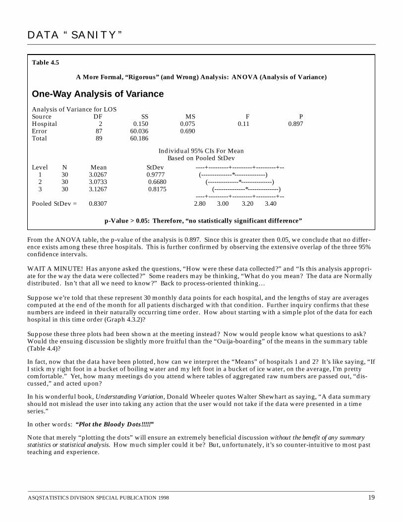
From the ANOVA table, the p-value of the analysis is 0.897. Since this is greater then 0.05, we conclude that no differ-ence exists among these three hospitals. This is further confirmed by observing the extensive overlap of the three 95%confidence intervals.
WAIT A MINUTE! Has anyone asked the questions, “How were these data collected?” and “Is this analysis appropri-ate for the way the data were collected?” Some readers may be thinking, “What do you mean? The data are Normallydistributed. Isn’t that all we need to know?” Back to process-oriented thinking…
Suppose we’re told that these represent 30 monthly data points for each hospital, and the lengths of stay are averagescomputed at the end of the month for all patients discharged with that condition. Further inquiry confirms that thesenumbers are indeed in their naturally occurring time order. How about starting with a simple plot of the data for eachhospital in this time order (Graph 4.3.2)?
Suppose these three plots had been shown at the meeting instead? Now would people know what questions to ask?Would the ensuing discussion be slightly more fruitful than the “Ouija-boarding” of the means in the summary table(Table 4.4)?
In fact, now that the data have been plotted, how can we interpret the “Means” of hospitals 1 and 2? It’s like saying, “IfI stick my right foot in a bucket of boiling water and my left foot in a bucket of ice water, on the average, I’m prettycomfortable.” Yet, how many meetings do you attend where tables of aggregated raw numbers are passed out, “dis-cussed,” and acted upon?
In his wonderful book, Understanding Variation, Donald Wheeler quotes Walter Shewhart as saying, “A data summaryshould not mislead the user into taking any action that the user would not take if the data were presented in a timeseries.”
In other words: “Plot the Bloody Dots!!!!!”
Note that merely “plotting the dots” will ensure an extremely beneficial discussion without the benefit of any summarystatistics or statistical analysis. How much simpler could it be? But, unfortunately, it’s so counter-intuitive to most pastteaching and experience.
ASQSTATISTICS DIVISION SPECIAL PUBLICATION 1998 19
Table 4.5
A More Formal, “Rigorous” (and Wrong) Analysis: ANOVA (Analysis of Variance)
One-Way Analysis of Variance
Analysis of Variance for LOS Source DF SS MS F PHospital 2 0.150 0.075 0.11 0.897Error 87 60.036 0.690Total 89 60.186
Individual 95% CIs For MeanBased on Pooled StDev
Level N Mean StDev ----+---------+---------+---------+--1 30 3.0267 0.9777 (--------------*--------------) 2 30 3.0733 0.6680 (--------------*--------------) 3 30 3.1267 0.8175 (--------------*--------------)
----+---------+---------+---------+--Pooled StDev = 0.8307 2.80 3.00 3.20 3.40
p-Value > 0.05: Therefore, “no statistically significant difference”
DATA “SANITY”

20 ASQSTATISTICS DIVISION SPECIAL PUBLICATION 1998
Example 2 — The Pharmacy Protocol--”Data Will Be Tested for the Normal Distribution”
More TamperingUsing the most expensive antibiotic is appropriate under certain conditions. However, money could be saved if it wasonly prescribed when necessary. In an effort to reduce unnecessary prescriptions, an antibiotic managed care studyproposed an analysis whereby individual physicians’ prescribing behaviors could be compared. Once again, armedonly with the standard “stats” course required in pharmacy school, a well-meaning person took license with statisticsto invent a process that would have consequences for extremely intelligent people (who have little patience for poor prac-tices). Real data for 51 doctors are shown in Table 4.6 along with direct quotes from the memo.
“If distribution is normal—Physicians whose prescribing deviates greater than one or two standard deviations fromthe mean are identified as outliers.”
“If distribution is not normal—Examine distribution of data and establish an arbitrary cutoff point above whichphysicians should receive feedback (this cutoff point is subjective and variable based on the distribution of ratiodata).”
DATA “SANITY”
No Difference?!Graph 4.3.2

ASQSTATISTICS DIVISION SPECIAL PUBLICATION 1998 21
Table 4.6MD Total Target % Target SD_True
1 62 0 0.00 4.512 50 0 0.00 5.023 45 0 0.00 5.294 138 1 0.72 3.025 190 3 1.58 2.576 174 4 2.30 2.697 43 1 2.33 5.418 202 5 2.48 2.509 74 2 2.70 4.1310 41 2 4.88 5.5411 32 2 6.25 6.2712 45 3 6.67 5.2913 30 2 6.67 6.4814 161 12 7.45 2.8015 35 3 8.57 6.0016 84 8 9.52 3.8717 147 16 10.88 2.9318 116 13 11.21 3.3019 166 20 12.05 2.7520 98 12 12.24 3.5921 57 7 12.28 4.7022 79 10 12.66 3.9923 76 10 13.16 4.0724 58 8 13.79 4.6625 50 8 16.00 5.0226 37 6 16.22 5.8327 42 7 16.67 5.4828 30 5 16.67 6.4829 101 18 17.82 3.5330 56 10 17.86 4.7431 39 7 17.95 5.6832 55 10 18.18 4.7933 101 19 18.81 3.5334 99 19 19.19 3.5735 52 10 19.23 4.9236 53 11 20.75 4.8837 52 11 21.15 4.9238 37 8 21.62 5.8339 41 9 21.95 5.5440 45 10 22.22 5.2941 68 18 26.47 4.3042 75 21 28.00 4.1043 59 17 28.81 4.6244 83 24 28.92 3.9045 192 56 29.17 2.5646 217 64 29.49 2.4147 79 24 30.38 3.9948 32 10 31.25 6.2749 38 12 31.58 5.7650 59 21 35.59 4.6251 37 17 45.95 5.83
Total 4032 596 14.78%
DATA “SANITY”
“Data will be tested for normal distribution”
Graph 4.3.3
In fact, the test for normality (Graph 4.3.3) isMOOT…and INAPPROPRIATE! These data repre-sent “counts” that are summarized via a percentageformed by the ratio of two counts (TargetPrescriptions / Total Prescriptions). The fact thateach physician’s denominator is different causesproblems in applying the much touted “normalapproximation” to these data. In fact these dataactually follow binomial distribution characteristicsmore closely, which allows one to easily use a nor-mal approximation via p-charts for a summary, aswe’ll see in Trap 4.
The scary issue here is the proposed ensuing“analysis” resulting from whether the data are nor-mal or not. If data are normally distributed, doesn’tthat mean that there are no outliers? Yet, thatdoesn’t seem to stop our “quality police” from low-ering the “gotcha” threshold to two or even one (!)standard deviation to find those darn outliers.
Did you know that, given a set of numbers, 10%will be the top 10%? Think of it this way: Fifty-onepeople could each flip a coin 50 times and beranked by the number of heads. The average is 25,but the individual numbers would range between14 and 36 (a 2-1/2 fold difference!) and be normallydistributed1. Yet, looking for outliers would beludicrous—everyone had the same process and low-ering the outlier detection threshold doesn’t changethis fact! Not only that, half could be considered“above” average, the other half “below” average,and any arbitrary ranking percentage could beinvoked!
Returning to the protocol, even scarier is what isproposed if the distribution is not “normal”—estab-lish an arbitrary cutoff point (subjective and variable)!Remember Heero’s quote, “When you mess withpeoples’ minds, it makes them crazy!”
1From the binomial distribution, 0.5±3 √ = 0.5±3(0.707) = 0.288 → 0.712,i.e., 28.8% - 71.2%. Multiplying by 50flips yields a range of (50*0.288=) 14 to (50*0.712=) 36 occurrence of “heads” for any group of 50 consecutive flips. Notethat the range would be different if the coin were flipped a different number of times.
(0.5)(1-0.5)_________50

DATA “SANITY”
22 ASQSTATISTICS DIVISION SPECIAL PUBLICATION 1998
By the way, the data “pass” the normality test, which brings us to…
4.4 Trap 4: Inappropriate Calculation of Standard Deviation and “Sigma” Limits.
Example 1 —A Continuation of the Pharmacy Protocol Data
Since the data pass the normality test (see Graph 4.3.3), the proposed analysis uses “one or two standard deviation”
limits based on the traditional calculation of sigma, √ . Applying this technique to the individual 51percentages yields a value of 10.7. Graph 4.4.1 graphically displays the suggested analysis, with one, two, and threestandard deviation lines are drawn in around the mean. So simple, obvious,…and wrong!
Suppose outliers are present. Doesn’t this mean they are atypical (“boiling water” or “ice water”)? In fact, wouldn’ttheir presence tend to inflate the estimate of the traditional standard deviation? But, wait a minute, the data “appear”normal…it’s all so confusing! So, there aren’t outliers?
How about using an analysis appropriate for the way the data were collected? The “system” value is determined as the totalnumber of times the target antibiotic was used divided by the total number of prescriptions written by the 51physicians. Note how this is different from merely taking the average of the 51 percentages, whichyields a value of 15.85%.)
Based on the appropriate statistical theory for binomial data, standard deviations must be calculated separately for eachphysician because each wrote a different number of total prescriptions. (The formula is
These were also given in Table 4.6 (SD_True) and we immediately notice that none of the 51 numbers even comes closeto the standard deviation of 10.7 obtained from the traditional calculation.
In Graph 4.4.2, the statistically correct analysis using “three” standard deviations as the special cause threshold (knownas Analysis of Means) is shown side by side with Graph 4.4.1. It turns out that the “conservative” three standard devia-tion limits calculated correctly are similar to the one standard deviation limits of the incorrect analysis.
____ ∑ (Xi
– X)21n-1
( = = 14.78%).596_____4032
√ Total prescriptions written by that physician).(0.1478)(1-0.1478)_______________________________________
Who are the Culprits???
Graph 4.4.2Graph 4.4.1

ASQSTATISTICS DIVISION SPECIAL PUBLICATION 1998 23
Now that we’ve agreed on the analysis, what is the appropriate interpretation (a hint of Trap 6)? Anyone outside his orher (correctly calculated) individual common cause band is, with low risk of being wrong, a special cause. In otherwords, these physicians are truly “above average” or “below average.” (Note that despite their high percentages,given the relatively small total number of prescriptions written by Physicians 48 and 49, their values could still beindicative of a process at 14.78%. Remember—”Innocent until proven guilty.”)
What should we conclude? Only that these physicians have a different “process” for prescribing this particular drugthan their colleagues. It is only by examining the “inputs” to their individual processes (people, methods, machines,materials, environment) that this special cause of variation can be understood. Maybe some of this variation is appro-priate because of the type of patient (people) they treat or many other reasons. However, some of it may be inappro-priate (or unintended) due to their “methods” of prescribing it. Remember, improved quality relates to reducing inap-propriate variation. We can’t just tell them “Do something!” without answering the natural resulting question, “Well,what should I do differently from what I’m doing now?” This will take data.
Most of the physicians, about 75%, fall within the common cause band, so this seems to represent majority behavior. Agood summary of the prescribing process for this drug seems to be that its use within its antibiotic class has resulted ina process capability of almost 15%. Approximately 15% of the physicians exhibit “above average” behavior in prescrib-ing this particular drug and 10% exhibit “below average” behavior in prescribing this drug. (It is important to look atthose outside the system on both sides, even if only one side is of concern. If those below the system have betterprocesses for prescribing the target drug, perhaps the other physicians could adopt them. On the other hand, this maybe evidence that they are under-prescribing the target drug, resulting in higher costs due to longer lengths of stay.)
Example 2 — Revisiting the Length Of Stay Data
The use of inflated standard deviations does not only occur in aggregated data summaries. Another common error isin the calculation of control limits. Let’s revisit Trap 3’s Length of Stay data for Hospital 2 shown in Table 4.7.
Many people (and control chart software programs) are under the mistaken impression that because limits on anIndividuals control chart are set at three standard deviations, all they have to do is calculate the overall standard devia-tion, multiply it by three, then add and subtract it to the data’s average. Graph 4.4.3 shows this technique applied tohospital 2’s length of stay data. The traditional standard deviation of the 30 numbers is 0.668.
How Many Standard Deviations?
So often in my presentations, I am challenged about the use of three standard deviations to detect special causebehavior. People just can’t seem to get the “two standard deviation, 95% confidence” paradigm out of their heads(Who can blame them? That’s how they were taught.) Most of the time, my guess is that this is also due to theirexperience of using an inflated estimate of the true standard deviation.
It is also important to realize that in this example, 51 simultaneous decisions are being made! The usual statisticalcourse teaches theory based making only one decision at a time. For our data set, if there were no outliers, what isthe probability that all 51 physicians would be within two standard deviations of the average? (0.95)51= 0.073, i.e.,there is a 92.7% chance that at least one of the 51 physicians would “lose the lottery” and be treated as a specialcause when, in fact, they would actually be a common cause.
Simultaneous decision-making, as demonstrated by this p-chart, is called Analysis of Means (ANOM) and wasinvented by Ellis Ott. Shewhart, Ott, Deming, Brian Joiner, Wheeler, and Hacquebord all recommend the use ofthree standard deviations—that makes it good enough for me. (Of course, given the proviso that the standarddeviation is calculated correctly in the first place. In fact, Deming hated the use of probability limits!) I am takinga risk here (Dr. Deming, please forgive me!), but, by using three standard deviation limits, the probability of all 51physicians being within three standard deviations is approximately (0.997)51 = 0.858, i.e., even with the “conserva-tive” three standard deviation criterion, there is still a 14.2% chance that at least one physician could be mistakenlyidentified as a special cause.
DATA “SANITY”

And many people tend to dogmatically apply the sacred “three sigma rule”of control charts to data, thus concluding in this case, “There are no specialcauses in these data because none of the data points are outside the threesigma limits.”(!)
Of course, a preliminary run chart analysis would have warned us that doinga control chart on the data as a whole was ludicrous. The runs analysis would tipus off that the process exhibited more than one average during the timeperiod. From the plot, it is obvious that three different processes were pre-sent during this time. The standard deviation used in control limit calcula-tions is supposed to only represent common cause variation. Taking thestandard deviation of all 30 data points would include the two special caus-es, thus inflating the estimate.
So, what should be done? A very common approach is to take the movingranges between consecutive data points (shown in Table 4.7). Most booksthat use the moving range estimate sigma as the average of these movingranges (in this case, 0.393) divided by 1.128, a constant from statisticaltheory. (In this case, sigma is estimated as 0.348.) However, what if the datacontain special causes, as this data set does? It is obvious that the movingranges from observation 15 to observation 16 (Moving range = 1) and obser-vation 23 to 24 (Moving range = 2.3) represent more than “inherent” varia-tion. The process clearly shifted. Granted, these do not cause as much“inflation” as using the overall standard deviation (compare 0.668 vs. 0.348),
but can we protect ourselves from such occurrences, which tend to be the rule and not the exception? In fact, it is notunusual for one special cause data point to produce two consecutive overly large moving ranges.
In my experience, a useful alternative is the median moving range, which is robust to outlying moving ranges caused by“shifts” and individual observation special causes. The only difference is that a different constant, 0.954 (once again,from statistical theory), is divided into the median moving range to obtain the estimate of the standard deviation. Note with these data, the standard deviation from the median moving range, 0.314, is the smallest of the threemethods. Donald Wheeler discusses the use of the median moving range in Understanding Variation and Brian Joineruses it exclusively when introducing control charts in his book Fourth Generation Management. I also prefer it becauseof the “one stop shopping” aspect of it – there’s no need to estimate sigma, exclude special causes and estimateagain. Minitab Statistical Software has introduced the option of using the median moving range in its Individualscontrol charts.
Another useful piece of information addresses Trap 1’s two-point trends. The Median Moving Range can tell us howfar apart any two consecutive points need to be before declaring a special cause. The product of (3.865 x (MedianMoving Range)) represents the largest difference we would expect to see between two consecutive data points. Thus, amoving range greater than this value is evidence of a special cause.
Six values are outside the control limits, which leads us to…
24 ASQSTATISTICS DIVISION SPECIAL PUBLICATION 1998
DATA “SANITY”
Table 4.7
LOS2 MR MR_Sort1 3.4 * 0.12 3.1 0.3 0.13 3.0 0.1 0.14 3.3 0.3 0.15 3.2 0.1 0.26 2.8 0.4 0.27 2.6 0.2 0.28 3.2 0.6 0.29 3.3 0.1 0.2
10 3.1 0.2 0.211 3.4 0.3 0.212 3.0 0.4 0.213 2.8 0.2 0.314 3.1 0.3 0.315 2.9 0.2 0.316 1.9 1.0 0.317 2.5 0.6 0.318 2.0 0.5 0.419 2.4 0.4 0.420 2.2 0.2 0.421 2.6 0.4 0.422 2.4 0.2 0.423 2.0 0.4 0.424 4.3 2.3 0.525 3.8 0.5 0.526 4.0 0.2 0.627 3.8 0.2 0.628 4.2 0.4 1.029 4.1 0.1 2.330 3.8 0.3 *
Standard deviation of LOS2 = 0.66795
Median of MR = 0.3Std. Dev. = 0.3 / 0.954 = 0.314Average of MR = 0.393
Std. Dev. = 0.393 / 1.128 = 0.348]
Graph 4.4.3

4.5 Trap 5: Misleading Special Cause Signals on a Control Chart.
Example 1 — “When the control chart exhibits a point outside of the control limits, the point in time should beinvestigated to find out why” (Maybe…Maybe not)
In Graph 4.5.1, the LOS data from Hospital 2 arereplotted using a standard deviation of 0.314 and,unlike the previous control chart, observations nowgo beyond the control limits. What is the properinterpretation?
Armed only with the “one point outside three stan-dard deviations” rule (the easiest to remember), the“naïve” interpretation would be, “Gee, we seem tohave special causes at observations 16, 18, 23, 24, 28,and 29. What happened during each of thosemonths?” [Don’t laugh…I encounter this all thetime…and bet that you do, too.] When you consid-er the fact that control charts are usually the lastthing taught in a 3-4 day course on “tools” (whenpeople’s brains are already “full”), how can we rea-sonably expect people to not only use them proper-ly, but also ask the right questions after the chart isobtained?
As said before, a run chart would have alerted us to thefact that different processes were at work during thistime. It would be premature to do a control chart of allthe data, and a control chart would probably only con-fuse the issue. In fact, the question should be, “Whathappened at observations 16 and 24?” The other pointsoutside of the control limits (observations 18, 23, 28, and29) were due to the fact that the process average hadmoved—the old control limits were no longer valid at thesenew process levels.
Based on the runs analysis and the standard deviationobtained from the median moving range, the correctinterpretation of the data is shown in Graph 4.5.2.
Example 2 —The Overtime DataA supervisor was getting a lot of managerial “heat”regarding her overtime figures. Almost two years of bi-weekly overtime data were compiled (See Table 4.8.)
No doubt these data were “analyzed” via the bi-weekly “This period/Year-to-date/Same period last year/Last Year-to-date/Variance from Budget” paradigm. How about an analysis of the process producing these data?
One plot (if any is done at all) that seems to be in vogue is the “Year-to-Date Average” shown in Graph 4.5.3. Isn’t itamazing how the variation decreases as the year goes on (It’s almost always commented upon!)? Remember, at period27, a new year starts and that blasted variation rears its ugly head again!
How about a run chart? From Table 4.7, the median overtime is 0.7, and “plotting the bloody dots” (Graph 4.5.4) seemsto call attention to a couple of things—First, there are distinct “peaks” at periods 1, 15, and 36. Second, there is a dis-tinct run of length 8 occurring from observations 33 to 40.
ASQSTATISTICS DIVISION SPECIAL PUBLICATION 1998 25
Graph 4.5.1
Correct Interpretation
Graph 4.5.2
DATA “SANITY”

DATA “SANITY”
26 ASQSTATISTICS DIVISION SPECIAL PUBLICATION 1998
Investigation showed that periods 1, 15, and 36 contained majorholidays. An interesting question then becomes whether thesepeaks are appropriate or not. Do we expect people to work onholidays? If they do, are all their hours considered overtime? Inother words, if policies were designed to keep this from occurring,they are not working. Temporarily, it may be a good idea toseparate bi-weekly periods containing a major holiday and plotthem on a separate chart to monitor the current state and anyinterventions. It would be interesting to note the behavior of theother holiday periods contained within the data.
Table 4.8
Period OT MR_OT MR_Sort
1 1.98 * 0.012 0.67 1.31 0.053 0.49 0.18 0.064 0.74 0.25 0.115 0.21 0.53 0.156 0.64 0.43 0.187 0.90 0.26 0.188 0.45 0.45 0.219 1.03 0.58 0.21
10 0.18 0.85 0.2211 0.13 0.05 0.2312 0.70 0.57 0.2313 0.47 0.23 0.2514 0.70 0.23 0.2515 2.21 1.51 0.2616 0.34 1.87 0.2917 0.59 0.25 0.3118 1.00 0.41 0.3719 0.59 0.41 0.3920 0.58 0.01 0.3921 0.69 0.11 0.41 [Median]22 1.41 0.72 0.41 [Median]23 0.75 0.66 0.4324 0.96 0.21 0.4325 0.57 0.39 0.4526 0.39 0.18 0.5327 0.82 0.43 0.5328 0.29 0.53 0.5629 0.58 0.29 0.5730 1.30 0.72 0.5831 0.42 0.88 0.6632 0.27 0.15 0.7233 1.51 1.24 0.7234 1.20 0.31 0.8535 0.83 0.37 0.8836 2.99 2.16 1.1437 1.30 1.69 1.2438 1.51 0.21 1.3139 1.12 0.39 1.5140 1.68 0.56 1.6941 0.54 1.14 1.8742 0.48 0.06 2.1643 0.70 0.22 *
Mean of MR_OT = 0.57143SD = .57143 / 1.128 = 0.507
Median of MR_OT = 0.41000SD = 0.41 / 0.954 = 0.430
Overall “Standard Deviation” = 0.58
A “typical” display (if any at all ) is the “Year-to-Dateaverage”:
Graph 4.5.3
Graph 4.5.4
How about a run chart?

ASQSTATISTICS DIVISION SPECIAL PUBLICATION 1998 27
The run of length 8 represented a four-month period when two receptionists quit, and the supervisor was interviewingand hiring replacements--Definitely a special cause and atypical of her usual process. It’s interesting to note that ifturnovers were an inherent problem in the process, the control limits would probably be much wider, the processwould have a higher average, and this run of 8 would not have occurred.
Comparing the various calculations for standard deviation as in Trap 4, the overall traditional calculation yields 0.58.The average moving range (which is inflated by the seven large moving ranges created by periods 1, 15, and 36; the“shift” up from period 32 to 33; and the “shift” down from 40 to 41), gives 0.507. Using the median moving range of allthe data, we obtain 0.43. Note the dramatic difference in control limits when each is multiplied by three!
So, we know the common cause range, but whataverage should it enshroud? What representsthis supervisor’s “typical” process? Doesn’t itmake sense to characterize it by using the non-special cause periods, of which there are 33?This yields an average of 0.62 FTE (See Graph4.5.5). Her process doesn’t seem capable of con-sistently obtaining zero overtime! The lowercontrol limit is less than zero, which means thatshe will occasionally have a period with zero over-time, but merely due to good luck. There is alsothe “period from hell” when she will have 1.91FTE overtime, once again, due to no fault of herown. “Two sigma limits” (2/3 of the distancebetween the average and the upper and lowerlimits), which should cover 90-98% of the com-mon cause variation, have also been drawn in toestablish a range on the “typical” pay period —
0 - 1.48 FTE. (This comes from Wheeler’s Empirical Rule.) However, what the chart seems to say is that this supervisorhas a process which, as currently “designed,” can count on 0.62 FTE of overtime. So, if all she is going to do is get“heat,” she may as well put 0.62 FTE in her budget!
Note that despite periods 33-40 being a special cause, only the period containing the holiday actually goes out of theupper control limit, once again showing the importance of doing a preliminary runs analysis.
Can this process be improved? Maybe…but it will take a common cause strategy of aggregating the 33 common causeperiods and doing a Pareto analysis, i.e., stratification, (if traceability to process inputs is possible) on the pattern ofovertime. Reacting to the individual high or low data points (which seems to be the current “strategy”) would be a no yieldstrategy.
4.6 Trap 6: Choosing Arbitrary Cutoffs for “Above” Average and “Below” Average.
Example 1 — The PTCA “Incident” DataA cardiologist went screaming into a hospital QA director’s office because two of his colleagues had “above average”numbers of incidents where patients needed to be rushed to the Operating Room during a PTCA. (PTCA is a proce-dure done by cardiologists.) The data are presented in the following table:
Graph 4.5.5
MD # Incidents # PTCA # Incidents / # PTCAs
1 1 36 .02782 4 53 .07553 4 79 .0506
MD # Incidents # PTCA # Incidents / # PTCAs
4* 2 58 .03455 2 110 .0455
Total 16 336 .0476
DATA “SANITY”
*The Screaming Cardiologist (Obviously “better than average” and believing his performance the “gold standard”)

No doubt about it…two physicians (#2 and #3) had values above the average. Does this mean it’s because of the“methods” input to their processes, as the “screamer” seems to assume? The 4.8% level of this incident doesn’t seem tobe acceptable to one colleague. However, is this “special cause” strategy of “find the bad apples” correct, given thedata? Without a context of variation within which to interpret these percentages, are the two “above average culprits”truly, i.e., “statistically,” above average?
Think back to the Pharmacy Protocol discussion in Trap 4. In that example the issue was a bogus (and inflated) calcu-lation of the standard deviation, but at least they wanted a statistical analysis. However, when percentages areinvolved, it is not unusual for people to forego any semblance of statistical analysis and merely treat the differencebetween any two percentages as a special cause, especially when presented in tabular form.
So, using the theory of process-oriented thinking and the formula introduced in the Pharmacy Protocol discussion, wehave a new question. “If this process averages 4.8% incidents, is it possible, given the total number of PTCAs per-formed by an individual physician, that his or her observed number of incidents is merely common cause variationreflecting this process average?”
(Think back to flipping a coin 50 times and counting the number of “heads”—even though the average is 25 (a“process” average of 50%), any one “trial” of 50 flips will yield a number of heads between 14 and 36).
Applying a “p-chart” analysis to the PTCA data results in the conclusions shown in Figure 4.4 and displayedgraphically in Graph 4.6.1.
Note that, despite the “messiness” of the formula, the only differencein the individual physicians’ calculations is the denominator of thesquare root expression. The denominator represents the total“window of opportunity” for which the particular MD could obtainan “incident.” In this case, it translates to his or her total number ofPTCAs performed. Operational definition criteria can then be usedto judge each PTCA as to whether the specified “incident” occurredor not.
The conclusion from the statistical analysis is that the current processis “designed” to obtain a 4.8% incident rate; no statistical differenceexists among the performances of the five physicians. The type ofvariation we are dealing with is common cause, therefore, a commoncause strategy would seem to be indicated. What would this entail?
Unfortunately, sixteen incidents are a relatively small number, butthe common cause strategy would dictate that they be “aggregated”then stratified via some type of Pareto analysis. The hope would bethat one or two lurking process problems could be exposed to
28 ASQSTATISTICS DIVISION SPECIAL PUBLICATION 1998
Figure 4.4
MD Incident PTCA % Incident1 1 36 2.782 4 53 7.553 4 79 5.064 2 58 3.455 5 110 4.55
Total 16 336 4.76 %
MD 1
Common Cause Range is:
0.0476±3
[2.8% Observed—Common cause]
MD 2
0.0476±3
[7.6% Observed—Common cause]
MD 3
0.0476±3
[5.1% Observed—Common cause]
MD 40.0476±3
[3.4% Observed—Common cause]
MD 5
0.0476±3
[4.6% Observed—Common cause]
√ (0.0476)(1-0.0476)_______________36
= 0 – 15.4%
√ (0.0476)(1-0.0476)_______________53
= 0 – 13.5%
√ (0.0476)(1-0.0476)_______________79
= 0 – 12%
√ (0.0476)(1-0.0476)_______________58
= 0 – 13.2%
√ (0.0476)(1-0.0476)_______________110
= 0 – 10.8%
Graph 4.6.1
DATA “SANITY”

account for a large majority of the variation. In other words, these problems would be present as a common thread run-ning through a majority of the cases. Theories could then be developed and tested on the current process and subse-quent plotting of data would be used to assess progress. Analysis of means could also periodically compare the cur-rent state of physician performance.
It does not entail subjecting each of the sixteen “incident” cases separately to a painstaking review then deciding to“change something” based solely on the circumstances of that individual case. If smart people are given an opportuni-ty to find something, they generally will. The end result would be sixteen new policies and/or procedures that addcomplexity with marginal resulting value. However, this is the “simple, obvious,…and wrong” process that “commonsense” seems to dictate. Isn’t it obvious that this strategy treats each undesirable incident (“variation”) as a specialcause and isolates subsequent analysis in a vacuum?
Example 2 —Those Ubiquitous Bar Graphs: The Health System Ranking DataThis is a reproduction of a survey result published in a major metropolitan newspaper. Potential customers (patients,payers, and employers who offer health plans to their employees) were demanding data on how various health systemswere satisfying their current customers. So, the typical customer satisfaction survey consisting of the usual vaguequestions was sent to 250 participants in each plan.
An approximation of the graph from the newspaper appears in Graph 4.6.2. The average of all 20 systems’ data isshown as the first “bar” followed by each of the 20 systems surveyed. As you can see, the bar for each system is“stacked,” with the upper portion being the percent who answered “Definitely Yes” to the question, “Would you rec-ommend your clinic to adult friends or family members if they needed care?” the middle portion being the percentwho answered “Probably Yes,” and the lower portion being the percent who answered either “Probably Not” or“Definitely Not”. Note that the data are “normalized” by aligning the “Probably Not or Definitely Not” numbers asthe “origin” for the bars (Yes, it was actually published like this!). Each system was also “ranked” into its respectivequartile for each item in the survey.
As stated previously, the lack of any context of variationmakes Graph 4.6.2 impossible to interpret meaningfully.In addition, the “stacking” of various levels of responsesmerely adds confusion and more potential opportunities totamper.
Another way to summarize data like these is to calculatethe “average score” for each clinic and present thesescores in bar graph form. The usual “top 5-10%,” “bot-tom 5-10%,” “above average,” “below average,” “quar-tile,” etc. “Ouija board” criteria get applied and sometype of “interpretation” results. Once again, these barswould need a context of variation to be interpreted.
One way that has been useful in my experience is to do aseries of analyses. Why not use Analysis of Means tocompare the number of times each health system receivedspecifically a “definitely Yes” response relative to thetotal number of responses? This analysis is shown inGraph 4.6.3.
Given this system of 20 health systems, customers answer this question “definitely Yes” 57.4% of the time. The objec-tive now is to see whether some health systems demonstrate a higher incidence of “definitely Yes” (in Deming’s terms,“above” the system) as well as a lower incidence of “definitely Yes” (“below” the system). Statistically, systems 11 and12 are above average and systems 7 and 15 are below average.
What would happen if “quartile” rankings were used instead? The marketing departments of systems 1, 16, and 18would have undeserved “bragging rights” by joining systems 11 and 12 in the “top” quartile for customer satisfaction.Systems 2, 10, and 19 would “lose the lottery” and get branded with systems 7 and 15 in the lowest quartile (whilesystem 3 heaves a sigh of relief).
ASQSTATISTICS DIVISION SPECIAL PUBLICATION 1998 29
Graph 4.6.2
DATA “SANITY”

Next, an analysis was performed on percent incidence ofobtaining either a “definitely Yes” or a “probably Yes.”This “widens the net” a little bit. While some systemsmay not be outstanding performers, people could still befairly satisfied with them. This analysis is shown inGraph 4.6.4.
When combined, “definitely Yes” and “probably Yes”account for 92.6% of the responses! There are no healthsystems “above” this system average (although systems12 and 17 are close). System 7, previously a special cause“below” the system, has now pulled into the “pack,” butsystem 15 remains statistically below average. (Note that,given the sample size of approximately 250, obtaining100% “definitely Yes” and “probably Yes” would be aspecial cause in this process.)
Finally, I have also found it useful to look at the other“end” of the spectrum, if you will. Given a sample ofhuman beings, there is always the presence of the
“grumble factor”—sometimes, you just can’t satisfy any-body! So, the combined response “probably Not” and“definitely Not” was analyzed for these 20 healthsystems. Graph 4.6.5 displays this analysis.
It seems that these 20 health systems just can’t satisfy7.3% of their clients. However, there is one specialcause—system 15 (again!)--who is actually above average(Poor systems 3, 7, 8, and 19 who would “lose the lottery”and join system 15 in the “top quartile of dissatisfac-tion!”). No one seems to be exempt from the “grumblefactor” as no system falls out below average, but I’m suresystems 1, 4, 12, 13, and 17’s marketing departmentswouldn’t mind bragging that they fell in the bottomquartile for least customer satisfaction—the “least of theleast satisfied.”
4.7 Trap 7: Improving Processes Through The UseArbitrary Numerical Goals And Standards.A statement has been attributed to Deming that is suppos-edly his definition of “insanity”—Doing things the waywe’ve always done them, yet expecting different results.Imposing arbitrary numerical goals or “tougher” standardson a work environment (“typical” inputs to an organiza-tion’s processes, wouldn’t you say?) with the hope thatthese goals will somehow magically in and of themselves“improve” things is somewhat like that. This brings upanother issue—measured “numbers” themselves might getbetter, but as far as the actual process itself goes…Well, neverunderestimate how clever frightened human beings can bewhen faced with a goal. (By the way, who decided that allgoals must end with a zero or five—with the specific excep-tion of an impossible situation when it is permissible to usethree as a “stretch” goal?) Deming was adamant in declar-ing, “A goal without a method is nonsense!”
DATA “SANITY”
30 ASQSTATISTICS DIVISION SPECIAL PUBLICATION 1998
Graph 4.6.3
Graph 4.6.4
Graph 4.6.5

Actually, arbitrary numerical goals and standards involve two stages. The first is establishing the goal or standarditself and the second involves the processes of measuring a situation, assessing it versus the goal, then taking appropri-ate action on this “gap” (variation). Implicit in all of this is the question of whether people know exactly how to goabout achieving the goal in a way that optimizes the system as a whole. Granted, some goals are far from arbitrary andmay even be considered “facts of life”—So what? What specifically should the organization’s workers do differently?
Example 1 — Pharmacy Protocol DataLet’s revisit the Pharmacy Protocol data. The correct analy-sis is shown again in Graph 4.7.1.
Suppose a goal had arbitrarily been set that “No more than15% of prescriptions in this class should be the target drug!”(Oh-oh, ends in a five!). Since this graph captures the a c t u a lprocess capability, the effect of this goal can be assessed. It ismeeting the goal with the exception of the truly “above aver-age” physicians who are outside their common cause limits.The “gap” between the actual process performance and goal iszero. Even though it is meeting the goal, a special cause strat-egy can be used on the eight such “above average” physiciansto possibly achieve some incremental improvement.
But what tends to happen in these cases? Usually, any devi-ation from a goal is treated as a special cause. Altogetherthere are 28 physicians above 15%. So, in addition to theeight outside the system, there are 20 physicians (40%!) who
would incorrectly be considered “above average” and reported as “noncompliant.” Because they are within the com-mon cause band of the process average, they can statistically be considered no different from the average. Thus, theyare neither statistically different from the goal nor different than the 18 physicians (35%) who happened to “win the lot-tery” and end up in the common cause band below the average.
Suppose the goal had arbitrarily been set at 10%. (Oh-oh, ends in a zero!) Despite all wishes and exhortations, theprocess would remain at its current capability of 15%. How would the gap between the actual performance and thedesired performance (“variation”) be acted upon?
The “simple, obvious, and wrong” way would be to provide feedback to anyone who has a rate of over 10% —a horri-ble tampering strategy. The process, as it currently exists and operates, would not be capable of meeting this goal. There wouldneed to be a fundamental change in all physician behavior, i.e., basically a common cause strategy because the observed“gap” between 15% and 10% is common cause. However, a special cause strategy could be used in studying the physi-cians who are statistically above the current capability of 15%. That may yield some improvement, but not necessarilyof the magnitude needed to attain the goal. Now, studying the physicians who are statistically “below average” mayyield some appropriate behaviors that could lead to such improvement or at least attain a performance closer to thedesired goal. There are no guarantees and, unless the goal is somehow tied to a significant organizational achieve-ment, mere discussion of the goal is a complete waste of time. Intelligent, “statistical” discussion of the “gap” betweenthe actual and desired performance on the other hand…
Goals in and of themselves are not bad. It depends on how they are used. Obsession with a goal itself is a no yieldstrategy. However, if the current process performance can be honestly measured and assessed (aside from considera-tion of any goal), and the gap (once again, “variation”) between the current performance and the goal be correctly diag-nosed as to whether it is common cause or special cause, an appropriate strategy will emerge to help close the gap(although it won’t necessarily attain the goal). Usually, a mixture of common cause and special cause strategies is nec-essary; however, it is a human tendency to “default” to the “everything is a special cause” strategy.
Example 2 — Bonuses Based on PerformanceThere are two general ways that goals are used. The first is assessment and action based on a tabular summary of data(say at the end of the year when meeting certain goals is tied to compensation). The Pharmacy Protocol data is such anexample. The time identity of the data points making up the summary is usually lost and the summary uses “aggre-gate” performance for the period under scrutiny. Typically, any variation of the summary from the goal is consideredspecial cause.
ASQSTATISTICS DIVISION SPECIAL PUBLICATION 1998 31
Graph 4.7.1
DATA “SANITY”
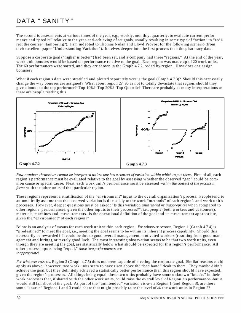
The second is assessments at various times of the year, e.g., weekly, monthly, quarterly, to evaluate current perfor-mance and “predict” relative to the year-end-achieving of set goals, usually resulting in some type of “action” to “redi-rect the course” (tampering?). I am indebted to Thomas Nolan and Lloyd Provost for the following scenario (fromtheir excellent paper “Understanding Variation”). It delves deeper into the first process than the pharmacy data.
Suppose a corporate goal (“higher is better”) had been set, and a company had three “regions.” At the end of the year,work unit bonuses would be based on performance relative to the goal. Each region was made up of 20 work units.The 60 performances were sorted, and they are shown in the Graph 4.7.2, coded by region. How does one assignbonuses?
What if each region’s data were stratified and plotted separately versus the goal (Graph 4.7.3)? Should this necessarilychange the way bonuses are assigned? What about region 2? So as not to totally devastate that region, should theygive a bonus to the top performer? Top 10%? Top 20%? Top Quartile? There are probably as many interpretations asthere are people reading this.
Raw numbers themselves cannot be interpreted unless one has a context of variation within which to put them. First of all, eachregion’s performance must be evaluated relative to the goal by assessing whether the observed “gap” could be com-mon cause or special cause. Next, each work unit’s performance must be assessed within the context of the process itforms with the other units of that particular region.
These regions represent a stratification of the “environment” input to the overall organization’s process. People tend toautomatically assume that the observed variation is due solely to the work “methods” of each region’s and work unit’sprocesses. However, deeper questions must be asked: “Is this variation unintended or inappropriate when compared toother regions’ performances, given the other inputs to their processes?”, i.e., people (both workers and customers),materials, machines and, measurements. Is the operational definition of the goal and its measurement appropriate,given the “environment” of each region?”
Below is an analysis of means for each work unit within each region. For whatever reasons, Region 1 (Graph 4.7.4) is“predestined” to meet the goal, i.e., meeting the goal seems to be within its inherent process capability. Should thisnecessarily be rewarded? It could be due to good overall management, motivated workers (resulting from good man-agement and hiring), or merely good luck. The most interesting observation seems to be that two work units, eventhough they are meeting the goal, are statistically below what should be expected for this region’s performance. Allother process inputs being “equal,” these two performances areinappropriate!
For whatever reasons, Region 2 (Graph 4.7.5) does not seem capable of meeting the corporate goal. Similar reasons couldapply as above; however, two work units seem to have risen above the “bad hand” dealt to them. They maybe didn’tachieve the goal, but they definitely achieved a statistically better performance than this region should have expected,given the region’s processes. All things being equal, these two units probably have some unknown “knacks” in theirwork processes that, if shared with the other work units, could raise the overall level of Region 2’s performance--but itwould still fall short of the goal. As part of the “unintended” variation vis-à-vis Region 1 (and Region 3), are theresome “knacks” Regions 1 and 3 could share that might possibly raise the level of all the work units in Region 2?
DATA “SANITY”
32 ASQ STATISTICS DIVISION SPECIAL PUBLICATION 1998
Graph 4.7.2 Graph 4.7.3

Region 3 (Graph 4.7.6) is the proverbial “lottery” relative tothe goal--if the difference from the goal is treated as specialcause. The “gap” between Region 3 and the goal is zero.Furthermore, the analysis of means comparing work unitperformance shows no statistical differences relative toRegion 3’s overall average. Everyone should receive thebonus! However, discussion of Region 3’s “gap” fromRegion 1’s performance should occur to possibly exposeprocess practices that might reduce some “unintended” vari-ation. How much variation between Region 1 and Region 3is “appropriate,” given the inputs to their processes?
In summary, note how putting numbers into a statisticalcontext through understanding the observed variationalways yields a series of questions that may demand deeperknowledge of the processes being studied. A superficial “one pass” analysis of comparing numbers to goals runs the“simple, obvious, and wrong” danger—and consequences on very intelligent people.
Example 3 — “Constant Monitoring Versus Goal” ProcessThe Overtime example discussed under Trap 5 was an example of this, except the goal was not formalized—People justaren’t “supposed to” have overtime! Also, in that case, we had a lot of data for good assessment of the process’s inher-ent capability. What about the common situation where “the slate is wiped clean” every January and, at best, one canonly use last year’s data and current year-to-date for comparison to the latest set of goals?
Because of the impact of managed care, medical uti-lization is coming under closer scrutiny—using moreresources does not guarantee more money! It is notunusual for organizations to appoint a utilizationmanager (someone with an MBA) who works “jointly”with a physician to “monitor” medical utilization.This results in monthly meetings where numerousgraphs are “presented” and “discussed.”
One aspect of Utilization management involves esti-mating the number of days patients “should” spend inthe hospital for various conditions. When patients arehospitalized with these conditions, their lengths ofstay can be compared with the predicted (or budgeted)lengths. If patients stay longer than “budgeted,” thedepartments make less profit, so any deviation (orvariance) the “wrong way” can be a major concern.Graph 4.7.7 is an example of utilization data.
ASQ STATISTICS DIVISION SPECIAL PUBLICATION 1998 33
Graph 4.7.4 Graph 4.7.5
Graph 4.7.6
DATA “SANITY”
Analysis of Means for Process 2 PerformanceComparison by Work Unit
Analysis of Means for Process 3 PerformanceComparison by Work Unit
Analysis of Means for Process 1 PerformanceComparison by Work Unit
Graph 4.7.7

Note that the budget figure is treated as sacrosanct—any deviation from it is always treated as special cause! Positivevariation under all conditions, of course, is “unacceptable.”
As mentioned before, we need a context of variation to interpret numbers. The time ordered nature of this data setbegs for a control chart. Granted, nine data points may not be much, but it’s all the data we have. It couldn’t be anyworse than the “Ouija board” discussion (and resulting action)!
Due to the small number of data points, the control chart limits in Graph 4.7.8 are based on the average moving rangeinstead of the median. (We may also want to consider these limits “tentative” until more data are collected.)
As astonishing as it seems, there are no indications of special causes--and look at the month-to-month variation! Infact, if the process operates normally, there is the possibility (in the “month from hell”) of obtaining a positive 417 dayvariance randomly, even when the process has an average of 74 (90-98% of the time, the monthly variance will rangebetween -155 and 303)! Of course, there will be a chorus of, “We have to do something!”—resulting in consequencesfor intelligent people.
Like the poor supervisor in the overtime data example, theymay want to consider the implications of a positive 74-daymonthly variance on their current budget. If this is notacceptable, some type of common cause strategy might beneeded to achieve the goal, which would involve disaggre-gating and stratifying the process (if possible) to look forpotential opportunity.
But, wait a minute! The question needs to be asked, “Howwere these data defined and collected?” Does the “vari-ance” represent inherent utilization variance or the fact thatthe model used to predict “budget days” is lousy?
Because of the large variation, one might also be tempted toask, “Even though the average is 74, is it possible that theprocess is really on budget, i.e., is the difference between 74and 0 simply common cause variation?” How could this betested? The control chart in Graph 4.7.9 forces an averageof zero onto this process. It’s interesting that no special
Graph 4.7.9
DATA “SANITY”
34 ASQSTATISTICS DIVISION SPECIAL PUBLICATION 1998
Jan Feb Mar Apr May Jun Jul Aug Sep
Actual Days 3120 2633 2879 2673 2877 2819 2621 2672 2671
Budgeted Days 3125 2623 2874 2798 2701 2503 2499 2658 2518
Variance Days -5 10 5 -125 176 316 122 14 153
Month Var_Days MR_VDays
1 -5 * 2 10 15 3 5 5 4 -125 130 5 176 301 6 316 140 7 122 194 8 14 108 9 153 139
Average of MR_VDays = 129.00
Common Cause Limits: 74 + (2.66 x 129)Graph 4.7.8

causes are triggered; however, the last five months have had a positive variance…what if it continued for three moremonths?
Note that a different series of questions are asked about the situation when it is studied as a process. And, once again,the goal itself is irrelevant—How does the “gap” behave and is a common cause or a special cause strategy needed?
4.8 Trap 8: Using Statistical Techniques on “Rolling” or “Moving” Averages—A Lurking Trap.
After reading an article by Lloyd Nelson (“The Deceptiveness of Moving Averages,” Journal of Quality Technology,April 1983) and noticing how much financial departments use the technique of rolling averages, I decided to do a littlesimulation. How many of us have taught courses within our organizations to people from such departments withoutrealizing the types of data to which they will return and apply techniques such as run charts and control charts?
Believe it or not, these Graphs 4.8.1 – 4.8.4 are of the same data! 101 random numbers were generated from a normaldistribution with mean 50 and standard deviation of 5. The first graph (Graph 4.8.1) shows a run chart of the last50 numbers from this sequence (observations 52-101). No trends, no runs of length 8, and it passes the total numberof runs test (25 observed, 19 to 32 expected). In other words, a stable process. Of course…it was generated that way.
Now, let’s simulate a commonly used financial technique known as the “four quarter rolling average,” i.e., constructrolling averages of four. The next graph (Graph 4.8.2) shows the average of observations 49 through 52 followed by theaverage of observations 50 through 53, etc., ending with the average of observations 98 through 101. In other words,it’s still a plot of observations 52 through 101, but with a slight twist. Note how this creates the appearance of special
ASQSTATISTICS DIVISION SPECIAL PUBLICATION 1998 35
Graph 4.8.1 Graph 4.8.2
DATA “SANITY”
Graph 4.8.3 Graph 4.8.4

causes—runs of length 9 and 10, 9 total runs with 19 to 32 expected, and a “special cause” increase for the lastobservation. This runs analysis is inappropriate for the way the data were defined and collected.
The next graph (Graph 4.8.3) simulates another commonly used technique, the “twelve month rolling average,” i.e.,constructing rolling averages of 12. The plot contains the average of observations 41 through 52 followed by theaverage of observations 42 through 53, etc., ending with the average of observations 90 through 101. Once again,it’s merely plotting observations 52 through 101. Note the “runs” of length 8 and 13, and it also does not pass theexpected number of runs test—11 observed versus 19 to 32 expected.
Finally, a favorite Wall Street technique seems to be the 52 week rolling average. This is simulated in the fourth graph(Graph 4.8.4). The average of observations 1 through 52 is followed by the average of observations 2 through 53, etc.,ending with the average of observations 50 through 101. Note that the heavier the rolling, the more dramatic theappearance. Is it any wonder that people can look at graphs like these, see “special causes” using rules we’ve taughtthem, and end up “messing with people’s minds?” As a result of such plots, I’ve had people confess to me that theywere told to look for reasons for “increases” or “decreases” that seemed so obvious from the graphs, but subsequentinvestigation was frustrating and fruitless.
Out of curiosity, I generated one more set of 101 numbers from the same process and proceeded as before: graphs ofrolling averages of 4, 12, and 52. These are shown in Graphs 4.8.5 a-d.
The process has not changed. However, notice how these graphs give a totally different impression of the process fromtheir counterparts in the first set of data (all except the graph of the actual data of course)!
Why do people feel the need to create such indices (as Deming would say, “Simple, obvious, and wrong!”)? Becausethey well-meaningfully want to reduce the variation so as to make better predictions. However, making the variationgo away “on paper” does not make it disappear in actuality! The variation “is what it is”. Besides, understandingStatistical Thinking and the difference between common causes and special causes of variation will allow one to makebetter predictions despite the presence of the heretofore feared variation!
Graph 4.8.5a Graph 4.8.5b
Graph 4.8.5c Graph 4.8.5d
36 ASQSTATISTICS DIVISION SPECIAL PUBLICATION 1998
DATA “SANITY”

5.0 SummaryThe traps and techniques speak for themselves. The purpose of this publication was to demonstrate how statisticaltechniques in and of themselves do not exist in a vacuum.
5.1 The Fundamentals of VariationThe following list was developed to summarize and bridge this gap between Statistical Thinking and statistical tech-niques (The author is indebted to his former 3M colleague, Andrew Kirsch, who originally suggested this format anddrafted the first incarnation):
1) Good data collection requires planning, which is as important as the data themselves.• The first question must be, “What is the objective?”
2) Good data analysis requires knowing how the data were collected or will be collected. The analysis must beappropriate for the method of collection.• Raw data say little,• Graphical methods are the first methods of choice, however…
• Bar graphs are appropriate only for stratifying via either a Pareto analysis (“count” data) or stratified his-togram (“continuous” data),
• Bar graphs of data over time “waste ink.” Do a time plot/run chart of where the bars “end,”• The proposed analysis should be clear before one piece of data is collected.
3) All data result from a measurement process.• Is the measurement process agreed-upon and reliable?• Have vague terms been properly and operationally defined?• Do the people actually collecting the data understand the data’s purpose and the processes of how to measure
and collect them?4) Variation exists in all things, but may be hidden by:
• excessive round-off of the measurement,• excessive aggregation,• using “rolling” or “moving” averages.
5) All data occur as an output from some process and contain variation. This variation is caused and has sourceswhich can be better identified through proper data collection.
6) There are sources of variation due to inputs to a process (People, Methods, Machines, Materials, Measurement,and Environment) and variation in time of these individual inputs as well as their aggregate. Both are reflected inthe output characteristic being measured.
7) The stability of the process (over time) producing the data is of great importance for prediction or taking futureaction.
8) All data occur in time.• Neglect of the time element may lead to invalid statistical conclusions.
9) Any source of variation can be classified as either a common cause or a special cause. It is important to distinguishone from the other to take appropriate action.• The presence of special causes of variation may invalidate the use of certain statistical techniques,• Any and all data analyses must be based in sound statistical theory and help to interpret the observed variation
meaningfully in terms of identifying common and special causes. This will drive subsequent questions askedand investigated with further data collection.
10) There is variation (uncertainty) even when an object is measured only once.
5.2 Final Comments from the AuthorPart of me wants to apologize, yet part of me doesn’t, if some of you may have felt “uncomfortably warm” while read-ing parts of this publication. Change is never easy, and many current practices of teaching statistical techniques via theubiquitous “short courses” actually do more damage than ultimate good (see Butler and Rough references inBibliography). That is not anyone’s fault! These are good people (BOTH instructors and participants) doing their best.Kerridge makes a wonderful quote in his article (referenced in the Bibliography - he is a world-famous Deming philos-ophy teacher) to summarize both the current state of organizational work processes and the process of teaching statis-tics: “If we are actually trying to do the wrong thing, we may only be saved from disaster because we are doing itbadly.” Rather eye-opening, isn’t it?
In my 20-year career, I’ve come to realize that at least half of a statistician’s job relates to the psychology of change—and “those darn humans” fiercely resist being changed! Humans being humans, logic is not always persuasive (andonly logicians use it as a source of income). It usually takes nothing less than a “significant emotional event” (a theoryand term coined by Massey—see Bibliography) (or “hit in the gut”) to motivate people to even think about changing.
ASQSTATISTICS DIVISION SPECIAL PUBLICATION 1998 37
DATA “SANITY”

Over time, and through many events out of their direct control, people have conditioned themselves to think in certainways—their daily motivations tend to be unconscious and reflex-like. Unless these deep, hidden beliefs can be chal-lenged, exposed, and, through unrelenting conscious choice, replaced by new beliefs, people will generally choose not to change,even when they rationally know that the change is beneficial. Given the current societal and organizational environments(process input!) where change has become a constant, individual behavior represents a last vestige of control—andpeople increase their resistance by several orders of magnitude. This unsettling climate exacerbates what is, even in thebest of times, the uncomfortable, emotionally exhausting process of changing our own behaviors. The Franklin RealityModel (yes, of the Franklin-Covey Planner people--see Bibliography) is an outstanding resource for understanding thiscomplex human phenomenon and harnessing its power for leveraging change.
I was guilty of falling into these eight traps for at least the first 10 years of my career. Not only that, I was blissfullyignorant of their true impact on overall organizational culture. In 1988, a seminar with Heero Hacquebord was my“significant emotional event” through his no-nonsense, straight-shooting style (Heero makes me look sedate! AndMassey makes Heero look sedate!). When I left his seminar, I felt “punched in the gut” and then some. It really chal-lenged my isolated little statistical world, and I didn’t like it one bit—and I had no more excuses for feeling victimized!So, I’m truly sorry if you feel that this publication has added another source of stress that you didn’t need. My lastintent was to come across as “threatening,” “angry,” “self-righteous,” or “preachy.” Look at my last name (Italian) andsubstitute the word “passion” when tempted to think otherwise (“Blame” Heero!). You are doing the best you canwith what you’ve been taught up till now. Nobody’s to “blame” for anything! However, my intent was to expose youto situations that could uncomfortably make you realize that yes, indeed, there are alternatives to the status quo—andyou’re the one who is in control of how you consciously choose to deal with it.
Quite frankly, I am now outraged (and hope you are, too) at the waste caused by poor applications of what should besimple statistical theory, especially nonsensical decisions having consequences on extremely intelligent people (People likeyou!). It’s so easy to take the easy (and human) way out and feel victimized by statistical ignorance, especially as usedin American managerial processes. Treading a fine line, I have tried to present information in a way that would stimu-late your realization that whether or not people understand statistics, they are already using statistics. It is my hope that youcould turn any discomfort “inside out” and choose to change your behavior however you must so that your work cul-ture can attain a more enlightened state of “data sanity.” And, in the long term, despite some severely frustratingmoments, everyone would ultimately win! And there’s the key—changing one’s own behavior. A sobering fact I havelearned in my limited psychological applications: The only person you can change is yourself! However, can beingexposed to your behavior motivate others to consciously examine their own behavior deeply and choose to do some-thing about it? By exhibiting the behavior, you’ve done all you can—other people must decide for themselves...andyou have absolutely no control over it.
I also have no control over how you choose to react to this publication. “Pure” logic would have kept you “safe” andvirtually guarantee that you would continue (with the best of intentions) to do what you’ve always done—I had per-mission from the Statistics Division to “push” a little bit. Actually, if parts of it made you uncomfortable, that’s a verygood sign. You obviously care deeply about the use of statistics. Keep thinking about what unconscious assumptions ofyours seem to be threatened. Can it motivate you to consciously change your behavior? Can you see it as empoweringyou not to be a victim? To paraphrase something the famous enfant terrible 20th century composer Igor Stravinsky oncesaid: “You have to understand the rules before you are allowed to break them.”
For my final comments, I want to describe an exercise Mr. Smith uses at the end of the Franklin Reality Model. He hasus draw circles representing the various roles we play in our lives. In the middle of all this, he tells us to put a circlecenter of the other circles to represent ourselves. He asks us to put a number from one to ten (the higher the better) inthat circle asking us to rate ourselves, individually, as a “human being.” After a small wait, he challenges us if we putany number other than a “10” in that circle by saying, “The good Lord didn’t make us to be ‘7s,’ ‘8s,’ and ‘9s.”
My friends, you are ALL “10s.” If you felt challenged by any of this material, that’s good. I’m not implying that any-one’s a “bad” person (You are all “10s.”), but it may be necessary to choose some different behaviors for the good ofyourself, your co-workers, and your organization.
Good luck and best wishes…
DATA “SANITY”
38 ASQSTATISTICS DIVISION SPECIAL PUBLICATION 1998
Davis Balestracci is a Statistical Specialist for HealthSystem Minnesota, reporting to the Chief Executive Officer.From 1985-1991, he worked for 3M during which time he won two corporate quality awards and two processtechnology awards for his innovative use of statistical methods. Since 1989, he has focused on adapting thequality improvement model used in manufacturing to the business management and service industries. Davishas a BS degree in chemical engineering and an MS degree in statistics.

BIBLIOGRAPHYAndell JL. “Confessions of a Shot Messenger”. Journal for Quality and Participation. January/February 1996.
[Ever try to implement this statistical “stuff” and get “shot” doing it? Some good suggestions to minimize the probability]Anscombe, F.J., “Graphs in Statistical Analysis”. American Statistician. 27, 17-21 ( 1 9 7 3 )Balestracci D & Barlow J. Quality Improvement: Practical Applications for Medical Group Practice, 2nd Edition. Englewood, CO. Center for Research in
Ambulatory Health Care Administration (CRAHCA), 1996. Phone: (303)-397-7888 to order. The book is also available through Quality Press.[Despite the title, I did not write exclusively for a health care audience. People from many different fields have given feedback that the book shows howto integrate Statistical Thinking into everyday work and use it as motivation for organizational transformation]
Bennett, R et al. Gaining Control. Salt Lake City, UT: Franklin Quest Co., 1987.[A text with more detail on the Franklin Reality Model]
Berwick DM. “Controlling Variation in Health Care: A Consultation From Walter Shewhart.” Medical Care. 1991; 23(12).[Applies Nolan/Provost (see below) variation paradigm to medicine…Eye opening!]
Brown MG. “Is Your Measurement System Well Balanced?” Journal for Quality and Participation. October/November 1994.[Outstanding paper with a survey to determine organizational data needs]
Butler RS. “On the Failure of the Widespread Use of Statistics.” AMSTAT News. March 1998.[Gulp hard and see why the tone of my publication has an air of urgency about it]
Couch JM. “Quality Turf Wars.” Quality Digest. October 1997.Deming WE. “What Happened in Japan?” Industrial Quality Control. August 1967.
[One of the more readable Deming papers that puts statistical methods in an organizational improvement context]Executive Learning Inc. Brentwood, TN: Executive Learning Inc. (call 1-800-929-7890 for preview & purchasing information).
[This is an excellent source for training materials for statistical tools. They have both “health care” and “manufacturing” versions]Frances AE and Gerwels JM. “Building a Better Budget.” Quality Progress. October 1989.
[Want to shake things up? Suggest using this simple and brilliant paper for doing your organization’s next budget]Franklin International Institute, Inc. Gaining Control “The Franklin Reality Model” (video). Salt Lake City, UT: Franklin International Institute, Inc., 1990.
(call 1-800-654-1776)[If you want a practical model for understanding human behavior and motivating change, there is no better video. This is a consistent class favorite.]
Grinnell JR. “Optimize the Human System”. Quality Progress. November 1994.[The hidden human behavior issues behind a quality transformation. Hint: It’s more than “tools”]
Hacquebord, H. “Health care from the perspective of a patient: Theories for improvement.” Quality Management in Health Care. 1994, 2(2)Hare LB et al. “The Role of Statistical Thinking in Management.” Quality Progress. February 1995.Joiner Associates, Inc. Fundamentals of Fourth Generation Management (video series). Madison, WI: Joiner Associates Inc., 1992. Free preview cassette avail-
able. Call 1-800-669-TEAM to get on mailing list. Excellent resources.[Outstanding video series in a Statistical Thinking format. I use it for my quality transformation class]
Joiner B. Fourth Generation Management: The New Business Consciousness. New York, NY: McGraw-Hill, Inc., 1994. [Deming’s philosophy integrated into everyday work. Reads like a novel]
Kerridge, D. “Dr. Deming’s cure for a sick system.” Journal for Quality and Participation. December 1996.[Is your organization obsessed with “costs?” Maybe you should consider addressing “confusion,” “conflict,” “complexity,” and “chaos” first]
Massey M. Flashpoint! When Values Collide! (video). Boulder, CO: Morris Massey Associates, Inc.[If you want to motivate honest discussion in your culture, this and the next video will do it! These will make many people “uncomfortably warm,” yet,trust me, they will be willing to talk about it. This is somewhat similar to the Franklin Reality Model, but “turns up the heat” several (hundred!)degrees. Call 1-800-346-9010 for preview and purchase information)]
Massey M. Just Get It! (video). Boulder, CO: Morris Massey Associates, Inc.[Call 1-800-346-9010 for preview and purchase information.]
McCoy R. The Best of Deming. Knoxville, TN: SPC Press, Inc., 1994.[If you want a collection of Deming “snippets” to restore your sanity during a bad day, highly recommended]
Mills JL. “Sounding Board: Data Torturing.” New England Journal of Medicine. 1993; 329(16).[Exposes “PARC” analysis for precisely what it is]
Neave HR. The Deming Dimension. Knoxville, TN: SPC Press, Inc., 1990.[The best overall theoretical, yet practical explanation of the Deming philosophy]
Nelson EC. “Measuring for Improvement: Why, What, When, How, For Whom?” Quality Connection. Spring 1995, 4(2).Nelson LS. “The Deceptiveness of Moving Averages.” Journal of Quality Technology. April 1983.Nolan TW and Provost LP. “Understanding Variation.” Quality Progress. May 1990.
[A virtual “must read” if this publication has you wanting to learn more]Ott ER. Process Quality Control. New York, NY: McGraw-Hill, 1975.
[An “old-fashioned” book with a TON of statistical “wisdom”]Ralston F. Hidden Dynamics. New York, NY: AMACOM, 1995.
[Excellent book on change and human emotion in the workplace. I use it as a text in my second internal quality seminar and people rave about it]Rough J. “Measuring Training From a New Science Perspective.” Journal for Quality and Participation. October/November 1994.
[Very useful for rethinking current methods of training/education, especially related to statistics]Turner R. “The Red Bead Experiment for Educators.” Quality Progress. June 1998.
[If this article can’t convince you that Statistical Thinking is everywhere, nothing can! Excellent demonstration of several of the “traps”]Wheeler DJ. Advanced Topics in Statistical Process Control. Knoxville, TN: SPC Press, Inc., 1995.Wheeler DJ. “Collecting Good Count Data.” Quality Digest. November 1997.
[Don Wheeler’sQuality Digest columns are absolute one-page “gems.” Unfortunately, he no longer writes the column]Wheeler DJ. “Description or Analysis?” Quality Digest. June 1996.
[“Control Charts 101”]Wheeler DJ. “46 Men and a Test.” Quality Digest. September 1997.Wheeler DJ. “Good Limits From Bad Data (Part II).” Quality Digest. April 1997.Wheeler DJ. “Myths About Shewhart’s Charts.” Quality Digest. September 1995.Wheeler DJ and Chambers DS. Understanding Statistical Process Control. Knoxville, TN: SPC Press, Inc., 1986.Wheeler DJ. Understanding Variation: The Key to Managing Chaos. Knoxville, TN: SPC Press, Inc., 1993.
[If you want people to “get it,” hand them one of these (or one of the “one-pagers”)]Wheeler DJ. “When Do I Recalculate My Limits?” Quality Digest. May 1996.
[What is this obsession people seem to have to know exactly “when” to recalculate control limits? Understand the chart first and you won’t have to askthe question!]
ASQSTATISTICS DIVISION SPECIAL PUBLICATION 1998 39
DATA “SANITY”

STATISTICS DIVISIONAMERICAN SOCIETY FORQUALITY c/o Janice Shade7 Sylvan WayParsippany, NJ 07054
Non-Profit Org.U.S. Postage
PAIDCedarburg, WIPermit No. 199
©All rights reserved. Except as permitted under the United States Copyright Act of 1976, no part of this publication may bereproduced or distributed in any form or by any means, without the prior written permission of the ASQ Statistics Division.