Slide Design for Non-Designers - Amazon S3Design+for+Non-Designers-ebook.pdfSlide Design for...
102
Transcript of Slide Design for Non-Designers - Amazon S3Design+for+Non-Designers-ebook.pdfSlide Design for...


Slide Design for Non-Designers
Slide Design
for Non-Designers
By Ellen Finkelstein
Author of: How to Do Everything with PowerPoint 2007
101 Tips Every PowerPoint User Should Know PowerPoint 2013 Essentials
PowerPoint for Teachers: Dynamic Presentations and Interactive Classroom Projects
www.ellenfinkelstein.com

Slide Design for Non-Designers
ii
Slide Design for Non-Designers
Published by Rainbow Resources Publishing
2010 Coral Lane | Fairfield, IA 52556 Copyright 2012 & 2017 by Rainbow Resources Publishing,
Fairfield, Iowa. All rights reserved. For information, e-mail
Manufactured in the United States of America
No part of this publication may be reproduced, stored in a retrieval system or
transmitted in any form or by any means, electronic, mechanical, photocopying,
recording, scanning or otherwise, except as permitted under Sections 107 or 108 of the
1976 United States Copyright Act, without either the prior written permission of the
Publisher, or authorization through payment of the appropriate per-copy fee to the
Copyright Clearance Center, 222 Rosewood Drive, Danvers, MA 01923, (978) 750-
8400, fax (978) 646-8600. Requests to the Publisher for permission should be addressed
to contact@ellenfinkelstein or Ellen Finkelstein, Rainbow Resources Publishing, at the
above address, or 641-472-1832.
Limit of liability/disclaimer of warranty: the publisher and the author make no Representations or warranties with respect to the accuracy or completeness of the Contents of this work and specifically disclaim all warranties, including without Limitation warranties of fitness for a particular purpose. No warranty may be created or extended by sales or promotional materials. The advice and strategies contained herein may not be suitable for every situation. This work is sold with the understanding that the publisher is not engaged in rendering legal, accounting, or other professional services. Neither the publisher nor the author shall be liable for damages arising herefrom. The fact that an organization or website is referred to in this work as a citation and/or a potential source of further information does not mean that the author or the publisher endorses the information the organization or website may provide or recommendations it may make. Further, readers should be aware that Internet websites listed in this work may have changed or disappeared between the time this work was written and when it is read. For general information on our other products and services, please go to www.ellenfinkelstein.com. This book may be published in both electronic and print format. Microsoft and PowerPoint are either registered trademarks or trademarks of Microsoft, Inc., in the U.S.A. and/or certain other countries. Microsoft product screen shots reprinted with permission from Microsoft Corporation. (c) 2012, 2017. All rights reserved. All other trademarks are the property of their respective owners.

Slide Design for Non-Designers
iii
About the Author
Ellen Finkelstein has been teaching and
writing about PowerPoint and presenting since
1994. She is the author of 101 Tips Every
PowerPoint Should Know, How to Do Everything
with PowerPoint 2007 (and earlier editions on
PowerPoint 2000, 2002, and 2003), PowerPoint
2013 Essentials, as well as the co-author (with
Pavel Samsonov, PhD,) of PowerPoint for
Teachers: Dynamic Presentations and Interactive
Classroom Projects.
Ellen has written articles on PowerPoint for,
and been quoted in, numerous magazines and
websites.
Her well-known website,
www.ellenfinkelstein.com, contains PowerPoint
and presentation tips and tutorials, including the
PowerPoint Tips Blog. The free PowerPoint Tips

Slide Design for Non-Designers
iv
Newsletter is e-mailed to over 10,000
subscribers. You can sign up for your own copy
at
ellenfinkelstein.com/pptblog/getstarted/.

Slide Design for Non-Designers
v
Acknowledgments & Dedication
I’d like to thank my husband, Evan, for
supporting me in my work, and my two children,
who are the joys of my life.
***
To MMY, for teaching me that religion and
science are not in conflict, and that anyone can
experience the deepest level of life as bliss
consciousness.

Slide Design for Non-Designers
vi
Slide Design for Non-Designers
vii
Table of Contents
About the Author ........................................... iii
Acknowledgments & Dedication ........................ v
Table of Contents .......................................... vii
Introduction .................................................. ix
Chapter 1: Create custom theme colors .......... 14
Converting colors from your website............ 3
Getting your own colors ............................. 6
Using your colors ...................................... 7
Chapter 2: Format the slide master ................ 10
Left- and top-justify slide titles ................. 11
Create top and bottom borders ................. 13
Chapter 3: Use the Tell ‘n’ ShowSM Method ...... 20
Diagrams ............................................... 22
Charts ................................................... 25
Clean up a chart ..................................... 26
Save a chart template in PowerPoint 2013 and later ...................................................... 28
Save a chart template in PowerPoint 2007/2010 ............................................. 28
Images .................................................. 29
How to remove complex image backgrounds in PowerPoint 2010 and later .................... 33
Chapter 4: Layout principles .......................... 36
Alignment .............................................. 39
The rule of thirds .................................... 41
Chapter 5: Contrast ...................................... 49

Slide Design for Non-Designers
viii
Chapter 6: Finishing Touches ......................... 52
Keylines ................................................. 52
Belly Bands ............................................ 54
Semi-transparent band ............................ 56
Shadows ................................................ 58
Chapter 7: The 4 layouts that always look good 63
Vertical image on one side of the slide ....... 64
Full slide image ....................................... 67
Title and image on the rest of the slide ...... 68
Text at upper-left, image at lower-right ..... 69
Chapter 8: Keep a library of slides .................. 72
Chapter 9: Summary .................................... 75
Bonus Chapter A: Keyboard shortcuts ............. 78
Table 1: Normal view keyboard shortcuts ..... 78
Table 2: Slide Show view keyboard shortcuts 82
Bonus Chapter B: More Design Tips ................ 84
Bonus Chapter C: More valuable information .... 85
Get more tips for free! ............................. 85
Visit EllenFinkelstein.com ......................... 85
Get other great books, courses and webinar recordings! ............................................. 86
Get personalized training ......................... 86
Let me know what you thought of this book 87

Slide Design for Non-Designers
ix
Introduction
Watch a short introductory video I made to explain how you can get the most out
of this e-book! Go to www.allaboutpresenting.com/dap/my-content/ where you downloaded this e-
book. Use the log-in information you received when you bought this e-book.
(Be sure to save that log-in information in a safe place so you can easily find it whenever you see references to this page
throughout the book.)
When I did a survey of my subscribers
asking them which topics they were interested
in, 50% of the respondents chose “Slide Design
for Non-Designers.” I also did a similar webinar a
couple of years ago for an outside webinar
company that was very popular. So I know I’ve
hit a nerve.
I empathize, because I’m not a designer
either. I used to write for Presentations magazine
before it stopped publishing and I once wrote an
article about presentations without bullet points. I
included an image of a sample slide but it was so

Slide Design for Non-Designers
x
poorly designed that a reader wrote a letter to the
editor asking how they could print such a slide! It
was very embarrassing and I decided I would
learn how to create great-looking slides.
I listened to top designers at the
PowerPoint Live conference each year (now
called Presentation Summit), looked at award-
winning presentations, read books like
PresentationZen by Garr Reynolds and
Slide:ology by Nancy Duarte, and practiced my
skills. Finally, I got to the point where people
complimented my slides! That felt great and I
want to give you that same experience.
Start using the principles in this ebook
immediately. As soon as possible, I suggest that
you open an existing presentation and give it a
makeover using some of the principles that you’ll
learn in this ebook. The sooner you use these
principles, the more they’ll become an effortless
part of your toolbox. Designing slides will
become much easier for you. Not only that, you’ll
spend less time on them and the results will be

Slide Design for Non-Designers
xi
far superior—both in the way the slides look and
in the effect on your all-important audience.
I recommend that whenever possible, you
hire a professional designer. With the right
person, the results can be spectacular. If your
presentation is important enough and you have
the money, go for it! But the reality is that this
isn’t always possible. It’s expensive and takes
time.
Your presentations are important, so you
want good results. This is a need that we all
share. How can you design good slides on your
own?
When you look at the slide in Figure i-1,
you immediately think it’s boring, don’t you?
Well, your audience does, too. That starts you off
Figure i-1: A good example of what not to do!

Slide Design for Non-Designers
xii
on the wrong foot.
Most people have an idea of what they
don’t want, but they aren’t sure how to get a
look that looks professional and has high-impact.
They know that they aren’t designers, so they
get frustrated quickly.
But by looking at the slide in Figure i-1, we
have one guideline of what not to do: Choose a
standard background (one of the ones that
comes with PowerPoint) and add bulleted text.
I’ll explain techniques that professionals
use that you can easily use as well. First and
foremost in this category is consistency. Have
you noticed how professionally designed
presentations use consistent colors and fonts? In
the first chapter, I’ll show you how to set up
colors for your presentation.
Throughout this book, look for these icons!
They indicate a tip, a download, or an outside
resource.

Slide Design for Non-Designers
xiii
Tip
Download
Resource
These icons will provide you with valuable
content.
Slide Design for Non-Designers
xiv
Chapter 1: Create custom theme
colors
Watch a short video I made on how to
create custom theme colors. Go to www.allaboutpresenting.com/dap/my-
content/ where you downloaded this e-book. Use the log-in information you received when you bought this e-book.
Professionally designed presentations use
consistent colors and fonts. The first technique is
to start each presentation by doing something
most people never do — setting theme colors. If
you deliver a similar presentation over and over,
you can do this once and save it as a template or
theme.
If you work in a large company, a template
or theme may already be available for you. In
fact, you may be required to use it.

Slide Design for Non-Designers
2
Why create a theme colors? First of all, the
default colors look old and tired. Second, your
presentation colors should support your other
materials, such as your website and print
materials. Finally, your colors should be
consistent throughout your presentation and
without appropriate theme colors, you’ll find
yourself changing colors of individual objects on
slide after slide after slide.
Figure 1-1: Setting up theme colors are a first step
to designing a presentation.
Slide Design for Non-Designers
3
How do you find the colors you want? The
first place to go is to your website and print
materials. These are more likely to be
professionally designed and continuity among all
your content is important for branding. Here are
instructions for converting these colors to the
red-green-blue (RGB) format that PowerPoint
uses.
Converting colors from your website
Websites use a hexadecimal code for
numbers. They look like this: 0033FF. You need
to convert those to the red-green-blue (RGB)
system that PowerPoint can accept. The easiest
method is to ask your Web designer for the
colors used on your site. If that doesn’t work,
there are 2 other methods you can use—looking
at the code on your website or using a color
picker.
Follow these steps to use the code from
your website:
1. Open a page from your website in your browser.

Slide Design for Non-Designers
4
2. Right-click and choose View > (Page) Source.
3. Choose Edit > Find and search for the # sign.
4. Write down the 6 alphanumeric digits that follow each instance of the # sign.
Examples are #FF0000 and #003366. Note: if your formatting is all contained in
a CSS file (your Web designer will know), you need to get the numbers from that
file. 5. Go to www.dtp-
aus.com/hexadeci.htm for a hexadecimal to RGB conversion table.
6. Take the first 2 numbers of the
hexadecimal code and convert that. That’s the red.
7. Convert the next 2 numbers for the green 8. Convert the last 2 numbers for the blue.
9. Do this for all the numbers on your website.
You now have the RGB colors you need.

Slide Design for Non-Designers
5
Figure 0-1-2 The
Eyedropper makes
copying colors easy.
Perhaps an easier method is to display
colors (such as from your website) on the screen
and use a color picker
(also called an
eyedropper) to get the
RGB numbers. If all you
have is a printed
brochure, you can scan it
and then view it on your
screen.
If you have
PowerPoint 2013 or later,
you have a color picker
within PowerPoint! Almost
everywhere you can choose a color, you’ll see
the Eyedropper item. Here are the steps to use
it:
1. Select the object that you want to
recolor. For creating theme colors, you can start with a series of boxes on a slide
and then get their RGB stats. 2. If the color you want is available in
PowerPoint (on a slide, for example), click the Eyedropper item and click the

Slide Design for Non-Designers
6
object that has the color you want to match.
3. If the color is outside PowerPoint (on a web page, for example), click the
Eyedropper item and move your cursor onto a slide. Then press and hold the Ctrl
key and click and draft your mouse over the color you want. Release the mouse
button and Ctrl key.
For earlier versions, you can use a 3rd party
color picker. Here are the steps for one color
picker, ColorPic:
Download the free ColorPic
(www.iconico.com/colorpic/) or another program that lets you point (with an “eyedropper”) to colors on the screen and
get the color specifications. (Many free ones are available.)
1. Open the program and point to the
color you want. 2. Write down the resulting color
specifications. Note: ColorPic gives you several specification types, but for
PowerPoint, you want the RGB numbers.
Getting your own colors
If you’re starting from scratch, use an
online tool that generates color schemes. One

Slide Design for Non-Designers
7
example is Adobe Color. You can find color
schemes or create your own. It’s lots of fun!
Go to color.adobe.com; you need to register to use certain features. You can’t download themes in a format PowerPoint
can use, but you can print and view the color values, including RGB values). Click
the button with the tooltip that says, “Make changes to this theme and view color values.”
Using your colors
Once you’ve
decided on your colors,
it’s time to set up
PowerPoint.
Create the theme
colors:
1. For PowerPoint 2007 and 2010,
on the Design tab, click Colors.
For PowerPoint 2013 and later,
open the Slide Master by choosing
View>Slide Master and then click Colors.
Figure 1-3: Start with an
existing set of colors.

Slide Design for Non-Designers
8
2. Pick the theme color set that you like most or that is closest to the colors you
want. 3. Click Create New Theme Colors or
Customize Colors at the bottom. 4. Click a color swatch that you want to
change and choose the new color. For custom colors, click More Colors. Look at
the sample in the dialog box to see how the colors work together.
5. When you’re done, enter a memorable name for your theme colors and click
Save.
You can now see that name on the list of
theme colors. Now, whenever you need a color,
all the colors you specified are available in the
Figure 1-4: You
can change the
colors to suit your
needs.

Slide Design for Non-Designers
9
1st row of colors in the color palette. You also
have tints of those colors available.
You can use these colors in other presentations as well! Depending on your version of PowerPoint, choose the Design
tab, then Colors or choose the View tab, then Slide Master, then Colors. Click the
Colors drop-down arrow and choose the Theme Colors you created.
Download a free PowerPoint theme (a
.thmx file) with custom theme colors where you downloaded this e-book at
www.allaboutpresenting.com/dap/my-content/. Use the log-in information you received when you bought this e-book.

Slide Design for Non-Designers
10
Chapter 2: Format the slide
master
Now that you have your theme colors,
you’re ready to create the slide master. I’m going
to give you some tips for that, too.
To get to the slide master, press Shift and
click the Normal view icon at the bottom-right of
the PowerPoint screen. Or choose View from the
ribbon, then click Slide Master.
In the left-hand pane, scroll to the upper,
larger thumbnail and click it to display it in the
central area. This is the Master and it controls all
the layouts. The other thumbnails show the
Figure 2-1: Slide Master view in PowerPoint 2016

Slide Design for Non-Designers
11
various layouts that you can choose for any
slide; changes you make on these thumbnails
affect only slides that use that layout.
Left- and top-justify slide titles
Have you ever noticed how the position of
centered slide titles jumps from slide to slide,
giving you a slight eye strain? For this reason, I
recommend titles that are left-justified
horizontally and top-justified vertically.
To left-justify, select the text that says,
“Click to edit Master title style” and click the Left
Justify button on the mini-toolbar that pops up or
on the Home tab of the ribbon.
To top-justify, select the placeholder by
clicking its border, right-click, and choose Format
Shape. Click the Text Options link, then click the
Textbox icon just below. From the Vertical
Figure 2-2: The Left Justify button is
selected so all slide titles start on the left.

Slide Design for Non-Designers
12
Alignment list, choose Top. An alternative is to
bottom-justify.
Figure 2-3: Top-justify a slide title so that the top
of the slide title is always in the same place.

Slide Design for Non-Designers
13
When setting the font size for titles, if some of your titles will be long, make the
text size smaller. Although 44 is the default, 40 or 36 will make your life
easier. The title text doesn’t need to be much bigger than the slide text.
Since you should have some idea of the
color of your background (white or some other
color), make sure that your title and body text is
legible against it. Very legible. Select it and
choose a new color from the mini-toolbar or the
Home tab.
Create top and bottom borders
Start with your background, if you’ll have
one. What, you can create a presentation without
a background? As I’ll show you, you can create
some great slides like that. In fact, some of the
top designers don’t use backgrounds. Without a
background, you’ll feel liberated. My concept of
slide design for non-designers doesn’t necessarily
include backgrounds, although I sometimes use
them.

Slide Design for Non-Designers
14
If you feel you must have a background
and text slides, keep the background very
simple. For example, top and bottom borders are
a quick way to create a unique background that
isn’t distracting and looks distinctive and
professional. Because the middle is white, it’s a
variation on the no-background concept.
Here are the steps for a simple background
with top and bottom borders:
1. On the Master, draw a rectangle that covers the title placeholder and format it
as desired. For example, remove the outline by choosing Shape Outline, No
Outline on the Format tab.
Figure 2-4: A background should not be
distracting.

Slide Design for Non-Designers
15
2. Right-click it and choose Send to Back. Make sure that the text shows up clearly
against the fill color. 3. Draw another rectangle on the bottom.
Make this one much narrower. 4. If you want, you can use a transparency
gradient fill. I explain how in Chapter 3.
Another alternative to a white background is a gradient. For detailed instructions on creating a gradient, see
the blog post on my website, “Create multi-color gradients in PowerPoint” at
www.ellenfinkelstein.com/pptblog/create-multi-color-gradients/.
Choose a very readable font. Most people
don’t pay much attention to the font if they’re
not designers. For example, I don’t like the
Figure 2-5: On a screen, sans-serif fonts are
easiest to read.

Slide Design for Non-Designers
16
default Calibri font because I think the stroke is a
little thin for easy reading, so I often choose
Arial, Tahoma, or Verdana.
By creating your own background or using
no background at all, your presentation will seem
to be customized, rather than boilerplate. Your
audience will appreciate it.
If you have a top and bottom border, for
example, you can easily vary it for your audience.
While most people suggest using your own colors,
for branding, how about using your potential
customer’s colors? If you do that, you’ll be the
only one, I can almost guarantee you, and your
attention to this detail will be noticed.
Once you have a good background and
slide master, be sure to save it as a template or
theme, so that you can reuse it. One secret of
the pros is that they save everything, well
organized so they can find it easily; they reuse
their best ideas and don’t reinvent the wheel
each time. That’s because, as you’ve probably

Slide Design for Non-Designers
17
figured out by now, doing a good job of design
takes time. (In Chapter 8, I explain how to
create and use a Slide Library.)

Slide Design for Non-Designers
18
To save a theme in PowerPoint 2007 and
later, go to the Design tab and click the More
button to the right of the Theme Gallery. At the
bottom, choose Save Current Theme. Then, your
settings will be available from the Theme Gallery.
Download a free PowerPoint theme (a
.thmx file) with custom theme colors, plus a sample 2-slide presentation where
Figure 2-6: To save your slide master settings as a
theme, expand the Themes Gallery and choose Save
Current Theme at the bottom.

Slide Design for Non-Designers
19
you downloaded this e-book at www.allaboutpresenting.com/dap/my-
content/. Use the log-in information you received when you bought this e-book.
Templates can include text, shapes,
images, and so on, but themes only include
design information. To save a template, choose
File>Save As and choose one of the template
options in the File of Type drop-down list. You
can save a template in all versions of PowerPoint.

Slide Design for Non-Designers
20
Figure 3-1: Bullets make any topic look
boring.
Chapter 3: Use the Tell ‘n’
ShowSM Method
Nobody loves slide after slide of bulleted
text. I’m sure you have sat through such a
presentation, perhaps many. Face it, no matter
how fascinating the topic and skilled the
presenter, bullets look boring. From long
experience, people associate bulleted text with
boring presentations, so when you use them, you
start out at a disadvantage.

Slide Design for Non-Designers
21
When you use the Tell ‘n’ ShowSM
method, your slide design is much more
simplified. Text and visual, text and visual. How
easy is that? Put one point on a slide, so you
may need to expand one slide to four.
What is the Tell ‘n’ ShowSM method? You
tell your point using the slide title. Then you
show it with a graphic that explains your point.
It’s just like the boy’s book (see Figure 3-2). On
one side, the text tells the story. On the other
side, a BIG picture shows the story.
Figure 3-2: The Tell ‘n’ ShowSM method helps you
design slides with ease.
Slide Design for Non-Designers
22
I have a video on YouTube that shows
this transformation. The URL is ellenhelps.me/1point. This 5-minute
video will change your presentation life. (While you’re there, please “like” the video and I invite you to subscribe to my
YouTube channel.)
When you have text on a slide, think how
you can convey the concepts visually. The three
basic types of visuals are:
1. Diagrams: Show a process or relationship
2. Charts/graphs: If you have numbers that show a trend, use a chart.
3. Photos: Use photos that are literal or symbolic.
Other visuals also exist, such as a table of
data (a spreadsheet) or a map, but I’ll focus on
these three. I’ll cover each type separately.
Diagrams
Diagrams show relationships, so they help
your audience visualize concepts. You can turn
text into a diagram. This is easy in PowerPoint
2007 and later using the SmartArt feature, but

Slide Design for Non-Designers
23
you can also create diagrams manually, by
inserting shapes, arrows, and so on.
Even though the diagram is just text, it
looks a lot more striking, so people remember
what you’re saying. And to repeat—a diagram
shows a relationship between the words, which
bullet points don’t. You can turn the text in
Figure 3-3 into the diagram in Figure 3-4,
showing that content comes first, then design,
then delivery.
Figure 3-3: Bullets don’t show relationships.

Slide Design for Non-Designers
24
To convert bulleted text to SmartArt, follow
these steps:
1. Click inside the text placeholder.
2. On the Home tab, in the Paragraph group, click Convert to SmartArt.
3. Choose one of the diagrams, as shown in
Figure 3-5, or choose More SmartArt diagrams for all the options.
4. Use the SmartArt Tools Design and Format tabs to change colors, formatting,
and more.
Figure 3-4: A diagram shows relationships clearly
and makes text more visually appealing.

Slide Design for Non-Designers
25
Charts
How do you create charts that people can
actually understand? You accomplish this by
limiting the amount of information in any one
chart. If you need to present complex data, do it
in a handout. You should also simplify the display
of the chart. Keep the chart 2D, remove or dim
the grid lines, and keep the colors consistent with
the rest of the presentation.
The typical chart is awful!
Figure 3-5: You can choose froma wide variety of
SmartArt diagrams.

Slide Design for Non-Designers
26
Here are my suggested steps for improving
chart formatting.
Clean up a chart
1. Right-click and choose Change Chart Type. Then choose a 2D chart type; 3D
charts are harder to understand. 2. Select the border (if any) and the grid
lines and press the Del key on your keyboard. If you feel that you need the
grid lines, select them, right-click and choose Format Gridlines. In the Line Color
category, choose Solid Line and choose a soft color, such as light gray for a white
background. 3. If you need the values to be clear, click
one of the bars, right-click and choose
Figure 3-6: Many charts are difficult to understand
and full of unnecessary elements.

Slide Design for Non-Designers
27
Add Data Labels. Repeat for other sets of bars if necessary.
4. The text is almost always too small. Right-click on each axis, the legend, and
data labels, choose Font, and enter a larger Font Size in the Font dialog box.
5. To format a bar or column chart, right-click a bar and choose Format Data
Series, which means all the bars of one color. You can use the Series Options
category to make the bars wider, by reducing the Gap Width value. (Who
would guess?)
Depending on your data, you may also need
to format the axes to get the numbering and
formatting that you want. Right-click an axis,
choose Format Axis and you’ll see lots of
numerical and labeling options.
Figure 3-7: A simpler chart is easier to understand.

Slide Design for Non-Designers
28
Finally, when you have what you want, save the chart style! Many people don’t
know that they can do this.
Save a chart template in PowerPoint 2013 and later
With the chart selected, right-click and
choose Save as Template. Give the file a name
and click Save.
Save a chart template in PowerPoint 2007/2010
With the chart selected, click the Chart
Tools Design tab. In the Type group, choose Save
As Template. Give the file a name and click Save.
To use the chart template next time, right-
click and choose Change Chart type. In the dialog
box, choose the Templates category and choose
the template you want.
Imagine how much time you’ve saved!
Slide Design for Non-Designers
29
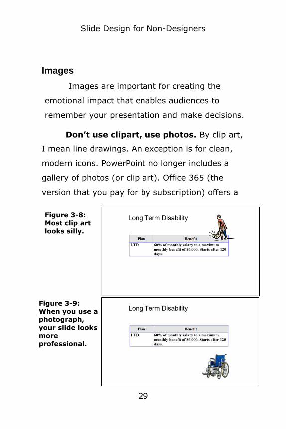
Images
Images are important for creating the
emotional impact that enables audiences to
remember your presentation and make decisions.
Don’t use clipart, use photos. By clip art,
I mean line drawings. An exception is for clean,
modern icons. PowerPoint no longer includes a
gallery of photos (or clip art). Office 365 (the
version that you pay for by subscription) offers a
Figure 3-8:
Most clip art
looks silly.
Figure 3-9:
When you use a
photograph,
your slide looks
more
professional.

Slide Design for Non-Designers
30
good library of icons.
In PowerPoint 2013 and later, choose Insert
tab > Online Pictures where you can use Bing
Image Search or connect with online accounts
where you store your own images. For example,
you can connect with Flickr and OneDrive.
When you get results from Bing in any
version, although the images are supposedly
Creative Commons images (offering various levels
of permission to use), be sure to check. And
remember that you need to give attribution for
most Creative Commons licenses.
To find free images that you can legally use, on my website, go to my blog post at www.ellenfinkelstein.com/pptblog/find-
free-photos-and-images-for-powerpoint/. If you can’t find what you want for free,
go to stockunlimited.com, where you can buy top-quality photos inexpensively.
Remove the background of images. Find
images with a solid background, like the clock in
Figure 3-10. They’re much more powerful. Make
them large!

Slide Design for Non-Designers
31
To remove a solid background, select the
image. Go to Picture Tools Format tab, Adjust
group, click the Color drop-down list, and choose
Set Transparent Color at the bottom. Click the
background. PowerPoint 2010 introduced a more
sophisticated background removal tool, which I
cover at the end of this chapter.
Crop images to just what you need. This
not only saves space but cropped images are
much more powerful because you focus the
audience on the essence of the image. Look at
Figures 3-11 and 3-12. Doesn’t the cropped
subway car look so much closer?
Figure 3-10: A picture with no background is
effective, especially when it is the focus of
the slide.

Slide Design for Non-Designers
32
To crop an image, click the image to select
it and display the Format tab. Click the Crop
button in the Size group. Drag the crop handles
inward. Then click off the image.
Figure 3-11: This is the original photo.
Figure 3-12: The cropped photo makes the
subway look closer, so it’s more powerful.

Slide Design for Non-Designers
33
How to remove complex image backgrounds in PowerPoint 2010 and later
Since PowerPoint 2010, you can remove the
background around strong objects within a photo,
even if the background is more than one color.
Follow these steps:
1. Select the photo.
2. On the Format tab that appears, click the Remove Background button. Depending
on your version of PowerPoint, you may see a border with handles on the corners
and edges. If you do, drag the border outward (usually) so that all of the object
that you want to keep is inside. Purple areas will be deleted; normally colored
Figure 3-13: Here is the original image.

Slide Design for Non-Designers
34
areas will be retained. (Note: It may be helpful to increase the zoom, which is at
the lower-right corner of the PowerPoint window.)
3. To keep an area that is marked for removal (purple), click the Mark Areas to
Keep button. Then either click and drag along an area of the object in the drawing
or just click in several places. 4. To remove an area that is marked to be
kept (normally colored), click the Mark Areas to Remove button. Then either click
and drag along an area of the object in the drawing or just click in several places.
5. When you’re done, click Keep Changes. If
you don’t like the result, choose Undo on the Quick Access toolbar (or press Ctrl +
Z).

Slide Design for Non-Designers
35
You won’t always get perfect results with
this tool. If you have Adobe Photoshop or
Photoshop Elements and know how to use it well,
you can get more precise results. But when it
works in PowerPoint, it’s wonderful!
I work with my clients to make over
slides using the Tell ‘n’ ShowSM method. Check out this service at www.ellenfinkelstein.com/pptblog/1-on-
1-presentation-training/
Figure 3-14: Without the background, the shoes stand
out better, making the point clearer.

Slide Design for Non-Designers
36
Chapter 4: Layout principles Watch a short video I made on how to use the rule of thirds. Go to
www.allaboutpresenting.com/dap/my-content/ where you downloaded this e-
book. Use the log-in information you received when you bought this e-book.
When your slide master is done, it’s time to
start designing the individual slides. The problem
for most people is that they don’t know where to
put the various elements (meaning text and
graphics) so that the slides look professional and
help the audience understand the content.
Figure 4-1: Layout prinicples help you know where to
put slide elements.

Slide Design for Non-Designers
37
In this chapter, we’ll cover some basic
principles and then two layout techniques—
alignment and the rule of thirds.
Did you know that professional designers
often sketch various layouts on paper?
Figure 4-2: Designers often sketch out
their layout ideas on paper.

Slide Design for Non-Designers
38
When you have a lot of content on a slide, sketch out options on a piece of
paper before going into PowerPoint.
Here are four important principles to help
you with layout:
1. Keep it simple, less is more.
2. Look at other presentations, ads in magazines, billboards, websites, and
brochures for ideas 3. Ask others to review your slides. This
applies to all your design, not just layout; some people just have a better eye for
these things than others.
For simple slides, use PowerPoint’s
standard layouts. They help you lay out slides and keep them consistent.
Designers know certain principles and they
learn how to use them. You can learn, too. It’s
Figure 4-3: The layout of this slide came from
choosing one of several options.

Slide Design for Non-Designers
39
mostly a matter of trying them out and seeing
the difference. After a few tries, you start
thinking more like a designer!
In the next two sections, I’ll talk about two
principles that will help you lay out a slide:
alignment and the rule of thirds.
Alignment
Alignment just means lining up elements
on your slide.
Figure 4-4: Alignment is a principle of layout
that designers use often.

Slide Design for Non-Designers
40
You may have seen or created a slide with
everything centered. I see this type of slide a lot.
But think of what the eye has to do as it
scans the content. It might seem orderly because
everything is centered, but it’s really very helter-
skelter.
If instead you align the text, the eye has a
much straighter path. The direction of the rope
leads your eye to the text instead of to a blank
Figure 4-6:
Aligning
text with an
image
makes the
slide easier
for the eye
to scan.
Figure 4-5:
When all the
elements are
centered,
they aren’t
aligned.

Slide Design for Non-Designers
41
area on the slide. Think about where an image
leads your eye and then use that space.
The rule of thirds
The rules of thirds is often used by
designers. It’s not a rule that you must use, but it
can help if your slides don’t seem just right.
The rule of thirds has been used for a
long time by both painters and photographers. The next time you take a
photo, think of the rule of thirds!
You divide up the slide into thirds both
horizontally and vertically. The idea is to put
important content on the intersections of the
lines, called – would you believe it? – power
points!
You can also put content along the lines. For
example a tree trunk might be aligned with one of
the vertical lines.

Slide Design for Non-Designers
42
In Figure 4-8, the focal point is at the
center of the slide, not on any rule-of-thirds
points.
Figure 4-8: This slide does not use the rule of
thirds.
Figure 4-7: The rule of thirds creates focal
points for your slide.

Slide Design for Non-Designers
43
However, on the slide, you can see how the
focus is on the lower-right intersection.
Figure 4-10 shows a slide with more
content, with and without the guides. This slide
would be hard to lay out without the help of the
rule of thirds principle. It has an asymmetrical
kind of balance that’s very pleasant.
Figure 4-9:
This slide has the
same content as
the slide in Figure
4-8, but its content
is on the focal
points.
Here you see it with
and without the
rule of thirds
guides.

Slide Design for Non-Designers
44
For the default widescreen slide, which is
13.33" wide by 7.5" high, the rule of thirds
measurements are 4.44" horizontally and 2.5"
vertically as shown in Figure 4-11.
Figure 4-10:
Here you see a
more complex
slide with and
without the
guides.
Figure 4-11: Here you see a more complex
slide with and without the guides.

Slide Design for Non-Designers
45
A standard slide is 7.5 inches high and 10
inches wide. Therefore, the measurements are
3.33 horizontally and 2.5 vertically.
An easy way to work with the rule of thirds
is to use the guides in PowerPoint. In PowerPoint
2007 and later, go to View tab> Show group, and
check the Guides check box.
Your screen now looks like Figure 4-12:
If the ruler isn’t displayed, choose View
(tab)> Ruler. The ruler will help you space the
guides properly.
Figure 4-11 These measurements
divide a widescreen slide into thirds.
Figure 4-12: When you display guides, you see one
vertical and one horizontal line.

Slide Design for Non-Designers
46
Since you need two guides in each
direction, you need to add one guide in each
direction. To add a guide, hold down the Ctrl key
and drag the existing guide. (Sometimes it’s hard
to drag the guide; just keep trying until you find
the exact right location to drag.) When you drag,
you see measurements to help you, as shown in
Figure 4-13.
Figure 4-13: As you drag a
guide, you see measurements
taken from the ruler.
Slide Design for Non-Designers
47
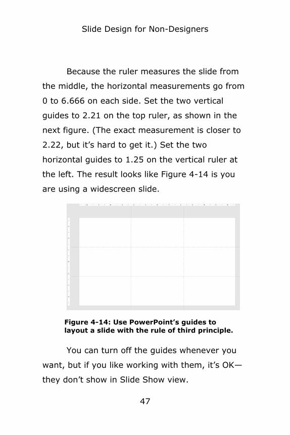
Because the ruler measures the slide from
the middle, the horizontal measurements go from
0 to 6.666 on each side. Set the two vertical
guides to 2.21 on the top ruler, as shown in the
next figure. (The exact measurement is closer to
2.22, but it’s hard to get it.) Set the two
horizontal guides to 1.25 on the vertical ruler at
the left. The result looks like Figure 4-14 is you
are using a widescreen slide.
You can turn off the guides whenever you
want, but if you like working with them, it’s OK—
they don’t show in Slide Show view.
Figure 4-14: Use PowerPoint’s guides to
layout a slide with the rule of third principle.

Slide Design for Non-Designers
48
Now you have a tool to easily lay out slides;
you don’t have to be a designer to use it!
Download a presentation with sample slides using the ideas in this chapter where you downloaded this e-book at
www.allaboutpresenting.com/dap/my-content/. Use the log-in information you
received when you bought this e-book.
I work with my clients to design and lay out their slides. Check out this service at
www.ellenfinkelstein.com/pptblog/1-on-1-presentation-training/

Slide Design for Non-Designers
49
Chapter 5: Contrast
Contrast is important for any design. The
basics are simple—text must have enough
contrast from the background to be clearly
legible. Use black or dark text on a white
background; use white or light text on a dark
background.
Figure 5-1: The brain is hard-wired to notice
contrasting elements.

Slide Design for Non-Designers
50
But you can do more with contrast; you
can highlight specific content, such as the
example in Figure 5-2, with red text that adds
contrast. It looks sharper; it wakes you up and
you notice it. That’s what you want!
When you create your theme colors, as I
explained in Chapter 1, add one color that contrasts strongly with the rest of the
colors.
You can make one shape a different color so
that it stands out. In charts, if you want to
highlight one of the bars, click the Format tab and
fill it with a contrasting color.
Figure 5-2: You can make your audience notice a
specific element by making it a contrasting color.

Slide Design for Non-Designers
51
If you have text on top of an image, you
need to make sure the contrast is strong enough
that the text is easily legible. I cover one method
of doing this, a semi-transparent band, in Chapter
6.
Download a presentation with sample
slides using the ideas in this chapter here you downloaded this e-book at
www.allaboutpresenting.com/dap/my-content/. Use the log-in information you
received when you bought this e-book.
I work with my clients to design clear, powerful, and persuasive slides. Check
out this service at www.ellenfinkelstein.com/pptblog/1-on-
1-presentation-training/

Slide Design for Non-Designers
52
Chapter 6: Finishing Touches
Watch a short video I made on how to create striking shadows. Go to
www.allaboutpresenting.com/dap/my-content/ where you downloaded this e-book. Use the log-in information you
received when you bought this e-book.
There are four finishing touches that I’d
like to teach you:
• Keylines
• Belly bands
• Semi-transparent bands
• Shadows
These features can make a ho-hum
presentation look professional. Designers use
them, but you can easily learn them, too.
Keylines
A keyline is just a thin line. It connects or
separates components and creates a simple
structure. It also highlights alignment. Just that
one line can make a slide look more professional.

Slide Design for Non-Designers
53
Figure 6-1 shows a slide with two images
and two captions. It’s a good slide, but the eye
may not know where to go.
Figure 6-2 shows the same slide with two
keylines. Do you see how the lines hold the
image and its caption together and guide your
attention from one to the other? Plus, the keyline
adds a professional designer’s touch.
Figure 6-1: Without keylines, the slide is a
little hectic.

Slide Design for Non-Designers
54
Belly Bands
A belly band is a band of color can hold
content on the slide together and give it
cohesiveness.
In Figure 6-3, you see a plain slide. There’s
nothing wrong with it, but nothing connects the
names of the cities.
Adding a band of color behind the text
connects the cities and adds a unifying factor.
Figure 6-3: This slide is a little too plain and has
nothing to hold together the names of the cities.

Slide Design for Non-Designers
55
A belly band may have a transparency
gradient, which is one color, gradating from 0
transparency to 85% or 100% transparency. You
can use this technique for other shapes as well,
so it’s a good one to know.
To create a transparency gradient from left
to right in PowerPoint 2007 and later:
1. Insert a shape, such as a rectangle.
2. Right-click the shape and choose Format Shape.
3. Click the Line or Line Color category and choose No Line.
4. Click or expand the Fill category and choose Gradient Fill.
5. Change the angle in the Angle text box to 0°.
6. Under the Gradient Stops section, in
2007, click the down arrow and choose
Figure 6-4: The belly band carries the color across
the entire slide, behind the text and image.

Slide Design for Non-Designers
56
Stop 2. Click Remove. In 2010 and later, drag the middle marker off the gradient
line to remove it. This gives you Stop 1 at a position of 0% and Stop 2 at a position
of 100% 7. Click or choose Stop 1. Click the Color
drop-down and choose the color you want. By default, the Transparency value
is 0%. 8. Click or choose Stop 2. Click the Color
drop-down and choose the same color. 9. Drag the Transparency slider to the
desired value, such as 85% or 100% (completely transparent).
10. To vary where the shape becomes
transparent, you can adjust Stop 2’s position.
Semi-transparent band
A semi-transparent band often holds text; it
makes the text easier to read in front of an
image. Often the band (which is just a rectangle)
is a dark gray, making it look like a sheet of
smoky Lucite, but you can also use white, black,
or a color from the image. Here’s an example:

Slide Design for Non-Designers
57
You can see that the
bar allows the photo to
show through. Here are
the steps to create a semi-
transparent bar:
1. Insert a rectangle from the Drawing
group of the Home
tab. 2. To remove the
outline, right-click and choose Format
Figure 6-5: A semi-transparent bar provides a modern
look and helps make text easily legible.
Figure 6-6: A very dark
gray gives the look of
smoky lucite.

Slide Design for Non-Designers
58
Shape. In the Line Color category, choose No Line.
3. Go to the Fill section or category. To set the color of the fill, use the Color drop-
down list. If you want to match a color in the image, choose the Eyedropper option
and click on that color in the image. 4. To make the fill semi-transparent, drag
the Transparency slider to 25-50%. (You may want to make minor adjustments
later.) 5. Close the task pane.
6. With the rectangle selected, type the text that you want to appear.
If you’re frustrated trying to get the text in the right place on the rectangle, insert
a separate text box on top of the rectangle and type your text there. You’ll
find it easier to drag the text box wherever you want it.
Shadows
Shadows add a subtle 3D effect and
professional designers use them widely. You’ll
need to experiment to find a look you like,
because there is no single technique. Here are
some examples.

Slide Design for Non-Designers
59
When you have several objects overlapping,
a shadow gives a realistic look, as if the top
objects are a little above the bottom ones.
If you remove the background of an image,
PowerPoint does something wonderful when you
add a shadow — you get what I call a contour
shadow. (I explain how to remove the background
of an image in Chapter 3.)
Figure 6-7: Two of the books have bottom and right
shadows, to lift them above the books beneath.

Slide Design for Non-Designers
60
If you combine this feature with the flexible
settings available in PowerPoint 2007 and later,
you can get some amazing results. Here you see
a fairly dramatic shadow around the young
woman.
To add a shadow in PowerPoint 2007 and
later, follow these steps:
1. Select the picture.
2. From the Format tab, choose Picture Effects> Shadow.
3. Choose one of the preset shadow options. 4. To further adjust the shadow, at the
bottom of the same menu, choose Shadow Options. A dialog box (2007 and
Figure 6-8: With a large shadow, the woman appears
to be almost jumping off the slide!
Slide Design for Non-Designers
61
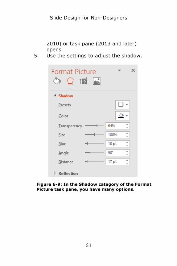
2010) or task pane (2013 and later) opens.
5. Use the settings to adjust the shadow.
Figure 6-9: In the Shadow category of the Format
Picture task pane, you have many options.

Slide Design for Non-Designers
62
Play around with the Shadow settings until
you see the effect of each control and get the
results you want.
Download a presentation with sample slides using the ideas in this chapter
where you downloaded this e-book at www.allaboutpresenting.com/dap/my-
content/. Use the log-in information you received when you bought this e-book.
I work with my clients to design clear,
powerful, and persuasive slides. Check out this service at
www.ellenfinkelstein.com/pptblog/1-on-1-presentation-training/

Slide Design for Non-Designers
63
Chapter 7: The 4 layouts that
always look good Watch a short video I made on how to use the 4 layouts that always look good. Go to
www.allaboutpresenting.com/dap/my-content/ where you downloaded this e-
book. Use the log-in information you received when you bought this e-book.
Here is a shortcut to good design—my 4
layouts that always look good. When you’re in a
hurry, or if you find the principles I’ve covered to
be too involved, just use these.
A typical slide, with a centered image, such
as the one you see in Figure 7-1, is very
common, but it’s very forgettable. I have already
discussed how alignment can improve this type
of slide.
Note that a centered graphic is fine if your
graphic is a graph/chart or diagram. That’s
because you don’t want to extend text to the
edges of the slide; it just doesn’t look good.

Slide Design for Non-Designers
64
But images are different. They actually look
better when you extend them to the edges of the
slide.
Instead, use one of the following 4 layouts.
Vertical image on one side of the slide
Figure 7-2 shows one layout that is easy to
create and always looks good. If the original
image isn’t vertical, you can often crop it. As I’ve
shown you, cropping can make the image more
powerful.
Figure 7-1: A centered image gives a default, boring
impression.

Slide Design for Non-Designers
65
To create a slide like this, use the Title Only
layout. To choose this layout, right-click off the
slide (or on the slide but where there are no
objects) and choose Layout or Slide Layout. Then
choose Title Only.
Choose Insert > Picture and insert the
image you want to use. Move and resize the
image to cover the right side of the slide. Select
and crop it if necessary. If the image takes up
about half of the slide, this often places the focal
point of the image on a power point according to
the rule of thirds.
Figure 7-2: This layout displays text on the left with a
vertical image on the right.

Slide Design for Non-Designers
66
Right-click the photo and choose
Order>Send to Back or Send to Back. You can
now see the title placeholder. Type the title of the
slide.
Select the title placeholder and drag the
right middle handle to the left, so that the
placeholder is on the left side of the slide, as
shown in Figure 7-3.
When you change the shape of the
placeholder, the text wraps to fit inside it.
Depending on the vertical alignment, the text will
wrap up, or down, as you see in Figure 7-3.
Drag the placeholder down so that it fits on
the slide. You can leave it at the upper left or
Figure 7-3:
Drag the right
side of the title
placeholder to
the left side of
the slide.

Slide Design for Non-Designers
67
move it further down on the slide, depending on
what you think looks best.
Full slide image
Another great choice is to cover the entire
slide with a photo. Go ahead and hide that ugly
template you’re supposed to use!
Use the Title Only layout. To choose this
layout, right-click off the slide (or on the slide but
where there are not objects) and choose Layout
or Slide Layout. Then choose Title Only.
Then simply insert a photo and resize and
position it to cover the slide. But be careful not to
distort the photo. If one edge hangs over the
slide, figure out the best place to crop and then
crop it to fit.
Figure 7-4:
A full-slide
photo can be
very powerful.

Slide Design for Non-Designers
68
Right-click the photo and choose
Order>Send to Back or Send to Back. You can
now type the title of the slide.
If the text doesn’t show up well on the
image, make the text placeholder semi-
transparent, as you see in Figure 7-5. This goes
back to the concept of contrast, covered earlier.
I explained how to make a shape semi-
transparent earlier in this book.
Consider extending the placeholder (or
shape) across the entire width of the slide or using a transparency placeholder that fades one edge to 100% transparency.
Title and image on the rest of the slide
You may want to leave the title area blank
for the text, so you can put the image below the
Figure 7-5:
A semi-
transparent
text
placeholder
ensures
legibility.

Slide Design for Non-Designers
69
title. As with the other layouts, you may need to
crop the image.
Start with the Title Only layout. Insert the
image and resize and place it so that it fits below
the title text. Then crop it as necessary.
Figure 7-6: Put the title at the top and fill the rest of
the slide with an image.
Text at upper-left, image at lower-right
This technique works best with an image
that has no background. For this reason, I didn’t
use the previous image of the boy writing.

Slide Design for Non-Designers
70
This layout creates a diagonal line between
two opposing centers of attention that the eye
follows.
I explain how to remove an image’s
background in Chapter 3, whether a solid color or
more complex.
Take an existing slide that has a title and a
photo and redo it with all four layouts. You’ll like
the results! Once you’ve used them a couple of
times, you’ll see how easy they are to create.
Download a presentation with sample slides using the ideas in this chapter
Figure 7-7: For this layout, use an image with
a background that matches the slide
background, or remove the background.
Slide Design for Non-Designers
71
where you downloaded this e-book at www.allaboutpresenting.com/dap/my-
content/. Use the log-in information you received when you bought this e-book.
I work with my clients to design clear, powerful, and persuasive slides. Check out this service at
www.ellenfinkelstein.com/pptblog/1-on-1-presentation-training/

Slide Design for Non-Designers
72
Chapter 8: Keep a library of slides
When you create a good slide, you don’t
want to recreate that work. That’s a waste of
time. Instead, keep a library of slides.
Professionals do this all the time.
Start a new presentation and call it Slide
Library on the title slide and for the file name. In
PowerPoint 2007 and later, on the Home tab,
choose the New Slide down arrow and then click
Reuse Slides at the very bottom. In the task
pane that opens, click Browse>Browse File (not
Slide Library). Check the Keep Source Formatting
checkbox at the bottom of the task pane selected
if you want to keep the original slide master.
When you browse to a file, you’ll see all its
slides displayed. Just click the ones you want to
add them to your Slide Library file.

Slide Design for Non-Designers
73
As you create new presentations, continue
to add slides to your slide library. This library can
get large, so you may want to start a new one
every year, depending on how many slides you’re
keeping. Keep these libraries in a separate folder
for easy access.
When you want to use a slide, repeat the
process; in PowerPoint 2007 and later, on the
Home tab, choose the New Slide down arrow>
Reuse Slides. In the task pane that opens, click
Browse>Browse File. Browse to the presentation
you want. Check the Keep Source Formatting
checkbox at the bottom of the task pane selected
if you want to keep the original slide master.
Then click the slide that you want to insert it
after the current slide.
It’s easy to copy and paste a slide from
one presentation to another.
In the source file, click the slide in the left-
hand column and copy it to the Clipboard. In the
destination file, click where you want the file to
go in the left-hand column and paste. By default,

Slide Design for Non-Designers
74
the file takes on the look of the destination file,
but you can use the Paste icon that appears to
choose Keep Source Formatting.
I work with my clients to design clear, powerful, and persuasive slides. Check
out this service at www.ellenfinkelstein.com/pptblog/1-on-
1-presentation-training/
Slide Design for Non-Designers
75
Chapter 9: Summary
Good slide design isn’t hard. Probably the
biggest mistake I see is presenters putting too
much on a slide. When I review clients’ slides, I
often turn one slide into two or even more slides.
Then, slide design is much easier.
Remember the techniques:
• Chapter 1: Create custom theme
colors
• Chapter 2: Design your slide master
• Chapter 3: Use the Tell ‘n’ ShowSM
method
• Chapter 4: Use the layout principles
of alignment and the rule of thirds
• Chapter 5: Use contrast to make
important elements stand out

Slide Design for Non-Designers
76
• Chapter 6: Add finishing touches—
keylines, belly bands, semi-
transparent bars, and shadows
• Chapter 7: Use the 4 layouts that
always look good
• Chapter 8: Create and use a slide
library
I’ve given you lots of material, but when
you review it and start to use it, you’ll find that
you can design better slides, even without artistic
ability. As you practice the techniques, they’ll
become more and more familiar and soon you’ll
be getting better results almost effortlessly.
Download a presentation with sample
slides from this book where you downloaded this e-book at
www.allaboutpresenting.com/dap/my-content/. Also, watch the short tutorial videos I made for you. Use the log-in
information you received when you bought this e-book.
You can use these sample slides like a Slide
Library and then copy and paste them into a new

Slide Design for Non-Designers
77
presentation. Then, just change the text and the
picture to customize the slide for your needs.
To change a picture but keep its formatting, right-click it and choose Change Picture. You may need to choose
From a File, depending on your version of PowerPoint. Then navigate to your own
image.
Would you like 1-on-1 consulting for your slides? I work with my clients to design
clear, powerful, and persuasive slides. Check out this service at
www.ellenfinkelstein.com/pptblog/1-on-1-presentation-training/
Slide Design for Non-Designers
78
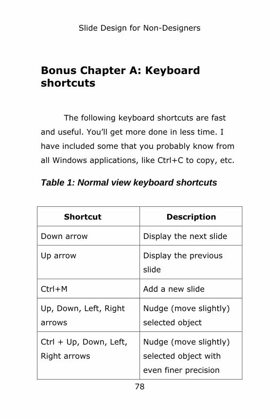
Bonus Chapter A: Keyboard
shortcuts
The following keyboard shortcuts are fast
and useful. You’ll get more done in less time. I
have included some that you probably know from
all Windows applications, like Ctrl+C to copy, etc.
Table 1: Normal view keyboard shortcuts
Shortcut Description
Down arrow Display the next slide
Up arrow Display the previous
slide
Ctrl+M Add a new slide
Up, Down, Left, Right
arrows
Nudge (move slightly)
selected object
Ctrl + Up, Down, Left,
Right arrows
Nudge (move slightly)
selected object with
even finer precision

Slide Design for Non-Designers
79
Alt + Up, Down, Left,
Right arrows
Disable the invisible
grid so that you can
drag objects with no
restriction
Tab Cycle through objects
on a slide (select one
object first)
Ctrl+A Select all objects on a
slide, or select all text
in a selected
AutoShape, text box, or
text placeholder
Ctrl+Z Undo your most recent
action
F4 Repeat your most
recent action
Esc When you’re when
you’re editing text in an
object, exit Edit mode
so you can work with

Slide Design for Non-Designers
80
the object (rather than
the text in it).
Otherwise, deselect any
selected objects.
Ctrl+G Group selected objects
so that you can work
with them as one object
Ctrl+Shift+G Ungroup selected
objects
Ctrl+D Duplicate a selected
object
Ctrl+drag Copy and move a
selected object
Shift+drag Constrain the
movement of a selected
object to vertical or
horizontal
Ctrl+Shift+C Copy formatting of the
selected object; works
with Ctrl+Shift+V
Slide Design for Non-Designers
81
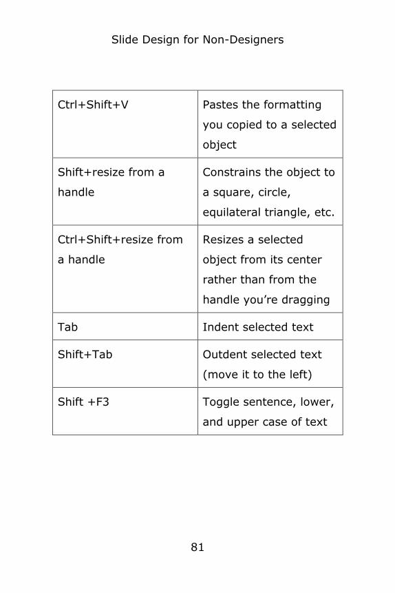
Ctrl+Shift+V Pastes the formatting
you copied to a selected
object
Shift+resize from a
handle
Constrains the object to
a square, circle,
equilateral triangle, etc.
Ctrl+Shift+resize from
a handle
Resizes a selected
object from its center
rather than from the
handle you’re dragging
Tab Indent selected text
Shift+Tab Outdent selected text
(move it to the left)
Shift +F3 Toggle sentence, lower,
and upper case of text

Slide Design for Non-Designers
82
Table 2: Slide Show view keyboard shortcuts
Shortcut Description
F5 Switch to slide show
view with 1st slide
displayed
Shift+F5 Switch to slide show
view with current slide
displayed
Enter, Spacebar, N,
Page Down, Right
arrow, Down arrow
Next slide or animation
P, Up arrow, Left arrow,
Page Up, Backspace
Move to previous slide
or animation
Slide number + Enter Display the slide
number you typed
B Black out the screen
W White out the screen
Ctrl+P Switch to pointer (for
annotation)

Slide Design for Non-Designers
83
Ctrl+A Display arrow cursor
E Erase screen annotation
Esc Exit slide show view

Slide Design for Non-Designers
84
Bonus Chapter B: More Design
Tips
I have lots more design-related tips on
my PowerPoint Tips Blog. You might be
interested in some of these.
9 tips to design presentations for
webinars
Better photo slides—the 3-side rule
8 steps to add branding to your
presentations
5 principles for easier and faster slide
creation
6 steps to create a quick PowerPoint
makeover
Slide Design for Non-Designers
85
Bonus Chapter C: More valuable
information
To become an outstanding presenter, you’ll
probably need more than just this book. Here are
some additional resources.
Get more tips for free!
Sign up for the free PowerPoint Tips
Newsletter at
EllenFinkelstein.com/pptblog/getstarted/.
You’ll learn techniques to improve your content,
create great graphics, and professionally deliver
your presentation. You’ll also receive a free
training video, 13 Techniques to Make
Designing Your Slides EASY!
Visit EllenFinkelstein.com
EllenFinkelstein.com offers PowerPoint
tips, tutorials, and techniques to help you create
better presentations. It’s all free.

Slide Design for Non-Designers
86
Get other great books, courses and webinar recordings!
Do you need to learn more about
PowerPoint? Would you like to become a
PowerPoint expert? If you want to learn more
about PowerPoint, check out the books,
courses, and webinar recordings in my e-
store.
Get personalized training
I offer 1-on-1 training to work with you to
make over slides and develop a more powerful
presentation. Read more about this training
here.
I also offer team training, on-site or
virtually. Read about my corporate training
here.
Please tell your friends about Slide Design
for Non-Designers. They can get it at
ellenfinkelstein.com/pptblog/slide-design-
for-non-designers/

Slide Design for Non-Designers
87
Slide Design for Non-Designers is also
for sale in quantity — at a steep discount. The
cover can be customized and branded. For more
information, contact us here.
Let me know what you thought of this book
How much did you know about PowerPoint
before you read this book? Which tips helped you?
How have you been able to work faster or create
better presentations?
I’d like to hear your experiences using
these principles. Contact me here.

Slide Design for Non-Designers
88
1.