Scatter Diagram - Mr. Chau's VSA Page -...
25
Scatter Diagram By Laura Chow, Jefferson Cheung, Jason Yeung, Mr. Chau
Transcript of Scatter Diagram - Mr. Chau's VSA Page -...

Scatter DiagramBy Laura Chow, Jefferson Cheung, Jason Yeung, Mr. Chau

What is a Scatter Diagram?Definition of Scatter Diagram: A scatter diagram is a tool for analyzing relationship between two variables. One variable is plotted on the horizontal axis and the other is plotted on the vertical axis. The pattern of their interesting points can graphically show relationship patterns.
Most often a scatter diagram is used to prove or disprove cause-and-effect relationships.
While the diagram shows relationships, it does not by itself prove that one variable are from a common cause that is unknown or that one variable can be used as a surrogate for the other.

When do we use Scatter Diagram- A scatter diagram is used when we want to show the correlation that exists between two sets of data.
We use Scatter Diagram when there is too much information whereas we can’t afford enough time for bar chart
- It is also better version of efficiency comparing to Bar Charts.
- We use scatter diagrams like in stock market, population distribution

How to use the Scatter DiagramWe can use Scatter Diagram by the steps below:
1) Collect data. Gather 50 to 100 paired samples of data that show a possible relationship.2) Draw the diagram. Draw roughly equal horizontal and vertical axes of the diagram, creating a square plotting area. Label the axes in convenient multiples (1, 2, 5, etc.) increasing on the horizontal axes from left to right and on the vertical axis from bottom to top. Label both axes.3) Plot the paired data. Plot the data on the chart, using concentric circles to indicate repeated data points.4) Title and label the diagram.Interpret the data. Scatter diagrams will generally show one of six possible correlations between the variables.

What do they look like

Question #1

Example#1 of a Scatter DiagramMatt sells ice-creams at outdoor events. He often buys too much or too little ice-cream from the wholesalers, so does not make as much profit as he would like. He decides to record how many ice-creams he sells over a number of days, to see whether there is a link between the temperature and number of ice-creams sold.

Information for Scatter Diagram
Temperature (°C) 21 26 15 24 18 29 20 27 23 17 30 19
Number of ice-creams sold 70 86 50 80 58 96 66 92 74 54 100 62

Reflections- There appears to be a connection. When the temperature is low, the number of ice-creams sold is also low. When the temperature is high, the number of ice-creams sold is high.
- But it is much easier to judge the results by looking at a scatter diagram.
Plotting a scatter diagram is easy. The results are in pairs, so it is just like plotting coordinates.

Information and Results of Scatter Diagram
- The axes have been drawn so that the temperature is on the horizontal axis and number of ice-creams sold on the vertical. We therefore plot the points (21, 70), (26, 86), (15, 50) etc.

Question #2
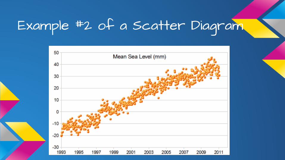
Example #2 of a Scatter Diagram

Comparison of Charts

Who use Scatter DiagramPeople like the following use Scatter Diagrams- Stockbrokers- Business Man- Company (IT people)- Government- Teachers
Importance of this chartIn the above examples, you can see that the dots, which are actually data points, have various relationships. The Strong correlation indicates that there is a close relationship between the data that is paired together. In the middle diagram, you see a slightly different pattern indicating that there is, in some cases, a relationship and in other cases there is no relationship. The last diagram on the right indicates that there is no correlation, or no relationship at all between the paired data.In the first diagram on the left, you would be able to determine that you have a strong relationship and thus one measurement has a strong relationship to the other; therefore, you would be able to prove that one item affects the other closely.

Types of CorrelationsA positive correlation means when the value of one set of data increases, the other data will also increase.
A real life example is the amount of rain and the size of puddles. Obviously, the more it rains, the larger the size of the puddles.

Types of CorrelationsA negative correlation means when the value of one set of data increases, the other data will decrease.
A real life is the more the watch is in use, the less energy is left in its battery.

Types of CorrelationsLastly, there may be two sets of data that has "no correlation". In this relationship, the value of one set of data has neither "positive" nor "negative" effect on the other set of data.
A real life example is the amount of water we drink has no relationship to the amount ofHomework we would like to do.

Use of Scatter DiagramDrawing a Line of Best Fit
If the scatter plot shows that the relationship between two sets of data has a positive or negative correlation, another use for the scatter plot is to be able to make predictions using a "line of best fit" or "fitted line". The line of best fit allows you to make predictions because every point on the line is associated with a glide slope value and average speed value. Thus, any value I choose for glide slope will have a corresponding average speed value, which can be found by locating the point on the line of best fit.

Real Life ExampleThe following data shows the relation between height and size of shoes for a set of people. Using the data plot a graph.

Real Life ExampleEach data point denoted by a small circle in the graph represents the shoe size at a particular height on two variables. We noted that there is a positive correlation between the shoe size and the height for a set of people. When the value of the height increases, the shoe size will also increase.

ConclusionWe believe we did well in this project. In our presentation, we tell the purposes of using a
Scatter Diagram, which is to show the correlation exists between two sets of data. We also tell
technically how to draw a Scatter Diagram, and what do they look like. We also give real life
examples on how to use Scatter Diagram. There are examples, such as there is a positive
correlation between the number of ice-cream sold and the temperature. However, there is a
negative correlation between the time of a watch is in use and the less energy is left in the
battery. Sometimes, there is no correlation, for example, between the amount of water we
drink and the amount of homework we need to do. A comparison between a line chart, a bar
chart and a pie chart is also given for reference. So we did a good job. Thank You!!!

Credit PageLaura: Research, Conclusion, Editing, Script Writing, Example on Ice-Cream, How to use Scatter Diagram, How do they look like, WHo use Scatter Diagram, Definition of Scatter Diagrams, Types of Correlations, Importance of the chart
Jefferson: Research, What is Scatter Diagram, When to use Scatter Diagram, Comparison of Charts, Types of Correlation, Use of Scatter Diagram (Draw a line of best fit), Real Life Example (Shoe size v height), Thank You page & Script
Jason Yeung: Research, Technical, Bibliography, Importance of this chart, Comparison of Chart, Ending Page, Importance of the chart
Mr Chau: Guidance
chi hin: research

BibliographyScatter<http://web2.concordia.ca/Quality/tools/25scatter.pdf>"Drawing Scatter Diagrams." BBC News. BBC, n.d. Web. 13 Mar. 2014. <http://www.bbc.co.uk/schools/gcsebitesize/maths/statistics/scatterdiagramsrev1.shtml>http://www.mathsisfun.com/data/scatter-xy-plots.htmlhttp://thequalityweb.com/scatter.html

Thank you for Listening