Rolling stone contents
5
-
Upload
annabellehussey -
Category
Education
-
view
163 -
download
2
Transcript of Rolling stone contents
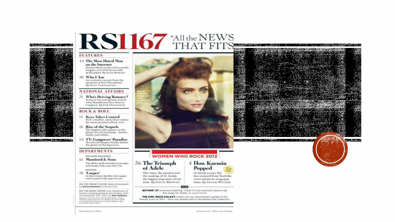

Main image- This contents page is from the issue of Rolling Stone which had Adele on the front cover. Therefore, it is surprising that the main image on the contents page is of another artist. This breaks the typical conventions of music magazines who usually have a main image of their cover artist on their contents page. The main image is of singer Amy Heidermann a member of a band named Karmin, she is a hip hop/pop artist which shows the magazine’s hybrid genre as it’s not just focused on rock music which makes the magazine more appealing to a wide audience. She is positioned with her arm holding her hair and looking dramatically upwards with her expression focused and lips almost pouting to emphasise her cheek bones. This represents her as mysterious and ‘perfect looking’. This would appeal to a female audience who might admire her/want to look like her, they would also be the target audience for her pop genre of music. She is also represented as mysterious as she is portrayed looking up towards something in the distance (that the reader can’t see). This mysterious representation would attract the audience because she is quite a current artist who is not yet entirely well known. It would entice them to read the feature based on her to find out more about her music. The upward direction of her eyes also connotes that she’s looking forwards which could be a metaphor for her looking towards the future of her music career. This suggests to the audience that she has a lot of potential and that her band is definitely worth listening to. However, as the main image is her alone without her band members it suggests that she’s the lead singer and the most important further adding to the readers interest. Her dramatic pose shocking and exciting may be announced in the magazine which could imply why she’s alone and without the rest of her band. It suggests that she’ll be embarking on a solo career in music.
Lighting- The way that the light reflects onto the image makes it look as if you’re looking at her through a window. The ‘window effect’ could be to convey to the audience that the magazine has an inside scoop on her involving her personal life. This is reinforced by the sell line on the image which says ‘ready for her close up’ which again suggests that the magazine will be getting up and close and personal with the artist.

The title- the title in the top right hand corner of the magazine says ‘RS1167’ and is written in both block black and red capitals. The title is an abbreviation of the magazine name and has it’s issue number next to it. This a unique way of conveying the magazine title which includes the issue number too as usually most music magazines have the issue number on the front cover of the magazine. The font colour of black and red are stereotypical colours of a rock genre which represents the original genre of the magazine, although rolling stone magazine now tries to appeal to a younger readership as well as older audience. The magazine focuses om popular culture and has a traditional mix of content. This shows that the magazine has kept to using black and red as there are iconic colours to the magazine and will increase it’s brand identity. By having the issue number as the biggest text on the page it draws the readers focus, this could be to emphasise the large amount of copies its sold and the popularity around the magazine. It shows new readers that the magazine has a large audience consisting of regular readers that they should become apart of. Next to the title is the headline ‘all the news that fits’ written in quotation marks. As this is placed at the top of the page next to the title it suggests that this is the slogan for the magazine. ‘news that fits’ is capitalised which implies that magazine consists of everything that is current. The word ‘news’ also suggests that the magazine doesn’t just focus on music it also covers topics such as news, politics and general popular culture. This would appeal to an older audience who may be interested in the politics as well as music. This is reinforced by the four divisions that the page is split into: Features, National Affairs, Rock & Roll and Departments and then a one off special for the issue ‘women who rock 2012’. From these separate cover lines referring to different contents of the magazines it proves that the magazine is not solely based on music. Under ‘women who rock 2012’ there are two main features ‘the triumph of Adele’ and ‘how Karmin popped’ . As Adele is an extremely successful and popular artist this would straight away appeal to the audience. The audience would also be intrigued as to ‘how Karmin popped’ as she is the main image on the cover page who they’d want t find out more about. These features also in a bigger and bolder black font than the rest of the features which further emphasises their importance and draws the readers attention.

Features- the ‘features’ section of the magazine is at the top of the page as these will include be the new and enticing aspects of the magazine. Within the feature section there is ‘the most hated man on the internet’ which shows that the magazine is up to date with the latest internet trends which would appeal to a younger audience. It is a common code and convention for a magazine to have the ‘features’ at the top of the page as is this is what most readers would be interested in as regular readers already know what the magazine usually consists of and would be interested in the specific features of the new issue. However, in comparison to other magazines the Rolling Stone contents page doesn’t consist of a ‘regular’ section. Instead it includes the other divisions within the magazine. The ‘national affairs’ section would appeal to the older audience who would be interested in the political section of the magazine. Under this section is the title of the page ‘Who’s driving Romney?’ with the description ‘to know his real agenda, look at what republicans have done in congress’. The use of rhetorical question encourages the reader to read the page to find out the answer, the description also reinforces this with ‘to know his real agenda’ which suggests that the magazine has find out the truth that the reader might not know about. The ‘rock & roll’ division under this includes the cover lines ‘Keys Takes Control’, ‘Rise of the sequels’ and ‘TV: Gangster paradise’. These cover lines all emphasise the diversity of the magazine. The description under ‘Keys Takes Control’ says ‘Now a mother, Alicia Keys makes her most personal album.’ This would appeal to an audience of women, who may have children themselves and can relate to the change Keys faced when she had children which would encourage them to read about her new ‘personal album.’ In contrast, the page ‘Rise of the sequels’ refers to the ‘biggest video games on the planet’ which shows how the magazine also targets a younger audience who would be enticed by the page based on new video games which they’d want to own before anyone else.

The page numbers are written in a grey font whilst the cover lines are in a bold black which shows that the audience will first focus on what’s in the magazine and then look to the numbers of the pages to find them. The cover lines are all in a bold black font with their descriptions underneath in grey. This shows that the cover lines are the main way of enticing the audience and the descriptions of them just further encourage the audience. The same font is used throughout the contents page in varying sizes. This is to keep continuity and maintain a professional look, the bigger fonts are used on headlines and cover lines to grab the audiences attention. This would appeal to them as it directs them to the sections that they will enjoy the most. Overall, the page is organised efficiently making it easy for the reader to navigate through the magazine. The red font of the segments and the banner of the page make them stand out more than the other text, drawing attention to their significance. There is a plug at the bottom of the page in a gold circle at the bottom of the page beside the cover line ‘how Karmin popped’ which offers a ‘special flip cover’ for the audience which would entice them further to see what the flip cover is like and why it’s special.
At the bottom of the page credits are given to the photographers of the images on the page, underneath this is the names of the stylists and brand names of clothing used in the main image. For example, ‘Skirt by Topshop. Skirt by Dolce and Gabanna.’ This is a subtle form of advertisement on the page as Rolling Stone generates a wide audience that would be likely to see this advertisement and be interested in the companies they’re advertising.