Research Visual Communication History - Part 2
7
-
Upload
colleen-sedgwick -
Category
Art & Photos
-
view
191 -
download
1
Transcript of Research Visual Communication History - Part 2

Checkpoint B:
Progress Challenges 1-4
30521a - Research Visual Communication History
For D0105: Diploma of Graphic DesignStudy Period 3, Module 1
By: Colleen Sedgwick
Student Number E0498336

Check Points are made up of one or more Progress Challenges. These are designed to break down your learning into chunks and help you
work towards your final assessments. While your assessor will monitor your work when you submit at Check Points, this may not result in
direct feedback. We encourage you to discuss your work in progress on the student forums.
Instructions
1. Complete each Progress Challenge as detailed in the module.
2. Correctly label and then upload a PDF or ZIP for each Progress Challenge in the module:
Progress challenge 5: Research
Progress challenge 6: Research
Progress challenge 7: Australian band
Progress challenge 8: Australian band
3. Click ‘Submit for Marking’ to complete this Check Point.
Tips
You can edit your work and upload again, prior to submission.
To return to the Progress Challenges, click here.
.
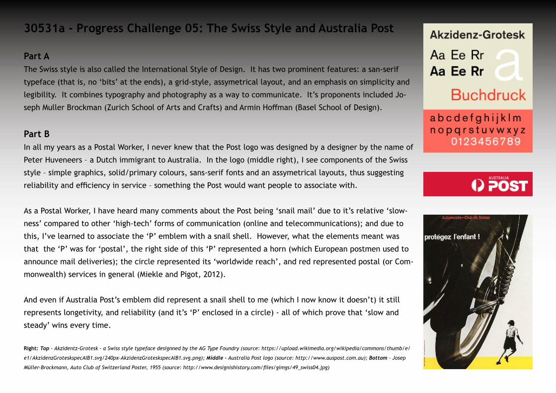
30531a - Progress Challenge 05: The Swiss Style and Australia Post
Part AThe Swiss style is also called the International Style of Design. It has two prominent features: a san-serif
typeface (that is, no ‘bits’ at the ends), a grid-style, assymetrical layout, and an emphasis on simplicity and
legibility. It combines typography and photography as a way to communicate. It’s proponents included Jo-
seph Muller Brockman (Zurich School of Arts and Crafts) and Armin Hoffman (Basel School of Design).
Part BIn all my years as a Postal Worker, I never knew that the Post logo was designed by a designer by the name of
Peter Huveneers – a Dutch immigrant to Australia. In the logo (middle right), I see components of the Swiss
style – simple graphics, solid/primary colours, sans-serif fonts and an assymetrical layouts, thus suggesting
reliability and efficiency in service – something the Post would want people to associate with.
As a Postal Worker, I have heard many comments about the Post being ‘snail mail’ due to it’s relative ‘slow-
ness’ compared to other ‘high-tech’ forms of communication (online and telecommunications); and due to
this, I’ve learned to associate the ‘P’ emblem with a snail shell. However, what the elements meant was
that the ‘P’ was for ‘postal’, the right side of this ‘P’ represented a horn (which European postmen used to
announce mail deliveries); the circle represented its ‘worldwide reach’, and red represented postal (or Com-
monwealth) services in general (Miekle and Pigot, 2012).
And even if Australia Post’s emblem did represent a snail shell to me (which I now know it doesn’t) it still
represents longetivity, and reliability (and it’s ‘P’ enclosed in a circle) - all of which prove that ‘slow and
steady’ wins every time.
Right: Top - Akzidentz-Grotesk - a Swiss style typeface designned by the AG Type Foundry (source: https://upload.wikimedia.org/wikipedia/commons/thumb/e/
e1/AkzidenzGroteskspecAIB1.svg/240px-AkzidenzGroteskspecAIB1.svg.png); Middle - Australia Post logo (source: http://www.auspost.com.au); Bottom - Josep
Müller-Brockmann, Auto Club of Switzerland Poster, 1955 (source: http://www.designishistory.com/files/gimgs/49_swiss04.jpg)

30531a - Progress Challenge 06: McDonalds - A Brand to Either Love or Hate
I chose McDonalds, trademark 'golden arches' and Ronald McDonald clown (Wikipedia, 2016). The fast food chain began in San Bernadino, Cal-
ifornia (USA) by the McDonald brothers (Richard and Maurice) in 1940, and became synonymous with fast food when it was purchased by Ray
Kroc in 1955. The golden arches were designed by Stanley Clark Meston and Charles Fish in the 1960's, and were yellow against a red back-
ground and altered by Fred Turner and then by Jim Schlinder in 1968, to what we see today (Hess, 1986; Hughes, 2008).
The fast food chain was criticised for their worker
exploitation (Associated Press, 2003; BBC News, 2005;
KIm 2013); environmental impact, mistreatment of an-
imals; and health implications6, and were compelled
to change their policies (McDonalds, 2016; McDonalds
Australia, 2016). Even the golden arches were asso-
ciated with Freudian theories, breasts and the insin-
uation that the fast food chain has replaced home-
cooked meals (Hess, 1986).
Right: Mc Donalds in Time Square, New York (Photographer,
Giorgio Martini); Source: https://commons.wikimedia.org/wiki/
File:MacDonalds_sign_in_Times_Square.jpg
30521a – Progress Challenge 07: Australian brandPart A
After searching for information about the history of the Australia Post logo, I finally find this blog entry by Miekle and Pigot (2012).
Dutch designer, Peter Huveneers was able to show what the elements meant - the 'P' for 'postal', the right side of this 'P' representing a horn
(which European postmen used to announce mail deliveries); the circle representing its 'worldwide reach', and red representing postal (or
Commonwealth) services in general. Take away from this – keep it simple and consistent so it will appear everywhere.
Part B
Another iconic Australian brand is Mambo clothing (Wikipedia, 2016c), founded in the early 1970s by Dare Jennings, in-house artist Jodi Phyl-
lis, freelancer Richard Allan (who did the 'farting dog'), and Mental-as-Anything's Reg Mombassa. It has grown from a
little 'after-hours' shop to one of the best-selling surfwear brands here in Australia. Unlike Australia Post's simple logo,
Mambo's brand identity is less 'corporate', more quirky, and synonymous with modern-day Australian surf-culture. This
indicates, to me, that being adventurous can pay off.
Part C
Serif fonts (Roman fonts) are letterforms with strokes on the ends, originating during the Roman period, where stonemasons used to carve
the letters into the stone on buildings. The serifs also meke the print easier easier to read (Wikipedia, 2016g). Sans-serif fonts (Gothic or
Grotesque fonts) are letterforms without serifs, originating in the late 18th and early 19th centuries, used in commercial printing, and more
recently, on computer screens (Wikipedia, 2016f).
The kind of body text I would use for a Tumblr site depends on what theme I use - I find Helvetica Neue to be suitable for most themes and
grid-like layouts the site uses. This typeface comes from the Swiss, International Typographic or Neo-grotesque style. It began in 1983, at D.
Stempel AG (a Linotype subsidiary), includes a unified set of weights and heights, and improvements in spacing, punction and legibility, thus
making it the 'go-to' font for online use.

30531a – Progress Challenge 08: Art Movement - Surre-
alism
I chose Surrealism as my area of interest: this movement begain in Europe during the
mid-1920s and declined in the 1960s. Its main proponents include Salvadore Dali, Joan
Miro, Andre Masson, Max Ernst, Meret Oppenheim and Rene Magritte (The Art Story,
2016).
The reasons for my interest in this genre are twofold:
1. I studied psychology and sociology through the University of New England, and I
am very interested in how the subconscious and conscious interact to influence our
emotions, thoughts and ideas. This art form is definitely a way of understanding
how the subconscious works, and how it influences our perceptions.
2. I also have a personal interest in the genre because I see that kind art work appear-
ing on album covers for rock bands. Some examples are the album cover for Nasty
Savage's records, Indulgence and Abstract Reality (Discogs, 2016). I hope to create
art work like this some day.
Right: Top: Nasty Savage - Indulgence (album cover); Source: http://www.azintex-music.com/index.
php?productID=5082; Bottom: Abstract Reality (album cover); source - http://www.metal-archives.com/
images/2/4/9/3/2493.jpg
References• Associated Press (2003): McJob http://www.cnn.com/2003/SHOWBIZ/books/11/11/offbeat.mcjob.ap/index.html', updated Tuesday, No-
vember 11, 2003 Posted: 3:39 PM • BBC News (2005): McLibel: Longest case in English history; http://news.bbc.co.uk/2/hi/uk_news/4266741.stm; Tuesday, 15 February, 2005,
16:27 GMT • Design is History (2016): Swiss, http://www.designishistory.com/home/swiss/; retrieved 21/01/16 at 03:08:24 AM• Discogs (2016): Nasty Savage http://www.discogs.com/artist/376212-Nasty-Savage; retrieved 21/01/16 at 03:45:28• Hess, Alan. “The Origins of Mcdonald's Golden Arches”. Journal of the Society of Architectural Historians 45.1 (1986): 60–67. Web.. http://
www.jstor.org/stable/990129?seq=1#page_scan_tab_contents; • Hughes, M (2008): Logos that became Legends – Icons from the World of Advertising, http://www.independent.co.uk/news/media/logos-
that-became-legends-icons-from-the-world-of-advertising-768077.html; updated Friday 4 January 2008, retrieved 21/01/16 at 03:19:53• Kim, S (November 21, 2013): McDonald's Defends Telling Workers to 'Quit Complaining' to Reduce Stress. ABC News. Updated November 21,
2013 - http://abcnews.go.com/Business/mcdonalds-defends-employee-tips-deemed-offensive-clueless-advocacy/story?id=20954354• McDonalds (2015): Golden Arches, https://en.wikipedia.org/wiki/Golden_Arches; updated 26 December 2015, at 18:27; retrieved 21/01/16
at 03:17:51• McDonalds (2016): Our Journey Together For Good, http://www.mcdonalds.com/us/en/our_story/values_in_action.html; retrieved 21/01/16
at 03:33:26• McDonalds Australia (2016): Responsibility https://mcdonalds.com.au/learn/responsibility; 21/01/16 03:34:52• Miekle, L, and Pigot, E (2012): Top Ten Australian Logos - 9th Place: Australia Post in Desktop Mag http://desktopmag.com.au/features/top-
10-australian-logos-9th/#.Vorh2hV97ct • The Art Story (2015): Surrealism, http://www.theartstory.org/movement-surrealism.htm; retrieved 21/01/16 at 03:43:06• Wikipedia (2016a): History of McDonalds, https://en.wikipedia.org/wiki/History_of_McDonald%27s; 13 January 2016, at 01:44, retrieved
21/01/16 at 03:17:35 • Wikipedia (2016b): International Typographic Style, updated 7th January, 2016, https://en.wikipedia.org/wiki/International_Typograph-
ic_Style, retrieved 17/01/16 at 04:51:06 AM • Wikipedia (2016c): Mambo Graphics, https://en.wikipedia.org/wiki/Mambo_Graphics; 16 January 2016, at 05:00; retrieved 21/01/16 at
03:37:36• Wikipedia (2016d): McDonalds, https://en.wikipedia.org/wiki/McDonald%27s#Corporate_overview; updated 19 January 2016, at 19:21. • Wikipedia (2016e): Ronald McDonald, https://en.wikipedia.org/wiki/Ronald_McDonald; updated 12 January 2016, at 18:30. • Wikipedia (2016f): Sans Serif, https://en.wikipedia.org/wiki/Sans-serif; updated 16 January 2016, at 03:09. • Wikipedia (2016g): Serif, https://en.wikipedia.org/wiki/Serif; updated 16 January 2016, at 02:40; retrieved 21/01/16 at 03:38:51• Wikipedia (2016h): Supersize Me, https://en.wikipedia.org/wiki/Super_Size_Me; updated 9 January 2016, at 23:33, retrieved 21/01/16 at
03:36:30