Satisfying User and Partner Needs- the Use of Specific Reviews at Eurostat

Commission européenne, 2920 Luxembourg, LUXEMBOURG - Tel. +352 4301-1
Office: BECH - Tel. direct line +352 4301-37123 - Fax +352 4301-33899
http://ec.europa.eu/eurostat
EUROPEAN COMMISSION EUROSTAT Directorate A: Cooperation in the European Statistical System; international cooperation; resources Task Force Peer Reviews
REPORT ON THE EUROSTAT 2015 USER SATISFACTION SURVEY
Index 1. Background – about the survey
2. Main outcomes
3. Results of the USS 2015
3.1. General information
3.1.1. Who uses Eurostat’s European statistics?
3.1.2. To do what?
3.1.2.1. How important are the statistics?
3.1.2.2. How often are the statistics used?
3.1.3. Where are European statistics obtained from?
3.2. Information on quality aspects
3.2.1. Overall quality
3.2.2. Timeliness
3.2.3. Completeness
3.2.4. Comparability
3.3. Trust in European statistics
3.4. Information on dissemination aspects
3.4.1. Access to European statistics on Eurostat’s website
3.4.2. Release calendar
3.4.3. Metadata and methodological information
3.4.4. Twitter account
3.4.5. User support
3.5. Overall quality of Eurostat's data and services
3.6. Comparison with previous year
4. Messages from the users
Annexes: 1. Typology of statistical areas as used in the survey. 2. Number of answers by country of workplace. 3. Brief
methodological description on the analysis of the results. 4. Assessment of overall quality – more detailed
results.

2
1. Background – about the survey
Eurostat’s mission is to be the leading provider of high quality statistics on Europe. In order
to measure the degree to which it meets its obligations towards its users, Eurostat carried out
a general User Satisfaction Survey (USS) over the period of July – September 2015. It was
based on the agreed model questionnaire for the European Statistical System and was
designed to obtain a better knowledge about users, their needs and satisfaction with the
services provided by Eurostat. The first survey of this kind was held in 2007 and then
repeated in 2009, 2011, 2012, 2013 and 2014. The USS 2015 is, therefore, the seventh of a
general nature.
The present survey covered four main aspects:
information on types of users and uses of European statistics,
quality aspects,
trust in European statistics,
dissemination of statistics.
The survey was carried out online, with a link on Eurostat website. It was launched on 9 July
and was open until 25 September. Email invitations were sent out to about 160 000 registered
Eurostat users.
A total of 4447 replies were received, less than the maximum number of 4839 received in
2014, even if the number of email invitations sent this year was the largest ever. The reasons
for a slightly decreased number of responses could be due partly to the high frequency of the
survey, which is a yearly survey since 2011; it might also be due to the fatigue effect on users
who were invited in the same period to participate to other public consultations (on the
extension of the European statistical programme, on the Integrated European Social Statistics,
on the Framework regulation integrating business statistics (FRIBS) and on the Strategy for
Agricultural Statistics 2020 and beyond) following the new Commission policy to consult the
general public for all revisions of legislation.
The questionnaire was similar to the one used in 2014, allowing for a comparative analysis
over time. It was also possible to compare the results of the survey with those of the previous
years for almost all questions. Only a couple of new questions were introduced in the
dissemination section to learn more about the users' opinion on the new Eurostat website.
To obtain a better overview of types of users, different user groups were distinguished in the
survey: 1) students, academic and private users, 2) EU, international and political
organisations, 3) business, 4) government and 5) other users.
A separate specific survey was carried out for press and media users. However, some media
users have nonetheless responded to the general user satisfaction survey. Their replies were
classified under the category “other users”.
The results presented in this report constitute a summary of the most interesting and
compelling findings, supported by graphs. For the first time this year, together with the main
3
differences compared to the previous survey, we present an evolution of the users' opinion
since 2011, date of the first yearly and fully comparable survey.
2. Main outcomes
General aspects
In 2015 the survey was open on line for two months and a half getting 4447 replies,
8.1% less than the maximum in 2014 (4839).
Looking at the distribution of respondents by user groups, students, academic and
private users accounted for the largest proportion (43.5%), followed by business
(25.2%)) and government (19.3%). Replies from international organisations,
including EU institutions, and from other users both accounted for more than 5%. The
distribution remains very similar to the previous year.
Like in 2014, all respondents indicated that “Economy and finance” and “Population
and social conditions” were the two areas they used most frequently. The former
received from 16.9% to 19.8% of responses whereas the latter ranged from 14.2% to
20.2% across all user groups.
As in 2014, “research” (23.8%) and “general background information” (18.5%) were
the most common purposes for all users combined. However, the purposes of
statistical data use varied by groups of respondents reflecting different needs and
nature of work of each group.
Almost two thirds of participants (66.5%) indicated European statistics to be either
“essential” or “important” for their work. Accounting for a breakdown by purposes,
statistical data were again most significant for “monitoring and policy formulation”,
and “preparing legislation” (“essential” for 41.0% and 40.1% of respondents,
respectively).
Almost one quarter of users (24.3%) stated they used European statistics in their daily
or weekly activities, 29.6% did so on a monthly basis and the remaining 46.0% at
other intervals.
Similarly to the previous year, Eurostat database stood out as the most popular source
of information with 75.2% of all respondents accessing it for their purposes. Nearly
half of the users (48.9%) utilised Eurostat’s main tables. Database and main tables
were followed by Statistics in Focus, Eurostat’s press release and Statistics Explained,
which accounted for respective shares of 24.7%, 24.4% and 23.9% of all users.
User assessment of the data sources (i.e. Eurostat's database and different types of
publications) was generally positive, passing the 60% of "very good/good"
judgements for Statistics in Focus (62.4%), Statistics Explained (60.3%) and Regional
Yearbook (60.2%). Only for the mobile applications, which were used by a mere
3.4% of the respondents in any case, the rate of "very good/good" replies was just
below 50% (48.0%).

4
Eurostat was interested to check if users continue to trust European statistics in a
period when European citizens sometimes seem sceptic about the role and functioning
of the EU institutions. As in previous years, responses were overwhelmingly positive,
with 94.2% of users stating they trusted European statistics greatly or tended to trust
them. Only 3.2% said they did not trust statistics and 2.6% had no opinion.
Quality aspects
Overall quality
The level of satisfaction with the overall quality of European data remained high, with
56.6% of all users considering the quality to be “very good” or “good” (slightly less
than in 2014) and 22.4% considering it as “adequate” (slightly more than in 2014).
At a more disaggregated level, “Economy and finance” received the highest positive
evaluation (60.9% of “very good/good” answers). It was followed by “International
trade” and “Population and social conditions”, with shares of 58.3% and 57.7%,
respectively. These are the same three areas which constantly outperform the average
every year.
On the other side of the spectrum, “Regional statistics” “Environment statistics” and
“Energy and transport” were among the ones with lowest share of positive views on
overall quality, with 49.8%, 50.5% and 52.2%, respectively. Nevertheless, all
statistical domains (excluding “other statistics”) received at least around half of “very
good/good” evaluations.
The quality of Eurostat’s data fares very well compared with other statistical data
producers. The majority of participants saw the quality as better or same, resulting in
a combined share of 64.2%. Among other positive sides of Eurostat, users highlighted
better quality and reliability of the data provided, more complete, more detailed and
harmonised data, better coverage and comparability, more metadata, better interface
and search engine, and the possibility to download data for free.
Chart 01. Assessment of overall data quality in 2014 and 2015
Source: Eurostat 2014 and 2015 user satisfaction surveys
Timeliness
59,6%
56,6%
20,4%
22,4%
12,5%
13,4%
7,5%
7,7%
0% 10% 20% 30% 40% 50% 60% 70% 80% 90% 100%
2014
2015 Very good/Good
Adequate
Poor/Very poor
No opinion

5
On average 51.4% of users saw timeliness of European data as “very good” or
“good”, 23.5% as “adequate” and 16.8% as “poor” or “very poor”. Compared to 2014,
this constitutes a slightly smaller share of the “very good/good” evaluations, a slightly
larger share of “adequate” evaluations, and a slightly larger share of “poor/very poor”
ones.
Chart 02. Assessment of overall timeliness in 2014 and 2015
Source: Eurostat 2014 and 2015 user satisfaction surveys
From a statistical domain perspective, “Economy and finance” was again rated as
having the best timeliness across all areas, followed this time by “International trade”
and “Population and social conditions”, accounting for 55.6%, 53.3% and 52.6% of
“very good/good” responses, respectively.
Looking at the user groups, 54.0% of government officials rated the timeliness as
“very good/good” and were closely followed by students and private users (53.6%).
Businesses were the least enthusiastic (45.0%).
Completeness
On average for all areas, 49.3% of users saw data completeness as “very good” or
“good”, 25.1% thought it was “adequate” and 16.0% perceived it as “poor” or “very
poor”.
Chart 03. Assessment of overall completeness in 2014 and 2015
Source: Eurostat 2014 and 2015 user satisfaction surveys
53,7%
51,4%
22,9%
23,5%
15,7%
16,8%
7,7%
8,3%
0% 10% 20% 30% 40% 50% 60% 70% 80% 90% 100%
2014
2015Very good/good
Adequate
Poor/Very poor
No opinion
50,9%
49,3%
24,6%
25,1%
15,6%
16,0%
8,9%
9,6%
0% 10% 20% 30% 40% 50% 60% 70% 80% 90% 100%
2014
2015 Very good/Good
Adequate
Poor/Very poor
No opinion

6
“Economy and finance” once again stood out as the best rated domain, followed by
“International trade” (54.2% and 53.3% of “very good/good” replies, respectively).
The least performing area remained “Regional statistics” with over a fifth (23.8%) of
respondents stating completeness of this domain was either “poor” or “very poor”.
From the user group perspective, EU, international and political organisations were
most positive about the completeness of European data (53.1% of “very good/good”
ratings).
Comparability
The average of “very good/good” responses across all areas was 49.5% this year,
21.4% saw comparability as “adequate” and 14.4% did not feel positive about it.
Chart 04. Assessment of overall comparability in 2014 and 2015
Source: Eurostat 2014 and 2015 user satisfaction surveys
Once again, “Economy and finance” as well as “International trade” were among the
highest rated domains with 54.5% and 50.8% of “very good” and “good” shares
respectively. Similarly to data timeliness and completeness, “Regional statistics”
received the lowest share of positive responses; however, more than 2 in 5
respondents (43.8%) saw the comparability of this domain as either “very good” or
“good”.
This year it was the EU, international and political organisations that were most
satisfied with the comparability of the data. 56.9% of them saw this quality aspect as
“very good” or “good”, an increase of 6.9% points compared to 2014.
Dissemination aspects
One of the key new questions of the user satisfaction survey 2015 was an enquiry
about the satisfaction with the new version of Eurostat's website. The results have
revealed overwhelming support to the updated version, with nearly three in four users,
not counting those who did not express an opinion, claiming to be “satisfied” (74.2%).
Further 19.6% stated that they were “partly satisfied”. In other words, the vast
majority of the surveyed website users were at least partly satisfied with the current
50,3%
49,5%
22,7%
21,4%
13,0%
14,4%
14,1%
14,7%
0% 10% 20% 30% 40% 50% 60% 70% 80% 90% 100%
2014
2015Very good/Good
Adequate
Poor/Very poor
No opinion

7
version. The new website is probably the reason why the satisfaction with other
dissemination aspects has improved in 2015.
This year, there has been an increase in the share of the respondents finding the access
to European statistics easy, with 50.7% of the respondents describing the access as
“easy”, in comparison to 45.3% in 2014.
With regard to the presentation of European data, 65.4% of respondents found
European statistics easy to understand, an increase of 8.2% points compared to 2014,
and a further 21.6% “partly easy”.
As in previous years, respondents were very positive about the content of Eurostat’s
website. On average 17.8% of all users were “very satisfied” with it and another
47.5% thought it was “good”. This gives a combined 65.3% of positive feedback
which is highly valuable for Eurostat and which rose by 2.3% points from 2014.
Respondents were less positive on the website’s technical characteristics, even if
some limited improvements could be registered. Just as in 2014, overall performance
and speed as well as database extraction tools received relatively high evaluations
with respective shares of “very good/good” responses reaching 53.7% and 50.8%.
Search facilities along with navigation to required information were once again the
ones with highest percentage of “poor/very poor” responses. As the results were
similar, although slightly better, to last years, it can be concluded that these attributes
still require further attention and improvements.
User assessment of Eurostat's mobile applications were quite similar to that of the
visualisation tools, with 61.6% of the users rating EU economy application either as
very good or good, and respectively 59.4% and 57.8% rating Country profiles
application and Quiz as “very good/good”.
Users’ awareness of Eurostat’s release calendar, which provides information on the
dates and times of Euro indicators’ publications, remained relatively low. Less than a
third of users seemed to be aware of it (28.3%), a slightly smaller share than in 2014
(29.2%). Among user groups, government as well as EU, international and political
organisations were most informed, with the shares of aware users being 41.2% and
39.5%, respectively. However, a large part of the users who are aware of the release
calendar, are satisfied with its content (67.6% in 2015 vs. 64.2% in 2014).
Metadata was utilised by almost a half of European data users (47.4%), and the share
of metadata users who find it easily accessible has grown to more than a half (52.8%)
this year. Users were also generally satisfied with metadata sufficiency. On average
55.3% - virtually the same as last year - found metadata sufficient for their purposes
and another 38.6% partly sufficient. 6.1% stated metadata was not sufficient.
Out of all respondents who expressed their opinion, 59.1% saw the interest of the
Eurostat's Twitter feed as good or very good.

8
Leaving out those with no opinion or not aware of the user support function, nearly
three in four of the respondents (74.4%) said they were either “very satisfied” or
“satisfied” with the support service provided by Eurostat – the figure raised by 2.5%
points from 2014. The share of unsatisfied users was 8.1% this year.
The level of overall satisfaction with Eurostat’s data and services was quite high with
67.0% of all respondents evaluating data and services as “very good” or “good”,
22.2% as “adequate” and only 3.3% as “poor” or “very poor”.
3. Results of the USS 2015
3.1 General information
3.1.1 Who uses Eurostat's European statistics?
Looking at the distribution of responses by user groups (Chart 1), students, academic and
private users accounted for the largest proportion (43.5%), followed by business (25.2%), and
government (19.3%). Replies from international organisations, including EU institutions, and
from other users both accounted for more than 5% of the total responses. The results remain
very similar to the previous year.
Chart 1. User groups, in %
Source: Eurostat 2015 user satisfaction survey
Throughout the last five years of the User Satisfaction Survey execution the distribution of
the different user groups remained largely similar (Chart 2). This guarantees that the results
can be compared through the years.
43,5%
25,2%
19,3%
6,1% 5,9%
0%
5%
10%
15%
20%
25%
30%
35%
40%
45%
50%
Students, academic andprivate users
Business Government Others EU, international andpolitical organisations

9
Chart 2. Distribution of respondents by user group, in %
Source: Eurostat 2011, 2012, 2013, 2014 and 2015 user satisfaction surveys
As in previous years, geographical distribution of European statistics’ users remained
strongly tilted towards the EU countries with 84.2% of respondents coming from the 28
Member States and remaining 15.8% from non-EU countries. On a country level, the biggest
proportion again came from Germany (11.8%), which was followed by Italy (7.3%), France
(7.3%) and Spain (7.1%). It is worth noting that relatively high percentage of users coming
from Belgium (6.9%) can be explained by their relationship to the European institutions
based in Brussels.
Participants were also asked to specify which statistics they used most frequently and given
an option to pick more than one answer. As seen from Chart 3, “Economy and finance” and
“Population and social conditions” remained the two dominating areas across all user groups,
except for business users. The former domain received from 16.9% to 19.8% of responses
whereas the latter ranged from 14.2% to 20.2% across user groups. For business
representatives, “Economy and finance” was found to be the most widely used domain
(19.3%), followed by “Industry, trade and services” (15.2%), “International trade” (14.7%)
and then “Population and social conditions” statistics (14.2%).
The least utilised statistics were “Environment”, “Science, technology and innovation” and
“Agriculture and fishery”, with approximate average shares of around 5%. When compared
to the results of last year, proportions remained roughly the same.
46
24
18
6 6
46
23
17
8 6
43
25
19
8 5
44
25
19
6 6
44
25
19
6 6
0
5
10
15
20
25
30
35
40
45
50
Students, academic andprivate users
Business Government EU, international andpolitical organisations
Others
2011 2012 2013 2014 2015

10
Chart 3. Use of European statistics by statistical domains and user groups, in %
Source: Eurostat 2015 user satisfaction survey
3.1.2 To do what?
The users of European statistics were also asked to indicate the purpose of their interest in it.
Multiple responses were available. As shown in Chart 4, “research” (23.8%) and “general
background information” (18.5%) were the most common purposes for all users combined.
However, a closer look at the purposes reveals a different nature of statistical data use by
groups of respondents.
As in previous years, “research” remained the main purpose for students and academia.
Combined with the fact that this user group represents 43.5% of the overall pool of
respondents, it explains a large total share of “research” and its dominance compared to other
domains, despite the fact that it is not the primary purpose for other user groups.
18,8%
18,8%
19,8%
19,3%
18,4%
16,9%
18,1%
19,5%
18,2%
14,2%
20,2%
16,9%
11,0%
9,1%
9,1%
15,2%
11,0%
10,5%
10,7%
11,3%
11,0%
9,0%
11,4%
10,1%
9,8%
7,6%
12,2%
14,7%
8,0%
9,6%
7,9%
7,6%
6,9%
9,4%
6,7%
8,5%
7,2%
8,0%
6,4%
5,5%
7,7%
7,7%
5,4%
6,1%
6,0%
3,8%
4,9%
6,8%
5,2%
6,2%
3,7%
3,7%
5,0%
5,1%
5,1%
5,1%
5,7%
4,4%
5,3%
6,6%
1,0%
0,8%
1,1%
0,8%
1,4%
1,3%
0% 10% 20% 30% 40% 50% 60% 70% 80% 90% 100%
All users
Students, academicand private users
EU, international andpolitical organisations
Business
Government
Others
Economy and finance Population and social conditions Industry, trade and services
Indicators International trade statistics Energy and transport
Regional statistics Environment statistics Science, technology and innovation
Agriculture and fishery statistics Other
11
Chart 4. Uses of European statistics by user groups, in %
Source: Eurostat 2015 user satisfaction survey
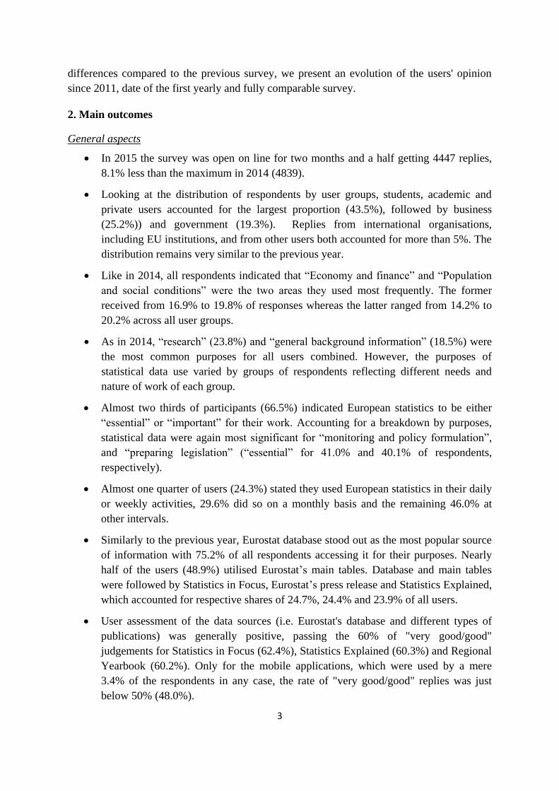
EU, international and political organisations mostly used statistics for “monitoring and
formulating policy” (17.3%) and then as “background information” (16.2%). For businesses,
“market analysis” remains the most popular purpose (22.1%) while “background
information” gets the highest rate from government representatives (23.3%). These results are
mostly in line with the analysis of User Satisfaction Survey 2014.
3.1.2.1 How important are the statistics?
Looking at the importance of European statistics, almost two thirds of participants (66.5%)
indicated them to be either “essential” or “important” for their work (Chart 5).
Accounting for a breakdown by purposes, statistical data were most significant for
“monitoring and policy formulation”, where it was indicated to be “essential” by 41.0% of
respondents and “important” by 37.3%. “Monitoring and policy formulation” was followed
by “preparing legislation”, with shares of 40.1% in the category “essential” and 35.4% in
“important”.
As in the previous year, European statistics were considered least essential for “market
analysis”, “decision-making in business”, and “general background information” (25.3%,
23.7% and 21.5% share of responses, respectively).
24
20
16
15
35
24
18
23
18
16
18
19
10
7
22
9
9
12
9
8
12
9
12
11
11
15
6
17
8
9
11
14
8
13
6
9
3
2
10
4
4
5
2
3
4
4
2
3
6
3
2
3
2
3
4
2
1
3
3
2
2
4
1
5
1
2
0% 10% 20% 30% 40% 50% 60% 70% 80% 90% 100%
Others
Government
Business
EU, international and political organisations
Students, academic and private users
All users
Research General background information
Market analysis Econometric model building and forecasting
Monitoring or formulating policy Re-dissemination of statistical data
Decision-making in business Negotiations
Media use Other
Preparing legislation

12
Chart 5. Importance of statistics for different uses, in % (How do European statistics
influence your work?)
Source: Eurostat 2015 user satisfaction survey
Chart 6 below shows the importance of statistics over time, throughout the period between
2011 and 2015. The importance of statistics remained high during this period, with around
two thirds of participants (62.9% to 67.5%) reporting them to be either “essential” or
“important” for their work. The figure was especially high in the four recent years (ranging
between 66.4% and 67.5%).
Chart 6. Importance of statistics (all purposes) 2011-2015
Source: Eurostat 2011, 2012, 2013, 2014 and 2015 user satisfaction surveys
21,5%
23,7%
25,3%
28,3%
28,7%
30,7%
31,3%
38,8%
39,5%
40,1%
41,0%
30,8%
30,9%
36,6%
35,8%
30,6%
36,0%
35,9%
37,9%
36,2%
37,8%
35,4%
37,3%
35,7%
47,5%
39,7%
38,9%
41,1%
35,4%
33,4%
30,8%
25,0%
22,7%
24,5%
21,7%
33,5%
0% 20% 40% 60% 80% 100%
General background information
Decision-making in business
Market analysis
Other
Media use
Negotiations
Research
Re-dissemination of statistical data
Econometric model building and forecasting
Preparing legislation
Monitoring or formulating policy
All purposes
Essential
Important
Other uses
62,9%
67,3% 67,5%
66,4% 66,5%
60%
61%
62%
63%
64%
65%
66%
67%
68%
2011 2012 2013 2014 2015

13
3.1.2.2 How often are European statistics used?
Knowing the purpose of use and importance of statistical information, it is interesting to see
how frequently statistics were used. As Chart 7 shows, almost one quarter of users (24.3%)
stated they used European statistics in their daily or weekly activities, 29.6% did so on a
monthly basis and the remaining 46.0% at other intervals. When compared to the results of
the survey carried out for media users, statistical information was used more frequently by
press and media representatives, with a percentage of daily and weekly usage exceeding 75%.
Users from EU, international and political organisations remain, as in previous years, the
most frequent users of European data with 39.9% using them daily or weekly.
Chart 7. Frequency of use by user groups, in %
Source: Eurostat 2015 user satisfaction survey
The frequency also differed by statistical domains (Chart 8). Highest daily use was found in
the areas of “Economy and finance” (12.1%), “Industry, trade and services” (11.4%) and
“International Trade Statistics” (10.4%). On the opposite, least frequently utilised domains
contained “Agriculture and fishery”, “Environment” and “Science, Technology and
Innovation”. The differences, however, were rather small.
5,8%
16,3%
7,8%
6,6%
5,5%
3,6%
18,5%
23,6%
22,2%
20,7%
17,2%
16,6%
29,6%
24,7%
31,1%
33,6%
29,5%
29,2%
46,0%
35,4%
38,9%
39,1%
47,8%
50,6%
0% 20% 40% 60% 80% 100%
All users
EU, international and politicalorganisations
Government
Others
Business
Students, academic andprivate users
Daily
Weekly
Monthly
At otherintervals

14
Chart 8. Frequency of use by statistical area, in %
Source: Eurostat 2015 user satisfaction survey
Chart 9 illustrates the trend of the frequency of use between 2011 and 2015. More
specifically, it shows the percentage of respondents who use Eurostat's statistics on daily,
weekly or monthly basis. Overall, the use of the statistics has slightly declined, the peak
being at 2012 and 2013 when two thirds of respondents (66.6% - 66.9%) used statistics at
least on a monthly basis.
Chart 9. Frequency of use 2011-2015
Source: Eurostat 2011, 2012, 2013, 2014 and 2015 user satisfaction surveys
9,5%
12,1%
11,4%
10,4%
8,7%
7,9%
7,8%
7,8%
7,6%
7,2%
7,0%
6,5%
23,6%
23,9%
22,8%
23,5%
21,8%
24,1%
10,2%
26,1%
23,6%
23,9%
21,6%
19,6%
29,8%
30,0%
30,3%
30,1%
29,8%
29,3%
20,3%
30,5%
30,7%
28,6%
30,4%
27,4%
37,1%
34,0%
35,5%
36,0%
39,7%
38,7%
61,7%
35,5%
38,1%
40,3%
41,0%
46,5%
0% 20% 40% 60% 80% 100%
Average for all areas
Economy and finance
Industry, trade and services
International trade statistics
Energy and transport
Population and social conditions
Other
Indicators
Regional statistics
Science, technology andinnovation
Environment statistics
Agriculture and fishery statistics
Daily
Weekly
Monthly
Otherintervals
65,0%
66,6% 66,9%
63,9%
62,9%
60%
61%
62%
63%
64%
65%
66%
67%
68%
2011 2012 2013 2014 2015

15
3.1.3 Where are European statistics obtained from?
When asked to specify the source of retrieving European data (Chart 10), Eurostat database
stood out as the most popular source with 75.2% of all respondents accessing it. The share of
responses remained highest across all user groups, however, the database was the most
popular among EU, international and political organisations (81.0%) with business and
government figures being very close (79.4% and 79.3% respectively)
With regard to other sources, nearly half of the users (48.9%) used Eurostat’s main tables,
which were most popular with students, academic and private users (51.9%). Database and
main tables were followed by Statistics in Focus, Eurostat press releases and Statistics
Explained, which accounted for respective shares of 24.7%, 24.4% 23.9% of all users.
Eurostat applications for mobile devices are used by a quite small share of respondents,
which was also the case in the previous year. Students, academic and private users were those
using them relatively more (4.7%).
Chart 10. Sources of European statistics by user groups, in %
Source: Eurostat 2015 user satisfaction survey
Respondents were also asked to assess the quality of the sources. Highest evaluations were
received by Statistics in Focus (62.4%), Statistics Explained (60.3%) and the Regional
Yearbook (60.2%). Only for the mobile applications, which remained being used by a mere
3.4% of the respondents, the rate of "very good/good" replies was just below 50% (48.0%).
0%
10%
20%
30%
40%
50%
60%
70%
80%
90%
Euro
stat
dat
abas
eac
cess
ible
fro
m it
sw
eb
site
Euro
stat
mai
nta
ble
s ac
cess
ible
fro
m it
s w
ebsi
te
Stat
isti
cs in
Fo
cus
Euro
stat
pre
ssre
leas
es
Stat
isti
cs E
xpla
ine
d
Oth
er E
uro
stat
pu
blic
atio
ns
Euro
stat
mic
rod
ata
Tailo
r-m
ade
Euro
stat
dat
a
Euro
stat
mo
bile
app
s (C
ou
ntr
yP
rofi
les,
EU
…
Oth
er p
rod
uct
s
All users
Students,academic andprivate users
EU,internationaland politicalorganisations
Business
Government
Others

16
Chart 11. Assessment of quality of data sources, in %
Source: Eurostat 2015 user satisfaction survey
3.2 Information on quality aspects
In accordance with the Eurostat’s mission statement, quality considerations play a central role
in both its corporate management and day-to-day statistical operations. It is thus important to
find out how users assess the quality of the European statistics produced and disseminated by
Eurostat. In addition to the overall quality, the survey looked at three different aspects of
quality that are considered as the most important for Eurostat - timeliness, completeness and
comparability.
3.2.1 Overall quality
As in the past, this year evaluations were generally positive with more than 50% of users
viewing the quality of statistics as “very good” or “good”. As can be seen from Chart 12, the
level of satisfaction with the overall quality of European data remained high, with 56.6% of
all users considering the quality to be “very good” or “good” and 22.4% as “adequate”.
Compared to 2014, this represents a small decrease from the corresponding figures last year
(59.6% and 20.4% respectively), as shown in Chart 13.
48,0%
53,8%
56,9%
57,1%
58,9%
60,2%
60,3%
62,4%
29,8%
26,5%
24,4%
23,3%
21,4%
20,3%
19,0%
18,0%
22,3%
19,7%
18,7%
19,7%
19,8%
19,5%
20,7%
19,6%
0% 20% 40% 60% 80% 100%
Mobile apps
Youth in Europe
Pocketbooks
Europe 2020 strategy
Press releases
Regional yearbook
Statistics Explained
Statistics in Focus
Very good/Good
Adequate
Poor/Very poor

17
Chart 12. Assessment of overall quality per statistical area, in %
Source: Eurostat 2015 user satisfaction survey
Chart 13. Difference in the assesment of overall quality per statistical area in 2014 and
2015, in % points
Source: Eurostat 2014 and 2015 user satisfaction surveys
32,8%
49,8%
50,5%
52,2%
53,7%
54,1%
54,3%
54,9%
57,7%
58,3%
60,9%
56,6%
22,7%
26,3%
25,8%
27,5%
26,2%
22,2%
22,9%
24,8%
21,2%
22,9%
19,5%
22,4%
16,4%
16,4%
15,2%
13,9%
12,6%
11,4%
14,9%
13,1%
13,8%
12,3%
13,5%
13,4%
28,1%
7,5%
8,5%
6,4%
7,5%
12,4%
7,8%
7,2%
7,3%
6,5%
6,2%
7,7%
0% 10% 20% 30% 40% 50% 60% 70% 80% 90% 100%
Other
Regional statistics
Environment statistics
Energy and transport
Industry, trade and services
Indicators
Science, technology and innovation
Agriculture and fishery statistics
Population and social conditions
International trade statistics
Economy and finance
Average for all areas
Very good/Good
Adequate
Poor/Very poor
No opinion
-6,0
-4,0
-2,0
0,0
2,0
4,0
6,0
Verygood/Good
Adequate
Poor/Verypoor
No opinion

18
At a more disaggregated level, “Economy and finance” again received the highest positive
evaluation (60.9% of “very good/good” answers). Just like in 2014, it was followed by
“International trade” and “Population and social conditions”, with shares of 58.3% and
57.7%, respectively. In spite of the slight fall of the satisfaction with the quality of the
statistics with the latter two domains to below 60%, these three areas remain the leaders, as it
has been the case every year.
It should also be noted that “Economy and finance” continue to be the highest rated area
across all quality dimensions. Given the interest in economic and financial developments in
Europe during the recent years and the fact that this domain is used most frequently, high
evaluations represent positive views of European data users. A more detailed analysis of the
domain revealed that “National accounts, “Price statistics”,” and “Balance of payments”
came to the top of the list with the first receiving 63.3% and the other two 60.8% both of
“very good/good” assessments.
On the other side of the spectrum, “Regional statistics”, “Environment statistics” and
“Energy and transport” were among the ones with lowest share of positive views on overall
quality, with 49.8%, 50.5% and 52.2%, respectively. Nevertheless, all statistical domains
(excluding “other statistics”) account at least for around half of “very good/good”
evaluations.
As far as regional data is concerned, some inherent characteristics are likely to be responsible
for a lower evaluation. Regional data is generally prepared in the ESS after national data and
in addition often implies supplementary data collections from regional offices. A consistent
request of users is also for more regional detail which frequently conflicts with resource
requirements in Member States.
When analysed by user groups, government officials remain the most positive, as in 2014,
about the overall data quality with a percentage of “very good/good” responses reaching 60.4.
They were followed by EU, international and political organisations (59.5%) and students,
academics and private users (58%) – the same groups as last year, only in a reverse order.
Government respondents are also the most positive when judging the data timeliness while
EU, international and political organisations are so on the data completeness and
comparability.
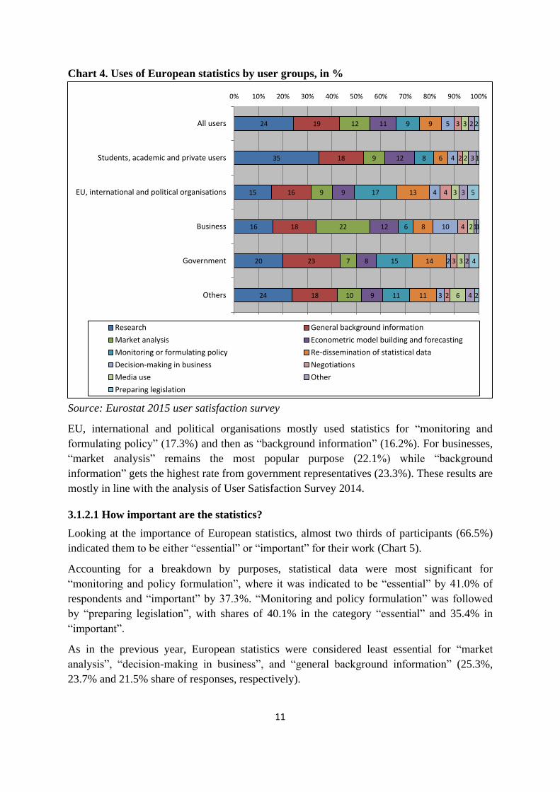
Chart 14 shows that there has not been a lot of difference with the overall data assessment in
the period from 2011 to 2015, and that a peak of user satisfaction was observed in 2014 when
nearly 60% of them claimed the data to be either very good or good.
19
Chart 14. Overall data quality 2011-2015
Source: Eurostat 2011, 2012, 2013, 2014 and 2015 user satisfaction surveys
Given that there are several producers of European statistics, respondents were also asked to
compare the quality of Eurostat’s data with that of national statistical institutes and other
international organisations. The results are presented in Chart 15.
Chart 15. Comparison with other statistical data producers by user groups
Source: Eurostat 2015 user satisfaction survey
As can be seen, the majority of participants consider the quality to be better or the same,
resulting in a combined share of 64.2%. Among other positive sides of Eurostat, users
57,3%
58,0%
57,6%
59,6%
56,6%
55%
56%
57%
58%
59%
60%
2011 2012 2013 2014 2015
0%
5%
10%
15%
20%
25%
30%
35%
40%
45%
Better Same Worse No opinion
All users
Students, academicand private users
EU, international andpolitical organisations
Business
Government
Others

20
highlighted better quality and reliability of the data provided, more complete, more detailed
and harmonised data, better coverage and comparability, more metadata, better interface and
search engine, and a possibility to download data for free.
Less than one in ten of all users (7.4%) considered European data of a worse quality when
compared to other sources. Respondents mentioned shorter time series, limited coverage of
non-EU sources and limited micro data, data completeness and timeliness and language
problems as major drawbacks due to which they may prefer other data sources. Some also
reported problems with the website. There were also users who saw Eurostat's dependency on
the data from NSIs as a shortcoming.
It is also worth noting that more than a quarter (28.4%) of the respondents did not have an
opinion on the issue, suggesting that a relatively large share of Eurostat statistics' users either
do not use other data sources or find it hard to formulate such comparisons.
3.2.2 Timeliness
The aspect of information timeliness reflects the length of time between its availability and
the event or phenomenon it describes. According to the results, which are presented in Chart
16, on average 51.4% of users saw timeliness of European data as “very good” or “good”,
23.5% as “adequate” and 16.8% as “poor” or “very poor. Timeliness remains the quality
dimension, of the three investigated, with the best performance.
From a statistical domain perspective, “Economy and finance” was again rated as having the
best timeliness across all areas, followed this time by “International trade” and “Population
and social conditions”, accounting for 55.6%, 53.3% and 52.6% of “very good/good”
responses, respectively.

21
Chart 16. Assessment of timeliness per statistical area, in %
Source: Eurostat 2015 user satisfaction survey
Looking at the user groups, 54.0% of government officials rated the timeliness as “very
good/good” and were closely followed by students and private users (53.6%). Businesses
were the least enthusiastic (45.0%).
From a timeliness perspective, 55.1% of all users considered Eurostat's timeliness to be better
than or the same as timeliness of national statistical offices in the member countries. Last
year the rate was 56.5%. Those perceiving timeliness as worse accounted for 15.7% versus
14.5% in 2014.
A slight decrease in the assessment of the overall timelines from 2014 can be seen in Chart
17. In fact, as Chart 17 demonstrates, 2014, with 53.7% of respondents reporting the
timeliness to be “very good” or “good”, was a peak year in terms of the positive assessment
of this indicator. Nonetheless, as can be seen in the same chart, in the other four years the
figure was only very slightly behind, with at least half of the respondents choosing either a
“very good” or “good” as their response.
29,7%
43,8%
46,5%
46,6%
47,2%
47,3%
48,2%
51,5%
52,6%
53,5%
55,6%
51,4%
22,7%
25,7%
26,2%
28,2%
28,4%
26,6%
27,1%
22,5%
22,3%
25,8%
20,9%
23,5%
21,1%
22,9%
18,7%
16,9%
17,1%
19,4%
18,1%
14,3%
16,7%
14,7%
15,9%
16,8%
26,6%
7,6%
8,6%
8,4%
7,2%
6,7%
6,5%
11,7%
8,5%
6,1%
7,6%
8,3%
0% 20% 40% 60% 80% 100%
Other
Regional statistics
Industry, trade and services
Environment statistics
Science, technology and innovation
Energy and transport
Agriculture and fishery statistics
Indicators
Population and social conditions
International trade statistics
Economy and finance
Average for all areas
Very good/Good
Adequate
Poor/Very poor
No opinion

22
Chart 17. Assessment of overall timeliness in 2011-2015
Source: Eurostat 2011, 2012, 2013, 2014 and 2015 user satisfaction surveys
The slight decrease of “very good” and “good” responses this year is further illustrated by
Chart 18 which shows that every statistical domain, with an exception of Agriculture and
Fishery, received fewer “very good/good” responses in 2015, compared to 2014. It can also
be seen that the decrease was small, not exceeding 4% points in any of the domains, and
being less than 1% point in some of them.
Chart 18. Differences in the assessment of data timeliness between 2014 and 2015 in %
points
Source: Eurostat 2014 and 2015 user satisfaction surveys
53,2%
51,3%
50,9%
53,7%
51,4%
49%
50%
51%
52%
53%
54%
2011 2012 2013 2014 2015
-5,0
-4,0
-3,0
-2,0
-1,0
0,0
1,0
2,0
3,0
4,0
5,0
Verygood/good
Adequate
Poor/Verypoor
No opinion

23
3.2.3 Completeness
Completeness is the extent to which all statistics that are needed are available. It is usually
described as a measure of the amount of available data from a statistical system compared to
the amount that was expected to be obtained. Chart 19 presents the results of user views on
data completeness in 2015.
On average for all areas, 49.3% of users saw data completeness as “very good” or “good”,
25.1% thought it was “adequate” and 16.0% perceived it as “poor” or “very poor”. “Economy
and finance” once again stood out as the best rated domain, followed by “International trade”
(54.2% and 53.3% of “very good/good” replies, respectively). The least performing area
remained “Regional statistics” with over a fifth (23.8%) of respondents stating completeness
of this domain was either “poor” or “very poor”.
Chart 19. Assessment of completeness of European statistics per statistical area, in %
Source: Eurostat 2015 user satisfaction survey
From the user group perspective, EU, international and political organisations were most
positive about the completeness of European data (53.1% of “very good/good” ratings). The
least satisfied group were business users, who accounted for the lowest level of positive
responses (44.9%).
As Chart 21 shows, compared to 2014, there was a small decrease (1.6%) in the “very good”
and “good” assessments of data completeness this year. Again, as can be seen in Chart 20, the
differences in the user satisfaction with this indicator in the last five years were minimal. The
share of those choosing “very good” and “good” as their response was around a half (49.6%
to 51.4) during all the five year period.
28,9%
40,8%
44,2%
44,9%
44,9%
45,4%
47,3%
47,5%
50,1%
53,3%
54,2%
49,3%
22,7%
27,6%
26,9%
28,9%
28,3%
26,2%
28,2%
24,9%
24,4%
25,2%
22,6%
25,1%
18,0%
23,8%
18,1%
16,7%
17,6%
18,3%
16,7%
13,1%
16,4%
13,5%
14,8%
16,0%
30,5%
7,8%
10,7%
9,5%
9,2%
10,1%
7,8%
14,5%
9,1%
8,1%
8,4%
9,6%
0% 20% 40% 60% 80% 100%
Other
Regional statistics
Environment statistics
Industry, trade and services
Energy and transport
Science, technology andinnovation
Agriculture and fishery statistics
Indicators
Population and social conditions
International trade statistics
Economy and finance
Average for all areas
Verygood/Good
Adequate
Poor/Very poor
No opinion

24
Chart 20. Assessment of overall completeness in 2011-2015
Source: Eurostat 2011, 2012, 2013, 2014 and 2015 user satisfaction surveys
A closer look to the different statistical domains again reveals slight decreases in the share of
“very good” and “good” responses between 2014 and 2015 in all the areas apart from
Agriculture and Fishery (Chart 21). It must be noted that the decrease did not reach 5% points
for any of the domains and was as little as 0.2-0.4% points in some cases.
Chart 21. Differences in the assessment of data completeness between 2014 and 2015 in
% points
Source: Eurostat 2014 and 2015 user satisfaction surveys
51,4%
49,6%
49,9%
50,9%
49,3%
48%
49%
50%
51%
52%
2011 2012 2013 2014 2015
-5,0
-4,0
-3,0
-2,0
-1,0
0,0
1,0
2,0
3,0
4,0
Verygood/goodAdequate
Poor/VerypoorNo opinion

25
3.2.4 Comparability
Comparability is the extent to which differences between statistics from different
geographical areas, non-geographic domains or over time can be attributed to differences
between the true values of statistics.
As seen from Chart 22, an average of “very good/good” responses across all areas was 49.5%
this year. 21.4% saw comparability as “adequate” and 14.4% did not feel positive about it.
Once again, “Economy and finance” as well as “International trade” were among the highest
rated domains with 54.5% and 50.8% of “very good” and “good” shares respectively.
Similarly to timeliness and completeness, “Regional statistics” received the lowest share of
positive responses; however, more than 2 in 5 respondents (43.8%) considered the
comparability of this domain to be either “very good” or “good”.
This year it was the EU, international and political organisations that were most satisfied with
the comparability of the data. 56.9% of them saw this quality aspect as “very good” or
“good”, an increase of 6.9% points compared to 2014.
Chart 22. Assessment of comparability of European statistics per statistical area, in %
Source: Eurostat 2015 user satisfaction survey
There has been a minimal (0.8% points) decrease in the assessment of the overall
comparability compared to last year (Chart 24), 2014 again being the year with the highest
user satisfaction (50.3%), as shown in Chart 23. Within the five year period, 2015 is the
second best year in terms of user satisfaction with overall comparability. Chart 23 also
demonstrates that those choosing either “very good” or “good” as their response when
28,1%
43,8%
44,2%
45,2%
45,7%
46,6%
47,0%
47,4%
49,5%
50,8%
54,5%
49,5%
23,4%
25,6%
23,3%
23,7%
22,5%
23,3%
22,7%
20,8%
22,2%
21,2%
18,5%
21,4%
13,3%
17,3%
15,9%
14,4%
15,7%
14,2%
14,8%
12,8%
15,2%
13,3%
13,7%
14,4%
35,2%
13,3%
16,6%
16,7%
16,2%
15,9%
15,5%
19,0%
13,1%
14,7%
13,2%
14,7%
0% 10% 20% 30% 40% 50% 60% 70% 80% 90% 100%
Other
Regional statistics
Environment statistics
Energy and transport
Science, technology and innovation
Agriculture and fishery statistics
Industry, trade and services
Indicators
Population and social conditions
International trade statistics
Economy and finance
Average for all areas
Verygood/GoodAdequate
Poor/Very poor
No opinion

26
assessing data comparability accounted for at least nearly half of the respondents (47.5% to
50.3%) throughout the period of 2011 to 2015.
Chart 23. Assessment of overall comparability in 2011-2015
Source: Eurostat 2011, 2012, 2013, 2014 and 2015 user satisfaction surveys
The slight decrease of “very good” and “good” responses between years 2014 and 2015 is
mirrored in all the statistical domains except for Industry, Trade and Services (Chat 24). The
differences between the two years were small however, ranging from 0.4 to 3.5% points.
Chart 24. Differences in the assessment of data comparability between 2014 and 2015 in
% points
Source: Eurostat 2014 and 2015 user satisfaction surveys
48,1%
47,5%
48,9%
50,3%
49,5%
46%
47%
48%
49%
50%
51%
2011 2012 2013 2014 2015
-4,0
-3,0
-2,0
-1,0
0,0
1,0
2,0
3,0
4,0
5,0
Verygood/goodAdequate
Poor/VerypoorNo opinion

27
3.3 Trust in European statistics
In a period when European citizens sometimes seem to be sceptic about the role and
functioning of the EU institutions, it was interesting to check if users continue to trust the
statistics produced by Eurostat. Results are presented in Chart 25.
As in previous years, responses were overwhelmingly positive, with 94.2% of users stating
they trusted European statistics greatly or tended to trust them. Only 3.2% said they did not
trust statistics and 2.6% had no opinion.
Chart 25. Trust in European statistics, in %
Source: Eurostat 2014 and 2015 user satisfaction surveys
Despite the potential bias that comes from the fact that Eurostat's data users should generally
trust the data they use, the constantly high rate of positive answers over time demonstrates a
very good and encouraging sign on the confidence of users in the statistics disseminated by
Eurostat.
94,2%
3,2% 2,6%
Trust in European statistics
Trust them greatly / Tend totrust them
Tend not to trust them /Distrust them greatly
No opinion

28
Chart 26. Trust in European statistics by user groups, in %
Source: Eurostat 2015 user satisfaction survey
When looking at the distribution of responses by user groups (Chart 26), the share of
respondents trusting European statistics is very similar for all groups, none going below 93%.
Looking at the responses, some of the reasons while people trust the statistics are that there
are no significant errors or discrepancies, and in the cases where they occur they are detected,
corrected and/or explained. The fact that Eurostat is professional and independent, has legal
obligations and is not politically influenced also helped to gain user trust.
As in 2014, the most recurrent comment of those few who tend not to trust European
statistics is because they depend on national statistics. Some also reported implausible data,
errors or discrepancies.
Between 2012 and 2015 there has been a continuous but very small decrease in trust in
European statistics – around 1% point over the 5 year period (Chart 27).
Chart 27. Trust in European statistics in 2012-2015
Source: Eurostat 2012, 2013, 2014 and 2015 user satisfaction surveys
94,2%
93,0%
93,9%
94,1%
94,5%
94,6%
3,2%
4,4%
3,8%
2,9%
3,8%
2,6%
2,6%
2,6%
2,3%
2,9%
1,8%
2,8%
80% 85% 90% 95% 100%
All users
Others
EU, international and
political organisations
Students, academic andprivate users
Business
Government
Trust them greatly /Tend to trust them
Tend not to trustthem / Distrustthem greatly
No opinion
95,3%
94,9%
94,4% 94,2%
90%
91%
92%
93%
94%
95%
96%
2012 2013 2014 2015

29
3.4 Information on dissemination aspects
This section covers a number of aspects concerning dissemination of European statistics
(access to the European statistics, content and characteristics of Eurostat's website, release
calendar and user support provided by Eurostat).
One of the key new questions of the user satisfaction survey 2015 was an enquiry about the
satisfaction with the new version of Eurostat's website. The results, presented in Chart 28,
have revealed overwhelming support to the updated version, with nearly three in four users,
not counting those who did not express an opinion, claiming to be “satisfied” (74.2%).
Further 19.6% stated that they were “partly satisfied”. In other words, the vast majority of the
surveyed website users were at least partly satisfied with the current version. Government as
well as students, academic and private users had the highest rate of “satisfied” responses
(76.2% and 75.4% respectively). Interestingly, the category with the smallest share of these
responses turned out to be EU, international and political organisations. However, this user
group had a larger than average share of “partly satisfied” respondents (23.5%). It can be
assumed that, since individuals working for such institutions tend to use Eurostat's statistics
often, and maybe they are working on continuous projects consulting the website every year,
they now need time of adaptation to the changes. It will be interesting to see how satisfaction
of this group – and indeed of all the users – changes in the upcoming years, once the users
have had the time to adjust to the new website.
Chart 28. User satisfaction with new Eurostat website, in %
Source: Eurostat 2015 user satisfaction survey
74,2%
76,2%
75,4%
72,4%
72,1%
68,6%
19,6%
17,8%
18,7%
23,8%
20,6%
23,5%
6,3%
6,0%
5,9%
3,8%
7,3%
7,8%
0% 20% 40% 60% 80% 100%
Average all users
Government
Students, academic and privateusers
Others
Business
EU, international and politicalorganisations
Yes
Partly
No

30
3.4.1 Access to European statistics on Eurostat's Website
The positive effect of the new website is shown also by the results of the two questions on
easiness of access to European statistics and of understanding them. This year, there has been
an increase in the share of the respondents finding it easy to access European statistics (Chart
29), with 50.7% of the respondents describing the access as “easy”, in comparison to 45.3%
in 2014. Last year more of the respondents found it “partly easy” (40.1% in 2014 vs. 29.5%
in 2015). With regard to the presentation (user-friendliness) of European data, 65.4% of
respondents found European statistics easy to understand, an increase of 8.2% points
compared to 2014, and a further 21.6% “partly easy” (Chart 30).
What is more, the number of users not having an opinion on these two questions has
noticeably increased this year (9.2% and 8.5% in 2015 vs. 2.7% and 2.8% in 2014
respectively). Perhaps this can be partly attributed to the novelties of the website. It is
possible that some users are not entirely sure how to access the statistics in the quickest way,
or are not able to understand them immediately, but they might not be sure whether it is truly
hard for them to reach these goals or whether they simply need some more time to get used to
the website.
Chart 29. Assessment of the access to European statistics, in % (Is it easy to access
European statistics?)
Source: Eurostat 2014 and 2015 user satisfaction surveys
Chart 30. Assessment of the presentation of the statistics on the website, in % (Are
European statistics presented in an easy-to-understand way?)
Source: Eurostat 2014 and 2015 user satisfaction surveys
50,7%
45,3%
29,5%
40,1%
10,6%
11,8%
9,2%
2,7%
0% 10% 20% 30% 40% 50% 60% 70% 80% 90% 100%
2015
2014
Yes
Partly
No
No opinion
65,4%
57,2%
21,6%
35,0%
4,5%
4,9%
8,5%
2,8%
0% 10% 20% 30% 40% 50% 60% 70% 80% 90% 100%
2015
2014
Yes
Partly
No
No opinion

31
As can be seen from the following Charts 31 and 32, both access to European statistics and
understanding them has, overall, become easier in the period between 2011 and 2015. This is
largely due to the peak in perceived easiness of both indicators in 2015, which has probably
increased because of the revamping of Eurostat's website.
Chart 31. Easiness to access European statistics 2011-2015
Source: Eurostat 2011, 2012, 2013, 2014 and 2015 user satisfaction surveys
Chart 32. Easiness to understand European statistics 2011-2015
Source: Eurostat 2011, 2012, 2013, 2014 and 2015 user satisfaction surveys
Users were also asked to evaluate the content of Eurostat’s database. As in previous years,
responses were very positive (Chart 33). On average 17.8% of all users were very satisfied
with the content and another 47.5% thought it was good. This gives a combined 65.3% of
47,2%
45,0%
46,5%
45,3%
50,7%
42%
43%
44%
45%
46%
47%
48%
49%
50%
51%
52%
2011 2012 2013 2014 2015
59,4%
57,3% 56,9% 57,2%
65,4%
52%
54%
56%
58%
60%
62%
64%
66%
68%
2011 2012 2013 2014 2015

32
positive feedback which is highly valuable for Eurostat and which rose by 2.3% points from
2014.
Just like in the previous year but in a reverse order, government representatives as well as
students, academic and private users were the ones with the highest rates of “good/very
good” responses (71.5% and 66.9% respectively).
Chart 33. Assessment of Eurostat's website content by user groups, in %
Source: Eurostat 2015 user satisfaction survey
Looking at the five-year period (Chart 34), one can notice that there was a peak in
satisfaction in 2012 which proved difficult to replicate afterwards. However, the difference
between the peak figure and the current one is smaller than 3% points.
Chart 34. Eurostat's website content 2011-2015
Source: Eurostat 2011, 2012, 2013, 2014 and 2015 user satisfaction surveys
In another question, users were requested to judge its technical characteristics (Chart 35).
Despite relatively high shares of “very good/good” or “adequate” evaluations, results were
again not as positive as in the case of the website’s content.
17,8%
22,4%
19,9%
19,0%
17,0%
13,0%
47,5%
39,2%
51,6%
47,9%
46,5%
45,9%
25,3%
24,7%
23,2%
23,3%
26,2%
30,4%
5,4%
6,8%
3,0%
5,3%
5,2%
7,1%
4,0%
6,8%
2,3%
4,4%
5,2%
3,7%
0% 10% 20% 30% 40% 50% 60% 70% 80% 90% 100%
All users
EU, international and political organisations
Government
Students, academic and private users
Others
Business
Very good
Good
Satisfactory
Poor / Verypoor
63,8%
68,0%
63,8%
63,0%
65,3%
60%
61%
62%
63%
64%
65%
66%
67%
68%
69%
2011 2012 2013 2014 2015

33
Quantitative results were very much in line with the qualitative assessment of free text
comments provided by the users. Just as in 2014, overall performance and speed as well as
database extraction tools received relatively high evaluations with respective shares of “very
good/good” responses reaching 53.7% and 50.8%.
Looking at the negative side, search facilities along with navigation to required information
were once again the ones with highest percentage of “poor/very poor” responses. As the
results were similar, although slightly better, to last years, it can be concluded that these
attributes still require further attention and improvements.
Chart 35. Assessment of technical characteristics of Eurostat's website, in %
Source: Eurostat 2015 user satisfaction survey
Chart 36 provides a visual comparison of how the user satisfaction with technical
characteristics has changed between 2014 and 2015, demonstrating that there has been a clear
increase in “very good” and “good”.
53,7%
50,8%
49,7%
38,7%
38,6%
26,2%
23,5%
23,0%
25,2%
26,7%
27,1%
16,9%
15,7%
16,0%
18,7%
16,1%
20,3%
9,2%
7,0%
10,2%
6,5%
18,5%
14,0%
47,7%
0% 10% 20% 30% 40% 50% 60% 70% 80% 90% 100%
Performance / Speed
Database extraction tools
Navigation to required info
Help texts / Help facilities
Search facilities
Alert and notification
Very good / Good
Adequate
Poor / Very poor
No opinion

34
Chart 36. Differences in the assessment of the technical characteristics of Eurostat's
website in % points (excluding no opinion)
Source: Eurostat 2014 and 2015 user satisfaction surveys
This year the users were asked to rate Eurostat's visualisation tools and Eurostat's mobile
applications. The satisfaction with the former indicator is presented in the Chart 37, and is
generally very positive, with virtually two thirds of respondents (66.5%) seeing the highest-
rated tool – Infographics “Economic trends” as very good or good, followed closely by
Statistical atlas and Infographics “Quality of life” (65.7% “good/very good” responses for
both indicators). Even the least-rated tool – Widgets – was rated as very good or good by
62.6% of the respondents who have used them and expressed an opinion.
Chart 37. Assessment of Eurostat visualisation tools
Source: Eurostat 2015 user satisfaction survey
-4,0
-3,0
-2,0
-1,0
0,0
1,0
2,0
3,0
4,0
5,0
Very good /GoodAdequate
Poor / Verypoor
66,5%
65,7%
65,7%
64,9%
64,5%
63,6%
63,5%
62,6%
62,2%
20,9%
21,4%
20,8%
22,2%
21,3%
23,4%
24,2%
22,9%
24,3%
12,6%
12,9%
13,6%
12,9%
14,3%
13,0%
12,3%
14,4%
13,5%
0% 10% 20% 30% 40% 50% 60% 70% 80% 90% 100%
Infographics - "Economic trends"
Statistical atlas
Infographics - "Quality of life"
Statistics illustrated - Inflation statistics
Infographics - "Young Europeans"
Statistics illustrated - EU2020 statistics
Inflation dashboard
Statistics illustrated - Regional statistics
Widgets
Very good/Good
Satisfactory
Poor / Verypoor

35
It is worth noting that there is a considerable difference between all the survey respondents,
the respondents who used Eurostat's visualisation tools, and the respondents who used these
tools and chose to express an opinion. As demonstrated in Chart 38, 30.9% to 47.2% of the
survey respondents used the different visualisation tools, Statistics Illustrated – Regional
Statistics being the most widely utilised tool, followed by Infographics “Economic trends”
(45.2%). However, as it can be seen in the same chart, the percentage of users who actually
gave their opinion in the question concerned was about 10% points smaller than the number
of tool users for each of the visualisation tools. In some cases, namely Infographics
“Economic trends”, Inflation dashboard and Widgets, this meant that the assessment was
given by less than 25% of users who filled in the survey. While the 18.8-24.7% represents a
reasonable absolute number of respondents, the differences of how many users expressed an
opinion is something to take into account when making comparisons between the assessments
of the different tools.
Chart 38. Users of Eurostat visualisation tools
Source: Eurostat 2015 user satisfaction survey
User assessment of Eurostat's mobile applications were quite similar to that of the
visualisation tools, with 61.6% of the users rating EU economy application either as very
good or good, and respectively 59.4% and 57.8% rating Country profiles application and
Quiz as “very good/good” (Chart 39).
37,4% 35,8%
32,6% 32,2% 31,4%
29,0%
24,7% 24,3%
18,8%
47,2% 45,2%
43,0% 43,1% 41,7%
38,8%
34,7% 35,6%
30,9%
0%
5%
10%
15%
20%
25%
30%
35%
40%
45%
50%
Stat
isti
csill
ust
rate
d -
Reg
ion
al…
Info
grap
hic
s -
"Eco
no
mic
tren
ds"
Stat
isti
cal a
tlas
Stat
isti
csill
ust
rate
d -
EU2
02
0…
Stat
isti
csill
ust
rate
d -
Infl
atio
n…
Info
grap
hic
s -
"Qu
alit
y o
flif
e"
Info
grap
hic
s -
"Yo
un
gEu
rop
ean
s"
Infl
atio
nd
ash
bo
ard
Wid
gets
Users expressing anopinion
Users expressing anopinion + users withno opinion

36
Chart 39. Assessment of Eurostat mobile applications
Source: Eurostat 2015 user satisfaction survey
As chart 40 demonstrates, there is an even bigger gap between the overall number of survey
respondents and the users actually expressing an opinion on this specific subject. Among the
survey respondents, between 14% and 16.7% appear to have used each of them (calculated by
adding the users who rated the application and the users who stated that they have no
opinion). The number of respondents who actually gave the rating was between 7.2% and
10.3% for the different applications, again indicating that some caution is needed when
interpreting the results.
Chart 40. Users of Eurostat mobile applications
Source: Eurostat 2015 user satisfaction survey
Overall, the open-ended comments of the respondents on the new website of Eurostat suggest
that users are satisfied with it, but that some nonetheless still find the interface non-intuitive.
61,1%
59,4%
57,8%
22,7%
21,9%
25,0%
16,2%
18,6%
17,2%
0% 10% 20% 30% 40% 50% 60% 70% 80% 90% 100%
EU economy
Country profiles
Quiz
Very good/ Good
Satisfactory
Poor / Very poor
10,3% 10,0%
7,2%
16,7% 16,4%
14,0%
0%
2%
4%
6%
8%
10%
12%
14%
16%
18%
Co
un
try
pro
file
s
EUec
on
om
y
Qu
iz
Users expressing anopinion
Users expressing anopinion + users withno opinion

37
Compared to the old website, users seem to prefer the aesthetics, presentation and design of
the current one, and also find the new website faster, easier to navigate and with fewer bugs.
Naturally, some of the respondents who were used to the previous website would have liked
not to change it. Those who preferred the previous website tended to find it more convenient
and noted that some of the data seemed to be no longer available and / or that there have been
unexplained changes in coding in the updated version. There have been instances of users
finding it hard to locate previously used data.
Questioned on what they would like to improve in the website, respondents gave many useful
comments, which include the following. A lot of respondents still found it rather difficult to
find data, especially for new users or those who do not use the webpage daily. Some have
reported headings to be confusing, and others felt that a clear overview was missing. The size
of the database and the high level of detail of data were also seen as a drawback by some
users who found it hard to find the specific data they needed. The lengthy pathway to the
actual data was also problematic for some; they found it time-consuming to access data other
than the most basic tables. Opinions were also voiced that data could be organised in other
ways than by theme.
Regarding data search, there were users dissatisfied with the search engine, some of whom
would have preferred to a search targeted exclusively to databases rather than the whole
website. Search by keywords was also difficult for a number of users. Respondents also
reported difficulties in understanding definitions and metadata for the users who are not
statisticians themselves.
To a lesser extent, units in which data is measured was reported to be confusing at times.
Some users also pointed to problems of consistency / homogeneity between tables and stated
that it was difficult to compare data; others found it confusing that some data sets were
present in more than one place. Origin of data and calculations behind them were also unclear
for some of the respondents, and others found it difficult to compare data either within
Eurostat or with that of other institutes. Finally, there were critical comments on the
complexity of data extraction and the limited choices that the user has in the process.
3.4.2 Release calendar
When asked about their awareness of Eurostat’s release calendar (Chart 41), which provides
information on the dates and times of Euro indicators’ publications, less than a third of users
seemed to be aware of it (28.3%), a slightly smaller share than in 2014 (29.2%). Among user
groups, government as well as EU, international and political organisations were most
informed, with the shares of aware users being 41.2% and 39.5%, respectively. A possible
explanation could be the fact that these users are interested in the newest data and try to get
them as soon as they are available. This year, unlike in 2013 and 2014, it was students,
academic and private users who were the least informed, with only 23.1% of them being
aware of the calendar.

38
Chart 41. Awareness of the release calendar among user groups, in %
Source: Eurostat 2015 user satisfaction survey
Within the five-year surveying period, the sharpest change in the awareness of the release
calendar occurred between 2011 and 2012, when the awareness climbed by more than 4%
points. Since then, there has been a continuous but very slight decrease in the awareness.
Chart 42. Awareness of release calendar 2011-2015
Source: Eurostat 2011, 2012, 2013, 2014 and 2015 user satisfaction surveys
Those who were aware of the calendar were also asked to assess whether the release calendar
had sufficient and relevant information to fulfil their needs (Chart 43). An even higher rate of
28,3%
41,2%
39,5%
29,2%
24,7%
23,1%
71,7%
58,8%
60,5%
70,8%
75,3%
76,9%
0% 10% 20% 30% 40% 50% 60% 70% 80% 90% 100%
All users
Government
EU, international and political organisations
Others
Business
Students, academic and private users
Aware
Notaware
26,6%
30,9%
29,7%
29,2%
28,3%
24%
25%
26%
27%
28%
29%
30%
31%
32%
2011 2012 2013 2014 2015

39
positive responses than 2014 (67.6% of all aware users in 2015 vs. 64.2% in 2014) indicates
that Eurostat release calendar continues to be of great value for those who are aware of it and
use it for their needs. 20.2% more of respondents said the calendar satisfied their needs
partly.
Chart 43. Assessment of sufficiency and relevance of information in the release calendar
by user groups, in %
Source: Eurostat 2015 user satisfaction survey
Just as in 2014, government officials were among the most satisfied users with 72.0% of
“yes” replies. EU, international and political organisations were again among the least
satisfied, however the share of the satisfied users in this group noticeably has gone up from
58.7% to 64.4%.
In their comments users expressed the wish to be able to consult indicators / press releases via
a direct link, and some would have preferred to have more topics covered by the release
calendar.
Since 2011, user satisfaction with the sufficiency and relevance of information in the release
calendar has been steadily growing, showing an overall increase of 11.1% points over the
five-year period (Chart 44).
67,6%
72,0%
67,1%
66,1%
65,9%
64,4%
20,2%
15,5%
17,7%
22,4%
23,3%
19,2%
2,5%
2,3%
2,5%
3,2%
1,3%
5,8%
9,7%
10,2%
12,7%
8,3%
9,4%
10,6%
0% 20% 40% 60% 80% 100%
All users
Government
Others
Business
Students, academic andprivate users
EU, international andpolitical organisations
Yes
Partly
No

40
Chart 44. Sufficiency and relevance of information in the release calendar 2011-2015
Source: Eurostat 2011, 2012, 2013, 2014 and 2015 user satisfaction surveys
3.4.3 Metadata and methodological information
Eurostat publishes metadata in order to provide better background information about the data
(definitions, methodology, classifications, nomenclature, etc.) and to explain their limitations.
Chart 45. Use of metadata by user groups, in %
Source: Eurostat 2015 user satisfaction survey
Users were asked to indicate whether they used metadata provided by Eurostat. As seen from
Chart 24, metadata was utilised by almost a half of European data users (47.4%), only a
marginal difference from last year (48.0%). This year, it was users from the government who
used metadata the most, followed by EU, international and political organisations. In these
56,5%
58,4%
62,8%
64,2%
67,6%
50%
52%
54%
56%
58%
60%
62%
64%
66%
68%
70%
1 2 3 4 5
47,4%
61,6%
57,0%
48,7%
46,0%
36,3%
52,6%
38,4%
43,0%
51,3%
54,0%
63,8%
0% 10% 20% 30% 40% 50% 60% 70% 80% 90% 100%
All users
Government
EU, internationaland political…
Others
Students, academicand private users
Business
Yes
No

41
groups shares of metadata users reached 61.6% and 57.0%, respectively. As in previous
years, business users were using metadata the least (36.3%).
Within the last five years, the most notable change in the use of metadata was a 7.4% points
increase in 2012. Since then, a very slight yearly decrease in usage has been observed.
Chart 46. Usage of metadata 2011-2015
Source: Eurostat 2011, 2012, 2013, 2014 and 2015 user satisfaction surveys
Metadata users were also asked about their accessibility. Results of Chart 47 reveal that this
year the share of respondents who find it easily accessible has grown to more than a half
(52.8%). A share of 39.3% thought it was partly easy to find and 8.0% experienced
difficulties.
Chart 47. Metadata accessibility, in %
Source: Eurostat 2015 user satisfaction survey
The increase in the share of users who find metadata easily accessible between 2014 and
2015 is true for all of the user groups, as demonstrated in Chart 48. For some of the groups,
43,5%
50,9%
48,9%
48,0% 47,4%
38%
40%
42%
44%
46%
48%
50%
52%
2011 2012 2013 2014 2015
52,8%
39,3%
8,0%
0%
10%
20%
30%
40%
50%
60%
Yes Partly No

42
namely EU, international and political organisations, business and 'other' users, this increase
has approached 10% points.
Chart 48. Differences in the assessment of the accessibility of metadata in % points
Source: Eurostat 2014 and 2015 user satisfaction surveys
As can be seen from Chart 49, 2014 was in fact an exceptional year with a drop in the share
of users who find metadata easy to access. Otherwise, this measure shows a steady increase
throughout the five year period, suggesting that users become more and more skilled in
finding the metadata suitable for their needs. The 5.4% points increase in 2015 also indicates
that the new website may have made easier for some of the users to locate metadata.
Chart 49. Easiness of access to metadata 2011-2015
Source: Eurostat 2011, 2012, 2013, 2014 and 2015 user satisfaction surveys
-15,0
-10,0
-5,0
0,0
5,0
10,0
15,0
Yes
Partly
No
45,3%
49,6%
50,9%
47,4%
52,8%
40%
42%
44%
46%
48%
50%
52%
54%
2011 2012 2013 2014 2015

43
Out of different types of metadata, metadata explaining statistics was the most popular (Chart
50). 90.7% of respondents that used metadata specified they utilised it. Metadata describing
statistical production and metadata on quality were used by 51.9% and 35.5% of users
respectively. These proportions are higher than last year, with an increase of 2.5% points for
metadata explaining statistics; 11.8% points for metadata describing statistical production;
7.3% points for metadata on quality (Chart 51).
Chart 50. Metadata use by types of metadata and user groups, in %
Source: Eurostat 2015 user satisfaction survey
Chart 51. Usage of metadata in 2014 and 2015
Source: Eurostat 2015 user satisfaction survey
0%
10%
20%
30%
40%
50%
60%
70%
80%
90%
100%
Metadata explaining the statistics Metadata describing the statisticalproduction
Metadata on quality
All users
Students,academic andprivate users
EU,internationaland politicalorganisations
Business
Government
90,7%
51,9%
35,5%
88,2%
40,1%
28,2%
0%
10%
20%
30%
40%
50%
60%
70%
80%
90%
100%
Met
adat
aex
pla
inin
gth
est
atis
tics
Met
adat
ad
esc
rib
ing
the
stat
isti
cal
pro
du
ctio
n
Met
adat
ao
n q
ual
ity
2015 2014

44
Metadata users were also generally satisfied with its sufficiency (Chart 52). On average
55.3% - virtually the same as last year - found metadata sufficient for their purposes and
another 38.6% partly sufficient. 6.1% stated metadata was not sufficient.
Apart from being most popular with all users, metadata explaining statistics was also the one
evaluated the best. 60.5% of respondents said it was sufficient and adequate for their needs.
Chart 52. Assessment of sufficiency of the different types of metadata, in %
Source: Eurostat 2015 user satisfaction survey
Similarly to 2014, some of the user comments pointed to further improvement of metadata
by: (i) providing more detailed meta information and definitions to all published data, (ii)
making clear, user-friendly and less technical explanations on calculations and definitions,
trying to avoid specialist language, (iii) clearly explaining data gaps, (iv) providing metadata
in more languages, (v) making it easier to find and understand its purpose, which could be
done by covering these issues in FAQ.
As Chart 53 demonstrates, as a whole there has been very little change in the user assessment
of metadata sufficiency between 2011 and now. 2013 proved to be a year when users were
more satisfied with this criterion.
Chart 53. Sufficiency of metadata 2011-2015
Source: Eurostat 2011, 2012, 2013, 2014 and 2015 user satisfaction surveys
55,3%
60,5%
52,8%
50,1%
38,6%
35,0%
41,1%
41,1%
6,1%
4,4%
6,1%
8,8%
0% 10% 20% 30% 40% 50% 60% 70% 80% 90% 100%
Average for allmetadata
Metadata explainingstatistics
Metadata describingstatistical production
Metadata on quality
Yes
Partly
No
55,2%
54,9%
57,2%
55,4% 55,3%
54%
54%
55%
55%
56%
56%
57%
57%
58%
2011 2012 2013 2014 2015

45
This year users were also asked to rate the interest of Eurostat's Twitter feed and a bit more
than 10% of the respondents expressed their opinion. The responses (Chart 54) showed a
positive evaluation, with over 90% of the respondents rating it as at least satisfactory. Out of
all respondents who expressed their opinion, 59.1% saw the interest of the Eurostat's Twitter
feed as good or very good.
Chart 54. Interest of Eurostat's Twitter feed
Source: Eurostat 2015 user satisfaction survey
3.4.4 User support
In the survey, users also had the opportunity to express their opinion on the support services
offered by Eurostat. Results are presented in Chart 55.
Leaving out those with no opinion or not aware of the user support function, nearly three in
four of the respondents (74.4%) said they were either “very satisfied” or “satisfied” with the
support service provided by Eurostat – the figure raised by 2.5% points from 2014. The share
of unsatisfied users was 8.1% this year.
Chart 55. Satisfaction with user support, in %
Source: Eurostat 2015 user satisfaction survey
59,1%
31,3%
9,6%
Very Good / Good
Satisfactory
Poor / Very poor
74,4%
17,5%
8,1%
Very satisfied / Satisfied
Neither satisfied nor unsatisfied
Unsatisfied / Very unsatisfied

46
From a user group perspective, government users were the most satisfied with the user
support (79.8%), followed by EU, international and political institutions (79.5%) and
students, academics and private users (73.8%). Similarly to the last year, businesses were
slightly less satisfied with the lowest share of positive responses, however the share of “very
satisfied/satisfied” business users has shown a notable increase from 66.8% to 70.9% since
2014.
Between 2011 and 2015, overall satisfaction with user support has improved by 2% points, as
shown in Chart 56.
Chart 56. Satisfaction with user support 2011-2015
Source: Eurostat 2011, 2012, 2013, 2014 and 2015 user satisfaction surveys
3.5 Overall quality of data and services
Users were also asked to express their views on the overall quality of the data and services
provided by Eurostat. As can be seen from Chart 56, the level of overall satisfaction remained
quite high with 67.0% of all respondents evaluating data and services as “very good” or
“good”, 22.2% as “adequate” and only 3.3% as “poor” or “very poor”. This year, EU,
international and political institutions as well as government provided most positive feedback
(72.2% and 70.5% choosing highest evaluations respectively).
72,4%
70,4%
72,7%
71,9%
74,4%
68%
69%
70%
71%
72%
73%
74%
75%
2011 2012 2013 2014 2015

47
Chart 57. Overall satisfaction with the quality of the data and services, in %
Source: Eurostat 2015 user satisfaction survey
As Chart 58 demonstrates, there has been little change in the assessment of the overall quality
of data and services since 2012.
Chart 58. Overall quality of data and services 2012-2015
Source: Eurostat 2011, 2012, 2013, 2014 and 2015 user satisfaction surveys
67,0%
72,2%
70,5%
68,5%
64,2%
61,0%
22,2%
16,3%
18,9%
20,4%
25,1%
28,7%
3,3%
4,9%
2,3%
3,3%
2,6%
3,8%
7,5%
6,5%
8,3%
7,8%
8,1%
6,6%
0% 20% 40% 60% 80% 100%
All users
EU, international andpolitical organisations
Government
Students, academic andprivate users
Others
Business
Very good /Good
Adequate
Poor / Verypoor
66,9%
66,1%
66,5%
67,0%
60%
61%
62%
63%
64%
65%
66%
67%
68%
2012 2013 2014 2015

48
3.6 Comparison with previous year
It is interesting to note that more positive feedback came again, as in 2013 and 2014, from the
comparison of overall evaluation of Eurostat’s data, products or services with the previous
year (Chart 59).
Contrary to the assessments of distinct quality components (timeliness, completeness and
comparability), a number of respondents stated they saw data quality components as “better”
than last year when looking at the bigger picture (18.4%, 17.4% and 16.7% respective shares
for the three quality components). This phenomenon might be explained by a potential
continuous increase in quality standards that users expect from Eurostat. Users may see
improved data or service quality from last year, but are not necessarily more satisfied with it.
What is more, users perceived improvements in Eurostat’s website, metadata provision and
support services (29.4%, 12.1% and 10.7% “better” responses respectively).
For every assessed criterion, the share of “better” responses was larger this year than in 2014,
which is a very good sign for the direction in which the improvements of Eurostat's quality is
going. However, a high percentage of “no opinion” responses remained, which can be partly
explained by the fact that some users did not take part in the survey last year, did not recall
their responses or simply did not have experience with the services.
Chart 59. Changes in perception of Eurostat's data and services quality
Source: Eurostat 2015 user satisfaction survey
4. Messages from the users
A list of suggestions for improvement was drawn taking into account both the quantitative
analysis of the answers to different questions and the recurrent comments that respondents
could give as a free text. Most of them have already been mentioned in the previous reports.
22,5%
29,4%
18,4%
17,4%
16,7%
12,1%
10,7%
30,6%
21,5%
34,0%
34,8%
35,6%
27,7%
24,1%
1,5%
3,3%
1,7%
1,9%
1,5%
0,8%
1,1%
45,4%
45,8%
46,0%
45,9%
46,2%
59,3%
64,1%
0% 20% 40% 60% 80% 100%
Overall
Website
Timeliness of data
Completeness ofdata
Comparability of data
Metadata
Support services
Better
Same
Worse
No opinion

49
To further improve the timeliness of statistical data, especially those with a time lag of
more than one year.
To encourage Member States to submit data on time and provide complete data,
especially those specific countries for which data are often missing.
To improve data comparability eliminating differences between national and
European statistics. To ensure that all indicators are calculated in the same way for all
countries and that data are identical and linked, when the same dataset exists in
different places on the website.
To make navigation, data search and extraction tools more intuitive and user-friendly.
Suggestions in that sense include: to reduce the number of steps necessary to reach the
requested table; to rethink headings and structure ; to make it easy to select multiple
data sets; to improve filtering in the search facilities; to provide an open API.
To expand the geographical coverage of provided data on non-EU countries.
To improve metadata by: (i) providing more detailed meta information and definitions
to all published data, (ii) making clear, user-friendly and less technical explanations
on calculations and definitions, trying to avoid specialist language, (iii) clearly
explaining data gaps, (iv) providing metadata in more languages, (v) making it easier
to find and understand its purpose, which could be done by covering these issues in
FAQ.
To provide data at a more disaggregated level or give more options for a breakdown.
To provide longer time series and the possibility to retrieve historical data that in
some cases could not be accessed any more.
To have more topics covered by the release calendar.
To make micro data more accessible to the users.
To keep further user surveys as concise and respondent-friendly as possible.

50
Annex 1
Statistical areas
1. Economy and finance, composed of
1.1 National accounts (including GDP, main aggregates and input-output tables)
1.2 European sector accounts
1.3 Price statistics
1.4 Government finance statistics
1.5 Balance of payments
1.6 Financial accounts and monetary indicators
2. Industry, trade and services, composed of
2.1 Structural business statistics
2.2 Short-term business statistics
2.3 Tourism
2.4 Information society
3. Population and social conditions, composed of
3.1 Labour market (including labour force survey)
3.2 Population
3.3 Health
3.4 Education and training
3.5 Living conditions and social protection
4. International trade statistics
5. Environment statistics
6. Agriculture and fishery statistics
7. Energy statistics
8. Transport statistics
9. Science and technology and innovation
10. Regional statistics
11. Europe 2020 indicators
12. Sustainable Development indicators
13. Euro indicators / PEEIs (principal European Economic Indicators)
14. Globalisation indicators
15. Other

51
Annex 2
Breakdown of respondents by user group and country of work place
Students, academic
and private users
EU, international and political
organisations
Business Government Others Total
Belgium 65 85 90 54 12 306
Bulgaria 49 1 11 11 7 79
Czech
Republic 31 0 23 19 4 77
Denmark 22 6 26 20 2 76
Germany 206 17 199 63 39 524
Estonia 10 0 0 7 2 19
Ireland 26 3 4 12 4 49
Greece 100 4 24 13 10 151
Spain 179 13 40 63 21 316
France 117 15 123 43 25 323
Croatia 20 0 7 9 3 39
Italy 139 18 71 78 19 325
Cyprus 10 0 4 10 1 25
Latvia 12 0 5 9 0 26
Lithuania 22 1 6 11 4 44
Luxembourg 15 11 13 14 2 55
Hungary 32 1 12 6 10 61
Malta 6 1 1 10 2 20
Netherlands 59 3 59 27 7 155
Austria 48 5 25 33 11 122
Poland 49 4 20 27 3 103
Portugal 100 6 31 28 5 170
Romania 85 4 25 24 4 142
Slovenia 18 1 8 24 2 53
Slovakia 25 1 4 7 3 40
Finland 15 3 12 12 3 45
Sweden 45 6 28 36 6 121
United
Kingdom 114 12 107 31 16 280
Other (non-
EU) 315 42 142 158 44 701
Total 1934 263 1120 859 271 4447

52
11,8%
7,3%
7,3%
7,1%
6,9%
6,3%
3,8%
3,5%
3,4%
3,2%
2,7%
2,7%
2,3%
1,8%
1,7%
1,7%
1,4%
1,2%
1,2%
1,1%
1,0%
1,0%
0,9%
0,9%
0,6%
0,6%
0,4%
0,4%
15,8%
0,0% 2,0% 4,0% 6,0% 8,0% 10,0% 12,0% 14,0% 16,0%
Germany
Italy
France
Spain
Belgium
United Kingdom
Portugal
Netherlands
Greece
Romania
Austria
Sweden
Poland
Bulgaria
Czech Republic
Denmark
Hungary
Luxembourg
Slovenia
Ireland
Finland
Lithuania
Slovakia
Croatia
Latvia
Cyprus
Malta
Estonia
Other (non-EU)

53
Annex 3
Brief description on the methodology for compiling the information on quality
Respondents to the user satisfaction survey had to choose the statistical areas they utilise data
from in one of the very first questions. Only for the areas selected by them in this question
they could later in the questionnaire provide an answer on the three quality aspects of
timeliness, completeness and comparability and on the overall quality.
The answers were summarised by Eurostat in the following way:
1. For all statistical areas that were composed of sub-areas the answers were summed-up in
such a way that the results would be compiled for the bigger heading (left column). As an
example we can take the bigger heading of "Industry, trade and services statistics", which is
composed of "Structural Business Statistics (SBS)", "Short term Statistics (STS)", "Tourism"
and "Information Society (INFSO)". Answers were provided for an assessment of SBS, STS,
Tourism and INFSO quality aspects but the results were added to come up with the figures
for the heading "Industry, trade and services statistics". The detailed results for SBS, STS,
Tourism and INFSO are also available but not published in this report.
The statistical domains (on the right) have been grouped under a bigger heading in the
following way:

54
2. Another compilation aspect is the adding up of the answers "very good" and "good" into
one answering category as well as adding up answers of "very poor" and "poor" into one
answering category. In the question about trust, the options "trust them greatly" and "tend to
trust them" as well as "tend not to trust them" and "distrust them greatly" were aggregated.
3. Percentages were then calculated as the share of answers for the heading of the statistical
area and for the answering categories of "good" (contains "very good" and "good"),
"adequate" and "poor" (contains "poor" and "very poor") as well as the "no opinion". As an
example the different steps of data calculation are illustrated in annex 4 for the question on
the assessment of overall quality.
4. Different smaller user categories were also aggregated in the following way to 5 broader
groups:
A) Students, academic and private users
Private users
Student or academic users
B) EU, international and political organisations
Commission DG or service
European Institution/body (other than Commission)
Political party/political organisation
International organisation
C) Business
Commercial company
Trade association
D) Government
Public administration
National Statistical Institute
E) Others
Redistributor of statistical information
Other

55
Annex 4
Example of calculations for the question on overall quality
Step 1. Detailed results for all statistical areas Q9: How do you rate the overall quality of European statistics?
Overall Quality Very
good Good Adeq. Poor
Very
poor
No
opinion Total
Economy and finance - National
accounts 516 805 383 186 99 99 2088
Economy and finance - European
sector accounts 176 303 182 74 32 66 833
Economy and finance - Price 274 414 225 95 43 81 1132
Economy and finance - Government
finance 218 331 179 95 37 58 918
Economy and finance - Balance of
payments 169 248 133 62 32 42 686
Economy and finance – Financial
accounts and monetary indicators 144 197 111 53 31 42 578
Industry, trade and services -
Structural business services 153 375 285 98 33 61 1005
Industry, trade and services - Short
term statistics 124 255 176 55 25 41 676
Industry, trade and services -
Tourism 89 136 104 41 20 36 426
Industry, trade and services -
Information society 83 141 95 34 12 51 416
Population and social conditions -
Labour market 322 595 328 152 56 88 1541
Population and social conditions -
Population 373 575 311 139 79 116 1593
Population and social conditions -
Health 143 246 153 62 34 60 698
Population and social conditions -
Education and training 188 356 211 93 45 92 985
Population and social conditions -
Living conditions 201 347 229 93 45 70 985
International trade 259 501 299 124 36 85 1304
Environment 120 242 185 85 24 61 717
Agriculture and fishery 113 259 168 63 26 49 678
Energy and transport - Energy 137 281 225 70 29 52 794
Energy and transport - Transport 89 198 146 67 22 35 557
Science, technology and innovation 131 244 158 71 32 54 690
Regional 160 321 254 119 39 72 965
Indicators - Europe 2020 indicators 193 311 190 71 41 110 916
Indicators - Sustainable development
indicators 113 180 144 49 12 63 561
Indicators – Euro indicators+PEEIs 134 165 123 28 21 79 550
Indicators - Globalisation 102 119 83 38 18 49 409
Other statistics 9 33 29 15 6 36 128
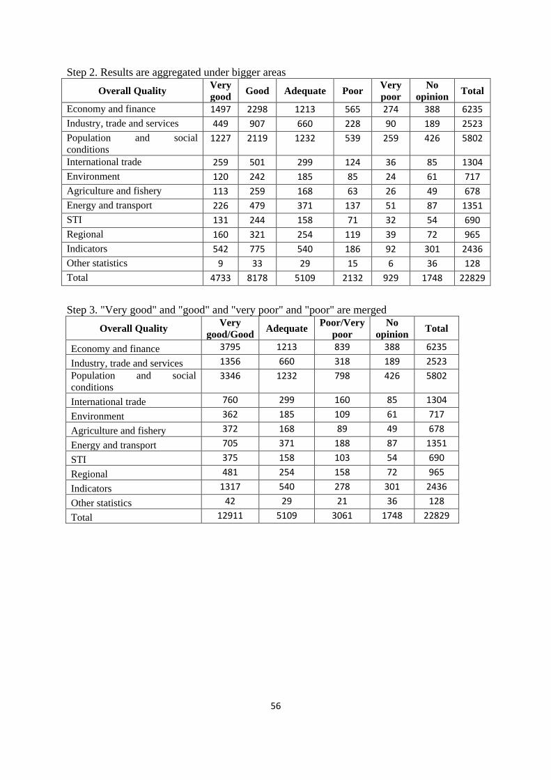
56
Step 2. Results are aggregated under bigger areas
Overall Quality Very
good Good Adequate Poor
Very
poor
No
opinion Total
Economy and finance 1497 2298 1213 565 274 388 6235
Industry, trade and services 449 907 660 228 90 189 2523
Population and social
conditions 1227 2119 1232 539 259 426 5802
International trade 259 501 299 124 36 85 1304
Environment 120 242 185 85 24 61 717
Agriculture and fishery 113 259 168 63 26 49 678
Energy and transport 226 479 371 137 51 87 1351
STI 131 244 158 71 32 54 690
Regional 160 321 254 119 39 72 965
Indicators 542 775 540 186 92 301 2436
Other statistics 9 33 29 15 6 36 128
Total 4733 8178 5109 2132 929 1748 22829
Step 3. "Very good" and "good" and "very poor" and "poor" are merged
Overall Quality Very
good/Good Adequate
Poor/Very
poor
No
opinion Total
Economy and finance 3795 1213 839 388 6235
Industry, trade and services 1356 660 318 189 2523
Population and social
conditions
3346 1232 798 426 5802
International trade 760 299 160 85 1304
Environment 362 185 109 61 717
Agriculture and fishery 372 168 89 49 678
Energy and transport 705 371 188 87 1351
STI 375 158 103 54 690
Regional 481 254 158 72 965
Indicators 1317 540 278 301 2436
Other statistics 42 29 21 36 128
Total 12911 5109 3061 1748 22829

57
Step 4. Final table with percentages calculated
Overall Quality Very
good/Good Adequate
Poor/Very
poor
No
opinion
Economy and finance 60.9% 19.5% 13.5% 6.2%
Industry, trade and services 53.7% 26.2% 12.6% 7.5%
Population and social
conditions
57.7% 21.2% 13.8% 7.3%
International trade 58.3% 22.9% 12.3% 6.5%
Environment 50.5% 25.8% 15.2% 8.5%
Agriculture and fishery 54.9% 24.8% 13.1% 7.2%
Energy and transport 52.2% 27.5% 13.9% 6.4%
STI 54.3% 22.9% 14.9% 7.8%
Regional 49.8% 26.3% 16.4% 7.5%
Indicators 54.1% 22.2% 11.4% 12.4%
Other statistics 32.8% 22.7% 16.4% 28.1%
Total 56.6% 22.4% 13.4% 7.7%