Reconnaissance
5
Reconnaissance and Locations
-
Upload
rachaeltara -
Category
Documents
-
view
66 -
download
0
Transcript of Reconnaissance

Reconnaissance and Locations

Ideas of locations

Ideas of locations
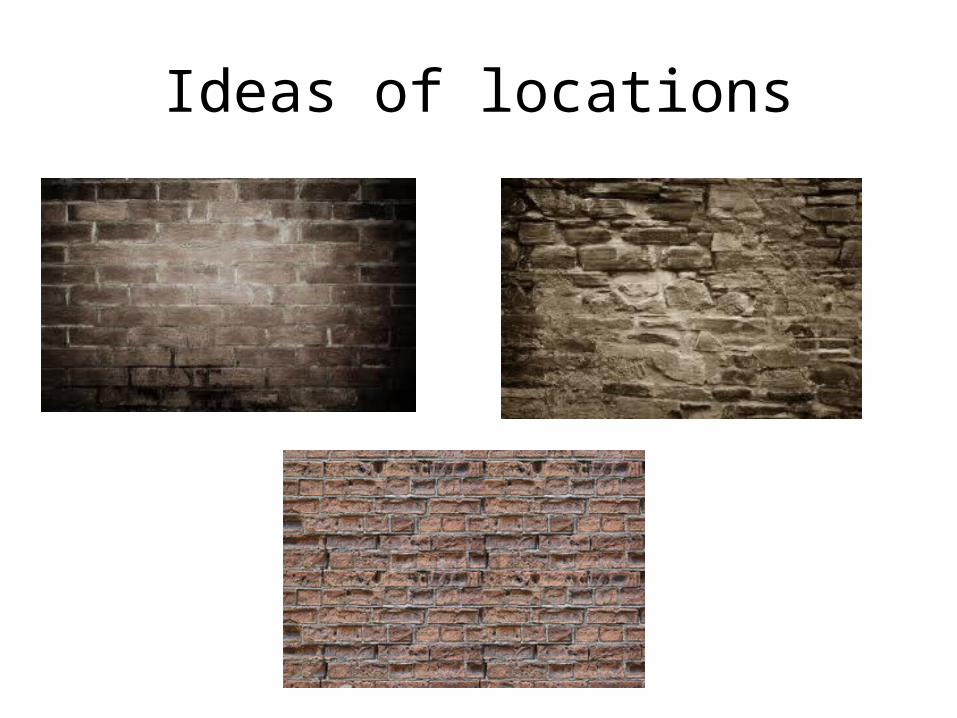
Ideas of locations

• As part of creating my Music Magazine, and also creating my front cover, contents page and double page spread I have had to think about and choose where in which my images are going to be taken, whether its going to be in daylight or at night time, what sort of backgrounds, colours and many more other things in order to get my images to the standard in which I want them. However I have had to think very wisely about all these things mentioned as wherever I choose to take my images or the colours in which I use they all have to relate and carry a symbiotic link with the RnB genre of music but also with other RnB music magazines. When choosing my locations, for advice I looked at other RnB magazines such as ‘Vibe’ , ‘XXL’ and some others in order to give me a ruff idea of what type of locations, backgrounds and colours are used when taking images for an RnB genred music magazine. I chose to look at these magazines for help as they were appropriate as they all feature symbiotic links relating back to the genre of music I have chosen to use within my magazine.
• When looking at the magazines ‘Vibe’ and ‘XXL’ most of their locations and backgrounds are all quite plain, they feature different colours yet they all still have plain backgrounds. They all seem to display just plain coloured background colours such as black, white, grey etc. So when looking what I should do I could either choose to follow the ideas of what they have chose to do to keep that correlation with RnB magazines, and on slide three I have displayed four colours which I may decide to choose as my background colour which will still keep the image effective. However on slide two and four there are some other options that I could use such as on slide two I have displayed five different styles of graffiti and on slide four I have provided four pictures of different types of brick which I could use, however when thinking about what is suitable for a RnB genre I have chosen to either do graffiti or just a plain coloured background as they will both look appropriate with my chosen model and the clothing that she will be wearing for the images.
• If I choose to use the graffiti background or just to use a plain coloured background both of which will not only go with my model and be suitable for my chosen genre but also will feature a symbiotic link between my front cover and my contents page. As you can see from the two content pages from ‘Vibe’ that are shown they both use very dark and natural colours as their backgrounds as for the front covers also displaying that these type of colours represent an RnB music magazine perfectly. For my contents page I have chosen to display a colour such as the ones shown in the pictures or another natural colour of my choice as I have found and believe that these type of colours truly represent an RnB magazine. For my sell lines I will either choose the colour white or black, to keep the simplicity effect of the magazine.
• For my last and final piece; the double page spreads. I have chosen to also use a natural plain colour as I will be featuring a large image of my model on this and also a cover story in which she is exposing to the readers. I believe that if I use a busy background or a vibrant colour for my double page spread it will loose its effectiveness and appeal reflecting an RnB music magazine. Any RnB double page spreads that I have looked at all display quite plain, natural colours that all truly reflect my chosen genre of RnB.