Recent Trends in Poverty in the Appalachian Region Trends in Poverty in the Appalachian Region: The...
105
Recent Trends in Poverty in the Appalachian Region: The Implications of the U.S. Census Bureau Small Area Income and Poverty Estimates on the ARC Distressed Counties Designation A Report Presented to: The Appalachian Regional Commission Prepared by: The Applied Population Laboratory University of Wisconsin 1450 Linden Drive Madison, WI 53706 August 2000
Transcript of Recent Trends in Poverty in the Appalachian Region Trends in Poverty in the Appalachian Region: The...

Recent Trends in Poverty in the Appalachian Region:
The Implications of the U.S. Census Bureau Small Area Income and Poverty Estimates
on the ARC Distressed Counties Designation
A Report Presented to:
The Appalachian Regional Commission Prepared by: The Applied Population Laboratory University of Wisconsin 1450 Linden Drive Madison, WI 53706 August 2000

i
TABLE OF CONTENTS Page
TABLE OF CONTENTS i LIST OF FIGURES iii LIST OF TABLES iv EXECUTIVE SUMMARY v SECTION I 1
Introduction 1
Small Area Income and Poverty Estimates Program 2 SECTION II 6
Overview of Total Poverty (all ages) in Appalachia during the 1990s 6
Total Poverty in the Sub-Regions of Appalachia 7 Total Poverty by State in Appalachia 9 Geographical Distribution of Total Poverty, 1989, 1993, and 1995 11 Development Districts 15 Total Poverty by Metropolitan Status 19 Total Poverty by Nonmetropolitan Social and Economic Function 20 Considering the Starting Level of Total Poverty and Subsequent Change 21 SECTION III 28
Child Poverty 28
Changes in Child Poverty, 1989-1995 28 Considering the Starting Level of Child Poverty and Subsequent Change 36
Child Poverty by Age group (0-4 and 5-17) 39 Considering the Starting Level of Young Child Poverty and 49 Subsequent Change SECTION IV 53
The ARC Distressed County Designation 53
Distressed Counties in 1980 and 1990 54 The Accuracy of Distressed Status at the end of the 1980s 59 SECTION V 64
The Effect of Using Post-Censal Poverty Estimates on
Distressed Status during the 1990s 64 Distressed Status, by State, 1990 to 1994 65 Distressed Status, by State, 1990 to 1996 66 Causes of Distressed Status Transition, 1990 to 1994 67 Causes of Distressed Status Transition, 1990 to 1996 70 Causes of Distressed Status Transition, 1994 to 1996 72 Counties Distressed Due to poverty at 200 percent of

ii
U.S. average and Above 72
SECTION VI 77
Conclusions and Recommendations 77 REFERENCES 81 APPENDICES 84
Appendix A - Small Area Income and Poverty Estimate Program 84 Methodology Appendix B - Economic Research Service Economic and Policy 87 Typology Definitions Appendix C - Appalachian Poverty Measures 89 Appendix D - Distressed Status Designation Methodology 94 Appendix E - Appalachian Distressed Counties 1980 – 1996 95

iii
LIST OF FIGURES Page 2.1 Total Poverty, ARC Counties, 1989 (Census) 12 2.2 Total Poverty, ARC Counties, 1993 (SAIPE) 13 2.3 Change in Poverty, ARC Counties, 1989-1993 14 2.4 Total Poverty, ARC Counties, 1995 (SAIPE) 16 2.5 Change in Poverty, ARC Counties, 1993-1995 (SAIPE) 17 2.6 Change in Poverty, ARC Counties, 1989-1995 18 2.7 Relative Poverty Position, ARC Counties, 1989-1993 25 2.8 Relative Poverty Position, ARC Counties, 1993-1995 (SAIPE) 27 3.1 Child Poverty (ages 0-17), ARC Counties, 1989 (Census) 29 3.2 Child Poverty (ages 0-17), ARC Counties, 1993 (SAIPE) 30 3.3 Change in Child Poverty, ARC Counties, 1989-1993 31 3.4 Child Poverty, ARC Counties, 1995 (SAIPE) 33 3.5 Change in Child Poverty, ARC Counties, 1993-1995 (SAIPE) 34 3.6 Change in Child Poverty, ARC Counties, 1989-1995 35 3.7 Relative Child Poverty Position, ARC Counties, 1993-1995 (SAIPE) 38 3.8 Young Child Poverty (ages 0-4), ARC Counties, 1989 (Census) 41 3.9 Young Child Poverty (ages 0-4), ARC Counties, 1993 (SAIPE) 42 3.10 Change in Young Child Poverty (ages 0-4), ARC Counties, 1989-1993 43 3.11 Young Child Poverty (ages 0-4), ARC Counties, 1995 (SAIPE) 44 3.12 Change in Young Child Poverty, ARC Counties, 1993-1995 (SAIPE) 45 3.13 Change in Young Child Poverty, ARC Counties, 1989-1995 46 3.14 Relative Young Child Poverty Position, ARC Counties,
1993-1995 (SAIPE) 52 4.1 ARC Distressed Counties, 1990 57 4.2 ARC Distressed Counties, 1980 58 4.3 Comparison of 1980 Census and 1990 SAIPE to 1990 Census 62 4.4 Comparison of 1980 Census and 1990 SAIPE Upper Bound
to 1990 Census 63 5.1 ARC Distressed Counties by type and change, 1990-1994 69 5.2 ARC Distressed Counties by type and change, 1990-1996 71 5.3 200 Percent Poverty Distressed Counties, 1990-1994 75 5.4 200 Percent Poverty Distressed Counties, 1990-1996 76

iv
LIST OF TABLES Page 2.1 Total Poverty rates for Appalachia and Non-Appalachia 7 2.2 Total Appalachian Poverty by Sub-Region 8 2.3 Total Poverty rates by Metropolitan Status in Appalachia 19 2.4 Relative Poverty Position of Appalachian Counties, 1989-1993 22 2.5 Relative Poverty Position of U.S. Counties, 1989-1993 23 2.6 Relative Poverty Position of Appalachian Counties, 1993-1995 24 2.7 Relative Poverty Position of U.S. Counties, 1993-1995 24 2.8 Poverty levels for Appalachian and U.S. Counties, 1995 (SAIPE) 26 3.1 Poverty rate for children age 0-17 yrs,
Appalachian and Non-Appalachian Counties 28 3.2 Relative Child Poverty Position of Appalachian Counties, 1993-1995 37 3.3 Relative Child Poverty Position of U.S. Counties, 1993-1995 37 3.4 Poverty rate for children ages 0-4,
Appalachian and Non-Appalachian Counties 39 3.5 Poverty rate for children ages 5-17,
Appalachian and Non-Appalachian Counties 39 3.6 Poverty rate for children ages 0-17, by region within Appalachia 40 3.7 Poverty rates for children ages 0-17, by state within Appalachia 47 3.8 Poverty rate for children ages 0-17,
by 1993 metropolitan status within Appalachia 48 3.9 Poverty rates for children 0-17, by 1993 Urban Continuum
(Beale Code) within Appalachia 49 3.10 Relative Young Child Poverty Position of ARC Counties, 1993-1995 50 3.11 Relative Young Child Poverty Position of U.S. Counties, 1993-1995 50 4.1a ARC Distressed Counties by State, 1980 and 1990 55 4.1b ARC Distressed Status Changes by Cause of Change 59 4.2 Comparison of 1980 Census and SAIPE in
Determining 1990 ARC Distressed Status 61
5.1 ARC Distressed Counties by State, 1990 and 1994 65 5.2 ARC Distressed Counties by State, 1990 and 1996 66 5.3 ARC Distressed Status Changes by Cause of Change 67 5.4 200 Percent Poverty Distressed Counties, 1990, 1994, and 1996 73

v
EXECUTIVE SUMMARY
The following report, funded by the Appalachian Regional Commission (ARC), explores recent
poverty trends for the 399 counties that comprise Appalachia, and examines the Census Bureau’s
Small Area Income and Poverty Estimates’1 effects on the ARC distressed county designation.
We begin with an examination of the changes in total poverty in Appalachia between 1979 and
the mid-1990s, with particular emphasis paid to the post-1990 period. The gap in poverty
between Appalachia and the rest of the country declined as poverty outside Appalachia increased
during the 1980s while remaining virtually unchanged in Appalachia. The U.S. average poverty
rate declined from 15.1 percent to 13.8 percent between 1993 and 1995, while poverty among
Appalachian counties declined from an average of 16.1 percent in 1993 to 14.6 percent in 1995.
The ARC counties with relatively higher rates of poverty are generally concentrated in
Kentucky, as well as West Virginia, southern Ohio, and Mississippi. Although Appalachia has
long been struggling economically, Appalachia’s total poverty rate in 1995 was only slightly
higher than in the rest of the country.
Child poverty in Appalachia increased slightly between 1989 and 1995, following the national
pattern. In particular, young children in Appalachia have experienced the greatest increases in
poverty, compared with older children and the general population. The geographical patterns of
total poverty and child poverty are overwhelmingly similar, with higher rates of child poverty
concentrated in eastern Kentucky, and significant portions of northern Tennessee, West Virginia,
southern Ohio, and Mississippi. Between 1993 and 1995 relative increases in child poverty were
most expansive in Alabama, the Carolinas, and New York, followed by Kentucky, West
Virginia, Virginia, Pennsylvania, Mississippi, and Georgia. Only Ohio and Tennessee
experienced fairly consistent relative declines in child poverty during the period. Similar to the
overall poverty rates for the sub-regions, the Central sub-region continued to experience the
highest child poverty rates within Appalachia. More than one-third of the children who lived in
the Central sub-region lived in households with incomes under the poverty line, with the poverty
rates in the other regions just over 20 percent. Poverty rates for children ages 0-4 years were,
1 The Census Bureau’s Small Area Income and Poverty Estimates are abbreviated as SAIPE. These will also be referred to as “SAIP estimates” to focus on the numerical estimates themselves rather than the overall statistical estimates program

vi
and continue to be, considerably higher than for children ages 5-17 years both nationally and in
Appalachia. This gap was even wider for Appalachian counties than for the remainder of the
U.S., with 27.3 percent of children ages 0-4 in poverty, compared to 19.5 percent for children
ages 5-17 in 1995.
The ARC has used the distressed county designation for almost twenty years to identify counties
with the most structurally disadvantaged economies. Each year the ARC updates the distressed
status of counties based on more current information on unemployment and per capita market
income. However, reliable county-level poverty rates have, until recently, only been available
from the decennial census at the beginning of each decade. The Census Bureau SAIPE program
has produced county-level poverty estimates for 1989, 1993 and 1995, giving the ARC the
option of using more recent poverty data to classify counties. We evaluate the influence of post-
censal estimates of poverty on the traditional distressed county classification, which uses only
the estimates of poverty from the most recent census, during both the 1980s and the early 1990s.
Of the 399 Appalachian counties, the number designated as distressed increased between 1980
and 1990 by 50 percent.2 This increase reversed a two-decade decline in the number of
distressed counties. Changing relative poverty levels were a factor in 10 of the 12 transitions
out of distressed status during the 1980s. Poverty did not contribute quite as greatly to the much
larger number of counties that became distressed in the 1980s.
Principally, we use two analyses to evaluate the viability of the SAIPE for the ARC designation
of distressed counties. We first evaluate the accuracy of the distressed status designation at the
end of a decade, comparing the 1980 census with the 1989 SAIPE (using the 1990 census as the
standard of accuracy). With certain caveats, the results from the 1980s demonstrate that as a
decade progresses, the SAIP point estimates more accurately predict the status of both distressed
and non-distressed counties than the poverty estimates from the previous census. Then we
examine the causes of status transitions that would occur in the early 1990s incorporating the
SAIPE into the distressed county designation. The number of counties that have been affected
2 The number of distressed counties in 1990 does not correspond to the number of counties officially designated distressed by ARC because distress levels were frozen during the 1988-1992 period awaiting the release of 1990 census poverty data (Wood and Bischak 2000). The distressed designation uses three year averages of unemployment and per capita market income. Numbers in Table 4.1a are based on a formula for defining distressed counties that incorporates poverty estimates from the last census, not the Census Bureau’s post-censal SAIPE estimates.

vii
by economic change in the 1990s can be better evaluated and joint changes in unemployment,
income, and/or poverty can be distinguished from changes in poverty alone. Between 1990 and
1994 the number of distressed counties in Appalachia declined sharply (38 percent), due more to
overall economic improvement in Appalachia relative to the U.S. as a whole than by substitution
of the SAIPE for the 1990 census poverty estimates. Moreover, relative shifts in unemployment
played a more important role as an independent cause of these transitions out of distressed status
than did shifts in poverty.
The distressed status accuracy results from the end of the 1980s suggest that the SAIPE would
provide a better determinant of distressed status than the poverty estimates derived from a decade
old census. The magnitude and causes of distressed status transitions in the first half of the
1990s indicate that using the SAIP estimates would alter the counties that would be designated
distressed by the ARC but not to a radical degree. However, both of these analyses demonstrate
that a simple substitution of the SAIP point estimates for census poverty estimates may
unjustifiably deny some counties distressed status recognition. As an antidote to this situation it
might be more defensible to combine the SAIP point estimate and the SAIP upper bound
estimate in the future determination of distressed status. This would accomplish the objective of
utilizing more current estimates of poverty while reducing the negative consequences of utilizing
an estimate of poverty with greater statistical variation than decennial census derived estimates.
Overall, the analysis of the 1990s indicates that the number of distressed counties has declined in
Appalachia during the decade. The Small Area Income and Poverty Estimates indicate a decline
in poverty in Appalachia relative to the U.S. as a whole, which reflects a concomitant relative
decline in unemployment and a relative increase in per capita market income. Determination of
distressed status using the 2000 Census of Population and Housing poverty rates should confirm
this decline. During the next decade, the accuracy of the SAIPE program should improve
significantly as new sources of income and poverty data, especially the American Community
Survey (ACS), become available, making them an even more viable option for the determination
of distressed status by the Appalachian Regional Commission.

1
SECTION I
Introduction
Since its formation in 1965, the Appalachian Regional Commission has pursued a
comprehensive program of regional development to improve socioeconomic conditions and
alleviate poverty. Initially, 85 percent of ARC funds were allocated to highway construction in
order to overcome the region’s remoteness and physical isolation from the rest of the country,
not withstanding Appalachia’s close proximity to the population concentrations of the Eastern
United States (Isserman and Rephann, 1995). Although highway construction has remained an
important activity for ARC, from its inception, funds have also been appropriated for hospitals
and treatment centers, land conservation and stabilization, mine land restoration, flood control
and water resource management, vocational education facilities, and sewage treatment works
(Isserman and Rephann, 1995). The ARC and state and local governments have spent more than
$15 billion on economic and social development in the region (Wood and Bischak 2000).
Although Appalachia continues to be a region of the U.S. with relatively high levels of poverty,
it has made significant gains during the past 25 years. Numerous articles, books and
documentaries have highlighted the plight of the Appalachian people over the years (Harrington,
1962; Caudill, 1963; Weller, 1965; Lyson and Falk, 1993; Couto, 1994). In this mountainous,
geographically remote, and disproportionately rural region, residents have traditionally
contended with a cyclical economy, lower than U.S. average earnings, and higher than average
poverty levels (PARC, 1964; ARC, 1972; ARC, 1979). Besides the rural and geographically
isolated nature of the region, the socioeconomic differences between Appalachia and other parts
of the country have been shaped by a number of factors including the relative lack of high-
skill/high-wage manufacturing, limited industrial diversity, sensitivity of the region’s industries
to recession, dependence on extractive industries, export of capital, and lack of investment in the
human capital of the region (Dix, 1978; Raitz and Ulack, 1984; Duncan, 1992; Haynes, 1997).
The following report explores recent poverty trends for the 399 counties that comprise
Appalachia. The Appalachian Regional Commission (ARC) has provided funding for this

2
research. The analysis examine the Census Bureau’s Small Area Income and Poverty Estimates
(abbreviated as SAIPE, which will also be referred to as “SAIP estimates” to focus on the
numerical estimates themselves rather than the overall statistical estimates program) and their
effects on the ARC distressed county designation. We begin with a discussion of the SAIP
estimates. This is followed by an examination of the changes in total poverty in Appalachia
between 1979 and the mid-1990s, with particular emphasis paid to the post-1990 period,
including a discussion of the geographical distribution of poverty. While our analysis covers the
total population (all ages), we focus in greater detail on child poverty. We conclude with an
evaluation of the impact of using the SAIPE estimates for the years 1989, 1993 and 1995 to
assign the economically distressed status designation used by the ARC.3
Small Area Income and Poverty Estimates Program
Detailed poverty and income levels for states and sub-state geographic areas, especially counties,
are among the most important products of the decennial census of population and housing.
However, the ten-year interval between the census enumerations leaves a relatively long time
span without more current data on the changes in poverty levels and rates in sub-state areas.
Measuring poverty at ten-year intervals does not capture fluctuations within the period and is
seldom coincident with the timing of major economic shifts. Moreover, national poverty trends
do not uniformly affect all states and sub-state areas, nor do these national trends consistently
affect all age groups within the population. This ten-year gap between censuses undermines the
ability of many federal, state, and local programs designed to alleviate poverty to effectively
identify and reach their target populations.
The Census Bureau’s Small Area Income and Poverty Estimates Program was initiated to
remedy this deficiency by providing post-censal county estimates of income and poverty. We
provide a brief summary of this program in this report; more detailed information on the Small
Area Income and Poverty Estimates Program can be found at the Census Bureau’s website
(http://www.census.gov /hhes/www/saipe/saipe93 /origins.html), and in reports from the
3 We have used the 1990 Census estimates for poverty when referring to poverty change since 1990. See appendix A for a further discussion of the Census Small Area Income and Poverty Estimates.

3
National Research Council (1998 and 2000). The primary reason for developing post-censal
estimates of income and poverty for small areas is that the national levels and spatial
distributions of these characteristics are not stable over time. If decennial census data are used
to benchmark poverty relief programs for an entire decade, the programs remain fixed on the
decennial targets even when income and poverty levels rise or fall nationally, or the relative
levels of poverty for population groups, states, or local areas change. The Census Bureau (under
authorization from Congress) prepares poverty estimates for children ages 5-17. These statistics
are for use by the U.S. Department of Education in allocating federal funds under Title I of the
Elementary and Secondary Education Act for education programs to aid disadvantaged school-
age children. In this report we examine levels and changes in poverty among the entire
population, among children ages 0-4, and among children ages 0-17, while recognizing that the
poverty estimates for children 5-17 and the models that generate them have been subjected to
greater scrutiny and more thorough evaluation (National Research Council, 1998).
The principal aim of the Census Bureau’s SAIPE program has been to produce post-censal
estimates of median income and poverty for states, counties, and school districts in the absence
of actual measures collected in a large-scale survey or a census. To accomplish this goal, the
Census Bureau uses multiple regression statistical modeling to generate updated county-level
estimates of income and poverty. Multiple regression is a statistical technique that attempts to
explain or predict the level of a single dependent variable based on the levels of a set of
independent variables (Vogt 1993). In the absence of a single source of reliable estimates for
income and poverty, regression modeling leverages several data sources and time periods in
order to optimize precision (National Research Council 1997).
The SAIPE multiple regression models have produced biennial estimates of income and poverty
beginning in 1993. The SAIPE model uses several county-level independent (predictor)
variables, the number of personal exemptions claimed on federal income tax returns by families
with incomes at or below the poverty level, the number of people receiving food stamps, the
1990 census of population, and the Census Bureau population estimates. The statistical model
incorporates county-level data on income and poverty from the Demographic Supplement of the
Current Population Survey (CPS) conducted in March each year, as the dependent variable. The
4
SAIPE model combines three years of CPS data to improve the precision of the estimates. This
technique is similar to ARC’s use of three-year averages for unemployment and per capita
market income in the designation of distressed counties. Because the CPS sample does not
include all counties, the relationship between the predictor variables and the dependent variable
is estimated for the subset of counties included in the CPS sample, and then applied to all
counties.
In 1994, Congress authorized a study by the National Research Council (NRC) to assess the
production, appropriateness, and the reliability of the updated poverty estimates for children ages
5-17. Upon evaluation of the original model and poverty estimates for 1993, the NRC Panel
concluded that the 1993 estimates represented a substantial step toward the production of post-
censal poverty estimates. The panel further recommended the use of these estimates (together
with poverty estimates from the 1990 Census) for allocations for school year 1997-98 under the
terms of Title I of the Elementary and Secondary Education Act allocations (National Research
Council, 1997). Subsequent revisions of the 1993 estimates were evaluated by the NRC Panel
and recommended for use in Title I allocations for school year 1998-99 (National Research
Council, 1998). The Panel concluded that the estimates, although containing strengths and
weaknesses, were superior to continued use of child poverty rate data from the outdated 1990
Census for allocations under Title I. Poverty estimates for counties and school districts for 1995
were also evaluated by the NRC Panel. The 1995 estimates for children ages 5-17, released in
1999, were recommended for Title I allocations for school year 1999-2000 (National Research
Council, 1999).
The decision to use the Census Bureau’s post-censal poverty estimates for funding allocations is
a tradeoff between precision obtained in the decennial census and more current (if less precise)
post-censal estimates. The 1990 census estimates of poverty are more precise in a statistical
sense because they are based on a very large sample (approximately one-sixth of all households).
However, they describe the income and poverty situation only as of 1989. The 1993 and 1995
estimates are considerably less precise, but because of their relative currency, they provide a
better description of poverty and economic conditions in the post-1990 period. The Census
Bureau plans to continue research and development efforts to improve the estimation models and
potentially reduce the time lag between the reference year of the estimates and their release date.
National income and poverty patterns changed between 1989 and the 1993 and 1995 SAIP
5
estimates. Between 1989 and 1993, Census Bureau estimates suggests that, median household
income declined by 7 percent, the number of people below the poverty level increased by 25
percent, and the number of poor children ages 5 to 17 increased by 24 percent. These belie the
heterogeneity of economic shifts in counties across the country. In the National Research
Council Panel’s preliminary analysis of poor school-age children for U.S. counties, several
categories of counties experienced trends that, in the Panel’s judgement, warranted further
investigation. For example, large metropolitan central city counties experienced a high-implied
percentage change in child poverty between the 1989 census estimates and the 1993 model-based
estimates (42%). This change declined systematically with decreasing population size for
metropolitan counties and continued the decline to the most remote, rural non-metropolitan
counties. Counties with higher percentages of Native Americans had lower implied increases in
child poverty; however, there was no particular pattern of change for counties containing
reservations. Farm counties had an implied decline in child poverty, while non-farm non-
metropolitan counties had an implied increase in child poverty. Some of this change may be
related to systematic biases in the estimation models (see National Research Council, 1998) but
in all likelihood also represents actual changes in levels of poverty and its geographic
distribution during this period.

6
SECTION II
Overview of Total Poverty (all ages) in Appalachia during the 1990s
Although Appalachia has long been struggling economically, Appalachia’s total poverty rate in
1995 was only slightly higher than in the rest of the country. Table 2.1 compares the poverty
rates for the 399 Appalachian counties with the rest of the country and the entire U.S.4 In 1979
(based on the 1980 Census), poverty rates were two percentage points higher in Appalachia than
in the remainder of the U.S. For 1989, we have two measures of poverty, the SAIPE and the
census (1990 Census). According to the SAIPE figures, the gap in poverty between Appalachia
and the rest of the country declined as poverty outside Appalachia increased during the 1980s
while remaining virtually unchanged in Appalachia. Nationally, the 1989 SAIPE indicate that the
proportion of people in poverty was slightly lower than indicated by the 1989 census.5 In
Appalachia, the SAIPE poverty rate was about 6.4 percent lower than the census rate.
In 1993, the poverty gap between Appalachian counties and counties in the remainder of the U.S.
was one percentage point, and by 1995 it had declined to just under one percentage point. The
SAIP estimates suggest that this apparent compression occurred because the poverty in
Appalachian counties had not increased as much as it had outside of Appalachia. While the net
change in poverty for Appalachia was an increase of one half of one percentage point between
1989 and 1995, poverty rates in counties outside of Appalachia increased by 1.5 percentage
points. Relative to the rest of the United States, Appalachian poverty continues to decrease, a
trend apparent in decennial census data since the 1960s.
4 Throughout this report, poverty figures are labeled with the year that they measure income. For example, the 1990 census measures income from 1989 and are labeled as 1989 census poverty rates. 5 The 1989 SAIP estimates of the numb er of people in poverty are 4.4% lower than the 1989 census figures. This includes adjustments made for the differences in the populations included in the poverty universe (U.S. Census Bureau, 1999).

7
Table 2.1: Total Poverty rates for Appalachian Counties and U.S counties outside of Appalachia
1979 Census
1989 SAIPE
1989 Census
1993 SAIPE
1995 SAIPE
Appalachian counties
14.1%
14.1%
15.3%
16.1%
14.6%
U.S. counties outside of Appalachia
12.2%
12.7%
12.9%
15.1%
13.7%
Total
12.4%
12.8%
13.1%
15.1%
13.8%
Total Poverty in the Sub-Regions of Appalachia
As the total poverty rates in Table 2.2 indicate, the economic fortunes of the three sub-regions of
Appalachia have shifted over the last few decades. Until recently, the northern sub-region
enjoyed higher incomes and lower poverty than the other sub-regions of Appalachia (PARC,
1964; ARC, 1972; ARC 1979, ARC 1981). Since the late 1960s however, the decline in the
manufacturing base and the gradual erosion of the higher paying jobs associated with this
industry has caused a relative decrease in income and higher poverty levels in northern
Appalachia. The poverty rate for the northern sub-region of Appalachia was higher in 1989 than
in either 1979 or 1969 (Couto, 1994). Between 1989 and 1993, the poverty rate increased
slightly by one to 2.5 percent, depending upon the estimate, SAIPE or census. But by 1995, the
poverty rate in northern Appalachian counties had declined slightly to 13.6 percent, remaining
above 1969 and 1979 levels.
In direct contrast to the northern sub-region, the southern sub-region has seen improvement in
incomes and poverty levels over the last three decades. Between 1979 and the 1995, the gap in
poverty levels between northern and southern Appalachia disappeared. Part of this convergence
may have been due to the geographical changes in manufacturing that occurred during the last 25
years. Studies have noted that northern Appalachia has been losing manufacturing plants and

8
employment at the same time that southern Appalachia has been experiencing manufacturing
growth (Jensen, 1998; Raitz and Ulack, 1984). Additionally, the metropolitan areas of Atlanta,
Birmingham and Winston-Salem, with their strong economies, have helped lower the overall rate
of poverty southern Appalachia. The SAIP estimates suggest that Southern Appalachia
experienced a 2.5 percentage point increase in poverty between 1989 and 1993 and then the same
percentage point decrease between 1993 and 1995. In other words, according to the SAIP
estimates, there has been no net change in poverty in this part of Appalachia during the first half
of the 1990s.
Table 2.2: Total Appalachian Poverty by Sub-Region
1979
Census
1989
SAIPE
1989
Census
1993
SAIPE
1995
SAIPE North
11.3%
12.5%
14.0%
15.0%
13.6%
Central
22.7%
24.2%
25.9%
26.0%
24.1%
South
15.3%
13.6%
14.3%
15.1%
13.6%
ARC counties
14.1%
14.1%
15.3%
16.1%
14.6%
The central Appalachian sub-region has undergone its own distinct pattern of recent change in
poverty. The poverty rate of the Central sub-region has been consistently higher than for the two
other sub-regions. There are two differences between the central sub-region and the other two
regions of Appalachia that partially account for the difference in poverty. First, the lack of
diversification of industry has forced this area to rely on one primary industry, coal mining, for
most of the century. Many authors have discussed the problems of extractive industries in
general and the crisis of mining and exporting the coal of central Appalachia in particular
(Duncan, 1985; Goodstein, 1989; Haynes, 1997). The profits from mining activities have largely
flowed out of the region as a result of ownership in the industry being predominated by distant
individuals and corporations, thereby exacerbating the economic uncertainty inherent in coal
extraction for the workers of Eastern Kentucky, Southern West Virginia, Western Virginia and
Northern Tennessee (Duncan, 1992). The original President’s Appalachian Regional

9
Commission in 1964 noted that, “Much of the wealth produced by coal and timber was seldom
seen locally. It went downstream with the great hardwood logs; it rode out on rails with the coal
cars; it was mailed between distant cities as royalty checks from non-resident operators to
holding companies who had bought rights to the land for 50 cent or a dollar an acre. Even the
wages of the miners returned to faraway stockholders via company houses and company stores”
(Isserman and Rephann 1995). The second factor distinguishing central Appalachia is that is it is
much more rural than the other parts of the region. There are only two metropolitan areas in
central Appalachia (Huntington, West Virginia–Ashland, Kentucky and Lexington, Kentucky).
Central Appalachia, like other nonmetropolitan areas nationally, suffers from higher than
average poverty rates. However poverty rates for central Appalachia are high even when
compared with other predominantly nonmetropolitan areas.
During the 1970s, the level of poverty in central Appalachia declined greatly. Increases in the
demand for coal, such as occurred with the 1970s energy crisis, generally meant increased
employment and lower poverty levels. During the 1980s as the energy crisis subsided, poverty
rates rose. The Central sub-region had a poverty rate in 1979 of 22.7 percent. This rate
increased to around 24 percent in 1989 according to the SAIP estimates or to around 26 percent
according to the 1990 census. The sub-region’s poverty rate was at 26 percent in 1993 and by
1995 it was close to the 1989 rate of 24 percent. Throughout this period it remained much higher
than the adjoining areas of Appalachia. Even though there is evidence that employment in central
Appalachia is diversifying, potentially easing poverty and unemployment to levels similar to the
rest of the region or the nation, it has been a slow transformation. Positive changes have been
concentrated mainly in manufacturing (reducing reliance on extractive industries) but they are
less evident in the service sectors.
Total Poverty by State in Appalachia
Rates of total poverty in Appalachia are not homogeneous across states, but instead show wide
disparities (Appendix C, Table 1). Eastern Kentucky, the part of the state that is in Appalachia,
and the entire state of West Virginia exhibited high rates of poverty throughout the period
examined in this report. This can be partially attributed to the high unemployment rates of these

10
states and to the extractive and cyclical nature of the industries there. The portion of Mississippi
located in Appalachia has also had a higher than average rate of poverty. Although only a small
part of Mississippi is in Appalachia, the state as a whole has a higher than average rate of
poverty. The Appalachian portions of Georgia, New York, North Carolina, Pennsylvania and
South Carolina have experienced rates of poverty below the Appalachian average include. For
some of these states, lower rates of poverty among the ARC counties may be a result of greater
diversification in the economic base of those counties. For Georgia in particular, many of the
Appalachian counties are suburban areas in the Atlanta metropolitan area. The difference
between the 1989 SAIPE and 1989 census poverty rates is greater for individual states than it is
for Appalachia as a whole or for the three sub-regions of Appalachia. Census Bureau tabulations
show that the greatest differences between 1989 SAIPE and 1989 Census poverty estimates are
for states in the Northeast and Midwest regions. The 1989 SAIPE estimates tend to be lower
than the 1989 Census estimates for Appalachian states in the Northeast and Midwest regions
(U.S. Census Bureau, 1999).
Consistent with the sub-regional change in poverty rates over the period, a north-south
divergence arises. SAIPE estimates for Appalachian counties in New York suggest a 3.5
percentage point increase (a 30 percent increase) in poverty between 1989 and 1995. Poverty
rates in Pennsylvania, Maryland, and West Virginia also increased between 1989 and 1995.
Poverty rates in Ohio decreased between 1989 and 1995 but the poverty rate was higher for all
three SAIPE years than it was in 1979. The three southeastern, Atlantic coastal Appalachian
states, North Carolina, South Carolina and Georgia, all showed small increases in poverty from
1989 to 1995. More interestingly, the Appalachian counties in these states have poverty rates
that have been declining for decades and are now among the lowest in Appalachia. Tennessee,
Virginia, Mississippi and Alabama enjoyed declining poverty rates during the 1990s.
Since Appalachia encompasses 13 states and 399 counties, it is a heterogeneous region and each
state does not contain an equal share of the Appalachian population. Pennsylvania, for example,
contains more than one-quarter of the Appalachian population and therefore has a large influence
on the overall poverty rate of the region. Since the poverty rates of Pennsylvania’s Appalachian
counties are lower than the rest of Appalachia and lower than the U.S. as a whole, Pennsylvania

11
lowers the overall rate of poverty for Appalachia. And, since the poverty rate in Pennsylvania
has increased since 1979, the overall decrease in Appalachia has been attenuated.
Geographical Distribution of Total Poverty, 1989, 1993, and 1995
The 1990 census’s total poverty rates for Appalachian counties are shown in Figure 2.1 as a
proportion of the total U.S. poverty rates. The four color categories correspond to poverty rates
relative to the U.S. average rate. We compare the Appalachian counties to U.S. average rates to
control for changes that merely reflect national trends and because in the calculation of
distressed status the comparisons are also made to U.S. averages. The counties with relatively
higher rates of poverty in 1989 were noticeably concentrated in Kentucky, as well as West
Virginia, southern Ohio, and Mississippi.
A cursory examination of SAIPE poverty rates in 1993 (Figure 2.2) indicates that relative
poverty rates have a similar geographical distribution across Appalachia as they did in 1989,
particularly the concentration in eastern Kentucky and West Virginia, although the northern
Kentucky/southern Ohio region had somewhat lower relative poverty rates in 1993. Figure 2.3
allows a closer examination of the change between 1989 (1990 Census) and the 1993 SAIP
estimate. For example, although both Figure 2.1 and 2.2 indicate that eastern Kentucky had
relatively high concentrations of poverty in both time periods, the black and white areas in
Figure 2.3 indicate which counties experienced either decreases in their total poverty rates or
below average increases compared to the U.S as a whole. Nearly all the eastern Kentucky
counties experienced a relative decline in poverty of at least three percent better than the national
average over the period and the remainder experienced a more moderate relative decline. The
significant increases in poverty (more than three percent above the national average) in
Appalachia between 1989 and 1993 according to the SAIP estimates were few and were isolated
counties in West Virginia, Pennsylvania, northern Virginia, Tennessee, and Georgia. Poverty in
eight of the ARC counties in eastern Tennessee increased at a greater rate than the national
average, as did a few counties in northern Georgia and in the western Carolinas. Counties that
experienced relative improvement from 1989 to 1993 were especially clustered in Mississippi,
Alabama, eastern Kentucky, southern Ohio, and West Virginia.
12
apl aplApplied Population Laboratory
University of Wisconsin - Madison
Poverty Rate RelativeTo U.S. Average
Below U.S. average100% - 150% of U.S. average150% - 200% of U.S. averageAbove 200% of U.S. average
APL-aeh-9/00
Figure 2.1:Total Poverty,
ARC Counties, 1989 (Census)
0 100 200 300 Miles

13
apl aplApplied Population Laboratory
University of Wisconsin - Madison
Poverty Rate RelativeTo U.S. Average
Below U.S. average100% - 150% of U.S. average150% - 200% of U.S. averageAbove 200% of U.S. average
APL-aeh-9/00
Figure 2.2:Total Poverty,
ARC Counties, 1993 (SAIPE)
0 100 200 300 Miles

14

15
Again, the distribution of total poverty across Appalachia in 1995 looked remarkably similar to
1989 and 1993 with higher poverty counties clustered in eastern Kentucky and West Virginia
(Figure 2.4). In contrast to the map of change between 1989 and 1993 (Figure 2.3), which
indicated a relative decrease in poverty among most ARC counties, a large majority of ARC
counties did not perform as well as the national average between 1993 and 1995 (Figure 2.5).
The U.S. average poverty rate declined from 15.1 percent to 13.8 percent between 1993 and
1995, while poverty among Appalachian counties declined from an average of 16.1 percent in
1993 to 14.6 percent in 1995. The prevalence of light gray and dark gray colored counties in
Figure 2.5 highlights the fact that distinct and concentrated areas of Appalachia did not perform
as well as the national average. Indeed, eastern Kentucky, West Virginia, western sections of
North Carolina and Virginia, and much of Alabama fall into this category. However,
Mississippi, Pennsylvania, and especially Tennessee, and Ohio did experience relative declines
in poverty during the decade. During the 1989 to 1995 period overall, Ohio and Mississippi
experienced the most consistent relative declines in poverty across Appalachian counties
followed by Pennsylvania, West Virginia, Virginia, Kentucky, Tennessee, and Georgia (Figure
2.6). Only the southern tier of New York counties consistently experienced a relative increase in
poverty.
Development Districts We also compiled total poverty rates for Appalachian counties by development district
(Appendix C, Table 2). There are patterns through the early and mid 1990s that are worth
highlighting. Many of the development districts continue to struggle with much higher than
average poverty levels. Most of these districts are in Eastern Kentucky (Buffalo Trace, Gateway
Area, Big Sandy Area, Lake Cumberland, Cumberland Valley and Kentucky River) and one of
these districts is in Alabama (South Central Alabama). These districts started out with 1989
poverty rates of at least 25 percent and continued to have poverty rates of at least 25 percent in
1995. One district, the East Central district of Mississippi, started out with a high rate of poverty
but according to the SAIP estimates, experienced a substantial decline in poverty between 1989
and 1995. This district’s poverty rate declined from 33.0 percent to 24.1 percent over the six-
year period. One district, West Virginia’s district 4, experienced a large increase in poverty from

16
apl aplApplied Population Laboratory
University of Wisconsin - Madison
Poverty Rate RelativeTo U.S. Average
Below U.S. average100% - 150% of U.S. average150% - 200% of U.S. averageAbove 200% of U.S. average
APL-aeh-9/00
Figure 2.4:Total Poverty,
ARC Counties, 1995 (SAIPE)
0 100 200 300 Miles

17

18

19
1989 to1995. It should be noted that every district in West Virginia experienced an increase in
poverty during the period.
Total Poverty by Metropolitan Status
Similar to the U.S. as a whole, there is a difference in total poverty levels between metropolitan
and non-metropolitan counties in Appalachia.6 Non-metropolitan counties historically have had
higher poverty rates than metropolitan counties (Fuguitt, Brown and Beale, 1989; Lichter and
McGlaughlin, 1995). This has also been the case in Appalachia. Throughout the period non-
metropolitan counties have had an aggregate poverty rate about five percentage points higher
than metropolitan counties (Table 2.3). This held true even in 1993 when the estimates tended to
show that overall U.S. poverty increased in metropolitan areas while it stayed the same in non-
metropolitan counties. The one exception to the difference is the 1989 Census poverty figures
with a slightly greater, six percentage point difference, between metropolitan and non-
metropolitan Appalachian counties. For 1989, the SAIPE poverty estimates did not capture the
same increase in poverty between 1979 and 1989 measured by the decennial census. This could
be an indication of the 1989 SAIPE model’s relative inability to accurately predict poverty for
counties with smaller populations.
Table 2.3: Total (All Ages) Poverty Rates by Metropolitan Status in Appalachia
Number of counties
1979
Census
1989
SAIPE
1989
Census
1993
SAIPE
1995
SAIPE Metro
109
11.8%
12.0%
12.8%
14.0%
12.5%
Nonmetro
297
17.2%
17.1%
18.8%
18.9%
17.4%
6 We use the 1993 delineation of metropolitan status (U.S. Census Bureau, 1992).
ARC counties
406
14.1%
14.1%
15.3%
16.1%
14.6%

20
For more detailed information on the effect of population size and proximity to metropolitan
counties, Table 3 in Appendix C provides aggregate Appalachian total poverty rates by the 1993
rural-urban continuum codes developed by the Economic Research Service of the U.S.D.A.
(Butler and Beale, 1994). Overall, there is a gradient of poverty rates based on the metropolitan
hierarchy code. The poverty rates among metropolitan counties are inversely related to their size
classification. Thus the largest and core metropolitan counties have the lowest poverty rates.
For non-metropolitan counties, the same pattern holds true with the caveat that adjacency status
also matters. Counties that are less urban (fewer people) and not adjacent to metropolitan
counties are more likely to have higher poverty rates. Over time, there isn’t much change in this
pattern. The only movement is that the largest counties have seen their poverty rates increase
faster than the other counties. Additionally, the suburban counties in the largest metropolitan
areas and the counties with no urban places have seen their poverty rates decrease over the
period.
Total Poverty by Nonmetropolitan Social and Economic Function
Appendix C, Table 4 shows total poverty rates broken down by non-metropolitan social and
economic function as developed by the Economic Research Service of the USDA (Cook and
Miser 1994; See Appendix B for definitions). The table reflects the higher poverty rates that
persist in Appalachian non-metropolitan counties as a whole. In each of the functional
categories, the poverty rate for classified counties has decreased during the 1990s. Throughout
the period, manufacturing and retirement destination counties have had the lowest poverty rates
in Appalachia. By the mid-1990s, poverty in Appalachian retirement-destination counties had
fallen below the national average. Not surprisingly, counties with the persistent poverty
designation have had the highest rates of poverty throughout the period. These are counties that
have maintained high poverty levels since the 1960 census. Persistent poverty counties in
addition to government and agricultural counties do demonstrate the biggest decreases in the
percent of persons living at or below poverty during the nineties. Lastly, the mining counties
highlight the changes mentioned earlier with a large increase in poverty rates between 1980 and
1990 that remained high throughout the period.

21
Considering the Starting Level of Total Poverty and Subsequent Change
Examining changes in poverty without a starting reference point can obscure the fact that while
there are counties that significantly increased their total poverty rate, many of these counties still
had relatively low rates even after the increase. The worsening trend, therefore, does not
necessarily place these counties in a worse position relative to counties with higher rates of total
poverty. For example, between 1989 (1990 Census) and 1993, counties could experience among
the highest rates of increase in poverty, yet their poverty level among counties could remain low.
This example illustrates our conviction that a comparison of changes in total poverty rates is
more meaningful when the relative starting levels of county poverty are taken into account. To
study change, therefore, we jointly consider shifts in total poverty and starting levels prior to
those shifts. We cross-classify counties according to their relative levels of total poverty in 1989
(above or below average) with their subsequent change in poverty between 1989 and 1993
(above or below average). Likewise, counties are jointly grouped according to their relative
levels of total poverty in 1993 and their relative change in poverty rates between 1993 and 1995.
The following tables and corresponding maps show how Appalachian counties fit into the four
categories based on the comparison of individual counties with the national level of poverty at
the beginning of the period and the comparison with the national change in poverty during the
period. Those counties labeled “Best” (light gray) had below average levels of total poverty and
decreased their poverty over the time period, or had below average increases. Those counties
labeled “Worrisome” (dark gray) also began with below average levels of poverty, but
experienced above average increases in poverty over the time period. Counties labeled
“Hopeful” (white) started the period with above average levels of poverty, but decreased their
poverty rates, or experienced below average increases, over the time period. Counties labeled
“Worst” (black) had above average levels of total poverty and above average increases in
poverty.
Table 2.4 shows a cross-tabulation of the 1989 poverty rates in Appalachia as determined by the
1990 Census and by the change in poverty rates between 1989 and the 1993 SAIP estimates.
Here, the national benchmark for initial level of total poverty is 13.1 percent and the national

22
change in the total poverty rate over the four years was an increase of 3.8 percent. The percent
of Appalachian counties with higher than average poverty rates was over 76 percent. A higher
percentage of counties (85.2 percent) had poverty rates that were either decreasing or not
increasing as rapidly as the national average. The largest proportion of counties (70.4 percent)
fit into the Hopeful category with a higher than average starting level of poverty in 1989 but a
lower than average change in poverty between 1989 and 1993. Over 14 percent were
considered to be in the Best Position (low starting rates and smaller than average increases),
while only 6.3 percent of Appalachian counties were categorized as Worst (high starting rates
and higher than average increases).
Table 2.4: Relative Poverty Position of Appalachian Counties, 1989-1993 Level
Change in Total (all ages) Poverty Rate Less Than U.S.
(< +3.8%)
Change in Total (all ages) Poverty Rate Greater Than U.S.
(> +3.8%)
Total
Counties Below U.S. Poverty Rate in 1989 (< 13.1%)
Best 59
14.8%
Worrisome 34
8.5%
93
23.3% Counties Above U.S. Poverty Rate in 1989 (> 13.1%)
Hopeful 281
70.4%
Worst 25
6.3%
306
76.7% Total
340 85.2%
59 14.8%
399 100%
The comparison between Tables 2.4 and 2.5 allows us to contrast the distribution of these county
types in Appalachia to the U.S. as a whole. The distribution of U.S. counties among these four
categories differs somewhat, with almost a quarter of U.S. counties categorized as Best between
1989 and 1993, and only 5.1 percent categorized as Worst. A somewhat smaller percentage of
U.S. counties were categorized as Hopeful and a higher percentage were categorized as
Worrisome, relative to Appalachian counties.
Figure 2.7 displays the spatial distribution of these four county types for the time period 1989-
1993. All of the Appalachian counties in Kentucky that had relatively high poverty in 1989
either decreased their poverty rates, or increased less than the national average and are therefore
labeled Hopeful (white). There were no strong clustering patterns of Best counties, although
western North Carolina and Pennsylvania had a disproportionate share. Pennsylvania, New

23
Table 2.5: Relative Poverty Position of all U.S. Counties, 1989-1993 Level
Change in Poverty Rate Less Than U.S.
(< +3.8%)
Change in Poverty Rate Greater Than U.S.
(> +3.8%)
Total
Counties Below U.S. Poverty Rate in 1989 (< 13.1%)
Best 722
23.1%
Worrisome 424
13.5%
1,146 36.6%
Counties Above U.S. Poverty Rate in 1989 (> 13.1%)
Hopeful 1,824 58.3%
Worst 160
5.1%
1,984 63.4%
Total
2,546 81.3%
584 18.7%
3,130 100%
York, and Georgia had a significant number of counties with lower than average poverty rates in
1989, but many of these counties increased their poverty rates at a rate greater than the national
average of 5.8 percent for the period, and therefore were labeled Worrisome (dark gray). The
Appalachian counties labeled Worst were largely clustered in West Virginia, and to a lesser
degree along the Tennessee/North Carolina border. Two counties in Georgia and two in New
York were also labeled worst due to having poverty rates just above the national average in 1989
and then experiencing a greater than average increase in poverty during the period.
Tables 2.6 and 2.7 show the Relative Poverty Positions for Appalachian and U.S. counties
between 1993 and 1995. In contrast to the increase in poverty between 1989 and 1993, the U.S.
experienced a decline in poverty (-4.3 percent) between 1993 and 1995. About 41 percent of
Appalachian counties experienced an even more significant decline in poverty rates than U.S.
counties on average, while 59 percent did not perform as well. Only thirteen percent of
Appalachian counties were considered to be in the Best category, compared to 25.7 percent of all
U.S. counties. Appalachia also had proportionately more counties categorized as Worst than did
the U.S. (39.8 percent versus 35.3 percent). It is important to remember that counties whose
poverty rates declined, but not as much as the national average, would be categorized as
experiencing a relative worsening trend in total poverty. This could partially account for the
significant jump in counties categorized as Worst in Appalachia.

24
Table 2.6: Relative Poverty Position of Appalachian Counties, 1993-1995
Level Change in Poverty Rate
Less Than U.S.
(< -4.3%)
Change in Poverty Rate
Greater Than U.S.
(> -4.3%)
Total
Counties Below U.S.
Poverty Rate in 1993
(< 15.1%)
Best
52 13.0%
Worrisome
77 19.3%
129 32.3%
Counties Above U.S.
Poverty Rate in 1993
(> 15.1%)
Hopeful
111 27.8%
Worst
159 39.8%
270 67.7%
Total
163 40.9%
236 59.1%
399 100%
Table 2.7:
Relative Poverty Position of U.S. Counties, 1993-1995
Change in Poverty Rate
Less Than U.S.
(< -4.3%)
Change in Poverty Rate
Greater Than U.S.
(> -4.3%)
Total
Counties Below U.S.
Poverty Rate in 1993
(< 15.1%)
Best
805
25.7%
Worrisome
780
24.9%
1,585
50.6%
Counties Above U.S.
Poverty Rate in 1993
(> 15.1%)
Hopeful
442
14.1%
Worst
1,105
35.3%
1,547
49.4%
Total 1,247
39.8%
1,885
60.2%
3,132
100%

25

26
The spatial distribution of these four county types for the time period 1993-1995 appears in
Figure 2.8. Although most of the Appalachian counties in Kentucky had been labeled Hopeful
between 1989 and 1993, between 1993 and 1995 their designation predominantly changed to
Worst. The Worst relative position and change counties were concentrated in Kentucky, West
Virginia, western Virginia, along the North Carolina/Tennessee border, and along the eastern and
western boundaries of Alabama. Again, we emphasize that certain counties labeled as “worst”
may have decreased their rates of poverty, but less than the national average. Therefore, while
those counties may have improved their position compared to the previous time period, their
relative position with regard to U.S. averages remained or became “worst.”
Finally, Table 2.8 provides the breakdown of counties for Appalachia and the U.S. as a whole by
status above or below the national poverty level. Appalachian counties were still more likely to
have poverty rates above the national average than all U.S. counties. Slightly more than two-
thirds of Appalachian counties had poverty rates above the U.S. national poverty rate. During the
time period covered by this analysis, a declining number of Appalachian counties exhibited these
high poverty rates. Between the 1979 census and the 1995 SAIP estimates, a net of 38 counties
moved from having higher than average poverty rates to lower than average poverty rates.
Interestingly, most of this decline occurred between the 1979 and 1989 census, a period when the
overall Appalachian poverty rate increased faster than the national poverty rate.
Table 2.8: Poverty levels for Appalachian and U.S. counties using SAIPE estimates for 1995. Appalachia United States Below U.S. Poverty Rate in 1995 (< 13.1%)
128 31.5%
1,485 47.3%
Above U.S. Poverty Rate in 1995 (> 13.1%)
278 68.5%
1,656 52.7%

27

28
SECTION III Child Poverty (ages 0-17)
We now shift our attention from total (all ages) poverty to poverty among the Appalachian child
(ages 0-17) population. Child poverty is an important indicator of overall child well being.
Although many factors put children at risk, nothing predicts bad outcomes for a child more
powerfully than growing up poor. Children who spend their early years in poverty often suffer
negative health, social and cognitive outcomes and are much more likely to be poor as adults.
Child poverty is a particularly persistent condition for minority children, whereas white children
are more likely to live in poverty for a relatively shorter time. Of great concern is the increasing
number of poor children in the U.S. during the last couple decades. In 1974, 10 million American
children lived below the poverty line; by 1994 the number had risen to over 15 million. This
represents an increase from 15 percent to 22 percent of all children, a poverty rate that is among
the highest in the developed world. Child poverty in Appalachia increased slightly between 1989
and 1995, following the national pattern. In particular, young children in Appalachia have
experienced the greatest increases in poverty, compared with to older children and the general
population.
Changes in Child Poverty, 1989-1995
Child poverty followed a pattern similar to that of overall poverty in Appalachia and the United
States, with increases between 1989 and 1993, followed by declines between 1993 and 1995.
However, child poverty in non-Appalachian counties in the U.S. increased significantly more
between 1989 and 1993. Still, the absolute level of child poverty was slightly higher in
Appalachian counties than in non-Appalachian counties (Table 3.1).
Table 3.1: Poverty rate for children age 0-17 years, Appalachian Counties and U.S. Counties outside of Appalachia
1989 SAIPE 1989 Census 1993 SAIPE 1995 SAIPE
Appalachian counties 20.5% 20.1% 23.3% 21.6%
U.S. Counties outside of Appalachia 19.6% 18.1% 22.6% 20.7%
Total 19.6% 18.3% 22.7% 20.8%

29
aplaplApplied Population Labor atory
University of Wisconsin - Madison
Child Poverty RateRelative To U.S. Average
Below U.S. average100% - 150% of U.S. average150% - 200% of U.S. averageAbove 200% of U.S. average
APL-aeh-9/00
Figure 3.1:Child Poverty (ages 0-17),
ARC Counties, 1989 (Census)
0 100 200 300 Miles
30
aplaplApplied Population Labor atory
University of Wisconsin - Madison
Child Poverty RateRelative To U.S. Average
Below U.S. average100% - 150% of U.S. average150% - 200% of U.S. averageAbove 200% of U.S. average
APL-aeh-8/00
Figure 3.2:Child Poverty (ages 0-17),
ARC Counties, 1993 (SAIPE)
0 100 200 300 Miles

31

32
Figures 3.1, 3.2, and 3.3 display the geographical distribution of child poverty (0-17 year olds)
among Appalachian counties for the years 1989 (Census) and 1993. As we might expect,
counties that experienced higher total poverty rates, also experienced higher child poverty rates.
While the maps of total poverty and child poverty are not identical, it is apparent that the patterns
are overwhelmingly similar. The counties with higher rates of child poverty in 1989 were
noticeably concentrated in eastern Kentucky, and significant portions of northern Tennessee,
West Virginia, southern Ohio, and Mississippi. The geographic pattern of child poverty also
shifted between 1989 and 1993, in a similar pattern to the shifts for total poverty.
The geographical distribution of SAIPE child poverty rates across Appalachia in 1993 (Figure
3.2) is quite similar to the 1989 distribution, particularly the concentration in eastern Kentucky
and West Virginia.
Figure 3.3 allows us to examine changes in child poverty rates between 1989 (1990 Census) and
the 1993 SAIP estimate more closely. For example, although both Figure 3.1 and 3.2 indicate
that eastern Kentucky had relatively high concentrations of child poverty in both time periods,
change in all the ARC Kentucky counties was a fairly evenly distributed relative improvement.
The dominance of black and white counties in Figure 3.3 indicates that between 1989 and 1993
Appalachia experienced a reduction in child poverty that was greater than the national average.
The most significant relative increases in child poverty in Appalachia between 1989 and 1993
were in West Virginia, northern Georgia, Tennessee, and the southern tier of New York.
Again not surprisingly Appalachian child poverty in 1995 (Figure 3.4) was distributed similarly to
total poverty, with higher child poverty counties clustered in eastern Kentucky and West Virginia.
However, between 1993 and 1995 a considerable majority of ARC counties either did not
decrease their child poverty rates as much as the U.S. averages, or increased their child poverty
rates during the two-year period (Figure 3.5). During this period relative increases in child
poverty were most expansive in Alabama, the Carolinas, and New York, followed by Kentucky,
West Virginia, Virginia, Pennsylvania, Mississippi, and Georgia. Only Ohio and Tennessee
experienced fairly consistent relative declines in child poverty during the period. Finally, Figure
3.6 examines change in child poverty between the 1990 Census and the 1995 SAIP estimate

33
aplaplApplied Population Labor atory
University of Wisconsin - Madison
Child Poverty RateRelative To U.S. Average
Below U.S. average100% - 150% of U.S. average150% - 200% of U.S. averageAbove 200% of U.S. average
APL-aeh-9/00
Figure 3.4:Child Poverty (ages 0-17),
ARC Counties, 1995 (SAIPE)
0 100 200 300 Miles

34

35

36
(1989-1995). The relative increases in child poverty experienced between 1989 and 1993 were
tempered by the declines between 1993 and 1995. The most significant relative declines in child
poverty between 1989 and 1995 were clustered in southern Ohio and Mississippi. Increases in
child poverty over the six-year period were most notably clustered in the New York, West
Virginia, northern Georgia and Alabama, and the western Carolinas. Many of these counties,
however, still had relatively low child poverty rates in 1995.
Considering the Starting Level of Child Poverty and Subsequent Change
As discussed with our comparison of total poverty rate changes, comparison of changes in child
poverty rates is more meaningful when the relative starting levels of county child poverty are
taken into account. Therefore we examine the Relative Child Poverty Position of ARC counties
for the most recent period, 1993-1995. Table 3.2 tabulates the 1993 poverty rates in Appalachian
counties and the change in poverty between 1993 and 1995. The national benchmark for level of
child poverty was 22.7 percent and the national change in the child poverty rate over the two
years was a decrease of 4.2 percent. The percent of counties in Appalachia with higher than
average child poverty rates was about 57 percent. A higher percentage of counties (69.7
percent) had child poverty rates that were either increasing, or decreasing less than the national
average. The largest proportion of Appalachian counties (40.1 percent) fit into the Worst
category with a higher than average starting level of child poverty in 1993, and a worse than
average change in child poverty between 1993 and 1995. Only 13 percent were considered to be
in the Best Position (low starting rates and better than average declines). As would be expected,
compared to the U.S. as a whole (Table 3.3), Appalachia has a significantly greater proportion of
its counties in the Worst position, and significantly fewer in the Best position.
Figure 3.7 examines the geographic distribution of the relative child poverty position among
Appalachian counties between 1993 and 1995. As Table 3.2 above describes, over 40 percent of
Appalachian counties were categorized as “worst” between 1993 and 1995. Those counties with
high rates of child poverty in 1993 and worse than average change in the following two year
period were clustered in eastern Kentucky, West Virginia, and in parts of Mississippi and
Alabama. There were smaller clusters of these worst category counties in New York, Virginia,
North Carolina, and Georgia. Of the 13 percent of Appalachian counties that were categorized
37
Table 3.2: Relative Child Poverty Position of Appalachian Counties, 1993-1995 Level
Change in Child Poverty Rate Less Than U.S.
(< -4.2%)
Change in Child Poverty Rate Greater Than U.S.
(> -4.2%)
Total
Counties Below U.S. Child Poverty Rate in 1993 (< 22.7%)
Best 52
13.0%
Worrisome 118
29.6%
170
42.6% Counties Above U.S. Child Poverty Rate in 1993 (> 22.7%)
Hopeful 69
17.3%
Worst 160
40.1%
229
57.4% Total
121 30.3%
278 69.7%
399 100%
Table 3.3: Relative Child Poverty Position of U.S. Counties, 1993-1995 Level
Change in Child Poverty Rate Less Than U.S.
(< -4.2%)
Change in Child Poverty Rate Greater Than U.S.
(> -4.2%)
Total
Counties Below U.S. Child Poverty Rate in 1993 (< 22.7%)
Best 752
24.0%
Worrisome 1,108 35.4%
1,860 59.4%
Counties Above U.S. Child Poverty Rate in 1993 (> 22.7%)
Hopeful 254
8.1%
Worst 1,018 32.5%
1,272 40.6%
Total
1,006 32.1%
2,126 67.9%
3,132 100%
as “best”, there did not appear to be any significant geographic concentrations, except in the
counties adjoining the Atlanta, Georgia, Cincinnati and Columbus, Ohio metropolitan areas, as
well as the westernmost Appalachian counties in Tennessee along Interstate 65. Counties
classified as “worrisome” seemed to follow a sickle-shaped pattern from New York and
Pennsylvania south, along the western Virginia border, the western Carolina borders, into
northern Georgia and Alabama. “Hopeful” counties, with above average child poverty but better
than average change in child poverty, were predominantly located in Tennessee but also appeared
in Ohio and West Virginia.

38

39
Child Poverty by Age Group (0-4 and 5-17) While poverty certainly has negative consequences for the general population, considerable
research has shown that poverty can be particularly detrimental to the development of very young
children. Poverty rates for children ages 0-4 years were, and continue to be, considerably higher
than for children ages 5-17 years both nationally and in Appalachia. This gap was even wider for
Appalachian counties than for the remainder of the U.S., with 27.3 percent of children ages 0-4 in
poverty, compared to 19.5 percent for children ages 5-17 in 1995.
Table 3.4: Poverty rate for children ages 0-4, Appalachian Counties and U.S. Counties outside of Appalachia
1989 SAIPE 1989 Census 1993 SAIPE 1995 SAIPE
Appalachian counties 24.9% 22.8% 28.7% 27.3%
U.S. counties outside of
Appalachia
23.9% 19.9% 27.8% 25.5%
Total 23.9% 20.1% 27.8% 25.7%
Table 3.5: Poverty rate for children ages 5-17, Appalachian Counties and U.S. Counties outside of Appalachia
1989 SAIPE 1989 Census 1993 SAIPE 1995 SAIPE
Appalachian counties 18.7% 19.2% 21.1% 19.5%
U.S. counties outside of
Appalachia
17.7% 17.4% 20.4% 18.7%
Total 17.7% 17.5% 20.4% 18.7%
In light of the markedly higher poverty rates in Appalachia for young children (aged 0-4), we
focus on this age group in the following maps. In 1989, the spatial patterns for young child

40
poverty and total child poverty were similar among Appalachian counties (Figure 3.8). In 1993
(Figure 3.9) the geographic distribution of total child poverty and young child poverty were
remarkably similar. Despite similarities in the spatial patterns, of child poverty, the actual rates
of young child poverty were significantly higher in 1993 (see Tables 3.4 and 3.5, above).
Comparing change in young child poverty between 1989 and 1993 (Figure 3.10), with change in
total child poverty over the same period (Figure 3.3), change in young child poverty was very
similar relative to the U.S. average change. Only in Virginia did a recognizably greater number
of counties experience on average significant increases in young child poverty compared to
overall child poverty.
Figure 3.11 provides the geographic distribution of the 1995 SAIP estimates for young child
poverty. Again, the higher than average (compared to U.S.) poverty counties were concentrated
in eastern Kentucky and West Virginia. Between 1993 and 1995 different patterns emerged with
regard to change in young child poverty (Figure 3.12). Compared to change in overall child
poverty (Figure 3.5), a significant cluster of counties in eastern Kentucky, western Virginia, and
in southern West Virginia performed much better than national average. Relatively poor
performance between 1993 and 1995 was observed for Alabama, the western Carolinas,
Pennsylvania, and New York.
Table 3.6 provides a breakdown of child poverty rates for the three sub-regions of Appalachia.
Similar to the overall poverty rates for the sub-regions, the Central sub-region continued to
experience the highest child poverty rates within Appalachia. According to the 1995 estimates,
more than one-third of the children who lived in the Central sub-region lived in households with
incomes under the poverty line, with the other three regions ranging from 20.1 percent to 21.6
percent.
Table 3.6: Poverty rate for children age 0-17 years, by region within Appalachia Number of
counties 1989 SAIPE 1989 Census 1993 SAIPE 1995 SAIPE
Northern 144 18.6% 19.2% 22.2% 20.3% Southern 177 18.3% 18.1% 21.3% 20.1% Central 85 37.6% 32.9% 37.2% 34.7% Appalachia 406 20.5% 20.1% 23.3% 21.6%

41
aplaplApplied Population Labor atory
University of Wisconsin - Madison
Young Child Poverty RateRelative To U.S. Average
Below U.S. average100% - 150% of U.S. average150% - 200% of U.S. averageAbove 200% of U.S. average
APL-aeh-9/00
Figure 3.8:Young Child Poverty (ages 0-4),ARC Counties, 1989 (Census)
0 100 200 300 Miles
42
aplaplApplied Population Labor atory
University of Wisconsin - Madison
Young Child Poverty RateRelative To U.S. Average
Below U.S. average100% - 150% of U.S. average150% - 200% of U.S. averageAbove 200% of U.S. average
APL-aeh-9/00
Figure 3.9:Young Child Poverty (ages 0-4),
ARC Counties, 1993 (SAIPE)
0 100 200 300 Miles

43

44
aplaplApplied Population Labor atory
University of Wisconsin - Madison
Young Child Poverty RateRelative To U.S. Average
Below U.S. average100% - 150% of U.S. average150% - 200% of U.S. averageAbove 200% of U.S. average
APL-aeh-9/00
Figure 3.11:Young Child Poverty (ages 0-4),
ARC Counties, 1995 (SAIPE)
0 100 200 300 Miles

45

46

47
Among the Appalachian states, counties within Kentucky had, by far, the highest child poverty
rates in 1989 (see Table 3.7). Child poverty in these Kentucky counties increased through 1993,
as it did in the majority of Appalachian counties. Georgia had the lowest child poverty rates
among its Appalachian counties in 1989, and maintained this relative position, although they did
experience overall increases over the next several years.
Table 3.7: Poverty rates for children ages 0-17 years, by state within Appalachia Number of
counties 1989 SAIPE 1989 Census 1993 SAIPE 1995 SAIPE
Alabama 37 20.6% 20.6% 23.3% 23.0% Georgia 37 12.7% 12.1% 16.4% 15.1% Kentucky 49 41.4% 36.1% 39.8% 37.8% Maryland 3 18.4% 17.2% 19.3% 18.7% Mississippi 22 28.0% 28.6% 28.6% 27.1% New York 14 14.2% 16.4% 21.0% 20.7% North Carolina 29 16.2% 15.5% 18.2% 18.5% Ohio 29 24.5% 23.6% 24.8% 21.8% Pennsylvania 52 16.8% 17.4% 19.8% 18.0% South Carolina 6 14.1% 14.9% 17.9% 18.0% Tennessee 50 21.9% 21.0% 25.8% 22.5% Virginia 23 26.4% 21.5% 25.5% 22.5% West Virginia 55 26.1% 26.2% 32.6% 30.0% Appalachia 406 20.5% 20.1% 23.3% 21.6%
Metropolitan status is another county-level characteristic that may influence child poverty rates.
Table 3.8 indicates that non-metropolitan counties in Appalachia have had, and continue to have,
significantly higher rates of child poverty than metropolitan counties. While both county types
follow the same general trend between 1989, 1993 and 1995, the particular economic conditions
that exist in non-metropolitan Appalachia, including high unemployment, industry and job loss,
and lack of adequate infrastructure may contribute to the sustained nature of their higher child
poverty rates.
Table 3.9 provides more specific information regarding county types and child poverty rates.
While in general non-metropolitan counties in Appalachia have higher child poverty rates than
do metropolitan counties, the Urban Continuum code (used earlier in Section II) provides an
even closer correlation with poverty rates. For example, in the 1989 Census, metro-core

48
Table 3.8: Poverty rates for children age 0-17 years, by 1993 metropolitan status within Appalachia. Number of
counties 1989 SAIPE 1989 Census 1993 SAIPE 1995 SAIPE
Metropolitan 109 16.9% 17.2% 20.5% 18.9% Nonmetropolitan 297 25.0% 24.0% 27.0% 25.3% Appalachia 406 20.5% 20.1% 23.3% 21.6%
counties in Appalachia had a 14.4 percent child poverty rate. The child poverty rate increased
along the Urban Continuum scale to 26.5 percent for nonmetro, 20,000 urban population, non-
adjacent to metro Appalachian counties. The child poverty rate was somewhat lower (23.9
percent) for the next category of counties, but increased again to 30.6 percent, fell to 27.6
percent, and then rose to a 35.5 percent child poverty rate for Non-metro, rural adjacent to metro
Appalachian counties. The 1993 and 1995 SAIP estimates followed this exact pattern of relative
child poverty rates along the Urban Continuum.

49
Table 3.9: Poverty rates for children age 0-17 years, by 1993 Urban Continuum (Beale Code) within Appalachia.
1993 Beale Category
Number of
counties
1989 SAIPE
1989 Census
1993 SAIPE
1995 SAIPE
Metro-core 7 14.2% 14.4% 17.2% 15.0% Metro-fringe 12 16.6% 15.6% 18.7% 16.4% Metro-medium 59 17.8% 17.8% 21.7% 20.0% Metro-small 31 17.8% 18.9% 21.9% 21.1% Non-metro, 20,000 urban population, adjacent to metro
20 19.8% 20.3% 23.2% 21.6%
Non-metro, 20,000 urban population, non-adjacent to metro
11 20.7% 22.6% 26.5% 24.4%
Non-metro, 2,500-19,999 urban population, adjacent to metro
83 21.3% 21.1% 23.9% 22.6%
Non-metro, 2,500-19,999 urban population, non-adjacent to metro
78 29.2% 27.4% 30.6% 28.6%
Non-metro, rural, adjacent to metro
40 25.8% 24.9% 27.6% 25.9%
Non-metro, rural non-adjacent to metro
65
39.8% 32.5% 35.5% 34.2%
ARC counties 406 20.5% 20.1% 23.3% 21.6%
Considering the Starting Level of Young Child Poverty and Subsequent Change
We examine the Young Child Relative Poverty Position of ARC counties for the most recent
period, 1993-1995 in order to provide a more meaningful analysis of change when considering
the starting levels of young child poverty. Table 3.10 shows a cross-tabulation of the 1993
young child poverty rates in Appalachian counties and the change in poverty rates between 1993
and the 1995 SAIP estimates. The national benchmark for level of young child poverty was 27.9
percent and the national change in the young child poverty rate over the two years was a
decrease of 3.7 percent. The percent of counties with higher than average young child poverty

50
rates was almost 63 percent. A similar percentage of counties (63.4 percent) had young child
poverty rates that were either increasing, or decreasing less than the national young child poverty
level. The largest proportion of counties (38.6 percent) fit into the Worst category with a higher
than average starting level of young child poverty in 1993, and a worse than average change in
young child poverty between 1993 and 1995. Only 12.3 percent of Appalachian counties were
considered to be in the Best Position (low starting rates and greater than average declines).
Compared to the U.S. as a whole (Table 3.11), Appalachia had a similar proportion of its
counties in the Worst position, but significantly fewer in the Best position.
Table 3.10: Young Child Poverty Relative Position of Appalachian Counties, 1993-1995 Level
Change in Young Child Poverty Rate Less Than U.S.
(< -3.7%)
Change in Young Child Poverty Rate Greater Than U.S.
(> -3.7%)
Total
Counties Below U.S. Young Child Poverty Rate in 1993 (< 27.9%)
Best 49
12.3%
Worrisome 99
24.8%
148
37.1% Counties Above U.S. Young Child Poverty Rate in 1993 (> 27.9%)
Hopeful 97
24.3%
Worst 154
38.6%
251
62.9% Total
146 36.6%
253 63.4%
399 100%
Table 3.11: Relative Young Child Poverty Position of U.S. Counties, 1993-1995 Level
Change in Child Poverty Rate Less Than U.S.
(< -3.7%)
Change in Child Poverty Rate Greater Than U.S.
(> -3.7%)
Total
Counties Below U.S. Child Poverty Rate in 1993 (< 27.9%)
Best 721
23.0%
Worrisome 1020
32.6%
1741
55.6% Counties Above U.S. Child Poverty Rate in 1993 (> 27.9%)
Hopeful 382
12.2%
Worst 1008
32.2%
1390
44.4% Total
1103 35.2%
2028 64.8%
3131 100%
Figure 3.14 provides the spatial distribution of the relative young child poverty position for ARC
counties between 1993 and 1995. The geographic patterns are very similar to the patterns of
starting position and change for overall child poverty with a few exceptions. The Appalachian
counties that were categorized as “best” again were not markedly geographically clustered
51
except in the counties adjoining the Atlanta, Georgia, Cincinnati and Columbus, Ohio
metropolitan areas. Notably the best category cluster that appeared in total child poverty among
the westernmost Appalachian counties in Tennessee along Interstate 65 does not appear in young
child poverty. Counties classified as “worrisome” again seemed to follow a sickle-shaped
pattern from New York and Pennsylvania south, along the western Virginia border, the western
Carolina borders, into northern Georgia and Alabama. Finally, those counties with high rates of
child poverty in 1993 and worse than average change in the following two-year period were
again clustered in eastern Kentucky, West Virginia, and in parts of Mississippi and Alabama.
Like for overall child poverty, there were smaller clusters of these worst category counties in
New York, Virginia, and North Carolina, but unlike overall child poverty there was not a cluster
in Georgia. The pattern of worst counties in Kentucky was quite distinct with a solid line several
counties wide following the entire western border of Appalachia and then extending into
Tennessee. The geographic distribution of hopeful counties for young children is quite different
than it was for all children. Tennessee is not as dominant in this category and there is a large and
contiguous cluster of hopeful counties in eastern Kentucky, Western Virginia, and Virginia.

52

53
SECTION IV The ARC Distressed County Designation
The Appalachian Regional Commission (ARC) has used the distressed county designation for
almost twenty years to identify counties with the most structurally disadvantaged economies.
Up to 30 percent of ARC’s Area Development Funds are targeted at distressed counties through
allocation of ARC grants to distressed counties, requiring only a 20 percent match from the state
and/or local government, which is lower than the state/local match required from non-distressed
counties. From 1983, the inception of the distressed counties program, through 1999 the ARC
has provided $266 million dollars in single-county grants to distressed counties. This sum
constituted 42 percent of such single-county grants awarded across Appalachia (Wood and
Bischak, 2000).
The ARC has modified the variables and the formulae used to determine distressed status several
times during the past two decades, adopting its present form in FY 1995. The current criteria for
distressed status compare the poverty, unemployment, and per capita market income of
Appalachian counties with national averages. Three-year rolling averages are utilized for
unemployment and per capita market income to moderate the effect of annual variation caused
by short-term economic fluctuations. Currently, a county qualifies as distressed if its poverty
rate and its unemployment rate are greater than or equal to 150 percent of the corresponding
national average and its per capita market income is less than or equal to 2/3 of the national
average. A county with a poverty rate of 200 percent or more of the national average need only
meet the criteria on one of the other two measures in order to be designated distressed. The ARC
also designates transitional, competitive, and attainment counties, although these categories will
not be addressed in this report.
Each year the ARC updates the distressed status of counties based on more current information
on unemployment and per capita market income. However, reliable county-level poverty rates
have, until recently, only been available from the decennial census at the beginning of each
decade. In the years between decennial censuses, poverty rates for individual counties change,
and the distribution of poverty within the region shifts. Using the poverty rates from the most
54
recent census ignores the subsequent changes in poverty conditions as the decade proceeds.
Post-censal updates of poverty paralleling the updated estimates for unemployment and per
capita market income could improve the distressed county designation. The Census Bureau’s
Small Area Income and Poverty Estimates (abbreviated as SAIPE, which will also be referred to
as “SAIP estimates” to focus on the numerical estimates themselves rather than the overall
statistical estimates program) program offers a potential solution to this problem. The Census
Bureau’s SAIPE program initially published county-level poverty estimates for 1993 (and 1989
for comparison with 1990 census poverty estimates) with updates scheduled on a biennial basis
during the remainder of the decade. In this section of the report, we incorporate the SAIPE
post-censal poverty estimates for 1989, 1993, and 1995 into the ARC distressed status
designation. We evaluate the influence of post-censal estimates of poverty on the traditional
distressed county classification, which uses only the estimates of poverty from the most recent
census, during both the 1980s and the early 1990s.
Distressed Counties in 1980 and 1990
To provide a context for the introduction of the SAIPE into the distressed county designation, we
first examine distressed counties in 1980 and 1990, using the poverty estimates from the
respective censuses (Appendix D Distressed Status Designation Methodology). Of the 399
Appalachian counties, the number designated as distressed increased between 1980 and 1990,
from 71 counties in 1980 to 105 in 1990, nearly a 50 percent increase (Table 4.1a).7 This
increase reversed a two-decade decline in the number of distressed counties. Between 1960 and
1980 the number of distressed counties declined from 214 to only 78, according to designations
made using a slightly modified distress formula, with single year income and unemployment
estimates rather than three-year averages (Wood and Bischak 2000). During the 1970s alone, the
number of distressed counties declined by more than 50 percent from 161.
77 The number of distressed counties in 1990 does not correspond to the number of counties officially designated distressed by ARC because distress levels were frozen during the 1988-1992 period awaiting the release of 1990 census poverty data (Wood and Bischak 2000). The distressed designation uses three year averages of unemployment and per capita market income. Numbers in Table 4.1a are based on a formula for defining distressed counties that incorporates poverty estimates from the last census, not the Census Bureau’s post-censal SAIPE estimates.

55
In 1980, Kentucky contained the largest number of distressed counties among Appalachian states
at 32, with Tennessee a distant second at 16. This represented 65 percent of the ARC counties in
Kentucky and 32 percent of the Tennessee ARC counties. The already high number of distressed
counties in Kentucky increased by five, making 75 percent of Kentucky’s ARC counties
distressed. During the 1980s West Virginia experienced an increase of 20 distressed counties or
nearly triple its 1980 number moving it into second place, with 27 distressed counties, behind
Kentucky. While only 13 percent of West Virginia ARC counties were distressed in 1980, 50
percent were in 1990. Over 60 percent of the distressed counties in 1990 were located in just
two states, Kentucky (37) and West Virginia (27). Ohio also had more than 2.5 times as many
distressed counties in 1990 than in 1980 with 13, or 24 percent of the ARC counties in Ohio.
Mississippi gained seven distressed counties during the decade, more than doubling the number
of distressed counties, and moving the percent of ARC counties distressed in that state from 29
percent to 62 percent. Only Tennessee lost a substantial number of distressed counties between
1980 and 1990, seven or just under one half of its distressed counties, moving it from the state
with the second most distressed counties in 1980 to fourth in 1990.
Table 4.1a:
ARC Distressed Counties by State, 1980 and 1990
ARC 1980 Distressed 1990 Distressed Change
State Counties # % # % # % Alabama 35 3 8.6 7 20.0 4 133 Georgia 35 1 2.9 0 0.0 -1 -100 Kentucky 49 32 65.3 37 75.5 5 16 Maryland 3 0 0.0 0 0.0 0 0 Mississippi 21 6 28.6 13 61.9 7 117 New York 14 0 0.0 0 0.0 0 0 North Carolina 29 3 10.3 2 6.9 -1 -33 Ohio 29 2 6.9 7 24.1 5 250 Pennsylvania 52 0 0.0 0 0.0 0 0 South Carolina 6 0 0.0 0 0.0 0 0 Tennessee 50 16 32.0 9 18.0 -7 -44 Virginia 21 1 4.8 3 14.3 2 200 West Virginia 55 7 12.7 27 49.1 20 286
TOTAL 399 71 17.8 105 26.3 34 48

56
Given the distribution of distressed counties across states in 1990, it is not surprising that
distressed counties were also geographically clustered (Figure 4.1). A large, contiguous group of
distressed counties encompassed nearly all the Appalachian counties in Kentucky then extended
several counties deep into West Virginia along the boundary of those two states. This cluster
also extended into a line of counties stretching northeast in Ohio and to a lesser degree into a
pocket of four distressed counties in Tennessee and two in North Carolina. A second large
cluster barely separated from the first by a single row of counties located just to its northeast,
was comprised of 20 counties in West Virginia. Principally Mississippi but also Alabama shared
two smaller agglomerations of distressed counties. In 1990 there were only six isolated
distressed counties that did not at least touch a corner of another distressed county.
The change in the geographic distribution of distressed counties between 1980 and 1990 not only
reflected an increase in the number and extent of distressed counties but also a substantial shift
northward and somewhat eastward in the bulk of distressed counties. This is especially evident
in the two large 1990 clusters of distressed counties in central Appalachia with the Kentucky
group growing, moving out of Tennessee and into Ohio and West Virginia and the second West
Virginia group emerging. The cluster of four contiguous distressed counties in West Virginia
that existed in 1980 grew to about 5 times that size in 1990 (Figure 4.2).
The large cluster centered in Kentucky in 1990 was also considerably larger than in 1980, having
grown significantly into West Virginia and Ohio. In 1980 a much larger portion of this cluster
was located in Tennessee, extending nearly to its southern border. In 1980, there was also a
somewhat more continuous line of distressed counties stretched along the Tennessee/North
Carolina border than in 1990. In contrast, the cluster of distressed counties along the southern
tier of Appalachia in Mississippi and Alabama was much smaller in 1980, containing only five
counties, compared to 10 in 1990. The cluster along the northern border of Mississippi,
extending into Alabama did not exist at all in 1980, with only two scattered distressed counties,
one distressed county in Mississippi and another in Alabama.
Throughout both periods, 1980 and 1990, 282 counties remained non-distressed, while 59
counties remained distressed (Table 4.1b). Of the 12 counties that transitioned from distressed to
non-distressed status during the 1980s, the majority of them (seven) did so solely as a result of
changes in poverty. An additional two resulted from joint changes in poverty and unemployment

57
apl aplApplied Population Laboratory
University of Wisconsin - Madison
Distress StatusNondistressedDistressed
0 100 200 300 Miles
APL-aeh-9/00
Figure 4.1: ARC Distressed Counties, 1990

58
apl aplApplied Population Laboratory
University of Wisconsin - Madison
Distress StatusNondistressedDistressed
Figure 4.2:ARC Distressed Counties, 1980
APL-aeh-9/00
0 100 200 300 Miles

59
and one other resulted from joint changes in poverty and income. The remaining two transitions
out of distressed status resulted from changes in unemployment. Therefore, changing relative
poverty levels were a factor in 10 of the 12 transitions out of distressed status during the 1980s.
Poverty did not contribute quite as greatly to the much larger number of counties (46) that
became distressed in the 1980s. The largest group of counties transitioning into distressed status
experienced changes in both income and poverty (10), followed by eight counties with changes
in unemployment and income, seven counties with changes in unemployment alone, seven
counties with changes in poverty alone, and six counties with changes in all three indicators of
distress.
Table 4.1b: ARC Distressed Status Changes by Cause of Change Number No Status Change 341 Non-Distressed 282 Distressed 59 Distressed to Nondistressed 12 Unemployment 2 Poverty and Unemployment 2 Poverty and Income 1 Poverty 7 Nondistressed to Distressed 46 Unemployment 7 Income 3 Unemployment and Income 8 Poverty and Unemployment 5 Poverty and Income 10 Poverty, Unemployment, and Income 6 Poverty 7
The Accuracy of Distressed Status at the End of the 1980s
As noted, a significant problem with the determination of distressed status during the course of a
decade is the diminishing relevance of the Census poverty rates as the decade progresses.
Substitution of the SAIP estimates in the determination process may more accurately identify
distressed counties, especially near the end of each decade. This section examines the change in
1990 distressed status when the SAIP estimates are substituted for the census-based estimate of
poverty during the 1980s. We compare the accuracy of “old” census poverty estimates (1980

60
census) with SAIP estimates (for 1989 poverty), when each is used to predict 1990 distressed
status as measured by the 1990 census. We calculated four versions of distressed status for 1990
using four different measures of poverty for calendar year 1989. The per capita market income
and unemployment figures are the same in all four versions of distressed status. The first
distressed status designation is identical to the 1990 distressed status used in the comparison of
1980 and 1990 above and includes poverty rates for 1989 as measured by 1990 census. The
second uses poverty rates from the 1980 census, which previously would have been the only
available measure of poverty at the end of a decade prior to the release of data from the new
census. Further, using the SAIPE we calculate two sets of distressed status designations for each
year. As in the analysis of the 1990s below, we incorporate the actual SAIP point estimate
(which will be referred to as the estimate or the point estimate) in one distressed status
designation and we incorporate the 95 percent confidence interval upper bound SAIP estimate
(which will be referred to as the upper bound or UB in the tables) to create a fourth measure of
distressed status. Table 4.2 compares the accuracy of the 1980 census and the two SAIPE
measures in replicating 1990 distressed status as determined by the 1990 census.
Of the 294 non-distressed counties in Appalachia in 1990 (i.e., as determined by the 1990
Census), both the SAIP point estimate and the 1980 census correctly categorized 281 of those
counties (Table 4.2). The 1980 census incorrectly classified 12 of those counties as distressed,
while both the 1980 census and the SAIP point estimate incorrectly categorized one of those
counties. As such, the SAIP point estimate correctly categorized 99.7 percent of the non-
distressed counties while the 1980 census did so for 95.6 percent of those counties. The SAIPE
upper bound incorrectly classified a greater number of counties as distressed than did the other
two measures; a total of 22 counties for an accuracy of 92.5 percent. The upper bound estimate
would be expected to classify a greater number of nondistressed counties as distressed since it is
the upper estimate of poverty at a 95 percent confidence level. All three measures correctly
categorized a very high percentage of the non-distressed counties, over 90 percent.
For the 105 counties that were distressed in 1990, the 1980 census categorized 28 of those
counties as non-distressed. Although, the SAIP point estimate only incorrectly categorized 19 of
these counties, this was an accuracy level of only 80 percent, while the 1980 census accuracy
was lower at 73.3 percent. The SAIP upper bound distressed categorization was much more
accurate than the other two in categorizing distressed counties with only three counties
incorrectly classified and an accuracy of 97.1 percent.
61
Table 4.2:
Comparison of 1980 Census and SAIPE in Determining 1990 Distressed Status
Point
Estimate
Upper Bound
Estimate
Non-Distressed 294 294
1980 Census and SAIPE Correct 281 267
Only 1980 Census Incorrect 12 5
Only SAIPE Incorrect 0 14
Both Incorrect 1 8
SAIPE (% Correct) 99.7% 92.5%
1980 Census (% Correct) 95.6% 95.6%
Distressed 105 105
1980 Census and SAIPE Correct 71 77
Only 1980 Census Incorrect 13 25
Only SAIPE Incorrect 6 0
Both Incorrect 15 3
SAIPE (% Correct) 80.0% 97.1%
1980 Census (% Correct) 73.3% 73.3%
Neither the 1980 census nor the 1989 SAIP point estimate adequately anticipated the overall expansion in distressed counties in terms of their northward shift (Figure 4.3). A sizeable portion of the distressed counties in the West Virginia cluster were classified as non-distressed by both the 1980 census and the SAIP point estimate. The 1980 census misclassified an additional five of those counties. Both indicators also largely missed the increase in the number of distressed counties in Ohio but this was true of the 1980 census to a greater extent. At the other end of that geographic cluster of distressed counties, the 1980 census did not accurately predict the improving status of counties in Tennessee and counties along the Tennessee/North Carolina border. Nor did these two indicators accurately anticipate the expansion of distressed counties in the border region of Mississippi and Alabama, although in this case the SAIPE incorrectly categorized more of the counties. However, the SAIPE upper bound does correctly categorize those distressed counties (Figure 4.4). The upper bound indicator also more accurately predicted the expansion of distressed counties in Ohio and West Virginia. However, it did misclassify a number of non-distressed counties as distressed, although those generally were not clustered but were scattered throughout Appalachia.

62

63

64
SECTION V The Effect of Using Post-Censal Poverty Estimates on Distressed Status during the
1990s
The Census Bureau SAIPE program has produced county-level poverty estimates for 1989, 1993
and 1995, giving ARC the option of using more recent poverty data to classify counties. The
post-censal SAIPE produced by the Census Bureau may more accurately reflect current poverty
rates in Appalachian counties. However, the use of post-censal estimates of poverty with
relatively large standard errors must be weighed against use of the outdated but more precise
census-based estimates of poverty.
In the following section we determine the distressed status of Appalachian counties in 1990,
1994, and 1996 using the poverty levels (for calendar year 1989) measured by the 1990 census.
We then substitute the 1993 and 1995 SAIPE for the 1990 census poverty estimate in the
distressed county determination, thus determining distressed status according to the SAIPE for
fiscal years 1994 and 1996. In this manner, the number of counties that have been affected by
economic change in the 1990s can be better evaluated and joint changes in unemployment,
income, and/or poverty can be distinguished from changes in poverty alone.
Further, using the SAIPE we calculate two sets of distressed status for each year, the first
incorporating the actual SAIP point estimate (which will be referred to as the estimate or the
point estimate) and the second incorporating the 95 percent confidence interval upper bound
SAIP estimate (which will be referred to as the upper bound or UB in the tables). Using the
upper bound SAIP estimate enables us to evaluate the statistical significance of distressed status
changes that are due to changes the in poverty indicator. This constitutes a more conservative
approach to incorporating the SAIPE into the distressed county designation, since only counties
whose poverty is below the distressed threshold to a statistically significant degree are
designated non-distressed. As such, we do not incorporate the SAIPE lower bound estimates
into the distressed status designation, since the lowest poverty rate within a 95 percent
confidence limit does not hold the same consequences of unjustifiably removing counties from
the distressed designation.

65
Distressed Status by State, 1990 to 1994
Using the 1993 SAIP estimates, between 1990 and 1994 the number of distressed counties in
Appalachia declined sharply by 38 percent from 105 in 1990 to only 65 in 1994 (Table 5.1).
Kentucky and Mississippi accounted for nearly one half (9 and 10 counties respectively) of the
decline in the number of distressed counties. This represented a 24 percent decline in the
number of distressed counties in Kentucky but a 77 percent decline for Mississippi. Seven fewer
West Virginia counties (26 percent) were distressed in 1994, as were six fewer Alabama counties
(86 percent).
Table 5.1: Distressed Counties by State, 1990 and 1994
ARC 1994 SAIPE 1994 SAIPE Upper Bound
State Counties 1990 Distressed Change % Change Distressed Change % Change Alabama 35 7 1 -6 -86 1 -6 -86 Georgia 35 0 0 0 0 0 0 0 Kentucky 49 37 28 -9 -24 36 -1 -3 Maryland 3 0 0 0 0 0 0 0 Mississippi 21 13 3 -10 -77 8 -5 -38 New York 14 0 0 0 0 0 0 0 North Carolina 29 2 1 -1 -50 2 0 0 Ohio 29 7 4 -3 -43 5 -2 -29 Pennsylvania 52 0 0 0 0 0 0 0 South Carolina 6 0 0 0 0 0 0 0 Tennessee 50 9 6 -3 -33 8 -1 -11 Virginia 21 3 2 -1 -33 3 0 0 West Virginia 55 27 20 -7 -26 23 -4 -15 TOTAL 399 105 65 -40 -38 86 -19 -18
Substituting the upper bound of the SAIPE, the decline in the number of distressed counties is
reduced by one half with 86 distressed counties as opposed to 65. Kentucky is most affected by
this substitution, with a decrease of only one county, as opposed to nine using the estimate. The
number of distressed counties in Mississippi also declines by only five, as opposed to 10 using
the estimate. The number of distressed counties in West Virginia was also affected by the use of
the upper bound SAIPE with a decrease of only 4. Alabama, the state that experienced the
largest percentage decline in the number of distressed counties, lost the same number of
distressed counties regardless of whether the point or upper bound estimate was used.

66
Distressed Status by State, 1990 to 1996
Using the point estimates to calculate distressed status in 1996 results in a 12 percent increase in
the number of distressed counties after 1994. The number of distressed counties increased from
65 in 1994 to 73 in 1996, although the number remained 32 percent lower than in 1990 (Table
5.2). Between 1994 and 1996, the number of distressed counties in Kentucky and Mississippi
increased by three and four respectively, yet remained substantially below the number of
distressed counties in each of those states in 1990. Among Appalachian states, only Ohio lost
distressed counties during both time periods, with a decrease of three counties between 1990 and
1994 and a decrease of two counties between 1994 and 1996, a cumulative 71 percent decline.
Table 5.2: Distressed Counties by State, 1990 and 1996
ARC 1996 SAIPE 1996 SAIPE Upper Bound
State Counties 1990 Distressed Change % Change Distressed Change % Change Alabama 35 7 1 -6 -86 1 -6 -86 Georgia 35 0 0 0 0 0 0 0 Kentucky 49 37 31 -6 -16 39 2 5 Maryland 3 0 0 0 0 0 0 0 Mississippi 21 13 7 -6 -46 8 -5 -38 New York 14 0 0 0 0 0 0 0 North Carolina 29 2 1 -1 -50 2 0 0 Ohio 29 7 2 -5 -71 6 -1 -14 Pennsylvania 52 0 0 0 0 0 0 0 South Carolina 6 0 0 0 0 0 0 0 Tennessee 50 9 8 -1 -11 11 2 22 Virginia 21 3 3 0 0 4 1 33 West Virginia 55 27 20 -7 -26 25 -2 -7 TOTAL 399 105 73 -32 -30 96 -9 -9 Using the upper bound SAIPE in 1996 alters the pattern of change with a decrease of only nine
counties to 96. The number of distressed counties in Kentucky increases by two, to 39, as does
the number of distressed counties in Tennessee, while Virginia increases by one. The number of
distressed counties using the upper bound in Alabama and Mississippi remains the same as in
1994 with a loss of six and five respectively compared to 1990.

67
Causes of Distressed Status Transition, 1990 to 1994
The dramatic decline in the number of distressed counties during the early part of the decade
(1990 to 1994) was due more to overall economic improvement in Appalachia relative to the
U.S. as a whole than by substitution of the SAIPE for the 1990 census poverty estimates (Table
5.3). Moreover, relative shifts in unemployment played a more important role as an independent
cause of these transitions out of distressed status than did shifts in poverty. Of the 42 counties
that transitioned from distressed to non-distressed status between 1990 and 1994, 12 did so as a
result of change in unemployment alone while an additional eight did so as a result of changes in
both unemployment and poverty. Another two counties moved from distressed to non-distressed
Table 5.3:
Distressed Status Changes by Cause of Change
90-94 90-96 94-96 Estimate UB Estimate UB Estimate UB No Status Change 355 368 359 368 385 385 Non-Distressed 292 288 290 283 323 301 Distressed 63 80 69 85 62 84 Distressed to Non-distressed 42 25 36 21 3 3 Unemployment 12 9 6 7 1 0 Income 2 4 1 5 2 1 Unemployment and Income 0 1 0 4 0 0 Poverty and Unemployment 8 2 5 1 0 0 Poverty and Income 5 2 3 0 0 0 Poverty, Unemployment, and Inc. 5 4 6 2 0 0 Poverty 10 3 15 2 0 2 Non-distressed to Distressed 2 6 4 10 11 11 Unemployment 2 2 3 4 9 6 Income 0 0 1 1 2 2 Poverty and Income 0 0 0 0 0 1 Poverty 0 4 0 5 0 2
as a result of change in per capita income, while five counties did so as a result of change in both
poverty and income. Combined changes in unemployment, income, and poverty resulted in five
counties leaving distressed status. Changes in poverty in combination with changes in
unemployment or income or both accounted for 2/3rds (28 counties) of the transition from
distressed to non-distressed status between 1990 and 1994. Less than 1/4th of the total transitions
(10) can be solely attributed to the substitution of the SAIP estimate. Two counties moved into
the distressed category as a result of change in unemployment.

68
Substituting the upper bound SAIPE further reduces the influence of changes in poverty on
distressed status, with only three counties moving to non-distressed status solely due to poverty
and 11 doing so as a result of changes in poverty combined with changes in one or both of the
other indicators. Using the upper bound, four counties become distressed between 1990 and
1994.
Counties that were designated as distressed in both 1990 and 1994 were largely clustered in
eastern Kentucky and in central West Virginia. With regard to the causes of transitions from
distressed status to non-distressed, no clear cut geographic patterns emerge. That said, eight of
the 12 counties in which change in unemployment alone caused a status change, were located on
the perimeter or just inside the eastern Kentucky distressed cluster (Figure 5.1). The remaining
four counties were located in Mississippi, three contiguous and one on the northern border.
Between 1990 and 1994 the five counties that transitioned from distressed to non-distressed due
to changes in poverty and unemployment combined were located in three states, but were all
situated along those state’s borders. Importantly, the 10 counties where changes in poverty alone
accounted for status shifts are located outside the major clusters of distressed counties in
Kentucky and West Virginia.

69

70
Causes of Distressed Status Transition, 1990 to 1996
Changes in distressed status between 1990 and 1996 follow a pattern similar to the changes
occurring between 1990 and 1994, although the independent role of change in unemployment in
transitions out of distressed status was markedly diminished, accounting for six of the 36
counties leaving distressed status (Table 5.3). Joint changes in all three of the indicators
accounted for six of the transitions out of distressed status, five were due to changes in poverty
and unemployment, and six resulted from changes in poverty and income. As a singular factor,
change in poverty was responsible for a much larger portion (15 counties or 40 percent) of
transitions out of distressed status between 1990 and 1996 than between 1990 and 1994. As a
result of changes in unemployment, three counties that were not distressed in 1990 became
distressed in 1996. During this interval one county became distressed as a result of income
changes.
Compared to using the 1996 SAIPE estimate, the substitution of the 1996 SAIPE upper bound
has an even greater effect on designations than it did in 1994. The independent effect of poverty
on distressed status is virtually eliminated, accounting for transition out of distressed status for
only two counties as opposed to 15. Status changes due to the joint changes of poverty and one
or both of the other indicators also diminish considerably. Using the upper bound, only 21
counties overall would move out of distressed status compared to 36 using the SAIP point
estimates.
Referring again to point estimate designations, counties that were designated as distressed in
both 1990 and 1996 remained clustered in eastern Kentucky and central West Virginia, although
Mississippi had more than half of its distressed counties in 1990 remain distressed in 1996 (see
Figure 5.2). This was a different pattern than was observed between 1990 and 1994. With
regard to the causes of transitions from distressed to non-distressed status, changes in poverty
alone accounted for this shift in several counties in southern Ohio as well as a few counties
surrounding the eastern Kentucky distressed cluster. Joint changes in poverty, unemployment

71

72
and income were responsible for five of the six previously distressed counties in Alabama
transitioning to non-distressed status. Otherwise, there did not appear to be any other discernible
geographical patterns of causes of county status change.
Causes of Distressed Status Transition, 1994 to 1996
While the transition from the 1990 census based poverty estimates to the SAIP estimates is
important for understanding the implications of changes in poverty for the distressed county
designation, comparison of the two SAIPE years is also important (Table 5.3). Not surprisingly,
a larger number of counties maintain the same status between 1994 and 1996 (385 compared to
355 between 1990 and 1994 and 359 between 1990 and 1996). Between 1994 and 1996, only
three counties transitioned from distressed to non-distressed; one of these was solely a result of
improving unemployment and the other two were a result of improving income and poverty.
Compared to the transitions from the 1990 census poverty estimates, a large number of counties
became distressed during the 1994 to 1996 period. Nearly all of those (9 of 11) were due to
increasing unemployment, while one was due to change in per capita market income. None of
the status changes in the 1994 to 1996 period were due solely to changes in poverty. However,
substituting the upper bound SAIPE, poverty was solely accountable for two counties moving
out of distressed status and for two counties moving into distressed status.
Counties Distressed Due to Poverty at 200 Percent of National Average and Above
Counties with a poverty rate of 200 percent of the national average or higher that meet the
criteria for distressed status on one of the other two indicators, unemployment or per capita
market income, are designated distressed. These counties, which will be referred to as 200
percent poverty distressed counties, may be disproportionately affected by the substitution of the
SAIP estimates for the decennial census poverty rates, due to the higher level of poverty
necessary to maintain their distressed status. Although it does not have direct implications for
the use of the SAIPE in the distressed designation, in this section we examine 200 percent
poverty distressed counties to assess the effect using the SAIPE estimates would have on their
status. In 1990, there were 13 such counties, 12 of which were distressed due to meeting the per
capita market income criteria, and one due to meeting the unemployment criteria (Table 5.4). In
the table, counties distressed on all 3 indicators are designated by PUI, while those distressed on
two indicators are designated by P*U or P*I.

73
In 1994, six of these counties (Athens, Ohio; Lincoln, Casey, and Rowan, Kentucky; Oktibbeha, Mississippi, and Boone, West Virginia) transitioned out of distressed status due to changes in poverty indicated by the SAIP estimates. One of these counties would not have been designated distressed in 1994 regardless of the use of SAIP estimates (Monroe, Kentucky) since its per capita market income also exceeded the distressed threshold in 1994. Substituting the 1994 upper bound SAIP estimates preserves the distressed status of three of the counties (Casey, and Rowan, Kentucky; and Oktibbeha, Mississippi). Table 5.4: 200 Percent Poverty Distressed Counties, 1990, 1994, and 1996 1994 1996
County State 1990 Estimate Upper Bound Estimate Upper Bound Monroe Kentucky P* I P P P P* Athens Ohio P* I P I P I I P I Lincoln Kentucky P* I P I P I P I P*U Casey Kentucky P* I P I P* I P I P*U Rowan Kentucky P* I P I P* I P I P*U Oktibbeha Mississippi P* I P I P* I P I P*U Owsley Kentucky P* I P* I P* I P*U P*U Whitley Kentucky P* I P* I P* I P*U P*U Hancock Tennessee P* I P* I P* I P*U P*U Clinton Kentucky P* I P* I P* I PUI PUI Cumberland Kentucky P* I P* I P* I PUI PUI Knox Kentucky P* I P* I P* I PUI PUI Boone West Virginia P*U PU P*U PU P*U Leslie Kentucky PUI P* I P* I P*U P*U Wayne Kentucky PUI P* I P* I P*U P*U Bell Kentucky PUI P* I P* I PUI PUI Clay Kentucky PUI P* I P* I PUI PUI McCreary Kentucky PUI P* I P* I PUI PUI Noxubee Mississippi PUI P* I P* I PUI PUI Mingo West Virginia PUI P*U P*U PUI PUI Jackson Kentucky PUI PUI PUI P*U P*U Lee Kentucky PUI PUI PUI P*U P*U Wolfe Kentucky PUI PUI PUI P*U P*U P = County poverty rate at or above 150% of national average P* = County poverty rate at or above 200% of national average U = County unemployment rate at or above 150% of national average I = County per capita market income at or below 2/3 of national average
With regard to the geographic distribution of the 200 percent poverty distressed counties, during the 1990 to 1994 period, both the stability and transition of this status occurred principally in southern Kentucky, proximate to the Tennessee border (Figure 5.3). Near this border, four counties were categorized as 200 percent poverty distressed in both 1990 and 1994 (dark gray), while another five changed to 200 percent poverty distressed counties (black) during the period. The counties that changed from 200 percent poverty distressed counties to non-distressed (vertical stripes) were scattered throughout the Appalachian region.
74
In 1990 there were seven counties that met the criteria for distressed status on all three indicators
but were distressed by virtue of meeting the distressed criteria on two of the indicators by 1996.
Six of these counties, (Leslie, Wayne, Bell, Clay, and McCreary, Kentucky; and Noxubee,
Mississippi), experienced changes in unemployment but remained distressed due to a poverty
rate of 200 percent of the national average or higher and a per capita market income of 2/3 or
less of the national average. The sixth county (Noxubee, Mississippi) experienced changes in
income but remained distressed. Since the poverty rates for these counties in the SAIP point
estimates were at or above 200 percent of the national average, substituting the upper bound
estimates would not affect their status. All six of the counties that were 200 percent poverty
distressed counties in 1990 and remained so in 1994, which were all located in Kentucky, were
also designated distressed in 1996. However, the indicators responsible for their distressed
categorizations changed. Three of the counties (Owsley, Whitley, and Hancock, Kentucky)
remained 200 percent poverty distressed categories but in 1990 and 1994 poverty and per capita
market income exceeded the distressed threshold while in 1996 unemployment exceeded the
threshold and income did not. The other three counties (Clinton, Cumberland, and Knox,
Kentucky) became distressed on all three indicators. The seven 1990 200 percent poverty
distressed counties that were not designated distressed in 1994, remained non-distressed in 1996
and the poverty rate for Athens County, Ohio fell below 150 percent of the national average.
Substituting the upper bound estimates, five of those counties would again remain distressed.
However, whereas four of them (Lincoln, Casey, Rowan, and Oktibbeha, Mississippi) were
distressed due to their per capita market income levels in 1990 and 1994, they are distressed due
to their unemployment rates in 1996. The other county (Boone, West Virginia) would remain
distressed due to its poverty and unemployment rates.
As would be expected from the 1990 to 1996 period, many of the 200 percent poverty distressed
counties were concentrated in southern Kentucky (Figure 5.4). All three of the counties that
moved from two indicator distressed to three indicator distressed between 1990 and 1996 were
located in this area. Whereas during the 1990 to 1994 period five counties along the
Kentucky/Tennessee border moved from three category distressed to two category distressed in
1996 all but two of those counties reverted to three category distressed. Unlike in 1994, a small
cluster of three more northerly Kentucky counties (Jackson, Lee and Wolfe) transitioned from
three indicator to two indicator distressed.

75

76

77
SECTION VI
Conclusions and Recommendations
Principally, we have used two analyses to evaluate the viability of the SAIP estimates for the
ARC designation of distressed counties. We first evaluate the accuracy of the distressed status
designation at the end of a decade, comparing the 1980 census with the 1989 SAIPE (using the
1990 census as the standard of accuracy). Then we examine the causes of status transitions that
would occur in the early 1990s incorporating the SAIPE into the distressed county designation.
Incorporating the SAIPE into the ARC distressed county designation formula is complicated by
the threshold rather than continuous designation. The extent of error in the SAIP estimates, or
any other estimates, cannot be known precisely. In a continuous funding allocation formula,
error in the estimates might increase or reduce a county’s funding, but in the case of a threshold
formula the error might completely eliminate funding for a county (See National Research
Council, 2000). Counties that meet the thresholds on the distress indicators are eligible for
distress funding while those that do not are not eligible for the funding. Therefore, error in the
estimates could result in a county unjustifiably being denied distressed status funding
completely. These consequences must be considered carefully in assessing the impact of the
SAIPE on the ARC distressed county designation.
The 1980s were an anomalous decade for distressed status in Appalachia and nationally with a
significant increase in the number of distressed counties following two decades of decline. It is
noteworthy that the distress trends for the U.S. as a whole were the same as those for Appalachia,
with distress rising in the 1980s. So it was not that Appalachia was different, but that the decade
was a break in the secular decline of distress nationally and regionally. This somewhat
undermines the usefulness of comparing the accuracy of the SAIPE and the 1980 census in
determining distressed status at the end of the decade. The SAIPE and decade old census results
might not behave in the same manner during a more typical decade in which the number of
distressed counties declines. With these caveats, the results from the 1980s demonstrate that as a
decade progresses, the SAIP point estimates more accurately predict the status of both distressed
and non-distressed counties than the poverty estimates from the previous census.
Both the SAIPE and the 1980 census categorized 1990 non-distressed counties very well (99.7

78
percent and 92.5 percent respectively), but they both largely failed to capture the increase in the
number of distressed counties. The SAIPE incorrectly categorized one in five of the distressed
counties and the 1980 census incorrectly categorized one in four. The SAIPE upper bound
estimate with its higher estimates of poverty than the point estimate did very well in categorizing
distressed counties with 97.1 percent accuracy. This would be expected in this decade of
relatively increasing poverty in Appalachia. The upper bound performed worse than the other
two measures in categorizing non-distressed counties but still correctly categorized 92.5 percent
of them. Based on the available evidence, we would conclude that the SAIPE upper bound
estimates most accurately categorize counties into the distressed status. However, this is a result
of the dramatic and unprecedented shifts in poverty during the decade in Appalachia and may not
hold true in future decades.
Although there will not be an independent confirmation of the accuracy of the SAIPE for
determining distressed status prior to the release of the 2000 census poverty rates, the impact of
the SAIPE on distressed status can be determined for 1994 and 1996, using the SAIP poverty
estimates for 1993 and 1995. Using the SAIP estimates in assigning distressed status to counties
during the 1990s did not independently account for the majority of status transitions. While it
did independently account for between approximately 24 and 40 percent of the transitions
(depending on the end year of the time period, 1994 or 1996), its greater utility was demonstrated
in combination with the other indicators. To a considerable extent, changes in poverty follow the
general patterns of economic change measured by unemployment and income. Of the three
distress indicators, unemployment had the largest independent effect on change in distressed
status between 1990 and 1994 (accountable for 12 of 42 transitions out of distressed status and
both the transitions into distressed status), although poverty affected distressed status
independently more frequently between 1990 and 1996 (accounting for 15 of 36 transitions out
of distressed status). Income independently affected distressed status change for only a small
number of counties. Therefore, during the early 1990s the ARC distressed county designation
was affected more by independent changes in unemployment than by the substitution of the
SAIPE for census-based poverty estimates. It should be noted that for the small number of
counties moving from distressed to non-distressed status during the 1980s (12), changes in
poverty alone accounted for nearly three quarters of them.

79
Substituting the SAIP upper bound poverty estimates into the distressed status designation
formula, further reduces the independent effect of poverty on distress. During the 1990 to 1994
period, the number of transitions out of distressed status solely due to changes in poverty would
be reduced from 10 to 3 with a reduction in the total number of transitions out of distressed
decreasing from 42 to 25. Likewise, during the 1990 to 1994 period, the number of transitions
out of distressed status solely due to changes in poverty would be reduced from 15 to just 2 with
a reduction in the total number of transitions out of distressed decreasing from 36 to 21. This
substitution would also result in four net additional counties moving into the distressed
designation in the 1990 to 1994 period and six net additional counties in the 1990 to 1996 period.
In sum, use of the upper bound estimate significantly reduces the independent effect of poverty
on distressed status during the early 1990s.
Overall, the analysis of the 1990s indicates that the number of distressed counties has declined in
Appalachia during the decade. The Small Area Income and Poverty Estimates indicate a decline
in poverty in Appalachia relative to the U.S. as a whole, which reflects a concomitant relative
decline in unemployment and a relative increase in per capita market income. Determination of
distressed status using the 2000 Census of Population and Housing poverty rates should confirm
this decline.
The distressed status accuracy results from the end of the 1980s suggest that the SAIPE would
provide a better determinant of distressed status than the poverty estimates derived from a decade
old census. The magnitude and causes of distressed status transitions in the first half of the
1990s indicate that using the SAIP estimates would alter the counties that would be designated
distressed by the ARC but not to a radical degree. However, both of these analyses demonstrate
that a simple substitution of the SAIP point estimates for census poverty estimates may
unjustifiably deny some counties distressed status recognition. As an antidote to this situation it
might be more defensible to combine the SAIP point estimate and the SAIP upper bound
estimate in the future determination of distressed status. This would accomplish the objective of
utilizing more current estimates of poverty while reducing the negative consequences of utilizing
an estimate of poverty with greater statistical variation than decennial census derived estimates.
In effect, use of both the point and upper bound estimates would serve as a statistical hold-
harmless provision under which counties would not lose their distressed designation unless their
80
poverty rate fell to a level below the distressed threshold with 95 percent confidence. More
specifically, the SAIP point estimate initially could be substituted into the distressed designation.
Then for counties designated as distressed at the beginning of the decade according to the census
but moving out of distressed status later in the decade solely due to change in poverty according
to the SAIPE (that is without concomitant changes in unemployment and/or per capita market
income), the SAIP upper bound estimates could be substituted into the distressed designation. In
this way, only counties for which the magnitude of the change in poverty responsible for
removing their distressed status designation was statistically significant in the SAIPE would be
negatively affected by the use of the SAIP estimates. This solution still would not benefit non-
distressed counties with actual relative changes in poverty of a sufficient magnitude to move
them into distressed status, yet undetected by the SAIPE. However, that is a problem that could
only be addressed in hindsight, as in the analysis of distressed status at the end of the 1980s in
this report.
During the next decade, the accuracy of the SAIPE program should improve significantly as new
sources of income and poverty data, especially the American Community Survey (ACS), become
available. When fully implemented in 2003, the ACS sample will include approximately
250,000 households each month compared to approximately 57,000 in the March CPS. The
sampling design will also select households in each county across the country, unlike the CPS.
The ACS will thus sample approximately three million households annually and 15 million
households over a five-year period. Poverty estimates for small areas will be derived by taking
multiple-year averages from the ACS, up to five years for the least populous counties. However,
the ACS slightly modifies the measure of poverty with questions asking about income during the
12 months preceding the interview, rather than the preceding calendar year as in the census and
the CPS. The ACS may provide an additional predictor variable in the SAIPE model or a
substitute for the current CPS derived dependent variable. Continued funding is a critical issue
for incorporating the ACS into the SAIPE program since insufficient funding would likely
necessitate reducing the sample size and introducing other discontinuities (NRC 2000).
However, the anticipated increased accuracy of the SAIPE will make them an increasingly viable
option for the Appalachian Regional Commission’s designation of distressed counties.

81
REFERENCES
Appalachian Regional Commission. 1972. Appalachia – An Economic Report: Trends in Employment, Income and Population. Washington, DC: Appalachian Regional Commission. Appalachian Regional Commission. 1979. Appalachia – A Reference Book. Washington, DC: Appalachian Regional Commission. Appalachian Regional Commission. 1981. Appalachia – A Reference Book: Supplement to the Second Edition. Washington, DC: Appalachian Regional Commission. Butler, Margaret A. and Calvin L. Beale. 1994. Rural-Urban Continuum Codes for Metro and Non-metro Counties, 1993. Staff Report No. 9425. Washington, D.C.: Agriculture and Rural Economy Division, Economic Research Service, U.S. Department of Agriculture. Caudill, Harry M. 1963. Night Comes to the Cumberland. Boston: Little, Brown and Co. Cook, Peggy J. and Karen L. Mizer. 1994. The revised ERS County Typology : An overview. Washington, D.C.: Economic Research Service, U.S. Department of Agriculture. Couto, Richard A. 1994. An American Challenge: A Report on Economic Trends and Social Issues in Appalachia. Dubuque, Iowa: Kendall/Hunt Publishing Company. Dix, K. 1978. “Appalachia: Third World Pillage?” In B. Ergood and B.E. Kuhre (Eds.) Appalachia: Social Context, Past and Present. Dubuque, Iowa: Kendall/Hunt Publishing. Duncan, Cynthia M. 1985. Capital and the State in Regional Economic Development: The Case of the Coal Industry in Central Appalachia. Lexington, Kentucky: University of Kentucky Press. Duncan, Cynthia M. 1992. “Persistent Poverty in Appalachia: Scarce Work and Rigid Stratification.” In Cynthia M. Duncan (Ed.) Rural Poverty in America. NewYork: Auburn House. Fuguitt, Glenn V. David L. Brown and Calvin L. Beale. 1989. Rural and Small Town America. New York: Russell Sage Foundation. Goodstein, Eban. 1989. “Landownership, Development, and Poverty in Southern Appalachia.” Journal of Developing Areas, 23(4): 519-533. Harrington, Michael. 1962. The Other America: Poverty in the United States. New York:
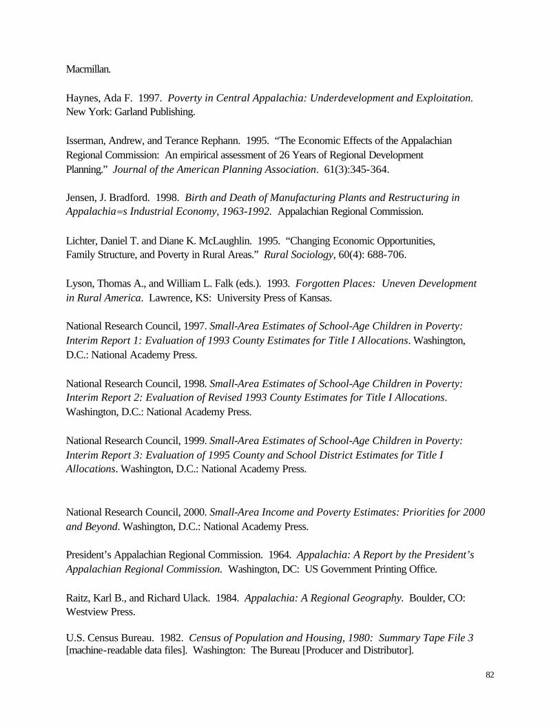
82
Macmillan. Haynes, Ada F. 1997. Poverty in Central Appalachia: Underdevelopment and Exploitation. New York: Garland Publishing. Isserman, Andrew, and Terance Rephann. 1995. “The Economic Effects of the Appalachian Regional Commission: An empirical assessment of 26 Years of Regional Development Planning.” Journal of the American Planning Association. 61(3):345-364. Jensen, J. Bradford. 1998. Birth and Death of Manufacturing Plants and Restructuring in Appalachia=s Industrial Economy, 1963-1992. Appalachian Regional Commission. Lichter, Daniel T. and Diane K. McLaughlin. 1995. “Changing Economic Opportunities, Family Structure, and Poverty in Rural Areas.” Rural Sociology, 60(4): 688-706. Lyson, Thomas A., and William L. Falk (eds.). 1993. Forgotten Places: Uneven Development in Rural America. Lawrence, KS: University Press of Kansas. National Research Council, 1997. Small-Area Estimates of School-Age Children in Poverty: Interim Report 1: Evaluation of 1993 County Estimates for Title I Allocations. Washington, D.C.: National Academy Press. National Research Council, 1998. Small-Area Estimates of School-Age Children in Poverty: Interim Report 2: Evaluation of Revised 1993 County Estimates for Title I Allocations. Washington, D.C.: National Academy Press. National Research Council, 1999. Small-Area Estimates of School-Age Children in Poverty: Interim Report 3: Evaluation of 1995 County and School District Estimates for Title I Allocations. Washington, D.C.: National Academy Press. National Research Council, 2000. Small-Area Income and Poverty Estimates: Priorities for 2000 and Beyond. Washington, D.C.: National Academy Press. President’s Appalachian Regional Commission. 1964. Appalachia: A Report by the President’s Appalachian Regional Commission. Washington, DC: US Government Printing Office. Raitz, Karl B., and Richard Ulack. 1984. Appalachia: A Regional Geography. Boulder, CO: Westview Press.
U.S. Census Bureau. 1982. Census of Population and Housing, 1980: Summary Tape File 3 [machine-readable data files]. Washington: The Bureau [Producer and Distributor].
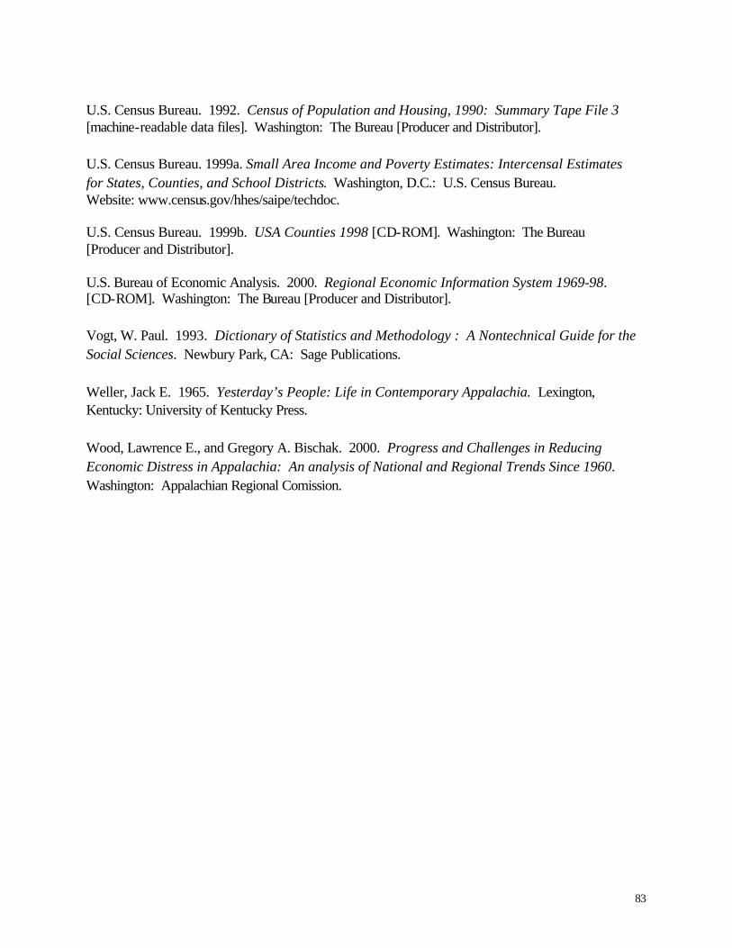
83
U.S. Census Bureau. 1992. Census of Population and Housing, 1990: Summary Tape File 3 [machine-readable data files]. Washington: The Bureau [Producer and Distributor]. U.S. Census Bureau. 1999a. Small Area Income and Poverty Estimates: Intercensal Estimates for States, Counties, and School Districts. Washington, D.C.: U.S. Census Bureau. Website: www.census.gov/hhes/saipe/techdoc. U.S. Census Bureau. 1999b. USA Counties 1998 [CD-ROM]. Washington: The Bureau [Producer and Distributor]. U.S. Bureau of Economic Analysis. 2000. Regional Economic Information System 1969-98. [CD-ROM]. Washington: The Bureau [Producer and Distributor]. Vogt, W. Paul. 1993. Dictionary of Statistics and Methodology : A Nontechnical Guide for the Social Sciences. Newbury Park, CA: Sage Publications. Weller, Jack E. 1965. Yesterday’s People: Life in Contemporary Appalachia. Lexington, Kentucky: University of Kentucky Press. Wood, Lawrence E., and Gregory A. Bischak. 2000. Progress and Challenges in Reducing Economic Distress in Appalachia: An analysis of National and Regional Trends Since 1960. Washington: Appalachian Regional Comission.

84
APPENDIX A Small Area Income and Poverty Estimate Program Methodology The data analyzed in this report are based in part on estimates of people in poverty prepared by
the U.S. Census Bureau as part of its Small Area Income and Poverty Estimates (SAIPE)
program. Portions of these estimates have been the subject of considerable analytical scrutiny due
to the fact that federal legislation calling for estimates of the numbers of related children ages 5-
17 living in poverty also called on the National Research Council (NRC) of the National
Academy of Sciences to establish a panel of experts to study the estimates and to make a
recommendation to the Secretary of the Department of Education regarding their statistical
adequacy for allocating to federal funds to school districts under Title I of the Elementary and
Secondary Education Act. Findings by the NRC Panel on Estimates of Poverty for Small
Geographic Areas have, to date, been reported in three published interim reports (National
Research Council, 1997, 1998, 1999).
With respect to the Census Bureau’s estimates for counties of children ages 5-17 in families with
incomes below the poverty level, the NRC panel, on the basis of its own studies as well as Census
Bureau evaluations of its estimation model and reasonable alternative models, issued a carefully
and narrowly worded recommendation: "[T]hat the Census Bureau’s revised 1993 county
estimates of poor school-age children be used in the Title I allocations for the 1998-1999 school
year" (National Research Council, 1998:3).
Three things must be noted with respect to this recommendation:
First, the scope of the recommendation pertains exclusively to the use of the Census Bureau’s
estimates of poor school-age (5-17) children for making allocations to counties under the Title I
program. The recommendation is based on the panel’s conclusion that use of the revised model-
based estimates for 1993 is preferable to using outdated 1990 Census-based estimates for such
allocations, and, in particular, the panel withholds any mention of the potential utility of these
numbers for other uses. Indeed, the Census Bureau’s own technical documentation for the SAIPE
program (U.S. Census Bureau, 1999a) specifically cautions the user who wishes, for example, to

85
compare census-based estimates of poverty with inter-censal model-based estimates of poverty, or
inter-censal estimates for two different years, exactly what we attempt to do in the present report.
Second, the recommendation pertains only to the Census Bureau’s estimates of poor school-age
(5-17) children. At the present time, the Bureau’s SAIPE program is producing estimates of the
number of poor and poverty rates for age groups 0-17, 5-17 and all ages. While the full extent of
the Census Bureau’s examination of the models for age groups 0-17 and all ages is unknown,
some evaluation data are available on the Census Bureau’s homepage (U.S. Census Bureau,
1999a). It is important to note, however, that the models for estimates of poverty of persons 0-17
and all ages were not examined by the NRC panel. It is the estimates of total poverty that are the
focus of the present report.
Third, even the estimates of poor school-age (5-17) children suffer from errors that often are quite
large. Based on the NRC panel studies (see, in particular, National Research Council, 1998), we
know that the revised 1993 estimates of poor school-age children are based on a model which
suffers a small bias in the estimates with respect to county size and proportion of Hispanic
residents. Moreover, the model shows evidence of "variance heterogeneity with respect to both
CPS sample size and poverty rate" (p. 41). Both are observations that prompted the panel to
suggest further research into alternative model specifications. Indeed, while the NRC panel
concluded that the Census Bureau’s estimation model performed as well as, or better than,
alternative models that were tested, the panel recommended considerable further model
experimentation and testing. Data users who have examined the county estimates have noted, as
do we, that most of the estimates have uncomfortably wide confidence intervals.
Finally, the NRC panel has drawn attention to the fact that census-based estimates of poverty and
CPS-based model estimates of poverty have systematic differences that arise from differences in
data collection procedures between the decennial census and the CPS (see, in particular, National
Research Council, 1997:Appendix B). There is some evidence that when compared to the 1990
Census, CPS-based poverty estimates of the number and proportion of school-age children are
higher. This fact, when considered alongside the additional fact that census-based estimates of
poverty themselves are based on a sample of the population (and thereby suffer from sampling

86
error), adds further complexity to the task of gauging the trends in poverty among counties
between 1990 and any subsequent year -- a task we herein undertake.

87
APPENDIX B Economic Research Service Economic and Policy Typology Definitions
Farming dependent counties: Farming contributed a weighted annual average of 20 percent of
more of total labor and proprietor income over the three years from 1987 to 1989.
Mining dependent counties: Mining contributed a weighted annual average of 15 percent or
more of total labor and proprietor income over the three years from 1987 to 1989.
Manufacturing dependent counties: Manufacturing contributed a weighted annual average of
30 percent or more of total labor and proprietor income over the 3 years from 1987 to 1989.
Government dependent counties: Government contributed a weighted annual average of 25
percent of more of total labor and proprietor income over the 3 years from 1987 to 1989.
Services dependent counties: Service activities (private and personal services, agricultural
services, wholesale and retail trade, finance and insurance, transportation and public utilities)
contributed a weighted annual average of 50 percent of more of total labor and proprietor income
over the 3 years form 1987 to 1989.
Non-specialized counties: Counties not classified as a specialized economic type over the 3 years
from 1987 to 1989.
Retirement destination counties: The population aged 60 years and over in 1990 increased by
15 percent of more during 1980-90 through in-migration of people.
Federal lands counties: Federally owned lands made up 30 percent of more of a county’s land
area in the year 1987.
Commuting counties: Workers aged 16 years and over commuting to jobs outside their county of
residence were 40 percent or more of all the county’s workers in 1990.

88
Persistent poverty counties: Persons with poverty-level income in the preceding year were 20
percent of more of total population in each of 4 years: 1960, 1970, 1980 and 1990.
Transfer dependent counties: Income from transfer payments (Federal, state and local) contributed a weighted annual average of 25 percent or more of total personal income over the 3 years from 1987 to 1989.

89
APPENDIX C Appalachian Poverty Measures Table C.1: Appalachian Poverty by State
1979
Census
1989
estimates
1989
Census
1993
estimates
1995
estimates Alabama
16.9%
15.6%
16.1%
16.8%
15.5%
Georgia
12.5%
9.8%
10.2%
11.5%
10.5%
Kentucky
26.0%
27.0%
29.0%
28.5%
26.9%
Maryland
11.9%
12.0%
12.5%
13.2%
12.9%
Mississippi
22.3%
20.4%
22.6%
21.1%
18.7%
New York
12.0%
10.6%
12.9%
14.3%
14.1%
North Carolina
13.8%
11.9%
12.4%
13.1%
12.4%
Ohio
12.6%
16.0%
17.4%
16.8%
14.4%
Pennsylvania
10.0%
11.2%
12.5%
13.3%
11.9%
South Carolina
12.6%
10.9%
11.6%
12.6%
11.6%
Tennessee
16.6%
15.6%
16.1%
17.8%
14.9%
Virginia
15.6%
17.5%
17.9%
17.6%
16.5%
West Virginia
15.0%
17.2%
19.7%
21.7%
19.9%
ARC counties
14.1%
14.1%
15.3%
16.1%
14.6%
Note: Poverty rates by state within Appalachia only include counties designated as Appalachian.

90
Table C.2: Poverty Rates by Developmental Districts for Appalachia.
1979
Census
1989
Census
1989
estimates
1993
estimates
1995
estimates
ALABAMA Northwest Alabama (1a) 15.5% 14.9% 16.7% 15.6% 14.9% North Central Alabama (1b) 16.7% 13.5% 14.4% 14.5% 13.4% Top of Alabama (1c) 15.6% 12.8% 13.6% 14.2% 13.3% West Alabama (1d) 22.4% 20.1% 21.9% 20.6% 19.7% Birmingham Regional (1e) 15.5% 15.9% 15.3% 17.0% 14.7% East Alabama (1f) 18.0% 16.2% 17.2% 18.5% 18.0% Central Alabama (1h) 18.2% 14.6% 14.5% 15.9% 13.7% South Central Alabama (1i) 33.0% 34.1% 34.5% 35.3% 34.4% GEORGIA Coosa Valley (2a) 13.2% 12.4% 12.5% 14.0% 14.2% Georgia Mountains (2b) 14.4% 11.9% 12.2% 13.4% 12.1% Chattahoochee-Flint (2c) 15.8% 13.4% 14.9% 13.4% 12.1% Atlanta Regional (2d) 7.0% 4.5% 4.7% 6.6% 5.8% Northwest Georgia (2e) 16.5% 14.0% 15.7% 16.7% 15.2% North Georgia (2f) 14.9% 12.3% 12.5% 13.8% 13.4% KENTUCKY Buffalo Trace (3a) 27.8% 25.9% 28.1% 26.5% 25.1% FIVCO (3b) 18.2% 19.1% 21.8% 22.5% 21.5% Bluegrass Area (3c) 22.2% 20.0% 22.3% 21.8% 19.7% Gateway Area (3d) 26.2% 26.0% 28.5% 28.0% 26.4% Big Sandy Area (3e) 22.4% 27.1% 29.5% 29.7% 28.5% Lake Cumberland (3f) 30.1% 28.0% 29.1% 27.9% 26.2% Cumberland Valley (3h) 30.2% 32.3% 33.5% 32.7% 31.0% Kentucky River (3i) 30.5% 33.6% 36.3% 35.3% 33.6% Barren River (3j) 29.1% 23.6% 26.9% 24.3% 23.7% MARYLAND Tri-County W. Maryland (4a) 11.9% 12.0% 12.5% 13.2% 12.9% MISSISSIPPI Northeast Mississippi (5a) 21.7% 21.5% 23.8% 21.4% 18.8% Three Rivers (5b) 18.8% 15.4% 17.8% 16.9% 14.9% Golden Triangle (5c) 25.6% 24.6% 26.6% 25.2% 22.6% East Central (5d) 37.2% 33.0% 35.1% 29.8% 24.1% North Central (5e) 24.6% 24.4% 26.4% 26.1% 23.9% NEW YORK Southern Tier West (6a) 12.5% 13.3% 14.0% 17.0% 16.0% Southern Tier Central (6b) 11.5% 10.7% 12.4% 14.3% 13.8% Southern Tier East (6c) 12.0% 9.2% 12.5% 13.1% 13.4% NORTH CAROLINA Southwestern North Carolina (7a) 18.8% 15.7% 17.2% 16.8% 16.4% Land of Sky (7b) 13.6% 12.3% 11.9% 13.1% 12.3% Isothermal (7c) 13.0% 10.7% 11.6% 12.5% 12.1% Region D (7d) 18.4% 15.1% 16.8% 15.3% 14.8%
91
1979
Census
1989
Census
1989
estimates
1993
estimates
1995
estimates Western Piedmont (7e) 10.0% 9.7% 10.3% 11.2% 10.9% Northwest Piedmont (7i) 12.1% 10.4% 10.6% 11.8% 10.7% OHIO Ohio Valley (8a) 14.2% 17.1% 18.4% 17.2% 14.7% Buckeye Hills -Hocking (8b) 14.3% 17.5% 20.3% 18.6% 16.1% Ohio Mid-Eastern (8c) 10.9% 14.1% 14.6% 15.2% 13.0% PENNSYLVANIA Northwest Pennsylvania (9a) 9.9% 12.3% 13.6% 14.8% 13.6% North Central Pennsylvania (9b) 10.1% 11.7% 13.4% 14.2% 12.6% Northern Tier (9c) 13.5% 11.9% 13.1% 14.0% 12.9% ECD of Northeastern Pennsylvania (9d)
9.9% 9.7% 10.4% 11.7% 10.2% Southwestern Pennsylvania (9e) 9.3% 11.4% 12.5% 13.4% 11.8% Southern Alleghenies (9f) 11.3% 12.7% 13.9% 14.7% 13.6% SEDA (9g) 11.9% 10.0% 12.5% 12.1% 11.1% SOUTH CAROLINA South Carolina Appalachian (10a) 12.6% 10.9% 11.6% 12.6% 11.6% TENNESSEE Upper Cumberland (11a) 20.2% 16.9% 18.6% 19.0% 16.2% East Tennessee (11b) 16.8% 15.7% 16.0% 17.4% 14.6% First Tennessee (11c) 16.1% 15.4% 16.5% 17.9% 15.3% South Central Tennessee (11d) 15.3% 13.8% 14.8% 16.1% 13.6% Southeast Tennessee (11e) 15.2% 15.1% 15.0% 18.0% 14.6% VIRGINIA LENOWISCO (12a) 20.1% 25.7% 23.4% 24.2% 22.7% Cumberland Plateau (12b) 16.1% 21.6% 21.5% 21.5% 21.2% Mount Rogers (12c) 14.6% 16.0% 15.5% 16.1% 14.7% New River Valley (12d) 15.7% 14.2% 17.8% 15.7% 14.2% Fifth Planning (12e) 8.7% 8.4% 7.7% 8.6% 7.7% Central Shenandoah (12f) 14.3% 11.2% 13.7% 11.6% 11.5% WEST VIRGINIA Region 1 (13a) 17.3% 22.0% 24.1% 26.7% 24.5% Region 2 (13b) 17.1% 20.6% 24.0% 25.0% 23.4% Region 3 (13c) 11.7% 15.1% 16.7% 19.7% 17.3% Region 4 (13d) 17.1% 20.9% 23.3% 25.4% 26.3% Region 5 (13e) 13.7% 15.1% 18.6% 20.2% 19.1% Region 6 (13f) 15.5% 16.6% 19.3% 20.7% 18.9% Region 7 (13g) 18.8% 21.5% 23.9% 26.0% 24.4% Region 8 (13h) 17.3% 14.1% 15.9% 17.0% 16.3% Region 9 (13i) 14.1% 9.6% 11.4% 14.6% 13.0% Region 10 (13j) 10.6% 14.5% 16.8% 18.2% 16.6% Region 11 (13k) 9.3% 12.3% 14.9% 16.0% 14.7%
Note: Some developmental districts include non-Appalachian counties that do not appear in this table.

92
Table C.3:
Poverty Rates by Urban Continuum Code for Appalachia
Beale Code (93)
Number of counties
1979
Census
1989
estimates
1989
Census
1993
estimates
1995
estimates Metro-core
7
8.4%
9.6%
10.3%
11.3%
9.8%
Metro-fringe
12
12.4%
11.3%
12.2%
12.9%
11.2%
Metro-medium
59
12.8%
12.8%
13.3%
14.9%
13.1%
Metro-small
31
12.6%
12.8%
14.3%
15.2%
14.2%
Non-metro, 20,000 urban population, adjacent to metro
20
13.1%
14.1%
15.4%
15.9%
14.5%
Non-metro, 20,000 urban population, non-adjacent to metro
11
15.9%
15.1%
18.2%
18.5%
16.6%
Non-metro, 2,500-19,999 urban population, adjacent to metro
83
15.6%
15.0%
16.4%
16.9%
15.5%
Non-metro, 2,500-19,999 urban population, non-adjacent to metro
78
18.9%
19.7%
21.6%
21.6%
19.9%
Non-metro, rural, adjacent to metro
40
19.6%
17.4%
19.7%
19.5%
18.1%
Non-metro, rural non-adjacent to metro
65
25.1%
24.9%
26.0%
25.1%
23.7%
ARC counties
409
14.1%
14.1%
15.3%
16.1%
14.6%

93
Table C.4: Poverty Rates by USDA Non-metropolitan Economic and Policy Functions
ERS Code
Number of counties
1979 Census
1989 SAIPE
1989 Census
1993 SAIPE
1995 SAIPE
Commuting
71
19.7%
18.3%
19.9%
19.9%
18.1%
Farming
6
25.2%
20.7%
22.6%
20.6%
19.6%
Federal Lands
24
19.1%
17.3%
18.5%
18.3%
17.3%
Government
24
25.9%
26.2%
28.5%
26.6%
24.8%
Manufacturing
128
15.4%
14.5%
15.8%
16.2%
14.9%
Mining
41
19.3%
22.5%
25.3%
26.4%
23.8%
Not Specified
65
18.9%
18.4%
19.5%
19.9%
18.2%
Poverty
93
27.0%
27.1%
28.9%
28.0%
26.0%
Retirement
19
15.7%
11.9%
12.9%
13.4%
12.4%
Service
32
15.4%
16.0%
17.8%
18.3%
16.8%
Transfer
91
22.2%
25.4%
27.4%
27.2%
25.3%
ARC Non-metro
297
17.2%
17.1%
18.8%
18.9%
17.4%

94
APPENDIX D Distressed Status Designation Methodology This report determines distressed status of Appalachian counties using the current ARC indicators. The poverty data to determine distressed status was derived from the 1980 and 1990 U.S. Censuses of Population and Housing (U.S. Census Bureau, 1982 and 1992) and the U.S. Census Bureau Small Area Income and Poverty Estimates (U.S. Census Bureau, 1999a). This report uses three-year average unemployment rates derived from USA Counties 1998 (U.S. Census Bureau, 1999b) and three-year average per capita market income derived from the Regional Economic Information System 1969-98 (U.S. Bureau of Economic Analysis, 2000). The use of the three-year averages for unemployment and per capita market income accounts for the differences in distressed counties between this report and Wood and Bischak (2000). National Averages and Distressed Standards (in parentheses) 1980 Poverty Rate - 12.4% (18.6%; 24.8%) Unemployment Rate - 6.87% (10.3%) Per Capita Market Income - $9,124 ($6,083) 1990 Census Poverty Rate - 13.1% (19.7%; 26.2%) SAIPE Poverty Rate - 13.1% (19.7%; 26.2%) Unemployment Rate – 5.9% (8.85%) Per Capita Market Income - $18,114 ($12,076) 1994 SAIP Poverty Rate - 15.1% (22.7%; 30.2%) Unemployment Rate – 6.14% (9.21%) Per Capita Market Income - $21,271 ($14,181) 1996 SAIPE Poverty Rate – 13.8% (20.7%; 27.6%) Unemployment Rate – 5.25% (7.87%) Per Capita Market Income - $23,089 ($15,393)

95
APPENDIX E Appalachian Distressed Counties 1980 – 1996 Table E.1: Distressed Counties, 1980, 1990, 1994, and 1996 (Bold Text = Distressed)
1994 1996
County State
1990 1990 Estimate Upper Bound Estimate
Upper Bound
Bibb Alabama PUI PUI I P I None P Fayette Alabama None PUI None None None P Franklin Alabama U PUI None None None None Lawrence Alabama PUI PUI None None None None Pickens Alabama PUI PUI PUI PUI PUI PUI Talladega Alabama PU PUI I P I P I P I Winston Alabama UI PUI None None None P Union Georgia P* I None None None None None Adair Kentucky P* I P I P I P I PUI PUI Bath Kentucky PUI PUI PUI PUI PUI PUI Bell Kentucky P* I PUI P* I P* I PUI PUI Breathitt Kentucky P* I PUI PUI PUI PUI PUI Carter Kentucky PUI PUI PUI PUI PUI PUI Casey Kentucky P* I P* I P I P* I P I P*U Clay Kentucky P* I PUI P* I P* I PUI PUI Clinton Kentucky P* I P* I P* I P* I PUI PUI Cumberland Kentucky P* I P* I P* I P* I PUI PUI Elliott Kentucky P* I PUI PUI PUI PUI PUI Estill Kentucky PUI PUI P I P* I P I P*U Floyd Kentucky P PUI PUI PUI PUI PUI Green Kentucky P I P I I P I UI PUI Harlan Kentucky P* PUI PUI PUI PUI PUI Jackson Kentucky PUI PUI PUI PUI P*U P*U Johnson Kentucky P PUI P I P* I PUI PUI Knott Kentucky PUI PUI PUI PUI PUI PUI Knox Kentucky P* I P* I P* I P* I PUI PUI Laurel Kentucky P P I P I P* I P I P I Lawrence Kentucky PUI PUI PUI PUI PUI PUI Lee Kentucky PUI PUI PUI PUI P*U P*U Leslie Kentucky P* I PUI P* I P* I P*U P*U Letcher Kentucky PUI PUI PUI PUI PUI PUI Lewis Kentucky PUI PUI PUI PUI PUI PUI Lincoln Kentucky PUI P* I P I P I P I P*U McCreary Kentucky PUI PUI P* I P* I PUI PUI Magoffin Kentucky PUI PUI PUI PUI PUI PUI Martin Kentucky P* PUI PUI PUI PUI PUI Menifee Kentucky PUI PUI PUI PUI PUI PUI P = County poverty rate at or above 150% of national average P*= County poverty rate at or above 200% of national average U= County unemployment rate at or above 150% of national average I = County per capita market income at or below 2/3 of national average
96
1994 1996
County State
1990 1990 Estimate Upper Bound Estimate
Upper Bound
Monroe Kentucky P* I P* I P P P P* Morgan Kentucky PUI PUI PUI PUI PUI PUI Owsley Kentucky PUI P* I P* I P* I P*U P*U Perry Kentucky P PUI PUI PUI PUI PUI Pike Kentucky P PU PU P*U PU P*U Powell Kentucky PUI PUI P I P* I P I P*U Rockcastle Kentucky P* I PUI P I P* I P I P*U Rowan Kentucky P I P* I P I P* I P I P*U Russell Kentucky PUI PUI P I P I PUI PUI Wayne Kentucky P* I PUI P* I P* I P*U P*U Whitley Kentucky PUI P* I P* I P* I P*U P*U Wolfe Kentucky PUI PUI PUI PUI P*U P*U Benton Mississippi P I PUI P I P* I PUI PUI Chickasaw Mississippi P I PUI None P U PU Choctaw Mississippi P* I PUI P I P* I PUI PUI Clay Mississippi P I PUI PUI PUI PUI PUI Kemper Mississippi P* I PUI P I P* I PUI PUI Marshall Mississippi P* I PUI PUI PUI PUI PUI Noxubee Mississippi PUI PUI P* I P* I PUI PUI Oktibbeha Mississippi P* I P* I P I P* I P I P*U Prentiss Mississippi I PUI I I I P I Tippah Mississippi P I PUI I P I I I Tishomingo Mississippi None PUI I I UI UI Webster Mississippi P I PUI I P I P I P I Winston Mississippi P* I PUI P I P* I PUI PUI Graham North Carolina PUI PUI UI PUI UI PUI Madison North Carolina P* I P I None None None P Swain North Carolina PUI PUI PUI PUI PUI PUI Adams Ohio PUI PUI PUI PUI UI PUI Athens Ohio P I P* I P I P I I P I Jackson Ohio U PUI I P I I P I Meigs Ohio None P I PUI PUI PUI PUI Monroe Ohio None PUI U U UI PUI Pike Ohio PUI PUI PUI PUI UI PUI Scioto Ohio U PUI PUI PUI PUI PUI Vinton Ohio I PUI UI PUI UI PUI Bledsoe Tennessee PUI I P I P I P I P I Campbell Tennessee PUI PUI P I P* I PUI PUI Claiborne Tennessee PUI P I P I P I P I P I Clay Tennessee P* I P I None P U PU Cocke Tennessee PUI PUI PUI PUI PUI PUI Cumberland Tennessee PUI I None None None None Fentress Tennessee PUI PUI PUI PUI PUI PUI Grundy Tennessee PUI PUI PUI PUI PUI PUI Hancock Tennessee PUI P* I P* I P* I P*U P*U P = County poverty rate at or above 150% of national average P*= County poverty rate at or above 200% of national average U= County unemployment rate at or above 150% of national average I = County per capita market income at or below 2/3 of national average

97
1994 1996
County State
1990 1990 Estimate Upper Bound Estimate
Upper Bound
Jackson Tennessee PUI P I I P I I I Johnson Tennessee P* I PUI PUI PUI PUI PUI Meigs Tennessee U PUI UI UI UI PUI Monroe Tennessee PUI UI I P I UI PUI Morgan Tennessee P* I PUI P I P I I P I Overton Tennessee PUI UI I P I UI PUI Pickett Tennessee P* I P I P I P I PUI PUI Rhea Tennessee P UI UI PUI UI UI Scott Tennessee PUI PUI PUI PUI PUI PUI Buchanan Virginia P PU PU PU PUI PUI Dickenson Virginia U PUI PUI PUI PUI PUI Lee Virginia P* I PUI PUI PUI PUI PUI Russell Virginia None PUI UI PUI UI PUI Barbour West Virginia P PUI PUI PUI PUI PUI Boone West Virginia None P*U PU P*U PU P*U Braxton West Virginia PUI PUI PUI PUI PUI PUI Calhoun West Virginia PUI PUI PUI PUI PUI PUI Clay West Virginia PUI PUI PUI PUI PUI PUI Doddridge West Virginia P I P I PUI PUI P I P*U Fayette West Virginia U PUI PUI PUI PUI PUI Gilmer West Virginia P I PUI PUI PUI PUI PUI Jackson West Virginia U PUI U PU None P Lewis West Virginia I PUI PUI PUI PUI PUI Lincoln West Virginia PUI PUI PUI PUI PUI PUI Logan West Virginia None PUI PU P*U PUI PUI McDowell West Virginia PU PUI PUI PUI PUI PUI Mason West Virginia U PUI U PU UI PUI Mingo West Virginia P PUI P*U P*U PUI PUI Monroe West Virginia P I PUI I P I I P I Nicholas West Virginia U PUI PUI PUI PUI PUI Pocahontas West Virginia U PUI U PU U PU Preston West Virginia PUI UI UI PUI UI PUI Randolph West Virginia None PUI PU PU PU PU Ritchie West Virginia UI PUI PUI PUI PUI PUI Roane West Virginia UI PUI PUI PUI PUI PUI Summers West Virginia PUI PUI PUI PUI PUI PUI Taylor West Virginia UI PUI PUI PUI PUI PUI Tucker West Virginia I UI UI UI UI PUI Upshur West Virginia I PUI PUI PUI PUI PUI Wayne West Virginia P PUI P I P I P I P I Webster West Virginia PUI PUI PUI PUI PUI PUI Wirt West Virginia UI PUI PUI PUI PUI PUI Wyoming West Virginia PU PUI PUI PUI PUI PUI P = County poverty rate at or above 150% of national average P*= County poverty rate at or above 200% of national average U= County unemployment rate at or above 150% of national average I = County per capita market income at or below 2/3 of national average