QUICK REFERENCE GUIDE - Friesens
11
QUICK REFERENCE GUIDE
Transcript of QUICK REFERENCE GUIDE - Friesens

QUICK REFERENCE GUIDE

A YEARBOOK IS:• a photo book • a memory book • a history book• a public relations tool• a record and reference book
WHAT IS A YEARBOOK?
WHAT IS A YEARBOOK ADVISOR AND WHAT DOES ONE DO?
• Recruits students for yearbook staff.
• Teaches computer programs and refreshes journalism skills early in the year.
• Works with students on the development of their story, design, and photo assignments.
• Helps establish a system to ensure deadlines are met.
• Is actively involved in creating a yearbook sales campaign.
• Evaluates assignments and work to give a grade.
• Helps with getting spreads submitted to Friesens.
• Helps with proof checks and returns them in a timely manner.
• Motivates and inspires.
• Helps to keep up a positive experience.
• Mediates in times of arguments or disagreements among staff of either a professional or personal nature.
• Stays on top of the latest journalism techniques, practices, and industry developments.
• Provides career shadowing opportunities for students interested in entering the journalism field.
RULES, ROLES & GOALSETHICS
PUBLISHING THE TRUTHA yearbook is oriented towards feature coverage and not published daily or monthly as many student newspapers are, it is still important for it to be a faithful, trustworthy accounting of the history of the school year. In fact, since a yearbook cannot print retractions or corrections in the same manner as a newspaper can, it is even more important for it to be factually accurate.
ADVERTISING POLICYDo not allow advertisers to dictate coverage decisions. For instance, it is not appropriate that a local used car dealership purchases an advertisement in return for inclusion in a story in the student life section on students and how they acquire their first cars.
Conversely, if an advertiser does something of major importance for the school – funds an endowment, builds a new theatre – it would be appropriate to cover in the yearbook.
2

MASKING THE TRUTH
At times, it is tempting to leave out some aspects of the year because the staff is afraid of “making someone look bad.”
A more slippery and common problem for yearbook staffers in the area of truth-telling is in resisting the temptation to alter a photograph’s content. While it is acceptable to use programs like Photoshop to replace traditional darkroom techniques like colour correction, it is not ethical to alter the factual content of an image.
Be sure to consult with your school administrators if you have any doubts about including something. Meet with them at the beginning to get a clear understanding of what they want out of the yearbook. Once printed it is here for life.
ROLES FOR COMMITTEEEDITOR(S) IN CHIEF
MANAGING EDITOR(S)
SECTION EDITORS
• Portrait Section Editor• Clubs/Organizations Section Editor• Sports Section Editor
PHOTOGRAPHY EDITOR
PHOTOGRAPHERS
BUSINESS MANAGER
ADVERTISING MANAGER
COPY EDITOR
GENERAL STAFF
SOCIAL MEDIA EDITOR
ADVISOR
EDITOR IN CHIEF
PHOTOGRAPHY EDITOR
SOCIAL MEDIA EDITOR
ADVERTISING MANAGER
COPY EDITORBUSINESS MANAGERMANAGING EDITOR(S)
PHOTOGRAPHERS
SPORTS SECTION EDITOR
PORTRAIT SECTION EDITOR
CLUBS/ORGANIZATIONS SECTION EDITOR
3

PLAN YOUR WORK… WORK YOUR PLAN• Work with your Friesens Consultant to create
deadlines that will realistically work with your schedule.
• Make mini deadlines to help meet submission deadlines. Sort photos, design spreads, write captions etc.
• Set book specifications such as quantity, page count, book size, cover options, etc. These can be changed before you submit any pages, if necessary.
• Gather information from teaching staff about clubs, teams and classes they're involved with.
• List activities, sports, clubs, and special events. Mark dates for games, practice, concerts, etc. on a common calendar.
PORTRAITS: • Find out dates for picture day, re-takes, grad
photos and when the images will arrive at the school.
THEME: • Make sure the theme can be represented
throughout the book, including cover, endsheets, opening and closing pages, dividers and design elements.
PAGE LADDER: • Determine how many spreads you need for each
section and which pages they will be on.
• A helpful formula for content is: Student Life - 20-25% Academics - 10-15% Sports - 18-22% Clubs and Organizations - 12-15% People - 22-28%
MARKETING DEADLINES: • Mark important dates on your calendar, such
as deadlines, special events, sport seasons, concerts, plays, graduation, and special trips. Create a checklist for all elements required for building a spread. Layouts, candids, team photos, text, and statistics. Assign spreads by submission deadlines.
• Meet weekly with editors.
• Celebrate successes.
• Gold stars for students who finish spreads.
• Schedule late nights at the beginning of the school year, a week before deadlines, so there's time for any corrections to be made.
• Editor's need to be available to their staff while they're working. Editor's responsibilities should be completed on their own time.
• Laugh a lot!
DESIGN & LAYOUTTHEMEDeciding the yearbook theme is the most important thing to do prior to starting a yearbook. The purpose of a yearbook is to tell the story of a particular year. The staff’s job is to capture the mood and climate of the school year and to tell the story so that it is believable, real and remembered. Each staff should endeavour to come up with that perfect word, phrase or expression that sets it
apart from other years. The theme should enhance the yearbook to tell the year’s story. Remember the theme, design and coverage need to make sense together.
A THEME SHOULD:
• Unify and create a mood for the book
• Be appropriate for the school and the year
• Have both text and graphic elements
4

• Create continuity throughout the book
• Be visible throughout each section
CREATING YOUR THEME• What’s the big idea?
• Is there something big happening this year?
• Do you have key words? Do these words have luggage, which may distract from the book.
• The theme may lend to a unique organization of the book.
• Design concept should be linked to your theme and influence page design.
• Make sure that the theme can be represented throughout the entire book. Cover, endsheets, opening and closing pages, divider pages and design elements (fonts, colours, folio tabs, and graphics).
• Use colours, fonts and design elements to further your theme.
• See Friesens Yearbook Curriculum Guide for a list of theme suggestions.
COLOURCMYK are the four colours that create the colours in a yearbook. They are cyan, magenta, yellow, and black. Your yearbook colours can be chosen and created from the Process Colour Guide booklet. Monitor colour is light and created using RGB (red, green and blue). Printed colour is CMYK ink on paper stock created using the mechanics of the printer. Monitor colours and printed colours vary because colour is dependent upon the output mechanism making the colour. RGB has more visible colours than CMYK therefore, not all colours on a monitor can be printed. Like different monitors display variations of colour, printing devices produce variations of colour. The Process Colour Guide is the most accurate guide as it is CMYK ink on paper stock.
ELEMENTS OF A SPREADReaders have short attention spans. To combat that, designers have developed a variety of tools to pull the reader into the text as well as through the text. Entry points, while they rarely add information, serve to help the reader navigate the spread.
DOMINANT PHOTOGRAPHThe dominant photo on a spread is the most important visual piece. This is what grabs attention and draws the reader into the story.
EYE LINEIf the dominant photograph is horizontal, the top or bottom of it, whichever doesn’t extend to the edge of the page, determines the eye line. All other items should set on or hang off the eye line. Think of the eye line like a clothesline with clothes blowing up or hanging down off of it. The eye line should not be in the center of the spread but should be about one third from the top or bottom.
FOLIO TABThe page information (title, section, page numbers, etc.) should be found on each page of the yearbook. This section of the page is called a folio or a folio tab and is typically located at the bottom of the spread.
They provide quick information, and can also assist in pulling your theme through each page of your book. This can be done through colour, graphics, fonts, and text.
HEADLINELarge type, usually the largest on the page, that pulls the reader into the page while adding information.
SECONDARY HEADLINE (SUB HEADERS)Add information in a form similar to a sentence. They are usually one-third to one-half the type size of the headline and are often in a contrasting font.
BODY COPYThe main story designed to be read.
5
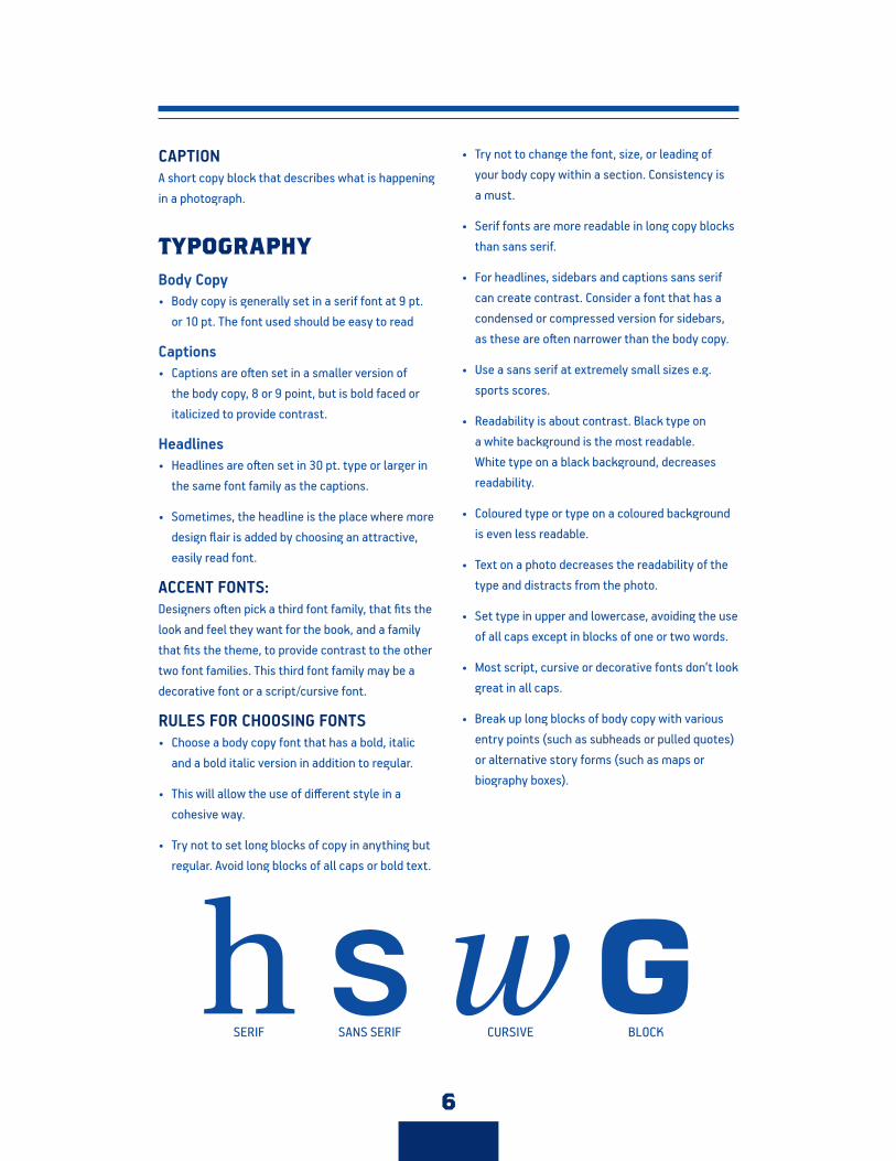
CAPTION A short copy block that describes what is happening in a photograph.
TYPOGRAPHYBody Copy• Body copy is generally set in a serif font at 9 pt.
or 10 pt. The font used should be easy to read
Captions• Captions are often set in a smaller version of
the body copy, 8 or 9 point, but is bold faced or italicized to provide contrast.
Headlines• Headlines are often set in 30 pt. type or larger in
the same font family as the captions.
• Sometimes, the headline is the place where more design flair is added by choosing an attractive, easily read font.
ACCENT FONTS: Designers often pick a third font family, that fits the look and feel they want for the book, and a family that fits the theme, to provide contrast to the other two font families. This third font family may be a decorative font or a script/cursive font.
RULES FOR CHOOSING FONTS • Choose a body copy font that has a bold, italic
and a bold italic version in addition to regular.
• This will allow the use of different style in a cohesive way.
• Try not to set long blocks of copy in anything but regular. Avoid long blocks of all caps or bold text.
• Try not to change the font, size, or leading of your body copy within a section. Consistency is a must.
• Serif fonts are more readable in long copy blocks than sans serif.
• For headlines, sidebars and captions sans serif can create contrast. Consider a font that has a condensed or compressed version for sidebars, as these are often narrower than the body copy.
• Use a sans serif at extremely small sizes e.g. sports scores.
• Readability is about contrast. Black type on a white background is the most readable. White type on a black background, decreases readability.
• Coloured type or type on a coloured background is even less readable.
• Text on a photo decreases the readability of the type and distracts from the photo.
• Set type in upper and lowercase, avoiding the use of all caps except in blocks of one or two words.
• Most script, cursive or decorative fonts don’t look great in all caps.
• Break up long blocks of body copy with various entry points (such as subheads or pulled quotes) or alternative story forms (such as maps or biography boxes).
SERIF SANS SERIF CURSIVE BLOCK
6

WRITINGWRITING TIPS???
KEEP IT SIMPLE• Short sentences, with simple sentence structure;
keep verbs close to subjects.
• Shorter paragraphs don’t scare the readers; most paragraphs should be under 40 words.
• Use the language of your reader. Write the way you talk, without slang and using good grammar.
BE SPECIFIC• No vague words like: “many”, “a few”, “several”,
or “a lot”.
• Use real information, not: “The team had a good season”, but instead try “the team had a 7–2 season”
• No need for school name or “this year” anywhere – it’s understood that’s what the book is about.
BE A JOURNALIST• Write in the third person “he”, “she”, or “they”
keeps “you” out of your reporting.
• Write in the past tense. The year will be over when the book arrives.
• Captions are always in the present, as a photo is a moment frozen in time.
• Do not editorialize. Report on the year and don’t push your opinion on the readers.
• Check your facts and attribute your quotes correctly.
• Balance is important. Tell both sides of a story.
INTERVIEWING
BE PREPARED• Do some background research and plan your
questions carefully.
• Don’t ask “yes” or “no” questions.
• Know your goal for the story.
DETAILS MAKE THE DIFFERENCE • Interview the person at the place that is the
context for the story, whether it’s the locker room, the drama room, or the physics lab. Such places are rich in descriptive detail.
• Take good notes. Write down everything you can about the conversation. Pay attention to details such as numbers, dates, statistics, key words, distinctive phrases and direct quotations.
• Fact check your story.
BE SENSITIVE • If there is a sensitive or emotional issue that is
at the heart of the story, it should come late in the interview. Leave time to recover from such moments and collect additional information.
BE CURIOUS • Good interviewers ask questions that interest
them because these will most likely also interest the reader.
BE PROVOCATIVE• The interviewer must ask some provocative
questions and photograph the special moments in the lives of the people at your school.
7

ORGANIZING YOUR STORY
Good writing follows good reporting and interviewing. Once you have gathered all the information you will need from the field, creating a narrative story structure is the next step.
CAPTIONSWhen someone looks at a picture, they’ll look at the caption for the specifics (name, place, context), but every caption should also intrigue in a way that makes them look back at the picture because they just learned something they didn’t know before
they read the caption. If the picture and caption work well together, they’ll look at the headline and then the story.
HEADLINES, SUBHEADS, AND SIDEBARS
The headline introduces the opening metaphor or premise of the story. If the headline is clever and witty, a reader might expect the story and spread to offer up more of the same. A second headline called a subhead is usually written in sentence form and performs the heavy lifting by introducing the opening action of the storyline. The subhead usually follows the main headline in smaller type.
PHOTOGRAPHYTHINKING VISUALLY
Photographers need to understand what they are doing when they get to an event. Just sending a student to an event with the instructions "take pictures" will not get you the results you intended. Students who have not done this before need clear detailed instructions.
BEFORE YOU SEND THEM TO THE WOLVES:
• Discuss the theme and layout style.
• Do they need to take portrait and landscape images?
• Go with them to their first event. Show them what to do. Show them how to introduce themselves to coaches, refs, and teachers.
• Show them what getting close means. Telling a student to get close to the action may mean the back seat in the bleachers to them.
• Have them do a practice shoot and review the pictures together.
• Show them what you need for team photos. Keep space around the edge of the frame to allow for cropping if needed.
• Create a list for images needed for each spread
a. Dominant Photo – Player making a layup taken from under the hoop.b. Shot of players watching game from the bench.c. 5+ image of fans cheeringd. Cheerleading teame. Action shots of players on court (get close)f. Coach and players in huddleg. Pregame warm-upsh. Post game victory celebration.
• They need to only submit good images; they should be deleting any shots that are obviously poor.
• Check photos at the midpoint of any season or event to be sure you have good images. If you do this now you have time to correct it.
HOW TO GET EVERYONE PICTURED IN YOUR BOOK
• Request a list from the office of the entire student body and all faculty and staff.
• Require all staffers to write the page number of each student who appears on their spreads.
• Put a black, red and green pen with the list.
> Use black to record the page number for
8
included in story/quote.
> Use red to indicate they are included in a photo.
> Use green to indicate class picture and group/team shot.
PHOTOJOURNALISM
THE 6 Ws: • Show Who, What, When, Where, Why, and How.
USE THE PHOTOS TO CAPTURE THE WHOLE STORY• Show conflict and struggle. Plan ahead and show
the effort, pain or determination that goes into the event you are covering.
INTRODUCE CHARACTERS AND LOCATION• Make sure you capture the most important
people, but also show the place, audience and context in your shots.
SHOW MORE THAN YOU CAN TELL• Capture the details you could never describe
in words – the facial expressions, costumes, poses and emotions that make a photo worth a thousand words.
ACTION, REACTION, AND INTERACTION• Capturing action is good, reaction of the
opposing team, audience or participants is better, and showing interactions between students, regardless of the activity is even better. This is why posed shots are the least desirable!
7 THINGS TO AVOID WHEN PLACING PHOTOS ON A LAYOUT1. Failure to use a dominant photo.
2. Not allowing enough image for a photo to bleed off the page.
3. Photos do not face across the pages. Plan the layout so that subjects look at the reader or across the gutter.
4. Forcing photos into predetermined spaces. Never stretch photos unproportionally. Change the layout if necessary.
5. No variety in the shape and size of photos.
6. Photos enlarged to fit a space. Only resize up to 125% or the image will start to deteriorate.
7. Spacing of photos is inconsistent. Internal margins should be the same throughout a spread or book.
COMPOSITION
FOCUS AND DEPTH OF FIELD• Focus is the most important element of
photography, but not everything in the photograph needs to be in focus. Depth of field refers to the part of the picture that is in focus.
CAMERA ORIENTATION• The camera can be held in two ways to view a scene;
landscape format (horizontal) or portrait format (vertical).
STANCE OR ANGLE OF VIEW• Photos taken at eye level can be a little boring.
• Move up higher, get closer to the ground, or move far off to the side for a more unusual perspective. Think bird’s eye view and worm’s eye view.
DISTANCE• Robert Capa (20th Century war photographer)
commented, “If your pictures aren’t good, you aren’t close enough.”
BALANCE AND THE RULE OF THIRDS• The rule of thirds imagines each image being
made of up a nine-square grid like a stretched tic-tac-toe box. Using the imagined lines and intersecting points on the grid as guides for placing key elements that makes up the composition.
FRAMING AND SHAPES• Use elements in the scene to frame the subject.
Shoot through the legs of a chair or branches of a tree for example. Make sure the subject is in tight focus.
9

LEADING LINES• Leading lines lure the eye deeper into a picture or
to an important subject. Straight, curved, parallel or diagonal lines are all good at promoting interest.
PATTERN AND REPETITION• Just as lines can lead the eye to a place in
the photograph, patterns can draw in the viewer to evaluate what they are looking at. eg. a sequence of swimmers’ feet, or a row of helmeted football players on a sideline, or a whole basket of peaches.
BLURRING AND FREEZING ACTION• Fast shutter speeds, freeze the action, and can
show the contortions of the athlete’s body. You can also capture movement by panning, or moving your camera with the object you are photographing. This keeps your subject in focus, but blurs the background, to give a good sense of speed.
PATIENCE AND THE DECISIVE MOMENT• Learn to anticipate motion and to trip the shutter
to capture the exact moment of an action or scene.
LIGHT• The quality of the light affects the overall mood
of the photo, the shadows which may or may not occur and every other part of the photograph.
• A great time of day for soft, mellow light in pictures happens at “golden hour,” which is about an hour before sunset.
• Photographs taken in bright light at noon have a lot of contrast, which creates harsh shadows.
SELECTING, STORING AND EDITING PHOTOGRAPHSChoosing what photos to keep for inclusion and which photos to discard is crucial. Photography should be planned, so photographers and layout staff know what the intended story and visual effect is, but at the same time, only good photos should make the yearbook. Just because an image was planned, it should not be included if it’s a bad shot. In the age of digital, when you can take hundreds of photos in one session, the most important aspect is to discard any photos that are not compelling before someone uses them, just because they have some space to fill. Here a few rules:
CROPPING• How you place photos, what parts you leave
out, and how much you resize images can have a great effect on what your pages look like. The golden rule applies here: Do unto others as you would have done upon you! Think about where things are placed and what is cut off!
THROWAWAY ANY PICTURE THAT…• Is out of focus.
• Is too dark, too light or too staid.
• Has technical imperfections scratches, lost highlights or bad colour.
• Does not tell a story! This is photojournalism!
• Is without a clear subject.
• Has the yearbook staff or their close friends.
• Is without a story to tell, that would only make the subject look foolish.
THE KEEPERS• Photos with a clear center of visual interest and
a story to tell.
• Photos that show action or even better the peak of action.
10

• Photos that were taken CLOSE to the subject, so they make good dominant photos.
• Pictures taken from interesting angles or perspectives.
PHOTOGRAPHS TO SPREAD• Consider the gutter. Make sure faces are not
trapped there!
• Watch the arms and legs – watch what you cut off, or what is sticking into the edges of your photos.
• Watch the background – are there poles coming out of the heads of your subjects?
• Do not destroy the rule of thirds that a photographer tried hard to shoot.
• Crop your images to exclude dead space, and create centers of visual interest, using the rule of thirds.
7 STEPS TO LOGICAL PHOTO MANAGEMENT1. Take photos in batches and store them with
others of the same theme.
2. Use a tracking sheet to record the 6 Ws for each photo as you take it.
3. Photos should be submitted. Someone should be in charge of storing, naming cataloguing and possibly grading and deleting photos – BEFORE they are allowed in any spread.
4. Store photos logically. Break down the images in folders corresponding to a sectional model; events, sports, portraits, academic, etc. Ensure that dates are included on the folders with names such as “Jr. Boys Basketball” in case multiple games are shot.
5. DO NOT let staff keep photos. All photos that are used should be kept in the same place, or it will be impossible to check quality, cropping, information or replace the image if it should get lost.
6. Mark used photos. Each photo should only appear ONCE in a yearbook.
7. Do not keep photos from previous years.
11