QBM117 Business Statistics Descriptive Statistics Graphical Presentation of Qualitative Data.
26
QBM117 Business Statistics Descriptive Statistics Graphical Presentation of Qualitative Data
-
date post
20-Dec-2015 -
Category
Documents
-
view
225 -
download
5
Transcript of QBM117 Business Statistics Descriptive Statistics Graphical Presentation of Qualitative Data.
QBM117Business Statistics
Descriptive Statistics
Graphical Presentation of Qualitative Data

Objective
• To summarise qualitative data using pie charts and bar charts

Graphical Methods for Qualitative Data
• Qualitative data are categorical observations.
• Qualitative data is often given in the form of a table with one column containing the categories and another column containing the number of observations (frequencies) in each category.
• Qualitative data is best presented as either a pie chart or a bar chart.

Example 2.3 from text
The student placement office at a university in New South Wales conducted a survey of last year’s graduates from the Faculty of Economics and Commerce to determine the general areas in which the graduates found jobs. Each graduate was asked in which area he or she found a job. The results are given in the following table.

Area of Employment Number of Graduates
Accounting 73
Finance 52
General Management 36
Marketing 64
Other 28
Total 253

Pie Charts
• The most popular graphical method for qualitative data is the pie chart.
• A pie chart represents data in the form of sections of a circle.
• Each section represents a category.
• The size of the section is proportional to the number of observations in the category.

Constructing a Pie Chart
• First we need to calculate the proportion of observations in each category.
• We draw a circle and divide it in to sections.
• The angle of each section of the circle is equal to the category’s proportion multiplied by 360°.
• Pie charts can be constructed easily using Excel.
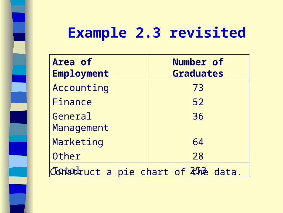
Example 2.3 revisited
Construct a pie chart of the data.
Area of Employment Number of Graduates
Accounting 73
Finance 52
General Management 36
Marketing 64
Other 28
Total 253

Employment
Area
Number of
Graduates
Proportion of
Graduates
Angle of
Circle
Accounting 73 73/253=0.2885
0.2885x360°=104°
Finance 52 52/253=0.2055
0.2055x360°=74°
Management
36 36/253=0.1423
0.1423x360°=51°
Marketing 64 64/253=0.2530
0.2530x360°=91°
Other 28 28/253=0.1107
0.1107x360°=40°
Total 253 1.0000 360°

Pie Chart of Area of Employment
Accounting29%
Finance21%General
Management14%
Marketing25%
Other11%

Bar Chart
• An alternative graphical method for qualitative data is the bar chart.
• In a bar chart, each category is depicted by a bar.
• The length of each bar represents the number of observations falling into the category.

Constructing a Bar Chart
• The categories are placed on the horizontal axis.
• Frequency is placed on the vertical axis.
• A bar is drawn for each category from the horizontal axis to a height that corresponds to the frequency of the category.
• The bars are of equal width.
• Each bar is separated from the others to enhance the visual presentation.

Example 2.3 revisited
Construct a bar chart of the data.
Area of Employment Number of Graduates
Accounting 73
Finance 52
General Management 36
Marketing 64
Other 28
Total 253

Bar Chart of Employment Areas
0
10
20
30
40
50
60
70
80
Accounting Finance GeneralManagement
Marketing Other
Areas of Employment
Nu
mb
er o
f G
rad
uat
es

Pie Chart or Bar Chart?
• The selection of chart is dependent on the intention of the user.
• If we want to emphasize the proportion of observations in each category then it is best to use a pie chart.
• If we want to compare categories it is best to use a bar chart.

Pie Charts and Bar Charts in Excel
• We are going to produce a bar chart of the rank data and a pie chart of the faculty data from Exercise 2.46 from the text.
• We are given the raw data and need to construct a pivot table to summarise the data before we can construct the charts.

Bar Chart of Rank of University Academics
0
20
40
60
80
100
120
140
160
180
associate professor lecturer professor senior lecturer
Rank
Nu
mb
er o
f A
cad
emic
s

Pie Chart of Faculty of University Academics
associate professor41%
lecturer13%
professor14%
senior lecturer32%

Multiple Qualitative Variables
• Often we are interested in more than one set of qualitative data.
• For example, we may have qualitative data for a number of years.
• We could do a separate pie chart for each year.
• Or we could display all the information on a single bar chart.

Bar charts for Multiple Sets of Data
• There are two types of bar charts that we use to display multiple sets of qualitative data.
- grouped bar chart
- component bar chart
• The selection of chart depends on the type of data and what you want to emphasize.

Grouped Bar chart
Consider the data in Table 2.12 on page 42 of the text (pg 40 abridged).
The data are the new passenger vehicle registrations in Australia by leading car manufacturers for 1997 and 1998.
We will construct a grouped bar chart of this data in Excel.

Grouped Bar Chart of the New Passenger Vehicle Registrations in Australia by Leading Car
Manufacturers for 1997 and 1998
0
2000
4000
6000
8000
10000
12000
Da
ew
oo
Fro
d
Ho
lde
n
Ho
nd
a
Hyu
nd
ai
Ma
zda
Mits
ub
ish
i
Nis
san
Su
ba
ru
To
yota
Oth
ers
Manufacturer
Nu
mb
er o
f R
egis
trat
ion
s
Oct-97
Oct-98
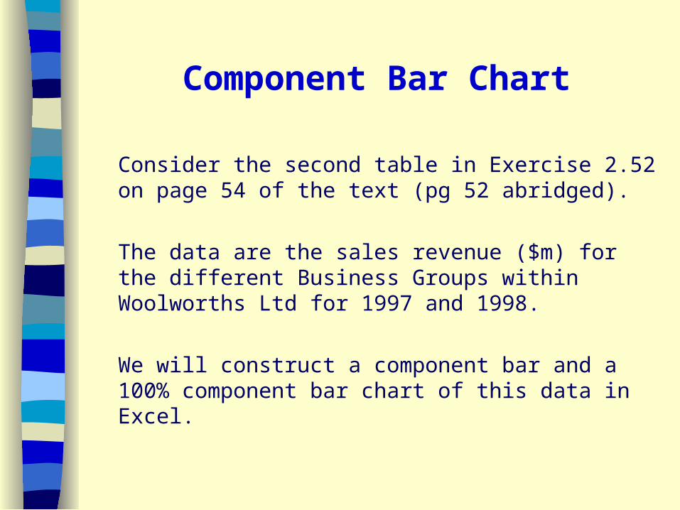
Component Bar Chart
Consider the second table in Exercise 2.52 on page 54 of the text (pg 52 abridged).
The data are the sales revenue ($m) for the different Business Groups within Woolworths Ltd for 1997 and 1998.
We will construct a component bar and a 100% component bar chart of this data in Excel.
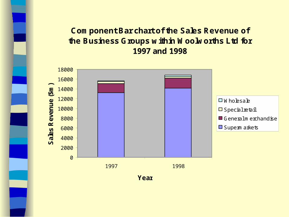
Component Bar chart of the Sales Revenue of the Business Groups within Woolworths Ltd for
1997 and 1998
0
2000
4000
6000
8000
10000
12000
14000
16000
18000
1997 1998
Year
Sal
es R
even
ue
($m
)
Wholesale
Special retail
General merchandise
Supermarkets

100% Component Bar Chart of the Sales Revenue of the Businsess Groups within
Woolworths Ltd for 1997 and 1998
0%
10%
20%
30%
40%
50%
60%
70%
80%
90%
100%
1997 1998
Year
Per
cen
tag
e o
f S
ales
R
even
ue Wholesale
Special retail
General merchandise
Supermarkets

Reading for next lecture
• Chapter 3 Sections 3.1-3.6