Profile of the 2011 National Air Emissions Inventory Profile of the 2011 National Air Emissions...
23
1 Profile of the 2011 National Air Emissions Inventory U.S. EPA 2011 NEI Version 1.0 Office of Air Quality Planning & Standards Emissions Inventory & Analysis Group April 2014 Acknowledgements EIAG Data Analysis Team and NEI Team
Transcript of Profile of the 2011 National Air Emissions Inventory Profile of the 2011 National Air Emissions...

1
Profile of the 2011 National Air Emissions Inventory
U.S. EPA 2011 NEI Version 1.0 Office of Air Quality Planning & Standards
Emissions Inventory & Analysis Group April 2014
Acknowledgements
EIAG Data Analysis Team and NEI Team

2
This report is an overview of the air pollutant emissions in the 2011 National Emissions Inventory (NEI) Version 1.01 (v1) (2011 NEI v1) published by the U.S. Environmental Protection Agency (EPA) in July 2013. The pollutants included in the NEI are the pollutants related to implementation of the National Ambient Air Quality Standards (NAAQS), known as criteria air pollutants (CAPs), as well as hazardous air pollutants (HAPs) associated with EPA’s Air Toxics Program. The CAPs have ambient concentration limits from the NAAQS program. These pollutants include lead (Pb), carbon monoxide (CO), nitrogen oxide (NOx), sulfur dioxide (SO2), particulate matter 10 microns in diameter or less (PM10) and particulate matter 2.5 microns in diameter or less (PM2.5). Precursors to CAPs include volatile organic compounds (VOCs), SO2, ammonia (NH3), and nitrogen oxide (NOx) emissions. The HAP pollutants include the 187 remaining HAP pollutants from the original 189 listed in Section 112(b) of the 1990 Clean Air Act Amendments2. In this report, we will be presenting information on CAPs, HAPs, and precursors.
The NEI is developed every three years, i.e., 2005, 2008, 2011, etc. This overview of the 2011 NEI applies the concepts developed in the 2008 NEI Report3 as well as many of the graphics and tables contained in that report. In some cases, 2011 data are compared to figures in the 2008 Report. A process is underway to update the 2011 NEI v1 to version 2.0 (v2), with v2 expected to be released in the fall of 2014. In this overview, emission profiles are presented for most of the CAPs and precursors, black carbon (which is a component of particulate matter), and for some specific HAPs that
account for a large portion of the nationwide cancer or non-cancer risks4 as well as contribute to the formation of ozone or fine particulate matter.
The information presented here about the 2011 NEI v1 includes the following:
Key emissions source contributions
National and state emissions trends
National emissions density maps
Emission differences between 2008 and 2011 (“2011” will pertain to the 2011 NEI v1 throughout report)—it should be noted that methods changes contribute to some of the noted emission changes from 2008 to 2011. These will be appropriately noted in this report for affected sectors.
Distribution of emissions by climate region
To keep the amount of materials associated with this report at the level of an overview, graphical summaries are provided for some, but not all, pollutants. Some detailed tabular emissions summaries associated with a graphic are not included in this overview document. Such additional materials are available by request, and readers who would like additional information associated with a given graphic or analysis are encouraged to contact the Emissions Inventory and Analysis Group, Data Analysis Team at [email protected].

3
1. 2011 NEI Version 1 (v1): Emissions data and documentation are available on http://www.epa.gov/ttn/chief/net/2011inventory.html 2. Information on 1990 Clean Air Act Amendments (CAA) available at http://epa.gov/oar/caa/caaa_overview.html 3. 2008 National Emissions Inventory: Review, Analysis and Highlights, http://www.epa.gov/ttn/chief/net/2008report.pdf 4. U.S. EPA National Air Toxics Assessment 2005, http://www.epa.gov/ttn/atw/nata2005/
(Remainder of page left intentionally blank)

4
Table 1: Total Emissions, all Sectors 2008 NEI v35 vs 2011 NEI v1
Pollutant Anthropogenic, x1000 Tons
(Man-made) Biogenic, x1000 Tons
(Natural) Total, x1000 Tons6 % Reduction in 2011 Total compared to 2008 Total
2008 2011 2008 2011 2008 2011
CO 79,655 75,760 6,474 6,528 86,129 82,288 4
NH3 4,359 4,316 NA NA 4,359 4,316 1
NOx 16,909 14,574 1,078 1,018 17,987 15,592 13
PM10 21,580 20,907 NA NA 21,580 20,907 3
PM2.5 6,014 6,306 NA NA 6,014 6,306 -5
SO2 10,324 6,557 NA NA 10,324 6,557 42
VOCs 17,759 18,169 38,909 39,653 56,668 57,822 -2
Pb 0.95 0.80 NA NA 0.95 0.80 16
Total HAPs 2,749 3,643 5,000 5,101 7,749 8,744 -13
Table 1 summarizes total emissions (all source sectors included) in the 2011 NEI v1 as compared with 2008 NEI v3.
CO, NOX and VOC are emitted in the greatest amounts in 2008 and 2011.
The greatest percent reductions from 2008 to 2011 have occurred in SO2, NOx, and Pb emissions. The increases in PM2.5,
VOCs, and HAPs are covered later in Figures 3 and 4.
Only CO, VOC, NOX and total HAPs have a biogenic emissions component. Most of the biogenic HAP emissions consist of
formaldehyde, methanol, and acetaldehyde. The 13% increase in total HAPs from 2008 to 2011 reflects all HAPs,
including biogenic HAP and non-VOC, non-PM HAPs, and is caused mainly by an increase in fire activity.
Pb, total HAPs and NOX emissions occur more commonly (greater than 65%) in urban than rural areas7. VOCs, SO2, and CO
emissions are also more prevalent in urban than rural areas (greater than 55%). All of the other pollutants, including PM
and NH3 occur more commonly in rural areas, though the PM urban/rural percentages are closer to 50:50.
5. 2008 NEI v3 represents EPA’s final inventory for the year 2008 6. Total Emissions sum includes continental U.S., Alaska, Hawaii, all territories, tribal lands, and excludes off-shore areas of federal waters. 7. As defined in the CAA, urban and rural definitions based on population density in a given county, as described in: http://www.epa.gov/ttn/nata2005/

5
Figure 1: National CAP Emission Trends, 2002-2013 (no Wildfires)
Pollutant Percent Reduction from
2008-2011 Percent Reduction from
2009-2013 Percent Reduction from
2002-2013
CO 9 4 33
NH3 2 2 -8
NOx 14 18 46
PM10 4 3 4
PM2.5 -0.5 0.5 -7
SO2 37 44 66
Anthropogenic VOCs 0.4 3 15
0
5,000
10,000
15,000
20,000
25,000
30,000
2002 2003 2004 2005 2006 2007 2008 2009 2010 2011 2012 2013
CA
P (
excl
ud
ing
CO
) Em
issi
on
s, T
ho
usa
nd
To
ns
PM2.5 PM10 SO2 VOC NOx NH3 CO
More information on Trends can be found at: http/www.epa.gov/ttn/chief/trends/idex.html
CO
NOx
PM10
VOC
SO2
PM2.5
NH3

6
Figure 1 shows national CAP emission trends8 from 2002 to 2013. Note that these emission totals differ slightly from the
emission totals in Table 1 because wildfire emissions are included in Table 1 but not in Figure 1.
The shaded area after 2011 indicates that specific NEI data are not available for 2012-2013 except for power plant data
and mobile sources. 2011 emissions values for all other sectors are used for 2012 and 2013 in the figure.
From 2002 to 2013, all pollutants other than NH3 and PM show decreases greater than 10%. The slight increase in NH3 is
partly due to a methods change between the years 2005 and 2008 for prescribed fires and the addition of waste disposal
emissions in the 2008 NEI for municipal and commercial composting. The small increase noted in PM2.5 is mostly due to
methods change for fires and increased dust emissions.
SO2 and NOX show the largest decreases from 2002 to 2013: 66% and 46%, respectively.
The table shows that decreases in PM2.5, VOC, CO, and NH3 are lower from 2008-2011 and 2009-2013 than for the entire
12 years.
8. U.S. National CAP Emission Trends are located on http://www.epa.gov/ttn/chief/trends/index.htm and include explanation of the data sources, method for developing trends, and
description of the ‘Tier’ emissions categories.
7
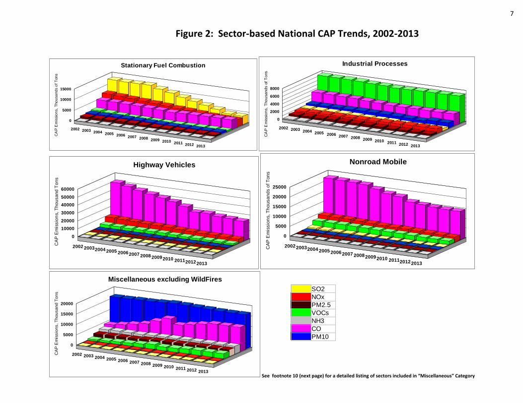
Figure 2: Sector-based National CAP Trends, 2002-2013
See footnote 10 (next page) for a detailed listing of sectors included in “Miscellaneous” Category
2002 2003 2004 2005 2006 2007 2008 2009 2010 2011 2012 2013
0
5000
10000
15000
CA
P E
mis
sio
ns,
Tho
usa
nd
s o
f T
on
s
Stationary Fuel Combustion
2002 2003 2004 2005 2006 2007 2008 2009 2010 2011 2012 2013
0
2000
4000
6000
8000
CA
P E
mis
sio
ns,
Tho
usa
nd
s o
f T
ons
Industrial Processes
2002 20032004 2005 20062007 2008 20092010 201120122013
0
10000
20000
30000
40000
50000
60000
CA
P E
mis
sio
ns, T
ho
usa
nd
To
ns
Highway Vehicles
200220032004 2005 20062007 200820092010 201120122013
0
5000
10000
15000
20000
25000
CA
P E
mis
sio
ns, T
ho
usa
nd
s o
f T
on
s
Nonroad Mobile
2002 2003 2004 2005 2006 2007 2008 2009 2010 2011 2012 2013
0
5000
10000
15000
20000
CA
P E
mis
sio
ns, T
ho
usa
nd
To
ns
Miscellaneous excluding WildFires
SO2
NOx
PM2.5
VOCs
NH3
CO
PM10

8
Figure 2 shows the national emissions data from Figure 1 by five major source Tier9 categories.
CO emissions are largest for the mobile sources, which drive the overall CO reductions.
There are large amounts of NOX emissions for stationary fuel combustion and mobile source sectors, and the overall reductions
are driven by both these sectors.
SO2 emissions are largest for the fuel combustion sector and for electric generating utilities in particular.
Miscellaneous sectors10 show uneven changes, in part due to changes in estimation methods for some of the sources included,
e.g., prescribed fires. Prescribed fires contribute to the increase in CO emissions in 2007 and then decrease in 2008.
Mobile sources highway vehicles and nonroad mobile emissions are based on use of a consistent version of the EPA’s emissions
estimation model “MOVES” (2010b) for on-road emissions and “NONROAD” (2008) for nonroad emissions11. The 2011 NEI v2
is expected to switch to the MOVES2014 model.
After 2011, the Electric-Utility Generation sector (EGUs) emissions (within the stationary fuel combustion sector) and mobile
source emissions show a decrease based on available year-specific data for 2012 and 2013. Other Tiers show no changes after
2011 (beyond 2011, these Tiers use constant emissions due to lack of year-specific emissions).
9. The five “Tier” categories shown in Figure 2 are aggregated from the 13 Tier categories described in the national air emissions trends page, http://www.epa.gov/chief/ttn/trends/index.html 10. A detailed listing of sectors included in “Miscellaneous” are outlined in the 2008 NEI Report (Page 12, Table 3—last column), found at: http://www.epa.gov/ttn/chief/net/2008report.pdf 11. More information on mobile source emissions models can be found at: http://www.epa.gov/otaq/models.htm

9
Figure 3: State Trends of CAP Emissions
Note: Percent change shown on maps does not equal magnitude of emissions (see Table 2)

10

11
Building on Table 1 and Figure 2, the maps in Figure 3 describe the difference in state CAP emissions as the percent change between the two recent NEIs – the 2008 v3 and the 2011 v1; and the percent change over the last 10 years, during the period 2002-2013. The brown (up) arrows are emissions increases and the blue (down) arrows are emission decreases. The size of the arrow describes the amount of the percent change in emissions that occurred, a larger arrow means a larger percent change in emissions during the noted time period; a smaller arrow indicates a smaller percent change. The percent change does not describe the magnitude of the emissions. For instance, there are some cases where a large percent change refers to a relatively small emissions magnitude.
While there may be an overall decrease in pollutant emissions at the national level, some states experience emission increases over time. The states listed in the Table 2 below have some of the larger percent emission increases for specific pollutants, mostly over the 10-year time period, and also several increases over the time period for the recent NEIs 2008 and 2011, particularly for VOC and CO. The table corresponds to the pollutant maps and details the predominant sector(s) that drive the emissions increase in the states with the larger percent increases in emissions. The reasons for these increases can include not only actual increases, but also methods changes. Such issues may be considered when assessing the potential impacts on air quality.
Table 2: Sectors with Emission Increases
Sector Pollutant States with increases NOX VOC SO2 CO NH3 PM2.5 PM10
agriculture livestock operations i CA, HI (very small emissions), LA, MT, ND, SD, WY
chemical manufacturing i LA
commercial marine vessels i AK
consumer commercial solvent use i KS
dust - agriculture operations i i PM2.5: AR, MS, SD; PM10: AR, LA, MS
dust – roads i i PM2.5: AR, MS, SD; PM10: AR, LA, MS, UT
fertilizer application i CA, HI (very small emissions), LA, MT, ND, SD, WY
fires – agricultural burning i i VOC, SO2, PM2.5, CO: SD; CO: AK, ND
fires – prescribed (Note: method changes in estimating agricultural fire and prescribed fire emissions occurred in going from 2008 to 2011)
i i i i i i i NOx: KS VOC: AK, AR, CO, KS, LA, MT, ND, NM, SD, UT, WY SO2: SD, OR CO: AK, ND, SD, WY NH3: AK, LA PM2.5: AR, LA, MS, SD; PM10: AR, LA
fuel combustion EGU oil i i NOx: HI; SO2: OR
fuel comb industrial boilers oil i i NOx: LA; SO2: OR
fuel comb indust boilers natural gas i OK
fuel comb indust boilers biomass i i SO2: OR; PM2.5, PM10: LA
fuel comb residential other nat gas i AK (very small emissions)
highway vehicles heavy duty diesel i ID
oil & gas production*
(Note: improved reporting in 2011)
i i i NOx: CO, KS, LA, NM, OK VOC: AK, AR, CO, KS, LA, MT, ND, NM, UT CO: MT, ND
stone quarrying/ mining i LA
waste disposal & recycling compost i CA * Oil and gas emissions are based on state-submitted point and nonpoint data as well as data from an EPA oil and gas emissions estimation tool.
More information on the data and tool is available in the 2011 NEI documentation (http://www.epa.gov/ttn/chief/net/2011inventory.html)

12
Figure 4: National Select HAP Trends, 2005-2011
For the select HAPs shown, many of the
largest emission increases going from
2005 to 2011 are driven by fires. In the
case of prescribed and wildfires, 2008 and
2011 were more active seasons than 2005.
The 2011 emissions for agriculture burning
are from the draft 2011 NEI v2 which
corrects overestimated emissions for
many Midwestern states in v1 of the 2011
NEI.
The small emission increase in 2011 for
the fuel combustion sectors is mostly for
formaldehyde and acetaldehyde from
residential wood combustion.
The 2011 emissions for the solvents sector
are from the draft 2011 NEI v2 to illustrate
some known HAP corrections, including
for tetrachloroethylene from drycleaning.
All of these HAP emissions have decreased
over the time period for the mobile source
sectors.
Solvent emissions are included in
“industrial” sector in Figure 2.
13
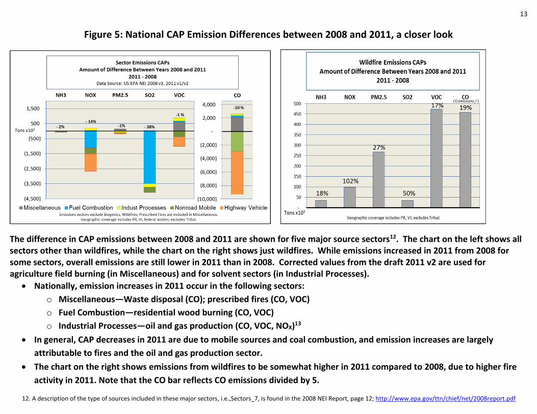
Figure 5: National CAP Emission Differences between 2008 and 2011, a closer look
The difference in CAP emissions between 2008 and 2011 are shown for five major source sectors12. The chart on the left shows all sectors other than wildfires, while the chart on the right shows just wildfires. While emissions increased in 2011 from 2008 for some sectors, overall emissions are still lower in 2011 than in 2008. Corrected values from the draft 2011 v2 are used for agriculture field burning (in Miscellaneous) and for solvent sectors (in Industrial Processes).
Nationally, emission increases in 2011 occur in the following sectors:
o Miscellaneous—Waste disposal (CO); prescribed fires (CO, VOC)
o Fuel Combustion—residential wood burning (CO, VOC)
o Industrial Processes—oil and gas production (CO, VOC, NOX)13
In general, CAP decreases in 2011 are due to mobile sources and coal combustion, and emission increases are largely
attributable to fires and the oil and gas production sector.
The chart on the right shows emissions from wildfires to be somewhat higher in 2011 compared to 2008, due to higher fire
activity in 2011. Note that the CO bar reflects CO emissions divided by 5.
12. A description of the type of sources included in these major sectors, i.e.,Sectors_7, is found in the 2008 NEI Report, page 12; http://www.epa.gov/ttn/chief/net/2008report.pdf
14
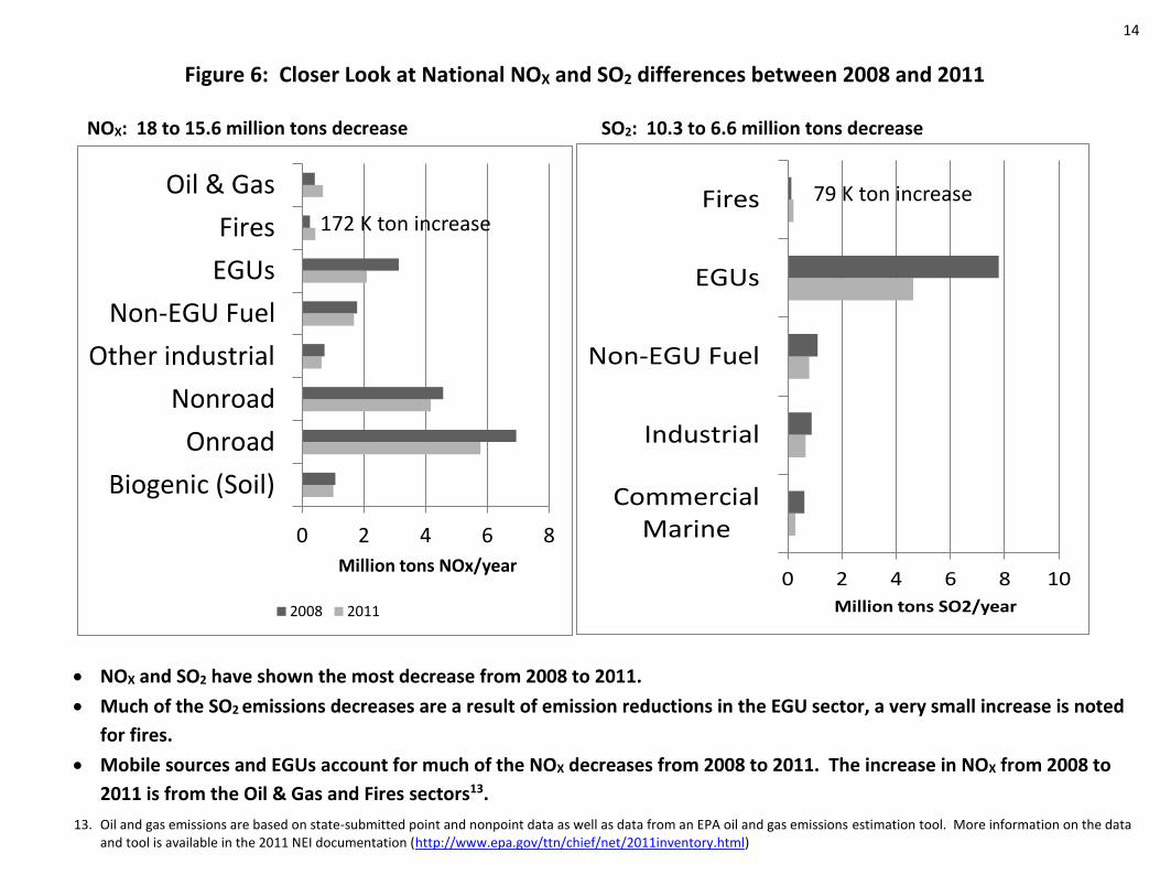
Figure 6: Closer Look at National NOX and SO2 differences between 2008 and 2011
NOX: 18 to 15.6 million tons decrease SO2: 10.3 to 6.6 million tons decrease
NOX and SO2 have shown the most decrease from 2008 to 2011.
Much of the SO2 emissions decreases are a result of emission reductions in the EGU sector, a very small increase is noted
for fires.
Mobile sources and EGUs account for much of the NOX decreases from 2008 to 2011. The increase in NOX from 2008 to
2011 is from the Oil & Gas and Fires sectors13.
13. Oil and gas emissions are based on state-submitted point and nonpoint data as well as data from an EPA oil and gas emissions estimation tool. More information on the data and tool is available in the 2011 NEI documentation (http://www.epa.gov/ttn/chief/net/2011inventory.html)
0 2 4 6 8
Biogenic (Soil)
Onroad
Nonroad
Other industrial
Non-EGU Fuel
EGUs
Fires
Oil & Gas
Million tons NOx/year
2008 2011
172 K ton increase
0 2 4 6 8 10
CommercialMarine
Industrial
Non-EGU Fuel
EGUs
Fires
Million tons SO2/year
79 K ton increase
15
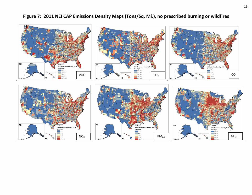
Figure 7: 2011 NEI CAP Emissions Density Maps (Tons/Sq. Mi.), no prescribed burning or wildfires
VOC SO2 CO
NOX PM2.5 NH3

16
These maps show 2011 CAP emissions at a county level using an emissions density metric.
County-specific emissions density is defined as: emissions in Tons/square-mile.
With fire emissions omitted from the analysis, most of the CAP emissions are concentrated on the East Coast
and in major urban areas. They compare well to similar maps generated using 2008 data14
While some of these CAPs are more concentrated in urban areas (CO, NOX, VOCs), others are more
prominent in rural areas (NH3) and others are split evenly (PM2.5).
PM10 is not shown, but its spatial pattern is very similar to the PM2.5 map.
14. 2008 NEI Report, Figures 13-14, page 19, available at: http://www.epa.gov/ttn/chief/net/2008report.pdf

17
Figure 8: Acrolein Emission Density Maps, 2011 NEI v1
These maps provide examples of HAP emission
density (tons/year/sq mile) for acrolein (Figure 8)
and benzene (Figure 9).
While these sample maps describe the national
and regional patterns of HAP emission
distributions in the 2011 NEI v1, they do not assess
or predict the absolute risks to human health and
ecosystems that may be associated with the
presence of any of these specific air pollutants.
Rather, they focus on the intensity of emission
releases.
The top map excludes fires (wild, prescribed and
agricultural). The bottom map shows emissions
when these large fires are included.
Fires are a significant contributor to acrolein
emissions. The bottom map indicates a higher
magnitude of emissions when fires are included.
Including fires also changes the spatial pattern -
highlighting the western U.S. where many large
wildfires occurred in 2011 and in the southeast as
well as for some of the middle states where many
prescribed fires occurred in 2011.
18
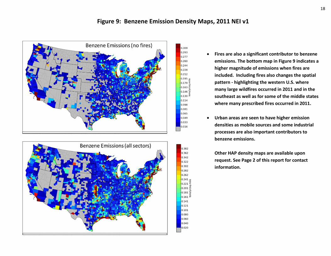
Figure 9: Benzene Emission Density Maps, 2011 NEI v1
Fires are also a significant contributor to benzene
emissions. The bottom map in Figure 9 indicates a
higher magnitude of emissions when fires are
included. Including fires also changes the spatial
pattern - highlighting the western U.S. where
many large wildfires occurred in 2011 and in the
southeast as well as for some of the middle states
where many prescribed fires occurred in 2011.
Urban areas are seen to have higher emission
densities as mobile sources and some industrial
processes are also important contributors to
benzene emissions.
Other HAP density maps are available upon
request. See Page 2 of this report for contact
information.

19
Figure 10: Wild, Prescribed and Agricultural Fires in the 2011 NEI
Fires are significant emitters of PM2.5, VOC, and several HAPs, i.e., acrolein, formaldehyde, and acetaldehyde.
The map on the left shows PM2.5 emissions by fire type with yellow indicating prescribed fires, green indicating
agricultural fires and brown indicating wildfires. The Southeast is dominated by prescribed burning, while the western
U.S. has more wildfire activity.
These three fire types account for about 20 million acres burned and 2.9 million tons of PM2.5, which is approximately
32% of total PM2.5 emissions in the 2011 NEI.
The chart on the right shows the trend of PM2.5 emissions from wildfires and prescribed fires from 2007 using a relative
consistent methodology (2007 was chosen as the base year due to the fact that previous years used a very different
method for estimating these fire emissions). These two fires types contribute about 2.3 million tons of PM2.5 emissions.
Wildfires account for the variability seen in total emissions from these large fires.
0
500
1000
1500
2000
2500
2007 2008 2009 2010 2011
PM
2.5
Em
issi
on
s (x
10
00
To
ns)
Year
Prescribed (Rx) Fires Wild Fires
20
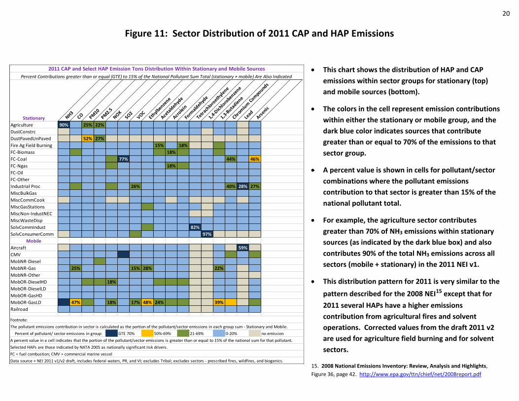
Figure 11: Sector Distribution of 2011 CAP and HAP Emissions
2011 CAP and Select HAP Emission Tons Distribution Within Stationary and Mobile Sources
Percent Contributions greater than or equal (GTE) to 15% of the National Pollutant Sum Total (stationary + mobile) Are Also Indicated
Stationary NH3CO PM
10
PM2.5
NOXSO2
VOCEth
ylbenze
ne
Aceta
ldehyd
e
Acrole
in
Form
aldehyd
e
Tetrach
loro
ethyl
ene
1,4-D
ichlo
robenze
ne
1,3-B
utadie
ne
Chrom
ium
Com
pounds
Lead
Arsenic
Agriculture 90% 25% 22%
DustConstrc
DustPavedUnPaved 52% 27%
Fire Ag Field Burning 15% 18%
FC-Biomass 18%
FC-Coal 77% 44% 46%
FC-Ngas 18%
FC-Oil
FC-Other
Industrial Proc 26% 40% 28% 27%
MiscBulkGas
MiscCommCook
MiscGasStations
MiscNon-IndustNEC
MiscWasteDisp
SolvCommIndust 82%
SolvConsumerComm 97%
Mobile
Aircraft 59%
CMV
MobNR-Diesel
MobNR-Gas 25% 15% 28% 22%
MobNR-Other
MobOR-DieselHD 18%
MobOR-DieselLD
MobOR-GasHD
MobOR-GasLD 47% 18% 17% 48% 24% 39%
Railroad
GTE 70% 50%-69% 21-69% 0-20% no emission
Data source = NEI 2011 v1/v2 draft, includes federal waters, PR, and VI; excludes Tribal; excludes sectors - prescribed fires, wildfires, and biogenics.
Footnote:
The pollutant emissions contribution in sector is calculated as the portion of the pollutant/sector emissions in each group sum - Stationary and Mobile.
Selected HAPs are those indicated by NATA 2005 as nationally significant risk drivers.
FC = fuel combustion; CMV = commercial marine vessel
A percent value in a cell indicates that the portion of the pollutant/sector emissions is greater than or equal to 15% of the national sum for that pollutant.
Percent of pollutant/ sector emissions in group:
This chart shows the distribution of HAP and CAP
emissions within sector groups for stationary (top)
and mobile sources (bottom).
The colors in the cell represent emission contributions
within either the stationary or mobile group, and the
dark blue color indicates sources that contribute
greater than or equal to 70% of the emissions to that
sector group.
A percent value is shown in cells for pollutant/sector
combinations where the pollutant emissions
contribution to that sector is greater than 15% of the
national pollutant total.
For example, the agriculture sector contributes
greater than 70% of NH3 emissions within stationary
sources (as indicated by the dark blue box) and also
contributes 90% of the total NH3 emissions across all
sectors (mobile + stationary) in the 2011 NEI v1.
This distribution pattern for 2011 is very similar to the
pattern described for the 2008 NEI15 except that for
2011 several HAPs have a higher emissions
contribution from agricultural fires and solvent
operations. Corrected values from the draft 2011 v2
are used for agriculture field burning and for solvent
sectors.
15. 2008 National Emissions Inventory: Review, Analysis and Highlights,
Figure 36, page 42. http://www.epa.gov/ttn/chief/net/2008report.pdf

21
Figure 12: Black Carbon Emissions in the 2011 NEI v1
EPA previously reported BC for 200516. In that inventory, about 52% of total BC came from mobile sources and about 35% from open burning.
The chart on the right shows that significant BC contributions for 2011 are from: mobile source diesel equipment and engines; biomass burning from wild and prescribed fires; and fuel combustion - residential wood and EGUs.
16. EPA Report to Congress, Chapter 4, located at http://www.epa.gov/blackcarbon
Fires42%
Mobile Nonroad
22%
Mobile Onroad19%
Fuel Combustion
11%
MiscOther4%
Industrial Processes
2%U.S. 2011
Black Carbon Emissions
Source: U.S. EPA 2011 NEI V1; 2011v6 Emissions Modeling Platform
Black carbon (BC) is a component of PM2.5 emissions. For most sectors, BC is estimated by applying speciation profiles to the PM2.5
emissions.
BC is about 9% of total PM2.5 emissions in the 2011 NEI v1.
The chart on the left shows that in 2011, fires (wild, prescribed, and agricultural fires)
account for 42% of BC emissions and mobile sources about 41%.
90% of the mobile source BC emissions come from diesel fuel combustion.

22
Figure 13: 2011 Emissions by Climate Region
This map describes the National Climatic Data Center (NCDC) Regions based on the climatological map developed and maintained by NOAA (U.S. National Oceanic and Atmospheric Administration). The U.S. is split into 9 regions based on homogeneity in meteorological conditions (meteorology, in turn, affects many emissions and emission processes) as determined by data analysis conducted by NOAA. HI and AK are excluded from these maps and related analyses.
This map is basis of the regional analysis shown in Figure 14.

23
Figure 14: Regional Ozone and PM2.5 Formation Potential Based on State CAP/ HAP Emission Intensity
These maps use the 9 climate regions defined on the previous page
and show the state CAP and HAP emission contributions associated
with the formation of ozone (top) and PM2.5 (bottom map).
Emissions from biogenics and wildfires are excluded.
The pollutants listed on each map are CAPs and HAPs known to be
ozone and PM2.5 precursors. The HAPs listed have been identified
for these maps due to their cancer and non-cancer risks17.
The intensity of color for each climate region indicates the amount
of emissions in a given region and how regions rank against each
other, with red and orange being high emission zones. For both
PM2.5 and ozone, the higher emission areas are in the south,
southeast, and the industrial midwest regions.
The symbols located on each state indicate the relative percent
contribution of the state emissions to the corresponding climate
region. Larger symbols indicate a larger contribution of emissions to
the region. For example, the south, southeast, and central regions
have relatively large amounts of both PM2.5 and ozone forming
emissions, and Texas, Florida, and Ohio contribute the most in each
region respectively.
In regions with relatively low amounts of PM2.5 and ozone forming
emissions, states such as Michigan, Colorado, Wyoming, Nebraska,
and North Dakota contribute significant amounts of emissions to
their respective regions. In the western climate region, California is
the dominant contributor to both ozone and PM2.5 .
17. U.S. EPA National Air Toxics Assessment 2005, http://www.epa.gov/ttn/atw/nata2005/