
Embodied Technological Progress and Productivity Slowdown ...

Do the Productivity Slowdown and the Inequality Increase Have a Common
Cause?Jason Furman (joint work
with Peter Orszag)
Peterson Institute for International Economics | 1750 Massachusetts Ave., NW | Washington, DC 20036
Peterson Institute for International EconomicsWashington, DC
November 9, 2017

Outline
1. The Question
2. Key Facts about Productivity and Inequality to Explain
3. Evidence for Reduced Dynamism
4. Evidence for Reduced Competition
5. Possible Explanations

Outline
1. The Question
2. Key Facts about Productivity and Inequality to Explain
3. Evidence for Reduced Dynamism
4. Evidence for Reduced Competition
5. Possible Explanations

Productivity slowdown has coincided with increased inequality
Source: Bureau of Labor Statistics; World Wealth and Income Database; author’s calculations.
-25
-20
-15
-10
-5
0
5
10
15
20
Bottom 90% Top 1%
1948-1973 1973-2015
Change in Share of IncomePercentage Points
0.0
0.5
1.0
1.5
2.0
2.5
3.0
3.5
Productivity
1948-1973 1973-2015
Nonfarm Business Productivity GrowthPercent, Annual Rate

How might productivity and inequality be related?
Traditional Explanation: Skill-biased technological change leads to inequality (e.g., Goldin and Katz 2010). This is in some tension with slowing productivity growth and the race with education explains less recently.

How might productivity and inequality be related?
Traditional Explanation: Skill-biased technological change leads to inequality (e.g., Goldin and Katz 2010). This is in some tension with slowing productivity growth and the race with education explains less recently.
Inequality Harms Growth: Some macro evidence (e.g., Ostry et al 2014) and micro channels (e.g., Bell et al 2016), but questions about the validity of the macro results and also the magnitudes.
Our argument: Common Cause: Reduced dynamism and reduced competition can cause lower productivity & inequality.

Recent research on these issues
Firm-level inequality is important (Barth et al 2014 and Song et al 2016)
Industries with more concentration invest less (Gutiérrez and Philippon 2016 and Goldman Sachs 2016)
At a macro level, the rise of concentration helps explain the decline of the labor share (Barkai 2016)
Industries with more concentration have seen larger declines in the labor share of income—but they explain this as sorting (Autor et al. 2017)

Outline
1. The Question
2. Key Facts about Productivity and Inequality to Explain
3. Evidence for Reduced Dynamism
4. Evidence for Reduced Competition
5. Possible Explanations

Facts a consistent story should explain
• Productivity growth has slowed But some firms are doing considerably better than others. Moreover, diffusion to lower performing firms is down.

Facts a consistent story should explain
• Productivity growth has slowed But some firms are doing considerably better than others. Moreover, diffusion to lower performing firms is down.
• Inequality has increased Largely an increase in inequality of labor income. Smaller
contribution from increased inequality of capital income and labor-capital share.
Within labor income, largely between firms not within firms.

More firms are earning super-normal returns
Note: The annual return to common equity is displayed for the stated year (i.e. 1996 or 2014) for all members of the S&P 500 as of the last week of May the following year (i.e. 1993 or 2015). The distribution of returns covers all members of the S&P 500 in the year indicated and buckets firms by single percentage-point intervals, smoothed by averaging over 20 five percentage-point intervals. The modal return in a given year was subtracted from each firm’s return such that both distributions are centered approximately at zero. The tail ends of the distribution (above or below a 60 percent or 20 percent return on equity, respectively) were trimmed for optical clarity. Source: Bloomberg Professional Service; CEA calculations.
1996
2014
0
4
8
12
16
20
24
28
-30 -25 -20 -15 -10 -5 0 5 10 15 20 25 30 35
Distribution of Annual Returns on Equity Across S&P 500Count of Firms with Given Return on Equity
Annual Return on Equity (less Modal Return)

Dramatic returns on invested capital potentially reflect economic rents
Note: The return on invested capital definition is based on Koller et al (2015), and the data presented here are updated and augmented versions of the figures presented in Chapter 6 of that volume. The McKinsey data includes McKinsey analysis of Standard & Poor’s data and exclude financial firms from the analysis because of the practical complexities of computing returns on invested capital for such firms. For further discussion of that point, see Koller et al. (2015).Source: Koller et al. (2015); McKinsey & Company.
Median
90 Percentile2014
75 Percentile
25 Percentile0
20
40
60
80
100
120
1965 1975 1985 1995 2005 2015
Return on Invested Capital Excluding Goodwill, U.S. Publicly-Traded Nonfinancial FirmsPercent

The OECD has shown that frontier firms have pulled away from other firms

Top 1% are accruing larger share of income
Source: World Wealth and Income Database; Saez and Zucman (2016); CEA calculations.

Increase in wage inequality is between firms, not within firms
Note: Only firms and individuals in firms with at least 20 employees are included. Only full-time individuals aged 20 to 60 are included in all statistics, where full-time is defined as earning the equivalent of minimum wage for 40 hours per week in 13 weeks. Individuals and firms in public administration or educational services are not included. Firm statistics are based on the average of mean log earnings at the firms for individuals in that percentile of earnings in each year. Data on individuals/their firms are based on individual log earnings minus firm mean log earnings for individuals in that percentile of earnings in each year. All values are adjusted for inflation using the PCE price index.Source: Song et al. (2016).
25th Percentile50th Percentile
90th Percentile
99th Percentile
-0.1
0.0
0.1
0.2
0.3
0.4
0.5
0.6
1978 1982 1986 1990 1994 1998 2002 2006 2010 2014
Within Firms: Change in Wage Structure Since 1981Change in Log Real Annual Wage
2013
25th Percentile
50th Percentile
90th Percentile
99th Percentile
-0.1
0.0
0.1
0.2
0.3
0.4
0.5
0.6
1978 1982 1986 1990 1994 1998 2002 2006 2010 2014
Between Firms: Change in Wage Structure Since 1981Change in Log Real Annual Wage
2013

Outline
1. The Question
2. Key Facts about Productivity and Inequality to Explain
3. Evidence for Reduced Dynamism
4. Evidence for Reduced Competition
5. Possible Explanations

Reduced entry of firms
Source: Census Bureau, Business Dynamics Statistics; CEA calculations.
Firm Entry Rate
2014
Firm Exit Rate
6
8
10
12
14
16
1975 1980 1985 1990 1995 2000 2005 2010 2015
Firm Dynamism, 1978-2014Percent

Younger firms are an increasingly small share
Note: “Young firms” are five years old or less.Source: Census Bureau, Business Dynamics Statistics; CEA calculations.
Share of Total Firms (left axis)
2014
Share of Total Employment (right axis)
10
12
14
16
18
20
22
24
0
10
20
30
40
50
60
1980 1985 1990 1995 2000 2005 2010 2015
Young Firms as a Share of the EconomyPercent Percent

Declining labor market fluidity
Source: Census Bureau, Business Dynamics Statistics; CEA calculations.
Job Creation Rate
2014
Job Destruction Rate
10
12
14
16
18
20
22
1975 1980 1985 1990 1995 2000 2005 2010 2015
Labor Market Dynamism, 1977-2014Percent

Migration rates of migration have also fallen
Source: Molloy, Smith, and Wozniak (2014).
Inter-county, same state(left axis)
Intra-county (right axis)
2013
0
0.02
0.04
0.06
0.08
0.1
0.12
0.14
0.16
0.18
0.010
0.015
0.020
0.025
0.030
0.035
0.040
0.045
1948 1955 1962 1969 1976 1983 1990 1997 2004 2011
Migration Rates by DistanceMigration Rate Migration Rate
Inter-state (left axis)

Outline
1. The Question
2. Key Facts about Productivity and Inequality to Explain
3. Evidence for Reduced Dynamism
4. Evidence for Reduced Competition
5. Possible Explanations

The return to productive capital has risen recently, despite a large decline bond
yields…
Note: The rate of return to all private capital was calculated by dividing private capital income in current dollars by the private capital stock in current dollars. Private capital income is defined as the sum of 1) corporate profits ex. federal government tax receipts on corporate income, 2) net interest and miscellaneous payments, 3) rental income of all persons, 4) business current transfer payments, 5) current surpluses of government enterprises, 6) property and severance taxes, and 7) the capital share of proprietors’ income, where the capital share was assumed to match the capital share of aggregate income. The private capital stock is defined as the sum of 1) the net stock of produced private assets for all private enterprises, 2) the value of total private land inferred from the Financial Accounts of the United States, and 3) the value of U.S. capital deployed abroad less foreign capital deployed in the United States. The return to nonfinancial corporate capital is that reported by the Bureau of Economic Analysis, and the one-year real interest rate is that reported by Robert Shiller at Yale University.Source: Bureau of Economic Analysis; Federal Reserve Board of Governors; Robert Shiller, Yale University; CEA calculations.
DifferenceReturn to All Private Capital
One-Year Real Interest
Rate-4
-2
0
2
4
6
8
10
12
1985 1990 1995 2000 2005 2010 2015
Return to Capital vs. Safe Rate of Return, 1985-2015Percent
2015

…While business investment has trended down
Note: Shading denotes recession.Source: Bureau of Labor Statistics, National Income and Product Accounts; CEA calculations.
2016:Q3
8
9
10
11
12
13
14
15
16
1950 1960 1970 1980 1990 2000 2010
Business Fixed Investment as Share of GDPPercent

Concentration has increased in most sectors
Note: Concentration ratio data is displayed for all North American Industry Classification System (NAICS) sectors for which data is available from 1997 to 2012.Source: Economic Census, Census Bureau.
Industry
Percentage Point Change in Revenue Share Earned by 50
Largest Fi rms, 1997-2012
Transportation and Warehous ing 11.4
Reta i l Trade 11.2
Finance and Insurance 9.9
Wholesa le Trade 7.3
Real Es tate Renta l and Leas ing 5.4
Uti l i ties 4.6
Educational Services 3.1
Profess ional , Scienti fi c and Technica l Services 2.6
Adminis trative/ Support 1.6
Accommodation and Food Services 0.1
Other Services , Non-Publ ic Admin -1.9
Arts , Enterta inment and Recreation -2.2
Health Care and Ass is tance -1.6
Change in Market Concentration by Sector, 1997-2012
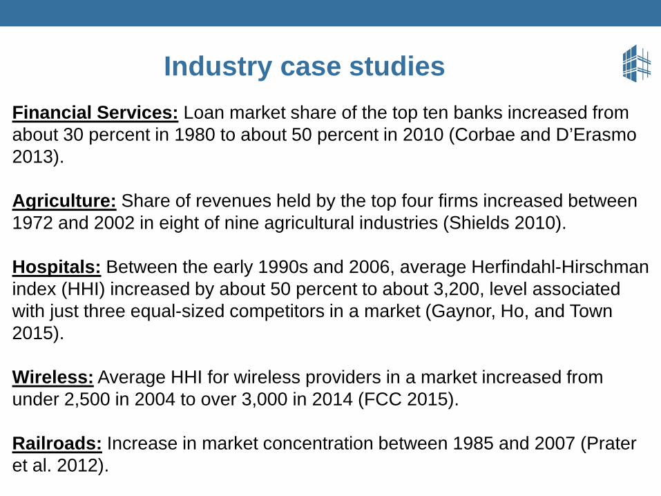
Industry case studiesFinancial Services: Loan market share of the top ten banks increased from about 30 percent in 1980 to about 50 percent in 2010 (Corbae and D’Erasmo 2013).
Agriculture: Share of revenues held by the top four firms increased between 1972 and 2002 in eight of nine agricultural industries (Shields 2010).
Hospitals: Between the early 1990s and 2006, average Herfindahl-Hirschman index (HHI) increased by about 50 percent to about 3,200, level associated with just three equal-sized competitors in a market (Gaynor, Ho, and Town 2015).
Wireless: Average HHI for wireless providers in a market increased from under 2,500 in 2004 to over 3,000 in 2014 (FCC 2015).
Railroads: Increase in market concentration between 1985 and 2007 (Prater et al. 2012).

Outline
1. The Question
2. Key Facts about Productivity and Inequality to Explain
3. Evidence for Reduced Dynamism
4. Evidence for Reduced Competition
5. Possible Explanations

Antitrust enforcement has become less vigorous

Network externalities

Common ownership has grown

Land use restrictions and occupational licensing are potential sources of reduced
dynamism
Source: Gyourko and Molloy (2015); The Council of State Governments (1952); Greene (1969); Kleiner (1990); Kleiner (2006); and Kleiner and Krueger (2013), Westat data; CEA calculations..
Real House Prices
2013
Real Construction Costs
70
100
130
160
190
220
250
1980 1984 1988 1992 1996 2000 2004 2008 2012
Real Construction Costs and House Prices Over TimeIndex, 1980=100
Share of Workers with a State Occupational License

Do the Productivity Slowdown and the Inequality Increase Have a Common
Cause?Jason Furman (joint work
with Peter Orszag)
Peterson Institute for International Economics | 1750 Massachusetts Ave., NW | Washington, DC 20036
Peterson Institute for International EconomicsWashington, DC
November 9, 2017