Photoshop A2 Film Poster
10
PHOTOSHOP A2 FILM POSTER BY CALLUM GOTT
-
Upload
hhscallumgotta2 -
Category
Education
-
view
95 -
download
2
Transcript of Photoshop A2 Film Poster
PHOTOSHOP A2 FILM POSTER
BY CALLUM GOTT
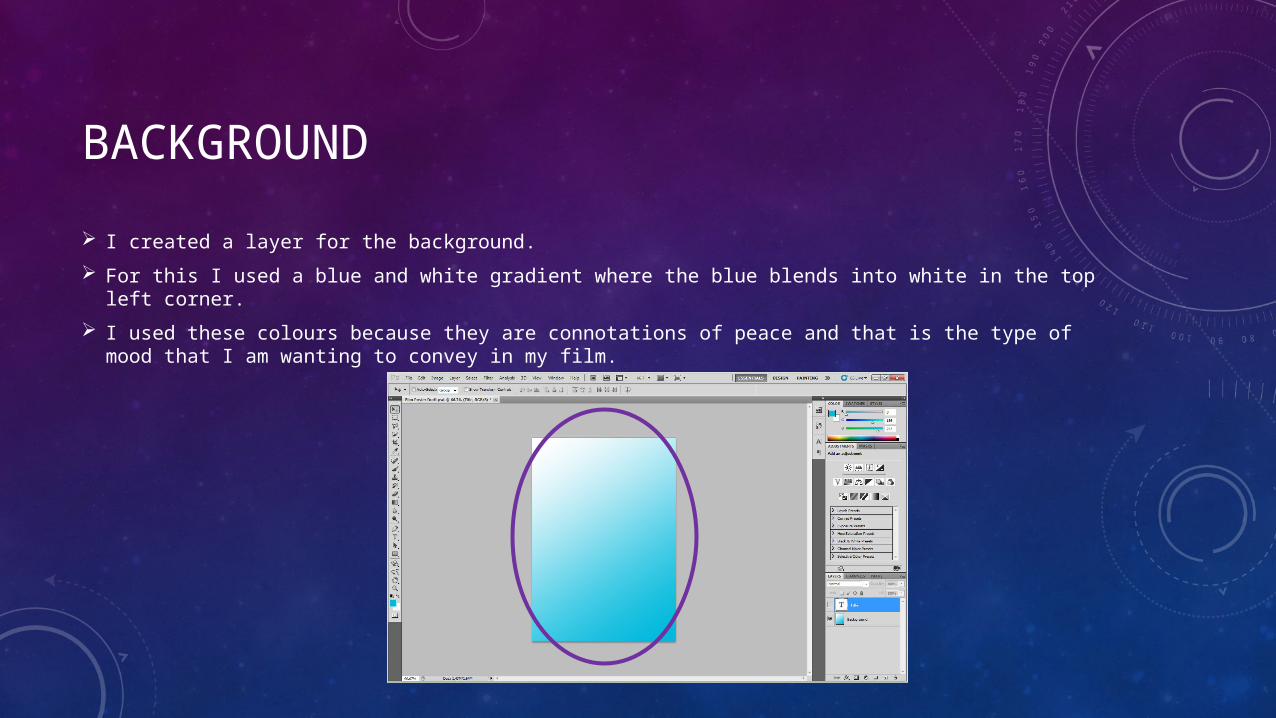
BACKGROUND
I created a layer for the background.
For this I used a blue and white gradient where the blue blends into white in the top left corner.
I used these colours because they are connotations of peace and that is the type of mood that I am wanting to convey in my film.
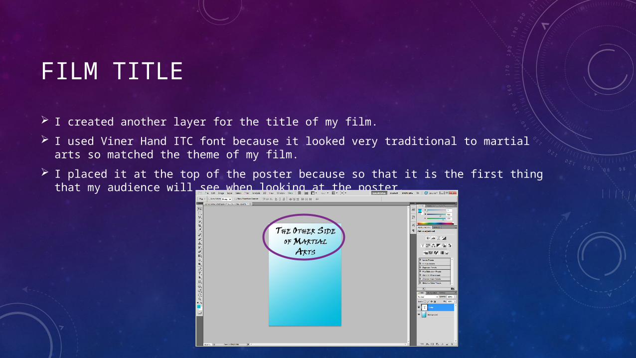
FILM TITLE
I created another layer for the title of my film.
I used Viner Hand ITC font because it looked very traditional to martial arts so matched the theme of my film.
I placed it at the top of the poster because so that it is the first thing that my audience will see when looking at the poster.
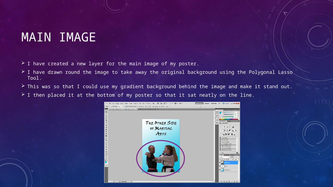
MAIN IMAGE
I have created a new layer for the main image of my poster.
I have drawn round the image to take away the original background using the Polygonal Lasso Tool.
This was so that I could use my gradient background behind the image and make it stand out.
I then placed it at the bottom of my poster so that it sat neatly on the line.
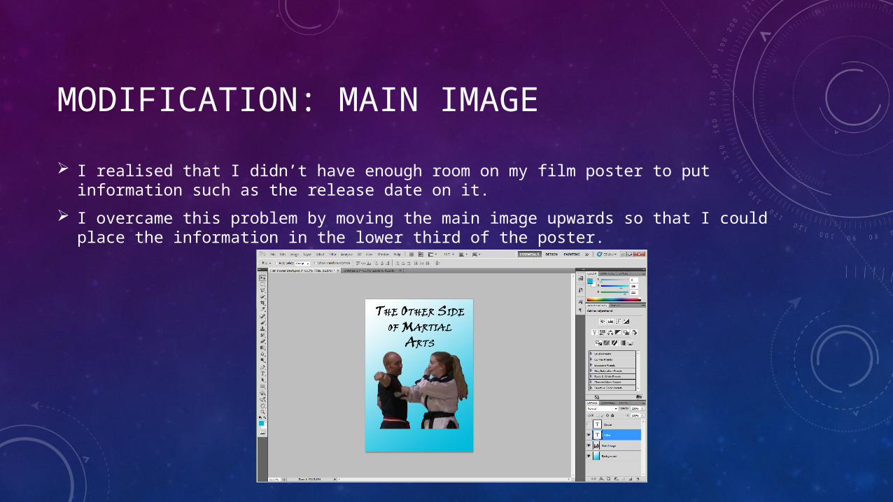
MODIFICATION: MAIN IMAGE
I realised that I didn’t have enough room on my film poster to put information such as the release date on it.
I overcame this problem by moving the main image upwards so that I could place the information in the lower third of the poster.
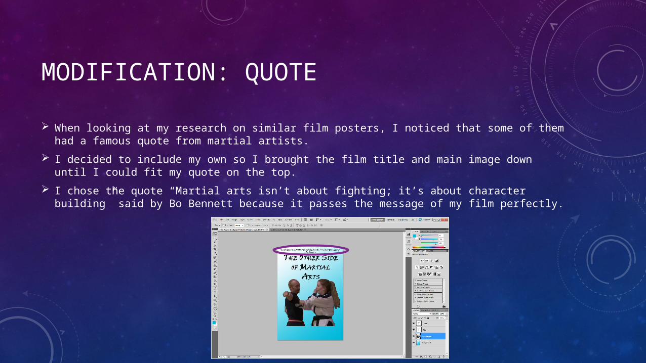
MODIFICATION: QUOTE
When looking at my research on similar film posters, I noticed that some of them had a famous quote from martial artists.
I decided to include my own so I brought the film title and main image down until I could fit my quote on the top.
I chose the quote “Martial arts isn’t about fighting; it’s about character building” said by Bo Bennett because it passes the message of my film perfectly.
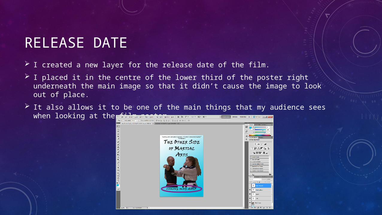
RELEASE DATE
I created a new layer for the release date of the film.
I placed it in the centre of the lower third of the poster right underneath the main image so that it didn’t cause the image to look out of place.
It also allows it to be one of the main things that my audience sees when looking at the film poster.
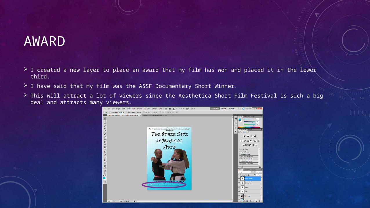
AWARD
I created a new layer to place an award that my film has won and placed it in the lower third.
I have said that my film was the ASSF Documentary Short Winner.
This will attract a lot of viewers since the Aesthetica Short Film Festival is such a big deal and attracts many viewers.
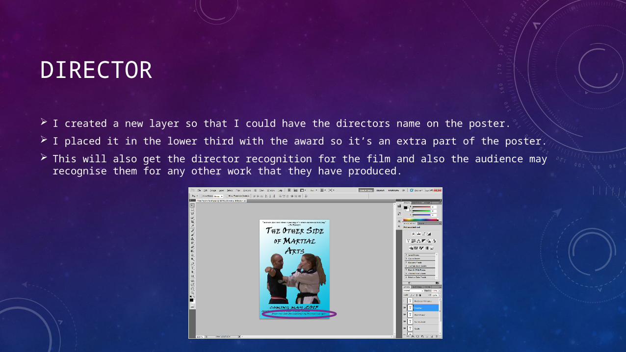
DIRECTOR
I created a new layer so that I could have the directors name on the poster.
I placed it in the lower third with the award so it’s an extra part of the poster.
This will also get the director recognition for the film and also the audience may recognise them for any other work that they have produced.
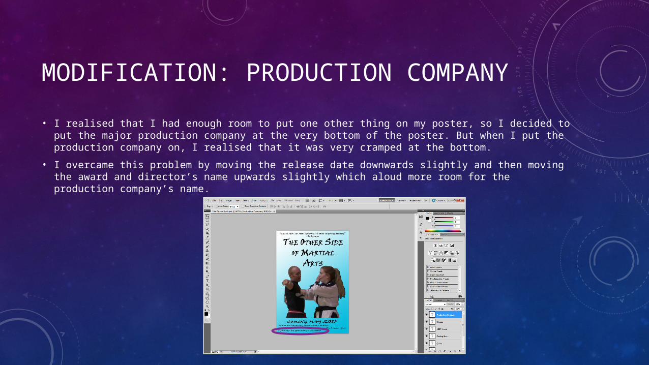
MODIFICATION: PRODUCTION COMPANY
• I realised that I had enough room to put one other thing on my poster, so I decided to put the major production company at the very bottom of the poster. But when I put the production company on, I realised that it was very cramped at the bottom.
• I overcame this problem by moving the release date downwards slightly and then moving the award and director’s name upwards slightly which aloud more room for the production company’s name.