Part 8
22
Double Page Magazine Spread
Transcript of Part 8

Double Page Magazine Spread
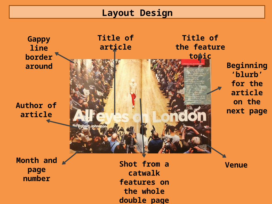
Layout Design
Beginning ‘blurb’ for the article on the
next page
Title of the feature topic
Month and page number
Shot from a catwalk features on the
whole double page spread
Venue
Gappy line border around
Author of article
Title of article

Style of Font
The title is big, bold and white (recurrent in all GQ double page
spreads) to immediately
catch attention
Same font author is written
smaller no engaging too
much attention
Font is white and formal – kept simple
as the picture is the main
feature in this spread
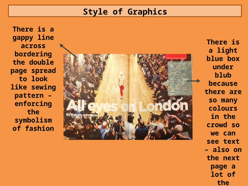
Style of Graphics
There is a gappy line across
bordering the double page
spread to look like sewing pattern –
enforcing the symbolism of
fashion
There is a light blue box
under blub because there are so many
colours in the crowd so we
can see text – also on the next page a
lot of the clothes are
blue to this is to match the
clothes
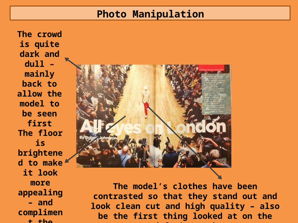
Photo Manipulation
The crowd is quite dark and dull –
mainly back to allow the model to be
seen first
The model’s clothes have been contrasted so that they stand out and look clean cut and high quality – also be
the first thing looked at on the article by readers
The floor is brightened to make it look
more appealing –
and compliment the model
Organisation of Information
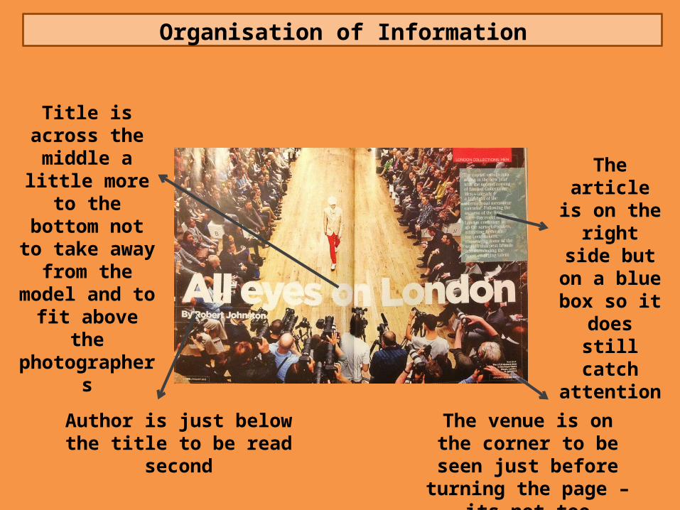
Title is across the middle a little more to the
bottom not to take away from
the model and to fit above the
photographers
Author is just below the title to be read second
The venue is on the corner to be seen just before
turning the page – its not too important
The article is on the right
side but on a blue box so it
does still catch
attention

Double Page Magazine Spread

Layout Design
Beginning ‘blurb’ for the article on the
next page
Title of article
Author and illustrator of
the article
Animated picture that featured on the whole double page
Title of the feature topic
Main purpose of the article
Month and page number
Style of Font
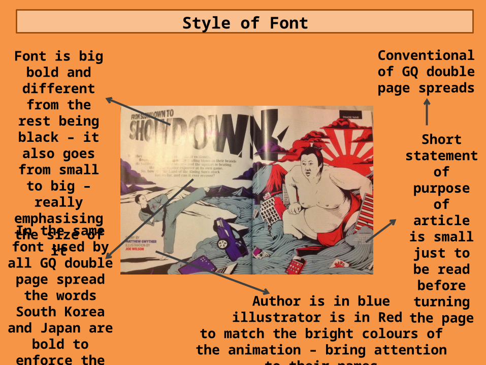
Font is big bold and different from the rest
being black – it also goes from small to big –
really emphasising the size of it
In the same font used by all GQ
double page spread the words South Korea and Japan
are bold to enforce the countries this is
on
Short statement of purpose of
article is small just to
be read before
turning the page
Author is in blueillustrator is in Red
to match the bright colours of the animation – bring attention to their names
Conventional of GQ double page
spreads
Style of Graphics
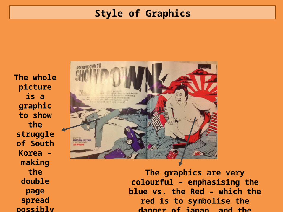
The whole picture is a graphic to show the
struggle of South Korea –
making the double page
spread possibly more
appealing The graphics are very colourful – emphasising the blue vs. the Red –
which the red is to symbolise the danger of japan, and the humble South Korea

Photo Manipulation
Font goes from small to big to enforce the impact of
emphasise the struggle
Colours are bold and eye catching
There are lots of lines and
detail to shapes,
highlighting and outlining – Also animation
is popular in these
countries so its relating to
their culture
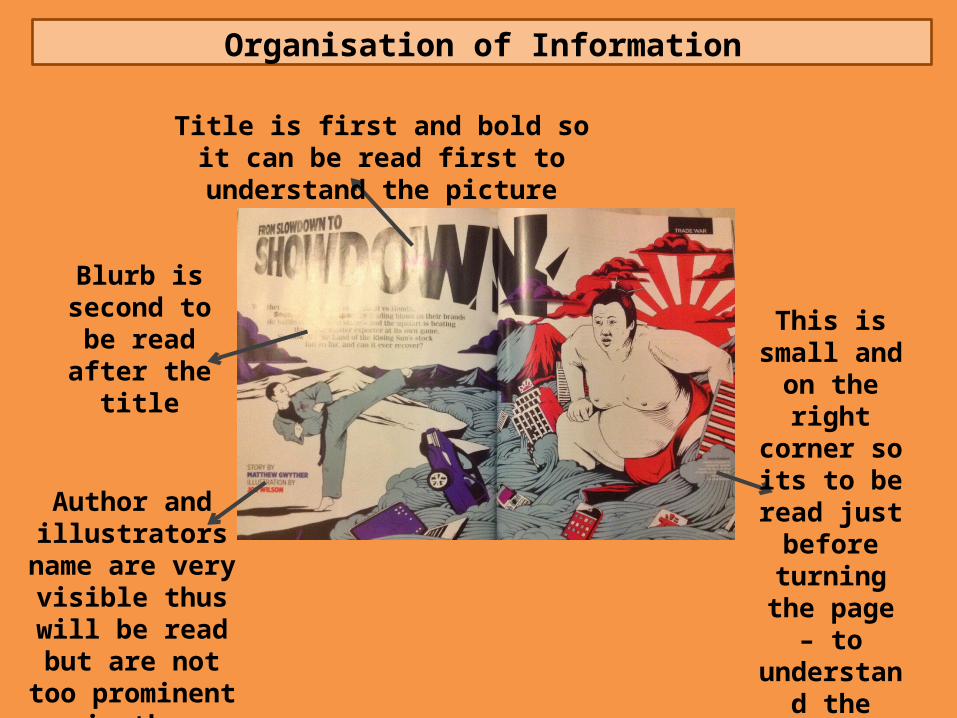
Organisation of Information
Blurb is second to be read after the
title
Author and illustrators name are very visible
thus will be read but are not too
prominent in the feature
This is small and on the right corner so its to be read just
before turning the page – to
understand the stock flotation
Title is first and bold so it can be read first to understand the picture
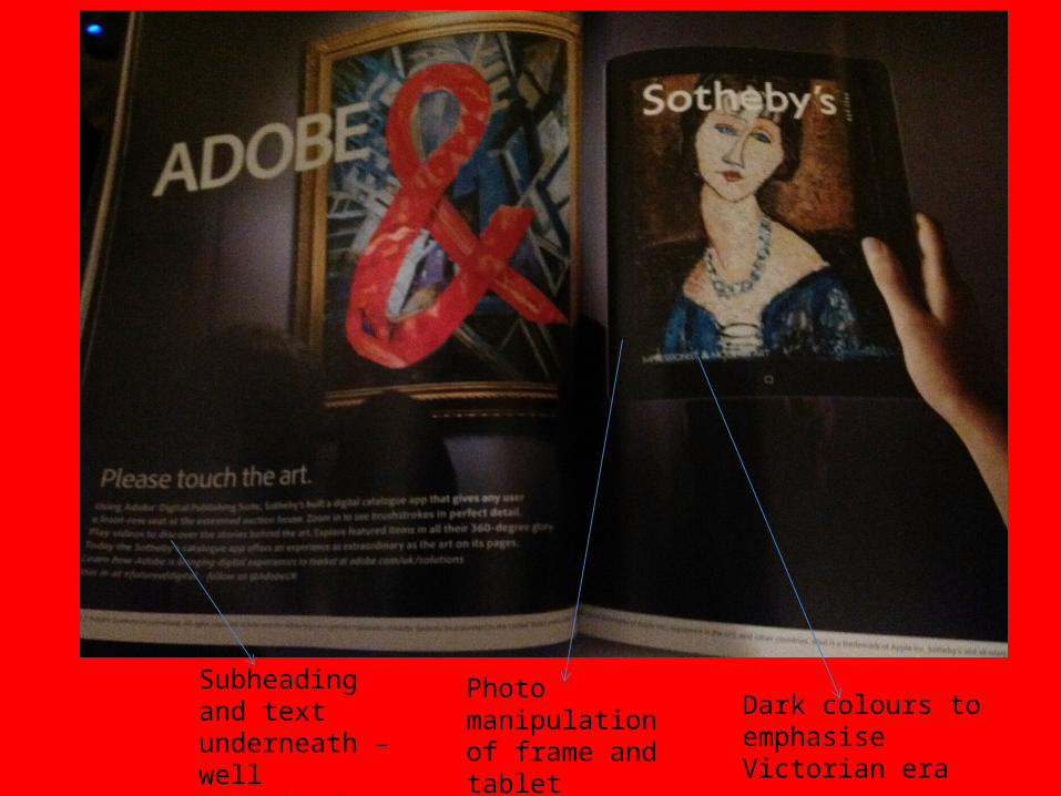
Subheading and text underneath – well organised information
Dark colours to emphasise Victorian era
Photo manipulation of frame and tablet
Interesting and relevant accompanying images
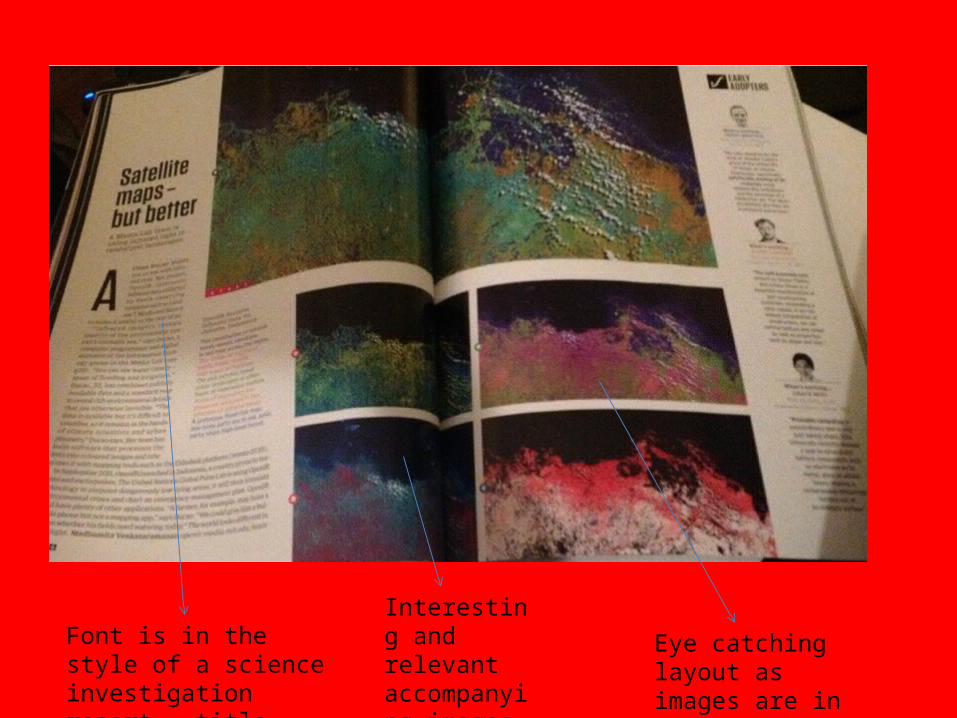
Font is in the style of a science investigation report – title then findings
Eye catching layout as images are in the centre

Eye catching birds eye view of a new home design – very effective
Text is underneath and quite minimal so the main focus can be on the images
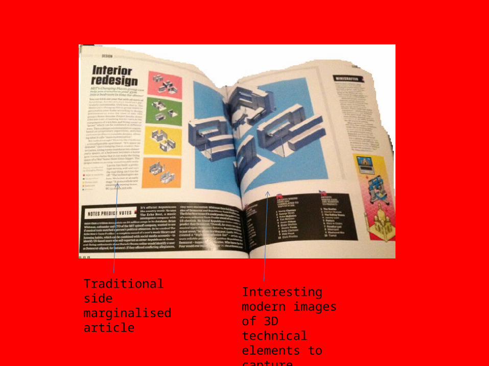
Interesting modern images of 3D technical elements to capture reader’s attention
Traditional side marginalised article
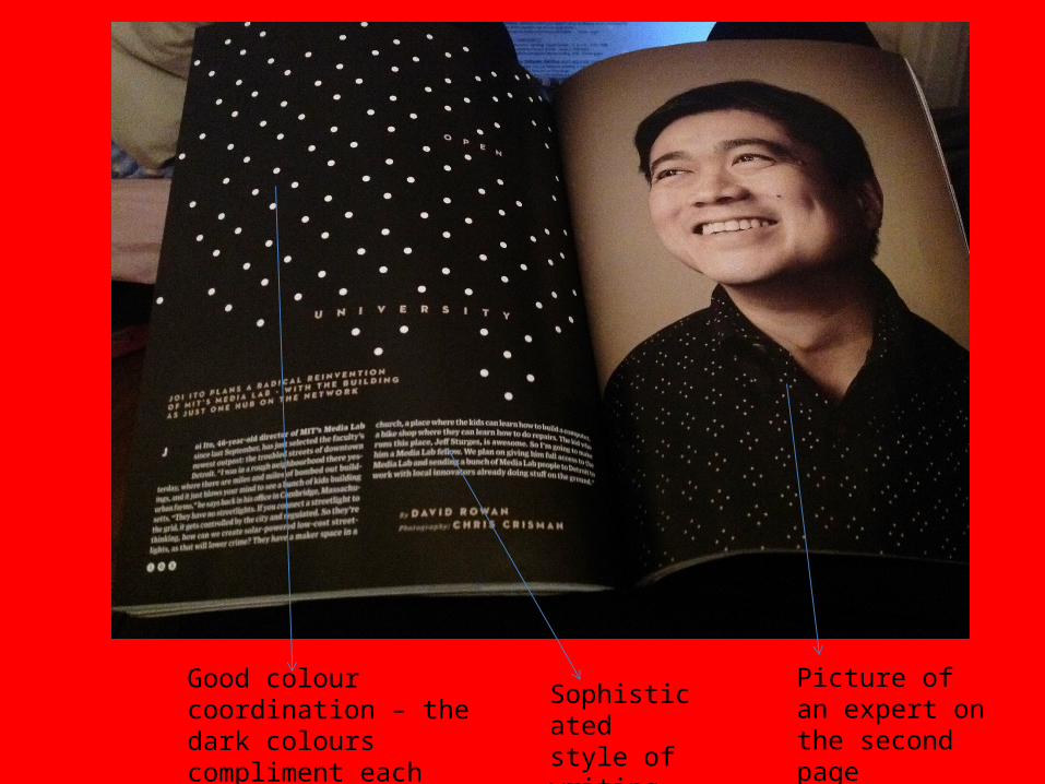
Good colour coordination – the dark colours compliment each other and connote seriousness
Picture of an expert on the second page
Sophisticated style of writing
layout design
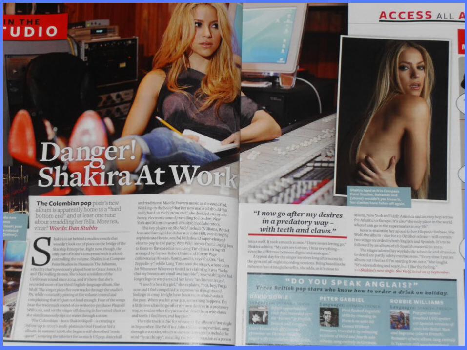
The background is a photograph of the famous singer.
Another, smaller photo which slightly overlaps the larger one and has a white frame to make it stand out.
The title is bold and in white to make it stand out to the reader.
It overlaps the large image of Shakira
how is the layout effective and eye catching?
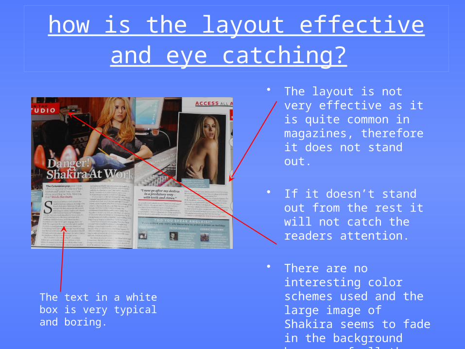
• The layout is not very effective as it is quite common in magazines, therefore it does not stand out.
• If it doesn’t stand out from the rest it will not catch the readers attention.
• There are no interesting color schemes used and the large image of Shakira seems to fade in the background because of all the overlapping images and text.
The text in a white box is very typical and boring.

style of graphics/photo manipulation
• Some of the colours in the larger image appear to be enhanced and made brighter in order to make the image more bold and eye-catching.
• The smaller photograph has been air-brushed and touched up.
• The lighting has also been darkened to add a shadow around her, thus making her stand out more in the frame.

organisation of information
• At first glance the first thing you see is the larger image of Shakira because of its size and its placed almost at the centre of the layout.
• The next thing that’s most visible is the second photograph of the singer
• Finally the reader is drawn to the bold white title which leads them to the text below.