PARETO CHARTS - Denver TO CREATE A PARETO CHART • Collect your data • Analyze and categorize...
15
PARETO CHARTS Peak Continuous Education
Transcript of PARETO CHARTS - Denver TO CREATE A PARETO CHART • Collect your data • Analyze and categorize...
PARETO CHARTS
Peak Continuous Education
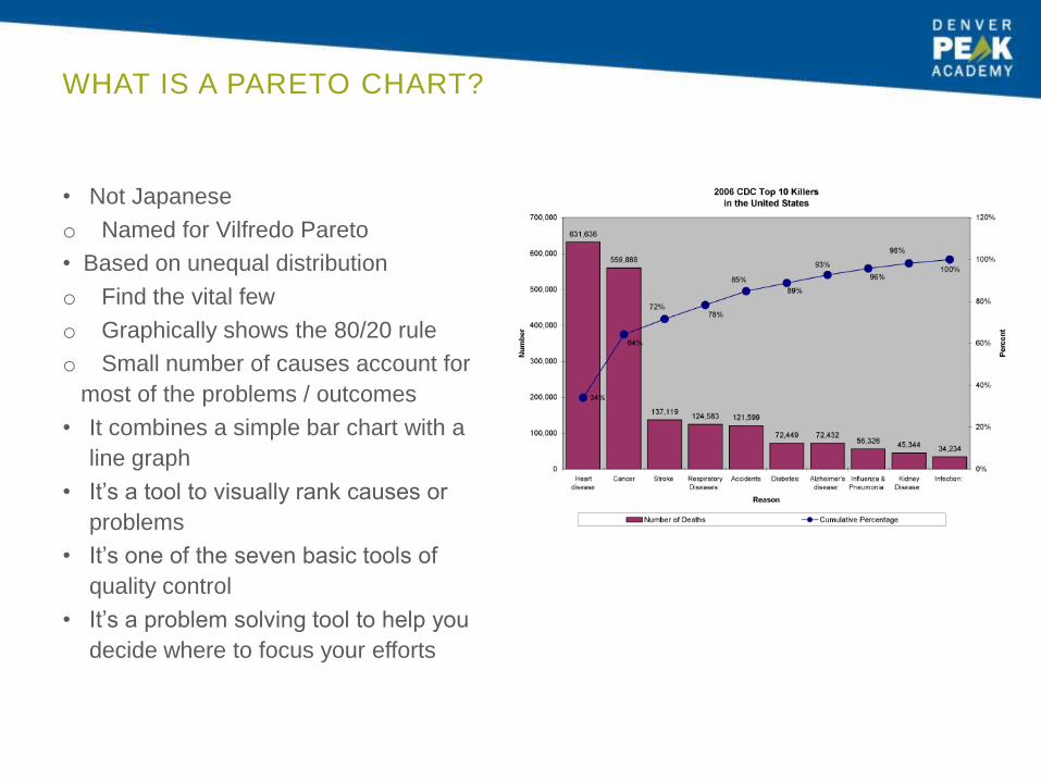
WHAT IS A PARETO CHART?
• Not Japanese
o Named for Vilfredo Pareto
• Based on unequal distribution
o Find the vital few
o Graphically shows the 80/20 rule
o Small number of causes account for
most of the problems / outcomes
• It combines a simple bar chart with a
line graph
• It’s a tool to visually rank causes or
problems
• It’s one of the seven basic tools of
quality control
• It’s a problem solving tool to help you
decide where to focus your efforts
WHEN TO USE A PARETO CHART
• When you want to break a big effort into smaller pieces and identify
major contributors
• When you want to focus and prioritize your efforts
• When there are multiple problems or reasons and you want to focus on
the most significant
• When analyzing the frequency of causes or reasons
• When data can be categorized and you can determine the number of
incidents in each category
• When you want to communicate
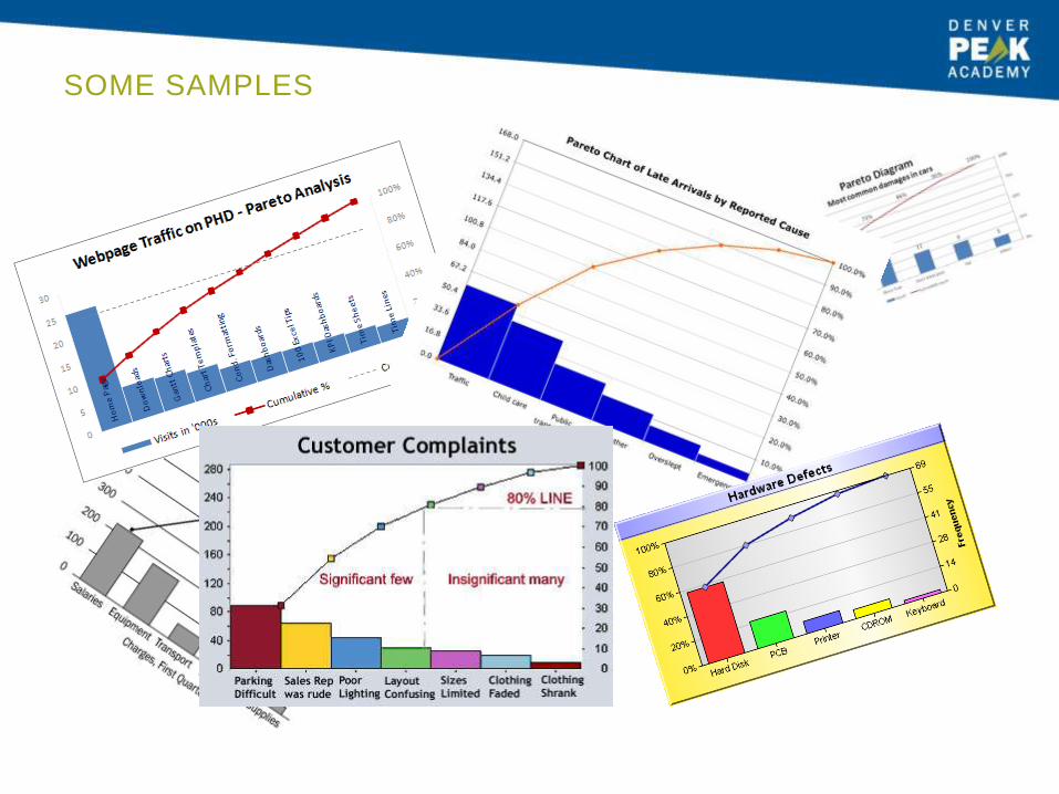
SOME SAMPLES
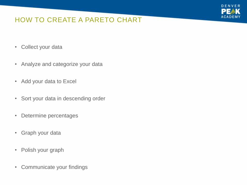
HOW TO CREATE A PARETO CHART
• Collect your data
• Analyze and categorize your data
• Add your data to Excel
• Sort your data in descending order
• Determine percentages
• Graph your data
• Polish your graph
• Communicate your findings
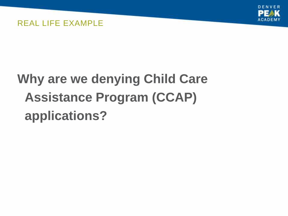
REAL LIFE EXAMPLE
Why are we denying Child Care
Assistance Program (CCAP)
applications?
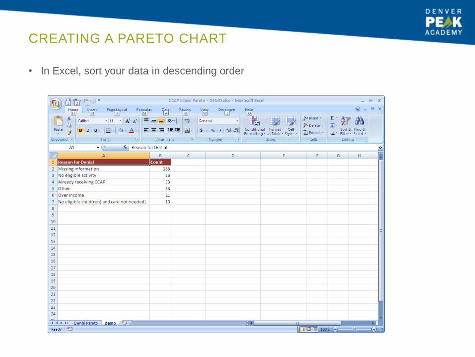
CREATING A PARETO CHART
• In Excel, sort your data in descending order
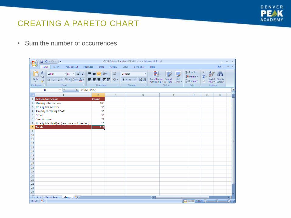
CREATING A PARETO CHART
• Sum the number of occurrences
CREATING A PARETO CHART
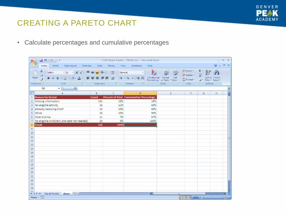
• Calculate percentages and cumulative percentages
CREATING A PARETO CHART
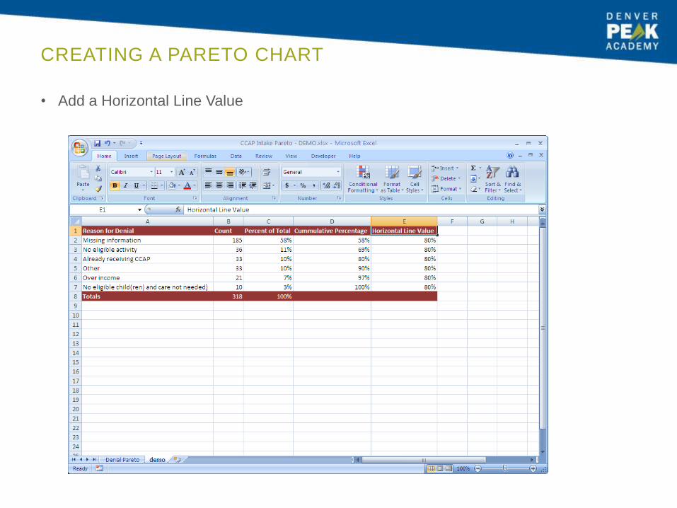
• Add a Horizontal Line Value

CREATING A PARETO CHART
• Select the data to create the chart – Reason for Denial, Percent of Total,
Cumulative Percentage, and Horizontal Line Value and Insert a Column Chart

CREATING A PARETO CHART
• The result won’t look like a Pareto Chart! That’s okay.
CREATING A PARETO CHART
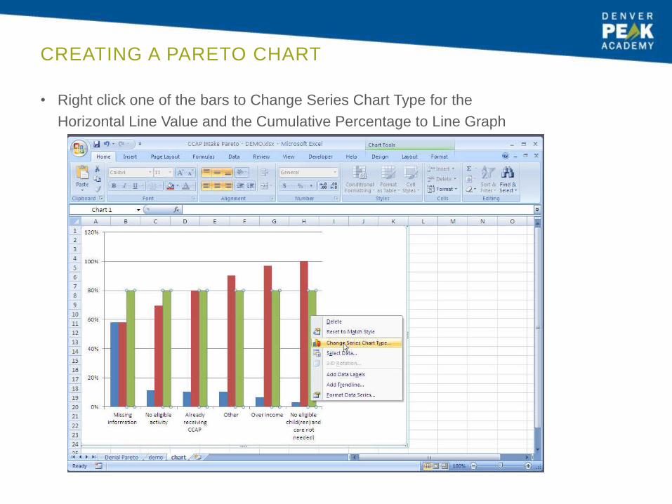
• Right click one of the bars to Change Series Chart Type for the
Horizontal Line Value and the Cumulative Percentage to Line Graph
CREATING A PARETO CHART
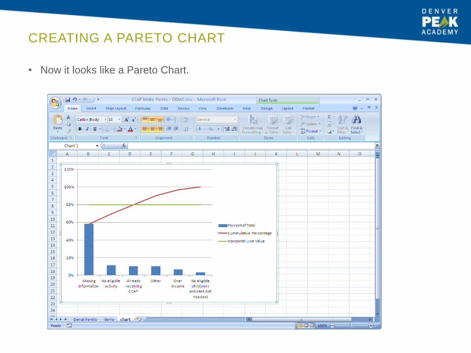
• Now it looks like a Pareto Chart.
IN CONCLUSION
• Working smarter is good – working smarter on the right things is better
• Determining the 20% of things that are really important can help show
where to concentrate improvement efforts
• The 80/20 rule can apply to nearly every aspect of both your work and
personal lives