Organizing Data - Cengagecollege.cengage.com/mathematics/brase/understanding_basic/2e/... ·...
22
Chapter 1 Organizing Data 1.1 Populations, Samples, and Data This section introduces the idea of making decisions about populations based on information, called data, from a sample. Terminology introduced in this section is important for the rest of the course material. Review 1. What is Statistics? Statistics is the study of how to collect, organize and interpret numerical information. It is an indispensable tool used to help make intelligent and unbiased decisions in all aspects of life, often when the information available is incomplete. 2. Important terms (a) A population is the set of all possible measurements, counts or observations that are of inter- est in a particular study. (b) A sample is a subset of the pop- ulation. Since it is usually im- practical or even impossible in terms of time or money to ob- tain every possible response we must often rely on information obtained from a sample. (c) A random sample is a sample in which every member of the population has an equal chance of belonging. Population Sample Copyright c Houghton Mifflin Company. All rights reserved. 1
-
Upload
truonghuong -
Category
Documents
-
view
214 -
download
0
Transcript of Organizing Data - Cengagecollege.cengage.com/mathematics/brase/understanding_basic/2e/... ·...

Chapter 1
Organizing Data
1.1 Populations, Samples, and Data
This section introduces the idea of making decisions about populations based on information, calleddata, from a sample. Terminology introduced in this section is important for the rest of the coursematerial.
Review
1. What is Statistics? Statistics is the study of how to collect, organize and interpret numericalinformation. It is an indispensable tool used to help make intelligent and unbiased decisions inall aspects of life, often when the information available is incomplete.
2. Important terms
(a) A population is the set of allpossible measurements, countsor observations that are of inter-est in a particular study.
(b) A sampleis a subset of the pop-ulation. Since it is usually im-practical or even impossible interms of time or money to ob-tain every possible response wemust often rely on informationobtained from a sample.
(c) A random sampleis a samplein which every member of thepopulation has an equal chanceof belonging.
PopulationSample
Copyright c Houghton Mifflin Company. All rights reserved. 1

2 Chapter 1. Organizing Data
3. A central theme, in the study of Statistics, is that of using information obtained from a sample tomake decisions or inferences concerning an entire population from which the sample has beendrawn. Techniques, which we will later study, will enable us to do this with a high level ofreliability.
4. Methods of Acquiring Data
(a) Sampling: Measuring, counting or noting a response from a subset of the population.
(b) Experimenting: Imposing a treatment and observing its effects.
(c) Simulating: Artificially producing outcomes when it’s impractical to do real lifeexperiments. Simulations are often performed on computers or calculators.
(d) Taking a Census:Measuring the entire population of interest. This is usually difficult, ifnot impossible.
5. When we collect data, it is important to know itslevel of measurementso we can determinewhich types of computation are meaningful. Appropriate calculations for each level can be usedat any higher level, but should not be used for any lower level. The levels are listed from lowestto highest.
(a) Nominal data can be put into categories.
i. Consists of names, categories, qualities or labels. For example, the type of car youdrive: Honda, Chrysler, Toyota, Ford, etc.
ii. Can categorize the data, but we are unable to determine if one piece of data is better orhigher than another.
iii. When numbers are used as labels, such as on a football uniform, they are classified asnominal data. For example, it is not meaningful to average the numbers on theuniforms for the Philadelphia Eagles.
(b) Ordinal data can be placed in rank order and categorized.
i. Designations or numerical rankings which can be arranged in ascending or descendingorder. For example, television ratings for the most popular show, second most popularshow, etc.
ii. We can compare rankings as to which is higher, however it does not make sense tosubtract one rank value from another. Differences in rankings are not meaningfulcomputations. For example, if you interview three candidates for a job, you may rankthem in order of preference as 1, 2, and 3. You can tell which candidate is ahead of theothers, but only in terms of order of preference, not in terms of the magnitude ordegree of preference. Candidates ranked #1 and #2 may be very close, while #3 mightbe totally unacceptable.
(c) Interval data can be subtracted to find the difference between two values, put in order andcategorized.
i. Data is numerical. Zero can be used to indicate a position in time or space, however,the zero at this level does not correspond to “none” of the specific variable beingmeasured. For example, the zero in the Fahrenheit temperature scale does not meanzero heat.
ii. Differences between data values are meaningful, but it does not make sense tocompare one data value as being twice (or any multiple of) another.
(d) Ratio data values can be divided, subtracted, put in order and put into categories.
Copyright c Houghton Mifflin Company. All rights reserved.

1.1 Populations, Samples, and Data 3
i. The highest level of measurement. For example, the number of gallons of gas you putin your car today.
ii. There is a zero on this scale which is interpreted as “none” of the variable in question.For example, you can put zero gallons of gas in your car.
iii. It is meaningful to say one measure is two times or three times as much as another.
Practice Problems
Throughout this manual, practice exercises will be included for each text section.
1. A Roper poll asked 938 adults in the United States if they though feeling financially secure wasan important aspect of having money.
(a) What is the population?
(b) What is the sample?
2. Respond to each of the following questions with a realistic answer. State the highest level ofmeasurement which you used.
(a) What is your favorite brand of cereal?
(b) How many credits have earned before this semester?
(c) In what year were you born?
(d) What is your academic major?
(e) What is your evaluation of your professor on a scale of 1 to 5, with 1 being the best?
(f) What is your telephone number?
Solutions to Practice Problems
1. (a) The set of responses from all adults in the United States.
(b) The 938 responses which were recorded in the poll.
2. (a) For example, consider the cereal Corn Flakes. This is nominal data. Your answer is a labelor a name.
(b) For example, consider the number 15. This is ratio data. Differences in numbers of creditsare meaningful computations. Zero would be a meaningful answer. One person could havetwice as many credits as another.
(c) For example, consider the year 1978. This is interval data. An answer of zero is impossible.
(d) For example, consider the field of Psychology. This is nominal data. The data is a label.One answer can not be compared numerically with another.
(e) For example, consider the number 4. This is ordinal data. Differences in rankings are notnumerically significant.
(f) For example, consider the phone number 555-1998. This is nominal data. The numbers areused as an identifying label. We would not add, subtract, or take the average of thesenumbers.
Copyright c Houghton Mifflin Company. All rights reserved.
4 Chapter 1. Organizing Data
Thinking About Statistics
1. In order to determine the television viewing preferences of college students, a survey was done ata local shopping mall, asking every tenth person who entered if they would prefer to watch a) 3rdRock From the Sun, b) Dharma and Greg, or c) Buffy the Vampire Slayer. What is wrong withthis survey from a statistical viewpoint?
2. A consumer magazine ranked the top rated CD players as follows.
Rank Model1 Technics SL-PD9272 Philips CDC9353 Sony CDP-C79FES4 Carver SD/A-3505 JVC XL-F207TN
Can we say that the Philips CD, in second place, is twice as good as the Carver, in fourth place?Explain.
Solutions to Thinking about Statistics
1. The implied population is the set of responses from all college students. By questioning those atthe mall, it is likely that many of the respondents would not be college students and that theirviewing habits would be different from those of college students. Such a study would give biasedresults about the opinions of college students since college students are not included in thepopulation we are sampling.
2. In ordinal data such as ranking of CD players, it is meaningless to say one model is twice asgood as another. The distance between consecutive ranks may be uneven. It’s possible that theratings for Technics and Philips (the top two brands) are very close with Sony (the third placebrand) following at a great distance.
Selected Solutions for Section 1.1
1. The implied population is the number of times each adult in the U.S. ate in fast-food restaurantseach week. The sample consists of the numerical responses of the 1261 adults who participatedin the survey. Note that in statistics, the population consists of the entire set of all measurements,counts, or responses that are of interest (not the people involved). The sample is the set ofmeasurements, counts or observations that are actually recorded. Additionally, any decisionsmade on the basis of this survey could be generalized for the adult population only. The sampledid not include any children.
5. (a) Ratio. It could take zero minutes to finish the test.
(b) Interval. the time difference between two o’clock and four o’clock is meaningful, but thereis not a zero on the measurement scale that indicates “no time”. Furthermore, six o’clock isnot twice as late as three o’clock.
(c) Nominal. Class standing is a category.
Copyright c Houghton Mifflin Company. All rights reserved.

1.2 Random Samples 5
(d) Ordinal. A rating of “good” is better than that of “acceptable”, but we cannot measure byhow much.
(e) Ratio. A zero is a meaningful score. A score of 90 indicates twice as many points as a scoreof 45.
(f) Ratio. A 20 year old is twice as old as a 10 year old. Do not be fooled by the fact that noone is zero years old.
9. (a) The phrase is ambiguous. To some it might mean two years and to others, ten. A moremeaningful phrase might be “in the last three years.”
(b) Responses to the first question might be influenced by the second.
(c) People would probably not state that they watch too much television. They might be morehonest if they were given a choice of rarely, sometimes, or frequently. Most would answer“sometimes”.
1.2 Random Samples
In this section, we consider the problem of obtaining a sample that represents the population of interest.
Review
1. Simple Random Sample
(a) Every member of the population has an equal chance of belonging to a simple randomsample.
(b) A random sample ensures that we have an unbiased representation of the population.
(c) Random numbers can be generated with a calculator that has a random number function, acomputer software program, or from the Table of Random Numbers in Appendix I, Table 1of the Brase Text.
2. Stratified Random Sample
(a) Members of the population are separated into subgroups (strata) having the samecharacteristic. Strata can be determined by gender, age, ethnicity, etc.
(b) A random sample is drawn from each strata.
(c) This method insures that each subgroup will be represented and that no subgroup will beomitted from the sample.
(d) Often individual stratum are sampled in proportion to their membership in the population.
3. Systematic Sample
(a) Members of the population are arranged in some order and assigned numbers.
(b) A first number is selected at random. From there, every kth number is selected.
(c) For example, to select a sample of 10 from a population of 529, divide529=10 = 52. Thenk = 52. Select a random number from 1 to 52. The measure or response for this numberwill be the first member of your sample.
Copyright c Houghton Mifflin Company. All rights reserved.

6 Chapter 1. Organizing Data
(d) Once the first member is selected, select every 52nd number for the sample. If the randomvalue selected was the 23rd, the sample will consist of measures or responses frompopulation members numbered 23, 75, 127, 179, 231, 283, 335, 387, 439, and 491.
(e) Once the first member is selected, the others are automatically selected. This method ofsampling can be used when there is no danger of cyclical phenomena. For example, chooseevery 10th member of the population, but do not choose every 4th season or every 7th day.
4. Cluster Sample
(a) The population is divided into sections or clusters from the same location. All clusters arelikely to have similar characteristics, so that when a sample is selected from one cluster, thesample is not biased. The unit for sampling is not an individual, but a naturally occurringsubgroup.
(b) One or more of the sections (clusters) is randomly selected.
(c) The sample is then taken randomly from the selected subgroup(s). Some subgroups will beomitted completely.
(d) Often used when clusters can be geographically determined. For example, the same zipcode, same block, same bank branch, same section of a course, etc.
5. Convenience Sample
(a) The sample consists only of the members of the population that are readily available andwilling to participate.
(b) This method of sampling may produce misleading or biased results.
Practice Problem
There are 529 students enrolled in a statistics course for the semester at your school. You are asked tointerview a sample of ten of these students for a research project. What steps would you take to select asimple random sample?
Solution to Practice Problem
First, assign a number to each student in the population. College I.D. numbers could be used, howeverit is probably easier to get the class lists and assign numbers 1 to 529 to the students. Select a startingpoint on your Random Number Table (Appendix I, Table 1 of the Brase text). For example, yourrandom digit sequence might look like the following.
26907 52180 05538 56277 56277 54190 10910 97564 11278 03772
Since 529 is a three-digit number, separate the digits into sets of three. For example, using our randomdigit sequence, the first eight three-digit numbers are 269, 075, 218, 005, 538, 562, 775, and 419.Select the first ten three-digit numbers that are less than 530. For example, from list above, we throwout 538, 562, and 775. The final list of ten three-digit numbers is
269 075 218 005 419 010 127 345 021 500
The random sample consists of the responses from the student who were assigned these numbers. Notethat 75 is expressed as a three-digit number 075 in our set of random numbers. A one digit number, like5, is expresses by 005. Naturally, with a different starting point, the sample would be different.
Copyright c Houghton Mifflin Company. All rights reserved.

1.2 Random Samples 7
Thinking About Statistics
Suppose, from the previous problem, you decided to question the first ten students who cam to a SkiClub meeting. What problems might this present for your study?
Solutions to Thinking About Statistics
Using a convenience sample of the first ten students would probably cause a bias in the responses.Belonging to a Ski Club might be characteristic of a certain type of individual (maybe those who havethe money or time to enjoy skiing). In addition, anyone who arrived late would not have an opportunityto be in the sample.
Selected Solutions for 1.2
1. (a) Answers may vary. Random numbers are those which are formed from digits generated bya computer into which a mathematical formula has been programmed such that every digithas an equal chance of appearing. A series of random digits has been reproduced in a tablein the back of your text. We could generate a random digit table ourselves by marking tenequal sized pieces of paper, 0,1,2,. . . ,9 placing them in a hat, mixing them up, drawing onepiece of paper and recording the number on it. Next, replace the paper you drew, remix,then and draw another. Repeat this process until you have enough digits. Random samplesare those samples in which every member of the population has an equal chance of beingincluded.
(b) Random samples are important because they insure that a study (with unbiased questions)will be unbiased.
5. Use a calculator, a computer software program such as Minitab, or your Random Number Table(Appendix I, Table 1 of the Brase text) to generate a set of four numbers that fall in theappropriate range. If a number is repeated, continue until you get four different ones. In this way,you will do what is referred to as “sampling without replacement”.
(a) If the first four students walking in the room were to make up the sample, those studentswho have an earlier class that is several buildings away would not have an equal chance ofbeing selected. Early students might possess certain similar traits that might make themearly. Or they might be students who live close to campus.
(b) If the last four students were selected, the conscientious students coming early would nothave an equal chance of being in the sample.
(c) If the sample consisted of students in the back row, nearsighted or short students (whowould be more likely to sit up front) would not have an equal chance.
(d) The four tallest students might tend to be male and thus females would not have an equalchance to be selected.
9. Assign even digits0; 2; 4; 6; and 8 to the outcome of heads and odd digits1; 3; 5; 7; and 9 to theoutcome of tails. Select a starting position at random in the random number table. If the first digitis even, record heads. If the first digit is odd, record tails. Continue in this manner until you have25 outcomes recorded. For example, suppose the fourth row in the random number table ischosen. Then the random numbers and the corresponding coin flips are are
Random numbers: 31524 49587 76612 39789 13537
Coin flip outcomes: TTTHH HTTHT THHTH TTTHT TTTTT
Copyright c Houghton Mifflin Company. All rights reserved.

8 Chapter 1. Organizing Data
13. (a) Yes, each time you roll a die, any of the outcomes 1 through 6 can occur, regardless ofwhether or not the outcome has occurred before. On the fourth roll, the outcome is 2.
(b) The percent of outcomes that represent “snake eyes” is5
20= 25%.
(c) Since the outcomes are randomly generated, we would not expect to get the same sequenceof outcomes.
1.3 Graphs
This section explores several types of graphs which can be used to produce a visual description orpictorial representation of the data.
Review
1. Bar Graphs
(a) The bars can represent data categories from any of the four levels of measurement(nominal, ordinal, interval, or ratio). Thus, each bar can represent a label, a response or aclass of numerical measurements.
(b) The height of each bar must correspond to some interval or ratio measure. We can computedifferences in heights of bars.
(c) The bars are of uniform width.
(d) There is equal spacing between the bars.
2. Pareto Chart
(a) These are bar graphs. The height of the bar represents frequency of type of problem ordefect.
(b) The bars are arranged left to right, from tallest to shortest.
(c) Pareto charts are used in Qualify Control to detect which problems occur most commonly.
3. Circle Graphs (Pie Charts)
(a) These graphs are used when a total quantity (such as a budget) is apportioned into severalnonoverlapping categories.
(b) A full circle contains 360�. We determine the number of degrees in a sector (or slice of thepie) by multiplying the percentage of the pie it occupies by 360�. For example, if a categoryoccupies 35% of the total, it should be represented by (.35)(360) = 126� of the circle.
4. Time Plots
(a) The horizontal axis marks regularly spaced time intervals.
(b) The vertical axis shows measurements of the same quantity taken at regular time intervals.
(c) The points are plotted and connected to form a line graph which is useful in detectingtrends.
Copyright c Houghton Mifflin Company. All rights reserved.

1.3 Graphs 9
Practice Problems
There were 1,859 individuals filing 1999 Federal Income Tax forms with a large accounting firm. Thepercentage of these individuals within five specific income brackets is shown as follows.
Category Earnings %A. less than $20,000 64%B. $20,001 to $35,000 24%C. $35,001 to $40,000 8%D. $40,001 to $75,000 3%E. $75,001 or more 1%
1. Make a circle graph to dis-play this information.
2. Construct an appropriatebar graph.
Solutions to Practice Problems
1. First, compute the number of degrees for each sector.
percentageCategory times 360 = degrees
A. (.64)(360) = 230.4B. (.24)(360) = 86.4C. (.08)(360) = 28.8D. (.03)(360) = 10.8E. (.01)(360) = 3.6
Total 360.0
1%3%8%
24%
64%
Individual Income Levels for1999
Use a protractor to separate the circle into the five appropriate sectors, each having thecorresponding number of degrees as computed.
2. To form the bar graph, construct the horizontal axis so that it describes the earnings variablecategories. The vertical axis is used to compare the number of clients in each category.
0
200
400
600
800
1000
1200
less than 20,000 20,001-35,000 35,0001-40,000 40,001-75,000 75,001 or more Income Level
1190
446
56149
19
Num
ber
Individual Income Levels for 1999
Copyright c Houghton Mifflin Company. All rights reserved.

10 Chapter 1. Organizing Data
Thinking About Statistics
Enrollment figures for Studymore University revealed in 1995 that the enrollment was 9,053 students.In 1996, it was 10,273 and in 1997, it was 11,047.
1. Which types of graphs would be appropriate to describe this data?
2. Which types of graphs would not be suitable to describe this data?
3. Construct a graph describing this data.
Solutions to Thinking About Statistics
1. The most appropriate type of graph would be a bar graph with a bars representing years.
2. It would not be possible to construct a circle graph depicting this information, since a circlegraph describes how parts of a whole are apportioned.
3.
0
2000
4000
6000
8000
10000
12000
1995 1996 1997
Enr
ollm
ent
9053
1027311047
Enrollment at Studymore University
Copyright c Houghton Mifflin Company. All rights reserved.

1.3 Graphs 11
Selected Solutions for Section 1.3
1. Categories represent educational level. The bar graph indicates an upward trend in income aslevel of education increases..
0
10
20
30
40
50
60
70
80
Gradeschool
Highschool
CollegeGraduate
1 Year +post-
graduate
Tho
usan
ds o
f do
llars
14.2
30.1
57.461.0
Highest Level of Educationand Average Annual Household Income
(in thousands of dollars)
5.Location (%)(360) = degreescloset (.68)(360) = 244.8under bed (.23)(360) = 82.8bathtub (.06)(360) = 21.6freezer (.03)(360) = 10.8
Under Bed 23%
Closet 68%
Bath Tub 6%
Freezer 3%
Where We Hide the Mess
Copyright c Houghton Mifflin Company. All rights reserved.

12 Chapter 1. Organizing Data
9.
3790
3795
3800
3805
3810
3815
3820
'86 '87 '88 '89 '90 '91 '92 '93 '94 '95 '96 '97
Fee
t abo
ve s
ea le
vel
Elevation of Pyramid Lake Surface–Time Plot
1.4 Histograms and Frequency Distributions
In this section, we explain the types of graphs that are used with data measured at the interval and ratiolevel.
Review
1. A histogram is a form of bar graph.
(a) The width of a bar is designated by an interval or ratio data value and thus has numericalsignificance.
(b) The height of a bar corresponds to the number of times the data values fall in that class.This is called the frequency and symbolized byf .
(c) The bars touch.
2. Frequency Polygon(or line graph)
(a) The line segments connect the top midpoints of the bars of a histogram.
(b) They can be drawn with or without showing the histogram. Simply connect the appropriatepoints.
3. Relative frequency histogram
(a) Horizontal scale is the same as a histogram.
(b) The vertical scale measures the relative frequency of a class.
(c) relative frequency =class frequencytotal frequency
Copyright c Houghton Mifflin Company. All rights reserved.

1.4 Histograms and Frequency Distributions 13
4. In order to construct a histogram, it is necessary to determine the following significant numbers.
(a) Number of Classes(indicated by bars)
i. Too few tends to lump the data together, whereas too many will chop it up too finely.
ii. This number may be determined by convenience, but it is usually between five andfifteen.
(b) Range
i. Determine the highest (greatest) data value.
ii. Determine the lowest (least) data value.
iii. Find the difference between the highest and lowest values. That is,Range= High � Low :
(c) Class Width
i. Divide the range by the number of classes.
ii. Round this number up to the next convenient value. Rounding up insures that all datavalues will fit inside the designated classes.
5. A frequency distribution table will consist of the following.
(a) Class Limits
i. The lower class limit is the least data value in a class.
ii. The upper class limit is the greatest data value in a class.
(b) Class Boundaries
i. To find the lower class boundary, subtract half the distance between class limits fromthe lower class limit.
ii. To find the upper class boundary, add half the distance between the class limits to theupper class limit.
(c) Theclass midpointsare found by taking the mean of the lower class limits and the upperclass limits. The class midpoint is also the mean of the class boundaries.
(d) Thefrequenciesare the number of times each data value falls in each class. Thisdetermines the heights of the corresponding bars.
(e) Therelative frequenciesare found by taking the frequency of the class divided by the totalfrequency. This value is always between 0 and 1. When multiplied by 100, the percent ofthe data that falls in each class is obtained. The total percent will always be equal to 100%,or 1, but rounding off may cause a slight variation.
6. Take the following steps to construct a frequency distribution table.
(a) Let the lower class limit for the first class be the lowest data value. To obtain the lowerclass limit for the second class, add the class width. Continue adding the class width toproduce subsequent lower class limits. List the numbers in a vertical column.
(b) Enter the corresponding upper class limits. The upper class limit for the first class is foundby subtracting 1 from the lower class limit of the second class. The rest of the upper classlimits can be found by adding the class width to each upper class limit value.
(c) Place a tally mark in the appropriate class corresponding to each data value. Form a verticalcolumn labeled “f ” (for frequency) to numerically represent the tally count for each class.
Copyright c Houghton Mifflin Company. All rights reserved.
14 Chapter 1. Organizing Data
(d) Form a vertical column for class boundaries. Note that the addition and subtraction of1
2
guarantees that the bars will touch. That is, the upper class boundary for the first classequals the lower class boundary for the second class.
7. Constructing Graphs
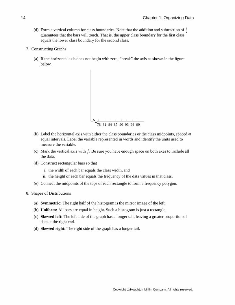
(a) If the horizontal axis does not begin with zero, “break” the axis as shown in the figurebelow.
78 81 84 87 90 93 96 99
(b) Label the horizontal axis with either the class boundaries or the class midpoints, spaced atequal intervals. Label the variable represented in words and identify the units used tomeasure the variable.
(c) Mark the vertical axis withf . Be sure you have enough space on both axes to include allthe data.
(d) Construct rectangular bars so that
i. the width of each bar equals the class width, and
ii. the height of each bar equals the frequency of the data values in that class.
(e) Connect the midpoints of the tops of each rectangle to form a frequency polygon.
8. Shapes of Distributions
(a) Symmetric: The right half of the histogram is the mirror image of the left.
(b) Uniform: All bars are equal in height. Such a histogram is just a rectangle.
(c) Skewed left:The left side of the graph has a longer tail, leaving a greater proportion ofdata at the right end.
(d) Skewed right: The right side of the graph has a longer tail.
Copyright c Houghton Mifflin Company. All rights reserved.

1.4 Histograms and Frequency Distributions 15
Practice Problems
A random sample of 30 department stores was selected and the price of Bache PX-200 CD players waschecked at each store. The results, rounded to the nearest dollar, are shown in the following table.
95 122 108 86 103 82 77 75 112 118 87 102
104 116 85 122 87 100 104 97 107 69 78 125
109 99 105 99 101 85
Using five classes, make a frequency distribution table. Construct a histogram, a frequency polygon,and a relative frequency histogram. The following hints will help you accomplish these tasks.
1. For the frequency distribution table:
(a) Count the number of classes.
(b) Determine the range.
(c) Determine the class width.
(d) Determine the lower class limits.
(e) Determine the upper class limits.
(f) Determine the class boundaries.
(g) Determine the class midpoints.
(h) Determine the frequencies in each class.
(i) Determine the relative frequency for each class.
2. For the histogram:
(a) Mark the horizontal axis with midpoint values spaced at equal intervals.
(b) Draw a bar centered at this value with a height equal to the frequency of the class. Adjacentbars must touch.
3. For the frequency polygon:
(a) Locate a point over the midpoint of each class at the center of the top line of the bar.
(b) Connect these points and extend the polygon down to the horizontal axis on either side.
4. For the relative frequency histogram:
(a) Mark equal spaces representing the midpoints for each class on the horizontal axis.
(b) The vertical axis marks the percent of the total frequency that each graph represents.
Copyright c Houghton Mifflin Company. All rights reserved.

16 Chapter 1. Organizing Data
Solutions to Practice Problems
1. The frequency distribution table:
I II III IV Vclass class midpoints frequency relativelimits boundaries frequency
69-80 68.5-80.5 74.5 4 0.13381-92 80.5-92.5 86.5 6 0.20093-104 92.5-104.5 98.5 10 0.333105-116 104.5-116.5 110.5 6 0.200117-128 116.5-128.5 122.5 4 0.133
Sum: 30 1.000
2. The histogram: Observe that, in this case, the histogram is symmetric.
0
2
4
6
8
10
74.50 86.50 98.50 110.50 122.50 Price in $
Freq
uenc
y
4
6
10
6
4
Price of Bache PX-200 CD Players
3. The frequency polygon: Since the histogram is symmetric, the frequency polygon is alsosymmetric.
0
2
4
6
8
10
74.50 86.50 98.50 110.50 122.50 Price in $
Freq
uenc
y
Price of Bache PX-200 CD Players
Copyright c Houghton Mifflin Company. All rights reserved.

1.4 Histograms and Frequency Distributions 17
4. The relative frequency histogram: This is also symmetric.
74.50 86.50 98.50 110.50 122.50
Price in $
Rel
ativ
e Fr
eque
ncy
0.00
0.05
0.10
0.15
0.20
0.25
0.30
0.35
0.133
0.200
0.333
0.200
0.133
Price of Bache PX-200 CD Players
Thinking About Statistics
1. The problems in the Brase text involve data that consist of integers only. When finding classboundaries on this type of data, we simply subtract 0.5 from each lower limit and add 0.5 to eachupper limit. There are occasions when the data is not reported in integer form. How would youcompute the class boundaries if this were the case?
2. Suppose the upper and lower class limits for a frequency distribution with five classes are asshown.
class 1 class 2 class 3 class 4 class 50.05-0.10 0.11-0.16 0.17-0.22 0.23-0.28 0.29-0.34
Compute the corresponding class boundaries for each of the five classes.
3. Suppose the lower and upper class limits for a frequency distribution with four classes are asshown.
class 1 class 2 class 3 class 417.2-17.6 17.7-18.1 18.2-18.6 18.7-19.6
Compute the corresponding class boundaries.
Solutions to Thinking About Statistics
1. When computing class boundaries, find the distance between consecutive classes and computehalf of that distance. Then subtract that quantity fromeach lower limit to get each lowerboundary and add that quantity toeach upper limit to get each upper boundary. Thus, if your datais expressed in integers, add and subtract 0.5. If your data is expressed to the nearest 0.1, add andsubtract 0.05. If your data is expressed to the nearest 0.01, add and subtract 0.005.
2. The class boundaries are as shown in the table.
class 1 class 2 class 3 class 4 class 50.045-0.105 0.105-0.165 0.165-0.225 0.225-0.285 0.285-0.345
Copyright c Houghton Mifflin Company. All rights reserved.

18 Chapter 1. Organizing Data
3. The class boundaries are as shown in the table.
class 1 class 2 class 3 class 417.15-17.65 17.65-18.15 18.15-18.65 18.65-19.65
Selected Solutions for Section 1.4
1. (a) The class width is 4.
(b)I II III IV V
Class RelativeLimits Boundaries Midpoint Frequency Frequency29-32 28.5-32.5 30.5 1 0.0333-36 32.5 -36.5 34.5 6 0.1937-40 36.5-40.5 38.5 12 0.3941-44 40.5-44.5 42.5 7 0.2345-48 44.5-48.5 46.5 4 0.1349-52 48.5-52.5 50.5 1 0.03
(c)
0
2
4
6
8
10
12
30.5 34.5 38.5 42.5 46.5 50.5
1
6
12
7
4
1
Degrees Fahrenheit
Fre
quen
cy
Histogram
(d)
0.00
0.05
0.10
0.15
0.20
0.25
0.30
0.35
0.40
30.5 34.5 38.5 42.5 46.5 50.5
0.03
0.19
0.39
0.23
0.13
0.03
Degrees Fahrenheit
Rel
ativ
e F
requ
ency
Relative Frequency Histogram(e)
0
2
4
6
8
10
12
30.5 34.5 38.5 42.5 46.5 50.5Degrees Fahrenheit
Fre
quen
cy
Frequency Polygon
Copyright c Houghton Mifflin Company. All rights reserved.
1.5 Stem and Leaf Displays 19
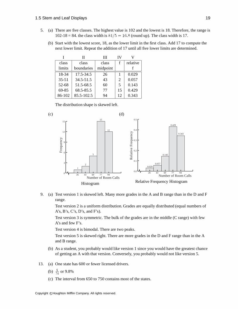
5. (a) There are five classes. The highest value is 102 and the lowest is 18. Therefore, the range is102-18 = 84. the class width is84=5 = 16:8 (round up). The class width is 17.
(b) Start with the lowest score, 18, as the lower limit in the first class. Add 17 to compute thenext lower limit. Repeat the addition of 17 until all five lower limits are determined.
I II III IV Vclass class class f relativelimits boundaries midpoint f
18-34 17.5-34.5 26 1 0.02935-51 34.5-51.5 43 2 0.05752-68 51.5-68.5 60 5 0.14369-85 68.5-85.5 77 15 0.42986-102 85.5-102.5 94 12 0.343
The distribution shape is skewed left.
(c)
0
3
6
9
12
15
1
15
2
5
12
Number of Room Calls
Fre
quen
cy
26 43 60 77 94
Histogram
(d)
0.0
0.1
0.2
0.3
0.4
0.5
0.029
0.429
0.057
0.143
0.343
Number of Room Calls
Re
lativ
e F
requ
ency
26 43 60 77 94
Relative Frequency Histogram
9. (a) Test version 1 is skewed left. Many more grades in the A and B range than in the D and Frange.
Test version 2 is a uniform distribution. Grades are equally distributed (equal numbers ofA’s, B’s, C’s, D’s, and F’s).
Test version 3 is symmetric. The bulk of the grades are in the middle (C range) with fewA’s and few F’s.
Test version 4 is bimodal. There are two peaks.
Test version 5 is skewed right. There are more grades in the D and F range than in the Aand B range.
(b) As a student, you probably would like version 1 since you would have the greatest chanceof getting an A with that version. Conversely, you probably would not like version 5.
13. (a) One state has 600 or fewer licensed drivers.
(b) 5
51or 9.8%
(c) The interval from 650 to 750 contains most of the states.
Copyright c Houghton Mifflin Company. All rights reserved.

20 Chapter 1. Organizing Data
1.5 Stem and Leaf Displays
Stem and leaf diagrams are a quick and efficient way to organize numerical data.
Review
1. All data values are displayed in a stem and leaf display. This provides an advantage over ahistogram in which the data is lumped together into classes.
2. The digits in each number in the data are divided into two groups called the stem and the leaf.
3. The digit that is the furthest to the left is called thestem. The digit or digits to its right representthe leaf or leaves.
4. There is no rule for separating the digits. However, the leaves usually consist of the significantdigit furthest to the right in each number. Data may be rounded off so that the digits to the rightare all zeros. In this case, use the first place value in which all digits are not zero. For data suchas 523,000, 656,000, and 790,000, the leaf unit should be 1000 and the first three leaves wouldbe 3,6 and 0. Corresponding stems would be 52, 65, and 79.
5. You can put all numbers that have the same stem on one line, two lines or five lines.
(a) When two lines per stem are used, the first line of a stem will have leaves of0; 1; 2; 3; and 4and the second line will have5; 6; 7; 8,and 9.
(b) If we turn a stem and leaf display on its side, we can classify the shape of the distribution inthe same way we do for a histogram (symmetric, uniform, skewed, etc).
(c) Sometimes the leaves are placed in numerical order, but this is not necessary. The leavesmay be written in any order.
(d) A stem and leaf display should include a key to the units used. This is so that others whoread it will be able to interpret the information displayed.
Practice Problems
In the following sets of numbers, decide where to separate the stem from the leaf. Include a key orexplanation of your units.
1. 23 4 65 28 54 8 22 36 43 51 5 42 29
2. 235 153 137 95 158 148 89 164 175 214 186
3. 13,400 15,800 21,000 16,700 14,300 12,400 9,500
Solutions to Practice Problems
1. Treat each data entry as a two digit number. The leaf unit is 1. Use the tens place as the stem.The stems will range from 0 to 6. So 2—3 means 23.
Copyright c Houghton Mifflin Company. All rights reserved.

1.5 Stem and Leaf Displays 21
2. Consider each data entry as a three digit number. The leaf unit is 1. Use the digits in thehundreds and tens place for the stem. The stems will range from 08 to 23. So 23—5 means 235.
3. Each data entry ends in two zeros and it appears that numbers have been rounded to the closesthundred. The leaf is 100 with the stem being the thousands digit and above. We can ignore thezeros in the tens and units places in our display as long as a key is provided. The key would say13—4 means 13,400.
Thinking About Statistics
When constructing your stem and leaf displays, be sure the leaves have equal spacing. The order inwhich the leaves are written does not matter, but the display will probably be easier to read if theentries are placed in ascending numerical order. Meaningful stem-and-leaf displays can be done with 1line per stem, 2 lines per stem, or 5 lines per stem because those numbers divide evenly into 10, thenumber of digits. With five lines per stem, the first line shows values with leaves of 8 and 9, the secondline with leaves of 6 and 7, the third line with leaves of 4 and 5, the fourth line with leaves 2 and 3 andthe last line with leaves of 0 and 1. The number of lines per stem should depend on the data. Make astem and leaf diagram for Problem 5 from the problem set for Section 1.4 of your textbook.
Solutions to Thinking About Statistics
The stem and leaf display, for Problem 5 from Section 1.4 of your text, should be as follows: The leafunit is 1.0 andN = 35.
depth stem leaf3 10 0127 9 0025
17 8 023456667826 7 0001134579 6 023894 5 83 4 62 3 71 21 1 8
The first column of this display represents the depth. From the top, the values represent the cumulativefrequencies until the middle of the data is reached. Thus the first line shows there are three entries.Since the second line has four entries, the depth shown on that line is 7. The middle of the data lies inthe fourth line. The other depths are the cumulative frequencies as added from the bottom line. The lastline has one data entry. The next to the last line has zero entries, so the depth is still one. The second tothe last line has one entry, so the depth is two. Reading up, there is one entry so the total is three.The middle column contains the stems and the column furthest to the right contains the leaves.
Copyright c Houghton Mifflin Company. All rights reserved.

22 Chapter 1. Organizing Data
Selected Solutions for Section 1.5
1.
(a)Walking Shoe Prices
(7 years ago)4 0 = $404 065 0255588996 000255997 006889
10 911 0
(b)Walking Shoe Prices
(now)4 0 = $404 046 0555887 000000045589 05
(c) In general, prices are higher now, probably due mostly to inflation. Note that seven yearsago, two of the rated walking shoe models cost more than any recently rated ones.
5.
(a)Minutes Beyond Two Hours
(1958-77)0 9 = 9 minutes past two hours0� 91� 03341� 556678892� 0022332� 5
(b)Minutes Beyond Two Hours
(1978-97)0 7=7 minutes past two hours0� 77888899999991� 0001124
(c) In more recent years the winning times have been closer to two hours. In (a) there are fivetimes under 2 hours 15 minutes. In (b) all 20 of the times are under 2 hours 15 minutes.
Copyright c Houghton Mifflin Company. All rights reserved.


![[Charles Henry Brase, Corrinne Pellillo Brase] Stu(BookFi.org)](https://static.fdocuments.in/doc/165x107/552c09984a7959e17c8b4639/charles-henry-brase-corrinne-pellillo-brase-stubookfiorg.jpg)