
Moi Helsinki - Aalto
51
[2016] Moi Helsinki Personalised user interface solutions for generative data
Transcript of Moi Helsinki - Aalto
[2016]
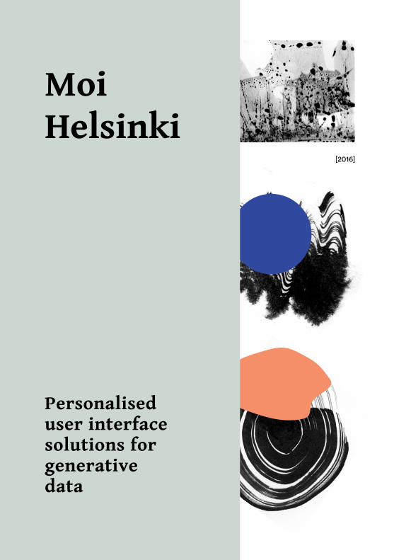
Moi Helsinki
Personaliseduser interfacesolutions forgenerativedata
Moi Helsinki. Personaliseduser interface solutionsfor generative data– A Master of Arts thesis by Tatiana Grebenshchikova (Hoffrén)
Completed at Aalto UniversitySchool of Arts, Design andArchitecture– Department of Media: Visual Communication
Supervised by – prof. Saku Heinänen
Advised by – Kate Pashinova
Proofread by – Ava Grayson
[2016]
Aalto University, P.O. BOX 11000, 00076 AALTO www.aalto.fi
Master of Arts thesis abstract
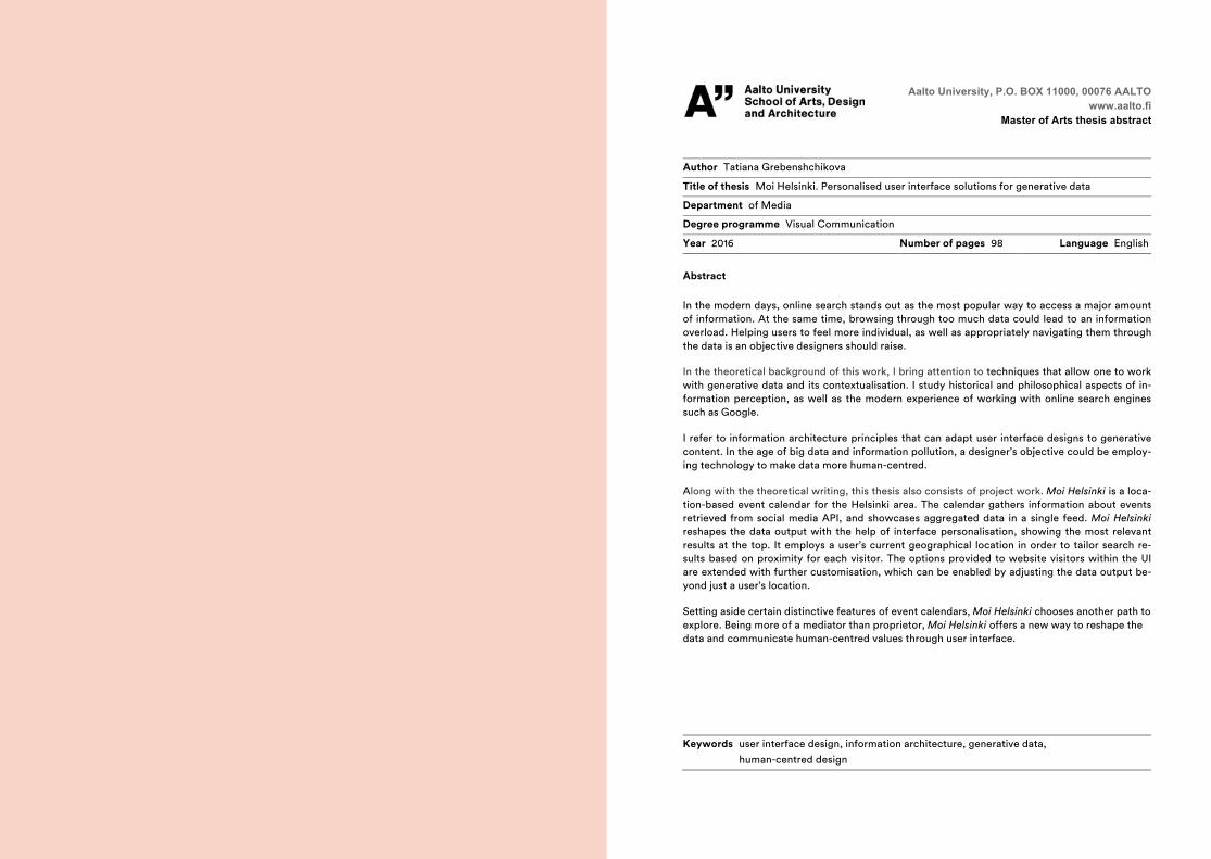
Author Tatiana Grebenshchikova Title of thesis Moi Helsinki. Personalised user interface solutions for generative data Department of Media
Degree programme Visual Communication
Year 2016 Number of pages 98 Language English
Abstract In the modern days, online search stands out as the most popular way to access a major amount of information. At the same time, browsing through too much data could lead to an information overload. Helping users to feel more individual, as well as appropriately navigating them through the data is an objective designers should raise. In the theoretical background of this work, I bring attention to techniques that allow one to work with generative data and its contextualisation. I study historical and philosophical aspects of in-formation perception, as well as the modern experience of working with online search engines such as Google. I refer to information architecture principles that can adapt user interface designs to generative content. In the age of big data and information pollution, a designer’s objective could be employ-ing technology to make data more human-centred. Along with the theoretical writing, this thesis also consists of project work. Moi Helsinki is a loca-tion-based event calendar for the Helsinki area. The calendar gathers information about events retrieved from social media API, and showcases aggregated data in a single feed. Moi Helsinki reshapes the data output with the help of interface personalisation, showing the most relevant results at the top. It employs a user’s current geographical location in order to tailor search re-sults based on proximity for each visitor. The options provided to website visitors within the UI are extended with further customisation, which can be enabled by adjusting the data output be-yond just a user’s location. Setting aside certain distinctive features of event calendars, Moi Helsinki chooses another path to explore. Being more of a mediator than proprietor, Moi Helsinki offers a new way to reshape the data and communicate human-centred values through user interface.
Keywords user interface design, information architecture, generative data, human-centred design
Moi Helsinki.
Personaliseduser interfacesolutions forgenerativedata
A Master’s Thesis byTatiana Grebenshchikova
Aalto UniversitySchool of Arts, Design and Architecture
Department of Media:Visual Communication
Helsinki, Finland2016
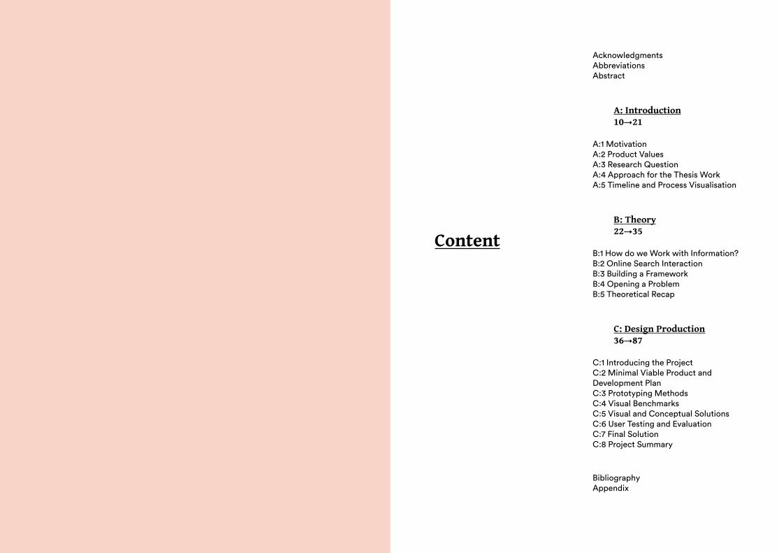
AcknowledgmentsAbbreviationsAbstract
A: Introduction10→21
A:1 MotivationA:2 Product ValuesA:3 Research QuestionA:4 Approach for the Thesis WorkA:5 Timeline and Process Visualisation
B: Theory22→35
B:1 How do we Work with Information?B:2 Online Search InteractionB:3 Building a FrameworkB:4 Opening a ProblemB:5 Theoretical Recap
C: Design Production36→87
C:1 Introducing the ProjectC:2 Minimal Viable Product and Development PlanC:3 Prototyping MethodsC:4 Visual BenchmarksC:5 Visual and Conceptual SolutionsC:6 User Testing and EvaluationC:7 Final SolutionC:8 Project Summary
BibliographyAppendix
Content
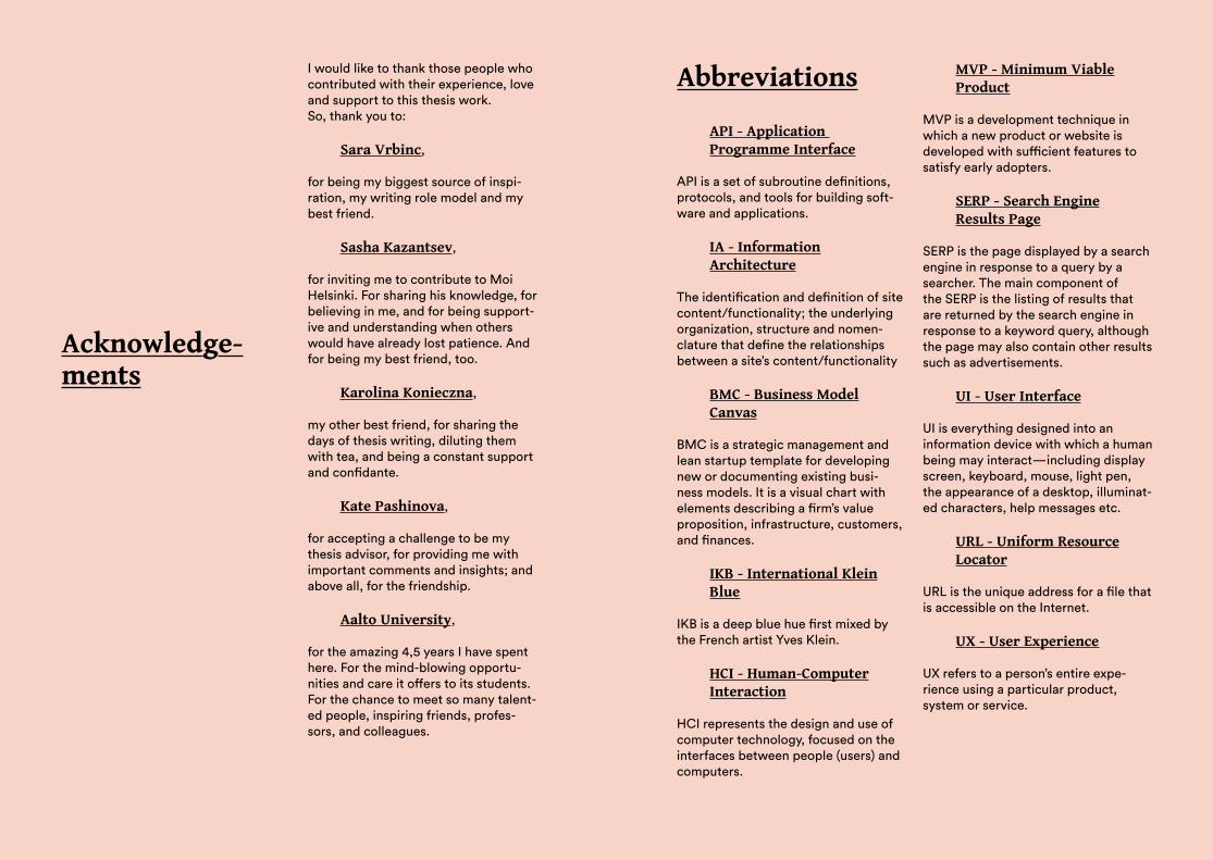
I would like to thank those people who contributed with their experience, love and support to this thesis work. So, thank you to:
Sara Vrbinc,
for being my biggest source of inspi-ration, my writing role model and my best friend.
Sasha Kazantsev,
for inviting me to contribute to Moi Helsinki. For sharing his knowledge, for believing in me, and for being support-ive and understanding when others would have already lost patience. And for being my best friend, too.
Karolina Konieczna,
my other best friend, for sharing the days of thesis writing, diluting them with tea, and being a constant support and confidante.
Kate Pashinova,
for accepting a challenge to be my thesis advisor, for providing me with important comments and insights; and above all, for the friendship.
Aalto University,
for the amazing 4,5 years I have spent here. For the mind-blowing opportu-nities and care it offers to its students. For the chance to meet so many talent-ed people, inspiring friends, profes-sors, and colleagues.
Acknowledge-ments
Abbreviations
API - Application Programme Interface
API is a set of subroutine definitions, protocols, and tools for building soft-ware and applications.
IA - InformationArchitecture
The identification and definition of site content/functionality; the underlying organization, structure and nomen-clature that define the relationships between a site’s content/functionality
BMC - Business ModelCanvas
BMC is a strategic management and lean startup template for developing new or documenting existing busi-ness models. It is a visual chart with elements describing a firm’s value proposition, infrastructure, customers, and finances.
IKB - International KleinBlue
IKB is a deep blue hue first mixed by the French artist Yves Klein.
HCI - Human-ComputerInteraction
HCI represents the design and use of computer technology, focused on the interfaces between people (users) and computers.
MVP - Minimum ViableProduct
MVP is a development technique in which a new product or website is developed with sufficient features to satisfy early adopters.
SERP - Search EngineResults Page
SERP is the page displayed by a search engine in response to a query by a searcher. The main component of the SERP is the listing of results that are returned by the search engine in response to a keyword query, although the page may also contain other results such as advertisements.
UI - User Interface
UI is everything designed into an information device with which a human being may interact—including display screen, keyboard, mouse, light pen, the appearance of a desktop, illuminat-ed characters, help messages etc.
URL - Uniform ResourceLocator
URL is the unique address for a file that is accessible on the Internet.
UX - User Experience
UX refers to a person’s entire expe-rience using a particular product, system or service.
Abstract
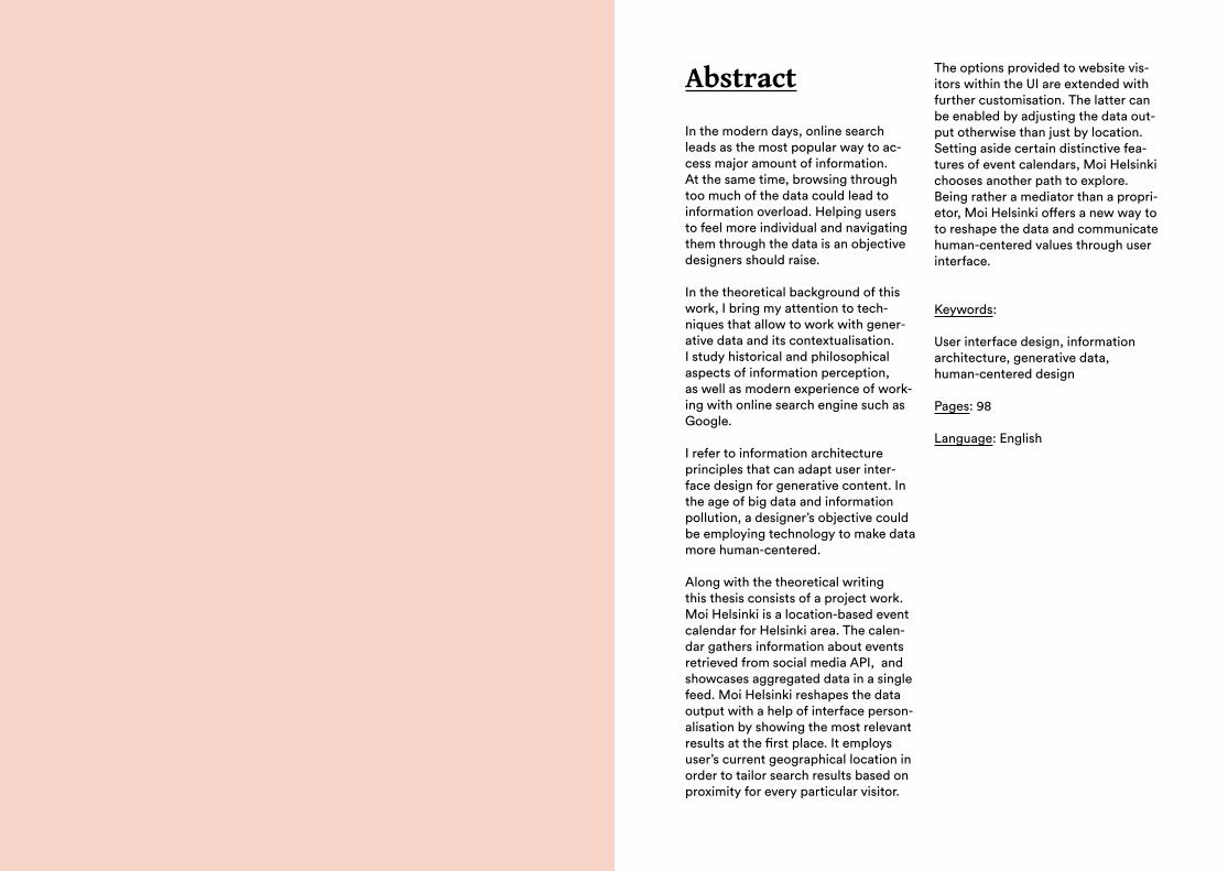
In the modern days, online search leads as the most popular way to ac-cess major amount of information.At the same time, browsing through too much of the data could lead to information overload. Helping users to feel more individual and navigating them through the data is an objective designers should raise.
In the theoretical background of this work, I bring my attention to tech-niques that allow to work with gener-ative data and its contextualisation. I study historical and philosophical aspects of information perception, as well as modern experience of work-ing with online search engine such as Google.
I refer to information architecture principles that can adapt user inter-face design for generative content. In the age of big data and information pollution, a designer’s objective could be employing technology to make data more human-centered.
Along with the theoretical writing this thesis consists of a project work. Moi Helsinki is a location-based event calendar for Helsinki area. The calen-dar gathers information about events retrieved from social media API, and showcases aggregated data in a single feed. Moi Helsinki reshapes the data output with a help of interface person-alisation by showing the most relevant results at the first place. It employs user’s current geographical location in order to tailor search results based on proximity for every particular visitor.
The options provided to website vis-itors within the UI are extended with further customisation. The latter can be enabled by adjusting the data out-put otherwise than just by location.Setting aside certain distinctive fea-tures of event calendars, Moi Helsinki chooses another path to explore. Being rather a mediator than a propri-etor, Moi Helsinki offers a new way to to reshape the data and communicate human-centered values through user interface.
Keywords:
User interface design, information architecture, generative data, human-centered design
Pages: 98
Language: English
A
IntroProduct forms are dissolving into social interactions.| Klaus Krippendorff
Cultural life is an important attribute of a city inhabitant. Channels through which the information reaches a poten-tial visitor of cultural events may vary. Today, we often use digital services for our daily information updates in the above-mentioned field. Whether a source of information is a blog or a social media invitation, they have a common feature—the source is inter-net-based. Nowadays, online searches are the most overwhelming and convenient way to access information. Google Search has been around for almost 20 years, shaping our experience of the web, making us digitally adapt, and helping us use search engines intuitive-ly. Due to the extremely high accessi-bility of large amounts of data, digital searching has become a significant part of our lives.
A role of design in this case is crucial: “Design enables interaction between user and technology through user interface” (Vrbinc, 2015). Therefore, the latter is very much responsible for the successful functioning of any digital design product. Interaction that tends to happen between a user and digital service is usually described as ‘user experience’ (UX). It can be perceived as an overall experience users gain within technology-involved interactions. In product development, we can
observe a tendency to move away from concrete products in order to design tasks for people to perform (Krippen-dorff, 2005). The priorities of online data presentation have been changing along with the time, and the realm of modern life has forced recent services to shift towards interactivity. One of the most important goals for service and graphic designers is to put the users into the centre of the planned interaction. Sometimes we don’t even realise what makes us feel excited about a certain online service or appli-cation, but often it can be attributed to the possibility to feel that we are active participants in this experience. One of the possible ways to enable user participation is through the personalisation of their experience. Displaying the data that could be meaningful for users contributes to better user involvement, and increases their interest in this data. Therefore, personalisation helps users to develop a distinctive connection with data.
In the days of information overload, helping users to feel more individual and navigating them through data is an objective that designers should strive for. Technology with a human face is much needed, and while working with a big amount of information, placing the data within a narrative framework emerges as one of the solutions. “By creating narrative and context to information, the data can become more human” (Thorp, 2011). Narration and contextualisation appear as very natural tools that allow humans to work with information. When applied to digital services, these tools could enable easier perception and quicker recognition, for example.
A10
→11
12→
13A
In the upcoming chapters, I would like to investigate the modern realms of working with digital data. I approach this study by bringing together a user interface (UI), a human-centred logic in information retrieval, and a concept of the event calendar.
A:1 Motivation
This thesis work documents the project of the concept development of Moi Helsinki—an online event calen-dar with location-based output for the Helsinki region. In this work I suggest a solution for personalising generative data retrieved from Facebook API. The prototype is aimed at gathering and structuring information in a way that would be convenient and meaningful for the users.
The original idea of setting up a design project for public use belongs to Sasha Kazantsev. He initiated this work as a master’s student in New Media at Media Lab (Aalto University School of Arts, Design and Architecture). Being a project founder, he studies social inter-action models and works on the tech-nical elements. I took on the role of user interface (UI) designer. Therefore, in this project I have been responsible for both the UI and the UX. Throughout this project we have taken care of mul-tiple tasks together, developing it from the ideation stage to the actual online prototype. As a team of two, we have started our work on a minimum viable product (MVP) while also considering a bigger scale and future development
scenarios. Nevertheless, despite the development maturity the core idea and values remain the same.
One of the benchmarks that was motivational for the project is a widely known online dating application called Tinder. It combines several affordanc-es that make an online experience outstanding: a search based on a user’s location, personal customisation, and playful decision making. Inspired by an example so relevant to our project, our team investigated if similar interaction principles could be applied to the field of cultural entertainment—more pre-cisely, to an event calendar for Helsinki.
We were interested in creating a service that would mediate between the users and data retrieved through social media API. Moi Helsinki does not accommodate all the information regarding the events, but does provide a location-based starting point to pro-ceed with the search. Once the user selects an event, they are redirected to a social media webpage. As such, we were keen on combining certain qual-ities that we found meaningful rather than offering an event calendar similar in its interaction model to already existing ones.
The benchmark investigation has shown that location-based event searches remain an unexplored path in the Helsinki area. As such, com-bined with other functions and shaped as a minimalistic interface, Moi Helsinki pursues its own goals. Moi Helsinki does not limit event categories—in its feed it displays all the possible events available in the area. Although this feature could be considered as a challenge, it also
opens unlimited possibilities to discover a wide range of events.
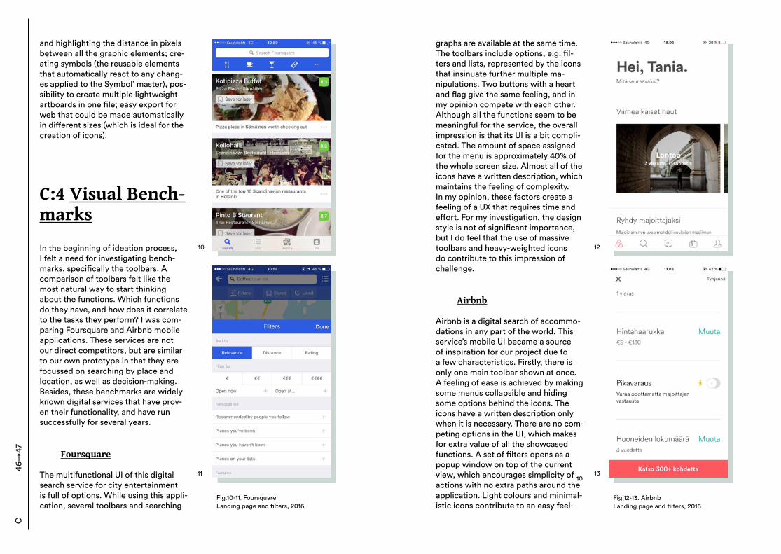
Benchmarks / competitors
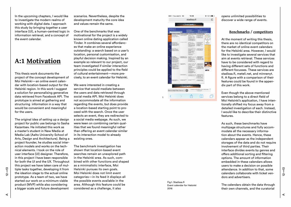
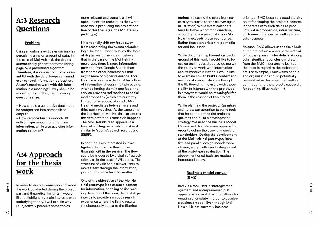
At the moment of writing this thesis, there are no identical competitors on the market of online event calendars for the Helsinki area. However, I would like to investigate several services that aim at events retrieval. These services have to be considered with regard to having different sets of functions and different focusses. These services are stadissa.fi, meteli.net, and minnenyt.fi. A figure with a comparison of their features could be found in the appen-dix part of this work. Even though the above-mentioned services belong to a direct field of Moi Helsinki’s application, I have inten-tionally shifted my focus away from a detailed investigation of each. Instead,I would like to describe their distinctive features.
As such, these benchmarks have multipage structures and fully accom-modate all the necessary informa-tion about the events. Hence, these calendars appear as the independent storages of the data and do not require involvement of third parties. Their interface divides events by genres and offers additional sorting and filtering options. The amount of information embedded in these calendars allows users to make a decision on possible attendance. In addition to that, some calendars collaborate with ticket ven-dors and advertisers. The calendars obtain the data through their own channels, and the curatorial
A12
→13
Fig.1. Stadissa.fiEvent calendar for Helsinki2016
1
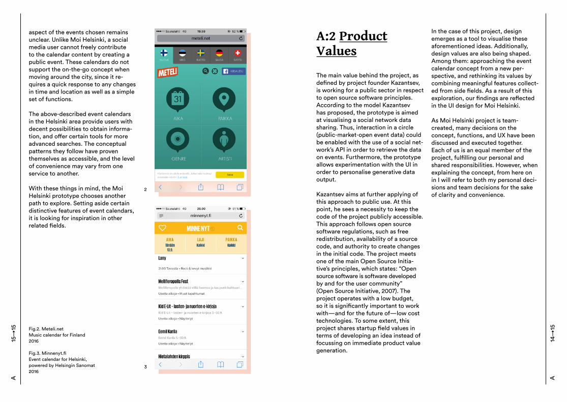
Fig.2. Meteli.netMusic calendar for Finland2016
Fig.3. Minnenyt.fiEvent calendar for Helsinki, powered by Helsingin Sanomat2016
aspect of the events chosen remains unclear. Unlike Moi Helsinki, a social media user cannot freely contribute to the calendar content by creating a public event. These calendars do not support the on-the-go concept when moving around the city, since it re-quires a quick response to any changes in time and location as well as a simple set of functions. The above-described event calendars in the Helsinki area provide users with decent possibilities to obtain informa-tion, and offer certain tools for more advanced searches. The conceptual patterns they follow have proven themselves as accessible, and the level of convenience may vary from one service to another. With these things in mind, the Moi Helsinki prototype chooses another path to explore. Setting aside certain distinctive features of event calendars, it is looking for inspiration in other related fields.
2
3
15→
15A
A:2 Product Values
The main value behind the project, as defined by project founder Kazantsev, is working for a public sector in respect to open source software principles. According to the model Kazantsev has proposed, the prototype is aimed at visualising a social network data sharing. Thus, interaction in a circle (public-market-open event data) could be enabled with the use of a social net-work’s API in order to retrieve the data on events. Furthermore, the prototype allows experimentation with the UI in order to personalise generative data output. Kazantsev aims at further applying of this approach to public use. At this point, he sees a necessity to keep the code of the project publicly accessible. This approach follows open source software regulations, such as free redistribution, availability of a source code, and authority to create changes in the initial code. The project meets one of the main Open Source Initia-tive’s principles, which states: “Open source software is software developed by and for the user community” (Open Source Initiative, 2007). The project operates with a low budget, so it is significantly important to work with—and for the future of—low cost technologies. To some extent, this project shares startup field values in terms of developing an idea instead of focussing on immediate product value generation.
In the case of this project, design emerges as a tool to visualise these aforementioned ideas. Additionally, design values are also being shaped. Among them: approaching the event calendar concept from a new per-spective, and rethinking its values by combining meaningful features collect-ed from side fields. As a result of this exploration, our findings are reflected in the UI design for Moi Helsinki. As Moi Helsinki project is team-created, many decisions on the concept, functions, and UX have been discussed and executed together. Each of us is an equal member of the project, fulfilling our personal and shared responsibilities. However, when explaining the concept, from here on in I will refer to both my personal deci-sions and team decisions for the sake of clarity and convenience.
A14
→15
A:3 Research Questions
Problem
Using an online event calendar implies perceiving a major amount of data. In the case of Moi Helsinki, the data is automatically generated to the listing page by a predefined algorithm. Therefore, it is crucial to build a pleas-ant UX with the data, keeping in mind user-centred information perception.A user’s need to work with this infor-mation in a meaningful way should be respected. From this, the following questions arise:
– How should a generative data input be reorganised into personalised output?– How can one build a smooth UX with a major amount of unfamiliar information, while also avoiding infor-mation pollution?
A:4 Approachfor the thesiswork
In order to draw a connection between the work conducted during the project part and theoretical insights, I would like to highlight my main interests with underlying theory. I will explain why I subjectively perceive some topics
more relevant and some less. I will open up certain techniques that were used while producing the project por-tion of this thesis (i.e. the Moi Helsinki prototype).
I intentionally shift my focus away from researching the events calendar logic. Instead, I want to study the logic of digital search services. I believe that in the case of the Moi Helsinki prototype, there is more information provided from Google Search than from some other benchmarks that might seem of higher relevance. Moi Helsinki is a service that enables a flow of information through multiple events. After collecting them in one feed, the service provides redirections to social media websites (which are currently limited to Facebook). As such, Moi Helsinki mediates between users and third party websites. At the same time, the interface of Moi Helsinki structures the data before this transition happens. The Moi Helsinki feed appears in a form of a listing page, which makes it similar to Google’s search result page (SERP).
In addition, I am interested in inves-tigating the possible flow of user thoughts within the service. The flow could be triggered by a chain of associ-ations, as in the case of Wikipedia. The structure of Wikipedia allows users to move freely through the information, jumping from one term to another. One of the objectives of the Moi Hel-sinki prototype is to create a context for information, enabling easier read-ing. To support this idea, the prototype intends to provide a smooth search experience where the listing results simultaneously adjust to the filtering
16→
17A
options, releasing the users from ne-cessity to start a search all over again. (illustration) While event calendars tend to follow a common direction, according to my personal vision Moi Helsinki exceeds these boundaries. Rather than a proprietor, it is a media-tor and facilitator.
While documenting theoretical back-ground of this work I would like to fo-cus on techniques that provide me with the ability to work with information and its contextualisation. I would like to examine how to build a context and enable data personalisation through the UI. Providing the users with a pos-sibility to interact with the prototype in a way that would be meaningful for them is the essence of this project. While planning the project, Kazantsev and I drew our attention to some tools that helped to define the project’s qualities and build a development strategy. We used the Business Model Canvas and User Personas approach in order to define the users and circle of stakeholders. During the development of the Moi Helsinki prototype, itera-tive and parallel design models were chosen, along with user testing aimed at the prototype’s evaluation. The above-mentioned tools are gradually introduced below.
Business model canvas(BMC)
BMC is a tool used in strategic man-agement and entrepreneurship. It appears as a visual chart that allows for creating a template in order to develop a business model. Even though Moi Helsinki is not currently business-
oriented, BMC became a good starting point for shaping the project’s context. It operates with such fields as prod-uct’s value proposition, infrastructure, customers, finances, as well as a few other aspects.
As such, BMC allows us to take a look at the project on a wider scale instead of focussing on smaller details. Among other significant conclusions drawn from the BMC, I personally learned the most in regard to the stakehold-ers. For example, I saw which people and organisations could potentially be involved in the project, as well as contributing to the project’s successful functioning. (Illustration →)
A16
→17
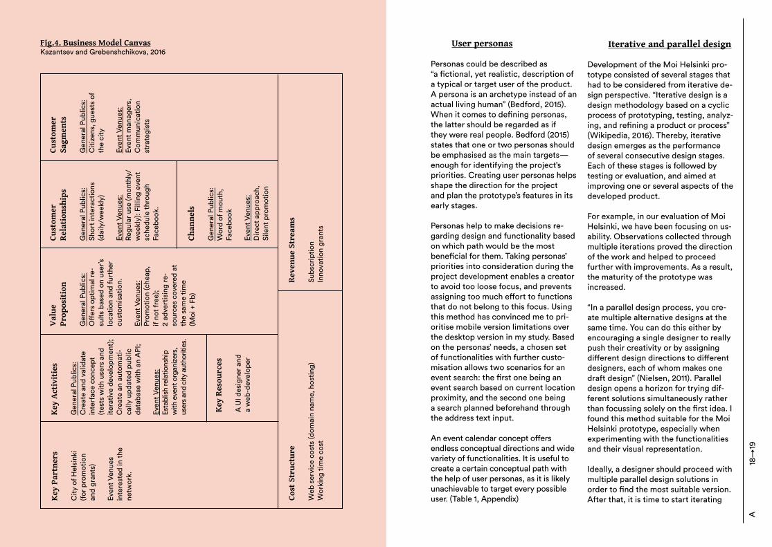
Fig.4. Business Model CanvasKazantsev and Grebenshchikova, 2016
Key
Par
tner
s
City
of H
elsi
nki
(for p
rom
otio
n an
d gr
ants
)
Even
t Ven
ues
inte
rest
ed in
the
netw
ork.
Key
Act
ivit
ies
Gen
eral
Pub
lics:
Cre
ate
and
valid
ate
inte
rfac
e co
ncep
t (t
ests
with
use
rs a
nd
itera
tive
deve
lopm
ent)
;C
reat
e an
aut
omat
i -ca
lly u
pdat
ed p
ublic
da
taba
se w
ith a
n A
PI;
Even
t Ven
ues:
Esta
blis
h re
latio
nshi
p w
ith e
vent
org
aniz
ers,
us
ers a
nd c
ity a
utho
ritie
s.
Val
uePr
opos
itio
n
Gen
eral
Pub
lics:
Off
ers
optim
al re
-su
lts b
ased
on
user
’s lo
catio
n an
d fu
rthe
r cu
stom
isat
ion.
Even
t Ven
ues:
Prom
otio
n (c
heap
, if
not f
ree)
;2
adve
rtis
ing
re-
sour
ces
cove
red
at
the
sam
e tim
e (M
oi +
Fb)
Cust
omer
Rel
atio
nshi
ps
Gen
eral
Pub
lics:
Shor
t int
erac
tions
(d
aily
/wee
kly)
Even
t Ven
ues:
Regu
lar u
se (m
onth
ly/
wee
kly)
: Fill
ing
even
t sc
hedu
le th
roug
h Fa
cebo
ok.
Cust
omer
Sagm
ents
Gen
eral
Pub
lics:
Citi
zens
, gue
sts
of
the
city
Even
t Ven
ues:
Even
t man
ager
s,C
omm
unic
atio
n st
rate
gist
s
Chan
nels
Gen
eral
Pub
lics:
Wor
d of
mou
th,
Face
book
Even
t Ven
ues:
Dire
ct a
ppro
ach,
Si
lent
pro
mot
ion
Rev
enue
Str
eam
s
Subs
crip
tion
Inno
vatio
n gr
ants
Cost
Str
uctu
re
Web
ser
vice
cos
ts (d
omai
n na
me,
hos
ting)
Wor
king
tim
e co
st
Key
Res
ourc
es
A U
I des
igne
r and
a w
eb-d
evel
oper
User personas
Personas could be described as “a fictional, yet realistic, description of a typical or target user of the product. A persona is an archetype instead of an actual living human” (Bedford, 2015). When it comes to defining personas, the latter should be regarded as if they were real people. Bedford (2015) states that one or two personas should be emphasised as the main targets—enough for identifying the project’s priorities. Creating user personas helps shape the direction for the project and plan the prototype’s features in its early stages. Personas help to make decisions re-garding design and functionality based on which path would be the most beneficial for them. Taking personas’ priorities into consideration during the project development enables a creator to avoid too loose focus, and prevents assigning too much effort to functions that do not belong to this focus. Using this method has convinced me to pri-oritise mobile version limitations over the desktop version in my study. Based on the personas’ needs, a chosen set of functionalities with further custo-misation allows two scenarios for an event search: the first one being an event search based on current location proximity, and the second one being a search planned beforehand through the address text input.
An event calendar concept offers endless conceptual directions and wide variety of functionalities. It is useful to create a certain conceptual path with the help of user personas, as it is likely unachievable to target every possible user. (Table 1, Appendix)
Iterative and parallel design
Development of the Moi Helsinki pro-totype consisted of several stages that had to be considered from iterative de-sign perspective. “Iterative design is a design methodology based on a cyclic process of prototyping, testing, analyz-ing, and refining a product or process” (Wikipedia, 2016). Thereby, iterative design emerges as the performance of several consecutive design stages. Each of these stages is followed by testing or evaluation, and aimed at improving one or several aspects of the developed product.
For example, in our evaluation of Moi Helsinki, we have been focusing on us-ability. Observations collected through multiple iterations proved the direction of the work and helped to proceed further with improvements. As a result, the maturity of the prototype was increased. “In a parallel design process, you cre-ate multiple alternative designs at the same time. You can do this either by encouraging a single designer to really push their creativity or by assigning different design directions to different designers, each of whom makes one draft design” (Nielsen, 2011). Parallel design opens a horizon for trying dif-ferent solutions simultaneously rather than focussing solely on the first idea. I found this method suitable for the Moi Helsinki prototype, especially when experimenting with the functionalities and their visual representation.
Ideally, a designer should proceed with multiple parallel design solutions in order to find the most suitable version. After that, it is time to start iterating
A18
→19
on the chosen solution with the aim to improve usability, followed by several iterative rounds. In the case of Moi Helsinki, I unintentionally altered the aforementioned sequence, coming up with the parallel solutions between iterations. Even though the border be-tween the stated technique and mine becomes vague at times, Moi Helsinki has displayed a need for both. In my opinion, iterative and parallel design models are significantly helpful methods in the fields of UI and UX. By using both models, I was able to diminish pressure and a fear of failure; when I was going through creative or conceptual difficulties, I did not hesitate to start over and try different directions. Some conceptual outcomes were eventually merged together and contributed to the most suitable solution.
User Testing
User testing is somewhere between the aforementioned methods, and aimed at measuring usability. “Usability testing is a technique used in user-cen-tred interaction design to evaluate a product by testing it on users. [...] It gives direct input on how real users use the system” (Nielsen, 1994). In general, conducting it allows the study and measurement of the ease of com-prehension. User testing could be done during the development stage and then once again during the pre-production stage. Early testing helps to diminish a risk of major flaws by identifying usability problems when they are still not too late to fix.
The testing for Moi Helsinki was performed on an unfinished proto-
type. It had a core objective to test the conceptual direction and function’s readability. The following questions were what the testing was aimed to answer:
– Can users can successfully perform a searching task?– Can users interpret the service core ideas correctly? – Are the function of the buttons understandable?
The test consisted of two parts: one part contained suggested answers, rated by relevancy, in order to mea-sure the usability; the second part of the test raised open questions and observed the user reaction regarding certain conceptual solutions. The test-ing investigated different sides of the project, and provided relevant insight for both UI and conceptual design development.By describing the approach for this thesis work, I am keen on explaining the working methods that were used by me personally—as well as the Moi Helsinki team in general—starting from the beginning of the project. I hope that this will demonstrate the key drivers behind both theoretical and production elements (described in detail in the following sections of this thesis).
(Testing materials in the appexndix)
20→
21A
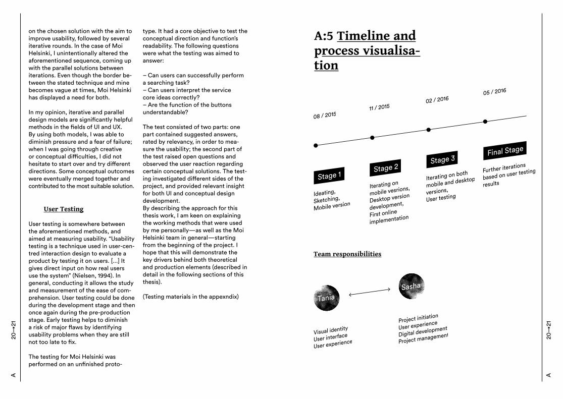
A:5 Timeline and process visualisa-tion
Team responsibilities
A20
→21
B
B:1 How do we work with information?Selection by association, rather than indexing.| Vannevar Bush
Historical aspects
Throughout the history of humankind, people have been eager to collect and store information. This could be explained by the limitations of human memory and impossibility of universal knowledge. To deal with tangible infor-mation (e.g. in a written form), people have been creating catalogues and libraries that employ a certain logic. It is this logic of categorisation that as-signs large amount of data to classes, subclasses, and so on.
Ironically, being invented by humans, categorisations do not follow a human logic. “The human mind does not work that way. It operates by association. With one item in its grasp, it snaps instantly to the next that is suggested by the association of thoughts” (Bush, 1945). As such, the human way of thinking is more chaotic than linear or classified. Of course, we are able to work with the information in an artifi-cial way, but it does not appear to be the most convenient way.
Several decades prior to internet era, Bush (1945) was speculating upon storing information for personal use. Having the mindset of an enlightened
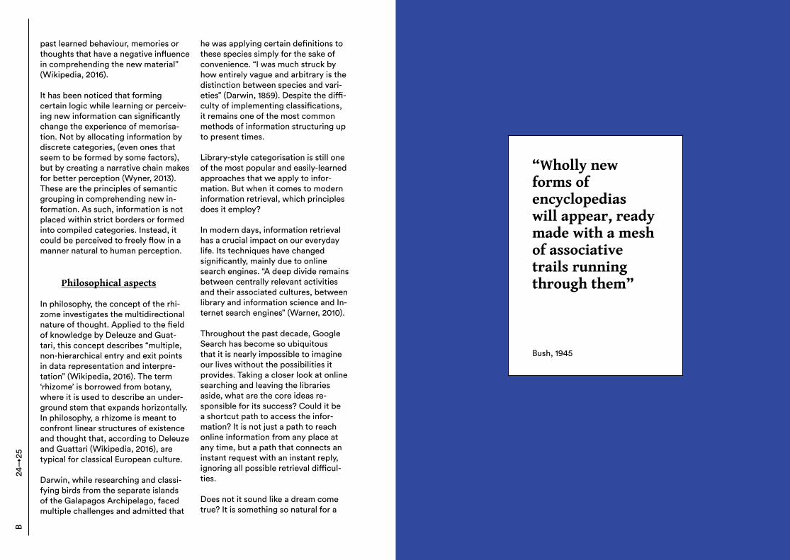
person, he fantasised about a machine called a ‘memex’, whose functions and even appearance is extremely close to a modern personal computer. For example, files would have been sorted and accessed by importance and frequency of use. The logic used by this data storage is derived from the logic used by human, and could be compared to a short-term memory that arises in the cortex of a human brain. To support his idea, Bush has argued that systems of indexing have been inefficient. Once you have started a particular search, you have to follow the logic until you reach the results. If you want to initiate a new search, you have to exit a system and start over again. What if catalogues, in a mean-ing of information repository, could operate with a human-based logic? “Selection by association, rather than indexing,” as Bush suggests. Surpris-ingly, back in 1945, Bush proposed the principle upon which Wikipedia works: “Wholly new forms of encyclopedias will appear, ready made with a mesh of associative trails running through them” (Bush, 1945). The ability to jump from one thought or term to another is one of the core principles of Wikipe-dia’s organisation, and one that makes it so convenient and intuitive to use.
In the field of human memory stud-ies, this notion of Bush’s correlates with interference theory. In general, it studies the connections between previously-stored information and newer findings, how they compete for domination, and what intersections and associative chains they form. “Interference occurs in learning when there is an interaction between the new material and transfer effects of
B22
→23
past learned behaviour, memories or thoughts that have a negative influence in comprehending the new material” (Wikipedia, 2016). It has been noticed that forming certain logic while learning or perceiv-ing new information can significantly change the experience of memorisa-tion. Not by allocating information by discrete categories, (even ones that seem to be formed by some factors), but by creating a narrative chain makes for better perception (Wyner, 2013). These are the principles of semantic grouping in comprehending new in-formation. As such, information is not placed within strict borders or formed into compiled categories. Instead, it could be perceived to freely flow in a manner natural to human perception.
Philosophical aspects
In philosophy, the concept of the rhi-zome investigates the multidirectional nature of thought. Applied to the field of knowledge by Deleuze and Guat-tari, this concept describes “multiple, non-hierarchical entry and exit points in data representation and interpre-tation” (Wikipedia, 2016). The term ‘rhizome’ is borrowed from botany, where it is used to describe an under-ground stem that expands horizontally. In philosophy, a rhizome is meant to confront linear structures of existence and thought that, according to Deleuze and Guattari (Wikipedia, 2016), are typical for classical European culture. Darwin, while researching and classi-fying birds from the separate islands of the Galapagos Archipelago, faced multiple challenges and admitted that
he was applying certain definitions to these species simply for the sake of convenience. “I was much struck by how entirely vague and arbitrary is the distinction between species and vari-eties” (Darwin, 1859). Despite the diffi-culty of implementing classifications, it remains one of the most common methods of information structuring up to present times. Library-style categorisation is still one of the most popular and easily-learned approaches that we apply to infor-mation. But when it comes to modern information retrieval, which principles does it employ? In modern days, information retrieval has a crucial impact on our everyday life. Its techniques have changed significantly, mainly due to online search engines. “A deep divide remains between centrally relevant activities and their associated cultures, between library and information science and In-ternet search engines” (Warner, 2010). Throughout the past decade, Google Search has become so ubiquitous that it is nearly impossible to imagine our lives without the possibilities it provides. Taking a closer look at online searching and leaving the libraries aside, what are the core ideas re-sponsible for its success? Could it be a shortcut path to access the infor-mation? It is not just a path to reach online information from any place at any time, but a path that connects an instant request with an instant reply, ignoring all possible retrieval difficul-ties. Does not it sound like a dream come true? It is something so natural for a
24→
25B
“Wholly new forms of encyclopedias will appear, ready made with a mesh of associative trails running through them”
Bush, 1945
human, yet took such a long time to appear. At this point I could not help but wonder if it is Google that has affected our way of retrieving informa-tion, or a human logic that has finally had a chance to appear in retrieval mechanisms.
B:2 Online search interaction
I find the Moi Helsinki challenge in information visualisation similar to that of the online search engine. In this chapter, I focus on Google as a primary benchmark in the field of information retrieval. Throughout its history, Goo-gle has achieved remarkable user rec-ognition. It processes about 1,2 trillion searches daily (Google Zeitgeist, 2012). The word ‘google’ has become a verb for online information retrieval, despite which online search engine is actually used. As such, in this work I will take a closer look at Google in particular, studying its contribution to the online search and interaction development between Google and its users since its launch in 1998.
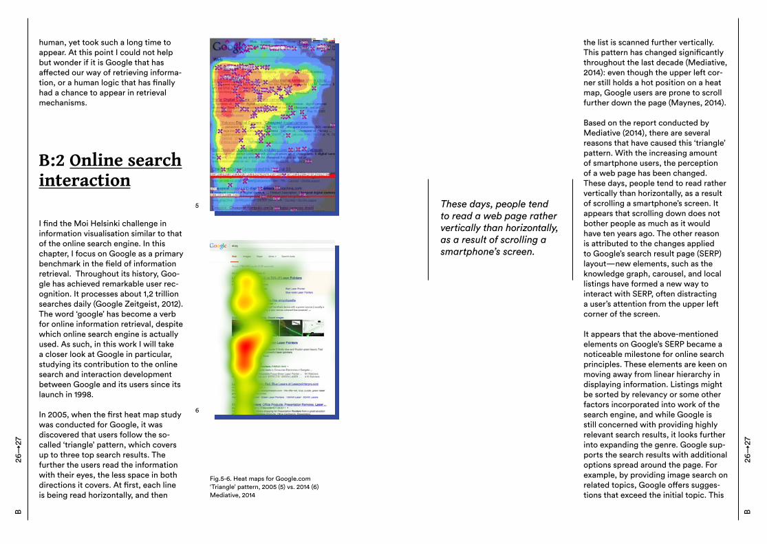
In 2005, when the first heat map study was conducted for Google, it was discovered that users follow the so-called ‘triangle’ pattern, which covers up to three top search results. The further the users read the information with their eyes, the less space in both directions it covers. At first, each line is being read horizontally, and then
Fig.5-6. Heat maps for Google.com‘Triangle’ pattern, 2005 (5) vs. 2014 (6)Mediative, 2014
5
6
26→
27B
the list is scanned further vertically. This pattern has changed significantly throughout the last decade (Mediative, 2014): even though the upper left cor-ner still holds a hot position on a heat map, Google users are prone to scroll further down the page (Maynes, 2014). Based on the report conducted by Mediative (2014), there are several reasons that have caused this ‘triangle’ pattern. With the increasing amount of smartphone users, the perception of a web page has been changed. These days, people tend to read rather vertically than horizontally, as a result of scrolling a smartphone’s screen. It appears that scrolling down does not bother people as much as it would have ten years ago. The other reason is attributed to the changes applied to Google’s search result page (SERP) layout—new elements, such as the knowledge graph, carousel, and local listings have formed a new way to interact with SERP, often distracting a user’s attention from the upper left corner of the screen.
It appears that the above-mentioned elements on Google’s SERP became a noticeable milestone for online search principles. These elements are keen on moving away from linear hierarchy in displaying information. Listings might be sorted by relevancy or some other factors incorporated into work of the search engine, and while Google is still concerned with providing highly relevant search results, it looks further into expanding the genre. Google sup-ports the search results with additional options spread around the page. For example, by providing image search on related topics, Google offers sugges-tions that exceed the initial topic. This
These days, people tend to read a web page rather vertically than horizontally, as a result of scrolling a smartphone’s screen.
B26
→27
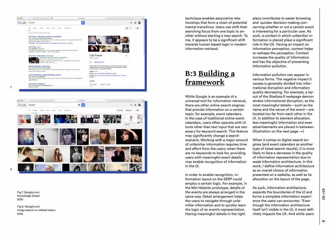
Fig.7. Google.comKnowledge Graph2016
Fig.8. Google.comImage search on related topics2016
7
8
technique enables associative rela-tionships that form a chain of potential mental transitions. Users can shift their searching focus from one topic to an-other without starting a new search. To me, it appears to be a significant shift towards human-based logic in modern information retrieval.
B:3 Building a framework
While Google is an example of a universal tool for information retrieval, there are other online search engines that provide information on a certain topic: for example, event calendars. In the case of traditional online event calendars, users often operate with UI tools other than text input that are nec-essary for keyword search. This feature may significantly change a search scenario. Working with a major amount of unfamiliar information requires time and effort from the users; when there are no keywords to look for, providing users with meaningful event details may enable recognition of information in the UI. In order to enable recognition, in-formation layout on the SERP could employ a certain logic. For example, in the Moi Helsinki prototype, details of the events are always arranged in the same way. Detail arrangement helps the users to navigate through unfa-miliar information and to quickly learn the logic of an event’s representation. Having meaningful details in the right
place contributes to easier browsing and quicker decision-making con-cerning whether or not a certain event is interesting for a particular user. As such, a context in which unfamiliar in-formation is placed plays a significant role in the UX. Having an impact on information perception, context helps to reshape the perception. Context increases the quality of information and has the objective of preventing information pollution.
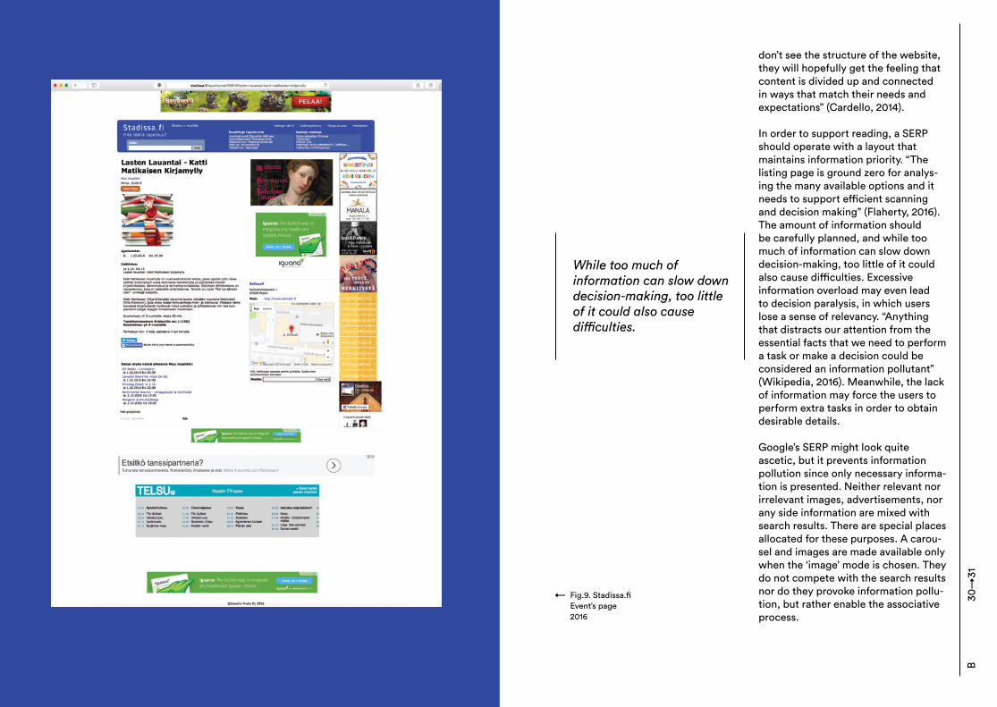
Information pollution can appear in various forms. The negative impact it causes is generally divided into infor-mational disruption and information quality decreasing. For example, a lay-out of the Stadissa.fi webpage demon-strates informational disruption, as the most meaningful details—such as the name and the venue of the event—are located too far from each other in the UI. In addition to element allocation, less meaningful information and even advertisements are placed in between. (illustration on the next page →) When it comes to digital search en-gines (and event calendars as another type of listed search results), it is more likely to face a decrease in the quality of information representation due to weak information architecture. In this work, I define information architecture as an overall choice of information presented on a website, as well as its allocation on the layout of the page. As such, information architecture expands the boundaries of the UI and forms a complete information experi-ence the users can encounter. “Even though the information architecture itself isn’t visible in the UI, it most defi-nitely impacts the UX. And while users
B28
→29
don’t see the structure of the website, they will hopefully get the feeling that content is divided up and connected in ways that match their needs and expectations” (Cardello, 2014). In order to support reading, a SERP should operate with a layout that maintains information priority. “The listing page is ground zero for analys-ing the many available options and it needs to support efficient scanning and decision making” (Flaherty, 2016). The amount of information should be carefully planned, and while too much of information can slow down decision-making, too little of it could also cause difficulties. Excessive information overload may even lead to decision paralysis, in which users lose a sense of relevancy. “Anything that distracts our attention from the essential facts that we need to perform a task or make a decision could be considered an information pollutant” (Wikipedia, 2016). Meanwhile, the lack of information may force the users to perform extra tasks in order to obtain desirable details. Google’s SERP might look quite ascetic, but it prevents information pollution since only necessary informa-tion is presented. Neither relevant nor irrelevant images, advertisements, nor any side information are mixed with search results. There are special places allocated for these purposes. A carou-sel and images are made available only when the ‘image’ mode is chosen. They do not compete with the search results nor do they provoke information pollu-tion, but rather enable the associative process.
While too much of information can slow down decision-making, too little of it could also cause difficulties.
Fig.9. Stadissa.fiEvent’s page2016
→
B30
→31
What if an event calendar employs Google’s logic in regards to information architecture? The objective could have been an extreme concentration on nec-essary information. The most import-ant factor here will be context—how to approach the information built around the event’s name, and what initial infor-mation could be displayed for the sake of enabling recognition.
B:4 Opening aproblem: how toadapt design forgenerative contentGood data visualization tech-niques and technologies,properly used, can extend our thinking into new realms of analytical sensemaking.| Stephen Few
Information architecture and perception
Generative data is not the easiest material for human perception, since working with it might include psycho-logical, visual, and cognitive percep-tion difficulties. So, following human perception rules could be one of the possible techniques to employ when designing the UI for generative data. The human brain approaches visual and cognitive perception differently.
Visual perception is processed faster and requires minimum effort, while cognitive perception requires more time and is less efficient (Few, 2014). When thinking about presenting the information, both kinds of perception should be respected:
Visualization is only successful to the degree that it encodes information in a manner that our eyes can discern and our brains can understand. [...] The goal is to translate abstract information into visual representations that can be easily, efficiently, accurately, and meaningfully decoded . (Few, 2014).
Therefore, taking into account human perception aspects could significantly increase the quality of information architecture (IA) and information assimilation. There are several principles observed and developed by the Gestalt School of Psychology back in 1912. These principles are still respected and widely used in design field. As such, Gestalt researchers investigate how humans perceive patterns and forms and organise them in a meaningful way. Gestalt principles explain human visual behaviour, and therefore could be employed for IA planning. The principles (also called laws) focus on such aspects as proximity, similarity, closure, symmetry, common fate, con-tinuity, and past experience. Among the principles mentioned, I am especially interested in proximity and similarity. As such, if some elements on the page are visually similar, they will be perceived in a relation to each
32→
33B
other. It is therefore possible to create a rhythm of elements that contributes to clear structure. The principle of proximity could also add certain values to information perception with the help of grouping the elements. Group divi-sion encourages the sense-making and easier navigation through information. To provide some examples, I could mention that certain sections in the toolbar could be grouped meaningfully. In some cases, this helps to perform a task faster, as all functions are then located in one place. “We can as-sume that roughly the same number of people who visited the separate sections first would choose the unified section, giving us a 75% success rate” (Nelson, 2006). In my opinion, Gestalt laws could be also applied to the listing page structure. Grouping and allo-cating information both visually and meaningfully helps the users to quickly find the logic behind the data.
Addressing to the users
While IA contributes to easier infor-mation perception for all the users in general, there should also be a way to add extra meaning for every partic-ular user. As such, addressing to the users emerges as one of the possible solutions. Our own devices, such as smartphones and personal computers, have embed-ded opportunities to bring information experience to a new level. They store major amounts of personal data that designers could use intelligently for the sake of better UX. While the user location is simply bytes of data stored somewhere in a smartphone’s pro-
cessor, shaping this data in a human context may bring new values to human-computer interaction (HCI). Jer Thorp (2011) investigates this data with a respect to users’ own histories stored on their devices. He claims that such an approach contributes to a fundamental respect, which is missing when it comes to a technology (illus-tration from TED talks). This attitude could be equally applied to all the data hidden behind APIs, like in case of our Moi Helsinki project. Designers could therefore employ the data as dialogue between the users and the technology. In this case, digital services might address directly to the users by arranging the data meaning-fully for every particular user. Sorting based on a user’s location or time might be considered as personalisa-tion, since the content is otherwise automatically generated and therefore impersonal. Personalisation is aimed at deliver-ing content and functions matching particular a user’s needs. Personal-isation could be embedded in the UI and/or be animated by triggering certain user’s actions in order for the system to understand which content to show. “Personalisation may deliver or emphasize particular information, restrict or grant access to certain tools, or simplify transactions and processes by remembering information about a user” (Schade, 2016). Among the tools that may help to shape more personal UX, favourites, wish lists, and saved items are all possibilities. These possi-bilities add value to every UX, as they bring human aspects to the data stored behind the screens, and the UX obtains a new meaning.
B32
→33
“By creating narrative and context to information, the data can become more human”
Thorp, 2011
B:5 Theoretical Recap
In this part of the thesis, I investigate ways people work with information from the angle that may be of interest to the designer. In a graphic designer’s work, things looking pleasing is only a logical consequence of structuring the information into an easily perceived way. Therefore I find it crucial to work with the content organisation, since it is behind every design visualisation. The content finds its reflection in the UI. The latter mediates between the users and technology. “The interface translates the operating functions of technologies, systems and information into a universal language that people understand” (Vrbinc, 2016). With the help of the UI, it is crucial to address the users employing human-centred logic. This way, the data obtains a new meaning and opens unlimited possibili-ties for remarkable UX.
In the age of big data and information pollution, making sense out of data is a new objective. When almost every-thing is digitalised, how do we make humans feel like their values are still respected amidst a myriad of digital bytes? Generative data could be reor-ganised into personalised output with the help of certain principles. These are the information-building principles that support human logic. The key factors, as investigated in the previous chapters, could be: – Grouping the elements meaningfully in order to enable narration;
– Letting the users to move through a search freely, as to follow the natural flow of thoughts;– Be conscious about the information to be presented—information pollution challenges task performance;– Taking advantage of users’ personal data by creating a personal history. In the end, it is not about the data it-self, but the way in which it is present-ed that makes it more human. Taking this into account might significantly improve the experience of HCI.
Following the theoretical part of this thesis, in the project description segment of this thesis, I keep my focus on describing IA decisions rather than my graphic design decisions. One thing does not necessarily exclude the other, but to me this master’s thesis emerges as a place for exploring new knowledge. Throughout my previous experience, I have not focussed on the topics examined in this work that I now explore with great interest. I believe this knowledge could significantly contribute to a classic graphic design practice and increase the understand-ing of the area while working side by side with professionals from related fields.
B34
→35
C
C:1 Introducing the project The designer doesn’t design things anymore, but designs conditions.| Felix Janssens Supported by several decades of internet technology, online search has become a surprisingly natural part of our life experience. It is an endless source of data and knowledge, woven into our everyday life. The project portion of this thesis work introduces a prototype that illustrates information retrieval principles investigated in the previous chapters. Moi Helsinki (moihelsinki.com) is a location-based event calendar for the Helsinki area. It is aimed at retrieving events from social media API and displaying them in relation to a user’s current location. Social media circles on the current stage of the project are limited to Facebook, which provides sufficient data for the prototype’s efficient functioning. “Moi Helsinki processes the data on the server and returns it to the user as an event calen-dar” (Kazantsev, 2016). This technique helps to aggregate the maximum amount of information that might be potentially interesting for a user at a given time and location. The objective of this prototype is to create a medium for information translation. The ability to amplify or accelerate existing processes could be considered as the major intent of design-technology interaction. “For the “message” of any medium or technol-
ogy is the change of scale or pace or pattern that it introduces into human affairs. The railway did not introduce movement or transportation or wheel or road into human society, but it accelerated and enlarged the scale of previous human functions” (McLuhan, 1964). Following McLuhan’s idea, this project is meant to rethink and in-crease the searching scale by providing a certain technology: in our case, the technology that allows the retrieval of diverse data allocated separately, collected into one feed. Moi Helsinki’s events listing page allows the maintenance of the total amount of information available to a user without reducing it. It reshapes automatically-generated data with the help of personalisation. Initial person-alisation is enabled by identifying a user’s location and listing the events by distance. Further customisation is available through time, date, and address settings. By doing this, I tried to diminish per-ception difficulties that might occur while browsing a long list of events, as the prototype collects all possible events happening in Helsinki on that particular date into its feed. Since the events are not curated, transferring users to an event’s Facebook page by clicking on the event’s name plays a crucial role in terms of credibility. It started with some technical fea-tures, but was quickly recognised as a powerful tool that makes it clear who is behind the information retrieved through Moi Helsinki.
Although this master’s thesis is an individual work, the prototype that illustrates it is a collaboration between
C36
→37
me and Kazantsev. Therefore when defining goals for this project, I must mention the aspects that are meaning-ful for both members. Kazantsev has initiated this project in order to provide a tangible example for his studies in the field of design for public use. Social network data sharing appears as an example of a low-cost public project. Low cost becomes possible due to startup principles of focussing on the idea rather than the product’s immediate value. Open source software principles are also taken into account, as the pro-totype is running with the help of freely-distributed digital tools. Its code also has the potential of being reused. As such, the main Open Source Initia-tion’s motto, “open source software is developed by and for the user com-munity,” is followed and respected. The Moi Helsinki prototype is a natural outcome from speculation concerning design for public use merged with software experiments. “The purpose of the prototype […] is to uncover the op-portunities of low-cost citizen engage-ment in data aggregation. The focus of the work is extracting data from social networks and looking for the interface that brings knowledge framework to the retrieved information” (Kazantsev, 2016). For myself, I defined the main goal within this project as the following: to build a prototype UI that enables inter-action between the interface and user, utilising human-based logic in informa-tion retrieval. This is a logic based on association rather than categorisation. While working with automatically-gen-erated data, the objective is to find a
solution for reshaping this data both graphically and meaningfully, so to make it easy perceivable for the users. “The challenge for designers is deter-mining how to organise information so that it is retrievable in a coherent form that minimises confusion and maximis-es understanding” (Murray, 2012).Besides, this project became a play-ground for design and technical tests. It gave me a chance to observe and document what working techniques and approaches could be adopted by a graphic designer in order to work with the changeable nature of a dynamic interface.
C:2 Minimum viable product and development plan Nobody is interested in TV until there are TV programs.| Marshall McLuhan
Behind the scenes
Moi Helsinki is a self-initiated project. It started as a collaboration between Sasha Kazantsev as an initiator and web developer, and myself as an invited graphic designer. During the early stages of the project, the team also included a creative coder who significantly processes in the server’s functioning despite not staying with the project permanently.
38→
39C
Due to organisational and ideological reasons—such as the non-proprietary nature of the prototype and not focus-sing on immediate value—the project has had limited work and budget resources. It has been counted that the total costs involved in prototype cre-ation did not exceed 100 euros. Open source software resources allowed us to build the prototype with minimum costs. Both Kazantsev and I dedicated a large amount of our time to project develop-ment. From one perspective, it could be called volunteering while working in our spare time, since we were not paid. With a very vague link to time and money restrictions, Moi Helsinki became a playground for design and technical experiments. This would have hardly been possible under most other circumstances. We were maintaining a project ideol-ogy while working on the prototype, and are planning to continue to follow it after the launch. Nevertheless, we can imagine the future of Moi Helsinki shifting towards monetisation. This would be possible in the case of fur-ther expansion, and could allow adding extended functions to the prototype. The project emerges as a minimum viable product (MVP). As such, it operates with the minimum amount of functions capable for the product’s efficient work. “MVP is a product with just enough features to gather validat-ed learning about the product and its continued development” (Wikipedia, 2016). This approach helps to collect validated learning about the product, represented by its main features, with-out investing the full amount of time,
money and effort. By this, the MVP diminishes the risk of possible major flaws and losses in comparison to the full version of the product. Despite the MVP stage of maturity, the core idea of an event calendar remained untouched throughout the whole working process. Programming techniques and UI, however, surpassed changes at several stages that could be considered as the project’s milestones. Each stage equals a new iteration that allows designers to “step through one design version after another” (Nielsen, 2011). The iterative design process makes it possible to go through as many iterations as needed, as there are always some usability difficulties remaining unsolved. Each stage was aimed at our proto-type’s testing, as well as questioning the direction of further development. Even though the concept was already simple enough, I kept ‘cleaning up’ the UI throughout the entire project duration. I was making choices aimed at building a minimalistic interface, reducing unnecessary functions, and building a path towards user interac-tion. Decision-making was at times challenging, since conceptualising a digital search service for events pro-vides a surplus of promising directions. Throughout the following chapters I will describe different stages of our project, explaining the choices that were made at every stage.
C38
→39
“The challenge for designers is determining how to organise information so that it is retrievable in a coherent form that minimises confusion and maximises understanding”
Murray, 2012
Justifying the choiceof a platform
It might be assumed that if humankind has already obtained a certain new media knowledge, it will make things easier for designers. Unfortunately, this knowledge is not universal: as everything in new media, it is affected by such factors as multiple platforms and different devices, which therefore create different user experiences. So, for instance, by switching to a new hardware, the user might completely lose all experience obtained during several years of interaction with the previous hardware. I assume that many of us have been in this kind of situa-tion, such as when an iOS user cannot figure out how to unlock an Android smartphone. As this thesis project’s prototype is a product of the digital world (and is therefore dependent on diverse new media conditions), the potential context of its advantages and disad-vantages must be examined. Thus, one of the first decisions to make about the prototype was the choice of platform. Looking at the three existing plat-form solutions, the team investigated whether it should be a native applica-tion, a website, or a hybrid application resembling an application on a web-based platform. Moi Helsinki is aimed at targeting a wide circle of audience, so we settled on a website format. Due to project’s location specifics (Helsinki, Finland), Windows appears to be a common-ly-used platform, along with iOs and Android. Its share of the market is about 10% (Vesselkov, Riikonen and Hämmäinen, 2014), and therefore
should not be excluded. Given this information, all three mobile platforms should be taken into account. Building an application for multiple platforms is money-, time-, and effort-consuming, and due to our team’s limited resources required involvement of external digital developers. I believe that the applica-tion development and its distribution through app stores is not of signifi-cant importance for this particular project, at least in its current stage. A hybrid application, while having a poorer technical performance than on the native analogues, also requires an installation through the app store specific for each platform. Therefore, each of the platforms, again, should be approached and maintained individu-ally. After investigating our team’s resourc-es and goals, it was concluded that a website format would be the most beneficial for the project, due to the following reasons: – It fully allows the building and testing of a prototype illustrative of the proj-ect’s ideas;– It meets the team’s expectations to target a wide audience by making the prototype accessible from multiple devices (working on every device that has a web browser);– It requires only one development body for all devices, therefore making the workload less time- and effort-con-suming;– Its distribution does not require an app store. Thereby, this choice fully meets Moi Helsinki’s conceptual requirements and technical possibilities. However, the possibility of an application creation
C40
→41
should not be excluded from the list of Moi Helsinki’s future goals.
Shaping the context
In order to introduce the context for this project, I have to define its users. Kazantsev and I created User Per-sonas in order to better understand and take into account different user needs. Our aim was to represent a group of users with similar attributes and behaviours. We defined them as ‘active smartphone users’, the residents of Helsinki who move around the area with different levels of physical and social activity. This definition gave us a possibility to focus on providing the UX relevant for the person moving through the city (Kazantsev, 2016). The geographical location of our project contributed to our decision to use a mobile-first approach. Helsinki has an established and yet expanding mobile web use: by 2013, over a half of handset devices used in Finland were smartphones (Vesselkov, Riikonen and Hämmäinen, 2014). Focusing on a design-on-the-go con-cept has been my priority throughout our working process. Having freedom of movement and enabling a smart-phone to identify a user’s current location in order to retrieve the closest events are valuable features for Moi Helsinki. This resulted in my aim to find simple functions and a minimal-istic UI visualisation. When users are checking their smartphones on-the-go, the amount of unnecessary details and functions should ideally be at a minimum.
The Moi Helsinki project is addressed to a wide group of users, and therefore was decidedly designed in English; it continues to be in only this language. These days, Helsinki appears to be a very international city, so using English for the menu and functions is meant to reduce understanding difficulties for those users who do not speak Finnish.
Setting the direction
When it comes to UI design, I believe it is a designer’s task to make the user experience as smooth as possible. Murray (2012) claims that intuitive design is rarely the result of a lucky guess: “In order to make truly intu-itive interfaces, designers must be hyper-aware of the conventions by which we make sense of the world—conventions that govern our navigation of space, our use of tools, and our engagement with media”. This quote perfectly reflects my design respon-sibilities in terms of the Moi Helsinki project. Within a given assignment and certain technical possibilities, a de-signer’s role is to mediate between the latter and the desirable UX through UI. Hence, the following steps for our team were to decide together on how the UI should be organised and which functions it should represent in order to deliver the concept of an event search and calendar. Even though the UI has changed quite radically through-out its iterations, its main functions, described below, remained almost untouched. The UI serves as a tool to enable the features that the service could offer.
42→
43C
The initial idea was to create a simple yet multifunctional interface. The list of the possible functions exceeds the current MVP, which is described in the next chapter. Here is the list of func-tions of this fully developed service, as I see it: –To feature suggestions and recom-mendations by invited curators;– Separating events based on different categories;– Enabling search options based on the settings that affect a choice the most (time, date, location, price);– Browsing by venues;– Including a login option in order to create and manage user’s personal list through likes or other distinguishing marks. As was mentioned before, the func-tions that are not yet implemented in the prototype are reserved for future development and potential expansion. The first version of the prototype was represented by three filtering options, each available independently. The op-tions were as follows: time, date, and price. I assumed it to be a minimal tool-kit that would allow users to make an appropriate decision about an event. The prototype has passed through sev-eral stages, described in the following chapters. It was expanded and shifted back towards minimalism. Finally, it obtained a list of settings dependent on our technical possibilities. At the time of writing this thesis, Moi Helsinki has a single feed with event listings, and three filters—address, time, and date—that make the event listing function like a SERP after filters are enabled.
The login option is already embedded in the prototype, but does not function yet. Following the login option, the ability to create your own list of events and further personalise your user expe-rience would be possible. Further per-sonalisation could be reached by mark-ing and saving events, which seems to be significantly important for Moi Helsinki’s efficient functioning. One of the possible strategies to enable these options is to create a subscription, in the case of the project’s shift towards commercialisation. In the future, Moi Helsinki could be adapted for different cities. Universal working principles that run the proto-type are easy to apply to basically any location. In this case, the prototype’s efficient work will be based on such key factors as developed entertain-ment culture and social media activity.
C42
→43
C:3 Prototyping methods
The Moi Helsinki prototype is aimed at merging Kazantsev’s ideas of design for public use and an event calendar operating with a minimalistic interface. The idea of a minimalistic UI following a minimalistic set of functions has several valid reasons. Firstly, it was dictated by choosing a mobile-first approach. Secondly, it was our team’s objective to create a service that would be truly simple in all facets. In this chapter, I will describe several prototyping methods that have been chosen for project’s implementation. We have chose iterative design as one of the prototyping methods for this Moi Helsinki project as it met our needs in testing different ideas. This method is based on multiple design versions (iterations), conducted one after another. The current design is evaluated after every iteration, and the changes aimed at improving the UX are applied to the next version. “Rede-signing user interfaces on the basis of user testing can substantially improve usability” (Nielson, 1993). It is suggest-ed to conduct a user test after every iteration. We did not have a possibility to test our prototype with users after every iteration. However, we have been applying heuristic evaluation points at every stage. Nielson (1993) claims that UI design should be built around the concept of iteration, as there is no expert in the world who is capable of creating a perfect UI from the first attempt.
The iterative approach to the proto-typing increases the quality of the UX, step-by-step learning, and fixing the weak points from previous iterations. Iterative design allows designers test ideas without finishing all UI elements. It also helps in saving time and effort, and focussing on polishing usability in-stead of on the final visuals. During our time prototyping Moi Helsinki, there were several iterations, referred to as stages below; each iteration equals an individual stage. Between some of the iterations, I have also been practicing parallel design. It came as a solution when I was not seeing a way to solve some of the UI or the UX problems, so I decided to test different design directions. I was creat-ing several alternative versions in order to find the most suitable solution that would be taken for iterating on it later. Nevertheless, though Moi Helsinki prototype runs on both desktop and mobile versions we have chosen the mobile-first approach for prototype development. The reason is that it allows one to concentrate on the nec-essary functions and their allocation in the limited space of a mobile screen. A smartphone’s constraints can force the designer to anticipate potential chal-lenges and resolve them beforehand. “In its simplest version mobile-first development constitutes working on the limited mobile design of the project prior to any major work done on the full desktop version” (Kazantsev, 2016). I believe that the mobile-first approach can contribute to a success-fully functioning minimalistic UI by focusing on essential functions. De-signing for mobile means “prioritising the essential and simplifying tasks and
44→
45C
interactions” (Budiu, 2015). While using smartphones, a user’s attention is frag-mented and the average session takes less time, compared to the desktop experience, so it is essential to keep things clear and provide users with the shortest path to necessary functions. The concept of device inertia may also be relevant our project. It means that users, after starting a task on one device, keep using it inertially and do not want to switch to another device, even if it could improve their UX (Pernice, 2015). Therefore, task performance should be equally smooth on both mobile and desktop versions. While many functions are usually more accessible on the desktop version, the mobile version of Moi Helsinki must be equally capable of performing tasks, as our potential clients are defined as the active smartphone users. One more technique used in our project was rapid prototyping. It is a fast creation of a full-scale model. In software development, it is applicable to a quickly-built working software program that enables users to review it. It allowed us to experiment with design and technical solutions in a live mode without claiming a final stage of the project. “In addition to this other risks can be controlled in the process, such as discovering the limitations of the system and overcoming misunder-standing about the expected outcome” (Kazantsev, 2015). Rapid prototyping allows the quick testing of different solutions, thus preventing unnecessary redesigns in the future. By combining these methods, I was able to constantly improve the quality of the UX, followed by the UI. I let the
work lead me, and even though its di-rection has not been that straight, the chosen prototyping methods allowed me to investigate and test different design solutions without a major loss of time and other resources.
Software experiments
As I was going deeper into the func-tional aspects of the prototype, the need for software experimentation evolved. As such, during this project I had to work with different software. It started with Adobe CC software such as Illustrator and Photoshop, well known to any graphic designer. At the sketching and ideation stage they pro-vided me with all the necessary tools. Their use was easy and familiar, which allowed for faster working progress. However, what suits traditional printed design does not suit the needs of quick web prototyping. During the prototype developing in a real scale, and while working side by side with Kazantsev as a web developer, I discovered certain limitations with the Adobe software software: for example, Illustrator is not meant to work with pixel graphics. The text size measurements Illustrator and Photoshop both provide do not correlate with the measurements set in our code. These are some of the reasons that encouraged me to find another solution. The result was that I switched to Sketch software. Sketch is a software for graphic designers creating mockups meant for web implementation. It provides a set of functions that are not yet incorporated in Adobe CC software. Among these functions are: measuring
C44
→45
and highlighting the distance in pixels between all the graphic elements; cre-ating symbols (the reusable elements that automatically react to any chang-es applied to the Symbol’ master), pos-sibility to create multiple lightweight artboards in one file; easy export for web that could be made automatically in different sizes (which is ideal for the creation of icons).
C:4 Visual Bench-marks
In the beginning of ideation process, I felt a need for investigating bench-marks, specifically the toolbars. A comparison of toolbars felt like the most natural way to start thinking about the functions. Which functions do they have, and how does it correlate to the tasks they perform? I was com-paring Foursquare and Airbnb mobile applications. These services are not our direct competitors, but are similar to our own prototype in that they are focussed on searching by place and location, as well as decision-making. Besides, these benchmarks are widely known digital services that have prov-en their functionality, and have run successfully for several years.
Foursquare
The multifunctional UI of this digital search service for city entertainment is full of options. While using this appli-cation, several toolbars and searching
Fig.10-11. FoursquareLanding page and filters, 2016
10
11
46→
47C
graphs are available at the same time. The toolbars include options, e.g. fil-ters and lists, represented by the icons that insinuate further multiple ma-nipulations. Two buttons with a heart and flag give the same feeling, and in my opinion compete with each other. Although all the functions seem to be meaningful for the service, the overall impression is that its UI is a bit compli-cated. The amount of space assigned for the menu is approximately 40% of the whole screen size. Almost all of the icons have a written description, which maintains the feeling of complexity. In my opinion, these factors create a feeling of a UX that requires time and effort. For my investigation, the design style is not of significant importance, but I do feel that the use of massive toolbars and heavy-weighted icons do contribute to this impression of challenge.
Airbnb
Airbnb is a digital search of accommo-dations in any part of the world. This service’s mobile UI became a source of inspiration for our project due to a few characteristics. Firstly, there is only one main toolbar shown at once. A feeling of ease is achieved by making some menus collapsible and hiding some options behind the icons. The icons have a written description only when it is necessary. There are no com-peting options in the UI, which makes for extra value of all the showcased functions. A set of filters opens as a popup window on top of the current view, which encourages simplicity of actions with no extra paths around the application. Light colours and minimal-istic icons contribute to an easy feel-
Fig.12-13. AirbnbLanding page and filters, 2016
1310
12
ing. The overall UX is quite intuitive; it allows the users to find their way around the application with functions used meaningfully. Studying these two benchmarks helped me to compare different ap-proaches for toolbars, and so shaped my goals for Moi Helsinki’s UI in its early stages. The goals are oriented to a smooth UX. As such, a rationally minimalistic UI with one menu leads to faster task performance. The popup pages help the user to concentrate on an ongoing task. Choosing either icons or words for the buttons reduce visual pollution and enable easy action. These features, if applied correctly (as in the case of Airbnb’s mobile applica-tion) support accessible and effortless UX. Some of these features became a lighthouse for our project and were lat-er tested in the Moi Helsinki prototype.
C:5 Visual andConceptualSolutions Freedom is not worth having if it does not include the freedom to make mistakes.| Mahatma Gahndi Iteration design as a method of proto-typing encouraged me to have several iteration states, that I refer to as stag-es. Each stage explores the functions and the visual language applied to
the prototype. Conceptual findings brought about by every stage are examined for advantages and disad-vantage, in order to transmit the best solutions to the next stage, therefore improving usability step by step. Below I describe every stage of Moi Helsinki’s development, from function-al and visual points of view.
Pre-stage I consider the pre-stage to be the earliest prototype that was developed Kazantsev before I joined the Moi Helsinki project. This stage was aimed at validating the concept’s viability and checking data availability in the Helsin-ki area. It was implemented on the free blogging platform (tumblr.com) with all the data obtained manually. The event listings for the upcoming day were posted at midnight, which allowed Kazantsev to maintain a high level of relevancy. Experimenting with the prototype has shown a wide variety of geographical locations of the events. This discovery has gradually resulted in the idea of sorting events based on their location. At this stage, a single feed consisted of the events listed with breakpoint titles showing their dates. Black background accommodated the event listing, and a yellow bar on the top of the screen contained a logo. Each line on the listing was assigned for one event, providing such information as the time, the name, the venue, and the price. Thus, the first prototype already represents one of the main ideas of the Moi Helsinki concept: collecting di-
48→
49C
verse local events in one feed. It could be considered as a promising starting point for further technical, conceptual, and visual upgrades.
Stage 1. Ideation.A start
Within this stage, I began my contri-bution to the Moi Helsinki project. Even with regard to some remarkable benchmarks, and taking into account our interface goals, Moi Helsinki’s UI and UX progression was not that straight. While Kazantsev and I had clearly-defined roles in this project, the UX planning happened to be a shared task. At every stage of the project, a chosen path for the UX has been an outcome of our discussions, comprised of brainstorming sessions with an equal contribution from both sides. My UI proposals at every stage are partly based on these discussions, and partly on my own vision of what could be potentially valuable for the project. The theoretical background described in the previous part of this thesis work was investigated simultaneously with the project work. Thus, visual and conceptual solutions were developing gradually. I should note that knowledge obtained through theoretical investiga-tion was mostly applied only during the final stage of the project. The idea was to create a multipage structure, with each page assigned to a different customisation option. The customisation options were defined as follows: time, price, and distance from a user’s current location. An ideation process with paper and digital mock-ups demonstrated some benefits and
disadvantages of this choice. Among the benefits, easy structure and clear data allocation could be listed. The disadvantages were being relegated to one customisation option at a time, and the necessity to switch between the pages in order to change the settings. At this stage we were only working on a mobile version of the prototype. To set the necessary level of simplicity in forms and functions, I had at this point chosen mobile application logic. It is crucial for me to note that I did not have any UI design experience prior to this project. Having a vague under-standing of this field’s restrictions, I began the prototype sketching with free hands. Although the reality hit me some time after, I now assume that this freedom helped me to set the direction with no hesitations. The UI is represented by a filters tool-bar (“Now, Here, and Free”) located in the bottom of the screen, like in some iOS applications; it was a matter of my personal taste as an iPhone user. The top part of the screen has About and Login options. The main space is given to the list of events itself. On the top of the list the chosen filter is shown as an interactive bar and available for manipulations. As enabling every filter means switching the pages, only one filter at a time could be applied. The main sorting factor, according to a se-lected filter, was not yet represented in the event listing, nor did a confirmation button for the applied filter exist. At this stage of prototype’s develop-ment, I was only operating with static data and there was no need for an on-
C48
→49
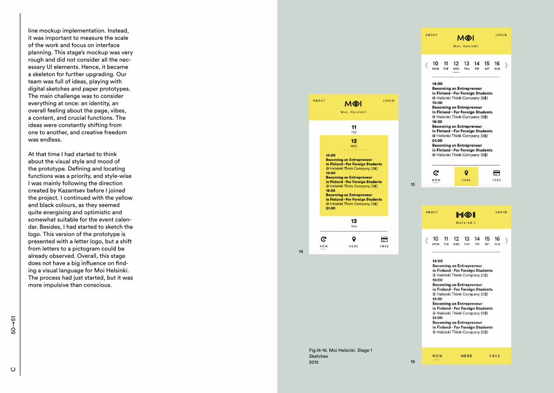
line mockup implementation. Instead, it was important to measure the scale of the work and focus on interface planning. This stage’s mockup was very rough and did not consider all the nec-essary UI elements. Hence, it became a skeleton for further upgrading. Our team was full of ideas, playing with digital sketches and paper prototypes. The main challenge was to consider everything at once: an identity, an overall feeling about the page, vibes, a content, and crucial functions. The ideas were constantly shifting from one to another, and creative freedom was endless. At that time I had started to think about the visual style and mood of the prototype. Defining and locating functions was a priority, and style-wise I was mainly following the direction created by Kazantsev before I joined the project. I continued with the yellow and black colours, as they seemed quite energising and optimistic and somewhat suitable for the event calen-dar. Besides, I had started to sketch the logo. This version of the prototype is presented with a letter logo, but a shift from letters to a pictogram could be already observed. Overall, this stage does not have a big influence on find-ing a visual language for Moi Helsinki. The process had just started, but it was more impulsive than conscious.
50→
51C
Fig.14-16. Moi Helsinki. Stage 1Sketches2015
14
15
16
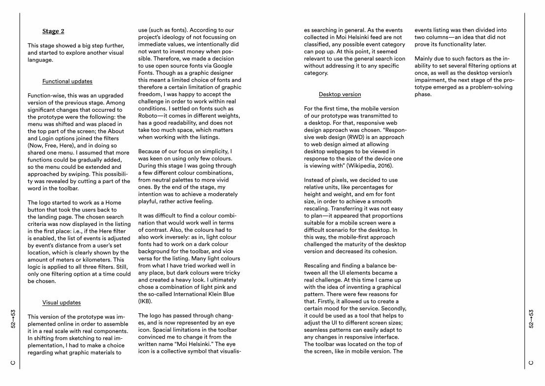
Stage 2 This stage showed a big step further, and started to explore another visual language.
Functional updates
Function-wise, this was an upgraded version of the previous stage. Among significant changes that occurred to the prototype were the following: the menu was shifted and was placed in the top part of the screen; the About and Login options joined the filters (Now, Free, Here), and in doing so shared one menu. I assumed that more functions could be gradually added, so the menu could be extended and approached by swiping. This possibili-ty was revealed by cutting a part of the word in the toolbar. The logo started to work as a Home button that took the users back to the landing page. The chosen search criteria was now displayed in the listing in the first place: i.e., if the Here filter is enabled, the list of events is adjusted by event’s distance from a user’s set location, which is clearly shown by the amount of meters or kilometers. This logic is applied to all three filters. Still, only one filtering option at a time could be chosen.
Visual updates
This version of the prototype was im-plemented online in order to assemble it in a real scale with real components. In shifting from sketching to real im-plementation, I had to make a choice regarding what graphic materials to
use (such as fonts). According to our project’s ideology of not focussing on immediate values, we intentionally did not want to invest money when pos-sible. Therefore, we made a decision to use open source fonts via Google Fonts. Though as a graphic designer this meant a limited choice of fonts and therefore a certain limitation of graphic freedom, I was happy to accept the challenge in order to work within real conditions. I settled on fonts such as Roboto—it comes in different weights, has a good readability, and does not take too much space, which matters when working with the listings. Because of our focus on simplicity, I was keen on using only few colours. During this stage I was going through a few different colour combinations, from neutral palettes to more vivid ones. By the end of the stage, my intention was to achieve a moderately playful, rather active feeling. It was difficult to find a colour combi-nation that would work well in terms of contrast. Also, the colours had to also work inversely: as in, light colour fonts had to work on a dark colour background for the toolbar, and vice versa for the listing. Many light colours from what I have tried worked well in any place, but dark colours were tricky and created a heavy look. I ultimately chose a combination of light pink and the so-called International Klein Blue (IKB). The logo has passed through chang-es, and is now represented by an eye icon. Spacial limitations in the toolbar convinced me to change it from the written name “Moi Helsinki.” The eye icon is a collective symbol that visualis-
52→
53C
es searching in general. As the events collected in Moi Helsinki feed are not classified, any possible event category can pop up. At this point, it seemed relevant to use the general search icon without addressing it to any specific category.
Desktop version
For the first time, the mobile version of our prototype was transmitted to a desktop. For that, responsive web design approach was chosen. “Respon-sive web design (RWD) is an approach to web design aimed at allowing desktop webpages to be viewed in response to the size of the device one is viewing with” (Wikipedia, 2016). Instead of pixels, we decided to use relative units, like percentages for height and weight, and em for font size, in order to achieve a smooth rescaling. Transferring it was not easy to plan—it appeared that proportions suitable for a mobile screen were a difficult scenario for the desktop. In this way, the mobile-first approach challenged the maturity of the desktop version and decreased its cohesion. Rescaling and finding a balance be-tween all the UI elements became a real challenge. At this time I came up with the idea of inventing a graphical pattern. There were few reasons for that. Firstly, it allowed us to create a certain mood for the service. Secondly, it could be used as a tool that helps to adjust the UI to different screen sizes; seamless patterns can easily adapt to any changes in responsive interface. The toolbar was located on the top of the screen, like in mobile version. The
events listing was then divided into two columns—an idea that did not prove its functionality later. Mainly due to such factors as the in-ability to set several filtering options at once, as well as the desktop version’s impairment, the next stage of the pro-totype emerged as a problem-solving phase.
C52
→53
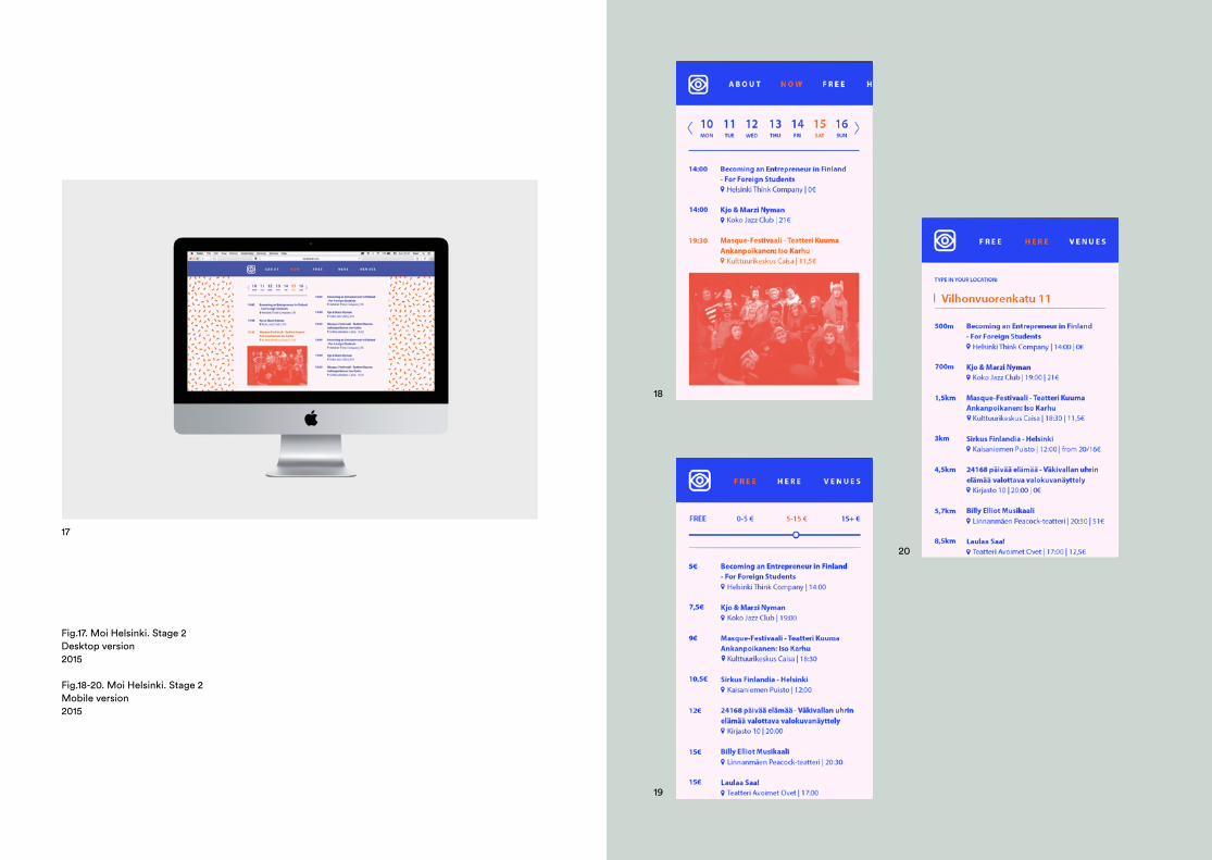
17
Fig.17. Moi Helsinki. Stage 2Desktop version2015
Fig.18-20. Moi Helsinki. Stage 2Mobile version2015
18
19
20
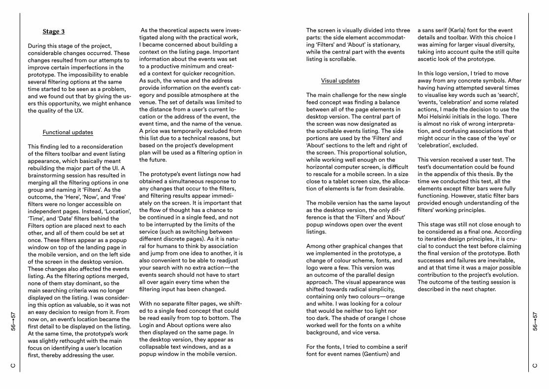
Stage 3 During this stage of the project, considerable changes occurred. These changes resulted from our attempts to improve certain imperfections in the prototype. The impossibility to enable several filtering options at the same time started to be seen as a problem, and we found out that by giving the us-ers this opportunity, we might enhance the quality of the UX.
Functional updates
This finding led to a reconsideration of the filters toolbar and event listing appearance, which basically meant rebuilding the major part of the UI. A brainstorming session has resulted in merging all the filtering options in one group and naming it ‘Filters’. As the outcome, the ‘Here’, ‘Now’, and ‘Free’ filters were no longer accessible on independent pages. Instead, ‘Location’, ‘Time’, and ‘Date’ filters behind the Filters option are placed next to each other, and all of them could be set at once. These filters appear as a popup window on top of the landing page in the mobile version, and on the left side of the screen in the desktop version. These changes also affected the events listing. As the filtering options merged, none of them stay dominant, so the main searching criteria was no longer displayed on the listing. I was consider-ing this option as valuable, so it was not an easy decision to resign from it. From now on, an event’s location became the first detail to be displayed on the listing. At the same time, the prototype’s work was slightly rethought with the main focus on identifying a user’s location first, thereby addressing the user.
As the theoretical aspects were inves-tigated along with the practical work, I became concerned about building a context on the listing page. Important information about the events was set to a productive minimum and creat-ed a context for quicker recognition. As such, the venue and the address provide information on the event’s cat-egory and possible atmosphere at the venue. The set of details was limited to the distance from a user’s current lo-cation or the address of the event, the event time, and the name of the venue. A price was temporarily excluded from this list due to a technical reasons, but based on the project’s development plan will be used as a filtering option in the future. The prototype’s event listings now had obtained a simultaneous response to any changes that occur to the filters, and filtering results appear immedi-ately on the screen. It is important that the flow of thought has a chance to be continued in a single feed, and not to be interrupted by the limits of the service (such as switching between different discrete pages). As it is natu-ral for humans to think by association and jump from one idea to another, it is also convenient to be able to readjust your search with no extra action—the events search should not have to start all over again every time when the filtering input has been changed. With no separate filter pages, we shift-ed to a single feed concept that could be read easily from top to bottom. The Login and About options were also then displayed on the same page. In the desktop version, they appear as collapsable text windows, and as a popup window in the mobile version.
56→
57C
The screen is visually divided into three parts: the side element accommodat-ing ‘Filters’ and ‘About’ is stationary, while the central part with the events listing is scrollable.
Visual updates
The main challenge for the new single feed concept was finding a balance between all of the page elements in desktop version. The central part of the screen was now designated as the scrollable events listing. The side portions are used by the ‘Filters’ and ‘About’ sections to the left and right of the screen. This proportional solution, while working well enough on the horizontal computer screen, is difficult to rescale for a mobile screen. In a size close to a tablet screen size, the alloca-tion of elements is far from desirable. The mobile version has the same layout as the desktop version, the only dif-ference is that the ‘Filters’ and ‘About’ popup windows open over the event listings. Among other graphical changes that we implemented in the prototype, a change of colour scheme, fonts, and logo were a few. This version was an outcome of the parallel design approach. The visual appearance was shifted towards radical simplicity, containing only two colours—orange and white. I was looking for a colour that would be neither too light nor too dark. The shade of orange I chose worked well for the fonts on a white background, and vice versa. For the fonts, I tried to combine a serif font for event names (Gentium) and
a sans serif (Karla) font for the event details and toolbar. With this choice I was aiming for larger visual diversity, taking into account quite the still quite ascetic look of the prototype. In this logo version, I tried to move away from any concrete symbols. After having having attempted several times to visualise key words such as ‘search’, ‘events, ‘celebration’ and some related actions, I made the decision to use the Moi Helsinki initials in the logo. There is almost no risk of wrong interpreta-tion, and confusing associations that might occur in the case of the ‘eye’ or ‘celebration’, excluded. This version received a user test. The test’s documentation could be found in the appendix of this thesis. By the time we conducted this test, all the elements except filter bars were fully functioning. However, static filter bars provided enough understanding of the filters’ working principles. This stage was still not close enough to be considered as a final one. According to iterative design principles, it is cru-cial to conduct the test before claiming the final version of the prototype. Both successes and failures are inevitable, and at that time it was a major possible contribution to the project’s evolution. The outcome of the testing session is described in the next chapter.
C56
→57
Fig.20. Moi Helsinki. Stage 3Desktop version2016
Fig.21-23. Moi Helsinki. Stage 3Mobile version2016
20
21
22
23
C:6 Testing and evaluation
As mentioned before, it is important to evaluate design when iterating. Re-designing the UI based on the findings obtained within user test may signifi-cantly improve usability. A 15-minute qualitative test was conducted for the desktop version during Stage 3. Both the desktop and mobile versions had an identical set of functions. However, at that time the desktop version was easier and faster to build online. The test was aimed at investigating the functions, behavioural patterns, and users’ reac-tions to the UI. The test questions and introduction to the test can be found in the appendix of this thesis. The test was performed on random people who were not familiar with the project, and took place in Aalto Design Factory and Helsinki University Library. The test was divided into two parts, each part pursuing its own goal. The first part of the test was aimed at investigating usability and comprehen-sion ease. It operated with ready-made answers that were suggested to the tested users, and appeared as a scale on which the answers could be rated by relevancy. This chart could be found in the appendix. This part was mainly focussed on semantic understanding and functionality, while the second part with free answers was focussed on the visual elements, general impres-sions, and suggestions.Testing results caused some changes that were gradually incorporated into
the prototype, according to iterative design principles. Important findings that concerned the functionality of the prototype were as follows: - There is no need to hide any details on the side space (‘Filters’ and ‘About’). They could be visible at all times;- The dates should be presented more clearly on the event listings. For ex-ample, when scrolling down, it would be useful to clearly see when one day ends and the next day starts;- Some extra options could be added, such as images, an attendance list, ticket sales, and event genre;- Event classification was suggested. From a design perspective, we re-ceived the following comments that eventually affected the prototype’s look: - Colour scheme looking like ‘startup colours’ due to its simplicity;- Colour scheme not evoking any associations with Helsinki, or Finland in general;- More visual diversity could be added to the event listings, e.g. through imag-es and colours;- Each day’s events could have differ-ent colour scheme for a sake of clearer division. The received feedback appeared to be crucial for the prototype’s further upgrading. Interestingly, some of the suggestions had been already includ-ed in our future development plan even before the test. Our team agreed with these suggestions but could not implement some options at the mo-ment. This is why our MVP is bound by certain limitations.
60→
61C
Nevertheless, those suggestions that were possible to apply to the MVP, were taken into account during the next stage of development, and hope-fully contributed to a more advanced level.
C:7 Final solution It helps to be brave if you don’t take things too seriously.| Marimekko As I have already mentioned before, the Moi Helsinki project provides our team—particularly myself—with the freedom to experiment and apply different technical and visual solutions. The current stage of the project is dedicated to the visual rethinking of the whole concept. This time, I look at the prototype’s visual style from a new perspective. The outcome is the rebalanced and visually-changed version, which operates with the set of functions created during the previous stage. Suggestions received during the user test were taken into account while developing this version of the prototype.
Functional updates
The mobile version has not received major changes in terms of the rear-rangement of elements. However, the balance of elements in the desktop version has shifted significantly. As of now, there are two functional fields on the screen instead of three. The left side is given to the ‘Filters’ and
‘About’—one at a time, depending on which option is enabled. If no options are enabled then the left side is filled with a pattern. The left side is not scrollable and always remains static. The right side accommodates the scrollable events listing. This structure allows a more convenient rescaling from the desktop to the mobile ver-sion. Here are other functional changes that were implemented: - The logo (home button), ‘Filters’, and ‘About’ are located next to each other in the toolbar at the top of the screen;- When ‘Filters’ are enabled, the search/filter input is displayed simulta-neously in the event listings;- The calendar’s appearance has been changed to a full month view instead of a week preview;- Breakpoint titles showing the dates were added. As such, a change of the date is presented in a clearer way.
Visual updates
After experimenting with the ascetic two colour design, I eventually came back to a more expressive visual representation. After the user testing I observed that it could potentially add certain value to a product: as in, creat-ing a distinct visual character for Moi Helsinki could significantly improve its recognition. It would be more difficult to reach this effect with only two co-lours and no graphic elements. Graphic patterns have always been one of my favourite visual elements, and eventu-ally I did not want to skip the opportu-nity to use them for this project. It ap-peared that function-wise it also helps
C60
→61
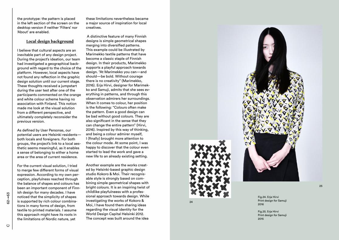
the prototype: the pattern is placed in the left section of the screen on the desktop version if neither ‘Filters’ nor ‘About’ are enabled.
Local design background
I believe that cultural aspects are an inevitable part of any design project. During the project’s ideation, our team had investigated a geographical back-ground with regard to the choice of the platform. However, local aspects have not found any reflection in the graphic design solution until our current stage. These thoughts received a jumpstart during the user test after one of the participants commented on the orange and white colour scheme having no association with Finland. This notion made me look at the visual solution from a different perspective, and ultimately completely reconsider the previous version. As defined by User Personas, our potential users are Helsinki residents—both locals and foreigners. For both groups, the project’s link to a local aes-thetic seems meaningful, as it enables a sense of belonging to either a home area or the area of current residence. For the current visual solution, I tried to merge few different forms of visual expression. According to my own per-ception, playfulness reached through the balance of shapes and colours has been an important component of Finn-ish design for many decades. I have noticed that the simplicity of shapes is supported by rich colour combina-tions in many forms of design, from textile to printed materials. I assume this approach might have its roots in the limitations of Nordic nature, yet
these limitations nevertheless became a major source of inspiration for local creatives.
A distinctive feature of many Finnish designs is simple geometrical shapes merging into diversified patterns. This example could be illustrated by Marimekko textile patterns that have become a classic staple of Finnish design. In their products, Marimekko supports a playful approach towards design. “At Marimekko you can—and should—be bold. Without courage there is no creativity” (Marimekko, 2016). Erja Hirvi, designer for Marimek-ko and Samuji, admits that she sees ev-erything in patterns, and through this observation admirers her surroundings. When it comes to colour, her position is the following: “Colours often make the pattern. Even a good design can be bad without good colours. They are also significant in the sense that they can change the entire pattern” (Hirvi, 2016). Inspired by this way of thinking, and being a colour admirer myself, I (finally) brought more attention to the colour mode. At some point, I was happy to discover that the colour even started to lead the work and gave a new life to an already existing setting.
Another example are the works creat-ed by Helsinki-based graphic design studio Kokoro & Moi. Their recognis-able style is strongly based on com-bining simple geometrical shapes with bright colours. It is an inspiring twist of childlike playfulneess with a profes-sional approach towards design. While investigating the works of Kokoro & Moi, I have found them sharing ideas regarding the visual identity for the World Design Capital Helsinki 2012. The concept was built around the idea
62→
63C
24
25
Fig.24. Erja HirviPrint design for Samuji2016
Fig.25. Erja HirviPrint design for Samuji2015
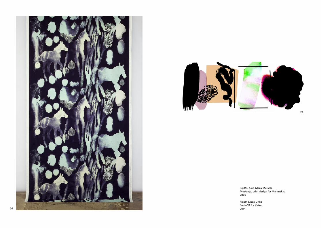
26
Fig.26. Aino-Maija MetsolaMustangi, print design for Marimekko2009
Fig.27. Linda LinkoSeries’14 for Kaiku 2014
27
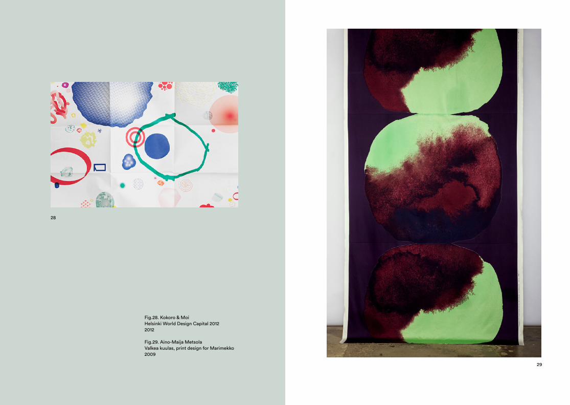
28
Fig.28. Kokoro & MoiHelsinki World Design Capital 20122012
Fig.29. Aino-Maija MetsolaValkea kuulas, print design for Marimekko2009
29
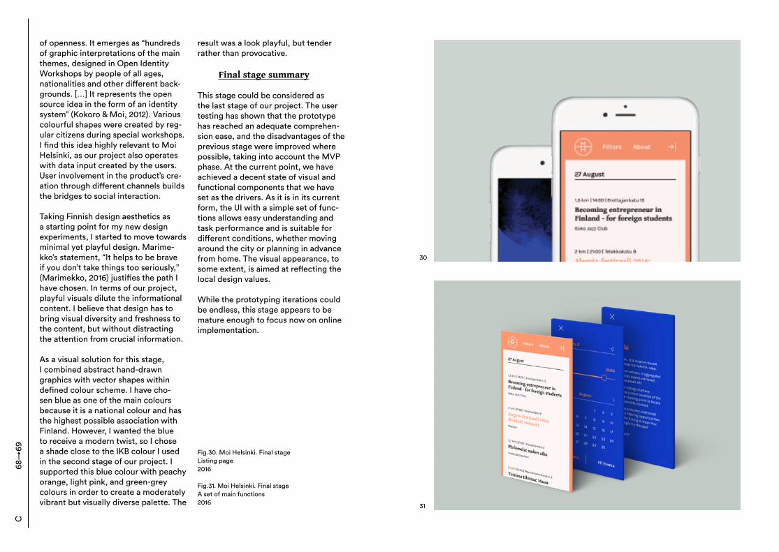
of openness. It emerges as “hundreds of graphic interpretations of the main themes, designed in Open Identity Workshops by people of all ages, nationalities and other different back-grounds. […] It represents the open source idea in the form of an identity system” (Kokoro & Moi, 2012). Various colourful shapes were created by reg-ular citizens during special workshops. I find this idea highly relevant to Moi Helsinki, as our project also operates with data input created by the users. User involvement in the product’s cre-ation through different channels builds the bridges to social interaction. Taking Finnish design aesthetics as a starting point for my new design experiments, I started to move towards minimal yet playful design. Marime-kko’s statement, “It helps to be brave if you don’t take things too seriously,” (Marimekko, 2016) justifies the path I have chosen. In terms of our project, playful visuals dilute the informational content. I believe that design has to bring visual diversity and freshness to the content, but without distracting the attention from crucial information. As a visual solution for this stage, I combined abstract hand-drawn graphics with vector shapes within defined colour scheme. I have cho-sen blue as one of the main colours because it is a national colour and has the highest possible association with Finland. However, I wanted the blue to receive a modern twist, so I chose a shade close to the IKB colour I used in the second stage of our project. I supported this blue colour with peachy orange, light pink, and green-grey colours in order to create a moderately vibrant but visually diverse palette. The
result was a look playful, but tender rather than provocative.
Final stage summary
This stage could be considered as the last stage of our project. The user testing has shown that the prototype has reached an adequate comprehen-sion ease, and the disadvantages of the previous stage were improved where possible, taking into account the MVP phase. At the current point, we have achieved a decent state of visual and functional components that we have set as the drivers. As it is in its current form, the UI with a simple set of func-tions allows easy understanding and task performance and is suitable for different conditions, whether moving around the city or planning in advance from home. The visual appearance, to some extent, is aimed at reflecting the local design values. While the prototyping iterations could be endless, this stage appears to be mature enough to focus now on online implementation.
68→
69C
Fig.30. Moi Helsinki. Final stageListing page2016
Fig.31. Moi Helsinki. Final stageA set of main functions2016
30
31
Mobile Version
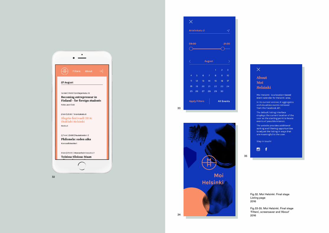
32
Fig.32. Moi Helsinki. Final stageListing page2016
Fig.33-35. Moi Helsinki. Final stage‘Filters’, screensaver and ‘About’ 2016
33
34
35
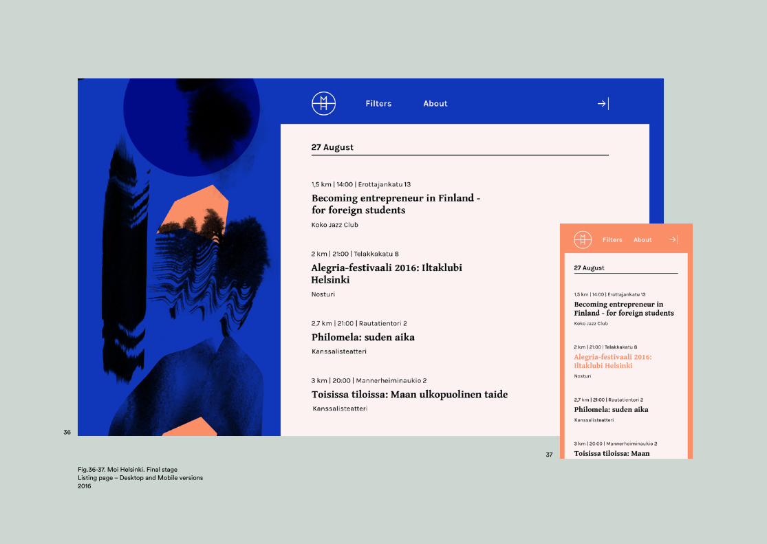
36
Fig.36-37. Moi Helsinki. Final stageListing page – Desktop and Mobile versions2016
37
Desktop Version
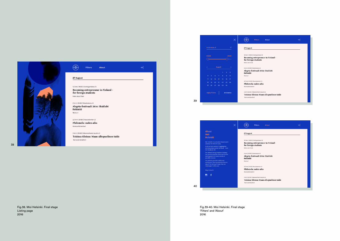
38
Fig.38. Moi Helsinki. Final stageListing page 2016
39
40
Fig.39-40. Moi Helsinki. Final stage‘Filters’ and ‘About’2016
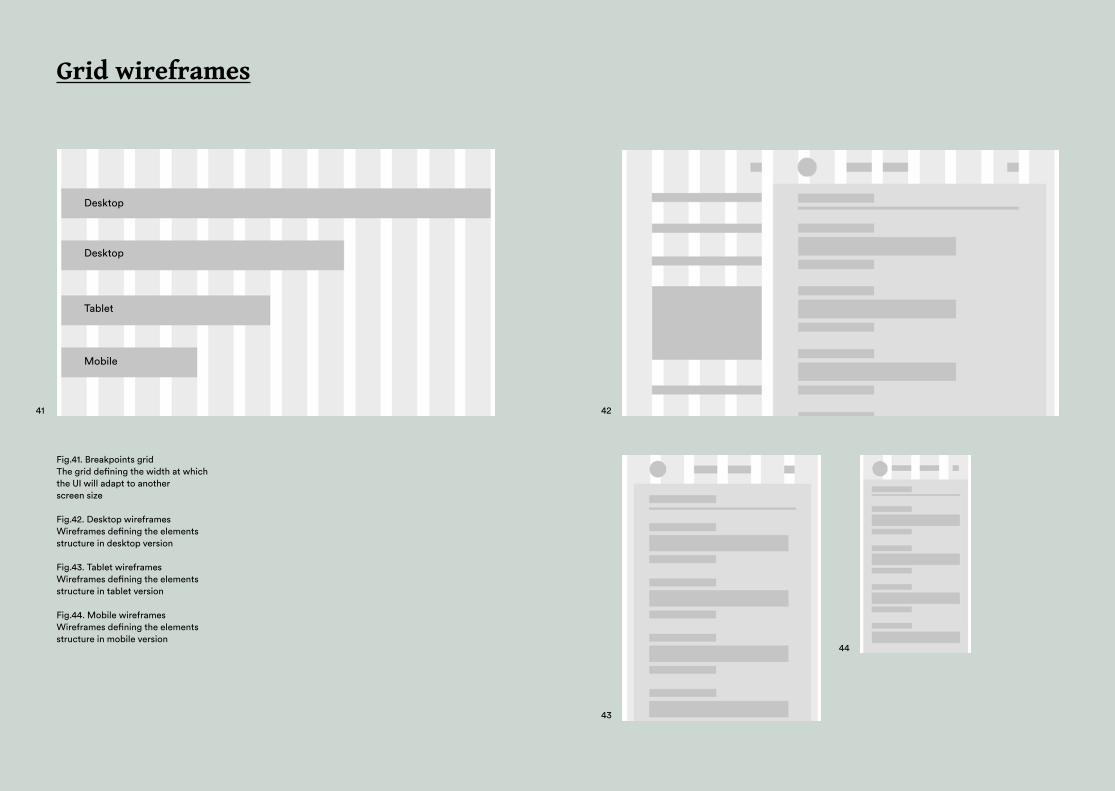
Grid wireframes
Fig.41. Breakpoints gridThe grid defining the width at which the UI will adapt to another screen size
Fig.42. Desktop wireframesWireframes defining the elements structure in desktop version
Fig.43. Tablet wireframesWireframes defining the elements structure in tablet version
Fig.44. Mobile wireframesWireframes defining the elements structure in mobile version
Desktop
Desktop
Tablet
Mobile
41 42
43
44
Style guide
Karla Regular
Aa Aa
ABCDEFGHIJKLMNOPQRSTUVWXYZabcdefghijklmnopqrstuvwxyz123456789!?.
Karla Bold
Aa Aa
ABCDEFGHIJKLMNOPQRSTUVWXYZabcdefghijklmnopqrstuvwxyz123456789!?.
Gentium Bold
Aa AaABCDEFGHIJKLM NOPQRSTUVWXYZabcdefghijklmnopqrstuvwxy123456789!?.
Fonts Logo
Colours
Text
Control
#FFF2F2
#FC8F67
#000000
#FFFFFF
#1037BB
Normal
Inactive
Active
Hover
Watched
Normal Hover
Event’s name header
Event’s name header
Event’s name header
Type in your address
Street name 15
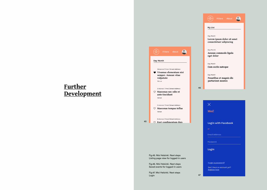
FurtherDevelopment
45
46
47
Fig.45. Moi Helsinki. Next stepsListing page view for logged-in users
Fig.46. Moi Helsinki. Next stepsSaved events for logged-in users
Fig.47. Moi Helsinki. Next stepsLogin
C:8 Project summary With the help of the Moi Helsinki project I was trying to answer several questions. How could one apply per-sonalisation to generative data? How could a smooth UX be built with a large amount of unfamiliar information? How could the recognition of this informa-tion be enabled and optimised? Beides these questions, this project evolved as a trip to the world of web design, which was a new working field for me, and this written thesis emerged as a place where I can describe my experi-ence. The project operates with data re-trieved from Facebook’s API, which is automatically generated on the Moi Helsinki listing page. Unlike Google Search, where the search is enabled by users, Moi Helsinki’s users face ready-shaped event listings. These listings are based on the user’s location, and can be further customised. Rethinking the principles of online search and investigating potential scenarios, I ad-opted a single feed concept. Moi Hel-sinki introduces a web page that could be read with ease from top to bottom. With all the functions available on the same page, it supports a seamless flow of thoughts. The amount of functions is set to the minimum, keeping the service as simple as possible. With a focus on mobility and identifying a user’s current location, it is important to build a simple UX that could be performed on-the-go.
An important part of user-service interaction is playful decision-making. In this particular case, playfulness can be created by users’ involvement in a service’s work. Firstly, it is an ability to project their own needs and circum-stances onto various data. Secondly, it is the use of interactive elements such as slidable toolbars that increase a feeling of interaction and personal involvement. Taking these features into account, my aim was to build the structure of a listing page that will allow a user to focus on meaningful details, with no pollution. While the events are unknown to the users, showing limited but meaningful details (location, time, date, and venue) are aimed at increas-ing recognition. It builds a micro-world of the listing page, helping to navigate through a large amount of data. It was discovered that credibility plays a significant role for web users (Nielson, 1997). In terms of Moi Hel-sinki, credibility could be achieved by transferring the users to a Facebook page of the events by clicking on the event’s name. The user test has shown a positive reaction to this function. This feature, which explains who is the organiser of the event, provides extra information, and the list of guests, actually evolved as a credibility prob-lem-solving solution. Several iteration states were aimed at achieving ease of comprehension. This ease was reached by simplifying the functions and polishing usability. In addition to that, iterations were adjusted for a suitable visual style. The final stage of the project illustrates the
86→
87C
objectives that are meaningful for Moi Helsinki. The Moi Helsinki project became a great opportunity to practice new working techniques. The previous-ly-mentioned experiences made me look at a graphic designer’s practice from a totally new angle. Creating the UX scenarios, planning the UI, taking into account potential expansion, iter-ating on the prototype, and conducting user tests—these are all things that I have not experienced while work-ing with printed matter. While there is a certain percentage of intuition involved in these processes, it is mostly based on specific knowledge that has to be learned, and could not simply be transferred from the previous classical graphic design education.
Further opportunities
The final stage of the project appears as the MVP. At the current stage, the Moi Helsinki prototype has the maximum amount of functions that our team was able to develop with our limited resources. It allows the full demonstration of data aggrega-tion and its further allocation, and the application of a human-based logic in information retrieval. From another angle, it allows the illustration of a model of media design for public use that enables a meaningful interaction between the public and the data re-trieved from social media. Potential expansion of the prototype is incorporated in the future develop-ment plan. Moi Helsinki as a concept allows numerous directions for further
upgrades, both from the design and collaborative sides. The next potential step I can propose is building the func-tions behind ‘Login’, which will contrib-ute to more advanced customisations and the possibility to build a personal history. Discovering the personal user space emerges as an interesting design task. Additionally, Moi Helsinki could expand the range of collaborators, which would open new possibilities to the service. “In the future, combin-ing multiple social network APIs with eventual content management may be a viable strategy for the projects of this kind” (Kazantsev, 2016). Extracting and rethinking existing data with the application of design management tools could bring the concept on a new level. However, this development path requires a business model. Expanding the project’s geographical borders seems an ambitious (though feasible) upgrade. Applying the Moi Helsinki model to other cities and countries is more than possible. The main thing required is social media ac-tivity in terms of events, which would be a crucial foundation for the model’s efficient work. As the project’s creators, Kazantsev and I hope that Moi Helsinki will bring attention to the benefits of shared data. Data generation with the help of design principles emerges as a way to enhance data translation and present it meaningfully in an accessible shape.
C86
→87
Bedford, A. (2015). Personas Make Users Memorable for Product Team Members. [on-line] NN Group. Available at: https://www.nngroup.com/articles/persona/ [Accessed 24.08.2016] Bush, V. (1945). As We May Think. [online] The Atlantic. Available at: http://www.theatlantic.com/magazine/archive/1945/07/as-we-may-think/303881/ [Accessed 14.06.2016] Budiu, R. (2015). Mobile User experience: limitations and strengths. [online] NN Group. Available at: https://www.nngroup.com/articles/mobile-ux/ [Accessed 21.07.2016] Cardello, J. (2014). The difference between information architecture and navigation. [online] NN Group. Available at: https://www.nngroup.com/articles/ia-vs-naviga-tion/ [Accessed 15.07.2016] Charlene, A. and Leroux B. (2011). Mobile application development: Web vs Native. Communications of the ACM, Volume 54 (5), pp. 49-53. EMarketer.com. (2014). Android Leads Finland’s Smartphone Market. [online] eMar-keter. Available at:http://www.emarketer.com/Article/Android-Leads-Finlands-Smartphone-Market-but-Not-by-Much/1011346 [Accessed 15.07.2016] Few, S. (2014). Data Visualisation for Human Perception. [online] The Interaction Design Foundation ApS. Available at: https://www.interaction-design.org/literature/book/the-encyclopedia-of-human-computer-in-teraction-2nd-ed/data-visualization-for-hu-man-perception [Accessed on 2.09.2016] Flaherty, K. (2016). The Anatomy of a List Entry [online] NN Group. Available at: https://www.nngroup.com/articles/list-en-tries/ [Accessed 13.07.2016] Franklin, C. (2010). How internet search engines work. [online] How stuff works. Available at: http://computer.howstuffworks.
Bibliography
com/internet/basics/search-engine.htm [Accessed 13.06.2016]
Franz, L. (2014). Size Matters: Balancing Line Length And Font Size In Responsive Web Design. [online] Smashing Magazine. Available at: http://www.smashingmagazine.com/2014/09/balancing-line-length-font-size-responsive-web-design/ [Accessed 15.07.2016] Fugmann, R. (1984). The five-axiom theory of indexing and information supply. Journal of the American Society for Information Sci-ence and Technology, [online] Volume 36 (2), pp. 63-140. Available at: http://onlinelibrary.wiley.com/doi/10.1002/asi.4630360206/epdf?r3_referer=wol&tracking_action=pre-view_click&show_checkout=1&purchase_re-ferrer=scholar.google.fi&purchase_site_li-cense=LICENSE_DENIED_NO_CUSTOMER [Accessed 26.09.2016] Kazantsev, A. (2016). Moi Helsinki. Design for public use and localisation of social media. MA. Aalto University. Kokoromoi.com. (2016). World design capital Helsinki 2012. [online] Kokoro & Moi. Available at: http://www.kokoromoi.com/work/wdc-helsinki-2012/ [Accessed 24.08.2016] Krippendorff, K. (2005). The semantic turn: a new foundation for design. Boca Raton, FL: CRC Press. Marimekko.com. (2016). Who we are. [on-line] Marimekko. Available at: https://www.marimekko.com/com_en/the-brand/about-us [Accessed 24.08.2016] Maynes, R. (2014). Eye Tracking in 2014: How Users View and Interact with Today’s Google SERPs. [online] Moz. Available at: https://moz.com/blog/eye-tracking-in-2014-how-users-view-and-interact-with-todays-google-serps [Accessed 15.06.2016] Mediative.com. (2014). Keeping an eye on Google – Eye tracking SERPs through
the years. [online] Mediative. Available at: http://www.mediative.com/eye-track-ing-google-through-the-years/ [Accessed 18.06.2016] Meier, T. (2015). Filtering and Sorting Best Practices on Mobile. [online] Medium. Avail-able at: https://medium.com/@thierrymeier/filtering-and-sorting-best-practices-on-mo-bile-61626449cec#.un8wlc50l [Accessed 12.05.2015] Meyer, K. (2015). The roots of minimalism in web design. [online] NN Group. Available at: https://www.nngroup.com/articles/roots-minimalism-web-design/ [Accessed 15.07.2016] Murray, J.H., 2012. Inventing the Medium: Principles of Interaction Design as a Cultural Practice. Cambridge, MA: The MIT Press, pp. 12-14.
Nielsen, J. (1993). Iterative User Interface Design. [online] NN Group. Available at: https://www.nngroup.com/articles/itera-tive-design/ [Accessed 24.09.2016]
Nielsen, J. (1994). Usability Engineering. Boston, MA: Academic Press Inc, p. 165.
Nielsen, J. (1997). How users read on the web. [online] NN Group. Available at: https://www.nngroup.com/articles/how-us-ers-read-on-the-web/ [Accessed 26.09.2016] Nielsen, J. (2006). 6 ways to fix a confused information architecture. [online] NN Group. Available,e at: https://www.nngroup.com/articles/fixing-information-architecture/ [Accessed 2.09.2016] Nielsen, J. (2011). Parallel & Iterative Design + Competitive Testing = High Usability. [on-line] NN Group. Available at: https://www.nngroup.com/articles/parallel-and-itera-tive-design/ [Accessed 24.08.2016] Normann, D. (1988). The design of everyday things. Cambridge, MA: The MIT Press.
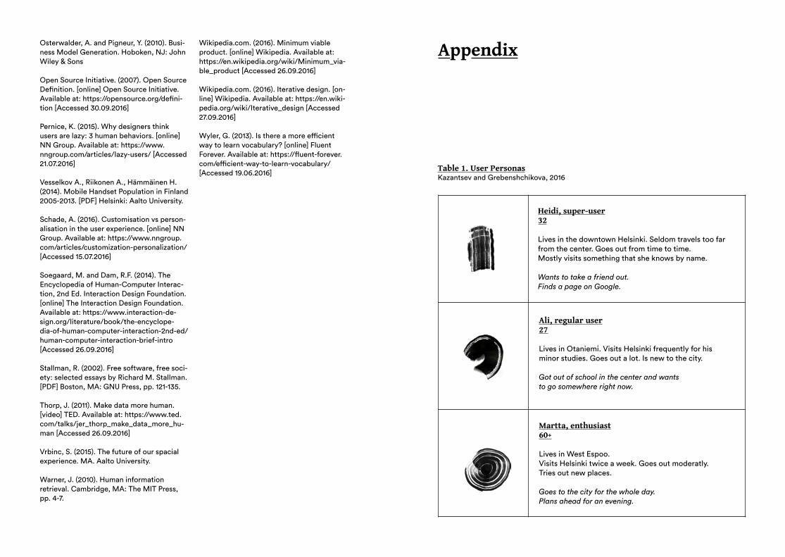
Osterwalder, A. and Pigneur, Y. (2010). Busi-ness Model Generation. Hoboken, NJ: John Wiley & Sons
Open Source Initiative. (2007). Open Source Definition. [online] Open Source Initiative. Available at: https://opensource.org/defini-tion [Accessed 30.09.2016] Pernice, K. (2015). Why designers think users are lazy: 3 human behaviors. [online] NN Group. Available at: https://www.nngroup.com/articles/lazy-users/ [Accessed 21.07.2016] Vesselkov A., Riikonen A., Hämmäinen H. (2014). Mobile Handset Population in Finland 2005-2013. [PDF] Helsinki: Aalto University. Schade, A. (2016). Customisation vs person-alisation in the user experience. [online] NN Group. Available at: https://www.nngroup.com/articles/customization-personalization/ [Accessed 15.07.2016]
Soegaard, M. and Dam, R.F. (2014). The Encyclopedia of Human-Computer Interac-tion, 2nd Ed. Interaction Design Foundation. [online] The Interaction Design Foundation. Available at: https://www.interaction-de-sign.org/literature/book/the-encyclope-dia-of-human-computer-interaction-2nd-ed/human-computer-interaction-brief-intro [Accessed 26.09.2016]
Stallman, R. (2002). Free software, free soci-ety: selected essays by Richard M. Stallman. [PDF] Boston, MA: GNU Press, pp. 121-135.
Thorp, J. (2011). Make data more human. [video] TED. Available at: https://www.ted.com/talks/jer_thorp_make_data_more_hu-man [Accessed 26.09.2016] Vrbinc, S. (2015). The future of our spacial experience. MA. Aalto University.
Warner, J. (2010). Human information retrieval. Cambridge, MA: The MIT Press, pp. 4-7.
Wikipedia.com. (2016). Minimum viable product. [online] Wikipedia. Available at: https://en.wikipedia.org/wiki/Minimum_via-ble_product [Accessed 26.09.2016]
Wikipedia.com. (2016). Iterative design. [on-line] Wikipedia. Available at: https://en.wiki-pedia.org/wiki/Iterative_design [Accessed 27.09.2016] Wyler, G. (2013). Is there a more efficient way to learn vocabulary? [online] Fluent Forever. Available at: https://fluent-forever.com/efficient-way-to-learn-vocabulary/ [Accessed 19.06.2016]
Appendix
Heidi, super-user32
Lives in the downtown Helsinki. Seldom travels too far from the center. Goes out from time to time.Mostly visits something that she knows by name.
Wants to take a friend out.Finds a page on Google.
Ali, regular user27
Lives in Otaniemi. Visits Helsinki frequently for his minor studies. Goes out a lot. Is new to the city.
Got out of school in the center and wants to go somewhere right now.
Martta, enthusiast60+
Lives in West Espoo.Visits Helsinki twice a week. Goes out moderatly. Tries out new places.
Goes to the city for the whole day. Plans ahead for an evening.
Table 1. User PersonasKazantsev and Grebenshchikova, 2016
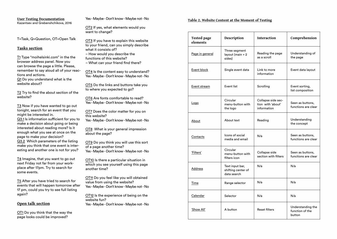
User Testing DocumentationKazantsev and Grebenshchikova, 2016
T=Task, Q=Question, OT=Open Talk
Tasks section
T1 Type “moihelsinki.com” in the the browser address panel. Now you can browse the page a little. Please, remember to say aloud all of your reac-tions and actions.Q1 Do you understand what is the website about?
T2 Try to find the about section of the website?
T3 Now if you have wanted to go out tonight, search for an event that you might be interested in.Q3.1 Is information sufficient for you to make a decision about going or being interested about reading more? Is it enough what you see at once on the page to make your decision? Q3.2 Which parameters of the listing make you think that one event is inter-esting and another one is not for you?
T4 Imagine, that you want to go out next Friday not far from your work-place after 17pm. Try to search for some events.
T5 After you have tried to search for events that will happen tomorrow after 17 pm, could you try to see full listing again?
Open talk section
OT1 Do you think that the way the page looks could be improved?
Yes - Maybe - Don’t know - Maybe not - No
OT2 If yes, what elements would you want to change?
OT3 If you have to explain this website to your friend, can you simply describe what it consists of? – How would you describe the functions of this website?– What can your friend find there?
OT4 Is the content easy to understand?Yes - Maybe - Don’t know - Maybe not - No
OT5 Do the links and buttons take you to where you expected to go?
OT6 Are fonts comfortable to read? Yes - Maybe - Don’t know - Maybe not - No
OT7 Does the color matter for you on this website?Yes - Maybe - Don’t know - Maybe not - No
OT8 What is your general impression about the page?
OT9 Do you think you will use this sort of a page another time?Yes - Maybe - Don’t know - Maybe not - No
OT10 Is there a particular situation in which you see yourself using this page another time?
OT11 Do you feel like you will obtained value from using the website?Yes - Maybe - Don’t know - Maybe not - No
OT12 Is the experience of being on the website fun?Yes - Maybe - Don’t know - Maybe not - No
Tested page elements
Description Interaction Comprehension
Page in generalThree segment layout (main + 2 sides)
Single event data
Circular menu-button with the logo
About text
Range selector
Selector
A button
Icons of social media and email
Circular menu-button with filters icon
Text input bar, shifting center ofdata search
Collapse side section with filters
Seen as buttons,functions are clear
N/a
N/a
N/a
N/a
Reset filtersUnderstanding thefunction of the button
N/a
N/a
N/a
Seen as buttons,functions are clear
Reading Understandingthe concept
Collapse side sec-tion with ‘about’ information
Seen as buttons, functions are clear
Event list Scrolling Event sorting, list composition
Link to moreinformation
Event data layout
Reading the page as a scroll
Understanding of the page
Event block
Event stream
Logo
About
Contacts
‘Filters’
Address
Time
Calendar
‘Show All’
Table 2. Website Content at the Moment of Testing
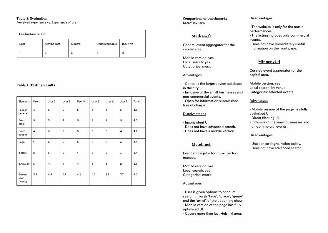
Evaluation scale
Lost
1 2 3 4 5
Maybe lost Neutral Understandable Intuitive
Table 3. EvaluationPerceived experience vs. Experience of use
Elements
Page ingeneral
4
5
4
1
2
5
3.5
5
3
5
5
5
4
4.5
5
4
5
5
5
4
4.7
5
5
5
5
1
4
4.2
3
4
5
5
5
3
4.2
3
4
5
2
5
3
3.7
5
5
4
3
3
2
3.7
4.3
4.3
4.7
3.7
3.7
3.5
4.0
Eventblock
Eventstream
Logo
‘Filters’
Generaluser fluency
‘Show all’
User 1 User 2 User 3 User 4 User 5 User 6 User 7 Total
Table 4. Testing Results
Comparison of benchmarksKazantsev, 2016
Stadissa.fi
General event aggregator for the capital area.
Mobile version: yes Local search: yes Categories: music
Advantages
- Contains the largest event database in the city. - Inclusive of the small businesses and non-commercial events. - Open for information submissions free of charge.
Disadvantages
- Inconsistent UI.- Does not have advanced search. - Does not have a mobile version.
Meteli.net
Event aggregator for music perfor-mances.
Mobile version: yes Local search: yes Categories: music
Advantages
- User is given options to conduct search through “time”, “place”, “genre” and the “artist” of the upcoming show. - Mobile version of the page has fully optimised UI. - Covers more than just Helsinki area.
Disadvantages
- The website is only for the music performances.- The listing includes only commercial events.- Does not have immediately useful information on the front page.
Minnenyt.fi
Curated event aggregator for the capital area.
Mobile version: yesLocal search: by venue Categories: selected events
Advantages
- Mobile version of the page has fully optimised UI.- Direct filtering UI.- Inclusive of the small businesses and non-commercial events.
Disadvantages
- Unclear sorting/curation policy. - Does not have advanced search.

Tatiana Grebenshchikova2016