Media Studies Evaluation: Question 1
9
Question 1: In what ways does your media product use, develop or challenge forms and conventions of real media products? Shannon Clarke
-
Upload
shannonclrke -
Category
Education
-
view
215 -
download
0
Transcript of Media Studies Evaluation: Question 1

Question 1:In what ways does your
media product use, develop or challenge forms and
conventions of real media products?
Shannon Clarke
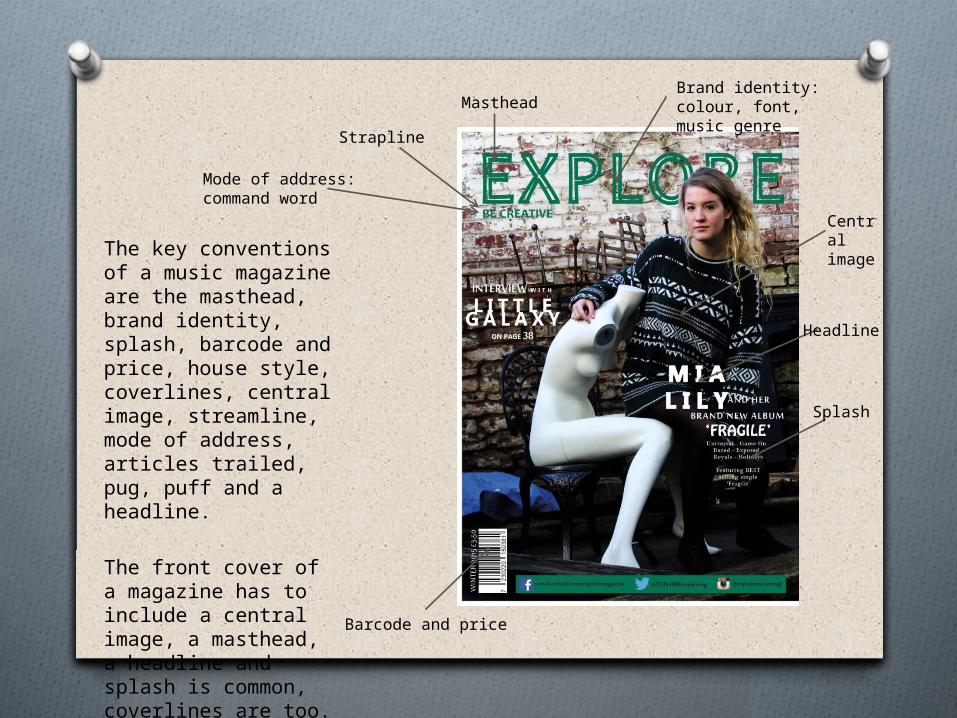
The key conventions of a music magazine are the masthead, brand identity, splash, barcode and price, house style, coverlines, central image, streamline, mode of address, articles trailed, pug, puff and a headline.
The front cover of a magazine has to include a central image, a masthead, a headline and splash is common, coverlines are too.
Central image
Masthead
Strapline
Headline
Splash
Barcode and price
Brand identity: colour, font, music genre
Mode of address:command word
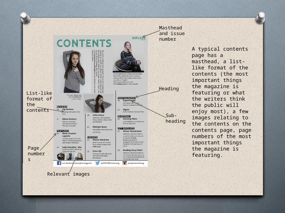
A typical contents page has a masthead, a list-like format of the contents (the most important things the magazine is featuring or what the writers think the public will enjoy most), a few images relating to the contents on the contents page, page numbers of the most important things the magazine is featuring.
Masthead and issue number
Heading
Sub-heading
List-like format of the contents
Page numbers
Relevant images

A typical double page spread in a music magazine contains an article or interview of an artist of band. A main image, large amounts of text, the masthead, a title and secondary images are commonly featured on a double page spread.
Issue number
Central (main) image
Page numberPull quote
Secondary image(s)
Drop cap
Article
TitleMasthead

I wanted to create a magazine that was unlike any other already available, so I had to research indie/alternative magazines already in the market of which I wanted to appeal to and then I had to put my own ideas to it.
During my research, I noticed that many of the indie magazines I analysed had only one word as their masthead, and also in one block colour of capital letters, e.g. DAZED, MOJO, FLUX. Therefore, I kept within the conventions by making my masthead one singular command word written in capitals (EXPLORE) and one block colour (green). However, to produce a magazine unlike any other, I reduced the weight of my type and increased the tracking. I also noticed that indie magazines such as DAZED and MOJO positioned their masthead at the top (and centred) of the front cover.
Increased tracking, reduced weight, one colour, in capitals, command word
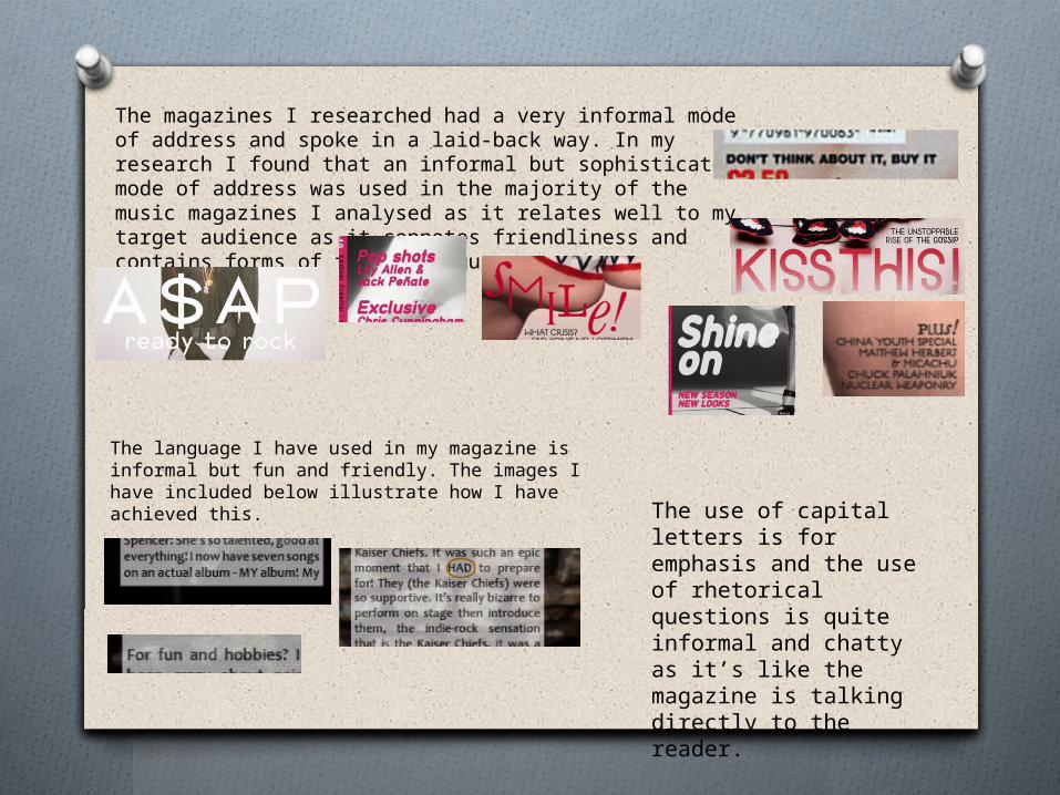
The magazines I researched had a very informal mode of address and spoke in a laid-back way. In my research I found that an informal but sophisticated mode of address was used in the majority of the music magazines I analysed as it relates well to my target audience as it connotes friendliness and contains forms of formal language.
The language I have used in my magazine is informal but fun and friendly. The images I have included below illustrate how I have achieved this. The use of capital
letters is for emphasis and the use of rhetorical questions is quite informal and chatty as it’s like the magazine is talking directly to the reader.
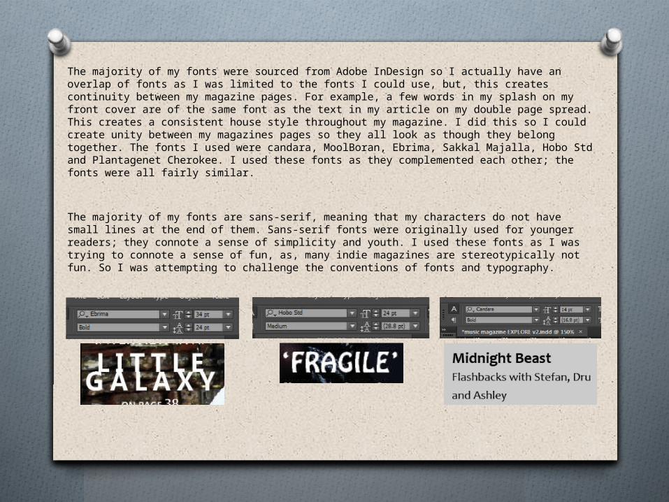
The majority of my fonts were sourced from Adobe InDesign so I actually have an overlap of fonts as I was limited to the fonts I could use, but, this creates continuity between my magazine pages. For example, a few words in my splash on my front cover are of the same font as the text in my article on my double page spread. This creates a consistent house style throughout my magazine. I did this so I could create unity between my magazines pages so they all look as though they belong together. The fonts I used were candara, MoolBoran, Ebrima, Sakkal Majalla, Hobo Std and Plantagenet Cherokee. I used these fonts as they complemented each other; the fonts were all fairly similar.
The majority of my fonts are sans-serif, meaning that my characters do not have small lines at the end of them. Sans-serif fonts were originally used for younger readers; they connote a sense of simplicity and youth. I used these fonts as I was trying to connote a sense of fun, as, many indie magazines are stereotypically not fun. So I was attempting to challenge the conventions of fonts and typography.

The mis-en-scene of my images follow and abide by the key conventions of real indie music magazines. Upon research into ideal images for my music magazines I discovered that the majority of the photographs used looked professional and well edited.
The professional look was achieved through the use of high quality photographs and editing them appropriately according to what their target audience responds to best. If their target audience are indie and alternative like mine, the photo’s should be edited so they are a little dark and described as grunge. If they edited them with a sepia effect or pink hues, their target audience may be reluctant to buy their magazine.The images I have included are from the fashion side of DAZED (the magazine). The photos are quite unusual and they fit into the category of niche – an indie audience would respond to this by buying this magazine.
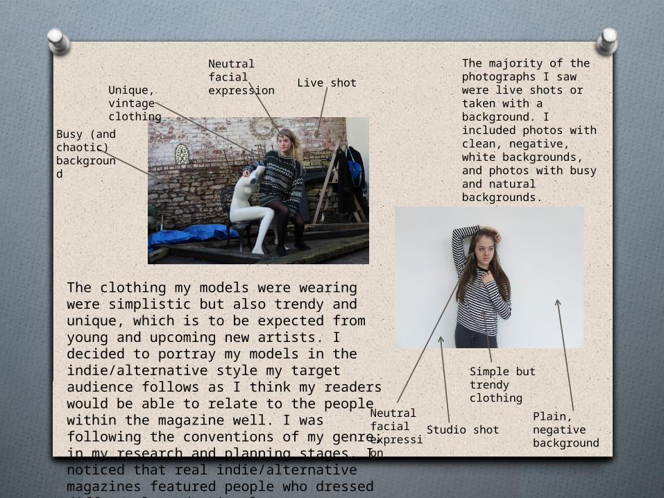
The majority of the photographs I saw were live shots or taken with a background. I included photos with clean, negative, white backgrounds, and photos with busy and natural backgrounds.
The clothing my models were wearing were simplistic but also trendy and unique, which is to be expected from young and upcoming new artists. I decided to portray my models in the indie/alternative style my target audience follows as I think my readers would be able to relate to the people within the magazine well. I was following the conventions of my genre; in my research and planning stages, I noticed that real indie/alternative magazines featured people who dressed differently and uniquely.
Simple but trendy clothing
Neutral facial expression
Plain, negative background
Studio shot
Live shotNeutral facial expressionUnique, vintage
clothing
Busy (and chaotic) background