Market research-v2
17
Market research British music magazines Q, Mojo & Metal Hammer Q Magazine is published by Bauer media, Europe’s largest privately owned publishing Group. In the uk it publishes popular music magazines like Kerrang, Q and Mojo. By 2012, Kerrang and Mojo alone had a readership of 690,000 every month. Bauer owns the most influential music magazines in the UK, Kerrang for instance, having the youngest mean age of 22 years. Bauer media owns 120 other brands, mainly in the magazine industry, but also has the Absolute Radio, 4Music and MFR amongst the few of them. The publisher mainly focuses on lifestyle, hobbies and music. , is one of Europe's largest media companies but its profits comes mainly from digital publishing. because of it’s reader profile, has different mission statements. While Q focuses modern music delivers “a magazine that is packed with insight, passion, and revelatory encounters with the greatest musicians of all-time, be they established or emerging musicians”. Q throughout its statement emphasizes its authority “Employing the world’s best music writers and photographers”, “Well respected by artists and labels”. In contrast, Mojo focuses both old hits and emerging artists. While Mojo and Q markets themselves to a wide audience with emphasis on popular music, Metal Hammer markets to an audience with an sole interest in metal music, and present themselves as the only magazine in the UK that covers contemporary and traditional metal bands. Their mission is to cover a wide range of metal music with in-depth interviews. Reader profile: The reader profile of both Mojo and Q is presented as passionate for music, but the reader contrasts in age. There is an eight year difference and this affects how the reader is presented. While The Q reader is energetic, highly active and in pursuit of his love for music, the Mojo reader has settled with kids, but has a high disposable income, that he uses to invest “an extensive mixture of vinyl”, with an interest in older bands. Despite being settled with kids, he occasionally goes to music festivals, usually smaller ones. The Q reader on the contrary goes to a gig almost every week and is more heavily invested in digital music than the Mojo reader. The Metal Hammer reader on the other hand is predominantly young male(85%), his income is less disposable, but as the magazine presents him as, a passionists that spends his spare money for “everything loud”, telling us that he enjoys and wants a variety of metal music. “providing access to the notoriously unobtainable young male audience, the Metal Hammer reader spends his spare cash on indulging his passion for everything loud. Non conformist and hard to please they desire only the best in entertainment” “Chris is 29 years old and lives in Leeds. Music is more important to him than anything else. It’s at the centre of his social life. It soundtracks all the best moments in his life. It’s his identity, his social currency and his world. Chris lives for gigs, festivals and those electrifying moments of togetherness that only music can provide. He is the one who sorts out gig tickets for his friends, turns them on to new bands and sets up the big festival weekend. “John is 37, a passionate and discerning music fan, long-time musician himself and dedicated record collector. With his high disposable income, John loves nothing more than sneaking off to the local independent record store to see what’s in. John proudly invests in an extensive mixture of vinyl (classics and rarities), CD’s, and carries a well stocked iPod that covers everything from prog to nu-folk, Motown to 60’s garage, blues and psychedelia” Focus groups: Both Mojo and Q has almost an identical ABC1 profile, with 0.2%(2012 media pack) from Mojo’s ABC1 rating at 72%(2012 media pack). Out of the three magazines, Metal Hammer has the youngest
-
Upload
vetle-andre-remme-olsen -
Category
Automotive
-
view
205 -
download
0
Transcript of Market research-v2
Market researchBritish music magazines
Q, Mojo & Metal Hammer
intro: Q Magazine is published by Bauer media, Europe’s largest privately owned publishing
Group. In the uk it publishes popular music magazines like Kerrang, Q and Mojo. By 2012, Kerrang and Mojo alone had a readership of 690,000 every month. Bauer owns the most
influential music magazines in the UK, Kerrang for instance, having the youngest mean age of 22 years. Bauer media owns 120 other brands, mainly in the magazine industry, but also has the
ownership of numerous radio stations. Absolute Radio, 4Music and MFR amongst the few of them. The publisher mainly focuses on lifestyle, hobbies and music.
Axel springer, is one of Europe's largest media companies but its profits comes mainly from digital publishing.
The mission: The Mission of Q and Mojo because of it’s reader profile, has different mission statements. While Q focuses modern music and presenting themselves as a guide to “the good stuff”, Mojo delivers “a magazine that is packed with insight, passion, and revelatory encounters with the greatest musicians of all-time, be they established or emerging musicians”. Q throughout its statement emphasizes its authority “Employing the world’s best music writers and photographers”, “Well respected by artists and labels”. In contrast, Mojo focuses both old hits and emerging artists.
While Mojo and Q markets themselves to a wide audience with emphasis on popular music, Metal Hammer markets to an audience with an sole interest in metal music, and present themselves as the only magazine in the UK that covers contemporary and traditional metal bands. Their mission is to cover a wide range of metal music with in-depth interviews.
Reader profile: The reader profile of both Mojo and Q is presented as passionate for music, but the reader contrasts in age. There is an eight year difference and this affects how the reader is presented. While The Q reader is energetic, highly active and in pursuit of his love for music, the Mojo reader has settled with kids, but has a high disposable income, that he uses to invest “an extensive mixture of vinyl”, with an interest in older bands. Despite being settled with kids, he occasionally goes to music festivals, usually smaller ones. The Q reader on the contrary goes to a gig almost every week and is more heavily invested in digital music than the Mojo reader.
The Metal Hammer reader on the other hand is predominantly young male(85%), his income is less disposable, but as the magazine presents him as, a passionists that spends his spare money for “everything loud”, telling us that he enjoys and wants a variety of metal music.
“providing access to the notoriously unobtainable young male audience, the Metal Hammer reader spends his spare cash on indulging his passion for everything loud. Non conformist and hard to please they desire only the best in entertainment”
“Chris is 29 years old and lives in Leeds. Music is more important to him than anything else. It’s at the centre of his social life. It soundtracks all the best moments in his life. It’s his identity, his social currency and his world. Chris lives for gigs, festivals and those electrifying moments of togetherness that only music can provide. He is the one who sorts out gig tickets for his friends, turns them on to new bands and sets up the big festival weekend. ”
“John is 37, a passionate and discerning music fan, long-time musician himself and dedicated record collector. With his high disposable income, John loves nothing more than sneaking off to the local independent record store to see what’s in. John proudly invests in an extensive mixture of vinyl (classics and rarities), CD’s, and carries a well stocked iPod that covers everything from prog to nu-folk, Motown to 60’s garage, blues and psychedelia”
Focus groups:
Both Mojo and Q has almost an identical ABC1 profile, with Q only behind of 0.2%(2012 media pack) from Mojo’s ABC1 rating at 72%(2012 media pack). Out of the three magazines, Metal Hammer has the youngest
readership, but also the least employed, with only 41% of their audience being in employment(2007 media pack) AND 51% in education. Judging from how the magazine presents its reader, “ spends his spare cash”, we can assume that the ABC1 profile of Metal Hammer is lower than both Mojo and Q.
SOURCES
http://www.inpublishing.co.uk/news/articles/abc_results_publisher_reaction_feb_2015_8506.aspx
http://www.mediaweek.co.uk/article/1307929/magazines-abcs-nme-print-sales-drop-below-15000
Textual analysis & Observations
Q Magazine
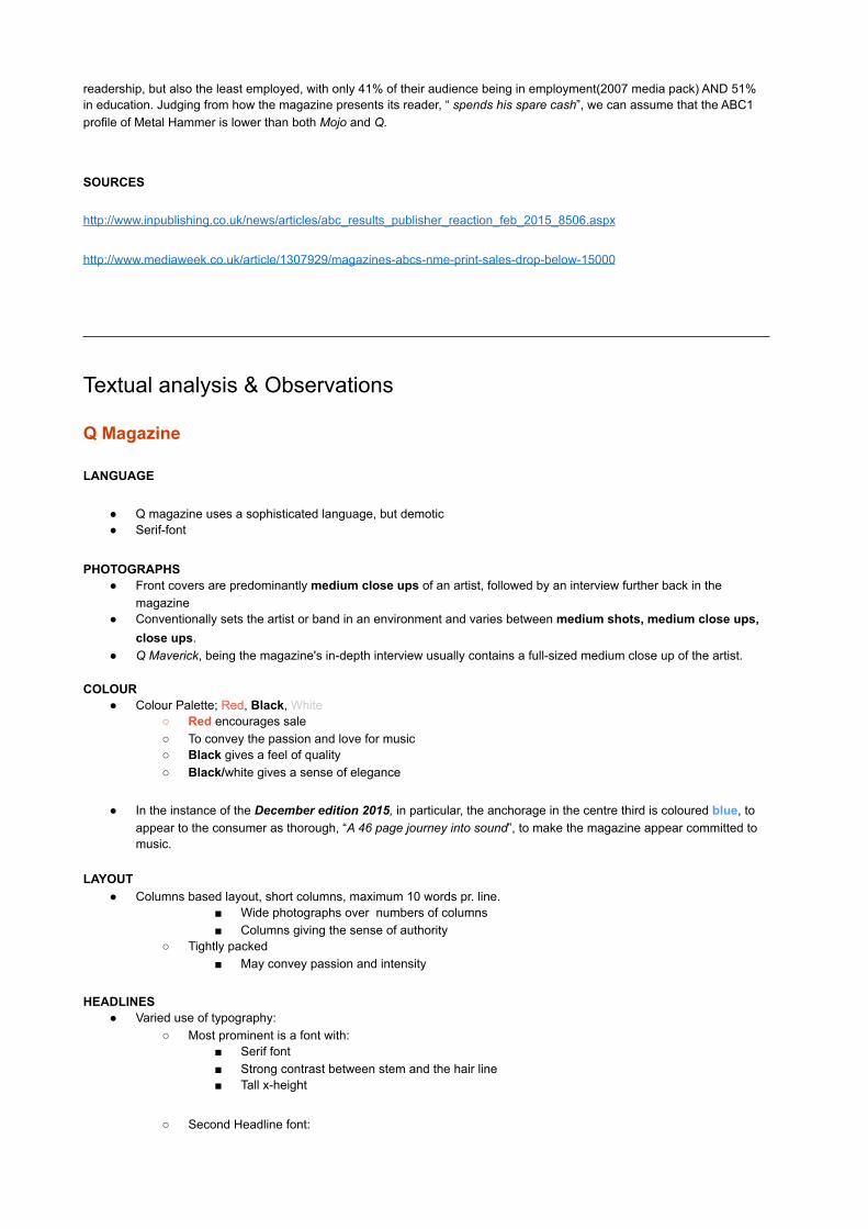
LANGUAGE
● Q magazine uses a sophisticated language, but demotic ● Serif-font
PHOTOGRAPHS● Front covers are predominantly medium close ups of an artist, followed by an interview further back in the
magazine ● Conventionally sets the artist or band in an environment and varies between medium shots, medium close ups,
close ups.● Q Maverick, being the magazine's in-depth interview usually contains a full-sized medium close up of the artist.
COLOUR
● Colour Palette; Red, Black, White○ Red encourages sale○ To convey the passion and love for music ○ Black gives a feel of quality ○ Black/white gives a sense of elegance
● In the instance of the December edition 2015, in particular, the anchorage in the centre third is coloured blue, to appear to the consumer as thorough, “A 46 page journey into sound”, to make the magazine appear committed to music.
LAYOUT ● Columns based layout, short columns, maximum 10 words pr. line.
■ Wide photographs over numbers of columns ■ Columns giving the sense of authority
○ Tightly packed ■ May convey passion and intensity
HEADLINES● Varied use of typography:
○ Most prominent is a font with: ■ Serif font ■ Strong contrast between stem and the hair line ■ Tall x-height
○ Second Headline font:

■ Sans-serif font ■ Closed counter ■ Mono-spaced ■
○ Third Headline font: ■ Sans-serif font ■ Varied thickness in stroke ■ Contrast between the stem and hair line ■ Rounded beaks, legs
BODY TEXT● Consistent use of font:
○ Serif-font ○ Contrast between the stem and hair line
LOGO ANALYSIS
Mojo● Published by Bauer Media● in 2011 it was the world's largest music magazine ● Colour Palette; Black, White, gray
Metal Hammer ● Published by Axel Springer● in 2011 it was the world's largest music magazine

Plug: Q effectively uses yellow in their plug to draw attention to what the magazine can offer. The clever use of yellow, which stimulates mental process and encourages mental process, increases arousal. In addition text printed on a yellow background was recalled better than text printed on a blue background(UW-L Journal of Undergraduate Research X (2007): The Effects of Colour on Memory). All of this makes the magazine more attractive.
PUFF: The use of a sans-serif font with a tall x-height, combined with the wording screams for attention and emphasises the magazines profile of being valuable.
Splash feature: The black on gray contrasted cover line in the left third, is an unusual colour combination, gray being unsettling and black giving the sense mystery. It creates curiosity with the reader. The red contrasted text bellow. The black font also emphases their authority within the genre. The highly saturated red strongly contrasts [INSERT ACCURATE TERMIOLOGY HERE] over, which emphases a turbulent past.
Top Strip: Distinguished with the a black and white contrast, black gives the sense mystery, but also gives us the association to rock, and therefore emphasise the character of Prince. Gray often gives expectations, “I think I’m normal”, which persuades the reader to buy the magazine. Right third plug: draws attention
through typography, and effectively stands out through the purple background, which gives associations to punk, a genre Prince performs.
Sub-Image: seen in the right third, in contrast to the splash image, prince looks away, giving the sense of mystery and builds up anticipation, combined with the top strip this spawns curiosity in the reader.
Cover lines: on the right third of the magazine cover, the white on red, red on white contrast makes builds up tension and effectively draws attention to itself. The white evokes action and the red proves to increase sales, combined to sub-consciously make the reader to buy the magazine. It also harmonises with the logo and discloses the design as the reader reads the logo till the eye stops on the bottom cover line.
Cover line right third, middle third: The font of”31” contrasts the entirety font-use throughout the magazine cover. It shares the commonality of a tall x-height, empathising the magazines authority, the serif font gives associations to the 1900s and past, giving it a sense of credibility, but the “old-fashioned” associations and characteristics are balanced with the hight contrast between the thick and thin strokes, making it more modern than types seen from the 19th century.
Masthead: in the left third , the white on red contrast highly effectively draws attention to the reader. The read is tagline is reflected throughout the magazine, which circles the design and creates continuity, making it more prominent, as well as making the magazine feel professional. Red urges the reader pay attention to the magazine and to buy it, the white Q has a similar effect, evoking action(http://www.ucreative.com/resources/infographic-a-color-guide-for-designers/). The slightly slanted Q and the tail makes it feel in motion. This also balances the associations with the Q, traditionally seen in serif typefaces associated with the 19th century and prior, and makes it feel more modern.
Splash Image: The image immediately establishes the hierarchy of the band, with the vocalist at the front and the rest of the band in the background. They all have eye contact with the camera, creating the effect of the reader having eye contact with the characters in the photograph, making us feel intimate and more easily relate with the characters in the photograph

Layout:
The Layout is column based, meaning it’s dominated by vertical shapes, furthermore reinforcing the magazine authority and [INSERT SOMETHING].
The Layout is balanced in how the smaller boxes in the left and centre third is contrasted by a big, medium close up of the photograph and the tall The Q reviews box. Together they form a tall column balancing the many elements boxes comprising the right column.
The Layout also reflects what kind of music the magazine cover, modern music. This in how ordered clear and regular the imposition is, with many of the shapes quite similar and repeating through the design. It resembles a sectional drawing of a modern house, thus giving the same sense of modernism.
Typography: The tall, monospaced, sans-serif font not only emphasise the magazines authority, but also reflects its mission statement: "ultimate guide to modern music”, which sans-serif fonts reflect, modernity. “Q reviews: the world's finest music guide” uses a serif font deliberately to give associations prior to the 1900s, making it more credible and through. The contrast between the serif Q and “contents” written in a sans serif font, conveys how the magazine publishes material from different eras in music.
Colour: The colour palette is predominantly black and white, giving a feeling of quality and elegance. But it is saturated by bubbles indicating the page which the article is, and reflects the colours in the photograph, empathising the the portraiture of the artist.
Photographs: Are either medium shots or medium close-ups of artists, and reflects how Q advertise itself of being close and connected to the music industry. The photographs of Prince compliments the vertical Layout and empathises his importance and dominance between 1993 and 2000.
Language
The language is deliberately mysterious filled with cliffhangers to excite the readers curiosity and to encourage sales. The magazine emphasise it’s authority by wording its reviews as “essentials” and “The worlds finest music guide”, establishing their reviews as a standard for music fans.

LayoutThe Layout is quite simpe and easy to graps for the reader, as it is the convention with most in-depth articles, and it makes the magazine feel modern, looking back at the contents page, it feels like a section drawing of a modern house. The readers first presented(by aligning the image to the left where all western cultures start to read) with a medium close up of the artist in the article, immediately communicating who it is about. The
hierarchy is suggested through the size of the different elements. The images is the first visual element that the reader notice, then the Title comes by. Thereafter, the reader might jump to the quotation, before the reader commence in reading.
The Initial kicking-off the article gives associations to the Q logo, which, through this consistency, manifests the logo og Q in the head of the reader, making it more
memorable and will also help them out in branding, as all red squares suddenly can be a reference to Q.
TypographyThe reader is immediately hit by the huge same sans-serif font used throughout the magazine, but "Johanna" is typed with a manipulated version of the typeface to make a greater impact on the reader. This can reflect or raise in popularity and success.
The font used for the running text is a serif font, conventionally used in longer articles as it’s more legible and easier on the eye, but also gives a sense of newspapers, as they commonly use serif fonts, which gives the reader associations to trustworthiness, credibility, seriousness, rigorousness and correctness. it gives especially associations to old newspapers before colour print.
ColourThe magazine uses their colour palette consistently throughout the article, with branding coloured in red, or ty highlight key words of greater importance. The simple black and white colour palette emphasise the associations we get from newspapers
PhotographsThe only photograph presented is in the article is a full cover photograph with a medium shot of the artist. Q stays true to its convention of displaying artist am media shot or medium close up. This continuity empathise how the magazine is close up.
The artist is also in eye contact with the camera, making the reader feel intimacy with the artist. The Cool colours in the photograph reflect the style of Johanna’s music, as the ingress describes her as music as “ornate” , “flamboyantly poetic”. Blue giving associations to the ocean, being deep and vast, hard to grasp, and the photograph successfully conveys just that.
LanguageThe language is highly sophisticated with a rich vocabulary targeted for the intellectual, wealthier, passionated music enthusiast, which is the focus Q targets. They use tasteful descriptions: “She employs unconventional structures, ornate arrangements and torrents of poetic language..."

Plug: the magazine effectively uses yellow in their plug to draw attention to what the magazine can offer. The clever use of yellow, which stimulates mental process and encourages mental process, increases arousal. In addition text printed on a yellow background was recalled better than text printed on a blue background(UW-L Journal of Undergraduate Research X (2007): The Effects of Colour on Memory). All of this makes the magazine more attractive.
PUFF: The use of a sans-serif font with a tall x-height, combined with the wording screams for attention and emphasises the magazines profile of being valuable. In contrast to Q, MOJO advertise the CD as “Free” instead of exclusive. This being the reason that MOJO advertise themselves to a more grown audience than Q.
Top strip: Effectively catches the eye of the reader by colouring it read combined with the anticipating wording “The Velvet Underground”. These elements combined gives us a sense of danger, which might attract the reader to the magazine.
Masthead: The Acts in a similar way as the Q in Q’s logo and is empathised in the Layout. Another convention of the MOJO tagline is its O being replaced by the head of the artist presented in the splash image. Its unusual 3D shape is in contrast to the flat modern design, giving us association with times prior to the 2000. The tagline also reflects The Editors Statement: “..greatest musicians of all-time, be they established or emerging musicians”.
Cover line: The Gray colour combined with the font used makes for a natural, but harmonic and balanced expression, which type being consistent and the gray colour being in contrast, but still harmonious to the colour palette, which appeals to a more grown audience.
Tagline: “The Music Magazine” states the magazine’s view of itself and reflects the editors statement of being a magazine for all genres, all types of music from both old and modern music.
Sub image: The black & white, grainy photograph gives the reader a nostalgic feeling and associations with the 60-70s. The hairstyle also hints to this.
Splash Image: His costume resembles the golden age of rock and roll, and gives the reader a nostalgic feeling, deliberately targeting the MOJO reader at the age of 37.
Splash feature: a

Colour: MOJO uses red to state the hierarchical order of the content displayed. Their colour palette of mainly black, white and red gives association to rock which reflects the content the magazine. From a marketing perspective red is proven to encourage sales and highlights the selling points of the magazine.
TypographyThe slab-serif font gives connotations to the 1970s, 80s and 90s. It’s consistently used throughout the magazine as headers, giving the sense of conservative and stability.
Photographs The vintage look of all of the presented photographs enhances the connotations of rock and roll, and provokes a
nostalgic feeling with the average MOJO reader, appealing to a older audience.
Layout:
The in contrast to Q is filled with many horizontal elements, reflecting the broad spectre of genres the magazine writes about. The Layout is much more crowded and varied in the size of the different elements, this also to convey variety in the magazine, and how “At MOJO we cover
the good stuff.”

LayoutThe Layout is quite frantic and complicated in comparison Q. But is dynamic with many elements carefully overlapping, makes it all more lively, as it might be intended since it describes the past, something dead or no longer in existence, and might feel dull in a design like Q. The regular Layout of the right page is given more life with the overlapping images and their irregular placement,
this contradicting causing excitement.
The rather large chunks of text forces the reader to be more thorough in his reading. This resembles books which is just plain text, and because of the audience, they enable this design because the older focus group(having the mean age of 37), the reader is more used to books than younger audiences, which in contrast to Q’s article, is
much more separated and in slimmer columns, making a faster rhythm both in the design and in the reading of the article.
They have increased the distances between the words so that the lines don’t cross the 12-words-per-line rule which is the optimal word count for easy reading. This makes the text fill out more of the page, making is resemble a book ever
TypographyThey use a serif-font to empathise the sense of a book and makes it easier for reading larger text.
The large O resembles the “O” used in the masthead of the cover page, using the initial in the same as Q, with the purpose of the reader to recognise regular black “Os" as MOJO.
ColourThey stay true to the colour palette of Black & White, but livens it up by using an element from the cover art in a different nuances of red, making the design continuous through the magazine
Rather than in Q, the simple black and white palette resembles a book because og the Layout of the text and the typography, it gives the same connotation of credibility and thoroughness, but as books often are, a travel in time.
PhotographsThe photographs furthermore empathise and plays on the nostalgic feel of the reader, with the lack and white colour, and the motive being from 60s-70s.They are also presented as film, which empathise nostalgia with the reader.
LanguageThe language is quite demotic which appeals to a broad audience, the vocabulary is of what the ordinary man in the street would speak, this making the text easy to grasp.

Plug: In comparison to the plug seen in MOJO and Q is much more subtle and harmonis with the rest of the design, using the blood texture that makes for a subtle contrast to the masthead and the black background.
Masthead: reflects the theme of the band presented on the splash image and in the splash feature. They deliberately use sparks to convey the intensity of the band and the temperature on the atmosphere they create. The sharp edges of the font conveys the hostility.
Tagline: The red sword and the contrasting white text typing out “Defence of the faith” furthermore emphases the anti establishment feeling the magazine wants the reader to feel. The white colour it purifies the message as almost noble task, and that the society on the contrary is filthy or corrupt.
PUFF: The use of a sans-serif font with a tall x-height, combined with the wording screams for attention and emphasises the magazines profile of being valuable. In contrast to Q and Metal Hammer advertise the CD as “Free” instead of exclusive. It’s also textured likewise with the other cover lines in the magazine. Consistent use of the font emphases the magazine’s roughness, avant garde and anti establishment feeling, as the media pack states.
Splash feature : The same feeling as the Masthead, but just bellow “Destroy the planet" is written in the same font as the rest of the cover lines seen on the PUFF, conveying the same feeling of hostility and the rejection of the mainstream society.
Quotation mark: Written in the same typeface with the same nuance of red it conveys very much the same message. The consistent use of the same design quickly teaches the reader to look for the same design.
Bottom strip: The magazine effectively uses a typeface with a tall x-height to compensate for the position of it, being one of the latest parts of the design to be read by the reader. The white on black contrast also contributes to this, and harmonises with the splash image.
Sub Image: reflects and emphasises the cover line, the tagline and the general design choices in the cover page, anti-society, revolutionary through mies-en-scene,with eyes covered in shadows, ammunition and a gun on the left shoulder. The Layout of him also coveys this, in who he’s positioned on the edge, in the far right corner, giving the sense of extremism and radicalism.
Cover line: consistent design of the cover lines, but the middle cover line shares the same shade of silver and special effects like the how “KIZZ” is typed out, but a different typeface is used to reflect the characteristics of the artist in the left third of the cover page, with more masculine traits, thick square strokes.
Splash Image:
Placed in the centre third and right third, it’s the most prominent part of the Layout. The Black and white contrast in the face of the subject matter and also the white contrast to the background, is reflected throughout the design. It conveys a sense of polarisation, one faction being the group which the reader identifies with and the rest of the society. The red tongue might symbolise the bloody fight they want it to be.
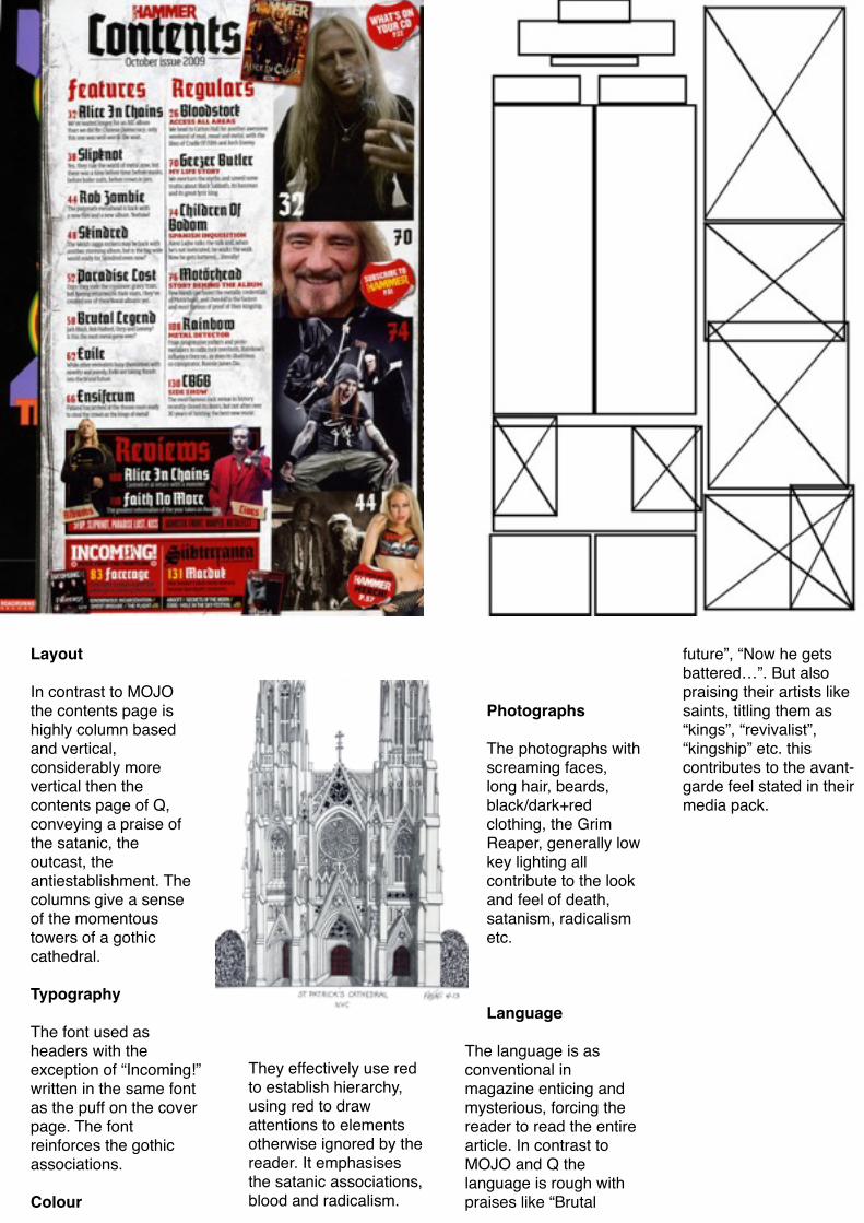
Layout
In contrast to MOJO the contents page is highly column based and vertical, considerably more vertical then the contents page of Q, conveying a praise of the satanic, the outcast, the antiestablishment. The columns give a sense of the momentous towers of a gothic cathedral.
Typography
The font used as headers with the exception of “Incoming!” written in the same font as the puff on the cover page. The font reinforces the gothic associations.
Colour
They effectively use red to establish hierarchy, using red to draw attentions to elements otherwise ignored by the reader. It emphasises the satanic associations, blood and radicalism.
Photographs
The photographs with screaming faces, long hair, beards, black/dark+red clothing, the Grim Reaper, generally low key lighting all contribute to the look and feel of death, satanism, radicalism etc.
Language
The language is as conventional in magazine enticing and mysterious, forcing the reader to read the entire article. In contrast to MOJO and Q the language is rough with praises like “Brutal
future”, “Now he gets battered…”. But also praising their artists like saints, titling them as “kings”, “revivalist”, “kingship” etc. this contributes to the avant-garde feel stated in their media pack.
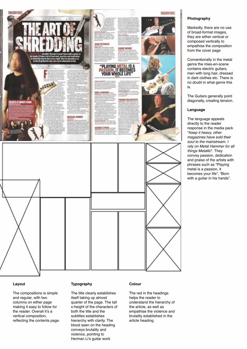
Layout
The compositions is simple and regular, with two columns on either page making it easy to follow for the reader. Overall it’s a vertical composition, reflecting the contents page.
Typography
The title clearly establishes itself taking up almost quarter of the page. The tall x-height of the characters of both the title and the subtitles establishes hierarchy with clarity. The blood seen on the heading conveys brutality and violence, pointing to Herman Li’s guitar work
Colour
The red in the headings helps the reader to understand the hierarchy of the article, as well as empathise the violence and brutality established in the article heading.
Photography
Markedly, there are no use of broad-format images, they are either vertical or composed vertically to empathise the composition from the cover page
Conventionally in the metal genre the mies-en-scene contains electric guitars, men with long hair, dressed in dark clothes etc. There is no doubt in what genre this is.
The Guitars generally point diagonally, creating tension.
Language
The language appeals directly to the reader response in the media pack “Keep it heavy, other magazines have sold their soul to the mainstream. I rely on Metal Hammer for all things Metallic”. They convey passion, dedication and praise of the artists with phrases such as “Playing metal is a passion, it becomes your life”, “Born with a guitar in his hands”.
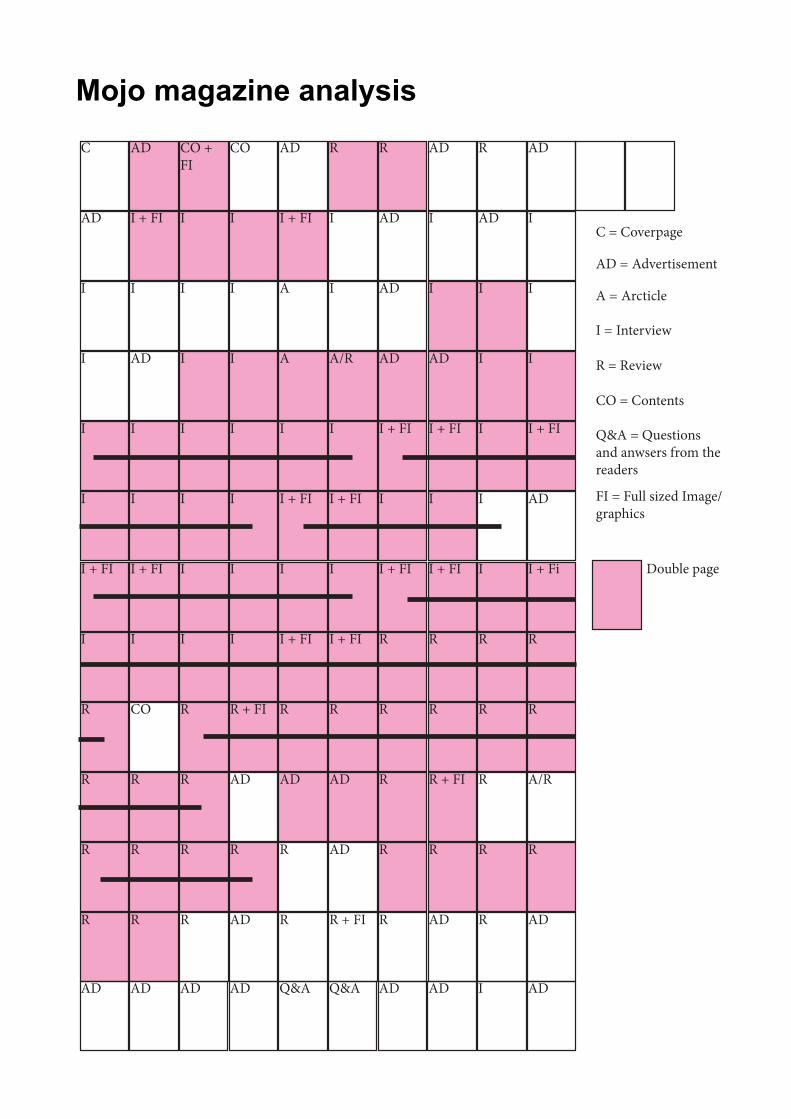
Mojo magazine analysis AD
I
I + FI
I
I
AD
I + Fi
R
R
A/R
R
AD
AD
R
I
I
AD
I
I
I
R
R
R
R
R
I
AD
I
I + FI
I
AD
I
I + FI
R
R
R + FI
R
AD
AD
R
AD
I + FI
AD
AD
I
I + FI
R
R
R
R
R
AD
R
I
I
I
A/R
I + FI
I
I + FI
R
AD
AD
R + FI
Q&A
AD
A
I
I + FI
A
I + FI
I
I + FI
R
AD
R
R
Q&A
COCO + FI
ADC
IIII
IIII
II I + FIAD
II ADI
I
I
I
R + FI
AD
R
AD
AD
I
I
I
R
R
R
R
AD
I
I + FI
I
CO
R
R
R
AD
I
I + FI
I
R
R
R
R
AD
C = Coverpage
AD = Advertisement
A = Arcticle
I = Interview
R = Review
CO = Contents
Q&A = Questions and anwsers from the readers
FI = Full sized Image/graphics
Double page