Bookish v2: Humanities Research at Scale
33
– Independent Work Report Spring 2019 – Bookish v2: Humanities Research at Scale Jackson Neus ’20 Advisor: Brian Kernighan Abstract Humanities research is becoming increasingly data-driven. The textual analysis of large col- lections of documents and files can offer insight into linguistic and historical trends that were previously unobservable through traditional research methods, and can be used to supplement or substantiate existing qualitative knowledge. However, many existing analysis tools cannot be run at scale and are thus less effective for large datasets (which contain potentially millions of files). On the other hand, tools that can be run at scale are often over-engineered and designed with technical users in mind, not humanities scholars. This project seeks to find the middle ground and create a lightweight-yet-scalable platform that enables non-technical users to easily explore and investigate their data. To evaluate the effectiveness of this platform, we are collaborating with Professor Angela Creager of the Princeton University History Department, who, along with other members of the department, seeks to investigate the evolution of the vocabulary surrounding the regulation of harmful substances in a corpus of nearly fifteen million documents. The platform has been successful thus far in enabling deeper analysis of Professor Creager’s instanced dataset. By building the platform in as generic a manner as possible, we hope to enable additional research teams to perform textual analysis at similarly large scales without requiring them to make similar investments of time and effort in the development of computational and analytical infrastructure.
Transcript of Bookish v2: Humanities Research at Scale
– Independent Work Report Spring 2019 –
Bookish v2: Humanities Research at Scale
Jackson Neus ’20Advisor: Brian Kernighan
Abstract
Humanities research is becoming increasingly data-driven. The textual analysis of large col-
lections of documents and files can offer insight into linguistic and historical trends that were
previously unobservable through traditional research methods, and can be used to supplement or
substantiate existing qualitative knowledge. However, many existing analysis tools cannot be run at
scale and are thus less effective for large datasets (which contain potentially millions of files). On
the other hand, tools that can be run at scale are often over-engineered and designed with technical
users in mind, not humanities scholars.
This project seeks to find the middle ground and create a lightweight-yet-scalable platform that
enables non-technical users to easily explore and investigate their data. To evaluate the effectiveness
of this platform, we are collaborating with Professor Angela Creager of the Princeton University
History Department, who, along with other members of the department, seeks to investigate the
evolution of the vocabulary surrounding the regulation of harmful substances in a corpus of nearly
fifteen million documents.
The platform has been successful thus far in enabling deeper analysis of Professor Creager’s
instanced dataset. By building the platform in as generic a manner as possible, we hope to enable
additional research teams to perform textual analysis at similarly large scales without requiring
them to make similar investments of time and effort in the development of computational and
analytical infrastructure.

Note: I first started working on this project during the Fall 2018 semester as a one-semester
independent work project in the Computer Science department. Though this report specifically
pertains to the portion of the project completed during the Spring 2019 semester, parts of my work
overlap with that of the previous semester. As such, portions of this report are either adapted or
copied directly from my fall semester report. That report, "Bookish: A Tool for Large-Scale Textual
Analysis of Arbitrary Datasets" can be found at [4].
1. Introduction
1.1. Motivation and Goals
Humanities research is becoming increasingly data-driven. Researchers now frequently supplement
traditional humanistic research methods with large-scale analysis of digital archives. This fusion of
humanities research and computerized analysis techniques is today known as the Digital Humanities.
As Duke University puts it, "[Digital Humanities] describes not just a collective singular but also
the humanities in the plural, able to address and engage disparate subject matters across media,
language, location, and history. But, however heterogeneous, the Digital Humanities is unified
by its emphasis on making, connecting, interpreting, and collaborating." [2]. This project has
been conducted in collaboration with members of two separate research projects in the Princeton
University Department of History, one of which is now directly supported by Princeton University’s
Center for Digital Humanities [3].
The first research project, which was the original impetus for this independent work, is led by
Professor Angela Creager. Professor Creager is a professor of the History of Science and is an
expert on the American regulatory landscape and the regulation of environmental and chemical
carcinogens. Over the many years that she has devoted to studying this landscape, Professor Creager
has observed a shift in priorities in cancer research and chemical regulation from the external to
the internal. As she explained in a 2016 presentation at the American Society of Environmental
History, "by the late 1960s, the US federal government targeted cancer from chemicals as a key
public health problem." This trend continued through the 1970s, but by the early 1990s, after a
2
decade of setbacks in the regulatory world, there had been a shift in focus from external agents (e.g.
chemicals) to internal agents (e.g. genes). The pressure on industry to create verifiably-safe products
had been reduced [1]. Professor Creager’s research in this field has primarily been qualitative,
though she hopes to find quantitative evidence to to support her hypothesis that such a shift has
occurred. Professor Creager has observed general trends in the vocabulary surrounding cancer
research and industry regulation using Google NGram Viewer (Figure 1) and has identified several
large repositories of relevant documents, but she currently lacks the resources to effectively analyze
them.
The second research project is led by Professor Keith Wailoo, also of the Princeton University
History Department (though my point of contact has been Dr. Dov Weinryb Grohsgal, an incredibly
knowledgeable and helpful postdoc). Professor Wailoo is investigating tobacco companies’ targeted
marketing schemes (which varied across different demographics) in the second half of the 20th
century. Dr. Weinryb Grohsgal and Professor Wailoo have already developed robust analysis
techniques that help to visualize the linguistic properties of such marketing techniques, but are
having trouble adapting these techniques to work at scale. Currently, they’re only able to analyze on
the order of 100 files at a time, which is insufficient for their research.
The objective of this independent work is therefore to create a platform that will enable these two
teams to take steps in their research that were previously not possible. Specifically, our aim is
to create a tool that will both allow researchers to confirm existing knowledge through the large-
scale analysis of instanced data and easily and intuitively explore large amounts of data in order
to formulate new directed research questions. Our goal is to create a platform that can be used
without the technical knowledge of a computer scientist (because it is targeted towards humanists),
and furthermore to develop the platform in a sufficiently generic manner such that other teams of
scholars (perhaps with one or two technical team members) may similarly seek out answers to their
research questions without having to invest the same amount of time and effort in the infrastructure
needed to efficiently analyze large amounts of data.
3
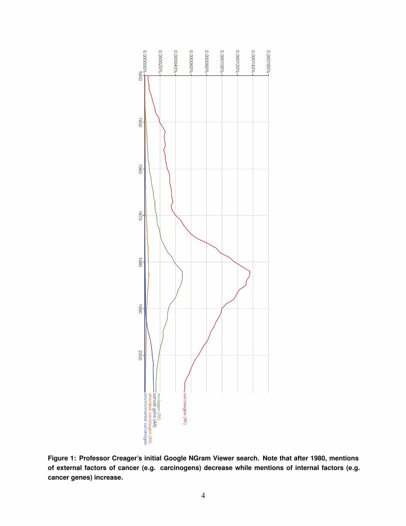
Figure 1: Professor Creager’s initial Google NGram Viewer search. Note that after 1980, mentionsof external factors of cancer (e.g. carcinogens) decrease while mentions of internal factors (e.g.cancer genes) increase.
4
1.2. Fall 2018 Independent Work
As noted above, work on this project began in Fall of 2018 as part of a one-semester independent
work project in the Computer Science department (also advised by Brian Kernighan). During the
fall, we developed a generic platform (dubbed "Bookish") to run large-scale analysis across millions
of files and visualize the results of said analyses. However, there was not enough time left after
developing the generic infrastructure to build out the platform to meet Professor Creager’s and
Professor Wailoo’s specific research needs. The specific goal of this semester of independent work
is to do just this. Our objective is to develop several analysis techniques that will facilitate further
insight into the specific domains of these researchers.
As such, less attention will be paid to the inner workings of the system in this report (though the
major components of the platform will be reviewed). To learn more about architectural details of
the system, please refer to [4].
1.3. Data Sources
Professor Creager and Professor Wailoo are interested in the chemical and drug industries and the
tobacco industry, respectively. A good candidate for the platform’s initial dataset is the University
of California San Francisco’s Industry Documents Library (IDL). A team at the University of
San Francisco (UCSF) has collected millions of files from the tobacco, drug, chemical, and food
industries. A large number of these files are internal documents made publicly available through a
variety of means. A majority of the tobacco files, for example, were made available as the result of a
settlement between the State of Minnesota and five major tobacco companies in a 1998 lawsuit [5].
These documents offer a great deal of insight into the focuses of different companies throughout the
20th and 21st centuries.
We identified and instanced this dataset last semester, but did not use it for much (as most of last
semester’s efforts were centered around building generic infrastructure).
5
2. Problem Background and Related Work
2.1. Analysis
Much work has been done in the field of textual analysis. Several online tools, including Google’s
NGram Viewer and the University of Illinois’ Bookworm, allow users to plot the usage of phrases in
large corpora of text over time. These tools are largely successful in efficiently querying incredibly
large amounts of data. However, while such tools are useful for cursory investigations into linguistic
trends, the visualizations that these tools offer (the usage of specified keywords over time) lack the
depth needed to inform and shape research. There is also an argument that these tools restrict users
to using datasets that are too large. Google Ngram Viewer only allows a user to select the language
of their query, and searches all documented text for the selected language. While Bookworm offers
several filters that allow a user to slightly narrow down the search space, it too can not be used to
query precise sets of documents.
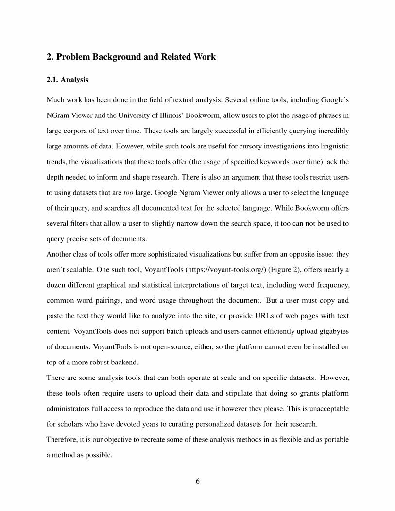
Another class of tools offer more sophisticated visualizations but suffer from an opposite issue: they
aren’t scalable. One such tool, VoyantTools (https://voyant-tools.org/) (Figure 2), offers nearly a
dozen different graphical and statistical interpretations of target text, including word frequency,
common word pairings, and word usage throughout the document. But a user must copy and
paste the text they would like to analyze into the site, or provide URLs of web pages with text
content. VoyantTools does not support batch uploads and users cannot efficiently upload gigabytes
of documents. VoyantTools is not open-source, either, so the platform cannot even be installed on
top of a more robust backend.
There are some analysis tools that can both operate at scale and on specific datasets. However,
these tools often require users to upload their data and stipulate that doing so grants platform
administrators full access to reproduce the data and use it however they please. This is unacceptable
for scholars who have devoted years to curating personalized datasets for their research.
Therefore, it is our objective to recreate some of these analysis methods in as flexible and as portable
a method as possible.
6
Figure 2: Voyant Tools
2.2. Infrastructure
Building the infrastructure required to efficiently process large amounts of data is a difficult and
time-consuming process. Today, many of the largest software companies offer consumer versions
of their in-house platforms and tools. Google offers cloud computing services through products like
BigQuery, and Amazon offers a number of big data-oriented tools including Data Lake and Batch.
These tools abstract away many of the challenges associated with resource- and time-intensive
computation. A programmer using one of these platforms need not worry about the minutiae of
parallel processing, nor must they worry about ensuring that computations continue running across
individual machine failures. However, many of these platforms suffer from the same issue that
the aforementioned analysis tools do – they are not flexible enough to support the querying of
multiple datasets that are stored in different locations and in different formats. Furthermore, these
services are often marketed towards software professionals and enthusiasts. They are not created
with humanists in mind, and as such, often feature very technical interfaces. For example, though
Amazon Batch closely aligns with our technical needs, it requires a user to specify a desired number
of virtual CPUs and a desired amount of RAM.
7

2.3. Current Analysis Methods
Professor Wailoo and Dr. Weinryb Grohsgal have made several attempts at analyzing data from
the UCSF Industry Documents Library without much success, both because the tools they have
employed can not be used at scale and because they lack the technology to efficiently select and
collect subsets of their dataset.
The first such tool is NVIVO, a popular qualitative data analysis platform. NVIVO enables users
to look at the linguistic characteristics of small corpora, including word frequency and word
associations. These properties are exactly the sort of thing that Professor Wailoo is interested in.
However, the problem with NVIVO is that it loads the entirety of a selected corpus into memory all
at once, which does not work when the size of the corpus exceeds the amount of available memory.
The pair has also tried running certain analysis tasks (both custom analysis scripts and standard
analyses offered in public libraries) through the R console. Though the R scripts can handle more
documents than NVIVO, they suffer from the same fundamental limitation: if a corpus is larger
than the amount of memory available on the machine, it can’t be analyzed. In an attempt to mitigate
this, Dr. Weinryb Grohsgal ran the analysis on a Research Computing cluster (which has far more
resources than a single consumer-grade machine) but ultimately he faced the same problem – the
relevant corpora are far too big to be loaded into memory, even on the cluster.
The second problem is dataset specific. As previously mentioned, the UCSF IDL dataset is of great
interest to both research groups. UCSF offers a public API that enables users to select documents by
a number of metadata fields. However, the API is paginated and only returns 100 results at a time.
It is a time-consuming process to manually aggregate each page of an API request, which makes
it very difficult to analyze large subsets of the dataset. Furthermore, there are only two download
options for the dataset: one can either download individual files or one can download quadrants of
the dataset (which are approximately 50GB when expanded and contain 3-4 million files). Even if
a researcher spends the time manually aggregating API results and building a list of, say, 10000
files, they have no easy way to specifically download those files. Either they download each file
individually, or they download the entire dataset, as most relevant subsets of files (e.g. all the files
8
associated with a specific author) are distributed across all four quadrants of the dataset.
2.4. Summary of Approach
The numerous shortcomings and/or incompatibilities in the discussed platforms and tools meant
that it would be difficult to create analysis tools using existing technology. For both of these reasons,
we decided to create a customized platform to meet researchers’ needs. This decision to led to the
creation of the Bookish application in the Fall of 2018.
As stated, our goal for this semester of independent work was to build out the platform to meet the
specific research goals of both Professor Creager and Professor Wailoo. To do this, we need to a)
automate the aggregation process for the UCSF dataset (described in the previous section) and b)
implement some of the analysis techniques offered by existing consumer platforms as well as those
already in use by Dr. Weinryb Grohsgal.
3. Approach
This project consisted of four phases: data collection, data normalization, the design and devel-
opment of the Bookish application, and the creation of specific analysis processes to support the
research of Professor Creager and Professor Wailoo.
We accomplished the first three phases of the project in the fall semester. They will be reviewed
briefly in this report, but to gain a full understanding of the generic Bookish platform please refer
to [4]. The fourth phase of the project, in which we customized the platform for specific research
teams, will be discussed in detail below.
3.1. Data Collection and Normalization
The first two phases of the project were to collect and store data and then to normalize it.
Initially, we collected data from several sources (as described in [4]). This semester, because
the focus was on implementing multiple analysis techniques and not on supporting many data
sources, we chose to focus solely on the University of California San Francisco’s (UCSF) Industry
Documents Library (IDL). As such, we will only discuss this dataset going forward.
9
The UCSF IDL dataset, which currently contains 14,868,705 documents (approx. 200GB) from the
tobacco, drug, chemical, and food industries [6] is particularly useful for this project for a multitude
of reasons. First and foremost, its contents are relevant to the specific research we are working to
support. Second, the repository is in remarkable shape, especially given its size. All documents have
already been converted to text using optical character recognition (OCR), and files are exceptionally
well-tagged (by industry, document type, author, brand, drug, public availability, etc.). Third, the
size of the dataset allows us to test the platform at scale.
Site administrators make the IDL dataset publicly available for download with four large .tar.gz
files, so we were able to download these archives and extract a local copy of the documents.
After uploading these files to our server, we converted them to a standard format using a variety
of Unix utilities. The intent of this data normalization was to remove punctuation and other non-
alphanumeric characters that would add noise to analysis results. Figures 3 - 5 show an example of
the normalization process. The details of this process are documented in [4].
3.2. Bookish Application
The primary goal of this project was to create an application that would allow users to analyze
linguistic and textual trends across instanced datasets. Because there is so much data, analyzing even
a portion of the instanced documents often takes a large amount of time. Therefore, it was necessary
to create a platform that allows a user to start analysis tasks in the background and return in several
hours (or days) when the tasks have completed. This required us to not only implement a web
application from which users can start, monitor, and view tasks, but also a robust backend which
schedules and runs long-duration tasks. The major components of the Bookish application will be
discussed in the following sections. For a detailed discussion of specific architecture decisions, see
[4].
3.2.1. Task Framework After prototyping several programmatic analysis methods, we found that
any sort of analysis on the instanced data generally involved two steps: generating smaller lists of
files from the larger datasets, and then performing various analyses on those smaller sets of files.
10
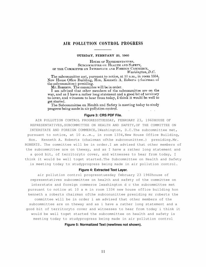
Figure 3: CRS PDF File.AIR POLLUTION CONTROL PROGRESSTUESDAY, FEBRUARY 23, 1960HOUSE OF
REPRESENTATIVES,SUBCOMMITTEE ON HEALTH AND SAFETY,OF THE COMMITTEE ON
INTERSTATE AND FOREIGN COMMERCE,lWashington, D.C.The subcommittee met,
pursuant to notice, at 10 a..m., in room 1334,New House Office Building,
Hon. Kenneth A. Roberts (chairman ofthe subconunittee.) presiding.Mr.
ROBERTS. The committee will be in order.I am advised that other members of
the subcommittee are on theway, and as I have a rather long statement and
a good bit, of territoryto cover, and witnesses to hear from today, I
think it would be well toget started.The Subcommittee on Health and Safety
is meeting today to studyprogress being made in air pollution control.
Figure 4: Extracted Text Layer.air pollution control progresstuesday february 23 1960house of
representatives subcommittee on health and safety of the committee on
interstate and foreign commerce lwashington d c the subcommittee met
pursuant to notice at 10 a m in room 1334 new house office building hon
kenneth a roberts chairman ofthe subconunittee presiding mr roberts the
committee will be in order i am advised that other members of the
subcommittee are on theway and as i have a rather long statement and a
good bit of territoryto cover and witnesses to hear from today i think it
would be well toget started the subcommittee on health and safety is
meeting today to studyprogress being made in air pollution control
Figure 5: Normalized Text (newlines not shown).
11
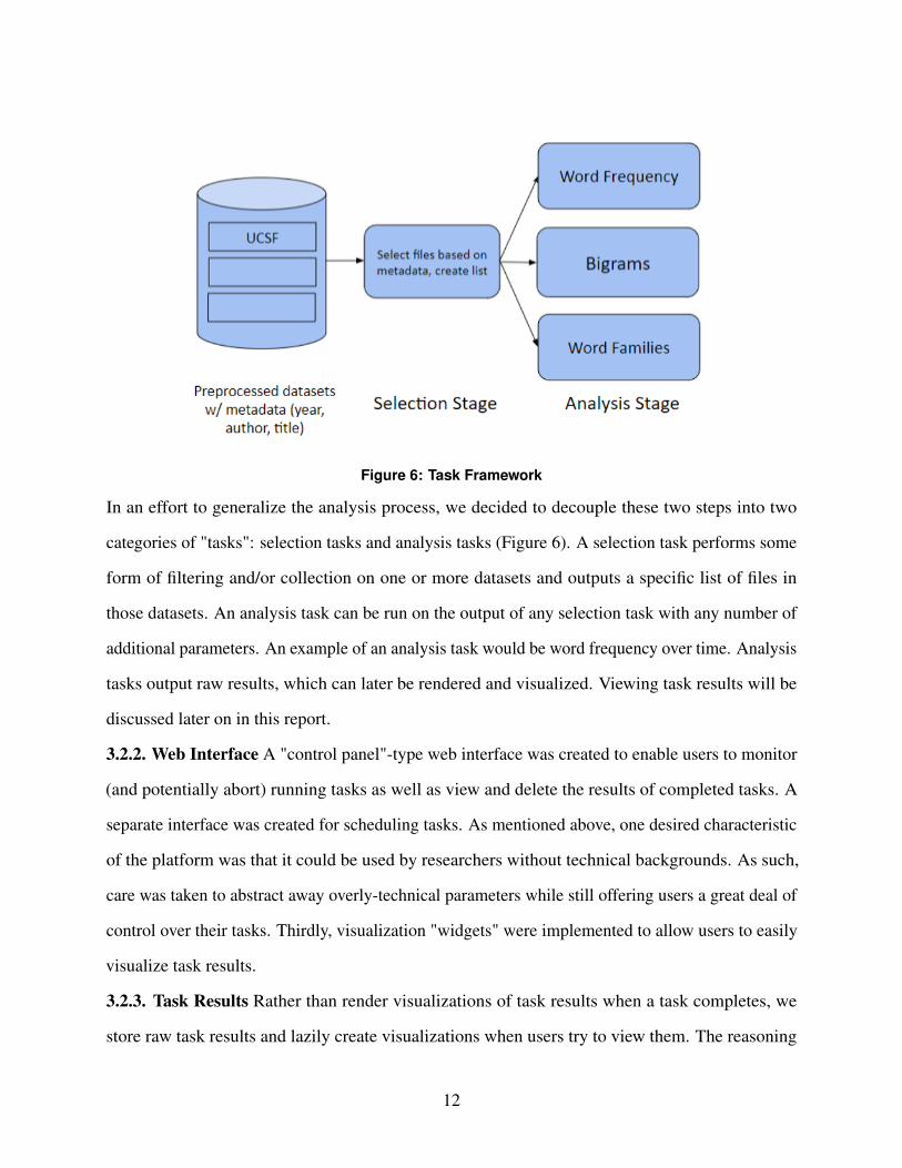
Figure 6: Task Framework
In an effort to generalize the analysis process, we decided to decouple these two steps into two
categories of "tasks": selection tasks and analysis tasks (Figure 6). A selection task performs some
form of filtering and/or collection on one or more datasets and outputs a specific list of files in
those datasets. An analysis task can be run on the output of any selection task with any number of
additional parameters. An example of an analysis task would be word frequency over time. Analysis
tasks output raw results, which can later be rendered and visualized. Viewing task results will be
discussed later on in this report.
3.2.2. Web Interface A "control panel"-type web interface was created to enable users to monitor
(and potentially abort) running tasks as well as view and delete the results of completed tasks. A
separate interface was created for scheduling tasks. As mentioned above, one desired characteristic
of the platform was that it could be used by researchers without technical backgrounds. As such,
care was taken to abstract away overly-technical parameters while still offering users a great deal of
control over their tasks. Thirdly, visualization "widgets" were implemented to allow users to easily
visualize task results.
3.2.3. Task Results Rather than render visualizations of task results when a task completes, we
store raw task results and lazily create visualizations when users try to view them. The reasoning
12

for this is threefold: first, a user will not necessarily be interested in visualizing the results for
every task they run, so we can save time by avoiding unnecessary work. Second, lazily generating
visualizations allows users to visualize data in more than one way, as any one task is not tied to
one particular visualization. Last, and most important, by storing raw text-based results we achieve
backwards compatibility. Existing visualizations to be changed and new visualizations to be added
without having to rerun potentially expensive tasks.
3.2.4. Deployment Initially we sought to host the application on a Princeton University Research
Computing machine. However, it was determined that our needs exceeded the capabilities of that
system, so we instead decided to host the platform on an Amazon Web Services Elastic Cloud 2
computing instance. Elastic Cloud 2 (EC2) is affordable and flexible, and makes it very easy to
resize instances as a project’s resource requirements increase or decrease.
3.3. Textual Analysis and Visualization Methods
Meetings with both Professor Creager and Dr. Weinryb Grohsgal indicated that the platform
needed to facilitate exploration of instanced data, as neither research group had highly-focused
research questions. At the same time, the platform needed to enable researchers to evaluate specific
hypothesis through data analysis. We subsequently developed two goals for the platform. The
analysis techniques we implemented needed to collectively enable users to both confirm existing
knowledge as well as motivate new (perhaps more directed) research questions.
While analysis methods and visualization techniques are intentionally decoupled on the Bookish
platform, they are entirely linked in theory. A specific analysis technique does not mean much
without a way to visualize the results, and vice versa. It was only after determining which analysis
techniques we would implement that we were able to build more general visualization widgets that
work for multiple techniques. As such, in the following subsections each analysis technique will be
presented along with its intended visualization(s).
3.3.1. Word Frequency Analysis The first analysis technique that we chose to implement was a
word frequency analysis. Users can specify a number of keywords and plot the relative frequency
13

of those terms in a specific corpus over time in a straight-forward multi-series line graph. The
motivation here was to mimic the functionality of Google Ngram Viewer, which Professor Creager
had already used in her initial research. As discussed above, Google Ngram Viewer offers no
granularity – it locks users into searching all stored text in a particular language. By implementing
word frequency analysis within the Bookish platform, we enable users to both confirm the presence
of known linguistic trends as well as identify new ones.
3.3.2. Top Bigrams Analysis The goal of top bigrams analysis is to identify the most frequent
bigrams (pairs of adjacent words) in a specific corpus of text and display them in a node-and-edge
graph. In such a graph, the nodes represent words and an edge between two words indicates that
those words frequently appear adjacent to one another in text. The width of an edge indicates the
frequency of a particular bigram relative to other bigrams in text. This analysis technique was
inspired in part by the O’Reilly book "R for Data Science", which features many node-and-edge
graphs in which nodes represent words and edges the relationships between them [7].
This analysis method is not very effective for confirming existing knowledge or evaluating existing
theories, as it simply finds the most frequent word pairs in text1. However, it is very useful for
exploring relatively unfamiliar data and looking for unexplained linguistic trends. A specific
example of how this analysis technique can inform new research questions will be presented in the
Results & Evaluation section (5).
3.3.3. Word Family Analysis The third analysis technique, dubbed word family analysis, helps to
visualize the relationships between different families of words in text. Users identify one or more
sets of words (word families) and a node-and-edge graph is created to contextualize the relatedness
between each pair of words. Just as with the bigrams analysis, each node represents a word and an
edge between two words indicates that they occur in the vicinity of one another at some point in
the queried text. Edge width is correlated to the relatedness of two words, a measure that will be
precisely described in the corresponding Implementation section (4.3.7).
1One might argue that there is some value in generating such an analysis to confirm existing theories. After all, if abigram that you expect to occur frequently shows up in the list of most frequent bigrams, you do have some sort ofpositive signal. But generating a list of frequent terms and hoping that yours is present seems far from efficient.
14
Word family analysis is a useful tool both for evaluating existing knowledge and for identifying
phenomena that are unexpected or that challenge one’s beliefs. This is because while users can
exactly specify word families of interest they have no control over the graph that is ultimately
produced.
Prior to this project, Professor Wailoo and Dr. Weinryb Grohsgal were performing word family
analysis using an R script that they had created. We used this code as inspiration when implementing
the analysis technique within the Bookish platform.
3.3.4. Multivisualization The aforementioned node-and-edge graph does not offer any information
on how relationships reflected in the graph change over time. As such, in the top bigrams and word
family analyses, analysis results can only meaningfully be displayed for one timestep at a time. We
chose this timestep to be a year, largely because the UCSF data is categorized by year.
However, much of the relevant research involves looking at how language and vocabulary changes
over time. For this reason, we allow the results for multiple years to be visualized simultaneously,
side-by-side (Figure 8). Similarly, we allow users to visualize the results of multiple analyses
side-by-side (for a given year) (Figure 9). This is particularly useful if a user wants to, say, look at
how language differs between two specific industries or two specific brands within an industry.
4. Implementation
4.1. Data Collection and Normalization
See [4].
4.2. Bookish Application
The implementation of the Bookish application is discussed in detail in [4]. Relevant aspects of the
platform will be reviewed briefly in this report.
4.2.1. Web Application The web application is implemented using Flask, a lightweight Python
web framework. The frontend of the Bookish application is implemented using HTML, CSS,
and Javascript/JQuery. We use AJAX to asynchronously request current task information from
15
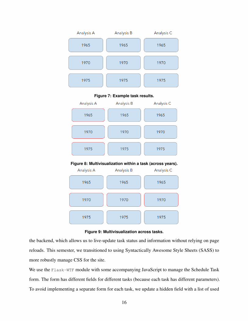
Figure 7: Example task results.
Figure 8: Multivisualization within a task (across years).
Figure 9: Multivisualization across tasks.
the backend, which allows us to live-update task status and information without relying on page
reloads. This semester, we transitioned to using Syntactically Awesome Style Sheets (SASS) to
more robustly manage CSS for the site.
We use the Flask-WTF module with some accompanying JavaScript to manage the Schedule Task
form. The form has different fields for different tasks (because each task has different parameters).
To avoid implementing a separate form for each task, we update a hidden field with a list of used
16
fields when a user selects the task type from a dropdown menu. The backend can then appropriately
discard irrelevant fields.
The implementation of visualizations will be discussed in detail later on in this report (4.4). Screen-
shots of the web application can be found in Appendix 1.
4.2.2. System Structure/Parameters The exact structure of the Bookish server is out of scope for
this report (see [4]). The key takeaway here is that instanced datasets are distributed across many
smaller storage devices to improve disk throughput without paying for higher bandwidth devices.
4.3. Tasks
The fundamental flaw with many existing analysis tools is that they attempt to read the entirety of a
corpus into memory simultaneously. We solve this problem in Bookish by parallelizing analysis
tasks and only processing a certain number of files (or groups of files) at once. By doing so, we
ensure that only a small number of files are loaded into memory at any given time. This is critical
when processing datasets at scale (a typical task may process 10-50GB of data, and our current
server does not have nearly that much memory).
4.3.1. Task Framework The specifics of the task framework are not relevant in this report, but one
thing worth mentioning is the task utility library. In many cases, it is advantageous to parallelize
a task. By leveraging multiple threads, we can complete a task’s workload more quickly. Also,
by processing each file individually, we remove the need to load the entire corpus into memory
at once. Instead, we load a file’s contents into memory right before the file is processed and free
that memory immediately after. In the fall semester, we created a utility library to facilitate the
parallelization of tasks within the Bookish platform.
Python’s multiprocessing library is particularly useful for implementing parallelization, as it
allows developers to easily multithread certain operations (e.g. map). However, some Bookish-
specific data structures are not thread-safe and can be corrupted when a developer uses the
multiprocessing library. To rectify this, we added wrappers for specific multiprocessing
functions to the task utility library that properly reinitialize data structures in newly-spawned threads.
17
This library was created last semester in the hopes of streamlining the process of implementing
new analysis tasks. Though the library needed to be expanded this semester, it did signficantly
reduce the amount of time it took to implement new highly-parallelizable analysis tasks (such as the
bigrams and word family tasks).
This semester we expanded the task utility library to support the chunking of data. Put simply, we
now have the ability to split a file list into chunks and process those chunks in parallel rather than
process each individual file in parallel. The functionality of and the motivations for chunking are
discussed in more detail as they relate to the top bigrams analysis task in section 4.3.6.
4.3.2. Task Execution/Task Monitoring See [4].
4.3.3. Task Results Task results are written to files and stored on the Bookish server. When one
task is passed to another as input, the results for the input task are read back into memory and
passed as one or more parameter(s).
4.3.4. IDL Selection Task We wanted to allow users to run analysis on all reasonable subsets of the
IDL dataset. UCSF already offers a public Apache Solr API that enables users to select documents
by a number of metadata fields (author, industry, brand, document type, etc.), so we decided that it
would be reasonable to simply support all valid Solr queries. The IDL selection task simply takes a
valid API query from the user and passes it through to the UCSF server.
The slight nuance here is that UCSF API is paginated and only returns 100 results at a time. To
select all results for for a specific API query, we simply request each page of results from the API
in order, aggregating results along the way. Though this task could be parallelized to request all
API result pages simultaneously, we chose to request the pages in serial so as to not overwhelm
the UCSF server (which is likely not as industrial as machines that serve other publicly-accessible
APIs).
4.3.5. Word Frequency Analysis Task The word frequency analysis task was implemented to
replicate the functionality of Google Ngram Viewer. It works as follows:
1. A list of filename-year pairs (the output of a selection task) are read in from the appropriate
results file.
18
2. Each filename is mapped to a word frequency dictionary using a custom multiprocessing
worker pool (described above in 4.3.1) and the starmap function. A word frequency dictionary
contains the absolute frequency of each specified keyword in a given file.
3. Word frequency dictionaries for files from the same year are merged. The cumulative number of
words in files for each year is also computed.
4. Absolute word frequencies are converted to relative frequencies using the word counts computed
in the previous step.
5. A dictionary mapping word frequency dictionaries to years is returned.
4.3.6. Top Bigrams Analysis Task The top bigrams task was by far the most difficult task to
implement. In order to compute the most frequent bigrams with complete accuracy, one needs to
keep track of the frequency of any and all bigrams throughout the entire task. However, files are
often distinct enough in content that storing the frequency of every observed bigram uses almost the
same amount of memory as storing the files themselves, which we already know to be infeasible
at scale. As such, we had to modify the analysis task to instead approximate the most frequent
bigrams. The task works as follows:
1. A list of filename-year pairs (the output of a selection task) are read in from the appropriate
results file.
2. The files are grouped by year and then split into chunks of fixed size (currently chunks have a
maximum size of 100).
3. Chunks are processed in parallel using the task utility library. For each chunk, a bigram frequency
table is constructed by iterating though each word pair in each file in the chunk. Bigrams that
include one or more stopwords (such as "the", "and", or in the case of the IDL dataset, "ucsf")
are ignored. From this frequency table, the top 50 most frequent bigrams are returned (along
with their frequencies in text).
4. Bigram frequency tables from chunks from the same year are merged.
5. From the merged bigram frequency table, the top 50 most frequent bigrams for each year are
returned (along with their frequencies).
19
This task is unique because rather than process each file in parallel, we split files into chunks
and process those chunks in parallel. The reasoning for this is twofold. First, chunking files
reduces memory usage. When starmap is used, the results for each item in the map must be
stored simultaneously. This becomes infeasible when storing a large amount of information (such a
full bigram frequency table) for each processed file. By chunking files, we reduce the number of
individual results that need to be stored by a factor of the chunk size (so with a chunk size of 100,
we store 1% of what we would without chunking, because there are 99% fewer map items).
Second, chunking improves the accuracy of the approximation. To see this, consider the following
scenario. We are processing a very large number of files. No two files share a top-50 bigram (i.e.
each file’s list of top bigrams is totally distinct). However, all files have the same 51st-most-frequent
bigram. Because it’s in every file, this 51st bigram is likely one of the most frequent bigrams in the
entire corpus. But it doesn’t make it into the final results, because it’s always discarded at the file
level. If chunks of files are processed together, the multiple occurrences of this lost bigram add up
and there’s a higher chance that the bigram makes the cut and appears in the final results.
There’s a balancing act here. Accuracy increases with chunk size, but larger chunks means slower
execution time (as there is less parallelization). Ultimately, we chose a chunk size of 100 because it
yielded seemingly-accurate results without impacting runtime too much. Specific outputs of this
analysis task will be presented in the Results section (section 5) of this report.
Implementing chunking required substantial additions to the task utility library.
4.3.7. Word Family Analysis Task Implementing word family analysis was facilitated by the fact
that Dr. Weinryb Grohsgal already had a working R implementation of the analysis. Although this
implementation does not work at scale, the general structure stayed the same in the Bookish task,
and we were able to use the same parameter values (for things like the Gaussian distribution, which
will be discussed shortly).
In word family analysis, word families (which are just sets of words) are defined and the relatedness
for each possible pair of words is computed. Relatedness is computed as follows:
20
• For each occurrence of a keyword (a word in one of the word families), consider the window
defined by the 20 words2 on either side of the occurrence (so 40 words in total).
• Count the frequency of other keywords in this window, weighting the frequencies with a Gaussian
distribution based on the location of a word in the window. This means that keywords closer to
the center of the window contribute more to relatedness than keywords towards the edges of the
window, which intuitively makes sense.
• Store these weighted frequencies separately for each keyword pair. The weighted frequency
between two keywords is the relatedness of the two words. These measures are what are used for
edge width in the final visualization.
Word family analysis does not use chunking because the map result for each file is relatively small.
The task works as follows:
1. A list of filename-year pairs (the output of a selection task) are read in from the appropriate
results file.
2. Word family analysis is performed separately on each file using a custom multiprocessing
worker pool (described above in Task Framework) and the starmap function.
3. Word family results for files from the same year are merged.
4. A dictionary mapping merged word family analysis results to years is returned.
4.4. Data Visualization
After determining specific analysis techniques, we identified the minimal set of visualization widgets
that would cover all analysis techniques. This was relatively straight-forward, as there are only
three analysis methods.
4.4.1. Basic (Raw Data) Viewer Regardless of the specific analysis method, users are able to view
the raw numerical results of an analysis task. This is simple to implement because the Bookish
backend always passes raw results to the frontend. There’s a button on each visualization widget
that says "Show Raw Data".
2The 20 comes from the Gaussian distribution (discussed in the next bullet point), which takes a parameter σ . In theR implementation of this analysis, researchers used a value of σ = 5 and considered the 4σ = 20 words on either sideof a keyword occurrence.
21
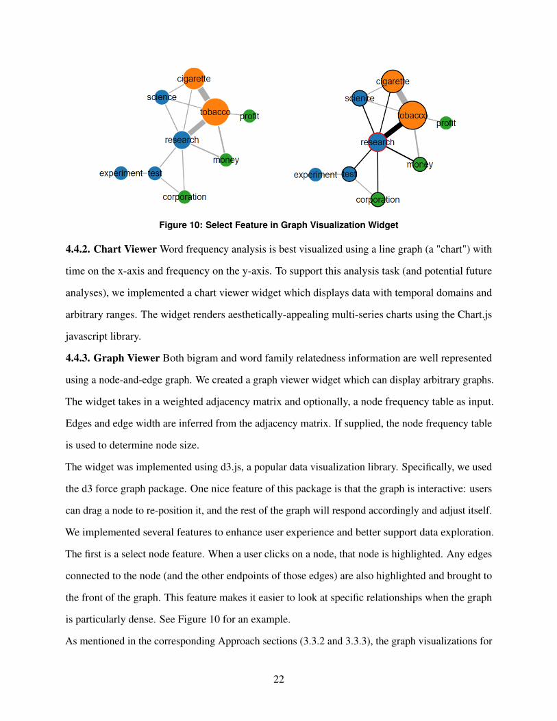
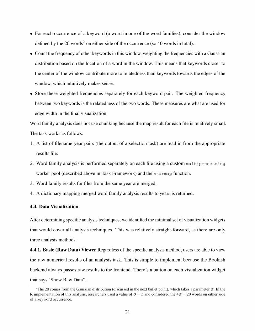
Figure 10: Select Feature in Graph Visualization Widget
4.4.2. Chart Viewer Word frequency analysis is best visualized using a line graph (a "chart") with
time on the x-axis and frequency on the y-axis. To support this analysis task (and potential future
analyses), we implemented a chart viewer widget which displays data with temporal domains and
arbitrary ranges. The widget renders aesthetically-appealing multi-series charts using the Chart.js
javascript library.
4.4.3. Graph Viewer Both bigram and word family relatedness information are well represented
using a node-and-edge graph. We created a graph viewer widget which can display arbitrary graphs.
The widget takes in a weighted adjacency matrix and optionally, a node frequency table as input.
Edges and edge width are inferred from the adjacency matrix. If supplied, the node frequency table
is used to determine node size.
The widget was implemented using d3.js, a popular data visualization library. Specifically, we used
the d3 force graph package. One nice feature of this package is that the graph is interactive: users
can drag a node to re-position it, and the rest of the graph will respond accordingly and adjust itself.
We implemented several features to enhance user experience and better support data exploration.
The first is a select node feature. When a user clicks on a node, that node is highlighted. Any edges
connected to the node (and the other endpoints of those edges) are also highlighted and brought to
the front of the graph. This feature makes it easier to look at specific relationships when the graph
is particularly dense. See Figure 10 for an example.
As mentioned in the corresponding Approach sections (3.3.2 and 3.3.3), the graph visualizations for
22

both the bigrams and word family analysis aren’t capable of capturing and displaying change over
time. It only really makes sense to display data for one year at a time. As such, we added a year
select panel to the visualization. A user can select any year included in the analysis results (or, as
will be discussed in the next section, multiple years) and the appropriate graph will be rendered.
To make the transition between graphs smoother (and to attempt to allow users to visualize how
relationships between words change over time), we do not fully rerender the graph. Instead, when
transitioning from one year to another, we find the intersection of the two data series and determine
exactly which nodes/edges need to be added and deleted and which nodes/edges can stay the same.
With this method, the act of transitioning between two years of data is itself informative, as you can
visualize how language use changes between the two years. Care was also taken to ensure that node
selection persists across these transitions in case a user wants to track a particular node through
time.
Specific examples of the graph visualization will be presented in the results section.
4.4.4. Metadata Overlay To help users better contextualize analysis results, we added a metadata
overlay to both the chart visualization widget and the graph visualization widget. This overlay
currently displays file and word count for each year3 of documents but can be expanded to include
whatever is of interest or use to researchers. See Figures 11 and 12 for examples of this overlay.
4.4.5. Multivisualization We currently support multivisualization within a task (i.e. across years)
and across tasks for the graph visualization widget. The way multivisualization works is fairly
straightforward. The visualization container contains multiple subcontainers, each of which can
display a d3 graph (for styling purposes, we currently limit the number of subcontainers to three).
When a user selects an additional year, the appropriate graph is either rendered in a vacant subcon-
tainer or the least-recently selected year is evicted from its subcontainer. Implementing cross-task
multivisualization required some more work, but we essentially use these same subcontainers.
Supporting multivisualization for the chart widget is not a difficult task, and is on the docket of
3These specific two metrics (file count and word count) are important in all analyses, as they are useful in determiningwhether oddities in results are worth investigating or are simply the result of having performed analysis on an overly-small sample size.
23
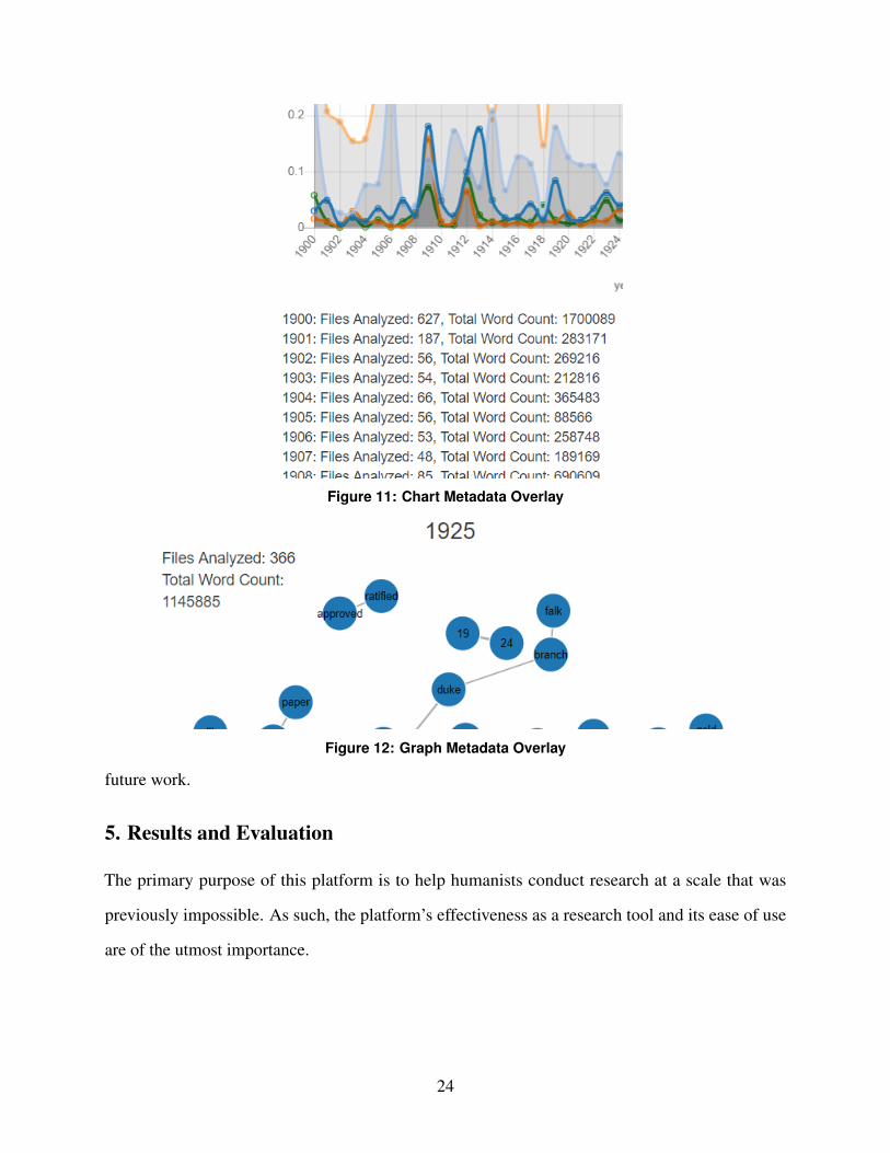
Figure 11: Chart Metadata Overlay
Figure 12: Graph Metadata Overlay
future work.
5. Results and Evaluation
The primary purpose of this platform is to help humanists conduct research at a scale that was
previously impossible. As such, the platform’s effectiveness as a research tool and its ease of use
are of the utmost importance.
24

5.1. Effectiveness as a Research Tool
When explaining our approach for this semester’s portion of the project, we identified two key
goals for the platform. Whichever analysis methods we implemented needed to collectively enable
researchers to both confirm existing knowledge and evaluate existing research questions as well as
explore new data and motivate new questions (which in turn may be answered with a combination
of traditional humanistic research methods and further use of the Bookish platform). We believe
that the Bookish platform has been successful in this regard. For example, after spending only a
few weeks on the application, Dr. Weinryb Grohsgal has already created a number of interesting
analyses that both substantiate his current understanding of the tobacco industry and force him to
ask questions that he does not yet know the answers to. A selection of these results are presented
below.
5.1.1. Selection of Specific Results The following analyses and visualizations are all based on the
same subset of data: all files in the IDL dataset created between the years of 1900 (inclusive) and
1950 (exclusive). There are 77,219 such files sourced from the tobacco, drug, chemical, and food
industries.
1. Word Frequency Analysis (Figure 13). Word frequency analysis was run on the selected subset
of documents for the keywords "health", "cigarette", "alcohol", "tobacco", and "disease". Dr.
Weinryb Grohsgal was able to explain how parts of the analysis result fit in with his existing
knowledge. For example, it makes sense that in 1918, during the height of the Spanish Influenza,
documents were less focused on tobacco and more focused on disease. At the same time, other
aspects of the chart were perplexing, such as the drop in use of the word "tobacco" in 1925 as
well as the consistently low use of the word "alcohol". The latter of these was surprising to
Dr. Weinryb Grohsgal because it is a common understanding that tobacco companies closely
followed and analyzed the position of alcohol in popular society and the regulatory world.
2. Top Bigrams Analysis (Figure 14). As we predicted with the top bigrams analysis in general,
this specific analysis motivated more questions than it answered (though Dr. Weinryb Grohsgal
was able to explain some of the visualization with his existing understanding of the tobacco
25
Figure 13: Word Frequency Analysis
landscape4). One bigram that stuck out was "lip cancer". Why was the tobacco industry
specifically interested in lip cancer in 1943? This is a question that in turn can be evaluated using
traditional historical research methods.
In this analysis, the presence of bigrams that one would expect to occur with high frequency in
text help to build confidence in the general methodology. Some non domain-specific examples
are "New York" and "Frank Sinatra". One domain-specific example is the bigram "Lucky Strike"
(a cigarette brand). Perhaps most compellingly, the entire Lucky Strike marketing jingle can be
observed in the graph: "Lucky Strike Means Fine Tobacco".
3. Word Family Analysis (Figure 15). Word family analysis was run on the selected subset of
documents with the word families ("cigarette", "alcohol", "cocaine"), ("addiction", "disease",
"sick", "ill"), and ("health", "therapy", "luxury", "comfort"). Figure 15 shows the analysis results
for 1900, 1920 and 1940. These three years placed side-by-side illustrate some interesting things
4Something that Dr. Weinryb Grohsgal pointed out was the link between "Tobacco" and "Expertise". Dr. WeinrybGrohsgal explained that after World War Two, there was a lot of interest in both government and industry in solvingproblems with social science. Experts in the social sciences – like psychology and sociology – were often hired toanalyze consumer patterns and behavior.
26
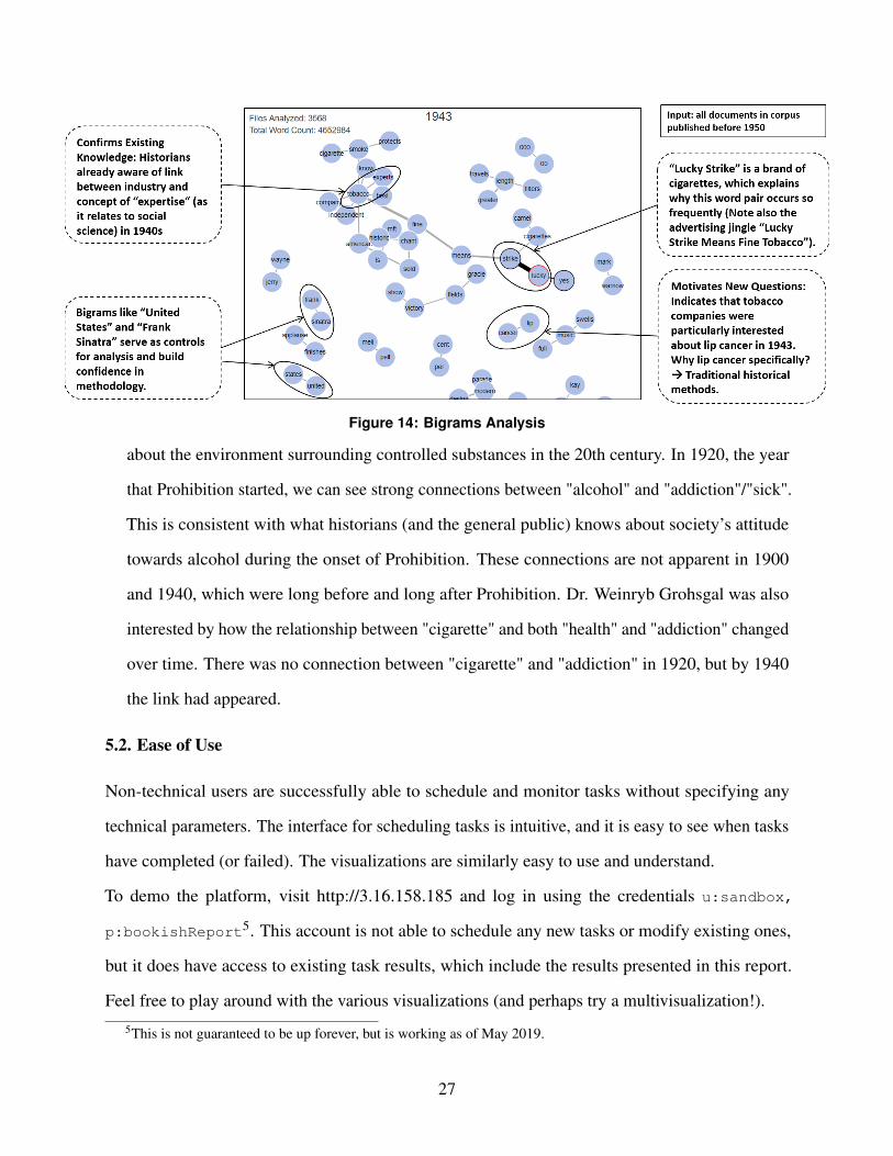
Figure 14: Bigrams Analysis
about the environment surrounding controlled substances in the 20th century. In 1920, the year
that Prohibition started, we can see strong connections between "alcohol" and "addiction"/"sick".
This is consistent with what historians (and the general public) knows about society’s attitude
towards alcohol during the onset of Prohibition. These connections are not apparent in 1900
and 1940, which were long before and long after Prohibition. Dr. Weinryb Grohsgal was also
interested by how the relationship between "cigarette" and both "health" and "addiction" changed
over time. There was no connection between "cigarette" and "addiction" in 1920, but by 1940
the link had appeared.
5.2. Ease of Use
Non-technical users are successfully able to schedule and monitor tasks without specifying any
technical parameters. The interface for scheduling tasks is intuitive, and it is easy to see when tasks
have completed (or failed). The visualizations are similarly easy to use and understand.
To demo the platform, visit http://3.16.158.185 and log in using the credentials u:sandbox,
p:bookishReport5. This account is not able to schedule any new tasks or modify existing ones,
but it does have access to existing task results, which include the results presented in this report.
Feel free to play around with the various visualizations (and perhaps try a multivisualization!).
5This is not guaranteed to be up forever, but is working as of May 2019.
27
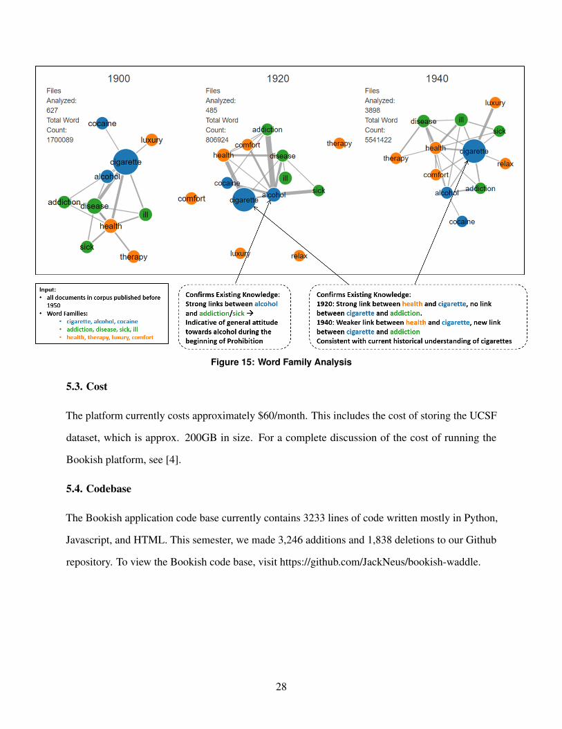
Figure 15: Word Family Analysis
5.3. Cost
The platform currently costs approximately $60/month. This includes the cost of storing the UCSF
dataset, which is approx. 200GB in size. For a complete discussion of the cost of running the
Bookish platform, see [4].
5.4. Codebase
The Bookish application code base currently contains 3233 lines of code written mostly in Python,
Javascript, and HTML. This semester, we made 3,246 additions and 1,838 deletions to our Github
repository. To view the Bookish code base, visit https://github.com/JackNeus/bookish-waddle.
28

6. Conclusion
6.1. Limitations
As shown in the case of the bigrams analysis, when processing a large number of files in parallel
only a small amount of information can be stored per file. This is because the results for every
file are stored simultaneously by the map object. As such, it is difficult to design and implement
tasks that find the "n most frequent" of something. Unsurprisingly, implementing tasks in which the
user knows what they’re looking for (i.e. tasks in which the user specifies keywords in one way or
another) is much easier and less resource-intensive.
Currently, the Bookish platform runs on a very low-tier Amazon Web Services machine. This
machine only has one virtual CPU and 2GB of memory. As such, it is not possible to analyze
corpora of more than approximately one million files. However, this limitation is driven by budget,
not by the Bookish architecture. If the Bookish platform is migrated to a server with more resources,
the application will easily handle larger jobs that current server cannot.
6.2. Future Work
6.2.1. Platform and Infrastructure There are a number of features we would like to implement
to better support collaboration on the platform. One thing that would be particularly useful for
research teams of multiple people is the ability to share tasks and results between accounts.
There are also a number of improvements that could be made to the underlying infrastructure. Those
are discussed in more detail in [4].
6.2.2. Data Sources Professor Angela Creager was recently awarded a Dataset Curation Grant from
the Princeton Center for Digital Humanities [3]. This grant gives Professor Creager the resources
to curate, categorize, and clean additional data sources. This is very important for her research,
as there are no other publicly-available datasets that are as well-organized and high-quality as the
Industry Documents Library. We will continue collaborating with Professor Creager to make sure
that these new data sources are properly instanced on the Bookish platform.
29
6.2.3. Analysis Methods As the research projects of Bookish users progress, we will continue
implementing new analysis tasks and enhancing existing ones. Something we hope to accomplish is
to modify the word family task to detect and add additional keywords that were not specified in a
family but that are still highly relevant to the words that the user did specify.
6.3. Summary
This semester of work has been successful in expanding the Bookish platform to meet the specific
research needs of both Professor Creager and Professor Wailoo of the Princeton University Depart-
ment of History. The platform shows great potential as a general tool for humanists. Non-technical
users can easily and efficiently run textual analysis on hundreds of thousands of documents. These
linguistic analysis techniques allow users to confirm existing domain knowledge with data-backed
evidence as well as explore large amounts of data in order to motivate new research questions.
7. Acknowledgements
First and foremost, I would like to offer my deepest thanks to Brian Kernighan for his continued
support and for the active role he took in advising this project (especially as it extended into a
second semester). His advice and guidance in our weekly meetings was invaluable and contributed
greatly to this project’s success.
This project would also not have been possible without the involvement of Angela Creager and
Dov Weinryb Grohsgal. Their research is what motivated the project to begin with, and I am deeply
grateful for their belief in the platform throughout its development as well as for the many hours we
spent eagerly discussing history, technology, and the intersection of the two.
8. Honor Code
This paper represents my own work in accordance with University regulations. /s/ Jackson Neus
References[1] A. Creager, “The making of environmental carcinogens,” in 2016 American Society of Environmental History,
2016.
30
[2] Duke University. Defining digital humanities. Available: https://guides.library.duke.edu/digital_humanities[3] W. F. Isfahani and G. Wythoff, “Meet our dataset curation grant winners 2019-2020,” 2019. Available:
https://cdh.princeton.edu/updates/2019/04/17/meet-our-dataset-curation-grant-winners-2019-2020/[4] J. Neus. (2019) Bookish: A tool for the large-scale analysis of arbitrary datasets. Available:
https://drive.google.com/file/d/1b54-kVuQkGp8B8UWlCBeU7YmUq6U5wx0/view?usp=sharing[5] University of California San Francisco. History - truth tobacco industry documents. Available: https:
//www.industrydocumentslibrary.ucsf.edu/tobacco/about/history/[6] University of California San Francisco. Industry documents library overview. Available: https://www.
industrydocumentslibrary.ucsf.edu/about/overview/[7] H. Wickham and G. Grolemund, R for Data Science. O’Reilly, 2017.
31
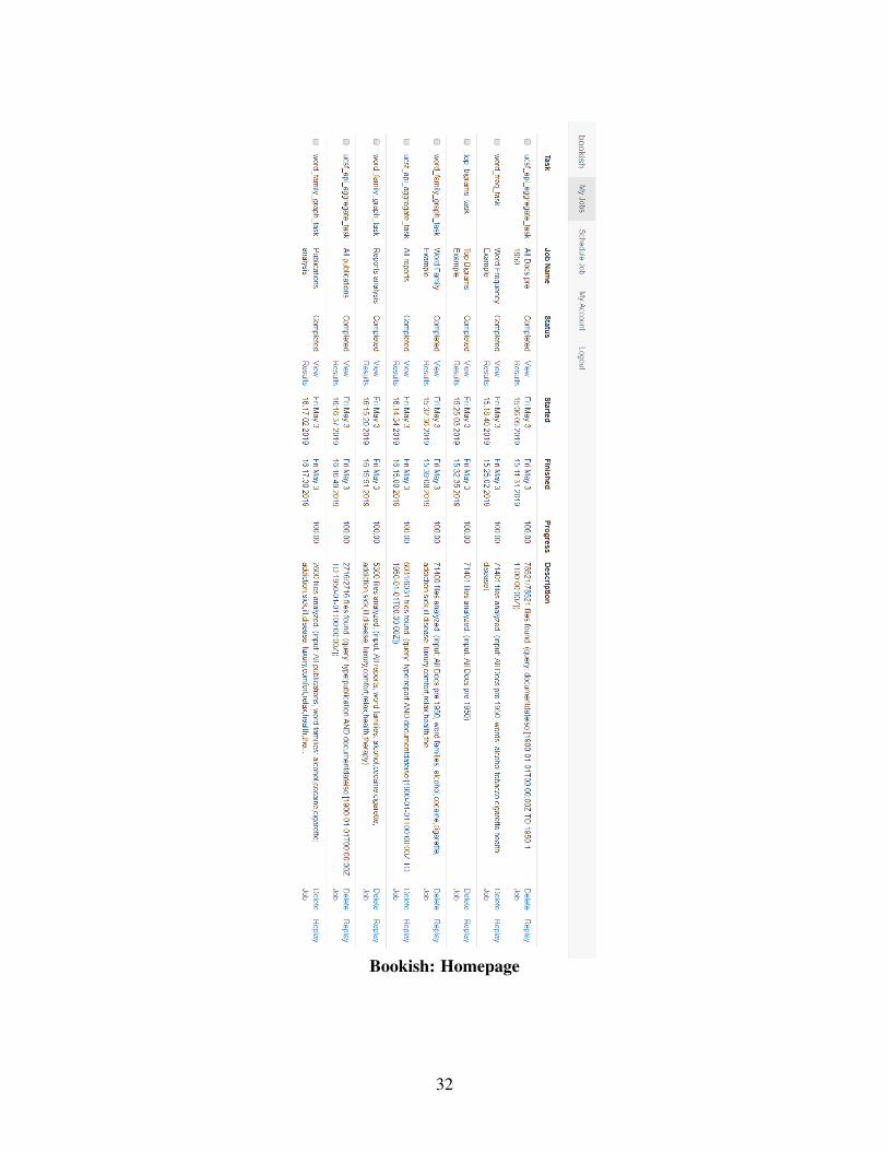
Bookish: Homepage
32
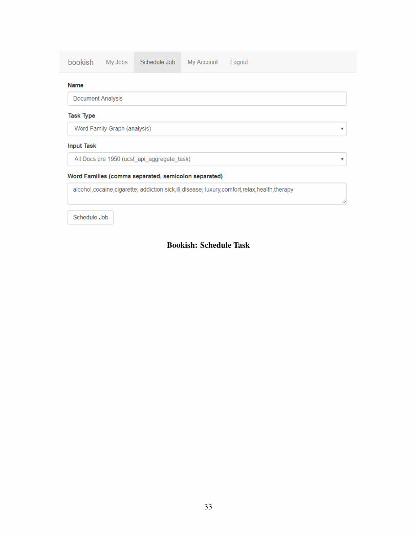
Bookish: Schedule Task
33