Maps for advocacy - archive - Tactical Technology Collective
25
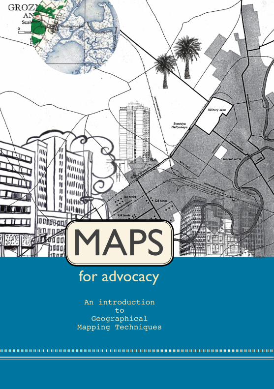
MAPS for advocacy An introduction to Geographical Mapping Techniques MAPS
Transcript of Maps for advocacy - archive - Tactical Technology Collective
C
MApsfor advocacy
An introduction to
Geographical Mapping Techniques
MAps

B i
This guide offers an introduction to how to use maps for advocacy. It reviews different tools and mapping techniques, explores certain types of data and their sources, offers an overview of different scenarios where mapping has been used for advocacy, and finally explains some useful terminology related to mapping.
It was written by Sean O’Connor, (with the support of the Open Society Institute) and the Tactical Technology Collective, also responsible for design, coordination and production. http://www.tacticaltech.org
This version of the guide was designed by Lynne Stuart ([email protected])Thanks to Ali Gharavi, Elijah Zarwan and Mifan Careem for their comments and help. Special thanks to Tim Hankey for copy editing.
ISBN: 978-81-908821-8-7 First published by Tactical Tech in September 2008, this edition in February 2010. Printed in India by Precision Fototype Services
This work is licensed under a Creative Commons Attribution-Share Alike 3.0 License http://creativecommons.org/licenses/by-sa/3.02
Disclaimer: In the preparation of this publication, the authors have made every effort to contact all copyright holders for published reproductions of all the web services and illustrations. All trademarks and copyrights remain property of their respective owners. For further clarification please contact [email protected]
Tactical Tech’s other resources include: Security in-a-boxMessage in-a-boxNGO in-a-boxMobiles in-a-box10 tactics for turning information into actionVisualizing Information for AdvocacyAn Introduction to Information Design (English and Russian)Quick ‘n Easy Guide to Online Advocacy
for advocacy
An Introduction to Geographical
Mapping Techniques
Maps

ii iii
Contents
1 Introduction 1
2 User Scenarios and Case Studies 1 Representation of Stories 5 (e.g. explaining issues, documenting changes) 2 Data Collection and Tracking 7 3 Using Maps to Explain and Explore 9 4 Constituency Organising and Mobilising 11
3 The Tools and Technologies Introduction to Mapping Technologies 15 Hosting Maps On Your Website 16 Virtual Globe Software 18 Open Source GIS 20 Other Mapping Tools: Flash-based Mapping 22 Resources 23
4 Geographic Data and Data Sources Online Based Map Data 25 User-generated data 26 Social Networking Sites and Multi-media 26 Mapping Ventures 26 Web Maps and Google Earth 29 GPS and Mobile Phone Technology 29 Other Resources 30 Government Data 31
5 Glossary 33
6 List of Illustrations 38

iv 1
introduction
Advocacy organisations worldwide face great challenges. One of these is how best to communicate and disseminate information to communities, staff, funders, governments and other organisations in a world saturated with information, media and advertising. They may also need to keep track of complex and diverse information in their own work. Using maps is one strategy to overcome these challenges. Mapping provides a powerful, clear, and intuitive medium for communicating and sharing information, statistics and data.
The power of geographic and spatial information design is often an untapped resource. Much work done by advocacy organisations has some “spatial” element to it and includes data that can, when approached creatively, be easier to explore and understand when mapped or displayed visually. However, until recently, using computer mapping technologies proved to be incredibly challenging, expensive and time consuming and therefore often inappropriate for small and medium-sized organisations.
Recently, however, increased technological access and easier usability have opened up the potential of mapping to almost anyone with a computer and an internet connection. Maps are no longer just printed documents or cartographic charts produced by governments, corporations or the United Nations. Today’s technologies allow organisations (and individuals) to create and publish their own maps relatively easily and inexpensively. Equally important has been the ability of mapping technology to transcend the traditional 2-dimensional map to include interactive and rich content such as pictures, video, datasets and textual information. All of these can then easily be shared globally through the web.
We are in the midst of an exciting time of change and innovation, the map consumer is becoming the map producer.
In this guide, current mapping technologies will be introduced, in a way that will both inform and hopefully inspire readers to ask:
How can I take advantage of visualising places and information?
How can maps be of use in my work?
How can maps be of use in my work?

2 3
GeoGraphic Data anD Data sources
Maps have the potential to depict an enormous wealth of information – far beyond their traditional use as a visual representation of infrastructure and geographical data (e.g. the shape and position of continents, coastlines, rivers, roads, towns, hospitals, etc. and the distances in between).
Maps can also be used to show the relationships between stakeholders and events, organisational structure and responsibilities, as well as textual/ statistical information and multimedia material (i.e. photos, video, podcasts, etc.) linked to specific places around the globe.
Where does the data come from? In some cases, it is available from governments, corporations and organisations; in other cases, individuals and users around the globe create their own data; and at times it simply doesn’t exist!
Explore the “Geographic Data and Data Sources” (page 25) for an introduction to data for maps and to learn where the data you might need comes from.
GLossarY
Mapping technologies present a large pool of terms you might be unfamiliar with.
Explore the “Glossary” section (page 33) for explanations of words that are made bold in the text to follow.
user scenarios anD case stuDies
Organisations around the globe are discovering fascinating ways to use mapping technologies in their operations. This has included using them as part of a public relations strategy to raise awareness, bearing witness to environmental destruction and human rights abuse, tracking illegal poaching and logging, explaining complex issues and relationships in new ways, data collection and planning the deployment of resources, organising protests and connecting people.
Check out the “User Scenarios and Case studies” section (page 5) for some original, exemplary case-studies of who is doing what and where with mapping.
the tooLs anD technoLoGies
Numerous mapping technologies are already available online and the mapping technology landscape is rapidly evolving. As people continually adapt and apply tools, keeping informed can be a challenge! The good news is that things are evolving for the better with increased access, user support groups, more user-friendly designed interfaces and newly developed features. This makes mapping technologies and services an interesting and practical medium for civil society organisations, journalists and individuals to use to share, explore, organise and collaborate.
However, it can also raise many questions:
What tools and technologies are appropriate for creating the map I want?
Is the information I want to map available to me?
How can I navigate all this confusing terminology?
Explore the “The Tools and Technologies” section (page 15) for an overview of the field and techniques used for mapping.
4 5
User scenarios and case studies
Geographical maps can be as powerful a tool in advocacy as artfully designed data visualisation, video, animation or pictures. In fact, maps can depict various formats of information including all of the above-mentioned and clearly represent links between places, events, facts and communities. They can be used to show changes over time, current state of affairs, for documenting events as well as for exploring and explaining issues. A few decades ago, geographical mapping used to be difficult, time consuming and hard to distribute in attractive formats. Today, tools and easy access to various data sets make them one of the most powerful support tactics in advocacy.
In this section, we give you some real-life examples of the deployment of mapping technologies to illustrate their possible use in advocacy and campaigning. These are divided into categories that highlight various ways of applying mapping technologies. Many of the projects could fit into more than one category, but follow what we see as their primary function.
representation of stories (for example: explaining issues, documenting changes)
Maps provide a fabulous medium for telling stories and documenting changes in a given place over a period of time. They give readers an additional perspective that taps into our ability to process visual information and relate to spatiality. Very often maps are also useful in understanding complex issues such as the conflict in Darfur (http://www.ushmm.org/maps/projects/
darfur/). Here are some examples:
superfundThe US-based investigative
journalism organisation http://www.
publicintegrity.org/Superfund/ included an
Superfund
Who else is using maps and why?

6 7
of the programme to design custom KML with thematic icons to fit the project’s needs. More information can be found on the project website. And more information on creating KML presentations in Google Earth, including a number of useful tutorials, can be found on the Google Earth Outreach initiative webpagehttp://earth.google.com/outreach/index.html.
Data coLLection & trackinG
Our understanding of complex social, political, medical and environmental situations can be enhanced with maps. In fact, it is often helpful to collect, track and disseminate data through a map interface that makes it both understandable and accessible to an intended audience. Recent global health events and political unrest have spurred the creation of maps that enable communities to collect and represent critical information in a visual form. Here are some examples:
healthMapThis guide brings together data sources
on infectious diseases to present a news-based map of disease worldwide (http://
www.healthmap.org/en). The project is run by the Children’s Hospital Informatics Program of the Harvard-MIT Division of Health Sciences & Technology. This type of application is a great example of aggregating a particular type of news stories and connecting them to their geographic location. It allows for an easy overview of global health problems.
What toolS Were USed: HealthMap aggregates health and infectious disease data from a number of sources. The data is sorted according to place and disease and placed on a Google Map API. The project is available in English, French and Spanish.
ushahidi.comUshahidi.com http://www.ushahidi.com/index.asp is a tool for tracking incidents
of violence in Kenya since the December 2007 disputed presidential election.
health map
interactive map as part of a major report on environmental clean-up sites designated by the US Environmental Protection Agency. A Google Map aPi (Application Programming Interface) map was used to plot these locations, called “Superfund” sites. Pictures and videos were also included in the map, linked to the particular location they were collected at. The maps not only showed the polluted places but also uncovered the companies and government agencies who were linked to the sites and tracked progress of the clean up.
What toolS Were USed: The map is an example of a Google Map API embedded into the organisation’s webpage. The organisation shot video footage of interviews with citizens involved in the story. The location where the video was taken was recorded, posted on YouTube and then later placed on the map. The videos were then embedded into the point locations on the map as links, using simple HTML notation.
ushMM crisis in Darfur The United States Holocaust Memorial Museum (USHMM) Crisis in Darfur
project, is an excellent example of how mapping can powerfully illustrate the ongoing reality of a humanitarian crisis http://www.ushmm.org/maps/. Combining mapping and rich content, it uses witness testimonies, satellite imagery, data, and other information placed on a Google Earth map to raise awareness of the reality of what is happening in Darfur. This is part of the larger USHMM Genocide Prevention Mapping Initiative.
What toolS Were USed: The project uses Google Earth as the main medium for presenting the imagery and other information. The Google Earth platform provides an easy medium for creating spatial data in the form of KMl (keyhole
markup language). The USHMM project goes beyond the simple functionality
Crisis in darfur

8 9
build the map using publicly available data sources, data collected with hand-held GPS units and other means to record the locations of road networks and other features. An active user community updates the map regularly, often by hosting events in cities around the globe where users will come together to thoroughly map a particular city or location within a city. A calendar of these events can be found at http://wiki.openstreetmap.org/index.php/Current_events. Started in 2004 it was released under a Creative Commons Attribution-ShareAlike 2.0 license.
What toolS are USed: The data presented in OpenStreetMap is unique in that it is not being licensed to the user through a user agreement, as is the case when using the Google Maps API and other tools. Instead, the data is owned by the contributors. The commendable goal of this project is to make a truly open map. Please visit the project page (http://wiki.openstreetmap.org/index.php/
Main_Page) for more information and technical detail.
usinG Maps to expLain anD expLore
There are many ways to explain issues and allow people to explore information. In this series of examples, we present maps that allow organisations to explain an advocacy issue and its associated information. Exploring the issues through maps adds another perspective that enhances the reader’s experience.
the Global Voices advocacy projectThis project describes itself as seeking to build a global anti-censorship
network of bloggers and online activists throughout the developing world who are dedicated to protecting freedom of expression and freedom of access to information online (http://advocacy.globalvoicesonline.org/maps/). This map from Global Voices gives an overview of online censorship efforts related to the social web and major web 2.0 websites.What toolS Were USed: The project uses a Google Maps API as the base layer and uses point markers to locate countries and individual organisations where censorship
internet censorship
It is a tool for citizen monitoring and allows users to submit – over a web interface or via SMS – incidents of violence that are verified by local NGOs and presented on a map.
What toolS Were USed: The map is another example of a Google Maps API but this time combined with data as shown on the figure. Users can submit data via SMS or through a form accessed on the usahahidi.com website. The information must then be transferred to the map by a member of the project team to maintain the integrity of the site. Multiple incident reports can be linked to a single location.
center for conservation and research sri Lanka (ccrsL)CCRSL http://demo.respere.com/ccrsl/index.php?ccr_url=map has designed
a mapping application for tracking GPS-collared elephants in Sri Lanka. The movement of three different elephants can be seen over time.
What toolS Were USed: The map uses a Google Maps API that has been customised by Rspere, a Sahana Company. The interface has been customised to allow viewers to see the current position of each of the tracked animals as well as track their paths in requested time frames. This is graphically represented as an additional layer on the map.openstreetMap
OpenStreetMap http://www.openstreetmap.org/ is a freely editable wiki-style map created by networks of users around the globe. The users collaboratively
tracking elephants in Sri lanka
openStreetMap

10 11
the power of serving and displaying geographic data over the Internet.
What toolS Were USed: The project takes advantage of a number of tools, including Open Source GIS and Google Earth. The programme also uses OpenLayers (http://www.openlayers.org/) – an open source project that utilises a JavaScript library for displaying map data in most modern web browsers.
A number of spatial datasets are hosted by the project using the Open Source GeoServer (http://www.openlayers.org/) GIS programme. The datasets can be accessed in two ways. They are presented in a limited-interactivity map using the OpenLayers JavaScript library as a map API. They are also accessible with a greater level of interactivity through Google Earth. GeoServer has the unique capability of well-developed support for Google Earth. It allows for taking a number of spatial datasets and easily outputting them in the proper KML format for viewing in the Google Earth programme. In this way, the datasets can be interacted with in a more dynamic way.
constituencY orGanisinG anD MobiLisinG
Advocacy often requires organising a constituency and mobilising networks or peers. Today, advocacy organisations are increasingly relying on the use of technology to connect with their audiences. Here are some examples of using maps for that purpose:
alternative asean network on burmaALTSEAN-Burma (Alternative ASEAN Network on Burma at http://www.altsean.org/) is a
network of organisations and individuals based in ASEAN member states working to support the movement for human rights and democracy in Burma. The organisation developed a map of 2007 protests and uprisings in that country using Google Maps. The map highlighted the location of protests inside Burma,
the dates on which they took place, the number of demonstrators and where arrests
have been made. Some of the landmarks also
2007 Burma Protests
efforts have taken place or are currently in effect. It uses a simple point marker colour scheme to differentiate different levels and types of censorship.
sunlight foundationRecently founded US non-profit, Sunlight
Foundation http://www.sunlightlabs.com/earmarks/, uses maps to enable citizens to learn more about their elected officials and what they
are doing. Its aim is to help reduce corruption, ensure greater accountability as well as foster public trust. The organisation’s Show Me the Money map takes data from the United States Congress 2007 Labor, Health and Human Services Appropriations Bill and plots it on the map. This advertises congressional provisions, or “earmarks”, on specific projects in a representative’s home state or district ensuring that there is transparency and awareness.
What toolS Were USed: The project uses a Google Map API as a base map for the data. The project webpage also does an excellent job of taking a user through the process of turning the data into an interactive map. We recommend visiting the project page for more information on this process.
International Conflict Research GroupThe War Views: Visualizing and Animating
Geographic Data on Conflict mapping project (http://www.icr.ethz.ch/research/warviews) shows the relation between conflict and geography, including natural resources such as oil and diamonds, and the distribution of ethnic groups. Run by the International Conflict Research group at the Center for Comparative and International Studies (Swiss Federal Institute of Technology), it uses several conflict-related geographic GIS datasets. These span from 1960 to 2004, integrating a number of open source web mapping technologies to leverage
Conflict mapping
Show me the money

12 13
by the United Nations Office for the Coordination of Humanitarian Affairs. It updates its website around the clock and disseminates new maps daily. The site is a hub for other UN bodies, NGOs, governments and those involved in humanitarian affairs.
What toolS Were USed: The programme specialises in disseminating static maps over the internet. This means that many of the tools presented in this guide – e.g. map APIs, Google Earth – are not used, but traditional GIS and other graphic design tools are used instead.
Who on earth caresWho On Earth Cares http://www.whoonearthcares.com/woec/home.action is an
application for Australians administered by the Australian Conservation Fund (AFC). It allows citizens to add themselves to the map and give information on what they are doing to cut their personal contribution to climate change. It also lets them customize a letter based on the inserted information to send to their elected officials. Users can explore what others in their area are doing to curb climate change and invite friends to join.
What toolS Were USed: The map uses the Google Map API. An interface has been customized that allows users to search for their location based on their postal code. Once a user has navigated to his/her exact location, the simple Google Map interface lets them drop a marker onto the map.
Climate change contribution calculator
relief Web: Kenya violence
link to video clips of the protests. This tool proved to be a good way to indicate “hot areas” to activists willing to participate in the protests. http://www.altsean.org/
Photogalleries/ProtestsMap.php
What toolS Were USed: The Google Maps web mapping application was the main tool used. Users can create maps on the Google Maps website with a simple point and click interface. The code for the map can easily be pulled and inserted into an organisation’s webpage. When the map sits on your page, it pulls the mapped data from the Google Maps servers (i.e. Google Maps hosts the map on the “back end”). Google Maps is not the only service that allows users to embed maps into their web pages. Yahoo! Maps (http://maps.yahoo.com) and the Open Source application Open Layers http://www.openlayers.org/ are also options. However, Google Maps arguably uses the easiest and most intuitive interface manageable by the non-expert. For more, see the Tools and Technologies section (page 15).
appalachian VoicesAppalachian Voices http://www.appvoices.org/ is an organisation working to
bring people together to solve the serious environmental challenges faced in the southern and central Appalachian Mountains. The organisation created a Google Earth KML presentation showcasing the environmental destruction caused by coal mining in the region. The project is featured by the Google Earth Outreach programme in their case studies gallery.
What toolS Were USed: The Google Earth programme is the main tool used. The project features 22 sites
where mountaintop removal has occurred and/or communities that have been affected. It also
overlays additional aerial imagery of areas of interest on top of the imagery included within the Google Earth program to give users a stark before-and-after perspective.
reliefWebReliefWeb http://www.reliefweb.int/rw/dbc.nsf/
doc100?OpenForm is a collection of documents and maps focussed on humanitarian emergencies
and natural disasters. The programme is administered
Coal-mining destruction

14 15
the tools and technologies
introDuction to MappinG technoLoGies
Maps are older than the written word and have been used for thousands of years as a tool to navigate and define the world we live in.
For much of this time, maps were drawn by hand in small numbers. Technological advances led to printed maps and much wider distribution, especially in the early 20th Century. In both eras, these were usually painstakingly created under the direction of specialists like cartographers, explorers and government departments. But maps, as we have known them, have changed. We no longer rely solely on the printing press or professionals for producing maps but increasingly turn to our own computers and the Internet for our mapping needs.
In the past few years, there have been exciting developments in mapping technology, profoundly impacting on the way we interact with maps. What was once reserved for experts is now widely available to those who have a personal computer, a reasonable Internet connection and some basic computer skills.
The major categories of today’s mapping technologies are presented on the following pages, with examples of their use in advocacy and other relevant areas.
Yahoo Maps: a map of Kampala
What tools and technologies are appropriate for creating my map?

16 17
advoCaCY exaMPle: Mapping the election conditions in Zimbabwe from Sokwanele – Zimbabwe Civic Action Support Group. This map uses the Google map API to present an alternative overview of the election process in Zimbabwe in March 2008. See more advocacy examples in the User Scenarios and Case Studies section (page 5).
Who oWnS it: The major caveat here is that every service has its own terms and conditions that should be taken into consideration. For example, the Google Map API reserves the right to include advertising as part of their service, although they do not at present.
The APIs presented in this toolkit are open APIs. This means that the documentation for the API is made available, they are openly publishable, and no additional costs have to be incurred to access them.
For those with privacy or other concerns, OpenLayers (http://www.openlayers.org) is a fully open source map API and is therefore free of some of the service terms presented by other map API providers. The caveat here is that while some of the other services have developed easy interfaces for users to create the maps and write the necessary JavaScript, OpenLayers requires users to develop their maps more independently.
PrivaCY ConCernS: To integrate a map API into a webpage, a user has to register the root URL from where the map will be hosted (to obtain what is commonly referred to as an API key that is inserted in to the JavaScript). General privacy from each of the service providers varies, but it is important to take into account the process of URL registration and the association this creates between a user and a map provider. Exact terms of service should be checked from each map API service provider’s website.
CoMMentS: Map API developers are constantly creating smarter interface designs and integration techniques that allow for new innovative applications. Currently, the Google Maps API (http://maps.google.com/) is arguably the best interface wherein a user can easily create an API map and simply copy and paste the code into the relevant webpage. Mapstraction (http://www.mapstraction.com) is a JavaScript map API library that lets users easily move between using Google Maps, OpenLayers and seven other map API services.
hostinG Maps on Your Website
What iS it: Map APIs are digital maps that can be customised and embedded into an organisation’s webpage. These maps, while viewed on your webpage, are hosted by the servers of Google Maps, Yahoo! Maps, Microsoft Virtual Earth or Open Layers. User-defined features can be added to the map to highlight places, people and events. Relevant data, text, pictures, video and other media can also be added to enhance the presentation. In short — it is a simple map that anyone can host on their website and lets you integrate rich content with minimal effort and cost.
SUggeSted USe: A map API can be used to display objects such as hospitals or voting stations on a simple interface presented through an organisation’s webpage.
Any organisation or individual with a webpage can host a map API on their own site. But there are also existing websites that host map APIs, that users can add their own data to. Socialight is an example of a social network where users can add content to a map API through a web browser or via SMS. More examples of this type of application, along with examples of organisations that have embedded API maps into their webpages, can be found on pages 5-13 and the cover of this guide.
Mapping the election in Zimbabwe

18 19
exploring and developing the way people can share geographic data (including the sharing of simple feature data, pictures and video), but also due to its general popularity with the media and online communities.
advoCaCY exaMPle: Many organisations have used the Google Earth platform to develop presentations for sharing their data and other geographic information.
Neighbors Against Irresponsible Logging (NAIL) (http://earth.google.com/
outreach/cs_nail.html) is a US-based advocacy group that was formed in response to a proposed logging programme in the Santa Cruz Mountains in California. A member of the NAIL group created a simple KML presentation of the logging
company’s proposal to share with fellow NAIL members. The group found it to be an effective
way of sharing geographic information and used the KML presentation to help others
understand the issue, raise public and media awareness, and inspire action.
The Google Earth team makes a number of advocacy organisation’s KML projects available as part of the Google
Earth base layer (i.e. the data and network links to these
projects are available with the initial installation). The Google Earth
Outreach programme also disseminates a number of case studies on advocacy organisations that utilise Google Earth. However, do note that your organisation doesn’t have to be recognised by Google for you to take advantage of the programme. Anyone can create KML projects to be shared with Google Earth users around the globe.
Who oWnS it: The programme itself is owned by Google. A free version is available to all those equipped to download and run the programme. Proprietary versions with extended functionality are available for a fee. The data shared, viewed and edited in Google Earth is available via user-created network
neighbours against irresponsible logging
VirtuaL GLobe softWare
What iS it: Virtual Globe Software is a general name for a number of software mapping applications using satellite imagery at their core. These can be accessed from the internet to create customised maps. This type of software programme typically makes satellite data of the earth available. Google Earth (http://earth.
google.com) is the best known of these applications, but other programmes such as NASA WorldWind (http://worldwind.arc.nasa.gov) should be considered as well.
Data in Google Earth is shared using a particular data format, Keyhole
Markup language (KMl), which is dynamic in its flexibility and allows content developers to include HTML and Adobe Flash-based elements. It can easily be written in Google Earth, but may also be shared in other programmes. For example, the Google Map API lets you develop a map API with a simple point-and-click interface. The data generated can then be exported as KML for use in the Google Earth platform.
SUggeSted USe: Virtual Globe Software applications could be appropriate for exploring satellite data of the earth to track particular geographic features (e.g. forests, fields, communities) and also as a platform for sharing geographic data with a community where relevant features can be added by their members. A major caveat is that the satellite data included varies with software application and location on the globe. It is also generally unpredictable where and when images will be updated and what image resolution is available.
Google Earth has dominated the field of Virtual Globe Software, not only because it involves a large community of people with a collective interest in
naSa world wind - landSat 7

20 21
desktop software applications, although they are increasingly migrating to and integrating elements from the Internet.
This type of system is for more complex interaction with geographic data that may not be possible through map APIs or the virtual globe software. GIS offers more robust analysis tools and capabilities for editing data. The line between all the mapping platforms is becoming increasingly blurry, so please see the User scenarios and case studies section for some ideas on how others have been integrating different technologies (pages 5-13).
However, there is no open source GIS programme offering users an interface to jump right in to start creating and editing maps. Programmes and the tools and tasks associated with them must be learned. However, if one can invest more resources, open source GIS tools can provide an effective platform to work with geographic data proving a greater depth and robustness than the map API and Virtual Globe Software which are used more for displaying and sharing data, less for editing and analysing.
Today, many organisations present data over the internet using specially configured GIS programmes. The data is often served as Web Mapping Service (WMS) feeds. On the receiving end, a user must have a program that can read the WMS feeds. There are many different open source GIS programmes that can do this (see ‘Resources’ on page 23 for a limited list of such programmes), as well as the Pro version of Google Earth.
SUggeSted USe: Quantum GIS – a popular open source GIS programme - could be used with geographic data obtained from a government’s data dissemination programme (e.g. primary and secondary schools in a country or particular district) and linked with external data about the features (e.g. number of students, graduation rate) to perform simple spatial analysis (e.g. where are schools failing and where are they succeeding).
advoCaCY exaMPle: The Bonn International Center for Conversion (http://
www.bicc.de/gis/index.php) – a non-profit working on peace, conflict resolution and
Conflict in Angola
links. In essence, a user creates some KML or a geographic data set (e.g. schools in Grand Cape Mount County, Liberia) and hosts the KML file on a website of their liking. Then, if the creator of the data makes it available, other users can download the KML file and view it on Google Earth.
PrivaCY ConCernS: The biggest concern surrounding Google Earth and other Virtual Globe Software is the availability of high-resolution satellite data – in which objects can be seen on the ground. In some areas, very high-resolution data is available, but in others it is not. However, more and more high-resolution data is being made available by Google Earth and other programmes regularly.
When images of objects on the ground are made available to the public, there are obvious privacy and security concerns that may arise. For example, a 2007 project by the American Association for the Advancement of Science (AAAS) (http://shr.aaas.org/geotech/burma/burma.shtml) used satellite data in Google Earth to identify villages in Burma that allegedly experienced human right violations, such as burning of village structures by military forces. Google Earth served as a medium for others to view the imagery. But security concerns arose from the fact that organisations working on human rights issues in the area thought the imagery could be used to further violations by the offending parties.
open source Gis
What iS it: Open source giS (Geographic Information Systems) refers to a mapping system for integrating, analysing, editing and sharing geographic data that is based on open source criteria. Historically, GIS programmes have been
graSS giS a vector map

22 23
resources general reSoUrCeSɶ
Google Maps http://maps.google..comYahoo Maps http://maps.yahoo.comOpen Street Maps http://www.openstreetmap.orgWikimapia http://wikimapia.orgWorld Freedom Atlas http://freedom.indiemaps.comDYI Map http://www.backspace.com/mapappworldKit http://worldkit.org
MaP aPi:ɶ Hosting Maps On Your WebsiteGoogle Mashup Mania Blog http://googlemapsmania.blogspot.com/Official Google Maps API blog http://googlemapsapi.blogspot.com/Mapstraction http://www.mapstraction.com/Open Layers http://www.openlayers.org
virtUal gloBe SoftWareɶGoogle Earth Outreach http://earth.google.com/outreach/index.htmlGoogle Earth blog http://gearthblog.com/Ogle Earth Blog http://www.ogleearth.com/World Wind Central http://www.worldwindcentral.com/wiki/Main_pageNASA WorldWind http:// worldwind.arc.nasa.govPoly9 FreeEarth http://freeearth.poly9.com/(This is a unique resource because it is a map API AND a virtual globe. This means there’s no software involved: users can embed the interactive virtual globe into their webpages.)
oPen SoUrCe giSɶOpen Source Geospatial Foundationhttp://www.osgeo.org/Open Geospatial Consortium http://www.opengeospatial.org/PlaniGlobe (digital vector maps)http://www.planiglobe.com/omc_set.html
The Open Geospatial Consortium http://www.opengeospatial.org/uDIG GIS (software tool) http://udig.refractions.net/Quantum GIS: (software tool) http://www.qgis.org/GeoServer: (software tool)
http://geoserver.org/display/GEOS/GeoServer+Home
23
disarmament issues – has used the open source GIS program MapBender (http://
www.mapbender.org/index.php/Main_Page) to present a map of Angola showing layers of data such as dominant ethnic groups or relative armaments within particular administrative provinces. This is part of a larger project investigating the use of GIS to present information through a web interface and test the usefulness of GIS in understanding conflict dynamics.
other MappinG tooLs: fLash-baseD MappinG
What iS it: You might come across other maps online that don’t seem to fit the descriptions of any of the tools and technologies discussed above. There is a good chance that they are adobe flash-based maps created with Adobe proprietary software. This software can be expensive and working with it is time consuming. However, engaging and efficient mapping projects can be made with it.
The World Freedom Atlas (http://freedom.indiemaps.com) is a tool for visualising world statistics through a map interface.
DIY Map (http://www.backspace.com/mapapp/) is an application that lets users take a predefined Flash map, customise it, and embed it into their webpage. This is a unique example of an already-built Flash map pre-designed and freely disseminated (to NGOs and others). Users should be able to engage with this map application with relative ease.
WorldKit (http://worldkit.org) is an application similar to the DIY Map (above).
advoCaCY USe: A Threat to Peace Project – described by Social Design Notes in 2005, was a map made in Flash based on the
poster produced by the NYC Independent Media Center. A Threat to Peace showed all
the nuclear manufacturing facilities, chemical and biochemical weapons facilities, weapons manufacturers, nuclear testing and launch sites in the US. The authors used DIY Map with some data from Google Maps. The reproduced Flash map can be found at
http://backspace.com/notes/2005/05/a-threat-
to-peace-interactive.phpa threat to peace

24 25
geographic data and data Sources
What kind of data do you want to map?
And where does that data come from?
These are two major questions that any organisation looking to integrate mapping technologies must ask. Geographic data comes from many sources and knowing where to find it or how to create it, can be a barrier that prevents organisations from taking advantage of the power of geographic information display. The categories below look at the different types of map data and should allow you to forge a better understanding of how to get started.
onLine base Map Data
Have you ever pulled up a web browser and looked at a Yahoo! map? Have you ever explored the Google Earth programme? It is likely that a lot of the readers of this guide have. When we talk about online base map data, that is the kind of data we are talking about: data that is made available by such services as Yahoo! or Google Maps or programmes like Google Earth or NASA World Wind. This data is essentially freely available for the world to explore.
What Can it Be USed for:
These services make satellite imagery, national boundaries and road network data available. This type of mapped information can be invaluable to many types of mapping projects. It can be used in simple ways – as a medium for posting photos associated with a geographic location – or in more complex ways – for identifying features in a satellite image or looking at a road network in a country.
note: Not all data is created equal! While the U.S. and much of Europe benefit from having well-developed road network data available through services like Google Maps, that is not the case everywhere. Popular service providers are building their data holdings at an impressive rate and do make new, international data available regularly. But knowing when your country might get updated high-resolution satellite imagery or a better-mapped road network just isn’t possible. It’s best to check out a service to see what data is available in your area.
Where will I get my data from?

26 27
networking site that has taken advantage of map APIs, in this case from Google.A guide on how to use Socialight can be found at http://socialight.com/help/fa
fliCKr (http://www.flickr.com/map) and PiCaSa (http://picasa.google.com) are tools for online digital photo management. Flickr users can mark the source location of their photos on a map, a process called geo-tagging. Other Flickr members or a pre-defined community of users can then view the photos on an online map. The process of geo-tagging is as simple as dragging and dropping. Flickr uses a Yahoo! Map API at its core, while Picasa uses Google Maps. There are also applications that can be run from a mobile phone that allow not only one-click-upload of photos to Flickr and other similar websites but also automatically geo-tag them. The best known example of such software is Shozu (http://www.shozu.com/portal/
index.do). The same can be done with photos stored on your computer with a new social web browser Flock (http://www.flock.com/). There is a virtual tour on geotagging on Flickr at http://www.flickr.com/help/screencasts/vol1/
Platial (http://www.platial.com/splash) is the self-described People’s Atlas. This is primarily a social networking site where users create thematic maps using a simple interface on the Platial site. The maps can then be explored by users all over the world. The site uses a Google Map API.
Questions and answers on Platial are at http://www.platial.com/faq.
vlogMaP (http://community.vlogmap.org) is an online resource for reporters using video. The website features a number of resources and tools for exploring video blogs, including maps where video blogs can be marked to the location where
flickr map
Perhaps you have data needs that go beyond what is provided by these services and programmes. Maybe provincial boundaries are an important feature to you. Or perhaps you require a dataset of hospitals and medical clinics in a region. You will probably have to look elsewhere. But whatever the case, exploring your area of interest in one of the major map API services or in a virtual globe is likely to be your best starting point.
Maps anD sociaL netWorkinG
Recent years have ushered in a new age of user-generated or volunteered geographic information, where lots of maps are being created and shared over the Internet. People are logging in to user networks with mapping applications at their core and “tagging” the house where they live. Others are taking photos or videos and placing them on a map, linking them to the location where they were shot. Some others still use a handheld GPS unit and record the path of a vehicle or the location of a protest. There are so many ways geographic information can be volunteered and shared. And the technologies to do this are advancing and fusing.
social networking sites and Multi-media Mapping VenturesIn the last few years, many social networking sites have started using maps to allow people to locate themselves, connect with other users in their area, as well as share photos, videos and other media. This has proved to be an interesting new application of maps and people are finding that networking via maps is easy and practical. A few of the major sites of interest – and which may provide inspiration for your own networks – are presented below. Note that in the context of social networking sites, many security and privacy issues apply. Please read Tactical Tech’s review of those sites and related concerns in the Quick ‘n’ Easy Guide to Online Advocacy http://onlineadvocacyguide.tacticaltech.org
SoCialight is primarily a service for place-based social networking. The website has a map at its core where users can create “sticky notes” to attach information to a place of interest (e.g. coffee shop, park, etc.). Other users can then explore the map and access the information. The service also allows users to send an SMS of their location to return information or access the service via a mobile web browser.
Socialight uses a Google Map API at its core. This is an example of a social

28 29
facebook.com/applications/Friends_GPS/2468391821 that allows geo-tagging of their location (from a computer or mobile phone), as well as adding photographs to the map and searching for people according to their location. It uses Google Maps API.
Web Maps anD GooGLe earth
Maps are everywhere on the web today. These maps are not just being created by experts or computer programmers. The technology has been shaped so that non-experts can also create maps.
A particular data format is becoming a key component in how maps are shared — Keyhole Markup Language (KML). Read more about KML in the Glossary (page x). If the idea of “data formats” initially seems overwhelming, that’s OK! It’s easy to interact with KML using Google Maps and Google Earth. Using either of these services, you can create maps that can be shared with others. The interface for doing so is easy and intuitive. But what you’re really doing is creating KML. If you create a map on Google Maps, you can also view the map on Google Earth. This allows for easier transitions between the two related technologies.
Gps anD MobiLe phone technoLoGY
Using handheld devices – such as laptops, gPS units that show your position on earth and mobile phones – to collect geographic data is another way for users to create and share geographic information. handheld gPS units take advantage of the US-owned Geographic Positioning System or GPS satellites.
facebook: friends gPS applicationvirtualvideomap
29
they were filmed and then shared with the VlogMap community. Videos are marked to their source location by manually locating the source with a Google Map API. The VlogMap data can also be exported and viewed on the Google Earth platform.
You can find more information on how to use VlogMap at http://community.vlogmap.org/handbook
YoUtUBe Thanks to a new default layer in Google Earth, it is now possible to add geo-tagging to any videos posted to YouTube. It can be easily found under the “Featured Content” or “Gallery” section. Once enabled, each video shows up as a little YouTube logo that can be clicked for more information, such as a video thumbnail preview, how many views it has, and a community rating. It’s not clear if Google shows every geo-tagged video submitted to the service. To add “geo-tagging” to any videos on YouTube, it is necessary to go to the “date and map options” settings of an uploaded clip. Similar functionality is available through the Google Maps web service, and many projects are using it successfully, among them are VideoMap http://somekmls.googlepages.com/videomap.htm or VirtualVideoMap http://www.virtualvideomap.com/
A short guide on how to geo-tag a video on youtube can be seen at http://www.seroundtable.com/archives/014470.html
faCeBooK (http://www.facebook.com) is an example of a very popular social networking site. The open platform allows third parties to create applications to be used within the programme. An example is Travel Map which is linked with Travellers Point http://www.travellerspoint.com/. Another application that all registered Facebook members can use is Friends GPS application http://www.
vlogMap

30 31
see if OpenStreetMap is in your area. A guide on how to use OpenStreetMap is at http://wiki.openstreetmap.org/index.php/Beginners%27_Guide
GoVernMent Data
Often geographic datasets are owned by national governments, UN bodies and NGOs. The trend seems to be moving towards free and open distribution of data sets, but that is not always so. One country or UN body might readily make their data available and accessible with an easy interface, while another might not.
A nation’s geographic information and the environment in which it is distributed is often referred to as its spatial data infrastructure. The type of geographic data typically owned by the state is road and other infrastructure network data, state-run facility data (e.g. schools and hospitals) and administrative boundary data. A list of spatial data infrastructure resources and links is provided by the Global Spatial Data Infrastructure Association (GSDI) at http://www.gsdi.org/SDILinks.asp.
The Southern Africa Humanitarian Information Management Network Initiative (SAHIMS) of the UNOCHA disseminates thematic data (and also administrative boundary data) through their web portal at http://www.sahims.net/gis/GIS%20input/GIS_Library_Regional.asp for selected countries in southern Africa. This is one example of a UN organisation making geographic data available. The data disseminated by SAHIMS is in a particular file format with the file extension .SHP: this is a file type common among geographic software platforms including many open source GIS programmes.
There is no one place for all your geographic data needs but a good place to start is your country’s own geographic data dissemination practices and any UN body or NGO that may engage in work related to yours. The Geospatial Data Infrastructure Association is another resource that can help to get you started. with investigating your country’s practices.
These connect with GPS receivers to “position” them or give the GPS receiver an exact location on earth.
But mobile phones and other devices can position themselves in other ways, using mobile networks and wi-fi signals to locate the position of the user. A combination of mobile network and satellite signals can also be used.
This presents the unique opportunity to collect data or other media (photos and videos) in the field and upload them directly to maps to be shared. Some fundamental questions remain though. Which phones allow me to take pictures that can be “geo-tagged”? How can I take advantage of the technologies? What is the mobile network environment in my country? All deserve thorough answers, unfortunately we cannot answer everything here. But we can provide a few interesting examples and suggest some resources for further exploration.
Zonetag PhotoS (http://zonetag.research.yahoo.com/index.php) is a service that allows users to upload pictures taken from mobile phones directly onto the Flickr photo sharing website. The service only works on supported phones and through network providers that serve primarily US markets.
An article about how to use Zonetag http://www.technospot.net/blogs/instant-
upload-to-flickr-with-location-tags-zonetag/
iPoKi http://www.ipoki.com/home.php is a web and mobile device social networking service that allows users to share their location with a group of pre-defined Ipoki users or “friends”. Ipoki can be used through a web browser or through supported mobile devices.
other reSoUrCeS: OpenStreetMap http://www.openstreetmap.org is a wiki style map that can be publicly edited by users around the globe. In this way, a network of users are developing their own street maps and avoiding reliance on government or other hard-to-access data. Check out your area on the globe to

32 33
glossaryapplication Programming interface (aPi)A simplified definition, for the purposes of this guide, is that it is a piece of software that allows users to add someone else’s programme into their own website. This is exactly why everyone can place Google maps inside their own home pages: Google Maps make their map API available for users to embed into their websites. They also make their API easy to customise, which is why it is has become so popular. Other map APIs, and in particular, Open Source map APIs, are unfortunately harder to customise.
A more detailed description of APIs can be found at http://en.wikipedia.org/wiki/Application_programming_interface or at http://www.freesoft.org/CIE/Topics/3.htm
Creative Commons licensing is a way of licensing content that puts emphasis on sharing and promotion over tightly restricted copyright ownership. Depending on which type of licence is used, selected rights of the creator or content can be protected. A Wikipedia definition can be found at http://en.wikipedia.org/wiki/Creative_Commons and for types of licences, templates, etc. visit http://creativecommons.org/
flash/flash mappingAdobe Flash is a proprietary software programme for creating interactive content, initially designed to create animations for display on web pages. Creating maps in Flash is an alternative to using traditional GIS, Google Maps, or other tools. Flash-based mapping projects often look professional and clean, as well as typically easy to interact with. Viewing content designed in Flash requires the installation of a freely available plug-in. A few applications have emerged that allow users to download a base map created in Flash and customise it. This avoids the need to purchase expensive software. More about Flash - http://www.webopedia.com/TERM/F/Flash.html People interested in learning Flash should visit - http://www.w3schools.com/flash/default.asp
geographic featuresThis refers to any object or feature in the real world that can be modelled or represented as part of a geographical dataset in a mapping software or service application.
geotag/geo taggingGeotagging is the process of adding geographical identification (e.g. latitude and longitude) to various media such as websites, RSS feeds or images. It is a form of geospatial metadata. Geotagging can help users find a wide variety of location-specific information.
For example, a user takes a picture at Stonehenge in the UK and wants to geotag his/her digital image so that the exact location of the photo can later be referenced. There are a number of ways he/she could do this:* A service like Flickr could be used, where a user can access a map over the web, find Stonehenge, and “drop” the digital image on the map, thereby recording the location of the photo.* If the user had a hand-held GPS, the location where the photo was taken could be recorded and attached to the image.* Other technologies are emerging, that could also assist in this process: phones with cameras and built-in geotagging capabilities, phones that take advantage of Wi-Fi signals for positions, etc.
For a full definition see http://en.wikipedia.org/wiki/Geotagging
How can I understand this technology?

34 35
Keyhole Markup language (KMl)Keyhole Markup Language (KML) is an XML-based language scheme for expressing geographic annotation and visualisation on online maps (2d) and earth browsers (3d). KML was developed for use with Google Earth, which was originally named Keyhole. It was created by Keyhole, Inc., which was acquired by Google in 2004. The name “Keyhole” is an homage to the the KH reconnaissance satellites, the original eye-in-the-sky military reconnaissance system first launched in 1976.
KML is the main language scheme used by the popular programme Google Earth and popular map service and application, Google Maps. Both of these tools provide interfaces that let a user point and click to create a map and write the necessary KML without ever having to interact with it. This has allowed for the increased opportunity for the non-programmer and those not familiar with XML to create maps.
More on KML can be found on Wikipedia (http://en.wikipedia.org/wiki/Keyhole_Markup_Language) or from Google (http://code.google.com/apis/kml/documentation/)
open SourceThis term describes a family of software that lacks the restrictions known by users of commercial proprietary software. Open source software is freely distributed, can be freely copied by the user, modified and redistributed. To create open source software, one has to licence it under one of the open source licences, such as General Public Licence. One of the key features of this licence is that whoever uses such software and creates any modifications to it must publish them under thesame free, open and collaborative conditions.
More information about Open Source here http://en.wikipedia.org/wiki/Open_source also check Free and Open Source Software at http://en.wikipedia.org/wiki/Free_software
Satellite dataIn this guide, satellite data refers to photographic imagery of the earth collected by satellites orbiting the globe.
SHP filesA SHP file is a popular geographic vector data format for geographic information systems (GIS) software. It is an early format of representing geographical data that consists of points, lines, and polygons. The SHP file was made popular (and ubiquitous) by ESRI GIS software, which is a popular proprietary software.
SHP files can also typically be handled on most Open Source GIS applications.It is common for governments and large organisations to disseminate their geographic data as
SHP files, so those wishing to engage with the data need to know how to handle them. Most Open Source programmes, like Quantum GIS or GeoServer, can handle the SHP file just fine. Working with the data in a programme like Google Earth is more complex and requires additional specialty software for importing the data.
More information, with examples, on Wikipedia at http://en.wikipedia.org/wiki/Shapefile
SMSSMS stands for Short Message Service, also more commonly known as a text message. These can be exchanged between mobile phones. More at http://www.wisegeek.com/what-is-sms.htm
giSGIS stands for Geographic Information System (GIS). It refers to a system for capturing, storing, analysing and managing data that is spatially mapped out. GIS is different from Google Maps, Google Earth or Flash maps. But the line between the technologies is becoming increasingly blurred. It is safe to say that GIS is important for managing multiple datasets, offering tools and features that cannot be found with simpler mapping applications. It provides a necessary tool for projects that engage with large amounts of geographic information. For a full definition of GIS, see: http://en.wikipedia.org/wiki/Geographic_information_system
gPSGPS stands for the Global Positioning System. It is a US-operated system of satellites that provides reliable positioning, navigation, and timing services to users around the globe on a worldwide basis. Anybody can freely access the GPS system if they have the necessary equipment. It enables you to identify your position exactly wherever you are. The system is made up of three parts: satellites orbiting the Earth; control and monitoring stations on Earth; and the GPS receivers owned by users. GPS satellites broadcast signals from space that are picked up and identified by GPS receivers. Each GPS receiver then provides a three-dimensional location (latitude, longitude, and altitude) plus the time, useful for drivers or those travelling in remote locations.
Other satellite-based navigation systems are being planned by various countries around the globe, to avoid complete reliance on the GPS system. Ground-based locating is also becoming more popular, with new technologies taking advantage of ubiquitous Wi-Fi signals in urban areas. Many new technologies use a combination of both GPS and Wi-Fi locating systems.
For more on GPS, see http://en.wikipedia.org/wiki/Global_Positioning_System
handheld gPS unitA handheld GPS unit is usually a small plastic device within some electronics that connects to the GPS satellites. It is able to locate itself on the earth and record that location for later use. All sorts of users need handheld GPS units, for example when a team of rescue workers during a natural disaster needs to make their location known to a relief team, or when a park ranger is tracking elephants.
Handheld GPS units can be expensive and are manufactured by many companies around the globe, most notably by the Garmin Corporation.
Today we are seeing other devices - such as phones, cameras, etc - being used as GPS receivers, which allows for new exciting possibilities.
high resolution/low resolutionHigh/ low resolution refers to the quality of a graphic - in this case, satellite imagery of the earth. High resolution means better detail (i.e. more pixels representing the same area) but produces much larger file sizes (for example, downloading it takes more time) than low resolution graphic. More information, see: http://en.wikipedia.org/wiki/Image_resolution
JavaScript scripting languageJavaScript is used in millions of Web pages to add functionality. It is a way of programming (a scripting language) most often used for client-side web development, which means it works from the browser on your computer and not served from the internet site. Originally it was developed for Netscape. In short JavaScript is a small, lightweight, object-oriented, cross-platform scripting language. In practice, it allows creating various types of forms or interfaces that can enable gathering and sending any information from a browser to the server. From there it can be stored in a data base and then processed. More information at http://en.wikipedia.org/wiki/JavaScript

36 37
Social network SiteMySpace, Facebook and Bebo are arguably the best known examples of Social Networking Sites (SNS). However, there are many more (see: http://en.wikipedia.org/wiki/List_of_social_networking_websites).
In general terms social networking sites are web based services that allow users to create their own profile, connect with other users of the system and see their list of connections either with other users or services. Read more about social networking sites on Wikipedia at http://en.wikipedia.org/wiki/Social_network_service
virtual globe SoftwareA virtual globe is a 3D software model or representation of the Earth (or even of other planets or moons). The first widely publicised and used virtual globe was Google Earth. The user has the ability to move freely around the virtual globe and explore its virtual environment by changing their viewing angle and position. For more information, see http://en.wikipedia.org/wiki/Virtual_globe
Web 2.0 websitesWeb 2.0 refers to a new generation of web services (web sites) that focus on interaction and users creaing their own content. The term Web 2.0 was coined by Tim O’Reilly (more at http://www.oreillynet.com/pub/a/oreilly/tim/news/2005/09/30/what-is-web-20.html) and Wikipedia has further information at http://en.wikipedia.org/wiki/Web_2)
Web BrowserA Web browser is a software programme that interprets the coding language of the World Wide Web in graphic form, displaying the translation rather than the coding. This allows anyone to “browse the Web” by simple point and click navigation, bypassing the need to know commands used in software languages.
Two widely-used examples are Explorer and Firefox. Read more on Wikipedia at http://en.wikipedia.org/wiki/Web_browser
Web Mapping Service (WMS)A web mapping service or WMS is a standard, for spatially referenced geographic data, set by the Open Geospatial Consortium. There are two important elements you should know about. There are WMS servers (e.g., GeoServer, MapBender, MapServer, etc.) that are specially configured server programmes for sending geographic data over the Internet. And there are WMS clients that allow users to access, view and possibly edit and analyse the WMS feeds (e.g. Google Earth Pro, NASA WorldWind, uDig, Quantum GIS, etc.). Governments, NGOs and others share data in this way, which is made easier by the standards put in place. More information can be accessed on Wikipedia at http://en.wikipedia.org/wiki/Web_Map_Service
Wiki /wiki styleA wiki is software that allows users to create, edit and link web pages easily. When we say wiki-style we mean in a collaborative and open way. More information about what a wiki is and its types, visit Wikipedia – the best known wiki project - http://en.wikipedia.org/wiki/Wiki

38 39
page 13 (right) Climate Change Contribution Calculator, snapshot of the Who On Earth Cares - Australian Climate Change Contribution Calculator project at http://www.whoonearthcares.com/woec/home.action
page 15 A map of Kampala: snapshot of the map of Kampala from http://maps.yahoo.com/
page 16 Mapping the election in Zimbabwe, snapshot of ‘Mapping the election conditions in Zimbabwe’ from http://www.sokwanele.com/map/all_breaches
page 18 NASA world wind - LandSat 7 from LandSat 7: NASA Ames Research Center http://worldwind.arc.nasa.gov/graphics/screenshots/02.jpg
page 19 Neighbours against irresponsible logging, snapshot of the Neighbours Against Irresponsible Logging project from http://earth.google.com/outreach/cs_nail.html
page 20 GRASS GIS a vector map, a vector-map with the height-lines from the NASA-LandSat- layers at http://kripton.kripserver.net/software/v.in.osm/visual_osm_height.jpg
page 21 Conflict in Angola, a snapshot of project Mapping DD&R and Economies of Violence in Angola, BICC from http://wms1.ccgis.de/mb22_pg/frames/index.php?PHPSESSID=0ipsgsu jh7forl2v91getbrp25&gui_id=bicc_angola&mb_myBBOX=6.40536064767307,-21.75341 51052209,31.1060186357767,-1.03789234484909
page 22 A threat to peace, a snapshot of A Threat to Peace Project, NYC Indymedia 2003 http://www.backspace.com/notes/2003/01/24/x.html
page 23 Planet Mars, The Agile Rabbit book of Historical and Curious Maps, page 23
page 24 Japan, The Agile Rabbit book of Historical and Curious Maps, page 93
page 27 Flickr Map, snapshot of the Map of the world presented on Flickr site as of 15 January 2008 (map based on yahoo maps) http://www.flickr.com/map/
page 28 VlogMap, snapshot of the Vlog Map service at http://community.vlogmap.org/
pages 28/29 VirtualVideoMap, snapshot of the site at http://www.virtualvideomap.com/
page 29 Facebook - Friends GPS, snapshot of the Friends GPS application part of http://www.facebook.com
page 30 clockwise, logos of the following services: Zonetag photos, OpenStreet Map, Ipoki, Socialight, Platial
page 31 Parc de Monceau, The Agile Rabbit book of Historical and Curious Maps, page 63
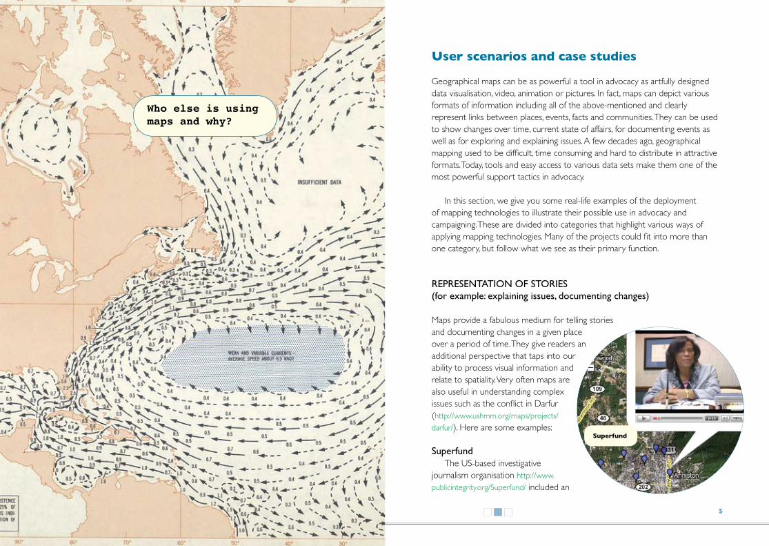
page 23 Climatological and oceanographic maps; Surface currents, from The Agile Rabbit book of Historical and Curious Maps, page 38
page 32 black and white image of Ancient plan of Shanghai, China from The Agile Rabbit book of Historical and Curious Maps page 49
page 37 Kilimanjaro, Tanzania, The Agile Rabbit book of Historical and Curious Maps, page 67
back (outside cover) compass rose from The Agile Rabbit book of Historical and Curious Maps,
illustrationsDescriptions and sources for illustrations used are as follows:
cover Map of Grozny from the virtual collection of the University of Texas at Austin, http:// www.lib.utexas.edu/maps/ modified by the guide designerpage i Detail from the solar system according to Copernicus and Ptolemeus from The Agile Rabbit book of Historical and Curious Maps by Pepin van Rooyen published byThe Pepin Press BV, 2005, www.pepinpress.com: page 4
page iv Asia, from The Agile Rabbit book of Historical and Curious Maps, page 87
page 3 South Pole and expeditions, The Agile Rabbit book of Historical and Curious Maps, page 29
page 5 Superfund, Center for Public Integrity – Superfund Project at http://www.publickintegrity.org/superfund
page 6 Crisis in Darfur, snapshot of the United States Holocaust Memorial Museum – Crisis in Darfur Project at http://www.ushmm.org/maps/
page 7 (top) Health map, a snapshot of the Children’s Hospital Informatics Program of the Harvard-MIT Division of Health Sciences & Technology - Health Map project at http://www.healthmap.org/en
page 7 (bottom) Violence in Kenya, Usahahidi.com map of the Violence in Kenya 2007/08 at http://www.ushahidi.com/index.asp
page 8 (left) Tracking elephants in Sri Lanka, snapshot of the Center for Conservation and Research Sri Lanka (ccrsl) – tracking GPS-collared elephants in Sri Lanka Project at http://demo.respere.com/ccrsl/index.php?ccr_url=map
page 8 (right) Open Street Map, snapshot of Open Street Map’s map of Johannesburg at http://wiki.openstreetmap.org/index.php/Current_events
page 9 Internet censorship, a snapshot of the Global Voices Internet Censorship project at http://advocacy.globalvoicesonline.org/maps/
page 10 (top) Show Me The Money at http://www.sunlightlabs.com/earmarks/
page 10 (bottom) Conflict Mapping, snapshot of The International Conflict Research - The War Views: Visualizing and Animating Geographic Data on Conflict mapping project at http://www.icr.ethz.ch/research/warviews
page 11 2007 Burma protests, snapshot of the Alternative ASEAN Network on Burma - 2007 Burma Protests Map at http://www.altsean.org/
page 12 Coal-mining destruction, snapshot of the Appalachian Voices - the environmental destruction caused by coal mining in the southern and central Appalachian Mountains, at http://www.appvoices.org/
page 13 (left) Relief Web - Kenya Violence, snapshot of the Relief Web - Relief Web Maps project - Kenya Election Violence 2007/2008 at http://www.reliefweb.int/rw/dbc.nsf/doc100?OpenForm

There are so many mapping technologies in use, how do I decide which one is best for me?
I want to take an existing map, add to it and host it on my web page
Map API: p16Map APIs are maps hosted by a service such as Google or Open Layers. You can use them for interaction on the web and customise them and embed into a website.
I want to add my data to a map hosted on a social networking website
I want to add some other media to my map, such as video, pictures or sound
Virtual globe: p18
WIKI style mapping: p30
Flash mapping: p22
Open source GIS: p20
I want to add data or pictures directly from my mobile phone to a map hosted on a website other than my own
I want to access satellite imagery of the earth and create a map presentation of the imagery that can be shared with others
I want to create a fancy online presentation with maps to highlight my data, images or other media and I have some ideas about Flash
I am comfortable using new software. I have some geographic data that I want to use to create my own map from scratch. I want it to show only information that is important to me
GOOd FOr reporting and live monitoring. Works best in Europe and the US and works only with small number of mobile phones
Open Source GIS are software programmes that allow users to adding and edit geographic data. They are available as desktop software and are becoming increasingly available over the web. They are typically complex tools to work with
Social networking: p26Most of the services based on Google maps
Mobile phone mapping: p29Most of the services based on Google maps
Multimedia ventures: p26
Virtual globes are software programmes that make a wealth of satellite imagery available to the end user. They can also be used to add other data to and to create robust map presentations that can be shared with others using the same software
IF yOu Are experienced with Flash you can create your own maps. Other applications exist that allow you to take a Flash map, customise it and embed it in a website. Flash maps typically look sleek
BeSt FOr mapping and organising visual and audio multimedia
By using one of the services based on Google maps or Yahoo maps
BeSt FOr collaborative maps where there is a lack of good data
A wiki is software that allows users to create, edit and link web pages easily
You need to know Flash. For example, go to The World Freedom Atlas
I want to work on a collaborative or wiki-style map
OtHer SOurCeS OF dAtA
Government data (p31) National government, UN organisations and other bodies often make data available on infrastructure, populations, etc. But availability of this kind of data varies from country to country
Commercial data (this booklet does not cover it) Companies often make satellite imagery, road data and other information available for a price. Pricing and availability varies from country to country
BeSt FOr complex maps that require significant work. You will probably need either government data available or a significant collection of your own data in place
GOOd FOr representing multimedia content on the map
GOOd FOr creating quick and simple maps, all you need is some good internet access
BeSt FOr complex maps where satellite data is important and you are ok with downloading software to do this, which typically takes up a lot of bandwidth
COlOur COdeS
fairly easy to make a bit harder to make rather difficult to make not necessarily covered in this guide
SHAPe COdeS
type of mapping example of tool we don’t really cover it in this guide line links tools and services that have multiple functions
Tactical Tech: February 2010

D
We could change the view to a vector graphic map or terrain. But let’s stick to the satellite view. Now we want to add two things to the map: a) the Rex cinema and b) how to get from there to the friend’s house.
The top right corner of the map has a navigation tool that lets us move our map towards different directions and zoom in and out.The next tool has an icon with a little hand to move our map by holding our mouse key. The next with the blue bubble enables us to place an orientation point on the map or a landmark. We will click on it and place the mark on our map – ourfriend’s home is on the corner of Assaye Road and Wheelers Rd near Cox Town. We will repeat this and place another one on the Brigade Rd. Now we will use the next icon (thin blue line) to show our route. We draw it in between our two placeholders.
ADjustInG tHe MAp & plACInG It on our sIte
The next step is worth trying yourself. We zoomed into the map and changed the shape of our home icon (we can change properties of all the elements: click twice on them and choose from offered shapes and colours. On the top right of the map, there are a few options for publishing or distributing your map. We click on “link” and copy the html code to our web site. And here is the simple map we created: http://wiki.mapping.tacticaltech.org/index.php/Example_Google_Map
For a comprehensive guide on Google Maps go to http://maps.google.com/help/maps/userguide/
HoW to BeGInOpen your internet browser and go
to http://maps.google.com. Login if you have a google mail account or create your new account by clicking on “sign in” (top corner on the right). Just follow the registration process.
CreAte your fIrst MAp By GIVInG It A nAMeClick on the “My maps” link in the
left top corner under the Google Maps logo. Choose “Create new map”; you will see two fields to fill in: the title of your map and the description. As an example, we will create a map describing how to get from the Rex Cinema in Bangalore to a friend’s house. We’ll call it “Bangalore: Rex Cinema to Friend’s Home”. For the description, we say “the fastest way to get from the Rex in Bangalore to a friend’s house”. There is one more option now – you can decide if your map will be public, so you can share it with everyone or you can keep it private. We are opting for public, because we want to share it with you. Let’s click on “done”, and our map details are saved.
fInDInG tHe loCAtIon & ADDInG InforMAtIon
Now we can see our map under “Maps created by me”. It should be toggled, lets click on “edit” and play with the map. First, we type our location in the search window, which you can find to the right of the Google logo. We type “Brigade road, Bangalore, India” – soon a map of Bangalore will appear with a red bulb showing the centre of the Brigade Rd in Bangalore. By default, we can see the satellite view with labels, like names of streets.
1
four easy steps to create a simple map
This exercise explains how use Google Maps to make your own map, add important details, and publish it on your website
2
3
4

B
We would love to see other examples of useful maps, in particular from non English speaking countries. If you know of any maps used for advocacy please send us a link – or a snapshot if it is not online for any reason – to: [email protected]. Authors of the best links may receive a prize (we cannot promise but we will definitely acknowledge every friendly mail by sending a nice email back. Of course we are also open to helpful critical comments.)
You’ve got data, now what do you do with it?
How do you tell your story using a map?
How can you create your map in 10 minutes?
How can you explain what’s happening in your
region using a map?