Magazine adverts
5
Magazine Advert Research
Transcript of Magazine adverts
Magazine Advert Research
Image of the artist is large in comparison to the information of the
song.This allows the
audience to recognise the artist quick if
flipping through pages of the magazine. In
doing this the advert is able to catch more eyes drawing more people to purchase
the song and album.
Image of the artist portrays a cool yet serious image giving the audience a slight preview of how the song and album will be.
The use of the white attire shows the R&B aspects of the album as it is a stereotype
commonly associated with Soul music, a key element found in the
genre.
The use of the colour pink for the writing of the artist causes the name to stand and
pop to the audience. This allows audiences who are not massive fans of the artist but recognise his name
the chance to spot the advertisement rather than idly skipping it
due to a lack of knowledge of the
person in the image.
Date of the release is in bold to show the
audience the most important information of
the advert.
Information of the most popular single on the
album in order to attract both fans and new
comers to the artist. Artist website can be seen in small writing at he bottom so fans can get more details on the info provided
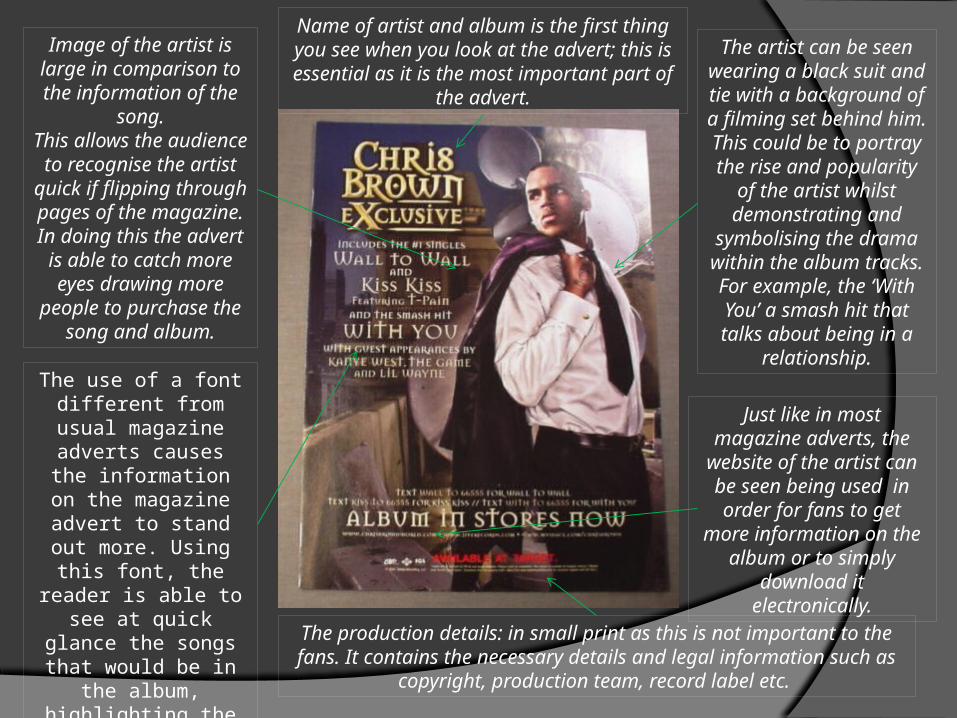
Image of the artist is large in comparison to the information of
the song.This allows the
audience to recognise the artist
quick if flipping through pages of the magazine. In doing this the advert is
able to catch more eyes drawing more people to purchase
the song and album.The use of a font different from usual magazine adverts
causes the information on the magazine advert to
stand out more. Using this font, the
reader is able to see at quick glance the songs that would be
in the album, highlighting the most
popular songs by increasing their font
size.
The artist can be seen wearing a black
suit and tie with a background of a
filming set behind him. This could be to portray the rise and
popularity of the artist whilst
demonstrating and symbolising the
drama within the album tracks. For
example, the ‘With You’ a smash hit that talks about being in a
relationship.Just like in most
magazine adverts, the website of the artist can be seen being
used in order for fans to get more
information on the album or to simply
download it electronically.The production details: in small print as this is not important
to the fans. It contains the necessary details and legal information such as copyright, production team, record label
etc.
Name of artist and album is the first thing you see when you look at the advert; this is essential as it is the most important part of the advert.

Just like in most magazine adverts, the
website of the artist can be seen being used in order for fans to get
more information on the album or to simply
download it electronically.
Unlike most magazine adverts which have a
large image of the artist, this magazine advert simply has an
image of all the machinery and
instruments used in the album. This is to give readers a preview of what to come whilst
sticking to the albums name of blue print as it
maps out the instruments to be used
and be expected.
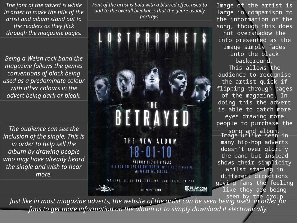
The audience can see the inclusion of the
single. This is in order to help sell the album
by drawing people who may have already
heard the single and wish to hear more.
The institution logo can be seen being placed on the advert. This is so that people know
the record label that is publishing the album
increasing brand awareness. Acting also
as a banner for the album, it lets readers
know that it is published by the
record label that they may be familiar with
and are known to publish good content.
The artist name is written in bold writing to immediately catch the eyes of the reader as it stands out on top of the white back ground.
The use of an all white background with a simple 3 red lines across the centre causes the page to stand out when readers flick through the magazine. Aimed to catch the eyes of the reader it draws
their attention and influences their thoughts as it standouts
Just like in most magazine adverts, the website of the artist can be seen being used in order for fans to get more information on the album or to simply download it
electronically.
The audience can see the inclusion of the single. This is in order to help
sell the album by drawing people who may have already heard the single and wish to hear
more.
Being a Welsh rock band the magazine follows the
genres conventions of black being used as a
predominate colour with other colours in the advert being dark or
bleak.
The font of the advert is white in order to make the title of the artist and album stand out to the readers as
they flick through the magazine pages.
Font of the artist is bold with a blurred effect used to add to the overall bleakness that the
genre usually portrays.
Image of the artist is large in comparison to the
information of the song, though this does not overshadow the info
presented as the image simply fades into the black
background.This allows the audience to recognise the artist quick if flipping through pages of
the magazine. In doing this the advert is able to catch more eyes drawing more people to purchase the
song and album.
Image unlike seen in many hip-hop adverts doesn’t over glorify the band but
instead shows their simplicity whilst staring in different directions giving fans the feeling like they
are being seen by the group