M07 SULL8028 03 SE C07 - Pearson Higher Ed
63
PART 2 Remember, statistics is a process. The first chapter (Part 1) dealt with the first two steps in the statistical process: (1) identify the research objective and (2) collect the information needed to answer the questions in the research objective. The next three chapters deal with organizing, summarizing, and presenting the data collected. This step in the process is called descriptive statistics. CHAPTER 2 Organizing and Summarizing Data CHAPTER 3 Numerically Summarizing Data CHAPTER 4 Describing the Relation between Two Variables Descriptive Statistics
Transcript of M07 SULL8028 03 SE C07 - Pearson Higher Ed

PART
2Remember, statistics is a process. The first chapter (Part 1) dealt
with the first two steps in the statistical process: (1) identify the
research objective and (2) collect the information needed to
answer the questions in the research objective. The next three
chapters deal with organizing, summarizing, and presenting
the data collected. This step in the process is called descriptive
statistics.
CHAPTER 2Organizing andSummarizing Data
CHAPTER 3NumericallySummarizing Data
CHAPTER 4Describing theRelation betweenTwo Variables
DescriptiveStatistics
M02_SULL8028_03_SE_C02.QXD 9/9/08 10:41 AM Page 65
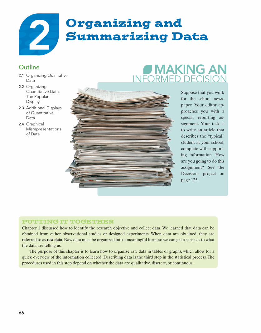
Organizing andSummarizing Data
66
Outline2.1 Organizing Qualitative
Data
2.2 OrganizingQuantitative Data:The PopularDisplays
2.3 Additional Displaysof QuantitativeData
2.4 GraphicalMisrepresentations of Data
Suppose that you workfor the school news-paper. Your editor ap-proaches you with aspecial reporting as-signment. Your task isto write an article thatdescribes the “typical”student at your school,complete with support-ing information. Howare you going to do thisassignment? See theDecisions project onpage 125.
PUTTING IT TOGETHERChapter 1 discussed how to identify the research objective and collect data. We learned that data can beobtained from either observational studies or designed experiments. When data are obtained, they arereferred to as raw data. Raw data must be organized into a meaningful form, so we can get a sense as to whatthe data are telling us.
The purpose of this chapter is to learn how to organize raw data in tables or graphs, which allow for aquick overview of the information collected. Describing data is the third step in the statistical process. Theprocedures used in this step depend on whether the data are qualitative, discrete, or continuous.
2M02_SULL8028_03_SE_C02.QXD 9/9/08 10:41 AM Page 66

Section 2.1 Organizing Qualitative Data 67
2.1 ORGANIZING QUALITATIVE DATAPreparing for This Section Before getting started, review the following:
• Qualitative data (Section 1.1, p. 7) • Level of measurement (Section 1.1, pp. 10–11)
Table 1
Back Back Hand Neck Knee KneeWrist Back Groin Shoulder Shoulder BackElbow Back Back Back Back BackBack Shoulder Shoulder Knee Knee BackHip Knee Hip Hand Back Wrist
Source: Krystal Catton, student at Joliet Junior College
Objectives 1 Organize qualitative data in tables2 Construct bar graphs3 Construct pie charts
In this section we will concentrate on tabular and graphical summaries of qualitativedata. Sections 2.2 and 2.3 discuss methods for summarizing quantitative data.
1 Organize Qualitative Data in TablesRecall that qualitative (or categorical) data provide measures that categorize orclassify an individual. When qualitative data are collected, we are often interestedin determining the number of individuals observed within each category.
Definition A frequency distribution lists each category of data and the number of occur-rences for each category of data.
Note to InstructorIf you like, you can print out anddistribute the Preparing forThis Section quiz located in theInstructor’s Resource Center.The purpose of the quiz is to verify the students have theprerequisite knowledge for thesection.
EXAMPLE 1 Organizing Qualitative Data into a Frequency Distribution
Problem: A physical therapist wants to get a sense of the types of rehabilitationrequired by her patients. To do so, she obtains a simple random sample of 30 of herpatients and records the body part requiring rehabilitation. See Table 1. Construct afrequency distribution of location of injury.
Approach: To construct a frequency distribution, we create a list of the body parts(categories) and tally each occurrence. Finally, we add up the number of tallies todetermine the frequency.
Solution: See Table 2. From the table, we can see that the back is the most commonbody part requiring rehabilitation, with a total of 12.
Table 2
Body Part Tally Frequency
Back 12Wrist 2Elbow 1Hip 2Shoulder 4Knee 5Hand 2Groin 1Neck 1ƒ
ƒ
ƒ ƒ
ƒ ƒ ƒ ƒ
ƒ ƒ ƒ ƒ
ƒ ƒ
ƒ
ƒ ƒ
ƒ ƒ ƒ ƒ ƒ ƒ ƒ ƒ ƒ ƒ
The data in Table 2 are stillqualitative. The frequency simplyrepresents the count of each category.
M02_SULL8028_03_SE_C02.QXD 9/9/08 10:41 AM Page 67

68 Chapter 2 Organizing and Summarizing Data
Definition The relative frequency is the proportion (or percent) of observations within acategory and is found using the formula
(1)
A relative frequency distribution lists each category of data together with therelative frequency.
Relative frequency =
frequencysum of all frequencies
In Other WordsA frequency distribution shows thenumber of observations that belong in each category. A relative frequencydistribution shows the proportion ofobservations that belong in eachcategory.
Table 3
Body Part Frequency Relative Frequency
Back 12
Wrist 2
Elbow 1 0.0333
Hip 2 0.0667
Shoulder 4 0.1333
Knee 5 0.1667
Hand 2 0.0667
Groin 1 0.0333
Neck 1 0.0333
230
L 0.0667
1230
= 0.4
From the table, we can see that the most common body part for rehabilitation is theback.
It is a good idea to add up the relative frequencies to be sure they sum to 1.In fraction form, the sum should be exactly 1. In decimal form, the sum may differslightly from 1 due to rounding.
EXAMPLE 2 Constructing a Relative Frequency Distribution of Qualitative Data
Problem: Using the data in Table 2, construct a relative frequency distribution.
Approach: Add all the frequencies, and then use Formula (1) to compute the rela-tive frequency of each category of data.
Solution: We add the values in the frequency column in Table 2:
We now compute the relative frequency of each category. For example, the relativefrequency of the category Back is
After computing the relative frequency for the remaining categories, we obtain therelative frequency distribution shown in Table 3.
1230
= 0.4
Sum of all frequencies = 12 + 2 + 1 + 2 + 4 + 5 + 2 + 1 + 1 = 30
Using TechnologySome statistical spreadsheets such as MINITAB have a Tallycommand. This command willconstruct a frequency and relativefrequency distribution of rawqualitative data.
Now Work Problems 25(a)–(b)
With frequency distributions, it is a good idea to add up the frequency columnto make sure that it sums to the number of observations. In the case of the data inExample 1, the frequency column adds up to 30, as it should.
Often, rather than being concerned with the frequency with which categories ofdata occur, we want to know the relative frequency of the categories.
M02_SULL8028_03_SE_C02.QXD 9/9/08 10:41 AM Page 68

Section 2.1 Organizing Qualitative Data 69
Bac
k
Elb
ow
Gro
in
Han
d
Hip
Kne
e
Nec
k
Shou
lder
Wri
st
Bac
k
Elb
ow
Gro
in
Han
d
Hip
Kne
e
Nec
k
Shou
lder
Wri
st
12
10
8
6
4
2
0
Freq
uenc
y
Types ofRehabilitation
Body Part
0.40
0.30
0.20
0.10
0
Rel
ativ
e Fr
eque
ncy
Types ofRehabilitation
Body Part
(a) (b)
Figure 1
2 Construct Bar GraphsOnce raw data are organized in a table, we can create graphs. Graphs allow us to seethe data and get a sense of what the data are saying about the individuals in thestudy. The cliché, “A picture is worth a thousand words,” has a similar applicationwhen dealing with data. In general, pictures of data result in a more powerful mes-sage than tables.Try the following exercise for yourself: Open a newspaper and lookat a table and a graph. Study each. Now put the paper away and close your eyes.What do you see in your mind’s eye? Can you recall information more easily fromthe table or the graph? In general, people are more likely to recall informationobtained from a graph than they are from a table.
One of the most common devices for graphically representing qualitative data is abar graph.Both nominal and ordinal data can easily be displayed with this type of graph.
Definition A bar graph is constructed by labeling each category of data on either the hori-zontal or vertical axis and the frequency or relative frequency of the category onthe other axis. Rectangles of equal width are drawn for each category. The heightof each rectangle represents the category’s frequency or relative frequency.
EXAMPLE 3 Constructing a Frequency and Relative Frequency Bar Graph
Problem: Use the data summarized in Table 3 to construct the following:
(a) Frequency bar graph(b) Relative frequency bar graph
Approach: We will use a horizontal axis to indicate the categories of the data(body parts, in this case) and a vertical axis to represent the frequency or relativefrequency. Rectangles of equal width are drawn to the height that is the frequencyor relative frequency for each category. The bars do not touch each other.
Solution(a) Figure 1(a) shows the frequency bar graph.
(b) Figure 1(b) shows the relative frequency bar graph.
Watch out for graphs that startthe scale at some value other than 0,have bars with unequal widths, havebars with different colors, or havethree-dimensional bars because theycan misrepresent the data.
EXAMPLE 4 Constructing a Frequency or Relative Frequency Bar Graph Using Technology
Problem: Use a statistical spreadsheet to construct a frequency or relative frequencybar graph.
M02_SULL8028_03_SE_C02.QXD 9/9/08 10:41 AM Page 69

70 Chapter 2 Organizing and Summarizing Data
Notice the order of the categories differ in Figures 1 and 2. In bar graphs, theorder of the categories does not matter, unless one is creating a Pareto chart.
Some statisticians prefer to create bar graphs with the categories arranged indecreasing order of frequency. Such graphs help prioritize categories for decisionmaking purposes in areas such as quality control, human resources, and marketing.
Definition A Pareto chart is a bar graph whose bars are drawn in decreasing order offrequency or relative frequency.
Figure 3 illustrates a relative frequency Pareto chart for the data in Table 3.
Figure 2
0.45
0.40
0.35
0.30
0.25
0.20
0.15
0.10
0.05
0
Rel
ativ
e Fr
eque
ncy
Types of Rehabilitation
Body Part
Bac
k
Kne
e
Shou
lder
Wri
st
Hip
Han
d
Elb
ow
Gro
in
Nec
k
Figure 3
Approach: We will use Excel to construct the frequency and relative frequencybar graph. The steps for constructing the graphs using MINITAB or Excel are givenin the Technology Step-by-Step on page 81. Note: The TI-83 and TI-84 Plus graph-ing calculators cannot draw frequency or relative frequency bar graphs.
Solution: Figure 2(a) shows the frequency bar graph and Figure 2(b) shows therelative frequency bar graph obtained from Excel.
Now Work Problems 25(c)–(d)
Side-by-Side Bar GraphsGraphics can provide insight when you are comparing two sets of data. For exam-ple, suppose we wanted to know if more people are finishing college today than in1990. We could draw a side-by-side bar graph to compare the two data sets. Datasets should be compared by using relative frequencies, because different sampleor population sizes make comparisons using frequencies difficult or misleading.However, when making comparisons, relative frequencies alone are not sufficient.
Using TechnologyThe graphs obtained from adifferent statistical packagemay differ from those in Figure 2.Some packages use the word countin place of frequency or percent inplace of relative frequency, however.
M02_SULL8028_03_SE_C02.QXD 9/9/08 10:41 AM Page 70
Section 2.1 Organizing Qualitative Data 71
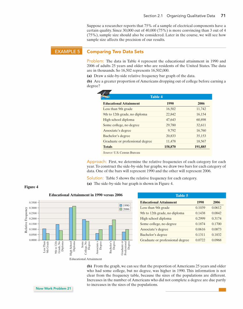
Approach: First, we determine the relative frequencies of each category for eachyear.To construct the side-by-side bar graphs, we draw two bars for each category ofdata. One of the bars will represent 1990 and the other will represent 2006.
Solution: Table 5 shows the relative frequency for each category.(a) The side-by-side bar graph is shown in Figure 4.
Table 4
Educational Attainment 1990 2006
Less than 9th grade 16,502 11,742
9th to 12th grade, no diploma 22,842 16,154
High school diploma 47,643 60,898
Some college, no degree 29,780 32,611
Associate’s degree 9,792 16,760
Bachelor’s degree 20,833 35,153
Graduate or professional degree 11,478 18,567
Totals 158,870 191,885
Source: U.S. Census Bureau
EXAMPLE 5 Comparing Two Data Sets
Problem: The data in Table 4 represent the educational attainment in 1990 and2006 of adults 25 years and older who are residents of the United States. The dataare in thousands. So 16,502 represents 16,502,000.(a) Draw a side-by-side relative frequency bar graph of the data.(b) Are a greater proportion of Americans dropping out of college before earning adegree?
Suppose a researcher reports that 75% of a sample of electrical components have acertain quality. Since 30,000 out of 40,000 (75%) is more convincing than 3 out of 4(75%), sample size should also be considered. Later in the course, we will see howsample size affects the precision of our results.
Table 5
Educational Attainment 1990 2006
Less than 9th grade 0.1039 0.0612
9th to 12th grade, no diploma 0.1438 0.0842
High school diploma 0.2999 0.3174
Some college, no degree 0.1874 0.1700
Associate’s degree 0.0616 0.0873
Bachelor’s degree 0.1311 0.1832
Graduate or professional degree 0.0722 0.0968
0.3500
0.3000
0.2500
0.2000
0.1500
0.1000
0.0500
0.0000
Rel
ativ
e Fr
eque
ncy
Educational Attainment in 1990 versus 2006
Educational Attainment
Les
s Tha
n9t
h G
rade
9th
to 1
2th
Gra
de, N
oD
iplo
ma
Hig
h Sc
hool
Dip
lom
a
Som
eC
olle
ge, N
oD
egre
e
Ass
ocia
teís
Deg
ree
Bac
helo
r’s
Deg
ree
Gra
duat
e or
Pro
fess
iona
lD
egre
e
19902006
Figure 4
(b) From the graph, we can see that the proportion of Americans 25 years and olderwho had some college, but no degree, was higher in 1990. This information is notclear from the frequency table, because the sizes of the populations are different.Increases in the number of Americans who did not complete a degree are due partlyto increases in the sizes of the populations.
Now Work Problem 21
M02_SULL8028_03_SE_C02.QXD 9/9/08 10:41 AM Page 71
72 Chapter 2 Organizing and Summarizing Data
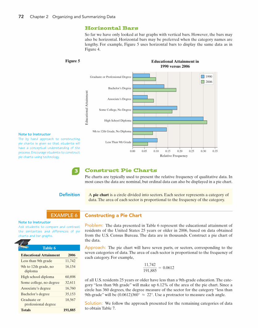
Note to InstructorAsk students to compare and contrastthe similarities and differences of piecharts and bar graphs.
Note to InstructorThe by hand approach to constructingpie charts is given so that students willhave a conceptual understanding of theprocess. Encourage students to constructpie charts using technology.
Table 6
Educational Attainment 2006
Less than 9th grade 11,742
9th to 12th grade, no diploma
16,154
High school diploma 60,898
Some college, no degree 32,611
Associate’s degree 16,760
Bachelor’s degree 35,153
Graduate or professional degree
18,567
Totals 191,885
Graduate or Professional Degree
Bachelor’s Degree
0.00 0.05 0.10 0.15 0.20 0.25 0.30 0.35
Associate’s Degree
Some College, No Degree
High School Diploma
9th to 12th Grade, No Diploma
Less Than 9th Grade
Edu
cati
onal
Att
ainm
ent
Educational Attainment in1990 versus 2006
Relative Frequency
1990
2006
Figure 5
3 Construct Pie ChartsPie charts are typically used to present the relative frequency of qualitative data. Inmost cases the data are nominal, but ordinal data can also be displayed in a pie chart.
Definition A pie chart is a circle divided into sectors. Each sector represents a category ofdata. The area of each sector is proportional to the frequency of the category.
EXAMPLE 6 Constructing a Pie Chart
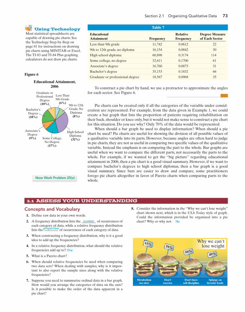
Problem: The data presented in Table 6 represent the educational attainment ofresidents of the United States 25 years or older in 2006, based on data obtainedfrom the U.S. Census Bureau. The data are in thousands. Construct a pie chart ofthe data.
Approach: The pie chart will have seven parts, or sectors, corresponding to theseven categories of data. The area of each sector is proportional to the frequency ofeach category. For example,
of all U.S. residents 25 years or older have less than a 9th-grade education. The cate-gory “less than 9th grade” will make up 6.12% of the area of the pie chart. Since acircle has 360 degrees, the degree measure of the sector for the category “less than9th-grade” will be Use a protractor to measure each angle.
Solution: We follow the approach presented for the remaining categories of datato obtain Table 7.
(0.0612)360° L 22°.
11,742191,885
= 0.0612
Horizontal BarsSo far we have only looked at bar graphs with vertical bars. However, the bars mayalso be horizontal. Horizontal bars may be preferred when the category names arelengthy. For example, Figure 5 uses horizontal bars to display the same data as inFigure 4.
M02_SULL8028_03_SE_C02.QXD 9/9/08 10:41 AM Page 72
Section 2.1 Organizing Qualitative Data 73
Table 7
EducationalAttainment
Degree Measureof Each Sector
Relative FrequencyFrequency
Less than 9th grade 11,742 0.0612 22
9th to 12th grade, no diploma 16,154 0.0842 30
High school diploma 60,898 0.3174 114
Some college, no degree 32,611 0.1700 61
Associate’s degree 16,760 0.0873 31
Bachelor’s degree 35,153 0.1832 66
Graduate or professional degree 18,567 0.0968 35
To construct a pie chart by hand, we use a protractor to approximate the anglesfor each sector. See Figure 6.
Pie charts can be created only if all the categories of the variable under consid-eration are represented. For example, from the data given in Example 1, we couldcreate a bar graph that lists the proportion of patients requiring rehabilitation ontheir back, shoulder or knee only, but it would not make sense to construct a pie chartfor this situation. Do you see why? Only 70% of the data would be represented.
When should a bar graph be used to display information? When should a piechart be used? Pie charts are useful for showing the division of all possible values ofa qualitative variable into its parts. However, because angles are often hard to judgein pie charts, they are not as useful in comparing two specific values of the qualitativevariable. Instead the emphasis is on comparing the part to the whole. Bar graphs areuseful when we want to compare the different parts, not necessarily the parts to thewhole. For example, if we wanted to get the “big picture” regarding educationalattainment in 2006, then a pie chart is a good visual summary. However, if we want tocompare bachelor’s degrees to high school diplomas, then a bar graph is a good visual summary. Since bars are easier to draw and compare, some practitionersforego pie charts altogether in favor of Pareto charts when comparing parts to thewhole.
Now Work Problem 25(e)
2.1 ASSESS YOUR UNDERSTANDING
Concepts and Vocabulary1. Define raw data in your own words.
2. A frequency distribution lists the of occurrences ofeach category of data, while a relative frequency distributionlists the of occurrences of each category of data.
3. When constructing a frequency distribution, why is it a goodidea to add up the frequencies?
4. In a relative frequency distribution, what should the relativefrequencies add up to? One
5. What is a Pareto chart?
6. When should relative frequencies be used when comparingtwo data sets? When dealing with samples, why is it impor-tant to also report the sample sizes along with the relativefrequencies?
7. Suppose you need to summarize ordinal data in a bar graph.How would you arrange the categories of data on the axis?Is it possible to make the order of the data apparent in apie chart?
8. Consider the information in the “Why we can’t lose weight”chart shown next, which is in the USA Today style of graph.Could the information provided be organized into a piechart? Why or why not. No
Using TechnologyMost statistical spreadsheets arecapable of drawing pie charts. Seethe Technology Step-by-Step onpage 81 for instructions on drawingpie charts using MINITAB or Excel.The TI-83 and TI-84 Plus graphingcalculators do not draw pie charts.
Figure 6
Educational Attainment,2006
Less Than9th Grade
(6%)
Bachelor’sDegree(18%)
High SchoolDiploma
(32%)Some College,No Degree
(17%)
Graduate orProfessional
Degree(10%)
Associate’sDegree(9%)
9th to 12thGrade, NoDiploma
(8%)
Why we can'tlose weight
63%59%
50%49%
Metabolismtoo slow
Don’texercise
Don’t haveself-discipline
Splurge onfavorite foods
number
proportion
M02_SULL8028_03_SE_C02.QXD 9/9/08 10:41 AM Page 73
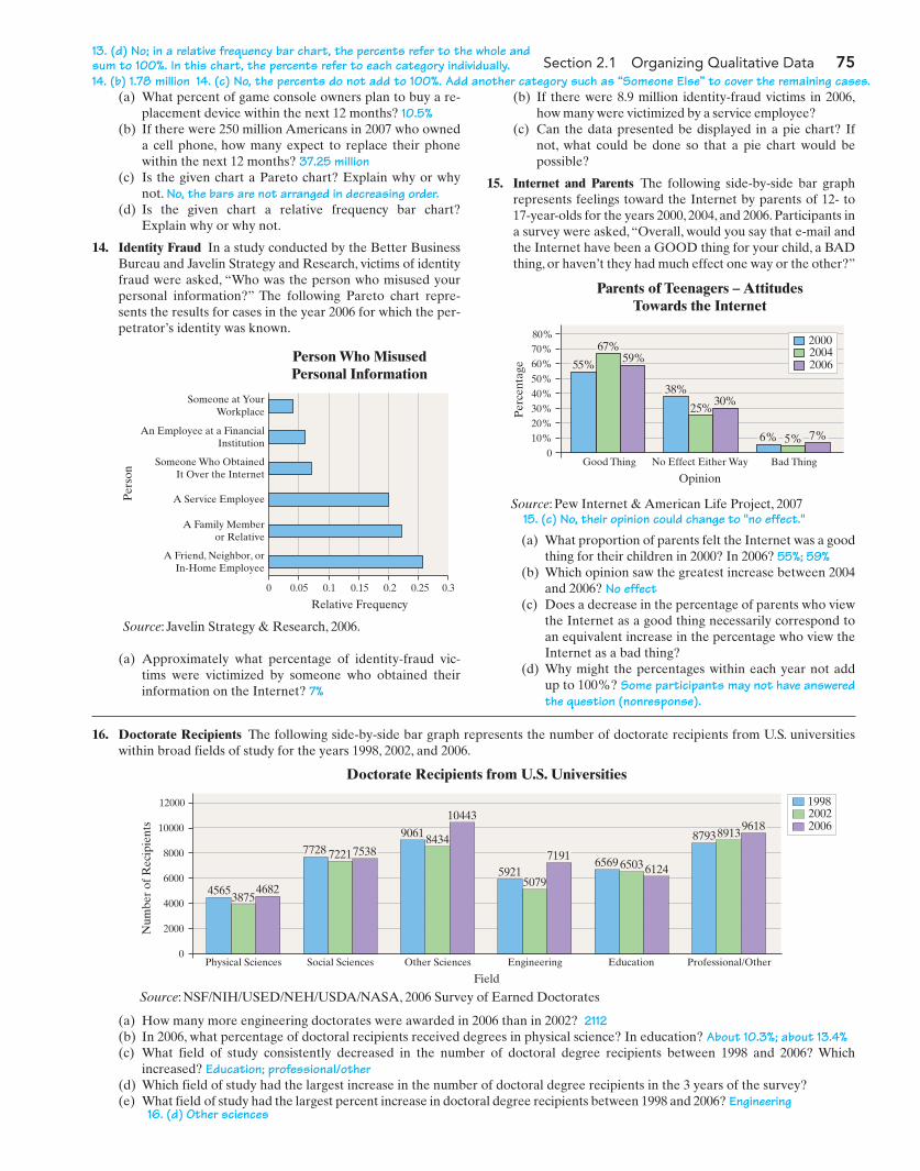
(a) If women had 1.9 million cosmetic surgeries in 2006,what percent were for tummy tucks? 7.7%
(b) What percent were for nose reshaping? 16.2%(c) How many surgeries are not accounted for in the graph?
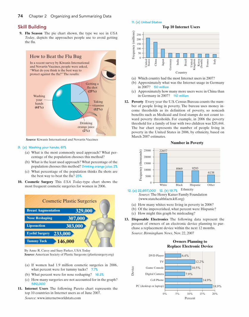
74 Chapter 2 Organizing and Summarizing Data
Getting aflu shot(25%)
Takingvitamins(12%)
Drinkingorange juice
(2%)
Washingyour
hands(61%)
Source: Kiwanis International and Novartis Vaccines
How to Beat the Flu BugIn a recent survey by Kiwanis Internationaland Novartis Vaccines, people were asked, “What do you think is the best way toprotect against the flu?” The results:
(a) What is the most commonly used approach? What per-centage of the population chooses this method?
(b) What is the least used approach? What percentage of thepopulation chooses this method? Drinking orange juice; 2%
(c) What percentage of the population thinks flu shots arethe best way to beat the flu? 25%
10. Cosmetic Surgery This USA Today-type chart shows themost frequent cosmetic surgeries for women in 2006.
9. (a) Washing your hands; 61%
329,000Breast Augmentation
307,000Nose Reshaping
303,000Liposuction
233,000Eyelid Surgery
Tummy Tuck 146,000
Cosmetic Plastic Surgeries
By Anne R. Carey and Suzy Parker, USA TodaySource: American Society of Plastic Surgeons (plasticsurgery.org) DVD Player
0% 5% 10% 15% 20%
TV 12.2%
Game Console
Digital Camera
Cell Phone
PC (desktop or laptop)
10.5%
7.9%
14.9%
18.9%
Dev
ice
Owners Planning toReplace Electronic Device
Percent
6.4%
25000
20000
15000
10000
5000
0
Freq
uenc
y (t
hous
ands
)
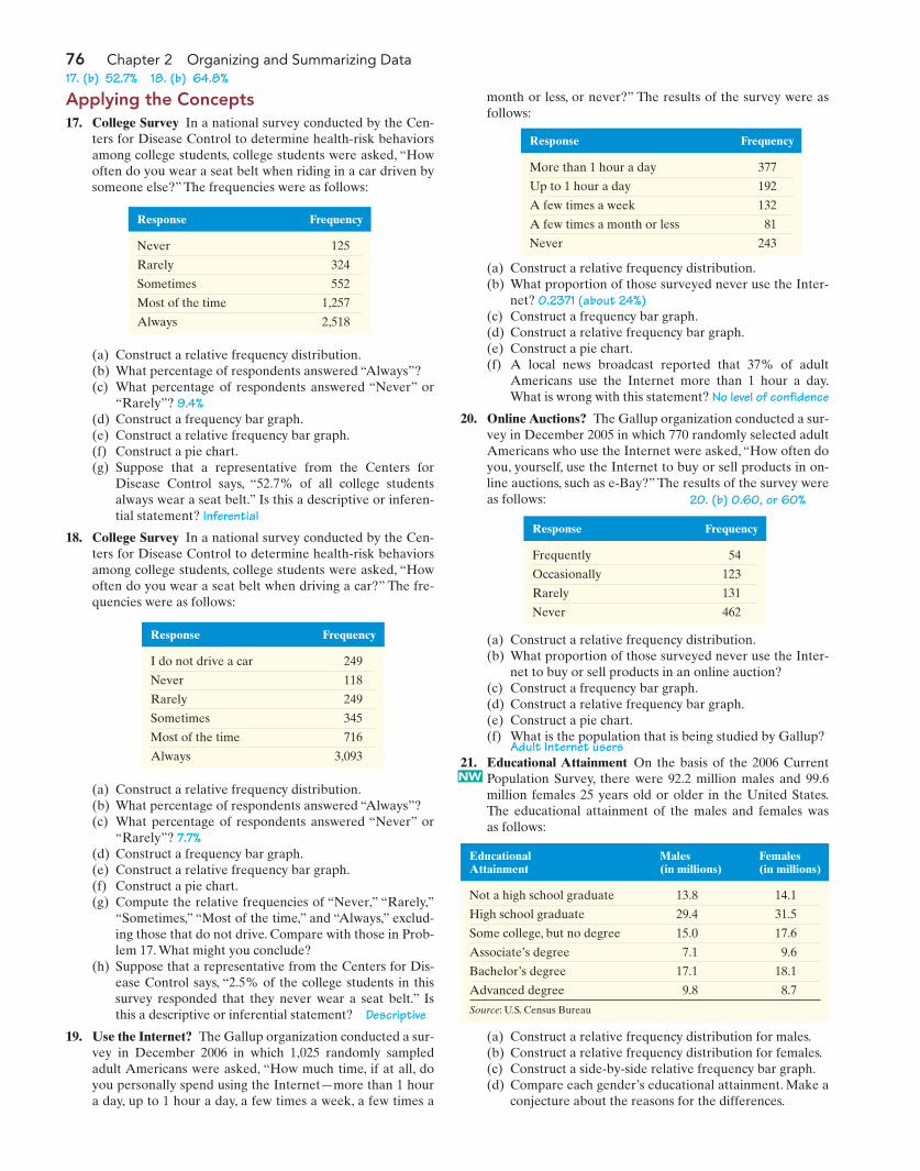
White Black Hispanic Other
Number in Poverty
Ethnicity
22657
8969 92936138
250
200
150
100
50
0Freq
uenc
y (m
illio
ns)
Top 10 Internet Users
Country
Uni
ted
Stat
es
Chi
na
Japa
n
Ger
man
y
Indi
a
Bra
zil
Fran
ce
Ital
y
Uni
ted
Kin
gdom
Kor
ea(S
outh
)
(a) Which country had the most Internet users in 2007?(b) Approximately what was the Internet usage in Germany
in 2007? 50 million(c) Approximately how many more users were in China than
in Germany in 2007? 110 million
12. Poverty Every year the U.S. Census Bureau counts the num-ber of people living in poverty. The bureau uses money in-come thresholds as its definition of poverty, so noncashbenefits such as Medicaid and food stamps do not count to-ward poverty thresholds. For example, in 2006 the povertythreshold for a family of four with two children was $20,444.The bar chart represents the number of people living inpoverty in the United States in 2006, by ethnicity, based onMarch 2007 estimates.
582,00011. Internet Users The following Pareto chart represents the
top 10 countries in Internet users as of June 2007.Source: www.internetworldstats.com
(a) How many whites were living in poverty in 2006?(b) Of the impoverished, what percent were Hispanic?(c) How might this graph be misleading?
13. Disposable Electronics The following data represent thepercent of owners of an electronic device planning to pur-chase a replacement device within the next 12 months.Source: Birmingham News, Nov. 22, 2007
Source: The Henry Kaiser Family Foundation(www.statehealthfacts.kff.org)
Skill Building9. Flu Season The pie chart shown, the type we see in USA
Today, depicts the approaches people use to avoid gettingthe flu.
11. (a) United States
12. (a) 22,657,000 12. (b) 19.7%
M02_SULL8028_03_SE_C02.QXD 9/9/08 10:41 AM Page 74
Section 2.1 Organizing Qualitative Data 75
(a) What percent of game console owners plan to buy a re-placement device within the next 12 months? 10.5%
(b) If there were 250 million Americans in 2007 who owneda cell phone, how many expect to replace their phonewithin the next 12 months? 37.25 million
(c) Is the given chart a Pareto chart? Explain why or whynot. No, the bars are not arranged in decreasing order.
(d) Is the given chart a relative frequency bar chart?Explain why or why not.
14. Identity Fraud In a study conducted by the Better BusinessBureau and Javelin Strategy and Research, victims of identityfraud were asked, “Who was the person who misused yourpersonal information?” The following Pareto chart repre-sents the results for cases in the year 2006 for which the per-petrator’s identity was known.
Someone at YourWorkplace
0 0.05 0.1 0.250.15 0.2 0.3
An Employee at a FinancialInstitution
Someone Who ObtainedIt Over the Internet
A Service Employee
A Family Memberor Relative
A Friend, Neighbor, orIn-Home Employee
Per
son
Person Who MisusedPersonal Information
Relative Frequency
14. (c) No, the percents do not add to 100%. Add another category such as “Someone Else” to cover the remaining cases.14. (b) 1.78 million
15. (c) No, their opinion could change to "no effect."
Source: Javelin Strategy & Research, 2006.
Source: Pew Internet & American Life Project, 2007
Source: NSF/NIH/USED/NEH/USDA/NASA, 2006 Survey of Earned Doctorates
13. (d) No; in a relative frequency bar chart, the percents refer to the whole andsum to 100%. In this chart, the percents refer to each category individually.
(b) If there were 8.9 million identity-fraud victims in 2006,how many were victimized by a service employee?
(c) Can the data presented be displayed in a pie chart? Ifnot, what could be done so that a pie chart would bepossible?
15. Internet and Parents The following side-by-side bar graphrepresents feelings toward the Internet by parents of 12- to17-year-olds for the years 2000, 2004, and 2006. Participants ina survey were asked, “Overall, would you say that e-mail andthe Internet have been a GOOD thing for your child, a BADthing, or haven’t they had much effect one way or the other?”
80%70%60%50%
20%10%
40%30%
0
Per
cent
age
Good Thing No Effect Either Way Bad Thing
Parents of Teenagers – AttitudesTowards the Internet
Opinion
7%5%6%
30%25%
38%
59%67%
55%
200020042006
16. Doctorate Recipients The following side-by-side bar graph represents the number of doctorate recipients from U.S. universitieswithin broad fields of study for the years 1998, 2002, and 2006.
12000
10000
4000
2000
8000
6000
0
Num
ber
of R
ecip
ient
s
Physical Sciences Social Sciences Other Sciences Engineering Education Professional/Other
Doctorate Recipients from U.S. Universities
Field
753872217728
46823875
4565
10443
84349061
7191
50795921 612465036569
961889138793
199820022006
(a) What proportion of parents felt the Internet was a goodthing for their children in 2000? In 2006? 55%; 59%
(b) Which opinion saw the greatest increase between 2004and 2006? No effect
(c) Does a decrease in the percentage of parents who viewthe Internet as a good thing necessarily correspond toan equivalent increase in the percentage who view theInternet as a bad thing?
(d) Why might the percentages within each year not addup to 100%? Some participants may not have answeredthe question (nonresponse).
(a) Approximately what percentage of identity-fraud vic-tims were victimized by someone who obtained theirinformation on the Internet? 7%
(a) How many more engineering doctorates were awarded in 2006 than in 2002? 2112(b) In 2006, what percentage of doctoral recipients received degrees in physical science? In education? About 10.3%; about 13.4%(c) What field of study consistently decreased in the number of doctoral degree recipients between 1998 and 2006? Which
increased? Education; professional/other (d) Which field of study had the largest increase in the number of doctoral degree recipients in the 3 years of the survey? (e) What field of study had the largest percent increase in doctoral degree recipients between 1998 and 2006? Engineering
16. (d) Other sciences
M02_SULL8028_03_SE_C02.QXD 9/9/08 10:41 AM Page 75
76 Chapter 2 Organizing and Summarizing Data
Applying the Concepts17. College Survey In a national survey conducted by the Cen-
ters for Disease Control to determine health-risk behaviorsamong college students, college students were asked, “Howoften do you wear a seat belt when riding in a car driven bysomeone else?” The frequencies were as follows:
month or less, or never?” The results of the survey were asfollows:
Response Frequency
Never 125
Rarely 324
Sometimes 552
Most of the time 1,257
Always 2,518
(a) Construct a relative frequency distribution.(b) What percentage of respondents answered “Always”?(c) What percentage of respondents answered “Never” or
“Rarely”? 9.4%(d) Construct a frequency bar graph.(e) Construct a relative frequency bar graph.(f) Construct a pie chart.(g) Suppose that a representative from the Centers for
Disease Control says, “52.7% of all college studentsalways wear a seat belt.” Is this a descriptive or inferen-tial statement? Inferential
18. College Survey In a national survey conducted by the Cen-ters for Disease Control to determine health-risk behaviorsamong college students, college students were asked, “Howoften do you wear a seat belt when driving a car?” The fre-quencies were as follows:
17. (b) 52.7% 18. (b) 64.8%
Response Frequency
I do not drive a car 249
Never 118
Rarely 249
Sometimes 345
Most of the time 716
Always 3,093
(a) Construct a relative frequency distribution.(b) What percentage of respondents answered “Always”?(c) What percentage of respondents answered “Never” or
“Rarely”? 7.7%(d) Construct a frequency bar graph.(e) Construct a relative frequency bar graph.(f) Construct a pie chart.(g) Compute the relative frequencies of “Never,” “Rarely,”
“Sometimes,” “Most of the time,” and “Always,” exclud-ing those that do not drive. Compare with those in Prob-lem 17. What might you conclude?
(h) Suppose that a representative from the Centers for Dis-ease Control says, “2.5% of the college students in thissurvey responded that they never wear a seat belt.” Isthis a descriptive or inferential statement? Descriptive
19. Use the Internet? The Gallup organization conducted a sur-vey in December 2006 in which 1,025 randomly sampledadult Americans were asked, “How much time, if at all, doyou personally spend using the Internet—more than 1 houra day, up to 1 hour a day, a few times a week, a few times a
Response Frequency
More than 1 hour a day 377
Up to 1 hour a day 192
A few times a week 132
A few times a month or less 81
Never 243
(a) Construct a relative frequency distribution.(b) What proportion of those surveyed never use the Inter-
net? 0.2371 (about 24%)(c) Construct a frequency bar graph.(d) Construct a relative frequency bar graph.(e) Construct a pie chart.(f) A local news broadcast reported that 37% of adult
Americans use the Internet more than 1 hour a day.What is wrong with this statement? No level of confidence
20. Online Auctions? The Gallup organization conducted a sur-vey in December 2005 in which 770 randomly selected adultAmericans who use the Internet were asked, “How often doyou, yourself, use the Internet to buy or sell products in on-line auctions, such as e-Bay?” The results of the survey wereas follows:
Response Frequency
Frequently 54
Occasionally 123
Rarely 131
Never 462
(a) Construct a relative frequency distribution.(b) What proportion of those surveyed never use the Inter-
net to buy or sell products in an online auction? (c) Construct a frequency bar graph.(d) Construct a relative frequency bar graph.(e) Construct a pie chart.(f) What is the population that is being studied by Gallup?
Adult Internet users21. Educational Attainment On the basis of the 2006 Current
Population Survey, there were 92.2 million males and 99.6million females 25 years old or older in the United States.The educational attainment of the males and females wasas follows:
Males (in millions)
Females (in millions)
Educational Attainment
Not a high school graduate 13.8 14.1
High school graduate 29.4 31.5
Some college, but no degree 15.0 17.6
Associate’s degree 7.1 9.6
Bachelor’s degree 17.1 18.1
Advanced degree 9.8 8.7
Source: U.S. Census Bureau
(a) Construct a relative frequency distribution for males.(b) Construct a relative frequency distribution for females.(c) Construct a side-by-side relative frequency bar graph.(d) Compare each gender’s educational attainment. Make a
conjecture about the reasons for the differences.
20. (b) 0.60, or 60%
NW
M02_SULL8028_03_SE_C02.QXD 9/9/08 10:41 AM Page 76
Section 2.1 Organizing Qualitative Data 77
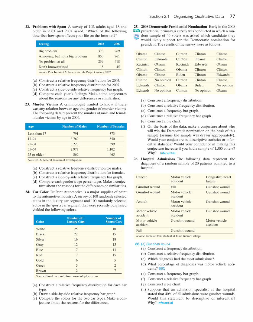
22. Problems with Spam A survey of U.S. adults aged 18 andolder in 2003 and 2007 asked, “Which of the followingdescribes how spam affects your life on the Internet?”
25. 2008 Democratic Presidential Nomination Early in the 2008presidential primary, a survey was conducted in which a ran-dom sample of 40 voters was asked which candidate theywould likely support for the Democratic nomination forpresident. The results of the survey were as follows:Feeling 2003 2007
Big problem 373 269
Annoying, but not a big problem 850 761
No problem at all 239 418
Don’t know/refused 15 45
Source: Pew Internet & American Life Project Survey, 2007
(a) Construct a relative frequency distribution for 2003.(b) Construct a relative frequency distribution for 2007.(c) Construct a side-by-side relative frequency bar graph.(d) Compare each year’s feelings. Make some conjectures
about the reasons for any differences or similarities.
23. Murder Victims A criminologist wanted to know if therewas any relation between age and gender of murder victims.The following data represent the number of male and femalemurder victims by age in 2006.
Age Number of Males Number of Females
Less than 17 791 373
17–24 3,762 550
25–34 3,220 599
35–54 2,977 1,102
55 or older 860 465
Source: U.S. Federal Bureau of Investigation
(a) Construct a relative frequency distribution for males.(b) Construct a relative frequency distribution for females.(c) Construct a side-by-side relative frequency bar graph.(d) Compare each gender’s age percentages. Make a conjec-
ture about the reasons for the differences or similarities.
24. Car Color DuPont Automotive is a major supplier of paintto the automotive industry.A survey of 100 randomly selectedautos in the luxury car segment and 100 randomly selectedautos in the sports car segment that were recently purchasedyielded the following colors.
Number ofLuxury Cars
Number ofSports CarsColor
White 25 10
Black 22 15
Silver 16 18
Gray 12 15
Blue 7 13
Red 7 15
Gold 6 5
Green 3 2
Brown 2 7
Source: Based on results from www.infoplease.com
(a) Construct a relative frequency distribution for each cartype.
(b) Draw a side-by-side relative frequency bar graph.(c) Compare the colors for the two car types. Make a con-
jecture about the reasons for the differences.
Obama Clinton Clinton Clinton Clinton
Clinton Edwards Clinton Obama Clinton
Kucinich Obama Kucinich Edwards Obama
Clinton Clinton Obama Clinton Clinton
Obama Clinton Biden Clinton Edwards
Clinton No opinion Clinton Clinton Clinton
Edwards Clinton Obama Biden No opinion
Edwards No opinion Clinton No opinion Obama
(a) Construct a frequency distribution.(b) Construct a relative frequency distribution.(c) Construct a frequency bar graph.(d) Construct a relative frequency bar graph.(e) Construct a pie chart.(f) On the basis of the data, make a conjecture about who
will win the Democratic nomination on the basis of thissample (assume the sample was drawn appropriately).Would your conjecture be descriptive statistics or infer-ential statistics? Would your confidence in making thisconjecture increase if you had a sample of 1,500 voters?Why? Inferential
26. Hospital Admissions The following data represent thediagnoses of a random sample of 20 patients admitted to ahospital.
(a) Construct a frequency distribution.(b) Construct a relative frequency distribution.(c) Which diagnosis had the most admissions? (d) What percentage of diagnoses was motor vehicle acci-
dents? 35%(e) Construct a frequency bar graph.(f) Construct a relative frequency bar graph.(g) Construct a pie chart.(h) Suppose that an admission specialist at the hospital
stated that 40% of all admissions were gunshot wounds.Would this statement be descriptive or inferential?Why? Inferential
Motor vehicleaccident
Congestive heartfailure
Cancer
Gunshot wound Fall Gunshot wound
Gunshot wound Motor vehicle accident
Gunshot wound
Assault Motor vehicleaccident
Gunshot wound
Motor vehicleaccident
Motor vehicleaccident
Gunshot wound
Motor vehicleaccident
Gunshot wound Motor vehicleaccident
Fall Gunshot wound
Source: Tamela Ohm, student at Joliet Junior College
NW
26. (c) Gunshot wound
M02_SULL8028_03_SE_C02.QXD 9/9/08 6:36 PM Page 77
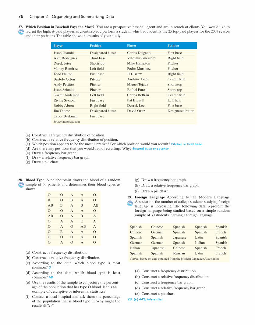
Player Position
Jason Giambi Designated hitter
Alex Rodriguez Third base
Derek Jeter Shortstop
Manny Ramirez Left field
Todd Helton First base
Bartolo Colon Pitcher
Andy Pettitte Pitcher
Jason Schmidt Pitcher
Garret Anderson Left field
Richie Sexson First base
Bobby Abreu Right field
Jim Thome Designated hitter
Lance Berkman First base
78 Chapter 2 Organizing and Summarizing Data
27. Which Position in Baseball Pays the Most? You are a prospective baseball agent and are in search of clients. You would like torecruit the highest-paid players as clients, so you perform a study in which you identify the 25 top-paid players for the 2007 seasonand their positions. The table shows the results of your study.
(a) Construct a frequency distribution.(b) Construct a relative frequency distribution.(c) According to the data, which blood type is most
common? O(d) According to the data, which blood type is least
common? AB(e) Use the results of the sample to conjecture the percent-
age of the population that has type O blood. Is this anexample of descriptive or inferential statistics?
O O A A O
B O B A O
AB B A B AB
O O A A O
AB O A B A
O A A O A
O A O AB A
O B A A O
O O O A O
O A O A O
Spanish Chinese Spanish Spanish Spanish
Chinese German Spanish Spanish French
Spanish Spanish Japanese Latin Spanish
German German Spanish Italian Spanish
Italian Japanese Chinese Spanish French
Spanish Spanish Russian Latin French
Source: Based on data obtained from the Modern Language Association
(a) Construct a frequency distribution of position.(b) Construct a relative frequency distribution of position.(c) Which position appears to be the most lucrative? For which position would you recruit? Pitcher or first base(d) Are there any positions that you would avoid recruiting? Why? Second base or catcher(e) Draw a frequency bar graph.(f) Draw a relative frequency bar graph.(g) Draw a pie chart.
28. Blood Type A phlebotomist draws the blood of a randomsample of 50 patients and determines their blood types asshown:
(g) Draw a frequency bar graph.
(h) Draw a relative frequency bar graph.
(i) Draw a pie chart.
29. Foreign Language According to the Modern LanguageAssociation, the number of college students studying foreignlanguage is increasing. The following data represent theforeign language being studied based on a simple randomsample of 30 students learning a foreign language.
(a) Construct a frequency distribution.
(b) Construct a relative frequency distribution.
(c) Construct a frequency bar graph.
(d) Construct a relative frequency bar graph.
(e) Construct a pie chart.
Source: usatoday.com
28. (e) 44%; inferential(f) Contact a local hospital and ask them the percentage
of the population that is blood type O. Why might theresults differ?
Player Position
Carlos Delgado First base
Vladimir Guerrero Right field
Mike Hampton Pitcher
Pedro Martinez Pitcher
J.D. Drew Right field
Andruw Jones Center field
Miguel Tejada Shortstop
Rafael Furcal Shortstop
Carlos Beltran Center field
Pat Burrell Left field
Derrek Lee First base
David Oritz Designated hitter
M02_SULL8028_03_SE_C02.QXD 9/9/08 6:36 PM Page 78
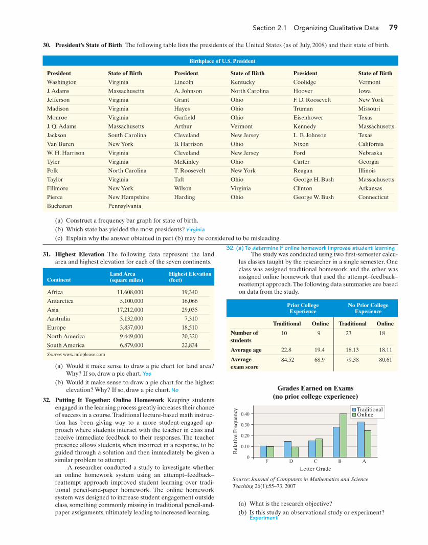
Section 2.1 Organizing Qualitative Data 79
31. Highest Elevation The following data represent the landarea and highest elevation for each of the seven continents.
The study was conducted using two first-semester calcu-lus classes taught by the researcher in a single semester. Oneclass was assigned traditional homework and the other wasassigned online homework that used the attempt–feedback–reattempt approach.The following data summaries are basedon data from the study.
Birthplace of U.S. President
President State of Birth President State of Birth President State of Birth
Washington Virginia Lincoln Kentucky Coolidge Vermont
J. Adams Massachusetts A. Johnson North Carolina Hoover Iowa
Jefferson Virginia Grant Ohio F. D. Roosevelt New York
Madison Virginia Hayes Ohio Truman Missouri
Monroe Virginia Garfield Ohio Eisenhower Texas
J. Q. Adams Massachusetts Arthur Vermont Kennedy Massachusetts
Jackson South Carolina Cleveland New Jersey L. B. Johnson Texas
Van Buren New York B. Harrison Ohio Nixon California
W. H. Harrison Virginia Cleveland New Jersey Ford Nebraska
Tyler Virginia McKinley Ohio Carter Georgia
Polk North Carolina T. Roosevelt New York Reagan Illinois
Taylor Virginia Taft Ohio George H. Bush Massachusetts
Fillmore New York Wilson Virginia Clinton Arkansas
Pierce New Hampshire Harding Ohio George W. Bush Connecticut
Buchanan Pennsylvania
30. President’s State of Birth The following table lists the presidents of the United States (as of July, 2008) and their state of birth.
(a) Construct a frequency bar graph for state of birth.(b) Which state has yielded the most presidents? Virginia(c) Explain why the answer obtained in part (b) may be considered to be misleading.
Land Area(square miles)
Highest Elevation(feet)Continent
Africa 11,608,000 19,340
Antarctica 5,100,000 16,066
Asia 17,212,000 29,035
Australia 3,132,000 7,310
Europe 3,837,000 18,510
North America 9,449,000 20,320
South America 6,879,000 22,834
Source: www.infoplease.com
Prior CollegeExperience
No Prior CollegeExperience
(a) Would it make sense to draw a pie chart for land area?Why? If so, draw a pie chart. Yes
(b) Would it make sense to draw a pie chart for the highestelevation? Why? If so, draw a pie chart. No
32. Putting It Together: Online Homework Keeping studentsengaged in the learning process greatly increases their chanceof success in a course.Traditional lecture-based math instruc-tion has been giving way to a more student-engaged ap-proach where students interact with the teacher in class andreceive immediate feedback to their responses. The teacherpresence allows students, when incorrect in a response, to beguided through a solution and then immediately be given asimilar problem to attempt.
A researcher conducted a study to investigate whetheran online homework system using an attempt–feedback–reattempt approach improved student learning over tradi-tional pencil-and-paper homework. The online homeworksystem was designed to increase student engagement outsideclass, something commonly missing in traditional pencil-and-paper assignments, ultimately leading to increased learning.
Traditional Online Traditional Online
Number ofstudents
10 9 23 18
Average age 22.8 19.4 18.13 18.11
Average exam score
84.52 68.9 79.38 80.61
0.40
0.30
0.10
0.20
0F D C B A
Rel
ativ
e Fr
eque
ncy
Grades Earned on Exams(no prior college experience)
Letter Grade
TraditionalOnline
Source: Journal of Computers in Mathematics and ScienceTeaching 26(1):55–73, 2007
32. (a) To determine if online homework improves student learning
(a) What is the research objective?(b) Is this study an observational study or experiment?
Experiment
M02_SULL8028_03_SE_C02.QXD 9/9/08 10:41 AM Page 79
80 Chapter 2 Organizing and Summarizing Data
the data in a table from A to F would be a better repre-sentation of the data than presenting it in a graph?
(g) What type of graph is displayed?
(c) Give an example of how the researcher attempted tocontrol variables in the study.
(d) Explain why assigning homework type to entirely sepa-rate classes can confound the conclusions of the study.
(e) For the data in the table, (i) identify the variables, (ii) in-dicate whether the variables are qualitative or quantita-tive, and (iii) for each quantitative variable, indicatewhether the variable is discrete or continuous.
(f) What type of variable is letter grade? What level ofmeasurement is letter grade? Do you think presenting
32. (g) Side-by-side relative frequency bar graph
(h) Could the data in the graph be presented in a pie chart?If so, what is the “whole”? If not, why not?
(i) Considering the students with no prior college experi-ence, how might the table and the graph generate con-flicting conclusions?
32. (h) Yes; all students who received a grade in the course
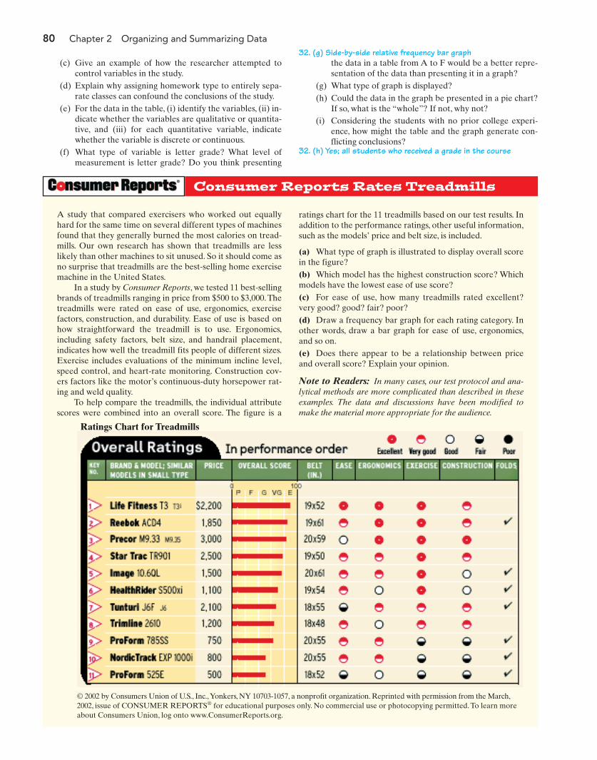
Consumer Reports Rates Treadmills
A study that compared exercisers who worked out equallyhard for the same time on several different types of machinesfound that they generally burned the most calories on tread-mills. Our own research has shown that treadmills are lesslikely than other machines to sit unused. So it should come asno surprise that treadmills are the best-selling home exercisemachine in the United States.
In a study by Consumer Reports, we tested 11 best-sellingbrands of treadmills ranging in price from $500 to $3,000.Thetreadmills were rated on ease of use, ergonomics, exercisefactors, construction, and durability. Ease of use is based onhow straightforward the treadmill is to use. Ergonomics,including safety factors, belt size, and handrail placement,indicates how well the treadmill fits people of different sizes.Exercise includes evaluations of the minimum incline level,speed control, and heart-rate monitoring. Construction cov-ers factors like the motor’s continuous-duty horsepower rat-ing and weld quality.
To help compare the treadmills, the individual attributescores were combined into an overall score. The figure is a
ratings chart for the 11 treadmills based on our test results. Inaddition to the performance ratings, other useful information,such as the models’ price and belt size, is included.
(a) What type of graph is illustrated to display overall scorein the figure?(b) Which model has the highest construction score? Whichmodels have the lowest ease of use score?(c) For ease of use, how many treadmills rated excellent?very good? good? fair? poor?(d) Draw a frequency bar graph for each rating category. Inother words, draw a bar graph for ease of use, ergonomics,and so on.(e) Does there appear to be a relationship between priceand overall score? Explain your opinion.
Note to Readers: In many cases, our test protocol and ana-lytical methods are more complicated than described in theseexamples. The data and discussions have been modified tomake the material more appropriate for the audience.
© 2002 by Consumers Union of U.S., Inc.,Yonkers, NY 10703-1057, a nonprofit organization. Reprinted with permission from the March,2002, issue of CONSUMER REPORTS® for educational purposes only. No commercial use or photocopying permitted. To learn moreabout Consumers Union, log onto www.ConsumerReports.org.
Ratings Chart for Treadmills
M02_SULL8028_03_SE_C02.QXD 9/9/08 10:41 AM Page 80

Section 2.1 Organizing Qualitative Data 81
TI-83/84 PlusThe TI-83 or TI-84 Plus does not have the ability todraw bar graphs or pie charts.
MINITABFrequency or Relative Frequency Distributions from Raw Data
1. Enter the raw data in C1.2. Select Stat and highlight Tables and selectTally Individual Variables3. Fill in the window with appropriate values.In the “Variables” box, enter C1. Check“counts” for a frequency distribution and/or“percents” for a relative frequency distribution.Click OK.
Bar Graphs from Summarized Data
1. Enter the categories in C1 and the frequencyor relative frequency in C2.2. Select Graph and highlight Bar Chart.3. In the “Bars represent” pull-down menu,select “Values from a table” and highlight“Simple.” Press OK.4. Fill in the window with the appropriatevalues. In the “Graph variables” box, enter C2. In the “Categorical variable” box, enter C1. By pressing Labels, you can add a title to the graph. Click OK to obtain the bar graph.
Bar Graphs from Raw Data
1. Enter the raw data in C1.2. Select Graph and highlight Bar Chart.3. In the “Bars represent” pull-down menu,select “Counts of unique values” and highlight“Simple.” Press OK.4. Fill in the window with the appropriatevalues. In the “Categorical variable” box,enter C1. By pressing Labels, you can add a title to the graph. Click OK to obtain the bar graph.
Pie Chart from Raw or Summarized Data
1. If the data are in a summarized table, enterthe categories in C1 and the frequency or
Á
TECHNOLOGY STEP-BY-STEP Drawing Bar Graphs and Pie Charts
relative frequency in C2. If the data are raw,enter the data in C1.2. Select Graph and highlight Pie Chart.3. Fill in the window with the appropriatevalues. If the data are summarized, click the“Chart values from a table” radio button; ifthe data are raw, click the “Chart raw data”radio button. For summarized data, enter C1 in the “Categorical variable” box and C2 in the “Summary variable” box. If the data are raw, enter C1 in the “Categoricalvariable” box. By pressing Labels, you canadd a title to the graph. Click OK to obtainthe pie chart.
ExcelBar Graphs from Summarized Data
1. Enter the categories in column A and the frequency or relative frequency in column B.2. Select the chart wizard icon. Click the“column” chart type. Select the chart type inthe upper-left corner and hit “Next.”3. Click inside the data range cell. Use themouse to highlight the data to be graphed.Click “Next.”4. Click the “Titles” tab to enter x-axis, y-axis,and chart titles. Click “Finish.”
Pie Charts from Summarized Data
1. Enter the categories in column A and the frequencies in column B. Select the chart wizard icon and click the “pie” charttype. Select the pie chart in the upper-leftcorner.2. Click inside the data range cell. Use themouse to highlight the data to be graphed.Click “Next.”3. Click the “Titles” tab to the chart title. Clickthe “Data Labels” tab and select “Show labeland percent.” Click “Finish.”
M02_SULL8028_03_SE_C02.QXD 9/9/08 10:41 AM Page 81

82 Chapter 2 Organizing and Summarizing Data
Note to InstructorIf you like, you can print out and distrib-ute the Preparing for This Section quizlocated in the Instructor’s Resource Cen-ter. The purpose is to verify the studentshave the prerequisite knowledge for thissection.
Note to InstructorRemind students of the differences be-tween discrete and continuous data.
2.2 ORGANIZING QUANTITATIVE DATA: THE POPULAR DISPLAYS
Preparing for This Section Before getting started, review the following:
• Quantitative variable (Section 1.1, pp. 7–8) • Discrete variable (Section 1.1, pp. 8–9)
• Continuous variable (Section 1.1, pp. 8–9)
Objectives 1 Organize discrete data in tables2 Construct histograms of discrete data3 Organize continuous data in tables4 Construct histograms of continuous data5 Draw stem-and-leaf plots6 Draw dot plots7 Identify the shape of a distribution
In summarizing quantitative data, we first determine whether the data are dis-crete or continuous. If the data are discrete and there are relatively few differentvalues of the variable, then the categories of data (called classes) will be the ob-servations (as in qualitative data). If the data are discrete, but there are many dif-ferent values of the variables or if the data are continuous, then the categories ofdata (the classes) must be created using intervals of numbers. We will first presentthe techniques required to organize discrete quantitative data when there arerelatively few different values and then proceed to organizing continuous quanti-tative data.
1 Organize Discrete Data in TablesWe use the values of a discrete variable to create the classes when the number ofdistinct data values is small.
EXAMPLE 1 Constructing Frequency and Relative FrequencyDistributions from Discrete Data
Problem: The manager of a Wendy’s fast-food restaurant is interested in studyingthe typical number of customers who arrive during the lunch hour. The data inTable 8 represent the number of customers who arrive at Wendy’s for 40 randomlyselected 15-minute intervals of time during lunch. For example, during one 15-minute interval, seven customers arrived. Construct a frequency and relativefrequency distribution.
Table 8
Number of Arrivals at Wendy’s
7 6 6 6 4 6 2 6
5 6 6 11 4 5 7 6
2 7 1 2 4 8 2 6
6 5 5 3 7 5 4 6
2 2 9 7 5 9 8 5
Approach: The number of people arriving could be 0, 1, 2, 3, From Table 8, wesee that there are 11 categories of data from this study: 1, 2, 3, 11. We tally theÁ ,
Á .
M02_SULL8028_03_SE_C02.QXD 9/9/08 10:41 AM Page 82
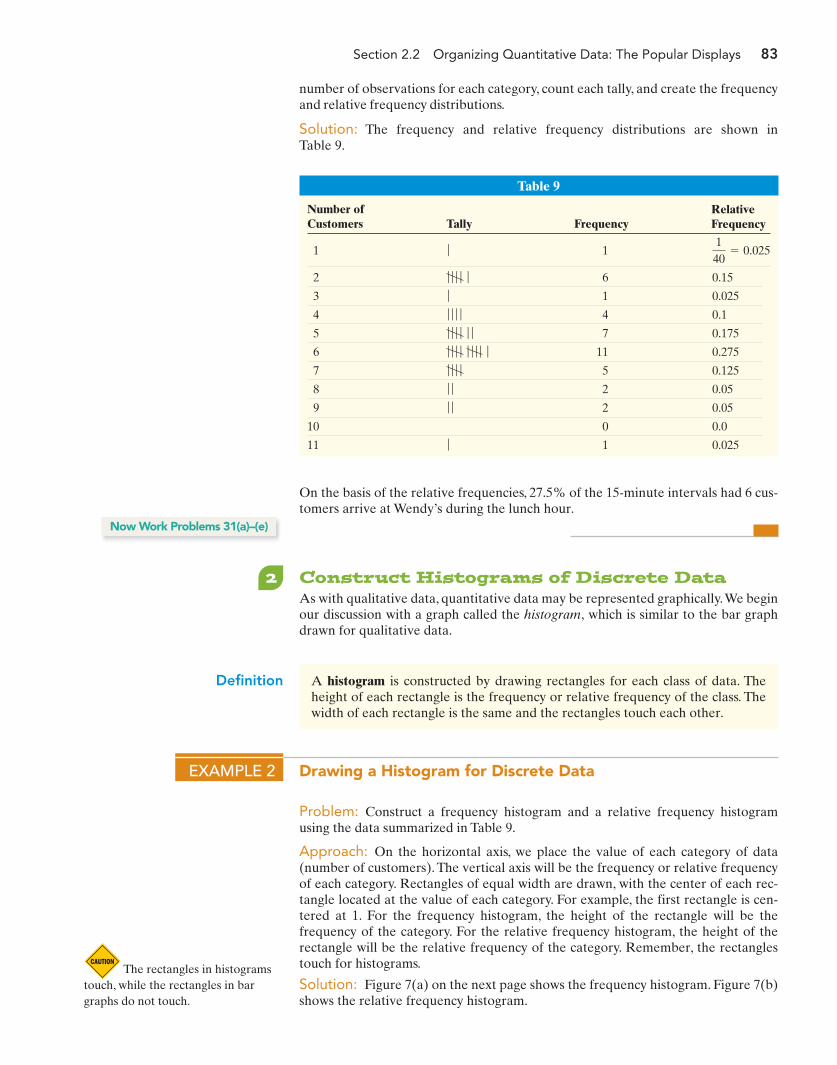
Section 2.2 Organizing Quantitative Data: The Popular Displays 83
number of observations for each category, count each tally, and create the frequencyand relative frequency distributions.
Solution: The frequency and relative frequency distributions are shown inTable 9.
1 1
2 6 0.15
3 1 0.025
4 4 0.1
5 7 0.175
6 11 0.275
7 5 0.125
8 2 0.05
9 2 0.05
10 0 0.0
11 1 0.025ƒ
ƒ ƒ
ƒ ƒ
ƒ ƒ ƒ ƒ
ƒ ƒ ƒ ƒ ƒ ƒ ƒ ƒ ƒ
ƒ ƒ ƒ ƒ ƒ ƒ
ƒ ƒ ƒ ƒ
ƒ
ƒ ƒ ƒ ƒ ƒ
140
= 0.025ƒ
Table 9
Number of Customers Tally Frequency
RelativeFrequency
On the basis of the relative frequencies, 27.5% of the 15-minute intervals had 6 cus-tomers arrive at Wendy’s during the lunch hour.
2 Construct Histograms of Discrete DataAs with qualitative data, quantitative data may be represented graphically.We beginour discussion with a graph called the histogram, which is similar to the bar graphdrawn for qualitative data.
Definition A histogram is constructed by drawing rectangles for each class of data. Theheight of each rectangle is the frequency or relative frequency of the class. Thewidth of each rectangle is the same and the rectangles touch each other.
Now Work Problems 31(a)–(e)
EXAMPLE 2 Drawing a Histogram for Discrete Data
Problem: Construct a frequency histogram and a relative frequency histogramusing the data summarized in Table 9.
Approach: On the horizontal axis, we place the value of each category of data(number of customers). The vertical axis will be the frequency or relative frequencyof each category. Rectangles of equal width are drawn, with the center of each rec-tangle located at the value of each category. For example, the first rectangle is cen-tered at 1. For the frequency histogram, the height of the rectangle will be thefrequency of the category. For the relative frequency histogram, the height of therectangle will be the relative frequency of the category. Remember, the rectanglestouch for histograms.
Solution: Figure 7(a) on the next page shows the frequency histogram. Figure 7(b)shows the relative frequency histogram.
The rectangles in histogramstouch, while the rectangles in bargraphs do not touch.
M02_SULL8028_03_SE_C02.QXD 9/9/08 10:41 AM Page 83

84 Chapter 2 Organizing and Summarizing Data
Freq
uenc
y
Arrivals at Wendy’s
Number of Customers
(a)
10
2
4
6
8
10
12
2 3 4 5 6 7 8 9 10 11
Rel
ativ
e Fr
eque
ncy
Arrivals at Wendy’s
Number of Customers
(b)
10
0.05
0.1
0.15
0.2
0.25
0.3
2 3 4 5 6 7 8 9 10 11
Figure 7
Table 10
AgeNumber (in thousands)
25–34 11,806
35–44 13,387
45–54 12,571
55–64 9,035
65–74 3,953
Source: Current Population Survey, 2006
Now Work Problems 31(f)–(g)
3 Organize Continuous Data in TablesClasses are the categories by which data are grouped. When a data set consists of arelatively small number of different discrete data values, the classes for the corre-sponding frequency distribution are predetermined to be those data values (as inExample 1). However, when a data set consists of a large number of differentdiscrete data values or when a data set consists of continuous data, then no suchpredetermined classes exist. Therefore, the classes must be created by using inter-vals of numbers.
Table 10 is a typical frequency distribution created from continuous data. Thedata represent the number of U.S. residents between the ages of 25 and 74 who haveearned a bachelor’s degree or higher. The data are based on the Current PopulationSurvey conducted in 2006.
In the table, we notice that the data are categorized, or grouped, by intervals ofnumbers. Each interval represents a class. For example, the first class is 25- to 34-year-old residents of the United States who have a bachelor’s degree or higher.We read this interval as follows: “The number of residents of the United States in2006 who were between 25 and 34 years of age and have a bachelor’s degree orhigher was 11,806,000.” There are five classes in the table, each with a lower classlimit and an upper class limit. The lower class limit of a class is the smallest valuewithin the class, while the upper class limit of a class is the largest value within theclass. The lower class limit for the first class in Table 10 is 25; the upper class limit is34. The class width is the difference between consecutive lower class limits. Theclass width for the data in Table 10 is
Notice that the classes in Table 10 do not overlap.This is necessary to avoid con-fusion as to which class a data value belongs. Notice also that the class widths areequal for all classes. One exception to this requirement is in open-ended tables. Atable is open ended if the first class has no lower class limit or the last class does nothave an upper class limit. The data in Table 11 represent the number of personsunder sentence of death as of December 31, 2006, in the United States.The last classin the table, “60 and older,” is open ended.
35 - 25 = 10.
Table 11
Age Number
20–29 382
30–39 1,078
40–49 1,122
50–59 535
60 and older 137
Source: U.S. Justice Department
In Other WordsFor qualitative and many discrete data,the classes are formed by using thedata. For continuous data, the classesare formed by using intervals of numbers,such as 30–39.
EXAMPLE 3 Organizing Continuous Data into a Frequency and Relative Frequency Distribution
Problem: Suppose you are considering investing in a Roth IRA. You collect thedata in Table 12, which represent the 3-year rate of return (in percent, adjusted forsales charges) for a simple random sample of 40 small-capitalization growth mutualfunds. Construct a frequency and relative frequency distribution of the data.
Approach: To construct a frequency distribution, we first create classes of equalwidth. There are 40 observations in Table 12, and they range from 10.06 to 23.76, so
M02_SULL8028_03_SE_C02.QXD 9/9/08 10:41 AM Page 84

we decide to create the classes such that the lower class limit of the first class is 10(a little smaller than the smallest data value) and the class width is 2. There is noth-ing magical about the choice of 2 as a class width. We could have selected a classwidth of 8 (or any other class width, as well). We choose a class width that we thinkwill nicely summarize the data. If our choice doesn’t accomplish this, we can alwaystry another one. The lower class limit of the second class will be Because the classes must not overlap, the upper class limit of the first class is 11.99.Continuing in this fashion, we obtain the following classes:
This gives us seven classes. We tally the number of observations in each class,count the tallies, and create the frequency distribution.The relative frequency distri-bution would be created by dividing each class’s frequency by 40, the number ofobservations.
Solution: We tally the data as shown in the second column of Table 13. The thirdcolumn in the table shows the frequency of each class. From the frequency distribu-tion, we conclude that a 3-year rate of return between 12% and 13.99% occurs withthe most frequency. The fourth column in the table shows the relative frequency ofeach class. So, 35% of the small-capitalization growth mutual funds had a 3-year rateof return between 12% and 13.99%.
10 - 11.9912 - 13.99
o
22 - 23.99
10 + 2 = 12.
Table 12
Three-Year Rate of Return of Mutual Funds (as of 10/31/07)
13.50 13.16 10.53 14.74 13.20 12.24 12.61 19.11
14.47 12.29 13.92 16.16 12.07 10.99 15.07 10.06
14.14 12.77 19.74 12.76 13.34 11.32 15.41 17.37
13.51 15.44 15.10 17.13 12.37 16.34 11.34 10.57
15.70 13.28 23.76 22.68 14.81 23.54 19.65 14.07
Source: TD Ameritrade
Section 2.2 Organizing Quantitative Data: The Popular Displays 85
Watch out for tables with classwidths that overlap, such as a firstclass of 20–30 and a second class of30–40.
Historical Note
Florence Nightingale wasborn in Italy on May 12, 1820. She wasnamed after the city of her birth.Nightingale was educated by herfather, who attended CambridgeUniversity.Between 1849 and 1851,shestudied nursing throughout Europe.In1854, she was asked to oversee theintroduction of female nurses into themilitary hospitals in Turkey. Whilethere, she greatly improved themortality rate of wounded soldiers.Shecollected data and invented graphs(the polar area diagram), tables, andcharts to show that improving sanitaryconditions would lead to decreasedmortality rates. In 1869, Nightingalefounded the Nightingale School Homefor Nurses. After a long and eventfullife as a reformer of health care andcontributor to graphics in statistics,Florence Nightingale died onAugust 13, 1910.
10–11.99 6
12–13.99 14
14–15.99 10
16–17.99 4 0.1
18–19.99 3 0.075
20–21.99 0 0
22–23.99 3 0.075ƒ ƒ ƒ
ƒ ƒ ƒ
ƒ ƒ ƒ ƒ
10/40 = 0.25ƒ ƒ ƒ ƒ ƒ ƒ ƒ ƒ
14/40 = 0.35ƒ ƒ ƒ ƒ ƒ ƒ ƒ ƒ ƒ ƒ ƒ ƒ
6/40 = 0.15ƒ ƒ ƒ ƒ ƒ
Table 13
Class (3-yearrate of return) Tally Frequency
RelativeFrequency
Three mutual funds had 3-year rates of return between 22% and 23.99%. Wemight consider these mutual funds worthy of our investment. This type of informa-tion would be more difficult to obtain from the raw data.
The choices of the lower class limit of the first class and the class width wererather arbitrary. Though formulas and procedures exist for creating frequency
M02_SULL8028_03_SE_C02.QXD 9/9/08 10:41 AM Page 85
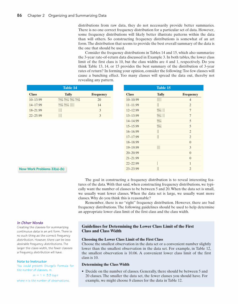
86 Chapter 2 Organizing and Summarizing Data
Table 15
Class Tally Frequency
10–10.99 4
11–11.99 2
12–12.99 7
13–13.99 7
14–14.99 5
15–15.99 5
16–16.99 2
17–17.99 2
18–18.99 0
19–19.99 3
20–20.99 0
21–21.99 0
22–22.99 1
23–23.99 2ƒ ƒ
ƒ
ƒ ƒ ƒ
ƒ ƒ
ƒ ƒ
ƒ ƒ ƒ ƒ
ƒ ƒ ƒ ƒ
ƒ ƒ ƒ ƒ ƒ ƒ
ƒ ƒ ƒ ƒ ƒ ƒ
ƒ ƒ
ƒ ƒ ƒ ƒ
Note to InstructorYou could present Sturge’s Formula forthe number of classes, m.
where n is the number of observations.m = 1 + 3.3 log n
In Other WordsCreating the classes for summarizingcontinuous data is an art form. There isno such thing as the correct frequencydistribution. However, there can be lessdesirable frequency distributions. Thelarger the class width, the fewer classesa frequency distribution will have.
distributions from raw data, they do not necessarily provide better summaries.There is no one correct frequency distribution for a particular set of data. However,some frequency distributions will likely better illustrate patterns within the datathan will others. So constructing frequency distributions is somewhat of an artform.The distribution that seems to provide the best overall summary of the data isthe one that should be used.
Consider the frequency distributions in Tables 14 and 15, which also summarizethe 3-year rate-of-return data discussed in Example 3. In both tables, the lower classlimit of the first class is 10, but the class widths are 4 and 1, respectively. Do youthink Table 13, 14, or 15 provides the best summary of the distribution of 3-yearrates of return? In forming your opinion, consider the following:Too few classes willcause a bunching effect. Too many classes will spread the data out, thereby notrevealing any pattern.
Table 14
Class Tally Frequency
10–13.99 20
14–17.99 14
18–21.99 3
22–25.99 3ƒ ƒ ƒ
ƒ ƒ ƒ
ƒ ƒ ƒ ƒ ƒ ƒ ƒ ƒ ƒ ƒ ƒ ƒ
ƒ ƒ ƒ ƒ ƒ ƒ ƒ ƒ ƒ ƒ ƒ ƒ ƒ ƒ ƒ ƒ
The goal in constructing a frequency distribution is to reveal interesting fea-tures of the data. With that said, when constructing frequency distributions, we typi-cally want the number of classes to be between 5 and 20. When the data set is small,we usually want fewer classes. When the data set is large, we usually want moreclasses. Why do you think this is reasonable?
Remember, there is no “right” frequency distribution. However, there are badfrequency distributions. The following guidelines should be used to help determinean appropriate lower class limit of the first class and the class width.
Now Work Problems 33(a)–(b)
Guidelines for Determining the Lower Class Limit of the FirstClass and Class Width
Choosing the Lower Class Limit of the First ClassChoose the smallest observation in the data set or a convenient number slightlylower than the smallest observation in the data set. For example, in Table 12,the smallest observation is 10.06. A convenient lower class limit of the firstclass is 10.
Determining the Class Width
• Decide on the number of classes. Generally, there should be between 5 and20 classes. The smaller the data set, the fewer classes you should have. Forexample, we might choose 8 classes for the data in Table 12.
M02_SULL8028_03_SE_C02.QXD 9/9/08 10:41 AM Page 86

Section 2.2 Organizing Quantitative Data: The Popular Displays 87
Freq
uenc
y
Return
(a)
100
2
4
6
8
10
12
Three-Year Rate of Returnfor Small Capitalization
Mutual Funds
14
12 14 16 18 20 22 24
Rel
ativ
e Fr
eque
ncy
Return
(b)
100
0.05
0.10
0.15
0.20
0.25
0.30
Three-Year Rate of Returnfor Small Capitalization
Mutual Funds
0.35
12 14 16 18 20 22 24
Figure 8
Using these guidelines, we would end up with the frequency distribution shownin Table 13.
In Other WordsRounding up is different from roundingoff. For example, 6.2 rounded up wouldbe 7, while 6.2 rounded off would be 6.
• Determine the class width by computing
Round this value up to a convenient number. For example, using the data in
Table 12, we obtain . We would round
this up to 2 because this is an easy number to work with. Rounding up mayresult in fewer classes than were originally intended.
class width L 23 .76 - 10.06
8= 1.7125
Class width L
largest data value - smallest data valuenumber of classes
Now Work Problems 37(a)–(c)
4 Construct Histograms of Continuous DataWe are now ready to draw histograms of continuous data.
EXAMPLE 5 Drawing a Histogram for Continuous Data Using Technology
Problem: Construct a frequency and relative frequency histogram of the 3-yearrate-of-return data discussed in Example 3.
Approach: We will use MINITAB to construct the frequency and relative fre-quency histograms. The steps for constructing the graphs using the TI-83/84 Plus
Note to InstructorHave students think about the factorsto consider in determining an appropriateclass width. Are there any ways that ahistogram can be used to distort thedata?
EXAMPLE 4 Drawing a Histogram of Continuous Data
Problem: Construct a frequency and relative frequency histogram of the 3-yearrate-of-return data discussed in Example 3.
Approach: To draw the frequency histogram, we will use the frequency distribu-tion in Table 13. We label the lower class limits of each class on the horizontal axis.Then, for each class, we draw a rectangle whose width is the class width and whoseheight is the frequency. To construct the relative frequency histogram, we let theheight of the rectangle be the relative frequency, instead of the frequency.
Solution: Figure 8(a) represents the frequency histogram, and Figure 8(b) repre-sents the relative frequency histogram.
M02_SULL8028_03_SE_C02.QXD 9/9/08 10:41 AM Page 87
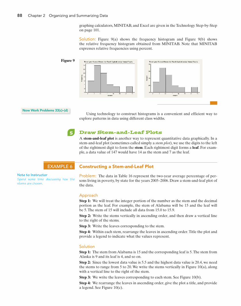
88 Chapter 2 Organizing and Summarizing Data
graphing calculators, MINITAB, and Excel are given in the Technology Step-by-Stepon page 101.
Solution: Figure 9(a) shows the frequency histogram and Figure 9(b) showsthe relative frequency histogram obtained from MINITAB. Note that MINITABexpresses relative frequencies using percent.
Note to InstructorSpend some time discussing how thestems are chosen.
Figure 9
Using technology to construct histograms is a convenient and efficient way toexplore patterns in data using different class widths.
Now Work Problems 33(c)–(d)
5 Draw Stem-and-Leaf PlotsA stem-and-leaf plot is another way to represent quantitative data graphically. In astem-and-leaf plot (sometimes called simply a stem plot), we use the digits to the leftof the rightmost digit to form the stem. Each rightmost digit forms a leaf. For exam-ple, a data value of 147 would have 14 as the stem and 7 as the leaf.
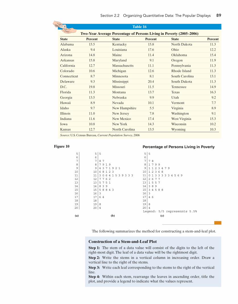
EXAMPLE 6 Constructing a Stem-and-Leaf Plot
Problem: The data in Table 16 represent the two-year average percentage of per-sons living in poverty, by state for the years 2005–2006. Draw a stem-and-leaf plot ofthe data.
ApproachStep 1: We will treat the integer portion of the number as the stem and the decimalportion as the leaf. For example, the stem of Alabama will be 15 and the leaf willbe 5. The stem of 15 will include all data from 15.0 to 15.9.
Step 2: Write the stems vertically in ascending order, and then draw a vertical lineto the right of the stems.
Step 3: Write the leaves corresponding to the stem.
Step 4: Within each stem, rearrange the leaves in ascending order.Title the plot andprovide a legend to indicate what the values represent.
SolutionStep 1: The stem from Alabama is 15 and the corresponding leaf is 5.The stem fromAlaska is 9 and its leaf is 4, and so on.
Step 2: Since the lowest data value is 5.5 and the highest data value is 20.4, we needthe stems to range from 5 to 20. We write the stems vertically in Figure 10(a), alongwith a vertical line to the right of the stem.
Step 3: We write the leaves corresponding to each stem. See Figure 10(b).
Step 4: We rearrange the leaves in ascending order, give the plot a title, and providea legend. See Figure 10(c).
M02_SULL8028_03_SE_C02.QXD 9/9/08 10:41 AM Page 88
Section 2.2 Organizing Quantitative Data: The Popular Displays 89
567891011121314151617181920
5
8 77 9 1 94 3 7 1 9 2 16 8 1 2 33 0 6 4 1 5 3 9 3 3 37 7 6 25 7 5 18 3 95 8 8 4 336 4
84
567891011121314151617181920
5
7 81 7 9 91 1 2 3 4 7 91 2 3 6 80 1 3 3 3 3 3 4 5 6 92 6 7 71 5 5 73 8 93 4 5 8 834 6
84
567891011121314151617181920
(a) (b) (c)
Percentage of Persons Living in Poverty
Legend: 5/5 represennts 5.5%
Figure 10
The following summarizes the method for constructing a stem-and-leaf plot.
Table 16
Two-Year Average Percentage of Persons Living in Poverty (2005–2006)State Percent State Percent State Percent
Alabama 15.5 Kentucky 15.8 North Dakota 11.3
Alaska 9.4 Louisiana 17.6 Ohio 12.2
Arizona 14.8 Maine 11.4 Oklahoma 15.4
Arkansas 15.8 Maryland 9.1 Oregon 11.9
California 12.7 Massachusetts 11.1 Pennsylvania 11.3
Colorado 10.6 Michigan 12.6 Rhode Island 11.3
Connecticut 8.7 Minnesota 8.1 South Carolina 13.1
Delaware 9.3 Mississippi 20.4 South Dakota 11.3
D.C. 19.8 Missouri 11.5 Tennessee 14.9
Florida 11.3 Montana 13.7 Texas 16.3
Georgia 13.5 Nebraska 9.9 Utah 9.2
Hawaii 8.9 Nevada 10.1 Vermont 7.7
Idaho 9.7 New Hampshire 5.5 Virginia 8.9
Illinois 11.0 New Jersey 7.8 Washington 9.1
Indiana 11.6 New Mexico 17.4 West Virginia 15.3
Iowa 10.8 New York 14.3 Wisconsin 10.2
Kansas 12.7 North Carolina 13.5 Wyoming 10.3
Source: U.S. Census Bureau, Current Population Survey, 2006
Construction of a Stem-and-Leaf PlotStep 1: The stem of a data value will consist of the digits to the left of theright-most digit. The leaf of a data value will be the rightmost digit.Step 2: Write the stems in a vertical column in increasing order. Draw avertical line to the right of the stems.Step 3: Write each leaf corresponding to the stems to the right of the verticalline.Step 4: Within each stem, rearrange the leaves in ascending order, title theplot, and provide a legend to indicate what the values represent.
M02_SULL8028_03_SE_C02.QXD 9/9/08 10:41 AM Page 89
90 Chapter 2 Organizing and Summarizing Data
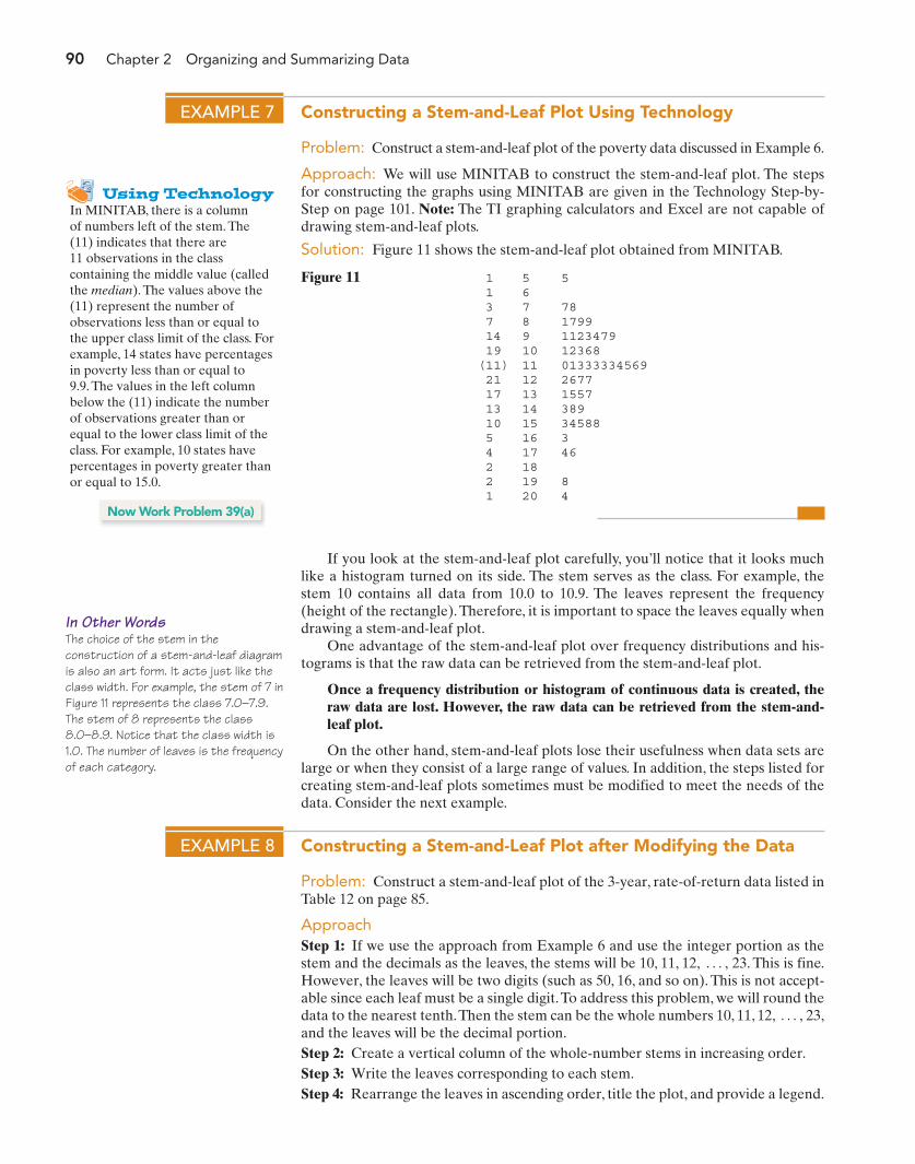
In Other WordsThe choice of the stem in theconstruction of a stem-and-leaf diagramis also an art form. It acts just like theclass width. For example, the stem of 7 inFigure 11 represents the class 7.0–7.9.The stem of 8 represents the class8.0–8.9. Notice that the class width is1.0. The number of leaves is the frequencyof each category.
Using TechnologyIn MINITAB, there is a columnof numbers left of the stem. The(11) indicates that there are11 observations in the classcontaining the middle value (calledthe median). The values above the(11) represent the number ofobservations less than or equal tothe upper class limit of the class. Forexample, 14 states have percentagesin poverty less than or equal to9.9. The values in the left columnbelow the (11) indicate the numberof observations greater than orequal to the lower class limit of theclass. For example, 10 states havepercentages in poverty greater thanor equal to 15.0.
If you look at the stem-and-leaf plot carefully, you’ll notice that it looks muchlike a histogram turned on its side. The stem serves as the class. For example, thestem 10 contains all data from 10.0 to 10.9. The leaves represent the frequency(height of the rectangle). Therefore, it is important to space the leaves equally whendrawing a stem-and-leaf plot.
One advantage of the stem-and-leaf plot over frequency distributions and his-tograms is that the raw data can be retrieved from the stem-and-leaf plot.
Once a frequency distribution or histogram of continuous data is created, theraw data are lost. However, the raw data can be retrieved from the stem-and-leaf plot.
On the other hand, stem-and-leaf plots lose their usefulness when data sets arelarge or when they consist of a large range of values. In addition, the steps listed forcreating stem-and-leaf plots sometimes must be modified to meet the needs of thedata. Consider the next example.
1 1 3 7 14 19(11) 21 17 13 10 5 4 2 2 1
567891011121314151617181920
5
781799112347912368013333345692677155738934588346
84
Figure 11
EXAMPLE 7 Constructing a Stem-and-Leaf Plot Using Technology
Problem: Construct a stem-and-leaf plot of the poverty data discussed in Example 6.
Approach: We will use MINITAB to construct the stem-and-leaf plot. The stepsfor constructing the graphs using MINITAB are given in the Technology Step-by-Step on page 101. Note: The TI graphing calculators and Excel are not capable ofdrawing stem-and-leaf plots.
Solution: Figure 11 shows the stem-and-leaf plot obtained from MINITAB.
Now Work Problem 39(a)
EXAMPLE 8 Constructing a Stem-and-Leaf Plot after Modifying the Data
Problem: Construct a stem-and-leaf plot of the 3-year, rate-of-return data listed inTable 12 on page 85.
ApproachStep 1: If we use the approach from Example 6 and use the integer portion as thestem and the decimals as the leaves, the stems will be 10, 11, 12, 23. This is fine.However, the leaves will be two digits (such as 50, 16, and so on). This is not accept-able since each leaf must be a single digit.To address this problem, we will round thedata to the nearest tenth.Then the stem can be the whole numbers 10, 11, 12, 23,and the leaves will be the decimal portion.Step 2: Create a vertical column of the whole-number stems in increasing order.Step 3: Write the leaves corresponding to each stem.Step 4: Rearrange the leaves in ascending order, title the plot, and provide a legend.
Á ,
Á ,
M02_SULL8028_03_SE_C02.QXD 9/9/08 10:41 AM Page 90

Section 2.2 Organizing Quantitative Data: The Popular Displays 91
SolutionStep 1: We round the data to the nearest tenth as shown in Table 17.
Table 17
13.5 13.2 10.5 14.7 13.2 12.2 12.6 19.1
14.5 12.3 13.9 16.2 12.1 11.0 15.1 10.1
14.1 12.8 19.7 12.8 13.3 11.3 15.4 17.4
13.5 15.4 15.1 17.1 12.4 16.3 11.3 10.6
15.7 13.3 23.8 22.7 14.8 23.5 19.7 14.1
Step 2: Write the stems vertically in ascending order as shown in Figure 12(a).Step 3: Write the leaves corresponding to each stem as shown in Figure 12(b).Step 4: Rearrange the leaves in ascending order, title the plot, and provide a legendas shown in Figure 12(c).
1011121314151617181920212223
1011121314151617181920212223
1011121314151617181920212223
5 1 60 3 32 6 3 1 8 8 45 2 2 9 3 5 37 5 1 8 11 4 4 1 72 34 1
1 7 7
78 5
1 5 60 3 31 2 3 4 6 8 82 2 3 3 5 5 91 1 5 7 8 1 1 4 4 72 31 4
1 7 7
75 8
(a) (b) (c)
Three-Year Rate of Return of Mutual Funds
Legend: 10|1 represents 10.1%
Figure 12
Note that altering the data to construct the graph in Figure 12(c) means that welose the benefit of being able to retrieve the original data (though we can retrieve thealtered data).A second limitation appearing in Example 8 is that we were effectivelyforced to use a “class width” of 1.0 even though a larger “width” may be more desir-able. This illustrates that we must weigh the advantages against the disadvantageswhen determining the type of graph to use in constructing our data summaries.
Split StemsConsider the data shown in Table 18. The data range from 11 to 48. If we draw astem-and-leaf plot using the tens digit as the stem and the ones digit as the leaf, weobtain the result shown in Figure 13. The data appear rather bunched. To resolvethis problem, we can use split stems. For example, rather than using one stem for theclass of data 10–19, we could use two stems, one for the 10–14 interval and thesecond for the 15–19 interval. We do this in Figure 14.
Note to InstructorDiscuss the similarities and differencesof histograms and stem-and-leaf dia-grams. Remind students that they candetermine the shape of the distributionjust as they did with histograms, by turn-ing the stem-and-leaf plot on its side.
Table 18
27 17 11 24 36
13 29 22 18 17
23 30 12 46 17
32 48 11 18 23
18 32 26 24 38
24 15 13 31 22
18 21 27 20 16
15 37 19 19 29
1 1 2 3 3 5 5 6 7 7 7 8 8 8 8 9 90 1 2 2 3 3 4 4 4 6 7 7 9 90 1 2 2 6 7 86 8
Legend: 1|1 represents 11
1234
Figure 13
1 1 2 3 35 5 6 7 7 7 8 8 8 8 9 90 1 2 2 3 3 4 4 46 7 7 9 90 1 2 26 7 8
6 8
11223344
Legend: 1|1 represents 11
Figure 14
In Other WordsStem-and-leaf plots are best used whenthe data set is small and the range ofvalues is not too wide.
In Other WordsUsing split stems is like adding moreclasses to a frequency distribution.
M02_SULL8028_03_SE_C02.QXD 9/9/08 10:41 AM Page 91
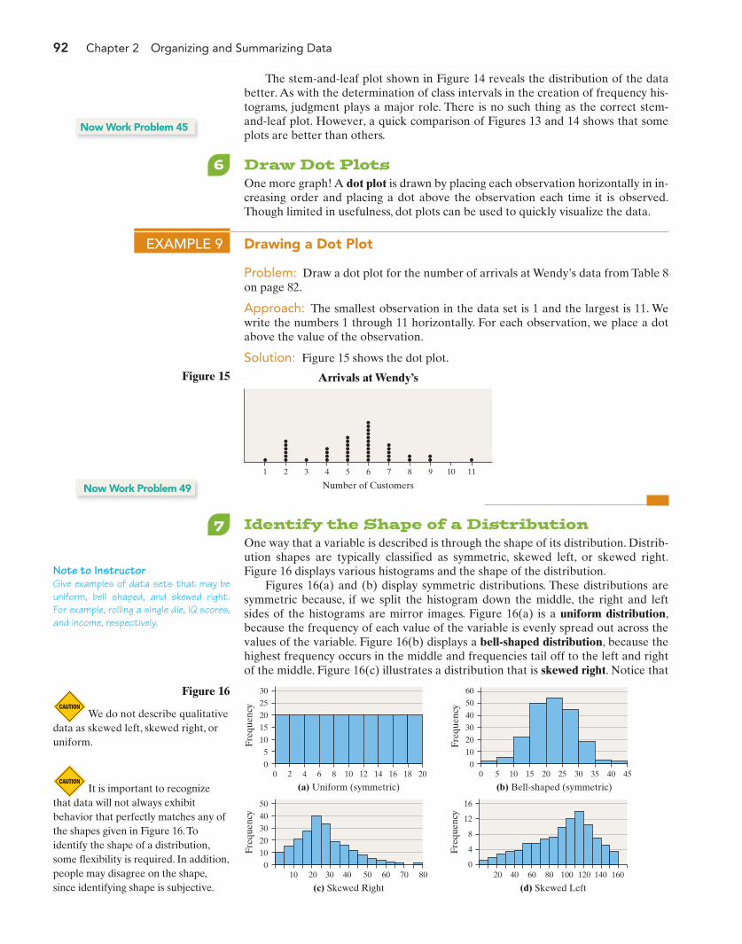
92 Chapter 2 Organizing and Summarizing Data
Note to InstructorGive examples of data sets that may beuniform, bell shaped, and skewed right.For example, rolling a single die, IQ scores,and income, respectively.
We do not describe qualitativedata as skewed left, skewed right, oruniform.
It is important to recognizethat data will not always exhibitbehavior that perfectly matches any ofthe shapes given in Figure 16.Toidentify the shape of a distribution,some flexibility is required. In addition,people may disagree on the shape,since identifying shape is subjective.
The stem-and-leaf plot shown in Figure 14 reveals the distribution of the databetter. As with the determination of class intervals in the creation of frequency his-tograms, judgment plays a major role. There is no such thing as the correct stem-and-leaf plot. However, a quick comparison of Figures 13 and 14 shows that someplots are better than others.
Now Work Problem 45
6 Draw Dot PlotsOne more graph! A dot plot is drawn by placing each observation horizontally in in-creasing order and placing a dot above the observation each time it is observed.Though limited in usefulness, dot plots can be used to quickly visualize the data.
EXAMPLE 9 Drawing a Dot Plot
Problem: Draw a dot plot for the number of arrivals at Wendy’s data from Table 8on page 82.
Approach: The smallest observation in the data set is 1 and the largest is 11. Wewrite the numbers 1 through 11 horizontally. For each observation, we place a dotabove the value of the observation.
Solution: Figure 15 shows the dot plot.
2 431 75 96 8 10 11
Number of Customers
Arrivals at Wendy’sFigure 15
Now Work Problem 49
7 Identify the Shape of a DistributionOne way that a variable is described is through the shape of its distribution. Distrib-ution shapes are typically classified as symmetric, skewed left, or skewed right.Figure 16 displays various histograms and the shape of the distribution.
Figures 16(a) and (b) display symmetric distributions. These distributions aresymmetric because, if we split the histogram down the middle, the right and leftsides of the histograms are mirror images. Figure 16(a) is a uniform distribution,because the frequency of each value of the variable is evenly spread out across thevalues of the variable. Figure 16(b) displays a bell-shaped distribution, because thehighest frequency occurs in the middle and frequencies tail off to the left and rightof the middle. Figure 16(c) illustrates a distribution that is skewed right. Notice that
30
25
20
15
10
5
0
Freq
uenc
y
60
50
40
30
20
10
0
Freq
uenc
y
20 4 6 8 10 12 14 16 18 20
(a) Uniform (symmetric)0 5 10 15 20 25 30 35 40 45
(b) Bell-shaped (symmetric)
Figure 16
Freq
uenc
y
Freq
uenc
y
50
40
30
20
10
010 20 30 40 60 8050 70 20 40 60 100 140 16080 120
(c) Skewed Right
16
12
8
4
0
(d) Skewed Left
M02_SULL8028_03_SE_C02.QXD 9/9/08 10:41 AM Page 92
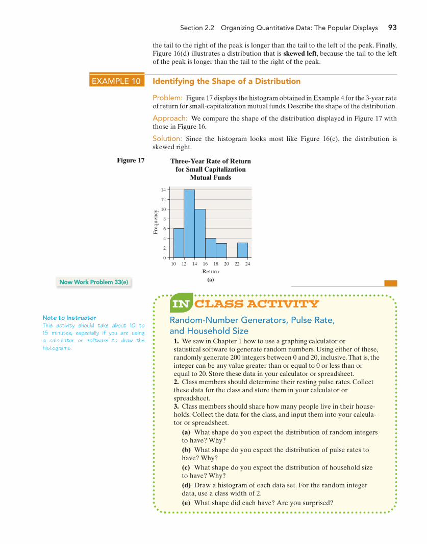
Section 2.2 Organizing Quantitative Data: The Popular Displays 93
Note to InstructorThis activity should take about 10 to15 minutes, especially if you are usinga calculator or software to draw thehistograms.
the tail to the right of the peak is longer than the tail to the left of the peak. Finally,Figure 16(d) illustrates a distribution that is skewed left, because the tail to the leftof the peak is longer than the tail to the right of the peak.
EXAMPLE 10 Identifying the Shape of a Distribution
Problem: Figure 17 displays the histogram obtained in Example 4 for the 3-year rateof return for small-capitalization mutual funds. Describe the shape of the distribution.
Approach: We compare the shape of the distribution displayed in Figure 17 withthose in Figure 16.
Solution: Since the histogram looks most like Figure 16(c), the distribution isskewed right.
Freq
uenc
y
Return
(a)
100
2
4
6
8
10
12
Three-Year Rate of Returnfor Small Capitalization
Mutual Funds
14
12 14 16 18 20 22 24
Figure 17
Random-Number Generators, Pulse Rate,and Household Size
1. We saw in Chapter 1 how to use a graphing calculator or statistical software to generate random numbers. Using either of these,randomly generate 200 integers between 0 and 20, inclusive. That is, theinteger can be any value greater than or equal to 0 or less than orequal to 20. Store these data in your calculator or spreadsheet.2. Class members should determine their resting pulse rates. Collectthese data for the class and store them in your calculator orspreadsheet.3. Class members should share how many people live in their house-holds. Collect the data for the class, and input them into your calcula-tor or spreadsheet.
(a) What shape do you expect the distribution of random integersto have? Why?(b) What shape do you expect the distribution of pulse rates tohave? Why?(c) What shape do you expect the distribution of household sizeto have? Why?(d) Draw a histogram of each data set. For the random integerdata, use a class width of 2.(e) What shape did each have? Are you surprised?
Now Work Problem 33(e)
M02_SULL8028_03_SE_C02.QXD 9/9/08 10:41 AM Page 93
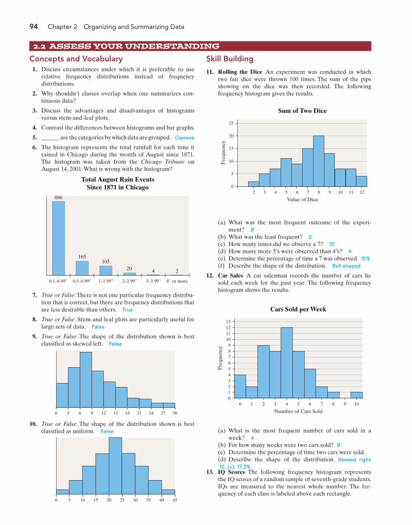
94 Chapter 2 Organizing and Summarizing Data
13. IQ Scores The following frequency histogram representsthe IQ scores of a random sample of seventh-grade students.IQs are measured to the nearest whole number. The fre-quency of each class is labeled above each rectangle.
2.2 ASSESS YOUR UNDERSTANDING
Concepts and Vocabulary1. Discuss circumstances under which it is preferable to use
relative frequency distributions instead of frequencydistributions.
2. Why shouldn’t classes overlap when one summarizes con-tinuous data?
3. Discuss the advantages and disadvantages of histogramsversus stem-and-leaf plots.
4. Contrast the differences between histograms and bar graphs.
5. ______ are the categories by which data are grouped. Classes
6. The histogram represents the total rainfall for each time itrained in Chicago during the month of August since 1871.The histogram was taken from the Chicago Tribune onAugust 14, 2001. What is wrong with the histogram?
Skill Building
11. Rolling the Dice An experiment was conducted in whichtwo fair dice were thrown 100 times. The sum of the pipsshowing on the dice was then recorded. The followingfrequency histogram gives the results.
Total August Rain EventsSince 1871 in Chicago
1–1.99" 2–2.99"0.1–0.49" 0.5–0.99" 3–3.99" 4" or more
886
165105
20 4 2
7. True or False: There is not one particular frequency distribu-tion that is correct, but there are frequency distributions thatare less desirable than others. True
8. True or False: Stem-and-leaf plots are particularly useful forlarge sets of data. False
9. True or False: The shape of the distribution shown is bestclassified as skewed left. False
0 3 6 9 12 15 18 21 24 27 30
10. True or False: The shape of the distribution shown is bestclassified as uniform. False
0 5 10 15 20 25 30 35 40 45
25
20
15
10
5
0
Freq
uenc
y
2 3 4 5 6 7 10 118 9 12
Value of Dice
Sum of Two Dice
(a) What was the most frequent outcome of the experi-ment? 8
(b) What was the least frequent? 2(c) How many times did we observe a 7? 15(d) How many more 5’s were observed than 4’s? 4(e) Determine the percentage of time a 7 was observed. 15%(f) Describe the shape of the distribution. Bell shaped
12. Car Sales A car salesman records the number of cars hesold each week for the past year. The following frequencyhistogram shows the results.
131211109876543210
Freq
uenc
y
0 1 2 3 4 5 8 96 7 10
Number of Cars Sold
Cars Sold per Week
(a) What is the most frequent number of cars sold in aweek? 4
(b) For how many weeks were two cars sold? 9(c) Determine the percentage of time two cars were sold.(d) Describe the shape of the distribution. Skewed right12. (c) 17.3%
M02_SULL8028_03_SE_C02.QXD 9/9/08 10:41 AM Page 94
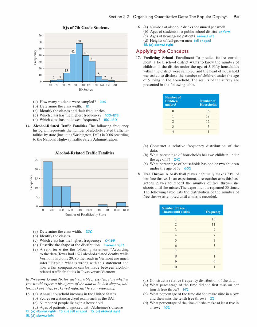
Section 2.2 Organizing Quantitative Data: The Popular Displays 95
16. (a) Number of alcoholic drinks consumed per week(b) Ages of students in a public school district uniform(c) Ages of hearing-aid patients skewed left(d) Heights of full-grown men bell shaped
Applying the Concepts17. Predicting School Enrollment To predict future enroll-
ment, a local school district wants to know the number ofchildren in the district under the age of 5. Fifty householdswithin the district were sampled, and the head of householdwas asked to disclose the number of children under the ageof 5 living in the household. The results of the survey arepresented in the following table.
2 3
13
42
58
40
31
82 1
70
60
50
40
30
20
10
0
Freq
uenc
y
60 70 80 90 100 110 120 130 140 150 160
IQ Scores
IQs of 7th Grade Students
(a) How many students were sampled? 200(b) Determine the class width. 10(c) Identify the classes and their frequencies.(d) Which class has the highest frequency? 100–109(e) Which class has the lowest frequency? 150–159
14. Alcohol-Related Traffic Fatalities The following frequencyhistogram represents the number of alcohol-related traffic fa-talities by state (including Washington, D.C.) in 2006 accordingto the National Highway Traffic Safety Administration.
0
15
20
25
10
5
0400200 1000 1400 1800600 800 1200 1600
Freq
uenc
y
Number of Fatalities by State
Alcohol-Related Traffic Fatalities
(a) Determine the class width. 200(b) Identify the classes.(c) Which class has the highest frequency? 0–199(d) Describe the shape of the distribution. Skewed right(e) A reporter writes the following statement: “According
to the data, Texas had 1677 alcohol-related deaths, whileVermont had only 29. So the roads in Vermont are muchsafer.” Explain what is wrong with this statement andhow a fair comparison can be made between alcohol-related traffic fatalities in Texas versus Vermont.
In Problems 15 and 16, for each variable presented, state whetheryou would expect a histogram of the data to be bell-shaped, uni-form, skewed left, or skewed right. Justify your reasoning.
15. (a) Annual household incomes in the United States(b) Scores on a standardized exam such as the SAT(c) Number of people living in a household(d) Ages of patients diagnosed with Alzheimer’s disease
Number ofChildrenunder 5
Number ofHouseholds
0 16
1 18
2 12
3 3
4 1
(a) Construct a relative frequency distribution of thedata.
(b) What percentage of households has two children underthe age of 5? 24%
(c) What percentage of households has one or two childrenunder the age of 5? 60%
18. Free Throws A basketball player habitually makes 70% ofher free throws. In an experiment, a researcher asks this bas-ketball player to record the number of free throws sheshoots until she misses. The experiment is repeated 50 times.The following table lists the distribution of the number offree throws attempted until a miss is recorded.
Number of FreeThrows until a Miss Frequency
1 16
2 11
3 9
4 7
5 2
6 3
7 0
8 1
9 0
10 1
(a) Construct a relative frequency distribution of the data.(b) What percentage of the time did she first miss on her
fourth free throw? 14%(c) What percentage of the time did she make nine in a row
and then miss the tenth free throw? 2%(d) What percentage of the time did she make at least five in
a row? 10%15. (a) skewed right 15. (b) bell shaped 15. (c) skewed right15. (d) skewed left
16. (a) skewed right
M02_SULL8028_03_SE_C02.QXD 9/9/08 10:41 AM Page 95
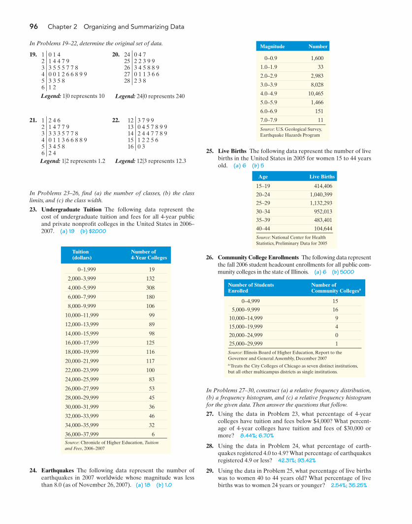
96 Chapter 2 Organizing and Summarizing Data
In Problems 19–22, determine the original set of data.
19. 20.
25. Live Births The following data represent the number of livebirths in the United States in 2005 for women 15 to 44 yearsold. (a) 6 (b) 5
0 1 41 4 4 7 93 5 5 5 7 7 80 0 1 2 6 6 8 9 93 3 5 81 2
123456
3 7 9 90 4 5 7 8 9 92 4 4 7 7 8 91 2 2 5 6 0 3
1213141516
2 4 61 4 7 7 93 3 3 5 7 7 80 1 1 3 6 6 8 8 93 4 5 82 4
123456
0 4 7 2 2 3 9 93 4 5 8 8 90 1 1 3 6 62 3 8
2425262728
21. 22.
In Problems 23–26, find (a) the number of classes, (b) the classlimits, and (c) the class width.
23. Undergraduate Tuition The following data represent thecost of undergraduate tuition and fees for all 4-year publicand private nonprofit colleges in the United States in 2006–2007. (a) 19 (b) $2000
Tuition(dollars)
Number of 4-Year Colleges
0–1,999 19
2,000–3,999 132
4,000–5,999 308
6,000–7,999 180
8,000–9,999 106
10,000–11,999 99
12,000–13,999 89
14,000–15,999 98
16,000–17,999 125
18,000–19,999 116
20,000–21,999 117
22,000–23,999 100
24,000–25,999 83
26,000–27,999 53
28,000–29,999 45
30,000–31,999 36
32,000–33,999 46
34,000–35,999 32
36,000–37,999 6Source: Chronicle of Higher Education, Tuitionand Fees, 2006–2007
24. Earthquakes The following data represent the number ofearthquakes in 2007 worldwide whose magnitude was lessthan 8.0 (as of November 26, 2007). (a) 18 (b) 1.0
Magnitude Number
0–0.9 1,600
1.0–1.9 33
2.0–2.9 2,983
3.0–3.9 8,028
4.0–4.9 10,465
5.0–5.9 1,466
6.0–6.9 151
7.0–7.9 11
Source: U.S. Geological Survey,Earthquake Hazards Program
Age Live Births
15–19 414,406
20–24 1,040,399
25–29 1,132,293
30–34 952,013
35–39 483,401
40–44 104,644
Source: National Center for HealthStatistics, Preliminary Data for 2005
26. Community College Enrollments The following data representthe fall 2006 student headcount enrollments for all public com-munity colleges in the state of Illinois. (a) 6 (b) 5000
Number of StudentsEnrolled
Number of Community Collegesa
0–4,999 15
5,000–9,999 16
10,000–14,999 9
15,000–19,999 4
20,000–24,999 0
25,000–29,999 1
Source: Illinois Board of Higher Education, Report to the Governor and General Assembly, December 2007a.Treats the City Colleges of Chicago as seven distinct institutions,but all other multicampus districts as single institutions.
In Problems 27–30, construct (a) a relative frequency distribution,(b) a frequency histogram, and (c) a relative frequency histogramfor the given data. Then answer the questions that follow.
27. Using the data in Problem 23, what percentage of 4-yearcolleges have tuition and fees below $4,000? What percent-age of 4-year colleges have tuition and fees of $30,000 ormore? 8.44%; 6.70%
28. Using the data in Problem 24, what percentage of earth-quakes registered 4.0 to 4.9? What percentage of earthquakesregistered 4.9 or less? 42.31%; 93.42%
29. Using the data in Problem 25, what percentage of live birthswas to women 40 to 44 years old? What percentage of livebirths was to women 24 years or younger? 2.54%; 35.25%
Legend: 1|0 represents 10 Legend: 24|0 represents 240
Legend: 1|2 represents 1.2 Legend: 12|3 represents 12.3
M02_SULL8028_03_SE_C02.QXD 9/9/08 10:41 AM Page 96

Section 2.2 Organizing Quantitative Data: The Popular Displays 97
(a) Are these data discrete or continuous? Explain. Discrete(b) Construct a frequency distribution of the data.(c) Construct a relative frequency distribution of the data.(d) What percentage of households in the survey have 3
color televisions? 20%(e) What percentage of households in the survey have 4 or
more color televisions? 7.5%(f) Construct a frequency histogram of the data.(g) Construct a relative frequency histogram of the data.(h) Describe the shape of the distribution. Skewed right
32. Waiting The following data represent the number ofcustomers waiting for a table at 6:00 P.M. for 40 consecutiveSaturdays at Bobak’s Restaurant:
(f) Repeat parts (a)–(e) using a class width of 4,000.(g) Does one frequency distribution provide a better sum-
mary of the data than the other? Explain.
34. Uninsured Rates The following data represent the percent-age of people without health insurance for the 50 states andthe District of Columbia in 2006.
1 1 4 2 3 3 5 1
1 2 2 4 1 1 0 3
1 2 2 1 3 1 1 3
2 3 2 2 1 2 3 2
1 2 2 2 2 1 3 1
Source: Based on data from the U.S. Department of Energy
11 5 11 3 6 8 6 7
4 5 13 9 6 4 14 11
13 10 9 6 8 10 9 5
10 8 7 3 8 8 7 8
7 9 10 4 8 6 11 8
(a) Are these data discrete or continuous? Explain. Discrete(b) Construct a frequency distribution of the data.(c) Construct a relative frequency distribution of the data.(d) What percentage of the Saturdays had 10 or more cus-
tomers waiting for a table at 6:00 P.M.? 27.5%(e) What percentage of the Saturdays had 5 or fewer
customers waiting for a table at 6:00 P.M.? 20%(f) Construct a frequency histogram of the data.(g) Construct a relative frequency histogram of the data.(h) Describe the shape of the distribution. bell shaped
33. Average Income The following data represent the per capita(average) disposable income (income after taxes) for the50 states and the District of Columbia in 2006.
With the first class having a lower class limit of 24,000 and aclass width of 3000:(a) Construct a frequency distribution.(b) Construct a relative frequency distribution.(c) Construct a frequency histogram of the data.(d) Construct a relative frequency histogram of the data.(e) Describe the shape of the distribution. skewed right
28,185 33,595 27,763 25,112 33,373 34,332
40,973 33,683 47,515 31,635 28,109 31,856
26,754 33,419 28,979 29,808 30,935 26,104
28,553 28,777 37,574 38,794 30,117 33,494
24,360 29,066 27,419 30,676 32,290 34,964
39,840 26,839 35,407 28,339 29,515 29,223
28,895 29,310 32,222 32,734 26,406 31,116
29,456 31,012 25,792 30,317 33,628 33,334
25,204 30,439 36,176
Source: U.S. Bureau of Economic Analysis, March 2007
15.2 16.5 20.9 18.9 18.8 17.2
9.4 12.1 11.6 21.2 17.7 8.9
15.4 14.0 11.8 10.5 12.3 15.6
21.9 9.3 13.8 10.4 10.5 9.2
20.8 13.3 17.1 12.3 19.6 11.5
15.5 22.9 14.0 17.9 12.2 10.1
18.9 17.9 10.0 8.6 15.9 11.8
13.7 24.5 17.4 10.2 13.3 11.8
13.5 8.8 14.6
Source: Illinois Hospital Association, September 2007
With the first class having a lower class limit of 8 and a classwidth of 2:(a) Construct a frequency distribution.(b) Construct a relative frequency distribution.(c) Construct a frequency histogram of the data.(d) Construct a relative frequency histogram of the data.(e) Describe the shape of the distribution. skewed right(f) Repeat parts (a)–(e) using a class width of 1.(g) Does one frequency distribution provide a better sum-
mary of the data than the other? Explain.
35. Serum HDL Dr. Paul Oswiecmiski randomly selects 40 ofhis 20- to 29-year-old patients and obtains the following dataregarding their serum HDL cholesterol:
70 56 48 48 53 52 66 48
36 49 28 35 58 62 45 60
38 73 45 51 56 51 46 39
56 32 44 60 51 44 63 50
46 69 53 70 33 54 55 52
Source: Paul Oswiecmiski
NW
NW
30. Using the data in Problem 26, what percentage of public com-munity colleges in Illinois enrolled between 5,000 and 9,999students? What percentage of public community colleges inIllinois enrolled 15,000 or more students? 35.56%; 11.11%
31. Televisions in the Household A researcher with A. C. Nielsenwanted to determine the number of color televisions inhouseholds. He conducts a survey of 40 randomly selectedhouseholds and obtains the following data.
With the first class having a lower class limit of 20 and a classwidth of 10:(a) Construct a frequency distribution.(b) Construct a relative frequency distribution.(c) Construct a frequency histogram of the data.
M02_SULL8028_03_SE_C02.QXD 9/9/08 6:36 PM Page 97
98 Chapter 2 Organizing and Summarizing Data
With the first class having a lower class limit of 0 and a classwidth of 0.40:(a) Construct a frequency distribution.(b) Construct a relative frequency distribution.(c) Construct a frequency histogram of the data.(d) Construct a relative frequency histogram of the data.(e) Describe the shape of the distribution. Skewed right(f) Repeat parts (a)–(e) using a class width of 0.8.(g) Which frequency distribution seems to provide a better
summary of the data?
37. Volume of Altria Group Stock The volume of a stock is thenumber of shares traded on a given day. The following data,in millions, so that 6.42 represents 6,420,000 shares traded,represent the volume of Altria Group stock traded for a ran-dom sample of 35 trading days in 2007.
(e) Construct a relative frequency histogram of the data.(f) Describe the shape of the distribution. skewed right
In Problems 39–42, (a) construct a stem-and-leaf plot and (b) describe the shape of the distribution.
39. Age at Inauguration The following data represent the agesof the presidents of the United States (from George Wahing-ton through George W. Bush) on their first days in office.Note: President Cleveland’s age is listed twice, 47 and 55,because he is historically counted as two different presidents,numbers 22 and 24, since his terms were not consecutive.(b) Bell shaped
6.42 23.59 18.91 7.85 7.76
8.51 9.05 14.83 14.43 8.55
6.37 10.30 10.16 10.90 11.20
13.57 9.13 7.83 15.32 14.05
7.84 7.88 17.10 16.58 7.68
7.69 10.22 10.49 8.41 7.85
10.94 20.15 8.97 15.39 8.32
Source: TD Ameritrade
(a) If six classes are to be formed, choose an appropriatelower class limit for the first class and a class width.
(b) Construct a frequency distribution.(c) Construct a relative frequency distribution.(d) Construct a frequency histogram of the data.(e) Construct a relative frequency histogram of the data.(f) Describe the shape of the distribution. skewed right
38. Violent Crimes Violent crimes include murder, forciblerape, robbery, and aggravated assault. The following datarepresent the violent-crime rate (crimes per 100,000 popula-tion) by state plus the District of Columbia in 2005.(a) If eight classes are to be formed, choose an appropriate
lower class limit for the first class and a class width.(b) Construct a frequency distribution.(c) Construct a relative frequency distribution.(d) Construct a frequency histogram of the data.
432 708 594 287 351 530
632 449 112 607 509 227
513 255 703 132 287 120
528 257 457 355 425 283
526 552 552 702 251 346
397 323 297 446 761 273
275 291 278 468 176 242
632 387 525 98 753 230
1459 267 282
Source: Federal Bureau of Investigation
42 48 51 52 54 56 57 61 65
43 49 51 54 55 56 57 61 68
46 49 51 54 55 56 58 62 69
46 50 51 54 55 57 60 64
47 50 52 54 55 57 61 64
Source: factmonster.com
40. Divorce Rates The following data represent the divorce rate(per 1,000 population) for most states in the United States inthe year 2004.Note: The list includes the District of Columbia, but excludesCalifornia, Georgia, Hawaii, Indiana, Louisiana, and Okla-homa because of failure to report. (b) Bell shaped
4.7 4.8 4.2 6.3 4.4 2.9 3.7
1.7 4.8 5.1 2.6 2.8 3.3 4.9
3.6 3.1 2.2 3.5 2.8 4.5 3.8
3.8 3.6 6.4 3.9 3.0 4.6 3.0
4.4 2.8 3.7 4.1 2.5 3.0 3.2
3.2 5.0 3.6 3.9 3.9 4.0 4.1
4.7 3.1 5.3
Source: U.S. Census Bureau, Statistical Abstract of the United States, 2006
41. Grams of Fat in a McDonald’s Breakfast The following datarepresent the number of grams of fat in breakfast mealsoffered at McDonald’s. (b) Bell shaped
12 22 27 3 25 30
32 37 27 31 11 16
21 32 22 46 51 55
59 16 36 30 9 24
Source: McDonald’s Corporation, McDonald’s USANutrition Facts, November 2007
NW
NW
(d) Construct a relative frequency histogram of the data.(e) Describe the shape of the distribution. Bell shaped(f) Repeat parts (a)–(e) using a class width of 5.(g) Which frequency distribution seems to provide a better
summary of the data?
36. Dividend Yield A dividend is a payment from a publiclytraded company to its shareholders. The dividend yield of astock is determined by dividing the annual dividend of astock by its price. The following data represent the dividendyields (in percent) of a random sample of 28 publicly tradedstocks of companies with a value of at least $5 billion.
1.7 0 1.15 0.62 1.06 2.45 2.38
2.83 2.16 1.05 1.22 1.68 0.89 0
2.59 0 1.7 0.64 0.67 2.07 0.94
2.04 0 0 1.35 0 0 0.41
Source: Yahoo! Finance
M02_SULL8028_03_SE_C02.QXD 9/9/08 10:41 AM Page 98
Section 2.2 Organizing Quantitative Data: The Popular Displays 99
(a) Round each observation to the nearest tenth of a centand draw a stem-and-leaf plot.
(b) Describe the shape of the distribution. Skewed right(c) Hawaii has the highest retail price for electricity.What is
Hawaii’s average retail price for electricity? Why mightHawaii’s rate be so much higher than the others?
42. Gasoline Mileages The following data represent the numberof miles per gallon achieved on the highway for small cars forthe model year 2008. (b) Slightly skewed right (or bell shaped)
33 36 27 37 29 33 26 33 32
32 29 34 28 31 31 35 33 35
29 33 45 33 28 32 32 35 30
32 31 31 32 32 36 31 23 29
29 31 25 29 34 29 34 28 33
27 35 29 32 27 24 33 30 28
Source: U.S. Department of Energy (fueleconomy.gov)
43. Electric Rates The following data represent the averageretail prices for electricity (cents/kWh) in 2006 for the50 states plus the District of Columbia.
7.07 12.84 8.24 6.99 12.82 7.61
14.83 10.13 11.08 10.45 7.63 20.72
4.92 7.07 6.46 7.01 6.89 5.43
8.30 11.80 9.95 15.45 8.14 6.98
8.33 6.30 6.91 6.07 9.63 13.84
11.88 7.37 15.27 7.53 6.21 7.71
7.30 6.53 8.68 13.98 6.98 6.70
6.97 10.34 5.99 11.37 6.86 6.14
5.04 8.13 5.27
Source: Energy Information Administration, State Electric Profiles:2006 Edition, November 2007
20.72 cents/kWh44. Housing Price Index The housing price index (HPI) serves
as an indicator of housing price trends by measuring averageprice changes in repeat sales or refinancing on the sameproperty. The following data represent the change in HPIfrom the third quarter of 2002 to the third quarter of 2007for a random sample of 40 U.S. cities.
12.27 18.82 13.50 42.22 77.96
39.65 40.33 113.82 55.69 20.18
36.34 87.23 72.54 27.83 42.02
36.92 15.91 24.22 91.92 29.04
14.26 17.78 24.11 41.02 25.88
94.41 63.45 81.15 56.90 41.23
73.57 71.77 29.15 76.02 26.08
18.57 38.74 81.40 19.31 30.97
Source: Office of Federal Housing Enterprise Oversight
(a) Round each observation to the nearest whole percentand draw a stem-and-leaf plot.
(b) Describe the shape of the distribution. Skewed right
45. Dependability Survey J. D. Power and Associates regularly surveys car owners and asks them about the reliability of their cars.Thefollowing data represent the number of problems per 100 vehicles over a 3-year period for the 2004 model year for all makes.
Make Problems per 100 Vehicles Make Problems per 100 Vehicles Make Problems per 100 Vehicles
Lexus 162 Saab 265 Jeep 314
Buick 187 Saturn 267 Oldsmobile 314
Infiniti 189 Ford 276 Mercedes-Benz 327
Lincoln 194 Nissan 280 Mitsubishi 327
Cadillac 196 Chrysler 285 Volvo 346
Honda 209 Mazda 285 Suzuki 365
Acura 212 Subaru 288 Hyundai 375
Toyota 216 Plymouth 289 Volkswagen 386
Mercury 224 Audi 295 Isuzu 393
Porsche 240 Pontiac 297 Daewoo 411
Chevrolet 262 Dodge 298 Kia 432
GMC 262 Jaguar 310 Land Rover 472
BMW 264
Source: J. D. Power and Associates, 2004 Vehicle Dependability Study
(a) Draw a stem-and-leaf plot, using the ones position as the leaf.(b) Round the data to the nearest ten (for example, round 162 as 160).(c) Draw a stem-and-leaf plot, treating the hundreds position as the stem and the tens position as the leaf
(so that 1|6 represents 160).(d) Redraw the stem-and-leaf plot using split stems.(e) In your opinion, which of these plots best summarizes the data? Why?
NW
M02_SULL8028_03_SE_C02.QXD 9/9/08 10:41 AM Page 99
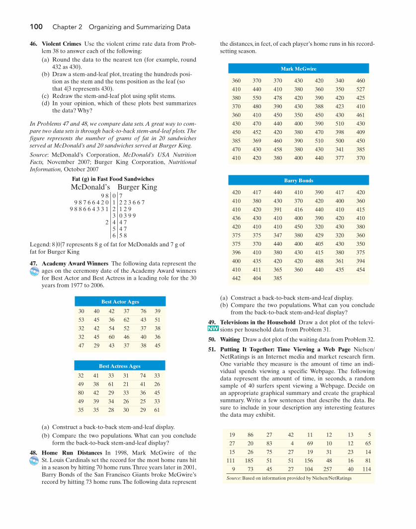
100 Chapter 2 Organizing and Summarizing Data
47. Academy Award Winners The following data represent theages on the ceremony date of the Academy Award winnersfor Best Actor and Best Actress in a leading role for the 30years from 1977 to 2006.
46. Violent Crimes Use the violent crime rate data from Prob-lem 38 to answer each of the following:(a) Round the data to the nearest ten (for example, round
432 as 430).(b) Draw a stem-and-leaf plot, treating the hundreds posi-
tion as the stem and the tens position as the leaf (so that represents 430).
(c) Redraw the stem-and-leaf plot using split stems.(d) In your opinion, which of these plots best summarizes
the data? Why?
In Problems 47 and 48, we compare data sets. A great way to com-pare two data sets is through back-to-back stem-and-leaf plots.Thefigure represents the number of grams of fat in 20 sandwichesserved at McDonald’s and 20 sandwiches served at Burger King.
Source: McDonald’s Corporation, McDonald’s USA NutritionFacts, November 2007; Burger King Corporation, NutritionalInformation, October 2007
4|3
0123456
72 2 3 6 6 71 2 90 3 9 94 74 75 8
9 89 8 7 6 6 4 2 0
9 8 8 6 6 4 3 3 1
2
McDonald’s Burger King
Best Actor Ages
30 40 42 37 76 39
53 45 36 62 43 51
32 42 54 52 37 38
32 45 60 46 40 36
47 29 43 37 38 45
Best Actress Ages
32 41 33 31 74 33
49 38 61 21 41 26
80 42 29 33 36 45
49 39 34 26 25 33
35 35 28 30 29 61
(a) Construct a back-to-back stem-and-leaf display.(b) Compare the two populations. What can you conclude
from the back-to-back stem-and-leaf display?
49. Televisions in the Household Draw a dot plot of the televi-sions per household data from Problem 31.
50. Waiting Draw a dot plot of the waiting data from Problem 32.
51. Putting It Together: Time Viewing a Web Page Nielsen/NetRatings is an Internet media and market research firm.One variable they measure is the amount of time an indi-vidual spends viewing a specific Webpage. The followingdata represent the amount of time, in seconds, a randomsample of 40 surfers spent viewing a Webpage. Decide onan appropriate graphical summary and create the graphicalsummary. Write a few sentences that describe the data. Besure to include in your description any interesting featuresthe data may exhibit.
Barry Bonds
420 417 440 410 390 417 420
410 380 430 370 420 400 360
410 420 391 416 440 410 415
436 430 410 400 390 420 410
420 410 410 450 320 430 380
375 375 347 380 429 320 360
375 370 440 400 405 430 350
396 410 380 430 415 380 375
400 435 420 420 488 361 394
410 411 365 360 440 435 454
442 404 385
Mark McGwire
360 370 370 430 420 340 460
410 440 410 380 360 350 527
380 550 478 420 390 420 425
370 480 390 430 388 423 410
360 410 450 350 450 430 461
430 470 440 400 390 510 430
450 452 420 380 470 398 409
385 369 460 390 510 500 450
470 430 458 380 430 341 385
410 420 380 400 440 377 370
(a) Construct a back-to-back stem-and-leaf display.(b) Compare the two populations. What can you conclude
form the back-to-back stem-and-leaf display?
48. Home Run Distances In 1998, Mark McGwire of theSt. Louis Cardinals set the record for the most home runs hitin a season by hitting 70 home runs.Three years later in 2001,Barry Bonds of the San Francisco Giants broke McGwire’srecord by hitting 73 home runs. The following data represent
19 86 27 42 11 12 13 5
27 20 83 4 69 10 12 65
15 26 75 27 19 31 23 14
111 185 51 51 156 48 16 81
9 73 45 27 104 257 40 114
Source: Based on information provided by Nielsen/NetRatings
the distances, in feet, of each player’s home runs in his record-setting season.
NW
Fat (g) in Fast Food Sandwiches
Legend: represents 8 g of fat for McDonalds and 7 g offat for Burger King
8 |0|7
M02_SULL8028_03_SE_C02.QXD 9/9/08 10:41 AM Page 100
Section 2.2 Organizing Quantitative Data: The Popular Displays 101
TI-83/84 PlusHistograms
1. Enter the raw data in L1 by pressing STATand selecting 1: Edit.2. Press 2nd Y = to access the StatPlot menu.Select 1: Plot1.3. Place the cursor on “ON” and press ENTER.4. Place the cursor on the histogram icon (see the figure) and press ENTER. Press 2nd
QUIT to exit Plot 1 menu.
5. Press WINDOW. Set Xmin to the lower classlimit of the first class. Set Xmax to the lowerclass limit of the class following the classcontaining the largest value. For example, if thefirst class is 0–9, set Xmin to 0. If the class widthis 10 and the last class is 90–99, set Xmax to100. Set Xscl to the class width. Set Ymin to 0.Set Ymax to a value larger than the frequencyof the class with the highest frequency.6. Press GRAPH.
Helpful Hints: To determine each class frequency,press TRACE and use the arrow keys to scroll througheach class. If you decrease the value of Ymin to avalue such as you can see the values displayed onthe screen easier. The TI graphing calculators do notdraw stem-and-leaf plots or dot plots.
MINITABHistograms
1. Enter the raw data in C1.2. Select the Graph menu and highlightHistogram3. Highlight the “simple” icon and press OK.4. Put the cursor in the “Graph variables” box.Highlight C1 and press Select. Click SCALE
Á
-5,
TECHNOLOGY STEP-BY-STEP Drawing Histograms and Stem-and-Leaf Plots
and select the Y-Scale Type tab. For a frequencyhistogram, click the frequency radio button. Fora relative frequency histogram, click thepercent radio button. Click OK twice.
Note: To adjust the class width and to change thelabels on the horizontal axis to the lower classlimit, double-click inside one of the bars in thehistogram. Select the “binning” tab in the windowthat opens. Click the cutpoint button and themidpoint/cutpoint positions radio button. In themidpoint/cutpoint box, enter the lower classlimits of each class. Click OK.
Stem-and-Leaf Plots1. With the raw data entered in C1, select theGraph menu and highlight Stem-and-Leaf.2. Select the data in C1 and press OK.
Dot Plots1. Enter the raw data in C1.2. Select the Graph menu and highlightDotplot.3. Highlight the “simple” icon and press OK.4. Put the cursor in the “Graph variables” box.Highlight C1 and press Select. Click OK.
ExcelHistograms
1. Enter the raw data in column A.2. Select Tools and Data Analysis . . .3. Select Histogram from the list.4. With the cursor in the Input Range cell, usethe mouse to highlight the raw data. Select theChart Output box and press OK.5. Double-click on one of the bars in thehistogram. Select the Options tab from themenu that appears. Reduce the gap width tozero.
Excel does not draw stem-and-leaf plots. Dot plotscan be drawn in Excel using the DDXL plug-in. Seethe Excel technology manual.
M02_SULL8028_03_SE_C02.QXD 9/9/08 10:41 AM Page 101
102 Chapter 2 Organizing and Summarizing Data
In this section, we continue to organize and summarize quantitative data by present-ing additional displays that are commonly used in statistical analysis. Specifically,we examine frequency polygons, cumulative distributions, ogives, and time-seriesgraphs.
1 Construct Frequency PolygonsAnother way of graphically representing quantitative data sets is through frequencypolygons. They provide the same information as histograms. Before we can providea method for constructing frequency polygons, we must learn how to obtain the classmidpoint of a class.
2.3 ADDITIONAL DISPLAYS OF QUANTITATIVE DATA
Note to InstructorThe material in this section may be omit-ted without loss of continuity, dependingon the time constraints. One suggestionis to have students read the section ontheir own.
Objectives 1 Construct frequency polygons2 Create cumulative frequency and relative frequency tables3 Construct frequency and relative frequency ogives4 Draw time-series graphs
Definition A frequency polygon is a graph that uses points, connected by line segments, torepresent the frequencies for the classes. It is constructed by plotting a pointabove each class midpoint on a horizontal axis at a height equal to the frequencyof the class. After the points for each class are plotted, line segments are drawnconnecting consecutive points.Two additional line segments are drawn connect-ing each end of the graph with the horizontal axis.
Suppose we wish to construct a frequency polygon of the data summarized inTable 13 on page 85 from Section 2.2. First we need to determine the class midpointsof each class, as shown in Table 19.
Table 19
Class (3-year rate of return) Class Midpoint Frequency
RelativeFrequency
10–11.99 6 0.15
12–13.99 14 0.35
14–15.99 15 10 0.25
16–17.99 17 4 0.1
18–19.99 19 3 0.075
20–21.99 21 0 0
22–23.99 23 3 0.075
12 + 142
= 13
10 + 122
= 11
Definition The class midpoint is found by adding consecutive lower class limits and dividingthe result by 2.
The class midpoint is used to draw frequency polygons.
M02_SULL8028_03_SE_C02.QXD 9/9/08 10:41 AM Page 102
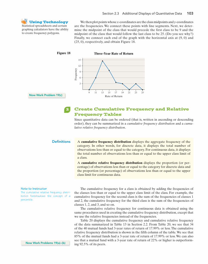
Section 2.3 Additional Displays of Quantitative Data 103
2 Create Cumulative Frequency and RelativeFrequency TablesSince quantitative data can be ordered (that is, written in ascending or descendingorder), they can be summarized in a cumulative frequency distribution and a cumu-lative relative frequency distribution.
9
3
6
12
9
15
11 13 15 17 19 21 23 25
Rate of Return
Three-Year Rate of Return
Fre
quen
cy
Figure 18
Using TechnologyStatistical spreadsheets and certaingraphing calculators have the abilityto create frequency polygons.
We then plot points whose x-coordinates are the class midpoints and y-coordinatesare the frequencies. We connect these points with line segments. Next, we deter-mine the midpoint of the class that would precede the first class to be 9 and themidpoint of the class that would follow the last class to be 25. (Do you see why?)Finally, we connect each end of the graph with the horizontal axis at (9, 0) and(25, 0), respectively, and obtain Figure 18.
Now Work Problem 19(c)
Definitions A cumulative frequency distribution displays the aggregate frequency of thecategory. In other words, for discrete data, it displays the total number ofobservations less than or equal to the category. For continuous data, it displaysthe total number of observations less than or equal to the upper class limit ofa class.
A cumulative relative frequency distribution displays the proportion (or per-centage) of observations less than or equal to the category for discrete data andthe proportion (or percentage) of observations less than or equal to the upperclass limit for continuous data.
The cumulative frequency for a class is obtained by adding the frequencies ofthe classes less than or equal to the upper class limit of the class. For example, thecumulative frequency for the second class is the sum of the frequencies of classes 1and 2, the cumulative frequency for the third class is the sum of the frequencies ofclasses 1, 2, and 3, and so on.
The cumulative relative frequency for continuous data is obtained using thesame procedures used in creating the cumulative frequency distribution, except thatwe use the relative frequencies instead of the frequencies.
Table 20 displays the cumulative frequency and cumulative relative frequencyof the data summarized in Table 13 in Section 2.2. From Table 20, we see that 34of the 40 mutual funds had 3-year rates of return of 17.99% or less. The cumulativerelative frequency distribution is shown in the fifth column of the table. We see that85% of the mutual funds had a 3-year rate of return of 17.99% or less. We can alsosee that a mutual fund with a 3-year rate of return of 22% or higher is outperform-ing 92.5% of its peers.
Note to InstructorThe cumulative relative frequency distri-bution foreshadows the concept of apercentile.
Now Work Problems 19(a)–(b)
M02_SULL8028_03_SE_C02.QXD 9/9/08 10:41 AM Page 103

104 Chapter 2 Organizing and Summarizing Data
3 Construct Frequency and RelativeFrequency OgivesRecall that the cumulative frequency of a class is the aggregate frequency less thanor equal to the upper class limit.
Using TechnologyStatistical spreadsheets and certaingraphing calculators have the abilityto draw ogives.
Table 20
Class (3-year rate of return) Frequency
Relative Frequency
CumulativeFrequency
Cumulative RelativeFrequency
10–11.99 6 0.15 6 0.15
12–13.99 14 0.35
14–15.99 10 0.25
16–17.99 4 0.1 34 0.85
18–19.99 3 0.075 37 0.925
20–21.99 0 0 37 0.925
22–23.99 3 0.075 40 1
0.50 + 0.25 = 0.7520 + 10 = 30
0.15 + 0.35 = 0.56 + 14 = 20
Definition An ogive (read as ) is a graph that represents the cumulative frequencyor cumulative relative frequency for the class. It is constructed by plottingpoints whose x-coordinates are the upper class limits and whose y-coordinatesare the cumulative frequencies or cumulative relative frequencies. After thepoints for each class are plotted, line segments are drawn connecting consecu-tive points. An additional line segment is drawn connecting the point for thefirst class to the horizontal axis at a location representing the upper limit of theclass that would precede the first class (if it existed).
“oh jive”
We can construct a relative frequency ogive using the data in Table 20 byplotting points whose x-coordinates are the upper class limits and whose y-coordinatesare the cumulative relative frequencies of the classes. We then connect the pointswith line segments. See Figure 19.
1
0.6
0.8
0.4
0.2
0
Cum
ulat
ive
Rel
ativ
eFr
eque
ncy
9.99 11.99 13.99 15.99 17.99 21.9919.99 23.99
Relative Frequency Ogive
Three-Year Rate of Return
Figure 19
From Figure 19 we can see that 75% of the mutual funds had a 3-year rate of re-turn less than or equal to 15.99%.Now Work Problems 19(d) and (e)
4 Draw Time-Series GraphsIf the value of a variable is measured at different points in time, the data are re-ferred to as time-series data. The closing price of Cisco Systems stock each monthfor the past 12 years is an example of time-series data.
M02_SULL8028_03_SE_C02.QXD 9/9/08 10:41 AM Page 104
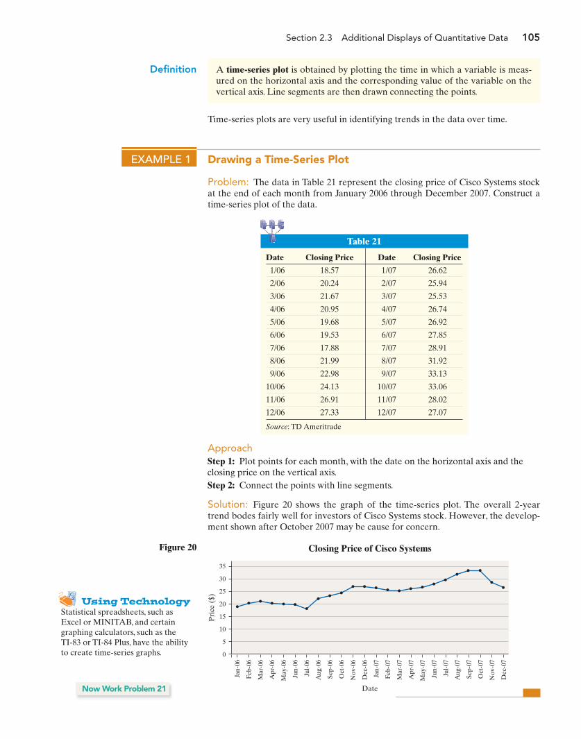
Section 2.3 Additional Displays of Quantitative Data 105
Definition A time-series plot is obtained by plotting the time in which a variable is meas-ured on the horizontal axis and the corresponding value of the variable on thevertical axis. Line segments are then drawn connecting the points.
Time-series plots are very useful in identifying trends in the data over time.
EXAMPLE 1 Drawing a Time-Series Plot
Problem: The data in Table 21 represent the closing price of Cisco Systems stockat the end of each month from January 2006 through December 2007. Construct atime-series plot of the data.
Table 21
Date Closing Price Date Closing Price
1/06 18.57 1/07 26.62
2/06 20.24 2/07 25.94
3/06 21.67 3/07 25.53
4/06 20.95 4/07 26.74
5/06 19.68 5/07 26.92
6/06 19.53 6/07 27.85
7/06 17.88 7/07 28.91
8/06 21.99 8/07 31.92
9/06 22.98 9/07 33.13
10/06 24.13 10/07 33.06
11/06 26.91 11/07 28.02
12/06 27.33 12/07 27.07
Source: TD Ameritrade
Pri
ce (
$)
Date
Closing Price of Cisco Systems
Jan-
06
Feb-
06
Mar
-06
Apr
-06
May
-06
Jun-
06
Jul-
06
Aug
-06
Sep-
06
Oct
-06
Nov
-06
Dec
-06
Jan-
07
Feb-
07
Mar
-07
Apr
-07
May
-07
Jun-
07
Jul-
07
Aug
-07
Sep-
07
Oct
-07
Nov
-07
Dec
-07
15
20
25
35
30
10
5
0
Figure 20
Using TechnologyStatistical spreadsheets, such asExcel or MINITAB, and certaingraphing calculators, such as the TI-83 or TI-84 Plus, have the abilityto create time-series graphs.
Now Work Problem 21
ApproachStep 1: Plot points for each month, with the date on the horizontal axis and theclosing price on the vertical axis.Step 2: Connect the points with line segments.
Solution: Figure 20 shows the graph of the time-series plot. The overall 2-yeartrend bodes fairly well for investors of Cisco Systems stock. However, the develop-ment shown after October 2007 may be cause for concern.
M02_SULL8028_03_SE_C02.QXD 9/9/08 10:41 AM Page 105
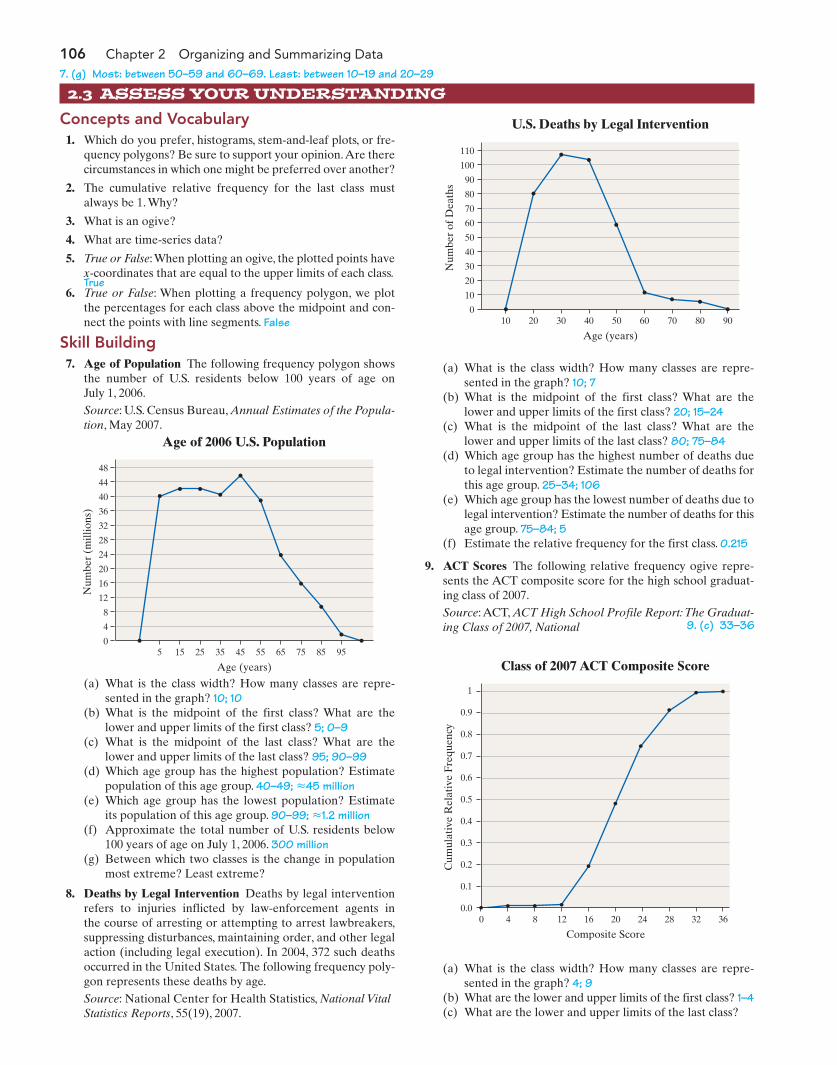
106 Chapter 2 Organizing and Summarizing Data
1. Which do you prefer, histograms, stem-and-leaf plots, or fre-quency polygons? Be sure to support your opinion.Are therecircumstances in which one might be preferred over another?
2. The cumulative relative frequency for the last class mustalways be 1. Why?
3. What is an ogive?
4. What are time-series data?
5. True or False:When plotting an ogive, the plotted points havex-coordinates that are equal to the upper limits of each class.
6. True or False: When plotting a frequency polygon, we plotthe percentages for each class above the midpoint and con-nect the points with line segments. False
2.3 ASSESS YOUR UNDERSTANDING
Concepts and Vocabulary
Num
ber
(mill
ions
)
Age (years)
Age of 2006 U.S. Population
48
44
40
36
32
28
24
20
16
12
8
4
05 15 25 35 45 55 65 75 85 95
Num
ber
of D
eath
s
Age (years)
U.S. Deaths by Legal Intervention
110
100
90
80
70
60
50
40
30
20
10
020 3010 40 50 60 70 80 90
(a) What is the class width? How many classes are repre-sented in the graph? 10; 10
(b) What is the midpoint of the first class? What are thelower and upper limits of the first class? 5; 0–9
(c) What is the midpoint of the last class? What are thelower and upper limits of the last class? 95; 90–99
(d) Which age group has the highest population? Estimatepopulation of this age group. 40–49; 45 million
(e) Which age group has the lowest population? Estimateits population of this age group. 90–99; 1.2 million
(f) Approximate the total number of U.S. residents below100 years of age on July 1, 2006. 300 million
(g) Between which two classes is the change in populationmost extreme? Least extreme?
8. Deaths by Legal Intervention Deaths by legal interventionrefers to injuries inflicted by law-enforcement agents in the course of arresting or attempting to arrest lawbreakers,suppressing disturbances, maintaining order, and other legalaction (including legal execution). In 2004, 372 such deathsoccurred in the United States. The following frequency poly-gon represents these deaths by age.Source: National Center for Health Statistics, National VitalStatistics Reports, 55(19), 2007.
«
«
(a) What is the class width? How many classes are repre-sented in the graph? 10; 7
(b) What is the midpoint of the first class? What are thelower and upper limits of the first class? 20; 15–24
(c) What is the midpoint of the last class? What are thelower and upper limits of the last class? 80; 75–84
(d) Which age group has the highest number of deaths dueto legal intervention? Estimate the number of deaths forthis age group. 25–34; 106
(e) Which age group has the lowest number of deaths due tolegal intervention? Estimate the number of deaths for thisage group. 75–84; 5
(f) Estimate the relative frequency for the first class. 0.215
9. ACT Scores The following relative frequency ogive repre-sents the ACT composite score for the high school graduat-ing class of 2007.Source:ACT, ACT High School Profile Report:The Graduat-ing Class of 2007, National
Cum
ulat
ive
Rel
ativ
e Fr
eque
ncy
Composite Score
Class of 2007 ACT Composite Score
1
0.9
0.8
0.7
0.6
0.5
0.4
0.3
0.2
0.1
0.00 4 8 12 16 20 24 28 32 36
7. (g) Most: between 50–59 and 60–69. Least: between 10–19 and 20–29
9. (c) 33–36
True
Skill Building7. Age of Population The following frequency polygon shows
the number of U.S. residents below 100 years of age on July 1, 2006.Source: U.S. Census Bureau, Annual Estimates of the Popula-tion, May 2007.
(a) What is the class width? How many classes are repre-sented in the graph? 4; 9
(b) What are the lower and upper limits of the first class? 1–4(c) What are the lower and upper limits of the last class?
M02_SULL8028_03_SE_C02.QXD 9/9/08 10:41 AM Page 106
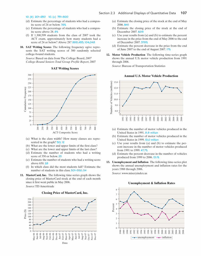
Section 2.3 Additional Displays of Quantitative Data 107
(d) Estimate the percentage of students who had a compos-ite score of 24 or below. 76%
(e) Estimate the percentage of students who had a compos-ite score above 28. 8%
(f) If 1,300,599 students from the class of 2007 took theACT exam, approximately how many students had ascore of 24 or below? Above 28? 988,455; 104,048
10. SAT Writing Scores The following frequency ogive repre-sents the SAT writing scores of 300 randomly selectedcollege-bound students.Source: Based on data from The College Board, 2007 College-Bound Seniors Total Group Profile Report, 2007
(a) Estimate the closing price of the stock at the end of May2006. $45
(b) Estimate the closing price of the stock at the end ofDecember 2007. $215
(c) Use your results from (a) and (b) to estimate the percentincrease in the price from the end of May 2006 to the endof December 2007. 378%
(d) Estimate the percent decrease in the price from the endof June 2007 to the end of August 2007. 17%
12. Motor Vehicle Production The following time-series graphshows the annual U.S. motor vehicle production from 1991through 2006.Source: Bureau of Transportation Statistics
Cum
ulat
ive
Freq
uenc
y
ACT Composite Score
SAT Writing Scores
300
275
250
225
200
175
150
125
100
75
50
25
0
200
250
300
350
400
450
500
550
600
650
700
750
800
(a) What is the class width? How many classes are repre-sented in the graph? 50; 12
(b) What are the lower and upper limits of the first class? (c) What are the lower and upper limits of the last class? (d) Estimate the number of students who had a writing
score of 350 or below. 25(e) Estimate the number of students who had a writing score
above 650. 28(f) In which class did the most students fall? Estimate the
number of students in this class. 501–550; 54
11. MasterCard, Inc. The following time-series graph shows theclosing price of MasterCard stock at the end of each monthsince it first went public in May 2006.Source:TD Ameritrade
10. (b) 201–250 10. (c) 751–800
Pri
ce (
$)
Date
Closing Price of MasterCard, Inc.
220200180160140120100806040200
May
-06
Jun-
06Ju
l-06
Aug
-06
Sep-
06O
ct-0
6N
ov-0
6D
ec-0
6Ja
n-07
Feb-
07M
ar-0
7A
pr-0
7M
ay-0
7Ju
n-07
Jul-
07A
ug-0
7Se
p-07
Oct
-07
Nov
-07
Dec
-07
Num
ber
of V
ehic
les
(mill
ions
)
Annual U.S. Motor Vehicle Production
13.0
12.0
11.0
10.0
9.0
8.0
1991
1992
1993
1994
1995
1996
1997
1998
1999
2000
2002
2004
2006
2001
2003
2005
(a) Estimate the number of motor vehicles produced in theUnited States in 1991. 8.8 million
(b) Estimate the number of motor vehicles produced in theUnited States in 1999. 13.0 million
(c) Use your results from (a) and (b) to estimate the per-cent increase in the number of motor vehicles producedfrom 1991 to 1999. 47.7%
(d) Estimate the percent decrease in the number of vehiclesproduced from 1999 to 2006. 13.1%
13. Unemployment and Inflation The following time-series plotshows the annual unemployment and inflation rates for theyears 1988 through 2006.Source: www.miseryindex.us
Per
cent
Unemployment & Inflation Rates
8
7
6
5
4
3
2
1
0
unemployment inflation
1991
1992
1993
1994
1988
1989
1990
1995
1996
1997
1998
1999
2000
2002
2004
2006
2001
2003
2005
M02_SULL8028_03_SE_C02.QXD 9/9/08 10:41 AM Page 107
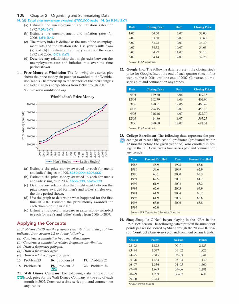
108 Chapter 2 Organizing and Summarizing Data
(a) Estimate the unemployment and inflation rates for1992. 7.5%; 3.0%
(b) Estimate the unemployment and inflation rates for2006. 4.6%; 3.4%
(c) The misery index is defined as the sum of the unemploy-ment rate and the inflation rate. Use your results from(a) and (b) to estimate the misery index for the years1992 and 2006. 10.5%; 8.0%
(d) Describe any relationship that might exist between theunemployment rate and inflation rate over the timeperiod shown.
14. Prize Money at Wimbledon The following time-series plotshows the prize money (in pounds) awarded at the Wimble-don Tennis Championship to the winners of the men’s singlesand ladies’ singles competitions from 1990 through 2007.Source: www.wimbledon.org
21. Walt Disney Company The following data represent thestock price for the Walt Disney Company at the end of eachmonth in 2007. Construct a time-series plot and comment onany trends.
14. (d) Equal prize money was awarded; £700,000 each; 14. (e) 6.9%; 12.0% P
rize
Mon
ey (
poun
ds)
Wimbledon’s Prize Money
700000
600000
500000
400000
300000
200000
1991
1992
1993
1994
1990
1995
1996
1997
1998
1999
2000
2002
2004
2006
2001
2003
2005
2007
Men’s Singles Ladies Singles
(a) Estimate the prize money awarded to each for men’sand ladies’ singles in 1990. £230,000; £207,000
(b) Estimate the prize money awarded to each for men’sand ladies’ singles in 2006. £655,000; £625,000
(c) Describe any relationship that might exist between theprize money awarded for men’s and ladies’ singles overthe time period shown.
(d) Use the graph to determine what happened for the firsttime in 2007. Estimate the prize money awarded foreach championship in 2007.
(e) Estimate the percent increase in prize money awardedto each for men’s and ladies’ singles from 2006 to 2007.
Applying the ConceptsIn Problems 15–20, use the frequency distributions in the problemindicated from Section 2.2 to do the following:
(a) Construct a cumulative frequency distribution.(b) Construct a cumulative relative frequency distribution.(c) Draw a frequency polygon.(d) Draw a frequency ogive.(e) Draw a relative frequency ogive.
Date Closing Price Date Closing Price
1/07 34.50 7/07 33.00
2/07 33.60 8/07 33.60
3/07 33.78 9/07 34.39
4/07 34.32 10/07 34.63
5/07 34.77 11/07 33.15
6/07 34.14 12/07 32.28
Source: TD Ameritrade
Date Closing Price Date Closing Price
9/04 129.60 6/06 419.33
12/04 192.79 9/06 401.90
3/05 180.51 12/06 460.48
6/05 294.15 3/07 458.18
9/05 316.46 6/07 522.70
12/05 414.86 9/07 567.27
3/06 390.00 12/07 691.31
Source: TD Ameritrade
22. Google, Inc. The following data represent the closing stockprice for Google, Inc. at the end of each quarter since it firstwent public in 2004 until the end of 2007. Construct a time-series plot and comment on any trends.
Year Percent Enrolled Year Percent Enrolled
1988 58.9 1998 65.6
1989 59.6 1999 62.9
1990 60.1 2000 63.3
1991 62.5 2001 61.7
1992 61.9 2002 65.2
1993 62.6 2003 63.9
1994 61.9 2004 66.7
1995 61.9 2005 68.6
1996 65.0 2006 65.8
1997 67.0
Source: U.S. Center for Education Statistics
Season Points Season Points
92–93 1,893 00–01 2,125
93–94 2,377 01–02 1,822
94–95 2,315 02–03 1,841
95–96 1,434 03–04 1,439
96–97 1,336 04–05 1,669
97–98 1,699 05–06 1,181
98–99 1,289 06–07 690
99–00 2,344
Source: www.nba.com
NW
NW
23. College Enrollment The following data represent the per-centage of recent high school graduates (graduated within12 months before the given year-end) who enrolled in col-lege in the fall. Construct a time-series plot and comment onany trends.
24. Shaq Shaquille O’Neal began playing in the NBA in the1992–1993 season.The following data represent the number ofpoints per season scored by Shaq through the 2006–2007 sea-son. Construct a time-series plot and comment on any trends.
15. Problem 23 16. Problem 24 17. Problem 25
18. Problem 26 19. Problem 33 20. Problem 34
M02_SULL8028_03_SE_C02.QXD 9/9/08 10:41 AM Page 108
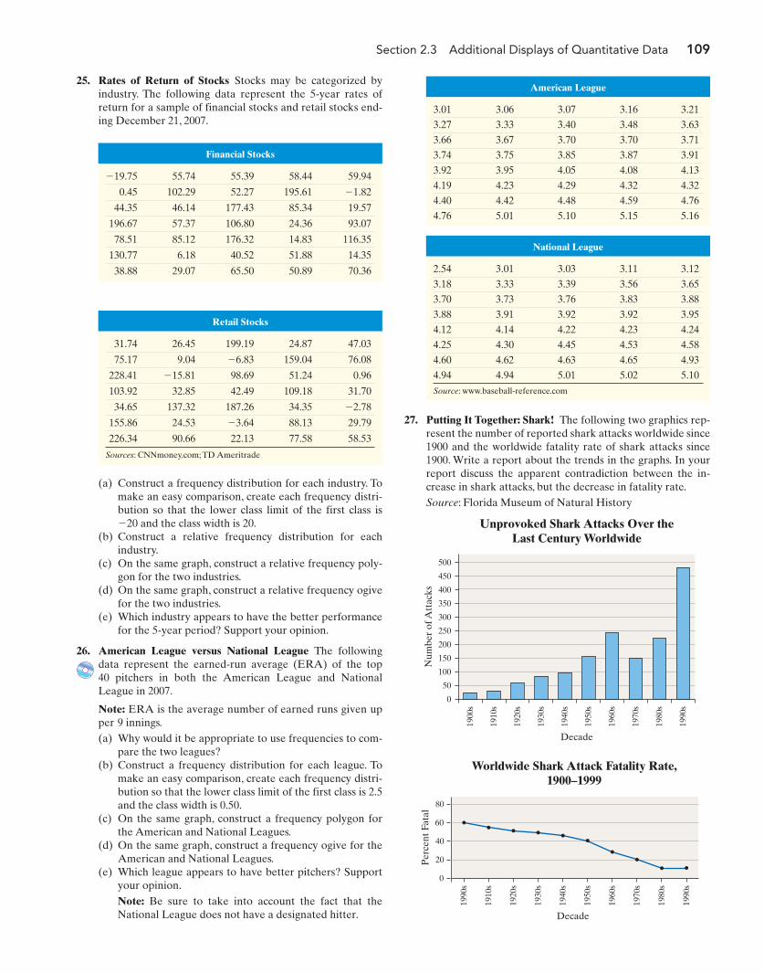
Section 2.3 Additional Displays of Quantitative Data 109
25. Rates of Return of Stocks Stocks may be categorized byindustry. The following data represent the 5-year rates ofreturn for a sample of financial stocks and retail stocks end-ing December 21, 2007.
Financial Stocks
�19.75 55.74 55.39 58.44 59.94
0.45 102.29 52.27 195.61 �1.82
44.35 46.14 177.43 85.34 19.57
196.67 57.37 106.80 24.36 93.07
78.51 85.12 176.32 14.83 116.35
130.77 6.18 40.52 51.88 14.35
38.88 29.07 65.50 50.89 70.36
Retail Stocks
31.74 26.45 199.19 24.87 47.03
75.17 9.04 �6.83 159.04 76.08
228.41 �15.81 98.69 51.24 0.96
103.92 32.85 42.49 109.18 31.70
34.65 137.32 187.26 34.35 �2.78
155.86 24.53 �3.64 88.13 29.79
226.34 90.66 22.13 77.58 58.53
Sources: CNNmoney.com; TD Ameritrade
National League
2.54 3.01 3.03 3.11 3.12
3.18 3.33 3.39 3.56 3.65
3.70 3.73 3.76 3.83 3.88
3.88 3.91 3.92 3.92 3.95
4.12 4.14 4.22 4.23 4.24
4.25 4.30 4.45 4.53 4.58
4.60 4.62 4.63 4.65 4.93
4.94 4.94 5.01 5.02 5.10
Source: www.baseball-reference.com
American League
3.01 3.06 3.07 3.16 3.21
3.27 3.33 3.40 3.48 3.63
3.66 3.67 3.70 3.70 3.71
3.74 3.75 3.85 3.87 3.91
3.92 3.95 4.05 4.08 4.13
4.19 4.23 4.29 4.32 4.32
4.40 4.42 4.48 4.59 4.76
4.76 5.01 5.10 5.15 5.16
(a) Construct a frequency distribution for each industry. Tomake an easy comparison, create each frequency distri-bution so that the lower class limit of the first class is�20 and the class width is 20.
(b) Construct a relative frequency distribution for eachindustry.
(c) On the same graph, construct a relative frequency poly-gon for the two industries.
(d) On the same graph, construct a relative frequency ogivefor the two industries.
(e) Which industry appears to have the better performancefor the 5-year period? Support your opinion.
26. American League versus National League The followingdata represent the earned-run average (ERA) of the top 40 pitchers in both the American League and NationalLeague in 2007.
Note: ERA is the average number of earned runs given upper 9 innings.(a) Why would it be appropriate to use frequencies to com-
pare the two leagues?(b) Construct a frequency distribution for each league. To
make an easy comparison, create each frequency distri-bution so that the lower class limit of the first class is 2.5and the class width is 0.50.
(c) On the same graph, construct a frequency polygon forthe American and National Leagues.
(d) On the same graph, construct a frequency ogive for theAmerican and National Leagues.
(e) Which league appears to have better pitchers? Supportyour opinion.Note: Be sure to take into account the fact that theNational League does not have a designated hitter.
27. Putting It Together: Shark! The following two graphics rep-resent the number of reported shark attacks worldwide since1900 and the worldwide fatality rate of shark attacks since1900. Write a report about the trends in the graphs. In yourreport discuss the apparent contradiction between the in-crease in shark attacks, but the decrease in fatality rate.Source: Florida Museum of Natural History
500
450
400
350
300
250
200
150
100
50
0
Num
ber
of A
ttac
ks
Unprovoked Shark Attacks Over theLast Century Worldwide
Decade
1900
s
1910
s
1920
s
1930
s
1940
s
1950
s
1960
s
1970
s
1980
s
1990
s
60
80
40
20
0
Per
cent
Fat
al
1910
s
1930
s
1990
s
1920
s
1940
s
1950
s
1960
s
1980
s
1970
s
1990
s
Worldwide Shark Attack Fatality Rate,1900–1999
Decade
M02_SULL8028_03_SE_C02.QXD 9/9/08 10:41 AM Page 109
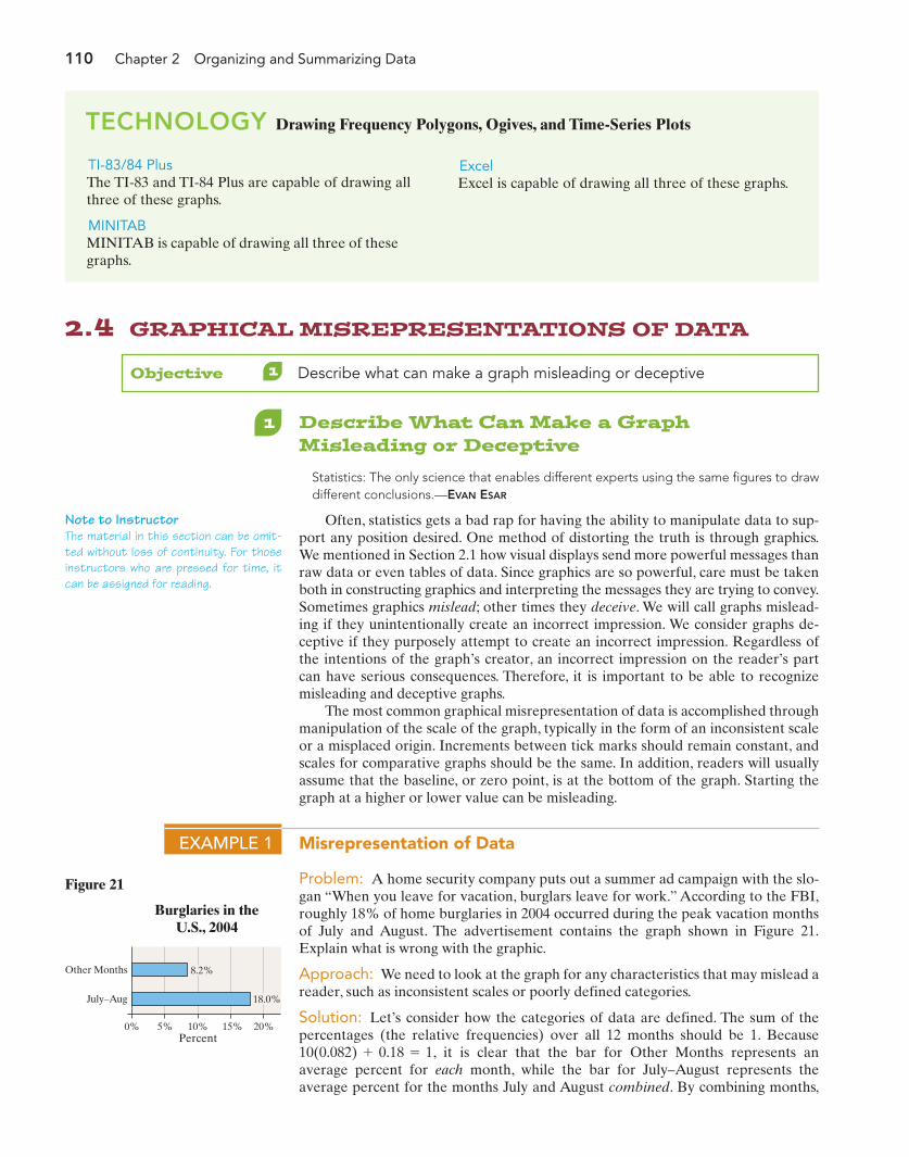
2.4 GRAPHICAL MISREPRESENTATIONS OF DATA
Note to InstructorThe material in this section can be omit-ted without loss of continuity. For thoseinstructors who are pressed for time, itcan be assigned for reading.
Objective 1 Describe what can make a graph misleading or deceptive
1 Describe What Can Make a GraphMisleading or Deceptive
Statistics: The only science that enables different experts using the same figures to drawdifferent conclusions.—EVAN ESAR
Often, statistics gets a bad rap for having the ability to manipulate data to sup-port any position desired. One method of distorting the truth is through graphics.We mentioned in Section 2.1 how visual displays send more powerful messages thanraw data or even tables of data. Since graphics are so powerful, care must be takenboth in constructing graphics and interpreting the messages they are trying to convey.Sometimes graphics mislead; other times they deceive. We will call graphs mislead-ing if they unintentionally create an incorrect impression. We consider graphs de-ceptive if they purposely attempt to create an incorrect impression. Regardless ofthe intentions of the graph’s creator, an incorrect impression on the reader’s partcan have serious consequences. Therefore, it is important to be able to recognizemisleading and deceptive graphs.
The most common graphical misrepresentation of data is accomplished throughmanipulation of the scale of the graph, typically in the form of an inconsistent scaleor a misplaced origin. Increments between tick marks should remain constant, andscales for comparative graphs should be the same. In addition, readers will usuallyassume that the baseline, or zero point, is at the bottom of the graph. Starting thegraph at a higher or lower value can be misleading.
EXAMPLE 1 Misrepresentation of Data
Problem: A home security company puts out a summer ad campaign with the slo-gan “When you leave for vacation, burglars leave for work.” According to the FBI,roughly 18% of home burglaries in 2004 occurred during the peak vacation monthsof July and August. The advertisement contains the graph shown in Figure 21.Explain what is wrong with the graphic.
Approach: We need to look at the graph for any characteristics that may mislead areader, such as inconsistent scales or poorly defined categories.
Solution: Let’s consider how the categories of data are defined. The sum of thepercentages (the relative frequencies) over all 12 months should be 1. Because
, it is clear that the bar for Other Months represents anaverage percent for each month, while the bar for July–August represents theaverage percent for the months July and August combined. By combining months,
10(0.082) + 0.18 = 1
Figure 21
0% 5% 10% 15% 20%
Other Months
July–Aug
8.2%
18.0%
Burglaries in theU.S., 2004
Percent
110 Chapter 2 Organizing and Summarizing Data
TI-83/84 PlusThe TI-83 and TI-84 Plus are capable of drawing allthree of these graphs.
MINITABMINITAB is capable of drawing all three of thesegraphs.
TECHNOLOGY Drawing Frequency Polygons, Ogives, and Time-Series Plots
ExcelExcel is capable of drawing all three of these graphs.
M02_SULL8028_03_SE_C02.QXD 9/9/08 10:41 AM Page 110

Section 2.4 Graphical Misrepresentations of Data 111
the unsuspecting reader is mislead into thinking that July and August each have amuch higher burglary rate.
Figure 22 gives a better picture of the burglary distribution.While there is an in-crease during the months of July and August, the increase is not as dramatic as thebar graph in Figure 21 implies. In fact, Figure 21 would be considered deceitfulbecause the security company is intentionally trying to convince consumers that Julyand August are much higher burglary months.
10%
8%
6%
4%
2%
0%
Per
cent
Burglaries in the U.S., 2004
Month
Jan
Feb
Mar
Apr
May Jun
Jul
Aug Sep
Oct
Nov
Dec
Source: FBI, Crime in the United States, 2004
Figure 22
Now Work Problem 5
EXAMPLE 2 Misrepresentation of Data by Manipulating the Vertical Scale
Problem: In 2005, Terri Schiavo was the center of a right-to-die battle that drewinternational attention. At issue was whether her husband had the right to removeher feeding tube on which she had been dependent for the previous 15 years. ACNN/USA Today/Gallup poll conducted March 18–20, 2005, asked respondents,“As you may know, on Friday the feeding tube keeping Terri Schiavo alive was re-moved. Based on what you have heard or read about the case, do you think that thefeeding tube should or should not have been removed?” The results were presentedin a graph similar to Figure 23. Explain what is wrong with the graphic.
6059585756555453
Per
cent
636261
Democrats
62
54 54
Republicans Independents
Results by Party (Error: �/� 7%)
Opinion Regarding Schiavo Case
Agree
Figure 23
Approach: We need to look at the graph for any characteristics that may mislead areader, such as manipulation of the vertical scale.
Solution: The graphic seems to indicate that Democrats overwhelmingly sup-ported the removal of the feeding tube, much more so than either Republicans orIndependents. Because the vertical scale does not begin at 0, it may appear thatDemocrats are 9 times more likely to support the decision (because the bar is 9times as high as the others) when there is really only an 8 percentage point differ-ence.The dramatic difference in bar heights overshadows the data being presented.Note that the majority of each party sampled supported the decision to remove thefeeding tube. In addition, given a 7 percentage point margin of error for each;
M02_SULL8028_03_SE_C02.QXD 9/9/08 10:41 AM Page 111
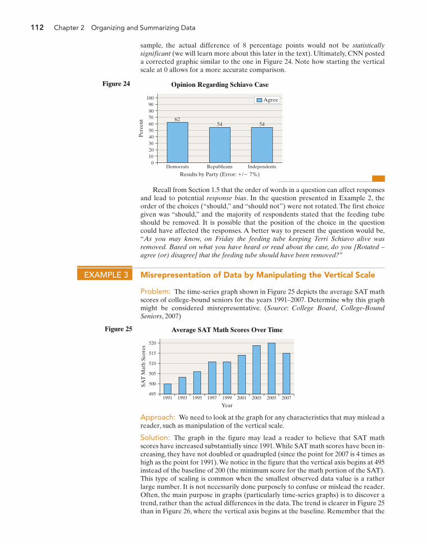
112 Chapter 2 Organizing and Summarizing Data
Recall from Section 1.5 that the order of words in a question can affect responsesand lead to potential response bias. In the question presented in Example 2, theorder of the choices (“should,” and “should not”) were not rotated. The first choicegiven was “should,” and the majority of respondents stated that the feeding tubeshould be removed. It is possible that the position of the choice in the questioncould have affected the responses. A better way to present the question would be,“As you may know, on Friday the feeding tube keeping Terri Schiavo alive wasremoved. Based on what you have heard or read about the case, do you [Rotated –agree (or) disagree] that the feeding tube should have been removed?”
70605040302010
0
Per
cent
1009080
Democrats
62
Republicans
54
Independents
54
Results by Party (Error: �/� 7%)
Agree
Opinion Regarding Schiavo CaseFigure 24
EXAMPLE 3 Misrepresentation of Data by Manipulating the Vertical Scale
Problem: The time-series graph shown in Figure 25 depicts the average SAT mathscores of college-bound seniors for the years 1991–2007. Determine why this graphmight be considered misrepresentative. (Source: College Board, College-BoundSeniors, 2007)
520
515
510
505
500
495
SAT
Mat
h Sc
ores
Average SAT Math Scores Over Time
Year1991 1993 1995 1997 1999 2001 2003 2005 2007
Figure 25
Approach: We need to look at the graph for any characteristics that may mislead areader, such as manipulation of the vertical scale.
Solution: The graph in the figure may lead a reader to believe that SAT mathscores have increased substantially since 1991.While SAT math scores have been in-creasing, they have not doubled or quadrupled (since the point for 2007 is 4 times ashigh as the point for 1991).We notice in the figure that the vertical axis begins at 495instead of the baseline of 200 (the minimum score for the math portion of the SAT).This type of scaling is common when the smallest observed data value is a ratherlarge number. It is not necessarily done purposely to confuse or mislead the reader.Often, the main purpose in graphs (particularly time-series graphs) is to discover atrend, rather than the actual differences in the data.The trend is clearer in Figure 25than in Figure 26, where the vertical axis begins at the baseline. Remember that the
sample, the actual difference of 8 percentage points would not be statisticallysignificant (we will learn more about this later in the text). Ultimately, CNN posteda corrected graphic similar to the one in Figure 24. Note how starting the verticalscale at 0 allows for a more accurate comparison.
M02_SULL8028_03_SE_C02.QXD 9/9/08 10:41 AM Page 112
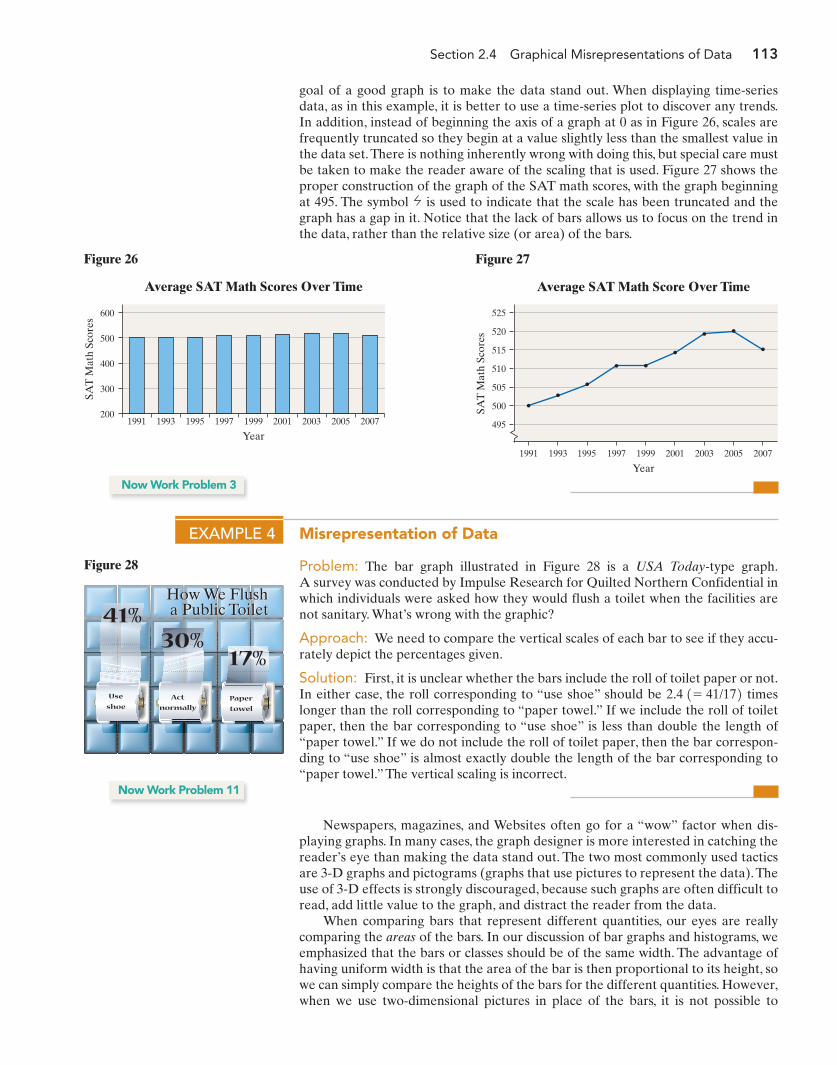
Section 2.4 Graphical Misrepresentations of Data 113
goal of a good graph is to make the data stand out. When displaying time-seriesdata, as in this example, it is better to use a time-series plot to discover any trends.In addition, instead of beginning the axis of a graph at 0 as in Figure 26, scales arefrequently truncated so they begin at a value slightly less than the smallest value inthe data set.There is nothing inherently wrong with doing this, but special care mustbe taken to make the reader aware of the scaling that is used. Figure 27 shows theproper construction of the graph of the SAT math scores, with the graph beginningat 495. The symbol is used to indicate that the scale has been truncated and thegraph has a gap in it. Notice that the lack of bars allows us to focus on the trend inthe data, rather than the relative size (or area) of the bars.
Newspapers, magazines, and Websites often go for a “wow” factor when dis-playing graphs. In many cases, the graph designer is more interested in catching thereader’s eye than making the data stand out. The two most commonly used tacticsare 3-D graphs and pictograms (graphs that use pictures to represent the data).Theuse of 3-D effects is strongly discouraged, because such graphs are often difficult toread, add little value to the graph, and distract the reader from the data.
When comparing bars that represent different quantities, our eyes are reallycomparing the areas of the bars. In our discussion of bar graphs and histograms, weemphasized that the bars or classes should be of the same width. The advantage ofhaving uniform width is that the area of the bar is then proportional to its height, sowe can simply compare the heights of the bars for the different quantities. However,when we use two-dimensional pictures in place of the bars, it is not possible to
600
500
400
300
200
SAT
Mat
h Sc
ores
Average SAT Math Scores Over Time
Year1991 1993 1995 1997 1999 2001 2003 2005 2007
Figure 26
SAT
Mat
h Sc
ores
Average SAT Math Score Over Time
525
520
515
510
505
500
495
1991 1993 1995 1997 1999
Year2001 2003 20072005
Figure 27
Now Work Problem 3
EXAMPLE 4 Misrepresentation of Data
Problem: The bar graph illustrated in Figure 28 is a USA Today-type graph.A survey was conducted by Impulse Research for Quilted Northern Confidential inwhich individuals were asked how they would flush a toilet when the facilities arenot sanitary. What’s wrong with the graphic?
Approach: We need to compare the vertical scales of each bar to see if they accu-rately depict the percentages given.
Solution: First, it is unclear whether the bars include the roll of toilet paper or not.In either case, the roll corresponding to “use shoe” should be timeslonger than the roll corresponding to “paper towel.” If we include the roll of toiletpaper, then the bar corresponding to “use shoe” is less than double the length of“paper towel.” If we do not include the roll of toilet paper, then the bar correspon-ding to “use shoe” is almost exactly double the length of the bar corresponding to“paper towel.” The vertical scaling is incorrect.
2.4 1= 41/172
How We Flush a Public ToiletHow We Flush a Public Toilet
Use
shoeAct
normallyPaper
towel
41%30%
17%
Figure 28
Now Work Problem 11
M02_SULL8028_03_SE_C02.QXD 9/9/08 10:41 AM Page 113
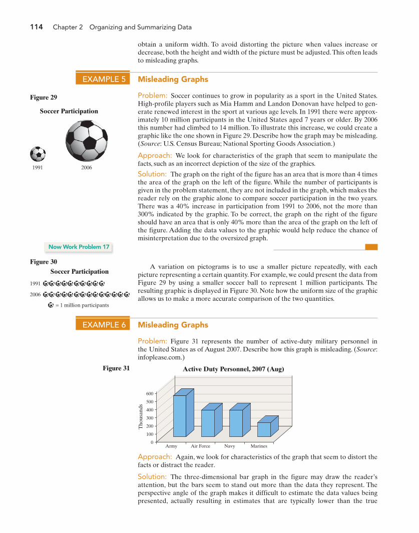
114 Chapter 2 Organizing and Summarizing Data
EXAMPLE 5 Misleading Graphs
Problem: Soccer continues to grow in popularity as a sport in the United States.High-profile players such as Mia Hamm and Landon Donovan have helped to gen-erate renewed interest in the sport at various age levels. In 1991 there were approx-imately 10 million participants in the United States aged 7 years or older. By 2006this number had climbed to 14 million. To illustrate this increase, we could create agraphic like the one shown in Figure 29. Describe how the graph may be misleading.(Source: U.S. Census Bureau; National Sporting Goods Association.)
Approach: We look for characteristics of the graph that seem to manipulate thefacts, such as an incorrect depiction of the size of the graphics.
Solution: The graph on the right of the figure has an area that is more than 4 timesthe area of the graph on the left of the figure. While the number of participants isgiven in the problem statement, they are not included in the graph, which makes thereader rely on the graphic alone to compare soccer participation in the two years.There was a 40% increase in participation from 1991 to 2006, not the more than300% indicated by the graphic. To be correct, the graph on the right of the figureshould have an area that is only 40% more than the area of the graph on the left ofthe figure. Adding the data values to the graphic would help reduce the chance ofmisinterpretation due to the oversized graph.
1991 2006
Soccer Participation
Figure 29
Now Work Problem 17
A variation on pictograms is to use a smaller picture repeatedly, with eachpicture representing a certain quantity. For example, we could present the data fromFigure 29 by using a smaller soccer ball to represent 1 million participants. Theresulting graphic is displayed in Figure 30. Note how the uniform size of the graphicallows us to make a more accurate comparison of the two quantities.
1991
2006
= 1 million participants
Soccer ParticipationFigure 30
EXAMPLE 6 Misleading Graphs
Problem: Figure 31 represents the number of active-duty military personnel inthe United States as of August 2007. Describe how this graph is misleading. (Source:infoplease.com.)
600
500
400
300
200
100
0
Tho
usan
ds
Army Air Force Navy Marines
Active Duty Personnel, 2007 (Aug)Figure 31
Approach: Again, we look for characteristics of the graph that seem to distort thefacts or distract the reader.
Solution: The three-dimensional bar graph in the figure may draw the reader’sattention, but the bars seem to stand out more than the data they represent. Theperspective angle of the graph makes it difficult to estimate the data values beingpresented, actually resulting in estimates that are typically lower than the true
obtain a uniform width. To avoid distorting the picture when values increase ordecrease, both the height and width of the picture must be adjusted.This often leadsto misleading graphs.
M02_SULL8028_03_SE_C02.QXD 9/9/08 10:41 AM Page 114
Section 2.4 Graphical Misrepresentations of Data 115
values. This in turn makes comparison of the data difficult. The only dimension thatmatters is bar height, so this is what should be emphasized. Figure 32 displays thesame data in a two-dimensional bar graph. Which graphic is easier to read?
The material presented in this section is by no means all-inclusive. There aremany ways to create graphs that mislead. Two popular texts written about ways thatgraphs mislead or deceive are How to Lie with Statistics (W. W. Norton & Company,Inc., 1982) by Darrell Huff and The Visual Display of Quantitative Information(Graphics Press, 2001) by Edward Tufte.
We conclude this section with some guidelines for constructing good graphics.
• Title and label the graphic axes clearly, providing explanations if needed. Includeunits of measurement and a data source when appropriate.
• Avoid distortion. Never lie about the data.• Minimize the amount of white space in the graph. Use the available space to let
the data stand out. If scales are truncated, be sure to clearly indicate this to thereader.
• Avoid clutter, such as excessive gridlines and unnecessary backgrounds or pic-tures. Don’t distract the reader.
• Avoid three dimensions. Three-dimensional charts may look nice, but they dis-tract the reader and often lead to misinterpretation of the graphic.
• Do not use more than one design in the same graphic. Sometimes graphs use adifferent design in one portion of the graph to draw attention to that area. Don’ttry to force the reader to any specific part of the graph. Let the data speak forthemselves.
• Avoid relative graphs that are devoid of data or scales.
600
500
400
300
200
100
0
Tho
usan
ds
Army Air Force Navy Marines
Active Duty PersonnelFigure 32
Applying the Concepts1. Inauguration Cost The following is a USA Today-type
graph. Explain how it is misleading.
InaugurationPrice Tag
$3.6 $16.3$28
$33
$3.6 $16.3$28
$33
Carter Reagan ClintonCarter Reagan GeorgeH. W. Bush
GeorgeH. W. Bush
$40$40
GeorgeW. BushGeorgeW. Bush
Clinton
2. Burning Calories The following is a USA Today-type graph.
7,5907,5905,7505,750
3,4503,4503,2203,22012 oz. beer12 oz. beer 12 oz. soda12 oz. soda
DoughnutDoughnut
CheeseburgerCheeseburger
Steps Needed to Burn Calories
(a) Explain how it is misleading.(b) What could be done to improve the graphic?
2.4 ASSESS YOUR UNDERSTANDING
M02_SULL8028_03_SE_C02.QXD 9/9/08 10:41 AM Page 115

116 Chapter 2 Organizing and Summarizing Data
34.5
34
33.5
33
32.5
32
31.5
Ear
ning
s ($
thou
sand
s)
Median Earnings for Females
Year2002 2003 2004 2005 2006
(a) How is the bar graph misleading? What does the graphseem to convey?
(b) Redraw the graph so that it is not misleading.What doesthe new graph seem to convey?
4. Union Membership The following relative frequency his-togram represents the proportion of employed people aged25 to 64 years old who were members of a union.Source: U.S. Bureau of Labor Statistics
(a) Describe how this graph is misleading. What might areader conclude from the graph?
(b) Redraw the histogram so that it is not misleading.
5. Robberies A newspaper article claimed that the afternoonhours were the worst in terms of robberies and providedthe following graph in support of this claim. Explain howthis graph is misleading.Source: U.S. Statistical Abstract, 2008
0.16
0.14
0.12
0.10
0.08
Pro
port
ion
Em
ploy
ed
25 35 45 6555
Union Membership
Age
25
20
15
10
5
0
Per
cent
of R
obbe
ries
Hourly Crime Distribution (Robbery)
Time Period6a–9a 9a–12p 12p–6p 6p–9p 9p–12a 12a–3a 3a–6a
NW
NW
15
10
5
0Acc
iden
ts (
mill
ions
)
24 Years and Younger 25 Years and Older
Number of Motor Vehicle Accidents, 2005
Age
7. Health Insurance The following relative frequency histogramrepresents the proportion of people aged 25 to 64 years oldnot covered by any health insurance in 2006.Source: U.S. Census Bureau
0.3
0.25
0.2
0.15
0.1Pro
port
ion
Not
Cov
ered
25 35 45 6555
Proportion Not Coveredby Health Insurance
Age
(a) Describe how this graph is misleading. What might areader conclude from the graph?
(b) Redraw the histogram so that it is not misleading.
8. New Homes The following time-series plot shows the num-ber of new homes built in the Midwest from 2000 to 2006.Source: U.S. Statistical Abstract, 2008
200
180
190
220
210
170
160
150
Num
ber
of N
ew H
omes
(tho
usan
ds)
2000 2001 2002 2003 2004 20062005
New Homes in Midwest
Year
(a) Describe how this graph is misleading.(b) What is the graph trying to convey?(c) In January 2006, the National Association of Realtors
reported,“A lot of demand has been met over the last fiveyears, and a modest rise in mortgage interest rates is caus-ing some market cooling. Along with regulatory tighten-ing on nontraditional mortgages, there will be fewerinvestors in the market this year.” Does the graph supportthis view? Explain why or why not.
3. Median Earnings The following graph shows the medianearnings for females from 2002 to 2006 in constant 2006dollars.Source: U.S. Census Bureau, Income, Poverty, and HealthInsurance Coverage in the United States, 2006
6. Car Accidents An article in a student newspaper claims thatyounger drivers are safer than older drivers and provides thefollowing graph to support the claim. Explain how this graphis misleading.Source: U.S. Statistical Abstract, 2008
M02_SULL8028_03_SE_C02.QXD 9/9/08 10:41 AM Page 116
33%Housing
18%Food
15%Transportation
11%Other
Cost of Raising KidsCost of Raising KidsCost of Raising Kids
Section 2.4 Graphical Misrepresentations of Data 117
Year 2001 2002 2003 2004 2005 2006 2007
Price per kWh (cents)
8.58 8.44 8.72 8.95 9.45 10.40 10.65
48.25
47.75
48
48.5
47.5
47.25
47
Inco
me
($ th
ousa
nds)
2001 2002 2003 2004 2005 2006
U.S. Median Household Income
Year
0.205
0.200
0.195
0.190
0.185
0.180
0.175
0.170
Pro
port
ion
1992 2004
Proportion of Workers Injured
Year
1977 2007
U.S. Strategic Oil Reserves(millions of barrels)
7.5
696.3
(a) Describe how the graph is misleading.(b) What is the graph trying to convey?(c) Redraw the graph so that Median Household Income
appears to be relatively stable for the years shown.
10. You Explain It! Oil Reserves The U.S. Strategic Oil Re-serve is a government-owned stockpile of crude oil. It wasestablished after the oil embargo in the mid-1970s and ismeant to serve as a national defense fuel reserve, as well asto offset reductions in commercial oil supplies that wouldthreaten the U.S. economy.Source: U.S. Energy Information Administration
(a) How many times larger should the graphic for 2007 bethan the 1977 graphic (to the nearest whole number)?
(b) The United States imported approximately 10.1 millionbarrels of oil per day in 2007. At that rate, assuming nochange in U.S. oil production, how long would the U.S.strategic oil reserve last if no oil were imported?
11. Cost of Kids The following is a USA Today-type graphbased on data from the Department of Agriculture. It repre-sents the percentage of income a middle-income family willspend on their children.
(a) How is the graphic misleading?(b) What could be done to improve the graphic?
12. Electricity The following table gives the average per kilowatt-hour prices of electricity in the United States for the years2001 to 2007.Source: U.S. Energy Information Administration
(a) Construct a misleading graph indicating that the priceper kilowatt-hour has more than tripled since 2001.
(b) Construct a graph that is not misleading.
13. ACT Composite The following table gives the average ACTcomposite scores for the years 2003–2007.
NW
Year 2003 2004 2005 2006 2007
Average ACT composite
20.8 20.9 20.9 21.1 21.2
(a) Construct a misleading time-series plot that indicatesthe average ACT composite score has risen sharply overthe given time period.
(b) Construct a time-series plot that is not misleading.(c) Which of the two graphs would you prefer if you were
merely looking for trends in the data? Explain.
14. Worker Injury The safety manager at Klutz Enterprisesprovides the following graph to the plant manager andclaims that the rate of worker injuries has been reduced by67% over a 12-year period. Does the graph support hisclaim? Explain.
10. (a) 93 times 10. (b) About 69 days
9. Median Income The following time-series plot shows themedian household income for the years 2001 to 2006 in con-stant 2006 dollars.Source: U.S. Census Bureau
M02_SULL8028_03_SE_C02.QXD 9/9/08 10:41 AM Page 117

U.S. Corn Production
9.8 9.4 9.9 9.5 9.010.1
11.8 11.1 10.5
13.1
1998
1999
2000
2001
2002
2003
2004
2005
2006
2007
0
4
8
118 Chapter 2 Organizing and Summarizing Data
2001 42.2 22.1
2002 43.0 22.0
2003 42.9 21.9
2004 42.8 21.5
2005 43.4 21.7
Source: U.S. Statistical Abstract, 2008
15. Health Care Expenditures The following data representhealth care expenditures as a percentage of the U.S. grossdomestic product (GDP) from 2001 to 2007. Gross domesticproduct is the total value of all goods and services createdduring the course of the year.Source: Center for Medicare and Medicad Services, Office ofthe Actuary
(a) Construct a time-series plot that a politician would cre-ate to support the position that health care expendi-tures, as a percentage of GDP, are increasing and mustbe slowed.
(b) Construct a time-series plot that the health care industrywould create to refute the opinion of the politician.
(c) Construct a time-series plot that is not misleading.
16. Motor Vehicle Death Rates The following data representthe number of motor vehicle deaths (within 30 days of acci-dent) and the traffic death rates (number of deaths per100,000 licensed drivers) from 2001 to 2005.
Year Health Care as a Percent of GDP
2001 14.5
2002 15.3
2003 15.8
2004 15.9
2005 16.0
2006 16.0
2007 16.2
YearMotor Vehicle Deaths(in thousands)
Traffic Death Rate (per100,000 licensed drivers)
(a) Construct a time-series graph to support the belief thatthe roads are becoming less safe.
(b) Construct a time-series graph to support the belief thatthe roads are becoming safer.
(c) Which graph do you feel better represents the situation?
17. Gas Hike The average per gallon price for regular unleadedgasoline in the United States rose from $1.46 in 2001 to $4.01in 2008.Source: U.S. Energy Information Administration(a) Construct a graphic that is not misleading to depict this
situation.(b) Construct a misleading graphic that makes it appear the
average price roughly quadrupled between 2001 and2007.
18. Overweight Between 1980 and 2006, the number of adultsin the United States who were overweight more than dou-bled from 15% to 34%.Source: Centers for Disease Control and Prevention(a) Construct a graphic that is not misleading to depict this
situation.
(b) Construct a misleading graphic that makes it appear thatthe percent of overweight adults has more than quadru-pled between 1980 and 2006.
19. Corn Production The following USA Today-type graphicillustrates U.S. corn production in billions of bushels for theyears 1998 to 2007.
(a) What type of graph is being displayed? Time-series(b) Describe some of the problems with this graphic.(c) Construct a new graphic that is not misleading and makes
the data stand out.
20. Putting It Together: College Costs The cover of the IthacaTimes from December 7, 2000 is shown.
(a) Identify the two variables being graphed and describethem in terms of type and measurement level.
(b) What type of data collection method was likely used tocreate this graph?
(c) What type of graph is displayed? Time-series(d) What message does the graph convey to you? How
might this graph be misleading?(e) Describe at least three things that are wrong with the
graph.
1965
1999
1999
1989
CornellUniversity’s
Tuition
CornellUniversity’s
Ranking
The Rising Cost of College
NW
M02_SULL8028_03_SE_C02.QXD 9/9/08 10:41 AM Page 118
Raw data are first organized into tables. Data are organizedby creating classes into which they fall. Qualitative data anddiscrete data have values that provide clear-cut categories ofdata. However, with continuous data the categories, calledclasses, must be created. Typically, the first table created is afrequency distribution, which lists the frequency with whicheach class of data occurs. Other types of distributions includethe relative frequency distribution and the cumulative frequencydistribution.
Once data are organized into a table, graphs are created. Fordata that are qualitative, we can create bar charts and pie charts.For data that are quantitative, we can create histograms, stem-and-leaf plots, frequency polygons, and ogives.
In creating graphs, care must be taken not to draw a graphthat misleads or deceives the reader. If a graph’s vertical axisdoes not begin at zero, the symbol should be used to indicatethe gap that exists in the graph.
CHAPTER 2 REVIEW
Summary
Section You should be able to Example Review Exercises
2.1 1 Organize qualitative data in tables (p. 67) 1, 2 2(a), 4(a) and (b) 2 Construct bar graphs (p. 69) 3 through 5 2(c) and (d), 4(c)3 Construct pie charts (p. 72) 6 2(e), 4(d)
2.2 1 Organize discrete data in tables (p. 82) 1 5(a) and (b)2 Construct histograms of discrete data (p. 83) 2 5(e) and (f)3 Organize continuous data in tables (p. 84) 3 3(a), 6(a) and (b), 7(a) and (b)4 Construct histograms of continuous data (p. 87) 4, 5 3(d) and (e), 6(e) and (f), 7(e) and (f)5 Draw stem-and-leaf plots (p. 88) 6 through 8 86 Draw dot plots (p. 92) 9 5(i)7 Identify the shape of a distribution (p. 92) 10 3(d), 6(e), 7(e), 8
2.3 1 Construct frequency polygons (p. 102) pp. 102–103 3(f)
Á
Objectives
2 Create cumulative frequency and relativefrequency tables (p. 103)
3(b) and (c), 5(c) and (d), 6(c) and (d),7(c) and (d)
pp. 103–104
3 Construct frequency and relative frequencyogives (p. 104)
3(h) and (i)p. 104
4 Draw time-series graphs (p. 104) 91
2.4 1 Describe what can make a graph misleading ordeceptive (p. 110)
10, 11, 12(b)1 through 6
Raw data (p. 66)Frequency distribution (p. 67)Relative frequency (p. 68)Relative frequency
distribution (p. 68)Bar graph (p. 69)Pareto chart (p. 70)Side-by-side bar graph (p. 70)Pie chart (p. 72)Class (p. 82)Histogram (p. 83)
Lower and upper class limits (p. 84)Class width (p. 84)Open ended (p. 84)Stem-and-leaf plot (p. 88)Stem (p. 88)Leaf (p. 88)Split stems (p. 91)Dot plot (p. 92)Uniform distribution (p. 92)Bell-shaped distribution (p. 92)Skewed right (p. 92)
Skewed left (p. 92)Class midpoint (p. 102)Frequency polygon (p. 102)Cumulative frequency
distribution (p. 103)Cumulative relative frequency
distribution (p. 103)Ogive (p. 104)Time-series data (p. 104)Time series plot (p. 105)
Vocabulary
Chapter 2 Review 119
M02_SULL8028_03_SE_C02.QXD 9/9/08 10:41 AM Page 119
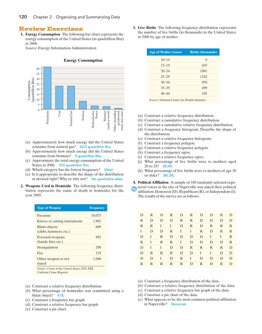
120 Chapter 2 Organizing and Summarizing Data
Type of Weapon Frequency
Firearms 10,075
Knives or cutting instruments 1,902
40
35
30
25
20
15
5
10
0
Con
sum
ptio
n (q
uadr
illio
n B
tu)
Energy Consumption
Pet
role
um
Coa
l
Nat
ural
Gas
Nuc
lear
Hyd
roel
ectr
icPo
wer
Bio
mas
s(s
uch
as w
ood)
Oth
er (
incl
udin
gge
othe
rmal
,w
ind,
and
sol
ar)
1. Energy Consumption The following bar chart represents theenergy consumption of the United States (in quadrillion Btu)in 2006.Source: Energy Information Administration
Review Exercises
(a) Approximately how much energy did the United Statesconsume from natural gas? 22.5 quadrillion Btu
(b) Approximately how much energy did the United Statesconsume from biomass? 3 quadrillion Btu
(c) Approximate the total energy consumption of the UnitedStates in 2006. 100 quadrillion Btu
(d) Which category has the lowest frequency? Other(e) Is it appropriate to describe the shape of the distribution
as skewed right? Why or why not? No; qualitative data
2. Weapons Used in Homicide The following frequency distri-bution represents the cause of death in homicides for theyear 2005.
(a) Construct a relative frequency distribution.(b) What percentage of homicides was committed using a
blunt object? 4.1%(c) Construct a frequency bar graph.(d) Construct a relative frequency bar graph.(e) Construct a pie chart.
Age of Mother (years) Births (thousands)
10–14 6
15–19 435
20–24 1081
25–29 1182
30–34 950
35–39 499
40–44 105
Source: National Center for Health Statistics
3. Live Births The following frequency distribution representsthe number of live births (in thousands) in the United Statesin 2006 by age of mother.
Blunt objects (clubs, hammers, etc.)
609
Personal weapons(hands, fists, etc.)
892
Strangulation 208
Fire 119
Other weapon or notstated
1,040
Source: Crime in the United States, 2005, FBI,Uniform Crime Reports
(a) Construct a relative frequency distribution.(b) Construct a cumulative frequency distribution.(c) Construct a cumulative relative frequency distribution.(d) Construct a frequency histogram. Describe the shape of
the distribution.(e) Construct a relative frequency histogram.(f) Construct a frequency polygon.(g) Construct a relative frequency polygon.(h) Construct a frequency ogive.(i) Construct a relative frequency ogive.(j) What percentage of live births were to mothers aged
20 to 24? 25.4%(k) What percentage of live births were to mothers of age 30
or older? 36..5%
4. Political Affiliation A sample of 100 randomly selected regis-tered voters in the city of Naperville was asked their politicalaffiliation:Democrat (D),Republican (R),or Independent (I).The results of the survey are as follows:
D R D R D R D D R D
R D D D R R D D D D
R R I I D R D R R R
I D D R I I R D R R
D I R D D D D I I R
R I R R I D D D D R
D I I D D R R R R D
D R R R D D I I D D
D D I D R I D D D D
R R R R R D R D R D
(a) Construct a frequency distribution of the data.(b) Construct a relative frequency distribution of the data.(c) Construct a relative frequency bar graph of the data.(d) Construct a pie chart of the data.(e) What appears to be the most common political affiliation
in Naperville? Democrat
M02_SULL8028_03_SE_C02.QXD 9/9/08 10:41 AM Page 120
Chapter 2 Review 121
5. Family Size A random sample of 60 couples married for 7 years were asked to give the number of children they have.The results of the survey are as follows:
(a) Construct a frequency distribution of the data.(b) Construct a relative frequency distribution of the data.(c) Construct a cumulative frequency distribution of the
data.(d) Construct a cumulative relative frequency distribution of
the data.(e) Construct a frequency histogram of the data. Describe
the shape of the distribution. bell shaped(f) Construct a relative frequency histogram of the data.(g) What percentage of couples married 7 years has two
children? 30%(h) What percentage of couples married 7 years has at least
two children? 76.7%(i) Draw a dot plot of the data.
0 0 3 1 2 33 4 3 3 0 31 2 1 3 0 34 2 3 2 2 42 1 3 4 1 30 3 3 3 2 12 0 3 1 2 34 3 3 5 2 04 2 2 2 3 32 4 2 2 2 2
6. Crime Rate by State The following data represent the crime rate (per 100,000 population) for each state and the District ofColumbia in 2005.
7. Diameter of a Cookie The following data represent the di-ameter (in inches) of a random sample of 34 Keebler ChipsDeluxe™ Chocolate Chip Cookies.
2.3414 2.3010 2.2850 2.3015 2.2850 2.3019 2.2400
2.3005 2.2630 2.2853 2.3360 2.3696 2.3300 2.3290
2.2303 2.2600 2.2409 2.2020 2.3223 2.2851 2.2382
2.2438 2.3255 2.2597 2.3020 2.2658 2.2752 2.2256
2.2611 2.3006 2.2011 2.2790 2.2425 2.3003
Source: Trina S. McNamara, student at Joliet Junior College
In (a)–(f), start the first class at a lower class limit of 1,800 and maintain a class width of 400.
(a) Construct a frequency distribution.(b) Construct a relative frequency distribution.(c) Construct a cumulative frequency distribution.(d) Construct a cumulative relative frequency distribution.(e) Construct a frequency histogram. Describe the shape of the distribution. Roughly symmetric(f) Construct a relative frequency histogram.(g) Repeat (a)–(f) using a class width of 1,000. In your opinion, which class width provides the better summary of the data? Why?
State Crime Rate State Crime Rate State Crime Rate
Alabama 4,324 Kentucky 2,798 North Dakota 2,076
Alaska 4,245 Louisiana 4,277 Ohio 4,014
Arizona 5,351 Maine 2,525 Oklahoma 4,551
Arkansas 4,586 Maryland 4,247 Oregon 4,687
California 3,849 Massachusetts 2,821 Pennsylvania 2,842
Colorado 4,437 Michigan 3,643 Rhode Island 2,970
Connecticut 2,833 Minnesota 3,381 South Carolina 5,100
Delaware 3,743 Mississippi 3,538 South Dakota 1,952
District of Columbia 6,206 Missouri 4,453 Tennessee 5,029
Florida 4,716 Montana 3,425 Texas 4,862
Georgia 4,621 Nebraska 3,710 Utah 4,096
Hawaii 5,048 Nevada 4,849 Vermont 2,401
Idaho 2,955 New Hampshire 1,928 Virginia 2,921
Illinois 3,632 New Jersey 2,688 Washington 5,239
Indiana 3,780 New Mexico 4,850 West Virginia 2,898
Iowa 3,125 New York 2,555 Wisconsin 2,902
Kansas 4,174 North Carolina 4,543 Wyoming 3,385
Source: Crime in the United States, 2005. FBI, Uniform Crime Reports.
(a) Construct a frequency distribution.(b) Construct a relative frequency distribution.(c) Construct a cumulative frequency distribution.(d) Construct a cumulative relative frequency distribution.(e) Construct a frequency histogram. Describe the shape of
the distribution.(f) Construct a relative frequency histogram.
M02_SULL8028_03_SE_C02.QXD 9/9/08 10:41 AM Page 121
122 Chapter 2 Organizing and Summarizing Data
8. Time Online The following data represent the average num-ber of hours per week that a random sample of 40 collegestudents spend online.
18.9 14.0 24.4 17.4 13.7 16.5 14.8 20.8
22.9 22.2 13.4 18.8 15.1 21.9 21.1 14.7
18.6 18.0 21.1 15.6 16.6 20.6 17.3 17.9
15.2 16.4 14.5 17.1 25.7 17.4 18.8 17.1
13.6 20.1 15.3 19.2 23.4 14.5 18.6 23.8
The data are based on the ECAR Study of UndergraduateStudents and Information Technology, 2007. Construct astem-and-leaf diagram of the data, and comment on theshape of the distribution. Skewed right
9. Eliminating Syphilis Syphilis is a highly infectious sexuallytransmitted disease. The disease is treatable, but if left un-treated can lead to serious health problems and even death.The prevalence of syphilis can be tracked by means of inci-dence rates (the number of reported cases per 100,000 popu-lation). The following data are the incidence rates forprimary and secondary syphilis (the most infectious) from1990 to 1999.
Year Rate Year Rate
1990 20.3 1995 6.2
1991 17.0 1996 4.2
1992 13.3 1997 3.1
1993 10.2 1998 2.5
1994 7.8 1999 2.4
Year Rate Year Rate
2000 2.1 2004 2.7
2001 2.1 2005 2.8
2002 2.4 2006 3.3
2003 2.5
Skin Health (Moisture Retention)
AHA Q10 Vitamin C Retinol Vitaniacin
40%Flats Only
31%Medium
High
1%ExtraHigh
28%Low
Heels forEveryday
(a) Construct a time plot for the data. Comment on theapparent trend.
(b) The low rate and localized occurrence led the Centers forDisease Control and Prevention (CDC) to develop theNational Plan to Eliminate Syphilis in 1999. Construct atime-series plot for incidence rates from 2000 to 2006.
(c) The CDC’s plan to eliminate syphilis was revised in 2006.Why do you think this was necessary?
(d) Would a histogram of incidence rates of syphilis allow aresearcher to observe trends in the data? Explain.
10. Misleading Graphs The following graph was found in amagazine advertisement for skin cream. How is this graphmisleading?
11. Misleading Graphs In 2005 the average earnings of a highschool graduate were $29,448. At $54,689, the average earn-ings of a recipient of a bachelor’s degree were about 86%higher.Source: U.S. Census Bureau, Current Population Survey,2006(a) Construct a misleading graph that a college recruiter
might create to convince high school students that theyshould attend college.
(b) Construct a graph that does not mislead.
12. High Heels The following graphic is a USA Today-typegraph displaying women’s preference for shoes.
(a) Which type of shoe is preferred the most? The least?(b) How is the graph misleading?
M02_SULL8028_03_SE_C02.QXD 9/9/08 10:41 AM Page 122
Chapter Test 123
CHAPTER TEST
16
14
12
10
8
6
4
2
0
Num
ber
of C
ham
pion
ship
s
Wimbledon Men’s SinglesChampionship (1968–2007)
Country Represented
Uni
ted
Stat
es
Swed
en
Aus
tral
ia
Swit
zerl
and
Ger
man
y
Cro
atia
Cze
chos
lova
kia
Net
herl
ands
1. (a) United States; 15
1. The following graph shows the country represented by thechampion of the men’s singles competition at the WimbledonTennis Championship from 1968 (when professional playerswere first allowed to participate in the tournament) through2007.Source: www.wimbledon.org
Gas Emissions
Carbon dioxide 5,934.4
Methane 605.1
Nitrous oxide 378.6
Hydrofluorocarbons,perfluorocarbons, and sulfur hexafluoride
157.6
Source: Energy Information Administration, Emissionsof Greenhouse Gases in the United States 2006,November 2007
2. (b) 83.87%
(a) Which country’s representatives won the most champi-onships from 1968 to 2007? How many did they win?
(b) How many more championships were won by represen-tatives of Australia than Germany? 2
(c) What percentage of championships from 1968 to 2007was won by representatives of Sweden? 17.5%
(d) Is it appropriate to describe the shape of the distributionas skewed right? Why or why not? No; qualitative data
2. The following frequency distribution represents the totalgreenhouse emissions in millions of metric tons in 2006 in theUnited States.
(a) Construct a relative frequency distribution.(b) What percent of emissions was due to carbon dioxide? (c) Construct a frequency bar graph.(d) Construct a relative frequency bar graph.(e) Construct a pie chart.
No high school diploma Some college Advanced degree High school graduate Advanced degree
High school graduate High school graduate High school graduate High school graduate No high school diploma
Some college High school graduate Bachelor’s degree Associate’s degree High school graduate
No high school diploma Bachelor’s degree Some college High school graduate No high school diploma
Associate’s degree High school graduate High school graduate No high school diploma Some college
Bachelor’s degree Bachelor’s degree Some college High school graduate Some college
Bachelor’s degree Advanced degree No high school diploma Advanced degree No high school diploma
High school graduate Bachelor’s degree No high school diploma High school graduate No high school diploma
Associate’s degree Bachelor’s degree High school graduate Bachelor’s degree Some college
Some college Associate’s degree High school graduate Some college High school graduate
3. The Metra Train Company was interested in knowing the educational background of its customers.The company contracted a mar-keting firm to conduct a survey with a random sample of 50 commuters at the train station. In the survey, commuters were asked todisclose their educational attainment. The following results were obtained:
1 7 3 8 2 3 8 2 6 3
6 5 6 4 3 4 3 8 1 2
5 3 6 3 3 4 3 2 1 2
4 4 9 3 5 2 3 5 5 5
2 5 6 1 7 1 5 3 8 4
(a) Construct a frequency distribution of the data.(b) Construct a relative frequency distribution of the data.(c) Construct a relative frequency bar graph of the data.(d) Construct a pie chart of the data.(e) What is the most common educational level of a commuter? High school graduate
4. The following data represent the number of cars that arrivedat a McDonald’s drive-through between 11:50 A.M. and 12:00noon each Wednesday for the past 50 weeks:(a) Construct a frequency distribution of the data.(b) Construct a relative frequency distribution of the data.(c) Construct a cumulative frequency distribution of the data.
M02_SULL8028_03_SE_C02.QXD 9/9/08 10:41 AM Page 123
124 Chapter 2 Organizing and Summarizing Data
100 114 165 169 198
279 214 206 220 143
147 209 226 229 260
263 246 249 118 125
269 294 352 376 434
459 147 149 121 133
164 189 190 250 311
273 244 284 190 122
5. (a) 100 grams; 50 grams
Closing Price ($) Number of Houses
50,000–99,999 4
100,000–149,999 13
150,000–199,999 19
200,000–249,999 7
250,000–299,999 3
300,000–349,999 2
350,000–399,999 1
400,000–449,999 0
450,000–499,999 1
(c) Construct a relative frequency distribution.(d) Construct a frequency histogram. Describe the shape of
the distribution. Skewed right(e) Construct a relative frequency histogram.
6. The following frequency distribution represents the closingprices (in dollars) of homes sold in a Midwest city.
(d) Construct a cumulative relative frequency distribution ofthe data.
(e) Construct a frequency histogram of the data. Describethe shape of the distribution. Skewed right
(f) Construct a relative frequency histogram of the data.(g) What percentage of weeks did exactly three cars arrive
between 11:50 A.M. and 12:00 noon? 24%(h) What percentage of weeks did three or more cars arrive
between 11:50 A.M. and 12:00 noon? 76%(i) Draw a dot plot of the data.
5. The following data represent the serving sizes (in grams) of40 sandwiches served at McDonald’s and Burger King.Sources: McDonald’s Corporation, McDonald’s USA Nutri-tion Facts, November 2007; Burger King Corporation,Nutritional Information, October 2007
(a) If eight classes are to be formed, choose an appropriatelower class limit for the first class and a class width.
(b) Construct a frequency distribution.
State Fertility Rate State Fertility Rate State Fertility Rate
Alabama 67.0 Kentucky 67.2 North Dakota 68.7
Alaska 76.7 Louisiana 70.6 Ohio 64.7
Arizona 81.6 Maine 54.5 Oklahoma 74.7
Arkansas 72.3 Maryland 64.2 Oregon 65.5
California 71.8 Massachusetts 57.0 Pennsylvania 60.6
Colorado 70.2 Michigan 61.7 Rhode Island 56.6
Connecticut 58.8 Minnesota 68.7 South Carolina 69.7
Delaware 67.3 Mississippi 75.8 South Dakota 78.4
District of Columbia 58.5 Missouri 67.9 Tennessee 67.5
Florida 67.3 Montana 69.5 Texas 78.8
Georgia 72.4 Nebraska 75.1 Utah 94.1
Hawaii 73.9 Nevada 78.0 Vermont 52.2
Idaho 80.9 New Hampshire 53.4 Virginia 66.3
Illinois 66.8 New Jersey 64.4 Washington 65.2
Indiana 68.3 New Mexico 74.7 West Virginia 59.4
Iowa 69.1 New York 61.1 Wisconsin 64.0
Kansas 73.3 North Carolina 69.0 Wyoming 75.9
Source: National Center for Health Statistics, National Vital Statistics Reports, Vol. 56, No. 7, December 5, 2007
(a) Round each observation to the nearest whole number and draw a stem-and-leaf diagram using split stems.(b) Describe the shape of the distribution. Slightly skewed right
7. The following data represent the fertility rate (births per 1,000 women aged 15 to 44) for each state and the District of Columbiain 2006.
(a) Construct a cumulative frequency distribution.(b) Construct a cumulative relative frequency distribution.(c) What percent of homes sold for less than $200,000? 72%(d) Construct a frequency polygon. Describe the shape of
the distribution. Skewed right(e) Construct a frequency ogive.(f) Construct a relative frequency ogive.
M02_SULL8028_03_SE_C02.QXD 9/9/08 10:41 AM Page 124

Chapter Test 125
8. The following data represent the average price (in dollars) ofa gallon of reduced fat (2%) milk in the United States at thebeginning of each month in the years 2006 and 2007. Con-struct a time-series plot and comment on any trends.
Month Average Price Month Average Price
1/06 3.19 1/07 3.19
2/06 3.15 2/07 3.18
3/06 3.15 3/07 3.21
4/06 3.11 4/07 3.22
5/06 3.09 5/07 3.30
6/06 3.06 6/07 3.47
7/06 3.03 7/07 3.70
8/06 3.06 8/07 3.77
9/06 3.05 9/07 3.80
10/06 3.09 10/07 3.76
11/06 3.06 11/07 3.77
12/06 3.11 12/07 3.74
Source: Agricultural Marketing Service, U.S. Department of Agriculture
Most PopularWays to Savefor College
CDs
17%
MutualFunds
31%
SavingsAccount
37%
Bonds
21%
the other 10. Ask each individual to study the tableor graph for 5 seconds. After 1 minute, give a ques-tionnaire that asks various questions regarding theinformation contained in the table or graph. Forexample, if you summarize age data, ask the indi-vidual which age group has the highest frequency.Record the number of correct answers for each in-dividual. Which summary results in a higher per-centage of correct answers, the tables or thegraphs? Write a report that discusses your findings.4. Now use the data collected from the question-naire to create some misleading graphs. Again,select 20 individuals. Give 10 individuals the mis-leading graphs and 10 individuals the correctgraphs. Ask each individual to study each graph for5 seconds. After 1 minute has elapsed, give a ques-tionnaire that asks various questions regarding theinformation contained in the graphs. Record thenumber of correct answers for each individual. Didthe misleading graphs mislead? Write a report thatdiscusses your findings.Note: Be sure to check with your school’s adminis-tration regarding privacy laws and policies regard-ing studies involving human subjects. >
9. The following is a USA Today-type graph.
Do you think the graph is misleading? Why? If you think it ismisleading, what might be done to improve the graph?
Tables or Graphs?You work for the school news-paper. Your editor approaches
you with a special reporting assignment.Your task isto write an article that describes the“typical”studentat your school, complete with supporting informa-tion. To write this article, you have to survey at least40 students and ask them to respond to a question-naire.The editor would like to have at least two qual-itative and two quantitative variables that describethe typical student. The results of the survey will bepresented in your article,but you are unsure whetheryou should present tabular or graphical summaries,so you decide to perform the following experiment.
1. Develop a questionnaire that results in obtain-ing the values of two qualitative and two quantita-tive variables. Administer the questionnaire to atleast 40 students on your campus.2. Summarize the data in both tabular and graphi-cal form.3. Select 20 individuals. (They don’t have to be stu-dents at your school.) Give the tabular summariesto 10 individuals and the graphical summaries to
M02_SULL8028_03_SE_C02.QXD 9/9/08 10:41 AM Page 125

The Day the Sky RoaredC
ASE
STU
DY
126
Shortly after daybreak on April 3, 1974, thunder began to rumble through the darkskies that covered much of the midwestern United States. Lightning struck areasfrom the Gulf Coast states to the Canadian border. By the predawn hours of thenext day, the affected region of around 490,000 acres was devastated by more than100 tornadoes. This “super outbreak” was responsible for the deaths of more than300 people in 11 states. More than 6,100 people were injured by the storms, withapproximately 27,500 families suffering some kind of loss. The total cost attributedto the disaster was more than $600 million. Amazingly, the storm resulted in six cat-egory 5 tornadoes with wind speeds exceeding 261 miles per hour. To put this figurein perspective, the region endured about one decade’s worth of category 5 torna-does in a single 24-hour period!
Fujita Wind Damage Scale
F-scale Wind Speed (mph) Damage
F-0 Up to 72 Light
F-1 73 to 112 Moderate
F-2 113 to 157 Considerable
F-3 158 to 206 Severe
F-4 207 to 260 Devastating
F-5 Above 260 Incredible
Structural engineers and meteorologists are interested in understanding cata-strophic events such as this tornado outbreak. Variables such as tornado intensity(as described by the F-scale), tornado duration (time spent by the tornado in con-tact with the ground), and death demographics can provide insights into theseevents and their impact on the human population.The following table lists the dura-tion time and F-scale for each tornado in the April 1974 super outbreak.
Tornado Duration Times for Outbreak of April 3–4, 1974
F-scale Tornado Duration (minutes)
F-0 1, 1, 5, 1, 1, 6, 4, 10, 5, 4, 1, 1, 1, 1, 1, 1, 1, 1, 1, 30, 1, 9
F-1 16, 13, 9, 8, 13, 10, 15, 1, 17, 23, 10, 8, 12, 5, 20, 31, 12, 5, 30, 13, 7, 1, 5, 13, 1, 2, 5, 10,1, 20, 5
F-2 7, 15, 2, 10, 23, 10, 7, 12, 8, 1, 8, 19, 5, 10, 15, 20, 10, 13, 20, 15, 13, 14, 1, 4, 2, 15, 30,91, 11, 5
F-3 9, 20, 8, 16, 26, 36, 10, 20, 50, 17, 26, 31, 21, 30, 23, 28, 23, 18, 35, 35, 15, 25, 30, 15, 22,18, 58, 19, 23, 31, 13, 26, 40, 14, 11
F-4 120, 23, 23, 42, 47, 25, 22, 22, 34, 50, 38, 28, 39, 29, 28, 25, 34, 16, 40, 55, 124, 30, 30, 31
F-5 37, 69, 23, 52, 61, 122
M02_SULL8028_03_SE_C02.QXD 9/9/08 10:41 AM Page 126
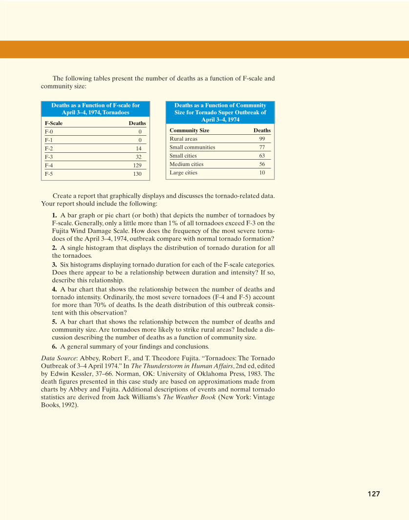
Create a report that graphically displays and discusses the tornado-related data.Your report should include the following:
1. A bar graph or pie chart (or both) that depicts the number of tornadoes byF-scale. Generally, only a little more than 1% of all tornadoes exceed F-3 on theFujita Wind Damage Scale. How does the frequency of the most severe torna-does of the April 3–4, 1974, outbreak compare with normal tornado formation?2. A single histogram that displays the distribution of tornado duration for allthe tornadoes.3. Six histograms displaying tornado duration for each of the F-scale categories.Does there appear to be a relationship between duration and intensity? If so,describe this relationship.4. A bar chart that shows the relationship between the number of deaths andtornado intensity. Ordinarily, the most severe tornadoes (F-4 and F-5) accountfor more than 70% of deaths. Is the death distribution of this outbreak consis-tent with this observation?5. A bar chart that shows the relationship between the number of deaths andcommunity size. Are tornadoes more likely to strike rural areas? Include a dis-cussion describing the number of deaths as a function of community size.6. A general summary of your findings and conclusions.
Data Source: Abbey, Robert F., and T. Theodore Fujita. “Tornadoes: The TornadoOutbreak of 3–4 April 1974.” In The Thunderstorm in Human Affairs, 2nd ed, editedby Edwin Kessler, 37–66. Norman, OK: University of Oklahoma Press, 1983. Thedeath figures presented in this case study are based on approximations made fromcharts by Abbey and Fujita. Additional descriptions of events and normal tornadostatistics are derived from Jack Williams’s The Weather Book (New York: VintageBooks, 1992).
127
Deaths as a Function of CommunitySize for Tornado Super Outbreak of
April 3–4, 1974
Community Size Deaths
Rural areas 99
Small communities 77
Small cities 63
Medium cities 56
Large cities 10
Deaths as a Function of F-scale forApril 3–4, 1974, Tornadoes
F-Scale Deaths
F-0 0
F-1 0
F-2 14
F-3 32
F-4 129
F-5 130
The following tables present the number of deaths as a function of F-scale andcommunity size:
M02_SULL8028_03_SE_C02.QXD 9/9/08 10:41 AM Page 127


![Naruto v02 c07 [animakong]](https://static.fdocuments.in/doc/165x107/55abc9d41a28ab403f8b465f/naruto-v02-c07-animakong.jpg)