LOGO GUIDELINES - Ohio State Buckeyes
5
LOGO GUIDELINES The Ohio State University Department of Athletics
Transcript of LOGO GUIDELINES - Ohio State Buckeyes

Ohio State AthleticsLogo Guidelines
Introduction
1
01LOGO
Insert text here...Insert text here...Insert text here...Insert text here...Insert text here...Insert text here...Insert text here...Insert text here...Insert text here...Insert text here...Insert text here...Insert text here...Insert text here...
LOGO GUIDELINES
The Ohio State University Department of Athletics
Ohio State AthleticsLogo Guidelines
1
01LOGO
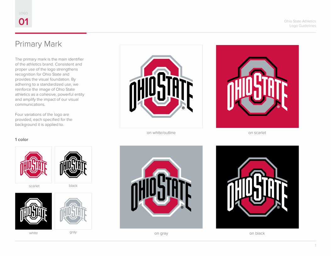
Primary Mark
on blackon gray
on white/outline on scarlet
The primary mark is the main identifier of the athletics brand. Consistent and proper use of the logo strengthens recognition for Ohio State and provides the visual foundation. By adhering to a standardized use, we reinforce the image of Ohio State athletics as a cohesive, powerful entity and amplify the impact of our visual communications.
Four variations of the logo are provided, each specified for the background it is applied to.
white gray
black
1 color
scarlet
Ohio State AthleticsLogo Guidelines
2
01LOGO
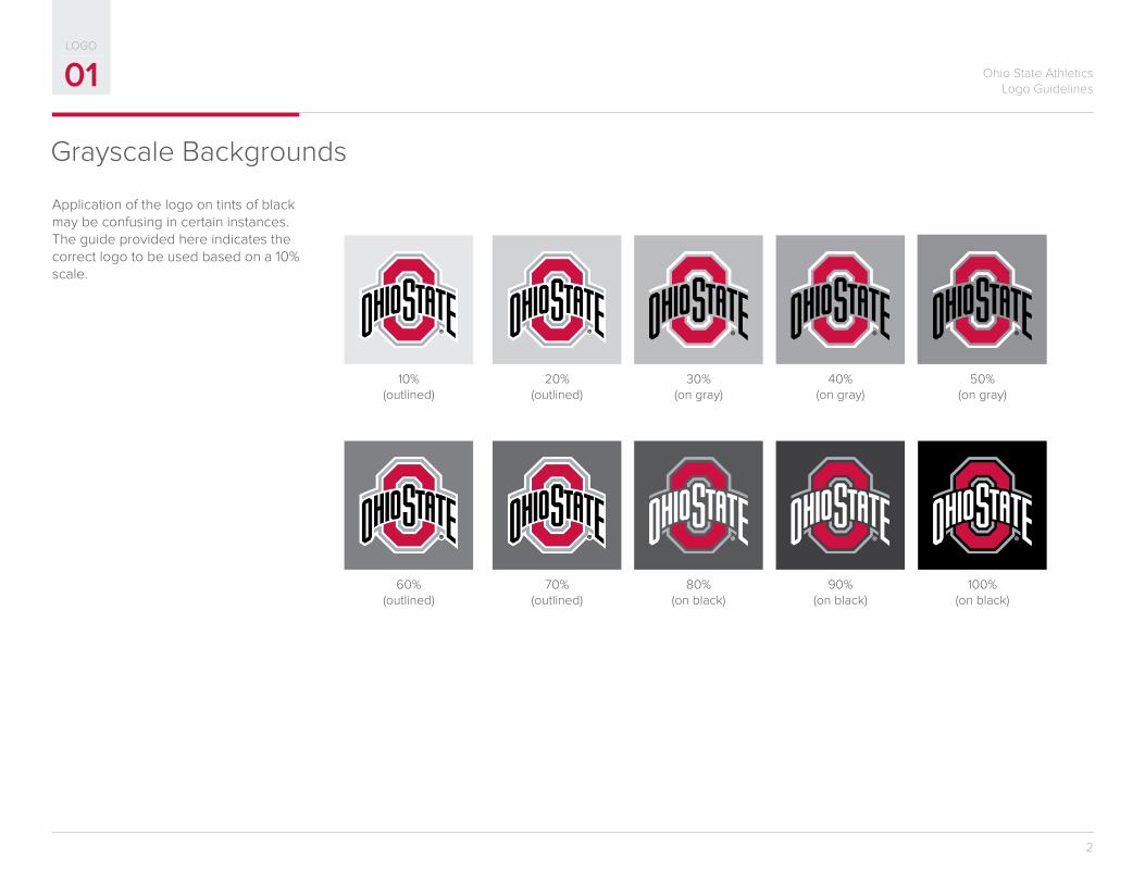
Grayscale Backgrounds
10%(outlined)
60%(outlined)
20%(outlined)
70%(outlined)
30%(on gray)
80%(on black)
40%(on gray)
90%(on black)
50%(on gray)
100%(on black)
Application of the logo on tints of black may be confusing in certain instances. The guide provided here indicates the correct logo to be used based on a 10% scale.
Ohio State AthleticsLogo Guidelines
3
01LOGO
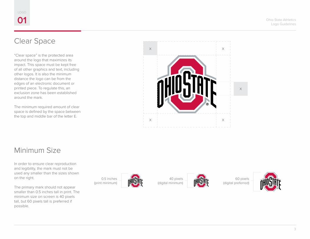
Clear Space
Minimum Size
In order to ensure clear reproduction and legibility, the mark must not be used any smaller than the sizes shown on the right.
The primary mark should not appear smaller than 0.5 inches tall in print. The minimum size on screen is 40 pixels tall, but 60 pixels tall is preferred if possible.
x
x x
xx
0.5 inches(print minimum)
40 pixels(digital minimum)
60 pixels(digital preferred)
“Clear space” is the protected area around the logo that maximizes its impact. This space must be kept free of all other graphics and text, including other logos. It is also the minimum distance the logo can be from the edges of an electronic document or printed piece. To regulate this, an exclusion zone has been established around the mark.
The minimum required amount of clear space is defined by the space between the top and middle bar of the letter E.
Ohio State AthleticsLogo Guidelines
4
01LOGO
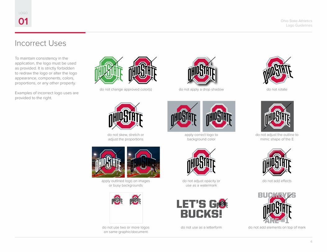
To maintain consistency in the application, the logo must be used as provided. It is strictly forbidden to redraw the logo or alter the logo appearance, components, colors, proportions, or any other property.
Examples of incorrect logo uses are provided to the right.
Incorrect Uses
do not apply a drop shadow
apply correct logo to background color
do not adjust opacity or use as a watermark
do not use as a letterform
do not change approved color(s)
do not skew, stretch or adjust the proportions
apply outlined logo on imagesor busy backgrounds
do not use two or more logos on same graphic/document
do not rotate
do not adjust the outline to mimic shape of the E
do not add effects
do not add elements on top of mark
LET’S G OBUCKS!
BUCKEYES
ARE #1