Learning Style Similarity for Searching...
6
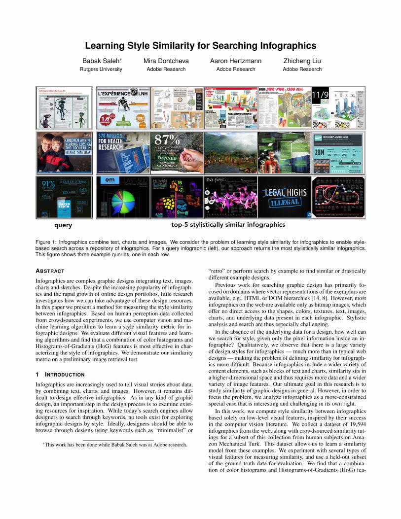
Learning Style Similarity for Searching Infographics Babak Saleh * Rutgers University Mira Dontcheva Adobe Research Aaron Hertzmann Adobe Research Zhicheng Liu Adobe Research query top-5 stylistically similar infographics Figure 1: Infographics combine text, charts and images. We consider the problem of learning style similarity for infographics to enable style- based search across a repository of infographics. For a query infographic (left), our approach returns the most stylistically similar infographics. This figure shows three example queries, one in each row. ABSTRACT Infographics are complex graphic designs integrating text, images, charts and sketches. Despite the increasing popularity of infograph- ics and the rapid growth of online design portfolios, little research investigates how we can take advantage of these design resources. In this paper we present a method for measuring the style similarity between infographics. Based on human perception data collected from crowdsourced experiments, we use computer vision and ma- chine learning algorithms to learn a style similarity metric for in- fographic designs. We evaluate different visual features and learn- ing algorithms and find that a combination of color histograms and Histograms-of-Gradients (HoG) features is most effective in char- acterizing the style of infographics. We demonstrate our similarity metric on a preliminary image retrieval test. 1 I NTRODUCTION Infographics are increasingly used to tell visual stories about data, by combining text, charts, and images. However, it remains dif- ficult to design effective infographics. As in any kind of graphic design, an important step in the design process is to examine exist- ing resources for inspiration. While today’s search engines allow designers to search through keywords, no tools exist for exploring infographic designs by style. Ideally, designers should be able to browse through designs using keywords such as “minimalist” or * This work has been done while Babak Saleh was at Adobe research. “retro” or perform search by example to find similar or drastically different example designs. Previous work for searching graphic design has primarily fo- cused on domains where vector representations of the exemplars are available, e.g., HTML or DOM hierarchies [14, 8]. However, most infographics on the web are available only as bitmap images, which offer no direct access to the shapes, colors, textures, text, images, charts, and underlying data present in each infographic. Stylistic analysis and search are thus especially challenging. In the absence of the underlying data for a design, how well can we search for style, given only the pixel information inside an in- fographic? Qualitatively, we observe that there is a large variety of design styles for infographics — much more than in typical web designs — making the problem of defining similarity for infograph- ics more difficult. Because infographics include a wider variety of content elements, such as blocks of text and charts, similarity sits in a higher-dimensional space and thus requires more data and a wider variety of image features. Our ultimate goal in this research is to study similarity of graphic designs in general. However, in order to focus the problem, we analyze infographics as a more-constrained special case that is interesting and challenging in its own right. In this work, we compute style similarity between infographics based solely on low-level visual features, inspired by their success in the computer vision literature. We collect a dataset of 19,594 infographics from the web, along with crowdsourced similarity rat- ings for a subset of this collection from human subjects on Ama- zon Mechanical Turk. This dataset allows us to learn a similarity model from these examples. We experiment with several types of visual features for measuring similarity, and use a held-out subset of the ground truth data for evaluation. We find that a combina- tion of color histograms and Histograms-of-Gradients (HoG) fea-
Transcript of Learning Style Similarity for Searching...
Learning Style Similarity for Searching InfographicsBabak Saleh∗
Rutgers UniversityMira Dontcheva
Adobe ResearchAaron Hertzmann
Adobe ResearchZhicheng LiuAdobe Research
query top-5 stylistically similar infographics
Figure 1: Infographics combine text, charts and images. We consider the problem of learning style similarity for infographics to enable style-based search across a repository of infographics. For a query infographic (left), our approach returns the most stylistically similar infographics.This figure shows three example queries, one in each row.
ABSTRACT
Infographics are complex graphic designs integrating text, images,charts and sketches. Despite the increasing popularity of infograph-ics and the rapid growth of online design portfolios, little researchinvestigates how we can take advantage of these design resources.In this paper we present a method for measuring the style similaritybetween infographics. Based on human perception data collectedfrom crowdsourced experiments, we use computer vision and ma-chine learning algorithms to learn a style similarity metric for in-fographic designs. We evaluate different visual features and learn-ing algorithms and find that a combination of color histograms andHistograms-of-Gradients (HoG) features is most effective in char-acterizing the style of infographics. We demonstrate our similaritymetric on a preliminary image retrieval test.
1 INTRODUCTION
Infographics are increasingly used to tell visual stories about data,by combining text, charts, and images. However, it remains dif-ficult to design effective infographics. As in any kind of graphicdesign, an important step in the design process is to examine exist-ing resources for inspiration. While today’s search engines allowdesigners to search through keywords, no tools exist for exploringinfographic designs by style. Ideally, designers should be able tobrowse through designs using keywords such as “minimalist” or
∗This work has been done while Babak Saleh was at Adobe research.
“retro” or perform search by example to find similar or drasticallydifferent example designs.
Previous work for searching graphic design has primarily fo-cused on domains where vector representations of the exemplars areavailable, e.g., HTML or DOM hierarchies [14, 8]. However, mostinfographics on the web are available only as bitmap images, whichoffer no direct access to the shapes, colors, textures, text, images,charts, and underlying data present in each infographic. Stylisticanalysis and search are thus especially challenging.
In the absence of the underlying data for a design, how well canwe search for style, given only the pixel information inside an in-fographic? Qualitatively, we observe that there is a large varietyof design styles for infographics — much more than in typical webdesigns — making the problem of defining similarity for infograph-ics more difficult. Because infographics include a wider variety ofcontent elements, such as blocks of text and charts, similarity sits ina higher-dimensional space and thus requires more data and a widervariety of image features. Our ultimate goal in this research is tostudy similarity of graphic designs in general. However, in order tofocus the problem, we analyze infographics as a more-constrainedspecial case that is interesting and challenging in its own right.
In this work, we compute style similarity between infographicsbased solely on low-level visual features, inspired by their successin the computer vision literature. We collect a dataset of 19,594infographics from the web, along with crowdsourced similarity rat-ings for a subset of this collection from human subjects on Ama-zon Mechanical Turk. This dataset allows us to learn a similaritymodel from these examples. We experiment with several types ofvisual features for measuring similarity, and use a held-out subsetof the ground truth data for evaluation. We find that a combina-tion of color histograms and Histograms-of-Gradients (HoG) fea-
tures works best for learning similarity, in comparison to the other,primarily low-level, visual features that we tested. Our work is ex-ploratory, we leave comprehensive study on the use of high-levelfeatures for future. We demonstrate the method by showing search-by-similarity results on the full dataset (Figure 1).
2 RELATED WORK
Our work lies at the intersection of data visualization, graphic de-sign, and learning similarity based on human judgments. To thebest of our knowledge, this paper is the first to explore style simi-larity for infographics.
Researchers have conducted experiments to understand whatmakes infographics effective and have found that visual embellish-ments including recognizable cartoons and images, elements thatare common to infographics, enhance data presentation and mem-orability [1, 2] . There also has been some previous work on ap-plying computer vision algorithms to data visualizations. Prasad etal. [13] categorize simple charts types, namely, bar charts, curveplots, pie charts, scatter plots and surface plots based on low-levelvisual features of bitmap images (HoG and SIFT). Savva et al. [15]classify a number of chart types, including bar charts, pie chartsand line graphs, extract the data from the visualization, and suggestimproved design layouts to visualize the same data in a better way.Both of these works require each input to comprise only a singlechart type, and both works attempt to factor out the effects of style.In contrast, we consider infographics that may comprise complexarrangements of elements, and we focus on comparing style with-out detailed parsing of the inputs.
Several previous systems have explored search-by-style for webdesign. Ritchie et al. [14] propose a search interface for web designthat supports style-based search based on a set of style features in-cluding layout, color, text, and images. Kumar et al. search for webdesigns based on style in a large dataset of 100,000 webpages [8],and demonstrate style retargeting across website designs by crowd-sourcing the mapping between designs [9]. Chaudhuri et al. [3]predict stylistic attributes of web designs. In each of these meth-ods, it is assumed that the full HTML/DOM hierarchy is availableand there is a limited space of possible layouts. In contrast, we fo-cus on infographics, for which vector data is rarely available, andthus, we must begin from bitmap input.
Our work is inspired by methods for style-based search in linedrawings [6], illustrations [5], and fonts [10]. Unlike previouswork, we focus on infographics, which include heterogenous ele-ments arranged in complex layouts.
3 OVERVIEW
Our goal is to determine the stylistic similarity between any twoinfographics. Given two bitmap images of infographics, our modelreturns a numerical score evaluating the stylistic similarity betweenthe two infographics. Our approach for learning and modeling sim-ilarity is similar to [5] and [10] and is summarized in Section 6. Totrain our similarity model, we crowdsourced similarity ratings fora subset of our dataset. We collected similarity ratings from hu-man subjects using Amazon Mechanical Turk. We demonstrate themethod through a search-by-example application (see Figure 4).
4 DATASET OF INFOGRAPHICS
To the best of our knowledge there is no established dataset ofinfographics. Thus, we created a dataset from the Flickr web-site. We chose Flick because it has a large collection of info-graphics and we could easily check for Creative Commons licens-ing. We gathered this collection by querying with the keyword “in-fographic” and downloading Creative Common images with highor medium resolution as defined by Flickr. We pruned imagesthat were photographs by inspecting the XMP metadata of each
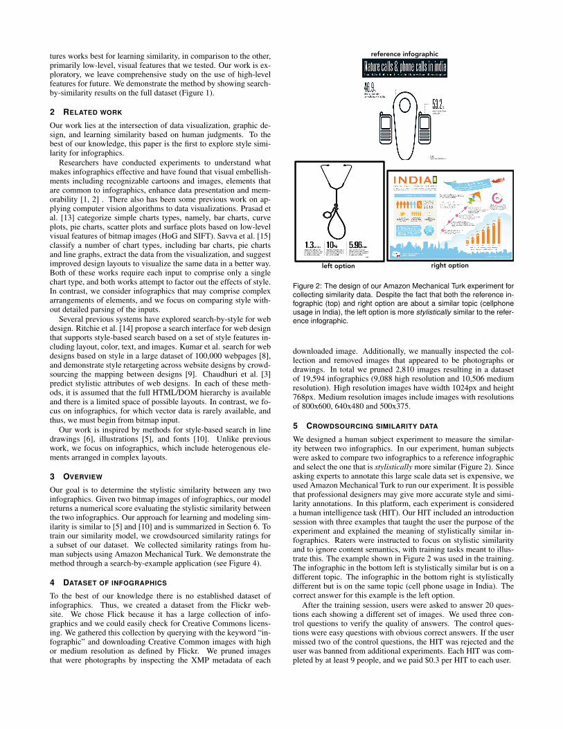
reference infographic
left option right option
Figure 2: The design of our Amazon Mechanical Turk experiment forcollecting similarity data. Despite the fact that both the reference in-fographic (top) and right option are about a similar topic (cellphoneusage in India), the left option is more stylistically similar to the refer-ence infographic.
downloaded image. Additionally, we manually inspected the col-lection and removed images that appeared to be photographs ordrawings. In total we pruned 2,810 images resulting in a datasetof 19,594 infographics (9,088 high resolution and 10,506 mediumresolution). High resolution images have width 1024px and height768px. Medium resolution images include images with resolutionsof 800x600, 640x480 and 500x375.
5 CROWDSOURCING SIMILARITY DATA
We designed a human subject experiment to measure the similar-ity between two infographics. In our experiment, human subjectswere asked to compare two infographics to a reference infographicand select the one that is stylistically more similar (Figure 2). Sinceasking experts to annotate this large scale data set is expensive, weused Amazon Mechanical Turk to run our experiment. It is possiblethat professional designers may give more accurate style and simi-larity annotations. In this platform, each experiment is considereda human intelligence task (HIT). Our HIT included an introductionsession with three examples that taught the user the purpose of theexperiment and explained the meaning of stylistically similar in-fographics. Raters were instructed to focus on stylistic similarityand to ignore content semantics, with training tasks meant to illus-trate this. The example shown in Figure 2 was used in the training.The infographic in the bottom left is stylistically similar but is on adifferent topic. The infographic in the bottom right is stylisticallydifferent but is on the same topic (cell phone usage in India). Thecorrect answer for this example is the left option.
After the training session, users were asked to answer 20 ques-tions each showing a different set of images. We used three con-trol questions to verify the quality of answers. The control ques-tions were easy questions with obvious correct answers. If the usermissed two of the control questions, the HIT was rejected and theuser was banned from additional experiments. Each HIT was com-pleted by at least 9 people, and we paid $0.3 per HIT to each user.
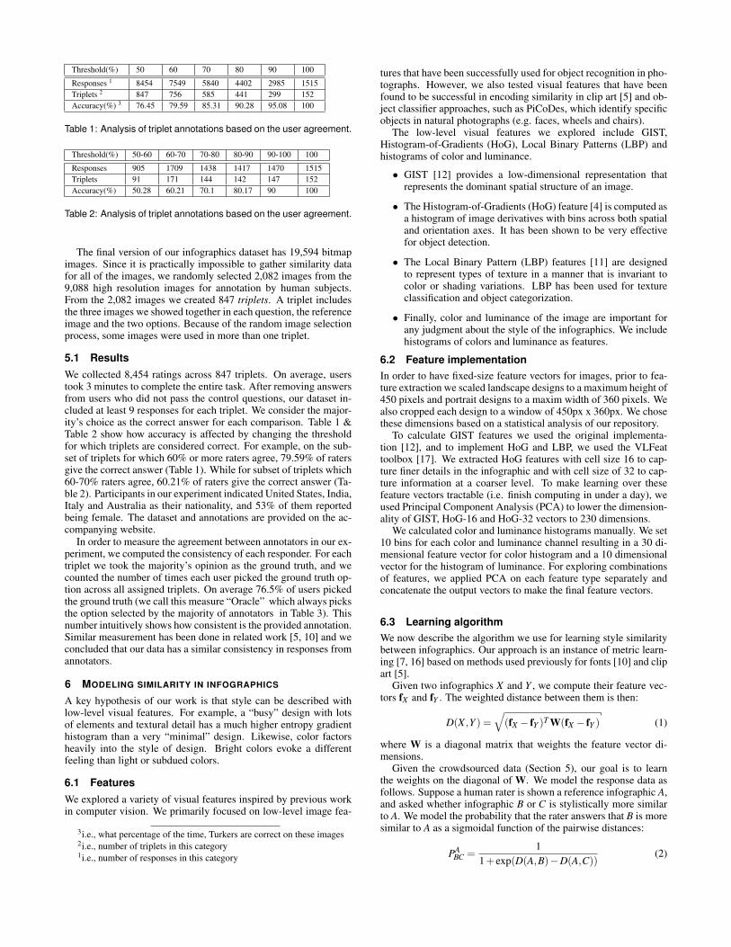
Threshold(%) 50 60 70 80 90 100
Responses 1 8454 7549 5840 4402 2985 1515Triplets 2 847 756 585 441 299 152Accuracy(%) 3 76.45 79.59 85.31 90.28 95.08 100
Table 1: Analysis of triplet annotations based on the user agreement.
Threshold(%) 50-60 60-70 70-80 80-90 90-100 100
Responses 905 1709 1438 1417 1470 1515Triplets 91 171 144 142 147 152Accuracy(%) 50.28 60.21 70.1 80.17 90 100
Table 2: Analysis of triplet annotations based on the user agreement.
The final version of our infographics dataset has 19,594 bitmapimages. Since it is practically impossible to gather similarity datafor all of the images, we randomly selected 2,082 images from the9,088 high resolution images for annotation by human subjects.From the 2,082 images we created 847 triplets. A triplet includesthe three images we showed together in each question, the referenceimage and the two options. Because of the random image selectionprocess, some images were used in more than one triplet.
5.1 ResultsWe collected 8,454 ratings across 847 triplets. On average, userstook 3 minutes to complete the entire task. After removing answersfrom users who did not pass the control questions, our dataset in-cluded at least 9 responses for each triplet. We consider the major-ity’s choice as the correct answer for each comparison. Table 1 &Table 2 show how accuracy is affected by changing the thresholdfor which triplets are considered correct. For example, on the sub-set of triplets for which 60% or more raters agree, 79.59% of ratersgive the correct answer (Table 1). While for subset of triplets which60-70% raters agree, 60.21% of raters give the correct answer (Ta-ble 2). Participants in our experiment indicated United States, India,Italy and Australia as their nationality, and 53% of them reportedbeing female. The dataset and annotations are provided on the ac-companying website.
In order to measure the agreement between annotators in our ex-periment, we computed the consistency of each responder. For eachtriplet we took the majority’s opinion as the ground truth, and wecounted the number of times each user picked the ground truth op-tion across all assigned triplets. On average 76.5% of users pickedthe ground truth (we call this measure “Oracle” which always picksthe option selected by the majority of annotators in Table 3). Thisnumber intuitively shows how consistent is the provided annotation.Similar measurement has been done in related work [5, 10] and weconcluded that our data has a similar consistency in responses fromannotators.
6 MODELING SIMILARITY IN INFOGRAPHICS
A key hypothesis of our work is that style can be described withlow-level visual features. For example, a “busy” design with lotsof elements and textural detail has a much higher entropy gradienthistogram than a very “minimal” design. Likewise, color factorsheavily into the style of design. Bright colors evoke a differentfeeling than light or subdued colors.
6.1 FeaturesWe explored a variety of visual features inspired by previous workin computer vision. We primarily focused on low-level image fea-
3i.e., what percentage of the time, Turkers are correct on these images2i.e., number of triplets in this category1i.e., number of responses in this category
tures that have been successfully used for object recognition in pho-tographs. However, we also tested visual features that have beenfound to be successful in encoding similarity in clip art [5] and ob-ject classifier approaches, such as PiCoDes, which identify specificobjects in natural photographs (e.g. faces, wheels and chairs).
The low-level visual features we explored include GIST,Histogram-of-Gradients (HoG), Local Binary Patterns (LBP) andhistograms of color and luminance.
• GIST [12] provides a low-dimensional representation thatrepresents the dominant spatial structure of an image.
• The Histogram-of-Gradients (HoG) feature [4] is computed asa histogram of image derivatives with bins across both spatialand orientation axes. It has been shown to be very effectivefor object detection.
• The Local Binary Pattern (LBP) features [11] are designedto represent types of texture in a manner that is invariant tocolor or shading variations. LBP has been used for textureclassification and object categorization.
• Finally, color and luminance of the image are important forany judgment about the style of the infographics. We includehistograms of colors and luminance as features.
6.2 Feature implementationIn order to have fixed-size feature vectors for images, prior to fea-ture extraction we scaled landscape designs to a maximum height of450 pixels and portrait designs to a maxim width of 360 pixels. Wealso cropped each design to a window of 450px x 360px. We chosethese dimensions based on a statistical analysis of our repository.
To calculate GIST features we used the original implementa-tion [12], and to implement HoG and LBP, we used the VLFeattoolbox [17]. We extracted HoG features with cell size 16 to cap-ture finer details in the infographic and with cell size of 32 to cap-ture information at a coarser level. To make learning over thesefeature vectors tractable (i.e. finish computing in under a day), weused Principal Component Analysis (PCA) to lower the dimension-ality of GIST, HoG-16 and HoG-32 vectors to 230 dimensions.
We calculated color and luminance histograms manually. We set10 bins for each color and luminance channel resulting in a 30 di-mensional feature vector for color histogram and a 10 dimensionalvector for the histogram of luminance. For exploring combinationsof features, we applied PCA on each feature type separately andconcatenate the output vectors to make the final feature vectors.
6.3 Learning algorithmWe now describe the algorithm we use for learning style similaritybetween infographics. Our approach is an instance of metric learn-ing [7, 16] based on methods used previously for fonts [10] and clipart [5].
Given two infographics X and Y , we compute their feature vec-tors fX and fY . The weighted distance between them is then:
D(X ,Y ) =√
(fX − fY )T W(fX − fY ) (1)
where W is a diagonal matrix that weights the feature vector di-mensions.
Given the crowdsourced data (Section 5), our goal is to learnthe weights on the diagonal of W. We model the response data asfollows. Suppose a human rater is shown a reference infographic A,and asked whether infographic B or C is stylistically more similarto A. We model the probability that the rater answers that B is moresimilar to A as a sigmoidal function of the pairwise distances:
PABC =
11+ exp(D(A,B)−D(A,C))
(2)
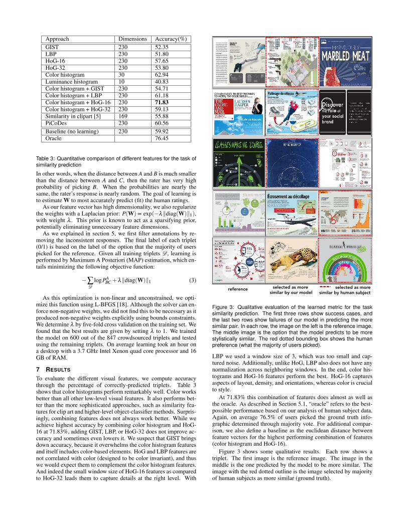
Approach Dimensions Accuracy(%)GIST 230 52.35LBP 230 51.80HoG-16 230 57.65HoG-32 230 53.80Color histogram 30 62.94Luminance histogram 10 40.83Color histogram + GIST 230 54.71Color histogram + LBP 230 61.18Color histogram + HoG-16 230 71.83Color histogram + HoG-32 230 59.13Similarity in clipart [5] 169 55.88PiCoDes 230 60.56Baseline (no learning) 230 59.92Oracle 76.45
Table 3: Quantitative comparison of different features for the task ofsimilarity prediction
In other words, when the distance between A and B is much smallerthan the distance between A and C, then the rater has very highprobability of picking B. When the probabilities are nearly thesame, the rater’s response is nearly random. The goal of learning isto estimate W to most accurately predict (fit) the human ratings.
As our feature vector has high dimensionality, we also regularizethe weights with a Laplacian prior: P(W) ∝ exp(−λ‖diag(W)‖1),with weight λ . This prior is known to act as a sparsifying prior,potentially eliminating unnecessary feature dimensions.
As we explained in section 5, we first filter annotations by re-moving the inconsistent responses. The final label of each triplet(0/1) is based on the label of the option that the majority of userspicked for the reference. Given all training triplets D , learning isperformed by Maximum A Posteriori (MAP) estimation, which en-tails minimizing the following objective function:
−∑D
logPABC +λ‖diag(W)‖1 (3)
As this optimization is non-linear and unconstrained, we opti-mize this function using L-BFGS [18]. Although the solver can en-force non-negative weights, we did not find this to be necessary as itproduced non-negative weights explicitly using bounds constraints.We determine λ by five-fold cross validation on the training set. Wefound that the best results are given by setting λ to 1. We trainedthe model on 600 out of the 847 crowdsourced triplets and testedusing the remaining triplets. On average learning took an hour ona desktop with a 3.7 GHz Intel Xenon quad core processor and 16GB of RAM.
7 RESULTS
To evaluate the different visual features, we compute accuracythrough the percentage of correctly-predicted triplets. Table 3shows that color histograms perform remarkably well. Color worksbetter than all other low-level visual features. It also performs bet-ter than the more sophisticated approaches, such as similarity fea-tures for clip art and higher-level object-classifier methods. Surpris-ingly, combining features does not always work better. While weachieve highest accuracy by combining color histogram and HoG-16 at 71.83%, adding GIST, LBP, or HoG-32 does not improve ac-curacy and sometimes even lowers it. We suspect that GIST bringsdown accuracy, because it overwhelms the color histogram featuresand itself includes color-based elements. HoG and LBP features arenot correlated with color (designed to be color invariant), and thuswe would expect them to complement the color histogram features.And indeed the small window size of HoG-16 features as comparedto HoG-32 leads them to capture details at the right level. With
reference selected as more similar by our model
selected as more similar by human subject
Figure 3: Qualitative evaluation of the learned metric for the tasksimilarity prediction. The first three rows show success cases, andthe last two rows show failures of our model in predicting the moresimilar pair. In each row, the image on the left is the reference image.The middle image is the option that the model predicts to be morestylistically similar. The red dotted bounding box shows the humanpreference (what the majority of users picked).
LBP we used a window size of 3, which was too small and cap-tured noise. Additionally, unlike HoG, LBP also does not have anynormalization across neighboring windows. In the end, color his-tograms and HoG-16 features perform the best. HoG-16 capturesaspects of layout, density, and orientations, whereas color is crucialto style.
At 71.83% this combination of features does almost as well asthe oracle. As described in Section 5.1, “oracle” refers to the best-possible performance based on our analysis of human subject data.Again, on average 76.5% of users picked the ground truth info-graphic determined through majority vote. For additional compar-ison, we also define a baseline as the euclidean distance betweenfeature vectors for the highest performing combination of features(color histogram and HoG-16).
Figure 3 shows some qualitative results. Each row shows atriplet. The first image is the reference image. The image in themiddle is the one predicted by the model to be more similar. Theimage with the red dotted outline is the image selected by majorityof human subjects as more similar (ground truth).
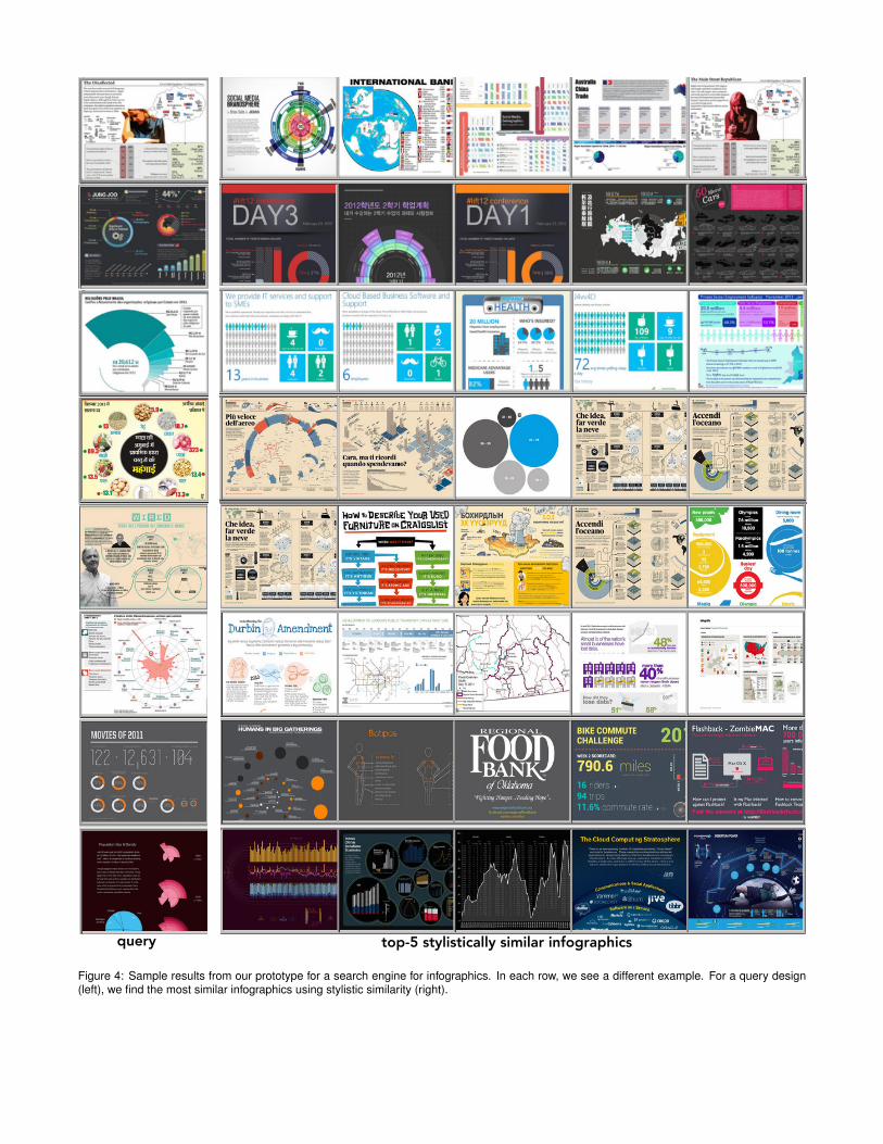
query top-5 stylistically similar infographics
Figure 4: Sample results from our prototype for a search engine for infographics. In each row, we see a different example. For a query design(left), we find the most similar infographics using stylistic similarity (right).
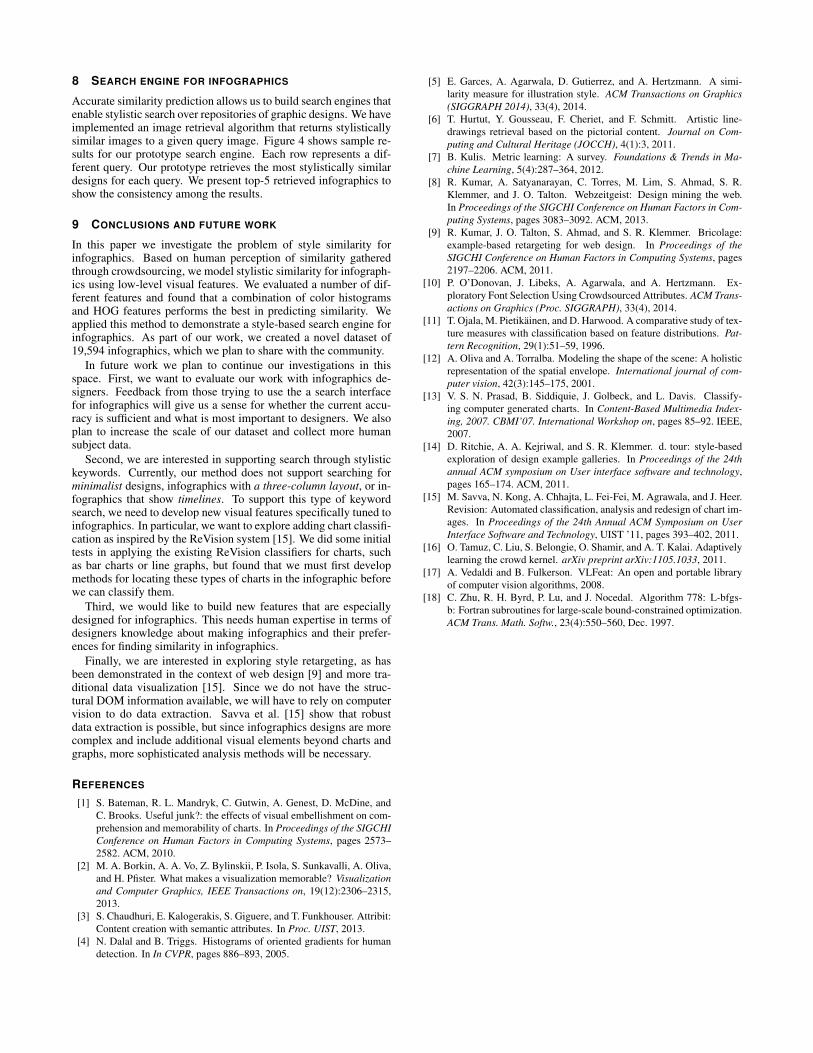
8 SEARCH ENGINE FOR INFOGRAPHICS
Accurate similarity prediction allows us to build search engines thatenable stylistic search over repositories of graphic designs. We haveimplemented an image retrieval algorithm that returns stylisticallysimilar images to a given query image. Figure 4 shows sample re-sults for our prototype search engine. Each row represents a dif-ferent query. Our prototype retrieves the most stylistically similardesigns for each query. We present top-5 retrieved infographics toshow the consistency among the results.
9 CONCLUSIONS AND FUTURE WORK
In this paper we investigate the problem of style similarity forinfographics. Based on human perception of similarity gatheredthrough crowdsourcing, we model stylistic similarity for infograph-ics using low-level visual features. We evaluated a number of dif-ferent features and found that a combination of color histogramsand HOG features performs the best in predicting similarity. Weapplied this method to demonstrate a style-based search engine forinfographics. As part of our work, we created a novel dataset of19,594 infographics, which we plan to share with the community.
In future work we plan to continue our investigations in thisspace. First, we want to evaluate our work with infographics de-signers. Feedback from those trying to use the a search interfacefor infographics will give us a sense for whether the current accu-racy is sufficient and what is most important to designers. We alsoplan to increase the scale of our dataset and collect more humansubject data.
Second, we are interested in supporting search through stylistickeywords. Currently, our method does not support searching forminimalist designs, infographics with a three-column layout, or in-fographics that show timelines. To support this type of keywordsearch, we need to develop new visual features specifically tuned toinfographics. In particular, we want to explore adding chart classifi-cation as inspired by the ReVision system [15]. We did some initialtests in applying the existing ReVision classifiers for charts, suchas bar charts or line graphs, but found that we must first developmethods for locating these types of charts in the infographic beforewe can classify them.
Third, we would like to build new features that are especiallydesigned for infographics. This needs human expertise in terms ofdesigners knowledge about making infographics and their prefer-ences for finding similarity in infographics.
Finally, we are interested in exploring style retargeting, as hasbeen demonstrated in the context of web design [9] and more tra-ditional data visualization [15]. Since we do not have the struc-tural DOM information available, we will have to rely on computervision to do data extraction. Savva et al. [15] show that robustdata extraction is possible, but since infographics designs are morecomplex and include additional visual elements beyond charts andgraphs, more sophisticated analysis methods will be necessary.
REFERENCES
[1] S. Bateman, R. L. Mandryk, C. Gutwin, A. Genest, D. McDine, andC. Brooks. Useful junk?: the effects of visual embellishment on com-prehension and memorability of charts. In Proceedings of the SIGCHIConference on Human Factors in Computing Systems, pages 2573–2582. ACM, 2010.
[2] M. A. Borkin, A. A. Vo, Z. Bylinskii, P. Isola, S. Sunkavalli, A. Oliva,and H. Pfister. What makes a visualization memorable? Visualizationand Computer Graphics, IEEE Transactions on, 19(12):2306–2315,2013.
[3] S. Chaudhuri, E. Kalogerakis, S. Giguere, and T. Funkhouser. Attribit:Content creation with semantic attributes. In Proc. UIST, 2013.
[4] N. Dalal and B. Triggs. Histograms of oriented gradients for humandetection. In In CVPR, pages 886–893, 2005.
[5] E. Garces, A. Agarwala, D. Gutierrez, and A. Hertzmann. A simi-larity measure for illustration style. ACM Transactions on Graphics(SIGGRAPH 2014), 33(4), 2014.
[6] T. Hurtut, Y. Gousseau, F. Cheriet, and F. Schmitt. Artistic line-drawings retrieval based on the pictorial content. Journal on Com-puting and Cultural Heritage (JOCCH), 4(1):3, 2011.
[7] B. Kulis. Metric learning: A survey. Foundations & Trends in Ma-chine Learning, 5(4):287–364, 2012.
[8] R. Kumar, A. Satyanarayan, C. Torres, M. Lim, S. Ahmad, S. R.Klemmer, and J. O. Talton. Webzeitgeist: Design mining the web.In Proceedings of the SIGCHI Conference on Human Factors in Com-puting Systems, pages 3083–3092. ACM, 2013.
[9] R. Kumar, J. O. Talton, S. Ahmad, and S. R. Klemmer. Bricolage:example-based retargeting for web design. In Proceedings of theSIGCHI Conference on Human Factors in Computing Systems, pages2197–2206. ACM, 2011.
[10] P. O’Donovan, J. Libeks, A. Agarwala, and A. Hertzmann. Ex-ploratory Font Selection Using Crowdsourced Attributes. ACM Trans-actions on Graphics (Proc. SIGGRAPH), 33(4), 2014.
[11] T. Ojala, M. Pietikainen, and D. Harwood. A comparative study of tex-ture measures with classification based on feature distributions. Pat-tern Recognition, 29(1):51–59, 1996.
[12] A. Oliva and A. Torralba. Modeling the shape of the scene: A holisticrepresentation of the spatial envelope. International journal of com-puter vision, 42(3):145–175, 2001.
[13] V. S. N. Prasad, B. Siddiquie, J. Golbeck, and L. Davis. Classify-ing computer generated charts. In Content-Based Multimedia Index-ing, 2007. CBMI’07. International Workshop on, pages 85–92. IEEE,2007.
[14] D. Ritchie, A. A. Kejriwal, and S. R. Klemmer. d. tour: style-basedexploration of design example galleries. In Proceedings of the 24thannual ACM symposium on User interface software and technology,pages 165–174. ACM, 2011.
[15] M. Savva, N. Kong, A. Chhajta, L. Fei-Fei, M. Agrawala, and J. Heer.Revision: Automated classification, analysis and redesign of chart im-ages. In Proceedings of the 24th Annual ACM Symposium on UserInterface Software and Technology, UIST ’11, pages 393–402, 2011.
[16] O. Tamuz, C. Liu, S. Belongie, O. Shamir, and A. T. Kalai. Adaptivelylearning the crowd kernel. arXiv preprint arXiv:1105.1033, 2011.
[17] A. Vedaldi and B. Fulkerson. VLFeat: An open and portable libraryof computer vision algorithms, 2008.
[18] C. Zhu, R. H. Byrd, P. Lu, and J. Nocedal. Algorithm 778: L-bfgs-b: Fortran subroutines for large-scale bound-constrained optimization.ACM Trans. Math. Softw., 23(4):550–560, Dec. 1997.