Justification Paper / Vanarsdale EDTECH 506
22
Randy VanArsdale JUSTIFICATION PAPER / EDTECH 506 / DR. TAE JEON Justification Design Process The design process framework used for this project is based on Lohr’s (2008) analyze, create and evaluate (ACE) model. During the analysis phase I determined that this instructional unit would comprise three related, basic English syntax: parts of speech, FANBOYS [coordinating conjunctions], and the subject, verb, object sentence pattern. In doing so, I determined exactly what I want the target learners to focus on. Lohr (2008) refers to this as ‘selection’. More specifically, this unit of instruction may form part of the grammatical syllabi for each of the seven ‘Levels’ (7 to 14-week terms ) through which students must progress in order to graduate from the Academic Bridge Program (ABP), an English language foundation program at Zayed University in the UAE. As part of the grammatical learning objectives, each Level requires demonstrated knowledge of various grammatical structures and sentence-level syntax. The three individual lessons for this unit have been designed primarily for the two lowest levels, 010 and 020 [approximately high-beginner to low-intermediate English]. However, this unit may also be used for presentation and review at the higher Levels (5, 6, 7 and 8). Anecdotal evidence shows that students require continuous recycling of basic grammatical and syntax structures throughout all of the Levels of the ABP, which makes this unit a useful addition to the overall ABP grammar syllabi. According to Lohr (2008), it is important to also organization during the analysis phase. In other words, decide how the information will be organized. To this end, all of the lessons in this unit involve supplementary practice using the iPad application Pages. In fact, all of the visuals created for this unit have all been designed for use in Pages. The visuals provide 1
-
Upload
randy-vanarsdale -
Category
Documents
-
view
214 -
download
0
description
Justification Paper / Vanarsdale EDTECH 506 / Fall 2012 / Dr. Tae Jeon
Transcript of Justification Paper / Vanarsdale EDTECH 506

Randy VanArsdaleJUSTIFICATION PAPER / EDTECH 506 / DR. TAE JEON
Justification
Design Process
The design process framework used for this project is based on Lohr’s (2008) analyze, create and evaluate (ACE) model. During the analysis phase I determined that this instructional unit would comprise three related, basic English syntax: parts of speech, FANBOYS [coordinating conjunctions], and the subject, verb, object sentence pattern. In doing so, I determined exactly what I want the target learners to focus on. Lohr (2008) refers to this as ‘selection’.
More specifically, this unit of instruction may form part of the grammatical syllabi for each of the seven ‘Levels’ (7 to 14-week terms ) through which students must progress in order to graduate from the Academic Bridge Program (ABP), an English language foundation program at Zayed University in the UAE. As part of the grammatical learning objectives, each Level requires demonstrated knowledge of various grammatical structures and sentence-level syntax.
The three individual lessons for this unit have been designed primarily for the two lowest levels, 010 and 020 [approximately high-beginner to low-intermediate English]. However, this unit may also be used for presentation and review at the higher Levels (5, 6, 7 and 8). Anecdotal evidence shows that students require continuous recycling of basic grammatical and syntax structures throughout all of the Levels of the ABP, which makes this unit a useful addition to the overall ABP grammar syllabi.
According to Lohr (2008), it is important to also organization during the analysis phase. In other words, decide how the information will be organized. To this end, all of the lessons in this unit involve supplementary practice using the iPad application Pages. In fact, all of the visuals created for this unit have all been designed for use in Pages. The visuals provide an overview of three separate topics, as well as drag-and-drop activities related to those topics.
It is advisable that instructors demonstrate how to manipulate the drag-and-drop activities prior to assigning this to students. Instructors may connect their iPad to an interactive whiteboard using a dongle to demonstrate this. Learners will be able to practice and consolidate learning by rearranging sentences elements. In line with constructivist thinking, people learners more deeply when they apply creative effort (Smith and Ragan, 2005).
1

Randy VanArsdaleJUSTIFICATION PAPER / EDTECH 506 / DR. TAE JEON
Another important aspect of analysis, according to Lohr (2008), is integration, or the question of how to provide meaningful context. Here I should mention that in September of 2012, Zayed University rolled out a major initiative in which all students and instructors were issued iPads. As a result, there is a great deal of expectation that all instructors and students will use their iPads on a daily basis, which means that there is a need for ideas, materials and applications that support curriculum learning objectives in a manner consistent with current best practice vis-a-via technology, hence my decision to create materials for use with the iPad.
I decided that I could do something with the iPad application Pages, which is the Mac equivalent of Microsoft Word, with the added functionality of being able to move and manipulate images easily on a page. Additional inspiration for this unit is a composite of refrigerator magnets, Cuisenaire rods, the Montessori Method and the iPad application Pages, which allows user to move and manipulate images on a digital page. What’s more, this unit may serve as curricula material for the ABP: If pedagogical practice can be documented in some readily understandable form, it can then be easily shared and thus there is the potential for greater uptake of innovative teaching practice (Agostinho, 2011).
Lohr (2008) describes creation as the translation of analysis into physical form: “you essentially take your goals and objectives may learn something you can see” (p. 76). In order to do this, I began to experiment with text and images in the iPad application Pages. After establishing that this first work, I began working with principles, actions and tools (PAT). As Lohr (2008) explains, principles refers to selection, organization integration, which I touched on above. Actions within the PAT framework referred to contrast, alignment, repetition and proximity. The last element of the PAT model, tools, refers to type, shape, color, depth and space. Taken together, the ACE and PAT models provide a useful framework, with which I designed this instructional unit.
What follows now is a detailed description of each set of visuals that I created using Adobe Fireworks. I will explain how I created each visual vis-à-vis Lohr’s (2008) ACE and PAT frameworks.
User Assumptions
ABP students are keen to study grammar, especially in the form of worksheets and/or online practice using their iPads, which makes this unit a useful contribution to grammar instruction. In addition to their limited English skills, Level 010 and 020 students in the ABP, for the most part, also lack effective metacognitive skills, or strategies for learning. As such, the lessons in this unit are a mix of discrete and holistic practice, both paper/pencil and
2

Randy VanArsdaleJUSTIFICATION PAPER / EDTECH 506 / DR. TAE JEON
digital. There are two primary reasons for the inclusion of traditional paper/pencil activity: the first is research suggests that learners retain more information and learn better when they write by hand as opposed to using a keyboard (Mangen & Velay, 2010); the second reason relates to the fact that many ABP students, as a result of a traditional education system in the UAE, equate worksheets with learning; using computers to learn is still in its early phases in the UAE.
Therefore, the aim of this unit of instruction is to provide students with the type of discrete learning practice typical of public education in the UAE, to which they are accustomed, as well as more holistic and productive tasks like the creation of presentations and videos using their iPads, which reflects not only Zayed University's expectations, but also a more progressive view of education in the 21st-century (Larson & Miller, 2011).
Graphic Description
A total of 22 separate graphic, not including duplicate images such as the word pieces, were created using Adobe Fireworks for this unit of instruction. All of the graphics are meant to be used primarily within the iPad application Pages. Screenshots of images in an iPad, as they would appear for learners, are also included on the student website for illustrative purposes.
Typography Subject/s, Verb/s, Object/s Images
Lohr (2008) recommends the "it depends rule" for choosing typography: the choice of font depends on the learner, the content, task, skill level, environment "and other elements in the visual" (p. 226). The target English language learners for this unit of instruction are relatively low level, which means that comprehension will be aided by keeping all text and visuals as clean and simple as possible:
[I]f the viewer’s attention is drawn in many directions with no clear visual hierarchy that informs him or her of the author’s overall design purpose … the author has an ethical responsibility to communicate clearly, overuse of indicative elements effectively violates this ethical purpose. (Rosenquist, 2012, p. 50)
Given that legibility is the primary consideration in the design of these images and the fact that the text serves as titles rather than extended reading passages, the sans serif font, Arial Rounded MT Bold font was an easy choice. Arial Rounded MT Bold, like Verdana, has a tall X-height, which increases legibility, and Arial Rounded MT Bold a nice wide counter, which also increases readability. In fact, Arial Rounded MT Bold surpasses Verdana, in that, the curves are full, soft, and the counters are more open.
3

Randy VanArsdaleJUSTIFICATION PAPER / EDTECH 506 / DR. TAE JEON
With regard to letter spacing, Lohr (2008) notes that "for type sizes larger than 30 points, kerning is generally performed to improve the appearance of the heading quotation mark (p. 237). The font size of the ‘subject/s, verb/s, object/s’ icons is 50, so kerning was increased to 75 in order to provide more legibility and aesthetics. The black silhouettes that form part of these images were sourced on an Internet site providing free vector images. The Fireworks lasso tool was used to create the free-form edge for aesthetic appeal.
Below the black silhouettes, a rectangular shape, colored black with the white text in the foreground, provides an organizing shape to increase not only legibility but also hopefully, memorability, while at the same time providing contrast between the white space and dark text and silhouettes (Lohr, 2008). Alignment was achieved by using resizing, kerning, and centered text along with aligned left and right edges. The use of identical shapes and colors also provides the images with a sense of repetition, thus harmony (Lohr, 2008).
User feedback expressed that the 'object/s' icon included too many images and were a little difficult to read. Other feedback suggested that kerning should be increased. In response to this feedback I increased kerning. However, I did not feel it was necessary to limit the object icon to only one or two large figures as it may give the false idea that objects comprise only a few types of concepts rather than many possibilities. Besides, the density of items within the icon figures increases progressively from subject, verb to objects, giving the figures a sense of continuity.
ShapesParts of Speech Icons
Lohr (2008) points out that after typography, shapes "are a designer's most useful tool" (p. 250). Lohr (2008) notes that "a good place to start a design is to determine the underlying shape of your document (known as the display shape)" (p. 250). For this project the display shape is an iPad screen, which is relatively small at "9.5 x 7.31". Lohr (2008) suggests symmetrical arrangements for square displays; as a result, the shapes you see above have been designed with this advice in mind. However, there is another source of inspiration for these designs - the Montessori grammar method.
The original inspiration for this project was a combination of Cuisenaire rods, refrigerator magnets and Japanese 'emojicons', with a contemporary twist in being designed exclusively for the iPad. After doing some additional research on the Internet, I came across the Montessori grammar method. The Montessori grammar method essentially involves learning to associate images and shapes with text and ideas. However, I wanted to design something a bit different, and I also felt that it would be better to reduce
4

Randy VanArsdaleJUSTIFICATION PAPER / EDTECH 506 / DR. TAE JEON
cognitive load by not forcing students to memorize the connection between shapes and parts of speech, especially given that this unit, unlike the Montessori method, will be used for a short period of time before students move on to other lesson. In other words, success of the activity should not depend on student's ability to memorize image and text relationships as with the Montessori method, which is an ongoing process.
Consequently, I designated a different range of shapes for the grammatical parts of speech. Inside the shapes, parts of speech are clearly labeled at the base, and within the main shape area are examples of that part of speech. In order to create the shapes I used Adobe Fireworks by starting with a 500 x 500 pixel, transparent canvas, to which I added a rectangular box at the bottom, which is colored black, with white, 39 point Verdana text. Over the rectangular area containing the text, I added symmetrically shaped vector masks, which, after experimenting with different shapes, I made transparent, cut, and then pasted the vector inside as a mask. The vector mask fill is transparent, with a black stroke of 10 and a hard line edge of seven. I then added a range of basic colors.
User tests produced the following observations:
I like the different shapes and that they aren't the 'usual' ones that we see. It makes it feel 'different' and purposeful. I find the white background distracting though… It will be nice if there is light color shading filling the inside of the shape. Not sure that the articles should be capitalized since none of the other words are other than proper pronouns. Something else to consider is making the shapes a bit like puzzle pieces, so for example, the articles would have a sticking out point that goes inside the noun shape to show that they are interconnected? Maybe a bit too much…?
Another user commented that when I first look at your shapes, it's the color black which strikes me and the thick border. I wonder what a dark grey border would do but then again you want the shape to be associated with the parts of speech.... In response to user feedback, I changed the articles to small letters; however, I did not add shading or minimize the black border strokes after experimenting with these changes - the original design works the best within the iPad screen.
Design Process Model – ACE / PATParts of Speech Introductory Image
During the analysis phase of ACE, according to Lohr (2008), the aim is to clarify instructional objectives (selection), provide well-organized information (organization), and “create an environment or context where the overall
5

Randy VanArsdaleJUSTIFICATION PAPER / EDTECH 506 / DR. TAE JEON
message and organization are easy to understand (integration)" (p. 75). The images chosen for this graphic, pearls and ocean surf, were specially chosen based on the fact that this unit is targeted to female Emirati students in the ABP.
Pearls have a special significance to all Emiratis, especially women, since pearls were once the primary source of trade in the Emirates until the early 20th century. Moreover, pearls are seen in a metaphorical sense as representative of Emirati women, who traditionally cover their hair and wear long black silk robes called ‘abayas’. In other words, the pearl shell, like the ‘abaya,’ covers a special beauty that lies inside. Therefore, the graphic image you see above is decorative in that the images of the pearls and the ocean surf should add to the appeal of the image, thereby making it more memorable as well as metaphorical, which I shall discuss in more detail later.
The image of ocean surf is meant to complement and contextualize the images of the pearls. Likewise, the cutout image of the woman standing to the left is primarily for decorative purposes, with the goal of increasing memorability of the graphic. The graphic is also, albeit to a lesser degree, an organizational visual as the different English parts of speech are represented by the various pearls in the image. Just as the pearls vary in size, color and shape, English parts of speech also vary in function and form. Hopefully the pearl images will also have a gestalt effect on memory by triggering previous experience, whereby “[t]he ability to keep information alive in short-term memory is increased when learners can associate that information with what they already know” (p. 168).
Of course, there is always the danger that
[i]mages are effective visual elements if … their natural purposes align with the actual document purpose, but they can fail or misfire if the image chosen somehow distracts from misaligns with actual document purpose. (Rosenquist, 2012, p. 46)
Nevertheless, this approach seems more effective than a simple flow chart or 'grammar tree', both of which would be more or less meaningless to the target learners. In fact, during the creation phase of a graphic organizer I searched the Internet for examples of grammar related images. I did not find anything interesting: mind maps, grammar tree diagrams and a lot of poorly designed and/or random grammar posters. I knew that I wanted something different that would be aesthetically pleasing, memorable and suggestive of organization. Lohr (2008) suggests synetics as a way of encouraging “divergent in generative thinking through activities that encourage the development of metaphors” (p. 77). While I did not exactly follow the procedure outlined in the textbook on pages 78 and 79, I did manage to come up with the analogy of pearls, hence the image below.
6

Randy VanArsdaleJUSTIFICATION PAPER / EDTECH 506 / DR. TAE JEON
With respect to a second component of the PAT model, actions, I tried to find the right balance of alignment, contrast and spacing to make the image as effective as possible. I believe that the images, text and colors are more or less balanced. I tried to give the type some depth by adding sharpening and embossing to 24 point, Arial Rounded MT Bold. I believe that the final result is effective, efficient and appealing in that attention is directed to important information. The graphic should provide an overview and create the impression of an introduction to additional information. Lohr (2008) urges budding designers to “[t]ake out visual elements that do not add anything” (p. 89). I am keenly aware of this and have tried to eliminate anything that simply adds clutter.
User feedback suggested additional text effects such as embossing and sharpening to create more uniformity. Additional feedback suggested that I assign a specific color to each pearl and reduce the number of pearls to match the number of parts of speech to achieve more integration. Other user feedback suggested that there is no connection to the images and English parts of speech.
In response to feedback, I changed the lettering by using a more crisp shadow and embossing effect, which I used afterwards for all title text. I also changed the primary color of the parts of speech from white to black to improve legibility. I did not, however, change the color of pearls or reduce the number of pearls to one-to-one relationship with the parts of speech. The rationale, as I explained above, relates to the fact that this is simply an introductory image with visual metaphors recognizable to the target audience. I also did not see the need to add any additional random images were colors since I have only done that with other visuals in this unit of instruction.
CARP Parts of Speech Tables
In order to reduce extraneous elements by focusing attention on what is important (Harp & Mayer, 1998, cited in Lohr, 2008), I tried to create a clean, minimalist table for each part of speech. Originally, I used a light gray background in the header section of each table as well as the same Arial Rounded MT Bold font in order to create contrast and minimize cognitive load. Alignment, which is indirectly related to chunking (Paas, Renkl & Sweller, 2003, cited in Lohr, 2008), is achieved primarily through the use of a table, which is then aligned with the parts of speech icons on the left side.
As a result, the two distinct images of the table and the icons are simultaneously perceived as one element. Lohr (2008) advises left-side text
7

Randy VanArsdaleJUSTIFICATION PAPER / EDTECH 506 / DR. TAE JEON
alignment; however, given the fact that the table text functions primarily as headers, centering the text seems more logical. Proximity, which is related to contiguity (Chandler & Sweller, 1991, cited in Lohr, 2008), is obviously found in the pairing of all the elements within the table and icon. To increase proximity, the padding within the cells and the borders of the table has been minimized.
Repetition, which is related to rehearsal and chunking (Ormrod, 2004, cited in Lohr, 2008), should be evident first through the use of the same table/icon style for each of the eight parts of speech. Secondly, there is repetition in both naming the parts of speech within the table as well as the icon, along with example words that are repeated both in the table as examples, as well as additional examples within each icon on the left side. So, for example, for the ‘nouns’ table we can see the word ‘rain’ repeated in the icon as well as an example word with an example sentence. This use of repetition should make the images more memorable, thereby more effective.
This assignment was perhaps the most difficult due to the fact that I spent a lot of time unnecessarily trying to create tables using a Fireworks plug-in when, ironically, I eventually created the tables by hand in Fireworks yet ended up with a much better product. The final product that you see above is a set of visuals that have a clean, crisp and visually well-balanced look. I also address user feedback pointing out a number of problems with my original attempts such as poor alignment and color contrast:
The tables look nice, but there are some obvious problems. First, the overall size of the tables is not uniform, which makes me wonder why. Second, there are some other discrepancies such as text size, and a break between the border and the light gray header and some of the tables. Third, the brown color does not come through in the example words and sentences for the pronoun table, and I may have to reconsider the yellow color for adverbs.
Selection Table, Word Pieces for Parts of Speech
Three of Mayer’s (2001, cited in Lohr, 2008) seven aspects of effective visual design are referred to as concentrated, concise and concrete, all of which “relate to the cognitive task of selection” (p. 102). Concrete alludes to elements that make a visual easy to visualize, while concise means limiting visual information, and concentrated refers to “emphasizing key points the graphics and text elements" (p. 102). Essentially, people learn better when extraneous information is minimized.
8

Randy VanArsdaleJUSTIFICATION PAPER / EDTECH 506 / DR. TAE JEON
According to (Lohr, 2008), optimizing figure-ground is an effective way of achieving maximum impact with regard to selection. Figure-ground is a cognitive principle, wherein people tend "to focus on one stimulus at a time rather than several” (p. 102). This means that it is important to facilitate the perception of the most essential aspects of the visual and minimizing nonessential aspects of the same visual: "implementing figure-ground to improve instruction simply the act of making the most important information stand out. When you do this it helps the learner focus on what is critical" (p. 102).
With regard to the visuals directly above, the aim is to optimize the figure-ground relationship by first minimizing any visual clutter. For example, I did not include any unnecessary images other than the cutout image of the woman. I have seen numerous examples of the visuals used primarily for decorative purposes; however, I find these types of visuals ineffective as the additional images generally do not contribute to the most important aspects of visual and, as Lohr (2008) points out, these sort of decorative images only serve to strain cognitive load: “what happens is that these fun features take over visually, making the instruction hard to access” (p. 105).
Based on this, one might ask, then why I included the cutout image of the woman? I have included the image of the woman in order to create a sense of continuity beginning with the opening graphic, and as Lohr (2008), notes, “[i]n areas such as medical education and engineering, realistic images are considered more effective because the external stimuli in the images are part of the real life experience” (p. 101). Of course, this unit is not related to medical education or engineering; nevertheless, I believe that the woman is an effective visual as she provides representation of the human element of learning. To my mind, the woman may represent both audience and participant. She is, if you like, an observer of the entire unit.
Lohr (2008) observes that the effective designer “will mainly use contrast as a way to make important information stand out. Tools that create contrast include type, color, space, shape and dimension” (p. 111). For the visuals above, I began by first experimenting with a table that contains as many columns as possible, yet one that fits comfortably within the small iPad screen. I also tried to find the right balance between the bottom and top rows since the parts of speech icons need to fit within the bottom row. In order to create some contrast, while at the same time creating a sense of unity, I decided to use the colors black and white for the small rectangular boxes containing text, the word pieces. Black-and-white creates a unified look with the table, and it makes sense to use these neutral colors given that the parts of speech icons are a variety of colors, thus creating the unity and contrast.
9

Randy VanArsdaleJUSTIFICATION PAPER / EDTECH 506 / DR. TAE JEON
The vertical rectangular shape on the left side of the table was added later to tie together the separate image elements. To create additional contrast, I added a raised emboss effect to the rectangular text boxes, along with an adjusted gradient color fill called starburst that was further enhanced with a sharpening effect. The larger vertical rectangular shape on the left side, next to the woman, also has a gradient fill called bars that has a similar, but slightly different gradient effect. In the first of the two images you see below, there are three rectangular text pieces on the left side. I added a basic, soft-rounded, stroke with a 4% tip in order to provide enough contrast.
User feedback consisted of a number of suggestions: (1) making the dividing vertical rectangle a little thinner or somehow less commanding, (2) using a simple vector-drawing of the outline of a person to tie the screens together rather than a picture, (3) try out the shaded background technique illustrated at the bottom of page 104 of the textbook as an alternative to the black lines of the text box, (4) give solid swaths of tone/color a try, (5) and overlay it with one of the sets of words.
In response to this feedback I changed the vertical rectangle fill with a different gradient pattern, a swirl effect – reflecting the idea of using color swaths, which does seem to blend in better. I did not, however, soften the lines or use shaded outlines as the original contrast is effective and looks good in the iPad.
Color 1FANBOYS
I agree with Lohr’s (2008) contention that “black, white, gray can be used effectively to facilitate selection” (p. 267). I also tried to optimize organization by using the color black for the most important pieces of information, followed by gray and, of course, a white background Lohr (2008).These images were originally all black and white. One reason for this choice is that all of the images relate to a number of conceptual items - various grammatical parts. As such, it did not seem logical to randomly add colors to concepts that have no inherent color. In fact, I have already done this: I used color to differentiate the eight parts of speech in a previous assignment; the continued addition of random color would unnecessarily add to learner cognitive burden.
In order to create additional contrast and signify important information, I used pattern effects, such as the black grilling [called Hatch 1] as well as the striped bars on the comma and period icons. I believe that this latter effect also provides a sense of depth, in the same way that shadowing would. Given the students' low language levels and a general lack of meta-cognitive
10

Randy VanArsdaleJUSTIFICATION PAPER / EDTECH 506 / DR. TAE JEON
skills, it is vital that design establishes clear and simple relationships with limited cognitive load demands; this includes selective use of color:
The use of decoratives (color, shape, lifelike images, typefaces) is to convey a specific feeling. These should be used sparingly and should be selected to promote the primary purpose of the document, rather than simply for visual effect or shock value. (Rosenquist, 2012, p. 50)
A user test resulted in the recommendation of using color for the FANBOYS icons and individual pieces – the user thought there was too much black and white. In response to this feedback I did added color with a vector mask fill using a photo of an orange flower. I believe the flower fill gives the shapes depth and provides contrast to the black and white frame/pieces without overlapping the solid color fill of the parts of speech – FANBOYS now stands on its own in relation to the other parts of speech, which makes sense as these grammatical items provide a special role in sentence formation.
OrganizationUnit Introductory Image
Establishing hierarchy is an important aspect of organization in design: “Hierarchy deals with communicating relative importance between elements in a display” (p. 122). Lohr (2008) maintains that organization provides “the learner or using the pathways through information. In doing this, you reduce the learner's cognitive load” (p. 123). Research shows that providing visual cues facilitates learning, especially for children and/or individuals unfamiliar with content Lohr (2008). Lohr (2008) notes that visual cues are especially important in performance environments where people need information at that moment: "The increase of self-directed learning and performance environments … requires that information be especially clear and easy-to-follow” (p. 124). The introductory image is a kind of performance visual for low-level learners who need to understand quickly and easily the content of the activity.
Lohr (2008) elaborates on three methods for creating hierarchy: chunking, entry points and horizontal/vertical planes. Chunking is a concept from cognitive psychology that refers to a typical person's ability to process a limited amount of information in short-term memory. For many years the rule of thumb was seven items, although more recent research has revised that number down to 3 to 5 chunks of information, which suggests that grouping information into meaningful/hierarchical clusters is important, especially for less capable users/learners Lohr (2008): “This arrangement is usually based on some type of hierarchy. Your chunks may be part of something sequential, they may be part of a natural order… or they may simply be arranged alphabetically” (p. 126). In line with Lohr’s (2008) suggestion, the visual organizer you see above has only three sets of
11

Randy VanArsdaleJUSTIFICATION PAPER / EDTECH 506 / DR. TAE JEON
important information chunked together: the title, the subtopics and a description.
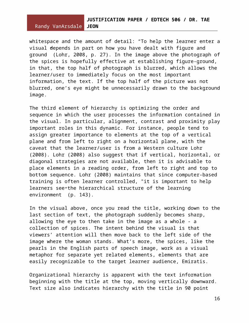
Research suggests that people tend to take in both detail and the larger picture same time, depending on the size of the image, whitespace and the amount of detail: “To help the learner enter a visual depends in part on how you have dealt with figure and ground” (Lohr, 2008, p. 27). In the image above the photograph of the spices is hopefully effective at establishing figure-ground, in that, the top half of photograph is blurred, which allows the learner/user to immediately focus on the most important information, the text. If the top half of the picture was not blurred, one’s eye might be unnecessarily drawn to the background image.
The third element of hierarchy is optimizing the order and sequence in which the user processes the information contained in the visual. In particular, alignment, contrast and proximity play important roles in this dynamic. For instance, people tend to assign greater importance to elements at the top of a vertical plane and from left to right on a horizontal plane, with the caveat that the learner/user is from a Western culture Lohr (2008). Lohr (2008) also suggest that if vertical, horizontal, or diagonal strategies are not available, then it is advisable to place elements in a reading order, from left to right and top to bottom sequence. Lohr (2008) maintains that since computer-based training is often learner controlled, "it is important to help learners see the hierarchical structure of the learning environment” (p. 143).
In the visual above, once you read the title, working down to the last section of text, the photograph suddenly becomes sharp, allowing the eye to then take in the image as a whole - a collection of spices. The intent behind the visual is that viewers’ attention will then move back to the left side of the image where the woman stands. What’s more, the spices, like the pearls in the English parts of speech image, work as a visual metaphor for separate yet related elements, elements that are easily recognizable to the target learner audience, Emiratis.
Organizational hierarchy is apparent with the text information beginning with the title at the top, moving vertically downward. Text size also indicates hierarchy with the title in 90 point font, the unit topics are 70 point font, and the description of the learning activity at the bottom is in a 50 point font. Proximity is evident given that the three chunks of text are separate yet near each other, while contrast is achieved through the deployment of modern, bold, raised-embossed text that mirrors the physical aspects of the iPad, set against an image of traditional spices. It is also worth mentioning that the colors of the image are nicely balanced with the white and black set against a range of colors in a similar color spectrum, especially the shades of purple.
12

Randy VanArsdaleJUSTIFICATION PAPER / EDTECH 506 / DR. TAE JEON
The unit introductory image is primarily decorative to solicit learner attention and retention. At the same time, the image of the woman provides a representative effect in that she serves as an observer/participant throughout the unit. Moreover, repetition of the woman provides a sense of continuity, yet a presence that does not distract the learner because the woman's attention is directed towards the content, not the learner/user: “notice how the image that faces the content… more effectively directs the eye then image that faces away” (p. 148).
A user test resulted in the suggestion of removing the word iPad from the title and adding it to the description of the bottom and reducing the amount of space between the two topics. Other feedback recommended eliminating the woman altogether and using a photo that is not out of focus. Another user expressed confusion as to the relation of the text to the image. In response to this feedback I changed positioning and wording of the text to include numbers to clarify hierarchy. However, I did not change the photo because I believe the blur effect is useful in reducing cognitive load as per my discussion above.
Color Project 2FANBOYS Introductory Image
Lohr (2008) contends that white space, also referred to as negative, counter and trapped space, is an often overlooked design element, in that,“[s]pace can direct the important information by chunking and separating individual elements” (p. 272). Citing Hartley (1985), Lohr (2008) goes on to say that space has three instructional benefits: an increase reading rate due to less redundancy, quicker access to important information, and it provides visual structure. Lohr (2008) adds that white space can create a sense of balance through symmetry and asymmetry.
In the image you see on the website, there is only one area of white space, the open space around the image, which is actually a screenshot of the visual in the app Pages. This white space is perhaps most significant as the image can be reduced or enlarged against the whitespace by simply tapping image and adjusting the blue frame that can be seen in the image. For the screenshots I have enlarged the image to the extent that seems to provide a balance between keeping the image in the frame and allowing some additional whitespace.
User tests resulted in feedback that the text, especially the words ‘conjunctions/FANBOYS’ stand out, but are somewhat blurred and hurt the eyes. Subsequently, I created a second version of the image using the same text effects – but this time with a white fill and a significantly thickened black stroke, a 4 point tip size, and a kerning of 90 – a user suggested increased
13

Randy VanArsdaleJUSTIFICATION PAPER / EDTECH 506 / DR. TAE JEON
kerning, which I did. There is also a shadow, called ‘inner glow’ around the edges, which provides a more distinct framing effect.
Other feedback suggested aligning the FANBOYS words from left to right to reduce cognitive load. For the less experienced visual designer, Lohr (2008) recommends, if possible, avoiding diagonal alignment altogether. However, in this case, the user was correct; subsequently, I changed alignment to slope down vertically.
IntegrationSubject, Verb, Object Sentence Pattern, Introductory Image
Lohr (2008) observes, “[t]he gestalt branch of psychology proposes that individuals construct representations that do not always reflect reality … when you optimize gestalt in instruction, you are essentially helping learners to see the big picture without overloading or short-term memory" (p. 160). Lohr (2008) identifies five gestalt principles germane to visual design: closure, contiguity, similarity, proximity and previous experience.
The visual item above is the English sentence pattern of subject, verb and object introductory image for one of my three lessons. The image is primarily decorative and mirrors cultural icons as do the first two lesson introduction images to create a feeling of similarity, which is “the mind’s tendency to group items based on likeness … By grouping elements, the mind is automatically reducing the cognitive load placed on memory” (p. 162).
All of these photos are taken from the Abu Dhabi Travelers Welcome set, which are open for use under Creative Commons in Flickr. This image, of UAE desert with camels silhouetted in the background, are culturally significant images that generate a sense of gestalt. Lohr (2008), for example, states that “[i]f you are creating instruction for specific audience, and are familiar with the customs and culture, you can use your knowledge of their culture to help strengthen learning. Since you are tapping into what learners already know” (p. 171).
Lohr (2008) explains that previous experience is related to information processing theory, whereby “[t]he ability to keep information alive in short-term memory is increased when learners can associate that information with what they already know” (p. 168). For instance, “[s]ymbols, icons and metaphors are widely used in instruction because of the previous experience rule” (p. 168).
Lohr (2008) emphasizes that similarity is an important element of instructional design for computer and web-based training, where users can become easily disoriented moving between screens in a nonlinear fashion.
14

Randy VanArsdaleJUSTIFICATION PAPER / EDTECH 506 / DR. TAE JEON
Lohr (2008) notes that grid systems are an effective way of establishing similarity by aligning objects providing consistency throughout instruction: “When you provide a consistent layout, you theoretically reduce cognitive load. Users do not have to relearn layout and move from screen to screen or page to page” (p. 166).
While my visuals are not laid out in a grid system due to the fact that the images do not form a website, I have tried to create some repetition with the introductory images. I have also used the image of the woman observer in a number of images in order to create a sense of continuity. As Lohr (2008) points out, it is important to determine if visual design interface “is performing the many functions of a responsive teacher/facilitator” (p. 173). Design should provide cues for navigation, feedback and overall ease-of-use. Lohr (2008) adds that it is the designer’s job “to do some of the organizational work front, in order to save the learner’s mind from having to do unnecessary work” (p. 175).
I am not certain, but the intention with the two camels facing each other in the background of the photo is to frame the viewer’s attention to the title. Closure refers to the mind’s tendency to find completion: “As learners, we often walk away from a learning situation with the overall impression or feeling, but lack awareness of the details. This phenomenon is related to closure, the mind’s unconscious continual effort to create meaning” (p. 162). Gestalt can also be achieved using boxes, which “often work better when you have used a section of an image. They act to visually define the edge if one is not supplied” (p. 182).
This is what I have done with the shading effect around the top corner of the image. I have also added a raised emboss effect around the entire image in order to enhance a framing effect. I also attempt to create a sense of contiguity, which refers to the phenomenon whereby the mind tends to “see the directions follow and will continue to follow directional cues” (p. 162). So while there is not a visible line connecting the words subjects, verbs and objects, hopefully a viewer’s eye will follow an imagined line. By placing the individual words separately but close enough to each other in a V-pattern, a viewer will mentally group them together, thereby creating a gestalt sense of proximity. A user test resulted in suggestions to reposition text on the image, which I did.
References
Agostinho, S. (2011). The use of a visual learning design representation to support the design process of teaching in higher education.
15
Randy VanArsdaleJUSTIFICATION PAPER / EDTECH 506 / DR. TAE JEON
Australasian Journal Of Educational Technology, 27(6), 961-978. Retrieved from http://tinyurl.com/cs4z5py
Mangen, A. & Velay, J. (2010). Digitizing literacy: Reflections on the haptics of writing, advances in haptics, Mehrdad Hosseini Zadeh (Ed.), ISBN: 978-953-307-093-3, InTech. Retrieved from http://www.intechopen.com/books/advances-in-haptics/digitizing-literacy-reflections-on-the-haptics-of-writing
Larson, L., & Miller, T. (2011). 21st century skills: Prepare students for the future. Kappa Delta Pi Record, 47(3), 121-123. Retrieved from http://tinyurl.com/7yuq6cw
Lohr, L. (2008). Creating graphics for learning and performance: Lessons in visual literacy. (2 ed.). Upper Saddle River, NJ: Merrill.
Rosenquist, C. (2012). Visual form, ethics, and a typology of purpose: Teaching effective information design. Business Communication Quarterly, 75(1), 45-60. Retrieved from http://tinyurl.com/canejmp
Smith, P. & Ragan, T. (2005). Instructional design. (3rd ed.). Hoboken, New Jersey: John Wiley & Sons.
Williams, R. & Tollett, J. (2006). The non-designers web book. (3rd ed.). Berkeley, California: Peachpit Press
16