Is a Picture Truly Worth a Thousand Words? Infographics ...
10
Is a Picture Truly Worth a Thousand Words? Infographics for Undergraduate Teaching Riana Steyn * , Adriana Botha, and Nita Mennega Department of Informatics, University of Pretoria, Pretoria, South Africa *[email protected] Abstract. Infographics, have emerged as an appealing academic tool. Sup-plementing traditional learning material such as textbooks, or PowerPoint slides, infographics allow for summarised versions of the same material. Millennials want access to relevant information literally at the click of a button. As educators, we have to find a way of engaging these students with new teaching practices and new learning styles. The researchers commenced on a quest to see how they could engage these students, not only by teaching them the relevant knowledge, but also by allowing these students to use a simple infographic, which covers an entire study theme, and testing the students’ perception of the use of infographics as a substitute for or even to replace “traditional” PowerPoint slides. The infographic was guided based on the 5 principles of the Gestalt theory. The study was conducted on 210 student participants, with limited prior experience of infographics. The infographic was perceived as a great tool and of good quality, which they would prefer to use as a study method over PowerPoint slides. As educators, we need to find ways in which to incorporate infographics as a learning approach, to enhance the learning experience of students. It is recommended that educators explore visual tools to enhance the learning experience and to retain the knowledge to which our students have been exposed. It is further recommended that infographics should be evaluated based on the five principles of Gestalt to not only improve designs, but also student experience. Keywords: Infographic, Visual communication tool, Learning tool, Hybrid learning, Traditional learning approaches 1 Introduction Teaching has long surpassed the handing out of a textbook, which includes all the content required for the term, semester or even year, or giving students a set of PowerPoint slides that they are expected to use, and add additional notes or summaries. Students are engaged with technology everywhere one looks. As educators, we need to find the means to embrace these technologies to engage more effectively with the students. As Puttnam [1] rightfully states: “If we want to win back the trust of young people, we need to engage far more effectively with their world – learn to view technology, and the way in which they relate to it – through their eyes.” The reality of 1
Transcript of Is a Picture Truly Worth a Thousand Words? Infographics ...

Is a Picture Truly Worth a Thousand Words?Infographics for Undergraduate Teaching
Riana Steyn*, Adriana Botha, and Nita Mennega Department of Informatics, University of Pretoria, Pretoria, South Africa
Abstract. Infographics, have emerged as an appealing academic tool. Sup-plementing traditional learning material such as textbooks, or PowerPoint slides, infographics allow for summarised versions of the same material. Millennials want access to relevant information literally at the click of a button. As educators, we have to find a way of engaging these students with new teaching practices and new learning styles. The researchers commenced on a quest to see how they could engage these students, not only by teaching them the relevant knowledge, but also by allowing these students to use a simple infographic, which covers an entire study theme, and testing the students’ perception of the use of infographics as a substitute for or even to replace “traditional” PowerPoint slides. The infographic was guided based on the 5 principles of the Gestalt theory.The study was conducted on 210 student participants, with limited prior experience of infographics.The infographic was perceived as a great tool and of good quality, which they would prefer to use as a study method over PowerPoint slides.As educators, we need to find ways in which to incorporate infographics as a learning approach, to enhance the learning experience of students.It is recommended that educators explore visual tools to enhance the learning experience and to retain the knowledge to which our students have been exposed. It is further recommended that infographics should be evaluated based on the five principles of Gestalt to not only improve designs, but also student experience.
Keywords: Infographic, Visual communication tool, Learning tool, Hybrid learning, Traditional learning approaches
1 Introduction
Teaching has long surpassed the handing out of a textbook, which includes all thecontent required for the term, semester or even year, or giving students a set ofPowerPoint slides that they are expected to use, and add additional notes or summaries.Students are engaged with technology everywhere one looks. As educators, we need tofind the means to embrace these technologies to engage more effectively with thestudents. As Puttnam [1] rightfully states: “If we want to win back the trust of youngpeople, we need to engage far more effectively with their world – learn to viewtechnology, and the way in which they relate to it – through their eyes.” The reality of
1

the students with whom we work is “always on/never off”, as coined by Ashraf [2] andPullan [3]. Turpie [4] said that “new technology and digital media engage youngpeople from the day they enter the world”. The students referred to here are millennials,who are “the first generation growing up with the internet” or even further Generation Z[5], which are students born after 1995. Kalantzis [6] says that, with this ever-changingworld, perhaps we – as educators – should lead the change. Bradshaw and Porter [7]note that most people are visual learners. Therefore, using visual aids as a teachingmechanism is inevitable.
Many universities are forced to engage in a blended learning environment wheretechnology-mediated learning and face-to-face sessions have to merge [8]. Kirkwoodand Prince [9] also noted that technology is no longer a field only for enthusiasts ornovel users. All lecturers should engage with technology [10, 11]. This new context oftechnology needs to be understood [10], and as educators, we should find the means toembed our understanding of technology within the existing classroom. Davidson,Major and Michaelsen [12] talk of the notion of getting students to become “activeparticipants in the learning process”, and not just having them sit in a classroom,listening to a lecturer and then repeating the theory back to the lecturer.
Vanichvasin [13] confirms three aspects of infographics in the learning process:appeal (as a communication tool to engage students), comprehension (to connectsubject matter and conceptualise it) and retention (to make knowledge morememorable).
This paper explores this notion by allowing students to give their viewpoint on theuse of an infographic as an additional learning tool to assist them by supporting thetraditional PowerPoint slides that educators love to use.
2 Literature Review
Yildirim [14] notes that many teaching approaches have adopted a hybrid approach.Bonk and Graham [15] define blended learning as the combination of “face-to-faceinstructions with computer-mediated instruction”. Bender [16] talks about hybridlearning, where a course that has face-to-face classes on campus has an additional webcomponent that is linked to the course. Woods, Baker and Hopper [17] confirm thiswhen they talk about the web-based augmentation of the traditional classroom setting.Bender [16], Rosenberg [18] and Wilson [19] talk of the best of both worlds: thisphenomenon of combining physical classroom interactions with some sort of webcomponent.
Yildirim [14] states that one of the most crucial forms of presenting information isthrough the use of visual aids. Visuals evoke emotions and create experiences [7],which is one of the reasons for the effective use of visual aids in a classroom envi-ronment. However, Yildirim [14] also says that no matter what visual aid, tool ortechnology one uses, each aid has its own properties of information, intended use andlearner preferences.
Yildirim [14] continues to note that graphics allow for the visual presentation ofinformation and that, in today’s teaching environment, infographics are seen as a newtype of material that provides information to fit within a certain scope or flow. “Too
2

much information can be presented with very little explanation,” [14]. He furtherdefines an infographic as “presenting information within a certain flow with the help ofvarious visuals and texts in a visual form,” [14] which is similarly defined by Sudakovet al. [20], who use words such as “images combined with knowledge”. It is importantto note that the information should be presented in a logical sequence, this is where theGestalt theory plays a crucial role. Gestalt says that one should not only focus on theindividual parts, but that the whole effect of the picture should also create a “wholeeffect” [21] or “gestalt” and that one experience perceptual wholes, and not necessarilyisolated parts. Wertheimer and Riezler [22] defines gestalt as “what happens to a part ofthe whole is, in clear-cut cases, determined by the laws of the inner structure of itswhole”, thus the individual pieces are driven or determined by the structure of theentire whole, also mentioned as the context.
Infographics stimulate a human’s visual system in order to recognise certain pat-terns and trends [20], and effective infographics present the data in pleasing andsimplistic ways. Williams [23] defines infographics as “the statistics, patterns andtrends in information; the characteristics of the information landscape” However the“trick” is to see how the whole picture says something relevant and once one startslooking at the individual parts, these also convey their own message [21]. Wang [24]confirms the use of Gestalt as “there are many ways Gestalt principles can help usorganize and present visual information better in an infographic, especially if you aredealing with complex information” and this paper uses complex information in anacademic setting.
Infographics are increasing in popularity in the education environment [7, 14, 20,25]. Yildirim [14] notes that the strongest aspects of infographics are their flexiblestructure, the fact that they allow information to be visual, and that they can be preparedin alternative forms, which means that each infographic can look different.
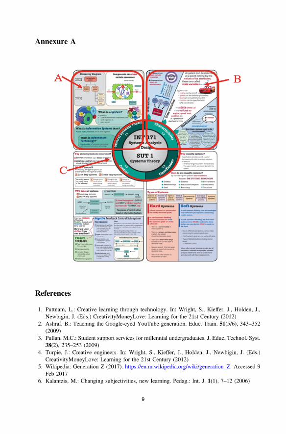
For the purpose of this research, an infographic was designed based on the firststudy unit of a first-year undergraduate course in business analysis and design. Theinfographic is a one-page view (see Annexure A), which is broken down into the fourstudy units, from a broader viewpoint, but once you start reading the context, you willnote each section relates to a theme within the broader study unit, thus gestalt.
2.1 Quality of Infographics
Gestalt theory has five principles which should be followed during design. Theseprinciples [24, 26] will now briefly be discussed.
• Similarity: Relationships are created by sharing visual characteristics. Colour wasused extensively in the infographic to create relationships amongst objects, as wellas borders around the various sub-themes within the study unit. See Annexure A,Section A for an example.
• Continuation: an object will allow the eye to follow in a specific direction once theeye is fixed on the object, until another object interrupts the flow. An example ofhow it is applied can be seen in Annexure A, Section B. The bold green lines showthat three topics exist, but the bold green arrow indicates the flow and thus ensurescontinuation is achieved.
3
• Closure: this principle is applied which allows the eye to close the loop, or the gap,it is also mostly recommended in art work, mosaics or sculptures. This infographicdid not include this principle due to the nature of the work. As this infographicalready summarises almost 69 academic slides and content in total, we did not wantto create confusion amongst the students to allow them to try and close the loop orfill the gaps.
• Proximity: Placing objects together makes them seem like a group, this can beapplied in various ways. This was applied by breaking down the infographic intothe various study themes within the entire study unit and placing borders aroundthese themes.
• Figure/ground: This is the relationship between objects and its surroundings. Thelayout was based around a clock, where one moves clockwise around the variousstudy units.
In addition to Gestalt’s theory which purely focuses on design, various otherauthors have also listed certain points or aspects which they consider to be relevant forcreating infographics specifically. The infographic used for this study was designed toensure a positive learning experience for the students. To determine if the infographicdesigned for this paper was considered good, the researchers addressed the charac-teristics of a good infographic according to various authors as follows (Table 1):
2.2 Further Background to the Study
This infographic was designed by the researchers with the help of an instructionaldesigner, as Yildirim [14] highlighted that instructional design is a crucial element tocreating infographics.
Table 1 Infographic characteristics
Characteristics Applied for this study
Purpose of the infographic [14] The infographic was designed to determine ifone can replace the traditional PowerPointslides with one view. Thus, 90 slides wereconsolidated into one view
Quality of the visuals and design [7, 14, 21,22, 24, 25]Level of visualising the information [14, 25]Information and visualisation of theinformation should be top quality (no errors,no unnecessary information should bedisplayed) [14]. Every element should dosomething [25].
The students were asked to evaluate theinfographic, in two ways. First, they had toanswer a question in an Answer Garden:“Type one word that you think describes theinfographic.” Secondly, they had to completea questionnaire based on the quality byanswering the following question: “Rate thequality of the infographic based on thefollowing”:Content/Layout/Visuals/Consistencybetween information and visuals/Noerrors/No unnecessary information/Colourappropriate/Preferred layout
4

The content of the specific study unit, Systems Theory, was analysed to determinethe most important concept of the study unit. Thus, the main information required onthe infographic was determined and extracted from the PowerPoint slides as a con-solidation of the main concepts, normally presented in 90 slides, into one view. Thisinformation was handed to the graphic designer with a brief plan or layout of what theresearchers had in mind. The infographic evolved through various iterations. The finalversion can be viewed in Annexure A.
3 Method
As part of a first-year course called Systems Analysis and Design, which was presentedat an urban university, the students had to grasp key concepts of the Systems Theorystudy unit. This research was conducted on completion of the first study unit, fourweeks into the students’ first semester of studies. Although it was assumed that thestudents had little experience of infographics as a learning tool, this was one of thequestions asked during the data gathering. The classes were split up into three groups,with their first contact session of the week either a Monday or a Tuesday. This isrelevant since the infographic was distributed in colour, printed in an A4 format, to allthe students who attended the classes during their first contact session of the week, thuseither on a Monday or a Tuesday.
The teaching of this study unit was traditionally through additional reading materialin a portable document format (PDF) and PowerPoint slides that were created and madeavailable to students through the learning management system (LMS) Blackboard. Intotal, there were 91 slides for the entire Study Unit 1, of which 22 were seen as being“empty” thus no new content. They were the introduction slides, the exercise slides or afew recap slides. Thus, 69 slides contained the content for Study Unit 1.
At the end of each study unit, the students have to write a quiz based on all thework covered in the slides. The quiz is online and they write it in their own time, thiswas written on the Friday before the infographic was distributed in class. They coulduse their learning material if they wanted to. During the following class (the Monday orTuesday class), the students all received a hard copy of the infographic in colour, whichwas the first time they had seen the infographic. They also had to complete an AnswerGarden stating what they love or hate about the infographic in one word. Of the 352students enrolled for this subject, 209 completed the questionnaire, implying a 59.4%response rate. The Answer Garden received 290 responses. The assumption theresearchers made due to the difference in responses was that a student could haveprovided more than one word in the Answer Garden. They were given 10 min to readit, and were then given a quiz consisting of 10 questions, randomly selected from thesame question bank as their first quiz on the Friday. They then had to complete the quizusing the infographic to answer the questions. After the quiz, they were asked tonavigate to the Answer Garden and type one word they thought best described theinfographic. The students then had to complete an online questionnaire on GoogleForms, consisting of 16 questions, on their experience and perception of the info-graphic, as well as the quality of the infographic. The feedback from the questionnairewas then analysed.
5

4 Findings
An Answer Garden is a free tool available on https://answergarden.ch/ [27] that allowsone to generate responses based on a specific question. As the respondents give theiranswers, a word cloud instantly grows, with repeating words growing bigger. Theresponses from the students can be seen in Fig. 1.
It is evident from the word cloud that the word “helpful” was the most repetitiveword, by accumulating 51 responses. This was followed by: Informative – 21responses; Useful – 19 responses; Convenient – 18 responses.
Thus, overall, there was a positive response from the students’ side towards theinfographic. The students were asked to be brutally honest and, if they hated it, theycould also state that. There were a few negative responses, such as “useless” (1response), “boring” (1 response) and “busy” (2 responses). This was expected aspeople do not agree on everything. However, the low negative response showed that,overall, the majority of the students could see the value of infographics.
The students then had to complete the questionnaire on Google Forms. This wascompleted during class time. Of the 209 respondents, the majority were male students(69.4%), followed by female students (58.7%) and those who preferred not to say(1.9%). Looking at their ages, 97.1% of the students belonged to Generation Z, thuswere born after 1995.
Asking them if they had ever used or seen an infographic as a study tool before,56.5% said “No”. The rest said “Yes”.
Printed textbooks, infographics and PowerPoint slides were the most preferredstudy methods. Interestingly, videos were only selected by 42% of the respondents,which is in contrast with the findings of Steyn et al. [11] and Yildirim [14]. BySelecting other one respondent said: “By making personal notes from informationcollected during class and out of a textbook”.
The next section of questionnaire related to the actual focus of this paper, whichwas the link back to a good-quality infographic. These questions were asked in theform of a Likert scale, with 1 being poor and 5 being excellent.
The main question asked was: “Rate the quality of the infographic based on thefollowing”: (1.) Content; (2.) Layout; (3.) Visuals; (4.) Consistency between
Fig. 1. Answer Garden word cloud
6

information and visuals; (5.) No errors; (6.) No unnecessary information; (7.) Colourappropriate; (8.) Preferred layout. It is evident from Fig. 2 that most of the studentsthought the infographic was excellent to above average for all the categories. Thus, didthe infographic meet the characteristics as set out by the literature? The answer is:“Yes, most definitely”.
Their opinion on whether they thought the infographic was an effective tool fromwhich to study for Study Unit 1. Some 94% of the students said “Yes”.
Students were asked their perception or opinion on the successful use of Info-graphic in the following contexts: (1.) In Presenting lectures; (2.) In explaining studymaterial; (3.) Used in learning activities; (4.) Showing examples; (5.) In summarizingcontent. Figure 3 clearly show various areas where student felt infographics couldsuccessfully be applied during their studies.
Fig. 2. Quality rating
Fig. 3. Using infographic in the following context
7

Additional comments about the infographic were: “Brilliant thank you!”; “It is areally good tool and I’m glad you did it for us.”; “It is a good summarisation of thework but it is a bit too clustered.”; “Loved it.”; “Really enjoyed it. Glad it was made.”;“Supercalifragilisticexpialidocious.”; “This infographic is extremely helpful. I hope thisform of study is implemented in all modules.”; “Why have we not done this before?This is a great way of learning…”
Some of the more constructive comments were: “Examples and short definitions,would not recommend for studying but as a nice summary of the content I wouldrecommend every student to have an infographic.”; “The infographic is an excellentassisting tool. However, it does not contain all the required detail for someone whoknows nothing about the content of the work. Brilliant for someone who has beenthrough the work before.”
5 Discussion
As educators, we have to engage students in “their” world, and one of the ways thispaper focused on was designing an infographic to assist the students in grasping largeamounts of information at a glance.
The infographic that was produced clearly ticked all the boxes when it came to thedesign and characteristics of a good infographic as a teaching tool as identified [7, 14,22]. It also followed the Gestalt theory’s principles for design [22, 24] to ensure that itis not just pictures and words placed onto a page to try something, but with carefulplanning and design, the end result can ensure that knowledge is not only transferred,but also laid down in the foundation of the students.
The next part of this research will focus on the true impact of the infographic on theknowledge retention of students.
6 Conclusion
This paper set out to determine whether an infographic can be used to enhance stu-dents’ learning abilities and, in the end, replace the “traditional” PowerPoint slides thateducators love to hand out. By careful planning and designing these types of inter-ventions, one can get to a place where knowledge is embedded in these student’s mindswhich they can use in their further studies and in the end apply when they enter theirwork environment. The results showed that the students felt that the quality of theinfographics was good and acceptable for them to use in Study Unit 1 and they wereexcited that lecturers are exploring different teaching methods to truly engage withthem.
8
Annexure A
References
1. Puttnam, L.: Creative learning through technology. In: Wright, S., Kieffer, J., Holden, J.,Newbigin, J. (Eds.) CreativityMoneyLove: Learning for the 21st Century (2012)
2. Ashraf, B.: Teaching the Google-eyed YouTube generation. Educ. Train. 51(5/6), 343–352(2009)
3. Pullan, M.C.: Student support services for millennial undergraduates. J. Educ. Technol. Syst.38(2), 235–253 (2009)
4. Turpie, J.: Creative engineers. In: Wright, S., Kieffer, J., Holden, J., Newbigin, J. (Eds.)CreativityMoneyLove: Learning for the 21st Century (2012)
5. Wikipedia: Generation Z (2017). https://en.m.wikipedia.org/wiki/generation_Z. Accessed 9Feb 2017
6. Kalantzis, M.: Changing subjectivities, new learning. Pedag.: Int. J. 1(1), 7–12 (2006)
9

7. Bradshaw, M.J., Porter, S.: Infographics: a new tool for the nursing classroom. Nurse Educ.:Technol. Corner 42(2), 57–59 (2017)
8. Kirkwood, A., Price, L.: Learners and learning in the twenty-first century: what do we knowabout students’ attitudes towards and experiences of information and communicationtechnologies that will help us design courses? Stud. High. Educ. 30(3), 257–274 (2005)
9. Kirkwood, A., Prince, L.: Technology-enhanced learning and teaching in higher education:what is ‘enhanced’ and how do we know? A critical literature review. Learn., MediaTechnol. 39(2), 6–36 (2014)
10. Laurillard, D.: The pedagogical challenges to collaborative technologies. Comput.-Support.Collab. Learn. 4, 5–20 (2009)
11. Steyn, R., Millard, S., Jordaan, J.: The use of a learning management system to facilitatestudent-driven content design: an experiment. In: Huang, T.-C., Lau, R., Huang, Y.-M.,Spaniol, M., Yuen, C.-H. (eds.) SETE 2017. LNCS, vol. 10676, pp. 75–94. Springer, Cham(2017). https://doi.org/10.1007/978-3-319-71084-6_10
12. Davidson, N., Major, C.H., Michaelsen, L.K.: Small-group learning in higher education -cooperative, collaborative, problem-based and team-based learning: an introduction by guesteditors. J. Excell. Coll. Teach. 25(3&4), 1–6 (2014)
13. Vanichvasin, P.: Enhancing the quality of learning through the use of infographics as visualcommunication tool and learning tool. In: ICQA 2013 International Conference on QACulture: Cooperation or Competition, Bangkok (2013)
14. Yildirim, S.: Infographics for educational purposes: their structure, properties and readerapproaches. Turk. Online J. Educ. Technol. 15(3), 98–110 (2016)
15. Bonk, C.J., Graham, C.R.: The Handbook of Blended Learning: Global Perspectives, LocalDesigns. Pfeiffer, San Francisco (2006)
16. Bender, T.: Discussion-Based Online Teaching to Enhance Student Learning: Theory,Practice, and Assessment, 2nd edn, p. 256. Stylus Publishing, LLC, Virginia (2012)
17. Woods, R., Baker, J.D., Hopper, D.: Hybrid structures: faculty use and perception of web-based courseware as a supplement to face-to-face instruction. Internet High. Educ. 7, 281–297 (2004)
18. Rosenberg, M.J.: Knowledge management and learning: perfect together. In: Reiser, R.A.,Dempsey, J.V. (eds.) Trends and Issues in Instructional Design and Technology. Pearson,Boston (2012)
19. Wilson, R.W.: In-class-online hybrid methods of teaching planning theory: assessingimpacts on discussion and learning. J. Plan. Educ. Res. 28, 237–246 (2008)
20. Sudakov, I., Bellsky, T., Usenyuk, S., Polyakova, V.V.: Infographics and mathematics: amechanism for effective learning in the classroom. Probl., Resour., Issues Math. Undergrad.Stud. 26(2), 158–167 (2016)
21. Behrens, R.R.: Art, design and gestalt theory. Leonardo 31(4), 299–303 (1998)22. Wertheimer, M., Riezler, K.: Gestalt theory. Soc. Res. 11(1), 78–99 (1944)23. Williams, F.M.: Diversity, thinking styles, and infographics. In: 12th International
Conference of Women Engineers and Scientists (2002)24. Wang, L.: Gestalt principles for information design. In: HOW Magazine (2017)25. Saunders, D.H., Horrel, A., Murray, A.: Infographics for students assessment: more than
meets the eye. BJSM (2017)26. Staff: Gestalt theory in typography & design principles. In: HOW Magazine (2015)27. AnswerGarden: Answer Garden (2018). https://answergarden.ch/. Accessed 20 Feb 2018
78 R. Steyn et al.
10