How my magazine changed over time
10
How my magazine changed over time. 1 st attempt This is my first attempted of doing my music magazine, I done this on PowerPoint, what I don’t like about this is that it is quite simple for a music magazine, so I want to try and use Photoshop next and explore my ideas further. I think I will keep the same picture because I really like it, maybe I’ll change the colour of it a little bit.
-
Upload
larissalovesbey -
Category
Documents
-
view
38 -
download
0
Transcript of How my magazine changed over time

How my magazine changed over time.1st attempt
This is my first attempted of doing my music magazine,I done this on PowerPoint, what I don’t like about this is that it is quite simple for a music magazine, so I want to try and use Photoshop next and explore my ideas further. I think I will keep the same picture because I really like it, maybe I’ll change the colour of it a little bit.

2nd attempt on my music magazine
This is my 2nd attempt and I really liked it but what is not really working for me is how the letters gets kind of lost on the bright background, so my next step is to find a way to make the writing stand out a but more, and I also want to add a Facebook logo so people can find the ‘Rmagazine’ on Facebook and I also want to add a price.
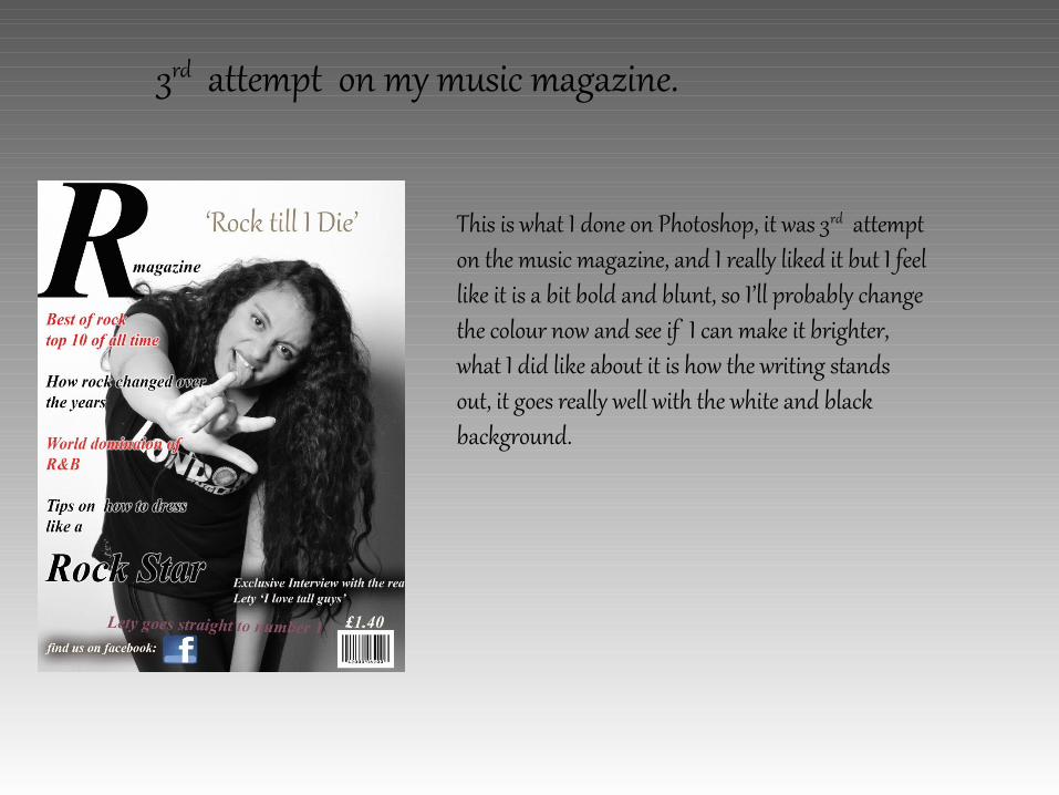
3rd attempt on my music magazine.
This is what I done on Photoshop, it was 3rd attempt on the music magazine, and I really liked it but I feel like it is a bit bold and blunt, so I’ll probably change the colour now and see if I can make it brighter, what I did like about it is how the writing stands out, it goes really well with the white and black background.

My final magazine cover
This is my final music magazine and I am really happy with the results, the colour are amazing, the fonts are just the way I wanted, I think the layout works really well and no area is blank. I like the red of the font links with my model’s lipstick.

My 1st attempt on my double page spread
This is my first attempt on doing my double page spread, but the blue I don’t think it really links to the front page, so I think my next step would be to experiment with different colours and maybe try out different fonts, maybe I wont change the ‘L’ I really like the way it stands out.
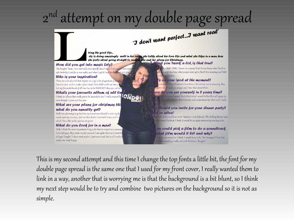
2nd attempt on my double page spread
This is my second attempt and this time I change the top fonts a little bit, the font for my double page spread is the same one that I used for my front cover, I really wanted them to link in a way, another that is worrying me is that the background is a bit blunt, so I think my next step would be to try and combine two pictures on the background so it is not as simple.

Final double page spread
This is my final double page spread, a lot of people said that they loved the pictures so I am really happy that I was able to combine the two pictures that I like together, I blended the pictures into the background so the writing would be visible, I also changed the colour to red so it linked to the front page of my magazine. Overall I am really happy with my double page spread

1st Content page
This is my first attempt on my content page, I really like the picture but I feel like the font is not really good, and also the writing are a bit hard to read so my next aim is to be able to make sure that the writing is clearer, so I might blend the background a little bit.

Final Content pageThis is my final content page, I really like how the background blends really well with the whole page, I wanted to keep this page simple and something that it would be easy to read, so I decided that I wanted to keep the writing back and quite, I am also happy with the picture that I took, I think it goes really well with the writing.

Final Content pageThis is my final content page, I really like how the background blends really well with the whole page, I wanted to keep this page simple and something that it would be easy to read, so I decided that I wanted to keep the writing back and quite, I am also happy with the picture that I took, I think it goes really well with the writing.