GradeInflation - Dartblog.com Inflation Report.pdf · GradeInflation.com Grade Inflation at...
18
GradeInflation.com Grade Inflation at American Colleges and Universities Â
Transcript of GradeInflation - Dartblog.com Inflation Report.pdf · GradeInflation.com Grade Inflation at...
GradeInflation.com
Grade Inflation at American Colleges and Universities
Â
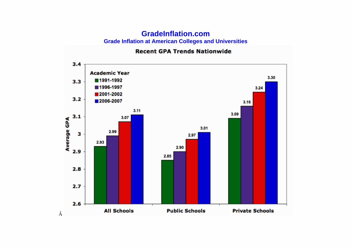
The figure above shows the average undergraduate GPAs for American colleges and universities from 1991-2006 based on data from: Alabama, Appalachian State, Auburn, Brown, Bucknell, Carleton, Central Florida, Central Michigan, Centre, Colorado, Colorado State, Columbia, Cornell, CSU-Fullerton, CSU-Sacramento, CSU-San Bernardino, Dartmouth, Duke, Elon, Florida, Furman, Georgia Tech, Georgetown, Georgia, Hampden-Sydney, Harvard, Harvey Mudd, Hope, Houston, Indiana, Kansas, Kent State, Kenyon, Knox, Messiah, Michigan, Middlebury, Nebraska-Kearney, North Carolina State, North Carolina-Asheville, North Carolina-Chapel Hill, North Carolina-Greensboro, Northern Iowa, Northern Michigan, Ohio State, Penn State, Pomona, Princeton, Purdue, Roanoke, Rutgers, Southern Illinois, Texas, Texas A&M, Texas State, UC-Berkeley, UC-Irvine, UCLA, UC-Santa Barbara, Utah, UW-Oshkosh, Virginia, Washington State, Washington-Seattle, Western Washington, Â Wheaton (IL), William & Mary, Winthrop, Wisconsin-La Crosse, and Wisconsin-Madison. Note that inclusion in the average does not imply that an institution has significant inflation. Data on the GPAs for each institution can be found at the bottom of this web page. Institutions comprising this average were chosen strictly because they have either published their data or have sent their data to the author on GPA trends over the last 11-16 years.
Last major update, March 10, 2009
Next major update, January 2016
Due to eye issues and subsequent surgery, next update delayed until February 2016
Added data for several new schools, March 14, 2009. Added SAT data for most schools, March 18, 2009. Added data and updated Figure 5, March 23, 2009. Added data and updated Figure 6, April 2, 2009. Added data and text as well as updated Figures 3 and 5, April 8, 2009. Added data for several more schools, April 17, 2009. Added data for several more schools, April 21, 2009. Added data for a few more schools and updated Elon data, April 24, 2009. Added data for a few more schools May 22, 2009. Added data for several more schools and updated data for South Florida and Florida Atlantic, June 23, 2009. Added data for a few more schools, January 5, 2010. Added link to commentary on some recent newspaper articles on grade inflation, February 3, 2010. Added Sweet Sixteen of Tough A's, more schools, and links to research paper, March 22, 2010. Added more schools and links to commentaries; added data to some existing schools, July 16, 2010. Added a chart and a link to a paper, May 29, 2012. Added a link to an interview, May 25, 2013. Announced next major update, November 20, 2016.
Introduction
This web site is an outgrowth of an op-ed piece that I wrote on grade inflation for the Washington Post, "Where All Grades Are Above Average" In the process of writing that article, I collected data on trends in grading from about 30 colleges and universities. I found that grade inflation, while waning beginning in the mid-1970s, resurfaced in the mid-1980s. The rise continued unabated at virtually every school for which data were available. By March 2003, I had collected data on grades from over 80 schools. Then I stopped collecting data until December 2008, when I thought it was a good time for a new assessment.
I now have data on average grades from over 230 schools (with a combined enrollment of over two million undergraduate students). I want to thank those that have helped me by either sending information or telling me where I can find it. I especially want to thank Chris Healy and Lee Coursey who, combined, uncovered over 50 web sites with detailed data. Chris Healy has written research papers with me on the topic of grading at American colleges and universities
that were published in 2010 and 2011; reprints are available here and here. I also want to thank those that have sent me emails on how to improve my graphics. Additional suggestions are always welcome. Send them to me, Stuart Rojstaczer, at: this address.
Â
Long Term Trends
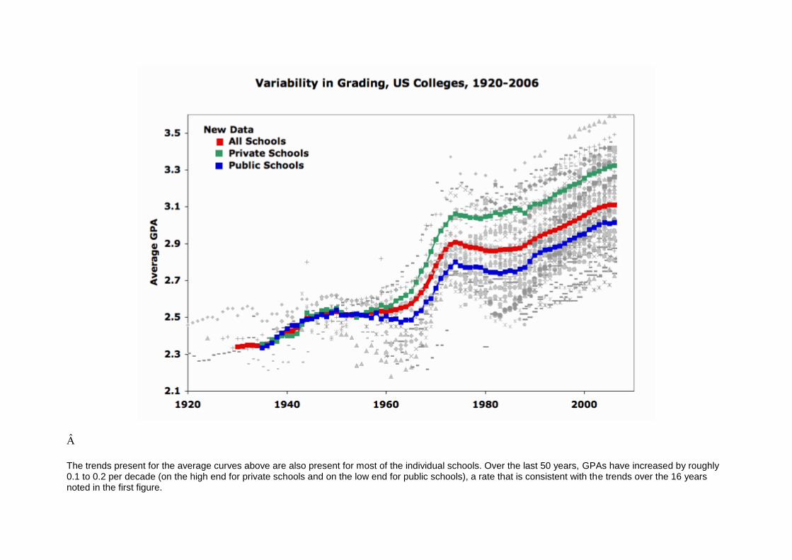
The chart below shows long term trends in GPA using data from the 70 institutions listed above and additional data from CSU-East Bay, James Madison, Minnesota, MIT, Montana State, Northwestern, Stanford, Western Michigan, and Williams. Data are scant for the first few years on the chart (averages from the 1930s are based on data from eight institutions), and the curves for that portion of time have a good deal of uncertainty. Each data point is represented by a grey dot. The red, green and blue colored squares represent averages for all schools, private schools only and public schools only, respectively.
The chart indicates that private and public schools graded on average very similarly until the late 1950s or 1960s, when grades began to bifurcate. On average, private schools now grade about 0.3 higher than public schools for the schools examined here. This trend fully developed in the 1980s; the reasons for this trend are beyond the scope of this website post, but details can be found in our 2010 research paper.
In the 1930s, the average GPA at American colleges and universities was about 2.35, a number that corresponds with data compiled by W. Perry in 1943. By the 1950s, the average GPA was about 2.52. GPAs took off in the 1960s with grades at private schools rising faster than public schools, lulled in the 1970s, and began to rise again in the 1980s at a rate of about 0.10 to 0.15 increase in GPA per decade. The grade inflation that began in the 1980s has yet to end.
Â
Â
The trends present for the average curves above are also present for most of the individual schools. Over the last 50 years, GPAs have increased by roughly 0.1 to 0.2 per decade (on the high end for private schools and on the low end for public schools), a rate that is consistent with the trends over the 16 years noted in the first figure.
Â
Â
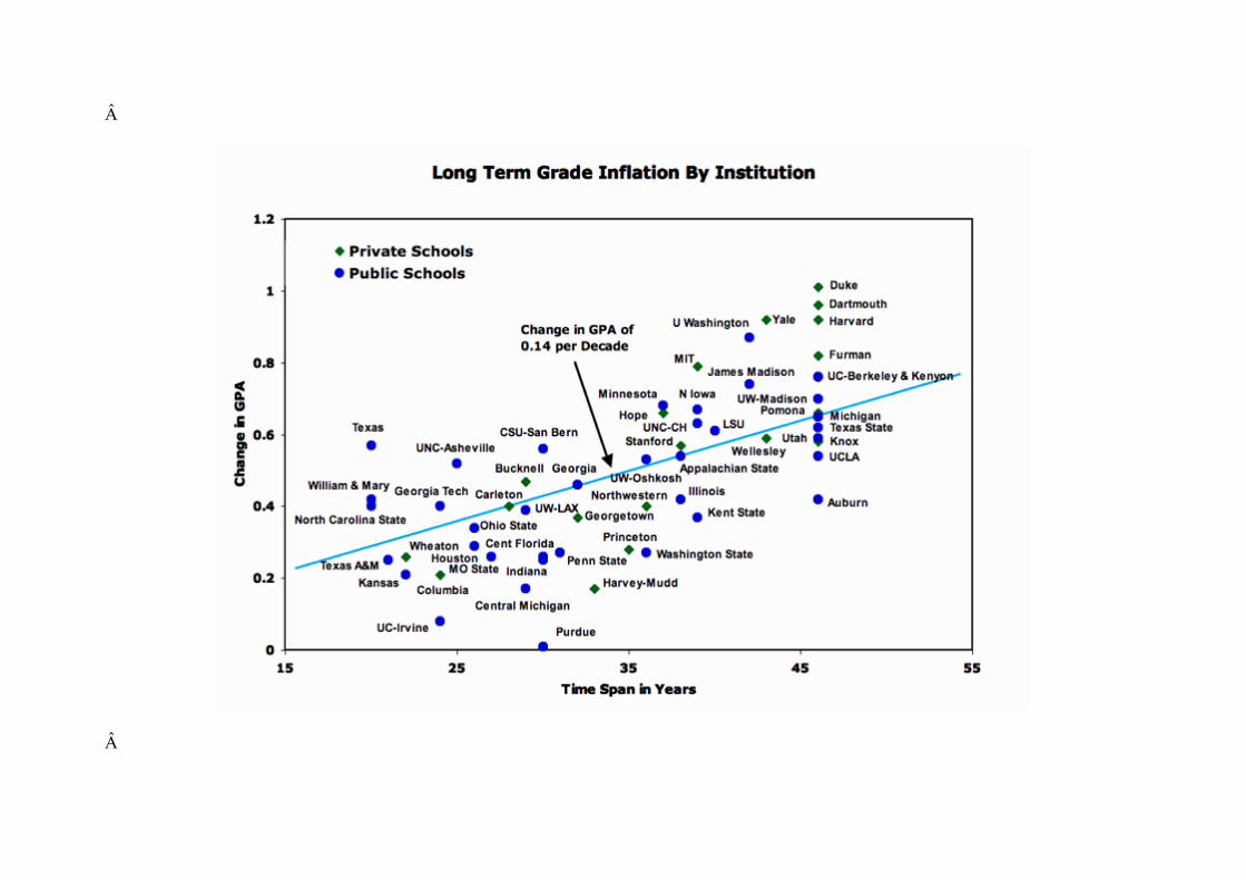
In the chart above, which shows changes in GPA as a function of time span in years, the solid line represents a least squares fit to the data. These data points represent almost all schools with data of 20 years in length or longer. Not included in the chart above is CSU-Fullerton, which had a drop in GPA of 0.10 over a 30 year period.
Note that the solid straight line tends to underpredict grade inflation since the 1960s and mid-1980s (time spans of greater than 40 years and less than 25 years, respectively) and overpredict grade inflation since the mid-1970s. This follows the general trend shown in the second figure: grade inflation waning in the mid-1970s to mid-1980s. It's worth noting that Dartmouth and Duke are in the upper right corner of this chart not because their grades are high relative to similar institutions today, but because their grades were low in 1960.
Statements have been made by some that grade inflation is confined largely to selective and highly selective colleges and universities. The three charts above indicate that these statements are not correct. Significant grade inflation is present almost everywhere and contemporary rates of change in GPA are only slightly higher for private schools.
Â
Recent Trends in Grade Inflation
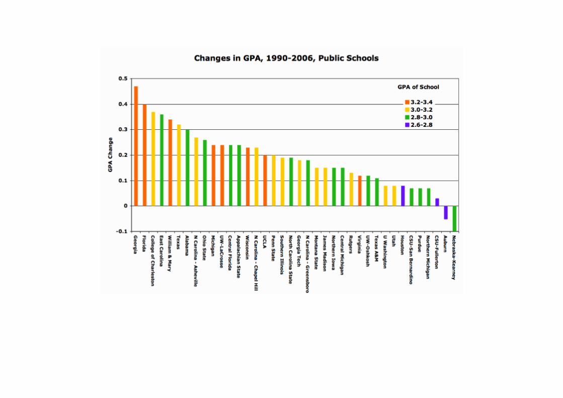
The charts below examine the magnitude of the rate of grade inflation for almost all of the institutions for which I have sufficient data on contemporary trends. The average GPA change for public schools over this recent 15 year interval (either 1990-2005 or 1991-2006, depending on the school) is 0.18 which corresponds to a rate of change of 0.12 per decade. The tendency is for schools with high average GPAs to also have high rates of change and for schools with low average GPAs to continue to have low rates of change. Essentially, the gap keeps widening between the high and low GPA schools. Flagship state schools in the South have the highest contemporary rates of grade inflation for this sample of public schools.
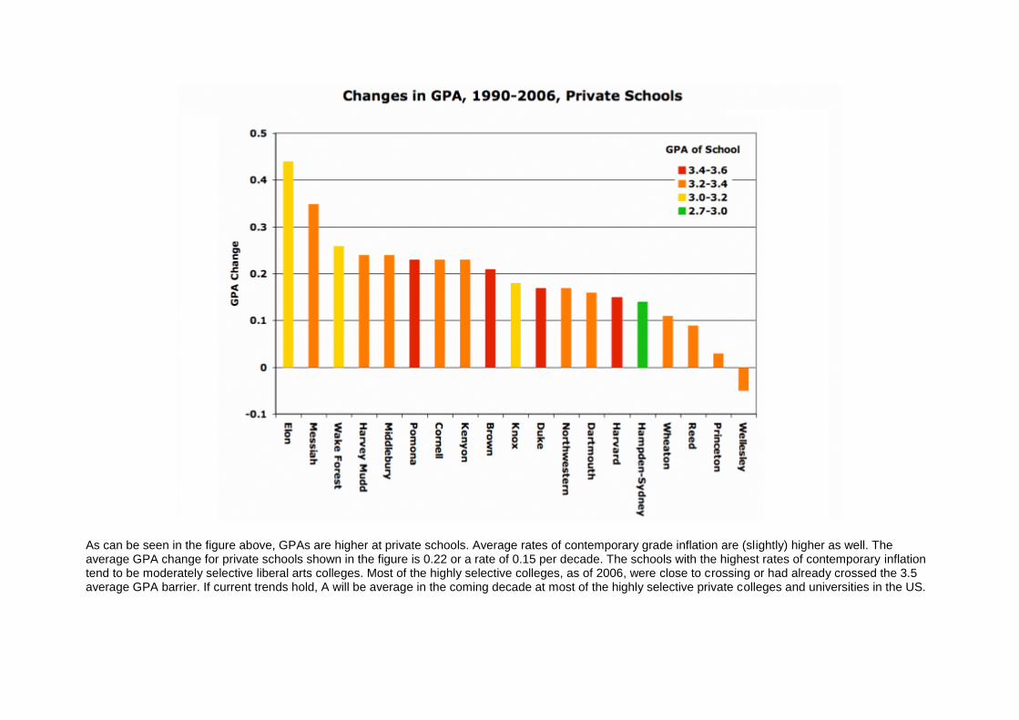
As can be seen in the figure above, GPAs are higher at private schools. Average rates of contemporary grade inflation are (slightly) higher as well. The average GPA change for private schools shown in the figure is 0.22 or a rate of 0.15 per decade. The schools with the highest rates of contemporary inflation tend to be moderately selective liberal arts colleges. Most of the highly selective colleges, as of 2006, were close to crossing or had already crossed the 3.5 average GPA barrier. If current trends hold, A will be average in the coming decade at most of the highly selective private colleges and universities in the US.
The three schools on the far right of the figure are notable. For two decades, Reed has made a significant effort to keep its grades in check. That effort has been successful. Princeton began to control its grades this decade. First Princeton went public with its data. Then it implemented a university-wide policy. As a result, grades have gone down significantly at Princeton over the last several years. Wellesley had a GPA of 3.55 in 2000, the highest GPA I can find anywhere from that year; in 2004, it implemented a new policy on grades. Wellesley's GPA for 2007-2008 was 3.31. When people say that grade inflation is a problem too difficult to solve, I have to disagree. It can be done. It has been done.
Grade Variation Between Disciplines and As a Function of School Selectivity
It is commonly said that there is more grade inflation in the sciences than in the humanities. This isn't exactly correct. What is true is that both the humanities and the sciences have witnessed rising grades since the 1960s, but it appears that the starting points for the rise were different. Below is an effort to examine grade differences over time between the humanities and the sciences. More data (in aggregate form) can be found in our paper published in 2010. The magnitude of the gap seems to have stayed fairly steady over the last 40 years. What has likely changed is not this grading differential, but students attitudes toward this grading differential. It used to be accepted with a shrug. My own personal observation is that students are so nervous about grades today - paradoxically this nervousness seems to increase with increased grade inflation - that the shrug has turned into a panic. For those interested in such things, those in the social sciences - like true politicians - tend to grade between the extremes of the humanities and natural sciences.
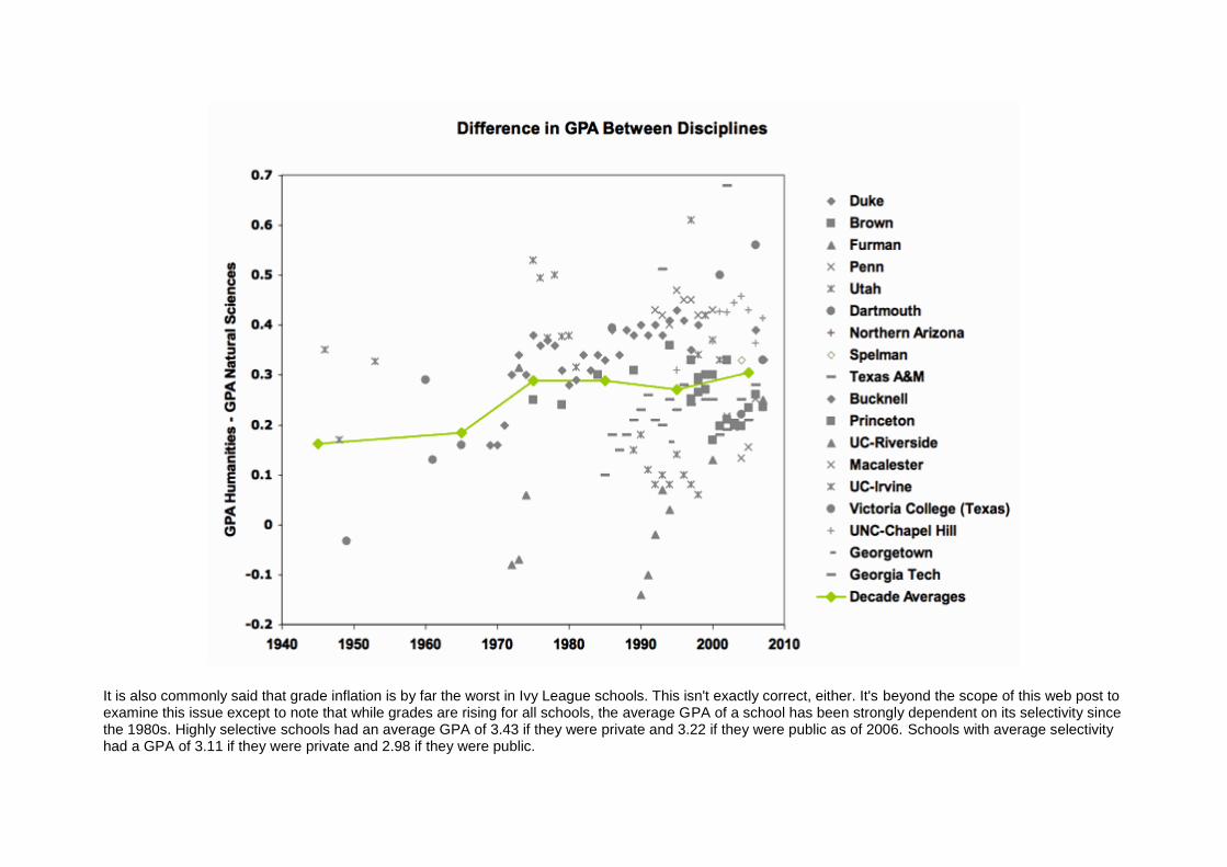
It is also commonly said that grade inflation is by far the worst in Ivy League schools. This isn't exactly correct, either. It's beyond the scope of this web post to examine this issue except to note that while grades are rising for all schools, the average GPA of a school has been strongly dependent on its selectivity since the 1980s. Highly selective schools had an average GPA of 3.43 if they were private and 3.22 if they were public as of 2006. Schools with average selectivity had a GPA of 3.11 if they were private and 2.98 if they were public.
Attempts to Relate Recent Grade inflation to Improved Student Quality and Other Factors
Some administrators and professors have tried to ascribe much of the increase in GPA since the mid-1980s to improvements in student quality. Almost all of these statements linking GPA to the presence of better students have been qualitative in nature. But there have been some attempts, notably at Duke, Texas and Wisconsin, to quantify this relationship using increases in SAT or ACT as a surrogate for increases in student quality.
Such quantitative efforts are of dubious worth because even the organization that administers the SAT test, the College Board, is unable to show that SAT scores are a good predictor of college GPA. A recent study by the University of California system of matriculates showed that SAT scores explained less than 14% of the variance in GPA. Bowen and Bok, in a 1998 analysis of five highly selective schools, found that SAT scores explained only 20% of the variance in class ranking. Their analysis also indicated that a 100 point increase in SAT was responsible for, at most, a 5.9 percent increase in class rank which corresponds to roughly a 0.10 increase in GPA. This result matches that of Vars and Bowen who looked at the relationship between SAT and GPA for 11 selective institutions. McSpirit and Jones in a 1999 study of grades at a public open-admissions university, found a coefficient of 0.14 for the relationship between a 100 point increase in SAT and GPA.
In our 2010 Teachers College Record paper, we found, similar to Bowen and Bok and Vars and Bowen, a 0.1 relationship between a 100 point increase in SAT and GPA using data from over 160 institutions with a student population of over two million.
At both Texas and Duke, GPA increases of about 0.25 were coincident with mean SAT increases (Math and Verbal combined) in the student population of about 50 points. At Wisconsin, ACT increases of 2 points (the equivalent to an SAT increase of about 70 points) were coincident with a GPA rise of 0.21. The above mentioned studies indicate that student quality increases cannot account for the magnitude of grade inflation observed. The bulk of grade inflation at these institutions is due to other factors.
While local increases in student quality may account for part of the grade inflation at some institutions, the national trend cannot be explained by this influence. There is no evidence that students have improved in quality nationwide since the mid-1980s.
There are many factors that contribute to grade inflation and quantitative assessments of causes will likely prove to be inconclusive. An oft-cited reason for grade inflation in the 1960's was the kindness of faculty members toward students trying to avoid the military draft during the Vietnam War.
The influence of affirmative action is sometimes used to explain grade inflation. However, much of the rise in minority enrollments occurred during a time, the mid-1970s to mid-1980s, when grade inflation waned. As a result, it is unlikely that affirmative action has had a significant influence.
The author believes that the resurgence of grade inflation in the 1980s principally was caused by the emergence of a consumer-based culture in higher education. Students are paying more for a product every year, and increasingly they want and get the reward of a good grade for their purchase. In this culture, professors are not only compelled to grade easier, but also to water down course content. Both intellectual rigor and grading standards have weakened. The evidence for this is not merely anecdotal. Students are highly disengaged from learning, are studying less than ever, and are less literate. Yet grades continue to rise.
Internal university memos say much the same thing. For example, the chair of Yale's Course of Study Committee, Professor David Mayhew, wrote to Yale instructors in 2003, "Students who do exceptional work are lumped together with those who have merely done good work, and in some cases with those who have done merely adequate work." In 2001, Dean Susan Pedersen wrote to the Harvard faculty:
"We rely on grades not only to distinguish among our students but also to motivate them and the Educational Policy Committee worries that by narrowing the grade differential between superior and routine work, grade inflation works against the pedagogical mission of the Faculty....While accepting the fact that the quality our students has improved over time, pressure to conform to the grading practices of one's peers, fears of being singled out or rendered unpopular as a 'tough grader,' and pressures from students were all regarded as contributory factors...."
Where Grade Inflation Isn't Pervasive
While grade inflation is pervasive at America's four year colleges and universities, it isn't everywhere. Like any epidemic, it's probably more interesting to study those schools that seem immune. Which schools are they? A little background first. As a rough rule of thumb, the average GPA of a school today can be estimated by the rejection percentage of its applicant pool:
GPA = 2.8 + Rejection Percentage /200 + (if the school is private add 0.2)
Non-selective public schools (typically with 15 percent rejection rates or less) with GPAs in the 2.8 range or less tend to have only modest grade inflation. Some have none.
Community colleges, while not the focus of my work, are where grade inflation does not seem to be common and grades have actually dropped. I don't have a lot of data on community colleges but I do have one very big piece of information: over a decade of average grades over the entire California Community Colleges system. That's a population of over two million students.
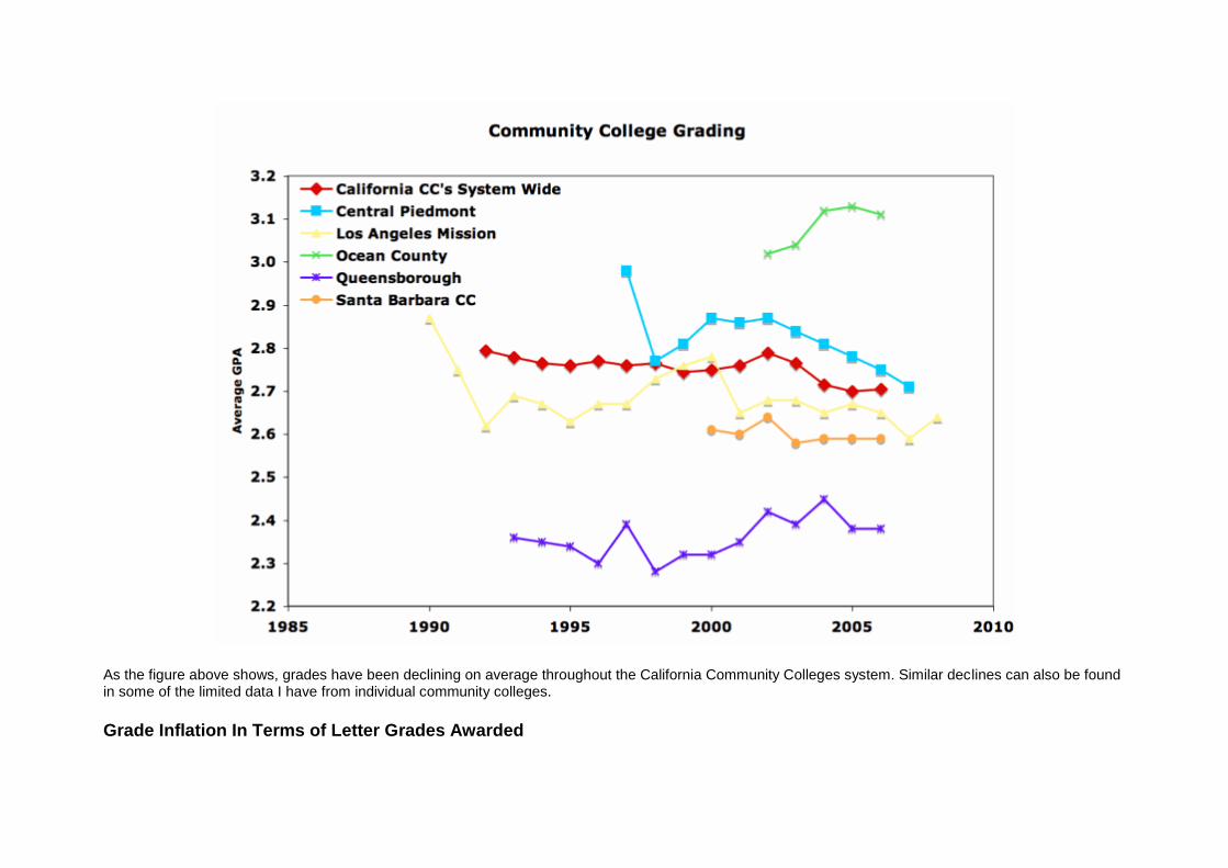
As the figure above shows, grades have been declining on average throughout the California Community Colleges system. Similar declines can also be found in some of the limited data I have from individual community colleges.
Grade Inflation In Terms of Letter Grades Awarded
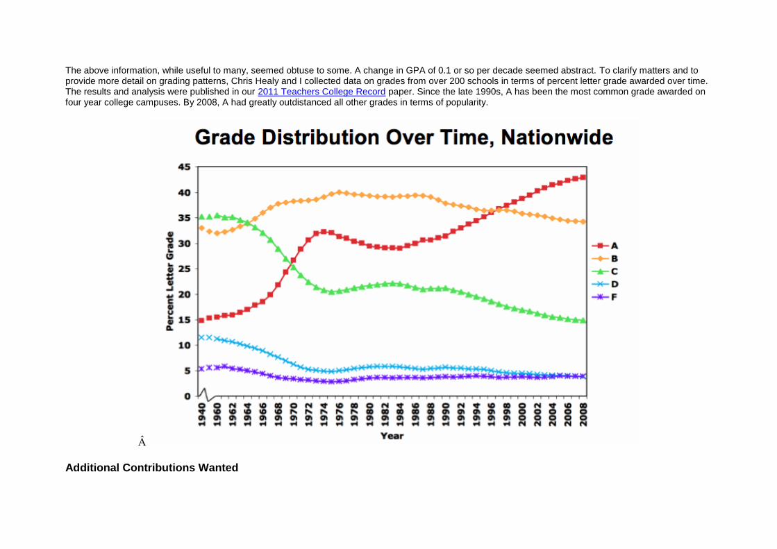
The above information, while useful to many, seemed obtuse to some. A change in GPA of 0.1 or so per decade seemed abstract. To clarify matters and to provide more detail on grading patterns, Chris Healy and I collected data on grades from over 200 schools in terms of percent letter grade awarded over time. The results and analysis were published in our 2011 Teachers College Record paper. Since the late 1990s, A has been the most common grade awarded on four year college campuses. By 2008, A had greatly outdistanced all other grades in terms of popularity.
Â
Additional Contributions Wanted
If you have verifiable data on grading trends not included here, and would like to include it on this web site, please contact me, Stuart Rojstaczer. I will acknowledge your contribution by name or if you prefer, the data's origin will remain anonymous.
Â
For More Information
For those interested in even more detail, here are some links to other material.
2013 talking head interview about 2012 paper, here.
2012 reseach paper on grading in America, here.
What college presidents know, but don't say publicly here.
New York Times Economix blog Q&A about grade inflation here and extended answer here.
Sweet Sixteen of Tough Graders, 2010, here.
2010 reseach paper on grading in America, here.
On the push to inflate grades, here.
Grades gone wild (originally published in the Christian Science Monitor), here.
Grade inflation at Duke, Part 2, here.
Grade inflation at Duke, Part 1, here.
Grade inflation in the state of North Carolina (originally published in the Raleigh News and Observer), here.
On the press and grade inflation deniers, here.
Refuting Adelman's database, here.
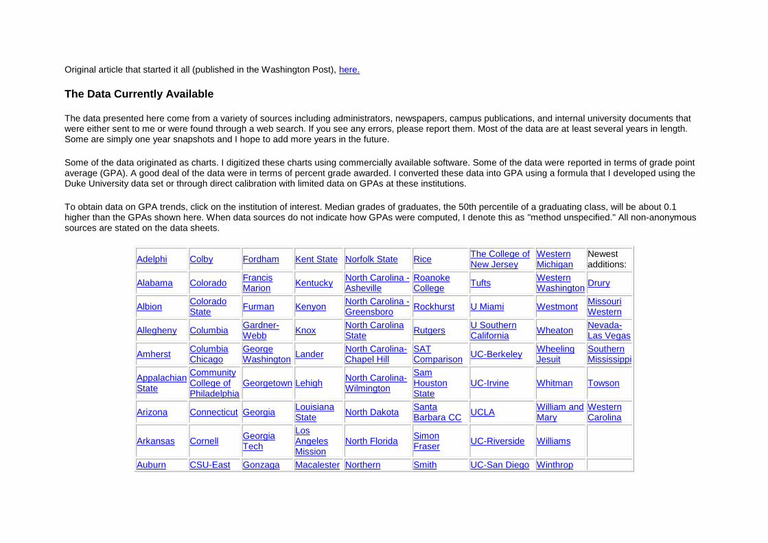
Original article that started it all (published in the Washington Post), here.
The Data Currently Available
The data presented here come from a variety of sources including administrators, newspapers, campus publications, and internal university documents that were either sent to me or were found through a web search. If you see any errors, please report them. Most of the data are at least several years in length. Some are simply one year snapshots and I hope to add more years in the future.
Some of the data originated as charts. I digitized these charts using commercially available software. Some of the data were reported in terms of grade point average (GPA). A good deal of the data were in terms of percent grade awarded. I converted these data into GPA using a formula that I developed using the Duke University data set or through direct calibration with limited data on GPAs at these institutions.
To obtain data on GPA trends, click on the institution of interest. Median grades of graduates, the 50th percentile of a graduating class, will be about 0.1 higher than the GPAs shown here. When data sources do not indicate how GPAs were computed, I denote this as "method unspecified." All non-anonymous sources are stated on the data sheets.
Adelphi Colby Fordham Kent State Norfolk State Rice
The College of New Jersey
Western Michigan
Newest additions:
Alabama Colorado
Francis Marion
Kentucky
North Carolina - Asheville
Roanoke College
Tufts
Western Washington
Drury
Albion
Colorado State
Furman Kenyon
North Carolina - Greensboro
Rockhurst U Miami Westmont
Missouri Western
Allegheny Columbia
Gardner-Webb
Knox
North Carolina State
Rutgers
U Southern California
Wheaton
Nevada-Las Vegas
Amherst
Columbia Chicago
George Washington
Lander
North Carolina-Chapel Hill
SAT Comparison
UC-Berkeley
Wheeling Jesuit
Southern Mississippi
Appalachian State
Community College of Philadelphia
Georgetown Lehigh
North Carolina-Wilmington
Sam Houston State
UC-Irvine Whitman Towson
Arizona Connecticut Georgia
Louisiana State
North Dakota Santa Barbara CC
UCLA
William and Mary
Western Carolina
Arkansas Cornell
Georgia Tech
Los Angeles Mission
North Florida
Simon Fraser
UC-Riverside Williams
Auburn CSU-East Gonzaga Macalester Northern Smith UC-San Diego Winthrop
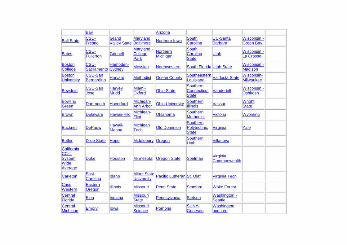
Bay Arizona
Ball State
CSU-Fresno
Grand Valley State
Maryland Baltimore
Northern Iowa
South Carolina
UC-Santa Barbara
Wisconsin - Green Bay
Bates
CSU-Fullerton
Grinnell
Maryland - College Park
Northern Michigan
South Carolina State
Utah
Wisconsin - La Crosse
Boston College
CSU-Sacramento
Hampden-Sydney
Messiah Northwestern South Florida Utah State
Wisconsin - Madison
Boston University
CSU-San Bernardino
Harvard Methodist Ocean County
Southeastern Louisiana
Valdosta State
Wisconsin-Milwaukee
Bowdoin
CSU-San Jose
Harvey Mudd
Miami-Oxford
Ohio State
Southern Connecticut State
Vanderbilt
Wisconsin - Oshkosh
Bowling Green
Dartmouth Haverford
Michigan-Ann Arbor
Ohio University
Southern Illinois
Vassar
Wright State
Brown Delaware Hawaii-Hilo
Michigan-Flint
Oklahoma
Southern Methodist
Victoria Wyoming
Bucknell DePauw
Hawaii-Manoa
Michigan Tech
Old Dominion
Southern Polytechnic State
Virginia Yale
Butler Dixie State Hope Middlebury Oregon
Southern Utah
Villanova
California CC's: System Wide Average
Duke Houston Minnesota Oregon State Spelman
Virginia Commonwealth
Carleton
East Carolina
Idaho
Minot State University
Pacific Lutheran St. Olaf Virginia Tech
Case Western
Eastern Oregon
Illinois Missouri Penn State Stanford Wake Forest
Central Florida
Elon Indiana
Missouri State
Pennsylvania Stetson
Washington - Seattle
Central Michigan
Emory Iowa
Missouri Science
Pomona
SUNY-Geneseo
Washington and Lee
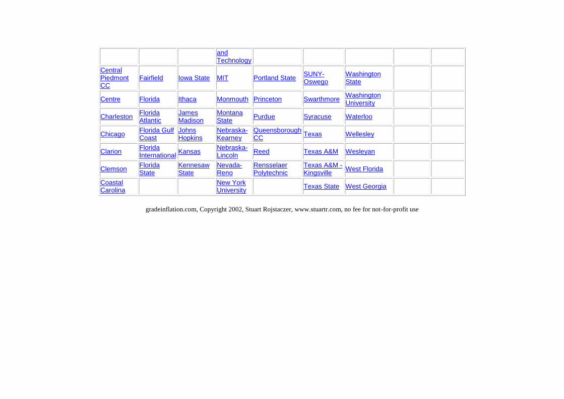
and Technology
Central Piedmont CC
Fairfield Iowa State MIT Portland State
SUNY-Oswego
Washington State
Centre Florida Ithaca Monmouth Princeton Swarthmore
Washington University
Charleston
Florida Atlantic
James Madison
Montana State
Purdue Syracuse Waterloo
Chicago
Florida Gulf Coast
Johns Hopkins
Nebraska-Kearney
Queensborough CC
Texas Wellesley
Clarion
Florida International
Kansas
Nebraska-Lincoln
Reed Texas A&M Wesleyan
Clemson
Florida State
Kennesaw State
Nevada-Reno
Rensselaer Polytechnic
Texas A&M - Kingsville
West Florida
Coastal Carolina
New York University
Texas State West Georgia
gradeinflation.com, Copyright 2002, Stuart Rojstaczer, www.stuartr.com, no fee for not-for-profit use