Google Calendar Redesign
8
Google Calendar Experience Design and Analysis (EDA) #1 i544 Experience Design Adhithya Ramakumar
-
Upload
adhithya-ramakumar -
Category
Design
-
view
233 -
download
0
Transcript of Google Calendar Redesign

Google CalendarExperience Design and Analysis (EDA) #1i544 Experience Design
Adhithya Ramakumar

Home Link - Current Design
Analysis• Both “Google” and “Calendar”
links redirect to the same page.
• There is a functional redundancy.
• This also occupies extra space which could be put to better use.
• Having two links with a similar functionality that links to the same page creates an ambivalent experience.
2
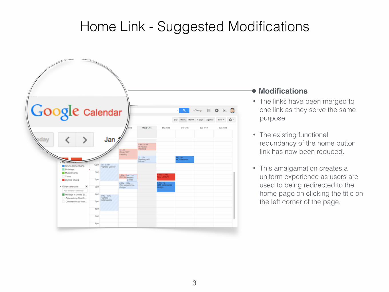
Home Link - Suggested Modifications
Modifications• The links have been merged to
one link as they serve the same purpose.
• The existing functional redundancy of the home button link has now been reduced.
• This amalgamation creates a uniform experience as users are used to being redirected to the home page on clicking the title on the left corner of the page.
3
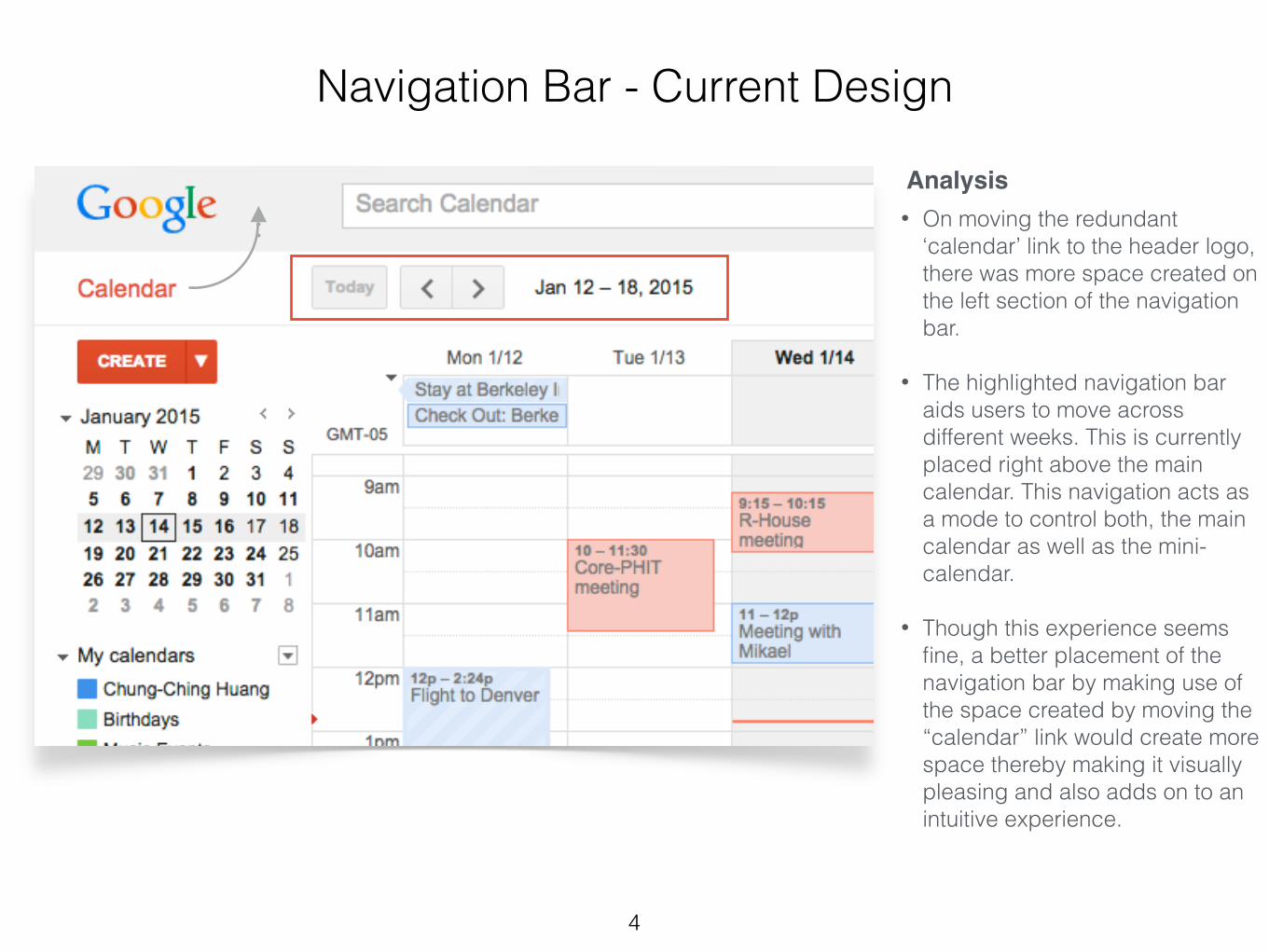
Navigation Bar - Current Design
Analysis• On moving the redundant
‘calendar’ link to the header logo, there was more space created on the left section of the navigation bar.
• The highlighted navigation bar aids users to move across different weeks. This is currently placed right above the main calendar. This navigation acts as a mode to control both, the main calendar as well as the mini-calendar.
• Though this experience seems fine, a better placement of the navigation bar by making use of the space created by moving the “calendar” link would create more space thereby making it visually pleasing and also adds on to an intuitive experience.
4

Navigation Bar - Suggested Modifications
Modifications• The navigation bar that helps
move across weeks has been moved to the extreme left portion of the screen.
• This repositioning provides a lucid visual cue by illustrating that it is a functional button to move across weeks, both in the mini-calendar as well as the main calendar.
• This modification creates a clear hierarchy of usage, highlighting that the navigation bar controls both, the main calendar and the mini-calendar.
5

Create Button Modifications
Analysis
• The current “Create” button consists of two operational portions - creating a new event and a quick add feature.
• The functionality of these buttons are distinct and vary considerably. Placing them together leads to an ambiguity.
Modifications
• The redesign separates the operational portions by providing a subtle division between the two buttons.
• This distinctly highlights each functionality separating creating an event and quick creation of an event.
6

Cell Spacing Modifications
Analysis• There is a 1 pixel spacing between the event
and the left column for ‘all-day’ events.
• But on the contrary, there is about 3 pixels spacing between the right edge of an event and the cell it is contained within.
• This irregular spacing causes an inconsistency in the visual hierarchy of the calendar.
Modifications
• The redesign addresses this inconsistency by making all cells maintain a 1 pixel spacing.
• This provides the calendar with a visual consistency that unifies the way events are aligned within a cell.
7

Complete Final Design
8