Global Decarbonisation Patterns – Total and Transport CO2 ...
32
Global Decarbonisation Patterns – Total and Transport CO 2 Intensity 1. Petri Tapio, Finland Futures Research Centre, University of Turku/ Department of Environmental Sciences, University of Helsinki 2. Nufar Finel, Department of Environmental Sciences, University of Helsinki 3. David Banister, Transport Studies Unit, University of Oxford 4. Jyrki Luukkanen, Finland Futures Research Centre, University of Turku 5. Jarmo Vehmas, Finland Futures Research Centre, University of Turku 6. Risto Willamo, Department of Environmental Sciences, University of Helsinki Working Paper N° 1056 October 2011 Transport Studies Unit School of Geography and the Environment http://www.tsu.ox.ac.uk/
Transcript of Global Decarbonisation Patterns – Total and Transport CO2 ...

Global Decarbonisation Patterns –Total and Transport CO2 Intensity
1. Petri Tapio, Finland Futures Research Centre, University of Turku/Department of Environmental Sciences, University of Helsinki
2. Nufar Finel, Department of Environmental Sciences, University ofHelsinki
3. David Banister, Transport Studies Unit, University of Oxford
4. Jyrki Luukkanen, Finland Futures Research Centre, University ofTurku
5. Jarmo Vehmas, Finland Futures Research Centre, University ofTurku
6. Risto Willamo, Department of Environmental Sciences, University ofHelsinki
Working Paper N° 1056
October 2011
Transport Studies UnitSchool of Geography and the Environment
http://www.tsu.ox.ac.uk/

2
Global decarbonisation patterns – total andtransport CO2 intensity
October 2011
Petri Tapio1,2,*, Nufar Finel2, David Banister3, Jyrki Luukkanen4, JarmoVehmas4 & Risto Willamo2
1 Finland Futures Research Centre, University of Turku, Kankurintie 31a, FI-01260Vantaa, Finland, Internet www.ffrc.utu.fi, Research Group www.fidea.fi .2 Department of Environmental Sciences, University of Helsinki, E-Building P.O. Box27 (Latokartanonkaari 3), FI-00014 University of Helsinki, Finland.3 Department of Geography and the Environment, Oxford University, South Parks Road,Oxford, OX1 3QY, UK.4 Finland Futures Research Centre, University of Turku, Pinninkatu 47, 3rd floor, FI-33100 Tampere, Finland.*Corresponding author, [email protected], Phone +35840 555 2963.
Abstract: Global warming is now considered to be an established fact, and there is little
doubt about the contribution of human induced carbon dioxide emissions from fossil
fuels to the changing climate. Global CO2 emissions, including international aviation
and maritime transport, grew by 50% 1971-1990, and by a further 32% 1990-2006.
Carbon intensity of the economy, which can be measured by the carbon dioxide
emissions per unit Gross Domestic Product, has reduced over time globally: this is the
decarbonisation effect. In this paper, the world’s countries (116 individual countries and
five groups of countries) have been grouped through a cluster analysis based on trends
in total carbon intensity and transport carbon intensity of the economy (transport CO2
emissions/GDP). Various patterns have been found, some of which are unexpected.
Countries with very different GDP per capita levels have similar development patterns
in total carbon intensity or transport carbon intensity. It is concluded that economic
growth is neither the cause of nor the salvation for CO2 emissions growth, but more
subtle measures of emission control are needed for each country.
Key words: energy, transport, decarbonisation
Acknowledgement: This article is the co-product of the SIGHT and IFEE projects. The
Academy of Finland is gratefully acknowledged for funding.

3
1. Introduction
Human induced global warming has developed from being a few climatologists’
dystopia to a plausible future scenario and (despite a few sceptics) a commonly agreed
fact. According to the Intergovernmental Panel on Climate Change (IPCC) Fourth
Assessment, there is no doubt that global average temperatures having risen and there is
only limited debate on whether human impact has contributed to the climate change.
The roles and shares of different greenhouse gas (GHG) emissions affecting radiative
forcing have been somewhat clarified since the First Assessment (Houghton et al.,
1990). Carbon dioxide (CO2) emissions from fossil fuel burning made up 57% of the
human induced GHG emissions in 2004 and this figure has grown throughout the years
(Rogner et al., 2007). As for transport, the share of CO2 is between 88-96% in the U.S.,
EU and Japan (Kahn Ribeiro et al., 2007).
While the First Assessment proclaimed that a 60-80% reduction of GHG emissions
from the 1990 level was needed to ‘stop’ climate change, climate stabilization scenarios
in the Fourth Assessment have given up the target. The six strictest stabilization
scenarios have the target of limiting global average surface temperature rise to
+2.0…2.4ºC from the pre-industrial era. This target would require the GHG emissions
to be reduced by 50-85% from the 2000 level (IPCC, 2007). The uncertainty is
considerable, since according to recent calculations a global 50% cut from 1990 values
(that is over 60% from 2005 values) would still leave a 16-51% probability of exceeding
the +2ºC warming target (Meinshausen et al., 2009). But the global emissions, including
international aviation and maritime transport, grew by 50% between 1970 and 1990, and
by a further 32% between 1990 and 2006, most of which occurred between 2000 and
2006 (CDIAC, 2009). According to International Maritime Organization (IMO 2010),
these figures underestimate the emissions of shipping.
When the growth of CO2 emissions from fossil fuel combustion is compared to
economic growth, a weak decoupling of trends can be recognised during 1971-2005. In
other words, the world economy grew faster than the CO2 emissions. This is the
decarbonisation effect (Nakićenović, 1996; Tapio et al., 2007; for other definitions see
Ausubel, 1995; Hoffert et al., 2002; Saikku et al., 2008; Sun and Meristö, 1999). When
emissions grow at a slower rate than the economy, one can speak of relative or weak
decarbonisation, but if the economy grows and emissions are reduced, the concept of

4
absolute or strong decarbonisation is used, sometimes also referred to as delinking or
decoupling depending on the applied field (Ballingall et al., 2003; Banister and Stead,
2002; Tapio, 2005; Tapio et al., 2007; Vehmas et al., 2007; Wernick et al., 1996).
Some societal sectors have been less successful in restricting the growth of CO2
emissions than others. Transport is one of these, especially in Europe (IPCC, 2007;
Peake, 1994; Stead, 2001; Tapio et al., 2007). While the total CO2 emissions in the
EU27 countries were reduced by 0.3% between 1990 and 2005, the transport emissions
grew at least by 31% (IEA, 2007), probably more (IMO, 2010). This is not surprising
given the expansion and integration of the European Union and the globalization of the
economy that has led to increasing passenger and freight transport throughout the globe.
Transport engineering also plays a role through building capacity in the road, maritime
and air transport infrastructure, including efficient maintenance and logistics. Land-use
trends also have an impact on travel demand through the growth in urban sprawl and the
distance between different social functions, such as production, shopping, dwelling,
work and leisure time activities (Banister et al., 2000; Newman and Kenworthy, 2000).
In Europe, the growth of transport emissions and the growth of transport volume are
now seen as a major problem with a considerable concern at the EU level, as well as at
the national and urban levels (Banister et al., 2007).
2. Objective
These are general global trends. But if individual countries are examined, diverse
patterns are found. The purpose of this paper is to explore the different decarbonisation
patterns of the world’s countries. Countries with similar trends in total carbon intensity
(TIIN) and transport carbon intensity (TRIN) are grouped together. Total carbon
intensity is defined as total CO2 emissions per Gross Domestic Product in real terms
measured with purchasing power parities (GDPppp). Transport carbon intensity is
defined as transport CO2 emissions per GDPppp. Purchasing power parity is used in
order to reduce the effect of currency fluctuations and different price levels in different
countries. The carbon intensities are measured here in kilograms of CO2 per US$2000.
Decarbonisation is defined as a reduction in carbon intensity (total and/or transport)
over time (Tapio et al., 2007). The time frame used is 1971-2005, and the method used
is cluster analysis where countries with similar profiles of carbon intensity are grouped

5
into clusters. Two runs are made, one for TIIN and the other for TRIN. Variation within
the clusters is then examined by the growth of GDP per capita and CO2 emissions per
capita for each country. In this explorative cluster analysis (see Jain et al. 1999) the
working hypothesis is that very different countries may have similar decarbonisation
patterns. In other words, the level of economic output does not determine the level of
carbon intensity.
The paper will proceed as follows. First, a review is made on the literature dealing with
the general relationship between the economy and environment. Next, the results of the
cluster analyses made by carbon intensities (total and transport) will be presented, and
this is followed by a section reporting the actual per capita GDP and CO2 emissions by
cluster. Finally, some policy conclusions for improving decarbonisation are made for
both the economy as a whole and for the transport sector.
3. Theoretical relation between the economy and environment
The relationships between economic growth, energy, transport, and environmental
issues are all subject to continuous debate. It dates back at least to Malthusian views of
population growth and food scarcity (Malthus, 1976). Based on British statistics
available in the late 18th century Malthus stated that geometric, exponential, J curve
growth of population is not compatible with linear growth of food supply. Malthus was
blamed for being pessimistic both from the right and the left – for example, by John
Stuart Mill (1976) who maintained that humans are capable of learning from their errors
and Friedrich Engels (1976) who emphasised the role of technical development in
increasing productivity, as well as the statistician Aldolphe Quetelet who used a wider
set of international population statistics (ref. Ariew, 2007).
The debate was fuelled by the Limits to Growth report by Meadows et al. (1972) who
used a computer model and stated that economic growth (using the term ‘capital’) and
population growth were the major drivers of resource scarcity and environmental
pollution. This study raised considerable debate over the following years with major
concerns raised by Oerlemans et al. (1972), Boyle (1973), Burke (1973) and, recently,
Turner (2008). Environmentally, the major critique was expressed by Oerlemans et al.
(1972, 252):

6
“…who can say what the height of the 1970 global pollution level – which in the model is meant
to be a measure of the world-wide effect of environmental disruption caused by man – should be
in relation to the 1900 level?”
After a few years these studies were followed up by another report for the Club of
Rome, authored by Mesarovic and Pestel (1975), and the famous ‘Bad News’ debate
(Bad News…, 1980; Simon, 1980). The Bad News debate, also known as the Simon-
Ehrlich debate, began when Simon (1980) questioned the environmental concern by
presenting several time series data. The debate was analysed by Dunlap (1983). He
stated that using empirical evidence of the past to make assertions to the future carrying
capacity of the Earth is eventually a paradigmatic debate between ‘human
exemptionalism’ emphasising that humans are exempt from the laws of nature and the
‘ecological paradigm’ maintaining that, however intelligent, humans are under the
influence of natural laws. These paradigms lead to different interpretations of the same
facts.
However, forming alternative future scenarios by utilising the historical facts makes
more sense than starting from tabula rasa. Since the beginning of 1990’s, numerous
publications have elaborated the relationship between economic growth and the
environment by testing and reconsidering the so-called Environmental Kuznets Curve
(EKC) hypothesis, or the inverted U curve. According to the EKC hypothesis, at a low
level of GDP per capita, economic growth is the primary objective and the
environmental problems are of secondary importance, but when a certain level of GDP
per capita is achieved, there will be enough wealth to invest in environmental protection
resulting in mitigated problems (e.g. Ang 2006; Ayres, 2008; Munasinghe, 1996; Shafik
& Bandyopadhyay, 1992)1.
Empirical studies have shown that different environmental problems have a different
relationship to economic growth (Arrow et al., 1995; de Bruyn and Opschoor, 1997).
The EKC hypothesis seems to work rather well with impurities in production processes,
such as sulphur dioxide or particulate matter emissions to the air or phosphorous
emissions in water. It works less well regarding resources and emissions not regarded as
impurities but inherent in almost all economic activities. This includes CO2 emissions
and combined indices such as total material requirement (TMR), direct material flow or
1 The Scirus search engine found over twelve thousand hits with the ‘environmental Kuznetz curve’concept in April 2010.

7
the ecological footprint (Behrens et al., 2007; deBruyn et al., 1998; Caviglia-Harris et
al., 2009; Guan et al., 2008; Turner, 2008; Vehmas et al., 2007). In many countries,
most notably the USA and Canada, the development of these pollutants (e.g. CO2) have
followed the N curve, where after a certain time, the easy technical solutions have been
implemented, and due to increasing material production and energy use the emission
curves turn up again (Galeotti et al., 2006). This development was already foreseen by
Georgescu-Roegen (1971). Furthermore, the results of EKC analyses tend to be strongly
affected by the case countries selected and the time period adopted (Ayres, 2008; Guan
et al., 2008; Stern, 2006; Vehmas et al., 2007; Zeng et al., 2008). In cross-sectional
studies comparing different nations on a single year, the relation is sometimes found
(see e.g. Ang & Liu 2006), but do countries follow the wealthier ones in their
development patterns over time?
GHG emissions have grown above the worst case average of the A1FI scenario of the
IPCC Special Report on Emissions Scenarios (SRES) (Schneider, 2009). Thus, the
debate between the environment and economic growth has re-emerged with the current
concern over climate change (Costanza, 2009; Fisher, 2007; Nordhaus, 2007).
Increasing doubts have also been expressed as to what GDP actually measures (Daly,
1996; Stiglitz et al., 2009). Is it a measure of welfare or only the volume of economic
production? Arguably it is the latter, but does it even measure the volume of economic
production correctly? These fundamental questions are acknowledged, but they are
beyond the scope of this paper.
The issue may be summed up by a variety of curve shapes (Fig. 1). One line of
discourse is the classic Malthusian problematic relationship between J curve and linear
upward curve, where the resolution is the S curve (Fig 1a). A second discourse is the
inverted U curve of the EKC hypothesis and the counterpart N curve. Even an L curve
has been found in Eastern European countries (Huang et al., 2008; Fig 1b). A steady
state approach promoted by Daly (1996) would represent a flat curve (Fig 1c).
Cornucopian thought would suggest a constant improvement due to economic growth, a
linear downward curve (Simon, 1980). Logically, each curve might have a low and
high as well as steeply and gently sloping or a rising variant (Fig 1d).
Given the various paradigmatic interpretations, a period of 35 years is examined from a
global perspective using linear scales. The results of two comparable relationships

8
between economic output (GDP) and environmental harm (total CO2 emissions and
transport CO2 emissions are interpreted by using the illustrations of Fig. 1, and the
absolute levels of carbon intensity are also analysed.
En
vir
on
me
nta
lha
rm
GDP per cap
J curve
S curve
a)
En
vir
on
me
nta
lha
rm
GDP per cap
N curve
L curve
EKC curve
b)
En
viro
nm
en
talh
arm
GDP per cap
Flat curve high
Flat curvemedium
Flat curve low
c)
En
viro
nm
en
talh
arm
GDP per cap
Linear upwardcurve fast
Linear upwardcurve slow
Linear downwardcurve slow
Linear downwardcurve fast
d)
Figure 1. Alternative relationships between economic growth and environmental harm. a) Limits
to Growth debate; b) Environmental Kuznets curve and empirical findings challenging
conventional wisdom; c) Steady State approaches emphasizing the absolute volume of
environmental harm; d) Approaches emphasising the speed of growth (or decrease) of
environmental harm. A summary of the following references: (de Bryun et al., 1998; Fonkych
and Lempert, 2005; Huang et al., 2008; Meadows et al., 1972; Shafik and Bandyopadhyay,
1992; Song et. al, 2008; Tapio et al., 2007).
4. Material and methods
4.1 Geographic, temporal and structural scope of the data
The data for the decarbonisation analysis are from the International Energy Agency
(IEA, 2007). For the period of 1971-2005, the research material contains 116 individual
countries and five groups of countries – Former USSR (15 current countries), Former
Yugoslavia (5), Other Africa (37), Other Asia (17) and Other Latin America (17).
Fifteen current countries are left out of the analysis as there were no data at all, and four
because there were no data for the whole period (see Appendix B).

9
Total CO2 emissions used in the study include the aggregated standard IPCC “sectoral
approach” emissions plus emissions from international aviation and maritime transport.
The original transport emissions data include the categories of “transport” including
road transport and “other transport” including rail transport, domestic aviation and
waterborne transport. International aviation and maritime transport are reported as
separate categories not included in “transport”. These were summed up to form
transport CO2 emissions used in the study. Pipeline transport (of oil, gas and water) is
excluded from transport emissions but is included in total emissions.
Adding international aviation and maritime transport gives a non-conventional
perspective to the analysis, and this provides an important new source of data for
analysis. According to Eyring et al. (2009) and Lee et al. (2009), these covered up 1.9%
(aviation) and 2.7% (maritime) of the total CO2 emissions in the World in 2007. The
radiative forcing effect by aviation is higher due to other GHG emissions and contrails,
whereas it might be significantly lower by shipping in the short term due to the cooling
effect of high particle and sulphur oxides emissions from impure burning processes
(Eyring et al., 2009; Lee et al., 2009; IMO, 2010). For total emissions, the IPCC
sectoral approach has also been used with the international transport emissions added to
it. Some criticism has been posed towards the IEA data since it gives clearly and
systematically lower fuel consumption numbers to maritime transport than activity
based studies (IMO, 2010, 26). This paper is concerned about the trends in total
transport CO2 emissions and as the IEA data is consistent and transparently
documented, it is possible to carry out this international comparison over a considerable
time period. Nevertheless, it is important to keep in mind the various uncertainty in the
statistical systems in different countries.
International aviation and maritime emissions are allocated to countries where the ships
and planes are bunkered. This approach can be criticized because it does not take into
account the responsibilities of the consumers and multinational firms, who often come
from the wealthier countries – thus externalizing their emissions to developing
countries. However, this question is not only inherent to the transport emissions but also
to the total emissions, because many countries buy electricity from other countries and
therefore emissions are allocated to the seller rather than the consumer of energy.
Furthermore, there are also embedded emissions related to all exports and imports of
goods, covering over 20% of total CO2 emissions in 2001 (Peters and Hertwich, 2007).

10
Allocating transport emissions is rather complicated as a ship typically buys fuel en
route to somewhere else than where it is bunkered. Dominant fuel seller countries keep
the fuel price low and attract ships with this product. The same phenomenon may be
observed in road transport near country borders. The product measured by this method
is not the good transported, nor transport service itself but energy sold to the vehicle.
Another apparent problem is that the allocation does not take into account the place
where emissions are released. This is crucial in measuring the emissions affecting health
and acidification (Eyring et al., 2009). Regarding CO2 this fact is less dramatic since it
spreads throughout the globe.
4.2 Cluster analysis
The decarbonisation patterns are explored with a hierarchical cluster analysis using the
Furthest Neighbour algorithm in the SPSS 15.1 software (see e.g. Everitt et al., 2001).
There are two runs, one on total carbon intensity (TIIN) and another on transport carbon
intensity (TRIN). The clustered entities are the countries (or groups of countries), and
the 35-year time series data are organized as thirty-five variables in each run. No
variable standardization is needed since all variables are on the same scale. The normal
Euclidean measure of dissimilarity has been used where the units of carbon intensity are
expressed as kilograms of CO2 per US$2000.
Cluster analysis summarises the annual differences in the carbon intensity between pairs
of countries. The distance of one case (in this case a country) to be grouped to the other
cases already grouped can be measured by various rules, for example, the distance to the
nearest neighbour case of the already established groups, the average distance to all
members of the established groups or to the furthest neighbour of each group (Jain et al.
1999; Everitt et al. 2001). Furthest Neighbour was chosen in this study for four reasons:
1) Complex statistical methods were not needed since the sample consists of almost all
countries in the world. 2) The principle of the grouping is simple and clear. 3) Furthest
Neighbour has performed reasonably well in comparative studies (Milligan 1996). 4) A
considerable alternative, the Ward method, would require the use of squared Euclidean
measure that would emphasize large differences in few calendar years rather than
smaller systematic differences throughout the period.

11
Furthest Neighbour belongs to agglomerative cluster analyses, in which, at first, all
cases are treated as single clusters. The algorithm first clusters together the closest cases
and then compares the distance of each case to the furthest neighbour of the already
grouped clusters (e.g. Tan et al. 2006).
Cluster analysis does not determine the number of clusters, but displays the summed
differences between cases (i.e. the countries), and the order in which the countries
should be clustered together. The number of outliers is minimized, but the variation of
the patterns is identified. Larger clusters are divided into sub-groups whereas smaller
clusters are not further divided for the purpose of illustration. The smaller clusters with
rather high differences also have high intensities, that is the shapes of the curves are
close to each other although there is some difference in their position.
5. Results
Based on the cluster analysis of total carbon intensity (TIIN), the countries can be
presented in eleven clusters and four outliers (Fig. 2). As for transport carbon intensity
(TRIN), ten clusters and five outliers can be formed (Fig. 3). The clusters are described
in terms of the absolute level of carbon intensity – very high, high, rather high, rather
low, low, and very low. This tells about the eco-efficiency (Schmidt-Bleek, 2000) of the
economy, or to put it simply: how many kilograms of CO2 need to be emitted in order to
earn one dollar in the countries in a cluster on average? In addition, the interest here is
also in the trend whether the carbon intensity of a cluster is increasing (‘worsening’),
decreasing (‘progressing’) or representing a flat line (‘constant’ or ‘fluctuating’).
5.1 Patterns of total carbon intensity
Clusters 6 and 7 represent the lowest lines for total carbon intensity (TIIN), around
200g/$ and 300g/$, respectively (Fig. 2). There was limited decrease or increase in
carbon intensity between 1971 and 2005. Cluster 6 consists mostly of developing
countries and is perhaps the most coherent cluster in terms of the development of
economic output per capita (see Table 1). Cluster 7, in turn, includes a variety of
(mainly West) African, Latin American and South Asian countries ranging from
developing countries to emerging economies and even the mature European economy of
Switzerland.

12
The next lowest levels are in Clusters 1 and 2, but whereas the countries in Cluster 1
achieved a reduction from 500g/$ to below 400g/$, the carbon intensity of Cluster 2
increased from some 300 to 400g/$. Cluster 1 includes mature economies from Europe
and countries of various stages of development from Latin America, Eastern Asia and
Africa. Cluster 2 has a notable share of Mediterranean countries as well as developing
or emerging economies in South-Eastern Asia and Latin America.
The shapes of the lines of Cluster 3 (increase) and 4 (decrease) were similar to those of
Clusters 1 and 2, but steeper and at a higher carbon intensity level (500g/$ on average).
Cluster 3 is a small group of Islamic countries – two oil producers, Brunei and Iran, and
Jordan. Cluster 4 consists of a few mature Northern European economies, two
Mediterranean islands and two industrial East-Asian countries.
Cluster 5 has an almost identical downward shape with that of Cluster 4 but, again, at a
higher level, now from 1.0 to 0.5kg/$. It consists of fossil fuel intensive North
American and Central European countries. Cluster 8 represents a very steep reduction
from 2.5 to 0.8kg/$, but is still rather high compared to the other clusters. The members
of this cluster come distinctively from Eastern Europe and have similar profile to the
emerging economies of China and Jamaica, as well as the highly mature economies of
Luxembourg and Singapore.
The carbon intensity in the countries of Cluster 9, on average, increased but slowly,
starting from figures almost triple to those of Cluster 3 in 1970, but both clusters ended
up at the same level by 2005. The very high intensity of Cluster 10 had a peak of
1.7kg/$ in 1995, rising before that and lowering afterwards. Both clusters 9 and 10
include almost completely oil producers since Lebanon is the only country not having
produced oil between 1970-2005.
Cluster 11 has the highest carbon intensity levels, but also a considerable development
from 5 to 2 kg/$. This small cluster consists of only two countries – Bahrain and North
Korea. In addition to the clusters, there were five outliers from North Africa and Middle
East which had patterns of their own.

13
Figure 2. Total carbon intensity of the world 1971-2005 – eleven clusters and four outliers (units
kg CO2/US$2000). Cluster averages indicated with thick line. Country codes in Appendix B.
T o tal carbo n intensity
C luster 1
0
0.2
0.4
0.6
0.8
1
1.2
1970 1975 1980 1985 1990 1995 2000 2005
C luster 1: AT, HK, KE, SE, CL, IS, NO, VN,
CU, IT, PA, ZM , FR, JP, SN
T o tal carbo n intensity
C luster 3
0
0.2
0.4
0.6
0.8
1
1.2
1970 1975 1980 1985 1990 1995 2000 2005
C luster 3 : BN, IR, JO
T o tal carbo n intensity
C luster 5
0
0.2
0.4
0.6
0.8
1
1.2
1970 1975 1980 1985 1990 1995 2000 2005
C luster 5 : BE, CA, DE, HU, NL, US, Other
Latin America
T o tal carbo n intensity
C luster 7
0
0.2
0.4
0.6
0.8
1
1.2
1970 1975 1980 1985 1990 1995 2000 2005
C luster 7 : AO, AR, BR, CO, CG, CI, DO,
GA, M A, M Z, M M , PE, PH, PT, CH, TN,
UY, Other Asia
T o tal carbo n intensity
C luster 9
0
0 .5
1
1.5
2
2 .5
1970 1975 1980 1985 1990 1995 2000 2005
C luster 9 : AU, LB, LY, GA, SA, ZA, SY,
VE, ForYU
T o tal carbo n intensity
C luster 11
0
1
2
3
4
5
6
7
1970 1975 1980 1985 1990 1995 2000 2005
C luster 11: BH, KP
T o tal carbo n intensity
C luster 2
0
0.2
0.4
0.6
0.8
1
1.2
1970 1975 1980 1985 1990 1995 2000 2005
C luster 2 : DZ, BO, EC, EG, GR, IN, ID, IL,
M Y, M X, NZ, NG, PK, ES, TH, TR, ZW
T o tal carbo n intensity
C luster 4
0
0.2
0.4
0.6
0.8
1
1.2
1970 1975 1980 1985 1990 1995 2000 2005
C luster 4 : TP, CY, DK, FI, IE, KR, M T, GB
T o tal carbo n intensity
C luster 6
0
0.2
0.4
0.6
0.8
1
1.2
1970 1975 1980 1985 1990 1995 2000 2005
C luster 6 : BD, BJ, CM , CD, CR, SV, ET,
GH, GT, HT, HN, NP, NI, PY, LK, SD, TZ,
TG, Other Africa
T o tal carbo n intensity
C luster 8
0
0 .5
1
1.5
2
2 .5
1970 1975 1980 1985 1990 1995 2000 2005
C luster 8 : BG, CN, JM , LU, PL, RO, SG,
SK, YE
T o tal carbo n intensity
C luster 10
0
0 .5
1
1.5
2
2 .5
1970 1975 1980 1985 1990 1995 2000 2005
C luster 10 : ForUSSR, KW, TT, AE
T o tal carbo n intensity
Out lie rs
0
1
2
3
4
5
6
7
1970 1975 1980 1985 1990 1995 2000 2005
Outliers : AL, GI, IQ, OM

14
5.2 Patterns of transport carbon intensity
The second cluster analysis is performed on transport carbon intensity (TRIN). Here, the
lowest intensity levels are within Clusters 1 and 2, consisting mainly of the low
intensity countries of the TIIN Clusters 6 and 7 (Fig 3; Table 1). The lines are flat and
stayed below 50g/$ in Cluster 1 and below 100 g/$ in Cluster 2 throughout the period.
Cluster 1 is a rather small group of six very low GDP countries. Cluster 2 instead is a
large and diverse group of 40 countries ranging from South and Central European
mature economies to Latin American and Asian developing and emerging economies.
The next lowest intensities are within Clusters 3, 4 and 5, where Cluster 3 achieved a
reduction below 100g/$ whereas Cluster 4 intensity increased above this line and
Cluster 5 stayed a little above it throughout the period. Cluster 3 consists of many
countries that have undergone or are in the process of transition towards market
economy. Some restriction to mobility is perhaps still present. Cluster 4 countries do not
seem to have a common denominator. Cluster 5 is the second largest cluster including
mainly mature European economies but also emerging Latin American, Asian and
African economies.
The development of Clusters 6, 7 and 8 follows a similar shape to Clusters 3, 4 and 5,
respectively, but on a clearly higher level at over 200g/$. Further, the reduction of
transport carbon intensity in Cluster 6 was more rapid than that of the respective Cluster
3, especially during 1971-1985, almost levelling off after that. Cluster 6 includes the
fossil fuel intensive North American countries, Canada and the U.S., but also three
African countries and the aggregated group of ‘Other Latin American’ countries that
followed a similar development in transport carbon intensity despite the large
differences in economy and society at large. The small Cluster 7 consists of fossil fuel
intensive countries and important international transport nodes. Cluster 8 includes oil
producers and countries having been isolated due to geographic of political/military
grounds.
There were two small hyper transport carbon intensive Clusters 9 and 10, where Cluster
9 (Arab Emirates and Iraq) intensity boomed from below 50g/$ to over 1.5kg/$ during
the period and Cluster 10 (Singapore and Yemen) intensity was halved from over 1kg/$
level. These changes in intensity were due mainly to significant changes in the GDP of

15
the countries. In addition, six countries were outliers and were not grouped to any of the
clusters.
Figure 3. Transport carbon intensity of the world 1971-2005 – ten clusters and five outliers (y-
axis unit kg CO2/US$2000). Cluster averages indicated with thick line. Country codes in Appendix
B.
T ranspo rt carbo n intens ity
C luster 1
0
0.1
0.2
0.3
0.4
1970 1975 1980 1985 1990 1995 2000 2005
C luster 1: BD, CD, ET, HT, M A, NP
T ranspo rt carbo n intens ity
C luster 3
0
0.1
0.2
0.3
0.4
1970 1975 1980 1985 1990 1995 2000 2005
C luster 3: AL, BJ, CN, CI, CU, KP, PL, LK,
SD, ZW
T ranspo rt carbo n intens ity
C luster 5
0
0.1
0.2
0.3
0.4
1970 1975 1980 1985 1990 1995 2000 2005
C lust er 5: ForUSSR, AO, BE, BO, BG, CL, DK,
EG, FI, GA, HK, IS, IE, M Y, M X, NZ, NO, PA, ZA,
ES, SE, TH, GB, ZM , ForYU
T ranspo rt carbo n intens ity
C luster 7
0
0.1
0.2
0.3
0.4
1970 1975 1980 1985 1990 1995 2000 2005
C luster 7: AU, EC, LU, NL, NG
T ranspo rt carbo n intens ity
C luster 9 (N o te scale)
0
0.5
1
1.5
1970 1975 1980 1985 1990 1995 2000 2005
C luster 9: IQ, AE
T ranspo rt carbo n intens ity
C luster 2
0
0.1
0.2
0.3
0.4
1970 1975 1980 1985 1990 1995 2000 2005
C lust er 2 : DZ, AR, AT, BR, CM , TP, CO, CR, CZ,
DO, SV, FR, DE, GH, GT, HN, HU, IN, ID, IL, IT, JP,
M Z, M M , NI, PK, PE, PH, PT, RO, SK, CH, TZ, TG,
TN, TR, UY, VN, OthAfr, OthAsia
T ranspo rt carbo n intensity
C luster 6
0
0.1
0.2
0.3
0.4
1970 1975 1980 1985 1990 1995 2000 2005
C luster 6: CA, CG, KE, M T, SN, US, Other
Latin America
T ranspo rt carbo n intens ity
C luster 8
0
0.1
0.2
0.3
0.4
1970 1975 1980 1985 1990 1995 2000 2005
C luster 8: CY, JM , JO, KW, LB, SY, VE
T ranspo rt carbo n intens ity
C luster 10 (N o te scale)
0
0.5
1
1.5
1970 1975 1980 1985 1990 1995 2000 2005
C luster 10: SG, YE
T ranspo rt carbo n intens ity
C luster 4
0
0.1
0.2
0.3
0.4
1970 1975 1980 1985 1990 1995 2000 2005
C luster 4: BN, GR, IR, KR, PY, QA
T ranspo rt carbo n intensity
Out liers
(N o te sca le)
0
0.5
1
1.5
2
2.5
1970 1975 1980 1985 1990 1995 2000 2005
Outliers: BH, LY, OM , SA, TT.
GI excluded (min 3,2, max 6.1).

16
5.3 The similar are different
The TIIN and TRIN Clusters and are compared in Table 1. The table shows the
countries located in each Cluster. There are many countries that stay together in both
runs, but every cluster except TRIN Cluster 10 was divided between the runs. This
indicates that the TIIN and TRIN live their own lives and have partly separate driving
forces. As for TIIN, the multitude of available energy sources in different parts of the
world seems to be the cause rather than the level of energy use. As for TRIN, the level
of mobility, modal split and unit emissions merely seem to result in the differences
since transport is almost exclusively dependent on oil.
The patterns show that the carbon intensity of world’s countries has developed in a
variety of ways between 1971 and 2005. It is notable, that many low intensity countries
have produced a flat line. The higher the intensity, the more likely it has changed,
increased or decreased, over time.
The countries grouped in the same cluster are similar in terms of their carbon intensity
(total or transport) as calculated through a series of ratios. But how similar are they in
other terms? As can be seen in Figure 2, Figure 3 and Table 1, some rather similar
countries seem to stick together, such as the UK, Ireland, Denmark and Finland; or the
U.S. and Canada; or Sweden, Iceland and Norway. But also very different countries
may end up in the same clusters, such as the latter Nordic group with Chile, Hong
Kong, Panama and Zambia, or the U.S. and Canada with the group of Other Latin
America.
Looking at TRIN alone, the U.S. and Canada have developed in a similar way to Congo,
Kenya, Malta and Senegal. The two Nordic clusters are merged together, and also
include Angola, Belgium, Bolivia, Bulgaria, Egypt, Former USSR, Former Yugoslavia,
Gabon, Malaysia, Mexico, New Zealand, South Africa, Spain and Thailand. This is a
considerable variety of countries in the geographic, economic, social and cultural sense.

17
Table 1: Countries located in cross-tabulated total carbon intensity (TIIN) clusters and transportcarbon intensity (TRIN) clusters using data from 1971-2005TIIN1971-2005Clusters
TRIN 1971-2005 Clusters To-tal
TRIN_IVery lowintensityFlat line
TRIN_IILowintensityFlat line
TRIN_IIIMediumintensityDecrease
TRIN_IVMediumintensityIncrease
TRIN_VMediumintensityFlat line
TRIN_ VIHighintensityDecrease
TRIN_VIIHighintensityIncrease
TRIN_VIIIHighintensityFlat line
TRIN_IXVery highintensityIncrease
TRIN_XVery highintensityDecrease
TRIN_OVariouspatterns
TIIN_ILowintensityDecrease
AustriaItalyFranceJapanVietnam
Cuba
NorwaySwedenChileZambiaPanamaIcelandHongKong
KenyaSenegal
15
TIIN_IILowintensityIncrease
IndiaPakistanIndonesiaAlgeriaTurkeyIsrael
Zimbabwe Greece
SpainThailandBoliviaMexicoEgyptMalaysiaN.Zealand
EcuadorNigeria
17
TIIN_IIIMediumintensityIncrease
BruneiIran
Jordan
3
TIIN_IVMediumintensityDecrease
Taiwan Korea
IrelandDenmarkFinlandUK
Malta Cypros
8
TIIN_VHighintensityDecrease
HungaryGermany
BelgiumCanadaUSAOther Lat.Am.
Nether-lands
7
TIIN_VIVery lowintensityFlat line
BangladeshNepalDemCongoEthiopiaHaiti
El SalvadorTogoOthAfricaGuatemalaNicaraguaHondurasCameroonGhanaTanzaniaCosta Rica
BeninSri LankaSudan
Paraguay
19
TIIN_VIILowintensityFlat line
Morocco
PhilippinesMyanmarMozambiqueTunisiaPeruOthAsiaColombiaArgentinaBrazilPortugalUruguayDominicanRSwitzerland
Côte d'IvoireAngolaGabon
Congo
18
TIIN_VIIIVery highintensityDecrease
Czech Rep.RomaniaSlovakRep.
ChinaPoland
Bulgaria Luxembourg JamaicaSingaporeYemen
10
TIIN_IXHighintensityIncrease
QatarForYugosl.South Africa
AustraliaSyriaVenezuelaLebanon
SaudiArabiaLibya
9
TIIN_XVery highintensityFluctuating
ForUSSR KuwaitU. ArabEmirates
Trinidad&Tobago
4
TIIN_XIHyperintensityDecrease
Dem P.Repof Korea
Bahrain
2
TIIN_OVariousPatterns
Albania IraqOmanGibraltar
4
Total 6 40 10 6 25 7 5 7 2 2 6 116
TIIN_I means Cluster I in the analysis of total carbon intensity. Respectively, TIIN_II means Cluster II in the analysis oftotal carbon intensity and so on. TIIN_O and TRIN_O mean Outliers.

18
In order to get a picture of the differences between the countries with similar
development patterns of carbon intensity, the GDP per capita and CO2 emissions per
capita values (average and standard deviation) in each TIIN cluster are presented in
Table 2 Figures 4 and 5 visualize the development. Although there is a low variation
within clusters in carbon intensity, the variety of the components (GDP per capita and
emissions per capita) is impressive, with standard deviation (SD) in GDP per capita
ranging from 39% to 156% percent of the cluster means in 1971, 30% to 115% in 1990,
and from 23% to 119% in 2005. Only TIIN Cluster 5 has SD values constantly below
60% of the average value, but this is still considerable, as can be seen in Figure 3.
Another rather coherent group is TIIN Cluster 4. Similar findings concern total CO2
emissions per capita, where the SD measured as per cent from the mean value varies
between 45% and 127% in 1971; 26% and 115% in 1990; and 15% and 115% in 2005.
As for transport CO2 emissions per capita, the SD values are between 14% and 139% in
1971; between 38% and 137% in 1990; and, between 31% and 139% in 2005. Again,
TIIN Clusters 4 and 5 are the only groups having SD values below 60% of the cluster
average.
Table 2. The similar are different. Average per capita values and standard deviation (SD) in per
cent for GDP, total CO2 emissions and transport CO2 emissions within the TIIN clusters
Group
Year 1971 1990 2005 1971 1990 2005 1971 1990 2005Cluster 1 Mean value 8.28 13.83 18.28 4.40 4.52 5.28 1.16 1.50 2.01
SD in % 73 76 77 79 77 76 69 82 85
Cluster 2 Mean value 4.51 6.48 8.74 1.51 2.70 3.63 0.50 0.87 1.15
SD in % 107 99 99 114 96 91 124 108 108
Cluster 3 Mean value 11.89 10.93 11.34 1.83 6.58 7.99 0.51 1.46 1.95
SD in % 109 106 82 53 89 72 14 65 57
Cluster 4 Mean value 8.29 16.50 25.51 6.30 8.58 10.34 1.32 2.29 3.14
SD in % 64 30 23 68 26 15 56 38 31
Cluster 5 Mean value 12.78 19.64 25.33 12.22 12.16 12.49 2.75 3.31 4.09
SD in % 39 36 36 45 42 44 60 60 52
Cluster 6 Mean value 2.16 2.16 2.58 0.25 0.26 0.44 0.13 0.16 0.24
SD in % 66 67 78 80 81 85 77 89 108
Cluster 7 Mean value 4.69 5.82 7.14 1.30 1.44 1.81 0.44 0.52 0.67
SD in % 112 115 104 118 115 105 94 121 110
Cluster 8 Mean value 6.02 10.16 15.32 10.40 10.78 10.34 1.23 2.71 4.74
SD in % 95 101 105 127 84 99 123 173 171
Cluster 9 Mean value 19.60 10.07 13.48 6.82 9.60 12.40 2.05 2.00 2.64
SD in % 156 81 92 83 92 107 105 71 85
Cluster 10 Mean value 23.41 12.78 16.58 15.52 20.36 23.48 3.67 7.41 6.21
SD in % 84 69 47 90 79 49 118 137 89
Cluster 11 Mean value 4.12 7.60 10.34 16.84 16.29 15.36 8.49 2.59 3.02
SD in % 117 90 119 104 91 111 139 129 139
Outliers Mean value 6.35 7.78 10.28 7.75 15.88 38.22 6.52 13.04 33.96
SD in % 49 78 91 130 155 173 146 186 192
World average 4.62 6.30 8.49 3.90 4.13 4.37 0.90 1.00 1.13
GDPppp per cap (103US$2000) Total CO2 per cap (t) Transport CO2 per cap (t)

19
Figure 4. Similar development of carbon intensity is not necessarily determined by the level of
economic output. Total CO2 emissions per capita (y-axis) and GDPppp per capita (x-axis) in the
TIIN clusters 1971-2005. Each line presents the development in one country. CO2 emissions
are measured in tonnes of CO2, GDP measured in thousand US$2000 using purchasing power
parities.
TIIN Cluster 1
0
5
10
15
20
25
0 5 10 15 20 25 30 35 40 45
Countries: AT, CU, FR, HK, IS, IT, JP, KE, NO, PA, SN, VN, ZM
TIIN cluster 2
0
5
10
15
20
25
0 5 10 15 20 25 30 35 40 45
Countries: DZ, BO, EC, EG, GR, IN, ID, IL, MY, MX, NZ, NG,
PK, ES, TH, TR
TIIN Cluster 3
0
5
10
15
20
25
0 5 10 15 20 25 30 35 40 45
Countries: BN, IR, JO
TIIN Cluster 4
0
5
10
15
20
25
0 5 10 15 20 25 30 35 40 45
Countries: TP, CY, DK, FI, IE, KR, MT, GB
TIIN Cluster 5
0
5
10
15
20
25
0 5 10 15 20 25 30 35 40 45
Countries: BE, CA, DE, HU, NL, US, Other Latin America
TIIN Cluster 6
0
5
10
15
20
25
0 5 10 15 20 25 30 35 40 45
Countries: BD, BJ, CM, CD, CR, SV, ET, GH, GT, HT, HN, NP,
NI, PY, LK, SD, TZ, TG, Other Africa
TIIN Cluster 7
0
5
10
15
20
25
0 5 10 15 20 25 30 35 40 45
Countries: AO, AR, BR, CO, CG, CI, DO, GA, MA, MZ, MM, PE,
PH, PT, CH, TN, UY, Other Asia
TIIN Cluster 8 Note scales!
0
5
10
15
20
25
30
35
40
45
50
0 10 20 30 40 50 60
Countries: BG, CN, CZ, JM, LU, PL, RO, SG, SK, YE
TIIN Cluster 9 Note scales!
0
5
10
15
20
25
30
35
40
45
50
0 20 40 60 80 100 120
Countries: AU, LB, LY, QA, SA, ZA, SY, VE, Former Yug
TIIN Cluster 10
Note scales!
0
5
10
15
20
25
30
35
40
45
50
0 10 20 30 40 50 60
Countries: KW, TT, AE, Former USSR
TIIN Cluster 11
Note y-axis scale!
0
5
10
15
20
25
30
35
40
45
50
0 5 10 15 20 25 30 35 40 45
Countries: BH, KP
TIIN outliers
Note y-axis scale!
0
20
40
60
80
100
120
0 5 10 15 20 25 30 35 40 45
Countries: AL, GI, IQ, OM

20
Figure 5. Transport carbon intensity clusters in terms of transport CO2 emissions per capita (y-
axis) and GDPppp per capita (x-axis) 1971-2005. Each line presents the development in one
country. Transport CO2 emissions are measured in tonnes of CO2, GDP measured in thousand
US$2000 using purchasing power parities.
TRIN Cluster 1
Note low er scales
0
0.5
1
1.5
2
2.5
3
3.5
4
0 5 10 15 20
Countries: BD, CD, ET, HT, MA, NP
TRIN Cluster 2
0
1
2
3
4
5
6
7
8
0 10 20 30 40
Countries: DZ,AR,AT,BR,CM,TP,CO,CR,CZ,DO,SV,FR,DE,GH,GT,HN,HU, IN, ID, IL, IT,JP,MZ,MM,NI,PK,PE,PH,PT,RO,SK,CH,TZ,TG,TN,TR,UY,VN,Other Africa,Other Asia
TRIN Cluster 3
0
1
2
3
4
5
6
7
8
0 10 20 30 40
Countries: AL, BJ, CN, CI, CU, KP, PL, LK, SD, ZW
TRIN Cluster 4
Note higher x-axis scale
0
1
2
3
4
5
6
7
8
0 20 40 60 80 100 120
Countries: BN, GR, IR, KR, PY, QA
TRIN Cluster 5
0
1
2
3
4
5
6
7
8
0 10 20 30 40
Countries: AO, BE, BG, CL, DK, EG, FI, GA, HK, IS, IE, MY,
MX, NZ, NO, PA, ZA, ES, SE, TH, GB, ZM
TRIN Cluster 6
0
1
2
3
4
5
6
7
8
0 10 20 30 40
Countries: CA, CG, KE, MT, SN, US, Other Latin America
TRIN Cluster 7
Note higher scales
0
5
10
15
20
25
0 10 20 30 40 50 60
Countries: AU, EC, LU, NL, NG
TRIN Cluster 8
Note higher scales
0
5
10
15
20
25
0 10 20 30 40 50 60
Countries: CY, JM, JO, KW, LB, SY, VE
TRIN Cluster 9
Note higher scales
0
5
10
15
20
25
0 10 20 30 40 50 60
Countries: IQ, AE
TRIN Cluster 10
Note higher scales
0
5
10
15
20
25
0 10 20 30 40 50 60
Countries: SG, YE
TRIN Outliers
Note higher scales
0
5
10
15
20
25
0 10 20 30 40 50 60
Countries: BH, LY, OM, SA, TT. GI excluded from the graph -
GDP21 700 $, CO2 132 tn/cap in 2005.

21
6. Discussion
6.1 Interpretation of the results
The theoretical section of this paper has considered the different perspectives and
previous empirical findings on the relationships between economic growth and the
environment. The empirical relationships in this study have been described in terms of
CO2 emissions from burning fossil fuels in 116 individual countries and five country
groups. Emissions from the transport sector have also been addressed. What then are the
lessons learnt from the analyses above?
There is no single relationship between economic growth and CO2 emissions, but a
variety of relationships. Inverted U curve shapes has been established in TIIN Clusters
1 and 11 (perhaps also 4) and perhaps TRIN Cluster 3. The N curve is present in TIIN
Cluster 5 and TRIN Clusters 6 and 8. Disturbingly many clusters followed the Linear
upward curve: TIIN Clusters 2 and 7 and especially TRIN Clusters 2, (3,) 5, 7, 8 and
10. The Flat curve could be found in TIIN Cluster 6 and TRIN Cluster 1. There are also
more exotic shapes, such as the Z curve that apply to TIIN Clusters 8 (excluding
Singapore) and 9. Some shapes are virtually non-identifiable: TIIN Clusters 3 (a T
curve?) and 10 as well as TRIN Clusters 4 and 9. There were no J curve clusters, but
some countries embedded in Linear upward curve clusters followed the J curve – in
TIIN at least Chinese Taipei, Malaysia and Portugal; and in TRIN at least Belgium,
Hong Kong, Luxembourg, Portugal and Singapore.
The relationship is not determined by the level of GDP per capita (see also Narayan &
Narayan 2010). For example, TIIN Cluster 5 countries present the N curve but while the
upward turning point was about $22,200 in the USA, it was about $18,600 in the
Netherlands and about $9,900 in Hungary. TIIN Cluster 4 countries might be an
example of the inverted U curve, but here, for example, Denmark peaked at $26,100,
whereas Malta peaked at $13,300. The explanatory and predictive power of the EKC
and the N curve hypotheses must be seriously questioned.
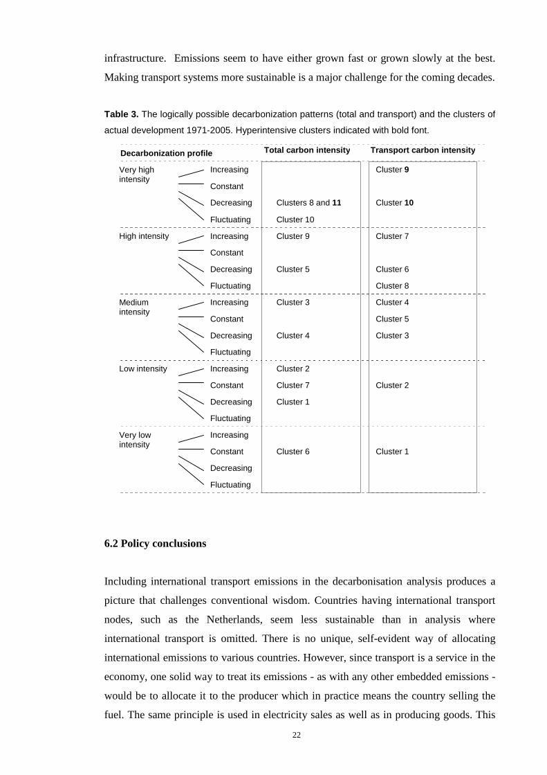
Emissions from the transport sector have special characteristics (Table 3). Transport is
stubbornly dependent on oil products, as alternative fuels are less competitive in terms
of price, energy density, ease of handling and the ubiquity of the supporting
22
infrastructure. Emissions seem to have either grown fast or grown slowly at the best.
Making transport systems more sustainable is a major challenge for the coming decades.
Table 3. The logically possible decarbonization patterns (total and transport) and the clusters of
actual development 1971-2005. Hyperintensive clusters indicated with bold font.
6.2 Policy conclusions
Including international transport emissions in the decarbonisation analysis produces a
picture that challenges conventional wisdom. Countries having international transport
nodes, such as the Netherlands, seem less sustainable than in analysis where
international transport is omitted. There is no unique, self-evident way of allocating
international emissions to various countries. However, since transport is a service in the
economy, one solid way to treat its emissions - as with any other embedded emissions -
would be to allocate it to the producer which in practice means the country selling the
fuel. The same principle is used in electricity sales as well as in producing goods. This
Total carbon intensity Transport carbon intensity
High intensity
Decreasing Cluster 5 Cluster 6
Increasing Cluster 9 Cluster 7
Constant
Fluctuating Cluster 8
Mediumintensity
Increasing Cluster 3 Cluster 4
Decreasing Cluster 4 Cluster 3
Constant Cluster 5
Fluctuating
Low intensity Increasing Cluster 2
Decreasing Cluster 1
Constant Cluster 7 Cluster 2
Fluctuating
Very lowintensity
Increasing
Decreasing
Constant Cluster 6 Cluster 1
Fluctuating
Very highintensity
Increasing Cluster 9
Decreasing Clusters 8 and 11 Cluster 10
Constant
Fluctuating Cluster 10
Decarbonization profile

23
might have an effect on fuel prices, and help reduce the distortions caused in many
countries by the extensive use of fuel subsidies for transport.
It is concluded that the GDP per capita level determines neither the total carbon
intensity nor the transport carbon intensity. Therefore, the realistic debate is not between
the pro-growth and anti-growth arguments but more subtle strategies and means of
emissions reduction are needed (see e.g. Pacala and Socolow, 2004; Jollands et al.,
2010). Now, that the economy is in recession and considerable governmental funds are
used in various market interventions, it is important to emphasize climate friendly
measures for recovery instead of getting back to business as usual. If progress in
reducing carbon dependency is not determined by the level of the GDP, then this is
good news.
Increasing eco-efficiency of the economy results in a reduction of carbon intensity. This
is an important goal for effective use of resources, since carbon dioxide is not an
impurity in the burning process, but an indicator of fossil fuel use as well. Efficient use
of resources is a relevant policy goal independent of the level of economic output (see
e.g. Darmstadter, 2001). This is why carbon intensity, rather than carbon dioxide
emissions per capita was used as the basic unit of measurement in this study.
6.3 Directions for further research
The analysis of this paper is based on aggregate emissions. It can be argued that
aggregated carbon intensity does not reveal the reasons behind the results – very
different countries may look like similar in terms of aggregated carbon intensity of the
economy. For this reason, further research should pay attention to the following six
suggestions.
First, a structural decomposition of CO2 emissions from different sectors such as
transport, industry, agriculture, services etc. of the economy should be carried out,
identifying how the change in emissions or emission intensity has changed due to
changes in economic activity and carbon intensity of each sector, and due to change in
the shares of different sectors in the whole economy. There is a large literature of this
kind decomposition analysis which has been applied to energy consumption and CO2

24
emissions and corresponding intensities as well. Recommendations for the use of
different decomposition techniques in these fields have been made e.g. by Ang (2004).
Second, detailed structural decomposition of emissions by fuel sources and transport
mode should be made, and this includes the increases in maritime and aviation where
considerable future growth is expected. Earlier studies exist on total emissions (e.g. Sun,
2004) or energy consumption (e.g. Ang, 1994), but the same analysis could be repeated
using traffic mode specific emissions in order to gain a more in-depth view. For
example, does road transport really dictate all the results or might some weak signals be
found in trends in the other modes?
Third, a Kaya identity or IPAT and ImPACT analysis should be performed in order to
find out the contribution of population, GDP per capita, Energy use per GDP and CO2
emissions per energy use to the emissions (see eg. Ehrlich & Holdren 1971; Raupach et
al. 2007; Ausubel & Waggoner 2008; Saikku et al. 2008). Each factor could be
incorporated in a cluster analysis. As for transport, this is a very challenging task, since
transport volumes would be an equivalent to energy use, but there is no international
data on transport volumes. Eurostat has data on transport volumes for EU15 countries
from 1970 onwards, but for other countries, available data is either scattered, scarce, or
incompatible. Road and some rail transport volume statistics may be found from
International Road Federation (IRF), but domestic waterborne modes, domestic
aviation, bicycling and walking are excluded.
Fourth, for a sensitivity analysis, other CO2 emission data could be used to compare
results based on various data sources, for example comparing IMO and IEA data on
maritime CO2 emissions or CDIAC and IEA data on total emissions.
Fifth, as time passes by, the analysis could be updated with the most recent data sets.
The period of 2005-2010 might give a very different view due to the global economic
recession, and the increasing role that the large countries of Asia are having on global
travel patterns, the use of energy and CO2 emissions levels.
Sixth, the policies of the best performing countries in the best practice clusters should
be analysed by qualitative policy analysis. These countries are characterised by low
and/or decreasing carbon intensity combined with high GDP per capita: Switzerland,
25
Sweden and Norway in total carbon intensity and Japan, Germany and Switzerland in
transport carbon intensity. A qualitative analysis on policy documents, interviews with
key informants in the administration, supplemented by geographic information and a
wider set of statistics would contribute to the understanding of success stories. Wealthy
countries having high carbon intensity could be analysed in this comparison with the
‘best of the best’.
Appendix A: Clustering process
The process of clustering the countries is presented in the hierachical trees, or
dendrograms. Fig.6 presents the grouping of the TIIN clusters and Fig. 7 the grouping
of the TRIN clusters. Each cluster is indicated with a specific colour.

26
Figure 6. TIIN dendrogram – each cluster is indicated with a colour. Outliers in black ink.

27
Figure 7. TRIN dendrogram – each cluster is indicated with a colour. Outliers in black ink.

28
Appendix B: Country codes used in graphs.
Country Code Country Code Country Code
Albania AL Greece GR Panama PA
Algeria DZ Guatemala GT Paraguay PY
Angola AO Haiti HT Peru PE
Argentina AR Honduras HN Philippines PH
Australia AU Hong Kong (China) HK Poland PL
Austria AT Hungary HU Portugal PT
Bahrain BH Iceland IS Qatar QA
Bangladesh BD India IN Romania RO
Belgium BE Indonesia ID Saudi Arabia SA
Benin BJ Islamic Republic of Iran IR Senegal SN
Bolivia BO Iraq IQ Singapore SG
Brazil BR Ireland IE Slovak Republic SK
Brunei Darussalam BN Israel IL South Africa ZA
Bulgaria BG Italy IT Spain ES
Cameroon CM Jamaica JM Sri Lanka LK
Canada CA Japan JP Sudan SD
Chile CL Jordan JO Sweden SE
China CN Kenya KE Switzerland CH
Chinese Taipei TP Dem. People's Republic of Korea KP Syria SY
Colombia CO Korea KR United Republic of Tanzania TZ
Congo CG Kuwait KW Thailand TH
Democratic Republic of Congo CD Lebanon LB Togo TG
Costa Rica CR Libya LY Trinidad and Tobago TT
Côte d'Ivoire CI Luxembourg LU Tunisia TN
Cuba CU Malaysia MY Turkey TR
Cyprus CY Malta MT United Arab Emirates AE
Czech Republic CZ Mexico MX United Kingdom GB
Denmark DK Morocco MA United States US
Dominican Republic DO Mozambique MZ Uruguay UY
Ecuador EC Myanmar MM Venezuela VE
Egypt EG Namibia NA Vietnam VN
El Salvador SV Nepal NP Yemen YE
Ethiopia ET Netherlands NL Zambia ZM
Finland FI New Zealand NZ Zimbabwe ZW
France FR Nicaragua NI Other Africa OthAfra
Gabon GA Nigeria NG Other Latin America OthLAmb
Germany DE Norway NO Other Asia OthAsiac
Ghana GH Oman OM Former Yugoslavia ForYugd
Gibraltar GI Pakistan PK Former USSR ForUSSRe
aBurkina-Faso, Burundi, Cape Verde, Central African Republic, Chad, Comoros, Djibouti, EquatorialGuinea, Gambia, Guinea, Guinea-Bissau, Lesotho, Liberia, Madagascar, Malawi, Mali, Mauritania,Mauritius, Niger, Reunion, Rwanda, Sao Tome and Principe, Seychelles, Sierra Leone, Somalia,Swaziland & Uganda.bAntigua and Barbuda, Aruba, Bahamas, Barbados, Belize, Bermuda, Dominica, French Guyana,Grenada, Guadeloupe, Guyana, Martinique, St. Kitts and Nevis, Anguilla, Saint Lucia, St. Vincent andGrenadines & Surinam.cAfghanistan, Bhutan, Cambodia, Fiji, French Polynesia, Kiribati, Laos, Macau, Maldives, NewCaledonia, Papua New Guinea, Samoa, Solomon Islands, Tonga & Vanuatu.dBosnia-Herzegovina, Croatia, Former Yugoslav Republic of Macedonia, Serbia/Montenegro & Slovenia.eArmenia, Azerbaijan, Belarus, Estonia, Georgia, Kazakhstan, Kyrgyzstan, Latvia, Lithuania, Republic ofMoldova, Russia, Tajikistan, Turkmenistan, Ukraine & Uzbekistan.NB! The following countries are excluded due to incomplete or lack of data: Anguilla, Botswana, BritishVirgin Islands, Cambodia, Cayman Islands, Christmas Island, Cook Islands, Eritrea, Falkland Islands,Liechtenstein, Mongolia, Montserrat, Namibia, Nauru, Netherlands Antilles, Niue, Palau, Saint Helena,Saint Pierre-Miquelon, Turks and Caicos Islands & Western Sahara.

29
References
Ang, B.W., 1994. Decomposition of industrial energy consumption. The energy intensityapproach. Energy Economics 16, 163-174.
Ang, B.W., 2004. Decomposition analysis for policymaking in energy: which is the preferredmethod? Energy Policy 32, 1131-1139.
Ang, B.W., Liu, N., 2006. A cross-country analysis of aggregate energy and carbon intensities.Energy Policy 34, 2398-2404.
Ariew, A., 2007. Under the influence of Malthus’s law of population growth: Darwin eschewsthe statistical techniques of Aldolphe Quetelet. Studies in History and Philosophy of SciencePart C: Studies in History and Philosophy of Biological and Biomedical Sciences 38, 1-19.
Arrow, K., Bolin, B., Costanza, R., Dasgupta,P., Folke,C., Holling, C. S., Jansson,B-O., Levin,S., Mäler, K-G., Perrings, C., Pimentel, D., 1995. Economic growth, carrying capacity and theenvironment. Ecological Economics 15, 91-95.
Ausubel, J., 1995. Technical progress and climatic change. Energy Policy 23, 411-416.
Ayres, R. U., 2008. Sustainability economics: Where do we stand? Ecological Economics 67,281-310.
Bad news: Is it true?, 1980. Science 210, 1296-1308. [Eight untitled letters responding Simon(1980) and Simon’s reply.]
Ballingall, J., Steel, D., Briggs, P., 2003. Decoupling economic activity and transport growth:the state of play in New Zealand. Ministry of Transport, AT RF 03,http://www.transport.govt.nz/downloads/decoupling-paper.pdf .
Banister, D., Stead, D., 2002. Reducing transport intensity. European Journal of TransportInfrastructure Research 2, 161-178.
Banister, D., Stead, D., Steen, P., Åkerman, J., Dreborg, K., Nijkamp, P., Schleicher-Tappeser,R., 2000. European Transport Policy and Sustainable Mobility. Spon Press, Suffolk (UK).
Banister, D., Pucher, J., Lee-Gosselin, M., 2007. Making sustainable transport politically andpublicly acceptable: Lessons from the EU, USA and Canada, in: Rietveld, P., Stough, R.(Eds.), Institutions and Regulatory Reform in Transport. Edward Elgar, Cheltenham, pp. 18-51.
Behrens, A., Giljum, S., Kovanda, J., Niza, S., 2007. The material basis of the global economy –Worldwide patterns of natural resource extraction and their implications for sustainableresource use policies. Ecological Economics 64, 444-453.
Boyle, T.J., 1973. Hope for the technological solution. Nature 245, 127-128.
de Bruyn, S.M., Opschoor, J. B., 1997. Developments in the throughput-income relationship:theoretical and empirical observations. Ecological Economics 20, 255-268.
de Bruyn, S.M., van den Bergh, JC.J.M., Opschoor, J.B., 1998. Economic growth andemissions: reconsidering the empirical basis of environmental Kuznets curves. EcologicalEconomics 25(2): 161-175.
Burke, F.E., 1973. Ignorance about limitations to growth. Nature 246, 226-230.
Caviglia-Harris, J. L., Chambers, D., Kahn, J. R., 2009. Taking the “U” out of Kuznets: Acomprehensive analysis of the EKC and environmental degradation. Ecological Economics45, 1149-1159.
CDIAC, 2009. Global CO2 emissions from fossil-fuel burning, cement manufacture, and gasflaring: 1751-2006. Carbon Dioxide Information Analysis Center,http://cdiac.ornl.gov/ftp/ndp030/global.1751_2006.ems.
Costanza, R., 2009. Could climate change capitalism? Nature 458, 1107-1108.

30
Darmstadter, J., 1992. Energy transitions, In: Darmstadter, J. (Ed.), Global Development and theEnvironment. Perspectives on Sustainability, Resources for the Future, Washington D.C., pp.63-71.
Darmstadter, J., 2001. The energy-CO2 connection: A review of trends and challenges, in:TomanM.A. (Ed.) Climate Change Economics and Policy: An RFF Anthology. RFF Press,Washington D.C., pp. 24-34.
Dunlap, R.E., 1983. Comment: Ecological “news” and competing paradigms. TechnologicalForecasting & Social Change 23, 203-206.
Ehrlich, P., Holdren, J., 1971. Impact of population growth. Science 171, 1212-1217.
Engels, F., 1976 (originally 1844). Outlines of a Critique of Political Economy, in: Appleman,P. (Ed.), An Essay of the Principle of Population: Text, Sources and Background, Criticism,W.W. Norton, New York, pp.148-150.
Everitt, B. S., Landau, S., Leese, M., 2001. Cluster Analysis, 4th ed. Arnold, London.
Eyring, V., Isaksen, I.S.A., Berntsen, T., Collins, W.J., Corbett, J.J., Endresen, O., Grainger,R.G., Moldanova, J., Schlager, H., Stevenson, D.S., 2009. Transport impacts on atmosphereand climate: Shipping. Atmospheric Environment, in Press.
Fisher, B., 2007. CO2 emissions: Getting bang for the buck. Science 318, 1865.
Fonkych, K., Lempert, R., 2005. Assessment of Environmental Kuznets Curves andSocioeconomic Drivers in IPCC’s SRES Scenarios. The Journal of Environment Development14(1): 27-47.
Galeotti, M., Lanza, A., Pauli, F., 2006. Reassessing the environmental Kuznets curve for CO2
emissions: A robustness exercise. Ecological Economics 57, 152-163.
Guan, D., Hubacek, K., Weber, C.L., Peters, G.P., Reiner, D.M., 2008. The drivers of ChineseCO2 emissions from 1980-2030. Global Environmental Change 18: 626-634.
Hoffert, M. I., Caldeira, K., Benford, G., Criswell, D.R., Green, C., Herzog, H., Jain, A.K.,Kheshgi, H.S., Lackner, K.S., Lewis, J.S., Lightfoot, H.D., Manheimer, W., Mankins, J.C.,Mauel, M.E., Perkins, L.J., Sclesinger, M.E., Volk, T., Wigley, T.M.L., 2002. Advancedtechnology paths to global climate stability: Energy for a greenhouse planet. Science 298,981-987.
Houghton, J. T., Jenkins, G. J. and Ephraums, J. J. (Eds.), 1990. Climate Change. The IPCCScientific Assesment, Report Prepared for IPCC by Working Group 1. Cambridge Univ.Press, Cambridge.
Huang, W.M., Lee, G.W.M., Wu, C.C., 2008. GHG emissions, GDP growth and the KyotoProtocol: A revisit of Environmental Kuznets Curve hypothesis. Energy Policy 26, 239-247.
IEA, 2007. CO2 Emissions from Fuel Combustion. International Energy Agency, CD-Rom.
IMO, 2010. Second IMO GHG study 2009. Buhaug, Ø., Corbett, J.J., Endresen, Ø., Eyring, V.,Faber, J., Hanayama, S., Lee, D.S., Lee, D., Lindstad, H., Markowska, A.Z., Mjelde, A.,Nelissen, D., Nilsen, J., Pålsson, C., Winebrake, J.J., Wu, W., Yoshida, K. InternationalMaritime Organization (IMO) London, UK,www.imo.org/includes/blastDataOnly.asp/data_id%3D27795/GHGStudyFINAL.pdf.
IPCC, 2007. Summary for policymakers, in: Metz, B., Davidson, O. R., Bosch, P. R., Dave, R.,Meyer, L. A. (Eds.), Climate Change 2007: Mitigation. Contribution of Working Group III tothe Fourth Assessment Report of the Intergovernmental Panel on Climate Change. CambridgeUniv. Press, Cambridge, pp. 1-23.
Jain, A.K., Murty, M.N., Flynn, P.J., 1999. Data clustering: A review. ACM ComputingSurveys 31, 364-323.
Jollands, N., Waide, P., Ellis, M., Onoda, T., Laustsen, J., Tanaka, K., deT’Serclaes, P.,Barnsley, I., Bradley, R., Meier, A., 2010. The 25 IEA energy efficiency policyrecommendations to the G8 Gleneagles Plan of Action. Energy Policy, in Press.

31
Kahn Ribeiro, S., Kobayashi, S., Beuthe, M., Gasca, J., Greene, D., Lee, D.S., Muromachi, Y.,Newton, P.J., Plotkin, S., Sperling, D., Wit, R., Zhou, P.J., 2007. Transport and itsinfrastructure, in: Metz, B., Davidson, O.R., Bosch, P.R., Dave, R., Meyer, L.A. (Eds.),Climate Change 2007: Mitigation. Contribution of Working Group III to the FourthAssessment Report of the Intergovernmental Panel on Climate Change. Cambridge Univ.Press, Cambridge, pp. 323-385.
Lee, D.S., Pitari, G., Grewe, V., Gierens, K., Penner, J.E., Petzold, A., Prather, M.J.,Schumann, U., Bais, A., Berntsen, T., Iachetti, D., Lim, L.L., Sausen, R., 2009. Transportimpacts on atmosphere and climate: Aviation. Atmospheric Environment, in Press.
Malthus, T.R., 1976 (orig. 1798). An essay of the principle of population, in: Appleman, P.(Ed.), An Essay of the Principle of Population: Text, Sources and Background, Criticism,W.W. Norton, New York.
Meadows, D.H., Meadows, D.L., Randers, J., Behrens III, W.W., 1972. The Limits to Growth.A Report for the Club of Rome’s Project on the Predicament of Mankind. Earth Island,London.
Meinshausen, M., Meinshausen, N., Hare, W., Raper, S.C.B., Frieler, K., Knutti, R. Frame, D.J.,Allen, M.R., 2009. Greenhouse-gas emission targets for limiting global warming to 2ºC.Nature 458, 1158-1163.
Mesarovic, M. and Pestel, E., 1975. Mankind at the Turning Point. The Second Report to theClub of Rome. Hutchinson & Co Publishers, London.
Mill, J.S., 1976 (originally 1848). Principles of Political Economy, in: Appleman, P. (Ed.), AnEssay of the Principle of Population: Text, Sources and Background, Criticism, W.W. Norton,New York, pp. 151-156.
Milligan, G.W., 1996. Clustering Validation: Results and Implications for Applied Analyses, in:Arabie, P., Hubert, L.J., & De Soete, G. (eds.): Clustering and Classification, World ScientificPubl., River Edge, NJ, pp. 341-375.
Munasinghe, M., 1996. An overview of the environmental impacts of macroeconomic andsectoral policies, in: Munasinghe, M. (Ed.), Environmental Impacts of Macroeconomic andSectoral Policies. The International Society for Ecological Economists, The World Bank &The United Nations Environment Programme, Washington, pp. 1-14.
Nakićenović, N., 1996. Decarbonization: Doing more with less. Technological Forecasting & Social Change 51, 1-17.
Narayan, P.K., Narayan, S., 2010. Carbon dioxide emissions and economic growth: Panel dataevidence from developing countries. Energy Policy 38, 661-666.
Newman, P., Kenworthy, J., 2000. The ten myths of automobile dependence world. TransportPolicy & Practice 6, 15–25.
Nordhaus, W., 2007. CO2 emissions: Getting bang for the buck. Response to Fisher (2007).Science 318, 1866-1868.
Oerlemans, T.W., Tellings, M.M.J., de Vries, H., 1972. World dynamics: Social feedback maygive hope for the future. Nature 238, 251-255.
Pacala, S., Socolow, R., 2004. Stabilization wedges: Solving the climate problem for the next 50years with current technologies. Science 305, 968-972.
Peake, S., 1994. Transport in Transition: Lessons from the History of Energy. Earthscan,London.
Peters, G.P., Hertwich, E.G., 2007. CO2 embodied in international trade with implications forglobal climate policy. Environmental Science & Technology 42, 1401-1407.
Raupach, M.R., Marland, G., Ciais, P., Le Quéré, C., Canadell, J.G., Klepper, G., Field, C.B.,2007. Global and regional drivers of accelerating CO2 emissions. Proceedings of the NationalAcademy of Science 104, 10288-10293.
32
Rogner, H.-H. Zhou, D., Bradley, R., Crabbé, P., Edenhofer, O., Hare, B., Kuijpers, L.,Yamaguchi, M., 2007. Introduction, in: Metz, B., Davidson, O. R., Bosch, P. R., Dave, R. &Meyer, L. A. (Eds.), Climate Change 2007: Mitigation. Contribution of Working Group III tothe Fourth Assessment Report of the Intergovernmental Panel on Climate Change. CambridgeUniv. Press, Cambridge, pp. 95-116.
Saikku, L., Rautiainen, A., Kauppi, P., 2008. The sustainability challenge of meeting carbondioxide targets in Europe by 2020. Energy Policy 36, 730-742.
Schmidt-Bleek, F., 2000. Luonnon uusi laskuoppi. Gaudeamus, Helsinki. [Finnish translation oftwo books: Wieviel Umwelt braucht der Mensch? MIPS – das Mass für ökologischesWirtschaften (orig. 1994) and Das MIPS-Konzept. Weniger Naturverbrauch – mehrLebensqualität durch Faktor 10 (orig. 1998).]
Schneider, S., 2009. The worst-case scenario. Nature 458, 1104-1105.
Simon, J. L., 1980. Resources, population, environment: An oversupply of false bad news.Science 208, 1431-1437.
Shafik, N., Bandyopadhyay, S., 1992. Economic growth and environmental quality. Time-seriesand cross-country evidence. Policy Research Working Papers 0904. Background Paper forWorld Development Report 1992, The World Bank, 50 p.
Song, T., Zheng, T., Tong, L., 2008. An empirical test of the environmental Kuznets curev inChina: A panel cointegration approach. China Economic Review 19, 381-392.
Stead, D., 2001. Transport intensity in Europe – indicators and trends. Transport Policy 8, 29-46.
Stern, D.I., 2006. Reversal of the trend in global anthropogenic sulfur emissions. GlobalEnvironmental Change 16: 207-220.
Stiglitz, J.E., Sen, A., Fitoussi, J.P., 2009. The measurement of economic performance andsocial progress revisited. OFCE No 2009-33. Centre de recherche en économie de SciencesPo, Paris, www.ofce.sciences-po.fr/pdf/dtravail/WP2009-33.pdf.
Sun, J.W., Meristö, T., 1999. Measurement of dematerialization/materialization: A case analysisof energy saving and decarbonization in OECD countries, 1960-95. Technological Forecasting& Social Change 60, 275-294.
Sun, J.W., 2004. The impact of energy mix on CO2 emissions: a case from CO2 emissions inthe OECD 1971-2000. Energy Sources 26, 915-926,
Tan, P-N., Steinbach, M., Kumar, V., 2006. Introduction to Data Mining. Addison-Wesley.Chapter 8, Cluster Analysis: Basic Concepts and Algorithms. Available at www-users.cs.umn.edu/~kumar/dmbook/ch8.pdf.
Tapio, P., 2005. Towards a theory of decoupling: Degrees of decoupling in the EU and the caseof road traffic in Finland between 1970 and 2001. Transport Policy 12, 137-151.
Tapio, P., Banister, D., Luukkanen, J., Vehmas, J., Willamo, R., 2007. Energy and transport incomparison: Immaterialisation, dematerialisation and decarbonisation in the EU15 between1970 and 2000. Energy Policy 35, 433-451.
Turner, G.M., 2008. A comparison of The Limits to Growth with 30 years of reality. GlobalEnvironmental Change 18: 397-411.
Vehmas, J. Luukkanen, J., Kaivo-oja, J., 2007. Linking analyses and environmental Kuznetscurves for aggregated material flows in the EU. Journal of Cleaner Production 15, 1662-1673.
Wernick, I.K., Herman, R., Govind, S., Ausubel, J., 1996. Materialization anddematerialization: Measures and trends. Daedalus 125, 171-198.
Zeng, N., Ding, Y., Pan, J., Wang, H., Gregg, J., 2008. Climate change – the Chinese challenge.Science 319, 730-732.