GCSE ART & DESIGN - Oaklands School
12
1 GCSE ART & DESIGN
Transcript of GCSE ART & DESIGN - Oaklands School

1
GCSE
ART & DESIGN

What are your expectations? What do you want to learn/gain? What help do you need?
2
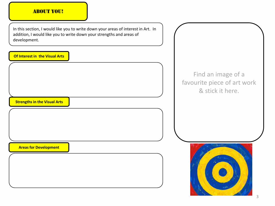
In this section, I would like you to write down your areas of interest in Art. In addition, I would like you to write down your strengths and areas of development.
Of Interest in the Visual Arts
Strengths in the Visual Arts
Areas for Development
About You!
3
Find an image of a favourite piece of art work
& stick it here.

STARTING POINT Interpretations of the theme. Spider grams/mind maps,
collected images/photographs, Postcard etc
Art EXAM Process
OBSERVATIONAL DRAWINGS OF THE ARTISTS
WORK/FOUND OBJECTS Develop ideas through investigations, demonstrating critical understanding of sources.
Varied media: Pencil, pen and ink, wash, biro, chalk, water-colour, wax resist, pencil crayon, pastel, collage. Remember to use scale. You don’t have to do a drawing of the whole thing, but can record a section and blow it up!
Don’t forget to include magazines cuttings, prints, postcards, anything you can lay your hands on, relating to that culture/artist/topic! We do this to get a feel of the artists style, as well as improving our drawing/recording skills
Record ideas, observations and insights relevant to intentions as work progresses.
Use your annotation booklets!!
Present a personal and meaningful response that realises intentions and demonstrates understanding of visual language.
EVALUATION EVALUATE-Write about what you have achieved throughout the project,
what do you think about your work?
Refine work by exploring ideas, selecting and experimenting with appropriate media, materials,
techniques and processes.
AO1
AO2
AO3
AO4
4
DEVELOP
REFINE
RECORD
PRESENT

Displaying your work is something you need to start thinking about. When you have completed a project, displaying it gives you the opportunity to look at it, form an opinion, as well as the viewer
to look at it as a whole.
There are several ways in how to display your work. This sheet will give you some ideas, on how you may want to approach this
Displaying your work
5

Project Checklist
Brain stormed/spider diagram of topic/theme
Observational drawings (OD’s)
OD: Variety of materials
OD: Shape, colour, form, texture, line & scale on Artist/objects/culture with annotated notes
Made good use of large sheets of paper/sketchbook
Idea pages/sheets inspired by subject matter and your own imagination with notes
Development sheets/pages showing development of an idea with annotated notes
Final piece in 2D or 3D
Annotations based on culture/artist
All work labeled and named clearly and all together
This is a checklist to help you plan what you need to do, to fulfill and complete a successful project
Plan Your Time
Wisely!
Be realistic in what you
want to achieve!
Take advantage
of lunch time
sessions!
Try to make Sure You
Tick All The Boxes!
6

Question 1: Introduction/Front cover/Title? Question 2: Quantity of Facts? Question 3: Quantity of own opinions and thoughts? Question 4: Use of Art vocabulary/key words? Question 5: Presentation of work? Question 6: Artist research? Question 7: Experimentation linked to artist style? Question 8: Development of ideas from starting point?
GCSE self/Peer Feedback Sheet Name:
Areas for Improvement
Strengths
Date:
Topic:
I
C D N
7
KEY: N = No Evidence D= Developing (Some evidence) C= Confident (Good) I= Independent (Excellent)

8
Week 1
Week 2
Week 3
Week 4
Week 5
Week 6
Week 7
Week 8
What am I going to do /complete each week? Weekly Planner

9
Have you brain stormed/spider diagram your question?
Have you completed observational drawings (OD’s), relating to your chosen question, including links to an artist and culture?
Do your OD’s include a variety of materials ?
Do your OD’s show shape, colour, form, texture, line & scale relating to the artist/culture and question with annotated notes?
Have you made good use of paper/sketchbook?
Do you show idea pages/sheets inspired by subject matter and your own imagination with notes?
Do you have development sheets/pages showing development of an idea with annotated notes?
Have you decided on a final design/piece, and practiced it?
Have you written an evaluation of your exam piece and statement on the culture/artist?
All work clearly labeled and all together
Have you completed your final piece within the 10 hours, and are you happy with it?
If you have ticked
all the boxes and
are happy, well
done!!
Final Exam Checklist
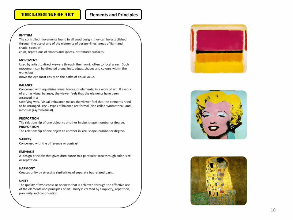
RHYTHM The controlled movements found in all good design, they can be established through the use of any of the elements of design--lines, areas of light and shade, spots of color, repetitions of shapes and spaces, or textures surfaces. MOVEMENT
Used by artist to direct viewers through their work, often to focal areas. Such movement can be directed along lines, edges, shapes and colours within the works but move the eye most easily on the paths of equal value. BALANCE
Concerned with equalizing visual forces, or elements, in a work of art. If a work of art has visual balance, the viewer feels that the elements have been arranged in a satisfying way. Visual imbalance makes the viewer feel that the elements need to be arranged. The 2 types of balance are formal (also called symmetrical) and informal (asymmetrical). PROPORTION The relationship of one object to another in size, shape, number or degree. PROPORTION The relationship of one object to another in size, shape, number or degree. VARIETY
Concerned with the difference or contrast. EMPHASIS A design principle that gives dominance to a particular area through color, size, or repetition. HARMONY
Creates unity by stressing similarities of separate but related parts. UNITY
The quality of wholeness or oneness that is achieved through the effective use of the elements and principles of art. Unity is created by simplicity, repetition, proximity and continuation.
The Language of Art Elements and Principles
10
The Language of Art
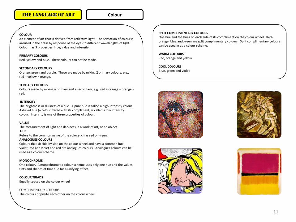
COLOUR An element of art that is derived from reflective light. The sensation of colour is aroused in the brain by response of the eyes to different wavelengths of light. Colour has 3 properties: Hue, value and intensity. PRIMARY COLOURS Red, yellow and blue. These colours can not be made. SECONDARY COLOURS Orange, green and purple. These are made by mixing 2 primary colours, e.g., red + yellow = orange. TERTIARY COLOURS Colours made by mixing a primary and a secondary, e.g. red + orange = orange -red. INTENSITY The brightness or dullness of a hue. A pure hue is called a high-intensity colour. A dulled hue (a colour mixed with its compliment) is called a low intensity colour. Intensity is one of three properties of colour. VALUE The measurement of light and darkness in a work of art, or an object. HUE Refers to the common name of the color such as red or green. ANALOGUES COLOURS Colours that sit side by side on the colour wheel and have a common hue. Violet, red and violet and red are analogues colours. Analogues colours can be used as a colour scheme. MONOCHROME One colour. A monochromatic colour scheme uses only one hue and the values, tints and shades of that hue for a unifying effect. COLOUR TRIADS Equally spaced on the colour wheel COMPLIMENTARY COLOURS The colours opposite each other on the colour wheel
SPLIT COMPLIMENTARY COLOURS One hue and the hues on each side of its compliment on the colour wheel. Red-orange, blue and green are split complimentary colours. Split complimentary colours can be used in as a colour scheme. WARM COLOURS Red, orange and yellow COOL COLOURS Blue, green and violet
Colour
11

COMPOSITION The placement of forms, shapes, colors, and light and dark areas in a work of art. Artists use composition to direct the viewer's eye to the most important elements of a work of art. ASYMMETRICAL BALANCE Another name for informal balance, in which unlike objects have equal visual weights or eye attraction. INFORMAL BALANCE Way of organizing parts of a design so that unlike objects have equal visual weight or eye attraction. Asymmetry is another term for informal balance. Opposite of formal balance. BILATERAL BALANCE A special type of formal balance in which tow halves of balance composition are identical, mirror images of each other. RECEDING PLANE PRINCIPLE Composition which gives he viewer somewhere to go, builds space within the piece of work VISUAL WEIGHT Attraction the elements in a work of art have for the viewers eyes. Visual weight is affected by size, contour, intensity of colour, warmth and coolness of colours, contrast in value, texture and position. PERSPECTIVE A technique for creating the illusion of depth on a 2-d surface. ONE POINT LINEAR PERSPECTIVE In a one point linear perspective all receding lines meet at a singular vanishing point. TWO PINT LINEAR PERSPECTIVE Different sets of parallel lines meet at different vanishing points. AREAS OF COMPOSITION Foreground-most forward space Middle ground-Middle, background-space furthest back from front, middle and behind.
The Language of Art Composition
HORIZON LINE Point where the lands meets the sky. PICTURE PLANE Surface you are working on. PLANES IN SPACE Are directional, some go up, some go back and some go down etc. EDGE Foreground-crisp, sharp and clean Middle ground-less sharp, slightly soft or fuzzy. Background-edges should be soft. SIZE Typically objects or shapes in the foreground are large, objects in the middle ground are smaller an objects in the back ground are small. OVERLAPPING Overlapping objects/shapes helps to crate the illusion that there is space between them.
12