Fun with the R Grid Package
35
Journal of Statistics Education, Volume 18, Number 3, (2010) Fun with the R Grid Package Lutong Zhou University of Western Ontario W. John Braun University of Western Ontario Journal of Statistics Education Volume 18, Number 3 (2010) www.amstat.org/publications/jse/v18n3/zhou.pdf Copyright c 2010 by Lutong Zhou and W. John Braun all rights reserved. This text may be freely shared among individuals, but it may not be republished in any medium without express written consent from the authors and advance notification of the editor . Key Words: Cave plot; Fire data; grob; gTree; gList; Viewport Abstract The increasing popularity of R is leading to an increase in its use in undergraduate courses at universities (R Development Core Team 2008). One of the strengths of R is the flexible graphics provided in its base package. However, students often run up against its limita- tions, or they find the amount of effort to create an interesting plot may be excessive. The grid package (Murrell 2005) has a wealth of graphical tools which are more accessible to such R users than many people may realize. The purpose of this paper is to highlight the main features of this package and to provide some examples to illustrate how students can have fun with this different form of plotting and to see that it can be used directly in the visualization of data. 1. Introduction There is increasing interest in teaching R at the undergraduate, and even early undergradu- ate level. Graphics is (or at least should be) featured prominently in elementary statistical 1
-
Upload
nguyentuyen -
Category
Documents
-
view
227 -
download
2
Transcript of Fun with the R Grid Package

Journal of Statistics Education, Volume 18, Number 3, (2010)
Fun with the R Grid Package
Lutong ZhouUniversity of Western Ontario
W. John BraunUniversity of Western Ontario
Journal of Statistics Education Volume 18, Number 3 (2010)www.amstat.org/publications/jse/v18n3/zhou.pdf
Copyright c© 2010 by Lutong Zhou and W. John Braun all rights reserved. This text maybe freely shared among individuals, but it may not be republished in any medium withoutexpress written consent from the authors and advance notification of the editor.
Key Words: Cave plot; Fire data; grob; gTree; gList; Viewport
Abstract
The increasing popularity of R is leading to an increase in its use in undergraduate coursesat universities (R Development Core Team 2008). One of the strengths of R is the flexiblegraphics provided in its base package. However, students often run up against its limita-tions, or they find the amount of effort to create an interesting plot may be excessive. Thegrid package (Murrell 2005) has a wealth of graphical tools which are more accessible tosuch R users than many people may realize. The purpose of this paper is to highlight themain features of this package and to provide some examples to illustrate how students canhave fun with this different form of plotting and to see that it can be used directly in thevisualization of data.
1. Introduction
There is increasing interest in teaching R at the undergraduate, and even early undergradu-ate level. Graphics is (or at least should be) featured prominently in elementary statistical
1

Journal of Statistics Education, Volume 18, Number 3, (2010)
computing courses. Standard plotting using base graphics is relatively straightforward tolearn, but students can find themselves running up against difficulties fairly quickly. Forexample, placement of titles and labels in standard formats is easy, but placing a label atan oblique angle might require some ingenuity. Displaying several plots on one page isalso easy, using par(mfrow), and with effort, the margins around the panels can be con-trolled using par() settings such as oma, etc. Controlling the size, shape and locationof the panels requires even more effort, if it is possible at all. These are among the manysituations that students might face. An experienced R programmer might be able to han-dle them, but not beginners. We believe that grid provides a convenient way of producingcertain kinds of plots and pictures. Perhaps more importantly, it provides the statistics stu-dent with a new perspective on graphics, and we hope to demonstrate in this article thatproducing plots in this new way can be an enjoyable experience as well.
We have found that the grid package is an interesting and surprisingly simple way to do alot of things that are either difficult or impossible using the more traditional base graphics.Initially, grid poses more of a challenge than base graphics, because there are a few keyconcepts which must be absorbed first. However, once those key concepts (or even just oneof those key concepts, the viewport) are understood, students can construct graphs innew and surprising ways.
The grid package is an R package, developed by Paul Murrell in the 1990s. Among otherthings, it gives us an easier way to produce plots at specified locations of the plottingregion. Customized multiple plots can be produced more easily using grid.
The first purpose of this paper is to provide a brief but sufficiently complete introductionto grid that could be used in an introductory statistical computing course. We will describethe very basic ideas of the grid package, introducing viewports, editing graphic objects(grobs), and demonstrating how grid can be an alternative to traditional graphics. Thesecond purpose of the paper is to demonstrate that, in addition to what is already availablein the lattice package, the grid package offers flexibility which can be exploited in a varietyof ways to visualize data.
1.1 Using Viewports
The grid package is loaded into R as follows:
library(grid)
The viewport is the central feature of the grid package. It gives us a rectangular regionwhich is used to orient a plot. Figure 1 exhibits an example of a viewport inside the plotting
2

Journal of Statistics Education, Volume 18, Number 3, (2010)
region:
vp <- viewport(x=0.5,y=0.5,width=0.9, height=0.9)
The vp object contains rules for how a viewport can be created. This one is centered at (.5,.5), with width .9 and height .9 relative to the graphics window. Nothing would actuallyappear on the computer screen, but we display the outline of the viewport in the left panelof Figure 1.
Figure 1. Left panel: An empty viewport outline by dashed lines which do not actuallyappear if only the given code is used. Right panel: a circle plotted in the viewport vp usinggrid.circle.
After we construct a viewport, we need to tell R to use it. This is done with thepushViewport() function. After a viewport has been “pushed”, a graphics window iscreated on the graphics device, if it wasn’t already there. When we typepushViewport(vp) the viewport, vp, becomes the focus of our current plotting. Notethat the dashed lines which outline the viewport would normally not appear.
By default, the coordinates of the lower left corner of the viewport are (0,0), and the upperright corner has coordinates (1,1). As a first example, we will draw a circle of radius 0.3centered at (0.6, 0.4), after outlining the viewport with a rectangle whose sides are drawnwith dashed line segments:
pushViewport(vp)# a rectangle (with dashed lines) on the border of the viewport:grid.rect(gp=gpar(lty="dashed"))# a circle centered at (.6,.4) with radius .3:grid.circle(x=0.6, y=0.4, r=0.3)
The result is shown in the right panel of Figure 1.
3

Journal of Statistics Education, Volume 18, Number 3, (2010)
Another example is displayed in Figure 2. This can be drawn by calling the functionstickperson() whose code is displayed here:
stickperson <- function() {grid.circle(x=.5, y=.8, r=.1, gp=gpar(fill="yellow"))grid.lines(c(.5,.5), c(.7,.2)) # vertical line for bodygrid.lines(c(.5,.7), c(.6,.7)) # right armgrid.lines(c(.5,.3), c(.6,.7)) # left armgrid.lines(c(.5,.65), c(.2,0)) # right leggrid.lines(c(.5,.35), c(.2,0)) # left leg
}
The code uses the gp argument when drawing the circle; this argument takes a large num-ber of graphical parameters which are specified by gpar(). This is the grid version of thepar() function used in base graphics. Many, but not all, of the parameters are the sameas in base graphics. Here, we have used the fill parameter in order to colour the interiorof the circular head yellow.
The built-in grid.lines() function is also used; this constructs line segments in theusual 1×1 viewport. The first segment is drawn from (.5, .7) to (.5, .2), the second segmentis drawn from (.5, .6) to (.7, .7), and so on.
Figure 2. A simple stick-person.
Besides plotting within a viewport, we can construct and push additional viewports withina previously pushed viewport. For example, we can create a second (smaller) viewportwithin the existing viewport as shown in Figure 3:
vp1 <- viewport(x=0.5, y=0.75, width=0.6, height=0.3)pushViewport(vp1)
4
Journal of Statistics Education, Volume 18, Number 3, (2010)
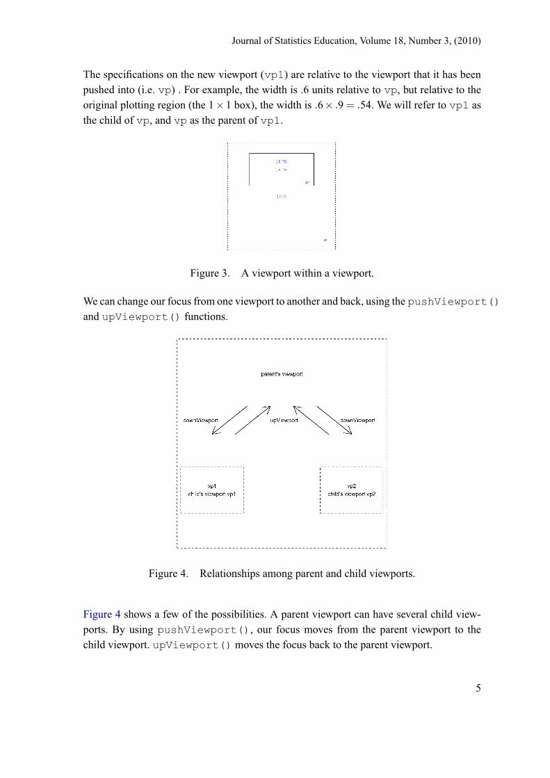
The specifications on the new viewport (vp1) are relative to the viewport that it has beenpushed into (i.e. vp) . For example, the width is .6 units relative to vp, but relative to theoriginal plotting region (the 1×1 box), the width is .6× .9 = .54. We will refer to vp1 asthe child of vp, and vp as the parent of vp1.
Figure 3. A viewport within a viewport.
We can change our focus from one viewport to another and back, using the pushViewport()and upViewport() functions.
Figure 4. Relationships among parent and child viewports.
Figure 4 shows a few of the possibilities. A parent viewport can have several child view-ports. By using pushViewport(), our focus moves from the parent viewport to thechild viewport. upViewport() moves the focus back to the parent viewport.
5

Journal of Statistics Education, Volume 18, Number 3, (2010)
The commands downViewport() and popViewport() also change our focus. Forexample, after returning to vp, the command downViewport(vp1) moves us backfrom vp to vp1. It is also possible to push viewports repeatedly, allowing a given viewportto have not only children viewports, but grandchildren and great-grandchildren and so on.More details can be found in Murrell (1999).
Having pushed vp1 (after pushing vp), we can construct a plot in vp1. In the left panelof Figure 5, we display a blue circle which is centered in vp1 (by default) and which hasradius 0.5 (by default). Code for this is:
grid.circle(gp=gpar(col="blue"))# plot the outline of vp1:grid.rect()
Figure 5. Left Panel: a circle within the child viewport vp1, which was pushed inside theparent viewport vp; Right Panel: adding a circle in the parent viewport vp, after movingup from the child viewport vp1.
To return our focus to vp, we type
upViewport()
As before, we draw another circle, this time in purple, as shown in the right panel ofFigure 5.
grid.circle(gp=gpar(col="purple"))# centered at (0.5, 0.5) with radius of 1 as default.
This confirms that our focus has been moved back to the parent viewport. Note that if wehad pushed a viewport twice in a row, we could use the upViewport() function twiceto return to the original viewport, or we could use
6

Journal of Statistics Education, Volume 18, Number 3, (2010)
upViewport(2)
The argument in brackets determines the number of generations to move up the viewporttree.
The following example shows that nesting viewports can be done repeatedly, and seem-ingly, indefinitely. Again, gridlines() is used to draw the diagonal line segments: thefirst segment is drawn from (.05, .95) to (.95, .05) and the second segment is drawn from(.05, .05) to (.95, .95).
Next, a for loop is used to create a sequence of nested viewports, all of which haveheights and widths which are 90% of the lengths of the heights and widths of their parents.A simple rectangle is drawn at each stage, resulting in the “tunnel” appearance displayedin the left panel of Figure 6.
pushViewport(viewport())grid.lines(c(.05, .95), c(.95, .05))grid.lines(c(.05, .95), c(.05, .95))for (i in 1:100) {
vp <- viewport(h=.9, w=.9)pushViewport(vp)grid.rect()
}
Figure 6. Left Panel: The result of nesting 100 viewports within each other. Right Panel:Three stick-people walking through the tunnel, each scaled automatically corresponding totheir location in the tunnel.
7

Journal of Statistics Education, Volume 18, Number 3, (2010)
The right panel of Figure 6 shows 3 stick-people walking through the tunnel at variousdistances. Note that in order to draw the figure on the left, we have to push 100 viewports.Therefore, we can get back to the original plotting region by applying:
upViewport(100)
From here, we push 5 viewports before drawing the “nearest” stick-person. By pushing aviewport at x=.8, the person is drawn on the right side of the tunnel. The second stick-person is drawn at the 20th viewport, and on the left side of the tunnel. The last person isdrawn at the 30th viewport in the center.
for (i in 1:30) {vp <- viewport(h=.9, w=.9)pushViewport(vp)# person 1:if(i == 5) {
pushViewport(viewport(x=.8))stickperson()upViewport()
}# person 2:if(i == 20) {
pushViewport(viewport(x=.2))stickperson()upViewport()
}# person 3:if(i == 30) stickperson()
}
1.2 Using Viewports to Display Data
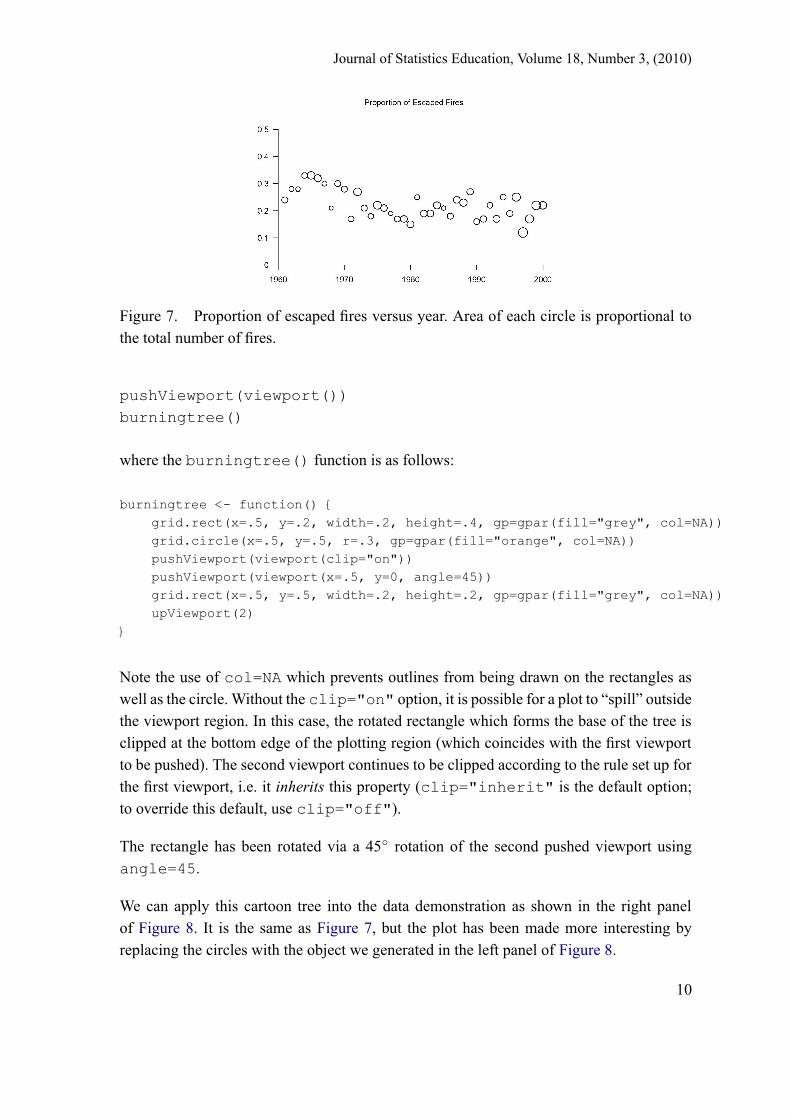
Figure 7 displays information about escape fires, based on a realistic, but hypothetical,data set. Every year, a certain proportion of wildfires cannot be controlled immediatelyand continue to grow, often rapidly. The following vector gives fairly realistic values forcertain parts of North America.
escape_prop <-c(0.24, 0.28, 0.28, 0.33, 0.33, 0.32, 0.3, 0.21, 0.3, 0.28, 0.17,0.27, 0.21, 0.18, 0.22, 0.21, 0.19, 0.17, 0.17, 0.15, 0.25, 0.19,0.19, 0.22, 0.21, 0.18, 0.24, 0.23, 0.27, 0.16, 0.17, 0.22, 0.17,0.25, 0.19, 0.25, 0.12, 0.17, 0.22, 0.22)
8

Journal of Statistics Education, Volume 18, Number 3, (2010)
The total number of fires per year in an area the size of Ontario could be:
nfires <-c(953, 620, 584, 839, 1415, 1180, 656, 408, 872, 965, 853,1492, 951, 772, 1541, 1114, 479, 860, 1166, 1208, 657, 1140,1223, 1275, 489, 932, 1096, 1378, 1033, 889, 1046, 818, 1213,782, 962, 1666, 2017, 1689, 1885, 1435)
In Figure 7, we see the escape proportion plotted against year, but the area of the plottingsymbol is proportional to the total number of fires. Since we are plotting in the unit square,we need to scale the counts so that the circle areas are small enough:
nfirescode <- nfires/max(nfires)
Similarly, we need the index on the horizontal axis (corresponding to year) to take valuesbetween 0 and 1:
index <- (1:40)/41
The code to produce Figure 7 is then:
pushViewport(viewport(width=.9, height=.9))pushViewport(viewport(y=.75, width=.9, height=.9))for (i in 1:40) {
vp <- viewport(x=index[i],y=escape_prop[i], height=.03, width=.03)pushViewport(vp)grid.circle(r=sqrt(nfirescode[i]/pi))upViewport()
}
grid.xaxis(at=c(0,index[c(10,20,30,40)]), label=seq(1960,2000,10))grid.yaxis(at=seq(0,.5,.1))grid.text("Proportion of Escaped Fires", y=.6)
Note the use of grid.xaxis() to produce the horizontal axis. This is similar to thexaxis() function in the base package. The locations of the tick marks are governed bythe at argument, and we have applied year labels at these locations using the labelargument.
In popular media, plots like the right panel of Figure 8 are preferred over Figure 7. Acartoon of a burning tree is shown in the left panel of Figure 8. It is obtained from thefollowing code:
9
Journal of Statistics Education, Volume 18, Number 3, (2010)
Figure 7. Proportion of escaped fires versus year. Area of each circle is proportional tothe total number of fires.
pushViewport(viewport())burningtree()
where the burningtree() function is as follows:
burningtree <- function() {grid.rect(x=.5, y=.2, width=.2, height=.4, gp=gpar(fill="grey", col=NA))grid.circle(x=.5, y=.5, r=.3, gp=gpar(fill="orange", col=NA))pushViewport(viewport(clip="on"))pushViewport(viewport(x=.5, y=0, angle=45))grid.rect(x=.5, y=.5, width=.2, height=.2, gp=gpar(fill="grey", col=NA))upViewport(2)
}
Note the use of col=NA which prevents outlines from being drawn on the rectangles aswell as the circle. Without the clip="on" option, it is possible for a plot to “spill” outsidethe viewport region. In this case, the rotated rectangle which forms the base of the tree isclipped at the bottom edge of the plotting region (which coincides with the first viewportto be pushed). The second viewport continues to be clipped according to the rule set up forthe first viewport, i.e. it inherits this property (clip="inherit" is the default option;to override this default, use clip="off").
The rectangle has been rotated via a 45◦ rotation of the second pushed viewport usingangle=45.
We can apply this cartoon tree into the data demonstration as shown in the right panelof Figure 8. It is the same as Figure 7, but the plot has been made more interesting byreplacing the circles with the object we generated in the left panel of Figure 8.
10

Journal of Statistics Education, Volume 18, Number 3, (2010)
pushViewport(viewport(width=.9, height=.9))pushViewport(viewport(y=.75, width=.9, height=.9))for (i in 1:40) {
vp <- viewport(x=index[i],y=escape_prop[i], height=nfirescode[i]/10,width=.03)
pushViewport(vp)burningtree() # this replaces the grid.circle of Figure 7upViewport()
}
grid.yaxis(at=seq(0,.5,.1))grid.xaxis(at=c(0,index[c(10,20,30,40)]), label=seq(1960,2000,10))grid.text("Proportion of Escaped Fires", y=.6)
Figure 8. Left panel: a cartoon of a burning tree. Right panel: the same as Figure 7, butwith cartoon burning trees instead of circles. Sizes are proportional to total number of fires.
Our final example of this section shows how a .jpeg file can be read into R and manipulatedeasily using grid functions. In this example, we read in a photograph and show how torotate it and write text on it. To read in the file, we need the rimage package installed:
library(rimage)uwo <- read.jpeg("uwo.jpg") # the file uwo.jpg should be in the R
# working directory
The image file that has been read in consists of an array of 3 matrices, containing the colourinformation for each pixel element: red (r), green (g) and blue (b).
11

Journal of Statistics Education, Volume 18, Number 3, (2010)
x1 <- uwo[,,1] # the "r" of rgbx2 <- uwo[,,2] # the "g"x3 <- uwo[,,3] # the "b" each of x1, x2, x3 is a matrix
The following code draws the picture, pixel by pixel, by drawing filled rectangles corre-sponding to the rgb colours coming from the .jpeg image. By rotating the outer viewport45◦, the image is rotated as well, as seen in Figure 9.
widthno <- ncol(x1) # specifies number of grid cells in x directionheightno <- nrow(x1) # number of grid cells in y direction
xygrid <- expand.grid(seq(1,2*widthno,2)/(2*widthno),seq(1,2*heightno,2)/(2*heightno))
pushViewport(viewport(angle=45))vp <- viewport(h=min(1, heightno/widthno),
w=min(1,widthno/heightno), gp=gpar(alpha=1))pushViewport(vp)grid.rect(height=1/heightno, width=1/widthno, x=rev(xygrid$Var1),
y=xygrid$Var2, gp=gpar(fill=rgb(rev(as.vector(t(x1))),rev(as.vector(t(x2))),rev(as.vector(t(x3))),1),lty="blank"))
upViewport()upViewport()grid.text("Having fun with grid at the University of Western Ontario")
Figure 9. The results of manipulating input from a JPEG file using grid functions.
1.3 Graphic Objects and Editing
Another important feature of grid graphics is the graphical object (also called a grob). Thisidea also originated with Murrell (1999). There are two ways of interacting with a grob.One involves drawing it immediately as with the following functions:
12

Journal of Statistics Education, Volume 18, Number 3, (2010)
grid.rect() - creates a rectangle grob and draws it.grid.circle() - creates a circle grob and draws it.grid.polygon() - creates a polygon grob and draws it.grid.text() - creates a text grob and draws it.grid.lines() - creates a line segment and draws it.
Alternatively, a grob can be created, but not drawn, as with the following functions:
rectGrob() - creates a rectangle grob but does not draw it.circleGrob() - creates a circle grob but does not draw it.polygonGrob() - creates a polygon grob but does not draw it.textGrob() - creates a text grob but does not draw it.linesGrob() - creates a line segment grob but does not draw it.
If we want to draw one of these grobs, we could use the grid.draw() function. We canmodify a grob by using the functions grid.edit() and editGrob(). We demonstratethis in the following example.
First we construct a .1× .1 rectangle grob centered at (.5,.5) and called gr. We do not drawit yet.
gr <- rectGrob(width=0.1,height=0.1, name="gr")# x= 0.5, y=0.5 by default.
Now, we can use editGrob to make a copy of this rectangle, which will be put in adifferent place, centered at (.2,.6):
gr1 <- editGrob(gr, vp=viewport(x=0.2, y=0.6), name="gr1")
Then we draw the copy using:
grid.draw(gr1)
and we can create a 2nd rectangle, gr2, centered it at (.7,.75):
gr2 <- editGrob(gr, vp=viewport(x=0.7, y=0.75), name="gr2")grid.draw(gr2)
We can create a third rectangle, gr3 centered at(.5,.4):
13

Journal of Statistics Education, Volume 18, Number 3, (2010)
gr3 <- editGrob(gr, vp=viewport(x=0.5, y=0.4), name="gr3")grid.draw(gr3)
The plot of gr1, gr2 and gr3 is shown in the left panel of Figure 10.
Figure 10. Left panel: three rectangle grobs drawn in three different viewports. Rightpanel: the same three rectangle grobs after rotating the three viewports.
Figure 10 shows three rectangles located in different places. We can use grid.edit()to change both the location and the angle (rotation) of each of the drawn rectangles. Wedo this by changing the orientations of the viewports of each rectangle instead of changingthe rectangles themselves.
gr1 <- grid.edit("gr1", vp= viewport(x=.2,y=.6, angle=30))gr2 <- grid.edit("gr2", vp= viewport(x=.7,y=.75, angle=63))gr3 <- grid.edit("gr3", vp= viewport(x=.5,y=.4, angle=72))
The result is pictured in the right panel of Figure 10. Note that on the computer’s graphicswindow, what appears in the right panel would have replaced what had appeared in the leftpanel.
One advantage of editing grobs is improved animations. We can rotate these three rectan-gles by using a for loop and changing the angle with the index of the for loop:
for (i in 1:1000){grid.edit("gr1", vp= viewport(x=.2,y=.6, angle=i))grid.edit("gr2", vp= viewport(x=.7,y=.75, angle=i*2))grid.edit("gr3", vp= viewport(x=.5,y=.4, angle=i*3))
}
14

Journal of Statistics Education, Volume 18, Number 3, (2010)
To increase the speed of rotation, we can multiply the loop index by a number larger than1. That is, we could replace the first line of code above with for (i in 1:1000*5){to speed up the spinning by a factor of 5.
We now give an example to show how grid can be used to make an interesting plot withmuch less effort than would be required otherwise.
Figure 11. Rotated and scaled stars.
Figure 11 is a plot demonstrating how easy it is to place and orient plots in grid and controlthe size of the object (star here) too. The code for creating a single star is as follows. It isconstructed from three overlapping triangles.
pushViewport(vp=viewport())b2 <- sqrt(1/cos(36*pi/180)ˆ2-1)/2b3 <- sin(72*pi/180)/(2*(1+cos(72*pi/180))) - (1-sin(72*pi/180))/2
triangle2 <- polygonGrob(c(0,.5,1),c(b3,b2+b3,b3), name="triangle2",gp=gpar(fill="yellow", col=0))grid.draw(triangle2)
Our triangle should now appear. To get the 3 overlapping triangles which form our star, wecan use the following codes:
for (i in 0:2){pushViewport(vp=viewport(angle=72*i))grid.draw(triangle2)upViewport()}
15

Journal of Statistics Education, Volume 18, Number 3, (2010)
Arguably, base graphics could be used to produce such an object. However, the real powerof grid becomes clear when we change the scale, location and orientation of each star. Thefollowing code produces for stars at different locations and angles as in Figure 11.
grid.rect(gp=gpar(fill="blue")) # this gives a blue background#draw star 1:pushViewport(vp=viewport(x=.2, y=.2, w=.25, h=.25, angle=40))for (i in 0:2){pushViewport(vp=viewport(angle=72*i))grid.draw(triangle2)upViewport(1)}upViewport(1)
#draw star 2:pushViewport(vp=viewport(x=.8, y=.8, w=.3, h=.3, angle=90))for (i in 0:2){pushViewport(vp=viewport(angle=72*i))grid.draw(triangle2)upViewport(1)}upViewport(1)
#draw star 3:pushViewport(vp=viewport(x=.7, y=.3, w=.2, h=.2, angle=130))for (i in 0:2){pushViewport(vp=viewport(angle=72*i))grid.draw(triangle2)upViewport(1)}upViewport(1)
#draw star 4:pushViewport(vp=viewport(x=.3, y=.7, w=.15, h=.15, angle=210))for (i in 0:2){pushViewport(vp=viewport(angle=72*i))grid.draw(triangle2)upViewport(1)}upViewport(1)
1.4 gTree and gList
The function gList() allows us to create a list of grobs. It facilitates the construction ofseveral items in one plotting region together. For example, in the left panel of Figure 12,
16

Journal of Statistics Education, Volume 18, Number 3, (2010)
we have plotted a stick-person, but we used the following code to create the grob that wasactually drawn:
stickpersonGrob <- gList(circleGrob(x=.5, y=.8, r=.1, gp=gpar(fill="yellow")),linesGrob(c(.5,.5), c(.7,.2)), linesGrob(c(.5,.7), c(.6,.7)),linesGrob(c(.5,.3), c(.6,.7)), linesGrob(c(.5,.65), c(.2,0)),linesGrob(c(.5,.35), c(.2,0)))
grid.draw(stickpersonGrob)
Figure 12. Left Panel: the stickperson grob generated with the gList function; RightPanel: the same grob as on the left, but rotated 80◦ using editGrob().
The function gTree() creates a tree-structure which can be used to organize the com-ponents of more complicated graphic objects. Such a tree-structure contains several grobsnested together. In a tree-structure, a grob can contain other grobs. The “children” argu-ment specifies the components of the gTree. The children component is usually a list,constructed by gList. For example, we can use the gList created above as follows:
stickpersonG <- gTree(children= stickpersonGrob, name="stickperson")grid.draw(stickpersonG) # the stick-person appears as in the left panel
# of Figure 12grid.edit("stickperson", vp=viewport(angle=80)) # rotated stick-person
# as in the right panel of Figure 12
The grob stickpersonG contains six other grobs—a circle and five line segments.When we build this object as a tree, we can edit it as a single grob. Note that we haveused the name argument to name the grob so that we can edit it later. The above codeshows how to edit it to rotate it by 80◦.
17

Journal of Statistics Education, Volume 18, Number 3, (2010)
Our final example of this section exploits gTree and the editing feature of grid. Fig-ure 13 shows a fengche (a windmill). In this example, we have constructed the fan blades,so that they can be made to rotate.
We construct one blade first, then use grid.edit to copy this blade into three otherlocations, composing all four blades. Using grid.edit, we can rotate this fengche. Thecode for this example is shown in Appendix A.1.
Figure 13. A windmill (fengche): A surprisingly simple figure to draw with grid graphics,using gTree and gList. The code has been written in a way that allows for the optionof rotating the blades.
1.5 Other Scales
Until now, we have restricted grid to construct plots in a 1×1 box. However, not all mea-surements are in the interval [0,1]. Fortunately, it is possible to use other scales and toconvert between scales relatively easily.
We consider only two of the many options available.
• native - locations and sizes are relative to the x− and y− scales for the currentviewport; the horizontal and vertical measurements can then be in any rectangularregion we wish.
• npc - Normalized Parent Coordinates. Treats the bottom-left corner of the currentviewport as the location (0,0) and the top-right corner as (1,1)
These are the coordinate systems we use most frequently. The second one is the default,and all of our examples, so far, have used this system. There are other scales that could beused, such as: cm, inches, mm, points, lines,... . . . .
18

Journal of Statistics Education, Volume 18, Number 3, (2010)
Figure 14 shows an example of the use of native coordinates: a map of part of Ontario. Inthis case, the measurements are longitude and latitude values which are not in the interval[0,1].
Figure 14. A map of Central and Northern Ontario.
The code below can be used to produce the map. Notice that it uses the ONTbound dataframe which contains latitude and longitude values at a grid of points outlining the bound-ary of Ontario. This data frame can be obtained from the gridfun package, available fromhttp://www.stats.uwo.ca/faculty/braun/Rpackages.
library(gridfun)data(ONTbound)width <- 4.5; height <- 2.7xrange <- range(swf$LONGITUDE)+ width/2*c(-1,1)yrange <- range(swf$LATITUDE) + height/2*c(-1,1)vp <- viewport(x=0.5, y=0.5, width=0.8, height=0.8,
xscale=xrange, yscale=yrange)pushViewport(vp)grid.xaxis(); grid.yaxis()grid.rect(gp=gpar(lty="dashed"))upViewport()pushViewport(viewport(x=0.5, y=0.5, width=0.8, height=0.8,
xscale=xrange, yscale=yrange, clip="on"))grid.lines(unit(ONTbound$V1, "native"),
unit(ONTbound$V2, "native"), gp=gpar(col="purple"))
2. Application to Visualization of Data
There are many built-in functions for data visualization in the lattice package (Deep-ayan Sarkar (2008). lattice: Lattice Graphics. R package version 0.17-15.), such as: xyplotand histogram. The grid package can extend those useful plots. It is easier to place the
19

Journal of Statistics Education, Volume 18, Number 3, (2010)
plots in different locations by using the grid package. Therefore, plotting with latticebecomes more flexible.
2.1 Histogram Plots
In our first example, we display the distribution of forest fire areas. The data that we useare not real, but are a realistic representation of what the fire size distribution in Ontariomight be. There are over 44,000 observations in this data set.
Figure 15 shows a histogram of the final area (in hectares, natural log scale) observations.From the plot we can tell it is heavily skewed. It is very hard to tell how many fires are in thetail part of the distribution except that the numbers are small. But how small? Therefore,we push a viewport into a blank region of the histogram plot, in order to zoom in on theunclear tail. We construct the plots using functions from both grid and lattice:
library(gridfun) # this package contains the data setdata(area) # area is a vector of 44000 observationshistoverlay(log(area+1), maintitle = "Fire Area Ontario",
xlab = "fire area", maintitle2 = "Area (large values only)")
Note the use of the histoverlay() function. The code can be found in Appendix A.2.
Figure 15. A histogram of all fire areas together with a histogram of large fire areas inthe inset.
The following is part of a simulated fire weather dataset similar to what might have beenobserved at 6 different locations in Ontario, denoted by ”FOR”, ”RED”, ”THU”, ”HEA”,”NOR” and ”SAU”.
20

Journal of Statistics Education, Volume 18, Number 3, (2010)
District TEMP WIND_DIR WIND_SPEED RAIN DMC MONTH DAY NumStrikes NumFiresRep LATITUDE LONGITUDE julianFOR 0.68 98.09 21.409168 0 6.34 4 16 20 0 48.6095 -93.3785 1FOR 7.17 144.07 11.244835 0 7.57 4 17 3 0 48.6095 -93.3785 2FOR 15.09 196.28 12.201915 1 2.64 4 18 7 0 48.6095 -93.3785 3FOR 18.88 91.13 14.505482 0 14.68 4 19 0 0 48.6095 -93.3785 4FOR 15.59 161.55 21.161168 1 19.17 4 20 7 0 48.6095 -93.3785 5FOR 11.86 108.62 4.307180 1 8.94 4 21 3 0 48.6095 -93.3785 6
The variables are as follows:
• District - short form of the weather station’s name
• TEMP - daily noontime temperature
• WIND_DIR - daily noon time wind direction
• WIND_SPEED - daily wind speed
• RAIN - daily rainfall amount (mm)
• DMC - duff moisture code, an indication of dryness.
• MONTH - month in year 1985
• DAY - day of the month in year 1985
• TIME - data record time
• NumStrikes - number of lightning strikes
• NumFiresRep - number of fires
• LATITUDE - latitude of the weather station
• LONGITUDE - longitude of the weather station
• julian - julian dates
Another example using the histoverlay function to plot the rain fall amount is shownin Figure 16.
The code for producing Figure 16 is:
data(swf)rain <- swf$RAINhistoverlay(log(rain+1), maintitle ="Rain Fall Amount",xlab = "rain area", cutoff=3, maintitle2 = "Rain (large values only)")
21

Journal of Statistics Education, Volume 18, Number 3, (2010)
Figure 16. A histogram of rainfall amount together with a histogram of large rainfallamounts in the inset.
Figure 17 shows a plot of rainfall amount, number of lightning strikes and number of firesusing the histogram function in the lattice package.
The code for Figure 17 is:
# Top left panel:vp <- viewport(width = 0.9, height=0.9)pushViewport(vp)grid.rect(gp=gpar(lty="dashed"))vp1 <- viewport(x=0.25, y=0.75, width=0.5, height=0.5)pushViewport(vp1)rainplot <- histogram(log(swf$RAIN), main="Rainfall Amount", type="count")print(rainplot, newpage=FALSE)upViewport()
# Top right panel:vp2<-viewport(x=0.7,y=0.75,h=0.5,w=0.5)pushViewport(vp2)strikeplot <- histogram(log(swf$NumStrikes), main="Number of Strikes",
type="count")print(strikeplot, newpage=FALSE)upViewport()
# Bottom panel:vp3 <- viewport(y=0.25, height=0.5, width=0.9)pushViewport(vp3)fireplot <- histogram(log(swf$NumFiresRep), main="Number of Fires",
type="count")print(fireplot, newpage=FALSE)
22

Journal of Statistics Education, Volume 18, Number 3, (2010)
Figure 17. Three histograms: rainfall amount, number of lightning strikes and number offires in one viewport. The three variables are all on log scales.
2.2 Cave Plots
Our next example is a cave plot (Becker et al. 1994). Figure 18 illustrates it. The idea ofthe cave plot is to graphically demonstrate the relationship between two time series.
Figure 18. A single cave plot illustrating the relationship among rain and number oflightning strikes for a single year.
In Figure 18, we show the relationship among daily lightning strikes (orange vertical lines)and rain amounts (blue vertical lines). We used the caveplot() function for this pur-pose. The code is given in Appendix A.3.
23

Journal of Statistics Education, Volume 18, Number 3, (2010)
data(swf)# choose the weather station at Red Lake ("RED")district <- "RED"DIS <- subset(swf, District==district)vp <- viewport(x=.4, width=.6, height=.6)pushViewport(vp)# draw the cave plot of rainfall amount, number of lightning strikes according to the julian dates:# the function caveplot is given in Appendix A.3.caveplot(DIS$RAIN, sqrt(DIS$NumStrikes), DIS$julian, DIS$julian)# add a title:grid.text("Cave Plot for Red Lake -- 1985", x=0.5, y=unit(20,"lines"))upViewport(2)
The simple legend on the right of Figure 18 can be constructed with
colours <- c("orange", "blue")legend <- c("Lightning", "Rain")n <- length(colours)for (i in 1:n) {
ylevel <- c(0.4,0.4) + (4-i)*0.05grid.lines(x=c(0.75,0.8), y=ylevel, gp=gpar(col=colours[i]))grid.text(legend[i], x=0.82, y=ylevel, just=c("left","centre"))
}
We have constructed this in the form of a loop to indicate how one might possibly accom-modate more than 2 legend elements. Simply augment colours and legend to includethe additional colours and corresponding variables. This will work reasonably well for upto 6 or 7 variables.
In this case, the plot would be indicating that although usually lightning clusters occur inthe presence of rain, it is possible for lightning to occur when there is no precipitation.Such circumstances are conducive to wildfire ignitions.
Figure 19 is an extension of the single cave plot. At different locations on the map, weconstruct cave plots corresponding to the different weather stations. We have also includedadditional information at each station on moisture levels (DMC) and on counts of fireignitions. The code to produce the figure is given in Appendix A.3.
3. Translating base Functions to grid Functions
In many cases, it is not difficult to convert traditional plotting functions into grid functions.
24

Journal of Statistics Education, Volume 18, Number 3, (2010)
Figure 19. Several cave plots located at different weather stations.
The first example is based on the traditional function curve. The change we made forconverting is: for some particular codes as lines and plot, we changed them into thecorresponding grid codes using grid.lines and grid.points. The usage of our newgCurve() function is as follows:
gCurve <- function (expr, from, to, ylab = NULL,log = NULL, xlim = NULL, gp = gpar(),default.units = "npc",vp = NULL,name = NULL, draw = TRUE, ...)
From gCurve we generate a function called grid.mirror, which draws the mirrorimage of a curve. We give this function in Appendix A.4, and we make use of it here toconstruct an ellipse:
"ellipse" <- function (w=1/10, h, angle, xrange = c(0, 1),yrange = c(0,1), default.units = "native",vp = viewport(xscale = xrange, yscale = yrange, height=h, width=w,angle=angle), gp1 = NULL, gp2 = NULL, name = NULL) {grid.mirror(0.5 + sqrt(0.5ˆ2 - (0.5 - x)ˆ2), 0, 1,
default.units = default.units,return = FALSE, vp = vp, gp1 = gp1, gp2 = gp2, name = name)
}
The code to obtain Figure 20 is then:
vp <- viewport(width=0.9,height=0.9)pushViewport(vp)grid.rect(gp=gpar(lty="dashed"))ellipse(h=0.5, angle=30)
25

Journal of Statistics Education, Volume 18, Number 3, (2010)
Figure 20. A single ellipse, rotated by rotating the viewport 30◦.
By plotting ellipses in viewports located at various weather stations, we can obtain exhibitwind speed and direction simultaneously. Figure 21 shows this for one particular day.
Figure 21. Several ellipses located at a number of weather stations to indicate the windspeed and wind direction. The width of each single ellipse corresponds to the wind speed,and the orientation of the ellipse corresponds to the wind direction.
The red head of the ellipse points in the direction of the wind, while the width correspondsto the magnitude of the windspeed. The code for this plot is given in Appendix A.4.
Another example of the conversion from base to grid is with the function identify().We can use the grid function grid.locator() to modify this function so that we canidentify points on a grid plot. Our function grid.identify() has the following usage:
26

Journal of Statistics Education, Volume 18, Number 3, (2010)
grid.identify(x, y, labels, n=length(x), color=TRUE, col=seq(1,n))
The usage of grid.identify() is the same as the traditional function identify().Here is an example of the use of grid.identify function to identify rainfall amounts.
Figure 22. A scatterplot of DMC versus temperature, with rainfall amounts identified bycrosses.
The code for constructing Figure 22 is as follows:
range = range(swf$TEMP)yrange = range(swf$DMC)vp = viewport(width=0.7, height=0.7, xscale=xrange, yscale=yrange)pushViewport(vp)grid.text("temperature", x=0.5, y=-0.15)grid.text("DMC", x=-0.15, y=0.5)grid.points(swf$TEMP, swf$DMC, gp=gpar(col="grey"))grid.xaxis()grid.yaxis()
grid.identify(swf$TEMP, swf$DMC, labels=swf$RAIN, n= 5)[1] 20.085537 7.389056 54.598150 2.718282 0.000000
27

Journal of Statistics Education, Volume 18, Number 3, (2010)
4. Conclusions
The grid package is relatively easy for R beginners to learn and handle, although, initially,it may appear to be very difficult. Its flexibility makes it attractive to the users. Once auser has developed facility with grid, orientation, sizing, and labelling of plots can oftenbe more straightforward than with base graphics. We should point out, however, that itmay be possible to perform many of the tasks that we describe below using base graphicsfunctions, such as layout(), for example. Thus, we are not arguing that grid is absolutelynecessary; rather, we believe that it provides a convenient way of producing certain kindsof plots and pictures.
The grid package can also be used to obtain insightful plots of different data sets withreasonable effort. The features such as the viewport provide an easy way of plotting inspecified locations. Editing yields an easy way to rotate a plot or to change its location orsize. It is often relatively easy to convert an existing base graphics function to grid. Thisgives us flexibility to produce different kinds of plots which can then be easily placed atvarious places on the graph, because of the power of the viewport and the possibility ofediting objects before they are actually drawn as well as after they have been drawn.
Perhaps most importantly, we have found the grid package to stimulate our thinking abouthow graphs can be constructed. The viewport and editing concepts make the approach verydifferent from the traditional approach, and they invite much experimentation. We hope thatthe examples provided in this paper augment the many examples that can be found in thework of Murrell, and that they stimulate others to think of other creative ways of using thisfascinating package.
Acknowledgments
This work has been supported by funding from a MITACS and GEOIDE project in sta-tistical forestry. We are grateful to two anonymous referees who have made very usefulcomments which have inspired us to improve the paper substantially. We would also liketo thank Doug Woolford for a careful reading of an earlier version of the manuscript.
Appendix
A.1 The Fengche (Windmill)
The following code draws the fengche which is pictured in Figure 13:
28

Journal of Statistics Education, Volume 18, Number 3, (2010)
roofvp <- viewport(x=0.5, y=5/12, width=1/3, height=1/6,just=c("centre","bottom"), clip="on")
#just: Adjust the location of the viewport so it is centred# horizontally at x=.5 and its bottom is located at y=5/12.#We use clipping to hide half of the circle that will form the roof.pushViewport(roofvp)roof <- grid.circle(x=0.5, y=0, r=0.8, gp=gpar(fill="brown"), name="roof")grid.draw(roof)upViewport()
#The following constructs and draws the tower:grid.polygon(x=c(1/3,2/3,15/24,9/24), y=c(0,0,1/2-1/12,5/12), gp=gpar(fill="grey"))
#The following constructs one fan blade object but does not draw it:vp <- viewport(x=0.5, y=2/3, width=1/6, height=2/6, just= c("right","bottom"))blade1 <- gTree (children= gList(rectGrob(x=c(rep(0,6), rep(0.5,6)),
y=c(rep(0:5/6,2)), width=1/2,height=1/6, just=c("left","bottom"),gp=gpar(col="grey",lwd=3, fill="orange"),vp=vp),
rectGrob(gp=gpar(col="white", lwd=3), vp=vp)), name="blade1")
#We can make copies of the other three blades using editGrob:blade2 <- editGrob(blade1, vp= viewport(angle=90), name="blade2")blade3 <- editGrob(blade1, vp= viewport(angle=180), name="blade3")blade4 <- editGrob(blade1, vp= viewport(angle=270), name="blade4")
#We now construct the crossed shafts:segments <- segmentsGrob(x0=c(0,0.5), y0=c(0.5,0), x1=c(1,0.5),
y1=c(0.5,1), gp=gpar(col="brown",lwd=10))
#x0: the starting x-coordinates of the line segments.#y0: the starting y-coordinates of the line segments.#x1: the stopping x-coordinates of the line segments.#y1: the stopping y-coordinates of the line segments.
# Combine the shafts and blades in a way that allows us to edit them as a single object:fengche <- gTree(children= gList(blade1, blade2, blade3, blade4, segments),
vp=viewport(angle=45), name="fengche")
# Draw the shafts and blades on to the windmill:grid.draw(fengche)
# We can rotate the blades as follows:for (i in 1:1000) grid.edit("fengche", vp=viewport(angle=i/2))
29

Journal of Statistics Education, Volume 18, Number 3, (2010)
A.2 Histogram Plots
The histoverlay function uses the lattice histogram function and allows an additionalhistogram of extreme values (larger than the value of cutoff) to be plotted as an inset.This is primarily of use for data which are right-skewed. The function can be appropriatelymodified to handle left-skewed data.
"histoverlay" <- function(data, cutoff, maintitle="Histogram",xlab = "x", maintitle2="Histogram (large values only)")
{library(lattice)vp1<-viewport(x=0.5,y=0.5,h=0.9,w=0.9,gp=gpar(col="black"))pushViewport(vp1)trellis.par.set(par.main.text=list(alpha=1, cex=1.2, col="black", font=2))latticePlot<-histogram(data, main=maintitle, type="count", xlab=xlab)print(latticePlot,newpage=FALSE)vp2<-viewport(x=0.6,y=0.5,h=0.5,w=0.5)pushViewport(vp2)trellis.par.set(par.main.text=list(alpha=1, cex=.8, col="black", font=2))if (missing(cutoff)) cutoff <- quantile(data, probs=.9)latticePlot2<-histogram(data[data>cutoff], main=maintitle2,
type="count", xlab=xlab)print(latticePlot2,newpage=FALSE)
}
A.3 Cave Plots
The following function can be used to draw a single cave plot:
‘caveplot‘ <- function(a,b,atime,btime){xrange <- range(c(atime, btime))vp1 <- viewport(x=0.5, y=0.5, width=.9, height=.9, xscale=xrange,
yscale=c(0, max(a)+max(b)))pushViewport(vp1)grid.rect()n <- length( a)m <- length( b)grid.segments( unit(atime,"native"), rep(0,n), unit(atime,"native"),
unit(a, "native"),gp=gpar(col="blue"))grid.segments( unit(btime,"native"), unit(rep(max(a)+max(b),m),"native"),unit(btime,"native"), unit(max(a)+max(b)-b,"native"),gp=gpar(col="orange"))
}
The first two arguments specify the nonnegative time series to be compared in the plot.These are drawn as vertical segments protruding upward from the bottom and downward
30

Journal of Statistics Education, Volume 18, Number 3, (2010)
from the top, respectively. The last two arguments specify the horizontal locations of therespective segments (i.e. the time indices for the two series).
In Figure 18, we have used the above function to plot lightning and rain, but we have addedin additional information on duff moisture code (DMC) and number of fires as well. Thefollowing function allows us to construct such a plot for a single district from the data setwe are using. The width and height arguments in the following function control thesize of the viewport that the cave plot will be drawn in.
smallcaveplot <- function(district, width, height){DIS <- subset(swf, District==district)DIS <- DIS[complete.cases(DIS),]vp1 <- viewport(x=unit(DIS$LONGITUDE[1], "native"),
y=unit(DIS$LATITUDE[1], "native"),width=unit(width, "native"),height=unit(height, "native"))
pushViewport(vp1)caveplot(DIS$RAIN,sqrt(DIS$NumStrikes), DIS$julian, DIS$julian)DIS1 <- subset(DIS, NumFiresRep!=0) # only draw a circle if there is
# at least one fire reportedif (length(DIS$julian)!=0){if (dim(DIS1)[1] > 0){grid.points(unit(DIS1$julian, "native"),
DIS1$NumFiresRep, gp=gpar(col=2))}}grid.lines(unit(DIS$julian, "native"),
unit(DIS$DMC,"native"), gp=gpar(col=3, lty=1))grid.text(district, x=0.5, y=0.5)upViewport(2)
}
The multiple cave plots which are pictured in Figure 19 can be constructed using repeatedcalls to the above function.
# call the function to produce the plotssmallcaveplot("FOR", 4.5, 2.7)smallcaveplot("SAU", 4.5, 2.7)smallcaveplot("NOR", 4.5, 2.7)smallcaveplot("RED", 4.5, 2.7)smallcaveplot("HEA", 4.5, 2.7)
A.4 The Ellipse Plots
The code for Figure 21 is given in this subsection. First, we need the map:
31

Journal of Statistics Education, Volume 18, Number 3, (2010)
data(ONTbound)xrange <- c(-98, -70)yrange <- c(40, 58)vp <- viewport(x=.5, y=.5, width=0.8, height=0.8, xscale=xrange,
yscale=yrange)pushViewport(vp)grid.rect(gp=gpar(lty="dashed"))grid.xaxis()grid.yaxis()upViewport()pushViewport(viewport(x=.5, y=.5, width=0.8, height=0.8, xscale=xrange,
yscale=yrange, clip="on"))grid.lines(unit(ONTbound$V1, "native"), unit(ONTbound$V2, "native"),
gp=gpar(col="purple"))
The following function draws an ellipse at a weather station’s longitude and latitude.
Ellipseloc <- function(Dis){swf070185 <- subset(swf, MONTH==7&DAY==1) # pick one day from the data setswf71<- subset(swf070185, District==Dis) # choose the weather stationc1<- swf71$LONGITUDEc2<- swf71$LATITUDEvp1<- viewport(x=unit(c1, "native"), y=unit(c2, "native"), width=.1,
height=.1)pushViewport(vp1)ellipse(h=swf71$WIND_SPEED/10, angle=swf71$WIND_DIR, gp1=gpar(col="red"))grid.text(Dis, x=0.5, y=0.5) #label the ellipse with
#the weather station nameupViewport()
}
Multiple calls to above function allow us to draw the ellipses at the weather station loca-tions:
Ellipseloc("RED")Ellipseloc("FOR")Ellipseloc("THU")Ellipseloc("HEA")Ellipseloc("NOR")Ellipseloc("SAU")grid.text("Wind Speed", x=0.2, y=0.2)
The following function allows us to draw a curve and its mirror image. This function is thebasis of the ellipse() function used to construct the wind speed and direction plot de-scribed above. Syntax is similar to the gCurve() function (and the curve() function).
32

Journal of Statistics Education, Volume 18, Number 3, (2010)
"grid.mirror" <-function (expr, from, to, n = 101, add = FALSE, lty = 1, ylab = NULL,
draw = TRUE, log = NULL, xlim = NULL, gp1 = gpar(), gp2 = gpar(),vp = NULL,default.units = "npc", name = NULL, return = FALSE, samevp = FALSE,...)
{sexpr <- substitute(expr)if (is.name(sexpr)) {
fcall <- paste(sexpr, "(x)")expr <- parse(text = fcall)if (is.null(ylab))
ylab <- fcall}else {
if (!(is.call(sexpr) && match("x", all.vars(sexpr), nomatch = 0)))stop("’expr’ must be a function or an expression containing ’x’")
expr <- sexprif (is.null(ylab))
ylab <- deparse(sexpr)}if (is.null(xlim))
delayedAssign("lims", {pu <- par("usr")[1:2]if (par("xlog"))
10ˆpuelse pu
})else lims <- xlimif (missing(from))
from <- lims[1]if (missing(to))
to <- lims[2]lg <- if (length(log))
logelse paste(if (add && par("xlog"))
"x", if (add && par("ylog"))"y", sep = "")
if (length(lg) == 0)lg <- ""
x <- if (lg != "" && "x" %in% strsplit(lg, NULL)[[1]]) {if (any(c(from, to) <= 0))
stop("’from’ and ’to’ must be > 0 with log=\"x\"")exp(seq(log(from), log(to), length = n))
}else seq(from, to, length = n)y <- eval(expr, envir = list(x = x), enclos = parent.frame())
33

Journal of Statistics Education, Volume 18, Number 3, (2010)
require(grid)l1 <- linesGrob(x = x, y = y, default.units = default.units,
gp = gp1, vp = vp)l2 <- linesGrob(x = x, y = 2 * min(y) - y, default.units = default.units,
gp = gp2, vp = vp)if (draw) {
grid.draw(l1)grid.draw(l2)
}if (default.units == "native" & return == TRUE)
upViewport(1)invisible(gTree(children=gList(l1, l2), name=name))
}
A.5 grid.identify()
The grid.identify() function depends on the built-in function grid.locator()and is as follows:
grid.identify <- function (x, y, labels, n=length(x),color=TRUE,col=seq(1,n)) {labelresult <- NULLif ( length(col) < n){col <- rep(col,length=n)}for ( i in 1:n){
nx <- length(x)locatedpoint <- grid.locator()distance2 <- (as.numeric(locatedpoint[[1]]) -x)ˆ2
+ (as.numeric(locatedpoint[[2]]) -y)ˆ2obsno <- seq (1,nx) [min(distance2)==distance2]if (is.factor(labels)){labels <- as.character (labels)}if(color){grid.points (x[obsno],y[obsno],gp=gpar(col=col[i]),pch=3)}labelresult <- c(labelresult,unique(labels[obsno]))}
print(labelresult)}
References
Becker, R.A., Clark, L.A., and Lambert, D. (1994) “Cave plots: a graphical technique forcomparing time series,” Journal of Computational and Graphical Statistics. 3 277–283.
R Development Core Team (2008). R: A language and environment for statistical comput-ing. R Foundation for Statistical Computing, Vienna, Austria. ISBN 3-900051-07-0, URLhttp://www.R-project.org.
34

Journal of Statistics Education, Volume 18, Number 3, (2010)
Murrell, P. (2005) R Graphics. Chapman and Hall/CRC, Boca Raton, Florida.
Murrell, P. (1999) “A mechanism for arranging plots on a page,” Journal of Computationaland Graphical Statistics. 8 121-134.
Lutong ZhouUniversity of Western Ontariocarly [email protected]
W. John BraunUniversity of Western Ontario
Volume 18 (2010) | Archive | Index | Data Archive | Resources | Editorial Board |
Guidelines for Authors | Guidelines for Data Contributors |Guidelines for Readers/Data Users | Home Page |
Contact JSE | ASA Publications|
35