
From data to diagrams: an introduction to basic graphs and charts
26
DATA JOURNALISM TRAINING Day 3
-
Upload
school-of-data -
Category
Data & Analytics
-
view
79 -
download
0
Transcript of From data to diagrams: an introduction to basic graphs and charts

DATA JOURNALISM TRAINING
Day 3
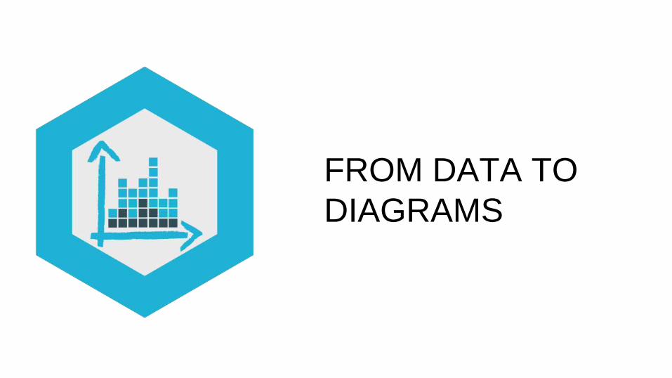
FROM DATA TO
DIAGRAMS
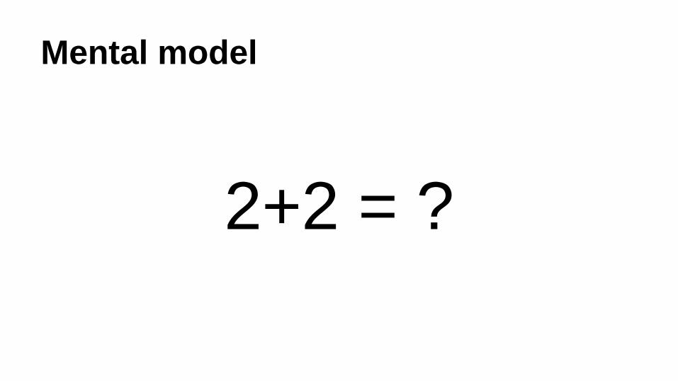
Mental model
2+2 = ?
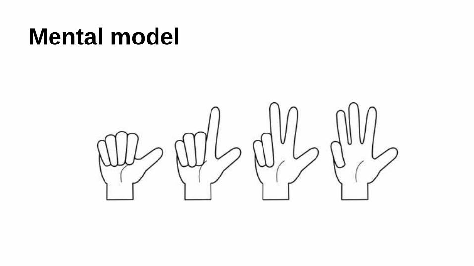
Mental model
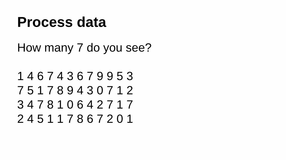
Process data
How many 7 do you see?
1 4 6 7 4 3 6 7 9 9 5 3
7 5 1 7 8 9 4 3 0 7 1 2
3 4 7 8 1 0 6 4 2 7 1 7
2 4 5 1 1 7 8 6 7 2 0 1

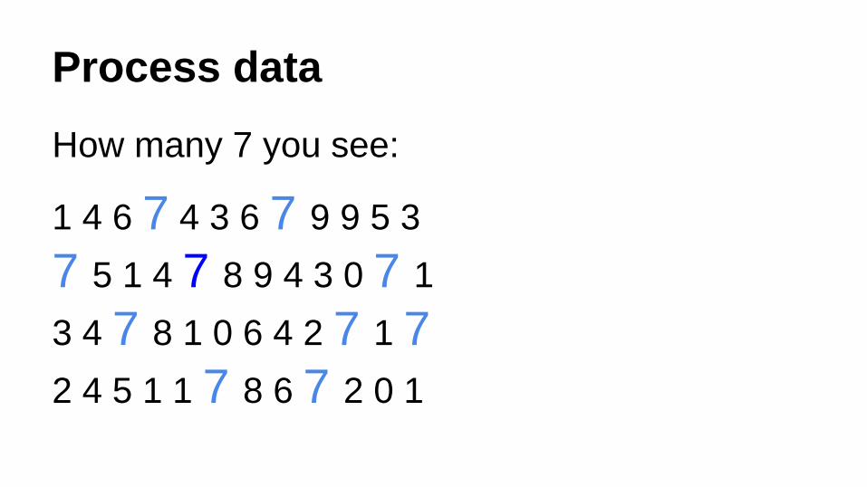
Process data
How many 7 you see:
1 4 6 7 4 3 6 7 9 9 5 3
7 5 1 4 7 8 9 4 3 0 7 1
3 4 7 8 1 0 6 4 2 7 1 7
2 4 5 1 1 7 8 6 7 2 0 1
Process data
How many 7 you see:
1 4 6 7 4 3 6 7 9 9 5 3
7 5 1 4 7 8 9 4 3 0 7 1
3 4 7 8 1 0 6 4 2 7 1 7
2 4 5 1 1 7 8 6 7 2 0 1
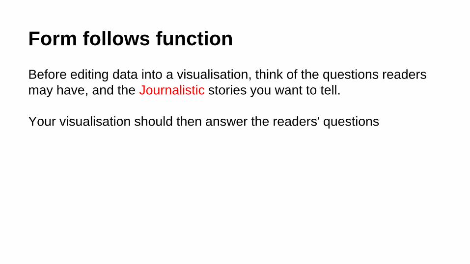
Form follows function
Before editing data into a visualisation, think of the questions readers
may have, and the Journalistic stories you want to tell.
Your visualisation should then answer the readers' questions
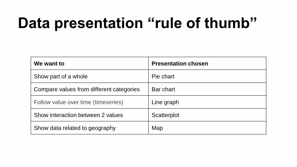
We want to Presentation chosen
Show part of a whole Pie chart
Compare values from different categories Bar chart
Follow value over time (timeseries) Line graph
Show interaction between 2 values Scatterplot
Show data related to geography Map
Data presentation “rule of thumb”
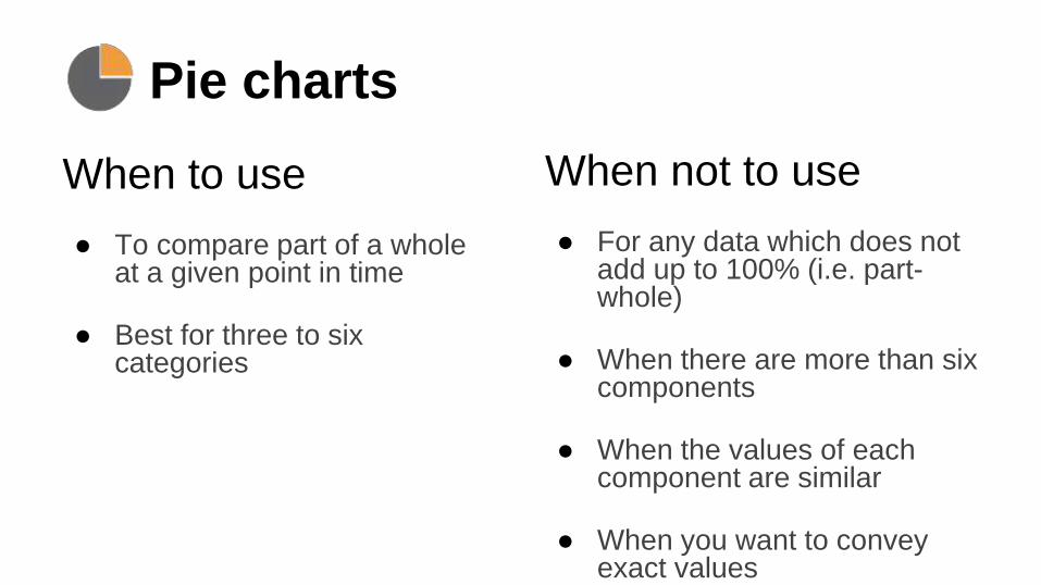
Pie charts
When to use
● To compare part of a whole at a given point in time
● Best for three to six categories
When not to use
● For any data which does not add up to 100% (i.e. part-whole)
● When there are more than six components
● When the values of each component are similar
● When you want to convey exact values
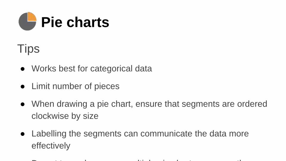
Pie charts
Tips
● Works best for categorical data
● Limit number of pieces
● When drawing a pie chart, ensure that segments are ordered
clockwise by size
● Labelling the segments can communicate the data more
effectively
● Do not try and compare multiple pie charts – use another
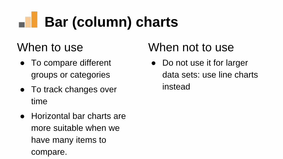
Bar (column) charts
When to use
● To compare different
groups or categories
● To track changes over
time
● Horizontal bar charts are
more suitable when we
have many items to
compare.
When not to use
● Do not use it for larger
data sets: use line charts
instead
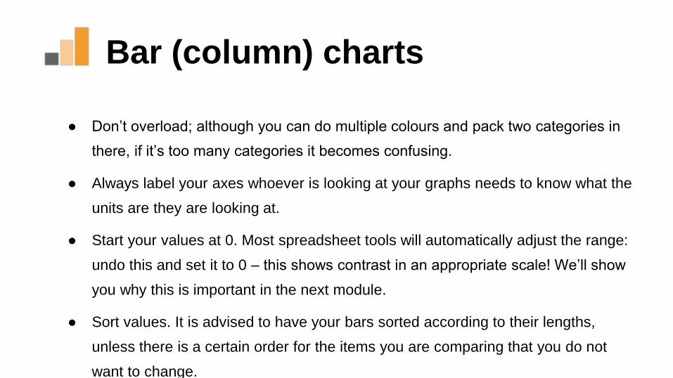
Bar (column) charts
● Don’t overload; although you can do multiple colours and pack two categories in
there, if it’s too many categories it becomes confusing.
● Always label your axes whoever is looking at your graphs needs to know what the
units are they are looking at.
● Start your values at 0. Most spreadsheet tools will automatically adjust the range:
undo this and set it to 0 – this shows contrast in an appropriate scale! We’ll show
you why this is important in the next module.
● Sort values. It is advised to have your bars sorted according to their lengths,
unless there is a certain order for the items you are comparing that you do not
want to change.
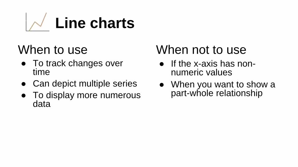
Line charts
When to use● To track changes over
time
● Can depict multiple series
● To display more numerous data
When not to use● If the x-axis has non-
numeric values
● When you want to show a part-whole relationship
Line charts
● Line graphs are ideal for continuous data
● On the y axis we still have our values on the x axis we
have the time measured.
● This graph works best if the time interval between the
measurements is equal (Of course line charts are not
limited to time series).
● Again it’s important, when comparing multiple
categories, to start your y axis with 0.
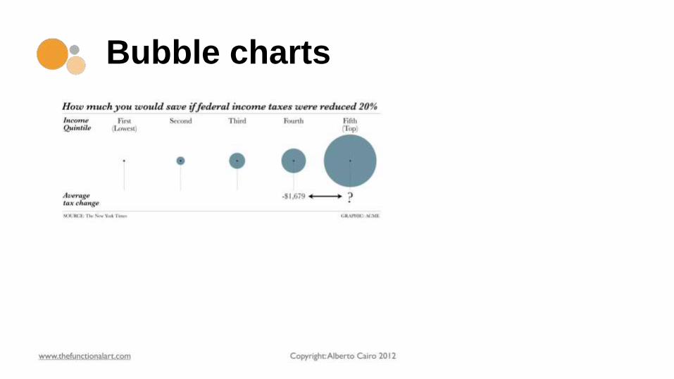
Bubble charts
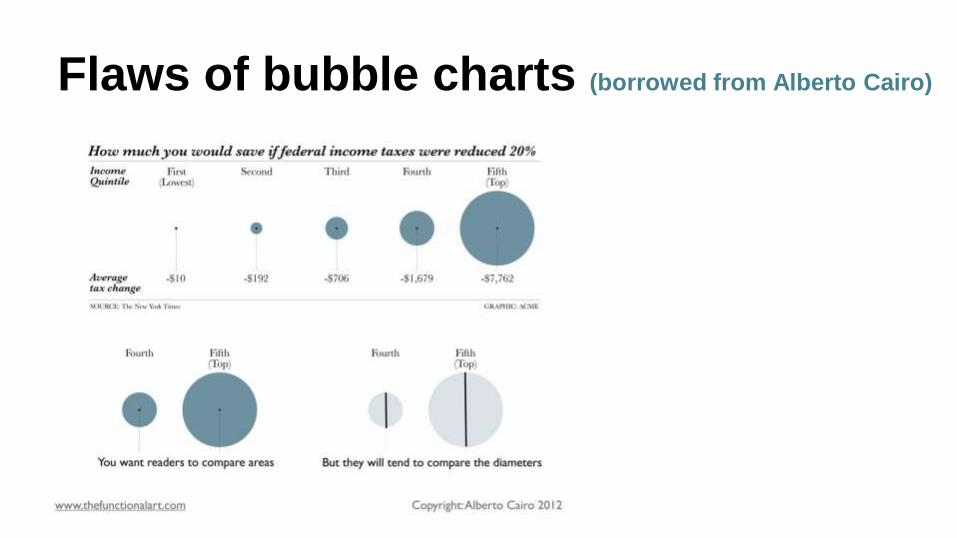
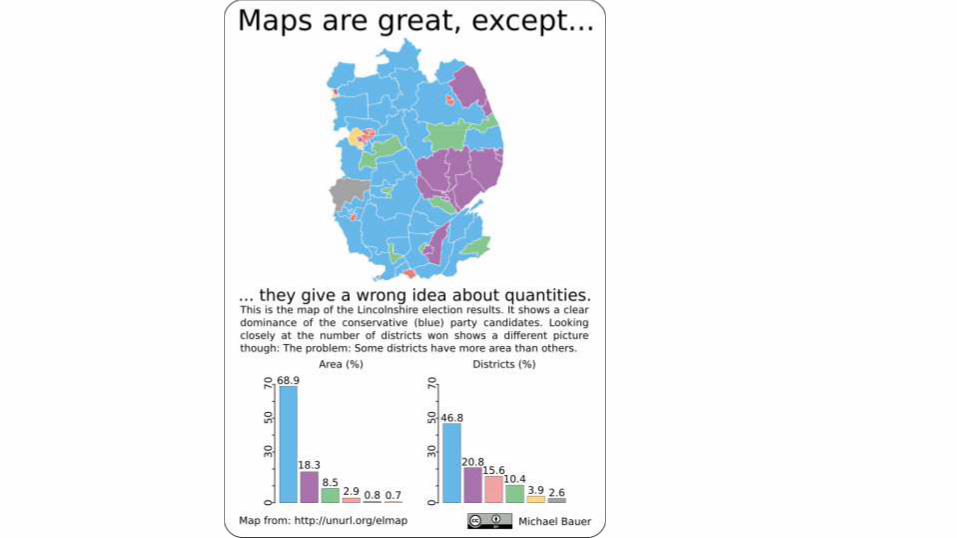
Flaws of bubble charts (borrowed from Alberto Cairo)
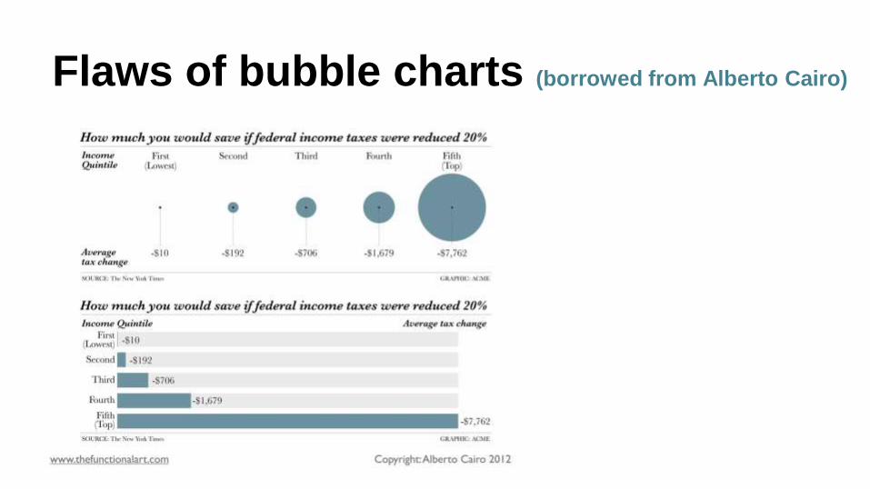
Flaws of bubble charts (borrowed from Alberto Cairo)

Telling a Story
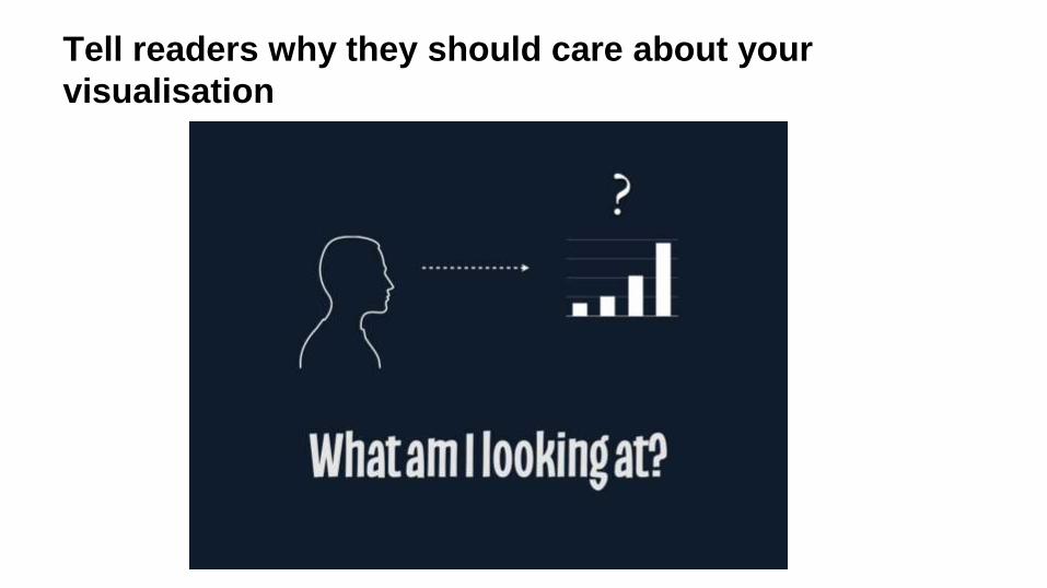
Tell readers why they should care about your
visualisation
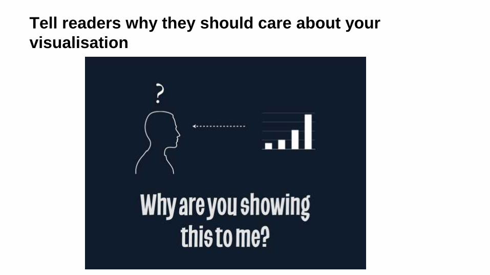
Tell readers why they should care about your
visualisation
Design guidelines
● Use color wisely: http://colorbrewer2.com
http://www.colourlovers.com/
● Keep a consistent style
● Choose one highlight
● Remove junk!
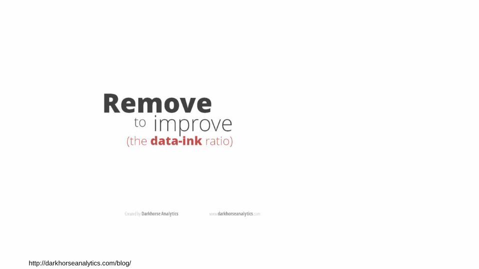
http://darkhorseanalytics.com/blog/