Folio Sheets Your Title Here
7
-
Upload
andrew-gordon -
Category
Documents
-
view
218 -
download
1
description
Sheets for project
Transcript of Folio Sheets Your Title Here
Your Title Here Vision Magazine
Research
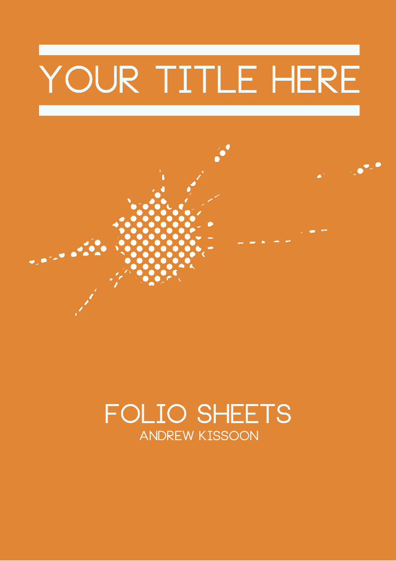
At the begining of this brief we were asked to look at problems and solve them. I began thinking about our course and how we could help expose our work to a larger audience, as most of what we produce is mainly displayed on our blogs and not around the university. My frist initial idea was to create a video documentary which would be shown online. I wanted to show what we do on the course and how we create our work. As i knew what i wanted to present, but wasn’t sure about how i could do it i started doing some visual research. I looked at two books which were visual research and design writing reserach. The booked helped me understand the process i needed in gathering information. The main point i was focusing on, was the fact that graphics work was not shown as much as Fashion is around the university. I needed to hear everyones opinion about this matter before i progressed any further. This led me to create a online voting poll on facebook, which asked student from UCA if Graphics and New Media work is showcased enough. With all the votes saying no i began thinking about producing a magazine instead of a video as i was inspired by the online pdfs that was on the website issuu. I began thikning about the content and wrote a list down on the blog. As the magazine was mainly to showcase work i asked a few students if they would like to display any work that they have done on the course so far.

Your Title Here Vision Magazine
Initial idea
With the magazine as my main idea i started looking at other magazines for inspiration. The magazine that i found helpful and inspiring was the UCA glue magazine which showcases work from all campuses. I generally liked its style as it was very simple and easy to glance through the work. I did feel however that it didnt hold enough information on the course or the students, which was something i was aiming for.I started looking at other graphics magazine like Creative Review, Computer Arts, Art In America etc to get a general understanding on how they put there content together. I was impressed by a few page design i saw. But there were others times i thought didn’t work well, for this research i started taking note of how i wanted to create my magazine. I burrowed a few book from the library which were about designing for magazines, i thought these books were helpful as the explain the structure and how to postion content for the reader to follow. The most important thing i noticed, was that most magazines had a certain theme for instance a colour theme or a certain style of text that would be displayed throught the magazine. I looked at how i could create my own stlye and did a brainstorm of what i could possibly do to create this.

Your Title Here Vision Magazine
Logo Design
The next step was creating the logo for the magazine. I looked at a variety of magazine for inspiration, there was a few that caught my eye like like Little White Lies and Digital Arts. I started looking at dif-ferent typograpghy headings online which influence me to start sketching a few ideas for my logo. The name for the magazine vision came from my old college typography painting. I thought that this name fit in well for the subject of Graphics and New Media. After i was happy with the name i started sketch-ing some logos on paper. Initially i wanted something that was eye catching and that could be identified easily as i think these combinations are important. the majority of my inspirations came from websites like Deviantart and DaFont. I tried to avoid imagery based logos as i didn’t think it would fit in well, i also tired to avoid dark colours and sticked mainly to three light colours. I used blue and white for the magazine main colour, as i think both of these colours go really well together.
Overall im happy with the logo i think it fits in well with what the magazine is about. i also think the choice of colour is appropriate too since i was looking for a bright colour for the magazine’s theme blue fits in well.

Your Title Here Vision Magazine
Layout/Content
After creating the name i looked at gathering the content for my magazine. I was looking to use work from New Media and Graphics. I asked a few people if they were interested in displaying their work for the magazine. I also had to take some photos of students working and around the university in general. I had to write a list of everything i needed to keep myself organised. as each page i was puting in a new image. To give images a professional look i used photoshop to add tone to a few pictures. I decided to collect and organise the content first as it would be much easier to design the layout after. The next stage was organising the layout, i wanted to make the magazine easy to read and i didn’t want to overload the pages with too much information like i’ve seen some graphics magazines do. I took my inspiration from a couple of magazines i research, there were several styles that Digital Arts used that i found interesting. They continously used a image on a whole page and the text on the other. Another source of inspiration comes from the website pentagram. As they have a editorial section filled with vari-ous amounts of magazine designs. It helped me with sorting out the typography, as this is an effective part when desiging a magazine.
Your Title Here Vision Magazine
Development
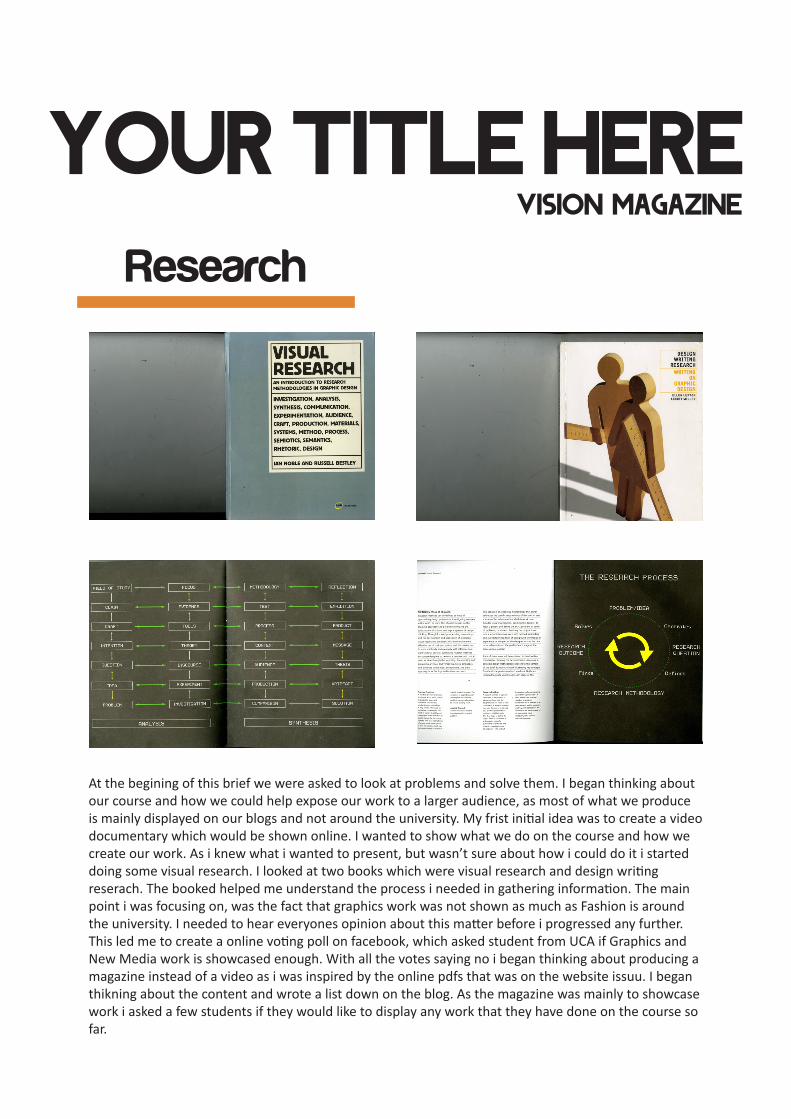
The development for this magazine took a good few weeks, i was constantly changing the layout re-writ-ing articles and changing the images. As this was my first attempt a creating a magazine i learned a fair amount through trail and error. There was certain methods that worked better than others, i found at time i was adding a lot of content to one page squashing it together. I decided on spreading my content out and not necessarily using up all the space on the page. My main aim was to make the content clear and easy for the viewers to read, and as i had limited time to design 40 pages i didn’t want to spend a huge amount of time desiging pages.
The Design for my front cover was inspired by both the Little White Lies magazine and the artist Julian Opie. I wanted to have a Graphic image on the front cover, something that was attractive and stands out. I think its goes well with both the colour and the typography. My first idea for the cover was to create a typography collage using words that relate to graphic design. But i changed my idea due to it becoming complicated and standing out more that the logo did. The research i’ve done on magazine covers have helped me design mine. I was always looking to make the cover simple yet effective.

Your Title Here Vision Magazine
Outcome
For the final outcome i am genrally happy with what i have produce in a short time period. i think its a good attempt for my first magazine. There still a lot that i think could have been put in the magazine but didn’t due to the fact that i need people’s cooporation which i didn’t get much of as everyone had a pile of work on their hands to deal with. Also in terms of designing i now know what i can do to improve layouts and typograghy. Since the magazine was made to showcase work and inform people, i believe that it has done its job and that people from outside the course would understand a little bit more about Graphic Design. Overall i think its more indepth than Glue which was my initial aim. But i would also mention that a lot more student work is needed. I think by doing this it has opened my eyes on how designs are made, especially layouts for magazine and how the arrangements for image and typograpghy is im-portant for any magazine. I decided to do this as i’ve always wanted to try designing a maga-zine since the start of university, but more towards the photgrapghy side rather than focusing on student work. Overall i think the research has helped me understand important aspects of design, i feel more confident if i was to create another magazine and not hesitate to experi-ment and try new things, unlike before, as i was always afraid how it would look.