Five Secrets for Building Fierce Dashboardsanalytics.ncsu.edu/sesug/2016/RV-185_Final_PDF.pdfFive...
10
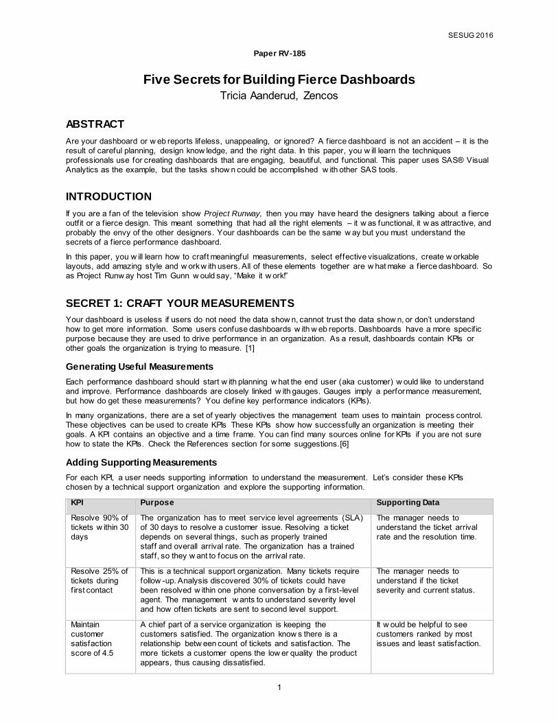
SESUG 2016 1 Paper RV-185 Five Secrets for Building Fierce Dashboards Tricia Aanderud, Zencos ABSTRACT Are your dashboard or w eb reports lifeless, unappealing, or ignored? A fierce dashboard is not an accident – it is the result of careful planning, design know ledge, and the right data. In this paper, you w ill learn the techniques professionals use for creating dashboards that are engaging, beautiful, and functional. This paper uses SAS® Visual Analytics as the example, but the tasks show n could be accomplished w ith other SAS tools. INTRODUCTION If you are a fan of the television show Project Runway, then you may have heard the designers talking about a fierce outfit or a fierce design. This meant something that had all the right elements – it w as functional, it w as attractive, and probably the envy of the other designers. Your dashboards can be the same w ay but you must understand the secrets of a fierce performance dashboard. In this paper, you w ill learn how to craft meaningful measurements, select effective visualizations, create w orkable layouts, add amazing style and w ork w ith users. All of these elements together are w hat make a fierce dashboard. So as Project Runw ay host Tim Gunn w ould say, “Make it w ork!” SECRET 1: CRAFT YOUR MEASUREMENTS Your dashboard is useless if users do not need the data show n, cannot trust the data show n, or don’t understand how to get more information. Some users confuse dashboards w ith w eb reports. Dashboards have a more specific purpose because they are used to drive performance in an organization. As a result, dashboards contain KPIs or other goals the organization is trying to measure. [1] Generating Useful Measurements Each performance dashboard should start w ith planning w hat the end user (aka customer) w ould like to understand and improve. Performance dashboards are closely linked w ith gauges. Gauges imply a perfor mance measurement, but how do get these measurements? You define key performance indicators (KPIs). In many organizations, there are a set of yearly objectives the management team uses to maintain process control. These objectives can be used to create KPIs These KPIs show how successfully an organization is meeting their goals. A KPI contains an objective and a time frame. You can find many sources online for KPIs if you are not sure how to state the KPIs. Check the References section for some suggestions.[6] Adding Supporting Measurements For each KPI, a user needs supporting information to understand the measurement. Let’s consider these KPIs chosen by a technical support organization and explore the supporting information. KPI Purpose Supporting Data Resolve 90% of tickets w ithin 30 days The organization has to meet service level agreements (SLA) of 30 days to resolve a customer issue. Resolving a ticket depends on several things, such as properly trained staff and overall arrival rate. The organization has a trained staff, so they w ant to focus on the arrival rate. The manager needs to understand the ticket arrival rate and the resolution time. Resolve 25% of tickets during first contact This is a technical support organization. Many tickets require follow -up. Analysis discovered 30% of tickets could have been resolved w ithin one phone conversation by a first-level agent. The management w ants to understand severity level and how often tickets are sent to second level support. The manager needs to understand if the ticket severity and current status. Maintain customer satisfaction score of 4.5 A chief part of a service organization is keeping the customers satisfied. The organization know s there is a relationship betw een count of tickets and satisfaction. The more tickets a customer opens the low er quality the product appears, thus causing dissatisfied. It w ould be helpful to see customers ranked by most issues and least satisfaction.
Transcript of Five Secrets for Building Fierce Dashboardsanalytics.ncsu.edu/sesug/2016/RV-185_Final_PDF.pdfFive...
SESUG 2016
1
Paper RV-185
Five Secrets for Building Fierce Dashboards Tricia Aanderud, Zencos
ABSTRACT
Are your dashboard or w eb reports lifeless, unappealing, or ignored? A f ierce dashboard is not an accident – it is the result of careful planning, design know ledge, and the right data. In this paper, you w ill learn the techniques professionals use for creating dashboards that are engaging, beautiful, and functional. This paper uses SAS® Visual Analytics as the example, but the tasks show n could be accomplished w ith other SAS tools.
INTRODUCTION
If you are a fan of the television show Project Runway, then you may have heard the designers talking about a f ierce outf it or a f ierce design. This meant something that had all the right elements – it w as functional, it w as attractive, and probably the envy of the other designers. Your dashboards can be the same w ay but you must understand the secrets of a f ierce performance dashboard.
In this paper, you w ill learn how to craft meaningful measurements, select effective visualizations, create w orkable layouts, add amazing style and w ork w ith users. All of these elements together are w hat make a f ierce dashboard. So as Project Runw ay host Tim Gunn w ould say, “Make it w ork!”
SECRET 1: CRAFT YOUR MEASUREMENTS
Your dashboard is useless if users do not need the data show n, cannot trust the data show n, or don’t understand how to get more information. Some users confuse dashboards w ith w eb reports. Dashboards have a more specif ic purpose because they are used to drive performance in an organization. As a result, dashboards contain KPIs or other goals the organization is trying to measure. [1]
Generating Useful Measurements
Each performance dashboard should start w ith planning w hat the end user (aka customer) w ould like to understand and improve. Performance dashboards are closely linked w ith gauges. Gauges imply a performance measurement, but how do get these measurements? You define key performance indicators (KPIs).
In many organizations, there are a set of yearly objectives the management team uses to maintain process control. These objectives can be used to create KPIs These KPIs show how successfully an organization is meeting their goals. A KPI contains an objective and a time frame. You can f ind many sources online for KPIs if you are not sure how to state the KPIs. Check the References section for some suggestions.[6]
Adding Supporting Measurements
For each KPI, a user needs supporting information to understand the measurement. Let’s consider these KPIs chosen by a technical support organization and explore the supporting information.
KPI Purpose Supporting Data
Resolve 90% of tickets w ithin 30 days
The organization has to meet service level agreements (SLA) of 30 days to resolve a customer issue. Resolving a ticket depends on several things, such as properly trained staff and overall arrival rate. The organization has a trained staff, so they w ant to focus on the arrival rate.
The manager needs to understand the ticket arrival rate and the resolution time.
Resolve 25% of tickets during f irst contact
This is a technical support organization. Many tickets require follow -up. Analysis discovered 30% of tickets could have been resolved w ithin one phone conversation by a f irst-level agent. The management w ants to understand severity level and how often tickets are sent to second level support.
The manager needs to understand if the ticket severity and current status.
Maintain customer satisfaction score of 4.5
A chief part of a service organization is keeping the customers satisf ied. The organization know s there is a relationship betw een count of tickets and satisfaction. The more tickets a customer opens the low er quality the product appears, thus causing dissatisf ied.
It w ould be helpful to see customers ranked by most issues and least satisfaction.
Fiv e Secrets for Building Fierce Dashboards, continued SESUG 2016
2
Using Actionable Data
Once you know the requirement measurements, you can w ork on creating actionable data for your dashboard. Actionable data has three characteristics: appropriate, correct, and timely.
You have to ensure that the required data for the above KPIs exists. Many organizations reach a barrier w hen they realize they do not have the appropriate data for their measurements. At this point, the organization may need to implement more serious tools. It is also possible that much of the data is available but some is not automated. For some measurements on your dashboard, you might need to get creative w ith how the data is accessed. There’s nothing w rong w ith having a spreadsheet manually updated monthly to include in the dashboard.
The data has to be correct. The counting rules should be defined and understood w ithin the organization. Management has to agree on w hat constitutes the success of the measurement. The data must be accurate particularly if you consider someone’s job performance may be based on w hat you present.
A w orse situation occurs w hen the data is not refreshed often or it is so inaccurate that no one looks at the dashboard. This may be the number 1 killer of a f ierce dashboard – essentially the dashboard is not useable. If the data is frequently inaccurate, then it can cause some political issues in the organization. If employees have their performance review s based on this data, they w ill get testy if it’s w rong. If the data sets are refreshed yearly for a monthly dashboard, then no one really needs it after January.
SECRET 2 – INDICATORS AMP YOUR DATA
When show ing data, you have to determine the best w ay to deliver your message. Here’s some suggestions on how to show KPIs, trends, and breakouts. You have to choose the right indicators or your message may be lost. There are sometimes several methods available to show the data – your job is to the pick the best one.
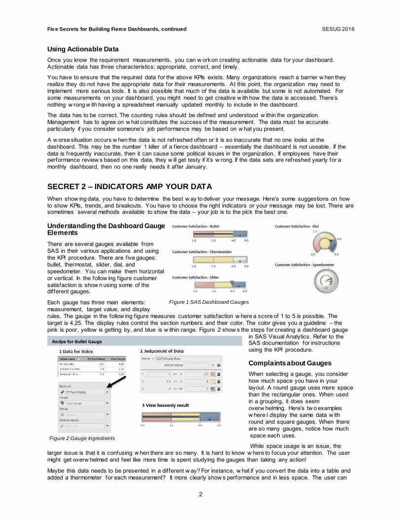
Understanding the Dashboard Gauge Elements There are several gauges available from SAS in their various applications and using the KPI procedure. There are f ive gauges: bullet, thermostat, slider, dial, and speedometer. You can make them horizontal or vertical. In the follow ing f igure customer satisfaction is show n using some of the different gauges.
Each gauge has three main elements: measurement, target value, and display rules. The gauge in the follow ing f igure measures customer satisfaction w here a score of 1 to 5 is possible. The target is 4.25. The display rules control the section numbers and their color. The color gives you a guideline – the pink is poor, yellow is getting by, and blue is w ithin range. Figure 2 show s the steps for creating a dashboard gauge
in SAS Visual Analytics. Refer to the SAS documentation for instructions using the KPI procedure.
Complaints about Gauges
When selecting a gauge, you consider how much space you have in your layout. A round gauge uses more space than the rectangular ones. When used in a grouping, it does seem overw helming. Here’s tw o examples w here I display the same data w ith round and square gauges. When there are so many gauges, notice how much space each uses.
While space usage is an issue, the larger issue is that it is confusing w hen there are so many. It is hard to know w here to focus your attention. The user might get overw helmed and feel like more time is spent studying the gauges than taking any action!
Maybe this data needs to be presented in a different w ay? For instance, w hat if you convert the data into a table and added a thermometer for each measurement? It more clearly show s performance and in less space. The user can
Figure 1 SAS Dashboard Gauges
Figure 2 Gauge Ingredients

Fiv e Secrets for Building Fierce Dashboards, continued SESUG 2016
3
see quickly that only three airlines meet the criteria. Now there is a new issue – is the target too high? But now w e are focused on the data instead of the layout.
Figure 3 Gauge Layout Considerations
Showing Trends in the Data
Dashboards can be used to reveal trends. For KPI 1, the managers w ant to know how often the team falls below the line. They can understand if this trend just started occurring or is a continuing trend. A line chart allow s you to show trends because it measures the value at regular intervals. You w ant the intervals to make sense for your dashboard. If the dashboard is intended to show daily progress it w ouldn’t make sense to show the trend at yearly level.
Figure 4 Show trending with line charts
Showing the Breakdown
Bar charts allow you to show how the category breaks out. For a technical support organization, it is important to know the severity of the trouble tickets since you react differently to each. The manager could understand w hy responsiveness w as low er if she saw that most of the tickets from the previous day w ere a crit ical severity. Likew ise, if the manager sees an increase in unresolved minor tickets, she may understand there is a new tech support agent w ho is having training issues or cannot keep up.
Figure 5 Using Bar Charts

Fiv e Secrets for Building Fierce Dashboards, continued SESUG 2016
4
Bar charts can also allow you to rank elements so the manager can see w hat is driving an issue. In the follow ing f igure, it is relevant that customer CX_0044 has the most open tickets and the low est level of satisfaction. This gives the manager a signal to investigate this customer. Both of these charts used ranking – one counts the top 5 w hile other ranks the bottom 5.
Figure 6 Using Ranking with Horizontal Bar Charts
Combining Data Objects
In some cases, it may make sense to combine data objects. The dual bar-line chart show s a trend w ith the category count. You can see in the follow ing f igure there is a relationship w ith the on-time resolution and the ticket arrival rate. When arrival rises, responsiveness low ers.
Figure 7 Using a Bar Line Chart
There are other data objects that combine measurements, such as a targeted bar chart. This chart show s the sales rep actual sales to target. This object is similar to a gauge but it allow s you to see more data at once.
Figure 8 Targeted Bar Chart
SECRET 3 – YES, LAYOUT MATTERS
Once you know the measurements you w ant to use and the objects you w ant to display, you can place these items on a page. Most dashboards are displayed on a w eb page. Use w ebpage design principals w hen creating your dashboard.
Key layout principals
The layout must emphasize w hat is important about the information. There are tw o layout design ideas frequently mentioned w hen you study w eb design: Gestalt and F-Pattern layout. Web design is a deep f ield of study and this paper is addressing the topic at a high level.

Fiv e Secrets for Building Fierce Dashboards, continued SESUG 2016
5
Your Brain Likes to Understand Data Objects as Group
Many designers refer to Gestalt Principals w hen discussing layout. During the 1920s German psychologists described how humans organize visual information. These f indings are referred to as the Gestalt Principals. These principals discuss how the mind tries to make sense of a group of objects – such as graphs on a page. [2]
Figure 9 Your eyes are trained
When you violate these principals, your user is confused and doesn’t w ant to interact w ith your dashboard. When designing the layout, think about how the user groups items just based on how they look or in some cases – add things that are not there.
F-Pattern Layout Supports Your Scanning Users
When you look at a w eb page, your eye has a tendency to view it in a particular pattern. You scan across the page, dow n the page, and at some point across the page again. It is in the pattern of an F or an E. That is an interesting scientif ic f inding but w hat does that really have to do w ith your dashboard? [4]
Note that besides telling you about the pattern I also used the w ord scan. When a user f irst visits your dashboard, most likely they are not going to read all the text f irst. They are going to scan to understand w hat goes together and learn the quickest w ay to use the dashboard.
You can exploit this pattern to improve the dashboard usability. Design the layout w here the user expects to f ind things. In the follow ing layout, the controls are across the top of the page and in the center of the page, there are more controls. It’s an E-pattern or F-pattern, right?
Account for Interactivity within the Tool
If the tool is interactive or you intend to add programming to assist w ith interactivity, then determine how you can use it. How w ill users identify pathw ays or understand more information is available. In some case it is obvious. You might have controls on the page like a drop-dow n list, buttons, or a slider. The user understands these objects control other objects. Consider carefully w here these items are placed on the page.
In the follow ing example, the trend chart controls the charts beneath it. For each point on the trend chart, the user clicks to the see top sales for that month. The user can also explore by regional area or product area.
Figure 10 Exploiting a User's Laziness
Figure 11Interactivity creates a smaller layout, but user rich
experience

Fiv e Secrets for Building Fierce Dashboards, continued SESUG 2016
6
Sketch, Wireframe, Boom!
You may have a lot of ideas for the layout at this point. Start sketching your ideas on paper. Force yourself to think of three or more layouts. In the end, you may like your f irst design the best but you w ill learn from each iteration. You w ill be tempted to skip this step – but don’t. This step forces you to think of the measurements and w hat you are trying to communicate.
This is the time to organize the KPIs and other information you have. You w ant to place information in logical groupings and the measurements that support those groupings. Here’s the chance to apply your Gestalt principles! It’s also time to think about w hat each measurement is trying to express. Does a trend chart w ork better or does treemap help the user more? Try it out on paper.
Figure 12 Sketch your ideas
After the sketching, you can use a tool like MS Visio to draw w ireframes. Wireframes help your customer (or boss) understand how you plan to layout all of the information. Use arrow s to show how you intend the user to move betw een the sections and w here interactions are going to be. It’s easier to untangle an ineffective design at this stage and to get feedback from your end user.
Figure 13 Wireframes show the pathways

Fiv e Secrets for Building Fierce Dashboards, continued SESUG 2016
7
SECRET 4: BETTER HAVE SOME STYLE
Style is w hat makes users w ant to look at your dashboard. You w ant the dashboard to be functional and attractive.
Don’t Let Your Font Betray Your Message
There are hundreds of font choices. Fonts can be assigned to four broad categories: serif, sans serif, script, and decorative. A serif font has a small line on the ends. Sans-serif means the line is not there. Script looks like cursive handw riting. Decorative are those fonts that have a fun element.
Figure 14 Font styles
Many studies have been conducted on fonts and readability. The general conclusion is serif fonts are easier to read as text because of the serifs.[5] The serif guides the eye across the page. Other considerations for readability are the font size and w idth. Arial Narrow is considered one of the w orse fonts for readability mainly due to it’s narrow size and lack of serifs. Many designers uses a sans-serif font for headings and serif for body type. In a dashboard, there is not a lot of space. You w ant your data visualizations to be the star not the headings.
Fonts communicate subtle messages about your design. Look at the follow ing fonts and consider the subtle messages each is providing. Consider how each of these fonts w ould appear on a dashboard and how it might change your message. For instance, do you really w ant Comic Sans to show your dismal sales f igures? It might give an impression of “the company is sinking and the report builder f inds that comical!”
Figure 15 Fonts have hidden meanings
You’ll Need a Color palette
As w ith fonts, color is another element of style. And just like fonts, colors communicate meaning as w ell. SAS offers many pre-chosen styles or palettes that w ork w ell. You may w ant to distinguish your dashboard from others. Color is an easy w ay to do that.
There are many w ebsites that can assist w ith selecting a palette and others that suggest them. It is hard to select an aesthetically pleasing and effective palette. Sometimes the end user w ill insist on their corporate colors and if so then you are stuck. How ever, if the dashboard remains internal to the company they may not feel as strongly.
Here’s the guidelines to consider as you select your palette:
Use a neutral background that allow s your data to be the star. Neutral can be gray, beige, light blue, black, or w hite.
Select f ive colors that provide enough contrast that you can distinguish them in a bar or line chart. You w ill w ant to try them in a few charts as w ell.
A softer palette w orks better. A sharp palette may be too shocking or hard to understand distinguish w ithout a darker background.
When show ing treemaps or other data objects that show a difference, use a gradient value of a color. Users can better understand something going from light to dark as a scale. One end of the scale is good and the other end is bad or vice versa.

Fiv e Secrets for Building Fierce Dashboards, continued SESUG 2016
8
Here’s a few suggested palettes w ith their palettes and fonts. These are just some examples of how you might w ant to use palettes. Each one has a different f lavor and tone. Your main consideration should be does it hide my data.
Background: White Product A: Fire Engine Red Product B: Dark Teal Product C: Bright Pink Product D: Gold Product E: Dark Brow n Font: Calibri
Background: Dark Gray Product A: Light Blue Product B: Dark Green Product C: Dark Blue Product D: Seafoam Green Product E: Medium Yellow Font: Cambria
Figure 16 Suggested Dashboard Color Palettes
Refer to Color Speaks Louder Than Words in the References section for another interesting discussion about color and how it is applied.
Design Thinking: Let the Data Talk
The most successful dashboards use a clean, minimal look. As Edw ard Tufte w ould direct us, “Let the data talk”. Avoid using logos or other decorative elements on your page. You must careful that your design choices do not upstage the data or distract your user from understanding the main messages.
Some tips for keeping your design clean:
If your dashboard is internal to the organization, there is little reason to have the logo on it. If it’s required to be there, keep it small and near the right top.
Add a title section to your dashboard that contains any supporting information the users need to access the dashboard or handle any housekeeping topics. This might be useful for new users or people questioning w hen the data is updated or how the charts are prepared.
Use an info w indow that can pop-up and contain information. In the follow ing f igure, this info w indow contains the counting rules for the section and some information about the data preparation.
SECRET 5: USER ADOPTION IS IMPORTANT
If you build a dashboard and no one uses it, it is frustrating. The main reason this situation occurs is because the users do not f ind the dashboard useful. It may be because the dashboard contains measurements that no one uses. Or the data used w ithin the dashboard is inaccurate. It’s also possible that the dashboard is too diff icult to use. Many of these symptoms point to a designer w ho didn’t w ork w ith the end user.
The only time you should build a dashboard alone is w hen you are prototyping an idea. Many managers do not realize the value of a dashboard until they can see a w orking model. After view ing the model, they begin to understand the value. You can then have a conversation w ith the managers about w hat is happening in their organizations that is going w rong. The so-called pain points. You w ant to know about the pain points because this is w here the opportunity for change and process control present itself.
As you build the dashboard, you w ant to present layout ideas to the end user. This allow s the team to become excited about w hat you are doing and guide you to help them get the best end result. Even after you f inish the dashboard, it is a good idea to w atch the users interact w ith it. You w ant to ensure they are able to understand the information pathw ays and how to answ er the questions they have.
While some dashboards may be needed for a short time period, most dashboards are used for several years w ithin organizations. This doesn’t mean the content does change or the KPIs. Ensure you have documented your proces s w ell enough for someone else to pick it up.

Fiv e Secrets for Building Fierce Dashboards, continued SESUG 2016
9
CONCLUSION
One of my favorite quotes is from John Ruskin, “Quality is never an accident, it alw ays the result of intelligent effort.” Nothing could be truer w hen creating a dashboard. All of the elements discussed in this paper must be given proper consideration for the end result to be useful.
An attractive, useable dashboard draw s users to the data. Providing interactivity encourages them to explore and learn w hat the data is telling them about their organization. How ever, a pretty dashboard is not enough. The metrics must be of value and presented in an understandable w ay.
REFERENCES
[1] Aanderud, T and Homes, M. 2014. “SAS® Admins Need a Dashboard, Too” Proceedings of SAS Global Forum 2014, Washington, DC: SAS Global Forum. Available at: http://support.sas.com/resources/papers/proceedings14/1247-2014.pdf
[2] Tuck, Michael. “Gestalt Principals Applied in Design”. Six Revisions. August 2010. Available at: http://sixrevisions.com/w eb_design/gestalt-principles-applied- in-design/
[3] Thompson, J 2016. “Color Speaks Louder Than Words”. Proceedings of Southeastern SAS Users Conference, 2016, Bethesda, MA: SESUG.
[4] Jones, B 2012. Understanding the F-Layout in Web Design, March 7 2012. Available at: http://w ebdesign.tutsplus.com/articles/understanding-the-f-layout-in-w eb-design--w ebdesign-687.
[5] Parker, R. 2006. Looking Good in Print (6th Edition), Scotsdale, AZ, Paraglyph Press.
[6] Aanderud, T. “Adding Dashboard Indicators w ith a SAS Stored Process”. BI Notes for SAS Users Blog. Available at: http://bi-notes.com/2011/11/sas-bi-w eb-report-studio-dashboard/
RECOMMENDED READING
Few , S. 2012. Show Me the Numbers: Designing Tables and Graphs to Enlighten (2nd Edition). Burlingname, CA Analytics Press.
Few , S. 2013. Information Dashboard Design: Displaying Data for At-a-Glance Monitoring, Second Edition. Burlingame, CA, Analytics Press.
Tufte, E. 2001. The Visual Display of Quantitative Information. Chesire, CT: Graphics Press.
La Grouw ,Gail. 2012. Effective Dashboard Design: Design Secrets to Getting More Value from Performance
Dashboards. Scotts Valley, CA : CreateSpace Independent Publishing Platform
KPI Library, Available at: http://w w w.kpilibrary.com
SmartKPIs.com, Available at: http://smartkpis.kpiinstitute.org/
Blogs Related to Topic
BI Notes for SAS Users, Available at: http://w w w.bi-notes.com
Zencos Blog, Available at: http://w w w.zencos.com/blog
Fiv e Secrets for Building Fierce Dashboards, continued SESUG 2016
10
ACKNOWLEDGEMENTS
Thanks to the Zencos DataViz team for reading the draft multiple times and providing suggestions. Also thanks to Chris Battiston for some pre-reads. Any errors and omissions are my ow n.
CONTACT INFORMATION
Your comments and questions are valued and encouraged. Contact the author at:
Tricia Aanderud Zencos [http://w w w.zencos.com] Cary, NC [email protected]
SAS and all other SAS Institute Inc. product or service names are registered trademarks or trademarks of SAS Institute Inc. in the USA and other countries. ® indicates USA registration.
Other brand and product names are trademarks of their respective companies.