Firefly™ Analysis Workbench user guide -...
67
Discover more at abcam.com Firefly™ Analysis Workbench user guide Contents GUI navigation……………………………. 1 Bargraph………………………………..…. 2 Clear button……………………………….. 3 Sample/probe clustering…………………. 4 Data processing pipeline…………………. 6 Data sets……………………………..……. 8 Data statistics………………………..……. 11 Experiment………………………..………. 13 New experiment button…….……………. 14 Experimental table…………………..……. 15 Export button……………………...………. 16 Flow cytometer data……………...………. 17 FWS file……………………………………. 18 geNorm algorithm and probe stability.…. 19 Heatmap pane……………………………. 20 Limit of detection…………………………. 23 Load button…………………………….…. 24 Menus……………………………………... 25 Negative button……………………..……. 26 Normalization…………………..…………. 27 Normalization button……..………………. 31 PLX file……………………………………. 32 Pair plots……………………….…………. 33 Plate………………………………………. 34 Plate view………………………………. 35 Probe table………………………………. 38 Bargraph…………………………………. 39 Firefly™ Discovery Engine…………….. 40 Replicate merging………………………. 41 Replicate pooling………………………... 42 Sample, probes, variables……..………. 43 Sample quality………………..…………. 44 Sample sheet……………………………. 45 Sample table…………………………….. 46 Bargraph…………………………………. 47 Selection…………………………………. 48 Significance………………………...……. 50 Special variables………..………………. 51 Table……………………………..………. 52 Variable…………………………….……. 53 Variable analysis…………..……………. 54 Differential analysis………..……………. 57 Variable data chart………………………. 58 Variable data table………………………. 59 Defining variables……………..…………. 60 Anova repeated samples..………………. 61 Variable table………………………..……. 63 Volcano plot………………………………. 64 Chart controls……………..………..…….. 65 References…………………….…………. 66
Transcript of Firefly™ Analysis Workbench user guide -...

Discover more at abcam.com
Firefly™ Analysis Workbench user guide Contents GUI navigation……………………………. 1 Bargraph………………………………..…. 2 Clear button……………………………….. 3 Sample/probe clustering…………………. 4 Data processing pipeline…………………. 6 Data sets……………………………..……. 8 Data statistics………………………..……. 11 Experiment………………………..………. 13 New experiment button…….……………. 14 Experimental table…………………..……. 15 Export button……………………...………. 16 Flow cytometer data……………...………. 17 FWS file……………………………………. 18 geNorm algorithm and probe stability.…. 19 Heatmap pane……………………………. 20 Limit of detection…………………………. 23 Load button…………………………….…. 24 Menus……………………………………... 25 Negative button……………………..……. 26 Normalization…………………..…………. 27 Normalization button……..………………. 31 PLX file……………………………………. 32 Pair plots……………………….…………. 33 Plate………………………………………. 34 Plate view………………………………. 35
Probe table………………………………. 38 Bargraph…………………………………. 39 Firefly™ Discovery Engine…………….. 40 Replicate merging………………………. 41 Replicate pooling………………………... 42 Sample, probes, variables……..………. 43 Sample quality………………..…………. 44 Sample sheet……………………………. 45 Sample table…………………………….. 46 Bargraph…………………………………. 47 Selection…………………………………. 48 Significance………………………...……. 50 Special variables………..………………. 51 Table……………………………..………. 52 Variable…………………………….……. 53 Variable analysis…………..……………. 54 Differential analysis………..……………. 57 Variable data chart………………………. 58 Variable data table………………………. 59 Defining variables……………..…………. 60 Anova repeated samples..………………. 61 Variable table………………………..……. 63 Volcano plot………………………………. 64 Chart controls……………..………..…….. 65 References…………………….…………. 66

GUI navigation The GUI elements are labeled in the following image:
Discover more at abcam.com 1 of 67
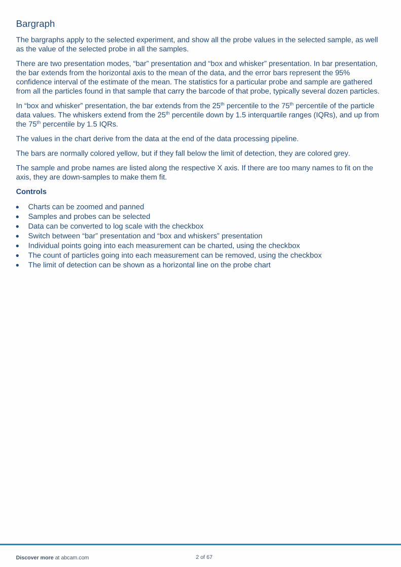
Bargraph The bargraphs apply to the selected experiment, and show all the probe values in the selected sample, as well as the value of the selected probe in all the samples.
There are two presentation modes, “bar” presentation and “box and whisker” presentation. In bar presentation, the bar extends from the horizontal axis to the mean of the data, and the error bars represent the 95% confidence interval of the estimate of the mean. The statistics for a particular probe and sample are gathered from all the particles found in that sample that carry the barcode of that probe, typically several dozen particles.
In “box and whisker” presentation, the bar extends from the 25th percentile to the 75th percentile of the particle data values. The whiskers extend from the 25th percentile down by 1.5 interquartile ranges (IQRs), and up from the 75th percentile by 1.5 IQRs.
The values in the chart derive from the data at the end of the data processing pipeline.
The bars are normally colored yellow, but if they fall below the limit of detection, they are colored grey.
The sample and probe names are listed along the respective X axis. If there are too many names to fit on the axis, they are down-samples to make them fit.
Controls
• Charts can be zoomed and panned • Samples and probes can be selected • Data can be converted to log scale with the checkbox • Switch between “bar” presentation and “box and whiskers” presentation • Individual points going into each measurement can be charted, using the checkbox • The count of particles going into each measurement can be removed, using the checkbox • The limit of detection can be shown as a horizontal line on the probe chart
Discover more at abcam.com 2 of 67
Clear button All data and experiments are removed from the workspace.
Discover more at abcam.com 3 of 67

Sample/probe clustering In the heatmap, samples and probes can be clustered according to their similarity to one another. Comparing two probes, if their sample-to-sample variation is similar, the probes are considered to be "close".
Comparing two samples, if the pattern of highly expressed and lightly expressed probes is similar, the samples are considered to be "close".
Clusters of "similar" probes are progressively assembled by first putting every probe into its own cluster, and then repeatedly linking the two clusters at each stage which are most similar to each other. When the last two clusters are linked, the pattern of links forms a binary tree.
The branches of the tree are an indication of how closely linked the two nodes are; short branches are tight connections, as shown in the following comparison.
a. Samples are not close to one another b. Samples are closely related to one another The ideas of similarity between probes or samples are captured mathematically as a “distance matrix”, which measures the distance of each probe to each other probe (ab np x np matrix) and each sample to each other sample (an ns x ns matrix). The distance between probes can be measured in a variety of ways. • The simplest distance metric is the root mean square difference between the data in the different samples. If
the probe P has values P1, P2, P3, P4 … in the different samples, and the probe Q has values Q1, Q2, Q3, Q4 … in the different samples, the RMS distance between probes P and Q is √ (P1-Q1)2+(P2-Q2)2+… The distances in the RMS metric start at 0 and are in the units of data.
• The Pearson distance is based on the Pearson correlation coefficient between probes P and Q, and is defined as 1-√ R2 so that probes that are well correlated have distance 0, and the maximum distance is 1.
• The choice of metric depends on what data is being analysed. If the data in the heatmap is expression level, Pearson may bay be the most suitable choice. The RMS metric tends to treat all highly expressed probes as similar to one another, and all weakly expressed probes as similar to one another. If the data in the heatmap is fold-change, then either metric is suitable, since all data are relative. The default heat map is fold-change and the default metric is RMS.
Discover more at abcam.com 4 of 67
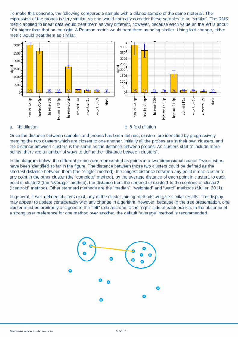
To make this concrete, the following compares a sample with a diluted sample of the same material. The expression of the probes is very similar, so one would normally consider these samples to be “similar”. The RMS metric applied to linear data would treat them as very different, however, because each value on the left is about 10X higher than that on the right. A Pearson metric would treat them as being similar. Using fold change, either metric would treat them as similar.
a. No dilution b. 8-fold dilution
Once the distance between samples and probes has been defined, clusters are identified by progressively merging the two clusters which are closest to one another. Initially all the probes are in their own clusters, and the distance between clusters is the same as the distance between probes. As clusters start to include more points, there are a number of ways to define the “distance between clusters”.
In the diagram below, the different probes are represented as points in a two-dimensional space. Two clusters have been identified so far in the figure. The distance between those two clusters could be defined as the shortest distance between them (the “single” method), the longest distance between any point in one cluster to any point in the other cluster (the “complete” method), by the average distance of each point in cluster1 to each point in cluster2 (the “average” method), the distance from the centroid of cluster1 to the centroid of cluster2 (“centroid” method). Other standard methods are the “median”, “weighted” and “ward” methods (Muller, 2011).
In general, if well-defined clusters exist, any of the cluster-joining methods will give similar results. The display may appear to update considerably with any change in algorithm, however, because in the tree presentation, one cluster must be arbitrarily assigned to the “left” side and one to the “right” side of each branch. In the absence of a strong user preference for one method over another, the default “average” method is recommended.
Discover more at abcam.com 5 of 67

Data processing pipeline
Data
Internal data is represented as a statistical object for each sample and probe. The statistical object contains all the data values for that sample and probe combination, as well as the mean, standard deviation, standard error of the mean, confidence interval of the mean, coefficient of variation.
The statistical object by default computes the mean and variance measures from a central cohort of the data values, with appropriate corrections to the variance measures. By default, the cohort is the 25th-27th percentile, though this can be changed on the analysis settings page. Using the full population can result in undue influence of an outlier data value. Using too narrow a cohort can result in poor estimates of the variance.
For flow cytometry data, the data values are typically positive numbers in the range 1-10,000, with units that depend on the cytometer manufacturer. After background or negative subtraction (to be described below) some valued in the matrix may be negative. Such values correspond to wells which are below background due to noise; either the background was particularly high in that well, or the probe signal was particularly low. When taking the log of subtracted data, a log floor is applied to avoid taking the log of negative numbers.
Blanks and negatives
Blank and normalization probes are defined separately for each experiment.
A blank probe corresponds to particles which intentionally have no probes bound to them. Any signal from such a probe corresponds to non-specific binding of target to particle and should be discounted. A background for each well is defined by averaging all the blank probes in that well. That background is subtracted from all the other probes in the well.
Blank subtraction is carried out whenever blank probes are selected.
Negative wells are used to correct for background signal due to effects such as stray light in the cytometer, or unintentional fluorescence from instrument materials, carrier fluids or the hydrogel particles. The average data in the negative wells are subtracted probe for probe from the data in other wells.
It is not suitable to use a sample from a healthy patient as a negative, because all under-expressed targets in other patients will then be negative numbers and will not be shown on logscale heatmap or barcharts. Negative wells should contain inert material, for example, plain water or PBS.
Negative subtraction is carried out whenever negatives probes are selected.
Normalization
Normalization probes serve to correct for well to well variability arising from, for instance, different sample concentrations in different wells, different volumes due to pipetting imprecision, and other normal handling variation in sample preparation. A normalization probe ideally corresponds to a housekeeping target that can be expected to vary in a like manner among all samples. A variety of normalization styles are supported, including
Discover more at abcam.com 6 of 67
• No normalization • Normalization by user-selected probes • Normalization by auto-selected probes • Normalization by geometric mean
The default is to normalize using auto-selected probes, chosen using the geNorm algorithm. Both the geNorm implementation as well as the geometric mean skip probes which have very low expression levels, or which result from hemolysis.
Normalization is applied whenever normalization probes are selected.
Whatever the normalization style, a synthetic probe is created using a geometric average of the selected normalization probes. That synthetic probe is then scaled to have mean 1.0. In each well, all the probes are divided by the synthetic probe. Having a synthetic normalization probe with mean 1.0 results in the original probes retaining values in the same numeric range as their original values.
Synchronization
The data pipeline for an experiment is refreshed every time there is any change to its inputs, including the choice of blanks, negative wells, normalization probes, wells removed from the experiment, etc. The displayed data is always consistent with the displayed settings.
Summary
Source Yields Usage Blanks Derived from one or a few
probes A background level for each well
Subtracted on a well-by-well basis from each probe
Negatives Derived from a few wells A background level for each probe
Subtracted on a probe-by-probe basis in every well
Normalization Derived from one or a few probes
A reference probe with mean 1.0
Each probe in each well is divided by the reference probe in that well
Discover more at abcam.com 7 of 67

Data sets There are four concepts related to data in the workbench.
• A sample is one record of an FCS file. A sample belongs to only one FCS file. • A flow cytometry file (FCS) contains many samples. • A plate is collection of samples, organized for visual display and easy selection. A plate can have at most 96
samples. • An experiment is a collection of samples, organized together for statistical analysis. An experiment can have
an unlimited number of samples, including experiments from many plates.
There is no one-to-one correspondence between FCS files, plates, or experiments. Many combinations are possible, depending on the task at hand. The following image shows some of the more common cases. The usage and workflows for each one is described below.
One FCS file, one plate, one experiment
Usage: most frequent case.
Procedure: read an FCS file, the plate will appear automatically, select the samples of interest, create an experiment.
Discover more at abcam.com 8 of 67

Combining non-overlapping FCS files into one plate
Usage: if two sets of samples were scanned on different days, but it were desired to view them and process them as one set.
Procedure: At the time the FCS file browser is open, select more than one FCS file before clicking "open". The wells from both files will appear on the plate. Form an experiment as usual.
A similar result can be accomplished by reading one FCS file into one plate, reading the other FCS file into a different plate, forming experiments on both plates, and then merging the experiments. The plates, however, will remain distinct.
Combining overlapping FCS files into one plate
Usage: if the first scan of the plate did not read enough particles, and a second scan is performed. Both reads of each well can be combined into a single well.
Proceed as if they were non-overlapping. However, when the workbench notices that data from two incoming samples have the same well name, it will prompt you if it is ok to merge them. If you accept, the FCS records from both files will be combined into the same well on the plate. If you refuse, both samples will be present separately, and will not appear in the plate view. They will be visible in the plate list view instead.
Normally you would only want to combine FCS files onto a plate if they were derived from the same barcoded batch.
Breaking one FCS file into multiple plates and experiments
Usage: when a plate combines wells with particles from different barcoded batches. It is essential to separate out the wells with different barcodes, because the workbench converts FCS events to particles using all the samples on a plate. If one barcode is a 70-plex and the other is a 35-plex, the results are unpredictable.
Procedure: after reading the FCS file, select a group of samples on the plate, and use the popup to create a new plate. Repeat for each group of samples to be treated separately. When finished, you generally will want to discard the original combination plate, since each sample will have two "owners", the combination plate, and the subset plate. Then, for each subset plate, select the appropriate PLX file using the top menu. Finally, form experiments on each of the subset plates.
Form a multi-plate experiment
Usage: a set of samples is too large to fit on a single plate.
Procedure: read each 96-well FCS file into one plate, and form an experiment. When all experiments are created, merge them into a single super-experiment. You may want to delete all the single plates after that, since they will clutter the experiment table.
Surprises
The lack of correspondence between a plate and an experiment can be confusing. However it is an inevitable consequence of the fact that not every experiment can be represented as a plate (e.g. an experiment with 400 samples, generated by collecting samples from multiple plates). Some examples that may help clarify the difference are
• If several experiments are created on a plate, it is perfectly legitimate to delete the plate; in fact all the plates can be deleted. The experiments will survive, since they are based on the underlying data, not on the plate.
Discover more at abcam.com 9 of 67

• If an experiment is created using 8 samples from a plate, and and two of the samples are then deleted from that plate, the experiment will still have 8 samples while the plate has 6. The plate and the experiment are independent collections referencing the same underlying data set.
• Particle calling is done at the plate level. If you have a plate with rows (A,B,C,) and make a new experiment with just row B, then make an experiment with just row B on the original and copied plate, the two experiments can be subtly different. The larger collection of particles available on the original plate allow better definition of the code grid and better particle calling. A particle that was classified as one probe when looking at all the samples might be re-classified as a different probe when looking at a subset of the samples. One particle out of the dozens typically used for the statistics of each probe in each sample generally does not make a big difference, but it explains why the result might be subtly affected.
• If all wells on a plate do not share the same barcode, it is imperative to separate the plate into sub-plates. Defining sub-experiments is not sufficient to separate the particle calling, which is at the plate level.
Discover more at abcam.com 10 of 67

Data statistics In each sample, numerous particles with the same probe are detected. The signal levels from the particles are aggregated to form an estimate of the mean signal in the well as well as the confidence interval of the mean. A number of processing steps are included, including:
• Outlier removal • Quantile choice • Mean • Variance, standard deviation, standard error • Confidence interval
Outlier removal
Occasionally a particle may have the barcode of the probe but provides an invalid signal. For instance, the barcode might have been misread, and it actually belongs to some other probe. The particle may have been folded or twisted while passing through the flow cell, and the signal was not properly read. Two particles might have passed through together, confusing the particle calling algorithm. In any case, such outliers could severely distort the statistics of the distribution. For instance, if the expected value of the probe is of order 50 ± 5 and one particle has a value of 9000, it would outweigh the contributions of dozens of valid particles.
To remove outliers, a preliminary estimate of the mean and standard deviation is formed using the 25-75% quantile of the signal distribution. Each particle is then assigned a p-value of belonging to the distribution, using its signal and the mean/standard deviation of the distribution. Particles with p<10% are considered outliers and removed from consideration. The probability can be modified using the probe settings panel.
Central quantile
After outlier removal, the remaining particles are ranked, and a quantile from which statistics are to be computed is chosen. By default, the quantile is set as the 25-75% quantile. This provides statistical estimates comparable to that of using the full 0-100% quantile, while providing a second layer of protection against extreme values. The quantile chosen can be modified using the probe settings panel. The quantile can be imagined as a slider, between wide open (0-100%) which gives unbiased estimates of mean and variance, and very tight (49-51%) which gives a median estimate to the mean, but a very poor estimate of the variance. The default setting of 25-75% gives a good balance between estimation accuracy and robustness to outliers.
Mean signal
The mean is taken conventionally, as the arithmetic mean of the particle signals in the central quantile.
Variance, standard deviation, standard error
The variance is computed conventionally from the RMS deviation of the central quantile. It is then corrected by a factor which accounts for the quantile width, to give an unbiased estimate of the population variance.
The standard deviation is the square root of the variance.
The standard error of the mean is calculated as the standard deviation divided by square root of the number of particles. SEM = stdDev / � n. The SEM estimates the standard deviation between samples of size n chosen at random from the same population, and is an estimate of the variance of the mean.
Discover more at abcam.com 11 of 67
Confidence interval
The confidence interval is computed as the 95% interval around the mean:
CI = μ ± 1.96 SEM
Given the set of particles measured, the mean signal in the well has a 95% likelihood of falling inside the confidence interval.
Discover more at abcam.com 12 of 67

Experiment An "Experiment" is a matrix of samples and probes arising from some original data source. The original data source can be FCS data, sequence data, or other sources. At each intersection of the matrix, a statistical object is defined, containing a mean signal level, standard deviation, confidence interval, and other measures.
An experiment separates the abstraction of the data from the original source data. When an experiment is saved or exported, only the abstracted sample/probe data matrix is retained, not the source data (e.g. particle counts for flow cytometry data, raw reads for sequencing).
An experiment can be a subset or a superset of a plate. For analyzing data from multiple plates together, the experiment is the appropriate organizational unit.
Discover more at abcam.com 13 of 67
New experiment button An "Experiment" is a group of samples (wells) which are processed together. After they have been grouped, operations such as blank subtraction, normalization, charting and export are carried out on them together.
To define a group, select some wells. A selection can be defined by dragging over a rectangle. Control-select toggles the selection status of cells, so an irregular group can be defined by dragging a rectangle and then selectively control-clicking selected wells to remove them, or control-clicking unselected wells to add them.
After selection, click the New Experiment button and a new experiment will appear on the Experiment Panel.
The default names for experiments are Experiment1, Experiment2, etc. Experiments can be renamed by clicking on the experiment name.
Experiments can overlap. It is often useful to have an “All” experiment in addition to the individual experimental groups, for a first tour of the data.
Individual wells can be Experiments.
Discover more at abcam.com 14 of 67
Experimental table The experiment table shows a list of currently defined experiments.
Each experiment has a name, which is initially Exp nnn, where nnn indicates a unique number. The experiment can be renamed by clicking in the name field.
The view also shows the number of samples that were selected from the plate view for this experiment, as well as the number of probes analyzed.
The "norm" column gives the type of normalization chosen for this experiment.
When an experiment is selected, its probes, samples and variables are shown in tabbed set of tables underneath the experiment table. All the charts for the experiment are drawn and put into a series of tabbed panes to the right. The heatmap pane is brought to the front.
The following actions are driven by the experiment table and its right-click popup menu:
• The names of the experiments can be modified by clicking and typing. • Experiments can be merged by selecting one or more and using the popup. The resulting experiment will
have the union of the samples and the intersection of the probes of all the experiments in the merge. • Experiments can be duplicated. This is often useful prior to deleting probes (or samples) in an experiment, to
compare results with and without the extra probes. • The data can be exported to a CSV file for further analysis. • The replicates in an experiment can be merged. • Experiments can be deleted
The Negative Button and Normalize Button apply to the currently selected experiment.
The Export Button exports all experiments.
Discover more at abcam.com 15 of 67
Export button The export button can be used to save either a binary workspace or a comma-separated-values (CSV) format file.
The binary workspace can be re-loaded for further analysis in Firefly Analysis Workbench.
The CSV file can be read into R, Matlab, Excel, or other data analysis program for further processing.
CSV file format
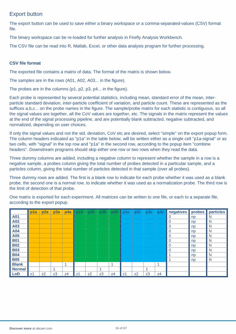
The exported file contains a matrix of data. The format of the matrix is shown below.
The samples are in the rows (A01, A02, A03... in the figure).
The probes are in the columns (p1, p2, p3, p4... in the figure).
Each probe is represented by several potential statistics, including mean, standard error of the mean, inter-particle standard deviation, inter-particle coefficient of variation, and particle count. These are represented as the suffices a,b,c... on the probe names in the figure. The sample/probe matrix for each statistic is contiguous, so all the signal values are together, all the CoV values are together, etc. The signals in the matrix represent the values at the end of the signal processing pipeline, and are potentially blank subtracted, negative subtracted, and normalized, depending on user choices.
If only the signal values and not the std. deviation, CoV etc are desired, select "simple" on the export popup form. The column headers indicated as "p1a" in the table below, will be written either as a single cell "p1a-signal" or as two cells, with "signal" in the top row and "p1a" in the second row, according to the popup item "combine headers". Downstream programs should skip either one row or two rows when they read the data.
Three dummy columns are added, including a negative column to represent whether the sample in a row is a negative sample, a probes column giving the total number of probes detected in a particular sample, and a particles column, giving the total number of particles detected in that sample (over all probes).
Three dummy rows are added. The first is a blank row to indicate for each probe whether it was used as a blank probe, the second one is a normal row, to indicate whether it was used as a normalization probe. The third row is the limit of detection of that probe.
One matrix is exported for each experiment. All matrices can be written to one file, or each to a separate file, according to the export popup.
p1a p2a p3a p4a p1b p2b p3b p4b p1c p2c p3c p4c negatives probes particles A01 0 np N A02 0 np N A03 0 np N A04 0 np N A05 0 np N B01 0 np N B02 0 np N B03 0 np N B04 1 np N B05 1 np N Blank 1 1 1 Normal 1 1 1 LoD z1 z2 z3 z4 z1 z2 z3 z4 z1 z2 z3 z4
Discover more at abcam.com 16 of 67
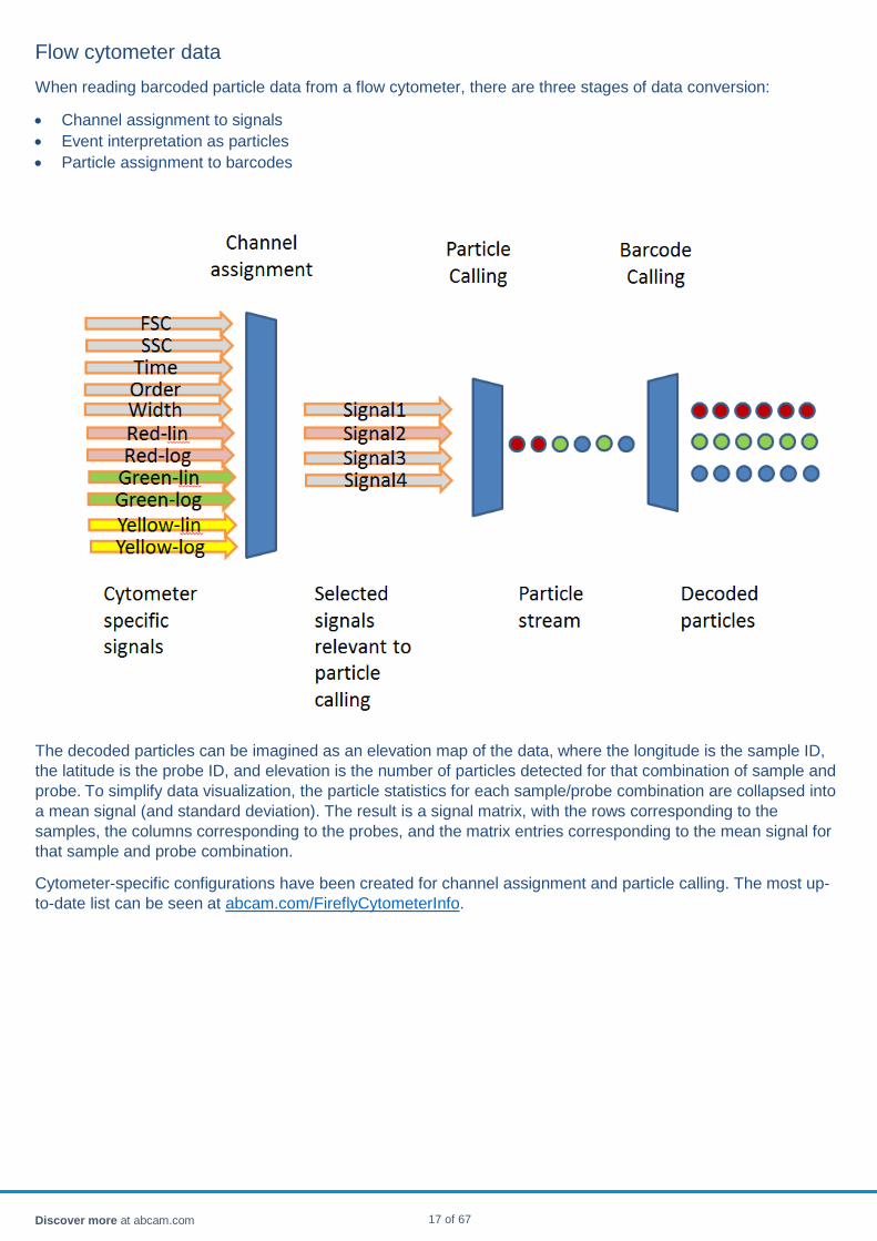
Flow cytometer data When reading barcoded particle data from a flow cytometer, there are three stages of data conversion:
• Channel assignment to signals • Event interpretation as particles • Particle assignment to barcodes
The decoded particles can be imagined as an elevation map of the data, where the longitude is the sample ID, the latitude is the probe ID, and elevation is the number of particles detected for that combination of sample and probe. To simplify data visualization, the particle statistics for each sample/probe combination are collapsed into a mean signal (and standard deviation). The result is a signal matrix, with the rows corresponding to the samples, the columns corresponding to the probes, and the matrix entries corresponding to the mean signal for that sample and probe combination.
Cytometer-specific configurations have been created for channel assignment and particle calling. The most up-to-date list can be seen at abcam.com/FireflyCytometerInfo.
Discover more at abcam.com 17 of 67
FWS file A workspace comprises:
• A set of plates • A set of experiments
A workspace is saved to disk with a .fws suffix, so that a session can be re-started at any time from the point where the workspace was saved.
A workspace contains sample and probe data; it does not contain the originating data, whether from flow cytometry or from sequencing.
Discover more at abcam.com 18 of 67

geNorm algorithm and probe stability If the experiment contains a subset of probes that are "housekeeping" probes that are expressed at the same level in every sample, they can serve as good normalization probes.
In a given experiment, it is usually not known what probes were in fact unchanged between samples, since there are other random variables affecting the measured data. However if there were such a subset of housekeeping probes, they would share the characteristic that many of the random variables would affect the measurements of all such together. As an example, pipetting variation, sample dilution, sample collection technique variation, temperature variation between wells, and so on, would usually act across the set of probes.
As a consequence, the probes that are expressed at the same level in each sample would rise and fall in a constant ratio to each other. For example, if mir-7a were expressed at twice the level of mir-7b in all samples, the vector of mir-7a in all samples divided by the vector of mir-7b in all samples will be a vector of 2.0's, and the standard deviation of that vector is zero.
These considerations lead Vandesompele and others [1] to define a distance between two probes P and Q as being the standard deviation of a vector composed of the ratio of P/Q expressed in all samples (more precisely, log2(P/Q)). Having defined a distance between two probes, the "stability" of a probe is then defined as the average distance of one probe to all the others. If there is a core housekeeping group of probes, they will all be within a short distance from each other (zero in the idealized example above), while the probes of biological interest which are varying from sample to sample due to treatment or disease or age or some other factor will be further from the average probe -- they will be less "stable".
The geNorm (Vandesompele et al, 2002) algorithm chooses a set of normalization probes starting with the most stable probe and progressively accumulating more until the average of the accumulated probes converges.
The workbench allows you to visualize the process by displaying the stability chart shown below. The vertical axis is the average distance to all the other probes using the mean probe-probe distance defined above. The shape of the chart is relatively typical, with many probes of similar stability on the left, and a few "unstable" probes on the right, corresponding to probes that vary a lot between samples with a different pattern than most other probes. The "unstable" probes are often the ones of most interest, though may also just be noisy. Hemolysis markers in serum samples might vary substantially due to variability in serum purification. It is not unusual to find the "unstable" probes at the top of the significance table in differential analysis, and the most "stable" probes at the bottom of the significance table.
A custom normalization scheme can be designed by, for instance, selecting the 12 most stable probes (left-most in the chart), then perhaps de-selecting one or two that are expected to vary between samples in an interesting way. While that selection is active, using the popup menu in the header of the probe table, “norm” column, the selected probes can be set as normalizers.
Discover more at abcam.com 19 of 67

Heatmap pane The heatmap pane is a composite of several objects, as seen below.
• Clicking in the picture on each of the highlighted areas will bring up more information on it. • The chart and the axes can be zoomed as described in chart controls. • When samples and/or probes are selected with the mouse, the selections in the plate view, plate list view,
sample view and probe view are synchronized.
Main heatmap
The heatmap is a grid of cells. Each column corresponds to one probe. Each row corresponds to one sample. The cell is colored by the fold-change of the probe in this sample relative to the average of all samples. The level in a particular sample is based on an average of all the particles in the sample, as described under statistics. The value is potentially blank-subtracted, negative-subtracted and normalized, as described under data processing. The color scale bar at the upper right shows the fold change.
Hovering over a rectangle brings up detailed information for the sample/probe combination. The arithmetic and logarithmic values are presented. Also the data values from raw through blank subtraction through negative subtraction through normalization are shown.
Discover more at abcam.com 20 of 67
Probe names
The probe names are listed along the top of the axis. If there are too many names, some names will disappear to allow the remaining names to be displayed.
Probe tree
The probes are clustered as described under clustering. Probes that have similar expression levels to each other are placed closed to each other. The shorter the branches, and the fewer the branches, joining two probes, the closer they are to each other in expression pattern across samples.
Sample names
The sample names are listed along the top of the axis. If there are too many names, some names will disappear to allow the remaining names to be displayed.
Sample tree
The samples are clustered as described under clustering. Samples that show similar probe expression patterns are placed close together. The shorter the branches, and the fewer the branches, joining two samples, the closer they are to each other in expression pattern. Replicates will generally cluster closely together.
Color scale
The color scale is scaled so the darkest color corresponds to the lowest numerical value in the array, and the brightest color corresponds to the highest numerical value in the array. Average-expression numbers are white. The numerical scale is plotted along the color scale for reference. A negative sample will appear as a dark horizontal bar. A blank probe will appears as a dark vertical bar.
Variables
The different variables that have been defined appear. They are also colored according to their values. For real-valued variables, such as the sample quality ("qc"), the colors run from the lowest to highest value of the variable. For discrete variables, such as patient gender, or group ID, the color corresponds to the alphabetical order of the group name.
Graph control form
• The transformation drop-down menu allows selection between linear data, log data, and fold-change data. o With linear data, a single large value can result in a binary heatmap -- one orange and everything else
blue. o Log data spreads the values through color space in a more interesting way. o Fold-change data shows the log10 of the ratio between a probe value to the average of all the other
samples for that probe (i.e. relative to the column average). Fold-change is often the best way to view a heatmap because under-expressed and over-expressed probes are given equal prominence.
• After blank and negative subtraction, it is possible for a probe to be negative in a sample. To avoid taking the log of a negative value, a floor of 1.0 is applied.
• If there is one probe with a very high range of over and under expression, it may dominate the heatmap. To visualize the more moderate probes, the color range can be zoomed using the sub-range controls.
• Inverting the color map swaps the ends.
Discover more at abcam.com 21 of 67
Probe access
• Analysis - the axis can be sorted as: o None - probe order. o Cluster - order defined by the clustering tree. o Group -- the probes are ordered by most significantly differentially expressed.
• Metric - different metrics can be used to estimate the "similarity" between each pair of probes. o RMS compares two probes as the root mean square difference of the probe levels o Pearson compares two probes as 1-� R2 where R2 is the Pearson correlation coefficient of the
probes. o Since probes are often of different orders of magnitude, the Pearson comparison is more likely to be
useful for comparing one probe to another, since it was developed in the context of correlating variable Y to variable X, which may not even be measured in the same units
• The branch law affects the drawing of the tree branches. If the branches are of very different lengths, some of the horizontal tree segments may be impossible to distinguish. A branch law of 1.0 draws branches in linear proportion to the clustered branch length. A branch law of 0.5 draw branches as the square root of the clustered branch length. A branch law of 0.0 draws branches independent of computed length, so that the length of the branch reflects only the depth in the tree.
• The checkbox Show Labels turns the probe names on and off. • The checkbox Draw Tree turns the drawn tree on and off. The order is preserved even if the tree is not
visible.
Sample axis control form
• Analysis - the axis can be clustered, or not clustered. • Metric - different metrics can be used to estimate the "similarity" between each pair of samples.
o RMS compares two samples as the root mean square difference of the sample levels across all the probes.
o Pearson compares two samples as 1-√ R2 where R2 is the Pearson correlation coefficient of the samples across all the probes.
o Since sample values tend to be of like magnitude, either Pearson or RMS metrics are likely to result in similar results.
• The branch law affects the drawing of the tree branches. If the branches are of very different lengths, some of the horizontal tree segments may be impossible to distinguish. A branch law of 1.0 draws branches in linear proportion to the clustered branch length. A branch law of 0.5 draw branches as the square root of the clustered branch length. A branch law of 0.0 draws branches independent of computed length, so that the length of the branch reflects only the depth in the tree.
• The checkbox Show Labels turns the sample names on and off. • The checkbox Draw Tree turns the drawn tree on and off. The order is preserved even if the tree is not
visible.
Discover more at abcam.com 22 of 67
Limit of detection A probe is detected in a particular sample if the statistical distribution of the probe's particles in that sample is significantly higher than the distribution of that probe's particles in the negative (water) samples.
The limit of detection of a probe, is an estimate of the level that probe should have in order to be significantly detected in a given sample.
The limit of detection of a probe is calculated from the negative samples, using a combination of two factors. Let Sww be the well-to-well standard deviation of the mean signals, and Spp be the mean of the particle-particle standard errors. Then the limit of detection is calculated as √ (3 Sww)2 + (4 Spp)2. Empirically it has been determined by comparison to dilution series on large numbers of probes that this gives a conservative estimate of the limit of detection.
If no negative samples are defined, no limit of detection is available.
Discover more at abcam.com 23 of 67
Load button The button loads either a flow cytometer data set (FCS file) or a Firefly™ Analysis Workspace (FWS file) from disk, sing the Java FileChooser to help you locate the desired files.
Load FCS
• Multiple FCS files can be selected at the same time and they will be loaded into the same plate. • To load files into separate plates, load each one in a separate action. • To view multiple plates in one experiment:
o Load each plate into a tab o Create experiments from each plate o Merge the experiments
Load FWS
• A previous workspace can be loaded into memory. • If there is already a workspace present in the memory, you will be prompted whether to replace it, or merge
the incoming workspace with the existing one. The merged workspace will have a set of plates that is the union of the plates from the two workspaces, and a set of experiments that is the union of the experiments from the two workspaces. The plate and experiment names are disambiguated by prefixing them with “WSn” where n is an integer reflecting the order of workspace creation in this session.
Discover more at abcam.com 24 of 67

Menus
File menu
Open FCS One or more FCS files are loaded from disk. Same as the load button. Save workspace Save the current session and its settings. The working dataset is stored, not the original
source data. For instance, when saving data derived from an FCS file, the original light intensities and channels are discarded, and only the fully decoded particle data for each sample and probe are saved. The file is saved in a binary format in a folder called .firecode in your home folder. In Windows, that would be home folder which is typically at C:/Users/YourName/.firecode, on Unix or Mac at /home/YourLogin/.firecode.
Load workspace Reload the workspace from the last session, or reload a named workspace. Clear Clear all loaded data. Same as the clear button. Import PLX Import a new barcoded PLX file. It is not automatically applied to any plate data. To
apply it to a data plate, use settings PLX file after selecting that plate. Examine FCS file Shows a page with all the detailed settings of the cytometer. May be useful for analyzing
data from a cytometer the program has not seen before. The default settings will show all the data columns, such as FCS, SSC, time and the detector colors.
Quit
Analyze menu
Modify settings Particle analysis details can be changed here. Caution: In most cases the PLX file should contain all the information necessary and no change in settings will be needed.
PLX file Re-analyze a plate using a different PLX file. Generate combination variables
Generates extra variables from the existing ones. For example, given age, sex and treatment, it will add age/sex, age/treatment and sex/treatment as well as age/sex/treatment as variables for consideration.
Export particle data
Exports a CSV or raw particle data, for every sample and probe.
Help menu
Support Contact information for support. About Firefly™ Analysis Workbench
Details on version, change log, build date, memory usage.
Discover more at abcam.com 25 of 67
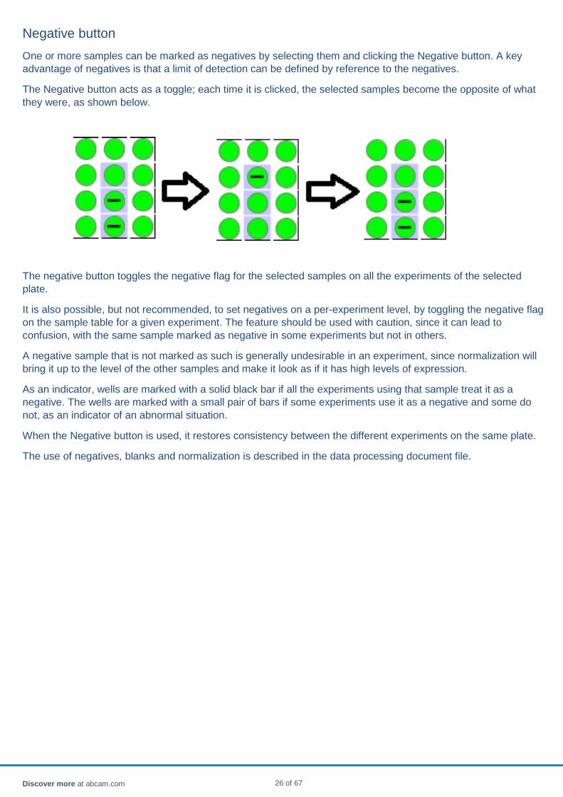
Negative button One or more samples can be marked as negatives by selecting them and clicking the Negative button. A key advantage of negatives is that a limit of detection can be defined by reference to the negatives.
The Negative button acts as a toggle; each time it is clicked, the selected samples become the opposite of what they were, as shown below.
The negative button toggles the negative flag for the selected samples on all the experiments of the selected plate.
It is also possible, but not recommended, to set negatives on a per-experiment level, by toggling the negative flag on the sample table for a given experiment. The feature should be used with caution, since it can lead to confusion, with the same sample marked as negative in some experiments but not in others.
A negative sample that is not marked as such is generally undesirable in an experiment, since normalization will bring it up to the level of the other samples and make it look as if it has high levels of expression.
As an indicator, wells are marked with a solid black bar if all the experiments using that sample treat it as a negative. The wells are marked with a small pair of bars if some experiments use it as a negative and some do not, as an indicator of an abnormal situation.
When the Negative button is used, it restores consistency between the different experiments on the same plate.
The use of negatives, blanks and normalization is described in the data processing document file.
Discover more at abcam.com 26 of 67
Normalization
Motivation
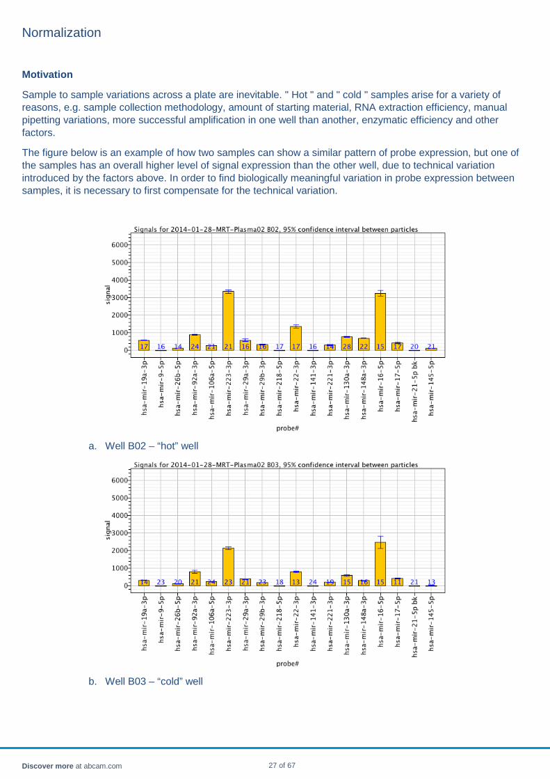
Sample to sample variations across a plate are inevitable. " Hot " and " cold " samples arise for a variety of reasons, e.g. sample collection methodology, amount of starting material, RNA extraction efficiency, manual pipetting variations, more successful amplification in one well than another, enzymatic efficiency and other factors.
The figure below is an example of how two samples can show a similar pattern of probe expression, but one of the samples has an overall higher level of signal expression than the other well, due to technical variation introduced by the factors above. In order to find biologically meaningful variation in probe expression between samples, it is necessary to first compensate for the technical variation.
a. Well B02 – “hot” well
b. Well B03 – “cold” well
Discover more at abcam.com 27 of 67
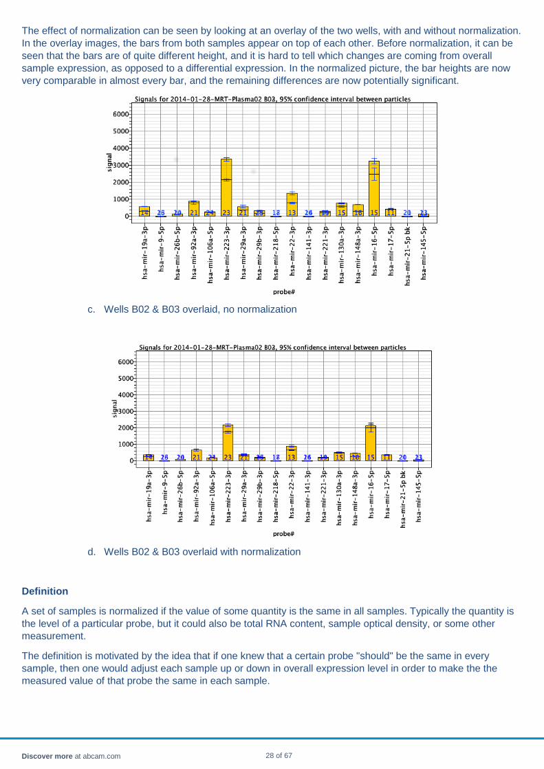
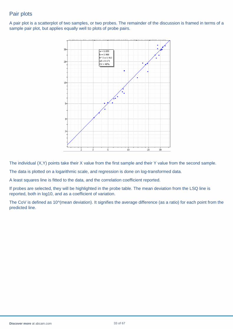
The effect of normalization can be seen by looking at an overlay of the two wells, with and without normalization. In the overlay images, the bars from both samples appear on top of each other. Before normalization, it can be seen that the bars are of quite different height, and it is hard to tell which changes are coming from overall sample expression, as opposed to a differential expression. In the normalized picture, the bar heights are now very comparable in almost every bar, and the remaining differences are now potentially significant.
c. Wells B02 & B03 overlaid, no normalization
d. Wells B02 & B03 overlaid with normalization
Definition
A set of samples is normalized if the value of some quantity is the same in all samples. Typically the quantity is the level of a particular probe, but it could also be total RNA content, sample optical density, or some other measurement.
The definition is motivated by the idea that if one knew that a certain probe "should" be the same in every sample, then one would adjust each sample up or down in overall expression level in order to make the the measured value of that probe the same in each sample.
Discover more at abcam.com 28 of 67

In practice, it is often not known what probe should be the same in every sample (or even whether there is any such probe). Instead, one chooses some set of normalization probes, numerically synthesizes a composite probe from those probes, and adjusts the sample levels so that the synthetic probe is the same across all samples.
A variety of approaches to choosing normalization probes are provided, discussed below.
When and when not to use normalization
The primary advantage of normalization is compensating for technical variation between samples. In addition, normalization usually reduces inter-sample standard deviation. For the same reason, differential expression between sample groups is more likely to find significant probes, because the sample-to-sample "noise" is reduced.
There are some situations when normalization needs to be treated with caution. If, for instance, a particular drug treatment causes higher expression of every probe, or most of the probes, in a treated sample, then normalization will tend to wash out the difference between the treated and untreated samples. In a dilution series, normalization will by definition make all the dilutions look the same.
Overall, if there is a good reason to believe that the variation in overall probe expression level between samples is meaningful to the experiment and not just an artifact, that there should be "hot" and "cold" wells, normalization is not recommended.
Choosing normalizers
There are several approaches to choosing normalization probes. We focus here on endogenous controls. Exogenous controls (spike-in probes) only compensate for some particular sources of variation, and cannot account for, for instance, sample purification efficiency. They may even vary inversely with the expression level of endogenous controls if they compete with the endogenous probes for enzymes and reagents, making them wholly unrepresentative of the actual sample data.
• Manual selection: a set of probes which are expected to be unaffected by the variables of interest in the experiment can be chosen.
• Probe Averaging: the average of all probes in a sample provides an estimate of the overall expression level in that sample.
• Normalizer selection algorithms: The geNorm publication (Vandesompele et al., 2002) introduced a procedure to automatically choose normalizers for each experiment. Other approaches have subsequently been developed, such as NormFinder (Anderson et al., 2004).
Any choice of normalizer requires certain assumptions. Manual selection requires the assumption that the chosen probes are actually the same in all samples, and that the measured differences are entirely due to technical variation. Probe averaging requires the assumption that the overall expression level should be the same in every sample, and that the measured differences are technical. Algorithmic approaches assume that the set of probes used in the experiment includes some subset which is the same in all samples, except for technical variation.
With that in mind, a judgement call is always required. In the absence of any other information, a probe averaging approach is often a safe place to start, especially if only a small number of probes are expected to change between one condition and another. If there is reason to believe a large fraction of the probes in the set may change in response to experimental variables such as treatment type, or time after dosing, then a norm-finding algorithm may be preferred, in order to single out the relatively few probes which are invariant.
Discover more at abcam.com 29 of 67

Implementation details
In Firefly Analysis Workbench, all three methods above are supported. In the probe table, each probe has a checkbox to indicate whether or not it is being used as a normalization probe.
To choose probes manually, check off the desired probes. The data set is recalculated on the fly each time the probe is checked or un-checked; there is no "apply" button.
To choose probes automatically, use the normalization button. The workbench will check off the probes it selects, as if you had checked them manually. You can inspect the algorithm's choices, and override them with the checkboxes.
To choose the algorithm used, use the top menu item Analyze -> Choose Normalization Scheme.
When choosing normalizers, the workbench by default excludes very low expressed probes and hemolysis probes. You can override those choices with the normalization checkboxes.
Whatever set of probes are chosen as normalizers, they are combined using a geometric average to form a synthetic normalizer, so that weakly and strongly expressed probes are both represented in the average That is, in each well, the signals from the normalizer probes in that well are geometrically averaged, resulting in a synthetic probe that has a value in each well.
After averaging, the normalizer probe is "deflated" so that it has an average value of 1.0. As a consequence, "hot" wells will have values above 1, and "cold" wells will have values below 1. The deflated normalizer can be viewed as a "hotness" index for each well.
The final step in normalization is that the probes in each well are divided by the deflated normalizer in that well. As a result, probes retain their natural range of values after normalization, typically 1-10,000 depending on the cytometer used. Without the deflation step, each probe would be divided by the normalizer. Depending on whether the probe was higher or lower than the normalizer, its range of values would likely be of order 0.01-100, making interpretation less intuitive.
Normalization within replicates
There are situations where it is not appropriate to expect some quantity to be the same across all the samples in an experiment. For instance, in a dilution series, the replicates within a dilution cohort would be expected to have comparable signal levels for all targets, but between cohorts, the levels should be distinctly different. Or, in samples originating from serum vs samples originating from plasma, it is not a priori obvious that the mix of targets in the replicates of one should have the same average as the mix of targets in the replicates of the other.
In such situations where there is a mix of apples and a mix of oranges, so to speak, rather than trying to normalize so that all the apples and oranges have the same value of some quantity, it may be preferable to do a more limited normalization where each apple is normalized using only data from apples, the oranges normalized using only data from oranges, and no attempt is made to force the apples look like the oranges.
Logically, the approach is the same as splitting the experiment into an apple experiment and an orange experiment, normalizing each experiment individually, and then re-assembling the data into a single experiment.
The workbench automates this type of normalization if (a) a variable called Replicate is defined for the samples and (b) normalization by replicates is chosen as the normalization scheme. Any of the usual normalization schemes (geNorm, average) can be combined with replicates; it simply means that the usual scheme is only applied within the sub-experiment consisting of one replicate group.
The overall benefits of normalization will still apply within the groups; the difference between "hot" and "cold" wells will be taken out, and only the true sample-to-sample variation in each probe remains.
Discover more at abcam.com 30 of 67

Normalization button The normalization button turns on or off normalization for a selected experiment.
• Choosing no normalizers turns off normalization entirely. • Choosing "average" normalization selects all the probes that are expressed above a threshold level. • Choose "geNorm" normalization selects probes according to the geNorm algorithm.
Normalizers can also be chosen manually, by clicking checkboxes for individual probes on the probe table.
Any change to the normalization probes (set or clear) triggers a re-computation of the data pipeline, so that the displayed data is always normalized by the set of normalization probes that are visibly checked.
The auto-selection scheme can be chosen on the top menu bar on the Settings menu. These selected probes can be subsequently fine-tuned by hand, using the check-boxes on the probes table of the experiment.
Be aware that normalization tends to equalize differences between samples. If there are samples with markedly different concentrations, for instance, a dilution series, normalization will bring all the wells to a single, average, dilution.
In the extreme case, if you have negative wells which are not marked as such, they will be brought up to the same level as the regular samples and will appear to have high levels of signal. Negative wells should be marked as such.
Discover more at abcam.com 31 of 67

PLX file A PLX file defines which particles have which probes on them.
It is presently a list of comma-separated fields giving the two-digit code of the probe, and the name of the probe.
Discover more at abcam.com 32 of 67
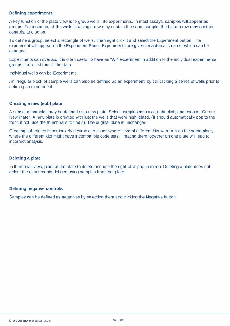
Pair plots A pair plot is a scatterplot of two samples, or two probes. The remainder of the discussion is framed in terms of a sample pair plot, but applies equally well to plots of probe pairs.
The individual (X,Y) points take their X value from the first sample and their Y value from the second sample.
The data is plotted on a logarithmic scale, and regression is done on log-transformed data.
A least squares line is fitted to the data, and the correlation coefficient reported.
If probes are selected, they will be highlighted in the probe table. The mean deviation from the LSQ line is reported, both in log10, and as a coefficient of variation.
The CoV is defined as 10^(mean deviation). It signifies the average difference (as a ratio) for each point from the predicted line.
Discover more at abcam.com 33 of 67

Plate
A plate is a visual representation of a 96-well plate, primarily used to select, group and separate samples.
FCS samples on a plate go through particle analysis together using a single barcode. If multiple different barcodes are mixed in the same plate, it is imperative to break the plate down into its sub-plates, otherwise the results will be unreliable. For instance, if one barcode is a 70 plex and the other is a 20 plex, there is no appropriate basis for analyzing the samples from each barcode together.
Plates can be broken down either through the GUI or by using a sample sheet.
Discover more at abcam.com 34 of 67

Plate view The plate panel provides a detailed view of a single plate, as well as a navigation aid to other plates that have been loaded. Clicking on different plates in thumbnail view will bring focus to the selected plate.
a. Plate view b. Thumbnail view
The plate in focus can be viewed in plate view (default) or in list view. To toggle between one view and the other, use the popup menu (right-click). If the samples do not come from a plate (e.g. single well experiments) no well IDs are defined and the plate view may be empty, but the samples can still be found in list view. The popup menu is the same between list and plate view, and provides access to several functions.
The list view is shown below. The samples are given default short names according to their well position, if read from a plate. The full names of the sample are derived from the file from which they originated. The quality score depends on the data source and measures the quality of data in that sample.
In the plate view, the sample wells are color coded according to the QC score. The colors (traffic light colors, i.e. red/yellow/green) are determined by barcoding signals, and are unrelated to probe intensity. A sample might be green in the plate view (high particle detection rate) and have very low signals in the probe panel (nothing hybridized to the probes in that sample).
In the same session where raw data (FCS, sequence data) has been loaded, extra information is available about the sample by hovering over it.
Discover more at abcam.com 35 of 67
Defining experiments
A key function of the plate view is to group wells into experiments. In most assays, samples will appear as groups. For instance, all the wells in a single row may contain the same sample, the bottom row may contain controls, and so on.
To define a group, select a rectangle of wells. Then right click it and select the Experiment button. The experiment will appear on the Experiment Panel. Experiments are given an automatic name, which can be changed.
Experiments can overlap. It is often useful to have an "All" experiment in addition to the individual experimental groups, for a first tour of the data.
Individual wells can be Experiments.
An irregular block of sample wells can also be defined as an experiment, by ctrl-clicking a series of wells prior to defining an experiment.
Creating a new (sub) plate
A subset of samples may be defined as a new plate. Select samples as usual, right-click, and choose "Create New Plate". A new plate is created with just the wells that were highlighted. (If should automatically pop to the front, if not, use the thumbnails to find it). The original plate is unchanged.
Creating sub-plates is particularly desirable in cases where several different kits were run on the same plate, where the different kits might have incompatible code sets. Treating them together on one plate will lead to incorrect analysis.
Deleting a plate
In thumbnail view, point at the plate to delete and use the right-click popup menu. Deleting a plate does not delete the experiments defined using samples from that plate.
Defining negative controls
Samples can be defined as negatives by selecting them and clicking the Negative button.
Discover more at abcam.com 36 of 67
Other popup menu items
Rename samples Use a sample sheet to rename samples and add groups. Write FCS data A subset of the FCS data constituting the plate can be exported as a new FCS
file, by selecting samples and using the popup menu. If multiple experiments were run on one plate for expediency, the feature allows the data to be separated as if they had been run on different plates. Since a plate can be created by reading several disparate FCS files at once, the feature also FCS records from different files to be mixed and matched into a new FCS file.
Split plate according to OrderID
A variable called OrderID will be used to automatically make a series of plates with the samples grouped by OrderID.
Show FCS parameters Displays the parameters of the FCS run, such as gain settings, instrument used, etc.
Delete samples Removes samples from the plate. Also removes them from all experiments that have samples from that plate.
Pool samples by replicate Combines multiple FCS samples into a single “super-sample” with all the particles of the samples in the super-sample. Samples are pooled if they have the same value of the variable called “replicate”.
Pool selected samples Manually pool samples. The samples that are selected are all pooled into a single “super-sample”.
Toggle list view Toggle between plate view and list view.
Discover more at abcam.com 37 of 67

Probe table The probe table lists the probes found in the selected experiment.
• The "Row" column identifies the original order of the probe before any sorting operations were performed. • The "Probes" column is the name of the probe, taken from the barcode / PLX file. • The "Hide" column allows a probe to be hidden from charts.
o Hiding a probe does not affect blank subtraction and normalization. o Hiding a probe removes it from the list of differentially expressed candidates, which can lead to an
increase in significance for the remaining probes. • The "neg/blank" column marks a probe to be marked as a blank probe. Blank probes are subtracted from the
data. • The "norm" column marks a probe to be used as a normalizer. Multiple normalization probes may be
selected. They are averaged together. Groups of probes can be automatically selected as normalizers using the Normalization Button.
• The "samples" column lists how many samples contained this probe. • The "particles" column lists the total number of particles with this probe among all samples in this experiment.
The popup menu allows a probe to be looked up in the Firefly Discovery Engine.
The header of the table has a separate popup menu from the body of table, as usual.
Example
1. To hide all probes except three, bring up the popup menu in the header of the "hide" column. 2. Choose "select all" - all the checkboxes are checked, making all probes hidden. (All charts will go blank,
since all probes are hidden) 3. Select the three desired probes. 4. Bring up the popup menu in the header of the "hide" column. 5. Choose "uncheck selected".
Alternatively, the desired probes can be un-hidden one by one using the checkboxes.
Discover more at abcam.com 38 of 67
Bargraph The bargraphs apply to the selected experiment, and show all the probe values in the selected sample, as well as the value of the selected probe in all the samples.
The bar for each probe or sample shows the best estimate of the signal for that probe/sample combination, based on several dozen individual particle values. The error bar indicates the 95% confidence interval of the estimate. The value in the chart is the value at the end of the data processing pipeline.
The bars are normally colored yellow, but if they fall below the limit of detection, they are colored grey.
The sample and probe names are listed along the respective X axes. If there are too many names to fit on the axis, they are down-sampled to make them fit.
Controls
• The charts can be zoomed and panned. • Samples and probes can be selected. • The data can be converted to log scale with the checkbox. • The individual points going into each measurement can be charted, using the checkbox. • The limit of detection can be shown as a horizontal line on the probe chart.
Discover more at abcam.com 39 of 67

Firefly™ Discovery Engine The search box connects to the Firefly Discovery Engine to search for literature references related to microRNAs and the search terms you define in the search box. It yields clickable word clouds related to microRNAs, genes, authors and conditions.
Discover more at abcam.com 40 of 67
Replicate merging A new experiment can be created by merging the samples in an experiment that are technical replicates. The technical replicates are recognized either as those that have the same value of the variable called "Replicate", or if there is no such variable, if the samples have the same short names.
Samples that have no replicate name, or that are singletons, are dropped from the new experiment.
Each set of samples in the original experiment comprising a replicate group becomes a single sample in the new experiment. The statistical values in the merged sample are no longer individual assay particles, but represent the mean values of each sample that went into the replicate. If the experiment is examined in bargraph mode with "show points" selected, instead of several dozen data points on each bar in the bargraph, the bar will just have 3 data points for a triplicate experiment.
Discover more at abcam.com 41 of 67
Replicate pooling When replicate samples are combined at the FCS level, they are referred to as "pooled" samples. If three samples, one with 20 particles, another with 25 particles, and another with 30 particles, are pooled, the original samples will be removed from the plate and a single sample with 75 particles will appear. Unpooled samples are not changed.
Both replicate pooling and replicate merging can be used in analysis. Replicate pooling only applies to FCS data, while replicate merging can apply to any type of sample data and may be preferable.
Discover more at abcam.com 42 of 67
Samples, probes, variables This tabset provides access to
• The sample table • The probe table • The variable table
Discover more at abcam.com 43 of 67

Sample Quality Every sample has a data quality score . The data quality score depends on its source of origin. For data arising from reading barcoded particles on a flow cytometer, the data quality score is the product of three factors
• The fraction of events in this sample that were successfully converted into particles • The fraction of particles in this sample whose barcodes were successfully read • The fraction of all probes in the experiment that were found in this sample.
For data arising from reading sequencing data, the data quality score is derived from the number of reads.
Discover more at abcam.com 44 of 67
Sample sheet Samples names, and optionally groups, can be defined using a text file with a number of columns, separated by commas (CSV format). The first column is a well name, used to identify the sample. The second column is a name for the sample that will appear on charts and in tables. Other columns define variables, that is, sample groupings.
For instance, a 4x3 experiment might be described as follows:
well, patientId, condition A01, pid1, pre-treatment A02, pid2, pre-treatment A03, pid3, pre-treatment A04, pid4, pre-treatment B01, pid5, post-treatment B02, pid6, post-treatment B03, pid7, post-treatment B04, pid8, post-treatment C01, pid9, normal C02, pid10, normal C03, pid11, normal C04, pid12, normal C05, aneg, NA C06, aneg, NA C07, apos, NA C08, apos, NA
The header rows specifies that there are three columns in the file. The first two columns are always the well location and sample name. Any number of other columns may be named, which will become named variables. The variables can be used to pool samples across replicates, or as factors for Anova analysis. The names should not contains commas or spaces.
In the above example, there are 3 groups, each with 4 patients. There are 4 other samples which are assay negative and positive controls. They are assigned group IDs of NA, so that they are not compared to the patient groups during Anova analysis. (Control samples would presumably always look significantly different to patient samples, and create false significance.)
The table should not be ragged; every row must have the same number of columns. If the column has no meaningful value in that row (for instance, a negative sample is neither male nor female, neither case nor control patient) the entry should be NA, or empty. An empty entry is denoted by two commas in immediate succession. A space between the commas is treated as if it were a name.
The match is based on the well name embedded in the FCS record for that well (A01 etc.).
CSV generation
The easiest way to generate a CSV file is with a text editor or spreadsheet of your choice. If you generate in a spreadsheet, export in CSV format, rather than the native format (e.g. .xslx for Excel).
If you have renamed samples and created variables using the GUI elements of the workbench, an easy way to preserve and recycle the effort is to export the experiment to CSV. The first columns of the CSV file, preceding the data columns, will be the well name, sample name and the variables. Thus they meet the requirements for being a sample name array. Delete the data columns and dummy rows/columns.
To get started, you can download a template.
Discover more at abcam.com 45 of 67

Sample table The sample table lists the samples selected in the present experiment, and the values of any variables defined for those samples.
• The "Row" column identifies the original order of the sample before any sorting operations were performed • The "Sample" column provides a short name of the sample that will appear in charts and tables. The default
short name is to the part of the sample name that varies sample to sample. For instance, the samples are named longfilename_a01, longfilename_a02, longfilename_a03, then the short names will be a01, a02, a03. The samples may be renamed directly by clicking and typing in their name field. They may also be renamed as a batch using a sample sheet, which also offers the option of defining sample groups of various kinds.
• The "hide" column allows a sample to be hidden from charts • The "neg/blank" column marks a sample to be marked as a negative sample. Negative samples are
subtracted from the data. • The "norm" column is not currently active for samples. • The "probes" column in the sample table lists how many probes were found in this samples. • The "particles" column lists the total number of particles among all probes found in this sample.
Several items are accessible from the popup menu.
Assign group Define variable values for the sample. Variable setup Set up parameters of the differential analysis (primary variable, control variables,
etc.) Sort samples by column Sort samples by row Delete Removes samples from this experiment (does not affect the plate that they came
from).
Discover more at abcam.com 46 of 67

Bargraph The bargraphs apply to the selected experiment, and show all the probe values in the selected sample, as well as the value of the selected probe in all the samples.
The bar for each probe or sample shows the best estimate of the signal for that probe/sample combination, based on several dozen individual particle values. The error bar indicates the 95% confidence interval of the estimate. The value in the chart is the value at the end of the data processing pipeline.
The bars are normally colored yellow, but if they fall below the limit of detection, they are colored grey.
The sample and probe names are listed along the respective X axes. If there are too many names to fit on the axis, they are down-sampled to make them fit.
Controls
• The charts can be zoomed and panned. • Samples and probes can be selected. • The data can be converted to log scale with the checkbox. • The individual points going into each measurement can be charted, using the checkbox. • The limit of detection can be shown as a horizontal line on the probe chart.
Discover more at abcam.com 47 of 67

Selection At any time, a set of samples and probes are selected. The selected samples and probes are highlighted with a violet "halo" in charts and pictures, and in tables by a color which depends on the underlying operating system (Mac, Windows, Linux).
The selection is synchronized in all views, including
• Plate view • List view • Sample table • Probe table • Bargraphs • Pair graphs • Heatmap
Creating and extending selections
An unmodified mouse click or drag will select one sample, one probe, one well, one cell of a heatmap, or one row of a table.
A control-mouse click or drag will add to the selection.
An alt-shifted mouse click or drag will remove from the selection.
MacOS note:
Cmd-mouse is not the same as Ctrl-mouse. Ctrl-mouse is what is needed for making selections.
Cmd-mouse is treated the same as right-button with no keyboard event (because an Apple mouse only has one button, right-click has to be faked with Cmd-mouse).
Discover more at abcam.com 48 of 67
Examples
Right-clicking an area of the heatmap will select the probes and samples falling in the area.
It is possible, for example, to use the heatmap pane to select all the probes in one cluster, and then in the probe table to use that same selection as the basis for normalization.
In a sample pair plot, selecting data points will highlight the corresponding probes.
Discover more at abcam.com 49 of 67

Significance The p-value of a finding is the probability that the finding would have occurred by chance alone even if the null hypothesis is true.
The following example in the form of a quiz may help clarify the definition.
If you were to conduct an experiment in which you asked both men and women to identify foods by smell, and found that women performed better, and after conducting a t-test, found that p<.05, what would this mean? [Note: These data are fictitious]
• There is at least a 95% chance that, in the entire population, women are better at identifying food by smell than men are.
• In the sample, fewer than 5% of the men performed better than the average woman at identifying foods by smell.
• If men and women were equally good at identifying food by smell, you'd see women doing this much better by chance less than 5% of the time.
• The difference between men and women observed in sample is within 5% of entire population.
Answer
If men and women were equally good at identifying food by smell, you'd see women doing this much better by chance less than 5% of the time.
Discover more at abcam.com 50 of 67

Special variables Several optional variables, if provided, are used to make certain operations faster. Such variables are excluded from differential analysis.
The Replicate variable allows samples that are replicates to be pooled or merged. Samples with the same value for the variable will be merged/pooled. The values can be any text, e,g, #1,#2,#3 or patientA,patientB,patientC.
The OrderID variable allows a plate with multiple different experiments to be automatically split into multiple plates.
Discover more at abcam.com 51 of 67

Table All tables share some common features.
The rows can be re-ordered by clicking on the column name in the header.
• The original ordering can be restored by clicking on the field "row". • Extra information about a column or row can be obtained by hovering with the mouse over an element. • One row can be selected by clicking on it • Multiple rows can be selected by clicking the first rows, pressing the shift key, and clicking the end of a range • Multiple rows can also be selected by click-dragging the mouse over a range
Any changes made in a table, such as checking a checkbox, selecting rows, changing a name, are propagated immediately. There is no "apply" button.
There is a popup menu for the body of the table, and a separate popup menu for the header.
The header popup menu can be used to set checkboxes en masse.
Check selected / Unchecked selected sets/unsets the checkboxes for all the selected
rows.
Check all / Uncheck all sets/unsets the checkboxes for all the rows.
Discover more at abcam.com 52 of 67
Variable A "variable" is some property of a sample which may be relevant to the data. Examples of variables are:
• Age • Sex • Smoker/non-smoker • Weight • Sample quality control • Sample replicate ID • Case/control • Treatment, placebo
Variables can have continuous values (e.g. weight, sample quality) or discrete values (e.g. case/control).
Variables are defined through the sample table GUI by the following procedure. They can also be defined by reading a Sample sheet.
The influence of a discrete variable on the data can be visualized using the variable analysis tab.
Discover more at abcam.com 53 of 67
Variable analysis When variables are defined, the software computes the fold-change between the groups of the variable, and determines whether the changes are significant.
The data are presented in both a table and a chart.
To clarify the discussion of variables, it is helpful to break out four cases of increasing complexity.
Two groups (e.g. case/control) Multiple groups (e.g. non-smoker, exposed to passive smoke, light smoker, heavy smoker)
Simplex assay Two sample t-test Anova test Multiplex assay Two sample t-test with correction for
multiple comparisons Anova test with correction for multiple comparisons
In addition to these standard cases, repeated-sample Anova is also supported.
Two-sample t-test
When there is a single probe of interest and just two groups, the null hypothesis is that the mean of the probe in both groups is the same. The mean signal in each well of the first group are treated as data points for that group, the well means for the other group are treated as the data points for the other group, and a general two-sample t-test is performed.
Two-sample t-test with correction for multiple comparisons
When multiple probes are assayed at once, the issue of multiple comparisons arises. The two-sample t-test used for a single probe is likely to generate many "significant" results by chance alone when many probes are tested at once, just as the odds of winning the lottery with 70 tickets are better than with 1. To put it another way, how seriously would you take somebody who rolled the dice 20 times, came up with snake eyes three times, and decided the dice was biased towards snake eyes, because they got a roll that had only has a 2.77% probability on a single toss? The many probes that are not significant in a multiplex assay matter, in just the same way as the many rolls of the dice that did not turn up snake eyes. Xkcd has an excellent cartoon.
To compensate for the statistical likelihood of finding an apparently significant result when many different probes are analyzed, both the "raw" and an "adjusted" score are presented by the software. The raw score is the t-test result for each probe as if that probe had been the only probe. The Bonferroni method provides an adjusted score which corrects for the issue of multiple comparisons and provides an improved estimate of significance. That is, it provides a better estimate of how likely that observed result would have occurred by chance even if the null hypothesis were true (H0 = the probe is the same in every group).
The Bonferroni method controls the experiment-wise false-positive rate. An alternative approach preferred by some is the Benjamini-Hochberg (BH) method to control the False Discovery Rate. The procedure is to rank the raw p-values p1, p2, p3,… pn starting with the smallest, and then to compare each pi with an adjusted significance threshold of (i/n) α where α is the desired FDR rate, by default 5%. The null hypothesis is rejected (i.e. the data is considered significant) when the p-values are below the adjusted threshold.
Very crudely speaking, the Bonferroni method tries to keep the number of false positives less than 1, while the BH tries to limit the number of false positives to no more than 5% of all the positives. Unless there are of order 20 significant probes, the two methods can be expected to give similar results. The figure below is one way to visualize the difference. In each case, the probes that are potentially significant are those whose p-values fall below the green line representing the significance threshold.
Discover more at abcam.com 54 of 67
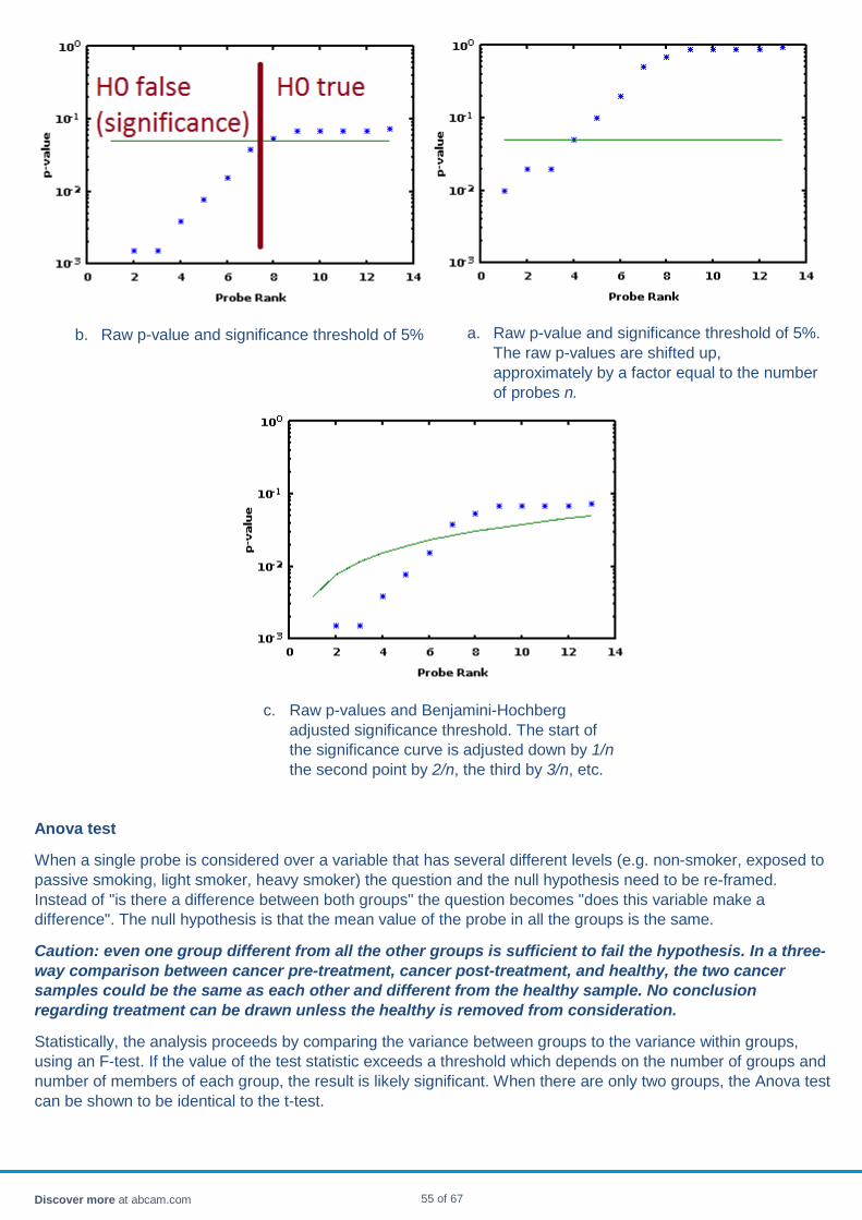
Anova test
When a single probe is considered over a variable that has several different levels (e.g. non-smoker, exposed to passive smoking, light smoker, heavy smoker) the question and the null hypothesis need to be re-framed. Instead of "is there a difference between both groups" the question becomes "does this variable make a difference". The null hypothesis is that the mean value of the probe in all the groups is the same.
Caution: even one group different from all the other groups is sufficient to fail the hypothesis. In a three-way comparison between cancer pre-treatment, cancer post-treatment, and healthy, the two cancer samples could be the same as each other and different from the healthy sample. No conclusion regarding treatment can be drawn unless the healthy is removed from consideration.
Statistically, the analysis proceeds by comparing the variance between groups to the variance within groups, using an F-test. If the value of the test statistic exceeds a threshold which depends on the number of groups and number of members of each group, the result is likely significant. When there are only two groups, the Anova test can be shown to be identical to the t-test.
b. Raw p-value and significance threshold of 5% a. Raw p-value and significance threshold of 5%. The raw p-values are shifted up, approximately by a factor equal to the number of probes n.
c. Raw p-values and Benjamini-Hochberg adjusted significance threshold. The start of the significance curve is adjusted down by 1/n the second point by 2/n, the third by 3/n, etc.
Discover more at abcam.com 55 of 67
Anova test with correction for multiple comparisons
Analyzing many different probes over a variable with several levels raises the same multiple comparisons issues as over a variable with just two levels. The same methods (Bonferroni and Benjamini-Hochberg) are used to adjust the p-values and estimate significance cutoff as for the two-level case.
Frequently asked questions
Q: How are assay control probes and blank probes considered in the analysis?
A: They are removed from consideration.
Q: If my experiment is designed around 12 particular probes which may or not be biomarkers, but I
also included 12 other probes for normalization or other purposes. How should they be treated?
A: If the extraneous probes will not be considered as biomarkers no matter how the data comes out, it
is reasonable to remove them from analysis by using the "hide" checkbox on the probe table.
Q: Suppose I start with 45 potential biomarkers, and find that none are significantly different among
groups, after adjusting for multiple comparisons. If I hide all the probes except the most significant
(or rather, least in-significant) probes, the adjusted p-value becomes significant. Is the probe
significant or not?
A: No. That is equivalent to ignoring 17 out of 20 failed rolls of the dice in the snake eyes example.
Discover more at abcam.com 56 of 67

Differential analysis When a discrete variable is defined, a differential analysis can be performed. Samples with the same value of the discrete variable are pooled into groups. Each probe is then compared using Anova analysis across the groups. The Anova (analysis of variation) seeks to identify whether the defined groups shows statistically significant differences in expression of the probe. The p-value for each probe is computed by looking at a t-test of the null hypothesis that the variation of the probe between groups could have arisen by chance. The inter-group variance is compared to the intra-group variance to derive a t-statistic for each probe.
After all probes have been subjected to Anova analysis, the probes are ranked in order of the most statistically significant change.
When using a multiplex assay, the issue of multiple comparisons should be kept in mind. A statistical procedure used to identify significance for a probe tested in isolation is likely to generate many "significant" results by sheer chance when many probes are tested at once, just as the odds of winning the lottery with 70 tickets are better than with 1. Thus using unadjusted p-values is likely to lead to false positives, especially in the context of a large PLX file.
To compensate for the statistical likelihood of finding an apparently significant result when sufficiently many different probes are analyzed, a "raw" and an "adjusted" score is presented. The raw score defines the statistical significance of the differential expression as if that probe had been the only probe. The adjusted score corrects for multiple comparisons using the Bonferroni method.
The Anova results are presented in a table and a chart on the Groups tab. In addition, a "volcano" plot of the significance relative to the fold change summarizes the data.
To access differential analysis
• Define one or more variables by reading a sample sheet or through the GUI • On the Variables tab select the desired variable • Select the Groups tab to see the table and chart
To sort the probes in order of significant difference of expression
• Select the heatmap tab and under the probe controls, select the desired variable as the "analysis" option. • Click "Use probe order" button at the bottom of the heatmap controls. You may need to reselect the variable
in the "analysis" pull-down. • Select the Groups tab to see the table and chart
Discover more at abcam.com 57 of 67
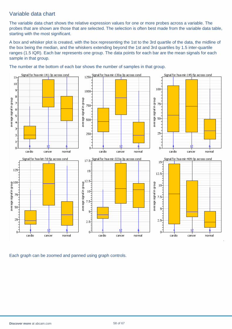
Variable data chart The variable data chart shows the relative expression values for one or more probes across a variable. The probes that are shown are those that are selected. The selection is often best made from the variable data table, starting with the most significant.
A box and whisker plot is created, with the box representing the 1st to the 3rd quartile of the data, the midline of the box being the median, and the whiskers extending beyond the 1st and 3rd quartiles by 1.5 inter-quartile ranges (1.5 IQR). Each bar represents one group. The data points for each bar are the mean signals for each sample in that group.
The number at the bottom of each bar shows the number of samples in that group.
Each graph can be zoomed and panned using graph controls.
Discover more at abcam.com 58 of 67

Variable data table The differential expression table gives details of the Anova analysis for all the probes. The probes are sorted according to their p-value by default, but they can be sorted on any column by clicking the heading of that column.
• The "row" column gives the order of the probes prior to any re-ordering. The starting ordering is in order of p-value.
• The "probe" column is the probe name. It is highlighted in bold if it is significantly different between groups, after adjusting for multiple comparisons.
• The "fold" column behaves differently if there are two groups (e.g. case/control) or multiple groups. o Two groups: fold is the ratio of the second to the first group. It is expressed as a numerical ratio, e.g.
2-fold is 2.0. o If there are more than two groups, it is the ratio of the highest to the lowest group.
• The "adjusted p-value" column is the adjusted p-value of the result, corrected for multiple comparisons. • The "unadj p-value" column is a single-probe p-value, without correction for multiple comparisons. • The "low" column gives the mean of the lowest group value of the probe • The "high" column is the mean of the highest group value of the probe
The popup menu allows the table to be exported. It also allows a choice of multiple comparison adjustment, either Bonferroni, or Benjamini-Hochberg. Further details on the methods are presented in the variable analysis page.
Discover more at abcam.com 59 of 67

Defining variables Variables are defined through the sample table GUI.
• With the mouse, select a group of samples and right-click them. • In the popup, select "Assign to Group" which results in a new popup with "Variable Name" and "Group Name"
fields. • In the new popup, choose, or create, a variable name. The default variable "Case/Control" has groups "Case"
and "Control" predefined. No samples are assigned to either group by default. • Choose, or create a group name. • Click "Ok". The selected samples are assigned to the group of the variable. • Repeat for each desired group of the variable. • It is not necessary to include every sample -- unassigned ones are simply ignored for variable processing
purposes
Note that the sample selection can be done using samples selected by any option - on the plate, from a graph, etc. For example, the horizontal row in the plate view was used to select the samples in the picture below.
Discover more at abcam.com 60 of 67
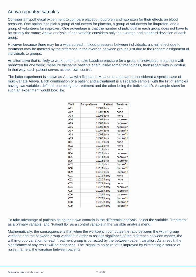
Anova repeated samples Consider a hypothetical experiment to compare placebo, ibuprofen and naproxen for their effects on blood pressure. One option is to pick a group of volunteers for placebo, a group of volunteers for ibuprofen, and a group of volunteers for naproxen. One advantage is that the number of individual in each group does not have to be exactly the same; Anova analysis of one variable considers only the average and standard deviation of each group.
However because there may be a wide spread in blood pressures between individuals, a small effect due to treatment may be masked by the difference in the average between groups just due to the random assignment of individuals to groups.
An alternative that is likely to work better is to take baseline pressure for a group of individuals, treat them with naproxen for one week, measure the same patients again, allow some time to pass, then repeat with ibuprofen. In that way, each patient serves as their own control.
The latter experiment is known as Anova with Repeated Measures, and can be considered a special case of multi-variate Anova. Each combination of a patient and a treatment is a separate sample, with the list of samples having two variables defined, one being the treatment and the other being the individual ID. A sample sheet for such an experiment would look like.
To take advantage of patients being their own controls in the differential analysis, select the variable "Treatment" as a primary variable, and "Patient ID" as a control variable in the variable analysis menu.
Mathematically, the consequence is that when the workbench computes the ratio between the within-group variation and the between-group variation in order to assess signifance of the difference between means, the within-group variation for each treatment group is corrected by the between-patient variation. As a result, the significance of any result will be enhanced. The "signal to noise ratio" is improved by eliminating a source of noise, namely, the variation between patients.
Discover more at abcam.com 61 of 67
If there are several such variables, for instance, patient ID, and "blood pressure taken in the morning" vs "blood pressure taken in the evening", and capsule / tablet, all such variables can be treated as a control variables.
A disadvantage of such a design relative to the simple design is that the matrix of patients and treatments must be fully populated - that is, every treatment must have every patient and every patient must have tried all the treatments. Any patient who missed a treatment, or who wasn't measured prior to treatment, should be dropped. If not, the workbench will warn and drop back to single-variable Anova.
There should also be more than one entry in each sub-group, in order to define within-group variance. There is no requirement that the number of replicates in each experimental cell needs to be the same. For instance, in the above example, Harry could have 5 BP measurements with ibuprofen and 3 BP measurements with naproxen.
Discover more at abcam.com 62 of 67

Variable table The variable table lists the currently defined variables for the currently selected experiment. The columns are:
• The "row" column provides the order of the variable prior to any re-ordering • The "name" column is the name of the variable • The "type" column is the type of a variable - double, string, integer, or enumerated.
o Enumerated variables, where there is a short list of choices such as "male/female" or "case/control", provide a basis for differential (ANOVA) analysis.
Other variables can be defined:
• through the GUI • by reading a sample sheet
To define a variable through the GUI, follow these instructions. New variables and values of the variables are created on the fly.
To delete a variable, use the right click menu.
Discover more at abcam.com 63 of 67

Volcano plot A volcano plot is a type of scatter plot, used to identify significant fold changes in probes. It has the significance on the vertical axis and the fold values on the horizontal axis.
For bivariate data (case/control, male/female, treatment/placebo etc), each probe is represented by one point, the Y value being its adjusted significance and the X value being the fold change.
For multivariate data (dose1/dose2/dose3/no dose for instance, or child / adolescent / adult), each probe is represented by as many values as there are groups. The Y values are all the same, being the significance. The X values are the group scores relative to the average of all scores.
The probes can be selected.
a. Bi-variate data b. Multi-variate data
Discover more at abcam.com 64 of 67
Chart controls Charts can be zoomed and panned in a variety of ways.
Mouse click
Left- click: Reset to automatic zoom Right-click: Bring up chart-specific menu.
Mouse wheel
Rotating the mouse wheel will cause the chart to zoom in or out. If the mouse is over the X axis, only the X axis will zoom. If the mouse is over the Y axis, only the Y axis will zoom. If the mouse is over the chart area, both axes will zoom together.
The chart normally only zooms out to the full extent of the data. To zoom out further than any data present, pressing the Ctrl key at the same time zooming out will override the extents.
Mouse motion
If an area is shift-dragged with the mouse, the chart will zoom to that area. If the mouse starts over the X axis, only the X axis will zoom. If the mouse starts over the Y axis, only the Y axis will zoom. If the mouse is over the chart area, both axes will zoom together.
If a point is dragged with the mouse, the chart will pan accordingly. Panning is only possible if the chart has been zoomed.
If an area is right-dragged with the mouse, all the samples/probes contained in that area will be selected. The selections will propagate through to the tables.
Keyboard
The Backspace key will return to the previous zoom setting. The Home key will reset to the automatic zoom setting. Arrow keys will pan the picture.
Discover more at abcam.com 65 of 67

References Vandesompele J, De Preter K, Pattyn F, Poppe B, Van Roy N, De Paepe A and Speleman F (2002). Accurate normalization of real-time quantitative RT-PCR data by geometric averaging of multiple internal control genes. Genome Biol, 3(7); RESEARCH0034.
Andersen CL, Jensen JL and Ørntoft TF (2004). Normalization of real-time quantitative RT-PCR data: a model based variance estimation approach to identify genes suited for normalization – applied to bladder- and colon-cancer data-sets. Cancer Res, 64(15), 5245-50.
Discover more at abcam.com 66 of 67