
Existing products research
4
Existing product research Nicole Tunningley
-
Upload
nicole-tunningley -
Category
Education
-
view
383 -
download
0
Transcript of Existing products research

Existing product research
Nicole Tunningley
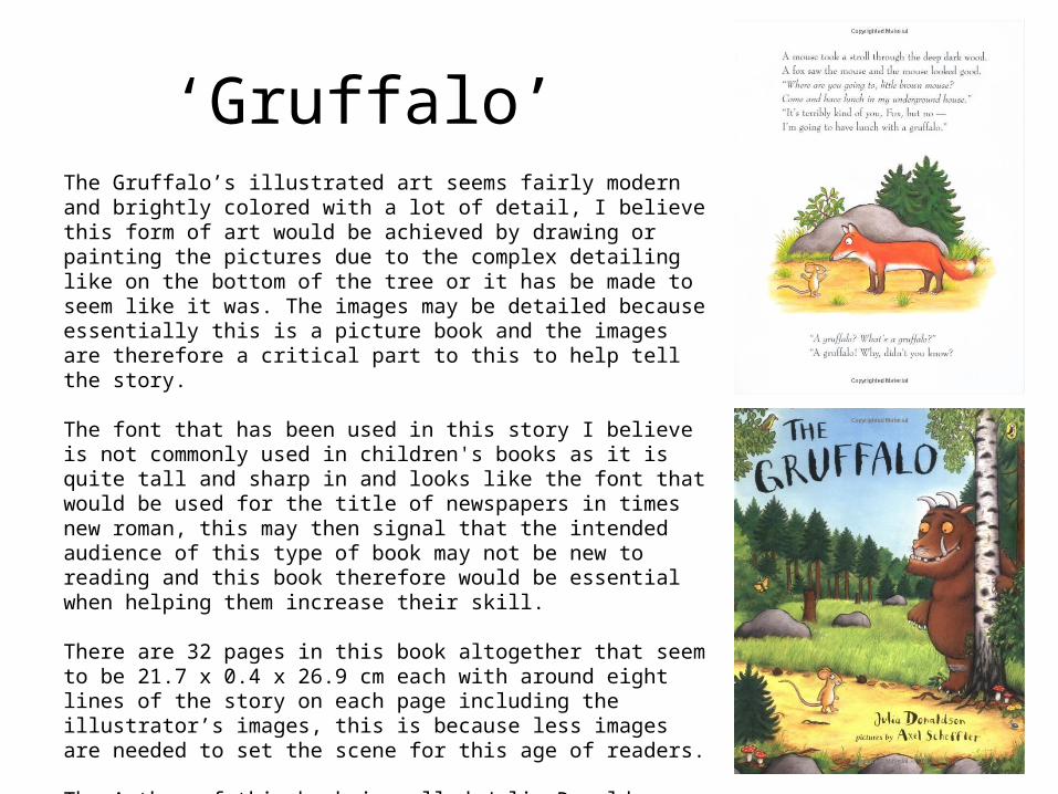
‘Gruffalo’The Gruffalo’s illustrated art seems fairly modern and brightly colored with a lot of detail, I believe this form of art would be achieved by drawing or painting the pictures due to the complex detailing like on the bottom of the tree or it has be made to seem like it was. The images may be detailed because essentially this is a picture book and the images are therefore a critical part to this to help tell the story.
The font that has been used in this story I believe is not commonly used in children's books as it is quite tall and sharp in and looks like the font that would be used for the title of newspapers in times new roman, this may then signal that the intended audience of this type of book may not be new to reading and this book therefore would be essential when helping them increase their skill.
There are 32 pages in this book altogether that seem to be 21.7 x 0.4 x 26.9 cm each with around eight lines of the story on each page including the illustrator’s images, this is because less images are needed to set the scene for this age of readers.
The Author of this book is called Julia Donaldson who is a very popular children’s book writer, the illustrator is Axel Scheffler and the publisher is a group known as Macmillan children’ books
‘We’re going on a bear hunt!’
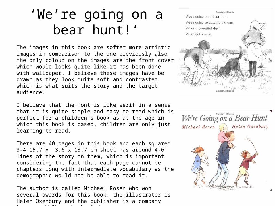
The images in this book are softer more artistic images in comparison to the one previously also the only colour on the images are the front cover which would looks quite like it has been done with wallpaper. I believe these images have be drawn as they look quite soft and contrasted which is what suits the story and the target audience.
I believe that the font is like serif in a sense that it is quite simple and easy to read which is perfect for a children's book as at the age in which this book is based, children are only just learning to read.
There are 40 pages in this book and each squared 3-4 15.7 x 3.6 x 13.7 cm sheet has around 4-6 lines of the story on them, which is important considering the fact that each page cannot be chapters long with intermediate vocabulary as the demographic would not be able to read it.
The author is called Michael Rosen who won several awards for this book, the illustrator is Helen Oxenbury and the publisher is a company known as Walkers books ltd.

‘Cat in the hat’The images in this book are eccentric in comparison to the prior because they are black and white with a selective color splash on various different sections e.g. the image on the left has color on the window glass of blue, the chairs and girl’s bow are both a bright pink, I believe this would have been achieved by drawing it digitally and filling it with color or scanning it through to catch details. Personally, I think this art style suits the wacky story and author.
I believe the font is serif again as it is soft and not too sharp or loopy which is suitable for a child's book and means that they can actually read it, this is good for at the age it is aimed at children are only just learning to read bigger words.
There are 64 pages in this 16.3 x 0.5 x 22.5 cm sized book with 4-8 lines of the story on each page, this is suitable as it means there are enough images to go with the story to get the children’s imaginations going.
Dr. Seuss is both the Author and Illustrator for this quirky book and is well-known in the children's book region for creating classics that will be loved for generations. It is published by the popular HarperCollins Children’s books


