Enhancing PeopleSoft with Custom Look and Feel...Enhancing PeopleSoft with Custom Look and Feel Todd...
29
Transcript of Enhancing PeopleSoft with Custom Look and Feel...Enhancing PeopleSoft with Custom Look and Feel Todd...

Enhancing PeopleSoft with Custom Look and Feel
Todd Kummer

2
Objective
Share what we’ve learned about how to design highly usable PeopleSoft applications.

3
Agenda
• Why is usability important?
• Thinking differently about PeopleTools
• What’s possible?
• Knowing the problem before designing the solution
• The perils of data model driven design
• How to avoid common PeopleTools pitfalls
4
Good Usability
• Infrequently used functionality is out of the way (minimal clutter)
• Minimal number of clicks required for most users (minimal “clickiness”)
• User doesn’t need instructions, but help is readily available
• "No matter how beautiful, no matter how cool your interface, it would be better if there were less of it." -Alan Cooper

5
Good Usability
• Benefits
– Reduced training
– Reduced support call volume
– Higher productivity
– Fewer mistakes
– High utilization / less enforcement
– Happy, loyal users
6
Rethinking PeopleTools
• Stop building PeopleSoft apps, start building web apps
• The competition is the rest of the web—when users open a browser they have expectations
• Don’t rule anything out
• One of the top benefits of PeopleTools is its openness
7
What’s Possible?
• Customer had been live on PeopleSoft eBenefits for several open enrollments
• “Forced elections”, i.e. all employees use app
• Problem:
– Too many HR support calls for open enrollment
– Too many serious user errors
• Overview of Solution
Case Study: eBenefits Makeover

8
What’s Possible?
• Results:
– 95% reduction in support calls
– Zero serious errors to date
– CEO – “I actually did it myself … now that is simple.”
– Relations Specialist – “I was done in less than 5 minutes, even after comparing 3-4 different enrollment options”
– IT Engineer – “Holy crap that was awesome!”
What’s the Problem?
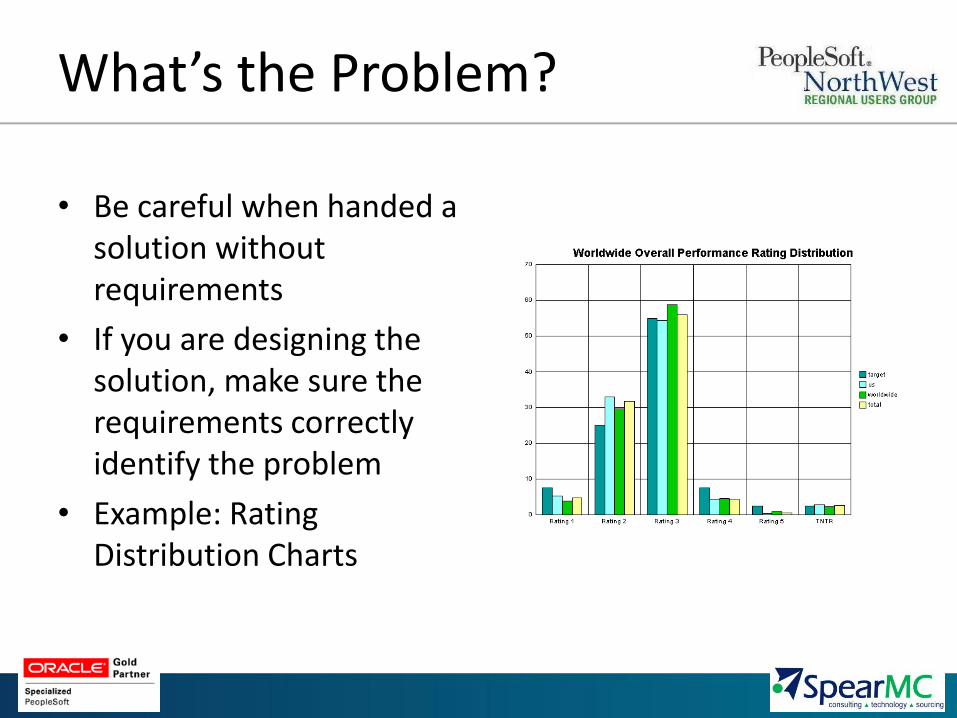
• Be careful when handed a solution without requirements
• If you are designing the solution, make sure the requirements correctly identify the problem
• Example: Rating Distribution Charts
10
What’s the Problem?
• Mockups
– Non-functional, “sketches” of user interface
– Powerful tool for correctly identifying the problem
– Increases likelihood design will make sense to the users
– Example: Cerner eBenefits makeover

Initial
White
Board

Wireframe mockup in Balsamiq

Final mockup
in Excel
14
What’s the Problem?
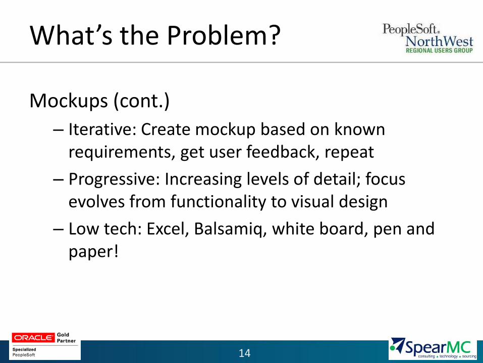
Mockups (cont.)
– Iterative: Create mockup based on known requirements, get user feedback, repeat
– Progressive: Increasing levels of detail; focus evolves from functionality to visual design
– Low tech: Excel, Balsamiq, white board, pen and paper!

15
Data Model Driven Design
• Traditionally pages look a lot like tables
• PeopleTools is a very good rapid application development tool, not a design tool

16
Data Model Driven Design
• Solution 1: Folders
– Start with the main information
– Provide the ability to see additional information in context
– Example: ePerformance Documents

17
Data Model Driven Design

18
Data Model Driven Design
• Solution 2: Multipane Pages
– Divide the page into multiple, independent panes
– Each pane displays a component/page or other content
– Example: Staffing Workbench

Data Model Driven Design

20
Avoiding PeopleTools Pitfalls
• Effective Dating
– Traditional method of exposing effective date to user can result in unnecessary clutter
– Effective dating should only be as prominent as it is important to the user
– Example: ePerformance Goal Manager


24
Avoiding PeopleTools Pitfalls
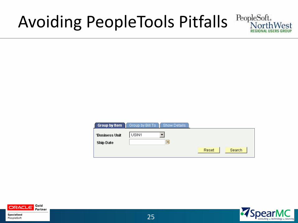
• Switching Modes: Fields available to specify dependent on mode or initial criteria
– Traditional method of hiding and unhiding fields based on user selection can be confusing
– Distinguish the mode selection from other criteria
– Provide a consistent page
– Example: Allocation Workbench Search
25
Avoiding PeopleTools Pitfalls
26
Avoiding PeopleTools Pitfalls
• The standard color palette
– Don’t be afraid to use color
– But…use it mostly to guide the user, not to decorate
– Example: Cerner eBenefits

27
Avoiding PeopleTools Pitfalls
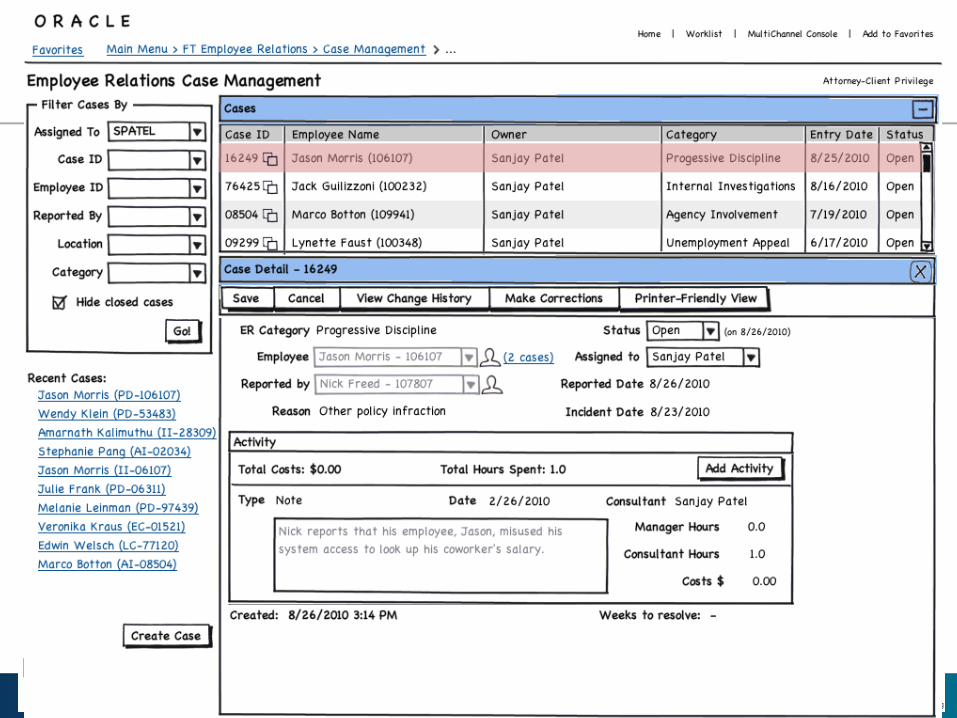
• The standard search dialog
– Powerful, but limited ability to customize look & feel
– What navigation mechanism would get most users to exactly what they are interested in with the fewest clicks?
– Example: Employee Relations Case Management
Questions?
Enhancing PeopleSoft with
Custom Look and Feel