
Earth’s Orbit and Contemporary Climate ChangeIntroductory summary ... compared to the benchmarks...
49
Earth’s Orbit and Contemporary Climate Change Duncan Steel I shew the thing and reason why; At large, in breif, in middle wise, I humbly give a playne advise; For want of tyme, the tyme untrew Yf I have myst, commaund anew Your honor may. So shall you see That love of truth doth govern me. John Dee, 1583. Introductory summary In this document I discuss how well-known variations in Earth’s orbit around the Sun result in variations in the solar flux received (at different latitudes and at different times of year) which might be expected to cause changes in the climate in accord with what is actually being observed now, independent of any major contribution from anthropogenic global warming (AGW). Contrary to the supposition of many, apsidal precession occurs quite quickly, shifting the date of perihelion referenced to the equinoxes and solstices by one day every 57 or 58 years, and therefore by more than four days since 1750 (the nominal start of the Industrial Revolution, when releases of carbon dioxide and other greenhouse gases began in earnest). This has caused the total solar flux impinging on the Earth at the time of the vernal/spring equinox to increase by 0.24 per cent over the past 250 years; this is a non-negligible amount compared to the benchmarks set for anthropogenic global warming (AGW). It follows that the widespread belief that orbital changes only cause climate change over intervals of several millennia is incorrect. Further, I identify the reason why the influence of perihelion precession on the present-day climate and its changing nature has been overlooked by climate scientists: they appear to have compared the latitude-dependent insolations in different epochs over the past millennium at different points on Earth’s heliocentric orbit in terms of equal steps in ecliptic longitude rather than equal steps in time, the results derived therefore being erroneous and misleading. It might perhaps be regarded as being ironic that the main factor causing the insolation changes in question – the precession of perihelion – is also the very thing that causes equal steps in ecliptic longitude around our orbit not to be equivalent to equal steps in time. A coincidence that has contributed to this confusion is the fact that by convention the vernal equinox is: (a) Used as the zero point for ecliptic longitude values; (b) The start of
Transcript of Earth’s Orbit and Contemporary Climate ChangeIntroductory summary ... compared to the benchmarks...

Earth’s Orbit and Contemporary Climate Change
Duncan Steel
I shew the thing and reason why;
At large, in breif, in middle wise,
I humbly give a playne advise;
For want of tyme, the tyme untrew
Yf I have myst, commaund anew
Your honor may. So shall you see
That love of truth doth govern me.
John Dee, 1583.
Introductory summary In this document I discuss how well-known variations in Earth’s orbit around the Sun result in
variations in the solar flux received (at different latitudes and at different times of year) which
might be expected to cause changes in the climate in accord with what is actually being
observed now, independent of any major contribution from anthropogenic global warming
(AGW).
Contrary to the supposition of many, apsidal precession occurs quite quickly, shifting
the date of perihelion referenced to the equinoxes and solstices by one day every 57 or 58
years, and therefore by more than four days since 1750 (the nominal start of the Industrial
Revolution, when releases of carbon dioxide and other greenhouse gases began in earnest).
This has caused the total solar flux impinging on the Earth at the time of the vernal/spring
equinox to increase by 0.24 per cent over the past 250 years; this is a non-negligible amount
compared to the benchmarks set for anthropogenic global warming (AGW). It follows that the
widespread belief that orbital changes only cause climate change over intervals of several
millennia is incorrect.
Further, I identify the reason why the influence of perihelion precession on the
present-day climate and its changing nature has been overlooked by climate scientists: they
appear to have compared the latitude-dependent insolations in different epochs over the past
millennium at different points on Earth’s heliocentric orbit in terms of equal steps in ecliptic
longitude rather than equal steps in time, the results derived therefore being erroneous and
misleading. It might perhaps be regarded as being ironic that the main factor causing the
insolation changes in question – the precession of perihelion – is also the very thing that
causes equal steps in ecliptic longitude around our orbit not to be equivalent to equal steps in
time.
A coincidence that has contributed to this confusion is the fact that by convention the
vernal equinox is: (a) Used as the zero point for ecliptic longitude values; (b) The start of

2
Earth’s Orbit and Contemporary Climate Change ─ All original text and graphics ©Duncan Steel 2014 Website: duncansteel.com Email: [email protected]
northern spring (as astronomically-defined); and (c) The event upon which years in different
epochs are registered against each other in studies of palaeoclimatology. Because of this the
vernal equinox is the only juncture in each year/each orbit at which the ecliptic longitude and
the day-of-year remain in agreement regardless of the longitude of perihelion in that epoch.
One of the main arguments in favour of AGW causing the observed alterations in the
climate and increase in the globally-averaged temperature is the apparent correlation
between that temperature rise and the enhanced levels of greenhouse gases (carbon dioxide
in particular) since 1750. Another correlation, which seems to have been mostly overlooked,
is the fact that perihelion, in its 21,000-year precession cycle, was aligned with the winter
solstice as recently as the mid-13th century; since it moved past that alignment, perihelion
has been progressing further into winter (i.e. the one day per 57/58 years produced by
precession) and closer to the vernal equinox. The effect of this is that on every day during the
first half of each year the Earth has been getting progressively closer to the Sun compared to
the same day-of-year on the preceding orbit, and so the solar power to the planet has been
consistently increasing across those six months in terms of year-to-year comparisons. In the
second half of the year the converse is true, with the Earth becoming progressively further
away on each day-of-year. The result of this would be expected to be, in the northern
hemisphere, milder winters, warmer springs, and cooler latter halves of the year; whereas in
the southern hemisphere spring would be cooler and summer warmer.
When this analysis of insolation changes is carried out correctly I find that the most
substantial variations are occurring at high latitudes across spring: in the northern hemisphere
the spring insolation is increasing markedly, whilst in the southern hemisphere the insolation
across austral spring is reducing. In itself this might be anticipated to result in what is actually
observed: record melting of ice and snow cover in the Arctic whilst there is year-on-year
growth of the extent of Antarctic sea ice. The insolation changes involved are found to exceed
the magnitude of the heating ascribed to AGW by the IPCC.
However, the so-called ice albedo feedback effect must cause additional leveraging of
these solar flux changes: increased insolation in the north causes greater and earlier loss of
the high-albedo snow and ice cover, and so greater absorption of sunlight, whereas in the
south the converse occurs.
My conclusion is that whilst AGW may indeed be causing some elevation of the
globally-averaged temperature, the effect of Earth’s shifting orbital axis is greater in
magnitude: that effect is broadly positive (warming) in the northern hemisphere and negative
(cooling) in the southern hemisphere, but overall would be expected to contribute to an
increase in the averaged global temperature. I term this concept the Changing Spring
Insolation (CSI) hypothesis. If this is correct then AGW is simply causing an acceleration in
climatic changes which would have eventuated anyway.
The major aim of this document is to lay out my calculations and results in a suitable
way for those with the necessary backgrounds to be able to understand the argument, and to
identify any errors of fact or interpretation that I may have made. I would hope that several

3
Earth’s Orbit and Contemporary Climate Change ─ All original text and graphics ©Duncan Steel 2014 Website: duncansteel.com Email: [email protected]
others will take it upon themselves to repeat my calculations (I give pointers herein as to how
to do so) and so verify the outcomes.
Comments and observations are welcome, but only on the substantive subject of this
document: how Earth’s shifting orbit is affecting the insolation received at different latitudes
and different times of year in the present epoch. Any comments on other matters pertaining
to global warming/climate change will simply be deleted and will not be seen by any others
(nor even read by myself). The focus here is on one matter only.
Preamble It is apparent that the globally-averaged temperature has been gradually increasing over at
least the past two centuries (although there may have been a hiatus in this trend over the last
decade and a half) and that in various respects the climate is changing in different ways in
different locations.
The widely-favoured (but much-debated) explanation of the above is that the prime
cause of these changes is the enhanced trapping of thermal infra-red radiation that must
result from increasing atmospheric levels of various ‘greenhouse gases’ as a result of
humankind’s activities since the start of the Industrial Revolution. These gases include carbon
dioxide, methane, and water vapour; the reasoning is that as their mixing ratios are elevated,
various holes in the wavelength-dependent infra-red opacity of the atmosphere are partially
filled or blocked, the thermal re-radiation of solar energy by the Earth is obstructed somewhat,
and so the temperature of the planet goes up so as to compensate. The physics involved in
this is quite straightforward, and the overall picture is termed the Anthropogenic Global
Warming (AGW) hypothesis.
I have little doubt that AGW is indeed contributing to the measured globally-averaged
temperature increase, even though as a scientist I remain open to the possibility that the basic
tenets of the AGW hypothesis might be wrong; for example, it is conceivable that the Earth
might have some form of natural thermostat which maintains the temperature as the holes in
the infra-red opacity are blocked.
Leaving such possibilities aside for later study by others (or perhaps myself), there are
two broad reasons for believing that AGW is indeed occurring:
(a) The temperature has gone up as the greenhouse gas levels (in particular carbon
dioxide) have gone up, a demonstration of correlation; and
(b) Detailed computer models of the energy budget and balance (or otherwise) of the
Earth as a whole indicate an expectation of increasing temperature and concomitant
climate change as the greenhouse gas levels climb, based on physical principles of
which a few have been mentioned above.
On (b), the models involved are extremely complicated, requiring the adoption of a wide
variety of assumptions, for not all of which are there supporting observations or
measurements. That does not make the models wrong – and overall I have no reason to

4
Earth’s Orbit and Contemporary Climate Change ─ All original text and graphics ©Duncan Steel 2014 Website: duncansteel.com Email: [email protected]
imagine that they are wildly incorrect – but the sheer complexity involved means that caution
is needed. Apart from anything else, models developed by different research teams appear to
result in predictions (and post-dictions) that differ substantially.
On (a) the correlation is quite striking. But correlation does not prove causality:
sometimes an apparent correlation can also be a case of coincidence.
Also, the causative link between two phenomena may not always be direct. It is
recognised that murder rates in the USA go up at the same times as ice-cream sales go up, but
that is not a case of ice cream provoking people to kill others (or mass-murderers being keen
on ice-cream); rather, one suspects that the hot, humid climatic conditions that prompt the
ice-cream purchases also result in people being less well-tempered than they might be when
the conditions are more comfortable.
Nevertheless, strict science forces one to accept a likely link between rising global
average temperature and increasing greenhouse gases since the Industrial Revolution
(nominally since 1750, conventionally adopted as a reference year because it is before the
carbon dioxide releases really started to boom).
That does not, however, mean that all of the observed temperature increase is due to
AGW; nor does it mean that all of the observed changes in climate are the result of increasing
greenhouse gas levels. There might be other contributory causes.
In this document I summarise a natural phenomenon that should also be expected to
cause both global warming and climate change. I term it the Changing Spring Insolation (CSI)
hypothesis. It can be broadly characterised as follows:
(a) As with AGW, the CSI hypothesis indicates temporal correlation with what is
observed (i.e. the warming and climate change measured over the past couple of
centuries would indeed be expected to be occurring now rather than in some other
random epoch); and
(b) In contrast to AGW, the CSI hypothesis is described by a very simple (and yet
complete) model which can be verified by anyone, without any specialist
knowledge being required.
The CSI hypothesis depends mainly on the known gradual movement of Earth’s
perihelion position (closest approach to the Sun in each orbit) and is quite straightforward to
understand.
Most significantly, the CSI hypothesis leads to a prediction of certain observed
phenomena (e.g. increased melting of Arctic ice whereas the Antarctic sea ice extent is
growing annually) which the AGW hypothesis does not, and indeed has considerable difficulty
in explaining post hoc.
In view of the above – claims that I substantiate later in this document – Ockham’s
razor dictates that the CSI model should be adopted as the central working hypothesis for

5
Earth’s Orbit and Contemporary Climate Change ─ All original text and graphics ©Duncan Steel 2014 Website: duncansteel.com Email: [email protected]
contemporary climate change, although as I alluded earlier it would not be reasonable to think
that AGW is not also contributing to the observed changes.
Overall my present position would be that the AGW phenomenon is simply causing an
acceleration in changes which would have occurred anyway, but a full investigation and
resolution of this question will require the development of evolutionary models of the climate
which stretch over some centuries and out to about a millennium, with both the CSI and the
AGW components (and their effects) being properly included.
One might think that this must surely have been done in the past, but to the best of
my knowledge it has not. Every climate change publication I have studied in detail and which
incorporates the effects of the precession of Earth’s orbit around the Sun on the distribution
(in time and latitude) of the incoming solar flux has contained a fundamental mistake which
invalidates the results obtained.
The material I discuss in this document has been reviewed by a handful (6 or 8) of my
astronomer colleagues (and I have also presented it as a research colloquium a couple of
times). They have been uniformly stunned by the error apparently made by climatologists in
assessing how the solar flux at Earth at different times of year varies over extended periods
(decades to centuries to a millennium), this error involving a misunderstanding of the
implications of Kepler’s second law of orbital motion. Nevertheless, any responsibility for
mistakes made in this document and the calculations that are represented herein remain the
fault of myself.
It might well be, therefore, that I have myself made one or more grave mistakes
somewhere in my analysis and computations. One person identifying such a mistake would be
enough to show that the Changing Spring Insolation hypothesis is false. My intent in making
this document available is to invite those readers with the necessary backgrounds and
capabilities to consider what I have calculated and to inspect what I have presented herein,
and if they find that I am wrong in any way please to point out the error. Confirmatory
calculations would also be useful.
On the other hand, if I have not erred then I have demonstrated that human-released
greenhouse gases are not the dominant cause of the climate change observed to be occurring
now, and a rather simple natural effect which has been hitherto unrecognised or
underestimated is in fact the major agency of the changes we are experiencing.
It is essential that we should understand properly the causes and effects, both natural
and man-made, which can cause perturbations of Earth’s climate. Unless we have such an
understanding we cannot make confident predictions about how the climate may change in
the near- to mid-term, nor make informed and wise decisions about how we might need to
alter our behaviour, or adapt to inevitable changes.

6
Earth’s Orbit and Contemporary Climate Change ─ All original text and graphics ©Duncan Steel 2014 Website: duncansteel.com Email: [email protected]
Assumptions and Background Material In this rather long section I will describe the various assumptions I have made in performing
the calculations presented in this document, so that readers will not need to wonder about
the input parameters used in different parts of the analysis. Also, I will cover most of the
necessary background material.
Solar flux:
I have assumed that only the direct solar short-wave radiation (i.e. essentially that across the
visible part of the spectrum, although including those parts of the near infra-red and ultra-
violet that penetrate the atmosphere and cause near-surface heating) is of any significance in
terms of the incoming energy warming the Earth. This means that heat derived from sunlight
reflected from the Moon, the stars, extraterrestrial radiation at other wavelengths, cosmic
rays, and the upwards flux of heat from within the Earth, plus other minor sources that escape
my memory just now, are all neglected.
The incoming solar flux (as above) is assumed not to have varied over the interval of
interest (the past millennium or so), and to have had a value of S0 = 1,360 Watts per square
metre at a distance precisely one astronomical unit (AU) from the centre of the Sun. The solar
radiation is assumed to be coming from a source modelled as a point at the centre of the Sun
(i.e. effects due to limb darkening, Doppler shifts from the rotating and turbulent solar surface,
the finite angular size of the Sun and so on, are all neglected). Note that the precise value
adopted for the solar flux here (1,360 W/m2) is not important, because the calculated changes
in the influx at different latitudes and different times of year are all relative, and so it makes
very little difference if one decides to use a value of 1,367, 1,360 or 1,353 W/m2.
What is significant?
Considering the heat budget of the Earth, in 2007 the Intergovernmental Panel on Climate
Change (IPCC) announced a finding that the overall climatic effect of humankind’s activities
since the Industrial Revolution began a couple of centuries ago amounts to about 1.6 W/m2,
in terms of how our atmosphere is now trapping more energy than it would have done without
our releases of additional greenhouse gases through the burning of fossil fuels. In the more
recent 2013 IPCC assessment1, that estimate has been increased to 2.29 W/m2.
The flux of sunlight at Earth being about 1,360 W/m2, the above figures of 1.6 and 2.29
are respectively equivalent to 0.12 per cent and 0.17 per cent of the solar flux. Here I assume,
therefore, that any changes in the impinging solar flux above 0.01 per cent are non-negligible
in terms of climate change analysis. That limit defines what is ‘significant’, and what is not.
1 IPCC (2013): Summary for Policymakers. In: Climate Change 2013: The Physical Science Basis. Contribution of
Working Group I to the Fifth Assessment Report of the Intergovernmental Panel on Climate Change [Stocker,
T.F., D. Qin, G.-K. Plattner, M. Tignor, S. K. Allen, J. Boschung, A. Nauels, Y. Xia, V. Bex and P.M. Midgley
(eds.)]. Cambridge University Press, Cambridge, United Kingdom and New York, NY, USA; see page 11.

7
Earth’s Orbit and Contemporary Climate Change ─ All original text and graphics ©Duncan Steel 2014 Website: duncansteel.com Email: [email protected]
Earth’s heliocentric orbit
In any particular epoch (e.g. the year 1750, 2000, 1246, 950 etc.) Earth’s orbit is considered to
be an unperturbed ellipse governed by the relevant orbital elements for that epoch. That is,
the path taken by our planet throughout each year (or orbit) in question is assumed to follow
the osculating elements that apply, and effects due to the Moon are neglected; in reality, of
course, it is the Earth-Moon barycentre that follows the orbit, and that orbit is continually
perturbed by the other planets compared to the two-body assumption used here.
The only orbital elements of relevance here are the eccentricity (e) and the longitude
of perihelion (ϖ) as measured from the vernal equinox (i.e. the ecliptic longitude of the vernal
equinox is used as the zero point for such measurements, all in the ecliptic plane). The
inclination of Earth’s orbit is assumed to be zero (i.e. the Earth remains on the ecliptic).
In the diagram below I show the Earth’s orbit in the year 2000 (‘the present’) as an
orange ellipse, with a white circular orbit for reference; the semi-major axis of each
(equivalent to the radius of the circle) is 1 AU. The ellipse is oriented so as to show the present
longitude of perihelion, 282.9 degrees (measured from the vernal equinox). The dashed line
across the middle is the major axis of that ellipse. The minor axis (not shown) is perpendicular
to the major axis, but does not pass through the Sun (except in the case of an elliptical orbit
of eccentricity zero; that is, a circle).
The following perspective diagram may also aid understanding of what is going on in
terms of the astronomical definitions of the seasons, and when they each start and end. The
longitude of perihelion is continually shifting, from one epoch to another: in this diagram I
indicate its present position (early January) but also note that in the mid-13th century it was
aligned with the December or winter solstice (i.e. back in that epoch, ϖ = 270 degrees).

8
Earth’s Orbit and Contemporary Climate Change ─ All original text and graphics ©Duncan Steel 2014 Website: duncansteel.com Email: [email protected]
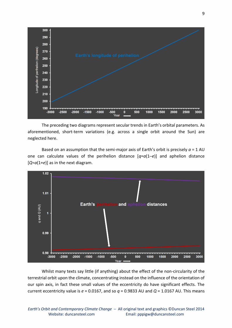
The values of e and ϖ used herein for different epochs are derived using the algorithm
and code of Berger (1978)2. The following two diagrams plot these two orbital parameters
from five millennia in the past until one millennium into the future. (Note that I consider the
year 2000 [usually labelled as Anno Domini or Common Era] to be ‘the present’; the reader
should also be aware that in geology, archaeological dating and the like the term ‘Before
Present’ is used to refer to numbers of years prior to the start of 1950 CE, the abbreviation BP
being used, with the abbreviation bp having a different meaning in that specific context.)
2 Berger, A., “Long-Term Variations of Daily Insolation and Quaternary Climatic Changes”,
Journal of the Atmospheric Sciences, volume 35, pp. 2362–2367 (1978).
9
Earth’s Orbit and Contemporary Climate Change ─ All original text and graphics ©Duncan Steel 2014 Website: duncansteel.com Email: [email protected]
The preceding two diagrams represent secular trends in Earth’s orbital parameters. As
aforementioned, short-term variations (e.g. across a single orbit around the Sun) are
neglected here.
Based on an assumption that the semi-major axis of Earth’s orbit is precisely a = 1 AU
one can calculate values of the perihelion distance [q=a(1─e)] and aphelion distance
[Q=a(1+e)] as in the next diagram.
Whilst many texts say little (if anything) about the effect of the non-circularity of the
terrestrial orbit upon the climate, concentrating instead on the influence of the orientation of
our spin axis, in fact these small values of the eccentricity do have significant effects. The
current eccentricity value is e = 0.0167, and so q = 0.9833 AU and Q = 1.0167 AU. This means

10
Earth’s Orbit and Contemporary Climate Change ─ All original text and graphics ©Duncan Steel 2014 Website: duncansteel.com Email: [email protected]
that the intensity of sunlight at perihelion compared to that at aphelion is (1.0167/0.9833)2 =
1.0691, and so at perihelion (currently in early January) the solar flux meeting the Earth is
almost seven per cent higher than at aphelion (in early July). That is certainly not negligible,
and is one of the reasons for the dichotomy between the climates of the northern and
southern hemispheres.
Precession: equinoctial and apsidal
I wrote above that the position/longitude of Earth’s perihelion is shifting continually, but I did
not explain how or why. It’s due to precession.
When people talk about the precession of Earth’s orbit there are two distinct
phenomena to which they might be referring, and so we must distinguish between them.
One is the precession of the equinoxes (also termed equinoctial or axial precession),
which has been recognised for at least 2,100 years; which person and which culture
discovered it is a matter of scholarly debate, although it is usually associated with Hipparchus.
In essence the Earth’s spin axis swivels around in terms of its orientation compared to the
distant stars, and in consequence the position of the vernal equinox moves westward
(clockwise when viewed from the north) along the ecliptic, taking almost 26,000 years to
complete a full 360-degree rotation. The main cause of equinoctial precession is the torque
imposed on the non-spherical Earth by the Moon, whose orbit is tilted compared to both the
equator and the ecliptic.
The second phenomenon is the precession of the long axis of Earth’s elliptical orbit:
apsidal precession or the precession of perihelion. This movement is in the opposite direction
to that of the equinoxes, and takes about 110,000 years to complete a rotation around the
ecliptic compared to the distant stars. Apsidal precession is largely due to gravitational
perturbations imposed on Earth’s orbit by the other planets, Jupiter in particular. (As an
advance point of interest I might note that this means that Jupiter is controlling the pace of
Earth’s climate change.)
What is of interest to us here is the relative movement of the equinoxes and perihelion,
because that results in a climate cycle of around 21,000 years (i.e. the reciprocal of the sum
of the reciprocals of 26,000 and 110,000).
This climate cycle of 21,000 years could equally-well have been deduced from two
different types of astronomical ‘year’. The anomalistic year (the average interval between
perihelion passages) lasts for 365.259636 mean solar days; the mean tropical year (MTY: the
average length of time to complete an orbit relative to the equinoxes and solstices, as
discussed later) lasts for 365.242190 days. The difference between those is 0.017446 days.
The reciprocal of that is about 57.32, which tells us how many years it takes for perihelion to
shift by one day compared to the equinoxes and solstices. Multiple that 57.32 by the number
of days in the year, and you get 21,000 years, the interval over which perihelion completes its
progression around the ecliptic (or, through a complete tropical year).

11
Earth’s Orbit and Contemporary Climate Change ─ All original text and graphics ©Duncan Steel 2014 Website: duncansteel.com Email: [email protected]
Many books and articles that talk about the Milankovitch theory for the origin of ice
ages and interglacials will mention this 21,000-year cycle and how it can cause long-term
climate change, without the authors recognising that in fact this movement of perihelion
might cause climate change on a far shorter time scale. The AGW hypothesis is all about small
changes having major implications. Here, we have seen that perihelion shifts by about one
day every 57 years. Since the canonical epoch of 1750 perihelion has moved by more than
four days, greater than one per cent of a year. Perhaps that is significant? (Rhetorical
question.)
Around 1750 perihelion happens to have been occurring on December 31st or January
1st, whereas now perihelion passage typically takes place on January 3rd or 4th. However, it
is not this coincidence with the start of the year that is pertinent here; what is more important
is that about 770 years ago, in the mid-13th century (nominally in 1246 CE), perihelion was
aligned with the winter solstice (about December 22nd) and since then it has moved out of
autumn and into winter, with climatic effects that I will discuss in detail later.
Immediately, however, it would be useful to mention the following. As perihelion
shifted past the winter solstice and therefore into the northern season of winter the effect
has been that at all corresponding times of year across both winter and spring the Earth has
been closer to the Sun than it was the year before, the decade before, or the century before.
That is, from the mid-13th century there has been an ongoing situation whereby the solar flux
meeting the Earth has been increasing monotonically across northern winter and spring (say,
the first half of the year), and in fact that effect is accelerating in that the change from year to
year is getting larger as perihelion moves ever later, and closer to the vernal equinox. I have
yet to see this fact mentioned amongst the myriad reports of the Arctic ice melting earlier and
to a greater extent than previously recorded, and yet it seems obvious that this must be
contributing to what is observed.
12
Earth’s Orbit and Contemporary Climate Change ─ All original text and graphics ©Duncan Steel 2014 Website: duncansteel.com Email: [email protected]
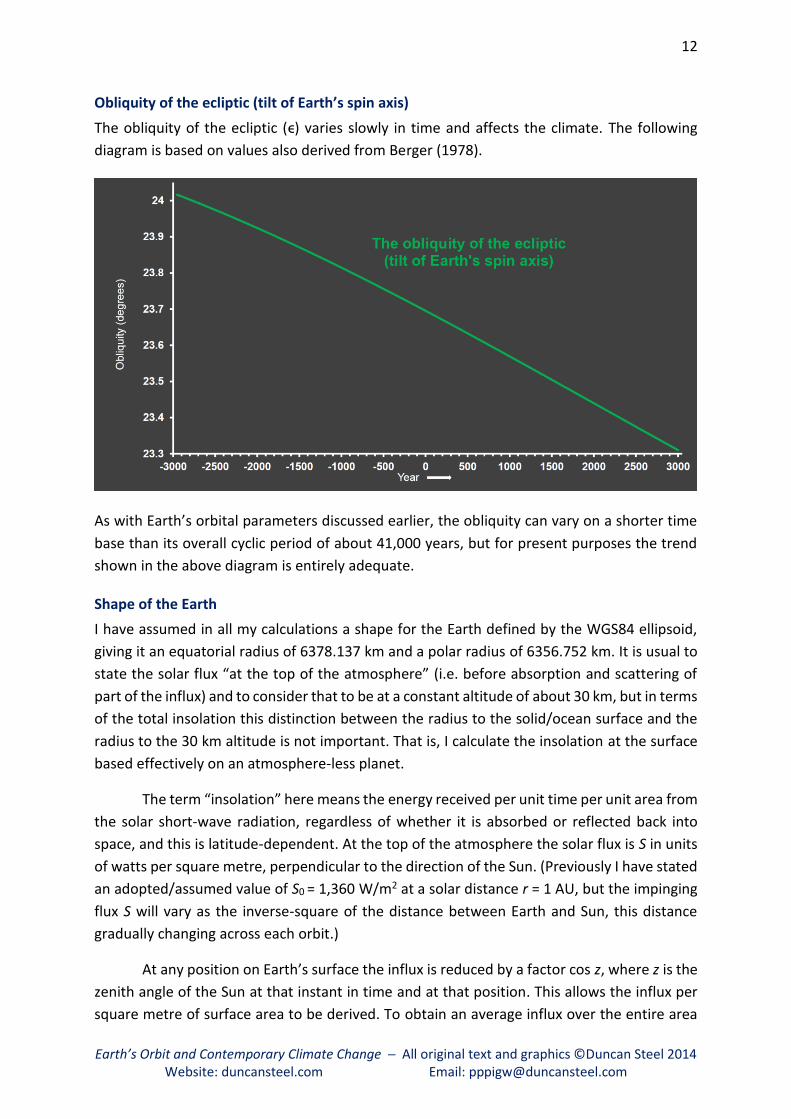
Obliquity of the ecliptic (tilt of Earth’s spin axis)
The obliquity of the ecliptic (ϵ) varies slowly in time and affects the climate. The following
diagram is based on values also derived from Berger (1978).
As with Earth’s orbital parameters discussed earlier, the obliquity can vary on a shorter time
base than its overall cyclic period of about 41,000 years, but for present purposes the trend
shown in the above diagram is entirely adequate.
Shape of the Earth
I have assumed in all my calculations a shape for the Earth defined by the WGS84 ellipsoid,
giving it an equatorial radius of 6378.137 km and a polar radius of 6356.752 km. It is usual to
state the solar flux “at the top of the atmosphere” (i.e. before absorption and scattering of
part of the influx) and to consider that to be at a constant altitude of about 30 km, but in terms
of the total insolation this distinction between the radius to the solid/ocean surface and the
radius to the 30 km altitude is not important. That is, I calculate the insolation at the surface
based effectively on an atmosphere-less planet.
The term “insolation” here means the energy received per unit time per unit area from
the solar short-wave radiation, regardless of whether it is absorbed or reflected back into
space, and this is latitude-dependent. At the top of the atmosphere the solar flux is S in units
of watts per square metre, perpendicular to the direction of the Sun. (Previously I have stated
an adopted/assumed value of S0 = 1,360 W/m2 at a solar distance r = 1 AU, but the impinging
flux S will vary as the inverse-square of the distance between Earth and Sun, this distance
gradually changing across each orbit.)
At any position on Earth’s surface the influx is reduced by a factor cos z, where z is the
zenith angle of the Sun at that instant in time and at that position. This allows the influx per
square metre of surface area to be derived. To obtain an average influx over the entire area

13
Earth’s Orbit and Contemporary Climate Change ─ All original text and graphics ©Duncan Steel 2014 Website: duncansteel.com Email: [email protected]
at the latitude in question one integrates and then averages the influx around that latitude
band between limiting terrestrial/geographic longitudes defined by where z becomes 90
degrees (i.e. equal deviations each side of the noontime meridian; above the polar circles at
certain times of year the longitude range may be ±180 degrees). By integrating over the length
of time that Earth is at that position in its orbit (the duration of each such step is discussed
below) one converts an average influx in watts per square metre at that latitude to an
insolation in joules per square metre averaged over all terrestrial longitudes at that particular
latitude, summed across the time step at that position in the orbit (and thus at that time of
year).
A brief note concerning how I step around the orbit in equal time steps in my
algorithm. Kepler’s second law of orbital motion states that the line vector connecting the Sun
with any planet sweeps out equal areas in equal times. The total area within Earth’s elliptical
orbit is X = π a b where a = 1 AU is the semi-major axis and b = a(1 ─ e2)½ is the semi-minor
axis, also in AU. By dividing X into 1,200 equal segments it is easy to calculate the mean
anomaly M at each step around the orbit, with that solve Kepler’s equation to derive the true
anomaly ν, and then find the radius vector r which renders the solar flux S = S0 /r2 which is
used to calculate the insolation during that time step as described in the preceding paragraph.
A final note of interest concerning the shape of the Earth in the present connection. If
one assumes a spherical form for our planet then for any constant value of the eccentricity e
the total insolation across one orbit is independent of the particular value of the longitude of
perihelion. However, this is not the case (quite) if the actual non-spherical shape of the Earth
is used. It is simple to see why. If perihelion coincided with a solstice (and thus aphelion with
the other solstice) then at that time the Earth would be presenting its maximum possible
cross-sectional area to the Sun, at the time when the Sun was closest, and overall the Earth
would receive more insolation summed over the orbit than at times when perihelion occurred
at any other longitude (i.e. not at one of the solstices).
Length of the year
The correct length of a year to use in studies of climatic variations is a matter which confuses
many people, leading to erroneous concepts being developed. It is important to be clear about
the distinction between years defined on an astronomical/scientific basis, and calendar years
(in whatever calendar) because most calendars are predicated on religious rather than
scientific concerns. I might recommend that readers refer to my own book3 on this matter for
a much fuller discussion than that given here.
As an example, consider the Gregorian calendar. Many people say that we use the
Gregorian calendar as the standard world-wide, but we do not: we merely use a leap-year
scheme that is identical to that used in the Gregorian calendar (which is actually a luni-solar
calendar with each year containing either 12 or 13 synodic months; to see why, consider the
3 Steel, D., Marking Time, Wiley, New York (2000).

14
Earth’s Orbit and Contemporary Climate Change ─ All original text and graphics ©Duncan Steel 2014 Website: duncansteel.com Email: [email protected]
mnemonic for when Easter occurs: the first Sunday after the first full moon after the equinox).
The reason that it is important to understand the distinction is that otherwise one can falsely
assume that the calendar we generally use is set up to follow the seasonal cycles, and actually
it is not: the Gregorian calendar was designed to regulate the date of Easter, nothing else. On
that calendar the vernal equinox is defined to be the whole of March 21st every year, whereas
in fact the equinox as defined astronomically (i.e. when the Sun crosses the ecliptic moving
northwards) is an instant of time that varies over a range of 53 hours on the Gregorian
calendar (or, our Western calendar using its leap-year cycle), the astronomical equinox not
occurring again on March 21st until early in the next century. This has significance in
phenological studies: part of the reason that flowers are blooming a bit earlier on the calendar
is that spring (which begins with the vernal equinox) is indeed coming slightly earlier! (This is
not to argue that climate change is not also having an influence on natural events; but we
must get it right.)
In terms of the astronomy involved there are many different definitions for ‘a year’
that are used for distinct applications; for example astronomers generally count centuries of
mean Julian years (36525 days) rather than mean Gregorian years (which would render
36524.25 days in a century).
In astronomy a commonly-used unit of time is the mean tropical year (MTY) of
365.242190 mean solar days at present. This is a figurative average over all start and end
points around the ecliptic; equivalently it is the average using the four commonly-applied
markers around the ecliptic, the two equinoxes and the two solstices, as four sets of start-
and-end points which are separated by 90 degrees in ecliptic longitude. Note that the MTY is
not the average time between vernal equinoxes (unless one averages over several tens of
millennia, over which interval various other parameters alter anyway), despite what is written
in many standard astronomical reference books. The average time between vernal equinoxes
(i.e. the vernal equinox year, this being the prime target interval for any calendar intended to
maintain that equinox on a constant date) is currently 365.242374 mean solar days.
A core assumption in a vast number of text books, from high school level through to
graduate courses, is that the Earth’s seasonal cycle is dominated by the tilt of our spin axis and
therefore the mean tropical year is properly the ‘seasonal year’. This assumption is incorrect.
An analysis by Thomson4 of temperature records since the invention of the thermometer in
the late seventeenth century has shown that the predominant annual cycle, at least through
to the middle of the twentieth century, was the anomalistic year; over more recent decades
the mean tropical year is found to give the best fit to the annual temperature cycle, for many
stations maintaining long-term measurements. It was that paper by Thomson which started
me on the analysis that has led to the present document.
4 Thomson, D.J, “The Seasons, Global Temperature, and Precession”, Science, volume 268, pp. 59-68 (1995).

15
Earth’s Orbit and Contemporary Climate Change ─ All original text and graphics ©Duncan Steel 2014 Website: duncansteel.com Email: [email protected]
This leaves me to decide upon which year length to use in my analysis. Actually, the
choice is straightforward in that I am wanting to calculate the way in which the solar flux
arriving at different latitudes at different times of year varies as Earth’s orbit changes. Above
I have said that I am assuming (with complete validity) the semi-major axis of our orbit to be
precisely one astronomical unit. The orbital period of such an orbit is defined to be a Gaussian
year, lasting slightly more than 365.256898 mean solar days. That is the year length I have
employed herein.
Note, however, that the value I have used does not really affect the outcomes of my
calculations. I can divide my ‘year’ into any number of arbitrary-length intervals of time; in
fact in my calculations I use time steps of precisely one part in 1,200 of a Gaussian year, as a
suitable trade-off between precision and computational alacrity. In his software code Berger
(1978), in one variant of the algorithm applied, uses a year divided into 365 ‘days’, except that
these intervals of time are actually each 1/365th of a ‘year’. Using an integer number of steps
(as have I: 1,200 of them) is required, and so I have no argument with that.
Having decided on the appropriate year length to use, I must next select some means
to register one year against another, in terms of their start and end markers. I have cautioned
above against using calendars in any form: a proper astronomical event must be used. The
appropriate one to use here is the vernal equinox, as aforementioned. In all year numbers I
employ here – and those year numbers should not be imagined to coincide precisely with a
year on any calendar – I have registered those years by using the start of day-of-year (DOY) 80
as the instant of the vernal equinox. (For those wedded to thinking in terms of calendars: that
would be the midnight occurring between March 20th and March 21st in an ordinary [non-
leap] year.)
An important thing to be mentioned here is the fact that the choice of this registration
instant for different years affects the outcome of the calculations resulting, as I have discussed
in detail in a preliminary paper5 covering the matters that I am addressing in the current
document. That is, if one uses instead the autumnal equinox as the registration point then the
outcomes may be broadly the same, but they are not identical. This is a matter which is worthy
of further detailed investigation, but the short version of the story is that there simply appears
to be no single registration point on Earth’s orbit which enables a unique comparison between
the influxes of solar radiation in different epochs.
Based on the above registration of years (vernal equinox at DOY=80) the dates of
perihelion follow a trend as in the diagram that follows:
5 Steel, D., “Perihelion precession, polar ice and global warming,”
Journal of Cosmology, volume 22, pp. 10106-10129 (2013).

16
Earth’s Orbit and Contemporary Climate Change ─ All original text and graphics ©Duncan Steel 2014 Website: duncansteel.com Email: [email protected]
Varying lengths of the seasons
In the preceding discussion I have said a few things about how the nature of the seasons must
be changing as perihelion shifts ever-onwards, moving away from the winter solstice and
towards the vernal equinox. However, I have yet to say how this affects the lengths of the
seasons.
Actually, the changing lengths of the seasons that result from the precession of
perihelion is implicit in my previous invocation of Kepler’s second law, but I did not make the
situation explicit. Let me remedy that now.
Kepler’s second law says that the Earth sweeps out equal areas in equal times. If we
are closer to the Sun then, because our radius vector at that time is smaller, our angular
velocity must be greater, if we are indeed to sweep out equal areas in equal times. In terms
of linear velocities, Earth’s speed at perihelion is about 30.3 kilometres per second, whereas
at aphelion it reduces to around 29.3 kilometres per second.
In the following diagram I show an arbitrarily-oriented low-eccentricity orbit (like that
of the Earth) as a brown ellipse, and again a white circular orbit for comparison. Around both
orbits I have inserted large dots to show the positions in the orbits, in all cases spaced by one-
twelfth of a year in time. Due to the fact that the speed in a circular orbit is constant, the white
dots are equally-spaced in terms of their angular jumps around the circle, but this is not the
case for the brown orbit, because the speed of the object in that orbit varies across the year.
At perihelion (at the top of the diagram) the brown and white dots are aligned, but then
(moving anti-clockwise) the brown dots get ahead of the white ones, because near perihelion
the brown planet is moving faster than the white one. As the two approach aphelion (at the
bottom of the diagram) the converse is true: the white dots, plodding along at a constant

17
Earth’s Orbit and Contemporary Climate Change ─ All original text and graphics ©Duncan Steel 2014 Website: duncansteel.com Email: [email protected]
speed near 29.8 km/sec, catch up with the brown dots until they coincide again at aphelion.
Thereafter the white dots are ahead of the brown ones until the latter catch up again at
perihelion.
What does this mean in terms of climate and the lengths of the seasons? As perihelion pushes
further into winter, Earth spends more of that season closer to the Sun and so moving faster;
and the converse is true for summer, our planet having a reducing average speed in that
season as aphelion progresses around the ecliptic.
Given the terrestrial orbital elements in antiquity and into the future as graphed
earlier, it is straightforward to calculate the durations of the seasons and how those alter, as
shown in the plot that follows.
18
Earth’s Orbit and Contemporary Climate Change ─ All original text and graphics ©Duncan Steel 2014 Website: duncansteel.com Email: [email protected]
As can be seen, winter (in the northern hemisphere) is the shortest season in the current
epoch, because perihelion is occurring in that season. Next shortest is autumn (or fall), then
spring, then summer is the longest. Stepping back to the mid-13th century, when perihelion
was aligned with the winter solstice (and aphelion was aligned with the summer solstice), a
symmetrical situation is seen in the plot: winter and autumn had the same lengths, but were
shorter than the other same-length pair, summer and spring.
The precession of perihelion therefore is causing not only the nature of the seasons to
alter, through the intensity of the sunlight arriving at the Earth changing for corresponding
times of year, but also the lengths of the seasons are varying for the same reason. Obviously
enough, this must cause the climate to change in different ways in different locations.
Calculations of solar flux
Total power to the Earth
With the above background material covered, I now move on to presenting the results of my
calculations of the solar flux at the Earth as a whole.
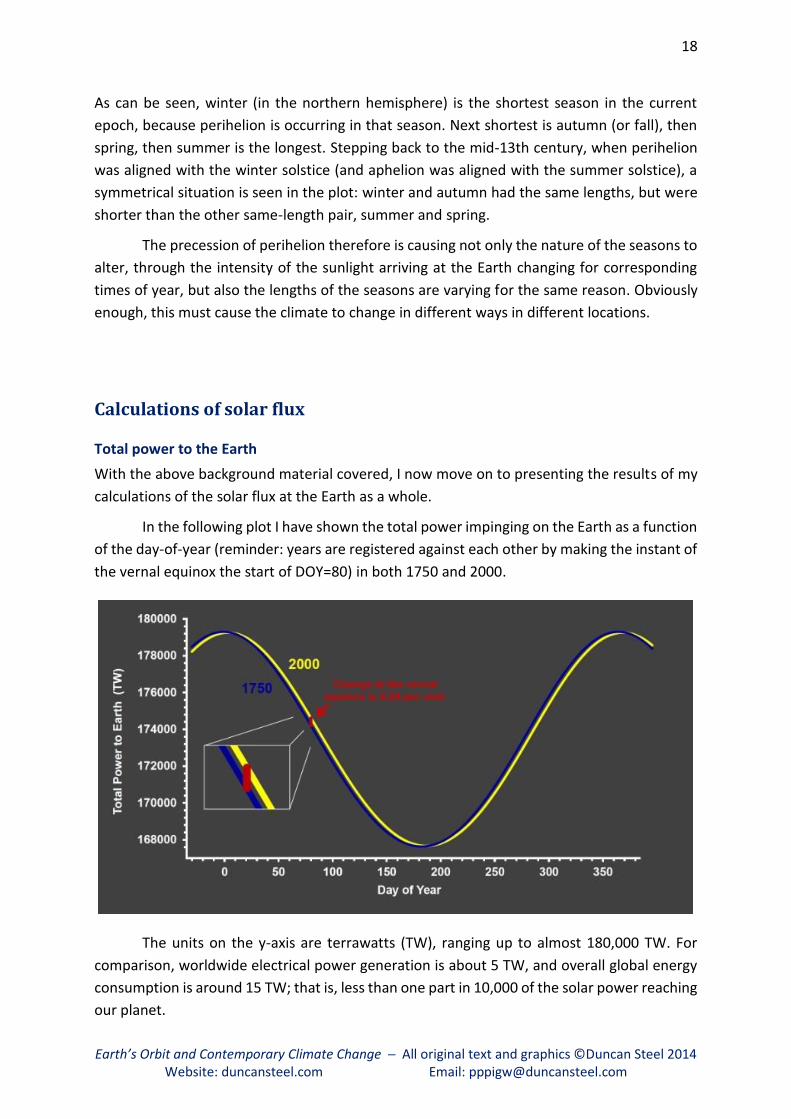
In the following plot I have shown the total power impinging on the Earth as a function
of the day-of-year (reminder: years are registered against each other by making the instant of
the vernal equinox the start of DOY=80) in both 1750 and 2000.
The units on the y-axis are terrawatts (TW), ranging up to almost 180,000 TW. For
comparison, worldwide electrical power generation is about 5 TW, and overall global energy
consumption is around 15 TW; that is, less than one part in 10,000 of the solar power reaching
our planet.

19
Earth’s Orbit and Contemporary Climate Change ─ All original text and graphics ©Duncan Steel 2014 Website: duncansteel.com Email: [email protected]
The two curves superficially appear to be sinusoidal, but in reality they are not, their
shapes being governed by the orbital speeds (i.e. Kepler’s second law again).
The maximum and the minimum of the blue curve for 1750 are slightly more extreme
than those parameters for the yellow curve for 2000, because the eccentricity in the earlier
epoch was slightly greater than at present.
More obvious is the fact that there is a phase shift between the curves. The maxima
occur at perihelion, which in 1750 was close to DOY=0 (i.e. at the junction between two years)
whereas now it is more than four days later. Recall that perihelion shifts by one day every 57.3
years, and so it moved by in excess of four days over this 250-year interval.
This is the main reason for the marked difference in the total solar flux arriving at the
Earth at the time of the vernal equinox, as indicated by the short red vertical line. The change
amounts to 0.24 per cent of the total power received. According to the “what is significant?”
rule previously described, that’s a significant fractional change.
So as to provide a more vivid example, in the next plot I compare the total power
received in 2000 against that from a millennium earlier, in the year 1000, as shown by the
purple curve. The phase shift is greater (perihelion moved by about 17.5 days) and the change
in the power received planet-wide at the vernal equinox is 0.99 per cent in this example.
An explanation for why sea ice is melting in the Arctic, but growing in the Antarctic
From the first of the two preceding graphs one can see that the arriving solar energy in 2000
is higher than that in 1750 across the whole of the first half of the year: that is, the yellow line
is above the blue one through until day-of-year 180 (i.e. the end of June). This fact was
foreshadowed above.

20
Earth’s Orbit and Contemporary Climate Change ─ All original text and graphics ©Duncan Steel 2014 Website: duncansteel.com Email: [email protected]
This means that the snow and ice of winter in the northern hemisphere should be
expected to be melting earlier now than it did back in the 18th century. Snow reflects back
into space 80 to 90 per cent of the impinging sunlight, whereas the same area of land or ocean
denuded of snow reflects back only 10 or 20 per cent, and so absorbs more than 80 per cent.
The overall effect of enhanced insolation in spring, as is actually occurring, is therefore as
follows: snow melts earlier, more solar energy is absorbed, and so the temperature goes up.
This general phenomenon, termed the ice albedo feedback effect, I will describe in more detail
much later in this document.
It is well-known that this early dispersal of snow and ice is what is occurring in the
Arctic, with the sea ice melting earlier and to a greater extent, opening up the Northwest
Passage to summer shipping for the first time in history.
Now look at the right-hand side of the graph, for the latter half of the year. The yellow
line is beneath the dark blue line, and the influx of solar energy is reduced now, compared to
1750. This means that the melting of snow and ice across spring in the southern hemisphere
would be expected to be delayed compared to the past. And this is just what is observed, with
Antarctic sea ice extents reaching record levels in the past few years, confounding the
predictions and expectations of climatologists. Again, I discuss this in more detail later.
How Earth’s temperature is actually changing
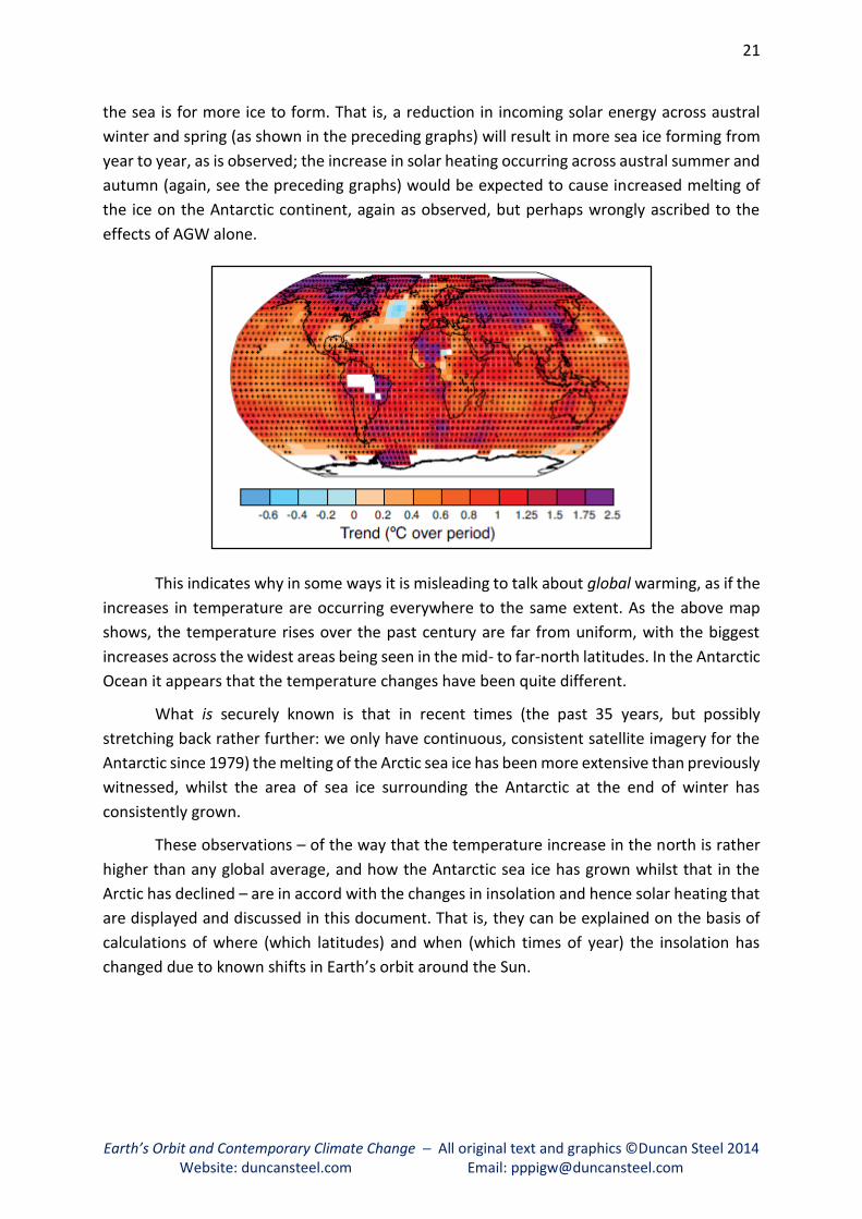
The following graphic, taken from the latest IPCC report6, shows the measured increases in
temperatures across the globe between 1901 and 2012.
I caution those reading who do not have a strong background in physics to be careful
about conflating or confusing temperature rises with heating. Phase changes of water suck up
lots of heat (which is simply a form of energy). If you put ice cubes into a cold drink, its overall
temperature will stay at 0°C until such time as the ice is all melted, assuming you keep it all
well stirred (or shaken, if your name is James Bond): the phase change from solid to liquid
consumes all the heat coming in from the surrounding environment (e.g. the warmer air in
the room/restaurant) until such time as the ice is entirely gone. (Similarly, the water in a
boiling electric kettle remains at 100°C, and does not go higher: all the energy being pumped
in by the electrical heating element is used to convert liquid water at 100°C to water vapour
at 100°C.) We can apply the same physics to the seawater surrounding the Antarctic:
figuratively-speaking, once its temperature has fallen to 0°C, the only way to extract heat from
6 Stocker, T.F., D. Qin, G.-K. Plattner, L.V. Alexander, S.K. Allen, N.L. Bindoff, F.-M. Bréon, J.A. Church,
U. Cubasch, S. Emori, P. Forster, P. Friedlingstein, N. Gillett, J.M. Gregory, D.L. Hartmann, E. Jansen, B. Kirtman,
R. Knutti, K. Krishna Kumar, P. Lemke, J. Marotzke, V. Masson-Delmotte, G.A. Meehl, I.I. Mokhov, S. Piao,
V. Ramaswamy, D. Randall, M. Rhein, M. Rojas, C. Sabine, D. Shindell, L.D. Talley, D.G. Vaughan and S.-P. Xie,
(2013): Technical Summary. In: Climate Change 2013: The Physical Science Basis. Contribution of Working
Group I to the Fifth Assessment Report of the Intergovernmental Panel on Climate Change [Stocker, T.F., D. Qin,
G.-K. Plattner, M. Tignor, S.K. Allen, J. Boschung, A. Nauels, Y. Xia, V. Bex and P.M. Midgley (eds.)]. Cambridge
University Press, Cambridge, United Kingdom and New York, NY, USA; see page 39.
21
Earth’s Orbit and Contemporary Climate Change ─ All original text and graphics ©Duncan Steel 2014 Website: duncansteel.com Email: [email protected]
the sea is for more ice to form. That is, a reduction in incoming solar energy across austral
winter and spring (as shown in the preceding graphs) will result in more sea ice forming from
year to year, as is observed; the increase in solar heating occurring across austral summer and
autumn (again, see the preceding graphs) would be expected to cause increased melting of
the ice on the Antarctic continent, again as observed, but perhaps wrongly ascribed to the
effects of AGW alone.
This indicates why in some ways it is misleading to talk about global warming, as if the
increases in temperature are occurring everywhere to the same extent. As the above map
shows, the temperature rises over the past century are far from uniform, with the biggest
increases across the widest areas being seen in the mid- to far-north latitudes. In the Antarctic
Ocean it appears that the temperature changes have been quite different.
What is securely known is that in recent times (the past 35 years, but possibly
stretching back rather further: we only have continuous, consistent satellite imagery for the
Antarctic since 1979) the melting of the Arctic sea ice has been more extensive than previously
witnessed, whilst the area of sea ice surrounding the Antarctic at the end of winter has
consistently grown.
These observations – of the way that the temperature increase in the north is rather
higher than any global average, and how the Antarctic sea ice has grown whilst that in the
Arctic has declined – are in accord with the changes in insolation and hence solar heating that
are displayed and discussed in this document. That is, they can be explained on the basis of
calculations of where (which latitudes) and when (which times of year) the insolation has
changed due to known shifts in Earth’s orbit around the Sun.

22
Earth’s Orbit and Contemporary Climate Change ─ All original text and graphics ©Duncan Steel 2014 Website: duncansteel.com Email: [email protected]
How the solar influx has changed over the past few centuries Above I showed how the total power (in watts) reaching the Earth from the Sun has varied
over the centuries, by integrating the flux in watts per square metre over the whole cross-
sectional area of the planet as presented to the direction of the Sun. I can also, of course,
calculate the latitude-dependent influx, and see how this has varied between 1750 and 2000.
Consider the pair of diagrams on the next page. That at the top shows in red when and
where on Earth (that is, at which latitudes) the incoming flux of sunlight has increased since
1750, and in blue when and where the solar influx has decreased. As might be expected from
the previous graphs, the insolation has generally increased during the first half of the year,
and decreased in the second half. However, the changes are not uniform in terms of
geography: the insolation changes are dependent on latitude, and so some places receive a
greater change in solar heating than others.
That upper diagram shows absolute influx changes (i.e. in watts per square metre). A
more interesting and instructive diagram is the lower one. This indicates the fractional rather
than absolute changes in insolation: obviously a change of 5 W/m2 in an influx that was 100
W/m2 would be anticipated to have a greater effect than the same 5 W/m2 increase on top of
a previous 500 W/m2 influx, the first being a 5 per cent alteration, the latter only 1 per cent.
In this lower diagram, colour-coded in yellow and turquoise, the greatest fractional
increase in solar heating is evidenced by the large, bright yellow area: this covers latitudes
between about 50 and 80 degrees north, during April and into May. That is, northern spring.
In consequence it is to be expected that the snow and ice in these northern and Arctic
latitudes will be melting earlier now than back a few centuries, and this will have the knock-
on effect of increasing the amount of sunlight absorbed over spring and then summer: snow
and ice reflect away 80–90 per cent of the sunlight hitting them, and so absorb only 10–20 per
cent of that energy, whereas once the ice has gone the bare land or ocean do the opposite
and absorb 80–90 of the incident solar flux. As the ice melts earlier, more solar energy is
absorbed, and so on: a positive feedback effect.
And so the planet warms, compared to the past.
I caution again that these calculations are based on registering years against each other using
the vernal equinox as the reference point. If any other point is used instead (e.g. the autumnal
equinox), the details of the graphs – but not the overall picture – will change.

23
Earth’s Orbit and Contemporary Climate Change ─ All original text and graphics ©Duncan Steel 2014 Website: duncansteel.com Email: [email protected]
The vertical axes indicate the latitude, ranging from 90 degrees south at the bottom (the South Pole) to 90 degrees north at the top (the North Pole),
with the equator midway between.
The horizontal axis indicates the time of year, from zero at the left to the end of the year at far right. Each year – actually an astronomically-defined
period known as the Gaussian Year – is registered/phased against the other by making the start of day-of-year 80 the instant of the vernal equinox,
when the Sun crosses the celestial equator whilst moving north. This marks the start of spring in the northern hemisphere, and is a necessary
technicality in order to compare the insolations (solar energy influxes) across different calendar years.
The main point to note here in the lower diagram is the location of the large bright yellow patch: this shows that the greatest fractional increase in
solar heating occurs in mid-northern and Arctic latitudes across spring (late March into April and May), and this will cause earlier melting of snow and
ice and therefore knock-on heating because a greater fraction of the incident sunlight is then absorbed by the land and sea once they are denuded of
their snow cover.
The overall effect: global warming, with a natural origin.

24
Earth’s Orbit and Contemporary Climate Change ─ All original text and graphics ©Duncan Steel 2014 Website: duncansteel.com Email: [email protected]
Why the distribution of incoming sunlight has changed, revisited
It being the case that I would like people to understand how and why the distribution of
incoming sunlight has changed, both in terms of when and where it arrives, I here revisit this
point and indicate what is happening in terms of Earth’s varying orbit. There is, though, a
secondary utility in this, because I will refer back later to the graphic below so as to explain the
way in which it seems that climatologists made a serious error in their calculations of how these
features of the incoming solar flux to Earth have changed, and so missed the Changing Spring
Insolation effect entirely.
Relative positions of Earth in the years 1000 and 2000
In the graphic below I depict three orbits around the Sun. The first orbit is a theoretical circular
orbit with radius equal to the semi-major axis of Earth’s orbit (i.e. 1 AU), and this is again shown
in white. The second, shown in green, is Earth’s actual elliptical orbit in the year 1000; and the
third, shown in blue, is Earth’s orbit in the year 2000. (For clarity in this graphic I have extended
the timespan from 250 to 1000 years, thus representing changes over the whole of the past
millennium.)
The straight green line indicates the long/major axis of Earth’s orbit in the year 1000,
and the straight blue line indicates the long/major axis of Earth’s orbit in 2000. These are angled
against each other due to the swivelling of our orbit’s orientation – apsidal precession – this
being why the date of perihelion shifts by one day every 57.3 years.

25
Earth’s Orbit and Contemporary Climate Change ─ All original text and graphics ©Duncan Steel 2014 Website: duncansteel.com Email: [email protected]
There are twelve white lines drawn radiating outwards from the Sun. These show equal
steps of 30 degrees in ecliptic longitude, the standard angular measurement around Earth’s
orbital plane, defined to start at zero at the vernal equinox, which is at the top of the graphic.
A circular orbit for any object results in it having a constant speed in that orbit, and so these
30-degree steps in ecliptic longitude also imply equal time jumps for the circular orbit. Any orbit
with a non-zero eccentricity, though, has a speed that varies between a maximum at perihelion
and a minimum at aphelion, and so such an orbit does not cover equal angles (of ecliptic
longitude) in equal times. This is a simple consequence of Kepler’s second law, as discussed
previously.
To illustrate the principle I have inserted green and blue dots around the two orbits for
the real Earth in the years 1000 and 2000 respectively. (The dots are not intended to depict the
size of our planet, just its positions.) Because the orbits are registered against each other at the
zero of ecliptic longitude (i.e. the vernal equinox at the top of the graphic), the green and blue
dots are aligned with each other there.
Progressing counter-clockwise from that equinox, the green and blue dots are located
according to equal time steps around each orbit. That is, there are time jumps of one-twelfth
of a year between successive dots. To show the situations more clearly, I have arranged a dozen
boxes around the outside, containing magnified views of the locations of the dots/the positions
of the Earth close to each 30-degree step in ecliptic longitude.
One can see that initially the green dots (year 1000) progressively lag further behind the
blue dots (year 2000), and both lag behind the radial white lines which show identical time-
steps of one-twelfth of a year for a circular orbit. After the autumnal equinox (at the bottom of
the graphic) the green dot overtakes the blue one, but both continue to trail the radial white
lines until they catch up with it again at the vernal equinox (at the top of the graphic).
These features are consequences to be expected on the basis of Earth’s elliptical (i.e.
non-circular) orbit, and the changing locations of its perihelion and aphelion (as shown by the
straight green and blue lines).
Climatic effects of these orbital changes
There are two distinct effects upon the solar radiation flux at the Earth – and therefore upon
the climate – which should be anticipated on the basis of this diagram. First, it is apparent that
the separations of the Sun (yellow dot) and the Earth (green and blue dots) throughout each of
the years 1000 and 2000 are not the same: in some positions (some times of year) the blue dot
is closer to the Sun than the green, whereas in others the green dot is closer. The intrinsic flux
of sunlight varies as the inverse-square of the distance from the Sun, and so the intrinsic flux
striking the Earth at set times of year differs between the two epochs. For example, looking at
the box at the top of the graphic, one sees that at the vernal equinox in 2000 the solar flux must
have been higher than in 1000, because the blue dot is closer to the Sun than the green one. In
itself this may be interpreted as implying that spring melting in the northern hemisphere might
be expected to have commenced earlier in 2000 than in 1000, again a matter I have discussed
previously in this document.

26
Earth’s Orbit and Contemporary Climate Change ─ All original text and graphics ©Duncan Steel 2014 Website: duncansteel.com Email: [email protected]
The above pertains to the relative radial positions of the green and blue dots. Now we
turn to their relative angular positions for the second climatic effect to be considered.
At the vernal equinox the green and blue dots have been aligned, by fixing this to be the
zero point, and the spin axis of the Earth at that time is in a plane perpendicular to the direction
of the Sun: that is what defines it to be the equinox, astronomically-speaking. As time
progresses during the year/the orbit the green and blue dots reach differing angular positions,
with the green dot initially lagging the blue but then overtaking it such that the blue lags behind
the green. What this means is that at equivalent times of year (recalling that these green and
blue dots indicate positions in equal time steps) the geometry differs for the arriving sunlight
in the years 1000 and 2000. That is, the angle between the direction of the Sun and the Earth’s
spin axis is not the same at the corresponding times of year in 1000 and 2000. This implies that
the latitudinal distribution of the incoming sunlight must have been different.
There are two effects on the climate that we can deduce from this graphic, then. One is
that the flux of sunlight at Earth as a whole changes between 1000 and 2000 if we compare
identical times of year. The other is that the distribution of that (changed) solar flux alters
between 1000 and 2000 in terms of the relative amounts of insolation reaching different
latitudes. It is these two factors that result in the changing insolation graphics shown previously
(on page 23).
Obviously these factors must affect the climate both locally and globally.
How climatologists got it wrong I wrote above that I would refer back to the preceding graphic in order to illustrate how
climatologists apparently made false calculations of how the insolation has changed over the
past millennium or so. As I have noted elsewhere, every paper that I had read in detail and
which involves this matter seems to have incorporated the same basic error; I have given some
specific examples in my preliminary paper7 on this topic. In addition I note that the various
reports of the IPCC have made scant mention of how Earth’s changing orbit affects the climate,
and dismissed it as a possible contributor to the observed global warming. How come?
The short answer to that question is this. The
climatologists have effectively calculated insolation changes
based on the false assumption that in different epochs the
Earth (the green and blue dots) is always on the white radial
lines, which delineate equal steps in ecliptic longitude but not
in time. If you take another look at that graphic, you will see
that this is only the case at the time/position of the vernal
equinox (because that’s the way it is defined). The values
obtained in such a way are spurious, indeed specious. How has
this epic error come about?
7 Steel, D., “Perihelion precession, polar ice and global warming,”
Journal of Cosmology, volume 22, pp. 10106-10129 (2013).
27
Earth’s Orbit and Contemporary Climate Change ─ All original text and graphics ©Duncan Steel 2014 Website: duncansteel.com Email: [email protected]
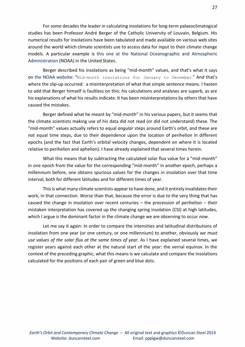
For some decades the leader in calculating insolations for long-term palaeoclimatogical
studies has been Professor André Berger of the Catholic University of Louvain, Belgium. His
numerical results for insolations have been tabulated and made available on various web sites
around the world which climate scientists use to access data for input to their climate change
models. A particular example is this one at the National Oceanographic and Atmospheric
Administration (NOAA) in the United States.
Berger described his insolations as being “mid-month” values, and that’s what it says
on the NOAA website: “Mid-month insolations for January to December.” And that’s
where the slip-up occurred: a misinterpretation of what that simple sentence means. I hasten
to add that Berger himself is faultless on this: his calculations and analyses are superb, as are
his explanations of what his results indicate. It has been misinterpretations by others that have
caused the mistakes.
Berger defined what he meant by “mid-month” in his various papers, but it seems that
the climate scientists making use of his data did not read (or did not understand) these. The
“mid-month” values actually refers to equal angular steps around Earth’s orbit, and these are
not equal time steps, due to their dependence upon the location of perihelion in different
epochs (and the fact that Earth’s orbital velocity changes, dependent on where it is located
relative to perihelion and aphelion). I have already explained that several times herein.
What this means that by subtracting the calculated solar flux value for a “mid-month”
in one epoch from the value for the corresponding “mid-month” in another epoch, perhaps a
millennium before, one obtains spurious values for the changes in insolation over that time
interval, both for different latitudes and for different times of year.
This is what many climate scientists appear to have done, and it entirely invalidates their
work, in that connection. Worse than that, because the error is due to the very thing that has
caused the change in insolation over recent centuries – the precession of perihelion – their
mistaken interpretation has covered up the changing spring insolation (CSI) at high latitudes,
which I argue is the dominant factor in the climate change we are observing to occur now.
Let me say it again: In order to compare the intensities and latitudinal distributions of
insolation from one year (or one century, or one millennium) to another, obviously we must
use values of the solar flux at the same times of year. As I have explained several times, we
register years against each other at the natural start of the year: the vernal equinox. In the
context of the preceding graphic, what this means is we calculate and compare the insolations
calculated for the positions of each pair of green and blue dots.

28
Earth’s Orbit and Contemporary Climate Change ─ All original text and graphics ©Duncan Steel 2014 Website: duncansteel.com Email: [email protected]
The climatologists’ error
The mistake made by climatologists, then, is this. Berger’s insolation values, stored at the NOAA
website linked earlier and used by many climate scientists, are NOT for the positions of the
green and blue dots. Berger’s insolation values were determined for the positions where the
white radial lines, showing equal steps in ecliptic longitude, cross the orbits. He termed these
“mid-month” values, and climatologists have incorrectly assumed that this means that they
pertain to the middle of each month, and so to the same time of year from one epoch to the
next.
That assumption is false, and the mistake made is pivotal. As Berger made very clear in
his original papers some decades ago, the insolation values he calculated and tabulated are
NOT for equal time steps around Earth’s orbit, and what he termed “mid-month” values are
neither at the middle of the month, or at the same time of year from one epoch to another.
This is what he wrote:
André Berger (1978); published in the Journal of the Atmospheric Sciences,
volume 35, pp.2362-2367.

29
Earth’s Orbit and Contemporary Climate Change ─ All original text and graphics ©Duncan Steel 2014 Website: duncansteel.com Email: [email protected]
Example of an erroneous calculation
Let me now give an example so as to illustrate the magnitude of the error involved. Someone
goes to the NOAA website I gave earlier (and I note that the same data are stored on other
climate change websites, such as those maintained by NASA) and navigates to Berger’s output
data files. Here is the start of the one we want, showing the insolation over the past millennium:
In the table headings date is the number of millennia prior to 1950 CE: note that I indicated
earlier on in this document that the ‘present’ for geological and archaeological dating is the
year 1950, and I have come across various published papers in which the authors incorrectly
assume that ‘the past millennium’ for Berger’s data stretches from 1000 to 2000, whereas in
fact it is from 950 to 1950. The second set of data in the table above (date = ─1) therefore
pertains to the year 950, not 1000.
The other headings in the tables are ecc for eccentricity, omega for the longitude of
perihelion, obl for the obliquity of the ecliptic, and prec for the so-called ‘precessional
parameter’ (e sin ϖ) which is often used in palaeoclimatological studies.
In each epoch there are 19 rows of values, for latitudes in ten-degree jumps from the
North Pole (+90 degrees) to the South Pole (─90 degrees). Going across the table, there are

30
Earth’s Orbit and Contemporary Climate Change ─ All original text and graphics ©Duncan Steel 2014 Website: duncansteel.com Email: [email protected]
twelve columns for Berger’s “mid-month” (Danger, Will Robinson!) values of insolation in
langleys per day; one would multiple by 0.4843 to get values in watts per square metre.
I have inserted a purple frame around three values in each of the two epochs, the
March, April and May values at latitude 60°N. Subtracting 446 from 450, 695 from 700, and 901
from 904, we naïvely obtain increases over that millennium of 4, 5 and 3 (in the above units).
That should immediately inform anyone that greater precision is required in order to perform
any such subtractions (i.e. get Berger’s program, change it from integer to floating-point
output, and run it again).
The imprecision is simply that, though, as opposed to a glaring mistake. The magnitude
of the mistake is easily estimated. Take the horizontal differences now: 700 minus 450 renders
250; 904 minus 700 renders 204; 695 minus 446 renders 249; and 901 minus 695 renders 206.
Thus the differences from March to April mid-month (actually, from ecliptic longitude 0° to 30°)
is about 250, and from April to May (ecliptic longitude 30° to 60° precisely) is about 205 (in
langleys per day).
Now, the differences
in ecliptic longitudes for the
same days-of-year can easily
be calculated:
Reading off that graph, by a
DOY near 110 (i.e. about 30
degrees beyond the vernal
equinox) the difference is
around 0.25 degrees, and by a DOY near 140 (i.e. about 60 degrees beyond the vernal equinox)
the difference has increased to about 0.5 degrees. As fractional values those both represent
jumps of about 1/120th of the gaps (because the graph above is close enough to a straight line
from DOY=80 to 140). This means that we can expect the horizontal differences derived above
(205 and 250) each to be in error by about 2 langleys/day, meaning that the vertical differences
calculated (4, 5 and 3) are essentially meaningless.
To say it another way: the calculations must be done properly, with the differences
being calculated for insolations derived for the same time of year, not for equal steps in ecliptic
longitude. As the preceding plot shows, over this one-millennium time step the difference
between the ecliptic longitudes for the same times of year can be greater than half a degree,
or half a day, introducing erroneous values for the insolation changes improperly calculated,
which are then worse than useless.
Berger explained clearly in his original papers how the changing lengths of the
astronomical seasons can cause his “mid-month” instants, in terms of the day-of-year, to vary
by several days over the full 21,000-year period of perihelion precession compared to the
equinoxes. That value (i.e. several days) should be apparent from my former plot showing how

31
Earth’s Orbit and Contemporary Climate Change ─ All original text and graphics ©Duncan Steel 2014 Website: duncansteel.com Email: [email protected]
the durations of the seasons vary over 6,000
years (repeated at right). Over an interval of
just a thousand years – the past millennium
– the mid-month instants have only shifted
relative to each other by about a quarter of
a day, but that is enough to make
calculations like those described above very
misleading.
Easy ways to do it properly
When I wrote my own software code, starting from first principles (the declination and thus
zenith angle of the Sun through the year from each point on Earth’s surface, Kepler’s second
law etc.) I came up with results that were surprising to me, and so I needed to check them. That
turned out to be a fairly easy thing to do, as follows.
Berger has generously made his FORTRAN program available for anyone to download
from his FTP site and then use it. I have done that, and verified the results obtained against my
independent software. Anyone else could do the same. I urge you to do so.
Although the insolation data published in connection with his 1978 paper (as above)
and then stored for use by climatologists on the NOAA website and elsewhere were output for
equal 30-degree steps in ecliptic longitude around Earth’s orbit, one can actually raise a simple
flag as an input to his program and instead get it to output daily insolations for any latitude(s)
one desires. The helpful comments that Berger inserted into his FORTRAN program indicate
how to do this. If you do that for two different epochs (say the years 950 and 1950 again, or
1000 and 2000, or 1750 and 2000) then you can validly take the differences between the
insolation values for the same time-of-year in each of the two epochs in order to see how the
evolution of the terrestrial orbit and spin axis tilt is altering the way in which solar energy is
heating the Earth.
This is one of the essences of science: checking, verification, falsification. If anyone does
not believe my results, they can check them all by doing their own calculations, perhaps starting
with Berger’s program. You just need a rudimentary knowledge of FORTRAN, and a suitable IDE
(Integrated Development Environment) so as to edit and run the program in a window on your
computer. It took me five minutes to find and download one, and it cost me $25. Within 60
minutes I had Berger’s program running and churning out results in accord with my own despite
the fact that it was 30 years since I’d last done any FORTRAN programming.
All I am saying is: this is easy to do, to check my results and deductions. I would hope
that many people will do so.

32
Earth’s Orbit and Contemporary Climate Change ─ All original text and graphics ©Duncan Steel 2014 Website: duncansteel.com Email: [email protected]
What is the significance of the climatologists’ error?
In the two-part graphic on the next page I show on the left a diagram depicting, with one frame
per month, how the insolation changed over the past millennium when the calculations are
performed properly with equal time steps around Earth’s orbit from a start at the vernal
equinox fixed at the start of day-of-year 80. Rather than simply the jump from one epoch to
another far away in time (e.g. from year 1000 to 2000, or from 1750 to 2000) here I have
calculated the insolation changes every decade between 1000 and 2000, so that there are 100
time steps across the frames.
On the right the diagram is similar, but the frames here show the results obtained from
making calculations for the insolations based on equal jumps in ecliptic latitude. The coloured
plots look rather smoother here: because they are fundamentally wrong! At the top I have
labelled them as being Specious Calculations: and these are what it seems that climatologists
have used in investigations of how the changing influx of sunlight might be affecting the
climate.
I note in passing the scale showing the changes in insolation for the correct (left-hand)
graphic. These changes range from ─8.1 W/m2 up to +4.4 W/m2 (over a full millennium).
Recalling that the IPCC has estimated that the AGW climate forcing is about 2.3 W/m2, it
appears that these intra-annually varying insolation changes cannot be ignored.
In one and only one of the (spurious) plots on the right is the pattern symmetrical about
the equator; that is, the pattern is the same for the northern and southern hemispheres. This
is the plot for the vernal/March equinox, where the ecliptic longitude is zero degrees by
definition. Because the years are registered against each other at this juncture in each
year/orbit, the only things affecting the insolation difference as calculated at this longitude are:
(a) The differing heliocentric distances and so intensity of sunlight (cf. the previous diagrams
showing the geometry); and (b) The very small changes in the tilt of Earth’s spin axis. Both (a)
and (b) affect the same latitudes north and south of the equator equally, and so this particular
plot is symmetric, as mentioned above.
The equivalent plot on the left – the correct plot for the time of the vernal equinox – is
similarly symmetric, although noisier due to the complexity of the more extensive calculations
that are required for an assessment of the insolation changes when equal time steps around
an orbit are employed.

33
Earth’s Orbit and Contemporary Climate Change ─ All original text and graphics ©Duncan Steel 2014 Website: duncansteel.com Email: [email protected]
Returning to the plots/panels on the right (in the illustration above) it is seen that the
largest insolation changes across northern spring (i.e. the bright red areas in the panels for
ecliptic longitudes of 30 and 60 degrees) are purportedly at low latitudes straddling the
equator, whereas the correct calculations shown in the left-hand graphic show these moving
to high northern latitudes. That is, the specious calculations depicted on the right have entirely
missed the changing spring insolation (CSI) effect.
A similar comment applies to the changes occurring during austral spring (October,
November, December) at far southern latitudes: the insolation is reducing by a greater amount
in reality (left panel) than the incorrect calculations (right panel) would suggest. That is, when
I write about the Changing Spring Insolation hypothesis I am talking about changes occurring
across local spring in both hemispheres.

34
Earth’s Orbit and Contemporary Climate Change ─ All original text and graphics ©Duncan Steel 2014 Website: duncansteel.com Email: [email protected]
The albedo and the amount of solar energy absorbed by the Earth The albedo of the Earth, and its variation, is a critical parameter in climate studies. Whilst there
are various slightly-different definitions of the albedo used in astronomy, for the present
purpose of climate change studies we can take the albedo to be the ratio of the solar flux
reflected away to the impinging solar flux.
If the albedo is represented as A, then the fraction of solar energy absorbed is 1–A. To
know how much solar energy is being absorbed, and where and when, we need albedo maps
for the whole planet, and these can only be obtained from satellite observations.
Here is a map of the albedo of the entire Earth, obtained using data from NASA’s Aqua
satellite, and averaged over the whole year. In the top image the effect of clouds and haze has
been taken out, leaving just the surface albedo/reflectivity. In the lower image the effect of
clouds and haze has been left in.
Several significant points can be understood from a close inspection of the upper image:
Perpetually snow-covered Greenland, the Antarctic and parts of the Himalayas have
persistent high albedos.
Arid deserts also have fairly-high albedos (Sahara, Kalahari, Gobi, central Australia, and
the Arabian Peninsula).
Sea ice elevates the albedo in the Arctic and all around the Antarctic compared to the
open ocean at lower latitudes (i.e. nearer the equator).
Heavily-vegetated areas have low albedos (Amazon, central Africa, Southeast Asia).
Far-north land areas have high albedos due to snow during much of the year (Canada,
northern Russia, Siberia).

35
Earth’s Orbit and Contemporary Climate Change ─ All original text and graphics ©Duncan Steel 2014 Website: duncansteel.com Email: [email protected]
Turning to the lower image, it is apparent that cloud cover increases the average albedo,
in particular at high latitudes both north and south, and also in a band along the equator.
The preceding images were annual averages, but we are interested here in how the
albedo varies during the year. The two images below, obtained using NASA’s Terra satellite,
show how the planet appeared on two single days of the year: that of the winter/December
solstice in the upper picture, and on the date of the summer/June solstice in the lower. (Note
that these images show the reflected solar radiation in watts per square metre, which is what
the satellite actually observes, rather than the albedo, as such; the latter requires images to be
processed so as to accommodate the incoming fluxes of sunlight at different latitudes in order
to calculate what fraction is reflected.)
These two images show distinct changes due to being obtained six months apart. For example:
The Arctic is dark in the upper image, and the Antarctic in the lower image, because no
sunlight reaches these locations at their respective wintertime solstices.
In both cases cloudiness at latitudes greater than about 40 degrees is more pronounced
in summer, and that will make the summers milder (due to more sunlight being reflected
away by the clouds) than would otherwise be the case.
The band of cloud along the equatorial region is again apparent.

36
Earth’s Orbit and Contemporary Climate Change ─ All original text and graphics ©Duncan Steel 2014 Website: duncansteel.com Email: [email protected]
The ice albedo feedback effect
This is a vitally-important subject which I could have covered in the introductory background
parts of this document, but decided to keep here, with the rest of the material about the effects
of Earth’s albedo, although I did mention it in passing earlier on.
It’s fairly obvious that the albedo of the Earth depends on where you look, and when.
Peering down from a high-flying aircraft one sees dark areas (pine forests and the ocean, for
example), middling regions (grass and sand), and bright regions (clouds and snow). Asphalt
roads have an albedo below 0.10; pine forests 0.08 to 0.15; deciduous forests 0.15 to 0.20; dry
soil and green grass about 0.25; sand about 0.40; concrete 0.50 to 0.60; bare sea ice 0.60 to
0.70; snow and clouds 0.80 to 0.90.
Things change, however. The above figures for forests assume summertime conditions.
In the winter a pine forest in the mountains may be covered in snow, pushing its albedo up,
whereas a deciduous forest will have lost its leaves, and its albedo is then reduced. The albedo
of dry soil plummets with a fall of rain. The albedo of grass increases as it dries out and is mown
for hay. A flat, calm sea may have an albedo of just 0.07, whereas for a rough, foamy ocean
that might be 0.20 or even higher.
The largest rapid changes, varying both upwards and downwards, come from clouds
covering dark land or sea areas, and then passing on by. The biggest seasonal changes come
from the melting of winter snow: an ice floe covered with pristine snow may reflect back into
space 90 per cent of the sunlight that hits it, but once that snow and ice melts in spring and
summer that sunlight is mostly absorbed, and only perhaps 10 per cent is reflected away.
It is this that leads to the ice albedo feedback effect. Most of the sunlight striking snow
is reflected back into space, but a small fraction is absorbed and through its heating action
along with warmer air passing over it the snow and ice melt. After that, the sunlight is impinging
on land or ocean, and instead of only 10 per cent being absorbed, now maybe 90 per cent is. If
the influx of sunlight is increased slightly then the snow and ice melts quicker, and a greater
proportion of the subsequently-arriving sunlight is absorbed.
That’s the ice albedo feedback effect. Of course it also acts the other way. Decrease the
influx of sunlight a little, the snow and ice melt more slowly and less extensively, the albedo
remains high, a reduced amount of energy is absorbed from the sunlight, and so the overall
effect over years is that more snow and ice form.
What this implies is that the changing spring insolation effect should be expected to
leverage far greater overall changes than are indicated by just the variation over decades and
centuries of the impinging solar flux. For the northern spring the increasing insolation melts
more snow and ice, and earlier, exposing both land and sea in the northern latitudes and thus
causing an upwards spiral in temperature and extent of ice melting. For the southern/austral
spring the contrary is to be expected: decreasing insolation in that season, and so slower
melting of the sea ice, and so a large albedo maintained for progressively longer, and so a
reduction in absorbed solar energy, and so more ice forming over winter, and so on.

37
Earth’s Orbit and Contemporary Climate Change ─ All original text and graphics ©Duncan Steel 2014 Website: duncansteel.com Email: [email protected]
Albedo data used in my analysis
What I wanted to do here was to obtain values of the albedo for each latitude for each day of
the year, for factoring against the insolations which I had already calculated (e.g. see the upper
graphic on page 39). It turned out that to achieve this required the downloading of many
gigabytes of data obtained by NASA’s Terra satellite, from a different detector (an instrument
designed specifically with albedo determinations as an aim) to that used in producing the
preceding images, plus a vast amount of processing by my computer and a phenomenal amount
of key-tapping by myself.
A typical Terra daily dataset from its MISR (Multi-angle Imaging Spectro-Radiometer)
instrument, processed to render albedo values, looks like this:
This dataset image is 180 pixels high (one pixel per degree of latitude) by 360 pixels wide (one
pixel per degree of longitude). The shallow S-shaped forms correspond to the tracks of the
satellite across the surface of the Earth, as it undertakes a polar orbit at an altitude of about
705 kilometres. At that height each orbits last about 99 minutes, and so it completes 14 and a
half orbits each day; hence the number of tracks seen above.
Comparing the areas containing data with the black areas (where there are no data for
those locations on that day), it can be seen that Terra scans about a quarter of the Earth’s
surface each day. The above image was obtained in late April (during northern spring), and so
the orientation of the orbit was arranged so as to achieve good coverage of the Arctic, at the
top, but to ignore much of the Antarctic because it was entering the austral winter. For data
collection during southern hemisphere spring and summer the satellite orbit is turned slightly
so as to deliver better Antarctic coverage, during the time of year that the Arctic receives no
sunlight and so no albedo can be measured (or, indeed, is relevant).
Next I took each day’s albedo measurements (as in the example dataset above) and
calculated the average albedo at each latitude (i.e. across each horizontal row in the image),
only counting those pixels that contain some data (not the black areas). That gave me a
composite single diagram with the average albedos for each latitude, and each day-of-year, as
in the next graphic. The day numbers across the bottom go from 0 to 366 not because this was
a leap year (actually the Terra data used here are from 2010) but because I needed slightly
more than a complete calendar year to mesh against my standard Gaussian year: therefore the
first day’s albedo data are from January 1st in 2010, and the final day’s data are from January
1st in 2011.

38
Earth’s Orbit and Contemporary Climate Change ─ All original text and graphics ©Duncan Steel 2014 Website: duncansteel.com Email: [email protected]
Obvious in this graphic are:
The high albedos in the polar regions.
The bright band along the equator, as seen previously (due to cloudiness).
Following across any horizontal line (i.e. constant latitude) there are variations across the year; for example, at around 50 degrees north the
albedo starts out high (due mainly to snow cover), decreases over spring and summer, and then increases again as autumn progresses.
The above diagram plotted the albedo (A), but what we are really interested in is the amount of solar energy that is absorbed, and so we actually
want a plot of the absorptivity (1–A). This is as in the following diagram.
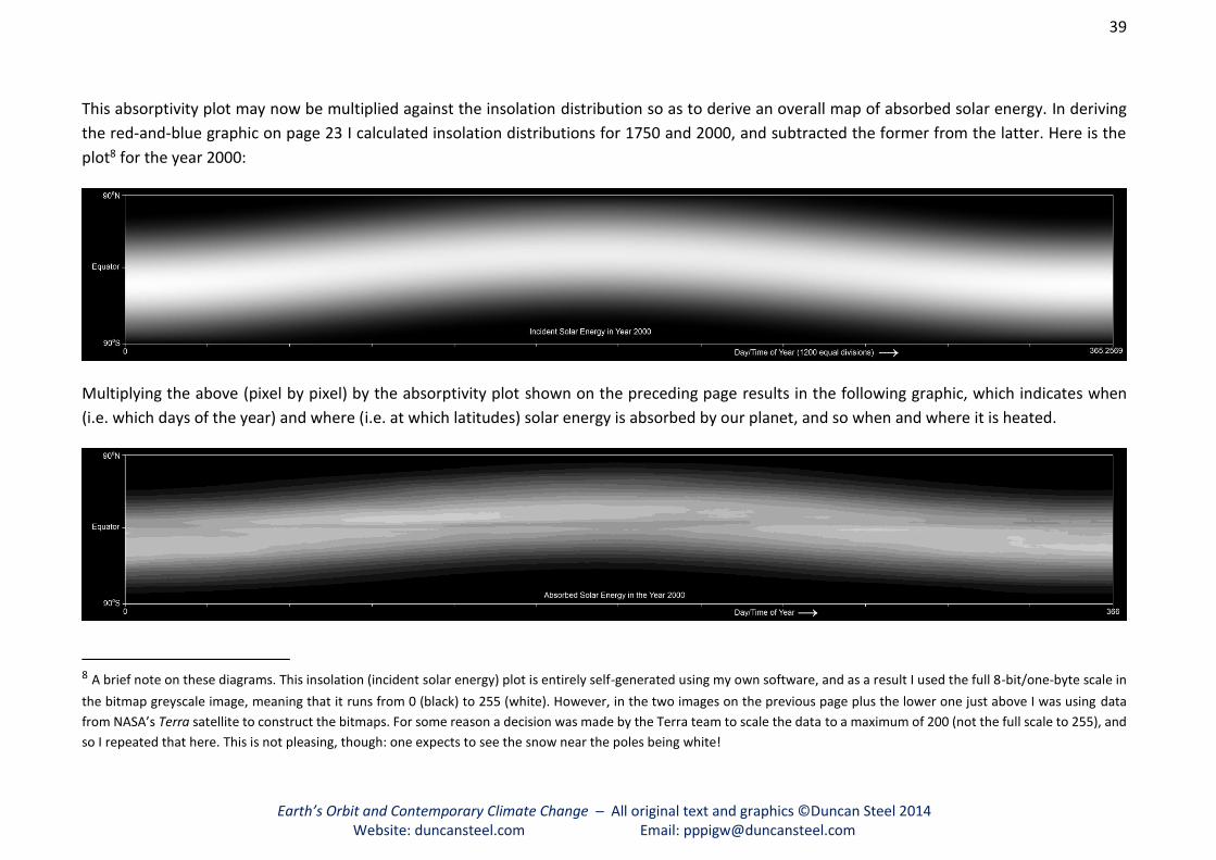
39
Earth’s Orbit and Contemporary Climate Change ─ All original text and graphics ©Duncan Steel 2014 Website: duncansteel.com Email: [email protected]
This absorptivity plot may now be multiplied against the insolation distribution so as to derive an overall map of absorbed solar energy. In deriving
the red-and-blue graphic on page 23 I calculated insolation distributions for 1750 and 2000, and subtracted the former from the latter. Here is the
plot8 for the year 2000:
Multiplying the above (pixel by pixel) by the absorptivity plot shown on the preceding page results in the following graphic, which indicates when
(i.e. which days of the year) and where (i.e. at which latitudes) solar energy is absorbed by our planet, and so when and where it is heated.
8 A brief note on these diagrams. This insolation (incident solar energy) plot is entirely self-generated using my own software, and as a result I used the full 8-bit/one-byte scale in
the bitmap greyscale image, meaning that it runs from 0 (black) to 255 (white). However, in the two images on the previous page plus the lower one just above I was using data
from NASA’s Terra satellite to construct the bitmaps. For some reason a decision was made by the Terra team to scale the data to a maximum of 200 (not the full scale to 255), and
so I repeated that here. This is not pleasing, though: one expects to see the snow near the poles being white!
40
Earth’s Orbit and Contemporary Climate Change ─ All original text and graphics ©Duncan Steel 2014 Website: duncansteel.com Email: [email protected]
It might be noted that on the preceding page the plot at top for the incident solar energy
runs across one complete Gaussian year of 365.2569 days, whereas in the lower plot for the
absorbed solar energy the y-axis runs to 366 days. This is not pedanticism: it’s important,
because we are dealing with small fractional differences in changing solar energy absorption
between, say, 1750 and 2000. One can only sum up the total absorbed energy, and calculate
the changes in insolation from one epoch to another, by rigorously keeping the year lengths
the same. In the albedo/absorptivity/absorbed energy plots I have allowed a wrap-around from
one year to the next due to the albedo measurements from the Terra satellite being daily
values, but I have calculated the overall energy absorption over the year with the year length
defined to be a Gaussian year, for scientific rigour.
The answers are as follows. The total incident solar energy is 5.469 x 1024 joules, and
the total absorbed solar energy is 3.674 x 1024 joules. The ratio of the two renders the average
– averaged over the year and also over all latitudes – terrestrial albedo: 0.328 from those
figures (i.e. 1.0 – [3.674/5.469]).
What I have done here is to use present-day figures to derive a present-day value for
the amount of solar energy being absorbed by the Earth. What we would also like to know is
this: was it different in the past, say in 1750, as result in natural changes in insolation and
albedo?
Albedo variations across a single year
How quickly does the Earth’s albedo change? Above I derived a value for the mean terrestrial
albedo – an average over all latitudes and longitudes, and also an average over the whole year
– of 0.328, based on the best-available data (from NASA’s Terra satellite). Many books and
standard sources give values around 0.3. There is no definitive value.
Over decades, centuries and millennia that parameter may vary, and researchers have
looked at a wide variety of possible causes for changes in the albedo, because it is of pivotal
importance in investigations of the radiation budget. These mooted causes range from jetliner
contrails through simple vagaries of cloudiness to alterations of the influx of galactic cosmic
rays to the atmosphere (these acting as nucleation centres, leading to increased atmospheric
opacity). Our knowledge of the Earth’s albedo may best be described as being ‘patchy’ (that
being a little joke that will be understood when one looks at the first diagram on page 42).
What I am concerned with here, initially, is how the albedo varies during the year at
differing latitudes. Later, I will turn attention to how knowledge of that might enable us to make
an educated guess at what the average albedo was 250 or 1,000 years ago.

41
Earth’s Orbit and Contemporary Climate Change ─ All original text and graphics ©Duncan Steel 2014 Website: duncansteel.com Email: [email protected]
Here is a repeat of the graphic showing the absorptivity in 2010:
This information can be used to determine how the albedo/absorptivity varies during
the year at each latitude; or, at least, how it did vary during the year in which the data were
collected. It’s obvious from our own experiences that the amount of cloudiness changes rather
haphazardly from day to day in many places, and so the albedo/absorptivity diagram for
another year should be expected to differ in detail, but to display broadly the same
characteristics. It is for this reason that I am able to use the 2010 observed albedos in concert
with the 2000 calculated insolations (although, to be sure, the insolations for 2010 are not
much different).
To get an idea of how the albedo/absorptivity varied during this year (2010), at least, I
took the above graphic and made a copy shifted to the right by five days, and then took the
negative of that copy, and added it to the above diagram (the original set of data). The resultant
is a differential: it shows how much the albedo/absorptivity changed over five days at each
latitude and each time of year. Positive changes (in the absorptivity) mean that the latitude in
question was absorbing a larger proportion of the insolation as time progressed, while a
negative change in absorptivity implies that at that latitude a reduced proportion of the sunlight
was being absorbed at that time of year compared to a few days or a week before.
Over the whole year, at each latitude, it all evens out and one comes back to the starting
position; but one expects to see seasonal changes. For example, at a high latitude where much
snow accumulates during the winter the albedo must fall during spring, and then when the late
autumn and winter snowfall begins again the albedo will creep back up. Clouds coming and
going may confuse things, but the general trend will be as above.
And so, here is a differential absorptivity plot, showing (a) Where; and (b) How quickly,
the absorptivity (one minus the albedo) changes:
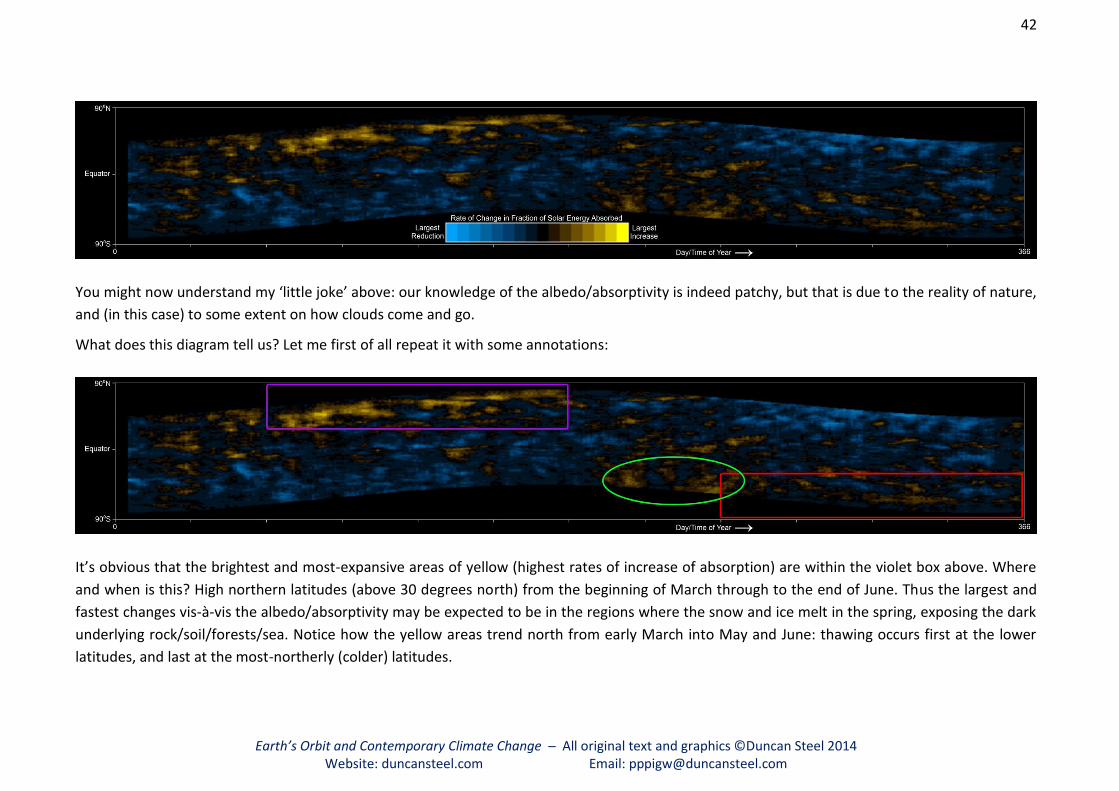
42
Earth’s Orbit and Contemporary Climate Change ─ All original text and graphics ©Duncan Steel 2014 Website: duncansteel.com Email: [email protected]
You might now understand my ‘little joke’ above: our knowledge of the albedo/absorptivity is indeed patchy, but that is due to the reality of nature,
and (in this case) to some extent on how clouds come and go.
What does this diagram tell us? Let me first of all repeat it with some annotations:
It’s obvious that the brightest and most-expansive areas of yellow (highest rates of increase of absorption) are within the violet box above. Where
and when is this? High northern latitudes (above 30 degrees north) from the beginning of March through to the end of June. Thus the largest and
fastest changes vis-à-vis the albedo/absorptivity may be expected to be in the regions where the snow and ice melt in the spring, exposing the dark
underlying rock/soil/forests/sea. Notice how the yellow areas trend north from early March into May and June: thawing occurs first at the lower
latitudes, and last at the most-northerly (colder) latitudes.

The equivalent southern hemisphere region and time-of-year is within the red box:
beyond latitude 30 degrees south, and from the start of September through to the end of
December. There is, perhaps, a slight excess of yellow over turquoise areas (i.e. quicker
absorption rises rather than absorption falls), but it is nothing like what is happening in the
northern hemisphere in spring (that is, in the violet box).
The third annotation in the diagram is a bright green oval. I have drawn this just to
highlight a couple of yellow regions (rapid increases in absorption) in the southern
hemisphere. These are at mid-latitudes and so outside of the main regions of snow in that
hemisphere (except for the southern Andes, which cover only a small area and so cannot
explain these yellow regions in the diagram). These may be due to the vagaries of clouds that
year. They are perhaps worthy of further investigation by scientists.
My final point, from that diagram: in the northern hemisphere in the later part of the
year (boreal autumn) and in the southern hemisphere in the corresponding interval (March
through June, austral autumn) there is a general coloration of turquoise. That is, the
absorptivity is falling, and the albedo is growing: snow and ice are accumulating, and perhaps
it’s cloudier than it was in the respective summers.
Let me now pull together two diagrams we have already seen, and in which I have used
the same type of colour-coding despite them displaying quite different physical phenomena.
The upper diagram below shows the fractional change in incident solar energy between 1750
and 2000, while the lower one shows the rate of change of absorptivity (the fraction of solar
energy absorbed) during the year.
Clearly, yellow is where the action is. In March through June in high northern latitudes
the insolation has increased by the largest proportion over the past few centuries, and this is
also the region where the absorbed fraction of the insolation increases fastest during the year.
It follows that the elevating insolation from year to year must be leveraging earlier spring
melting, and therefore especially large albedo changes resulting in higher solar absorption and
so warming: the ice albedo feedback effect.

44
Earth’s Orbit and Contemporary Climate Change ─ All original text and graphics ©Duncan Steel 2014
Website: duncansteel.com Email: [email protected]
What was the albedo 250 years ago?
I continue with a rhetorical question for which we do not, and cannot, have a definitive
answer. Unfortunately governments in 1750 were not far-sighted enough to start a satellite
observation program similar to those currently being carried out.
Indeed we do not even know, with the necessary precision for a full understanding of
Earth’s radiation budget, what the Earth’s albedo is now. One page on NASA’s Earth
Observatory website that deals with “Earth’s Energy Budget” begins with a disclaimer as
follows:
Determining exact values for energy flows in the Earth system is an area of ongoing
climate research. Different estimates exist, and all estimates have some
uncertainty. Estimates come from satellite observations, ground-based
observations, and numerical weather models. The numbers in this article rely most
heavily on direct satellite observations of reflected sunlight and thermal infrared
energy radiated by the atmosphere and the surface.
With that in mind I can argue that the albedo back in 1750 is what scientists often call a free
parameter9. I can choose any values that I want in order to conduct the experiment that I want
to do. I should be sensible, though, and make a justifiable choice.
What I will do is to pick up the absorptivities in a region of interest (latitudes
northwards of 30 degrees north, March through June), and replace them with the
absorptivities from 30 days earlier (February through May), so as to simulate the effect of the
putative delayed melting of the snow and ice back in 1750 compared to the present. We
certainly know that the amount of Arctic ice coverage now is rather less than in the past, with
record lows of sea ice being recorded in the north, justifying in principle my choice of free
parameter.
Here is the result:
The edited area, which is slightly darker – meaning less absorption, or a higher albedo – is
obvious.
9 Wikipedia: “As opposed to constants, and as opposed to other parameters which are restricted to represent
meaningful data, free parameters can be adjusted to allow the models to provide helpful insights. The values of
free parameters used in models may be provided by previous experiments, educated guesses, or assigned
randomly.”

45
Earth’s Orbit and Contemporary Climate Change ─ All original text and graphics ©Duncan Steel 2014
Website: duncansteel.com Email: [email protected]
I can now conduct the desired experiment, which has an aim of calculating the total
solar energy that would have been absorbed back in 1750 if the absorptivity were slightly
lower in that region of interest. When I do this computation, the result is that the total
absorbed solar energy is 3.652 x 1024 joules, and the average terrestrial albedo 0.332. In the
previous calculation the figures were 3.674 x 1024 joules, and an albedo of 0.328.
As might have been anticipated, the difference in absorbed energy is small, but
significant: a decrease by 0.61 per cent. That is, there is an expectation based on this
experiment that the absorption of solar energy now is about 0.6 per cent higher than in 1750.
That seems to be a significant amount. Recall that the new IPCC (2013) estimate for
the effect of AGW since the Industrial Revolution is 0.17 per cent of the solar flux at our
distance from the Sun. Recall also that we do not have a definitive value for Earth’s albedo
even now, and such a thing may not be attainable.
The bottom line is this: it seems that changes in Earth’s orbit over the past few
centuries are certainly important with regard to climate change, especially when one takes
into account the leveraging of the ice-albedo feedback effect, and these orbital changes
cannot be neglected.
Summary of the albedo’s influences
The simple numerical experiment I described above was not intended to be the last word. My
intent was limited to demonstrating that this is a matter worthy of further investigation, and
more sophisticated experiments. All I have done is to suggest that the changing insolation,
due to Earth’s swivelling orbit, must surely be causing the ice and snow to melt earlier in the
northern spring; and that the albedo changes that produces must be enhancing the total solar
energy Earth absorbs over the year.
On the basis of what I have described so far, the reality of the past millennium might
be this. The increasing spring insolation in the north has caused slow decreases in the ice cover
from year to year. At times, due to other vagaries of the climate such as the Mediaeval Warm
Period and the Little Ice Age, these ice cover decreases have either accelerated or else
reversed for a century or two. Earth’s climate system truly is complex; and we must
understand all of the factors that affect it.
In particular, since perihelion moved past the winter/December solstice in the mid-
13th century the increasing insolation must have caused some warming in the northern winter
and spring. The effect of that would not have an immediate substantial effect, if the increasing
insolation were still (mostly) being reflected by snow and ice, and so there was no large ice-
albedo feedback effect in operation (i.e. the greatly-enhanced solar energy absorption once
the ice has melted so that the sunlight is reaching the bare land or ocean). What would be
happening would be gradual thinning of the previously=perennial ice in the far north: the
sunlight would still be hitting snow, but the ice below would be reducing, bit by bit.

46
Earth’s Orbit and Contemporary Climate Change ─ All original text and graphics ©Duncan Steel 2014
Website: duncansteel.com Email: [email protected]
Eventually a tipping point would be reached, whereby the sea ice becomes so thin that
it starts to break up and then melt much more quickly. The timescale for the gradual ice
thinning would be several centuries; the timescale for this tipping point (and so more rapid
warming) might be just a few decades.
Computer modelling experiments to investigate such a scenario would need to be
evolutionary; that is, they would need to incorporate changes from year-to-year and decade-
to-decade over several centuries, perhaps the whole of the last millennium. In the idiom the
straw that broke the camel’s back it is understood that many straws had already been added
to the camel’s load before its rapid collapse occurred; so it is here.
Ancient records of the extent of the Arctic ice, and weather information, and other
sources of data, all might enable the computer experiments to be guided appropriately and
suitable constraints applied. But, as I wrote, the experiments would need to be evolutionary,
rather than simply taking two epochs (1750 and 2000) as snapshots, as I have done here.
How does AGW fit into this? As I must have made clear in several places, I have no
doubt that AGW is indeed a fact: that increased levels of greenhouse gases are directly causing
some elevation of the average worldwide temperature. However, it seems to be only an
additional effect bolstering something that would have happened anyway. That is, AGW may
have accelerated the gradual warming such that the above tipping point – when the sea ice
breaks apart, substantially enhancing the absorption of sunlight – has been reached earlier
than would otherwise have been the case, but now that tipping point has indeed been reached
one might expect some levelling off. Just as is observed, in fact.

47
Earth’s Orbit and Contemporary Climate Change ─ All original text and graphics ©Duncan Steel 2014
Website: duncansteel.com Email: [email protected]
Concluding Summary
There is a contemporary influence upon the climate due to the Earth’s shifting orbit, and
it has hitherto been either ignored by climate scientists or else incorrectly calculated;
Even over as short a timescale as a century or two this is a significant natural effect, when
measured against the calculated warming due to increased greenhouse gas levels since
the Industrial Revolution (i.e. Anthropogenic Global Warming, AGW);
Whilst AGW is undoubtedly occurring (i.e. increased greenhouse gas levels must be
pushing the temperature up), the pattern of physical observations and temperature
increases across the globe are consistent with this natural effect of changing insolation
due to Earth’s swivelling orbit being the dominant cause of climate change, with AGW
simply causing an acceleration in the influence of this natural agency;
It just so happens that we are living in an era in which the swivelling of Earth’s orbit is
having an especially pronounced effect, with our perihelion having been aligned with the
winter (December) solstice – and aphelion with the summer (June) solstice – in the mid-
13th century, since then having an increasing influence due to perihelion moving into
early January and thus deeper into northern winter;
The most significant increase in the intensity of arriving sunlight during each year in recent
centuries has been in northern latitudes across spring, and this will have an especially
large effect on the climate because the earlier melting of Arctic snow and ice which results
must cause increased absorption of sunlight through the consequent drop in albedo (the
ice-albedo feedback effect);
This can be termed the Changing Spring Insolation (CSI) theory, as opposed to the AGW
theory, in terms of explaining how and why the globally-averaged temperature has gone
up since the Industrial Revolution;
Such warming is in accord with the observations of increased melting of Arctic ice;
The above is also in accord with temperature records indicating that the greatest
increases in temperature over the past century or so have been in far northern latitudes;
In the southern hemisphere the trend in the variation in solar heating is the opposite,
with decreased insolation in austral spring and so delayed melting of sea ice;
Again this is in accord with physical observations, which show the Antarctic sea ice to be
reaching record levels each year, with the temperatures in the Antarctic Ocean being
either steady or possibly falling;
Ockham’s razor demands that the CSI theory be accepted as the working hypothesis for
observed climate change, because it is the simplest explanation and is undoubtedly valid
(unless someone can demonstrate that my calculations are wrong, along with those made
using Berger’s software code) although the AGW mechanism is certainly a (smaller)
contributing factor.

48
Earth’s Orbit and Contemporary Climate Change ─ All original text and graphics ©Duncan Steel 2014
Website: duncansteel.com Email: [email protected]
Invitation to review and identify errors My main purpose in publishing this document is to allow anyone and everyone to review the
calculations and analysis, and thus identify any errors that have slipped past me (and also
obviously my various colleagues who have previously reviewed this material). So far no
substantive errors have been found, and if that is indeed the reality then it follows that there
is a substantial contribution to the climate change and global warming presently observed
that is of a natural origin, the causative factor being the well-known ongoing variations of
Earth’s orbital parameters and spin axis tilt, although it is specifically the precession of
perihelion (apsidal precession) which dominates the alterations in solar influx.
I have pointed out herein how Berger’s computer program might be downloaded and
then used to derive insolation values as a function of time of year for different epochs, and
thus verify my results. Any person who is able to make a few changes to a FORTRAN program
and then run it, and perhaps use MS-Excel to process and plot the output data, should be able
to do that with a few hours’ effort.
Alternatively those with suitable backgrounds in physics, astronomy and computer
programming should be able to write their own code from scratch, just as I have done, and
obtain confirmatory results within a day or two. Although epoch-specific values of the
eccentricity, perihelion longitude and obliquity are available on various websites, there is no
need to worry overmuch about precise values: one could just use (for the past millennium) a
constant eccentricity of 0.0168, a constant obliquity of 23.4 degrees, and values of the
longitude of perihelion for each year derived simply from the difference in the lengths of the
anomalistic year (365.259636 days) and the mean tropical year (365.242190 days) coupled
with the fact that the perihelion longitude was near 270 degrees in the mid-13th century; the
main thing is to calculate insolations in equal steps in time around the orbits, not equal steps
in ecliptic longitude (because the latter is wrong).
Apologies in advance but please let me be clear that, whilst I have attempted to write
this document in an easily-understood way for those with the necessary backgrounds, this is
not intended to be an educational resource, as such. The intent here is to make the situation
sufficiently clear such that those with the needed capabilities, through their educations and
experience, will be able to comprehend what is going on and then identify any errors that I
might have made.
The only factors of interest here is the way in which the solar flux/insolation at
different latitudes has varied in contrasting ways over the past few centuries, the last
millennium at most, and how much of that insolation is absorbed (i.e. how the varying albedo
affects the heating of the Earth). No comments or questions about other matters will be
posted here. I recognise that many people like to argue about whether global temperatures
have gone up, whether the climate is changing, what the roles are of a wide variety of
conceivable influences upon the climate, and so on. Please go elsewhere to discuss those
matters.

49
Earth’s Orbit and Contemporary Climate Change ─ All original text and graphics ©Duncan Steel 2014
Website: duncansteel.com Email: [email protected]
Apart from the identification of any errors in my calculations or analysis, I would
welcome information from others pertaining to any previous publications that make the
precise points that I have described above; that is, how the spring insolation is changing at
high latitudes in both the northern and the southern hemispheres, and how this would
leverage climate change through the ice albedo feedback effect. The concept of the ice albedo
feedback effect is well-known, and is addressed in many research papers. I am familiar with
Milankovitch identifying the snow cover at 65 degrees north as being perhaps pivotal in ice
age/interglacial transitions. What I have not seen is the specifics of the high-latitude insolation
changes over the past several centuries/the past millennium, and its inevitable consequences.
Another thing of which I am unaware, and would invite input regarding, is any previous
work on evolutionary climate models which involve year-by-year recession of the ice and snow
cover in the northern hemisphere stretching over some centuries and out to about a
millennium. If the Changing Spring Insolation hypothesis is correct, then one would expect the
increasing spring insolation in the north to have resulted in the gradual loss of ice and then
warming through the ice albedo feedback effect, with interruptions of any consistent trend
being induced by the usual climatic vagaries. Also, it does not seem out of the question that
some useful information regarding ice recession across the land areas in the north (Canada,
Alaska, Siberia, Russia, Scandinavia, Greenland) may be available from both human and
physical records pertaining to the last half- to full-millennium.
To reiterate, the only matter that will be discussed here is how the insolation has
altered under the influence of Earth’s evolving orbit and directly related points. Please do not
waste your own time, and try to waste mine, by posting comments on any other matter. It
does not take me long to click the ‘trash’ button.
On the other hand, comments specifically pertaining to how orbital changes are
affecting the insolation in the present epoch are welcome. If I have made a mistake, please
show me where; or, if you have made your own calculations and can confirm those I have
presented, please say so.
If I were wrong, one would be enough. Ascribed to Albert Einstein (but perhaps apocryphal), in response
to a pamphlet entitled A Hundred Authors Against Einstein.


![Sjzl20091240-ZXMBW AGW (V3[1].08.10) Software Installation Guide](https://static.fdocuments.in/doc/165x107/577cd5711a28ab9e789acc63/sjzl20091240-zxmbw-agw-v310810-software-installation-guide.jpg)


![Benchmarks - May, 2011 | Benchmarks Onlineit.unt.edu/sites/default/files/benchmarks-05-2011.pdf · Benchmarks - May, 2011 | Benchmarks Online 4/28/16, 9:13:42 AM] By Patrick McLoud,](https://static.fdocuments.in/doc/165x107/5fe545814aa19825752e7bae/benchmarks-may-2011-benchmarks-benchmarks-may-2011-benchmarks-online-42816.jpg)