
Dimensions of Usability - e-ope.ee
22
81 4 Dimensions of Usability Whitney Quesenbery Cognetics Corporation Why talk about usability in a book about information design? Although there is not yet a consensus on a single definition of information design, one that I like is making “information accessible and usable to people” (Sless, 1992, p. 1). It is not enough to design well: We must also achieve information design that is usable. We therefore need to establish what “usable” means, so in this chapter I present five dimensions of usability, which can be used in several ways: As a model, they provide a way to understand what kind of usability is needed in different contexts; As a tool, they help guide the design process, suggesting both a general approach and specific choices; For evaluation, they are both useful as a way of understanding why a design is failing, and suggest appropriate techniques to get the design right. This multifaceted view of usability allows designers of both complex and simpler products to understand user requirements and evaluate the success of the design. The work of an information designer shares elements with others including user experience designers, information architects, graphic artists, interaction designers, user interface designers, usability engi- neers, writers, content managers, indexers, and quite a few more.
Transcript of Dimensions of Usability - e-ope.ee

81
4Dimensions of Usability
Whitney QuesenberyCognetics Corporation
Why talk about usability in a book about information design? Althoughthere is not yet a consensus on a single definition of information design,one that I like is making “information accessible and usable to people”(Sless, 1992, p. 1). It is not enough to design well: We must also achieveinformation design that is usable.
We therefore need to establish what “usable” means, so in thischapter I present five dimensions of usability, which can be used inseveral ways:
• As a model, they provide a way to understand what kind ofusability is needed in different contexts;
• As a tool, they help guide the design process, suggesting both ageneral approach and specific choices;
• For evaluation, they are both useful as a way of understandingwhy a design is failing, and suggest appropriate techniques toget the design right.
This multifaceted view of usability allows designers of both complexand simpler products to understand user requirements and evaluatethe success of the design.
The work of an information designer shares elements with othersincluding user experience designers, information architects, graphicartists, interaction designers, user interface designers, usability engi-neers, writers, content managers, indexers, and quite a few more.

82 Quesenbery
Each brings specific skills and their own perspective to the table. Ratherthan sort out the distinctions, I use the term designer generically, and theterms product or interface for the end result of the design.
Definitions of usabilityThe problem of defining usability is complicated by the fact that we usethe word “usability” to describe:
• a result – a quality of a product that is usable• a process – a methodology for creating those products• techniques – the specific methods or activities, such as contextual
observation and usability testing, used to achieve that result• a philosophy – a belief in designing to meet user needs
Although all of these are important, this chapter focuses on usability asa result.
So what is this quality of “usability”? To say usability is “ease of use”or even “user friendly” make good sound bites, but the phrases are toosimple to communicate the complexity of the user experience. A betterdefinition can be found in an ISO standard on usability (ISO 9241, 1998):
The extent to which a product can be used by specified users toachieve specified goals with effectiveness, efficiency and satisfac-tion in a specified context of use
This definition is more complete, but it reflects the emphasis of much ofthe original usability work on strongly defined tasks and work tools.This heritage has sometimes led people working in new media from theweb to wireless to assume that usability is not relevant to their work.This has been especially true for designers of products without a strongtask orientation, such as large information systems. In addition, design-ers of consumer products criticize usability as not accommodating theconcept of “fun” as a goal, even though it can be important in themarketplace.
For usability to apply to an experience in which a human can interacteffortlessly with a product, its definition must encompass both workmetrics and a sense of delight, wonder or exploration.
Five dimensions of usabilityTo create a new model, I expanded the ISO 9241 characteristics of usabil-ity (efficient, effective, and satisfying) to five dimensions: effective,efficient, engaging, error tolerant, and easy to learn (Quesenbery, 2001).
The Five Dimensions of Usability 83
“Satisfying” becomes “engaging” not merely to preserve the alliteration,but to raise the emotional level and create a sense of a dynamic interaction.
These dimensions, the 5 E’s, each describe an aspect of the userexperience (figure 4.1, next page). Taken together, they are a tool to createa more precise description of both the goals for, and experience of, usinga product. This chapter looks at how this broad view of usability contrib-utes to a successful product.
As a prescriptive design tool, the relative importance of each dimen-sion can be specified, allowing the usability goals to be balanced appropri-ately for each context. Although this flexibility offers no single interpreta-tion of “usability,” it offers the opportunity to customize its meaning foreach product, based on the needs of the users.
If the unofficial motto of usability is “it depends,” this model pro-vides a definition of what “it” depends on. This allows designers toavoid simplistic rules which may or may not be appropriate. For ex-ample, the often-quoted metric that “anything on a web site should bereachable in three clicks” may or may not apply to any individual siteand its users. It also allows business goals and other constraints to befactored into design decisions, balancing function requirements withusability requirements.
An analysis of the 5 E’s can start a human-centered design process.They provide a clear statement of user goals to complement othercontextual and task analysis. This chapter describes how to define thesegoals, but a complete description of user-centered design is beyond itsscope. A list of uncited references can be found in Further Reading under“Usability as a Process.”
The usefulness of the 5 E’s does not end with understanding users.As a descriptive tool, the five dimensions continue to be helpful. Theysuggest design approaches and can then be used to evaluate why aninterface is succeeding or failing.
Effective
The completeness and accuracy with which users achieve their goals.Effectiveness looks at how well the product helps people reach theirgoals. A user’s goal might be to find all important information on a topic,have fun, or complete a clerical task with minimum effort. Effectiveness ismeasured by finding out whether the user’s goals were met successfully.
The details of these goals can vary dramatically in different contexts:
• Users of a reference web site or corporate intranet used as adocument repository might need to find all relevant documentson a topic, rather than simply selecting a few likely candidates.

84 Quesenbery
In this case, the completeness of the search is important, lestcritical information be overlooked.
• A customer service representative may need to complete anorder form so that it can be fulfilled immediately. All entriesmust be correct, all necessary information present, and theremust be no ambiguities needing explanation.
• A help system must be able to provide the correct informationfor the user to continue working effectively with the minimuminterruption of their task.
• For games, the goal is to have fun. A successful game challengesthe player at just the right level.
Effectiveness does not require an annoying or dictatorial interfacewhich forces users down a single path toward the “right answer, ”but an understanding of their goals and the information and flexibilityneeded to reach them.
Efficient
The speed (with accuracy) with which users can complete their tasks.ISO 9241 defines efficiency as the total resources expended to complete atask effectively. Resources include the number of individual actions auser must take and the time spent on them.
Figure 4.1. The five dimensions describe different aspects of usability.This diagram shows them in balance. However, in most productssome dimensions have a higher priority than others. The challenge ofusability is to create a design that successfully accommodates all ofthe dimensions. (This diagram concept was developed in partthrough private communications with C. Jarrett, August 2001).
Easyto
Learn
ErrorTolerant
Efficient
Engaging
EffectiveEffective - 20%
Efficient - 20%
Engaging - 20%
Error Tolerant - 20%
Easy to Learn - 20%
The Five Dimensions of Usability 85
It is important in measuring efficiency that the boundaries ofthe task are defined appropriately. The user’s perception of the completetask, rather than individual functions as they are organized in theproduct, should be used for this definition. This is especially criticalwhen a task involves multiple functions or when the entire task cannotbe completed within the product.
• For an example, let us go back to a corporate user and the goalof finding all relevant documents. If we set the boundaries ofthe task as determining how much time it takes to enter a searchterm, execute a single search and retrieve a document, thissystem might appear very fast. But, if we look at the time theuser takes from deciding to search to locating the documentsthey need, the results might be quite different.
• The design of the navigation and the categorization of thecontent also has an impact on efficiency. In a work applicationlike the one used by the customer service representative, aninterface that makes it easy to move around the functions mightbe more efficient to use than one with a hierarchical or linearstructure, because its use will require less (inefficient) backtrack-ing, or repetitive traversal of a hierarchy.
• In a help system, dead-end topics can be converted into alter-nate navigation choices with appropriate links, enabling theuser to proceed without delay. Examples of this are links toadditional information included with a topic, or links to otherclosely related topics.
User assistance has a specific efficiency requirement. Because contex-tual help or other integrated user assistance interrupts the user, it musttake as little time as possible to guide the user to the answer to a ques-tion. Clear language also contributes to efficiency. Any word that forcesthe user to stop and think adds friction to the interface, whether it is anunfamiliar technical term or a cute label that conveys little meaning.
Often, effectiveness and efficiency are closely entwined. In manycases a marginal increase in efficiency may be less important thancompleting a task correctly. Understanding the relative value of thesetwo dimensions to users is an important step in design.
Unless the context in which the product is used demands an absoluteminimum time for use, a perception of efficiency may be more importantthan actual timings. If they are able to navigate without backtracking orerror, for example, an interface with a deeper hierarchy (i.e., one thatrequires more clicks) may seem faster to use than one where usersbecome confused or lost.

86 Quesenbery
Engaging
The degree to which the tone and style of the interface makes the productpleasant or satisfying to use.An engaging product is one that draws the user in, encouraging interac-tion. It is the most subjective of the five dimensions. Visual design is themost obvious medium through which the product attracts its audience,but the choice of language, the media used, and the style of the interac-tion all play a part in creating the experience that creates engagement.
• A help system or other information site might show glimpses ofother useful topics, promising a continuing interest. Onetechnique for doing this is the use of “related topics” links,signposts that point to new pages. These may take many forms,but all of them rely on the idea of browsing—allowing the userto follow a line of interest from topic to topic.
• The organization of the information and the way that organiza-tion is communicated to the user can also affect how engaging aproduct is. For example, on an intranet, the site map, table ofcontents, or index must be presented in a way that helps theuser understand it. Info-graphics or information visualizationsused to communicate a complex concept in a simple form are bothexamples of engaging interfaces. They may even be fun to use.
• Finally, the initial view—home page, front panel, or mainmenu—must communicate the contents and scope of theproduct. This initial impression must carry a lot of weight: Thevisual style must be appropriate to the business setting, there mustbe enough information to help the user form a mental model, andthe options for interaction must be clear and compelling.
It can be more difficult to see how a customer service application canbe engaging, but this dimension is important here too:
• An application that the user is required to use can be pleasantor unpleasant. A product that is attractive, respectful, andhelpful is more engaging than one which is ugly, rude, oraggravating.
• A good visual layout makes it easier for the user to work withthe customer by providing the information they need in ahighly readable form.
• Small rewards built into the application can congratulate theuser on reaching a work target.

The Five Dimensions of Usability 87
Error Tolerant
How well the design prevents errors, or helps with recovery from those that do occur.There are three sources of errors:
• There may be defects in the code or unanticipated conditionsthat interfere with the operation of the program.
• The designers may have misunderstood the user’s mentalmodel and created an interface that does not work predictably.
• The user may simply make a mistake.
An error-tolerant system is designed to help the user recover from suchproblems by providing information, choices of actions to correct theproblem, or other solutions. It also accommodates accidents, misinter-pretations, or other deviations from a single path to the goal.
Defects are often caused by a failure to consider all the possibilitiesfor user interaction. Strategies for error tolerance include:
• Errors such as missing information or data in an unanticipatedformat should be treated as part of the normal process and theircorrection incorporated into the interface rather than handled asan exception in a separate subsystem.
• It should be difficult for a user to take invalid actions. Solutionsinclude providing selection lists of appropriate choices, provid-ing clear examples for data entry, or disabling options whenthey are not active.
When errors are caused by a mismatch between user expectations andthe system’s technical model, the strategies used need to restore controlto the user as quickly as possible.
• Providing feedback as close as possible to the action provides theuser with an opportunity to correct any mistakes immediately, sothey can be corrected before their attention has shifted away.
• Making a product easy to learn also increases its error tolerance.Difficult tasks should be designed to include basic instructions,reducing the chance of an error based on confusion.
The final type of error is rarely considered carefully enough: Theuser might simply make a mistake.
• People can mis-click, selecting a different item than theyintended. Poor navigational cues might lead them to choose the

88 Quesenbery
“wrong” item. To make these situations error tolerant, allactions should be reversible. This includes the ability to back-track a navigational choice, or to undo an action easily.
• There are also situations in which the choice might be ambigu-ous with more than one “correct” selection. These are not errorsin the classic software development sense, but they do result ina mistake from the user’s point of view. In this situation, thedegree to which the design is error tolerant has a direct impacton its effectiveness.
The language in messages, especially error messages, can make thedifference between a product that seems rude and unhelpful and one inwhich “errors” are transformed into “navigational options.” A well-written message will not only help the user recover from a problem, butalso help prevent them from repeating the problem in the future.
Needless to say, documentation or user assistance should not pro-duce errors, especially when it is used to help users recover from them.This places special demands on online training or documentation towork flawlessly.
Easy to learn
How well the product supports both initial orientation and deepening under-standing of its capabilities.A product that is easy to learn allows users to build on their priorknowledge without deliberate effort. Ease of learning is created throughsome specific techniques, but it is also embodied in a helping attitudethroughout the interaction.
Good instructions, prompts, examples, or hints can provide enoughinformation to create an interface in which the user can extend priorexperiences into a new context.
As a dimension of usability, ease of learning includes new discoverythat goes on for the complete life of a product. For example, as they usean intranet, people expand their scope of work, explore new options,require access to additional functionality, or even change the way theyinteract with the product completely. Whatever the cause of thesechanges, the continued usefulness of the product depends on its abilityto support the user through them.
One of the criticisms of usability is that it places too much weight onthe ease of initial learning, or so-called intuitiveness. Many usability testsobserve users’ initial encounters with the product as a way of exposingproblems that can be easily masked once the interface becomes familiar.Critics complain that this methodology tends to produce products with a

The Five Dimensions of Usability 89
low barrier to entry, but which are not powerful enough for sustaineduse, or become tedious once the user is familiar with them. For example,a screen-full of instructions in an application that were helpful on firstuse can easily become annoying when it must be scrolled past everysingle time the page is read. Worse, long-time users of products such asthe customer service application become desensitized to messages orprompts, and are more likely to make an error by not reading anotherinstance carefully. An example of this phenomenon is the tendency toclick “OK” on every confirmation dialog without reading it.
An easy to learn interface is both consistent and predictable. Aconsistent interface ensures that terminology does not change, thatdesign elements and controls are placed in familiar locations, and thatsimilar functions behave similarly. Predictability expands this to placeinformation or controls where users expect them to be, and act in waysthey expect (Bergman & Haitani, 2000). A predictable interface allowsusers to transfer prior knowledge from similar products, and to makeuse of any interaction patterns they may have experienced.
Advanced functions, such as keyboard shortcuts, menu type-ahead,or other ways of compressing a hierarchy can dramatically increaseefficiency, but must also be easy to discover and thus take little effort tolearn. In some kinds of games, the discovery of these shortcuts is part ofthe fun, creating a tension between “engaging” and “easy to learn.”
The 5 E’s are interdependent
All 5 E’s must be considered together, and the product must provide foruser needs in each dimension.
There are natural relationships that can be exploited. We havealready discussed how efficiency and effectiveness work together.Another example is the way that good instructions built into the inter-face help improve both ease of learning and error tolerance.
There are also some natural tensions that must be balanced for asuccessful product. When one dimension is dominant, it is easy to ignoreothers, especially when they introduce competing requirements. Thelong-running debates between visual designers and usability engineersare partially a result of failure to explore ways to create a user experiencewhich is both engaging and efficient. Each group concentrates on a singledimension rather than looking at the whole user experience.
Using the 5 E’s to set design prioritiesUnderstanding the 5 E’s is useful as a way of seeing the multifacetednature of usability, but their real importance comes when they help to set

90 Quesenbery
priorities for the product’s design. As a tool, they can be used throughoutthe human-centered design process for both analysis and evaluation.
We can start by examining the five dimensions of needs for the usersof a product. Each group of users should be considered separately, andthen compared to the others for similarities and differences.
Contrasting priorities between applications
The following two examples show a summary of user needs for twoproducts: an online photography exhibition (figure 4.2) and the museumweb site, contrasting the different requirements between them.
Online museum exhibitionTo accompany an exhibition, a photography museum created a web
site with samples of the images, information about the artist and aboutthe exhibition. The museum wanted to both attract more visitors and toprovide a long-term educational site. The primary target users were:tourists looking for exhibitions, people already interested in the artist, andcasual visitors linking from the museum site for additional information.
Effective The content of the site must be effective in communicat-ing the exhibition material. Questions about the artistand the museum exhibit must be easily answered.
Efficient This is not a primary concern. People browsing photo-graphs are less interested in how quickly they can movearound the site than in the richness of the experience.However, the size of the images might be a problem andlong downloads needed to be avoided.
Engaging The site needs to be engaging in several ways: to encour-age those unfamiliar with the artist to stay and explore;to provide new and interesting information for research-ers; and to create a compelling experience in its ownright as an exhibition.
Error Tolerant Any content errors are unacceptable. In addition, therich media used on the site created several opportunitiesfor problems.
Easy to Learn One of the goals of the site is to encourage discovery. Itmust therefore invite exploration.
General museum web siteThe museum also has a general web site, with information about theirexhibits, educational programs, awards, and other activities. The usergroups for the larger site are more diverse than those for the exhibit,

The Five Dimensions of Usability 91
including: the same tourists, people shopping in the museum store, jobseekers and art world colleagues keeping up with the institution. All ofthese users are seeking information about the museum, though thedetails might be different. Their usability requirements are all similar:
Effective The site must include content that answers users’questions in an easy-to-find location.
Efficient Attention spans are relatively short. The site structuremust be straightforward and direct to minimize naviga-tion time. Writing should be concise and easily scanned.
Engaging For the users, the site provides their first impression ofwhat the museum is like. The degree to which the sitecan delight the visitor (and by extension convince themto visit the actual museum) is a measure of success.
Error Tolerant Errors are not acceptable in any form, especially thosecaused by a failure to meet user expectations.
Easy to Learn Users do not expect to have to learn to use a site. This sitemust allow for “zero-trial learning”—the ability to justwalk up and use a product successfully the first time.
Figure 4.2. The photographer Weegee was a character in his ownright. The web site for this online exhibition opens with an imageof him, with his camera, looking directly at the visitor.www.icp.org/weegee/. Source: © International Center of Photography

92 Quesenbery
The diagrams in figure 4.3 and 4.4 visually present the dimensions inproportion and shows how the usability requirements differ for these sites.
Varying requirements within a product
Sometimes, different users may have conflicting needs that must beresolved in the design. Individuals may also have varying needs, de-pending on the function. And needs can change over time or as thecontext changes. In analyzing a more complex product, you need to lookfor unexpected overlaps or differences. Requirements are not alwaysstraightforward to analyze.
Payroll applicationWhen users of a payroll application were interviewed, their prioritiesvaried depending on the function being described:
• For routine functions, such as entering weekly time sheets, theywanted a very efficient interface. This work was repetitive andhad to be performed every week.
• For difficult or infrequently used functions, such as issuing areplacement check, they wanted the function to be easy to learn: aguided experience with all options explained carefully to be surethey were doing the work correctly.
Figure 4.3. The 5 E’s for the Online Museum Exhibition: When onedimension is significantly more important, it is easy to lose sight ofthe others. In this design, efficiency and error tolerance need specialattention to ensure that failures in these dimensions do not undercutthe overall success of the site.
ErrorTolerant
Efficient
Effective Effective - 20%
Efficient - 5%
Engaging - 40%
Error Tolerant - 5%
Easy to Learn - 30%
Easyto
Learn
Engaging

The Five Dimensions of Usability 93
Figure 4.4. The 5E’s for the General Museum Site. In contrast to theexhibition, the museum site has more balanced usability require-ments. Although error tolerance is a low user priority, this oftenmeans that users simply expect it to be there, not that it can beignored in the design and development of the site.
• Throughout the interface, they wanted error tolerance. Theywanted to rely on the software to check their work for prob-lems, and to help them enforce legal and business rules.
Fortunately, the pattern of which functions were considered “rou-tine” and which ones “difficult” was generally consistent among differ-ent user groups—and corresponded to the impressions of the technicalsupport staff from the phone calls they received. In this case, the userrequirements, user goals, and business goals were in harmony: Everyonewanted an accurate payroll which could be created and maintained withas little overall effort as possible.
Identifying design tactics
After identifying design goals, the next use of the usability dimensions isto suggest design approaches or tactics. The goal at this stage is toidentify the design elements suggested by the usability needs, and seehow they fit together.
Table 4.1 shows some typical needs and tactics for each of thedimensions. It contains some of the heuristics I use as the starting pointfor a more detailed analysis.
Notice that these tactics are not specific design implementations.Instead, they are general principles that act as a starting point for adesign. Their value is ensuring that the design decisions are based on
Easyto
Learn
ErrorTolerant
EffectiveEffective - 20%
Efficient - 30%
Engaging - 30%
Error Tolerant - 5%
Easy to Learn - 15%
Efficient
Engaging

94 Quesenbery
user needs, not which technique is the most fun for the product team.There may be many ways to implement each requirement. The goal of thedesign work is to find a way to fit all of them together into a coherent whole.
An example of how a user need can suggest a design tactic, which inturn becomes a feature of a product, can be found below.
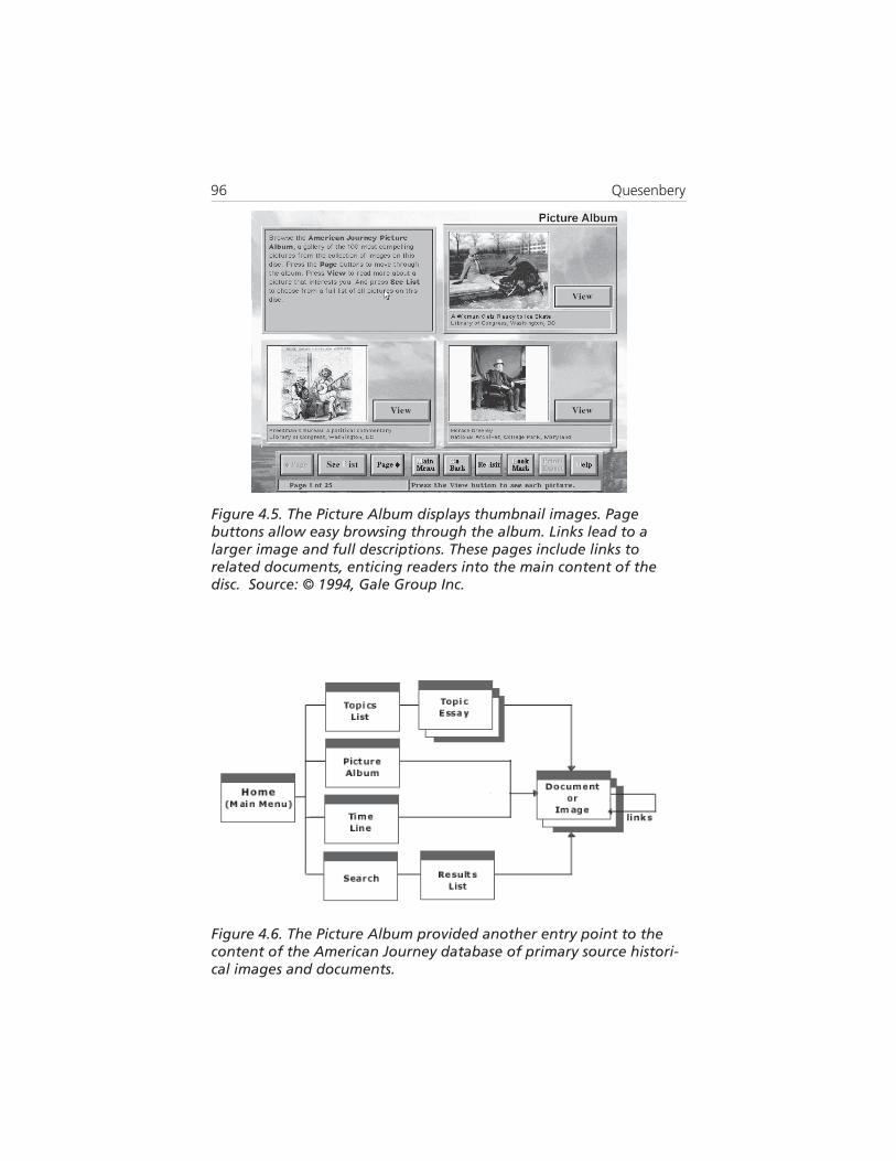
American Journey
American Journey (Primary Source Media, 1994) is a series ofcollections of historical images and documents for high school students.It is used as part of a curriculum on how to conduct research. The designteam identified a user group of “Reluctant Researchers”—students whowere typically not interested in school subjects and needed to be drawninto the material.Our solution was to look for a way to engage them, and we decided touse the images, which were very attractive. We knew that the solutionneeded to be easy to learn, so we created an album of the best pictures,which could be easily browsed (figures 4.5 and 4.6).
To integrate the Picture Album into the design, we used it as one ofthe entry points. Each image had a link to its main entry in the database.From this screen, the student could continue browsing to find other, related,images and documents—beginning the exploratory research process.
Although it was initially designed to solve the usability requirementsof one user group, the solution became a feature of the product, absorbedseamlessly into the overall design.
Creating usability goalsThe 5 E’s continue their usefulness as part of creating usability goals fora product. By connecting the original user requirements, they ensure thatthe usability goals express user needs well.
A usability goal is a design objective that is unambiguous andmeasurable. Usability goals guide the design process by establishing themost important values and the objectives a product must meet. It isimportant that they be accepted by the entire development team; other-wise they have simply deferred the inevitable conflicts, possibly to thepoint where they cannot be resolved successfully.A well-written goal has four components:
User Definition: Which users does this goal apply to?Task: What should they be able to do?Context: Under what conditions does the goal apply?Criteria: How will the success of this goal be measured?

The Five Dimensions of Usability 95
It is important to create specific metrics rather than using generalcriteria. For example, if users say “it has to be quick,” we know thatefficiency is important. But do they mean they need to complete the taskin seconds or minutes?
Table 4.1. Design approaches to meet key usability requirements
noisnemiD sdeeNyeK scitcaTngiseD
evitceffE ycaruccA
ehtnisecalpynamwohredisnoC,rorrerofseitinutroppoeraecafretni
.mehttsniagatcetorpdna
edivorpotseitinutropporofkooL.snoitamrifnocdnakcabdeef
tneiciffElanoitarepO
deeps
tnatropmitsomehtylnoecalP.resuehtfotnorfninoitamrofni
sasevomtahtnoitagivannokroW.ksatahguorhtelbissopsayltcerid
seziminimelytsnoitcaretniehteruseB.deriuqersnoitcaeht
gnigagnEsresuwarD
ni
tcudorpehtfostcepsatahwredisnoCetaroprocnidnaevitcarttatsomera
.ngisedehtotnimeht
otysaEnraeL
emit-ni-tsuJnoitcurtsni
plehotsecafretnipets-yb-petsetaerC.sksatxelpmochguorhtetagivansresu
edivorpotseitinutropporofkooL.gniniartfosknuhcllams
rorrEtnareloT
noitadilaV
nacnoitceleserehwsecalprofkooL.yrtneatadecalper
nacsrotaluclacerehwsecalprofkooL.yrtneatadtroppus
edulcnisegassemrorreekaM.smelborptcerrocotseitinutroppo
96 Quesenbery
Figure 4.6. The Picture Album provided another entry point to thecontent of the American Journey database of primary source histori-cal images and documents.
Figure 4.5. The Picture Album displays thumbnail images. Pagebuttons allow easy browsing through the album. Links lead to alarger image and full descriptions. These pages include links torelated documents, enticing readers into the main content of thedisc. Source: © 1994, Gale Group Inc.

The Five Dimensions of Usability 97
Conference registration site
Users of a conference registration system want their registrations to be accurate and complete. In other words, they have high needs foreffectiveness and error tolerance. The conference organizers want to besure that user satisfaction with the new system is high. The usabilitygoals for the site are derived from both the user requirements andbusiness goals:
Effective User Requirement: I want you to register me without error.Business Goal: Reduce costs in processing registrationsUsability Goal: Fewer than 5% of the registrations willhave errors, omissions, or inconsistencies requiring afollow-up contact by the staff.
Efficient User Requirement: I want to get this over with quickly.Business Goal: Reduce costs in processing registrations,and staff time to manage incomplete forms.Usability Goal: The user will be able to successfullycomplete the registration in under 5 minutes
Engaging User Requirement: I want to feel that the conferenceorganizers care about me.Business Goal: Convert to a completely online systemwithout customer objections.Usability Goal: In a follow-up survey, at least 80% ofregistrants will express comfort with using the onlinesystem instead of a paper form or phone registration.
Error tolerant User Requirement: I want to be sure I do this correctly.Mistakes might cost me money.Business Goal: Reduce the number of registrations thathave to be updated manually to correct mistakes.Usability Goal: The system will validate all housing, mealand tutorial choices and allow the user to confirmpricing for these options before completing the registration.
Easy to learn User Requirement: What’s to learn about registering for aconference?Business Goal: Ensure that savings from the new onlinesystem are not eliminated by costlytechnical support.Usability Goal: Users will be able to successfully completethe registration at the first attempt.
Usability goals are used as part of the envisioning work for a prod-uct, to help make decisions during the design process, and at the endwhen the design is evaluated.

98 Quesenbery
Using the 5 E’s to validate a designOnce the design is complete, the 5 E’s continue to be useful as theinterface is evaluated. Their characterization of the usability needs for aproduct helps determine the specific kinds of usability evaluationnecessary to validate a design (table 4.2).
Relationship to usability heuristics
One of the common methods of usability evaluation is a heuristic review(Molich & Nielsen, 1990). These reviews use a set of design principles toidentify problems that users might encounter in using the product. Atypical list of heuristics (Cognetics, 2000) includes:
• Matches users’ mental model• Speaks in the user’s language• Appropriate visual design and layout• Consistency• Visibility• Support for user actions• Prevents errors• Includes shortcuts• Supports discovery and learning• Provides user assistance• Supports standards
If heuristics are descriptive, the dimensions of usability are goal-oriented.Together they provide insights into both what the problems are, and whythey are a problem. Table 4.3 shows some of the relationships betweenthe heuristics and the 5 E’s.
No matter what evaluation technique was used, a careful analysis ofusability flaws against the five dimensions increases the value of theevaluation. The five dimensions of usability offer a direct link to theoriginal usability goals and therefore to any underlying problems in thedesign approach which are causing the usability problems.
ConclusionInformation is designed for people to read and use. Usability is con-cerned with how well they can do so. It is the measure of how successfula design is in “making information accessible and usable.”

The Five Dimensions of Usability 99
Table 4.2. Evaluation techniques for the dimensions of usability
noisnemiD noitaulavEfoepyT stnemeriuqeR
tneiciffE ,sksatcitsilaernokrowdemiTrosekortsyek/skcilcgnitnuoc
emitdespale
ytiledifhgiHgnikrowroepytotorpcitsilaerhtiwtcudorp
elbaliavaatad
evitceffE shtaplanoitagivanfosisylanAedamsresunetfowoheesot
.seciohcdoog
ytiledifhgihrowoLllahtiw,epytotorp
snoitpolanoitagivandelbane
detaulaveebnachcihwsksaTerewyehtyletaruccawohrof
netfowohdna,detelpmocrehtorosrorredecudorpyeht
smelborp
hcihwepytotorPetauqedasedulcni
llafonoitatneserpersksatehtnistnemele
gnigagnE rosyevrusnoitcafsitasresUotsweivretnievitatilauq
dnaecnatpeccaresueguagehtsdrawotsedutitta
erawtfos
ebyamsnoitaulaveesehTyektaro,emitrevoenod
laitinisahcus(esunistniop,egasutrohs,ecneirepxe
)egasuregnol
-hgihyltneiciffuSotepytotorpytiledif
laniftneserpertcudorp
rO
tcudorpgnikroW
rorrEtnareloT
htiwsksatedulcnIrehtoroseitiugibma
tsetnismelborplaitnetopsoiranecs
ro,edocgnikroWdooghtiwepytotorp
fonoitatneserpergnildnah-rorre
senituor
otysaEnraeL
noitcurtsnihcumwohlortnoCstnapicitraptsetotnevigsi
sksatrosnoitcnufedulcnIfoseergedgniyravhtiw
noitazirailimafroytluciffid
hgihromuidemynA,epytotorpytiledif
-noynagnidulcnisnoitcurtsnineercs

100 Quesenbery
In this chapter, we have discussed the 5 E’s:
• Effective. The completeness and accuracy with which usersachieve their goals
• Efficient. How directly and quickly those goals can be met, or thespeed (with accuracy) with which users can complete their tasks
• Engaging. The degree to which the tone and style of the inter-face makes the product pleasant, satisfying or enticing to use
• Error tolerant. How well the design prevents errors, or helpswith recovery from those that do occur
Table 4.3. Matching heuristics to the dimensions of usability
evahuoyfIesehtnismelborp
scitsirueh
singisedehtrehtehwredisnoCaerasihtnislaogytilibasugniteem
,ytilibisiv,ycnetsisnoC,stuctrohssedulcnis'resuehtniskaeps
egaugnal
ycneiciffE
eromdna(redrahgnikrowsresuerA?yrassecennaht)ylwols
resuroftroppuSsehctam,snoitca
,ledomlatnem'sresusrorrestneverp
tnareloTrorrE,evitceffE
smelborpgniretnuocnesresuerAroecafretniehtgnidnatsrednu
yletaruccadnayletelpmocgnikrowhtiwcnysnitonsitcudorpehtesuaceb
?snoitatcepxerieht
lausivetairporppAtuoyaldnangised
gnigagnE
?lufplehdnagnitivningisedehtsI
dnayrevocsidstroppuSresusedivorp,gninrael
ecnatsissa
gnigagnE,nraeLotysaE
ehtesuacebdesuacsmelborpesehterAtiesuaceb,elbaliavatonsiecnatsissa
sitiesuacebro,dnuofneebtonsah?lufplehyllautcaton
sdradnatsstroppuS nraeLotysaE,tnareloTrorrE
esuacebsekatsimgnikamsresuerAawollofotngisedehttcepxeyeht
erayehtesuacebrO?dradnats?dradnatsawonkydaerlaotdetcepxe
The Five Dimensions of Usability 101
• Easy to learn. How well the product supports both initialorientation and deepening understanding of its capabilities
These five dimensions of usability offer information designers a way todefine user requirements in a way that can help analyze, design, andevaluate an interface. This model provides a way of understanding therelationship between the content, and its presentation and use, that canguide the creation of the visual presentation, information design, andnavigation structure as a unified product that meets user needs.
ReferencesAmerican Journey (1994). Woodbridge, CT: Primary Source MediaBergman, E. & Haitani, R. (2000). Designing the palm pilot. In E.
Bergman (Ed). Information Appliances and Beyond (pp. 81-102). SanFrancisco: Morgan Kaufmann
Cognetics Corporation (2001). Cognetics design guidelines. RetrievedAugust 1, 2001 from http://www.cognetics.com/services/heuristic_guidelines.html
ISO 13407:1999 (1999) Human-Centered Design Processes For InteractiveSystems
ISO 9241-11:1998 (1998). Ergonomic requirements for office work with visualdisplay terminals – Part 11: Guidance On Usability
Molich, R. & Nielsen, J. (1990). Heuristic evaluation of user interfaces.Presented at ACM SIGCHI Conference on Computer HumanInterfaces.
Quesenbery, W. (2001). What does usability mean: looking beyond ‘easeof use. Presented at Society for Technical Communications AnnualConference. Retrieved August 1, 2001 from http://www.cognetics.com/presentations/whitney/more-than-ease-of-use.html
Sless, D. (1992). What is information design? In D. Sless & R. Penman(Eds.) Designing information for people (pp. 1-16). Canberra: Communica-tion Research Press.
Further readingUsability as a processBeyer, H. & Holtzblatt, K (1998). Contextual design: Defining customer-
centered systems. San Francisco: Morgan-Kaufmann.Cognetics Corporation (2000). The LUCID framework. Self-
published.Retrieved from http://www.cognetics.com /lucid/Hackos, J. & Redish, J. (1998). User and task analysis for user interface design. New
York: Wiley.

102 Quesenbery
Morville, P. & Rosenfeld, L. (1998). Information architecture for the WorldWide Web. Cambridge: O’Reilly.
Wood, L. (Ed). (1998). User interface design: Bridging the gap from userrequirements to design. Boca Raton: CRC Press.
Usability as techniquesDumas, J. & Redish, J. (1999). A practical guide to usability testing. 2nd Ed.
Exeter, UK: Intellect.Rubin, J. (1994). Handbook of usability testing. New York: Wiley.Nielsen, J. (1993). Usability engineering. Boston: Academic Press.
Usability as a philosophyKrug, S. (2000). Don’t make me think. Indianapolis: New Riders.Landauer, T. (1995). The trouble with computers: Usefulness, Usability, and
Productivity. Cambridge, MA: The MIT Press.Norman, D. (1990). The design of everyday things. New York: Doubleday.


