Determining the appropriate font size, and use of … the appropriate font size, and use of colour...
51
Determining the appropriate font size, and use of colour and contrast for underwater displays J.B. Morrison J.K. Zander Shearwater Human Engineering, 438 Felton Place, North Vancouver, BC, V7G 1Z9 (604) 929-6589 Contract no. W7711-997606 Scientific Authority: D. Eaton (416) 635-2086 Defence R&D Canada - Toronto Contract Report DRDC Toronto CR 2008-034 April 2008
Transcript of Determining the appropriate font size, and use of … the appropriate font size, and use of colour...

Determining the appropriate font size, and use of colour and contrast for underwater displays
J.B. Morrison J.K. Zander
Shearwater Human Engineering, 438 Felton Place, North Vancouver, BC, V7G 1Z9 (604) 929-6589 Contract no. W7711-997606 Scientific Authority: D. Eaton (416) 635-2086
Defence R&D Canada - Toronto Contract Report DRDC Toronto CR 2008-034 April 2008
Author J.B. Morrison, J.K. Zander
Shearwater Human Engineering
438 Felton Place North Vancouver, BC
V7G 1Z9
Approved by
Officer Commanding, Experimental Diving Unit
Approved for release by
K.C. Wulterkens
for Chair, Document Review and Library Committee
The scientific or technical validity of this Contract Report is entirely the responsibility of the Contractor and the contents do not necessarily have the approval or endorsement of Defence R&D Canada.
© Her Majesty the Queen as represented by the Minister of National Defence, 2008
© Sa majesté la reine, représentée par le ministre de la Défense nationale, 2008
Abstract Canadian mine countermeasures (MCM) divers currently use a combination of different displays to provide them with information about their safety, equipment, and status. MCM divers require a single, integrated display to simplify information gathering, and to provide information from the dive supervisor.
Ergonomic design guidelines were reviewed and modified for information display in the underwater environment. A two-phase experiment was conducted to determine the optimal font size and the optimal colour, contrast, and background combination(s) for underwater displays. Eighteen subjects viewed a series of displays in four environments that simulated a combination of light and dark, clear and turbid conditions. Each subject viewed over 210 display screens to compare different font sizes and colour and contrast combinations. Each screen was scored for accuracy and readability.
Results showed that when designing an underwater display, character height should be approximately 6 mm (26 point font size) when using Arial font. The display should have a black (or dark) background with light foreground letters. Light orange or light green were found to be the optimum colours for use in the display. A set of ergonomic guidelines for the design of underwater displays were developed based on the results of this study.
Résumé Les plongeurs canadiens de lutte contre les mines (LCM) emploient actuellement différents types de dispositifs d’affichage pour obtenir des renseignements sur leur sécurité, leur équipement et leur état. Les plongeurs de LCM ont besoin d’un dispositif d’affichage intégré et unique permettant de simplifier la collecte de renseignements et d’obtenir des renseignements provenant du superviseur de plongée.
Les directives en matière de conception ergonomique ont été examinées et modifiées pour un dispositif d’affichage d’informations dans un environnement sous-marin. Une expérience à deux volets a été menée afin de déterminer la taille optimale de la police de caractères, ainsi que la couleur, le contraste et l’arrière-plan optimums des dispositifs d’affichage sous l’eau. Dix-huit sujets ont visualisé un groupe de dispositifs d’affichage dans quatre environnements simulant une combinaison de conditions de lumière et d’obscurité, de clarté et de turbidité (eau claire et eau trouble). Chaque sujet a observé plus de 210 écrans d’affichage afin de comparer différentes combinaisons de tailles de polices de caractères, de couleurs et de contrastes. Les résultats de précision et de lisibilité ont été notés pour chacun des écrans.
Les résultats ont montré que, lors de la conception d’un dispositif d’affichage pour un usage sous l’eau, la hauteur des caractères devrait être d’environ 6 mm (grosseur de caractères de 26 points) pour la police de caractères Arial. L’écran devrait avoir un arrière-plan (ou fond) noir (ou foncé) avec caractères d’avant-plan de couleur claire. On a constaté que les couleurs orange pâle ou vert pâle constituaient les couleurs d’affichage optimales. À partir des résultats de l’étude, des directives en matière d’ergonomie ont été élaborées pour la conception de dispositifs d’affichage sous-marins.

This page intentionally left blank.

Executive summary Introduction: Canadian mine countermeasures (MCM) divers currently use a combination of different displays to provide them with information about their safety, equipment, and status when they are diving. MCM divers require a single, integrated display to simplify the process of gathering information, and to provide them with additional information from the dive supervisor who remains on the surface.
In the design of new multi-purpose underwater displays there is a need for design guidelines for information display. In particular, when working in low visibility and low ambient light environments the appropriate font size, colour, contrast, and display background is different from that of an air environment. Experiments were completed toward the development of design guidelines specific to information displays for use in the underwater environment. Design guidelines were developed by combining existing ergonomic guidelines designed for the air environment with what is known about the underwater environment and with new data obtained from this study.
Methods. Eighteen participants completed a series of visual tests in four environmental conditions: clear and turbid water in high ambient light conditions and clear and turbid water in low ambient light conditions. The experiment was completed in two stages. In the first stage, the smallest font size that could be read accurately and with ease in all four conditions were determined. In the second stage, the optimal colour and contrast combinations for displaying information in an underwater environment were determined by having subjects identify and rate the readability of text presented in a series of screens in different colours and contrasts. Results were scored for accuracy, readability and comfort.
Results. Objective and subjective measures were analysed to determine the size of font that met design criteria for readability. Results show that a character height of 6 mm high (26 point font size) Arial font is appropriate for underwater displays.
Colour and contrast combinations were analysed to determine both the best background and foreground colours for underwater displays. Results were analysed to determine which combination met design criteria for legibility and recognition. Results showed that a black background with a light foreground, ideally either light orange or light green, should be used in underwater displays.
Significance. The guidelines developed for designing displays for MCM divers can be generalised to all types of underwater displays. By providing MCM divers with an ergonomically designed integrated information display, the safety and efficiency of MCM diving may be improved.

Sommaire Introduction. Les plongeurs canadiens de lutte contre les mines (LCM) emploient actuellement différents types de dispositifs d’affichage pour obtenir des renseignements sur leur sécurité, leur équipement et leur état lorsqu’ils sont en plongée. Les plongeurs de LCM ont besoin d’un dispositif d’affichage intégré et unique permettant de simplifier la collecte de renseignements et d’obtenir des renseignements additionnels provenant du superviseur de plongée se trouvant en surface.
Dans la conception de nouveaux dispositifs multifonctions d’affichage sous l’eau, il est nécessaire de disposer de directives de conception pour l’affichage de l’information. En particulier, lorsque les plongeurs travaillent dans des environnements de faible visibilité et de faible éclairage ambiant, la grosseur des polices de caractères, la couleur, le contraste et l’arrière-plan des dispositifs d’affichage sont différents de ceux dans un environnement dans l’air (en surface). Des expériences ont été menées en vue de l’élaboration de directives de conception visant particulièrement les dispositifs d’affichage d’information employés dans un environnement sous-marin. On a préparé des directives de conception en combinant les directives existantes en matière d’ergonomie pour un environnement dans l’air, les données connues de l’environnement sous-marin et les nouvelles données obtenues dans le cadre de la présente étude.
Méthodes. Dix-huit participants ont effectué une série de tests visuels dans quatre conditions environnementales, soit : eau claire et eau trouble dans des conditions de forte lumière ambiante et eau claire et eau trouble dans des conditions de faible lumière ambiante. L’expérience comportait deux volets. Dans un premier temps, on a déterminé quelle grosseur de police de caractère pouvait être facilement lisible avec précision dans les quatre conditions environnementales. Dans un deuxième temps, on a déterminé les combinaisons optimales de couleur et de contraste pour afficher l’information sous l’eau en demandant aux participants d’identifier et de coter la lisibilité d’un texte présenté sur plusieurs écrans de couleurs et de contrastes différents. Les résultats ont été notés en fonction de la précision, de la lisibilité et de l’aisance.
Résultats. Des mesures objectives et subjectives ont été analysées afin qu’on puisse déterminer la grosseur de la police de caractères répondant au critère de conception sur la lisibilité. Les résultats ont montré que des caractères de la police Arial d’une hauteur de 6 mm (grosseur de police de 26 points) étaient appropriés pour les dispositifs d’affichage sous l’eau.
On a analysé les combinaisons de couleur et de contraste afin de déterminer les couleurs les mieux adaptées à l’arrière-plan (fond) et à l’avant-plan des dispositifs d’affichage sous l’eau. On a analysé les résultats afin de déterminer quelle combinaison répondait au critère de conception sur la lisibilité et la reconnaissance. Les résultats ont montré qu’un arrière-plan noir avec des caractères d’avant-plan pâles, idéalement de couleur orange pâle ou vert pâle, devraient être utilisés pour les dispositifs d’affichage sous l’eau.
Portée. Les directives élaborées pour la conception de dispositifs d’affichage destinés aux plongeurs de LCM peuvent s’appliquer à tous les types de dispositifs d’affichage sous l’eau. La sécurité et l’efficacité des plongeurs de LCM peuvent être améliorées si on fournit à ces derniers un dispositive d’affichage de l’information intégré et de conception ergonomique.

Table of Contents Figures .................................................................................................................................viii
Tables...................................................................................................................................viii
Introduction ........................................................................................................................... ix
Review of Ergonomic guidelines.........................................................................................................................x Viewing Distance ...........................................................................................................................................xi Screen Size.....................................................................................................................................................xi Luminance.................................................................................................................................................... xii Font Type ..................................................................................................................................................... xii Font size ....................................................................................................................................................... xii Colour and Contrast .................................................................................................................................... xiii
Study 1: Determination of optimum font size for underwater displays ......................xvii
Objectives ........................................................................................................................................................xvii Methods ...........................................................................................................................................................xvii Analysis ............................................................................................................................................................ xix Results ............................................................................................................................................................... xx
Study 2: Determination of optimum colours, contrasts and background for underwater displays. .............................................................................................................................xxiii
Objectives .......................................................................................................................................................xxiii Methods ..........................................................................................................................................................xxiii Analysis ........................................................................................................................................................... xxv
Legibility....................................................................................................................................................xxvi Colour Recognition ....................................................................................................................................xxvi Contrast Levels ..........................................................................................................................................xxvi
Results ............................................................................................................................................................ xxvi Background colour ................................................................................................................................... xxvii Legibility Criteria..................................................................................................................................... xxvii Colour Recognition and Contrast Levels ................................................................................................ xxviii Subjective Data ....................................................................................................................................... xxviii
Discussion ..........................................................................................................................xxx
References........................................................................................................................xxxv
Appendix 1......................................................................................................................xxxvii
Appendix 2............................................................................................................................39 • Accuracy Scores for conditions 1-4, white and black background Figures A1-8.................................39 • Readability scores for conditions 1-4, white and black background Figures A9-16 ............................39 • Comfort scores for conditions 1-4, white and black background Figures A17-24 ..............................40
Accuracy Scores for conditions 1-4 on a white background .............................................................................41 Accuracy Scores for conditions 1-4 on a black background .............................................................................42 Readability Scores for conditions 1-4 on a white background ........................................................................43
Readability Scores for conditions 1-4 on a black background ........................................................................44 Comfort Scores for conditions 1-4 on a white background .............................................................................45 Comfort Scores for conditions 1-4 on a black background .............................................................................46
Appendix 3: Associations of Colour ..................................................................................47 • Cultural Associations of Colour Table A1 ...........................................................................................47 • Associations of Colour by Professional Group Table A2.....................................................................47

Figures Figure 1: Seven point scale of readability ............................................................................xviii Figure 2: Accuracy of reading various font sizes in four environmental conditions................ xx Figure 3: Readability of various font sizes in four environmental conditions.......................... xx Figure 4: Five point scale of comfort .................................................................................... xxv
Tables Table 1: Font size recommendations ...................................................................................xiii Table 2: Display Variable: ................................................................................................... xiv Table 3: Font sizes used in Snellen chart when viewed at 20 feet and adapted font sizes
for viewing underwater display at 40 cm. .............................................................xviii Table 4: Environmental Conditions ..................................................................................... xix Table 5: Font heights in mm that meet design criteria: white background .......................... xxi Table 6: Font heights in mm that meet design criteria: black background .......................... xxi Table 7: Font size comparisons of underwater values and predicted values......................xxii Table 8: Experimental Conditions ......................................................................................xxiii Table 9: Colour specifications used in experiment: saturation in each primary colour.......xxiv Table 10: Colour and Contrast Options that met the design criteria for underwater displays
.....................................................................................................................................xxvii Table 11: Subjective colour preference................................................................................xxix Table 12. Ergonomic Guideline for Design of Underwater Displays ..................................xxxiv Table A1: Cultural Associations of Colour (from Thorell and Smith, 1990) ............................47 Table A2: Association of Colour by Professions (from Thorell and Smith, 1990)...................47
Introduction As military and commercial diving operations have become more complex, an effort has been made to improve diving equipment. In particular, existing underwater displays have been found to be inadequate for the display of detailed technical information required in more sophisticated diving operations.
Most underwater displays have been developed by modifying equipment that was originally designed for the air environment. This process has resulted in displays that are not optimal for diving activities. Traditional underwater displays have been designed as single-function displays such as depth, pressure, time, etc. Similarly, many newly designed underwater displays are designed specifically for one type of diving operation, such as decompression, underwater welding or underwater navigation. These single-purpose displays are not adaptable to providing the type of multi-purpose information display required in most military diving operations. Thus, divers are forced to adapt to the limitations in display technology. A proliferation of dedicated single-function displays adds to the equipment burden of the diver, restricts the diver’s ability to complete operations efficiently and compromises safety.
Several manufacturers have attempted to design improved underwater displays, including helmet-mounted displays that provide the diver with real-time information from the surface (US Navy), and a hand-held underwater computer that allows the diver manual input through a chordic keyboard (Sea PC). Although a number of prototypes have been reported, only a few have reached production.
In the design of new multi-purpose underwater displays there is a need for design guidelines for information display. In particular, when working in low visibility and low ambient light environments the appropriate viewing angle (font size), colour, contrast, and display background may be different from that of an air environment. The unique properties of the underwater environment make accessing and viewing displays difficult. A major consideration in determining underwater display guidelines is the change in the properties of light. Vision underwater is degraded as absorption, reflection, scatter, and refraction attenuate light energy.
Light energy is absorbed as it enters the water. The amount of absorption increases as wavelength changes from approximately 400 nanometers (nm) (blue-green) to approximately 700 nm (red). As light is absorbed through the water column, the longer wavelengths are progressively filtered out (Adolfson and Berghage, 1974). In deep diving (past 30 metres), the colour spectrum is limited, and most things will appear blue or green; this is known as the Tyndall effect (Adolfson and Berghage, 1974). According to research on colour perception underwater, the most visible colours in the majority of water conditions are fluorescent colours, specifically yellow, orange and light green (Emmerson & Ross, 1985, 1986).
Theoretically, providing the diver with a light source, such as a lit display, should control for the Tyndall effect because the light does not travel through the water column to the diver. Anecdotally, divers in the Canadian Forces have reported difficulty in differentiating red and
green colours at depth even when a light source is provided (Morrison et al., 1997). However, these reports have not been tested in a controlled experiment.
Colour is used in displays to provide visual cues. The appropriate use of colour enhances performance by aiding the viewer in grouping and coding similar objects on the screen. The use of colour can decrease search times and improve the ability to learn and remember the information on the display (Ware, 2004; Tufte, 2001). The goal when introducing colour into a display is to select colours that result in the best viewer comfort and visual performance. There are three main factors that affect the choice of colour(s): image characteristics; visual ability of the viewer; and ambient illumination (Ware, 2004). We know that divers frequently operate with degraded visibility, and in low levels of ambient illumination. When using a lit display in the underwater environment, luminance of the display and the colour and density of any suspended matter (turbidity) may also be important factors.
Reflection decreases the ambient light underwater by limiting the amount of light that enters the water. Reflection also limits the amount of light that enters the divers mask. As a result, divers operate in low ambient light levels. Through a combination of reflection and absorption, natural illumination is most often limited to 3 metres or less in Canadian waters (Adolfson and Berghage, 1974).
When operating in a low-light ambient environment, the eye is more sensitive to wavelengths in the middle of the colour spectrum (yellows and greens), and viewing colours at the ends of the visible spectrum (red or blue) are associated with discomfort (Thorell & Smith, 1990).
Scattering describes the process through which light is scattered by and absorbed by particulate matter in the water (turbidity). According to Luria and Kinney (1975) scattering causes a loss of energy from the line of sight between the object and the eye, blurring of the outline of the object and a decrease in the natural contrast between the object and its environment. Scatter affects both the short and the long wavelengths of light, but it affects the short wavelengths more (Luria and Kinney, 1975). In strong turbidity, the ambient light appears to be greenish, or even yellowish-green. The effect of scatter and turbidity on a divers ability to read an underwater display is not known.
Due to the refraction of light through the air-glass-water interface of the facemask, objects appear larger (30%) and closer (3/4 true distance) than they do in air (Barnard, 1991; Adolfson and Berghage, 1974).
The combined effect of absorption, reflection, scatter and refraction is that divers operate with severe visual deficiencies. Ergonomic guidelines should ensure that underwater displays are designed to control for these deficiencies.
The goal of this study is to develop an improved set of design guidelines for underwater displays based on objective and subjective data collected in the underwater environment.
Review of Ergonomic guidelines Existing ergonomic guidelines provide general strategies for the design of displays regardless of the operational environment. The design variables considered in these guidelines include: viewing distance, screen size, luminance, font type, font size, colour and contrast (Mil. Std, 1999; Sanders and McCormick, 1993; Schniederman, 1992 ). The first step in designing display guidelines for underwater display was to review the existing guidelines within the context of the underwater environment. Where applicable, the
existing ergonomics guidelines were adapted for the underwater environment. Where the existing guidelines were considered to be inappropriate, experiments were designed to develop new ergonomic guidelines specifically for the underwater environment.
Viewing Distance
The viewing distance of hand held displays varies, depending on the type and size of the display. The distance generally depends on arm length, font size, focal length and accommodation. In an air environment the viewing distance for a hand held display is usually between 30 to 50 cm. In an underwater environment, water visibility also affects viewing distance; thus, for an underwater display the viewing distance is usually between 20 to 40 cm. When designing a hand held display, and selecting an appropriate display design and font size, the larger distance of (40 cm) should be used. This represents the maximum distance at which a head down underwater display is likely to be viewed.
Screen Size
There are several factors that must be considered when determining the appropriate screen size for an underwater display. First, general ergonomic guidelines suggest that in an air environment the display should fit within ± 15° of the neutral line of sight (Sanders and McCormick, 1993). At a viewing distance of 40 cm, this would provide a screen size of approximately 20x20 cm. Second, the screen should not occlude the diver’s visual field. There are no guidelines for determining the optimum size of a display within a diver’s visual field. It is suggested by the authors that the display should not occupy more than 50% of the visual field when used alone, and preferably not more than 25% of the visual field if it is to be used while also performing other tasks. Since diving masks limit peripheral vision, the FOV must be calculated for the diving mask. Provided the FOV when wearing the mask is greater than ± 30°, then the first and second design criteria can both be met. Third, the size of the information display (the screen portion of the hand held display) should fit within the divers useful field of view (UFOV). UFOV describes the size of the region from which a diver can rapidly take in information (Ware, 2004). Assuming adequate light level, vision is most detailed in the fovea, and this part of the eye is used in attending to and processing detailed information from displays. UFOV can be expanded for simple displays without much detail, and can be concentrated for complex displays that require increased attention. The size of the UFOV depends on the task, stress level, and the information being displayed. Task complexity and high stress levels decrease the UFOV (Ware, 2004; Speilberger, 1960). Displays that are densely populated with targets or information are associated with small UFOV from 1 to 4° of visual angle (Wickens, 1992, Ware, 2004). Displays that have a lower character density (less than one per degree of visual angle) can have a UFOV as large as 15°. When designing an underwater display, it is important that the information being displayed is within the diver’s UFOV, yet it is difficult to predict the divers’ UFOV since the task and stress level of the diver will vary between different situations. However, it is possible to estimate a UFOV for underwater displays. It is most likely that underwater displays will have a relatively low character density for two reasons. First, font size must be large; hence, it is not possible to present a lot of information on one screen. Second, underwater displays should not be complex since the divers are operating in high stress environments and may be suffering

from narcosis. With increasing complexity of display, it is more likely that the diver will miss important information. It is likely that divers will have a UFOV of approximately 10°, which would result in a screen size of approximately 7x7 cm (for a viewing distance of 40 cm). Other design strategies can be used to attract the divers attention to relevant portions of the display when required. For instance, motion or change in colour can be used to attract the divers attention to an alarm. Since there are no data specific to underwater conditions, screen size and display size should be tested in an underwater environment.
Luminance
Luminance is critical to being able to view the screen. Standards have been designed for a variety of light conditions in air, but the underwater environment has not been considered. The underwater operational environment is darker than an air environment. Even in clear water at 10 msw the incident light is only 20% of that on the surface. In deep and turbid conditions the ambient light is very low. The closest equivalent light level in an air environment would be a dark night or black out condition. Displays for dark environments in air should use a low luminance (0.07-0.35 candella/m2)) red light to aid in viewing the screen (Mil Std., 1999). When night vision compatibility is required, the spectral output of all light emitting from or illuminating a display should be not greater than 600 nm in wavelength, and the light should be continuously variable and adjustable in luminance. There are two options to illuminating a display: external illumination or self-illumination. Self-illumination is a better option for the underwater operational environment because it is self-contained, it can be designed to be controlled by the diver, and/or automatically adjusted. The appropriate luminance range for the underwater environment is not known. Light absorbed by the water and particulate matter will affect the apparent luminance of the display when viewed by the diver. For the purpose of these experiments the divers were provided with adjustable luminance for the head down display.
Font Type
Human factors research has shown that for information displayed on a screen, particularly a low-resolution screen, sans serif fonts, such as Verdana or Arial, are preferred (Mayhew 1999). However, Boyarski et al. (1998) found no difference in reading speed or preference between 10 point serif and sans serif fonts when reading from a display. Visibility in the underwater environment is degraded, and as a result, even high-resolution screens may appear to be unclear or blurred. Turbidity in particular will cause a decrease in the contrast between objects or items and their background, thus decreasing the apparent resolution of the screen. For this reason, it is reasonable to conclude that a sans serif font should be used in underwater displays. Usability testing conducted in a previous study at Simon Fraser University confirmed that for underwater displays, Arial font was preferred over other fonts tested (Times New Roman, Palatino, and Comic Sans Serif). Users found Arial easy to read and pleasing to the eye (Zander, 1999).
Font size
For printed text, font size determines the vertical spacing between each line of alphanumeric characters in a document or display. Font size has traditionally been measured in points, with 72 points per 1 inch. Thus, a 72 point font prints as 1 line per inch, and a 12 point font allows for 6 lines per inch. In order to provide some spacing between characters on adjacent lines there is also ratio of character height to font size. This ratio may vary

depending on font type. For example, on a Snellen chart, the courier font size corresponding to 20/20 vision is 43 points, and the letter height is 25 points, or approximately 9 mm. While font appears relatively simple to define, the advent of electronic displays has rendered the interpretation of font size much more complex. The actual size (i.e., character height) that a 12 point font will display on the screen will vary as a function of font type, display resolution and screen size. In addition, characters that are defined in a web document can be displayed in different font sizes depending on the web browser characteristics. For these reasons, the use of font size in points to define character size in electronic displays can be extremely confusing, frustrating, and imprecise. Thus when defining font size on a display, it is prudent to include both font size in points and character height in mm. In this report character (or font) heights are given in mm and the corresponding font size is given in points, as defined above. Ergonomic criteria suggest that the appropriate font size is dependent on the luminance of the display screen and the importance of the information being presented (Sanders and McCormick, 1993). For critical uses (i.e., alarm messages) at 70 cm viewing distance, the font size on a display should be 5.1 to 7.6 mm for low luminance; and 3.0-5.1 mm for high luminance. Bullimore et al.(1992) recommends that alphanumeric character heights should subtend an angle of 20 min of arc, or 4 mm at a viewing distance of 60 cm. Viewing distance for a hand held underwater display is usually between 20 to 40 cm. The font sizes recommended by Sanders and McCormick (1993) were recalculated for a 40 cm (maximum distance) viewing distance, by applying a correction factor of 0.57 as shown in Table 1.
Table 1: Font size recommendations
Original Values at 70 cm viewing distance
New Values at 40 cm viewing distance
Low Luminance 5.1-7.6 mm 2.9-4.3 mm High Luminance 3.0-5.1 mm 1.7-2.9 mm
These guidelines may not be appropriate for the underwater environment. There are three factors that may affect font size. First, light is absorbed and scattered much more by water than by air, so that information about distant objects is lost (Bruce and Green, 1989). Second, the sediment in the water decreases visibility and increases scatter; and third, objects appear larger underwater (Adolfson and Berghage, 1974). These factors will affect the visibility of the display in different ways. Absorption, scatter and sediment make the display more difficult to see and contrast more difficult to differentiate which suggests that a larger font size might be required to adequately see the words or icons. However, refraction at the glass-water interface magnifies objects. Therefore, a study was designed to identify the font size that should be used in underwater displays. There were two criteria for selection of acceptable font sizes: viewers must be able to read the letters correctly and easily. Theoretically, the comfortable reading size should be 2.5 times the minimum readable value (Sanders & McCormick 1993). However, these data are derived from studies of text messages viewed in air, and may not hold true in an underwater environment.
Colour and Contrast
When determining the optimal colour(s) to be used in an underwater display, it is not possible to consider colour without also considering contrast. Contrast describes the range of difference between a light and a dark object. There are two types of contrast: colour
contrast, and brightness contrast. Contrast is dependent on the hue, saturation, and brightness of a colour. These three perceptual aspects of a light stimulus are related to its spectrum. Hue refers to the colour of the light, and the colour name is associated with the largest wavelength component in the spectrum. Saturation refers to the perceived purity of the colour. Brightness is related to the intensity of the light stimulus (Kantowitz and Sorkin, 1983). Colour contrast refers to the ratio of hue and saturation of the colour when compared to the hue and saturation of the surroundings. In terms of a display, this refers to the contrast between the foreground and the background of the display screen, and also the contrast between the display screen and the surrounding water. Brightness contrast refers to the perceived difference in the luminance of an image compared to the background luminance. For the legibility of text on a display, brightness contrast is more important than colour (Ware, 2004). According to ergonomic guidelines, contrast between the foreground and background should be high for both colour and brightness contrast. Both low levels of ambient light and turbidity must be considered when determining the appropriate level of contrast in the underwater environment. In low ambient light environments, lower levels of luminance are required to achieve a high brightness contrast between the display and the background. It is possible that the low ambient light levels of the underwater environment will result in a decrease in the amount of brightness contrast required in the display. Turbidity affects the ability to detect contrast in three ways: first, it colours the water; second, it increases light scatter; and third it blocks the light pathway between the display and the viewer. Turbid water will appear to be darker in colour than clear water, and will act as a coloured filter through which the diver views information. The colour contrast of a display must be high to ensure that the diver is still able to differentiate colours when viewing the display through turbid water. The light scatter caused by turbidity decreases the ability to perceive contrast between objects, and for this reason, contrast must be high. In turbid water, it may be advantageous to provide the diver with a display that has a dark background in order to minimize the amount of light scatter. A second study was designed to identify the optimal background, colour, and contrast levels for an underwater display. Table 2 outlines display characteristics that should be considered when designing a display, the applicability of existing guidelines to the underwater environment, and the resulting design decision.
Table 2: Display Variable: Display characteristic
Ergonomic Guideline Design decision
Font type For information displayed on a screen, sans serif fonts, such as Verdana or Arial, are preferred (Mayhew 1999 Bernard and Mills, 2000).
A simple sans serif font, such as Arial, should be used.
Font size Font size for critical information viewed from 70 cm viewing distance, should be: 5.1 to 7.6 mm
These criteria may not apply in the underwater environment due to viewing distance,

Display characteristic
Ergonomic Guideline Design decision
for low luminance levels; and 3.0 to 5.1 mm for high luminance (Sanders and McCormick, 1993).
absorption, scatter and visibility.
• Testing is required. Viewing distances
Viewing distance depends on the size and function of the display.
Viewing distance of 20 to 40 cm selected for head down displays based on anthropometric data and usual viewing angles of divers.
Screen size Screen size should fit within ± 15° of the viewer’s neutral line of sight (Sanders and McCormick, 1993).
Diving masks limit peripheral vision and the field of view. Display size should not occlude >25% field of view. For a HDD, screen size should not exceed 20x20cm, and ideally should be within diver’s UFOV (approx. 7x7cm at 40 cm distance). No data specific to underwater conditions is available. • Testing is required.
Luminance There are two options to illuminating a display: external illumination or self-illumination. Standards have been designed for a variety of light conditions in air. The underwater environment most closely represents a night or black out condition. Displays for dark environments in air should use a low luminance (0.07-0.35 cd/m2) (Mil Std. 1999). Luminance should be adjustable when multiple light environments might be encountered (Mil. Std., 1999)
Self-illumination is a better option for the underwater environment because of low levels of illumination. The appropriate luminance for the underwater environment is not known, but it is reasonable to conclude that adjustable luminance will encompass all underwater light conditions.
Contrast Foreground colour should be high contrast to background colour. Different colours used in the foreground should be high contrast to each other.
• Testing is required to determine suitable brightness and colour contrast levels.
Colour Guidelines suggest minimizing the number of colours in small displays; ensuring consistent use of colour; and avoiding use of similar colours. Colours that are more visible and definable include: red, green, blue,
Minimize number of colours used; Ensure consistency in use of colour to denote meaning. Use high colour and brightness contrasts.
Display characteristic
Ergonomic Guideline Design decision
orange, purple and brown (Ware, 2004, Thorell & Smith, 1990).
• Testing is required to select the optimal colours.
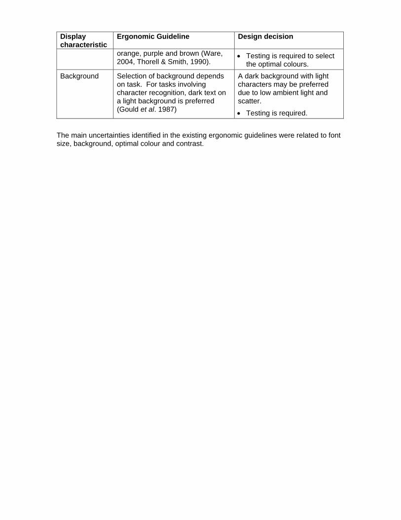
Background Selection of background depends on task. For tasks involving character recognition, dark text on a light background is preferred (Gould et al. 1987)
A dark background with light characters may be preferred due to low ambient light and scatter.
• Testing is required.
The main uncertainties identified in the existing ergonomic guidelines were related to font size, background, optimal colour and contrast.
Study 1: Determination of optimum font size for underwater displays
Objectives This experiment was designed to identify the optimal font size(s) to be used in underwater displays. The experiment addressed three specific design questions:
1. What is the smallest font that can be read accurately on an underwater display by the majority (90%) of subjects with a best-corrected vision of 20/20 feet (6/6 m)?
2. What is the smallest font that can be easily read by the majority (90%) of subjects?
3. Do underwater displays require different guidelines for font size from those used in air?
Methods Eighteen subjects participated in the experiment. Only subjects with a best-corrected vision of 20/20 (6/6) were included. The details of the experimental procedure were explained to the subjects in an information document and each subject completed an informed consent form. The experiment was approved by the Ethics Review Board of Simon Fraser University.
Subjects viewed an underwater liquid crystal display (LCD) through a diving mask mounted to the side of a glass tank. The side of the tank measured 30 x 90 cm, and was mounted on a table. The LCD was housed in a pressure-proof, water-proof transparent casing, and was immersed in the water filled tank. The glass faceplate of the diving mask was removed, with the glass wall of the tank acting as its replacement (i.e., the air-water interface). The mask was attached to the 30 cm side of the tank at a height that enabled subjects to sit comfortably while they completed the experiment. The distance between the subject’s eyes and the display was 40 cm. The experimenter controlled the information displayed on the LCD by using a remote laptop computer connected to the display by an underwater cable.
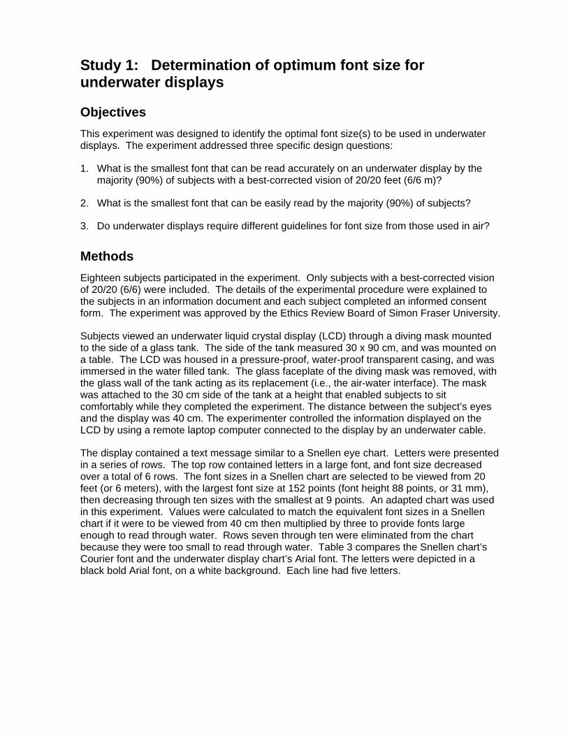
The display contained a text message similar to a Snellen eye chart. Letters were presented in a series of rows. The top row contained letters in a large font, and font size decreased over a total of 6 rows. The font sizes in a Snellen chart are selected to be viewed from 20 feet (or 6 meters), with the largest font size at 152 points (font height 88 points, or 31 mm), then decreasing through ten sizes with the smallest at 9 points. An adapted chart was used in this experiment. Values were calculated to match the equivalent font sizes in a Snellen chart if it were to be viewed from 40 cm then multiplied by three to provide fonts large enough to read through water. Rows seven through ten were eliminated from the chart because they were too small to read through water. Table 3 compares the Snellen chart’s Courier font and the underwater display chart’s Arial font. The letters were depicted in a black bold Arial font, on a white background. Each line had five letters.
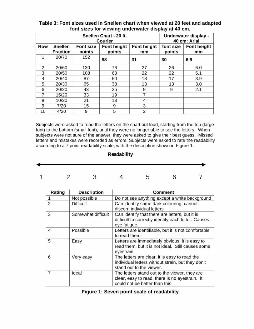
Table 3: Font sizes used in Snellen chart when viewed at 20 feet and adapted font sizes for viewing underwater display at 40 cm.
Snellen Chart - 20 ft. Courier
Underwater display - 40 cm: Arial
Row Snellen Fraction
Font size points
Font height points
Font height mm
font size points
Font height mm
1 20/70 152 88 31 30 6.9
2 20/60 130 76 27 26 6.0 3 20/50 108 63 22 22 5.1 4 20/40 87 50 18 17 3.9 5 20/30 65 38 13 13 3.0 6 20/20 43 25 9 9 2.1 7 15/20 33 19 7 8 10/20 21 13 4 9 7/20 15 9 3
10 4/20 9 5 2
Subjects were asked to read the letters on the chart out loud, starting from the top (large font) to the bottom (small font), until they were no longer able to see the letters. When subjects were not sure of the answer, they were asked to give their best guess. Missed letters and mistakes were recorded as errors. Subjects were asked to rate the readability according to a 7 point readability scale, with the description shown in Figure 1.
1 2 3 4 5 6 7
Readability
Rating Description Comment 1 Not possible Do not see anything except a white background 2 Difficult Can identify some dark colouring, cannot
discern individual letters 3 Somewhat difficult Can identify that there are letters, but it is
difficult to correctly identify each letter. Causes eye fatigue.
4 Possible Letters are identifiable, but it is not comfortable to read them.
5 Easy Letters are immediately obvious, it is easy to read them, but it is not ideal. Still causes some eyestrain.
6 Very easy The letters are clear, it is easy to read the individual letters without strain, but they don’t stand out to the viewer.
7 Ideal The letters stand out to the viewer, they are clear, easy to read, there is no eyestrain. It could not be better than this.
Figure 1: Seven point scale of readability

There were three factors (one display by two environmental) included in this experiment: font size, ambient light, and through water visibility. Six font sizes were tested in two ambient light conditions: light and dark; and two visibility conditions: clear water and turbid water, Table 4. Different letter combinations were used for each condition. Illumination level was measured in the water at the depth of the centre line of the display. In light conditions, the ambient illumination was 140 + 5 lux. In the dark condition, the ambient illumination level was less than 1 lux. Water turbidity was controlled at three feet (90 cm) visibility by adjusting the amount of sediment in the water. In order to simulate a brown-grey hue, cocoa power was added to the fresh water. Three-foot visibility was defined as the ability of the experimenter to read 5.1mm font height (22 point font size) through 3 feet of water, and to rate it as a 4 on the scale of readability.
Table 4: Environmental Conditions Condition Ambient Light Visibility
1 Light Clear
2 Dark Clear
3 Light Turbid 4 Dark Turbid
Analysis Data were analyzed according two main design criteria: accuracy and readability (ease of reading).
The objective data were analyzed to identify the smallest font size that could be read accurately by 90% (n≅16) of the subjects in all conditions. The subjective data were analyzed to identify the smallest font size that was rated as easy to read (minimum score of 6/7) by a minimum of 90% of the subjects in all conditions.
• To meet the accuracy criterion required a minimum of 16 of 18 subjects (~ 90%) to score 4/5 correct or higher; 2 subjects could score lower.
• To meet the readability criterion required a minimum of 16 of 18 subjects (~ 90%) to score 6/7 (very easy to read) or higher; 2 subjects could score lower.
In order to be acceptable a font size was required to meet the design criteria for both accuracy and readability.
Results The mean scores for accuracy and readability in each environmental condition are shown in figures 2 and 3 respectively.
0
1
2
3
4
5
6
0 2 4 6 8
Font size (mm)
Acc
urac
y (/5
)
clear water, lightclear water, darkturbid water, lightturbid water, dark
Figure 2: Accuracy of reading various font sizes in four environmental
conditions.
0
1
2
3
4
5
6
7
8
0 2 4 6 8
font size (mm)
Rea
dabi
lity
scor
e (/7
)
clear water, lightclear water, darkturbid water, lightturbid water, dark
Figure 3: Readability of various font sizes in four environmental conditions.
Table 5 presents the minimum font size that meets the design criteria for both accuracy and readability. The smallest font size that met the criterion for accuracy in all four conditions was row #3 (5.1 mm). There was no font size that met the criterion for readability in all four conditions. However, row #2 (6.0 mm) met the criterion for readability in three out of four conditions. In condition 3: turbid water in a light environment, none of the font sizes that were tested met the criteria.

Table 5: Font heights in mm that meet design criteria: white background n=18
90%≅16 Condition 1 clear water, light
Condition 2 clear water, dark
Condition 3 turbid water, light
Condition 4 turbid water, dark
Accuracy row 4: 3.9 row 4: 3.9 row 3: 5.1 row 3: 5.1 Readability row 2: 6.0 row 2: 6.0 none row 2: 6.0
Based on feedback from the subjects, and on preliminary results of research on colour and contrast, the experiment was repeated using white letters on a dark background. A sub-set of the same subject group was used. Twelve subjects returned and completed the additional tests. Results are provided in table 6.
Table 6: Font heights in mm that meet design criteria: black background n=12
90%≅11 Condition 1
clear water, light Condition 2
clear water, dark Condition 3 turbid water,
light
Condition 4 turbid water,
dark Accuracy row 4: 3.9 row 4: 3.9 row 3: 5.1 row 3: 5.1 Readability row 3: 5.1 row 3: 5.1 none row 2: 6.0
Repeating the experiment with white letters on a black background provided similar result to those achieved with black letters on a white background. Comparing tables 5 and 6 there are no differences in the font sizes that met the design criteria for accuracy in the four environmental conditions. In clear water, a smaller font size (3.9 mm) met the design criteria for readability when viewed on a black background. In turbid water there are no differences between the results for white and black backgrounds. Nevertheless, subjects reported that the white font on a black background is easier to read, and that they preferred it to reading black letters on a white background.
With both white and black backgrounds, there was no font size that met the design criteria set by the authors for readability in Condition 3. When asked to define why they were having difficulty in this condition, subjects described an experience similar to looking into a bright fog. They said that although they could read the letters, it was uncomfortable regardless of the font size. Due to the fact that high ambient light combined with turbid water conditions are rare and that no font size was considered easy to read in this condition, the criteria for selecting an appropriate font size for underwater viewing was modified. It was noted that, although not rated very easy to read by 90% of subjects, the mean readability scores in light turbid conditions are nevertheless similar to those in dark conditions (Figure 3). Hence row #2 (6.0 mm) was selected as the most practical choice as a guideline for font size in underwater displays. This font size meets the criterion for accuracy in all four conditions, and for readability in three out of four conditions.
Data were analyzed to determine if the ergonomic guideline for font size selection that is used in air (that a font size 2.5 times the smallest accurately read value will be comfortable); was appropriate for the underwater environment. Table 7 provides the values for the smallest font size that was read accurately in all four conditions, the predicted comfortable font size (using the air guidelines), and the font size that was rated “very easy” to read (6/7) by 90% of subjects.
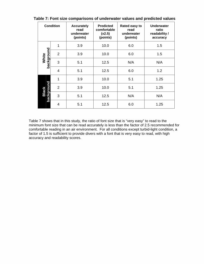
Table 7: Font size comparisons of underwater values and predicted values
Condition Accurately read
underwater (points)
Predicted comfortable
(x2.5) (points)
Rated easy to read
underwater (points)
Underwater ratio
readability / accuracy
1 3.9 10.0 6.0 1.5
2 3.9 10.0 6.0 1.5
3 5.1 12.5 N/A N/A Whi
te
back
grou
nd
4 5.1 12.5 6.0 1.2
1 3.9 10.0 5.1 1.25
2 3.9 10.0 5.1 1.25
3 5.1 12.5 N/A N/A Bla
ck
back
grou
nd
4 5.1 12.5 6.0 1.25
Table 7 shows that in this study, the ratio of font size that is “very easy” to read to the minimum font size that can be read accurately is less than the factor of 2.5 recommended for comfortable reading in an air environment. For all conditions except turbid-light condition, a factor of 1.5 is sufficient to provide divers with a font that is very easy to read, with high accuracy and readability scores.
Study 2: Determination of optimum colours, contrasts and background for underwater displays.
Objectives The goal of this experiment was to develop ergonomic guidelines for colour and contrast levels to be used in underwater displays, and to determine acceptable colours, contrast levels and background(s) for this type of display.
Toward this goal, there were three general design questions:
1. What is the optimal background (black or white) for an underwater display?
2. What are the optimum colours (in terms of accuracy, readability and comfort) for foreground information?
3. What contrast levels should be used for different components of foreground information?
4. Do display requirements differ between light and dark environments, and between clear and turbid environments?
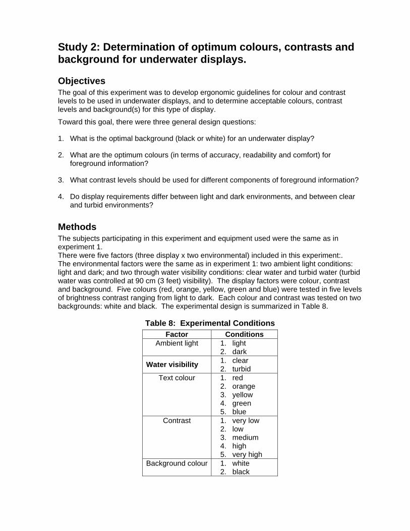
Methods The subjects participating in this experiment and equipment used were the same as in experiment 1. There were five factors (three display x two environmental) included in this experiment:. The environmental factors were the same as in experiment 1: two ambient light conditions: light and dark; and two through water visibility conditions: clear water and turbid water (turbid water was controlled at 90 cm (3 feet) visibility). The display factors were colour, contrast and background. Five colours (red, orange, yellow, green and blue) were tested in five levels of brightness contrast ranging from light to dark. Each colour and contrast was tested on two backgrounds: white and black. The experimental design is summarized in Table 8.
Table 8: Experimental Conditions Factor Conditions
Ambient light 1. light 2. dark
Water visibility 1. clear 2. turbid
Text colour 1. red 2. orange 3. yellow 4. green 5. blue
Contrast 1. very low 2. low 3. medium 4. high 5. very high
Background colour 1. white 2. black
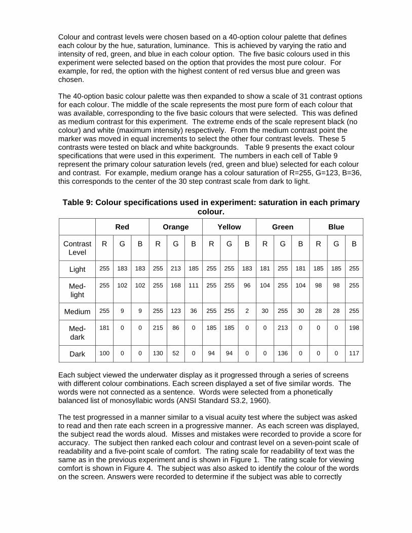
Colour and contrast levels were chosen based on a 40-option colour palette that defines each colour by the hue, saturation, luminance. This is achieved by varying the ratio and intensity of red, green, and blue in each colour option. The five basic colours used in this experiment were selected based on the option that provides the most pure colour. For example, for red, the option with the highest content of red versus blue and green was chosen.
The 40-option basic colour palette was then expanded to show a scale of 31 contrast options for each colour. The middle of the scale represents the most pure form of each colour that was available, corresponding to the five basic colours that were selected. This was defined as medium contrast for this experiment. The extreme ends of the scale represent black (no colour) and white (maximum intensity) respectively. From the medium contrast point the marker was moved in equal increments to select the other four contrast levels. These 5 contrasts were tested on black and white backgrounds. Table 9 presents the exact colour specifications that were used in this experiment. The numbers in each cell of Table 9 represent the primary colour saturation levels (red, green and blue) selected for each colour and contrast. For example, medium orange has a colour saturation of R=255, G=123, B=36, this corresponds to the center of the 30 step contrast scale from dark to light.
Table 9: Colour specifications used in experiment: saturation in each primary colour.
Red Orange Yellow Green Blue
Contrast Level
R G B R G B R G B R G B R G B
Light 255 183 183 255 213 185 255 255 183 181 255 181 185 185 255
Med-light
255 102 102 255 168 111 255 255 96 104 255 104 98 98 255
Medium 255 9 9 255 123 36 255 255 2 30 255 30 28 28 255
Med-dark
181 0 0 215 86 0 185 185 0 0 213 0 0 0 198
Dark 100 0 0 130 52 0 94 94 0 0 136 0 0 0 117
Each subject viewed the underwater display as it progressed through a series of screens with different colour combinations. Each screen displayed a set of five similar words. The words were not connected as a sentence. Words were selected from a phonetically balanced list of monosyllabic words (ANSI Standard S3.2, 1960).
The test progressed in a manner similar to a visual acuity test where the subject was asked to read and then rate each screen in a progressive manner. As each screen was displayed, the subject read the words aloud. Misses and mistakes were recorded to provide a score for accuracy. The subject then ranked each colour and contrast level on a seven-point scale of readability and a five-point scale of comfort. The rating scale for readability of text was the same as in the previous experiment and is shown in Figure 1. The rating scale for viewing comfort is shown in Figure 4. The subject was also asked to identify the colour of the words on the screen. Answers were recorded to determine if the subject was able to correctly

identify each colour. The subject then progressed to the next screen and read a new set of words aloud. The subject was then asked to compare the ease of detecting the words between the two screens, in order to determine the brightness contrast that the subject preferred for that colour. The test progressed until all of the different screen options were viewed and compared, through a total of 200 screens.
1
Preference/ Comfort
2 3 4 5 Rating Description Comment
1 Unacceptable The colour combination/contrast level is not appealing. It causes eye strain
2 Poor The colour combination/ contrast level is not good, but I can read the words
3 Adequate If this combination were used it would be readable, but it is not comfortable and I would not like to look at it for an extended duration
4 Good I like the colour, the contrast is adequate. There may be some glare or fuzziness that could be improved in this combination
5 Excellent I like the colour, the contrast is comfortable and appealing to the eye. I don’t notice any eye strain
Figure 4: Five point scale of comfort
All colour, contrast, and background combinations were tested in all four environmental conditions. All five colours were tested through each of five contrast levels from light to dark, first on a white background, then on a black background. Colours were tested consecutively through the colour spectrum, starting with red and finishing with blue. The colour progression was selected in a fixed order to provide the users with meaningful references and cues for comparison between colours throughout the experiment.
Subjects were asked to complete a questionnaire after completing all four conditions. The questionnaire was designed to collect information about subject preference for each of the colour and contrast options in each of the environmental conditions. Within the questionnaire, divers were asked to rank the colour and contrast options according to their preference and to provide information on what they liked and did not like about the different options.
Analysis The analysis was designed to determine which colour and contrast combinations met specific design criteria for use in an underwater display. Five design criteria were established for selecting colour and contrast combinations.

Legibility
The colour and contrast combination must receive high criterion scores in three separate measures of legibility: accuracy, readability, and comfort, in all four environmental conditions. High scores were defined as follows:
• Accuracy: a minimum of 16 out of 18 subjects (~90%) must achieve 100% accuracy (score=5/5); two can score lower.
• Readability: a minimum of 16 out of 18 subjects (~90%) of subjects must rate readability as very easy (score=6/7) or higher; two subjects can score lower.
• Comfort: a minimum of 16 out of 18 subjects (~90%) must rate comfort as “good” (score=4/5) or better; two can score lower.
The design criteria for accuracy were higher in this experiment than for selection of font size (Study 1). The criterion was increased in this experiment because subjects were identifying words rather than single letters. Words are easier to identify as the reader receives visual cues from the adjacent letters. For example, a four-letter word containing the letters T_EE is likely to be TREE.
Colour Recognition
The colour(s) must be easy to discriminate. A minimum of 16 out of 18 subjects must correctly identify the colour of the words in all four conditions. Subjects were not informed which colour was displayed on the screen. This was considered to be important for cases where colour coding is used to denote importance or different types of information on a single display (i.e., green=go vs. red=stop).
Contrast Levels
The selected colour(s) must pass the above four criteria at a minimum of two contrast levels. This criteria was included in order that colour coding would be possible with two contrast levels of the same colour For example, for light green and dark to be used for different meanings on the same display, both contrast levels must meet the criteria of legibility and recognition.
Analysis was completed using predominantly descriptive statistics to identify which colour and contrast options met the design criteria. This method was used because the primary objective was to determine which colours and contrast levels met the acceptance criteria described above, rather than whether particular colours or contrast were significantly different. A significant difference in performance level between two colours does not necessarily determine whether either is acceptable or unacceptable.
Results Results were analyzed based on the design criteria to identify the optimal use of colour and contrast for an underwater display. Data were first examined to select the appropriate background colour, then progressively filtered to identify which colour/contrast combinations met the five design criteria of legibility (accuracy, readability and comfort), colour recognition,
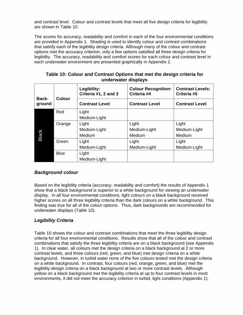
and contrast level. Colour and contrast levels that meet all five design criteria for legibility are shown in Table 10.
The scores for accuracy, readability and comfort in each of the four environmental conditions are provided in Appendix 1. Shading is used to identify colour and contrast combinations that satisfy each of the legibility design criteria. Although many of the colour and contrast options met the accuracy criterion, only a few options satisfied all three design criteria for legibility. The accuracy, readability and comfort scores for each colour and contrast level in each underwater environment are presented graphically in Appendix 2.
Table 10: Colour and Contrast Options that met the design criteria for underwater displays
Legibility: Criteria #1, 2 and 3
Colour Recognition: Criteria #4
Contrast Levels: Criteria #5
Back-ground
Colour Contrast Level Contrast Level Contrast Level
Red Light Medium-Light
Orange Light Medium-Light Medium
Light Medium-Light Medium
Light Medium-Light Medium
Green Light Medium-Light
Light Medium-Light
Light Medium-Light
Bla
ck
Blue Light Medium-Light
Background colour
Based on the legibility criteria (accuracy, readability and comfort) the results of Appendix 1 show that a black background is superior to a white background for viewing an underwater display. In all four environmental conditions, light colours on a black background received higher scores on all three legibility criteria than the dark colours on a white background. This finding was true for all of the colour options. Thus, dark backgrounds are recommended for underwater displays (Table 10).
Legibility Criteria
Table 10 shows the colour and contrast combinations that meet the three legibility design criteria for all four environmental conditions. Results show that all of the colour and contrast combinations that satisfy the three legibility criteria are on a black background (see Appendix 1). In clear water, all colours met the design criteria on a black background at 2 or more contrast levels, and three colours (red, green, and blue) met design criteria on a white background. However, in turbid water none of the five colours tested met the design criteria on a white background. In contrast, four colours (red, orange, green, and blue) met the legibility design criteria on a black background at two or more contrast levels. Although yellow on a black background met the legibility criteria at up to four contrast levels in most environments, it did not meet the accuracy criterion in turbid, light conditions (Appendix 1).
Colour Recognition and Contrast Levels
Although red met the legibility criteria for the two lightest contrast options, red did not meet the colour recognition criterion: less than 90% of the subjects were able to identify the colour as red. Approximately 44% of the subjects perceived the words to be white at the light level and approximately 33% of subjects perceived the words to be white at the medium-light level. Therefore, red did not meet the criterion for colour contrast levels: subjects could not identify the colour red at two different contrast levels that met the legibility criteria.
Orange met the legibility criteria for the three lightest contrast options: light; medium-light and medium. Orange was also recognizable as orange to all subjects at all three contrast options. Thus, orange met all of the legibility, colour recognition and contrast design criteria.
Yellow was recognizable through all levels of contrast, on both a white and a black background. However, yellow did not meet the legibility criteria, at any contrast level, for all four environmental conditions.
Green met the legibility criteria for the two lightest contrast options. Green also met the colour recognition criterion: subjects were able to identify the colour green at both the light and medium-light levels. Hence, green also met colour contrast criterion.
Although blue met the legibility criteria for the two lightest contrast options, subjects were unable to identify the colour blue at these contrasts. Approximately 67% of subjects reported that the words appeared to be white for the lightest blue contrast level, and 44% for the medium-light contrast option. Thus, blue did not meet the colour recognition and contrast design criteria.
The colours and contrasts that meet the colour recognition and contrast criteria are shown in Table 10. These results indicate that the optimum colour and contrast combinations for displaying information in an underwater environment are light to medium orange and light to medium-light green on a black background.
Subjective Data
Table 11 presents the questionnaire results indicating subject preference for colour and background. The data are presented to show the subject of each question in the left column, the colour options in the second column, and the percentage of subjects that selected each response for each light level and turbidity condition in the next four columns.
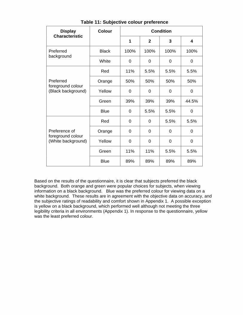
Table 11: Subjective colour preference
Condition Display Characteristic
Colour
1 2 3 4
Black 100% 100% 100% 100% Preferred background
White 0 0 0 0
Red 11% 5.5% 5.5% 5.5%
Orange 50% 50% 50% 50%
Yellow 0 0 0 0
Green 39% 39% 39% 44.5%
Preferred foreground colour (Black background)
Blue 0 5.5% 5.5% 0
Red 0 0 5.5% 5.5%
Orange 0 0 0 0
Yellow 0 0 0 0
Green 11% 11% 5.5% 5.5%
Preference of foreground colour (White background)
Blue 89% 89% 89% 89%
Based on the results of the questionnaire, it is clear that subjects preferred the black background. Both orange and green were popular choices for subjects, when viewing information on a black background. Blue was the preferred colour for viewing data on a white background. These results are in agreement with the objective data on accuracy, and the subjective ratings of readability and comfort shown in Appendix 1. A possible exception is yellow on a black background, which performed well although not meeting the three legibility criteria in all environments (Appendix 1). In response to the questionnaire, yellow was the least preferred colour.
Discussion The results of this study provide five basic guidelines for designing an underwater display.
1. The minimum font size that can be read accurately is a 5.1mm font height (22 point font size, see Table 3). However, for comfortable reading at up to 40cm viewing distance a minimum font of 6.0mm font height (26 points font size) should be used in underwater displays. Larger fonts can be used for attracting attention or denoting importance, but will not necessarily be easier for the diver to read.
2. Underwater displays should have a dark (black) background.
3. When using a display with a dark background, light-medium orange and light to medium-light green provide the best characteristics for contrast, legibility and colour recognition. These colours and contrasts meet the five ergonomic design criteria established in this study.
4. If more than one contrast level of the same colour is required, then orange is preferred as it meets the design criteria at more contrast levels.
5. Light and medium-light colours are easiest to read and should be used for detailed information such as text and symbols.
These findings are discussed in more detail, and combined with other ergonomic research to develop a set of comprehensive ergonomic guidelines for the design of underwater displays.
Font size has not been previously investigated in the underwater environment. According to research that was conducted in air, a 2.6 - 2.8 mm font height (12 point font size) is recommended for a viewing distance between 20 to 70 cm, and a 3.0 - 5.1 mm font height is recommended for critical messages with high luminance viewed at 70 cm (Sanders an McCormick, 1993). For specific displays or for other viewing distances, an ergonomic guideline has been developed for predicting appropriate font size (Ware, 2004; Tufte, 2001). The appropriate or comfortable font is predicted to be 2.5 times the smallest readable font size (Sanders and McCormick, 1993). Results of this study suggest that these guidelines are not appropriate for the underwater environment. The smallest legible font is 3.9 mm (17 point) in clear water and 5.1 mm (22 point font size) in turbid water. The comfortable, or readable, font height is 5.1 mm to 6.0 mm (26 point) which is approximately 1.2 to 1.5 times the smallest legible font (Table 7).
Background colour has been researched since the computer was introduced to office work environments. Most displays that are commercially available and used in an air environment have a light or white background; however, this is not because a light background is necessarily superior. Some ergonomic research suggests that the background colour of the display should match the general colour of the ambient environment (Thorell and Smith, 1990). For example, if viewing a screen in daylight against a light coloured wall, the display should have a white background colour, and if viewed in low ambient light against a dark wall, the display should have a dark background. This is not supported in the underwater environment, where subjects preferred the dark background in all environmental conditions.
The superiority of a black background with light foreground letters was particularly apparent in the turbid water conditions. It is not surprising that a display having a black background, which is associated with lower light emission levels and thus will generate less light scatter

from the particulate matter in the water, will receive higher scores in this environment. However, it is perhaps less intuitive that a black background with light foreground will be superior in clear water conditions. Subjects reported that in the clear water, regardless of ambient light conditions, viewing information on a black background was preferred. The preference of the black background may be attributed to light scatter in clear water, since the contrast levels were similar for the dark versus light background in the clear water conditions. These findings may be an indication that even in seemingly clear water, light scatter is distracting and uncomfortable for viewing and that effects of scatter are more pronounced in water than in air (Bruce and Green, 1989).
Research has shown that for colour displays that emit light, a dark background may be superior even in an air environment (Ware, 2004; Thorell and Smith, 1990). Thorell and Smith (1990) reported that colours were more visible and easier to discriminate while legibility scores were higher when viewed against a dark background. There was also a general preference for a dark background screen for tasks that required continuous reading or when colour discrimination was critical (Thorell and Smith, 1990). The fact that people preferred viewing a dark background may be related to discomfort and eye fatigue caused by extended viewing of a large area of brightness that occurs with light screens.
In the underwater environment, the advantages of a dark background are possibly more pronounced because colour discrimination is already limited, especially when diving in turbid water. Light scattering causes dark images on a light background to appear thinner and less readable (Ware, 2004). Minimizing the light flux by using a dark background decreases the amount of light scattering. Using a display with a black background may also protect the divers’ dark adaptation.
Colour discrimination alters depending on the background colour. In this study, subjects rated readability of dark red and dark blue colours highest when viewing a screen with a white background, and rated light orange, yellow and light green colours highest when viewing a screen with a black background. These findings are similar to findings from experiments completed in an air environment (Ware, 2004). Brighter colours, such as yellow, cyan, green and magenta on a dark background are generally superior for both recognition (discrimination) and readability than darker colours. When viewed against a white background, the opposite is true, darker colours such as red and blue receive higher scores (Thorell and Smith, 1990).
Based on these findings, it may be expected that any of the brighter colours would be acceptable for use in an underwater display; however, this is not necessarily true. Although yellow generally received high scores for accuracy, readability and comfort, it did not meet the design criteria for legibility. This finding was supported by the subjective data obtained from the questionnaire. Subjects reported that the yellow was fatiguing to view and that it was too bright causing the letters to look fuzzy and unclear. In many cases subjects believed that a different font style was used for the yellow words (all fonts were the same throughout the experiment) because the letters looked so different. This shows that vision and perception may be different in the underwater environment, and emphasizes the importance of testing different colour and contrast combinations in the correct environment before adapting ergonomic guidelines.
Although pure white on black was not tested in this study, it is reasonable to assume that it would have rated high for legibility. Pure white is brighter than any of the colour combinations tested in this study, and is most comparable in brightness to light yellow, therefore it may present the same disadvantages reported above. In dark environments, pure white is also more likely to degrade dark adaptation compared to a light colour. Using a light

colour on black may be more comfortable for extended viewing compared to using pure white on black. The guideline of the Military Standard (1999) that a red foreground should be used on a black background for night operations was not supported by the results of this study. Divers had difficulty recognizing light red as a colour and performed poorly when reading a more saturated red on black display. This discrepancy may be due to the different characteristics of water versus an air environment.
The results of this study indicate that orange and green displayed on a dark background are the best colour and contrast combinations to use in underwater displays. For displays that use colour coding with more than one contrast level of a given colour, it is preferable to use two levels with a high contrast to each other. Because three contrast levels of orange received high legibility scores, it is possible to use two contrasts of orange within one display with confidence that the foreground colours have both high contrast to their background and to each other.
Although red, blue, and yellow did not meet the ergonomic design criteria established in this study, the criteria were designed specifically to test visual performance when reading text based information. Thus, results do not preclude the use of red, yellow, and blue from display design. These colours may be suitable for other purposes within the display design, provided that the other guidelines for using multiple colours in a display are followed. For example, a medium red or blue (full saturation) could be used to denote larger solid objects within the display, as this contrast level will provide satisfactory colour recognition, and foreground/background contrast. Similarly, yellow may be useful for alarm signals, or to gain attention, as the objective data suggests that it is the brightest colour on a black background, and also slightly uncomfortable to the eye for normal reading.
When using more than one colour or contrast level, the basic ergonomic guidelines should be followed: colours should have a high colour or brightness contrast to each other and to the background colour. It may be possible to use both orange and green in underwater displays; however, there are reasons to avoid using the two colours in conjunction. Although orange and green are visually distinct for the majority of the population, they are similar for approximately 8% of the male population. Thus, colour blindness should be considered when designing a colour display. Approximately 10% of men and 1% of women have some form of colour blindness. Approximately 8% of male pattern colour blindness is either protanopia or deuteranopia, which results in deficiency when distinguishing red and green. In red-green colour blindness hues of red and green appear similar to the viewer. For this reason, displays should not use combinations of red and green to represent difference (change in status) on their display. For an underwater display, this means that the use of orange and green together should be approached with caution.
Colour blindness is not a concern for MCM divers because the vision standards for the majority of armed forces preclude colour blind people from becoming MCM divers. Thus, the use of orange and green to denote meaning is acceptable in displays designed for MCM divers. As stated in the introduction, Canadian MCM divers have reported difficulty in discriminating red and green LEDs at depth. Colour blindness cannot be the reason that MCM divers had difficulty in distinguishing between the green and red LEDs that are mounted in their mask. A more probable explanation is that the LEDs are mounted in a position that relies on the divers’ peripheral vision. Foveal vision is used to distinguish colour, not peripheral vision. It is likely that the divers have difficulty in identifying the colour because of the position of the LEDs. This effect could also occur when using a head mounted display if coloured coded information is located in the diver’s peripheral vision.
When colour is used for coding it should be used consistently throughout the display. This is how a colour becomes meaningfully related to the task, and is part of the reason why colour coding works to minimize search time and improve the usability of displays. Although colour should be used to attract attention to specific components, using too much colour coding is distracting for the viewer and can cause confusion and increase search time (Ware, 2004, Tufte, 2001). Some colours are inappropriate for colour coding because the viewer already associates them with meaningful tasks: for example red has been used to denote “danger” or “stop” so often that a population stereotype has developed. Hence, red should not be used to denote other meanings. Appendix 3 outlines some other common colour associations.
The findings of the present study have been combined with the ergonomic guidelines outlined in the introduction to provide a modified set of ergonomic guidelines for the design of underwater displays. The guidelines are provided in Table 12.

Table 12. Ergonomic Guideline for Design of Underwater Displays Display
characteristic Ergonomic Guideline
Font type Simple sans serif font, such as Arial. Font size Minimum of 6.0 mm font (character) height (26.0 point font size).
Spacing between lines is determined by the font type (Arial recommended). Larger font sizes can be used to denote importance or attract attention.
Viewing distances
Viewing distance of 20 to 40 cm for hand held displays.
Screen size Display size should occlude less than 25% of field of view if used when performing other activities. Max. dimensions approximately 20x20 cm for viewing at 40 cm. Screen size should be within diver’s UFOV (useful field of view: approximately 7x7cm). No data specific to underwater conditions are available. Further testing is required.
Luminance Display should be self-illuminating with adjustable luminance range with a lower value of 0.07 to 0.35 cd�m-2.
Background A black (or dark) background should be used. Contrast Contrast between colours and between foreground and background
must be high. Specifically, when colour is used on a black background it should be light to medium (as defined in this study). When two colours are used they must have a high colour contrast or brightness contrast.
Colour Light orange or light green (on a black background) should be used for text, symbols, and detailed drawings. Where colour recognition is important, light or medium-light red and blue should be avoided. The number of colours used in a single display should be minimized (3 or 4 recommended) to maximize the efficiency of colour coding and to minimize search time. Colour use should be consistent throughout the display to denote importance or attract attention. Colours used for colour coding should consider population stereotypes: colours with alternate, pre-existing meaning should be avoided.
References
1. Adolfson, J. and Berghage, T. (1974) Perception and Performance Underwater, First Edition, John Wiley, New York.
2. ANSI Standard St S3.2 (1960) Monosyllabic Word Intelligibility, Method for Measurement of
3. Barnard, P.J. (1991) Connecting psychological theory to HCl: science, craft or just plain craftiness? IEE Colloquium on Theory in Human-Computer Interaction (HCI),
4. Bernard, M. and Mills, M. (2000) So what size and type of font should I use on my Web site? Usability News, July, 2(2).
5. Boyarski, D., Neuwirth, C., Forlizzi, J., and Regli, S.H. (1998) A study of fonts designed for screen display, Computer Human Interaction (CHI) 98 Conference Proceedings, 87-94.
6. Bruce, P., and Green, P. (1989) Visual Perception: Physiology, Psychology and Ecology. Lawrence Erlbaum Associates (LEA), London, UK.
7. Bullimore, M.A., Fulton, E.J. and Howarth, P.A. (1992) Assessment of Visual Performance. In: Evaluation of Human Work. Ed: Wilson, JR and Corlett, EN, Taylor Francis, London. pp 648-681
8. Emmerson, P. & Ross, H. (1985) Colour constancy with change of viewing distance underwater. Perception, 14(3), 349-358.
9. Emmerson, P. & Ross, H. (1986) The effect of brightness on colour recognition underwater. Ergonomics, 29(12), 1647-1658.
10. Gould, J. D., Boies, S. J., Levy, S., Richards, J. T., & Schoonard, J. (1987) The 1984 Olympic message system: A test of behavioral principles of system design. Communications of the ACM, 30, 9, 758-769.
11. Kantowitz, B.H. and Sorkin, R.D. (1983) Human factors: Understanding people-system relationships. John Wiley, New York, p.124.
12. Luria, S.M. & Kinney, J.S. (1975) Vision in the water without a face mask. Aviation, Space, and Environmental Medicine, 46, 1128-1131.
13. Mayhew, D.J. (1999) The Usability Engineering Lifecycle. Academic Press, San Diego, CA.
14. Morrison, J., Hamilton, K. and Zander, J. (1997) Optimizing the performance and safety of mine countermeasures diving. Phase 1 Report. Prepared by Shearwater Human Engineering for: Department of National Defence PWGSC Contract No. WW7711-5-7266
15. Sanders, M. & McCormick, E. (1993) Human Factors in Engineering and Design, Seventh Edition. Addison-Wesley Publishing, Massachusetts.

16. Schneiderman, B. (1992) Designing the User Interface: Strategies for Effective Human- Computer Interaction, Second Edition. Addison-Wesley Publishing, Reading, Massachusetts.
17. Speilberger, C.D. (1966) Anxiety and Behaviour. Theory and Research on Anxiety. Academic Press, New York.
18. Thorell, L. G. & Smith, W. J. (1990) Using computer color effectively. Prentice Hall, Englewood Cliffs, NY.
19. Tufte, E. (2001) The Visual Display of Quantitative Information, Second Edition. Graphics Press, Cheshire, CT.
20. US Military Standard (1999) United States Military Standard: Department of Defense Design Criteria Standard. Mil-Std-1472F, Edited by Boff. K & Lincoln, J.
21. Ware, C. (2004) Information Visualization: Perception for Design, Second Edition, Morgan Kaufmann, San Mateo, Ca.
22. Wickens, C. (1992) Computational models of human performance. University of Illinois, Aviation Research Lab. Savoy, Il.
23. Zander, J. (1999) Total Systems Design: Development of an Integrated Display for MCM Divers. Internal Report, Environmental Physiology Unit, School of Kinesiology, Simon Fraser University.
Appendix 1 Legibility results: accuracy, readability and comfort.
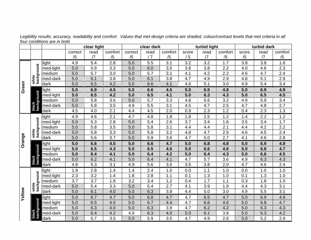
Legibility results: accuracy, readability and comfort. Values that met design criteria are shaded, colour/contrast levels that met criteria in all four conditions are in bold.
clear light clear dark turbid light turbid dark correct
/5 read
/7 comfort
/5 correct
/5 read / 7
comfort /5
score / 5
read /7
comfort /5
score /5
read /7
comfort/5
light 4.9 5.4 2.8 5.0 5.5 3.1 3.2 3.2 1.7 3.8 3.8 1.6 med-light 5.0 5.9 3.3 5.0 6.0 3.5 3.8 3.8 2.2 4.0 4.6 2.3 medium 5.0 5.7 3.0 5.0 5.7 3.1 4.1 4.2 2.2 4.6 4.7 2.4 med-dark 5.0 6.1 3.8 5.0 6.1 3.8 4.7 4.9 2.9 4.8 5.1 2.9
whi
te
back
grou
nd
dark 5.0 6.5 4.2 5.0 6.6 4.1 4.6 5.1 3.0 4.9 5.4 3.4 light 5.0 6.9 4.5 5.0 6.6 4.5 5.0 6.5 4.8 5.0 6.9 4.9 med-light 5.0 6.5 4.2 5.0 6.5 4.1 5.0 6.3 4.3 5.0 6.5 4.5 medium 5.0 5.8 3.6 5.0 5.7 3.3 4.8 5.6 3.2 4.9 5.9 3.4 med-dark 5.0 5.8 3.5 4.9 5.5 3.1 4.5 4.7 2.5 4.7 4.8 2.7
Gre
en
blac
k ba
ckgr
ound
dark 4.5 4.0 2.1 4.4 4.5 2.0 0.9 2.3 1.2 0.4 2.3 1.3 light 4.9 4.6 2.1 4.7 4.8 1.8 1.8 2.5 1.2 1.4 2.2 1.2 med-light 5.0 5.3 2.8 5.0 5.4 2.6 3.7 3.4 1.6 3.5 3.4 1.7 medium 5.0 5.8 3.5 5.0 5.8 3.1 4.4 4.4 2.1 4.4 4.2 2.2 med-dark 5.0 5.8 3.3 5.0 5.8 3.2 4.8 4.7 2.5 4.6 4.5 2.4
whi
te
back
grou
nd
dark 5.0 5.6 3.7 5.0 5.9 3.6 4.7 5.0 2.7 4.1 4.6 2.8 light 5.0 6.6 4.5 5.0 6.6 4.7 5.0 6.8 4.8 5.0 6.9 4.9 med-light 5.0 6.5 4.3 5.0 6.5 4.6 5.0 6.6 4.6 5.0 6.8 4.7 medium 5.0 6.4 4.1 5.0 6.4 4.2 5.0 6.4 4.3 5.0 6.6 4.5 med-dark 5.0 6.2 4.1 5.0 6.4 4.1 4.7 5.7 3.6 4.9 6.3 4.3
Ora
nge
blac
k ba
ckgr
ound
dark 4.8 5.3 3.1 4.9 5.6 3.0 3.5 3.8 2.0 4.7 4.6 2.4 light 1.9 2.8 1.4 1.4 2.4 1.0 0.0 1.1 1.0 0.0 1.0 1.0 med-light 2.3 3.2 1.4 1.8 2.8 1.1 0.1 1.3 1.0 0.1 1.3 1.0 medium 3.7 3.7 1.6 3.2 3.4 1.2 0.4 1.7 1.1 0.3 1.8 1.0 med-dark 5.0 5.4 3.3 5.0 5.4 2.7 4.1 3.9 1.9 4.4 4.3 3.1
whi
te
back
grou
nd
dark 5.0 6.1 4.0 5.0 6.3 3.8 4.4 5.0 3.0 4.9 5.5 3.1 light 5.0 6.7 4.7 5.0 6.8 4.7 4.7 6.5 4.7 5.0 6.9 4.9 med-light 5.0 6.5 4.5 5.0 6.7 4.4 4.7 6.6 4.6 5.0 6.8 4.7 medium 5.0 6.3 4.0 5.0 6.3 3.9 4.7 6.2 4.2 5.0 6.3 4.3 med-dark 5.0 6.4 4.2 4.9 6.3 4.0 5.0 6.1 3.8 5.0 6.3 4.2
Yello
w
blac
k ba
ckgr
ound
dark 5.0 5.7 3.5 5.0 5.9 3.5 4.7 4.9 2.6 5.0 5.2 2.9

Appendix 2 • Accuracy Scores for conditions 1-4, white and black background
Figures A1-8
• Readability scores for conditions 1-4, white and black background Figures A9-16
light 5.0 4.6 2.2 4.8 4.9 2.2 1.7 2.7 1.2 1.9 2.6 1.2 med-light 4.9 4.8 2.1 4.9 4.8 2.1 1.9 3.0 1.3 2.4 3.1 1.2 medium 4.9 4.5 1.8 4.9 4.5 1.9 1.7 2.8 1.3 2.34 3.1 1.3 med-dark 5.0 5.5 2.8 5.00 5.4 2.8 4.1 4.1 2.0 4.4 4.5 2.2
whi
te
back
grou
nd
dark 5.0 6.6 4.2 5.0 6.4 4.1 4.5 5.2 3.1 4.5 5.5 3.3 light 5.0 6.5 4.8 5.0 6.7 4.3 5.0 6.9 4.7 5.0 6.9 4.9 med-light 5.0 6.6 4.4 5.0 6.4 4.0 5.0 6.7 4.3 5.0 6.5 4.4 medium 5.0 5.8 3.6 5.0 6.0 3.4 5.0 5.9 3.7 5.0 5.9 3.7 med-dark 5.0 6.2 3.8 5.0 6.3 3.9 5.0 5.8 3.6 5.0 6.2 4.0
Gre
en
blac
k ba
ckgr
ound
dark 5.0 5.9 3.7 5.0 6.1 3.9 4.8 4.9 2.7 4.9 5.1 2.9 light 5.0 5.9 3.1 5.0 5.6 3.0 4.2 4.0 1.8 4.8 4.3 2.0 med-light 5.0 6.3 3.9 5.0 6.1 3.7 4.6 4.7 2.5 4.9 4.9 2.7 medium 5.0 5.9 3.5 5.0 5.9 3.4 4.7 4.9 2.6 4.8 4.7 2.5 med-dark 5.0 6.1 3.7 5.0 6.2 3.9 4.8 5.2 2.9 4.9 5.2 2.9
whi
te
back
grou
nd
dark 5.0 6.3 4.1 5.0 6.6 4.2 4.9 5.6 3.2 5.0 5.7 3.4 light 5.0 6.8 4.8 5.0 7.0 4.8 5.0 7.0 5.0 5.0 6.9 4.9 med-light 5.0 6.7 4.5 5.0 6.8 4.7 5.0 6.3 4.1 5.0 6.4 4.3 medium 5.0 5.7 3.2 5.0 5.6 3.4 4.8 4.8 2.8 4.9 5.2 3.0 med-dark 4.9 4.8 2.4 5.0 5.1 2.7 3.0 3.4 1.7 3.4 3.7 1.9
Blu
e
blac
k ba
ckgr
ound
dark 3.1 3.1 1.4 3.7 3.6 1.6 0.0 1.3 1.0 0.0 1.6 1.0
• Comfort scores for conditions 1-4, white and black background
Figures A17-24

Accuracy Scores for conditions 1-4 on a white background
Clear, light
0
1
2
3
4
5
6
light med-light medium med-dark dark
Contrast Level
Scor
e (/5
) redorangeyellowgreenblue
Clear, dark
0
1
2
3
4
5
6
light med-light medium med-dark dark
Contrast Level
Scor
e (/5
)
redorangeyellowgreenblue
Figure A-1: Accuracy Score: Condition 1 Clear water, high ambient light, white background
Figure A-2: Accuracy Score: Condition 2 Clear water, low ambient light, white background
Turbid, light
0
1
2
3
4
5
6
light med-light medium med-dark darkContrast Level
Scor
e (/5
)
redorangeyellowgreenblue
Turbid, dark
0
1
2
3
4
5
6
light med-light medium med-dark darkContrast Level
Scor
e (/5
)
redorangeyellowgreenblue
Figure A-3: Accuracy Score: Condition 3 Turbid water, high ambient light, white background
Figure A-4: Accuracy Score: Condition 4 Turbid water, low ambient light, white background

Accuracy Scores for conditions 1-4 on a black background
Clear, light
0
1
2
3
4
5
6
light med-light medium med-dark dark
Contrast Level
Scor
e (/5
) redorangeyellowgreenblue
Clear, dark
0
1
2
3
4
5
6
light med-light medium med-dark darkContrast Level
Scor
e (/5
)
redorangeyellowgreenblue
Figure A-5: Accuracy Score: Condition 1 Clear water, high ambient light, black background
Figure A-6: Accuracy Score: Condition 2 Clear water, low ambient light, black background
Turbid, light
0
1
2
3
4
5
6
light med-light medium med-dark darkContrast Level
Scor
e (/5
)
redorangeyellowgreenblue
Turbid, dark
0
1
2
3
4
5
6
light med-light medium med-dark dark
Contrast Level
Scor
e (/5
)
redorangeyellowgreenblue
Figure A-7: Accuracy Score: Condition 3 Turbid water, high ambient light, black background
Figure A-8: Accuracy Score: Condition 4 Turbid water, low ambient light, black background

Readability Scores for conditions 1-4 on a white background
Clear, light
0
1
2
3
4
5
6
7
8
light med-light medium med-dark darkContrast Level
Rea
dabi
lity
(/7) red
orangeyellowgreenblue
Clear, dark
012
3456
78
light med-light medium med-dark darkContrast Level
Rea
dabi
lity
(/7) red
orangeyellowgreenblue
Figure A-9: Readability Score: Condition 1 Clear water, high ambient light, white background
Figure A-10: Readability Score: Condition 2 Clear water, low ambient light, white background
Turbid, light
0
1
2
3
4
5
6
7
8
light med-light medium med-dark darkContrast Level
Rea
dabi
lity
(/7) red
orangeyellowgreenblue
Turbid, dark
0
1
2
3
4
5
6
light med-light medium med-dark darkContrast Level
Rea
dabi
lity
(/7) red
orangeyellowgreenblue
Figure A-11: Readability Score: Condition 3 Turbid water, high ambient light, white background
Figure A-12: Readability Score: Condition 4 Turbid water, low ambient light, white background

Readability Scores for conditions 1-4 on a black background
Clear, light
0
1
2
3
4
5
6
7
8
light med-light medium med-dark darkContrast Level
Rea
dabi
lity
(/7) red
orangeyellowgreenblue
Clear, dark
0
1
2
3
4
5
6
7
8
light med-light medium med-dark darkContrast Level
Rea
dabi
lity
(/7) red
orangeyellowgreenblue
Figure A-13: Readability Score: Condition 1 Clear water, high ambient light, black background
Figure A-14: Readability Score: Condition 2 Clear water, low ambient light, black background
Turbid, light
0
1
2
3
4
5
6
7
8
light med-light medium med-dark darkContrast Level
Rea
dabi
lity
(/7) red
orangeyellowgreenblue
Turbid, dark
0
1
2
3
4
5
6
7
8
light med-light medium med-dark darkContrast Level
Rea
dabi
lity
(/7) red
orangeyellowgreenblue
Figure A-15: Readability Score: Condition 3 Turbid water, high ambient light, black background
Figure A-16: Readability Score: Condition 4 Turbid water, low ambient light, black background

Comfort Scores for conditions 1-4 on a white background
Clear, light
0
1
2
3
4
5
6
light med-light medium med-dark darkContrast Level
Com
fort
(/5) red
orangeyellowgreenblue
Clear, dark
0
1
2
3
4
5
6
light med-light medium med-dark darkContrast Level
Com
fort
(/5)
redorangeyellowgreenblue
Figure A-17: Comfort Score: Condition 1 Clear water, high ambient light, white background
Figure A-18: Comfort Score: Condition 2 Clear water, low ambient light, white background
Turbid, light
0
1
2
3
4
5
6
light med-light medium med-dark darkContrast Level
Com
fort
(/5)
redorangeyellowgreenblue
Turbid, dark
0
1
2
3
4
5
6
light med-light medium med-dark dark
Contrast Level
Com
fort
(/5) red
orangeyellowgreenblue
Figure A-19: Comfort Score: Condition 3 Turbid water, high ambient light, white background
Figure A-20: Comfort Score: Condition 4 Turbid water, low ambient light, white background
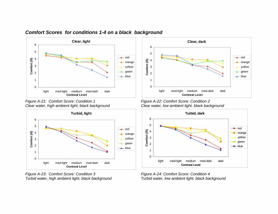
Comfort Scores for conditions 1-4 on a black background
Clear, light
0
1
2
3
4
5
6
light med-light medium med-dark darkContrast Level
Com
fort
(/5)
redorangeyellowgreenblue
Clear, dark
0
1
2
3
4
5
6
light med-light medium med-dark darkContrast Level
Com
fort
(/5)
redorangeyellowgreenblue
Figure A-21: Comfort Score: Condition 1 Clear water, high ambient light, black background
Figure A-22: Comfort Score: Condition 2 Clear water, low ambient light, black background
Turbid, light
0
1
2
3
4
5
6
light med-light medium med-dark darkContrast Level
Com
fort
(/5)
redorangeyellowgreenblue
Turbid, dark
0
1
2
3
4
5
6
light med-light medium med-dark darkContrast Level
Com
fort
(/5)
redorangeyellowgreenblue
Figure A-23: Comfort Score: Condition 3 Turbid water, high ambient light, black background
Figure A-24: Comfort Score: Condition 4 Turbid water, low ambient light, black background
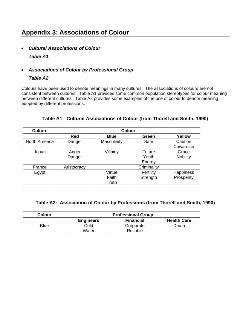
Appendix 3: Associations of Colour
• Cultural Associations of Colour
Table A1
• Associations of Colour by Professional Group
Table A2
Colours have been used to denote meanings in many cultures. The associations of colours are not consistent between cultures. Table A1 provides some common population stereotypes for colour meaning between different cultures. Table A2 provides some examples of the use of colour to denote meaning adopted by different professions.
Table A1: Cultural Associations of Colour (from Thorell and Smith, 1990)
Culture Colour Red Blue Green Yellow
North America Danger Masculinity Safe Caution Cowardice
Japan Anger Danger
Villainy Future Youth Energy
Grace Nobility
France Aristocracy Criminality Egypt Virtue
Faith Truth
Fertility Strength
Happiness Prosperity
Table A2: Association of Colour by Professions (from Thorell and Smith, 1990)
Colour Professional Group Engineers Financial Health Care
Blue Cold Water
Corporate Reliable
Death
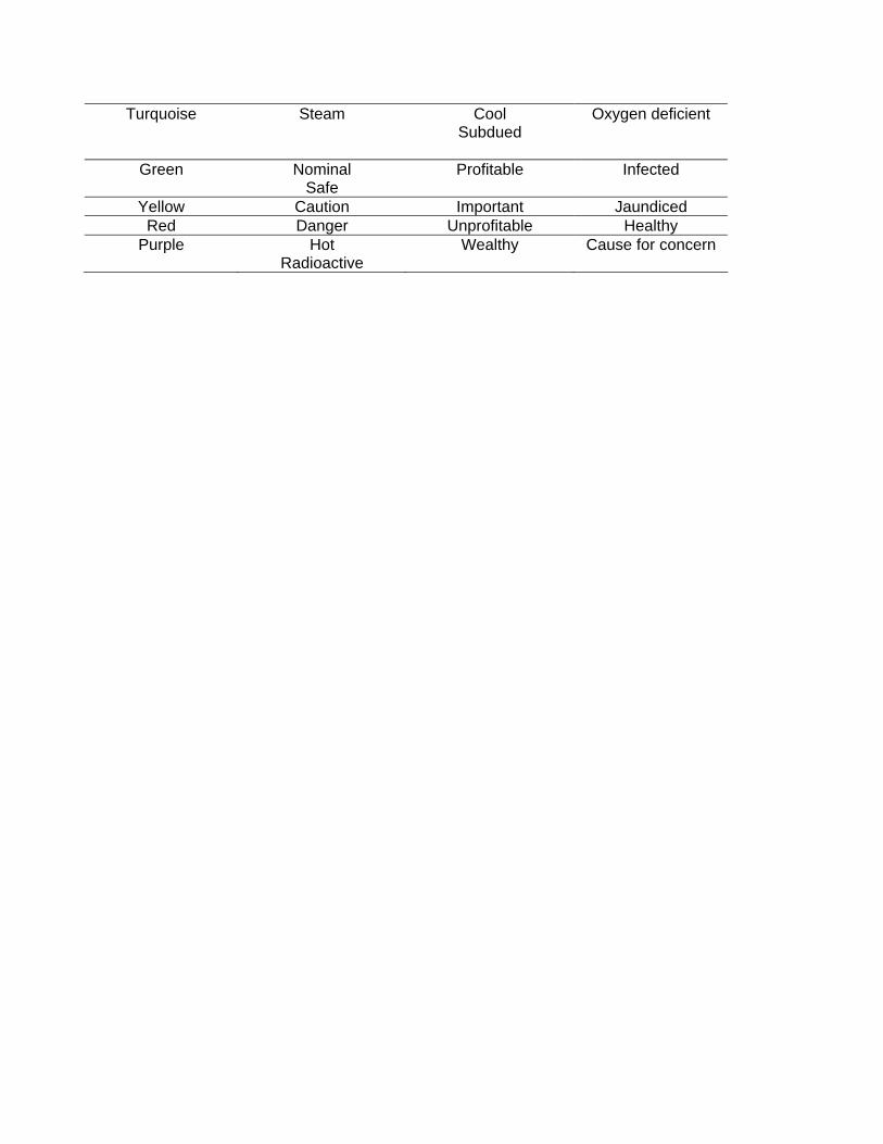
Turquoise Steam Cool Subdued
Oxygen deficient
Green Nominal Safe
Profitable Infected
Yellow Caution Important Jaundiced Red Danger Unprofitable Healthy
Purple Hot Radioactive
Wealthy Cause for concern
UNCLASSIFIED
DOCUMENT CONTROL DATA(Security classification of the title, body of abstract and indexing annotation must be entered when the overall document is classified)
1. ORIGINATOR (The name and address of the organization preparing the document, Organizationsfor whom the document was prepared, e.g. Centre sponsoring a contractor's document, or taskingagency, are entered in section 8.)
Publishing: DRDC Toronto
Performing: Shearwater Human Engineering,438 Felton Place, NorthVancouver, BC
Monitoring:
Contracting:
2. SECURITY CLASSIFICATION(Overall security classification of the documentincluding special warning terms if applicable.)
UNCLASSIFIED
3. TITLE (The complete document title as indicated on the title page. Its classification is indicated by the appropriate abbreviation (S, C, R, or U) in parenthesis atthe end of the title)
Determining the appropriate font size, and use of colour and contrast for underwaterdisplays (U)Détermination de la police de caractères appropriée et usage de la couleur et ducontraste dans les dispositifs d’affichage sous l’eau (U)
4. AUTHORS (First name, middle initial and last name. If military, show rank, e.g. Maj. John E. Doe.)
J.B. Morrison; J.K. Zander
5. DATE OF PUBLICATION(Month and year of publication of document.)
April 2008
6a NO. OF PAGES(Total containing information, includingAnnexes, Appendices, etc.)
49
6b. NO. OF REFS(Total cited in document.)
23
7. DESCRIPTIVE NOTES (The category of the document, e.g. technical report, technical note or memorandum. If appropriate, enter the type of document,e.g. interim, progress, summary, annual or final. Give the inclusive dates when a specific reporting period is covered.)
Contract Report
8. SPONSORING ACTIVITY (The names of the department project office or laboratory sponsoring the research and development − include address.)
Sponsoring:
Tasking:
9a. PROJECT OR GRANT NO. (If appropriate, the applicableresearch and development project or grant under which the document waswritten. Please specify whether project or grant.)
16i
9b. CONTRACT NO. (If appropriate, the applicable number under whichthe document was written.)
W7711−997606
10a. ORIGINATOR'S DOCUMENT NUMBER (The officialdocument number by which the document is identified by the originatingactivity. This number must be unique to this document)
DRDC Toronto CR 2008−034
10b. OTHER DOCUMENT NO(s). (Any other numbers under whichmay be assigned this document either by the originator or by thesponsor.)
11. DOCUMENT AVAILABILITY (Any limitations on the dissemination of the document, other than those imposed by security classification.)
Unlimited distribution
12. DOCUMENT ANNOUNCEMENT (Any limitation to the bibliographic announcement of this document. This will normally correspond to the DocumentAvailability (11), However, when further distribution (beyond the audience specified in (11) is possible, a wider announcement audience may be selected.))
Unlimited announcement
UNCLASSIFIED

UNCLASSIFIED
DOCUMENT CONTROL DATA(Security classification of the title, body of abstract and indexing annotation must be entered when the overall document is classified)
13. ABSTRACT (A brief and factual summary of the document. It may also appear elsewhere in the body of the document itself. It is highly desirable that the abstract
of classified documents be unclassified. Each paragraph of the abstract shall begin with an indication of the security classification of the information in the paragraph(unless the document itself is unclassified) represented as (S), (C), (R), or (U). It is not necessary to include here abstracts in both official languages unless the text isbilingual.)
(U) Canadian mine countermeasures (MCM) divers currently use a combination of differentdisplays to provide them with information about their safety, equipment, and status. MCMdivers require a single, integrated display to simplify information gathering, and to provideinformation from the dive supervisor.Ergonomic design guidelines were reviewed and modified for information display in theunderwater environment. A two−phase experiment was conducted to determine theoptimal font size and the optimal colour, contrast, and background combination(s) forunderwater displays. Eighteen subjects viewed a series of displays in four environmentsthat simulated a combination of light and dark, clear and turbid conditions. Each subjectviewed over 210 display screens to compare different font sizes and colour and contrastcombinations. Each screen was scored for accuracy and readability.Results showed that when designing an underwater display, character height should beapproximately 6 mm (26 point font size) when using Arial font. The display should have ablack (or dark) background with light foreground letters. Light orange or light green werefound to be the optimum colours for use in the display. A set of ergonomic guidelines forthe design of underwater displays were developed based on the results of this study.
(U) Les plongeurs canadiens de lutte contre les mines (LCM) emploient actuellementdifférents types de dispositifs d’affichage pour obtenir des renseignements sur leursécurité, leur équipement et leur état. Les plongeurs de LCM ont besoin d’un dispositifd’affichage intégré et unique permettant de simplifier la collecte de renseignements etd’obtenir des renseignements provenant du superviseur de plongée.Les directives en matière de conception ergonomique ont été examinées et modifiéespour un dispositif d’affichage d’informations dans un environnement sous−marin. Uneexpérience à deux volets a été menée afin de déterminer la taille optimale de la police decaractères, ainsi que la couleur, le contraste et l’arrière−plan optimums des dispositifsd’affichage sous l’eau. Dix−huit sujets ont visualisé un groupe de dispositifs d’affichagedans quatre environnements simulant une combinaison de conditions de lumière etd’obscurité, de clarté et de turbidité (eau claire et eau trouble). Chaque sujet a observéplus de 210 écrans d’affichage afin de comparer différentes combinaisons de tailles depolices de caractères, de couleurs et de contrastes. Les résultats de précision et delisibilité ont été notés pour chacun des écrans.Les résultats ont montré que, lors de la conception d’un dispositif d’affichage pour unusage sous l’eau, la hauteur des caractères devrait être d’environ 6 mm (grosseur decaractères de 26 points) pour la police de caractères Arial. L’écran devrait avoir unarrière−plan (ou fond) noir (ou foncé) avec caractères d’avant−plan de couleur claire. On aconstaté que les couleurs orange pâle ou vert pâle constituaient les couleurs d’affichageoptimales. À partir des résultats de l’étude, des directives en matière d’ergonomie ont étéélaborées pour la conception de dispositifs d’affichage sous−marins.
14. KEYWORDS, DESCRIPTORS or IDENTIFIERS (Technically meaningful terms or short phrases that characterize a document and could be helpful in
cataloguing the document. They should be selected so that no security classification is required. Identifiers, such as equipment model designation, trade name,military project code name, geographic location may also be included. If possible keywords should be selected from a published thesaurus, e.g. Thesaurus ofEngineering and Scientific Terms (TEST) and that thesaurus identified. If it is not possible to select indexing terms which are Unclassified, the classification of eachshould be indicated as with the title.)
(U) ergonomics; human engineering; underwater; diving; divers; immersion; hyperbaric;human systems interaction; HSI; information display


![[Paper Name] Font: Arial Bold, Font Size: 80pt, Color: Red, Align: Center]](https://static.fdocuments.in/doc/165x107/56814d53550346895dba8d78/paper-name-font-arial-bold-font-size-80pt-color-red-align-center-56ed5a486e849.jpg)