Designing a Good Web Site
31
Designing a Good Web Site
-
Upload
hari-ng-sablay -
Category
Documents
-
view
218 -
download
0
Transcript of Designing a Good Web Site

8/6/2019 Designing a Good Web Site
http://slidepdf.com/reader/full/designing-a-good-web-site 1/31
Designing a Good Web Site
8/6/2019 Designing a Good Web Site
http://slidepdf.com/reader/full/designing-a-good-web-site 2/31
Objective
• To understand the basics of what to do
and not to do on a web page
8/6/2019 Designing a Good Web Site
http://slidepdf.com/reader/full/designing-a-good-web-site 3/31
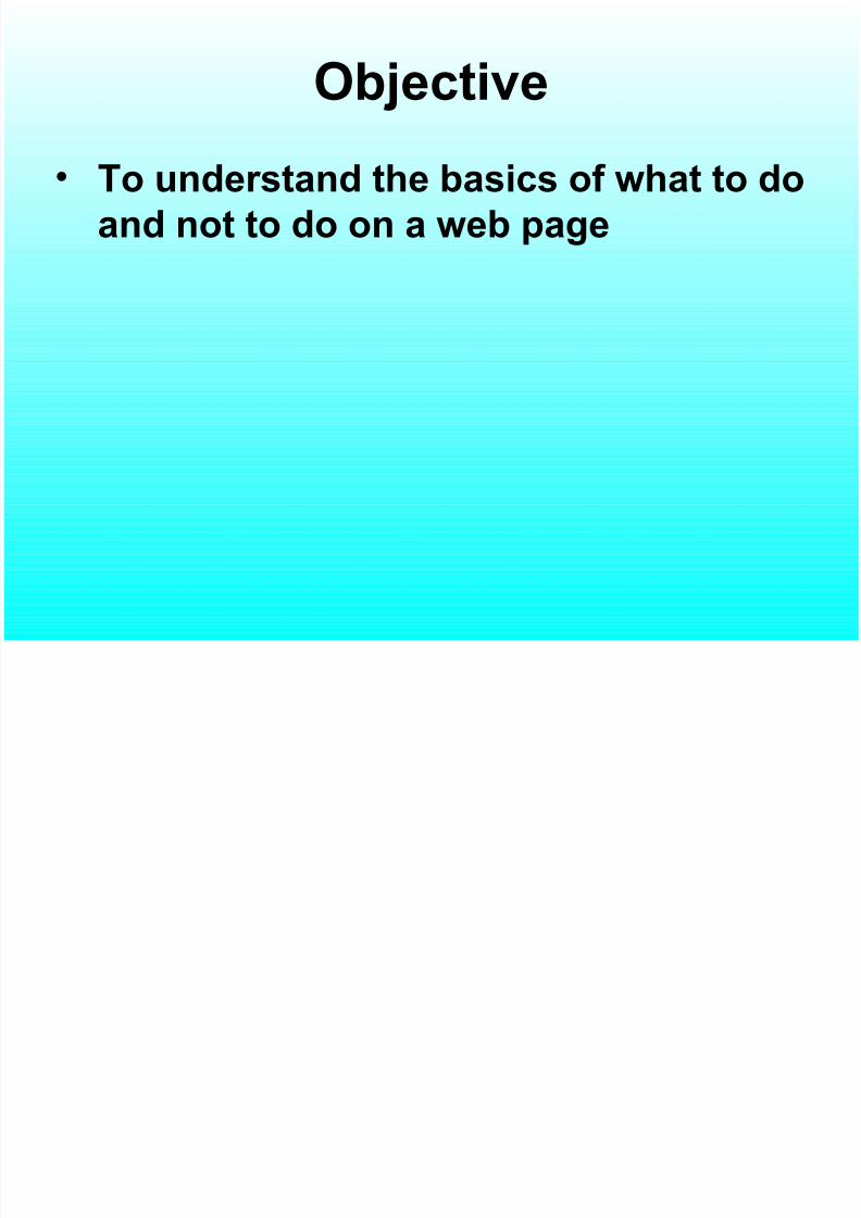
Step 1 – The foundation
• Understand your purpose
– Who will view
• Define the general results you want to
achieve – Why you want people to view
• What methods can be used to achieve the
goals – Forms for data entry, catalogs, schedules, etc.
• What are your visitors looking for?
8/6/2019 Designing a Good Web Site
http://slidepdf.com/reader/full/designing-a-good-web-site 4/31
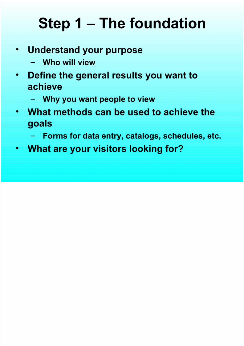
Principles of User Interface
Design• Layout
• Content awareness
•
Aesthetics• User experience
• Consistency
• Minimal user effort
8/6/2019 Designing a Good Web Site
http://slidepdf.com/reader/full/designing-a-good-web-site 5/31
Layout
• The screen is often divided into three
boxes
– Navigation area (top)
– Status area (bottom)
– Work area (middle)
• 3 Clicks rule
8/6/2019 Designing a Good Web Site
http://slidepdf.com/reader/full/designing-a-good-web-site 6/31
Content Awareness
• Each web page should have an appropriate title.
• Menus should show
– where you are
– where you came from to get there• It should be clear what information is within
each area
• Use dates and version numbers to aid system
users
8/6/2019 Designing a Good Web Site
http://slidepdf.com/reader/full/designing-a-good-web-site 7/31
Aesthetics
• Interfaces need to be functional and inviting
to use
• Avoid squeezing in too much, particularly
for novice users• Design text carefully
– Be aware of font and size
–
Avoid using all capital letters – Avoid underlined words
8/6/2019 Designing a Good Web Site
http://slidepdf.com/reader/full/designing-a-good-web-site 8/31
More Aesthetics
• Colors and patterns should be used
carefully
– Use colors to separate or categorize items
– Use only web-safe colors
8/6/2019 Designing a Good Web Site
http://slidepdf.com/reader/full/designing-a-good-web-site 9/31
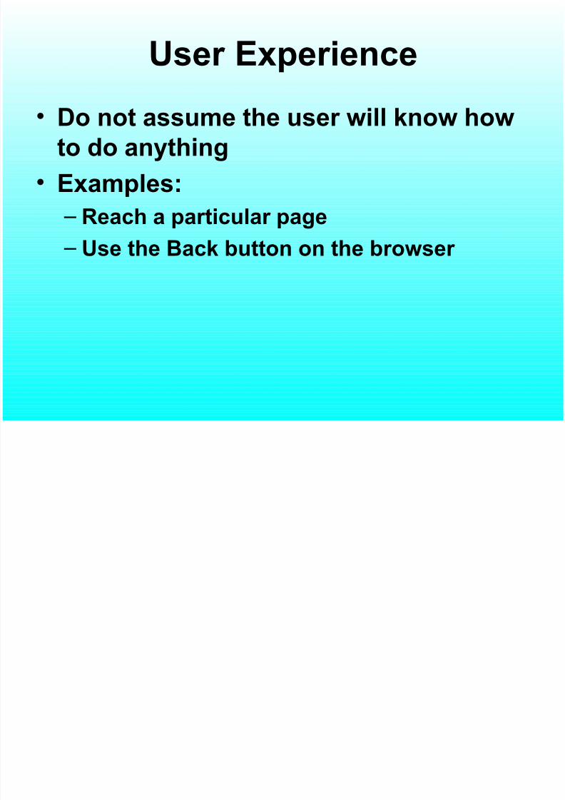
User Experience
• Do not assume the user will know how
to do anything
• Examples:
– Reach a particular page
– Use the Back button on the browser
8/6/2019 Designing a Good Web Site
http://slidepdf.com/reader/full/designing-a-good-web-site 10/31
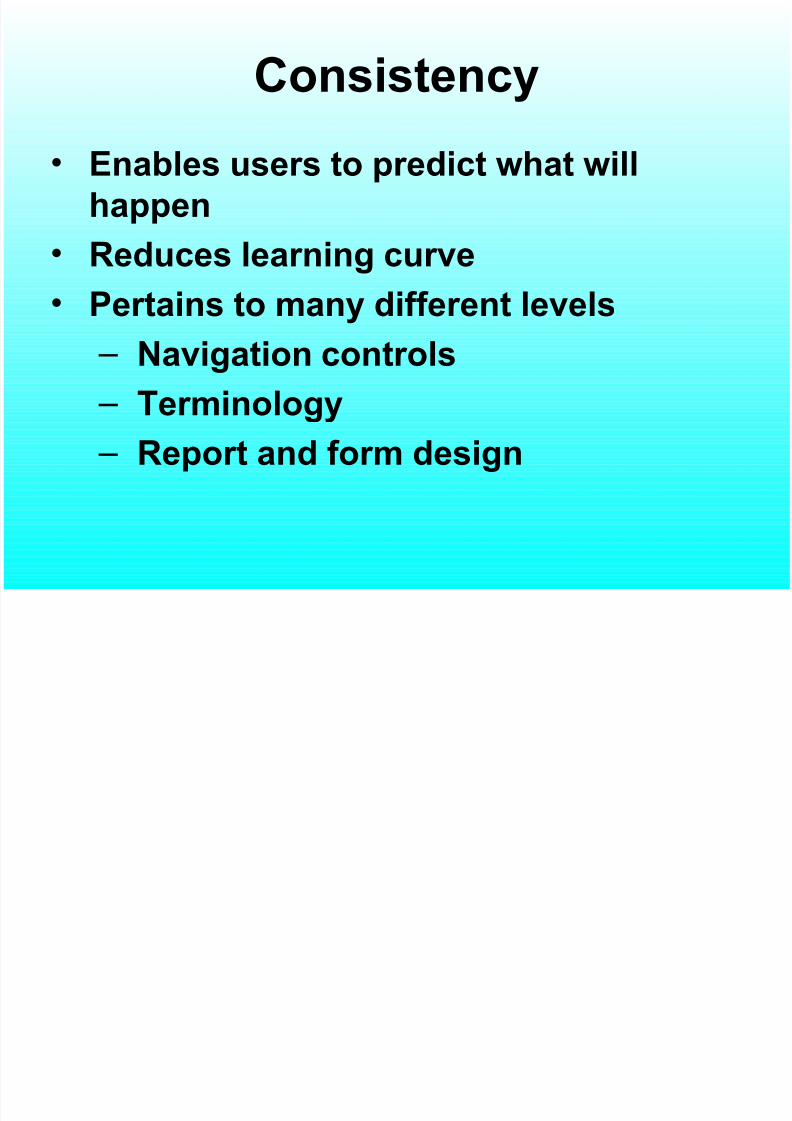
Consistency
• Enables users to predict what will
happen
• Reduces learning curve
• Pertains to many different levels
– Navigation controls
–
Terminology – Report and form design
8/6/2019 Designing a Good Web Site
http://slidepdf.com/reader/full/designing-a-good-web-site 11/31
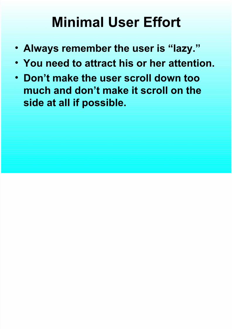
Minimal User Effort
• Always remember the user is “lazy.”
• You need to attract his or her attention.
•
Don’t make the user scroll down toomuch and don’t make it scroll on the
side at all if possible.
8/6/2019 Designing a Good Web Site
http://slidepdf.com/reader/full/designing-a-good-web-site 12/31
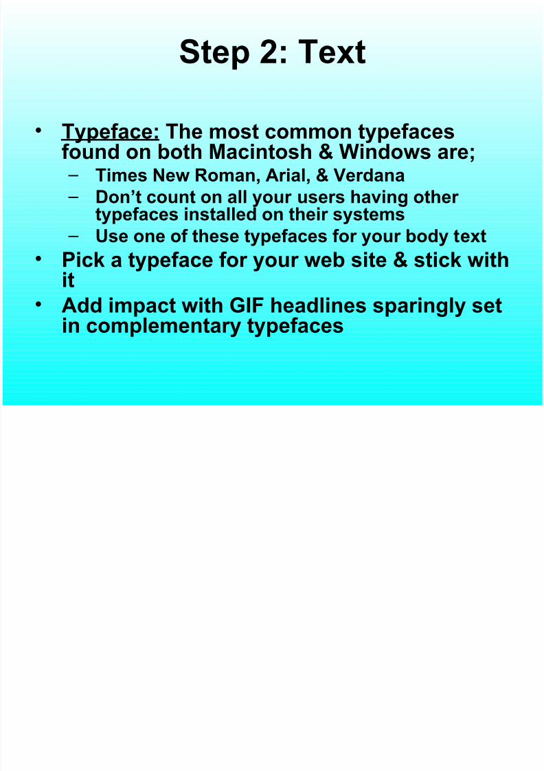
Step 2: Text
• Typeface: The most common typefacesfound on both Macintosh & Windows are; – Times New Roman, Arial, & Verdana – Don’t count on all your users having other
typefaces installed on their systems – Use one of these typefaces for your body text
• Pick a typeface for your web site & stick with
it• Add impact with GIF headlines sparingly set
in complementary typefaces
8/6/2019 Designing a Good Web Site
http://slidepdf.com/reader/full/designing-a-good-web-site 13/31
More on Typefaces
• The heading is the place to use a
creative typeface.
• Typefaces must often be purchased
• Choose a headline typeface that
breaks from the norm
•
If a document needs to be printed,then Adobe Acrobat PDF is the best
way to go.
8/6/2019 Designing a Good Web Site
http://slidepdf.com/reader/full/designing-a-good-web-site 14/31
Cascading Style Sheets
• These style sheets may be used to
achieve a higher level of control over
type specifications.
8/6/2019 Designing a Good Web Site
http://slidepdf.com/reader/full/designing-a-good-web-site 15/31
Spelling and Grammar
Always check
spelling andgrammar.
8/6/2019 Designing a Good Web Site
http://slidepdf.com/reader/full/designing-a-good-web-site 16/31
Step 3 - Forms
• Assign consistent names & values to
each element used in the form.
• Elements are:
– Checkboxes, Radio buttons, Text fields,
Text areas, Drop-down menus, Scrolling
lists, Hidden fields, Reset buttons, &
Submit buttons
8/6/2019 Designing a Good Web Site
http://slidepdf.com/reader/full/designing-a-good-web-site 17/31
More on Forms
• Forms should be: – Easy to navigate
– Precisely aligned
–
Easy to read – Self-explanatory
– Just the right size
– Checked for errors
–
Not boring – Polite
– Consistent in style
8/6/2019 Designing a Good Web Site
http://slidepdf.com/reader/full/designing-a-good-web-site 18/31
Step 4 - Color
• The red, green, blue (RGB) color wheel
is used to create all the colors. A
hexadecimal code is used with the first
2 characters representing red, thesecond two green, and the last two
blue.
8/6/2019 Designing a Good Web Site
http://slidepdf.com/reader/full/designing-a-good-web-site 19/31
Color Depth
• Determined by a computer’s video card,video-display driver, & monitor – either 24-bit, 16-bit, or 256 colors can be displayed
•
IE & Netscape have a common palette of 216web safe colors that do not dither whenviewed on different platforms
• You should use these colors, or blend these
colors together in GIF images to form newcolors
8/6/2019 Designing a Good Web Site
http://slidepdf.com/reader/full/designing-a-good-web-site 20/31
Readability
• Your colors should be easy on the eye
• Usually a light background with darkprint works best
8/6/2019 Designing a Good Web Site
http://slidepdf.com/reader/full/designing-a-good-web-site 21/31
Step 5 - Graphics
• Identity graphics – tell who you are
• Structural graphics – form the shapeof the page
• Navigational graphics – provide a wayfrom here to there
• Contextual graphics – tie directly to
page content• Ornamental graphics – embellish the
page
8/6/2019 Designing a Good Web Site
http://slidepdf.com/reader/full/designing-a-good-web-site 22/31
More Graphics
• Identity graphics, like a logo, should be in the
exact same location & be the exact same size onevery page.
• A picture is worth a thousand words – if it’s the
right picture.
• Photos may be downloaded from:
www.corbisimages.com, www.eyewire.com,
www.photodisc.com
• Check the fine print to be sure that you do not
violate copyright law with any of your images,etc.
8/6/2019 Designing a Good Web Site
http://slidepdf.com/reader/full/designing-a-good-web-site 23/31
GIF or JPEG?
• The GIF format is an indexed-color
format. It should be used for solid-
color graphics, logos, line art, &
cartoon-like illustrations. It producesthe best compression on large areas of
flat, contiguous color. Avoid using GIF
for photographs.• JPEG is used for photos & other
artwork with many colors.
8/6/2019 Designing a Good Web Site
http://slidepdf.com/reader/full/designing-a-good-web-site 24/31
Backgrounds
• Backgrounds are usually GIF files thatare patterns, vertical stripes,horizontal stripes, or big images.
• When designing background images,remember to: – Ensure readability
–
Avoid overly complex designs – Never let them see your seams
8/6/2019 Designing a Good Web Site
http://slidepdf.com/reader/full/designing-a-good-web-site 25/31
In General …
• Design for the lowest common
denominator for both browser &
display resolution.
• The most important item on each page
should be seen within the first 300
pixels – never assume a visitor will
scroll down.
8/6/2019 Designing a Good Web Site
http://slidepdf.com/reader/full/designing-a-good-web-site 26/31
Step 7 - Navigation
• Your site MUST be easy to navigate.
• Use horizontal or vertical navigation? – Determine the number of static links that must
be on every page
– Repeat at the bottom if they scroll out of site if necessary
– Where am I?Where have I been?
Where can I go nextWhere's the Home PageWhere's the Home Home Page
8/6/2019 Designing a Good Web Site
http://slidepdf.com/reader/full/designing-a-good-web-site 27/31
• No MMN (Mystery Meat Navigation) occurs
when, in order to find specific pages in a site,
the user must mouse over unmarkednavigational "buttons" -- graphics that are
usually blank or don't describe their function.
JavaScript code then reveals what the real
purpose of the button is and where it leads.
• MMN are only good in some specific cases
8/6/2019 Designing a Good Web Site
http://slidepdf.com/reader/full/designing-a-good-web-site 28/31
Frames
• Frames allow for a flexible site. Certain
items like headers & navigation remain
intact as visitors jump from page to page.
• Each frame holds 1 individual web page• A frameset holds all of your frames. Never
use more than 4 frames.
•
Each frame’s border, margins, width, height,scrollbars, & resizing can be set.
8/6/2019 Designing a Good Web Site
http://slidepdf.com/reader/full/designing-a-good-web-site 29/31
Step 8 – Site Structure
• Your web site is your virtual home. Be
sure your visitors feel welcome.
• Search engines may link your visitors
directly to any room in the house.
Make sure they know where they are &
can navigate easily no matter where
they arrive.
• Sketch everything out on paper first!
8/6/2019 Designing a Good Web Site
http://slidepdf.com/reader/full/designing-a-good-web-site 30/31
Step 9 – Be sure to:
• Provide contact information with full details – on every page, or with a constant link
• Provide information on what’s new with thesite & your company
• Provide company details to let them knowwho you are
• Never give just one way to reach a page.Larger sites need both a site map & a search
facility.• Give visitors an opportunity to send
feedback & answer all inquiries.
8/6/2019 Designing a Good Web Site
http://slidepdf.com/reader/full/designing-a-good-web-site 31/31
And Always•
Keep pages no wider than 800 pixels• Break longer pages into separate shorter
ones
• Remember that less is more – don’t go
overboard• Be sure to proofread!
• Use appropriate page titles (for searchengines to find you)
• Keep your site fresh – remove outdatedinformation
• Make sure you have the proper Meta tags(and keep them updated)