Data visualisation service definition visualization...Data Visualisation Services Prepared by PwC EU...
25
1 Data visualisation service definition Publications Office of the European Union March 2017
Transcript of Data visualisation service definition visualization...Data Visualisation Services Prepared by PwC EU...

1
Data visualisation service definition
Publications Office of the European UnionMarch 2017

2
DISCLAIMER
This document is for informational purposes only and theCommission cannot be held responsible for any use which maybe made of the information contained therein. References tolegal acts or documentation of the European Union (EU)cannot be perceived as amending legislation in force or otherEU documentation.
The document contains a brief overview of technical natureand is not supplementing or amending terms and conditions ofany procurement procedure; therefore, no compensation claimcan be based on the contents of the present document.
Data Visualisation Services
Prepared by PwC EU Services for the Publications Office of the European Union.

3
Table of contents
Page
1 Introduction 4
2 Basic steps for creating a data visualisation 7
3 Which tools for whom 16
4Data visualisation initiatives in the EU institutions and agencies
18
5 Additional information 23

4
IntroductionY1

5
Context
The Publications Office of the European Union has embarked onseveral activities which contribute to the development of a data cultureand the data capabilities within its institutions and agencies. In thiscontext, the foreseen activities create synergies with existinginitiatives of the Commission, such as participatory decision-makingand on data standardisation among others. The focus of the activitiesfor 2016-2017 has been set on:
• Developing capabilities in data visualisation and setting up acommunity of interest through the creation of a catalogue of reusabledata visualisation tools.
• Improving access to information held by the EU institutions andagencies by opening it up and publishing it in reusable, machine-readable formats, in particular following the linked data paradigm.
Stay informed:- Joinup community:
https://joinup.ec.europa.eu/asset/data_visualisation_and_open_data/description

6
Introduction
This document summarises best practices and on-going initiatives ondata visualisation at the European Union Institutions and agencies.
More specifically, it includes:
• The basic steps for creating a data visualisation;
• A matrix mapping several of the most popular data visualisationtools to the type of skills required to use them;
• Services and recommendations from the Commission to have inmind when creating a visualisation;
• A list of existing data visualisation initiatives at the EuropeanInstitutions and agencies;
• Key references and information resources in the field of datavisualisation.
This document is intended for the following audiences:
• EU Institution and agency staff and their contractors;
• Public Administrations in Europe.
who want to acquire basic knowledge of data visualisation.

7
Basic steps for creating a data visualisation
Y2

8
Basic steps for creating a data visualisation
Creating a data visualisation without proper preparation may lead toineffective or unintended results. It is important to assess beforehandthe raison d'être of the visualisation, the intended audience, as well ashow and where the data will be displayed.
The first step should always be to clearly state the businessquestion to be answered. By being conscious of the answer weneed, we can more effectively choose the data required to answer it. Acommon mistake is to dive head first into the available data and endup losing the initial goal and over-complicating a rather simpleprocess. Consequently, always start by answering the followingquestions:
What do you want to accomplish?
Do I need to persuade management about a position?
Do I need to inform the public of some facts?
Do I bring new ideas or existing opinions?
What is the key message I want to communicate?
Do I need to explain a current situation?
Do I need to describe a possible future situation?
Do I need to compare between different scenarios?
Which is the target audience?
Is it high level decision makers?
Is it investigation journalists?
Is it laymen or technical people?
Is it citizens?
What will the communication channel and medium be?
Will it be printed in a magazine?
Will it be printed on a poster?
Will it be inserted in a presentation?
Will it be hosted online in an interactive form?
Question formulation

9
The next step is to ensure that we have all the data we need in theformat that we need it. In this step, one should ensure, amongothers, that data is:
Available:
Does the dataset already exist?
In an internal database;
Through an online data portal (e.g. EUODP); or
Though a data provider (e.g. Gartner, Forrester, IDC).
If not can it be created?
By combining multiple datasets;
By harvesting online sources; or
By gathering through means of quantitative research.
Importantly, can this be done automatically?
Interoperable:
What is the data format?
Is it open format? Ideally, the data should be in open format (i.e. stored in a standard free from copyright, trademark or other commercial restrictions like CSV, JSON, RDF, etc.). This ensure that multiple tools can be used and it can avoid excessive costs for the otherwise needed commercial software.
Is it structured or unstructured? Structured data is data that is highly organised according to a defined model or scheme, such as tabular data. Unstructured data is essentially the opposite, such as text from webpages and documents. Ideally, data should be structured to allow creation of links to other data models and combining of sources.
Is it machine readable?Machine readable data is that which is in a format made for optimised consumption by a machine (e.g. CSV, XML, JSON). Data should be in a machine readable format as this greatly speeds up the process of importing it and ensures higher accuracy of it.
In case different datasets have to be integrated, are theirformats interoperable?
Some tools can automatically combine data of differentformats, otherwise transformation might be required.
Data Selection

10
Accessible:
Is the data freely available?
Numerous organisation publish quality data freely (e.g.EU ODP, Eurostat, Digital Agenda).
Is the data usable (e.g. is there any licensing)?
Sometimes data is not freely useable and may be subjectto usage limitations due to legal issues. Examples ofopen data licenses are the Creative Commons licenseand the Open Data Commons licence.
Licence issues should be handle carefully as it can lead tolegal complications.
Of good quality:
Is the data reliable?
Data that has been published on an official open dataportal or endorsed by a major institution can usually berelied on because one can assume that some level ofquality check has been done. This depends of course onthe importance of the source.
Does the data have a good enough quality?
More often than not there will be issues in a dataset, suchas: missing data, wrong data, inconsistent data and invaliddata.
These need to be detected beforehand in order to beaddressed during the data preparation phase.
Is the data described with appropriate metadata?
The metadata of a dataset give us invaluable insight intoits quality. It is best to always know the answers to somebasic questions, such as:
When was it created?
Who is the curator?
How was the data gathered? (researchers involved,quality measures)
Relevant:
Is the data suitable to answer my question?
Does it cover the required time period?
Does it cover the required geographical area?
Does it cover the required demographics?
Data Selection

11
The next step is to select the visualisation itself. The followingquestions can help guide this process:
What message do I want to communicate?
Different charts are more or less suitable to convey differentmessages. For example Line charts are great at displayingevolution, Pie chart at showing share, and maps for showinggeographic distribution.
What is the type of data I need to display?
Quantitative data (i.e. measurable values), are suitable for allkinds of charts;
Qualitative data (e.g. categorical values as “Red”, “Green”,“Big”, “Small”), are usually used to break down quantitativedata in visualisations, or are used to calculate counts to beused as quantitative data.;
Network data (e.g. Facebook, LinkedIn user relationship data),can be displayed through Network Graphs;
Textual data (e.g. text from tweets), can be displayed withwordclouds or be put in categories and displayed throughcommon chart types;
Log Data (e.g. running process log files), are often displayedthrough bar charts or line charts to indicate spikes in systemusage or number of errors.
Will the visualisation be static (e.g. poster or image) or dynamic(e.g. a dashboard where the user can interact with the data)?
Different charts are more or less suitable for dynamicvisualisations. One should take into account how avisualisation will look when data is added or removed from it,and whether it still conveys the message properly.
Will it be communicated via a portal or on social media?
If yes, it is important that the visualisation is fancy, “catchy”,or that it has a “Wow effect” in order to stand out of the crowdand get noticed.
Which type of data visualisation is it best to be used1?
The EU Data Visualisation Catalogue is an invaluable resourcethat offers guidance according all possible factors that canaffect this decision.
Visualisation type selection

12
After selecting our visualisation type there is the need to prepare thedata. In most visualisation projects preparing the data is a major partof the process and should under no circumstances be underestimated.
Data preparation may requires people with medium to deep technicalexpertise depending on the project. Mistakes cannot be tolerated inthe preparation phase as they can lead to dysfunctional visualisationsat best, and to providing an untrue message and lead to wrongdecisions at worst.
Things to consider here are:
Is data in the format required by the visualisation?
More often than not is not the case and some kind oftransformation is required. It is good practice to check theresults by alternative means and compare the results toensure it has been done correctly.
Is the data ready to use? It may require:
Cleaning (e.g. removing wrong values, fixing inaccurate orinconsistent values);
Structuring (e.g. creating a data model to fit the data into inorder to allow the development of visualisations).
Data Preparation

13
Depending on the desired outcome there are multitude toolsavailable. One must always take the time to select the right one asthis can greatly improve the results and affect the developmentprocess. However with the different tools comes different technicalskill requirements as well.
For instance, Excel allows the creation of simple visualisations fromtabular data, while having the unique advantage of being familiar tomostly anyone who has ever used a computer, thus allowing for easysharing and collaborative work.
QlikSense and Tableau are easy to use dashboarding tools thatrequire limited technical knowledge and allow for the creation of fancyinteractive visualisations to assist in data exploration and decisionmaking.
D3 offers unparalleled flexibility for creating online visualisations,however it requires substantial coding, thus limiting it to highlytechnical users.
For a more complete breakdown of available options refer to the EUData Visualisation Catalogue.
In this step special attention should be paid on:
Text: visualisation should not contain too much text, nevertheless atitle is always required. Additional text (e.g. subtitles, labels,legends) should be used only when necessary. Depending of theaudience you may consider to publish your visualisation in multiplelanguage.
Arrangement: improper arrangement of graph elements can atbest confuse readers and at worst mislead them. Thoughtfularrangement makes a data visualization easier to interpret. Thisincludes element proportions and ordering, axis intervals, etc.
Colours: colours lets you guide the viewer’s eye, draw attention todifferent points and tell your a story. Therefore, it can be thedifference between a good and a bad visualisation. If yourorganisation has a graphical guide (e.g. Eurostat) it should befollowed.
Development of the visualisation

14
In this step of the process the following points should be addressed:
What is the sustainability of my visualisation? Is my visualisationdependent on specific infrastructure (server, data portal, etc.) or adataset?
If yes, then we need to investigate the systems behind it. How will the database communicate with the front end
interface? Is the set up guarantee long term? Does the visualisation require periodical updates of the data to
feed into it? What could cause problems?
Does the visualisation respect the visualisation guidelines (e.g.web accessibility and accessibility requirements suitable for publicprocurement of ICT products and services in Europe)?
What medium will be used to display the visualisation (e.g. poster,LCD screens, interactive webpage…)?
When it is a poster, or any other printed medium, what yousee is what you get. However when the medium is digital,then one needs to test the visualisation on different possibledisplays that may be used to view it. This can affect all kindsof characteristics, from colours to sizes to parts of it beinghidden, and may subsequently impact the message.
Publication of the visualisation

15
Finally, in order to be sustainable your visualisations need to bedocumented. Here is a list of points that should appear in anydocumentation:
Scoping:
Who made the visualisation? Name of the publisher, nameof the producer, etc..
What was the purpose? logo, leaflet, brochure, posters,etc.
what is the key message you wanted to communicate?Give description and quality values.
Who was the target audience? internal or external actors,fields of activity, etc.
Visualisation Description:
Description of the visualisation solution.
Methodologies involved.
Technologies and tools involved.
Internet address (if applicable).
Screenshots.
Multilingual coverage (number of languages and their ISOcode).
Documentation

16
Which tools for whomY3

17
Which tools for whomThere are numerous tools available for creating data visualisations.Although some are accessible to anyone, others require specific skillsor trainings to be able to effectively use them. The matrix below mapssome of the most popular tools to the type of user.
ToolBasic User
Advanced User
Software Developer
Technical Skills
D3.JS HTML, CSS,
Javascript
Eurostat Tools None
FusionCharts.js HTML, CSS,
Javascript
Google Charts HTML, CSS,
Javascript
HighCharts.js HTML, CSS,
Javascript
Infogr.am None
Leaflet.js HTML, CSS,
Javascript
Microsoft Excel None
Power BI None
Piktochart None
Piwik HTML, CSS,
Javascript
Qlik Sense Qlik Script
QlikView Qlik Script
Raw None
Sisense None
Statistical Atlas None
Statwing None
Tableau None
Tableau Public None
Timeline.js HTML, CSS
Trendalizer None
More information and tools can be found on the catalogue of reusabledata visualisation tools developed by the Publications Office of the EU:http://52.50.205.146:8890/data_visualisation_catalogue/

18
Data visualisation initiatives in the EU Institutions and agencies
Y4

19
Data visualisation initiatives in the EU institutions and agencies
Project Charts
Institution Directorate-General for Communication
Details A chart is a tool that allows you to present numeric data in a graphical view. Charts can be interactive and published in a web page. These charts can be created using HighChart, a JavaScript library supporting several types of charts.(link to the tool)
Project Map
Institution Directorate-General for Communication
Details Map lets you embed interactive maps in your website. You can customize maps by displaying data in overlays. You can create your own overlays. Map is also a JavaScript library driven by Leaflet.(link to the tool)
Project GISCO (Geographic Information System of the Commission)
Institution Eurostat
Details GISCO (Geographical Information System of the Commission) is a service of Eurostat that answers needs for geographical information at the level of the European Union, the Member States and regions. (link)

20
Data visualisation initiatives in the EU institutions and agencies
For additional information, please refer to this page.
Project Data visualisations at the Fundamental Rights Agency
Institution European Union Agency for Fundamental Rights (FRA)
Details Visualisations to display interactively and visually the results of survey about fundamental rights.(link to presentation)
Project European Structural and Investment Funds (ESIF) open data platform
Institution DG REGIO
Details Monitoring platform to report information about EU funding, increasing transparency, boosting programmes’ performance and facilitating engagement with the stakeholders.(link to presentation)
Project Visualisation tools for statistics: the DIGICOMproject as an accelerator
Institution DG ESTAT
Details Creating and sharing new, innovative dissemination products, tools and services for the European Statistical System. (link to presentation)
Project Data visualisations at EEA
Institution European Environment Agency
Details The EEA use a lot of visualisations to represents information. To do so, they use the following tools and tehcniques: DaViz, Tableau, ArcGIS, Kibana, ElasticSearch, Statwing.(link to presentation)
21
Data visualisation initiatives in the EU institutions and agencies
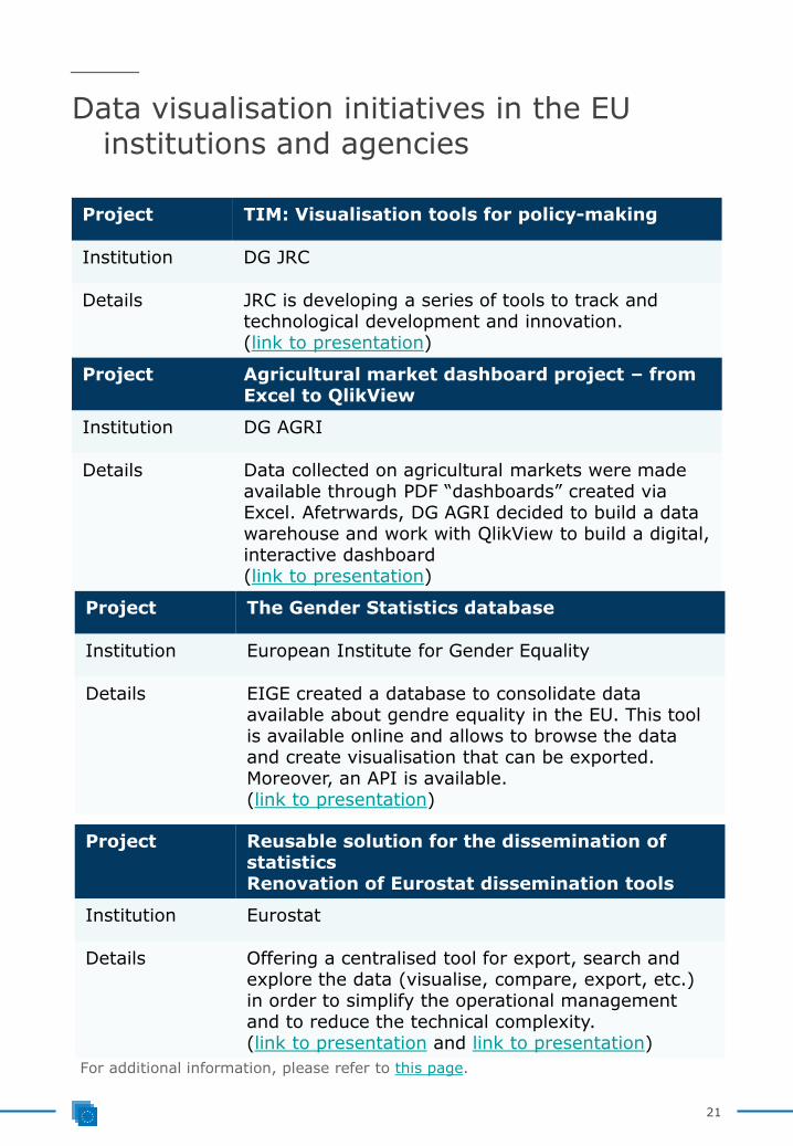
Project TIM: Visualisation tools for policy-making
Institution DG JRC
Details JRC is developing a series of tools to track and technological development and innovation.(link to presentation)
Project Agricultural market dashboard project – from Excel to QlikView
Institution DG AGRI
Details Data collected on agricultural markets were made available through PDF “dashboards” created via Excel. Afetrwards, DG AGRI decided to build a data warehouse and work with QlikView to build a digital, interactive dashboard(link to presentation)
Project The Gender Statistics database
Institution European Institute for Gender Equality
Details EIGE created a database to consolidate data available about gendre equality in the EU. This tool is available online and allows to browse the data and create visualisation that can be exported. Moreover, an API is available.(link to presentation)
For additional information, please refer to this page.
Project Reusable solution for the dissemination of statisticsRenovation of Eurostat dissemination tools
Institution Eurostat
Details Offering a centralised tool for export, search and explore the data (visualise, compare, export, etc.) in order to simplify the operational management and to reduce the technical complexity. (link to presentation and link to presentation)

22
Data visualisation initiatives in the EU institutions and agencies
Project Surveillance Atlas of Infectious diseases/ Business Intelligence tool for further data analysis
Institution Surveillance Atlas of Infectious diseases/ Business Intelligence tool for further data analysis
Details ATLAS gives access online to EU/EEA infectious disease surveillance data through an interactive interface. Moreover a BI suite is used to access, analyse and manipulates these data and create charts and maps.(link to presentation)
Project Visualisation needs of INEA
Institution Innovation and Networks Executive Agency
Details The data about INEA will be reported and monitored through the use of visualisations.(link to presentation)
Project Use of Tableau Software in the BeO and RIO project and use of D3 in MIDAS
Institution DG JRC
Details Data visualisations used to monitor research and innovation and bioeconomy using Tableau and D3.(link to presentation)
Project Converging from a cluttered landscape of data visualisation tools to a coherent web presence with standards that create synergies
Institution DG COMM
Details EIGE created a database to consolidate data available about gendre equality in the EU. This tool is available online and allows to browse the data and create visualisation that can be exported. Moreover, an API is available.(link to presentation)
For additional information, please refer to this page.

23
Additional informationY5

24
Additional information
The European Commission catalogue of datavisualisation tools
The Publications Office of the EU is also developing capabilities in datavisualisation and setting up a community of interest through thecreation of a catalogue of reusable data visualisation tools:
http://52.50.205.146:8890/data_visualisation_catalogue/
This catalogue allows relevant stakeholders to discover tools that willhelp them understand underlying patterns of the datasets, as well asto convey complex information to an audience in a manner that can bequickly consumed and easily understood without further explanation,and by encouraging and contributing to the culture of reusing softwaresolutions and knowledge. Stakeholders can also contribute either bysubmitting the description and related documentation of a visualisationtool that is not in the catalogue yet, by including technicaldocumentation or guidelines of a visualisation tool, or by submittingexamples created with a specific tool. Finally, stakeholders can askquestions or provide opinions of the visualisation tools through theforum.
Find out more about this project: https://bookshop.europa.eu/en/report-on-reusable-data-visualisation-tools-to-support-data-driven-policymaking-pbOA0416619/
Online resources
There are several catalogues of data visualisation tools and podcaststhat are interesting sources of information:
- http://www.datavizcatalogue.com/
- http://keshif.me/demo/VisTools:
- http://data-journalismtools.silk.co/
- http://datastori.es
- http://www.designingmapinterfaces.com
This section will presents some key references related to the field ofdata visualisation.

25
Additional information
Data visualisation specialists
We will present here some very interesting people to follow when itcomes to visualisations:
- Edward Tufte: Edward Tufte is a statistician and artist, specialised indata visualisation. He is Professor Emeritus of Political Science,Statistics, and Computer Science at Yale University and wroteseveral books about data visualisation.
- Stephen Few: Stephen Few is a leading expert in data visualisationfor sense-making and communication. He founded Perceptual Edge,and wrote several guides about business graphics, the visual designof dashboards and visual data analysis.
- Alberto Cairo: Alberto Cairo is the Knight Chair in Visual Journalismat the School of Communication of the University of Miami. Heworked several years in the field of data-journalism, infographicsand multimedia. He wrote two books about data visualisation andteaches courses on graphics and visualisations to journalismstudents.
- Andy Kirk: Andy Kirk is a freelancer specialised in data visualisation.He works as a consultant and provides training. He is also an author,speaker and researcher.
Data Visualisation catalogue
- The data visualisation catalogue. This site contains a library ofdifferent information visualisation types.
- Data visualisation tools & books. This site contains a web-baseddata exploration tool, to enable data exploration with the leasteffort, the most insights, in the shortest time.
- Data journalism tools. This site is a structured database listing toolsand resources that can be used to create visualisations.