Customizing and Editing Graphs - MINITABcms3.minitab.co.kr/board/minitab_data/10... · 5 Click...
347
Customizing and Editing Graphs
Transcript of Customizing and Editing Graphs - MINITABcms3.minitab.co.kr/board/minitab_data/10... · 5 Click...

Customizing and Editing Graphs

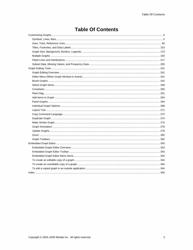
Table Of Contents
Copyright © 2003–2005 Minitab Inc. All rights reserved. 3
Table Of Contents Customizing Graphs .............................................................................................................................................................. 5
Symbols, Lines, Bars........................................................................................................................................................ 5 Axes, Ticks, Reference Lines... ...................................................................................................................................... 94 Titles, Footnotes, and Data Labels............................................................................................................................... 153 Graph Size, Background, Borders, Legends... ............................................................................................................. 173 Multiple Graphs ............................................................................................................................................................ 193 Fitted Lines and Distributions ....................................................................................................................................... 217 Subset Data, Missing Values, and Frequency Data..................................................................................................... 235
Graph Editing Tools ........................................................................................................................................................... 241 Graph Editing Overview................................................................................................................................................ 241 Editor Menu (When Graph Window is Active) .............................................................................................................. 241 Brush Graphs ............................................................................................................................................................... 242 Select Graph Items....................................................................................................................................................... 248 Crosshairs .................................................................................................................................................................... 250 Plant Flag ..................................................................................................................................................................... 251 Add Items to Graph ...................................................................................................................................................... 254 Panel Graphs................................................................................................................................................................ 264 Individual Graph Options.............................................................................................................................................. 268 Layout Tool................................................................................................................................................................... 271 Copy Command Language........................................................................................................................................... 272 Duplicate Graph............................................................................................................................................................ 274 Make Similar Graph...................................................................................................................................................... 275 Graph Annotation ......................................................................................................................................................... 276 Update Graphs ............................................................................................................................................................. 279 Zoom ............................................................................................................................................................................ 282 Graph Toolbars............................................................................................................................................................. 282
Embedded Graph Editor .................................................................................................................................................... 343 Embedded Graph Editor Overview............................................................................................................................... 343 Embedded Graph Editor Toolbar ................................................................................................................................. 343 Embedded Graph Editor Menu Items........................................................................................................................... 344 To create an editable copy of a graph.......................................................................................................................... 344 To create an uneditable copy of a graph...................................................................................................................... 344 To edit a copied graph in an outside application .......................................................................................................... 344
Index .................................................................................................................................................................................. 345


Customizing Graphs
Copyright © 2003–2005 Minitab Inc. All rights reserved. 5
Customizing Graphs Symbols, Lines, Bars... Data Display Overview For each graph, you can represent the data with one or more data displays, such as symbols, lines, bars, and areas. After creating the graph, you can:
• Change the attributes, such as size, color, and fill pattern of a data display (see Editing Data Display Overview).
• Add data displays (see Adding Graph Elements). The illustrations below provide a sample of the data displays available.
Symbol Connect line
Project lines Area
Bar Box
Customizing and Editing Graphs
Copyright © 2003–2005 Minitab Inc. All rights reserved. 6
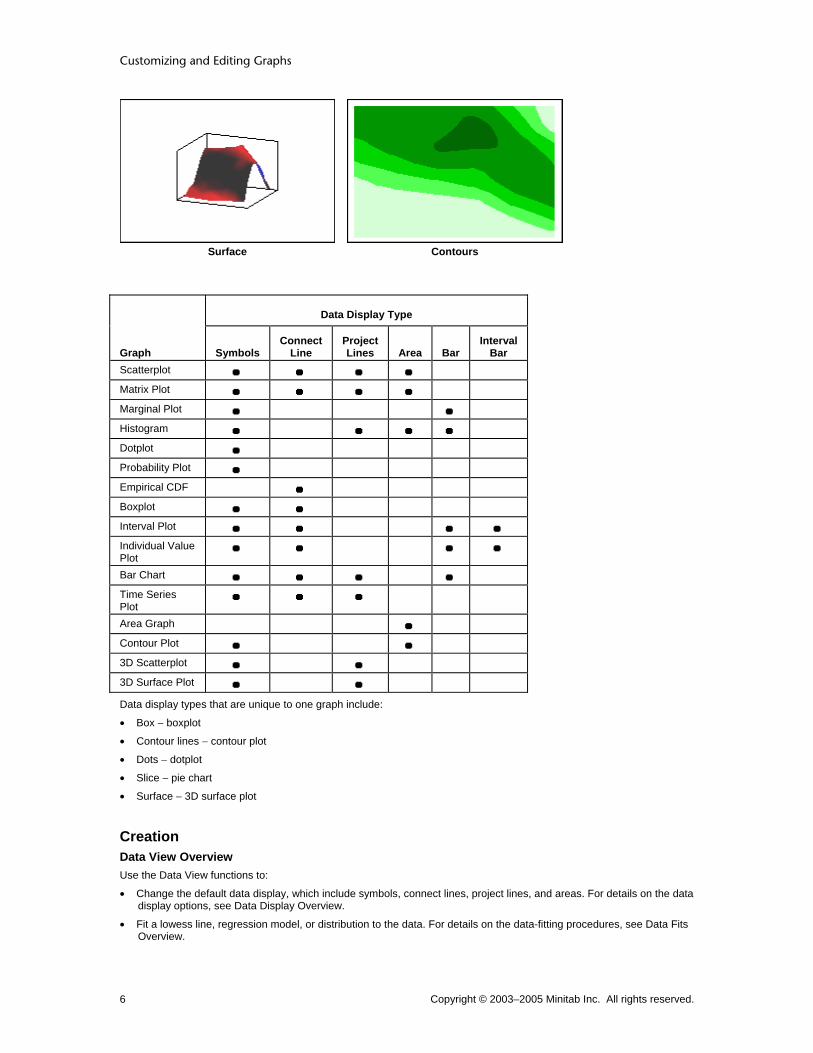
Surface Contours
Data Display Type
Graph Symbols Connect
Line ProjectLines Area Bar
IntervalBar
Scatterplot Matrix Plot Marginal Plot Histogram Dotplot Probability Plot Empirical CDF Boxplot Interval Plot Individual Value Plot
Bar Chart Time Series Plot
Area Graph Contour Plot 3D Scatterplot 3D Surface Plot
Data display types that are unique to one graph include:
• Box − boxplot
• Contour lines − contour plot
• Dots − dotplot
• Slice − pie chart
• Surface − 3D surface plot
Creation Data View Overview Use the Data View functions to:
• Change the default data display, which include symbols, connect lines, project lines, and areas. For details on the data display options, see Data Display Overview.
• Fit a lowess line, regression model, or distribution to the data. For details on the data-fitting procedures, see Data Fits Overview.

Customizing Graphs
Copyright © 2003–2005 Minitab Inc. All rights reserved. 7
Note To access the data display and data fitting functions:
• For probability plots and empirical cdf graphs, click Distribution in the graph dialog box.
• For other graphs, click Data View in the graph dialog box.
Scatterplot, Matrix Plot
Scatterplot, Matrix Plot − Data View − Data Display ... > Data View > Data Display Use to represent the data with one or more data display types, including symbols, connect lines, project lines, and areas. After creating a graph, you can:
• Change the data display attributes (see Editing Data Display Overview).
• Add or remove data display types (see Adding Graph Elements).
Dialog box items Data Display
Symbols: Check to represent each data point with a symbol. Connect line: Check to connect the data points. Project lines: Check to display lines that project from each data point to its base. Area: Check to shade the area below the data points to their base.
To change the data display 1 In the graph dialog box, click Data View. 2 Under Data Display, check one or more of the following:
• Symbols to represent each data point with a symbol. • Connect line to connect the data points. • Project lines to display lines that project from each data point to its base. • Area to shade the area below the data points to their base.
3 Click OK in each dialog box.
Examples of scatterplot data display You can represent the data with symbols, connect lines, project lines, and areas. You can also fit a lowess smoother and regression line to the data. In the Example of a simple scatterplot, you examine the relationship between voltage remaining in your camera batteries immediately after a flash and the length of time required for a battery to be ready to support another flash. You want to customize the data display.
Note Similar data display functions are available for matrix plots.
Symbols (default) and project lines 1 Open the worksheet BATTERIES.MTW. 2 Choose Graph > Scatterplot. 3 Choose With Groups, then click OK. 4 Under Y variables, enter FlashRecov. Under X
variables, enter VoltsAfter. 5 In Categorical variables for grouping (0-3),
enter Formulation. 6 Click Data View. 7 Check Project lines. 8 Click OK in each dialog box.

Customizing and Editing Graphs
Copyright © 2003–2005 Minitab Inc. All rights reserved. 8
Grouping variable 1 To recall the last dialog box, press [Ctrl]+[E]. 2 Click Data View. 3 Uncheck Project lines. 4 Check Connect line. 5 Click OK in each dialog box.
Histogram
Histogram − Data View − Data Display ... > Data View > Data Display Use to represent the data with one or more data display types, including bars, symbols, project lines, and areas. After creating a graph, you can:
• Change the data display attributes (see Editing Data Display Overview).
• Add or remove data display types (see Adding Graph Elements).
Dialog box items Data Display
Bars: Check to display bars that join each data value to its base. By default, the height of each bar is equal to the frequency of the interval it represents. Symbols: Check to represent each data value with a symbol. Project lines: Check to display lines that project from each data point to its base. Area: Check to draw a histogram with an outline of the bars (only visible if you uncheck Bars).
To change the data display 1 In the graph dialog box, click Data View. 2 Click the Data Display tab. 3 Under Data Display, check one or more of the following:
• Bars to display bars that join each data value to its base. By default, the height of each bar is equal to the frequency of the interval it represents.
• Symbols to represent each data value with a symbol. • Project lines to display lines that project from each data point to its base. • Area to draw a histogram with an outline of the bars (only visible if you uncheck Bars).
4 Click OK in each dialog box.
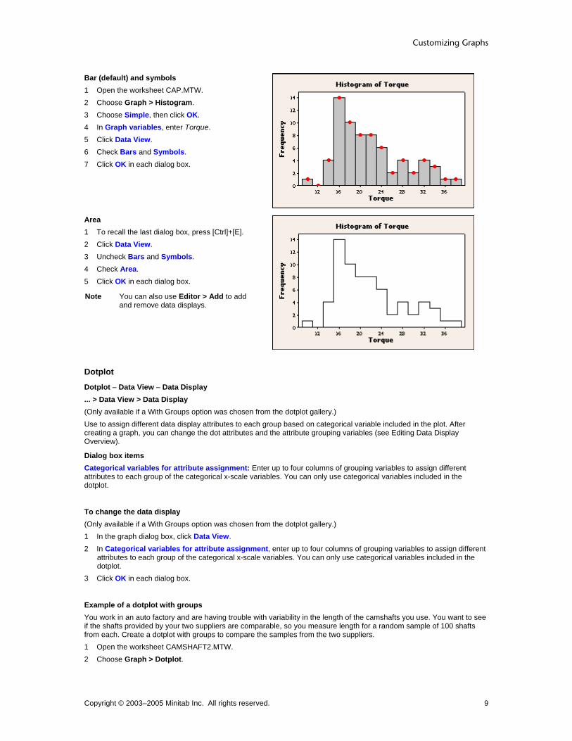
Examples of histogram data display You can represent the data with bars, symbols, project lines and areas. You can also fit a distribution and a lowess smoother to the data. In the Example of a simple histogram, you determine the amount of torque required to remove shampoo bottle caps. You want to customize the data display.
Customizing Graphs
Copyright © 2003–2005 Minitab Inc. All rights reserved. 9
Bar (default) and symbols 1 Open the worksheet CAP.MTW. 2 Choose Graph > Histogram. 3 Choose Simple, then click OK. 4 In Graph variables, enter Torque. 5 Click Data View. 6 Check Bars and Symbols. 7 Click OK in each dialog box.
Area 1 To recall the last dialog box, press [Ctrl]+[E]. 2 Click Data View. 3 Uncheck Bars and Symbols. 4 Check Area. 5 Click OK in each dialog box.
Note You can also use Editor > Add to add and remove data displays.
Dotplot
Dotplot − Data View − Data Display ... > Data View > Data Display (Only available if a With Groups option was chosen from the dotplot gallery.) Use to assign different data display attributes to each group based on categorical variable included in the plot. After creating a graph, you can change the dot attributes and the attribute grouping variables (see Editing Data Display Overview).
Dialog box items Categorical variables for attribute assignment: Enter up to four columns of grouping variables to assign different attributes to each group of the categorical x-scale variables. You can only use categorical variables included in the dotplot.
To change the data display (Only available if a With Groups option was chosen from the dotplot gallery.) 1 In the graph dialog box, click Data View. 2 In Categorical variables for attribute assignment, enter up to four columns of grouping variables to assign different
attributes to each group of the categorical x-scale variables. You can only use categorical variables included in the dotplot.
3 Click OK in each dialog box.
Example of a dotplot with groups You work in an auto factory and are having trouble with variability in the length of the camshafts you use. You want to see if the shafts provided by your two suppliers are comparable, so you measure length for a random sample of 100 shafts from each. Create a dotplot with groups to compare the samples from the two suppliers. 1 Open the worksheet CAMSHAFT2.MTW. 2 Choose Graph > Dotplot.

Customizing and Editing Graphs
Copyright © 2003–2005 Minitab Inc. All rights reserved. 10
3 Choose One Y − With Groups, then click OK. 4 In Graph variables, enter Length. 5 In Categorical variables for grouping (1-4, outermost first), enter Supplier. 6 Click the Data View tab. In Categorical variables for attribute assignment, enter Supplier. 7 Click OK in each dialog box.
Graph window output
Interpreting the results The mean lengths of the camshafts from the two suppliers appear to be similar. However, there is a great deal more variability in the length of shafts provided by supplier B. You might investigate supplier B's process more carefully.
Tip To see the bin range for a dot, hover your cursor over it.
Probability Plot
Probability Plot − Distribution − Data Display ... > Distribution > Data Display Use to represent the data with one or more data display types, including symbols and a distribution fit. You can also hide the confidence intervals or change the confidence level. After creating a graph, you can:
• Change the data display attributes (see Editing Data Display Overview).
• Add or remove data display types (see Adding Graph Elements).
Dialog box items Data Display
Both symbols and distribution fit: Choose to represent each data value with a symbol and fit a distribution to the data. Symbols only: Check to represent each data value with a symbol. Distribution fit only: Choose to fit a distribution to the data. Show confidence interval: Check to display the confidence interval for the fitted distribution.
Confidence level: Enter a number between 0 and 100 to specify the confidence level. The default is 95%.
To change the data display 1 In the graph dialog box, click Distribution. 2 Click the Data Display tab. 3 Under Data Display, choose one of the following:
• Both symbols and distribution fit to represent each data point with a symbol and fit a distribution to the data. • Symbols only to represent each data point with a symbol. • Distribution fit only to fit a distribution to the data.

Customizing Graphs
Copyright © 2003–2005 Minitab Inc. All rights reserved. 11
4 To display a confidence interval for the fitted distribution, check Show confidence interval. If you want a confidence level other than 95%, type a value from 0 to 100 in Confidence level.
5 Click OK in each dialog box.
Example of multiple overlaid probability plots You want to assess the efficacy of two coatings designed to reduce the flammability of fabrics. You randomly select 15 samples each of fabric with no coating, Coating A applied, and Coating B applied. Testers then hold each sample over an open flame for a fixed amount of time and measure the length of the burned portion. You typically use the 87th percentile as a benchmark for such tests. Create probability plots for each treatment to determine if the data are fit well by normal distributions and to estimate the 87th percentile for each population. 1 Open the worksheet FLAMERTD.MTW. 2 Choose Graph > Probability Plot. 3 Choose Multiple, then click OK. 4 In Graph variables, enter Fabric - CoatingB. 5 Click Scale, then click the Percentile Lines tab. 6 Under Percentile Lines, choose At Y values, and enter 87. 7 Click the Gridlines tab, then uncheck all boxes. Click OK. 8 Click Distribution, then click the Data Display tab. 9 Uncheck Show confidence interval. Click OK in each dialog box.
Graph window output
Interpreting the results The plotted points follow the fitted lines fairly closely, and the p-values for each Anderson-Darling test are greater than 0.10, suggesting that normal distributions fit these data fairly well. The estimated 87th percentiles for each population are:
• 4.21543 for the uncoated fabric
• 3.47944 for the fabric with Coating A
• 3.12936 for the fabric with Coating B The order of variables in the output table is the same as that in the legend. Coating A appears to reduce fabric burn, as evidenced by the leftward shift in the fitted line and the shorter mean burn length (3.013 as compared with 3.573 for the fabric with no coating). Coating A also appears to reduce the variability in the burn lengths, as evidenced by the steeper slope of the fitted line and the smaller standard deviation (0.4138 compared to 0.5700). However, appropriate tests would need to be conducted to confirm these observations. Coating B may be more effective than Coating A. Coating B reduced the mean burn length to 2.727 and the standard deviation to 0.3575.

Customizing and Editing Graphs
Copyright © 2003–2005 Minitab Inc. All rights reserved. 12
Empirical CDF Graph
Empirical CDF − Distribution − Data Display ... > Distribution > Data Display Use to represent the data with one or more data display types, including connect lines and a distribution fit. After creating a graph, you can:
• Change the data display attributes (see Editing Data Display Overview).
• Add or remove data display types (see Adding Graph Elements).
Dialog box items Data Display
Both connect line and distribution fit: Choose to connect the data points and fit a distribution to the data. Connect line only: Choose to connect the data points. Distribution fit only: Choose to fit a distribution to the data.
To change the data display 1 In the graph dialog box, click Distribution. 2 Click the Data Display tab. 3 Under Data Display, choose one of the following:
• Both connect line and distribution fit to connect the data points and fit a distribution to the data. • Connect line only to connect the data points. • Distribution fit only to fit a distribution to the data.
4 Click OK in each dialog box.
Example of multiple overlaid empirical cdf graphs You want to assess the efficacy of two coatings designed to reduce the flammability of fabrics. You randomly select 15 samples each of fabric with no coating, Coating A applied, and Coating B applied. Testers then hold each sample over an open flame for a fixed amount of time and measure the length of the burned portion. You typically use the 87th percentile as a benchmark for such tests. Create an empirical cdf graph to compare the fitted distributions for each treatment and estimate the 87th percentile for each population. 1 Open the worksheet FLAMERTD.MTW. 2 Choose Graph > Empirical CDF. 3 Choose Multiple, then click OK. 4 In Graph variables, enter Fabric - CoatingB. 5 Click Scale, then click the Percentile Lines tab. 6 Under Percentile Lines, choose At Y values, and enter 87. Click OK. 7 Click OK in each dialog box.

Customizing Graphs
Copyright © 2003–2005 Minitab Inc. All rights reserved. 13
Graph window output
Interpreting the results The stepped empirical cdf's follow the fitted lines fairly closely, suggesting that normal distributions fit these data fairly well. The estimated 87th percentiles for each population are:
• 4.215 for the uncoated fabric
• 3.479 for the fabric with Coating A
• 3.129 for the fabric with Coating B The order of variables in the output table is the same as that in the legend. Coating A appears to reduce fabric burn, as evidenced by the leftward shift in the fitted line and the shorter mean burn length (3.013 as compared with 3.573 for the fabric with no coating). Coating A also appears to reduce the variability in the burn lengths, as evidenced by the steeper slope of the fitted line and the smaller standard deviation (0.4138 compared to 0.5700). However, appropriate tests would need to be conducted to confirm these observations. Coating B may be more effective than Coating A. Coating B reduced the mean burn length to 2.727 and the standard deviation to 0.3575.
Boxplot
Boxplot − Data View − Data Display ... > Data View > Data Display Use to represent the data with one or more data display types, including boxes, symbols, and connect lines. After creating a graph, you can:
• Change the data display attributes (see Editing Data Display Overview).
• Add or remove data display types (see Adding Graph Elements).
Dialog box items Data Display
Median confidence interval box: Check to display a confidence interval box, which shows the 95% (default) confidence interval for the median. Interquartile range box: Check to display an interquartile range box (default). The box bottom is at the 25th percentile and box top at the 75th percentile. Range box: Check to display a box that extends from the minimum data value to the maximum data value. Outlier symbols: Check to represent each outlier with a symbol. Individual symbols: Check to represent each data point with a symbol. Median symbol: Check to represent each median with a symbol. Median connect line: Check to connect the medians of boxplots (only visible if you have categorical variables in the boxplot). Mean symbol: Check to represent each mean with a symbol. Mean connect line: Check to connect the means of grouped plots (only visible if you have categorical variables in the boxplot).
Customizing and Editing Graphs
Copyright © 2003–2005 Minitab Inc. All rights reserved. 14
Categorical variables for attribute assignment: (Only available if a With Groups option was selected from the boxplot gallery.) Enter up to four columns of grouping variables to assign different attributes to each group of the categorical x-scale variables. You can only use categorical variables included in the boxplot.
To change the data display 1 In the graph dialog box, click Data View. 2 Under Data Display, check one or more of the following:
• Median confidence interval box to display a confidence interval box, which shows the 95% (default) confidence interval for the median.
• Interquartile range box to display an interquartile range box (default), with the box bottom at the 25th percentile and box top at the 75th percentile.
• Range box to display a box that extends from the minimum data value to the maximum data value. • Outlier symbols to represent each outlier with a symbol. • Individual symbols to represent each data point with a symbol. • Median symbol to represent each median with a symbol. • Median connect line to connect the medians of grouped plots (only visible if you have categorical variables in the
boxplot). • Mean symbol to represent each mean with a symbol. • Mean connect line to connect the means of grouped plots (only visible if you have categorical variables in the
boxplot). 3 (Only available if a With Groups option was selected from the boxplot gallery.) In Categorical variables for attribute
assignment, enter up to four columns of grouping variables to assign different attributes to each group of the categorical x-scale variables. You can only use categorical variables included in the boxplot.
4 Click OK in each dialog box.
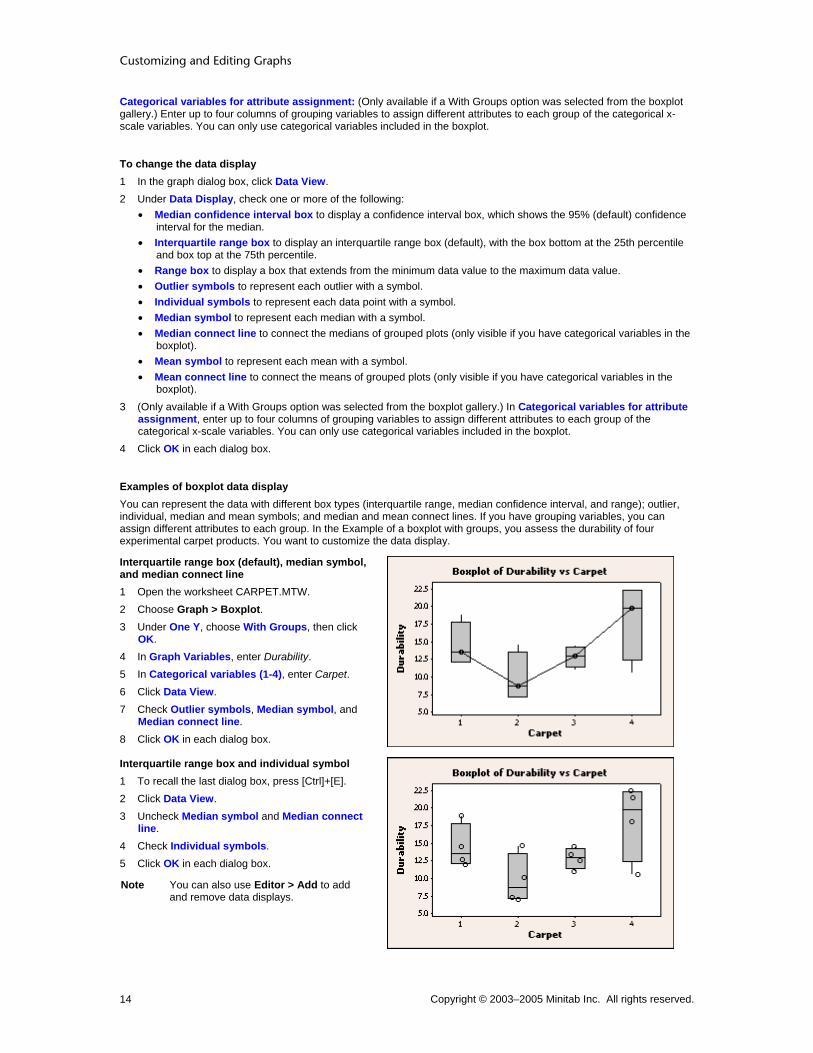
Examples of boxplot data display You can represent the data with different box types (interquartile range, median confidence interval, and range); outlier, individual, median and mean symbols; and median and mean connect lines. If you have grouping variables, you can assign different attributes to each group. In the Example of a boxplot with groups, you assess the durability of four experimental carpet products. You want to customize the data display.
Interquartile range box (default), median symbol, and median connect line 1 Open the worksheet CARPET.MTW. 2 Choose Graph > Boxplot. 3 Under One Y, choose With Groups, then click
OK. 4 In Graph Variables, enter Durability. 5 In Categorical variables (1-4), enter Carpet. 6 Click Data View. 7 Check Outlier symbols, Median symbol, and
Median connect line. 8 Click OK in each dialog box.
Interquartile range box and individual symbol 1 To recall the last dialog box, press [Ctrl]+[E]. 2 Click Data View. 3 Uncheck Median symbol and Median connect
line. 4 Check Individual symbols. 5 Click OK in each dialog box.
Note You can also use Editor > Add to add and remove data displays.

Customizing Graphs
Copyright © 2003–2005 Minitab Inc. All rights reserved. 15
Interquartile range box, mean symbol, and a categorical variable for attribute assignment 1 Press [Ctrl]+[E]. 2 Click Data View. 3 Uncheck Individual symbols. 4 Check Mean symbol. 5 In Categorical variables for attribute
assignment, enter Carpet. 6 Click OK in each dialog box.
Interval Plot, Individual Value Plot
Interval Plot, Individual Value Plot − Data View − Data Display ... > Data View > Data Display Use to represent the data with one or more data display types, including bars, symbols, and connect lines. After creating a graph, you can:
• Change the data display attributes (see Editing Data Display Overview).
• Add or remove data display types (see Adding Graph Elements).
Dialog box items Data Display
Interval bar: Check to display a confidence interval bar. The default confidence level is 95%. Bar: Check to display bars that join each mean to its base. Individual symbols: Check to represent each data point with a symbol. Mean symbol: Check to represent each mean with a symbol. Mean connect line: Check to connect the means of grouped plots (only visible if you have categorical variables in the plot). Median symbol: Check to represent each median with a symbol. Median connect line: Check to connect the medians of grouped plots (only visible if you have categorical variables in the plot).
Categorical variables for attribute assignment: (Only available if a With Groups option was chosen from the graph gallery.) Enter up to four columns of grouping variables to assign different attributes to each group of the categorical x-scale variables. You can only use categorical variables included in the plot.
To change the data display 1 In the graph dialog box, click Data View. 2 Under Data Display, check one or more of the following:
• Interval bar to display a confidence interval bar. The default confidence level is 95%. • Bar to display bars that join each data value to its base. • Individual symbols to represent each data point with a symbol. • Mean symbol to represent each mean with a symbol. • Mean connect line to connect the means of grouped plots (only visible if you have categorical variables in the
plot). • Median symbol to represent each median with a symbol. • Median connect line to connect the medians of grouped plots (only visible if you have categorical variables in the
plot). 3 (Only available if a With Groups option was selected from the graph gallery.) In Categorical variables for attribute
assignment, enter up to four columns of grouping variables to assign different attributes to each group of the categorical x-scale variables. You can only use categorical variables included in the plot.
4 Click OK in each dialog box.

Customizing and Editing Graphs
Copyright © 2003–2005 Minitab Inc. All rights reserved. 16
Examples of interval plot data display You can represent the data with interval bars, bars, symbols, and connect lines. If you have grouping variables, you can assign different attributes to each group. In the Example of an interval plot with groups, you assess the durability of four experimental carpet products. You want to customize the data display.
Interval bar, mean symbol, and mean connect line 1 Open the worksheet CARPET.MTW. 2 Choose Graph > Interval Plot. 3 Under One Y, choose With Groups. Click OK. 4 In Graph variables, enter Durability. 5 In Categorical variables for grouping (1-4,
outermost first), enter Carpet. 6 Click Data View. 7 Check Mean connect line. 8 Click OK in each dialog box.
Interval bar, mean symbol, and individual symbols 1 To recall the last dialog box, press [Ctrl]+[E]. 2 Click Data View. 3 Uncheck Mean connect line. 4 Check Individual symbols. 5 Click OK in each dialog box.
Note You can also use Editor > Add to add and remove data displays.
Interval bar, mean symbol and an additional categorical variable for attribute assignment 1 Press [Ctrl]+[E]. 2 In Categorical variables for grouping (1-4,
outermost first), add Composition. 3 Click Data View. 4 Uncheck Individual symbols. 5 In Categorical variables for attribute
assignment, enter Composition. 6 Click OK in each dialog box.
Examples of individual value plot data display You can represent the data with interval bars, bars, symbols, and connect lines. If you have grouping variables, you can assign different attributes to each group. In the Example of an individual plot with groups, you compare the elasticity of balls made with two different additives, along with a control. You want to customize the data display.

Customizing Graphs
Copyright © 2003–2005 Minitab Inc. All rights reserved. 17
Categorical variable for attribute assignment 1 Open the worksheet BILLIARD.MTW. 2 Choose Graph > Individual Value Plot. 3 Choose One Y - With Groups, then click OK. 4 In Graph variables, enter Elastic. 5 In Categorical variables for grouping (1-4,
outermost first), enter Additive Batch. 6 Click Data View. 7 In Categorical variables for attribute
assignment, enter Additive. 8 Click OK in each dialog box.
Individual symbols (default) and mean connect line 1 To recall the last dialog box, press [Ctrl]+[E]. 2 Click Data View. 3 Check Mean connect line. 4 Click OK in each dialog box.
Note You can also use Editor > Add to add and remove data displays.
Bar Chart
Bar Chart − Data View − Data Display ... > Data View > Data Display Use to represent the data with one or more data display types, including bars, symbols, connect lines, and project lines. After creating a graph, you can:
• Change the data display attributes (see Editing Data Display Overview).
• Add or remove data display types (see Adding Graph Elements).
Dialog box items Data Display
Bars: Check to display bars that join each data value to its base. Symbols: Check to represent each data value with a symbol. Connect line: Check to connect the data values. Project lines: Check to display lines that project from each data point to its base.
Categorical variables for attribute assignment: Enter up to four columns of grouping variables to assign different attributes to each group of the categorical x-scale variables. You can only use categorical variables included in the bar chart.
To change the data display 1 In the graph dialog box, click Data View. 2 Under Data Display, check one or more of the following:
• Bars to display bars that join each data value to its base. • Symbols to represent each data value with a symbol. • Connect line to connect the data values. • Project lines to display lines that project from each data point to its.
Customizing and Editing Graphs
Copyright © 2003–2005 Minitab Inc. All rights reserved. 18
3 In Categorical variables for attribute assignment, enter up to four columns of grouping variables to assign different attributes to each group of the categorical x-scale variables. You can only use categorical variables included in the bar chart.
4 Click OK in each dialog box.
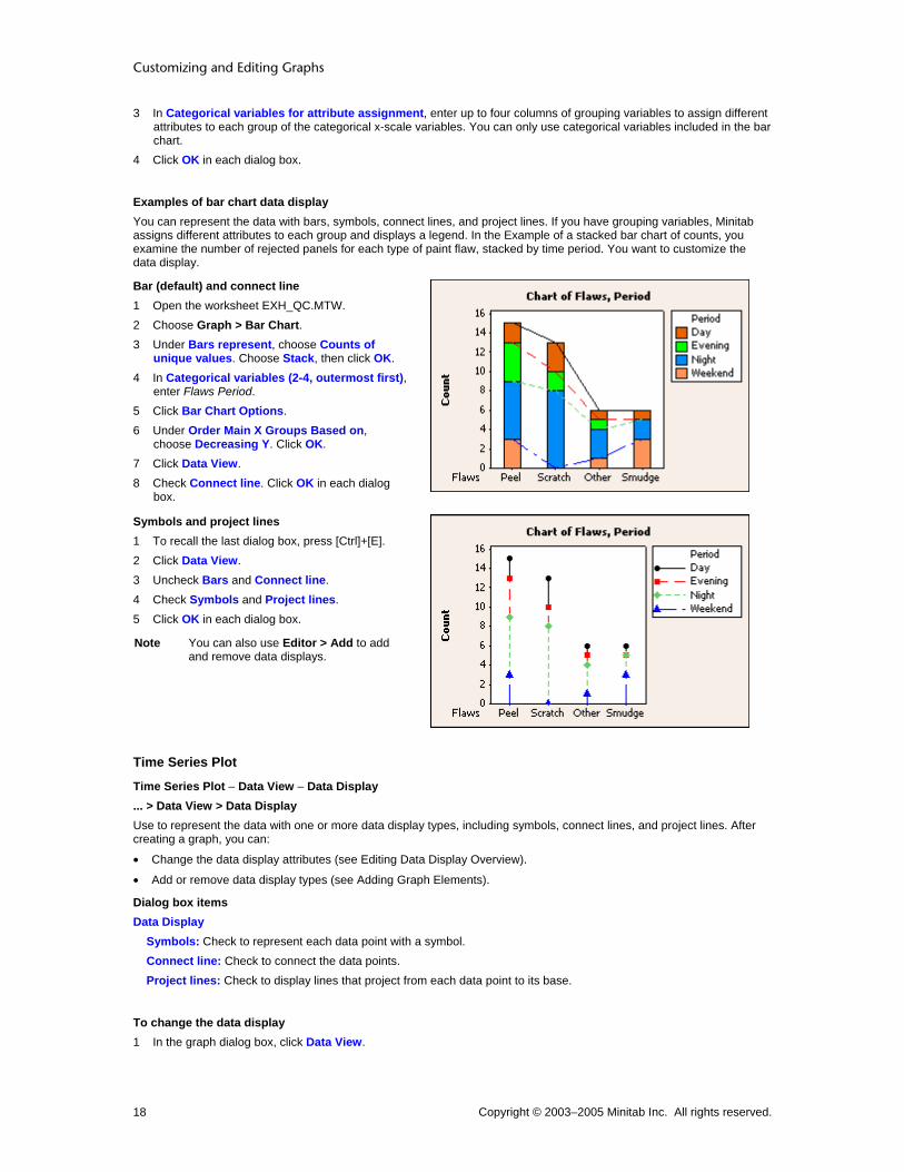
Examples of bar chart data display You can represent the data with bars, symbols, connect lines, and project lines. If you have grouping variables, Minitab assigns different attributes to each group and displays a legend. In the Example of a stacked bar chart of counts, you examine the number of rejected panels for each type of paint flaw, stacked by time period. You want to customize the data display.
Bar (default) and connect line 1 Open the worksheet EXH_QC.MTW. 2 Choose Graph > Bar Chart. 3 Under Bars represent, choose Counts of
unique values. Choose Stack, then click OK. 4 In Categorical variables (2-4, outermost first),
enter Flaws Period. 5 Click Bar Chart Options. 6 Under Order Main X Groups Based on,
choose Decreasing Y. Click OK. 7 Click Data View. 8 Check Connect line. Click OK in each dialog
box.
Symbols and project lines 1 To recall the last dialog box, press [Ctrl]+[E]. 2 Click Data View. 3 Uncheck Bars and Connect line. 4 Check Symbols and Project lines. 5 Click OK in each dialog box.
Note You can also use Editor > Add to add and remove data displays.
Time Series Plot
Time Series Plot − Data View − Data Display ... > Data View > Data Display Use to represent the data with one or more data display types, including symbols, connect lines, and project lines. After creating a graph, you can:
• Change the data display attributes (see Editing Data Display Overview).
• Add or remove data display types (see Adding Graph Elements).
Dialog box items Data Display
Symbols: Check to represent each data point with a symbol. Connect line: Check to connect the data points. Project lines: Check to display lines that project from each data point to its base.
To change the data display 1 In the graph dialog box, click Data View.

Customizing Graphs
Copyright © 2003–2005 Minitab Inc. All rights reserved. 19
2 Under Data Display, check one or more of the following: • Symbols to represent each data point with a symbol. • Connect line to connect the data points. • Project lines to display lines that project from each data point to its base.
3 Click OK in each dialog box.
Example of time series data display You can represent the data with symbols, connect lines, and project lines. You can also fit a lowess smoother to the data. If you have grouping variables, Minitab assigns different attributes to each group and displays a legend. In the Example of a simple time series plot, you track a company's quarterly sales over three years. You want to customize the data display.
Symbols (default) and project lines 1 Open the worksheet NEWMARKET.MTW. 2 Choose Graph > Time Series Plot. 3 Choose Simple, then click OK. 4 In Series, enter SalesB. 5 Click Time/Scale. 6 Under Time Scale, choose Calendar. Then
choose Quarter Year. 7 Under Start Values, choose One set for all
variables. 8 Under Quarter, type 1. Under Year, type 2000.
Click OK. 9 Click Data View. 10 Uncheck Connect line. Check Project lines. 11 Click OK in each dialog box.
Contour Plot
Contour Plot − Data View − Data Display ... > Data View > Data Display Use to represent the data with one or more data display types, including areas, contour lines, and symbols. After creating a graph, you can:
• Change the data display attributes (see Editing Data Display Overview).
• Add or remove data display types (see Adding Graph Elements).
More Use Tools > Options > Individual Graphs > Contour Plots > Options to set the default data display.
Dialog box items Data Display
Area: Check to shade the areas between contours. Contour lines: Check to draw contour lines. Symbols: Check to represent each x-y data point with a symbol.
To change the data display 1 In the graph dialog box, click Data View. 2 Under Data Display, check one or more of the following:
• Area to shade the areas between contours. • Contour lines to draw contour lines. • Symbols to represent each x-y data point with a symbol.
3 Click OK in each dialog box.
Customizing and Editing Graphs
Copyright © 2003–2005 Minitab Inc. All rights reserved. 20
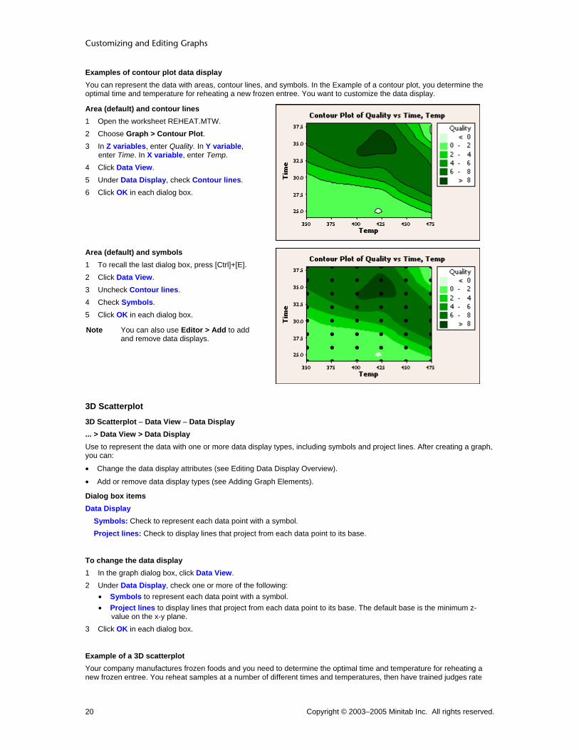
Examples of contour plot data display You can represent the data with areas, contour lines, and symbols. In the Example of a contour plot, you determine the optimal time and temperature for reheating a new frozen entree. You want to customize the data display.
Area (default) and contour lines 1 Open the worksheet REHEAT.MTW. 2 Choose Graph > Contour Plot. 3 In Z variables, enter Quality. In Y variable,
enter Time. In X variable, enter Temp. 4 Click Data View. 5 Under Data Display, check Contour lines. 6 Click OK in each dialog box.
Area (default) and symbols 1 To recall the last dialog box, press [Ctrl]+[E]. 2 Click Data View. 3 Uncheck Contour lines. 4 Check Symbols. 5 Click OK in each dialog box.
Note You can also use Editor > Add to add and remove data displays.
3D Scatterplot
3D Scatterplot − Data View − Data Display ... > Data View > Data Display Use to represent the data with one or more data display types, including symbols and project lines. After creating a graph, you can:
• Change the data display attributes (see Editing Data Display Overview).
• Add or remove data display types (see Adding Graph Elements).
Dialog box items Data Display
Symbols: Check to represent each data point with a symbol. Project lines: Check to display lines that project from each data point to its base.
To change the data display 1 In the graph dialog box, click Data View. 2 Under Data Display, check one or more of the following:
• Symbols to represent each data point with a symbol. • Project lines to display lines that project from each data point to its base. The default base is the minimum z-
value on the x-y plane. 3 Click OK in each dialog box.
Example of a 3D scatterplot Your company manufactures frozen foods and you need to determine the optimal time and temperature for reheating a new frozen entree. You reheat samples at a number of different times and temperatures, then have trained judges rate

Customizing Graphs
Copyright © 2003–2005 Minitab Inc. All rights reserved. 21
each for overall quality on a scale of 0 (not enjoyable) − 10 (most enjoyable). Create a 3D scatterplot with project lines to illustrate the average quality scores. 1 Open the worksheet REHEAT.MTW. 2 Choose Graph > 3D Scatterplot. 3 Choose Simple, then click OK. 4 In Z variable, enter Quality. In Y variable, enter Time. In X variable, enter Temp. 5 Click Data View. 6 Under Data Display, check Project lines. Click OK in each dialog box.
Graph window output
Interpreting the results Reheating at the shorter time intervals results in under-cooked product and low quality scores. However, reheating at the longest intervals combined with the highest temperatures also results in low scores because the food becomes over-cooked. The optimal settings appear to be between 400° and 450° and between about 30 and 36 minutes. Adding the project lines helps you visualize each point's position in three-dimensional space. Rotating the graph and viewing it from different angles can also help. Additional examples that help visualize these data include:
• Scatterplot with connect line
• Scatterplot with connect lines and groups
• 3D surface plot
• 3D wireframe plot
• Contour plot
Example of a 3D scatterplot with groups Your company manufactures frozen foods and you need to determine the optimal time and temperature for reheating a new frozen entree. You randomly assign two operators to reheat samples at a number of different times and temperatures. Three trained judges then rate each sample for overall quality on a scale of 0 (not enjoyable) − 10 (most enjoyable), and the average quality scores are recorded. Create a 3D scatterplot with project lines grouped by operator to illustrate the quality scores. 1 Open the worksheet REHEAT.MTW. 2 Choose Graph > 3D Scatterplot. 3 Choose With Groups, then click OK. 4 In Z variable, enter Quality. In Y variable, enter Time. In X variable, enter Temp. 5 In Categorical variables for grouping (0-3), enter Operator. 6 Click Data View. 7 Under Data Display, check Project lines. Click OK in each dialog box.

Customizing and Editing Graphs
Copyright © 2003–2005 Minitab Inc. All rights reserved. 22
Graph window output
Interpreting the results The operator does not appear to make a systematic difference in perceived quality. Reheating at the shorter time intervals results in under-cooked product and low quality scores. However, reheating at the longest intervals combined with the highest temperatures also results in low scores because the food becomes over-cooked. The optimal settings appear to be between 400° and 450° and between about 30 and 36 minutes. Adding the project lines helps you visualize each point's position in three-dimensional space. Rotating the graph and viewing it from different angles can also help. Additional examples that help visualize these data include:
• Scatterplot with connect line
• Scatterplot with connect lines and groups
• 3D surface plot
• 3D wireframe plot
• Contour plot
3D Surface Plot
3D Surface Plot − Data View − Data Display ... > Data View > Data Display Use to represent the data with one or more data display types, including a surface, symbols, and project lines. After creating a graph, you can:
• Change the data display attributes (see Editing Data Display Overview).
• Add or remove data display types (see Adding Graph Elements).
Dialog box items Data Display
Surface: Check to display a continuous surface of z-values (surface plot) or a grid of z-values (wireframe plot) that is fit to your data. Symbols: Check to represent each data point with a symbol. Project lines: Check to display lines that project from each data point to its base.
To change the data display 1 In the graph dialog box, click Data View. 2 Under Data Display, check one or more of the following:
• Surface to display continuous surface of z-values (surface plot) or a grid of z-values (wireframe plot) that is fitted to your data by interpolation.
• Symbols to represent each data point with a symbol.

Customizing Graphs
Copyright © 2003–2005 Minitab Inc. All rights reserved. 23
• Project lines to display lines that project from each data point to its base. The default base is the minimum z-value on the x-y plane.
3 Click OK in each dialog box.
Examples of 3D surface plot data display You can represent the data with a surface, symbols, and project lines. If you have grouping variables, Minitab assigns different attributes to each group and displays a legend. In the Example of a 3D surface plot, you determine the optimal time and temperature for reheating a new frozen entree. You want to customize the data display.
3D surface plot (surface only) 1 Open the worksheet
REHEAT.MTW. 2 Choose Graph > 3D Surface
Plot. 3 Choose Surface, then click OK. 4 In Z variable, enter Quality. In Y
variable, enter Time. In X variable, enter Temp.
5 Click OK.
3D surface plot (surface and project lines) 1 To recall the last dialog box,
press [Ctrl]+[E]. 2 Click Data View. 3 Check Surface and Project
lines. 4 Click OK in each dialog box.
3D wireframe plot (surface only) 1 Choose Graph > 3D Surface
Plot. 2 Choose Wireframe, then click
OK. 3 In Z variable, enter Quality. In Y
variable, enter Time. In X variable, enter Temp.
4 Click OK.
Customizing and Editing Graphs
Copyright © 2003–2005 Minitab Inc. All rights reserved. 24
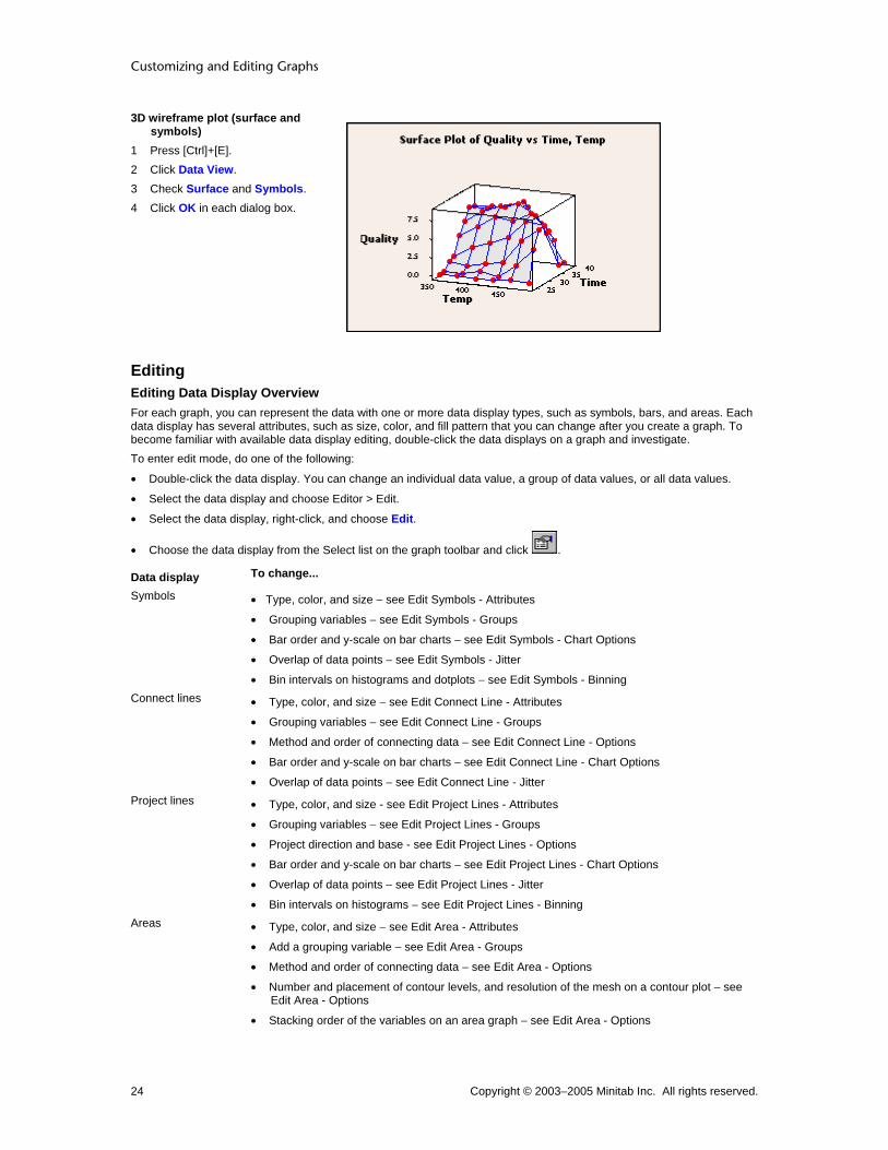
3D wireframe plot (surface and symbols)
1 Press [Ctrl]+[E]. 2 Click Data View. 3 Check Surface and Symbols. 4 Click OK in each dialog box.
Editing Editing Data Display Overview For each graph, you can represent the data with one or more data display types, such as symbols, bars, and areas. Each data display has several attributes, such as size, color, and fill pattern that you can change after you create a graph. To become familiar with available data display editing, double-click the data displays on a graph and investigate. To enter edit mode, do one of the following:
• Double-click the data display. You can change an individual data value, a group of data values, or all data values.
• Select the data display and choose Editor > Edit.
• Select the data display, right-click, and choose Edit.
• Choose the data display from the Select list on the graph toolbar and click .
Data display To change...
Symbols • Type, color, and size − see Edit Symbols - Attributes
• Grouping variables − see Edit Symbols - Groups
• Bar order and y-scale on bar charts − see Edit Symbols - Chart Options
• Overlap of data points − see Edit Symbols - Jitter
• Bin intervals on histograms and dotplots − see Edit Symbols - Binning Connect lines • Type, color, and size − see Edit Connect Line - Attributes
• Grouping variables − see Edit Connect Line - Groups
• Method and order of connecting data − see Edit Connect Line - Options
• Bar order and y-scale on bar charts − see Edit Connect Line - Chart Options
• Overlap of data points − see Edit Connect Line - Jitter Project lines • Type, color, and size - see Edit Project Lines - Attributes
• Grouping variables − see Edit Project Lines - Groups
• Project direction and base - see Edit Project Lines - Options
• Bar order and y-scale on bar charts − see Edit Project Lines - Chart Options
• Overlap of data points − see Edit Project Lines - Jitter
• Bin intervals on histograms − see Edit Project Lines - Binning Areas • Type, color, and size − see Edit Area - Attributes
• Add a grouping variable − see Edit Area - Groups
• Method and order of connecting data − see Edit Area - Options
• Number and placement of contour levels, and resolution of the mesh on a contour plot − see Edit Area - Options
• Stacking order of the variables on an area graph − see Edit Area - Options

Customizing Graphs
Copyright © 2003–2005 Minitab Inc. All rights reserved. 25
• Overlap of data points − see Edit Area - Jitter
• Bin intervals on histograms − see Edit Area - Binning Bars • Type, color, and size − see Edit Bars - Attributes
• Grouping variables − see Edit Bars - Groups
• Bar order and y-scale on bar charts − see Edit Bars - Chart Options
• Bin intervals on histograms − see Edit Bars - Binning Boxes • Type, color, and size − see Edit Box - Attributes
• Grouping variables − see Edit Box - Groups
• Box characteristics, such as endpoint type, whiskers, and width − see Edit Box - Options
In addition to the data displays described in the table above, you can also edit interval bars, contour lines, dots, pie slices, and 3D surfaces.
Area
Area
Graph Attributes Groups Options Jitter Binning Scatterplot Matrix Plot Histogram Area Graph Contour Plot
Edit Area − Attributes Select area > Editor > Edit Area > Attributes Use to customize area fill and border attributes on a scatterplot, matrix plot, histogram, or area graph. You can also customize the area attributes on a contour plot.
Dialog box items Fill Pattern
Automatic: Choose to accept the default fill pattern. Custom: Choose customize the fill pattern.
Type: Choose a fill type. Background color: Choose a background color.
Borders and Fill Lines Automatic: Choose to accept the default border and fill lines. Custom: Choose to customize the border and fill lines.
Type: Choose a border line type. Color: Choose a border and fill line color. Size: Choose a border line width.
To change fill attributes (areas, bars, boxes, and pie slices) 1 Select and double-click one or more areas, bars, boxes, or pie slices. See Selecting groups and single items. 2 Under Fill Pattern, choose one of the following:
• Automatic to accept the default fill pattern. • Custom to customize the fill pattern.
− From Type, choose a fill type.
− From Background color, choose a background color.
3 Under Borders and Fill Lines, choose one of the following:

Customizing and Editing Graphs
Copyright © 2003–2005 Minitab Inc. All rights reserved. 26
• Automatic to accept the default border and fill lines. • Custom to customize the border and fill lines.
− From Type, choose a border line type.
− From Color, choose a border and fill line color.
− From Size, choose a border line width.
4 Click OK.
Edit Area − Attributes Select contour areas > Editor > Edit Area > Attributes Use to customize contour area color and pattern on a contour plot. You can also customize the area attributes on a scatterplot, matrix plot, histogram or area graph.
Dialog box items Fill Color
One-color ramp: Choose to represent the contour areas using one color. (Only available if the contour plot has less than six levels. If you reduce the number of levels to be less than six in the Options tab, you must click OK before Minitab enables the Attributes tab.)
Color: Choose a color (red, blue, green, or gray) to represent the z-values. The darkest shade of this color represents the highest values.
Two-color ramp: Choose to represent the contour areas using two different colors. Low-end color: Choose a color to represent the lower z-values. The darkest shade of this color represents the lowest values. High-end color: Choose a color to represent the higher z-values. The darkest shade of this color represents the highest values.
Custom colors: Choose to select colors individually for each of the contour areas. Levels: Identifies the values for each contour area. This column does not take any input. Color: Choose a color for each contour area. Fill Type: Choose a fill type for each contour area.
To change area attributes 1 Double-click any contour area. 2 Under Fill Color, choose one of the following:
• One-color ramp to represent the contour areas using one color. (Only available if the contour plot has less than six levels. If you reduce the number of levels to be less than six in the Options tab, you must click OK before Minitab enables the Attributes tab.)
− From Color, choose a color to represent the z-values. The darkest shade of this color represents the highest values.
• Two-color ramp to represent the contour areas using two different colors.
− From Low-end Color, choose a color to represent the lower z-values. The darkest shade of this color represents the lowest values.
− From High-end Color, choose a color to represent the higher z-values. The darkest shade of this color represents the highest values.
• Custom colors to select colors individually for each of the contour areas.
− Under Color, choose a color for each contour area. Row 1 is for the lowest z-values.
− Under Fill Type, choose a fill type for each contour area. Row 1 is for the lowest z-values.
4 Click OK.
Edit Area − Binning Select area > Editor > Edit Area > Binning Use to define bin intervals by midpoints or cutpoints.
Dialog box items Interval Type

Customizing Graphs
Copyright © 2003–2005 Minitab Inc. All rights reserved. 27
Midpoint: Choose to define bin intervals by midpoints. Cutpoint: Choose to define bin intervals by cutpoints.
Interval Definition Automatic: Choose to accept the default number of bins. Number of intervals: Choose and enter the number of bins. Midpoint/Cutpoint positions: Choose and enter custom midpoint or cutpoint positions.
To change the binning 1 Double-click the area, bars, dots, symbols, or lowess smoother. 2 Click the Binning tab. 3 Under Interval Type, choose Midpoint or Cutpoint to define bin intervals by midpoints or cutpoints. 4 Under Interval Definition, choose one of the following to determine the number of bins:
• Automatic to accept the default number of bins. • Number of intervals, then enter the number of bins. • Midpoint/Cutpoint positions, then enter custom midpoint or cutpoint positions.
5 Click OK.
Edit Area − Groups Select all areas > Editor > Edit Area > Groups Use to add, remove, or change the grouping variables on a scatterplot, matrix plot, or histogram.
Dialog box items Categorical variables for grouping: Enter up to three columns of grouping variables to assign different attributes for each group and display a legend. Apply same grouping to other data displays: Check to update all data displays, such as symbols and project lines, to use the same grouping variables as the area. (Available for scatterplots and matrix plots. For histograms, Minitab automatically assigns the grouping variable to all data displays.)
To change the grouping variables 1 Select and double-click all areas, symbols, project lines, bars, or connect lines. See Selecting groups and single
items. 2 Click the Groups tab. 3 In Categorical variables for grouping, enter up to four columns containing categorical grouping variables. Minitab
assigns different attributes to each group and displays a legend. 4 If you like, check Apply same grouping to other data displays to assign the group attributes to all data displays on
the graph. (Not available with histograms, probability plots, or empirical cdf graphs.) 5 Click OK.
Edit Area − Options Select areas > Editor > Edit Area > Options Use to customize area projection direction, connection function, and base position on a scatterplot or matrix plot. You can also change the area options on a contour plot or area graph.
Dialog box items Projection Direction
Toward Y scale: Choose to extend areas horizontally towards the y-axis. Toward X scale: Choose to extend areas vertically towards the x-axis.
Connection Function Straight: Choose to connect points with straight lines, then fill the area underneath. Step: Choose to connect points using a step pattern. Choose Left to make steps with each point at the left of a step level, Center to put each point in the middle of the step level (the default), or Right to put each point to the right of the step level.
Base Position

Customizing and Editing Graphs
Copyright © 2003–2005 Minitab Inc. All rights reserved. 28
Auto: Choose to use the default base, which is the minimum data value for the y-scale. Custom: Enter a number for the base. Areas extend from the data value to the base.
To change the area options 1 Double-click the area. See Selecting groups and single items. 2 Click the Options tab. 3 Under Projection Direction, choose one of the following:
• Toward Y scale to extend areas horizontally towards the y-axis. • Toward X scale to extend areas vertically towards the x-axis.
4 Under Connection Function, choose one of the following: • Straight to connect points with straight lines, then fill the area underneath. • Step to connect points using a step pattern. Choose Left to make steps with each point at the left of a step level,
Center to put each point in the middle of the step level (the default), or Right to put each point to the right of the step level.
5 Under Base Position, choose one of the following: • Auto to use the default base, which is the minimum data value for the y-scale. • Custom to define your own base, then enter a number for the base. Areas extend from the data value to the base.
Tip You can add a horizontal or vertical base line by adding a reference line that has the same data value as your base. See Reference Line Overview.
6 Click OK.
Edit Area − Options Select all areas > Editor > Edit > Options Use to customize the stacking order of the variables on an area graph. You can also change the area options on a contour plot, and a scatterplot or matrix plot.
Dialog box items Variable Order
Column order (first on top): Choose to stack the variables in the order they are entered in the dialog box, with the first variable you enter on top of the stack. Variation order (largest on top): Choose to stack the variables by the degree of variation, with the variable demonstrating the largest variation on top of the stack.
To change the stacking order 1 Select and double-click all areas. See Selecting groups and single items. 2 Click the Options tab. 3 Under Variable Order, choose one of the following:
• Column order (first on top) to stack the variables in the order they are entered in the dialog box, with the first variable you enter on top of the stack.
• Variation order (largest on top) to stack the variables by the degree of variation, with the variable demonstrating the largest variation on top of the stack.
4 Click OK.
Edit Area − Options Select contour areas > Editor > Edit Area > Options Use to control the number and placement of contour levels, as well as the resolution of the mesh. Minitab establishes a series of regular x- and y-values, called a mesh, then estimates where the different contour levels will cross each rectangle of the mesh.

Customizing Graphs
Copyright © 2003–2005 Minitab Inc. All rights reserved. 29
5 by 5 mesh 15 by 15 mesh
Note Gridlines were added for reference, but do not necessarily indicate the exact layout of the mesh used to plot the contours.
By default, if your data form a regular x-y mesh, Minitab uses this mesh to estimate the contours. Otherwise, Minitab interpolates values for a regular 15 by 15 mesh. Alternatively, you can specify the number of x- and y-values to include:
• For higher resolution, use more values.
• For lower resolution, use fewer values.
Note Using a mesh with more and smaller intervals than exist between data points may appear to add more resolution to the image, but the added detail may not be meaningful.
Dialog box items Contour Levels
Automatic: Choose to accept the default number of contour levels. Number: Choose to specify the number of contour levels, then type a number between 2 and 11. Values: Choose to specify the z-values to plot as contours, then type from 2 to 11 values.
Mesh for Interpolating Surface Automatic: Choose to accept the default mesh. Custom: Choose to customize the mesh.
X-Mesh Number: Enter the number of x-values to include in the mesh. Y-Mesh Number: Enter the number of y-values to include in the mesh.
Boundary z-value: Enter a z-value to be used at the boundaries (corners and edges) of the plot if your data do not form a regular mesh. By default, Minitab uses the minimum z-value. (If your data follow a regular mesh, this option is not available. This option is not available with response surface or mixtures plots.)
To change the number of contours and mesh 1 Double-click any contour area or contour line. 2 Click the Options tab. 3 Under Contour Levels, choose one of the following:
• Automatic to accept the default number of contour levels. • Number to specify the number of contour levels, then enter a number between 2 and 11. • Values to specify the z-values to plot as contours, then enter from 2 to 11 values.
4 Under Mesh for Interpolating Surface, choose one of the following: • Automatic to accept the default mesh. • Custom to customize the mesh.
− In X-Mesh Number, enter the number of x-values to include in the mesh.
− In Y-Mesh Number, enter the number of y-values to include in the mesh.
5 In Boundary z-value, enter a z-value to be used at the boundaries (corners and edges) of the plot if your data do not form a regular mesh. By default, Minitab uses the minimum z-value. (If your data follow a regular mesh, this option is not available. This option is not available with response surface or mixtures plots.)
6 Click OK.

Customizing and Editing Graphs
Copyright © 2003–2005 Minitab Inc. All rights reserved. 30
Edit Area − Jitter Select all areas > Editor > Edit Area > Jitter Use to randomly offset (jitter) points to reveal overlapping points on a scatterplot or matrix plot. Because an area fills the space below the points, Minitab adjusts the area when the points are offset.
Dialog box items Add jitter to direction: Check to offset points so they do not overlap.
X: Type a number from 0 to 1 to specify the amount of jitter in the x-direction. Y: Type a number from 0 to 1 to specify the amount of jitter in the y-direction.
To add jitter 1 Select and double-click all areas, connect lines, project lines, or symbols. See Selecting groups and single items. 2 Click the Jitter tab. 3 Check Add jitter to direction to offset points so they do not overlap. Then:
• In X, type a number from 0 to 1 to specify the amount of jitter in the x-direction. • In Y, type a number from 0 to 1 to specify the amount of jitter in the y-direction. • (3D scatterplot only) In Z, type a number from 0 to 1 to specify the amount of jitter in the z-direction.
4 Click OK.
Examples of editing areas (area graph) In Example of an area graph, you examine the trends in employment in three industries in Wisconsin over five years: Wholesale and Retail Trade, Food and Kindred Products, and Fabricated Metals. You want to customize the areas.
Attributes Change the border size. 1 Double-click any area. 2 Under Borders and Fill Lines, choose
Custom. • From Size, choose 3.
3 Click OK.
Attributes Change the fill pattern and border size for one variable. 1 Select and double-click the Trade area.
See Selecting groups and single items for details.
2 Under Fill Pattern, choose Custom.
• From Type, choose . 3 Under Borders and Fill Lines, choose
Custom. • From Size, choose 1.
4 Click OK.
Examples of editing areas (contour plot) In Example of a contour plot, you examine the relationship between the time and temperature at which a frozen food was reheated and the quality of the final product. You want to customize the areas.

Customizing Graphs
Copyright © 2003–2005 Minitab Inc. All rights reserved. 31
Attributes Change the default colors. 1 Double-click a contour area. 2 Under Fill Color, choose Two-color ramp.
• From Low-end Color, choose Gray. • From High-end Color, choose Blue.
3 Click OK.
Options Increase the number of contour levels. 1 Double-click a contour area. 2 Click the Options tab. 3 Under Contour Levels, choose Number and
type 8. 4 Click OK.
Examples of editing areas (histogram) In the Example of a simple histogram, you determine the amount of torque required to remove shampoo bottle caps. You want to add and customize the areas.
Attributes Change the area fill pattern and color, and change the border width. 1 Choose Editor > Add > Data Display. 2 Under Data Display, uncheck Bars and check
Area. 3 Click OK. 4 Double-click the area. 5 Under Fill Pattern, choose Custom.
• From Type, choose . • From Background Color, choose .
6 Under Borders and Fill Lines, choose Custom. • From Size, choose 2.
7 Click OK.

Customizing and Editing Graphs
Copyright © 2003–2005 Minitab Inc. All rights reserved. 32
Groups Add a grouping variable. 1 Double-click the area. 2 Under Fill Pattern, choose Automatic. 3 Under Borders and Fill Lines, choose
Automatic. 4 Click the Groups tab. 5 In Categorical variables for grouping, enter
Machine. 6 Click OK.
Binning Change the number of bins. 1 Double-click the area. 2 Click the Binning tab. 3 Under Interval Definition, choose Number of
Interval. Enter 12. 4 Click OK.
Panel Display each group in a separate panel. 1 Choose Edit > Panel. 2 In By variables with groups in separate
panels, enter Machine. 3 Click OK.
Examples of editing areas (scatterplot or matrix plot) In the Example of a simple scatterplot, you examine the relationship between voltage remaining in your batteries immediately after a flash and the length of time required for a battery to be ready to support another flash. You want to add and customize the areas.
Note Similar area editing functions are available for matrix plots.

Customizing Graphs
Copyright © 2003–2005 Minitab Inc. All rights reserved. 33
Attributes Change the fill pattern and color. 1 Choose Editor > Add > Data Display. 2 Under Data Display, check Area. 3 Click OK. 4 Double-click the area. 5 Under Fill Pattern, choose Custom.
• From Type, choose . • From Background Color, choose .
6 Click OK.
Jitter Add random offset (jitter) points to reveal overlapping points. 1 Double-click the area. 2 Click the Jitter tab. 3 Check Add jitter to direction. 4 In X, enter 0.1. In Y, enter 0.25. 5 Click OK.
Options Change the connection function. 1 Double-click the area. 2 Click the Jitter tab. 3 Uncheck Add jitter to direction. 4 Click the Options tab. 5 Under Connection Function, choose Step.
Then choose Center. 6 Click OK.
Groups Add a grouping variable. 1 Double-click the area. 2 Click the Groups tab. 3 In Categorical variables for grouping, enter
Formulation. 4 Check Apply same grouping to other data
displays. Click OK. 5 Select and double-click the Old group. See
Selecting groups and single items for details. 6 Click the Attributes tab. 7 Under Fill Pattern, choose Custom.
• From Background Color, choose . 8 Click OK.

Customizing and Editing Graphs
Copyright © 2003–2005 Minitab Inc. All rights reserved. 34
Panel To improve visibility, display each group in a separate panel 1 Choose Editor > Panel. 2 In By variables with groups in separate
panels, enter Formulation. 3 Click OK.
Bars
Bars
Graph Attributes Groups Options Bar
Options Chart
Options Binning Marginal Plot (with histograms)
Histogram Interval Plot Individual Value Plot Bar Chart
Edit Bars − Attributes Select bars > Editor > Edit Bars > Attributes Use to customize bar fill and border attributes on a marginal plot, histogram, interval plot, individual value plot, or bar chart.
Dialog box items Fill Pattern
Automatic: Choose to accept the default fill pattern. Custom: Choose to customize the fill pattern.
Type: Choose a fill type. Background color: Choose a background color.
Borders and Fill Lines Automatic: Choose to accept the default border and fill lines. Custom: Choose to customize the border and fill lines.
Type: Choose a border line type. Color: Choose a border and fill line color. Size: Choose a border line width.
To change fill attributes (areas, bars, boxes, and pie slices) 1 Select and double-click one or more areas, bars, boxes, or pie slices. See Selecting groups and single items. 2 Under Fill Pattern, choose one of the following:
• Automatic to accept the default fill pattern. • Custom to customize the fill pattern.
− From Type, choose a fill type.
− From Background color, choose a background color.
Customizing Graphs
Copyright © 2003–2005 Minitab Inc. All rights reserved. 35
3 Under Borders and Fill Lines, choose one of the following: • Automatic to accept the default border and fill lines. • Custom to customize the border and fill lines.
− From Type, choose a border line type.
− From Color, choose a border and fill line color.
− From Size, choose a border line width.
4 Click OK.
Edit Bars − Options/Bar Options Select bar > Editor > Edit Bars > Options Select bar > Editor > Edit Bars > Bar Options (bar chart) Use to customize bar base position on a histogram, interval plot, individual value plot, or bar chart.
Dialog box items Base Position
Auto: Choose to use the default base. Custom: Choose and enter a number for the base. Bars extend from the data value to the base.
To change the base 1 Select and double-click one or more bars. See Selecting groups and single items. 2 Click the Options or Bar Options tab. 3 Under Base Position, choose one of the following:
• Auto to use the default base. • Custom to define your own base, then enter a number for the base. Bars extend from the data value to the base.
4 Click OK.
Edit Bars − Binning Select bars > Editor > Edit Bars > Binning Use to define bin intervals by midpoints or cutpoints.
Dialog box items Interval Type
Midpoint: Choose to define bin intervals by midpoints. Cutpoint: Choose to define bin intervals by cutpoints.
Interval Definition Automatic: Choose to accept the default number of bins. Number of intervals: Choose and enter the number of bins. Midpoint/Cutpoint positions: Choose and enter custom midpoint or cutpoint positions.
To change the binning 1 Double-click the area, bars, dots, symbols, or lowess smoother. 2 Click the Binning tab. 3 Under Interval Type, choose Midpoint or Cutpoint to define bin intervals by midpoints or cutpoints. 4 Under Interval Definition, choose one of the following to determine the number of bins:
• Automatic to accept the default number of bins. • Number of intervals, then enter the number of bins. • Midpoint/Cutpoint positions, then enter custom midpoint or cutpoint positions.
5 Click OK.

Customizing and Editing Graphs
Copyright © 2003–2005 Minitab Inc. All rights reserved. 36
Edit Bars − Groups Select all bars > Editor > Edit Bars > Groups Use to add, remove, or change the attribute grouping variables on a histogram. You can also change the groups on interval plots, individual value plots, and bar charts.
Dialog box items Categorical variables for grouping: Enter up to four columns of categorical grouping variables to assign different attributes to each group and display a legend.
To change the grouping variables 1 Select and double-click all areas, symbols, project lines, bars, or connect lines. See Selecting groups and single
items. 2 Click the Groups tab. 3 In Categorical variables for grouping, enter up to four columns containing categorical grouping variables. Minitab
assigns different attributes to each group and displays a legend. 4 If you like, check Apply same grouping to other data displays to assign the group attributes to all data displays on
the graph. (Not available with histograms, probability plots, or empirical cdf graphs.) 5 Click OK.
Edit Bars − Groups Select all bars > Editor > Edit Bars > Groups If you have grouping variables on an interval plot, individual value plot, or bar chart, you can assign different attributes to each group. You can also change the groups on a histogram.
Dialog box items Categorical variables for attribute assignment: Enter up to four columns of categorical grouping variables to assign different attributes to each group and display a legend. Apply attribute variables to other data displays: Check to update all data displays, such as symbols and connect lines, to use the same attribute variables as the bars.
To assign attributes based on grouping variables 1 Select and double-click all boxes, bars, connect lines, dots, interval bars, or project lines. See Selecting groups and
single items. 2 Click the Groups tab. 3 In Categorical variables for attribute assignments, enter up to four columns of categorical grouping variables for
bar chart and three for other graphs. Minitab assigns different attributes to each group and may display a legend. 4 If you like, check Apply attribute variable to other data displays to assign the group attributes to all data displays
on the graph. (Not available with dotplots.) 5 Click OK.
Edit Bars − Chart Options Select all bars > Editor > Edit Bars > Chart Options Select bar chart > Editor > Graph Options Use to specify increasing or decreasing bar order, choose a cumulative y-scale, or choose a percent scale for the y-axis. If you have more than one categorical variable, use to specify the grouping level for calculating the scale and to stack data.
Dialog box items Order Main X Groups Based On Choose the order for the bars. See Ordering Category Groups Based on Y-Axis Values.
Default: Choose to use the default order for bars. For bar charts of counts of unique values and functions of a variable, the default order is ascending, either numerically, chronologically, or alphabetically. (To use a value order other than alphabetical for text categories, see Ordering text categories.) For bar charts of values from a table, the default order is always the order in which the categories appear in the worksheet; any value order is ignored. Increasing Y: Choose to order bars from smallest to largest y-values.
Customizing Graphs
Copyright © 2003–2005 Minitab Inc. All rights reserved. 37
Decreasing Y: Choose to order bars from largest to smallest y-values.
Note If the data have multiple categorical variables, Minitab orders the bars by the sum of chart values for the outermost cluster groups.
Show Y as Percent: Check to use a percent scale on the y-axis. See Using Percent Scales and Accumulating Y Across X. Accumulate Y across X: Check to use a cumulative scale on the y-axis. See Using Percent Scales and Accumulating Y Across X. Take Percent and/or Accumulate If you have two or more categorical variables, specify for which grouping level you want to show y as a percent and/or accumulate y across x. The options available depend on the number of categorical variables that are included in the bar chart. For more information, see Using Percent Scales and Accumulating Y Across X.
Across all categories: Choose to apply a percent scale and/or cumulative scale across all categories. Within categories at level 1 (outermost): Choose to apply a percent scale and/or cumulative scale within categories at the outermost scale level only. Within categories at level 2: Choose to apply a percent scale and/or cumulative scale within categories at the second grouping level from the bottom only. Within categories at level 3: Choose to apply a percent scale and/or cumulative scale within categories at the third grouping level from the bottom only.
Stack values for last categorical variable: Check to stack the categories for the last categorical variable. Each category is represented by a separate segment of a bar. (Only available if you have two or more categorical variables.)
To change the bar order and y-scale 1 Select and double-click all bars, connect lines, project lines, or symbols. See Selecting groups and single items. 2 Click the Chart Options tab. 3 Under Order Main X Groups Based On, choose one of the following:
• Default to arrange the bars based on the variable type: numeric in ascending order, date/time in increasing chronological order, and text in alphabetical order. To change the display order for text categories, see Ordering text categories.
• Increasing Y to order bars from smallest to largest y-values. • Decreasing Y to order bars from largest to smallest y-values. See Ordering Category Groups Based on Y-Axis Values.
4 Check Show Y as Percent to use a percent scale on the y-axis. See Using Percent Scales and Accumulating Y Across X.
5 Check Accumulate Y across X to use a cumulative scale on the y-axis. See Using Percent Scales and Accumulating Y Across X.
6 Under Take Percent and/or Accumulate, choose one of the following. The options available depend on how many categorical variables are included in the bar chart. For more information, see Using Percent Scales and Accumulating Y Across X. • Across all categories to apply a percent scale and/or cumulative scale across all categories. • Within categories at level 1 (outermost) to apply a percent scale and/or cumulative scale within categories at the
outermost scale level only. • Within categories at level 2 to apply a percent scale and/or cumulative scale within categories at the second
grouping level from the bottom only. • Within categories at level 3 to apply a percent scale and/or cumulative scale within categories at the third
grouping level from the bottom only. 7 Check Stack values for last categorical variable to stack the categories for the last categorical variable. Each
category is represented by a separate segment of a bar. (Only available if you have two or more categorical variables.)
8 Click OK.
Examples of editing bars (bar chart) In the Example of a simple bar chart of counts, you examine the number of rejected door panels for each type of paint flaw. You want to customize the bars.

Customizing and Editing Graphs
Copyright © 2003–2005 Minitab Inc. All rights reserved. 38
Attributes Change the fill pattern and color, and change the fill line color. 1 Select and double-click all bars. 2 Under Fill Pattern, choose Custom.
• From Type, choose . • From Background Color, choose .
3 Under Borders and Fill Lines, choose Custom. • From Color, choose .
4 Click OK.
Bar options Change the base. 1 Select and double-click all bars. 2 Click the Bar Options tab. 3 Under Base Position, choose Custom.
Then enter 5. 4 Click OK.
Bar options Change the bar order and scale. 1 Select and double-click all bars. 2 Click the Bar Options tab. 3 Under Base Position, choose Automatic. 4 Click the Chart Options tab. 5 Under Order Main X Groups Based On,
choose Increasing Y. 6 Check Show Y as Percent. 7 Click OK.
Groups Add a grouping variable. 1 Select and double-click all bars. 2 Under Fill Pattern, choose Auto. 3 Under Borders and Fill Lines, choose
Automatic. 4 Click the Groups tab. 5 In Categorical variables for attribute
assignment, enter Flaws. 6 Click OK.

Customizing Graphs
Copyright © 2003–2005 Minitab Inc. All rights reserved. 39
Examples of editing bars (histogram) In the Example of a simple histogram, you examine the amount of torque required to remove shampoo bottle caps. You want to edit the bars.
Attributes Change the fill pattern and color, and change the border color and size. 1 Select and double-click all bars. 2 Under Fill Pattern, choose Custom.
• From Type, choose . • From Background Color, choose .
3 Under Borders and Fill Lines, choose Custom. • From Color, choose . • From Size, choose 2.
4 Click OK.
Options Change the base. 1 Select and double-click all bars. 2 Click the Options tab. 3 Under Base Position, choose Custom. Then
enter 5. 4 Click OK.
Groups Add a grouping variable. 1 Select and double-click all bars. 2 Under Fill Pattern, choose Automatic. 3 Under Borders and Fill Lines, choose
Automatic. 4 Click the Options tab. 5 Under Base Position, choose Automatic. 6 Click the Groups tab. 7 In Categorical variables for grouping, enter
Machine. 8 Click OK.
Panels To improve visibility, display each group in a separate panel 1 Choose Edit > Panel. 2 In By variables with groups in separate
panels, enter Machine. 3 Click OK.
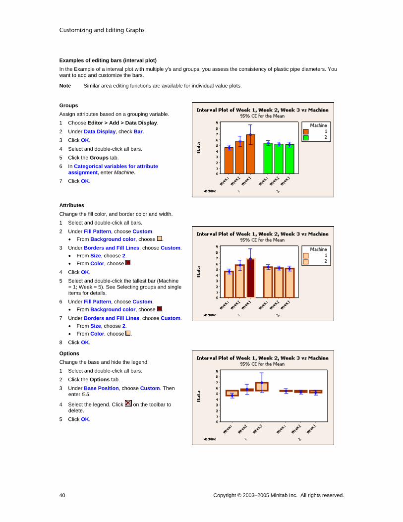
Customizing and Editing Graphs
Copyright © 2003–2005 Minitab Inc. All rights reserved. 40
Examples of editing bars (interval plot) In the Example of a interval plot with multiple y's and groups, you assess the consistency of plastic pipe diameters. You want to add and customize the bars.
Note Similar area editing functions are available for individual value plots.
Groups Assign attributes based on a grouping variable. 1 Choose Editor > Add > Data Display. 2 Under Data Display, check Bar. 3 Click OK. 4 Select and double-click all bars. 5 Click the Groups tab. 6 In Categorical variables for attribute
assignment, enter Machine. 7 Click OK.
Attributes Change the fill color, and border color and width. 1 Select and double-click all bars. 2 Under Fill Pattern, choose Custom.
• From Background color, choose . 3 Under Borders and Fill Lines, choose Custom.
• From Size, choose 2. • From Color, choose .
4 Click OK. 5 Select and double-click the tallest bar (Machine
= 1; Week = 5). See Selecting groups and single items for details.
6 Under Fill Pattern, choose Custom. • From Background color, choose .
7 Under Borders and Fill Lines, choose Custom. • From Size, choose 2. • From Color, choose .
8 Click OK.
Options Change the base and hide the legend. 1 Select and double-click all bars. 2 Click the Options tab. 3 Under Base Position, choose Custom. Then
enter 5.5.
4 Select the legend. Click on the toolbar to delete.
5 Click OK.
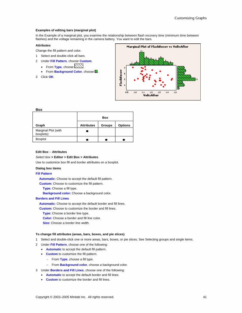
Customizing Graphs
Copyright © 2003–2005 Minitab Inc. All rights reserved. 41
Examples of editing bars (marginal plot) In the Example of a marginal plot, you examine the relationship between flash recovery time (minimum time between flashes) and the voltage remaining in the camera battery. You want to edit the bars.
Attributes Change the fill pattern and color. 1 Select and double-click all bars. 2 Under Fill Pattern, choose Custom.
• From Type, choose . • From Background Color, choose .
3 Click OK.
Box
Box
Graph Attributes Groups Options Marginal Plot (with boxplots)
Boxplot
Edit Box − Attributes Select box > Editor > Edit Box > Attributes Use to customize box fill and border attributes on a boxplot.
Dialog box items Fill Pattern
Automatic: Choose to accept the default fill pattern. Custom: Choose to customize the fill pattern.
Type: Choose a fill type. Background color: Choose a background color.
Borders and Fill Lines Automatic: Choose to accept the default border and fill lines. Custom: Choose to customize the border and fill lines.
Type: Choose a border line type. Color: Choose a border and fill line color. Size: Choose a border line width.
To change fill attributes (areas, bars, boxes, and pie slices) 1 Select and double-click one or more areas, bars, boxes, or pie slices. See Selecting groups and single items. 2 Under Fill Pattern, choose one of the following:
• Automatic to accept the default fill pattern. • Custom to customize the fill pattern.
− From Type, choose a fill type.
− From Background color, choose a background color.
3 Under Borders and Fill Lines, choose one of the following: • Automatic to accept the default border and fill lines. • Custom to customize the border and fill lines.

Customizing and Editing Graphs
Copyright © 2003–2005 Minitab Inc. All rights reserved. 42
− From Type, choose a border line type.
− From Color, choose a border and fill line color.
− From Size, choose a border line width.
4 Click OK.
Edit Box − Groups Select all boxes > Editor > Edit Box > Groups If you have grouping variables on a boxplot, you can assign different attributes to each group.
Dialog box items Categorical variables for attribute assignment: Enter up to four columns of categorical grouping variables to assign different attributes for each group and display a legend. Apply attribute variables to other data displays: Check to update all data displays, such as symbols and connect lines, to use the same attribute variables as the boxes.
To assign attributes based on grouping variables 1 Select and double-click all boxes, bars, connect lines, dots, interval bars, or project lines. See Selecting groups and
single items. 2 Click the Groups tab. 3 In Categorical variables for attribute assignments, enter up to four columns of categorical grouping variables for
bar chart and three for other graphs. Minitab assigns different attributes to each group and may display a legend. 4 If you like, check Apply attribute variable to other data displays to assign the group attributes to all data displays
on the graph. (Not available with dotplots.) 5 Click OK.
Edit Interquartile Range Box − Options Select all interquartile range boxes > Editor > Edit Interquartile Range Box > Options Use to customize interquartile range box endpoints or width, or suppress/display the whiskers on a boxplot.
Dialog box items Box endpoints
Quartiles: Choose to display the box bottom at the 1st quartile (25th percentile) and box top at the 3rd quartile (75th percentile). Hinges: Choose to use the hinges for the box endpoints. Percentile: Choose to specify the percentiles for the box bottom and top, then enter one number between 0 and 50 for the percentile.
Whiskers None: Choose to suppress display of whiskers. Show: Choose to display whiskers.
Box width proportional to sample size: Check to make the width of each box proportional to the square root of the number of observations in the box.
Note You can change the spacing between the x-scale categories, which also changes box width, see Edit Categorical Scale - Scale.
To change the box endpoints, box width, and display whiskers 1 Double-click all interquartile range boxes. See Selecting groups and single items. 2 Click the Options tab. 3 Under Box endpoints, choose one of the following:
• Quartiles to display the box bottom at the 1st quartile (25th percentile) and box top at the 3rd quartile (75th percentile).
• Hinges to use the hinges for the box endpoints. • Percentile to specify the percentiles for the box bottom and top, then enter one number between 0 and 50 for the
percentile.

Customizing Graphs
Copyright © 2003–2005 Minitab Inc. All rights reserved. 43
4 Under Whiskers, choose one of the following: • None to suppress display of whiskers. • Show to display whiskers.
5 Check Box width proportional to sample size to make the width of each box proportional to the square root of the number of observations in each group.
6 Click OK.
Edit Median Confidence Interval Box − Options Select all median confidence interval boxes > Editor > Edit Confidence Interval Box > Options Use to customize the median confidence interval box on a boxplot.
Dialog box items Confidence level: Enter a number between 0 and 100 to specify the confidence level. The default is 95%. The box endpoints correspond to the values of a confidence interval for the median based on the sign test. Whiskers
None: Choose to suppress display of whiskers. Show: Choose to display whiskers.
Box width proportional to sample size: Check to make the width of each box proportional to the square root of the number of observations in the box.
To change the median confidence interval box 1 Select and double-click all boxes. See Selecting groups and single items. 2 Click the Options tab. 3 In Confidence level, enter a number between 0 and 100 to specify the confidence level. The default is 95%. The box
endpoints correspond to the values of a confidence interval for the median based on the sign test. 4 Under Whiskers, choose one of the following:
• None to suppress display of whiskers. • Show to display whiskers.
5 Check Box width proportional to sample size to make the width of each box proportional to the square root of the number of observations in the box.
6 Click OK.
Edit Range Box − Options Select all range boxes > Editor > Edit Range Box > Options Use to customize range box width on a boxplot.
Dialog box items Box width proportional to sample size: Check to make the width of each box proportional to the square root of the number of observations in the box.
To change the range box width 1 Select and double-click all the range boxes. See Selecting groups and single items. 2 Click the Options tab. 3 Check Box width proportional to sample size to make the width of each box proportional to the square root of the
number of observations in each group. 4 Click OK.
Examples of editing interquartile range boxes (boxplot) In the Example of a boxplot with multiple y's and groups, you assess the consistency of plastic pipe diameters. You want to customize the interquartile range boxes.

Customizing and Editing Graphs
Copyright © 2003–2005 Minitab Inc. All rights reserved. 44
Groups Assign attributes based on a grouping variable. 1 Double-click any box. 2 Click the Groups tab. 3 In Categorical variables for attribute
assignment, enter Machine. 4 Click OK.
Attributes Change the fill pattern and color, and fill line color for each group. 1 Select and double-click the orange boxes
(Machine = 1). See Selecting groups and single items for details.
2 Under Fill Pattern, choose Custom. • From Background Color, choose .
3 Click OK. 4 Select and double-click the green symbols
(Machine = 2). 5 Under Fill Pattern, choose Custom.
• From Type, choose . • From Background color, choose .
6 Under Borders and Fill Lines, choose Custom. • From Color, choose .
7 Click OK.
Options Change the box endpoints and box width. 1 Double-click any box. 2 Click the Options tab. 3 Under Box Endpoints, choose Hinges. 4 Click OK.
Examples of editing confidence interval boxes (boxplot) In the Example of a boxplot with multiple y's and groups, you assess the consistency of plastic pipe diameters. You want to add and customize the confidence interval boxes.

Customizing Graphs
Copyright © 2003–2005 Minitab Inc. All rights reserved. 45
Groups Add confidence interval boxes, delete the interquartile range boxes, and a assign attributes based on a grouping variable. 1 Choose Editor > Add > Data Display. 2 Under Data Display, check Median confidence
interval box. 3 Click OK.
4 Select the interquartile range boxes. Click on the toolbar to delete them.
5 Double-click any box. 6 Click the Groups tab. 7 In Categorical variables for attribute
assignment, enter Machine. 8 Click OK.
Attributes Change the fill pattern and color, and border width for each group. 1 Select and double-click the orange boxes
(Machine = 1). See Selecting groups and single items for details.
2 Under Fill Pattern, choose Custom. • From Background Color, choose .
3 Under Borders and Fill Lines, choose Custom. • From Size, choose 2.
4 Click OK. 5 Select and double-click the green symbols
(Machine = 2). 6 Under Fill Pattern, choose Custom.
• From Background Color, choose . 7 Under Borders and Fill Lines, choose Custom.
• From Size, choose 2. 8 Click OK.
Options Change the confidence interval and show whiskers. 1 Double-click any box. 2 Click the Options tab. 3 In Confidence Interval, enter 0.90. 4 Under Whiskers, choose Show. 5 Click OK.
Examples of editing range boxes (boxplot) In the Example of a boxplot with multiple y's and groups, you assess the consistency of plastic pipe diameters. You want to add and customize the range boxes.

Customizing and Editing Graphs
Copyright © 2003–2005 Minitab Inc. All rights reserved. 46
Groups Add range boxes, delete the interquartile range boxes, and a assign attributes based on a grouping variable. 1 Choose Editor > Add > Data Display. 2 Under Data Display, check Range box. 3 Click OK.
4 Select the interquartile range boxes. Click on the toolbar to delete them.
5 Double-click any box. 6 Click the Groups tab. 7 In Categorical variables for grouping, enter
Machine. 8 Click OK.
Attributes Change the fill pattern and color for each group. 1 Select and double-click the orange boxes
(Machine = 1). See Selecting groups and single items for details.
2 Under Fill Pattern, choose Custom.
• From Type, choose . • From Background Color, choose .
3 Click OK. 4 Select and double-click the green symbols
(Machine = 2). 5 Under Fill Pattern, choose Custom.
• From Background Color, choose . 6 Click OK.
3D Box
Edit Box − Attributes Editor > Graph Options > Attributes Use to customize box fill and border attributes of the 3D box on a 3D scatterplot and 3D surface plot.
Dialog box items Fill Pattern
Automatic: Choose to accept the default fill pattern. Custom: Choose customize the fill pattern.
Type: Choose a fill type. Background color: Choose a background color.
Borders and Fill Lines Automatic: Choose to accept the default border and fill lines. Custom: Choose to customize the border and fill lines.
Type: Choose a border line type. Color: Choose a border and fill line color. Size: Choose a border line width.
To change fill attributes (areas, bars, boxes, and pie slices) 1 Select and double-click one or more areas, bars, boxes, or pie slices. See Selecting groups and single items. 2 Under Fill Pattern, choose one of the following:
• Automatic to accept the default fill pattern.

Customizing Graphs
Copyright © 2003–2005 Minitab Inc. All rights reserved. 47
• Custom to customize the fill pattern.
− From Type, choose a fill type.
− From Background color, choose a background color.
3 Under Borders and Fill Lines, choose one of the following: • Automatic to accept the default border and fill lines. • Custom to customize the border and fill lines.
− From Type, choose a border line type.
− From Color, choose a border and fill line color.
− From Size, choose a border line width.
4 Click OK.
Edit Box − Box Options Editor > Graph Options > Box Options Use to customize 3D box display and aspect ratio on a 3D scatterplot or 3D surface plot.
Dialog box items Show Box Faces
None: Choose to hide all box faces. Back faces only: Choose to show the back faces only. All faces: Choose to show all faces.
Box Aspect Ratio Default: Choose to accept the default aspect ratio. Proportional to data ranges: Choose to make the aspect ratio for axes proportional to the data ranges (maximum − minimum). Specified: Choose to specify the aspect ratio. Then enter the relative X, Y, and Z values.
To change 3D box options 1 Choose Editor > Graph Options. 2 Click the Box Options tab. 3 Under Show Box Faces, choose one of the following:
• None to hide all box faces. • Back faces only to show the back faces only. • All faces to show all faces.
4 Under Box Aspect Ratio, choose one of the following: • Default to accept the default aspect ratio. • Proportional to data ranges to make the aspect ratio for axes proportional to the data ranges (maximum −
minimum). • Specified to specify the aspect ratio. Then enter the relative X, Y, and Z values.
5 Click OK.
Edit Box − Surface Options Editor > Graph Options > Surface Options Use to customize the grid of regular x- and y-values (mesh) that Minitab uses to calculate the surface.
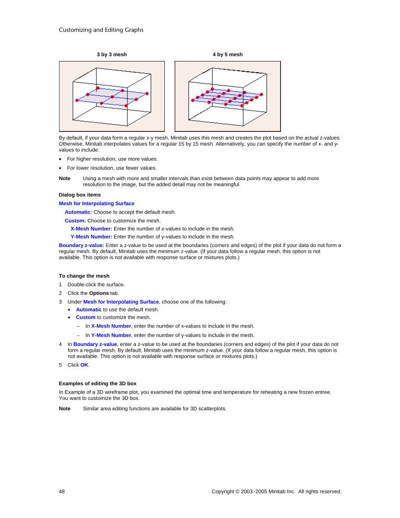
Customizing and Editing Graphs
Copyright © 2003–2005 Minitab Inc. All rights reserved. 48
3 by 3 mesh 4 by 5 mesh
By default, if your data form a regular x-y mesh, Minitab uses this mesh and creates the plot based on the actual z-values. Otherwise, Minitab interpolates values for a regular 15 by 15 mesh. Alternatively, you can specify the number of x- and y-values to include:
• For higher resolution, use more values.
• For lower resolution, use fewer values.
Note Using a mesh with more and smaller intervals than exist between data points may appear to add more resolution to the image, but the added detail may not be meaningful.
Dialog box items Mesh for Interpolating Surface
Automatic: Choose to accept the default mesh. Custom: Choose to customize the mesh.
X-Mesh Number: Enter the number of x-values to include in the mesh. Y-Mesh Number: Enter the number of y-values to include in the mesh.
Boundary z-value: Enter a z-value to be used at the boundaries (corners and edges) of the plot if your data do not form a regular mesh. By default, Minitab uses the minimum z-value. (If your data follow a regular mesh, this option is not available. This option is not available with response surface or mixtures plots.)
To change the mesh 1 Double-click the surface. 2 Click the Options tab. 3 Under Mesh for Interpolating Surface, choose one of the following:
• Automatic to use the default mesh. • Custom to customize the mesh.
− In X-Mesh Number, enter the number of x-values to include in the mesh.
− In Y-Mesh Number, enter the number of y-values to include in the mesh.
4 In Boundary z-value, enter a z-value to be used at the boundaries (corners and edges) of the plot if your data do not form a regular mesh. By default, Minitab uses the minimum z-value. (If your data follow a regular mesh, this option is not available. This option is not available with response surface or mixtures plots.)
5 Click OK.
Examples of editing the 3D box In Example of a 3D wireframe plot, you examined the optimal time and temperature for reheating a new frozen entree. You want to customize the 3D box.
Note Similar area editing functions are available for 3D scatterplots.

Customizing Graphs
Copyright © 2003–2005 Minitab Inc. All rights reserved. 49
Attributes Change the 3D box type and color. 1 Choose Editor > Graph Options. 2 Under Fill Pattern, choose Custom.
• From Background Color, choose . 3 Under Borders and Fill Lines, choose Custom.
• From Size, choose 2. 4 Click OK.
Box Options Change display of box faces. 1 Choose Editor > Graph Options. 2 Click the Box Options tab. 3 Under Show Box Faces, choose Back faces
only. 4 Click OK.
Surface Options Change the mesh. 1 Choose Editor > Graph Options. 2 Click the Surface Options tab. 3 Under Mesh for Interpolating Surface, choose
Custom. • In X-Mesh Number, type 30. • In Y-Mesh Number, type 30.
4 Click OK.
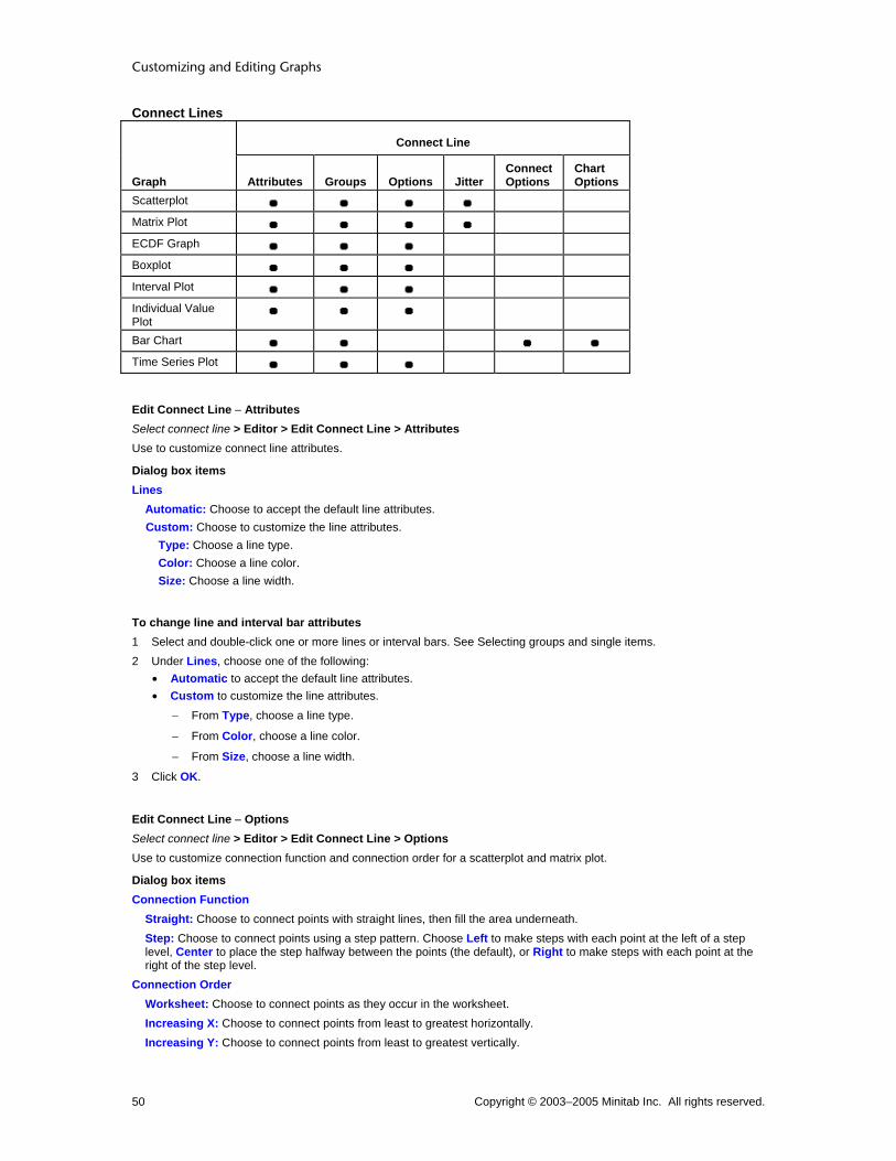
Customizing and Editing Graphs
Copyright © 2003–2005 Minitab Inc. All rights reserved. 50
Connect Lines
Connect Line
Graph Attributes Groups Options Jitter Connect Options
Chart Options
Scatterplot Matrix Plot ECDF Graph Boxplot Interval Plot Individual Value Plot
Bar Chart Time Series Plot
Edit Connect Line − Attributes Select connect line > Editor > Edit Connect Line > Attributes Use to customize connect line attributes.
Dialog box items Lines
Automatic: Choose to accept the default line attributes. Custom: Choose to customize the line attributes.
Type: Choose a line type. Color: Choose a line color. Size: Choose a line width.
To change line and interval bar attributes 1 Select and double-click one or more lines or interval bars. See Selecting groups and single items. 2 Under Lines, choose one of the following:
• Automatic to accept the default line attributes. • Custom to customize the line attributes.
− From Type, choose a line type.
− From Color, choose a line color.
− From Size, choose a line width.
3 Click OK.
Edit Connect Line − Options Select connect line > Editor > Edit Connect Line > Options Use to customize connection function and connection order for a scatterplot and matrix plot.
Dialog box items Connection Function
Straight: Choose to connect points with straight lines, then fill the area underneath. Step: Choose to connect points using a step pattern. Choose Left to make steps with each point at the left of a step level, Center to place the step halfway between the points (the default), or Right to make steps with each point at the right of the step level.
Connection Order Worksheet: Choose to connect points as they occur in the worksheet. Increasing X: Choose to connect points from least to greatest horizontally. Increasing Y: Choose to connect points from least to greatest vertically.

Customizing Graphs
Copyright © 2003–2005 Minitab Inc. All rights reserved. 51
To change the connect line options 1 Double-click the connect line. See Selecting groups and single items. 2 Click the Options tab. 3 Under Connection Function, choose one of the following:
• Straight to connect points with straight lines, then fill the area underneath. • Step to connect points using a step pattern. Choose Left to make steps with each point at the left of a step level,
Center to put each point in the middle of the step level (the default), or Right to put each point at the right of the step level.
4 Under Connection Order, choose one of the following: • Worksheet to connect points in the order they appear in the worksheet. • Increasing X to connect points from least to greatest horizontally. • Increasing Y to connect points from least to greatest vertically.
5 Click OK.
Edit Connect Line − Options/Connect Options Select connect line > Editor > Edit Connect Line > Options (empirical cdf, boxplot, interval plot, individual value plot, and time series plot) Select connect line > Editor > Edit Connect Line > Connect Options (bar chart) Use to customize connection function.
Dialog box items Connection Function
Straight: Choose to connect points with straight lines, then fill the area underneath. Step: Choose to connect points using a step pattern. Choose Left to make steps with each point at the left of a step level, Center to place the step halfway between the points (the default), or Right to make steps with each point at the right of the step level.
To change the connection function 1 Double-click the connect line. See Selecting groups and single items. 2 Click the Options (time series plot, interval plot, and boxplot) or Connect Options (bar chart) tab. 3 Under Connection Function, choose one of the following:
• Straight to connect points with straight lines, then fill the area underneath. • Step to connect points using a step pattern. Choose Left to make steps with each point at the left of a step level,
Center to put each point in the middle of the step level (the default), or Right to put each point at the right of the step level.
4 Click OK.
Edit Connect Line − Chart Options Select connect lines > Editor > Edit Connect Line > Chart Options Select bar chart > Editor > Graph Options Use to specify increasing or decreasing bar order, choose a cumulative y-scale, or choose a percent scale for the y-axis. If you have more than one categorical variable, use to specify the grouping level for calculating the scale and to stack data.
Dialog box items Order Main X Groups Based On Choose the order for the bars. See Ordering Category Groups Based on Y-Axis Values.
Default: Choose to use the default order for bars. For bar charts of counts of unique values and functions of a variable, the default order is ascending, either numerically, chronologically, or alphabetically. (To use a value order other than alphabetical for text categories, see Ordering text categories.) For bar charts of values from a table, the default order is always the order in which the categories appear in the worksheet; any value order is ignored. Increasing Y: Choose to order bars from smallest to largest y-values. Decreasing Y: Choose to order bars from largest to smallest y-values.

Customizing and Editing Graphs
Copyright © 2003–2005 Minitab Inc. All rights reserved. 52
Note If the data have multiple categorical variables, Minitab orders the bars by the sum of chart values for the outermost cluster groups.
Show Y as Percent: Check to use a percent scale on the y-axis. See Using Percent Scales and Accumulating Y Across X. Accumulate Y across X: Check to use a cumulative scale on the y-axis. See Using Percent Scales and Accumulating Y Across X. Take Percent and/or Accumulate If you have two or more categorical variables, specify for which grouping level you want to show y as a percent and/or accumulate y across x. The options available depend on the number of categorical variables that are included in the bar chart. For more information, see Using Percent Scales and Accumulating Y Across X.
Across all categories: Choose to apply a percent scale and/or cumulative scale across all categories. Within categories at level 1 (outermost): Choose to apply a percent scale and/or cumulative scale within categories at the outermost scale level only. Within categories at level 2: Choose to apply a percent scale and/or cumulative scale within categories at the second grouping level from the bottom only. Within categories at level 3: Choose to apply a percent scale and/or cumulative scale within categories at the third grouping level from the bottom only.
Stack values for last categorical variable: Check to stack the categories for the last categorical variable. Each category is represented by a separate segment of a bar. (Only available if you have two or more categorical variables.)
Edit Connect Line − Jitter Select all connect lines > Editor > Edit Connect Line > Jitter Use to randomly offset (jitter) points to reveal overlapping points on a scatterplot or matrix plot. Because a connect line passes through the points, Minitab adjusts the line when the points are offset.
Dialog box items Add jitter to direction: Check to offset points so they do not overlap. X: Type a number from 0 to 1 to specify the amount of jitter in the x-direction. Y: Type a number from 0 to 1 to specify the amount of jitter in the y-direction.
To add jitter 1 Select and double-click all areas, connect lines, project lines, or symbols. See Selecting groups and single items. 2 Click the Jitter tab. 3 Check Add jitter to direction to offset points so they do not overlap. Then:
• In X, type a number from 0 to 1 to specify the amount of jitter in the x-direction. • In Y, type a number from 0 to 1 to specify the amount of jitter in the y-direction. • (3D scatterplot only) In Z, type a number from 0 to 1 to specify the amount of jitter in the z-direction.
4 Click OK.
Edit Connect Line − Groups Select all connect lines > Editor > Edit Connect Line > Groups Use to add, remove, or change the grouping variables on a scatterplot, matrix plot, and time series plot. You can also add an attribute grouping variable to boxplots, interval plots, individual value plots, and bar charts.
Dialog box items Categorical variables for grouping: Enter up to three columns of categorical grouping variables to assign different attributes to each group and display a legend. Apply same grouping to other data displays: Check to update all data displays, such as symbols and project lines, to use the same grouping variables as the connect line.
To change the grouping variables 1 Select and double-click all areas, symbols, project lines, bars, or connect lines. See Selecting groups and single
items. 2 Click the Groups tab.
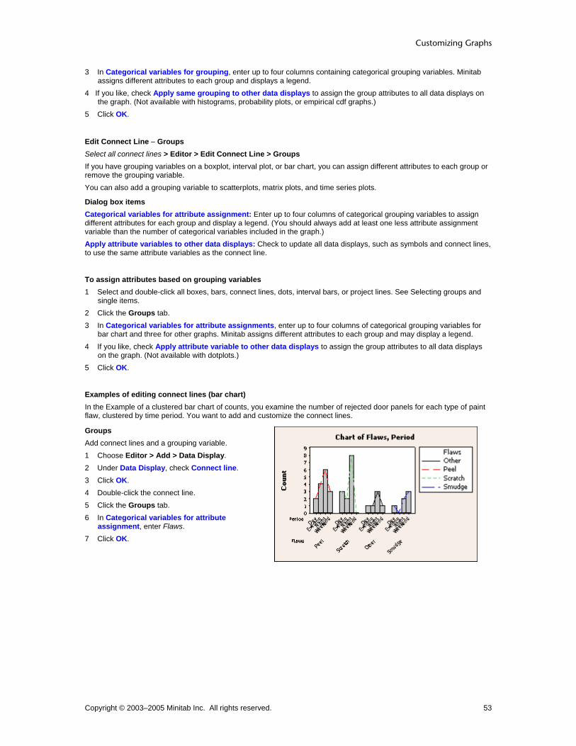
Customizing Graphs
Copyright © 2003–2005 Minitab Inc. All rights reserved. 53
3 In Categorical variables for grouping, enter up to four columns containing categorical grouping variables. Minitab assigns different attributes to each group and displays a legend.
4 If you like, check Apply same grouping to other data displays to assign the group attributes to all data displays on the graph. (Not available with histograms, probability plots, or empirical cdf graphs.)
5 Click OK.
Edit Connect Line − Groups Select all connect lines > Editor > Edit Connect Line > Groups If you have grouping variables on a boxplot, interval plot, or bar chart, you can assign different attributes to each group or remove the grouping variable. You can also add a grouping variable to scatterplots, matrix plots, and time series plots.
Dialog box items Categorical variables for attribute assignment: Enter up to four columns of categorical grouping variables to assign different attributes for each group and display a legend. (You should always add at least one less attribute assignment variable than the number of categorical variables included in the graph.) Apply attribute variables to other data displays: Check to update all data displays, such as symbols and connect lines, to use the same attribute variables as the connect line.
To assign attributes based on grouping variables 1 Select and double-click all boxes, bars, connect lines, dots, interval bars, or project lines. See Selecting groups and
single items. 2 Click the Groups tab. 3 In Categorical variables for attribute assignments, enter up to four columns of categorical grouping variables for
bar chart and three for other graphs. Minitab assigns different attributes to each group and may display a legend. 4 If you like, check Apply attribute variable to other data displays to assign the group attributes to all data displays
on the graph. (Not available with dotplots.) 5 Click OK.
Examples of editing connect lines (bar chart) In the Example of a clustered bar chart of counts, you examine the number of rejected door panels for each type of paint flaw, clustered by time period. You want to add and customize the connect lines.
Groups Add connect lines and a grouping variable. 1 Choose Editor > Add > Data Display. 2 Under Data Display, check Connect line. 3 Click OK. 4 Double-click the connect line. 5 Click the Groups tab. 6 In Categorical variables for attribute
assignment, enter Flaws. 7 Click OK.
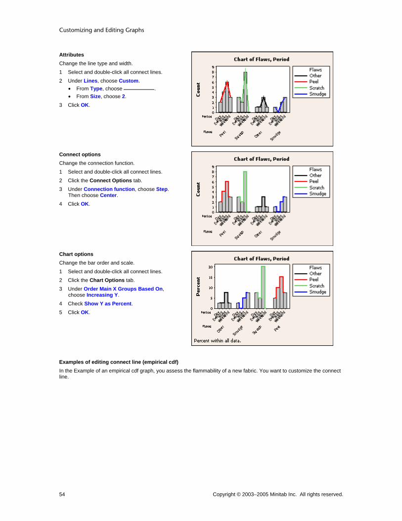
Customizing and Editing Graphs
Copyright © 2003–2005 Minitab Inc. All rights reserved. 54
Attributes Change the line type and width. 1 Select and double-click all connect lines. 2 Under Lines, choose Custom.
• From Type, choose . • From Size, choose 2.
3 Click OK.
Connect options Change the connection function. 1 Select and double-click all connect lines. 2 Click the Connect Options tab. 3 Under Connection function, choose Step.
Then choose Center. 4 Click OK.
Chart options Change the bar order and scale. 1 Select and double-click all connect lines. 2 Click the Chart Options tab. 3 Under Order Main X Groups Based On,
choose Increasing Y. 4 Check Show Y as Percent. 5 Click OK.
Examples of editing connect line (empirical cdf) In the Example of an empirical cdf graph, you assess the flammability of a new fabric. You want to customize the connect line.

Customizing Graphs
Copyright © 2003–2005 Minitab Inc. All rights reserved. 55
Attributes Change the connect line type and color. 1 Double-click the connect line. 2 Under Symbols, choose Custom.
• From Type, choose . • From Color, choose .
3 Click OK.
Options Change the connection function. 1 Double-click the connect line. 2 Click the Options tab. 3 Under Connection function, choose Straight. 4 Click OK.
Examples of editing connect line (scatterplot) In the Example of a simple scatterplot, you examine the relationship between voltage remaining in your batteries immediately after a flash and the length of time required for a battery to be ready to support another flash. You want to add and customize the connect lines.
Note Similar connect line editing functions are available for matrix plots.
Groups Add a grouping variable. 1 Choose Editor > Add > Data Display. 2 Under Data Display, check Connect Line. 3 Click OK. 4 Double-click the connect line. 5 Click the Groups tab. 6 In Categorical variables for grouping, enter
Formulation. 7 Check Apply same grouping to other data
displays. Click OK.
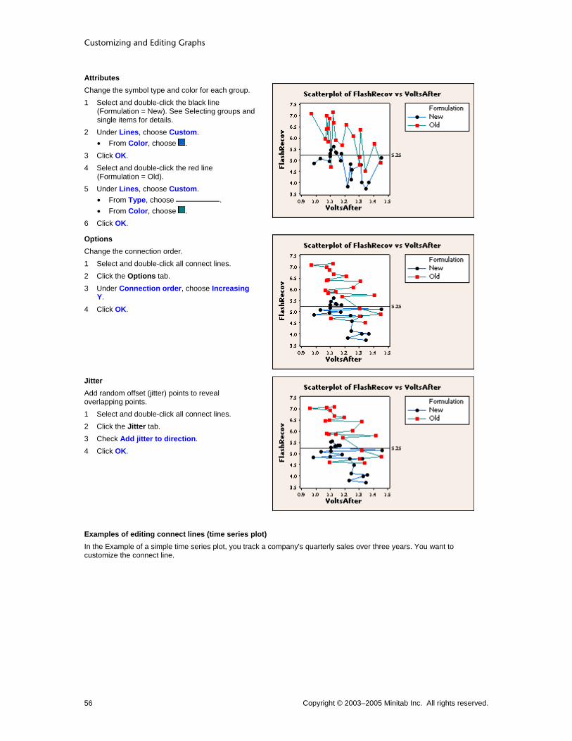
Customizing and Editing Graphs
Copyright © 2003–2005 Minitab Inc. All rights reserved. 56
Attributes Change the symbol type and color for each group. 1 Select and double-click the black line
(Formulation = New). See Selecting groups and single items for details.
2 Under Lines, choose Custom. • From Color, choose .
3 Click OK. 4 Select and double-click the red line
(Formulation = Old). 5 Under Lines, choose Custom.
• From Type, choose . • From Color, choose .
6 Click OK.
Options Change the connection order. 1 Select and double-click all connect lines. 2 Click the Options tab. 3 Under Connection order, choose Increasing
Y. 4 Click OK.
Jitter Add random offset (jitter) points to reveal overlapping points. 1 Select and double-click all connect lines. 2 Click the Jitter tab. 3 Check Add jitter to direction. 4 Click OK.
Examples of editing connect lines (time series plot) In the Example of a simple time series plot, you track a company's quarterly sales over three years. You want to customize the connect line.

Customizing Graphs
Copyright © 2003–2005 Minitab Inc. All rights reserved. 57
Attributes Change the line type, color, and size. 1 Double-click the connect line. 2 Under Lines, choose Custom.
• From Type, choose . • From Color, choose .
3 Click OK.
Groups Add a grouping variable. 1 Select and double-click all connect lines. 2 Under Lines, choose Automatic. 3 Click the Groups tab. 4 In Categorical variables for grouping
variables, enter Year. 5 Click OK.
Options 1 Select and double-click all connect lines. 1 Double-click the connect lines. 2 Click the Options tab. 3 Under Connection function, choose Step.
Then choose Center. 4 Click OK.
Examples of editing connect lines (interval plot) In the Example of a interval plot with multiple y's and groups, you assess the consistency of plastic pipe diameters. You want to add and customize the connect lines.
Note Similar connect line editing functions are available for boxplots and individual value plots.
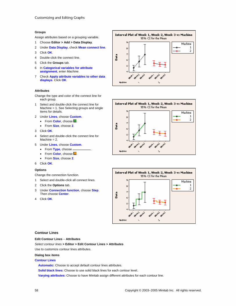
Customizing and Editing Graphs
Copyright © 2003–2005 Minitab Inc. All rights reserved. 58
Groups Assign attributes based on a grouping variable. 1 Choose Editor > Add > Data Display. 2 Under Data Display, check Mean connect line. 3 Click OK. 4 Double-click the connect line. 5 Click the Groups tab. 6 In Categorical variables for attribute
assignment, enter Machine. 7 Check Apply attribute variables to other data
displays. Click OK.
Attributes Change the type and color of the connect line for
each group. 1 Select and double-click the connect line for
Machine = 1. See Selecting groups and single items for details.
2 Under Lines, choose Custom. • From Color, choose . • From Size, choose 2.
3 Click OK. 4 Select and double-click the connect line for
Machine = 2. 5 Under Lines, choose Custom.
• From Type, choose . • From Color, choose . • From Size, choose 2.
6 Click OK.
Options Change the connection function. 1 Select and double-click all connect lines. 2 Click the Options tab. 3 Under Connection function, choose Step.
Then choose Center. 4 Click OK.
Contour Lines
Edit Contour Lines − Attributes Select contour lines > Editor > Edit Contour Lines > Attributes Use to customize contour lines attributes.
Dialog box items Contour Lines
Automatic: Choose to accept default contour lines attributes. Solid black lines: Choose to use solid black lines for each contour level. Varying attributes: Choose to have Minitab assign different attributes for each contour line.

Customizing Graphs
Copyright © 2003–2005 Minitab Inc. All rights reserved. 59
Custom attributes: Choose to assign attributes individually for each contour line, then choose a type, color, and size for each line.
Levels: Identifies the z-value of each contour line. This column does not take any input. Type: Choose a line type. Color: Choose a line color. Size: Choose a line width.
To change contour line attributes 1 Double-click any contour line. 2 Under Contour lines, choose one of the following:
• Automatic to accept the default contour line attributes. • Solid black lines to use solid black lines for each contour line. • Varying attributes to have Minitab assign different attributes for each contour line. • Custom attributes to assign attributes individually for each contour line, then choose a type, color, and size for
each line. Row 1 is for the lowest z-values.
− From Type, choose a line type.
− From Color, choose a line color.
− From Size, choose a line width.
3 Click OK.
Edit Contour Lines − Contour Labels Select contour lines > Editor > Edit Contour Lines > Contour Labels Use to show or hide contour labels, which indicate the value of each contour line.
Dialog box items Contour Labels
Automatic: Choose to accept the default labels. Minitab displays contour labels if the plot has solid black contour lines but no areas. (You can change the line type in the in Attributes tab.) Minitab displays a legend if the plot has areas, varying line attributes, or custom line attributes. Show labels: Choose to display contour labels. No Labels: Choose to hide contour labels.
To show or hide contour labels 1 Double-click any contour line. 2 Click the Contour Labels tab. 3 Under Contour Labels, choose one of the following:
• Automatic to accept the default contour labels. • Show labels to display contour labels. • No Labels to hide contour labels.
4 Click OK.
Edit Contour Lines − Font Select contour label > Edit Contour Lines > Font Use to customize contour label font and attributes.
Dialog box items Font: Enter a font name. Style
Bold: Check to make the text bold. Italic: Check to italicize the text. Underline: Check to underline the text.
Size: Enter a font size.

Customizing and Editing Graphs
Copyright © 2003–2005 Minitab Inc. All rights reserved. 60
Color: Choose a text color. Preview: Displays sample text with the selected attributes applied. This box does not accept input.
To edit the contour label font 1 Double-click any contour label. 2 Click the Font tab. 3 To change font attributes, do any of the following:
• Under Font, enter a font name. • Under Style , check Bold, Italic, and/or Underline. • Under Size, enter a font size. • From Color, choose a text color.
4 Click OK.
Edit Contour Lines − Font Background Select contour lines > Editor > Edit Contour Lines > Font Background Use to customize font background fill and border attributes for the contour labels.
Dialog box items Fill Pattern
Automatic: Choose to accept the default fill pattern. Custom: Choose to customize the fill pattern.
Type: Choose a fill type. Background color: Choose a background color.
Borders and Fill Lines Automatic: Choose to accept the default border and fill lines. Custom: Choose to customize the border and fill lines.
Type: Choose a border line type. Color: Choose a border and fill line color. Size: Choose a border line width.
To change the contour label background 1 Double-click any contour line. 2 Click the Font Background tab. 3 Under Fill Pattern, choose one of the following:
• Automatic to accept the default fill pattern. • Custom to customize the fill pattern.
− From Type, choose a fill type.
− From Background color, choose a background color.
4 Under Borders and Fill Lines, choose one of the following: • Automatic to accept the default border and fill lines. • Custom to customize the border and fill lines.
− From Type, choose a border line type.
− From Color, choose a border and fill line color.
− From Size, choose a border line width.
5 Click OK.
Edit Contour Lines − Options Select contour lines > Editor > Edit Contour Lines > Options Use to control the number and placement of contour levels, as well as the resolution of the mesh.

Customizing Graphs
Copyright © 2003–2005 Minitab Inc. All rights reserved. 61
Minitab establishes a series of regular x- and y-values, called a mesh, then estimates where the different contour levels will cross each rectangle of the mesh.
5 by 5 mesh 15 by 15 mesh
Note Gridlines were added for reference, but do not necessarily indicate the exact layout of the mesh used to plot the contours.
By default, if your data form a regular x-y mesh, Minitab uses this mesh to estimate the contours. Otherwise, Minitab interpolates values for a regular 15 by 15 mesh. Alternatively, you can specify the number of x- and y-values to include:
• For higher resolution, use more values.
• For lower resolution, use fewer values.
Note Using a mesh with more and smaller intervals than exist between data points may appear to add more resolution to the image, but the added detail may not be meaningful.
Dialog box items Contour Levels
Automatic: Choose to accept the default number of contour levels. Number: Choose to specify the number of contour levels, then enter a number between 2 and 11. Values: Choose to specify the z-values to plot as contours, then enter from 2 to 11 values.
Mesh for Interpolating Surface Automatic: Choose to accept the default mesh. Custom: Choose to customize the mesh.
X-Mesh Number: Enter the number of x-values to include in the mesh. Y-Mesh Number: Enter the number of y-values to include in the mesh.
Boundary z-value: Enter a z-value to be used at the boundaries (corners and edges) of the plot if your data do not form a regular mesh. By default, Minitab uses the minimum z-value. (If your data follow a regular mesh, this option is not available.)
To change the number of contours and mesh 1 Double-click any contour area or contour line. 2 Click the Options tab. 3 Under Contour Levels, choose one of the following:
• Automatic to accept the default number of contour levels. • Number to specify the number of contour levels, then enter a number between 2 and 11. • Values to specify the z-values to plot as contours, then enter from 2 to 11 values.
4 Under Mesh for Interpolating Surface, choose one of the following: • Automatic to accept the default mesh. • Custom to customize the mesh.
− In X-Mesh Number, enter the number of x-values to include in the mesh.
− In Y-Mesh Number, enter the number of y-values to include in the mesh.
5 In Boundary z-value, enter a z-value to be used at the boundaries (corners and edges) of the plot if your data do not form a regular mesh. By default, Minitab uses the minimum z-value. (If your data follow a regular mesh, this option is not available. This option is not available with response surface or mixtures plots.)
6 Click OK.

Customizing and Editing Graphs
Copyright © 2003–2005 Minitab Inc. All rights reserved. 62
Examples of editing contour lines In Example of a contour plot, you examine the relationship between the time and temperature at which a frozen food was reheated and the quality of the final product. You want to customize the plot.
Attributes Remove the areas and change the default line colors.
1 Select the areas. Click on the toolbar to delete them.
2 Double-click a contour line. 3 Under Contour Lines, choose Varying
Attributes. 4 Click OK.
Contour labels, font, and font background Change the default colors and size. 1 Double-click a contour line. 2 Click the Contour Labels tab. 3 Under Contour Labels, choose Show Labels. 4 Click the Font tab. 5 From Size, choose 14. 6 Click the Font Background tab. 7 Under Fill Pattern, choose Custom.
• From Background Color, choose . 8 Click OK.
Options Increase the number of contour levels. 1 Double-click a contour line. 2 Click the Contour Labels tab. 3 Under Contour Labels, choose No Labels. 4 Click the Options tab. 5 Under Contour Levels, choose Number and
type 8. 6 Click OK.
Dots
Dots
Graph Attributes Groups Binning Options Marginal Plot (with dotplots)
Dotplot
Edit Dots − Attributes Select dots > Editor > Edit Dot > Attributes Use to customize dot attributes on a dotplot or marginal plot with dotplots.

Customizing Graphs
Copyright © 2003–2005 Minitab Inc. All rights reserved. 63
Dialog box items Symbols
Automatic: Choose to accept the default symbol attributes. Custom: Choose to customize the symbol attributes.
Type: Choose a symbol type. Color: Choose a symbol color. Size: Choose a symbol size.
To change the symbol or dot attributes 1 Select then double-click one or more symbols or dots. See Selecting groups and single items. 2 Under Symbols, choose one of the following:
• Automatic to accept the default symbol attributes. • Custom to customize the symbol attributes.
− From Type, choose a symbol type.
− From Color, choose a symbol color.
− From Size, choose a symbol size.
3 Click OK.
Edit Dots − Binning Select dots > Editor > Edit Dots > Binning Use to define bin intervals by midpoints or cutpoints.
Dialog box items Interval Type
Midpoint: Choose to define bin intervals by midpoints. Cutpoint: Choose to define bin intervals by cutpoints.
Interval Definition Automatic: Choose to accept the default number of bins. Number of intervals: Choose and enter the number of bins. Midpoint/Cutpoint positions: Choose and enter custom midpoint or cutpoint positions.
To change the binning 1 Double-click the area, bars, dots, symbols, or lowess smoother. 2 Click the Binning tab. 3 Under Interval Type, choose Midpoint or Cutpoint to define bin intervals by midpoints or cutpoints. 4 Under Interval Definition, choose one of the following to determine the number of bins:
• Automatic to accept the default number of bins. • Number of intervals, then enter the number of bins. • Midpoint/Cutpoint positions, then enter custom midpoint or cutpoint positions.
5 Click OK.
Edit Dots − Groups Select all dots > Editor > Edit Dots > Groups If you have grouping variables on a dotplot, you can assign different attributes to each group.
Dialog box items Categorical variables for attribute assignment: Enter up to four columns of categorical grouping variables to assign different attributes to each group.
Customizing and Editing Graphs
Copyright © 2003–2005 Minitab Inc. All rights reserved. 64
To change the grouping variables 1 Select and double-click all areas, symbols, project lines, bars, or connect lines. See Selecting groups and single
items. 2 Click the Groups tab. 3 In Categorical variables for grouping, enter up to four columns containing categorical grouping variables. Minitab
assigns different attributes to each group and displays a legend. 4 If you like, check Apply same grouping to other data displays to assign the group attributes to all data displays on
the graph. (Not available with histograms, probability plots, or empirical cdf graphs.) 5 Click OK.
Edit Dots − Options Select all dots > Editor > Edit Dots > Options If you have grouping variables on a dotplot, you can stack the groups rather than display them separately.
Dialog box items Stack dots of innermost categorical variable: Check to stack the groups.
To stack groups 1 Double-click the dots. 2 Click the Options tab. 3 Check Stack dots of innermost categorical variable. 4 Click OK.
Examples of editing dots In the Example of a dotplot with groups, you compare the variability in camshaft length between two suppliers. You want to customize the dots.
Note Dot attributes editing is available for marginal plots with dotplots.
Attributes Change the dot color for one group. 1 Select and double-click
the lowest group (Supplier B). See Selecting groups and single items for details.
2 Under Symbols, choose Custom. • From Color, choose
. 3 Click OK.

Customizing Graphs
Copyright © 2003–2005 Minitab Inc. All rights reserved. 65
Options Stack the two groups. 1 Select and double-click
all dots. 2 Click the Options tab. 3 Check Stack dots of
innermost categorical variable.
4 Click OK.
Binning Change the number of bins. 1 Select and double-click
all dots. 2 Click the Binning tab. 3 Under Interval
Definition, choose Number of Intervals. Type 20.
4 Click OK.
Interval Bar
Edit Interval Bar − Attributes Select interval bar > Editor > Edit Interval Bar > Attributes Use to customize interval bar attributes.
Dialog box items Lines
Automatic: Choose to accept the default interval bar attributes. Custom: Choose to customize the interval bar attributes.
Type: Choose a line type. Color: Choose a line color. Size: Choose a line width.
To change line and interval bar attributes 1 Select and double-click one or more lines or interval bars. See Selecting groups and single items. 2 Under Lines, choose one of the following:
• Automatic to accept the default line attributes. • Custom to customize the line attributes.
− From Type, choose a line type.

Customizing and Editing Graphs
Copyright © 2003–2005 Minitab Inc. All rights reserved. 66
− From Color, choose a line color.
− From Size, choose a line width.
3 Click OK.
Edit Interval Bar − Groups Select all bars > Editor > Edit Interval Bar > Groups If you have grouping variables on an interval plot, you can assign different attributes to each group.
Dialog box items Categorical variables for attribute assignment: Enter up to four columns of categorical grouping variables to assign different attributes to each group and display a legend. Apply attribute variables to other data displays: Check to update all data displays, such as symbols and connect lines, to use the same attribute variables as the interval bar.
To assign attributes based on grouping variables 1 Select and double-click all boxes, bars, connect lines, dots, interval bars, or project lines. See Selecting groups and
single items. 2 Click the Groups tab. 3 In Categorical variables for attribute assignments, enter up to four columns of categorical grouping variables for
bar chart and three for other graphs. Minitab assigns different attributes to each group and may display a legend. 4 If you like, check Apply attribute variable to other data displays to assign the group attributes to all data displays
on the graph. (Not available with dotplots.) 5 Click OK.
Edit Interval Bar − Options Select interval bars > Editor > Edit Interval Bar > Options Use to customize interval bar type, display one- or two-sided intervals, and use a pooled standard deviation to calculate the intervals.
Dialog box items Type of Interval Standard error: Choose to display standard error bars, where the error bars extend one or more standard errors away from the mean.
Multiple: Enter a positive number to be used as the multiplier for standard errors (1 is the default). Confidence interval: Choose to display confidence intervals. The confidence intervals assume a normal distribution for the data and use t-distribution critical values.
Level: Enter a number between 0 and 100 to specify the confidence level. The default is 95%. The interval bar endpoints correspond to the values of a confidence interval for the mean. Bonferroni: Check to calculate Bonferroni intervals.
Side: Choose the location of the bars. When you choose two-sided, bars are drawn above and below the mean. Upper one-sided gives bars above; lower one-sided draws bars below the mean. For confidence intervals (default), the one-sided bars are shorter than the same side of the two-sided bars because Minitab uses a one-sided test. For standard error bars, the distance that error bars extend above or below the mean remains the same regardless of the selected side. Pool error across groups: Check to use the pooled degrees of freedom to calculate the critical value from the t-distribution for confidence interval bars, or a pooled standard error instead of calculating the error for each subgroup for standard error bars.
To change the interval bar options 1 Select and double-click all interval bars. See Selecting groups and single items. 2 Click the Options tab. 3 Under Type of Interval, choose one of the following:
• Standard error to display standard error bars, where the error bars extend one or more standard errors away from the mean.

Customizing Graphs
Copyright © 2003–2005 Minitab Inc. All rights reserved. 67
− In Multiple, enter a positive number to be used as the multiplier for standard errors (1 is the default). • Confidence interval to display confidence intervals. The confidence intervals assume a normal distribution for the
data and use t-distribution critical values.
− In Level, enter a number between 0 and 100 to specify the confidence level. The default is 95%. The interval bar endpoints correspond to the values of a confidence interval for the mean.
− Check Bonferroni to calculate Bonferroni intervals.
4 From Side, choose the location of the bars. When you choose two-sided, bars are drawn above and below the mean. Upper one-sided gives bars above; lower one-sided draws bars below the mean. For confidence intervals (default), the one-sided bars are shorter than the same side of the two-sided bars because Minitab uses a one-sided test. For standard error bars, the distance that error bars extend above or below the mean remains the same regardless of the selected side.
5 Check Pool error across groups to use the pooled degrees of freedom to calculate the critical value from the t-distribution for confidence interval bars, or a pooled standard error instead of calculating the error for each subgroup for standard error bars.
6 Click OK.
Examples of editing interval bars (interval plot) In the Example of a interval plot with multiple y's and groups, you assess the consistency of plastic pipe diameters. You want to customize the interval bars.
Note Similar area editing functions are available for individual value plots.
Groups Assign attributes based on a grouping variable. 1 Select and double-click all interval bars. 2 Click the Groups tab. 3 In Categorical variables for attribute
assignment, enter Machine. 4 Check Apply attribute variable to other data
displays. 4 Click OK.
Attributes Change the line type and color for one group. 1 Select and double-click the black interval bars
(Machine = 1). See Selecting groups and single items for details.
2 Under Lines, choose Custom. • From Type, choose . • From Color, choose .
3 Click OK.

Customizing and Editing Graphs
Copyright © 2003–2005 Minitab Inc. All rights reserved. 68
Options Change the confidence interval bar to a standard error bar. 1 Select and double-click all interval bars. 2 Click the Options tab. 3 Under Type of Interval, choose Standard
error. 4 Click OK.
Pie
Edit Pie − Attributes Select pie > Editor > Edit Pie > Attributes Use to customize slice background fill and border attributes.
Dialog box items Fill Pattern
Automatic: Choose to accept the default fill pattern. Custom: Choose customize the fill pattern.
Type: Choose a fill type. Background color: Choose a background color.
Borders and Fill Lines Automatic: Choose to accept the default border and fill lines. Custom: Choose to customize the border and fill lines.
Type: Choose a border line type. Color: Choose a border and fill line color. Size: Choose a border line width.
To change fill attributes (areas, bars, boxes, and pie slices) 1 Select and double-click one or more areas, bars, boxes, or pie slices. See Selecting groups and single items. 2 Under Fill Pattern, choose one of the following:
• Automatic to accept the default fill pattern. • Custom to customize the fill pattern.
− From Type, choose a fill type.
− From Background color, choose a background color.
3 Under Borders and Fill Lines, choose one of the following: • Automatic to accept the default border and fill lines. • Custom to customize the border and fill lines.
− From Type, choose a border line type.
− From Color, choose a border and fill line color.
− From Size, choose a border line width.
4 Click OK.

Customizing Graphs
Copyright © 2003–2005 Minitab Inc. All rights reserved. 69
Edit Pie − Options Select pie chart > Editor > Edit Pie Select pie chart > Editor > Graph Options Use to customize slice order, pie diameter, slice starting angle, and the minimum category size for separate slices.
Dialog box items Order slices by
Default: Choose to accept the default slice order. For raw data, the slice order is increasing value for numeric and date/time data; or alphabetical for text data. (To use a value order other than alphabetical for text categories, see Ordering text categories.) For summarized data, the default slice order is always the order in which the categories appear in the worksheet; any value order is ignored. Increasing volume: Choose to order slices from smallest to largest. Decreasing volume: Choose to order slices from largest to smallest.
Pie Diameter Automatic: Choose to accept the default pie diameter. Custom: Choose to customize the diameter size, then enter a diameter size greater than 0 and less than or equal to one.
Start angle: Type the starting angle in degrees for the slices. By default, slices start at 90° (12 o'clock) and go clockwise. Combine slices of this percent or less: Type a minimum percentage for separate slices. Categories with less than or equal to this percentage are grouped into a slice named Other, which is always placed last.
To change pie options 1 Double-click the pie. 2 Click the Options tab. 3 Under Order slices by, choose one of the following:
• Default to accept the default slice order. For raw data, the slice order is increasing value for numeric and date/time data; or alphabetical for text data. For summarized data, the default slice order is the order in which the categories appear in the worksheet.
• Increasing volume to order slices from smallest to largest. • Decreasing volume to order slices from largest to smallest.
− From Type, choose a fill type.
− From Background color, choose a color.
4 Under Pie Diameter, choose one of the following: • Automatic to accept the default pie diameter. • Custom to customize the diameter size, then enter a diameter size greater than 0 and less than or equal to one.
5 In Start angle, type the starting angle in degrees for the slices. By default, slices start at 90° (12 o'clock) and go clockwise.
6 In Combine slices of this percent or less, type a minimum percentage for separate slices. Categories with less than or equal to this percentage are grouped into a slice named Others, which is always placed last.
7 Click OK.
Edit Pie − Explode Select pie slices > Editor > Edit Pie > Explode Use to explode slices (pull them away from the others) to emphasize specific categories.
Dialog box items Explode slice: Check to move a slice away from the center of the pie for emphasis.
Explode length: Enter an explode distance between 0 and 1.
To explode pie slices 1 Select and double-click one or more slices. See Selecting groups and single items. 2 Click the Explode tab. 3 Check Explode Slice. In Explode length, enter a value between 0 and 1.

Customizing and Editing Graphs
Copyright © 2003–2005 Minitab Inc. All rights reserved. 70
4 Click OK.
Examples of editing the pie In the Example of a pie chart, you identified the most common causes of air loss in tires. You want to customize the pie chart.
Attributes Change the fill pattern and border size for the largest slice. 1 Select and double-click the largest pie slice
(Cause = Puncture). See Selecting groups and single items for details.
2 Under Fill Pattern, choose Custom.
• From Type, choose . 3 Click OK.
Explode Explode or pull the largest slice away from the others. 1 Select and double-click the largest pie slice
(Cause = Puncture). 2 Click the Explode tab. 3 Check Explode slice. 4 Click OK.
Options Change the slice order and increase the pie diameter. 1 Double-click the pie. 2 Click the Options tab. 3 Under Order slices by, choose Increasing
volume. 4 Under Pie Diameter, choose Custom. Then
enter 0.8. 5 Click OK.

Customizing Graphs
Copyright © 2003–2005 Minitab Inc. All rights reserved. 71
Project Lines
Project Lines
Graph Attributes Groups Options Project Options
Chart Options Jitter Binning
Scatterplot Matrix Plot Histogram Bar Chart Time Series Plot
3D Scatterplot
3D Surface Plot
Edit Project Lines − Attributes Select project lines > Editor > Edit Project Lines > Attributes Use to customize project lines attributes.
Dialog box items Lines
Automatic: Choose to accept the default project lines. Custom: Choose to customize the project lines.
Type: Choose a line type. Color: Choose a line color. Size: Choose a line width.
To change line and interval bar attributes 1 Select and double-click one or more lines or interval bars. See Selecting groups and single items. 2 Under Lines, choose one of the following:
• Automatic to accept the default line attributes. • Custom to customize the line attributes.
− From Type, choose a line type.
− From Color, choose a line color.
− From Size, choose a line width.
3 Click OK.
Edit Project Lines − Groups Select all project lines > Editor > Edit Project Lines > Groups Use to add, remove, or change the grouping variables on a scatterplot, matrix plot, histogram, time series plot, and 3D plots. You can also add grouping variables to bar charts.
Dialog box items Categorical variables for grouping: Enter up to four columns of grouping variables for bar chart and three for other graphs to assign different attributes to each group and display a legend. Apply same grouping to other data displays: Check to update all data displays, such as symbols and connect line, to use the same grouping variables as the project lines.
To change the grouping variables 1 Select and double-click all areas, symbols, project lines, bars, or connect lines. See Selecting groups and single
items.

Customizing and Editing Graphs
Copyright © 2003–2005 Minitab Inc. All rights reserved. 72
2 Click the Groups tab. 3 In Categorical variables for grouping, enter up to four columns containing categorical grouping variables. Minitab
assigns different attributes to each group and displays a legend. 4 If you like, check Apply same grouping to other data displays to assign the group attributes to all data displays on
the graph. (Not available with histograms, probability plots, or empirical cdf graphs.) 5 Click OK.
Edit Project Lines − Groups Select all project lines > Editor > Edit Project Line > Groups If you have grouping variables on a bar chart, you can assign different attributes to each group or remove the grouping variable. The columns must be categorical variables used in creating the graph. You can also add a grouping variable to scatterplots, matrix plots, histograms, time series plots, and 3D scatterplots.
Dialog box items Categorical variables for attribute assignment: Enter up to four columns of grouping variables for bar chart and three for other graphs to assign different attributes to each group and display a legend. Apply attribute variables to other data displays: Check to update all data displays, such as bars and connect lines, to use the same attribute variables as the project lines.
To assign attributes based on grouping variables 1 Select and double-click all boxes, bars, connect lines, dots, interval bars, or project lines. See Selecting groups and
single items. 2 Click the Groups tab. 3 In Categorical variables for attribute assignments, enter up to four columns of categorical grouping variables for
bar chart and three for other graphs. Minitab assigns different attributes to each group and may display a legend. 4 If you like, check Apply attribute variable to other data displays to assign the group attributes to all data displays
on the graph. (Not available with dotplots.) 5 Click OK.
Edit Project Lines − Options/Project Options Select project lines > Editor > Edit Project Lines > Options Select project lines > Editor > Edit Project Lines > Project Options (bar chart) Use to customize projection direction and base position for a scatterplot, matrix plot, histogram, bar chart, and time series plot. You can also change the options for a 3D scatterplot and 3D surface plot.
Dialog box items Projection Direction
Toward Y scale: Choose to extend lines horizontally from each data point toward the y-axis. Toward X scale: Choose to extend lines vertically from each data point toward the x-axis.
Base Position Auto: Choose to use the default base. Custom: Enter a number for the base. Lines extend from the data value to the base.
To change project line options 1 Double-click the project line. See Selecting groups and single items. 2 Click the Options tab. 3 Under Projection Direction, choose one of the following:
• Toward Y scale to extend lines horizontally from each data point toward the y-axis. • Toward X scale to extend lines vertically from each data point toward the x-axis.
4 Under Base Position, choose one of the following: • Auto to use the default base. • Custom to define your own base, then enter a number for the base. Lines extend from the data value to the base.

Customizing Graphs
Copyright © 2003–2005 Minitab Inc. All rights reserved. 73
Tip You can add a horizontal or vertical base line by adding a reference line that has the same data value as your base. See Reference Line Overview.
5 Click OK.
Edit Project Lines − Options Select project lines > Editor > Edit Project Lines > Options Use to customize projection direction and base position on a 3D scatterplot or 3D surface plot. You can also change the options for a scatterplot matrix plot, histogram, bar chart, and time series plot.
Dialog box items Projection Direction
Toward YZ plane: Choose to extend lines from each data point toward the yz-plane. Toward XZ plane: Choose to extend lines from each data point toward the xz-plane. Toward XY plane: Choose to extend lines from each data point toward the xy-plane.
Base Position Auto: Choose to use the default base, which is the data minimum or 0. Custom: Enter a number for the base. Lines extend from the data value to the base.
To change the project line options 1 Double-click the project lines. See Selecting groups and single items. 2 Click the Options tab. 3 Under Projection Direction, choose one of the following:
• Toward YZ plane to extend lines from each data point toward the yz-plane. • Toward XZ plane to extend lines from each data point toward the xz-plane. • Toward XY plane to extend lines from each data point toward the xy-plane.
4 Under Base Position, choose one of the following: • Auto to use the default base. • Custom to define your own base, then enter a number for the base. Lines extend from the data value to the base.
Tip You can add a horizontal or vertical base line by adding a reference line that has the same data value as the base. See Reference Line Overview.
5 Click OK.
Edit Project Lines − Chart Options Select project lines > Editor > Edit Project Lines > Chart Options Select bar chart > Editor > Graph Options Use to specify increasing or decreasing bar order, choose a cumulative y-scale, or choose a percent scale for the y-axis. If you have more than one categorical variable, use to specify the grouping level for calculating the scale and to stack data.
Dialog box items Order Main X Groups Based On Choose the order for the bars. See Ordering Category Groups Based on Y-Axis Values.
Default: Choose to use the default order for bars. For bar charts of counts of unique values and functions of a variable, the default order is ascending, either numerically, chronologically, or alphabetically. (To use a value order other than alphabetical for text categories, see Ordering text categories.) For bar charts of values from a table, the default order is always the order in which the categories appear in the worksheet; any value order is ignored. Increasing Y: Choose to order bars from smallest to largest y-values. Decreasing Y: Choose to order bars from largest to smallest y-values.
Note If the data have multiple categorical variables, Minitab orders the bars by the sum of chart values for the outermost cluster groups.
Show Y as Percent: Check to use a percent scale on the y-axis. See Using Percent Scales and Accumulating Y Across X.

Customizing and Editing Graphs
Copyright © 2003–2005 Minitab Inc. All rights reserved. 74
Accumulate Y across X: Check to use a cumulative scale on the y-axis. See Using Percent Scales and Accumulating Y Across X. Take Percent and/or Accumulate If you have two or more categorical variables, specify for which grouping level you want to show y as a percent and/or accumulate y across x. The options available depend on the number of categorical variables that are included in the bar chart. For more information, see Using Percent Scales and Accumulating Y Across X.
Across all categories: Choose to apply a percent scale and/or cumulative scale across all categories. Within categories at level 1 (outermost): Choose to apply a percent scale and/or cumulative scale within categories at the outermost scale level only. Within categories at level 2: Choose to apply a percent scale and/or cumulative scale within categories at the second grouping level from the bottom only. Within categories at level 3: Choose to apply a percent scale and/or cumulative scale within categories at the third grouping level from the bottom only.
Stack values for last categorical variable: Check to stack the categories for the last categorical variable. Each category is represented by a separate segment of a bar. (Only available if you have two or more categorical variables.)
To change the bar order and y-scale 1 Select and double-click all bars, connect lines, project lines, or symbols. See Selecting groups and single items. 2 Click the Chart Options tab. 3 Under Order Main X Groups Based On, choose one of the following:
• Default to arrange the bars based on the variable type: numeric in ascending order, date/time in increasing chronological order, and text in alphabetical order. To change the display order for text categories, see Ordering text categories.
• Increasing Y to order bars from smallest to largest y-values. • Decreasing Y to order bars from largest to smallest y-values. See Ordering Category Groups Based on Y-Axis Values.
4 Check Show Y as Percent to use a percent scale on the y-axis. See Using Percent Scales and Accumulating Y Across X.
5 Check Accumulate Y across X to use a cumulative scale on the y-axis. See Using Percent Scales and Accumulating Y Across X.
6 Under Take Percent and/or Accumulate, choose one of the following. The options available depend on how many categorical variables are included in the bar chart. For more information, see Using Percent Scales and Accumulating Y Across X. • Across all categories to apply a percent scale and/or cumulative scale across all categories. • Within categories at level 1 (outermost) to apply a percent scale and/or cumulative scale within categories at the
outermost scale level only. • Within categories at level 2 to apply a percent scale and/or cumulative scale within categories at the second
grouping level from the bottom only. • Within categories at level 3 to apply a percent scale and/or cumulative scale within categories at the third
grouping level from the bottom only. 7 Check Stack values for last categorical variable to stack the categories for the last categorical variable. Each
category is represented by a separate segment of a bar. (Only available if you have two or more categorical variables.)
8 Click OK.
Edit Project Lines − Jitter Select all project lines > Editor > Edit Project Lines > Jitter Use to randomly offset (jitter) points to reveal overlapping points on a scatterplot or matrix plot. Because project lines extend from the points, Minitab adjusts the project lines when the points are offset. You can jitter data points on scatterplots, matrix plots, and 3D scatterplots.
Dialog box items Add jitter to direction: Check to offset points so they do not overlap. X: Type a number from 0 to 1 to specify the amount of jitter in the x-direction. Y: Type a number from 0 to 1 to specify the amount of jitter in the y-direction. Z: (3D scatterplot only) Type a number from 0 to 1 to specify the amount of jitter in the z-direction.

Customizing Graphs
Copyright © 2003–2005 Minitab Inc. All rights reserved. 75
To add jitter 1 Select and double-click all areas, connect lines, project lines, or symbols. See Selecting groups and single items. 2 Click the Jitter tab. 3 Check Add jitter to direction to offset points so they do not overlap. Then:
• In X, type a number from 0 to 1 to specify the amount of jitter in the x-direction. • In Y, type a number from 0 to 1 to specify the amount of jitter in the y-direction. • (3D scatterplot only) In Z, type a number from 0 to 1 to specify the amount of jitter in the z-direction.
4 Click OK.
Examples of editing project lines (3D surface plot) In the Example of a 3D surface plot, you determine the optimal time and temperature for reheating a new frozen entree. You want to add and customize the project lines.
Attributes Add project lines and change the line color and size. 1 Choose Editor > Add > Data Display. 2 Under Data Display, check Project Lines. 3 Click OK. 4 Select and double-click all project lines. 5 Under Lines, choose Custom.
• From Color, choose . • From Size, choose 2.
6 Click OK.
Project options Change the projection direction. 1 Select and double-click all project lines. 2 Click the Options tab. 3 Under Projection Direction, choose Toward
YZ Plane. 4 Click OK.
Examples of editing project lines (bar chart) In the Example of a clustered bar chart of counts, you examine the number of rejected door panels for each type of paint flaw, clustered by time period. You want to add and customize the project lines.

Customizing and Editing Graphs
Copyright © 2003–2005 Minitab Inc. All rights reserved. 76
Groups Add project lines and a grouping variable. 1 Choose Editor > Add > Data Display. 2 Under Data Display, check Project Lines. 3 Click OK. 4 Select and double-click all project lines. 6 Click the Groups tab. 6 In Categorical variables for attribute
assignment, enter Period. 7 Click OK.
Attributes Change the line color for one group. 1 Select and double-click the green project lines
(Period = Night). See Selecting groups and single items for details.
2 Under Lines, choose Custom. • From Color, choose .
3 Click OK.
Project options Change the projection direction. 1 Select and double-click all project lines. 2 Click the Project Options tab. 3 Under Projection Direction, choose Toward Y
Scale. 4 Click OK.
Chart options Stack the bars and change the scale. 1 Select and double-click all project lines. 2 Click the Chart Options tab. 3 Check Show Y as Percent. 4 Check Stack values of innermost categorical
variable. 5 Click OK.

Customizing Graphs
Copyright © 2003–2005 Minitab Inc. All rights reserved. 77
Examples of editing project lines (histogram) In the Example of a simple histogram, you examine the amount of torque required to remove shampoo bottle caps. You want to add and customize the project lines.
Attributes Add project lines and change their line type, color, and size. 1 Choose Editor > Add > Data Display. 2 Under Data Display, check Project Lines. 3 Click OK. 4 Select and double-click all project lines.. 5 Under Lines, choose Custom.
• From Type, choose . • From Color, choose . • From Size, choose 2.
6 Click OK.
Options Change the base. 1 Select and double-click all project lines. 2 Click the Options tab. 3 Under Base Position, choose Custom. Then
enter 5. 4 Click OK.
Groups Add a grouping variable. 1 Select and double-click all project lines. 2 Under Lines, choose Automatic. 3 Click the Options tab. 4 Under Base Position, choose Auto. 5 Click the Groups tab. 6 In Categorical variables for grouping, enter
Machine. 7 Click OK.
Panel To improve visibility, display each group in a separate panel 1 Choose Editor > Panel. 2 In By variables with groups in separate
panels, enter Machine. 3 Click OK.

Customizing and Editing Graphs
Copyright © 2003–2005 Minitab Inc. All rights reserved. 78
Examples of editing project lines (scatterplot) In the Example of a simple scatterplot, you examine the relationship between voltage remaining in your batteries immediately after a flash and the length of time required for a battery to be ready to support another flash. You want to add and customize the project lines.
Note Similar project lines editing functions are available for matrix plots and 3D scatterplots.
Attributes Add project lines and change the line type and color. 1 Choose Editor > Add > Data Display. 2 Under Data Display, check Project Lines. 3 Click OK. 4 Select and double-click all project lines.. 5 Under Lines, choose Custom.
• From Type, choose . • From Color, choose .
6 Click OK.
Jitter Add random offset (jitter) points to see overlapping points. 1 Select and double-click all project lines. 2 Click the Jitter tab. 3 Check Add jitter to direction. 4 Click OK.
Options Change the projection direction. 1 Select and double-click all project lines. 2 Click the Jitter tab. 3 Uncheck Add jitter to direction. 4 Click the Options tab. 5 Under Projection Direction, choose Toward Y
Scale. 6 Click OK.

Customizing Graphs
Copyright © 2003–2005 Minitab Inc. All rights reserved. 79
Groups Add a grouping variable. 1 Select and double-click all project lines. 2 Under Lines, choose Automatic. 3 Click the Options tab. 4 Under Projection Direction, choose Toward X
Scale. 5 Click the Groups tab. 6 In Categorical variables for grouping, enter
Formulation. 7 Click OK.
Examples of editing project lines (time series plot) In the Example of a simple time series plot, you track a company's quarterly sales over three years. You want to add and customize the project lines.
Attributes Add project lines and change the line type and color. 1 Choose Editor > Add > Data Display. 2 Under Data Display, check Project Lines. 3 Click OK. 4 Select and double-click all project lines. 5 Under Lines, choose Custom.
• From Type, choose . • From Color, choose .
6 Click OK.
Options Change the base. 1 Select and double-click all project lines. 2 Click the Options tab. 3 Under Base Position, choose Custom. Then
enter 160. 4 Click OK.

Customizing and Editing Graphs
Copyright © 2003–2005 Minitab Inc. All rights reserved. 80
Groups Add a grouping variable. 1 Select and double-click all project lines. 2 Under Lines, choose Automatic. 3 Click the Options tab. 4 Under Base Position, choose Auto. 5 Click the Groups tab. 6 In Categorical variables for grouping, enter
Year. 7 Click OK.
Surface
Edit Surface − Attributes Select surface > Editor > Edit Surface> Attributes Use to customize surface type and attributes on a 3D surface plot.
Dialog box items Surface Type
Surface: Choose to display a smooth continuous surface. Wireframe: Choose to display a grid, or wireframe.
Surface Pattern Automatic: Choose to accept default surface attributes. Custom: Choose to customize the surface attributes.
Surface color: Choose a surface color. Wire color: (Wireframe only) Choose a line color for the wireframe. Wire size: (Wireframe only) Choose a line width for the wireframe.
To change surface attributes 1 Double-click the surface. 2 Under Surface Type, choose one of the following:
• Surface to display a smooth continuous surface. • Wireframe to display a grid, or wireframe.
3 Under Surface Pattern, choose one of the following: • Automatic to accept the default surface attributes. • Custom to customize the surface attributes.
− From Surface color, choose a surface color.
− (Wireframe only) From Wire color, choose a line color for the wireframe
− (Wireframe only) From Wire size, choose a line width for the wireframe.
4 Click OK.
Edit Surface − Lights Select surface > Editor > Edit Surface > Lights Use to customize number, position, color, and brightness of the lights illuminating a 3D surface plot.
Note Lighting options do not affect wireframe plots. You can also alter light positions using the light rotation buttons on the 3D Graph Tools toolbar.
Dialog box items Automatic: Choose to accept the default surface lighting. Custom: Choose customize the surface lighting.

Customizing Graphs
Copyright © 2003–2005 Minitab Inc. All rights reserved. 81
On: Check to turn on the light so that it illuminates the data surface. You can have up to three lights. Relative Position Control the location of the light relative to the center of the graph space. Type a larger number to move the light in the positive direction parallel to the axis. Type a smaller number to move the light parallel to the axis in the negative direction. See below for illustrations and additional information.
X: Type a number for the x-coordinate. Y: Type a number for the y-coordinate. Z: Type a number for the z-coordinate.
Color: Choose a color for the light. Brightness: Type a value between 0 (darkest) and 100 (brightest) to control the brightness of all lights. See below for an illustration.
More on Relative Position <back to top> The x-, y-, and z-coordinates for light position are expressed relative to the center of the data region, which is coordinate 0 0 0. Coordinate units are designed to be consistent between x, y, and z, and are thus not related to the data measurement units.
The red dot above the graph in the figure at left represents Light 1 in its default position. The blue dot represents Light 2 in its default position. The coordinates for these positions are: Light X Y Z
1 0 1 1
2 0 0 -1
Light 1 is positioned in the center of the graph space with respect to the x-axis (x = 0), but one unit in the positive direction with respect to both the y- and z-axes (y = 1 and z = 1). This gives it the appearance of being above and somewhat behind and to the right of the graph. Light 2 is positioned directly below the graph space, centered with respect to the x- and y-axes (x = 0 and y = 0), but one unit in the negative z direction (z = -1).
In the figure at left, x and y for Light 1 have been set to zero, so it is centered directly above the graph: Light X Y Z
1 0 0 1
2 0 0 -1
Notice that the red light illuminates more of the nearer face of the graph than in the previous figure.
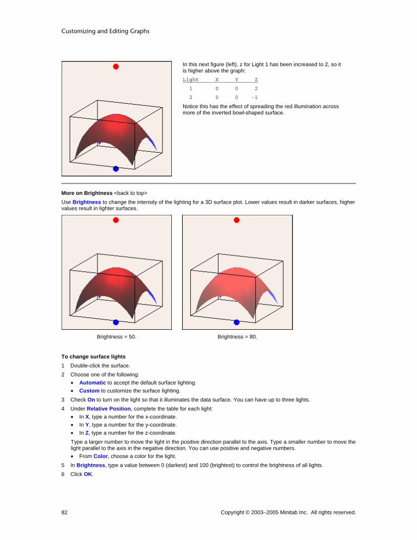
Customizing and Editing Graphs
Copyright © 2003–2005 Minitab Inc. All rights reserved. 82
In this next figure (left), z for Light 1 has been increased to 2, so it is higher above the graph: Light X Y Z
1 0 0 2
2 0 0 -1
Notice this has the effect of spreading the red illumination across more of the inverted bowl-shaped surface.
More on Brightness <back to top> Use Brightness to change the intensity of the lighting for a 3D surface plot. Lower values result in darker surfaces, higher values result in lighter surfaces.
Brightness = 50. Brightness = 80.
To change surface lights 1 Double-click the surface. 2 Choose one of the following:
• Automatic to accept the default surface lighting. • Custom to customize the surface lighting.
3 Check On to turn on the light so that it illuminates the data surface. You can have up to three lights. 4 Under Relative Position, complete the table for each light:
• In X, type a number for the x-coordinate. • In Y, type a number for the y-coordinate. • In Z, type a number for the z-coordinate. Type a larger number to move the light in the positive direction parallel to the axis. Type a smaller number to move the light parallel to the axis in the negative direction. You can use positive and negative numbers. • From Color, choose a color for the light.
5 In Brightness, type a value between 0 (darkest) and 100 (brightest) to control the brightness of all lights. 6 Click OK.

Customizing Graphs
Copyright © 2003–2005 Minitab Inc. All rights reserved. 83
Edit Surface − Options Select surface > Editor > Edit Surface > Options Use to customize the grid of regular x- and y-values (mesh) that Minitab uses to calculate the surface.
3 by 3 mesh 4 by 5 mesh
By default, if your data form a regular x-y mesh, Minitab uses this mesh and creates the plot based on the actual z-values. Otherwise, Minitab interpolates values for a regular 15 by 15 mesh. Alternatively, you can specify the number of x- and y-values to include:
• For higher resolution, use more values.
• For lower resolution, use fewer values.
Note Using a mesh with more and smaller intervals than exist between data points may appear to add more resolution to the image, but the added detail may not be meaningful.
Dialog box items Mesh for Interpolating Surface
Automatic: Choose to accept the default mesh. Custom: Choose to customize the mesh.
X-Mesh Number: Enter the number of x-values to include in the mesh. Y-Mesh Number: Enter the number of y-values to include in the mesh.
Boundary z-value: Enter a z-value to be used at the boundaries (corners and edges) of the plot if your data do not form a regular mesh. By default, Minitab uses the minimum z-value. (If your data follow a regular mesh, this option is not available. This option is not available with response surface or mixtures plots.)
To change the mesh 1 Double-click the surface. 2 Click the Options tab. 3 Under Mesh for Interpolating Surface, choose one of the following:
• Automatic to use the default mesh. • Custom to customize the mesh.
− In X-Mesh Number, enter the number of x-values to include in the mesh.
− In Y-Mesh Number, enter the number of y-values to include in the mesh.
4 In Boundary z-value, enter a z-value to be used at the boundaries (corners and edges) of the plot if your data do not form a regular mesh. By default, Minitab uses the minimum z-value. (If your data follow a regular mesh, this option is not available. This option is not available with response surface or mixtures plots.)
5 Click OK.
Examples of editing the surface In Example of a 3D surface plot, you examine the optimal time and temperature for reheating a new frozen entree. You want to customize the plot. To see the effect of changing the surface lighting, see Example of a 3D surface plot.
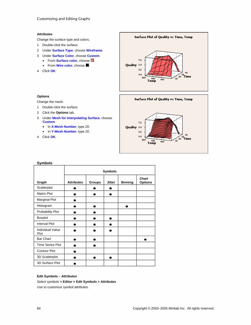
Customizing and Editing Graphs
Copyright © 2003–2005 Minitab Inc. All rights reserved. 84
Attributes Change the surface type and colors. 1 Double-click the surface. 2 Under Surface Type, choose Wireframe. 3 Under Surface Color, choose Custom.
• From Surface color, choose . • From Wire color, choose .
4 Click OK.
Options Change the mesh. 1 Double-click the surface. 2 Click the Options tab. 3 Under Mesh for Interpolating Surface, choose
Custom. • In X-Mesh Number, type 20. • In Y-Mesh Number, type 20.
4 Click OK.
Symbols
Symbols
Graph Attributes Groups Jitter Binning Chart Options
Scatterplot Matrix Plot Marginal Plot Histogram Probability Plot Boxplot Interval Plot Individual Value Plot
Bar Chart Time Series Plot Contour Plot 3D Scatterplot 3D Surface Plot
Edit Symbols − Attributes Select symbols > Editor > Edit Symbols > Attributes Use to customize symbol attributes.

Customizing Graphs
Copyright © 2003–2005 Minitab Inc. All rights reserved. 85
Dialog box items Symbols
Automatic: Choose to accept the default symbol attributes. Custom: Choose to customize the symbol attributes.
Type: Choose a symbol type. Color: Choose a symbol color. Size: Choose a symbol size.
To change the symbol or dot attributes 1 Select then double-click one or more symbols or dots. See Selecting groups and single items. 2 Under Symbols, choose one of the following:
• Automatic to accept the default symbol attributes. • Custom to customize the symbol attributes.
− From Type, choose a symbol type.
− From Color, choose a symbol color.
− From Size, choose a symbol size.
3 Click OK.
Edit Symbols − Binning Select symbols > Editor > Edit Symbols > Binning Use to define bin intervals by midpoints or cutpoints.
Dialog box items Interval Type
Midpoint: Choose to define bin intervals by midpoints. Cutpoint: Choose to define bin intervals by cutpoints.
Interval Definition Automatic: Choose to accept the default number of bins. Number of intervals: Choose and enter the number of bins. Midpoint/Cutpoint positions: Choose and enter custom midpoint or cutpoint positions.
To change the binning 1 Double-click the area, bars, dots, symbols, or lowess smoother. 2 Click the Binning tab. 3 Under Interval Type, choose Midpoint or Cutpoint to define bin intervals by midpoints or cutpoints. 4 Under Interval Definition, choose one of the following to determine the number of bins:
• Automatic to accept the default number of bins. • Number of intervals, then enter the number of bins. • Midpoint/Cutpoint positions, then enter custom midpoint or cutpoint positions.
5 Click OK.
Edit Symbols − Groups Select all symbols > Editor > Edit Symbols > Groups Use to add, remove, or change the grouping variables on a scatterplot, matrix plot, histogram, probability plot, time series plot, and 3D graph. You can also add a grouping variable to a boxplot, interval plot, individual value plot, or bar chart.
Dialog box items Categorical variables for grouping: Enter up to three columns of categorical grouping variables to assign different attributes to each group and display a legend.

Customizing and Editing Graphs
Copyright © 2003–2005 Minitab Inc. All rights reserved. 86
Apply same grouping to other data displays: Check to update all data displays, such as connect line and project lines, to use the same grouping variables as the symbols. (Not available with histograms or probability plots.)
To change the grouping variables 1 Select and double-click all areas, symbols, project lines, bars, or connect lines. See Selecting groups and single
items. 2 Click the Groups tab. 3 In Categorical variables for grouping, enter up to four columns containing categorical grouping variables. Minitab
assigns different attributes to each group and displays a legend. 4 If you like, check Apply same grouping to other data displays to assign the group attributes to all data displays on
the graph. (Not available with histograms, probability plots, or empirical cdf graphs.) 5 Click OK.
Edit Symbols − Groups Select all symbols > Editor > Edit Symbols > Groups If you have grouping variables on a boxplot, interval plot, individual value plot, or bar chart, you can assign different attributes to each group. You can also add a grouping variable to a scatterplot, matrix plot, histogram, probability plot, time series plot, and 3D graph.
Dialog box items Categorical variables for attribute assignment: Enter up to four columns of categorical grouping variables to assign different attributes to each group and display a legend. Apply attribute variables to other data displays: Check to update all data displays, such as bars and connect lines, to use the same attribute variables as the symbols. <Chart Options
To assign attributes based on grouping variables 1 Select and double-click all boxes, bars, connect lines, dots, interval bars, or project lines. See Selecting groups and
single items. 2 Click the Groups tab. 3 In Categorical variables for attribute assignments, enter up to four columns of categorical grouping variables for
bar chart and three for other graphs. Minitab assigns different attributes to each group and may display a legend. 4 If you like, check Apply attribute variable to other data displays to assign the group attributes to all data displays
on the graph. (Not available with dotplots.) 5 Click OK.
Edit Symbols − Jitter Select all symbols > Editor > Edit Symbols > Jitter Use to randomly offset (jitter) points to reveal overlapping points. You can jitter symbols on scatterplots, matrix plots, boxplots, interval plots, individual value plots, and 3D scatterplots.
Dialog box items Add jitter to direction: Check to offset points so they do not overlap.
X: Type a number from 0 to 1 to specify the amount of jitter in the x-direction. Y: Type a number from 0 to 1 to specify the amount of jitter in the y-direction. Z: (3D scatterplot only) Type a number from 0 to 1 to specify the amount of jitter in the z-direction.
To add jitter 1 Select and double-click all areas, connect lines, project lines, or symbols. See Selecting groups and single items. 2 Click the Jitter tab. 3 Check Add jitter to direction to offset points so they do not overlap. Then:
• In X, type a number from 0 to 1 to specify the amount of jitter in the x-direction. • In Y, type a number from 0 to 1 to specify the amount of jitter in the y-direction.

Customizing Graphs
Copyright © 2003–2005 Minitab Inc. All rights reserved. 87
• (3D scatterplot only) In Z, type a number from 0 to 1 to specify the amount of jitter in the z-direction. 4 Click OK.
Edit Symbols − Chart Options Select symbols > Editor > Edit Symbols > Chart Options Select bar chart > Editor > Graph Options Use to specify increasing or decreasing bar order, choose a cumulative y-scale, or choose a percent scale for the y-axis. If you have more than one categorical variable, use to specify the grouping level for calculating the scale and to stack data.
Dialog box items Order Main X Groups Based On Choose the order for the bars. See Ordering Category Groups Based on Y-Axis Values.
Default: Choose to use the default order for bars. For bar charts of counts of unique values and functions of a variable, the default order is ascending, either numerically, chronologically, or alphabetically. (To use a value order other than alphabetical for text categories, see Ordering text categories.) For bar charts of values from a table, the default order is always the order in which the categories appear in the worksheet; any value order is ignored. Increasing Y: Choose to order bars from smallest to largest y-values. Decreasing Y: Choose to order bars from largest to smallest y-values.
Note If the data have multiple categorical variables, Minitab orders the bars by the sum of chart values for the outermost cluster groups.
Show Y as Percent: Check to use a percent scale on the y-axis. See Using Percent Scales and Accumulating Y Across X. Accumulate Y across X: Check to use a cumulative scale on the y-axis. See Using Percent Scales and Accumulating Y Across X. Take Percent and/or Accumulate If you have two or more categorical variables, specify for which grouping level you want to show y as a percent and/or accumulate y across x. The options available depend on the number of categorical variables that are included in the bar chart. For more information, see Using Percent Scales and Accumulating Y Across X.
Across all categories: Choose to apply a percent scale and/or cumulative scale across all categories. Within categories at level 1 (outermost): Choose to apply a percent scale and/or cumulative scale within categories at the outermost scale level only. Within categories at level 2: Choose to apply a percent scale and/or cumulative scale within categories at the second grouping level from the bottom only. Within categories at level 3: Choose to apply a percent scale and/or cumulative scale within categories at the third grouping level from the bottom only.
Stack values for last categorical variable: Check to stack the categories for the last categorical variable. Each category is represented by a separate segment of a bar. (Only available if you have two or more categorical variables.)
Examples of editing symbols (bar chart) In the Example of a clustered bar chart of counts, you examine the number of rejected door panels for each type of paint flaw, clustered by time period. You want to add and customize the symbols.
Groups Add a grouping variable. 1 Choose Editor > Add > Data Display. 2 Under Data Display, check Symbols. 3 Click OK. 4 Select and double-click all symbols. 5 Click the Groups tab. 6 In Categorical variables for attribute
assignment, enter Period. 7 Click OK.

Customizing and Editing Graphs
Copyright © 2003–2005 Minitab Inc. All rights reserved. 88
Attributes Change the symbol color for one group. 1 Select and double-click the green symbols
(Period = Night). See Selecting groups and single items for details.
2 Under Symbols, choose Custom. • From Color, choose .
3 Click OK.
Chart options Change the bar order and scale. 1 Select and double-click all symbols. 2 Click the Chart Options tab. 3 Under Order Main X Groups Based On,
choose Increasing Y. 4 Check Accumulate Y across X. 5 Click OK.
Examples of editing symbols (boxplot) In the Example of a boxplot with multiple y's and groups, you assess the consistency of plastic pipe diameters. You can represent the data with outlier, individual, median, and mean symbols. You want to add and customize individual symbols.
Note Similar symbol editing functions are available for individual symbols on interval plots and individual value plots.
Groups Add a grouping variable. 1 Choose Editor > Add > Data Display. 2 Under Data Display, check Individual
symbols. 3 Double-click the symbols. 4 Click the Groups tab. 5 In Categorical variables for grouping, enter
Machine. 6 Click OK.

Customizing Graphs
Copyright © 2003–2005 Minitab Inc. All rights reserved. 89
Attributes Change the symbol type and color for each group. 1 Select and double-click the black symbols
(Machine = 1). See Selecting groups and single items for details.
2 Under Symbols, choose Custom. • From Type, choose . • From Color, choose .
3 Click OK. 4 Select and double-click the red symbols
(Machine = 2). 5 Under Symbols, choose Custom.
• From Type, choose . • From Color, choose .
6 Click OK.
Jitter By default, Minitab randomly offsets (jitters) points to display overlapping points. Remove the jitter. 1 Double-click the symbols. 2 Click the Jitter tab. 3 Uncheck Add jitter to direction. 4 Click OK.
Examples of editing symbols (contour plot) In the Example of a contour plot, you determine the optimal time and temperature for reheating a new frozen entree. You want to add and customize the the symbols.
Note Similar symbol editing functions are available for 3D surface plots.
Attributes Change the area fill pattern and color, and change the border width. 1 Choose Editor > Add > Data Display. 2 Under Data Display, check Symbols. Click OK. 3 Select and double-click all symbols. 4 Under Symbols, choose Custom.
• From Type, choose . • From Color, choose .
5 Click OK.
Examples of editing symbols (histogram) In the Example of a simple histogram, you determine the amount of torque required to remove shampoo bottle caps. You want to add and customize the symbols.
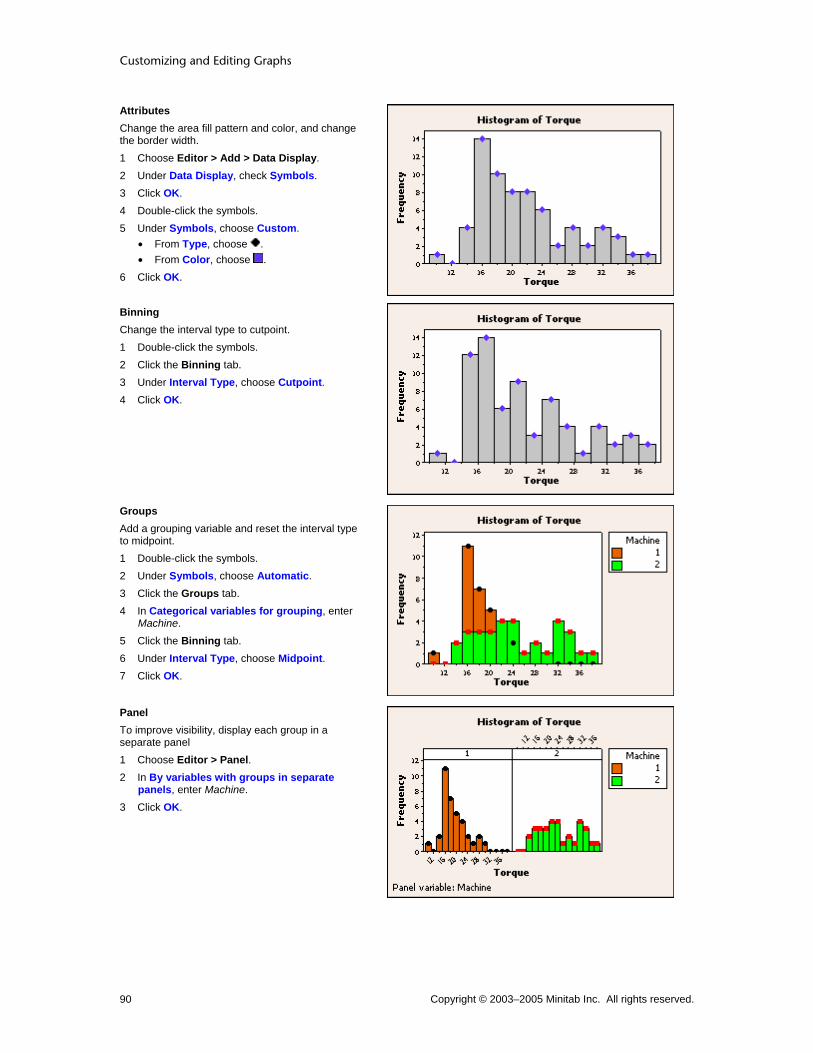
Customizing and Editing Graphs
Copyright © 2003–2005 Minitab Inc. All rights reserved. 90
Attributes Change the area fill pattern and color, and change the border width. 1 Choose Editor > Add > Data Display. 2 Under Data Display, check Symbols. 3 Click OK. 4 Double-click the symbols. 5 Under Symbols, choose Custom.
• From Type, choose . • From Color, choose .
6 Click OK.
Binning Change the interval type to cutpoint. 1 Double-click the symbols. 2 Click the Binning tab. 3 Under Interval Type, choose Cutpoint. 4 Click OK.
Groups Add a grouping variable and reset the interval type to midpoint. 1 Double-click the symbols. 2 Under Symbols, choose Automatic. 3 Click the Groups tab. 4 In Categorical variables for grouping, enter
Machine. 5 Click the Binning tab. 6 Under Interval Type, choose Midpoint. 7 Click OK.
Panel To improve visibility, display each group in a separate panel 1 Choose Editor > Panel. 2 In By variables with groups in separate
panels, enter Machine. 3 Click OK.

Customizing Graphs
Copyright © 2003–2005 Minitab Inc. All rights reserved. 91
Examples of editing symbols (marginal plot) In the Example of a marginal plot with histograms, you examine the relationship between flash recovery time (minimum time between flashes) and the voltage remaining in the camera battery. You want to edit the symbols.
Attributes Change the symbol type and color. 1 Double-click the symbols. 2 Under Symbols, choose Custom.
• From Type, choose ∗. • From Color, choose .
3 Click OK.
Attributes Change the symbol type and color for the three points with VoltsAfter values greater than 1.4. 1 Select and double-click a symbol for a VoltsAfter
value greater than 1.4. 2 Under Symbols, choose Custom.
• From Type, choose . • From Color, choose .
3 Click OK. 4 Repeat for the other two points.
Examples of editing symbols (probability plot) In the Example of a probability plot, you assess the flammability of a new fabric. You want to customize the symbols.
Attributes Change the symbol type and color. 1 Double-click the symbols. 2 Under Symbols, choose Custom.
• From Type, choose . • From Color, choose .
3 Click OK.
Examples of editing symbols (scatterplot) In the Example of a simple scatterplot, you examine the relationship between voltage remaining in your batteries immediately after a flash and the length of time required for a battery to be ready to support another flash. You want to customize the symbols.
Note Similar symbol editing functions are available for matrix plots and 3D scatterplots.

Customizing and Editing Graphs
Copyright © 2003–2005 Minitab Inc. All rights reserved. 92
Groups Add a grouping variable. 1 Double-click the symbols. 2 Click the Groups tab. 3 In Categorical variables for grouping, enter
Formulation. 4 Click OK.
Jitter Add random offset (jitter) points to see overlapping points. 1 Double-click the symbols. 2 Click the Jitter tab. 3 Check Add jitter to direction. 4 Click OK.
Attributes Change the symbol color for one group. 1 Select and double-click the red symbols
(Formulation = Old). See Selecting groups and single items for details.
2 Under Symbols, choose Custom. • From Color, choose .
3 Click OK.
Examples of editing symbols (time series plot) In the Example of a simple time series plot, you track a company's quarterly sales over three years. You want to customize the symbols.

Customizing Graphs
Copyright © 2003–2005 Minitab Inc. All rights reserved. 93
Groups Add a grouping variable. 1 Double-click the symbols. 2 Click the Groups tab. 3 In Categorical variables for grouping, enter
Year. 4 Click OK.
Attributes Change the symbol color and type for one group. 1 Select and double-click the green symbols
(Year = 2002). See Selecting groups and single items for details.
2 Under Symbols, choose Custom. • From Color, choose . • From Type, choose .
3 Click OK.
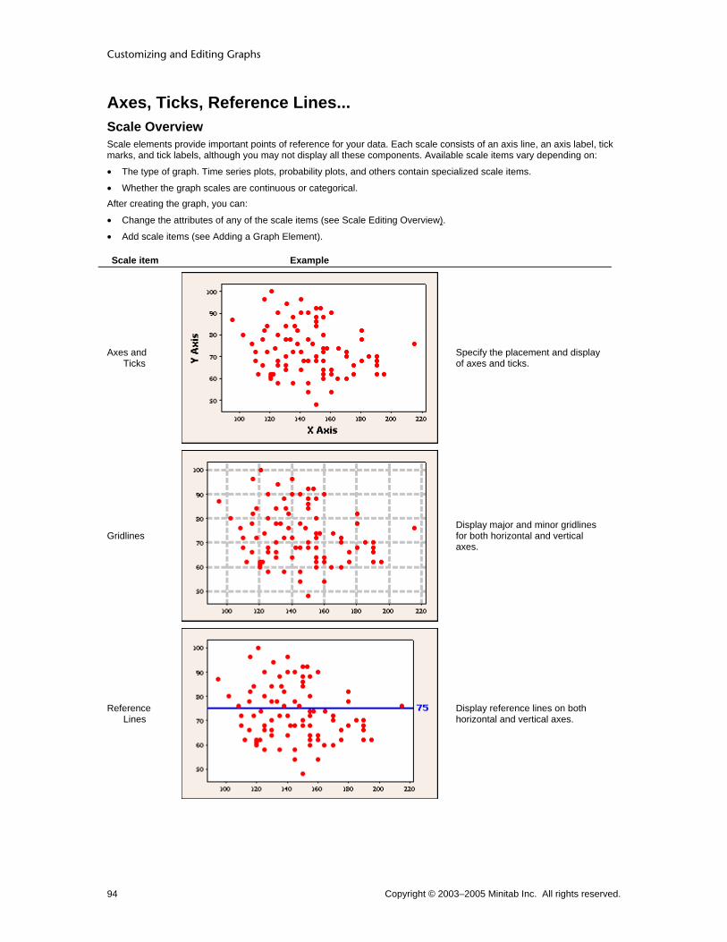
Customizing and Editing Graphs
Copyright © 2003–2005 Minitab Inc. All rights reserved. 94
Axes, Ticks, Reference Lines... Scale Overview Scale elements provide important points of reference for your data. Each scale consists of an axis line, an axis label, tick marks, and tick labels, although you may not display all these components. Available scale items vary depending on:
• The type of graph. Time series plots, probability plots, and others contain specialized scale items.
• Whether the graph scales are continuous or categorical. After creating the graph, you can:
• Change the attributes of any of the scale items (see Scale Editing Overview).
• Add scale items (see Adding a Graph Element).
Scale item Example
Axes and Ticks
Specify the placement and display of axes and ticks.
Gridlines
Display major and minor gridlines for both horizontal and vertical axes.
Reference Lines
Display reference lines on both horizontal and vertical axes.

Customizing Graphs
Copyright © 2003–2005 Minitab Inc. All rights reserved. 95
Percentile Lines
Display percentile lines on probability plots and Empirical CDF graphs.
Time Scale
Control time scales and start values with time series plots, area graphs, and control charts.
Secondary Scale
With graph editing, add a secondary scale to overlaid scatterplots and time series plots.
Creation Axes and Ticks Axes and Ticks Overview Axes and ticks provide directional and incremental points of reference for your data.

Customizing and Editing Graphs
Copyright © 2003–2005 Minitab Inc. All rights reserved. 96
Scale item
Example
Axis Lines
Extend the full length of the scale along each axis.
Tick lines and labels
Indicate intervals on a scale. Major ticks mark either intervals on the scale or categories, and have labels. Minor ticks mark smaller intervals between major ticks and do not have labels.
Axis labels
Identify the variables associated with the scale.
Note Minor ticks cannot be used with categorical scales, because there are no logical intervals between categories. See Continuous and Categorical Scales. Time, percent, and probability scales also do not allow minor ticks.
Axes and Ticks subdialog boxes all contain essentially the same elements, but differ in wording based on the graph type. Click the following links for graph-specific axes and ticks information:
• Graphs with categorical scales
• 3D Graphs
• Time Series and Area graphs
• Marginal Plots
• All other graphs

Customizing Graphs
Copyright © 2003–2005 Minitab Inc. All rights reserved. 97
Scale − Axes and Ticks ... > Scale > Axes and Ticks Use to specify which scale elements to display and where to display them. By default, Minitab displays the axis line, major ticks, and associated tick labels for each scale on the low side of the graph and the axis line only for the scale on the high side of the graph. After you create a graph you can:
• Edit the range of the scale.
• Edit the tick labels.
• Edit the attributes, font, and alignment of the scale.
• Add hidden scale items with the Show tab.
• Apply a scale transformation.
• Add a secondary scale to overlaid scatterplots or time series plots.
Dialog box items Axis line: Check to display axis lines on the low and high sides of the x- and y-scales. Major ticks: Check to display major tick marks on the low and high sides of the x- and y-scales. Major tick labels: Check to display major tick labels on the low and high sides of the x- and y-scales. Minor ticks: Check to display minor tick marks on the low and high sides of the x- and y-scales. Transpose Y and X: Check to transpose the variables that are plotted on each axis. Not available with all graphs. Adjust x-scale for threshold if distribution has this parameter: If you have chosen a distribution with a threshold parameter, checking this item adjusts the x-scale accordingly. Only available with probability plots.
Scale − Axes and Ticks for Categorical Scales ... > Scale > Axes and Ticks Use to specify which scale elements to display and where to display them on a categorical scale. By default, Minitab displays the major ticks and associated tick labels for each scale on the low side of each axis. After you create a graph you can:
• Edit the spacing of categories and their labels.
• Edit the tick labels.
• Edit the attributes, font, and alignment of the scale.
• Add hidden scale items with the Show tab.
Dialog box items Axis line: Check to display axis line on the low and high sides of the Value Scale (Y) and Category Scale (X). Major ticks: Check to display major tick marks on the low and high sides of the Value Scale (Y) and Category Scale (X). Category scale option not available with all graphs. Major tick labels: Check to display major tick labels on the low and high sides of the Value Scale (Y) and Category Scale (X). Category scale option not available with all graphs. Minor ticks: Check to display minor ticks on the low and high sides of the Value Scale (Y). Transpose value and category scales: Check to transpose the variables plotted on each axis. Not available with dotplot.
Scale − Axes and Ticks for Time Series and Area Graphs ... > Time/Scale > Axes and Ticks Use to specify which scale elements to display and where to display them. By default, Minitab displays the major ticks and associated tick labels for each scale on the low side of each axis. For more information on the scales of time series plots and area graphs, click Time Overview. After you create a graph you can:
• Edit the placement and increments of scale items.
• Edit the tick labels.
• Edit the attributes, font, and alignment of the scale.
• Add hidden scale items with the Show tab.
• Add a secondary scale to overlaid scatterplots or time series plots.

Customizing and Editing Graphs
Copyright © 2003–2005 Minitab Inc. All rights reserved. 98
Dialog box items
Note Available items may vary with control charts.
Axis line: Check to display axis lines on the low and high sides of the Value Scale (Y) and Time Scale (X). Major ticks: Check to display major ticks on the low sides of the Value Scale (Y) and Time Scale (X). Major tick labels: Check to display major tick labels on the low sides of the Value Scale (Y) and Time Scale (X). Minor ticks: Check to display minor ticks on the low and high sides of the Value Scale (Y).
Scale − Axes and Ticks for 3D Graphs ... > Scale > Axes and Ticks Use to specify which scale elements to display and where to display them. By default, Minitab displays the major ticks and associated tick labels for each scale on the low side of each axis. After you create a graph you can:
• Edit the range of the scale.
• Edit the tick labels.
• Edit the attributes, font, and alignment of the scale.
• Add hidden scale items with the Show tab.
Dialog box items Major ticks: Check to display major ticks on the low sides of the x-, y-, and z-scales. Major tick labels: Check to display major tick labels on the low sides of the x-, y-, and z-scales. Minor ticks: Check to display minor ticks on the low sides of the x-, y-, and z-scales.
Scale − Axes and Ticks for Marginal Plot ... > Scale > Axes and Ticks Use to specify which scale elements to display and where to display them. By default, Minitab displays the major ticks and associated tick labels for each scale on the low side of each axis. After you create a graph you can:
• Edit the range of the scale.
• Edit the tick labels.
• Edit the attributes, font,and alignment of the scale.
• Add hidden scale items with the Show tab.
Dialog box items Axis Line: Check to display axis lines on the low sides of the x- and y-scales. Major ticks: Check to display major ticks on the low sides of the x- and y-scales. Major tick labels: Check to display major tick labels on the low sides of the x- and y-scales. Minor ticks: Check to display minor ticks on the low sides of the x- and y-scales.
To display scale elements 1 In the data source dialog box, click Scale. 2 Check the components you want to display. 3 Click OK.
Note If you choose minor ticks, but not major ticks, Minitab displays minor ticks at the major tick positions.
Example of displaying the y-scale on the right axis From the Scale subdialog box, you can specify which scale components to display on your graph. By default, major ticks and tick labels are shown only on the low sides of the graph. In this example, you add these items to the high sides of the graph. 1 Open the file BATTERIES.MTW. 2 Choose Graph > Scatterplot.

Customizing Graphs
Copyright © 2003–2005 Minitab Inc. All rights reserved. 99
3 Choose With Groups, and click OK. 4 In Y, enter VoltsB. In X, enter Service. 5 In Categorical variables for grouping (0-3), enter Drain. 6 Click Scale, then click the Axes and Ticks tab. 7 Under Y Scale, High, and X Scale, High, check Major ticks and Major tick labels. Click OK in each dialog box.
Graph window output
Example of transposing axes of a probability plot You want to know whether your pager voltage data follow the normal distribution, so you create a probability plot. You transpose the axes to display percents on the horizontal axis. 1 Open the worksheet BATTERIES.MTW. 2 Choose Graph > Probability Plot > choose Single > OK. 3 In Variables, enter VoltsC. 4 Click Scale, then click the Axes and Ticks tab. 5 Check Transpose Y and X, then click OK in each dialog box.
Graph window output
Interpreting the results Visually, your pager data appear to follow the normal distribution, because all the data fall along the plotted line within the confidence intervals.
Customizing and Editing Graphs
Copyright © 2003–2005 Minitab Inc. All rights reserved. 100
Statistically, you can conclude that the normal distribution appears to fit your data, because the Anderson-Darling statistic (AD) is 0.2582 and the p-value (P) is 0.691.
Y-Scale Type
Scale − Y-Scale Type ... > Scale > Y-Scale Type Use to choose the y-scale type of a histogram, probability plot, or Empirical CDF. By default, Minitab displays a percent scale for probability plots and Empirical CDF graphs and a frequency scale for histograms.
Dialog box items Y-Scale Type
Frequency: Choose to use a frequency scale. This option is only available with histograms. Percent: Choose to use a percent scale. Density: Choose to use a density scale. This option is only available with histograms. Probability: Choose to use a probability scale. This option is not available with histograms. Score: Choose to use a scores scale. This option is only available with probability plots. (For calculations, see Method of obtaining probability plot points.) Accumulate values across bins: For histograms only, check to accumulate values from left to right with each bar. This option cannot be used with the Density option.
To change y-scale type 1 In the data source dialog box, click Scale, then click the Y-Scale Type tab. 2 Under Y-Scale Type, do one of the following:
• Choose Frequency to change the scale type to represent frequency. • Choose Percent to change the scale type to represent percentages. • Choose Density to change the scale type to represent density. Only with histograms. • Choose Probability to change the scale type to represent probability. Not available with histograms. • Choose Score to change the scale type to represent scores. Only with probability plots.
3 If you have chosen Frequency or Percent, check Accumulate values across bins to accumulate values from left to right with each bar. Only available with histograms.
4 Click OK.
Example of changing y-scale type Suppose you are creating a probability plot and decide to alter the default display of the scale from percentages to probability. 1 Open the worksheet FABRIC.MTW. 2 Choose Graph > Probability Plot. 3 Choose Single and click OK. 4 In Variables, enter C2. 5 Click Scale, then click the Y-Scale Type tab. 6 Under Y-Scale Type, choose Probability. Click OK in each dialog box.

Customizing Graphs
Copyright © 2003–2005 Minitab Inc. All rights reserved. 101
Graph window output
Gridlines
Scale − Gridlines ... > Scale > Gridlines Use to display gridlines at the major and minor tick positions. If you choose gridlines at the minor tick positions, gridlines are also drawn at the major tick positions. After you create a graph you can:
• Edit the display of gridlines.
• Edit the attributes of gridlines.
• Add gridlines with Editor > Add > Gridlines.
Dialog box items Z major ticks: Check to display gridlines at the z-axis major tick position. This option is only available with 3D plots. Z minor ticks: Check to display gridlines at the z-axis minor tick position. This option is only available with 3D plots. Y major ticks: Check to display gridlines at the y-axis major tick position. Y minor ticks: Check to display gridlines at the y-axis minor tick position. Y minor ticks are not available with probability or percent scales of probability plots. X major ticks: Check to display gridlines at the x-axis major tick position. X minor ticks: Check to display gridlines at the x-axis minor tick position. X minor ticks are not available with all graphs.
To display gridlines 1 In the Graph dialog box, click Scale and then click the Gridlines tab. 2 In the check boxes, check the tick positions of each axis for which you want to display gridlines.
Note If you choose gridlines to be displayed at the minor tick positions, but not at the major tick positions, Minitab displays gridlines at both major and minor tick positions.
3 Click OK.
Example of displaying gridlines Suppose you want to include a scatterplot in a presentation. To ensure that points are easily related to their respective values on both scales, you add gridlines. 1 Open the worksheet PULSE.MTW. 2 Choose Graph > Scatterplot. 3 Choose Simple and click OK. 4 In Y, enter Pulse1. 5 In X, enter Weight.

Customizing and Editing Graphs
Copyright © 2003–2005 Minitab Inc. All rights reserved. 102
6 Click Scale, then click the Gridlines tab. 7 Under Show gridlines for, check all items except Y minor ticks. 8 Click OK in each dialog box.
Graph window output
Reference Lines
Scale − Reference Lines ... > Scale > Reference Lines Use to display reference lines. By default, Minitab displays labels for each reference line. After you create a graph you can:
• Edit the attributes of reference lines.
• Edit the display of reference line labels.
• Edit the font of reference line labels.
• Edit the alignment of reference line labels.
• Add reference lines with Editor > Add > Reference Lines.
Dialog box items Show reference lines for Z positions: Enter the position for z-scale reference lines to be drawn. Only available with 3D graphs. Show reference lines for Y positions: Enter the position for y-scale reference lines to be drawn. Show reference lines for X positions: Enter the position for x-scale reference lines to be drawn.
To display reference lines 1 In the data source dialog box, click Scale, then click the Reference Lines tab. 2 In Show reference lines for Y positions, enter the y values at which you want reference lines drawn. Separate
multiple entries with a space. 3 In Show reference lines for X positions, enter the x values at which you want reference lines drawn. Separate
multiple entries with a space. 4 Click OK.
Scale − Reference Lines for Categorical Scales ... > Scale > Reference Lines Use to display reference lines when you create a graph with a scale displaying categorical data. By default, Minitab displays labels for each reference line. After you create a graph you can:
• Edit the attributes of reference lines.

Customizing Graphs
Copyright © 2003–2005 Minitab Inc. All rights reserved. 103
• Edit the display of reference line labels.
• Edit the font of reference line labels.
• Edit the alignment of reference line labels.
• Add reference lines with Editor > Add > Reference Lines.
Dialog box items Show reference lines at Y (value scale) positions: Enter the positions for value-scale reference lines. Show reference lines at X (category scale) positions: Enter the positions for category-scale reference lines. Each category is assigned an integer value. From left to right, the first category is 1, the second 2, and so on. Entering a value of 1.5 draws a reference line between the first and second categories.
To display reference lines with categorical scales 1 In the Graph dialog box, click Scale, then click the Reference Lines tab. 2 In Show reference lines at value scale positions, enter the values at which you want value scale reference lines
drawn. 3 In Show reference lines at category scale positions, enter the values at which you want category scale reference
lines drawn. Each category is assigned an integer value. From left to right, the first category is 1, the second 2, and so on. Entering a value of 1.5 draws a reference line between the first and second categories.
4 If you like, use any dialog box options, then click OK.
Scale − Reference lines for histograms, probability plots and empirical CDF ... > Scale > Reference Lines Use to display reference lines. By default, Minitab displays labels for each reference line. After you create a graph you can:
• Edit the attributes of reference lines.
• Edit the display of reference line labels.
• Edit the font of reference line labels.
• Edit the alignment of reference line labels.
• Add reference lines with Editor > Add > Reference Lines.
Dialog box items Show reference lines for Y positions: Enter the positions for y-scale reference lines. Show reference lines at X (data scale) positions: Enter the positions for x-scale reference lines.
To display reference lines with probability plots and histograms 1 In the Graph dialog box, click Scale, then click the Reference Lines tab. 2 In Show reference lines for Y positions, enter the y values at which you want reference lines drawn. 3 In Show reference lines for X (data) scale positions, enter the x values at which you want reference lines drawn. 4 If you like, use any dialog box options, then click OK.
Example of a simple scatterplot You are interested in how well your company's camera batteries are meeting customers' needs. Market research shows that customers become annoyed if they have to wait longer than 5.25 seconds between flashes. You collect a sample of batteries that have been in use for varying amounts of time and measure the voltage remaining in each battery immediately after a flash (VoltsAfter), as well as the length of time required for the battery to be able to flash again (flash recovery time, FlashRecov). Create a scatterplot to examine the results. Include a reference line at the critical flash recovery time of 5.25 seconds. 1 Open the worksheet BATTERIES.MTW. 2 Choose Graph > Scatterplot. 3 Choose Simple, then click OK. 4 Under Y variables, enter FlashRecov. Under X variables, enter VoltsAfter. 5 Click Scale, then click the Reference Lines tab. 6 In Show references lines for Y positions, type 5.25. Click OK in each dialog box.

Customizing and Editing Graphs
Copyright © 2003–2005 Minitab Inc. All rights reserved. 104
Graph window output
Interpreting the results As expected, the lower the voltage in a battery after a flash, the longer the flash recovery time tends to be. The reference line helps to illustrate that there were many flash recovery times greater than 5.25 seconds.
Percentile Lines Creation
Scale − Percentile Lines ... > Scale > Percentile Lines Use to display percentile lines. By default, Minitab displays labels for each percentile line. After you create a graph you can:
• Edit the attributes of percentile lines.
• Edit the font of percentile line labels.
• Edit the alignment of percentile line labels.
• Add a percentile line with Editor > Add > Percentile Line.
Dialog box items Percentile Lines
None: Choose to display no percentile line. At Y values: Choose to enter y-scale values for placing percentile lines. At data values: Choose to enter data values for placing percentile lines.
To display percentile lines 1 In the Graph dialog box, click Scale, then click the Percentile Lines tab. 2 Under Percentile Lines, choose At Y values or At data values and enter the percentiles or data values where you
want lines drawn. When entering multiple percentiles, leave a space between each entry. 3 Click OK.
Example of a probability plot You work for a textile manufacturer and want to assess the flammability of a new fabric. Testers hold randomly selected pieces of the fabric over an open flame for a fixed amount of time, and measure the length of the burned portion. You typically use the 87th percentile as a benchmark for such tests. Create a probability plot to determine if a normal distribution fits your data and to estimate the 87th percentile for the population. 1 Open the worksheet FLAMERTD.MTW. 2 Choose Graph > Probability Plot. 3 Choose Single, then click OK.

Customizing Graphs
Copyright © 2003–2005 Minitab Inc. All rights reserved. 105
4 In Graph variables, enter Fabric. 5 Click Scale, then click the Percentile Lines tab. 6 Under Percentile Lines, choose At Y values, and enter 87. Click OK in each dialog box.
Graph window output
Interpreting the results A normal distribution with a mean of 3.573 and a standard deviation of 0.57 appears to fit your sample data fairly well:
• The plotted points form a reasonably straight line.
• The plotted points follow the fitted line fairly closely.
• The p-value for the Anderson-Darling test is above 0.10. Because the distribution fits your data, you can use the fitted line to estimate percentiles for the population. The estimated 87th percentile for burn length is 4.215. If you hover your mouse over the fitted line or confidence intervals, Minitab displays the fitted percentiles and associated confidence bounds for several points:
You can be 95% confident that the 87th percentile for the population is between 3.84295 and 4.58790.

Customizing and Editing Graphs
Copyright © 2003–2005 Minitab Inc. All rights reserved. 106
Note Minitab calculates point-wise confidence intervals, thus the 95% confidence level applies only to individual intervals. If you use two or more intervals to estimate parameters, your actual confidence level for the group of estimates will be less than 95%.
Time Scale Time Overview Time series plots and area graphs use a time series scale for the x-axis. Time units are specified in the Time tab of the Time/Scale subdialog box. The time series scale can be:
• Index values (integers representing generic time units)
• Time units
− Calendar units (days, months, quarters, or years)
− Clock units (days, hours, minutes, or seconds)
• Stamp values from a column You can customize time units, start times, and increment times for index, calendar, and clock scales. See the chart below for ranges and default start values. The default increments are 1 unit.
Time scale Time unit Valid values Default start value
Index Generic All integers 1
Calendar Day 1 to 31 (depending on the month)
Current day
Month 1 to 12 Current month
Quarter 1 to 4 Current quarter
Year Valid 4-digit years Current year
Clock Second 0 to 59 0
Minute 0 to 59 0
Hour 0 to 23 0
Example of x-axis with a stamp column

Customizing Graphs
Copyright © 2003–2005 Minitab Inc. All rights reserved. 107
Example of x-axis with two calendar units − month and year
Time/Scale − Time − Time Series Plot Time Series Plot > Time/Scale > Time Use to specify a time scale for the x-axis. After you create a graph you can:
• Edit the time units of the scale.
• Edit the tick positions and range of the scale.
• Edit the tick labels.
• Edit the attributes, font, alignment, and display of the scale.
Dialog box items Time Scale
Index: Choose to label the x-axis with integers. Calendar: Choose to label the x-axis with a calendar scale, then choose the calendar units. Clock: Choose to label the x-axis with a clock scale, then choose the clock units. Stamp: Choose to label the x-axis with values from one or more stamp columns.
Stamp columns (1-3): Enter up to three columns containing stamp values. Start Values (not available with all graphs)
One set for all variables: Choose to use the same start values for each variable. Type the integer start values. One set for each variable: Choose to use a different set of start values for each variable. For each variable, type the integer start values.
Increment: Type the interval between successive worksheet observations on the innermost time scale.
Time/Scale − Time − Area Graph Area Graph > Time/Scale > Time Use to specify a time scale for the x-axis. After you create a graph you can:
• Edit the tick positions and range of the scale.
• Edit the tick labels.
• Edit the attributes, font, alignment, and display of the scale.
Dialog box items Time Scale
Index: Choose to label the x-axis with integers. Calendar: Choose to label the x-axis with a calendar scale, then choose the calendar units. Clock: Choose to label the x-axis with a clock scale, then choose the clock units.

Customizing and Editing Graphs
Copyright © 2003–2005 Minitab Inc. All rights reserved. 108
Stamp: Choose to label the x-axis with values from one or more stamp columns. Stamp columns (1-3): Enter up to three columns containing stamp values.
Start Values: Type the integer start values for the time scale. Increment: Type the interval between successive worksheet observations on the innermost time scale.
To customize the time scale 1 In the graph dialog box, choose Time/Scale. 2 Click the Time tab. 3 Under Time Scale, choose one of the following:
• Index to label the x-axis with integers. • Calendar to label the x-axis with a calendar scale.
− Choose the calendar units. • Clock to label the x-axis with a clock scale.
− Choose the clock units. • Stamp to label the x-axis with values from one or more stamp columns.
− In Stamp columns (1-3), enter up to three columns containing scale values.
4 Under Start Values, choose one of the following: • One set for all variables to use the same start values for each variable.
− Type the start value for each component of the time scale. • One set for each variable to use a different set of start values for each variable, if there are overlaid variables.
− For each variable, type the start values for each component of the time scale.
5 In Increment, type a value to increment the innermost time scale. 6 Click OK.
Example of using a stamp for the x-axis You need to plot your sales using the date format qQyy for the time scale; for example, 4Q00 stands for the fourth quarter of 2000. You enter a column in Minitab called Date and use this column for a stamp on the time series plot.
Note You can also use a stamp with area graphs or control charts.
1 Open the worksheet NEWMARKET.MTW. 2 Choose Graph > Time Series Plot. 3 Choose Simple, then click OK. 4 In Series, enter SalesB. 5 Click Time/Scale. 6 Under Time Scale, choose Stamp. 7 In Stamp columns (1-3), enter Date. Click OK in each dialog box.

Customizing Graphs
Copyright © 2003–2005 Minitab Inc. All rights reserved. 109
Graph window output
Interpreting the results The tick marks on the x-axis are labeled with values from the stamp column.
Example of using custom start times Suppose you want to see how the depth of a reservoir fluctuates over time. You collect measurements every other month for 16 months, starting in January of 1999. Create a time series plot with custom start times.
Note You can also use custom start times with area graphs.
1 Open the worksheet EXH_GRPH.MTW. 2 Choose Graph > Time Series Plot. 3 Choose Simple, then click OK. 4 In Series, enter Depth. 5 Click Time/Scale. 6 Under Time Scale, choose Calendar, then choose Month Year. 7 Under Start Values, choose One set for all variables. 8 Under Month, type 1. Under Year, type 1999. 9 In Increment, type 2. Click OK in each dialog box.
Graph window output
More If a graph has too many tick labels, you can hide some. See Axes and Ticks.

Customizing and Editing Graphs
Copyright © 2003–2005 Minitab Inc. All rights reserved. 110
Interpreting the results The time series plot shows data points for every other month, starting with January 1999.
Scale − Time, with control charts ... > Scale > Time Use to specify a time scale for the x-axis. After you create a graph you can:
• Edit the time units of the scale.
• Edit the range of the scale.
• Edit the tick labels.
• Edit the attributes, font, alignment, and display of the scale.
Dialog box items Time Scale
Index: Choose to label the x-axis with integers. Stamp: Choose to label the x-axis with values from one or more stamp columns.
Stamp columns (1-3): Enter up to three columns containing date/time, numeric, or text scale values.
To customize a control chart's time scale 1 In the control chart dialog box, click Scale. 2 Choose the Time tab. 3 Under X Scale, choose the time scale for the x-axis.
If you choose Stamp, in Stamp columns (1-3), enter one or more columns that contain the stamp information. 4 Click OK.
Editing Scale Editing Overview After you create a graph, you can add or customize scale elements. Refer to the table below for the appropriate procedure.
Scale Item
To change...
Axes and Ticks
• Range of the scale, number of major and minor ticks, and placement of ticks, see − Edit Scale - Scale − Edit Time Series and Area Graph Scale - Scale − Edit Categorical Scale - Scale
• Display of axis lines, ticks, and tick labels, see − Edit Scale - Show − Edit Categorical Scale - Show
• Time series variables, see − Edit Area Graph Scale - Time − Edit Time Series Plot - Time
• Type, color, and size of axis lines, tick orientation, and tick length, see − Edit Scale - Attributes
• Text of tick labels, see − Edit Scale - Labels − Edit Categorical Scale - Labels, Single Level − Edit Categorical Scale - Labels, Multiple Levels
• Font, style, size, and color of tick labels, see − Edit Scale - Font

Customizing Graphs
Copyright © 2003–2005 Minitab Inc. All rights reserved. 111
• Angle of tick labels, see − Edit Scale - Alignment
• Y-scale type on a histogram, probability plot, or Empirical CDF graph, see − Edit Scale - Type
• Y-scale type on a dendrogram, see − Edit Dendrogram Scale
• Transformation of the scale, see − Edit Scale - Transform
• Binning intervals, see − Edit Scale - Binning
• A primary scale into a secondary scale, see − Edit Scale - Secondary Scale
Axis Labels
• Font, style, size, and color of axis labels, see − Edit Axis Labels - Font
• Alignment of axis labels, see − Edit Axis Labels - Alignment
• Display of axis labels, see − Edit Axis Labels - Show
• Text of matrix plot axis labels, see − Edit Axis Labels - Text
Gridlines • Type, color, and size of gridlines, see − Edit Gridlines - Attributes
• Display of gridlines, see − Edit Gridlines - Show
Reference Lines
• Type, color, and size of reference lines, see − Edit Reference Lines - Attributes
• Display and location of reference line labels, see − Edit Reference Line Labels - Show
• Font, style, size, color, and text of reference line labels, see − Edit Reference Line Labels - Font
• Angle of reference line labels, see − Edit Reference Line Labels - Alignment
Percentile Lines
• Type, color, and size of percentile lines, see − Edit Percentile Lines - Attributes
• Font, style, size, color, and text of percentile line labels, see − Edit Percentile Line Labels - Font
• Angle of percentile line labels, see − Edit Percentile Line Labels - Alignment
Axes and Ticks
Edit Scale − Scale Select scale > Editor > Edit Scale > Scale Use to specify the range of the scale, the number of major and minor ticks, and their placement.
Dialog box items Major Tick Positions
Automatic: Choose to display default number and position of major ticks on the selected scale. Number of ticks: Choose to enter the number of major ticks displayed on the selected scale.

Customizing and Editing Graphs
Copyright © 2003–2005 Minitab Inc. All rights reserved. 112
Position of ticks: Choose to enter the position of major ticks on the selected scale. Scale Range
Minimum: Uncheck to enter a minimum value for the selected scale. Maximum: Uncheck to enter a maximum value for the selected scale.
Minor Ticks Number: Uncheck to enter the number of minor ticks displayed on the selected scale.
Same scale range for Y and X: Check to apply the same range to both scales. Only available with scatterplot. Same scale range for all panels: Check to apply the same range to all scales. Only available with matrix plot and when paneling with multiple variables. Same bins and scale range for all panels: Check to apply the same bins and range to all scales. Not available with all graphs. Transpose Y and X: Check to transpose the y- and x-scales. Not available with all graphs. Adjust x-scale for threshold if distribution has this parameter: If you have chosen a distribution with a threshold parameter, checking this item adjusts the x-scale accordingly. Only available with probability plots.
To edit scale range 1 Double-click the scale. 2 Click the Scale tab. 3 Under Major Tick Positions, do one of the following:
• Choose Automatic to accept the default number and placement of major ticks on the scale. • Choose Number of ticks and enter the number of major ticks on the scale. • Choose Position of ticks and enter location of each major tick on the chosen scale.
4 Under Scale Range, check Auto for both Minimum and Maximum to accept the default scale range, or do one or both of the following: • Uncheck Auto for Minimum to enter a custom minimum scale range. • Uncheck Auto for Maximum to enter a custom maximum scale range.
5 Under Minor Ticks, do one of the following: • Check Auto to accept the default number of minor ticks on the scale. • Uncheck Auto and, in Number, enter the number of minor ticks you want between each major tick.
6 To apply the scale range changes to both Y and X scales, check Same min and max for Y and X. 7 Click OK.
Example of editing scale range and labels In Example of displaying gridlines you created a simple scatterplot. You can edit this graph's range and labels.
Scale 1 Double-click the y-scale. 2 Under Major Tick Positions, choose Position
of ticks and enter 50 60 100 110. 3 Under Scale Range, do the following:
• Uncheck Auto for Minimum and enter 40. • Uncheck Auto for Maximum and enter 120.
4 Click OK.

Customizing Graphs
Copyright © 2003–2005 Minitab Inc. All rights reserved. 113
Labels 1 Double-click the y-scale. 2 Click the Labels tab. 3 Under Major Tick Labels, choose Specified.
Then enter 50 60-Normal 100-Normal 110. 4 Click OK.
Edit Scale − Show Select scale > Editor > Edit Scale > Show Use to show or hide axis lines, ticks, and labels. When editing marginal plots, 3D graphs, or secondary scales, there is no high or low side and a single check box is displayed.
Dialog box items Axis line: Check to show axis lines on the low and high sides of the selected scale. Not available with 3D graphs. Major ticks: Check to show major ticks on the low and high sides of the selected scale. Major tick labels: Check to show major tick labels on the low and high sides of the selected scale. Minor ticks: Check to show minor ticks on the low and high sides of the selected scale.
To edit scale display 1 Double-click the scale. 2 Click the Show tab. 3 Under Show, check or uncheck each item to show or hide the item on the Low or High side of the scale. 4 Click OK.
Edit Scale − Binning Select scale > Editor > Edit Scale > Binning
Dialog box items Interval Type
Midpoint: Choose to define bin intervals by midpoints. Cutpoint: Choose to define bin intervals by cutpoints.
Interval Definition Automatic: Choose to accept the default number of bins. Number of intervals: Choose and enter the number of bins. Midpoint/Cutpoint positions: Choose and enter custom midpoint or cutpoint positions.
To edit scale binning 1 Double-click the scale. 2 Click the Binning tab. 3 Under Interval Type, choose Midpoint or CutPoint to define bin intervals by midpoint or cutpoint. 4 Under Interval Definition, do one of the following:
• Choose Automatic to accept default number of bins. • Choose Number of intervals, then enter the number of bins. • Choose Midpoint/Cut point positions, then enter custom midpoint or cutpoint positions.
5 Click OK.
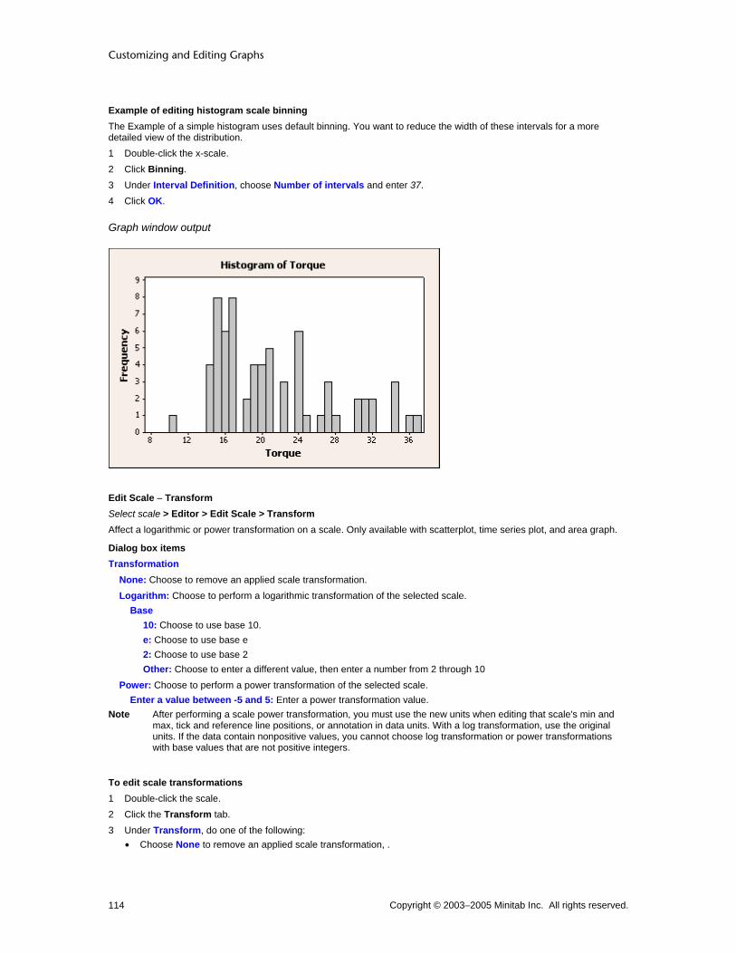
Customizing and Editing Graphs
Copyright © 2003–2005 Minitab Inc. All rights reserved. 114
Example of editing histogram scale binning The Example of a simple histogram uses default binning. You want to reduce the width of these intervals for a more detailed view of the distribution. 1 Double-click the x-scale. 2 Click Binning. 3 Under Interval Definition, choose Number of intervals and enter 37. 4 Click OK.
Graph window output
Edit Scale − Transform Select scale > Editor > Edit Scale > Transform Affect a logarithmic or power transformation on a scale. Only available with scatterplot, time series plot, and area graph.
Dialog box items Transformation
None: Choose to remove an applied scale transformation. Logarithm: Choose to perform a logarithmic transformation of the selected scale.
Base 10: Choose to use base 10. e: Choose to use base e 2: Choose to use base 2 Other: Choose to enter a different value, then enter a number from 2 through 10
Power: Choose to perform a power transformation of the selected scale. Enter a value between -5 and 5: Enter a power transformation value.
Note After performing a scale power transformation, you must use the new units when editing that scale's min and max, tick and reference line positions, or annotation in data units. With a log transformation, use the original units. If the data contain nonpositive values, you cannot choose log transformation or power transformations with base values that are not positive integers.
To edit scale transformations 1 Double-click the scale. 2 Click the Transform tab. 3 Under Transform, do one of the following:
• Choose None to remove an applied scale transformation, .

Customizing Graphs
Copyright © 2003–2005 Minitab Inc. All rights reserved. 115
• Choose Logarithm to apply a logarithmic transformation. Then under Base, enter a value from 2 through 10 or e for the natural log.
• Choose Power to change the power of the scale, then enter a value from -5 through 5. Note After performing a scale power transformation you must use the new units when editing that scale's min and
max, tick and reference line positions, or annotation in data units. With a log transformation, use the original units. If your data contains nonpositive values you can't choose log transformations or power transformations with base values that are not positive integers.
4 Click OK.
Example of editing scale transformations You are a vintner concerned about the cost of lab work done to measure sugar content in your grapes. A field test that can be done quickly at a lower cost seems promising. You hope a regression analysis will provide an equation to predict the precise reading, so you plot the readings against one another, using a scale transformation on the response variable to find an appropriate model.
Step 1 : Create the graph 1 Open the worksheet SUGAR.MTW 2 Choose Graph > Scatterplot > choose With Regression > OK. 3 In Y, enter Field. In X, enter Lab. Click OK.
Graph window output
Step 2 : Edit the transformation 1 Double-click the x-scale. 2 Click the Transform tab. 3 Under Transformation, choose Logarithm. 4 Under Base, choose 10. Click OK.

Customizing and Editing Graphs
Copyright © 2003–2005 Minitab Inc. All rights reserved. 116
Graph window output
Interpreting the results In the initial graph, it is clear that a regression fit is not appropriate with the original data. This pattern indicates that a transformation might be useful. A regression plot utilizing a log transformation of the response variable and a linear regression model would be most appropriate to find an equation for predicting lab results from in-field refractometer readings.
Edit Histogram Scale − Type Select y-scale > Editor > Edit Scale > Type Use to choose the y-scale type of a histogram. By default, Minitab displays a frequency scale for histogram.
Dialog box items Scale Type
Frequency: Choose to use a frequency scale. Percent: Choose to use a percent scale. Density: Choose to use a density scale.
Accumulate values across bins: Check to accumulate values from left to right with each bar. This option cannot be used with the Density option.
To edit histogram scale type 1 Double-click the scale. 2 Click the Type tab. 3 Under Scale Type, do one of the following:
• Choose Frequency to change the scale type to represent frequency. • Choose Percent to change the scale type to represent percentages. • Choose Density to change the scale type to represent density.
4 If you have chosen Frequency or Percent, check Accumulate values across bins to accumulate values from left to right with each bar.
5 Click OK.
Edit Probability Plot and Empirical CDF Graph Scale − Type Select y-scale > Editor > Edit > Type Use to choose the y-scale type of a probability plot or an Empirical CDF graph. By default, Minitab displays a percent-scale for these types of graphs.

Customizing Graphs
Copyright © 2003–2005 Minitab Inc. All rights reserved. 117
Dialog box items Scale Type
Percent: Choose to use a percent scale. Probability: Choose to use a probability scale. Score: Choose to use a scores scale. This option is only available with probability plots. (For calculations, see Method of obtaining probability plot points.)
To edit probability plot and Empirical CDF graph scale type 1 Double-click the scale. 2 Click the Type tab. 3 Under Scale Type, do one of the following:
• Choose Frequency to change the scale type to represent frequency. • Choose Percent to change the scale type to represent percentages. • Choose Probability to change the scale type to represent probability. • Choose Score to change the scale type to represent scores. Only with probability plots.
4 Click OK.
Example of editing scale type In Example of a probability plot, you created a graph with the default y-scale type, percent. You want to change the scale type to probability.
Note Similar scale-type editing functions are available for histograms, Empirical CDF graphs, and dendrograms.
1 Double-click the Percent scale. 2 Click Type. 3 Choose Probability. Click OK.
Graph window output
Edit Scale − Attributes Select scale > Editor > Edit Scale > Attributes Use to change the type, color, and size of the axis line, as well as the tick orientation and length.
Dialog box items Lines
Automatic: Choose to accept the default line attributes. Custom: Choose to change the line attributes.
Type: Choose a line type.

Customizing and Editing Graphs
Copyright © 2003–2005 Minitab Inc. All rights reserved. 118
Color: Choose a line color. Size: Choose a line thickness.
Tick Orientation Not available with 3D graphs. Outside: Choose to display tick lines outside the axis line. Inside: Choose to display tick lines inside the axis line. Out and In: Choose to display tick lines crossing the axis line.
Length of Major Ticks: Enter a value from 0 to 0.05 to change the tick length. Not available with 3D graphs. Apply same attributes to all scales: Check to change attributes for both y- and x-axes.
To edit line and scale attributes 1 Double-click the scale or gridline. 2 Click the Attributes tab. 3 Under Lines, choose one of the following (When editing gridlines, these items will appear under Major Gridlines and
Minor Gridlines.): • Automatic to accept the default line type and color • Custom to pick your own line type and color
− In Type, choose a line type.
− In Color, choose a color.
− In Size, choose a line thickness.
4 If you are editing scale attributes, under Tick Orientation, choose Outside, Inside, or Out and In. 5 In Length of major ticks, enter a value between 0 and 0.05. 6 Check Apply same attributes to all scales to apply your attribute changes to both the x- and y-axes. 7 Click OK.
Edit Scale – Labels Select scale > Editor > Edit Scale > Labels Use to change tick and axis labels in a continuous scale.
Dialog box items Major Tick Labels
Automatic: Choose to accept automatic tick labels. Specified: Choose to enter custom tick labels.
To edit scale labels 1 Double-click the scale. 2 Click the Labels tab. 3 Under Major Tick Labels, choose Specified and enter new tick labels. Click OK.
Note Labels that contain more than one word should be enclosed in quotation marks.
Edit Scale − Font Select scale > Editor > Edit Scale > Font Use to change the tick label font or attributes.
Dialog box items Font: Choose a font. Style
Bold: Check to make the text bold. Italic: Check to italicize the text. Underline: Check to underline the text.
Size: Enter a font size. Color: Choose a text color.
Customizing Graphs
Copyright © 2003–2005 Minitab Inc. All rights reserved. 119
Preview: Displays sample text with the selected attributes. This box does not accept input. Apply same font to all tick labels: Check to change the fonts on all scales.
To edit line and scale font 1 Double-click the label. 2 Click the Font tab. 3 To change font attributes, do any of the following:
• Under Font, type a font type or choose it from the list. • Under Style, check Bold, Italic, and/or Underline. • Under Size, type a font size or choose it from the list. • From Color, choose a text color.
4 To apply your font changes to all similar items, check Apply same font to all tick labels if available. 5 Click OK.
Edit Scale − Alignment Select scale > Editor > Edit Scale > Alignment Use to change the angle of the tick labels to improve legibility. In most cases, Minitab adjusts the size of the tick labels and/or tilts them so they do not overlap; however you may need to further adjust the labels.
Dialog box items Text angle: Choose a value from -360° to 360° to rotate the selected text.
To edit line and scale label alignment 1 Double-click the label. 2 Click the Alignment tab. 3 In Text angle, enter a value from -360° to 360° to rotate the selected text. 4 Under Position, do the following (not available with tick labels):
• Choose Automatic to accept the default label position. • Choose Custom to change the default label position; then choose a position from the list.
5 Under Offset, do the following (not available with tick labels): • Choose Automatic to accept the default label placement. • Choose Custom to change the default label placement.
− In Horizontal, enter the figure units to move the label to the left (−) or right (+).
− In Vertical, enter the figure units to move the label up (+) or down (−).
6 Click OK.
Example of editing scale display, attributes, labels, font, and alignment Suppose you have created a simple scatterplot for a presentation. You want to edit the scale's display, scale attributes, labels, font, and alignment.

Customizing and Editing Graphs
Copyright © 2003–2005 Minitab Inc. All rights reserved. 120
Creation 1 Open the worksheet PULSE.MTW. 2 Choose Graph > Scatterplot 3 Choose Simple and click OK. 4 In Y, enter Pulse1. In X, enter Weight. 5 Click OK.
Display 1 Double-click the y-scale. 2 Click the Show tab. 3 Check every item in the Low column, and check
Axis line in the High column. 4 Click OK.
Attributes 1 Double-click the y-scale. 2 Click the Attributes tab. 3 Under Tick Orientation, choose Inside. 4 In Length of Major Ticks, enter 0.02. 5 Click OK.
Labels 1 Double-click the y-scale. 2 Click the Labels tab. 3 Under Major Tick Labels, choose Specified
and enter 'Very Low' Low Average Average 'Higher than Average' 'Very High'.
5 Click OK.

Customizing Graphs
Copyright © 2003–2005 Minitab Inc. All rights reserved. 121
Font 1 Double-click the y-scale. 2 Click the Font tab. 3 From Color, choose 4 Check Apply same font to all tick labels. 5 Click OK.
Alignment 1 Double-click the y-scale. 2 Click the Alignment tab. 3 In Angle, enter 25. 4 Click OK.
Edit Axis Label − Font Select axis label > Editor > Edit Axis Label > Font Use to change the axis label font or attributes.
Dialog box items Font: Choose a font. Style
Bold: Check to make the text bold. Italic: Check to italicize the text. Underline: Check to underline the text.
Size: Enter a font size. Color: Choose a text color. Preview: Displays sample text with the selected attributes. This box does not accept input. Text: Type text to change the existing axis label. Not available with all graphs. Apply same font for Y and X axis labels: Check to apply attributes to both axis labels.
To edit line and scale font 1 Double-click the label. 2 Click the Font tab. 3 To change font attributes, do any of the following:
• Under Font, type a font type or choose it from the list. • Under Style, check Bold, Italic, and/or Underline. • Under Size, type a font size or choose it from the list. • From Color, choose a text color.
4 To apply your font changes to all similar items, check Apply same font to all tick labels if available. 5 Click OK.
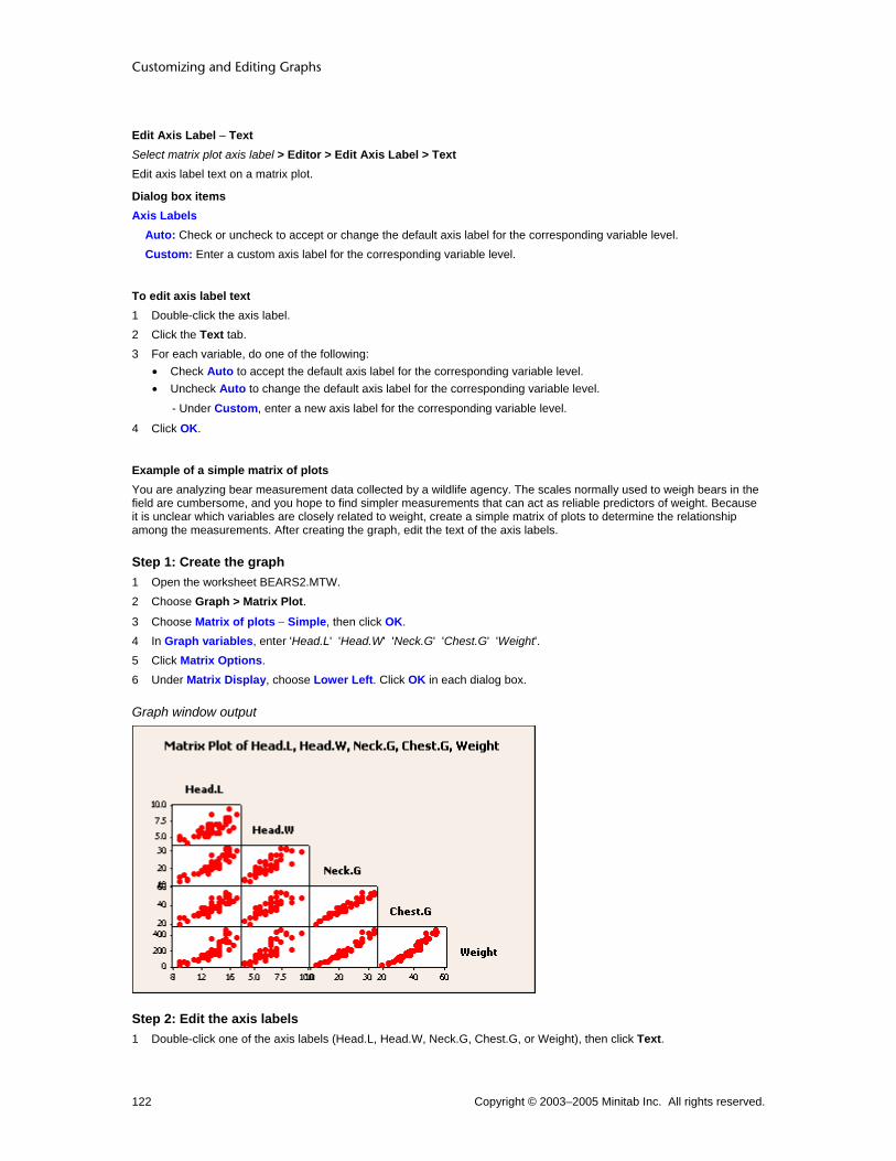
Customizing and Editing Graphs
Copyright © 2003–2005 Minitab Inc. All rights reserved. 122
Edit Axis Label − Text Select matrix plot axis label > Editor > Edit Axis Label > Text Edit axis label text on a matrix plot.
Dialog box items Axis Labels
Auto: Check or uncheck to accept or change the default axis label for the corresponding variable level. Custom: Enter a custom axis label for the corresponding variable level.
To edit axis label text 1 Double-click the axis label. 2 Click the Text tab. 3 For each variable, do one of the following:
• Check Auto to accept the default axis label for the corresponding variable level. • Uncheck Auto to change the default axis label for the corresponding variable level.
- Under Custom, enter a new axis label for the corresponding variable level.
4 Click OK.
Example of a simple matrix of plots You are analyzing bear measurement data collected by a wildlife agency. The scales normally used to weigh bears in the field are cumbersome, and you hope to find simpler measurements that can act as reliable predictors of weight. Because it is unclear which variables are closely related to weight, create a simple matrix of plots to determine the relationship among the measurements. After creating the graph, edit the text of the axis labels.
Step 1: Create the graph 1 Open the worksheet BEARS2.MTW. 2 Choose Graph > Matrix Plot.
3 Choose Matrix of plots − Simple, then click OK. 4 In Graph variables, enter 'Head.L' 'Head.W' 'Neck.G' 'Chest.G' 'Weight'. 5 Click Matrix Options. 6 Under Matrix Display, choose Lower Left. Click OK in each dialog box.
Graph window output
Step 2: Edit the axis labels 1 Double-click one of the axis labels (Head.L, Head.W, Neck.G, Chest.G, or Weight), then click Text.

Customizing Graphs
Copyright © 2003–2005 Minitab Inc. All rights reserved. 123
2 Uncheck Auto for Variable 1. 3 Under Custom, enter Head Length. 4 Uncheck Auto for Variable 2. 5 Under Custom, enter Head Width. 6 Uncheck Auto for Variable 3. 7 Under Custom, enter Neck Girth. 8 Uncheck Auto for Variable 4. 9 Under Custom, enter Chest Girth. Click OK.
Graph window output
Interpreting the results From this matrix of plots, chest girth and neck girth in a bear seem to be closely correlated with weight. It looks promising that you will be able to predict weight using other measurements.
Tip To see the row number and x- and y-values for a symbol, hover your cursor over it.
Edit Axis Label − Alignment Select axis label > Editor > Edit Axis Label > Alignment Use to rotate and move the axis labels.
Dialog box items Offset
Automatic: Choose to accept the default label offset. Custom: Choose to change the default label offset.
Horizontal: Enter the figure units to move the label to the left (−) or right (+) of the placement chosen under Position. Vertical: Enter the figure units to move the label up (+) or down (−) from the placement chosen under Position.
To edit line and scale label alignment 1 Double-click the label. 2 Click the Alignment tab. 3 In Text angle, enter a value from -360° to 360° to rotate the selected text. 4 Under Position, do the following (not available with tick labels):
• Choose Automatic to accept the default label position. • Choose Custom to change the default label position; then choose a position from the list.
5 Under Offset, do the following (not available with tick labels): • Choose Automatic to accept the default label placement.

Customizing and Editing Graphs
Copyright © 2003–2005 Minitab Inc. All rights reserved. 124
• Choose Custom to change the default label placement.
− In Horizontal, enter the figure units to move the label to the left (−) or right (+).
− In Vertical, enter the figure units to move the label up (+) or down (−).
6 Click OK.
Edit Axis Label − Show Select axis label > Editor > Edit Axis Label > Show Use to change axis label display.
Dialog box items Show Label: Check or uncheck to show or hide axis labels with an interactions plot, each y- versus each x-matrix plot, or a secondary scale. With all other graphs, choose from the options below.
None: Choose to hide the selected axis label. Low side: Choose to display the axis label on the low side. High Side: Choose to display the axis label on the high side.
To edit axis label display 1 Double-click the axis label. 2 Click the Show tab. 3 Under Show Label, check or uncheck Low or High to display the selected axis label on the low or high end of the
scale. 4 Click OK.
Edit Matrix Plot Axis Label − Show Select matrix plot axis label > Editor > Edit Axis Label > Show Use to edit axis label display.
Dialog box items Show Label: Check or uncheck to show or hide axis labels. Variable Label Placement (only available with matrix of plots)
Diagonal: Choose to place variable labels along the diagonal. Boundary: Choose to place variable labels along the boundary.
To edit matrix plot axis label display 1 Double-click the matrix plot axis label. 2 Click the Show tab. 3 Check or uncheck Show labels to show or hide axis labels. 4 Under Variable Label Placement, choose Diagonal or Boundary. 5 Click OK.
Example of editing axis label font, alignment, and display In Example of editing scale display, attributes, labels, font, and alignment, you began with a simple scatterplot. You can also edit this graph's axis label text, font, and alignment.

Customizing Graphs
Copyright © 2003–2005 Minitab Inc. All rights reserved. 125
Font 1 Double-click the y-axis label. 2 Under Style, check Italic. 3 Under Size, enter 12. 4 Check Apply same font to all axis labels. 5 Click OK.
Alignment 1 Double-click the y-axis label. 2 Click the Alignment tab. 3 In Text angle enter 45. 4 Click OK.
Show 1 Double-click the y-axis label. 2 Click the Show tab. 3 Under Show Label, choose High side. 4 Click OK. 5 Double-click the x-axis label. 6 Click the Show tab. 7 Under Show Label, choose High side. 8 Click OK.
Y-Scale Type
Edit Histogram Scale − Type Select y-scale > Editor > Edit Scale > Type Use to choose the y-scale type of a histogram. By default, Minitab displays a frequency scale for histogram.
Dialog box items Scale Type
Frequency: Choose to use a frequency scale. Percent: Choose to use a percent scale. Density: Choose to use a density scale.
Accumulate values across bins: Check to accumulate values from left to right with each bar. This option cannot be used with the Density option.

Customizing and Editing Graphs
Copyright © 2003–2005 Minitab Inc. All rights reserved. 126
Edit Dendrogram Scale − Type Select dendrogram scale > Editor > Edit > Type Use to choose the y-scale type of a dendrogram.
Dialog box items Scale Type
Similarity: Choose to display similarities on the y-axis. Distance: Choose to display distances on the y-axis.
To edit histogram scale type 1 Double-click the scale. 2 Click the Type tab. 3 Under Scale Type, do one of the following:
• Choose Frequency to change the scale type to represent frequency. • Choose Percent to change the scale type to represent percentages. • Choose Density to change the scale type to represent density.
4 If you have chosen Frequency or Percent, check Accumulate values across bins to accumulate values from left to right with each bar.
5 Click OK.
Edit Probability Plot and Empirical CDF Graph Scale − Type Select y-scale > Editor > Edit > Type Use to choose the y-scale type of a probability plot or an Empirical CDF graph. By default, Minitab displays a percent-scale for these types of graphs.
Dialog box items Scale Type
Percent: Choose to use a percent scale. Probability: Choose to use a probability scale. Score: Choose to use a scores scale. This option is only available with probability plots. (For calculations, see Method of obtaining probability plot points.)
To edit probability plot and Empirical CDF graph scale type 1 Double-click the scale. 2 Click the Type tab. 3 Under Scale Type, do one of the following:
• Choose Frequency to change the scale type to represent frequency. • Choose Percent to change the scale type to represent percentages. • Choose Probability to change the scale type to represent probability. • Choose Score to change the scale type to represent scores. Only with probability plots.
4 Click OK.
Example of editing scale type In Example of a probability plot, you created a graph with the default y-scale type, percent. You want to change the scale type to probability.
Note Similar scale-type editing functions are available for histograms, Empirical CDF graphs, and dendrograms.
1 Double-click the Percent scale. 2 Click Type. 3 Choose Probability. Click OK.

Customizing Graphs
Copyright © 2003–2005 Minitab Inc. All rights reserved. 127
Graph window output
Gridlines
Edit Gridlines − Attributes Select gridline > Editor > Edit Gridlines > Attributes Use to specify the type, color, and size of your gridlines. To add gridlines to a graph, choose Editor > Add > Gridlines.
Dialog box items Major Gridlines
Automatic: Choose to accept the default line attributes. Custom: Choose to change the line attributes.
Type: Choose a line type. Color: Choose a line color. Size: Choose a line thickness.
Minor Gridlines (not available with simplex design plot) Automatic: Choose to accept the default line attributes. Custom: Choose to change the line attributes.
Type: Choose a line type. Color: Choose a line color. Size: Choose a line thickness.
Apply same attributes to gridlines of all scales: Check to apply the attributes set in this dialog to all gridlines on the graph.
To edit line and scale attributes 1 Double-click the scale or gridline. 2 Click the Attributes tab. 3 Under Lines, choose one of the following (When editing gridlines, these items will appear under Major Gridlines and
Minor Gridlines.): • Automatic to accept the default line type and color • Custom to pick your own line type and color
− In Type, choose a line type.
− In Color, choose a color.
− In Size, choose a line thickness.
4 If you are editing scale attributes, under Tick Orientation, choose Outside, Inside, or Out and In. 5 In Length of major ticks, enter a value between 0 and 0.05. 6 Check Apply same attributes to all scales to apply your attribute changes to both the x- and y-axes.

Customizing and Editing Graphs
Copyright © 2003–2005 Minitab Inc. All rights reserved. 128
7 Click OK.
Edit Gridlines − Show Select gridline > Editor > Edit Gridlines > Show Use to control the display of major and minor gridlines. To add gridlines to a graph, use Editor > Add > Gridlines.
Dialog box items Show gridlines for major ticks: Check to display major gridlines. Show gridlines for minor ticks: Check to display minor gridlines.
To edit gridline display 1 Double-click a gridline. 2 Click the Show tab. 3 Check or uncheck Show gridlines for major ticks. 4 Check or uncheck Show gridlines for minor ticks, then click OK.
Example of editing gridline attributes and display The Example of displaying gridlines created a simple scatterplot with gridlines. You want to edit the gridline display and attributes.
Attributes 1 Double-click a gridline. 2 Under Major Gridlines, choose Custom. 3 From Color, choose . 4 From Size, choose 2. 5 Check Apply same attributes to gridlines of
all scales. 6 Click OK.
Show 1 Double-click an x-scale gridline. 2 Click the Show tab. 3 Uncheck Show gridlines for minor ticks. 4 Click OK.
Reference Lines
Edit Reference Lines − Attributes Select reference line > Editor > Edit Reference Line > Attributes Specify the type, color, and size of reference lines. To add a reference line to a graph, choose Editor > Add > Reference Lines.

Customizing Graphs
Copyright © 2003–2005 Minitab Inc. All rights reserved. 129
Dialog box items Lines
Automatic: Choose to accept the default line attributes. Custom: Choose to change the line attributes.
Type: Choose a line type. Color: Choose a line color. Size: Choose a line thickness.
Apply same attributes to all reference lines: Check to apply attribute changes to all reference lines in the graph.
To edit reference line attributes 1 Double-click a reference line. 2 Click the Attributes tab. 3 Under Lines, choose one of the following:
• Automatic to accept the default line type and color • Custom to pick your own line type and color
− In Type, choose a line type.
− In Color, choose a color.
− In Size, choose a line thickness.
4 Check Apply same attributes to all reference lines to apply your attribute changes to all similar items. 5 Click OK.
Edit Reference Line Labels − Show Select reference line > Editor > Edit Reference Line > Show Select reference line label > Editor > Edit Line Label > Show Use to hide and specify the display of the label. To add a reference line to a graph, choose Editor > Add > Reference Lines.
Dialog box items Show label
None: Choose to hide reference line labels. Low side: Choose to display reference line labels on the low side of the graph. High side: Choose to display reference line labels on the high side of the graph. (Not available with all graphs.)
Apply same label option to all reference lines: Check to apply the same display preferences to all reference lines.
To edit reference line label display 1 Double-click a reference line or label. 2 Click the Show tab. 3 If available, check or uncheck Show Label to show or hide the reference line label. 4 If available, under Show Label, do one of the following:
• Choose None to hide the reference line label. • Choose Low side to display the reference line label on the low side of the scale. • Choose High side to display the reference line label on the high side of the scale. (Not available with all graphs.)
5 Click OK.
Edit Reference Line Labels − Font Select reference line label > Editor > Edit Line Label > Font Use to edit the reference line label font attributes. To add reference lines to a graph, choose Editor > Add > Reference Lines.
Dialog box items Font: Choose a font.

Customizing and Editing Graphs
Copyright © 2003–2005 Minitab Inc. All rights reserved. 130
Style Bold: Check to make the text bold. Italic: Check to italicize the text. Underline: Check to underline the text.
Size: Enter a font size. Color: Choose a text color. Preview: Displays sample text with the selected attributes. This box does not accept input. Text: Type the reference line label. Apply same font to all reference labels: Check to apply same font changes to all labels.
To edit reference line label font 1 Double-click a reference line label. 2 Click the Font tab. 3 To change font attributes, do any of the following:
• Under Font, type a font type or choose it from the list. • Under Style, check Bold, Italic, and/or Underline. • Under Size, type a font size or choose it from the list. • From Color, choose a text color.
4 In Text, type the reference line label. 5 Check Apply same font to all reference labels to apply your font changes to all similar items. 6 Click OK.
Edit Reference Line Labels − Alignment Select reference line label > Editor > Edit Line Label > Alignment Use to rotate and move the reference line label. To add a reference line to a graph, choose Editor > Add > Reference Lines.
Tip You may find it easier to move reference line labels by clicking and dragging them.
Dialog box items Text angle: Enter a value from − 90° to 90° to rotate the selected text. Position
Automatic: Choose to accept the default label position. Custom: Choose to change the default label position; then choose a position from the list.
Offset Automatic: Choose to accept the default label placement. Custom: Choose to change the default label placement.
Horizontal: Enter the figure units to move the label to the left (−) or right (+) of the placement chosen under Position. Vertical: Enter the figure units to move the label up (+) or down (−) from the placement chosen under Position.
Apply same alignment to all reference lines of this scale: Check to apply the new angle to all reference lines on the same scale.
To edit reference line label alignment 1 Double-click a reference line label. 2 Click the Alignment tab. 3 In Text angle, enter a value from -360° to 360° to rotate the selected text. 4 Under Position, do the following:
• Choose Automatic to accept the default label position. • Choose Custom to change the default label position; then choose a position from the list.
5 Under Offset, do the following: • Choose Automatic to accept the default label placement.
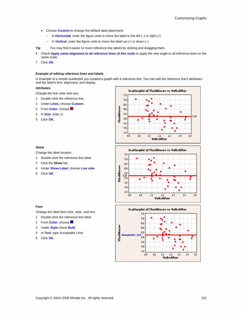
Customizing Graphs
Copyright © 2003–2005 Minitab Inc. All rights reserved. 131
• Choose Custom to change the default label placement.
− In Horizontal, enter the figure units to move the label to the left (−) or right (+).
− In Vertical, enter the figure units to move the label up (+) or down (−).
Tip You may find it easier to move reference line labels by clicking and dragging them.
6 Check Apply same alignment to all reference lines of this scale to apply the new angle to all reference lines on the same scale.
7 Click OK.
Example of editing reference lines and labels In Example of a simple scatterplot you created a graph with a reference line. You can edit the reference line's attributes and the label's font, alignment, and display.
Attributes Change the line color and size. 1 Double-click the reference line. 2 Under Lines, choose Custom. 3 From Color, choose 4 In Size, enter 3. 5 Click OK.
Show Change the label location. 1 Double-click the reference line label. 2 Click the Show tab. 4 Under Show Label, choose Low side. 5 Click OK.
Font Change the label font color, style, and text. 1 Double-click the reference line label. 2 From Color, choose 3 Under Style check Bold. 4 In Text, type Acceptable Limit. 5 Click OK.

Customizing and Editing Graphs
Copyright © 2003–2005 Minitab Inc. All rights reserved. 132
Alignment Change the label angle and position. 1 Double-click the reference line label. 2 Click the Alignment tab. 3 In Angle, type 25. 4 Under Position choose Custom. Then choose
Above, to the left. 5 Click OK.
Percentile Lines
Edit Percentile Lines − Attributes Select percentile line > Editor > Edit Percentile Line > Attributes Use to change the type, color, and size of your percentile lines. To add a percentile line to a graph choose Editor > Add > Percentile Lines.
Dialog box items Lines
Automatic: Choose to accept the default line attributes. Custom: Choose to change the line attributes.
Type: Choose a line type. Color: Choose a line color. Size: Choose a line thickness.
To edit percentile line attributes 1 Double-click a percentile line. 2 Click the Attributes tab. 3 Under Lines, choose one of the following:
• Automatic to accept the default line type and color • Custom to pick your own line type and color
− In Type, choose a line type.
− In Color, choose a color.
− In Size, choose a line thickness.
4 Click OK.
Edit Percentile Line Labels − Font Select percentile line labels > Editor > Edit Line Label > Font Select individual percentile line label > Editor > Edit Line Label > Font Use to edit the percentile line label font attributes. To add data percentile lines to a graph, choose Editor > Add > Percentile Lines.
Dialog box items Font: Choose a font. Style
Bold: Check to make the text bold. Italic: Check to italicize the text. Underline: Check to underline the text.
Size: Enter a font size. Color: Choose a text color.

Customizing Graphs
Copyright © 2003–2005 Minitab Inc. All rights reserved. 133
Preview: Displays sample text with the selected attributes. This box does not accept input. Text: Type the percentile line label. (only available when an individual percentile line label is selected) Apply same font to all percentile line labels: Check to apply same font changes to all labels. (only available when an individual percentile line label is selected)
To edit percentile line label font 1 Select and double-click all percentile line labels or a single label. See Selecting groups and single items.) 2 Click the Font tab. 3 To change font attributes, do any of the following:
• Under Font, type a font type or choose it from the list. • Under Style, check Bold, Italic, and/or Underline. • Under Size, type a font size or choose it from the list. • From Color, choose a text color.
4 In Text, type the percentile line label. (only available if individual percentile line label is selected) 5 Check Apply same font to all percentile labels if available to apply your font changes to all similar items. 6 Click OK.
Edit Percentile Line Labels − Alignment Select individual percentile line label > Editor > Edit Percentile Line > Alignment Use to rotate and move the percentile line label. To add a percentile line to a graph, choose Editor > Add > Percentile Lines.
Tip You may find it easier to move percentile line labels by clicking and dragging them.
Dialog box items Text angle: Enter a value from − 90° to 90° to rotate the selected text. Position
Automatic: Choose to accept the default label position. Custom: Choose to change the default label position; then choose a position from the list.
Offset Automatic: Choose to accept the default label placement. Custom: Choose to change the default label placement.
Horizontal: Enter the figure units to move the label to the left (−) or right (+) of the placement chosen under Position. Vertical: Enter the figure units to move the label up (+) or down (−) from the placement chosen under Position.
Apply same alignment to all percentile line labels of this scale: Check to apply the new angle to all percentile line labels on the same scale.
To edit percentile line label alignment 1 Select and double-click all percentile line labels or a single label. See Selecting groups and single items. 2 Click the Alignment tab. 3 In Text angle, enter a value from -360° to 360° to rotate the selected text. 4 Under Position, do the following:
• Choose Automatic to accept the default label position. • Choose Custom to change the default label position; then choose a position from the list
5 Under Offset, do the following (not available with tick labels): • Choose Automatic to accept the default label placement. • Choose Custom to change the default label placement.
− In Horizontal, enter the figure units to move the label to the left (−) or right (+).
− In Vertical, enter the figure units to move the label up (+) or down (−).
Tip You may find it easier to move percentile line labels by clicking and dragging them.
6 Click OK.

Customizing and Editing Graphs
Copyright © 2003–2005 Minitab Inc. All rights reserved. 134
Example of editing percentile lines and labels In Example of a probability plot, you created a graph with a percentile line. You can edit the line's attributes and label font. You can also edit an individual label's alignment.
Attributes Change the line color and size. 1 Double-click the percentile line. 2 Under Lines, choose Custom. 3 From Color, choose 4 In Size, enter 3. 5 Click OK.
Font Change the label color, style, and size. 1 Double-click a percentile line label. 2 From Color, choose 4 In Style, check Bold. 5 In Size, enter 12. 6 Click OK.
Alignment Change an individual label angle. 1 Select the percentile line label. 2 Select and double-click 87. 3 Click the Alignment tab. 4 In Angle, type 25. 5 Click OK.
Scale Transformations
Edit Scale − Transform Select scale > Editor > Edit Scale > Transform Affect a logarithmic or power transformation on a scale. Only available with scatterplot, time series plot, and area graph.
Dialog box items Transformation
None: Choose to remove an applied scale transformation. Logarithm: Choose to perform a logarithmic transformation of the selected scale.
Base 10: Choose to use base 10.
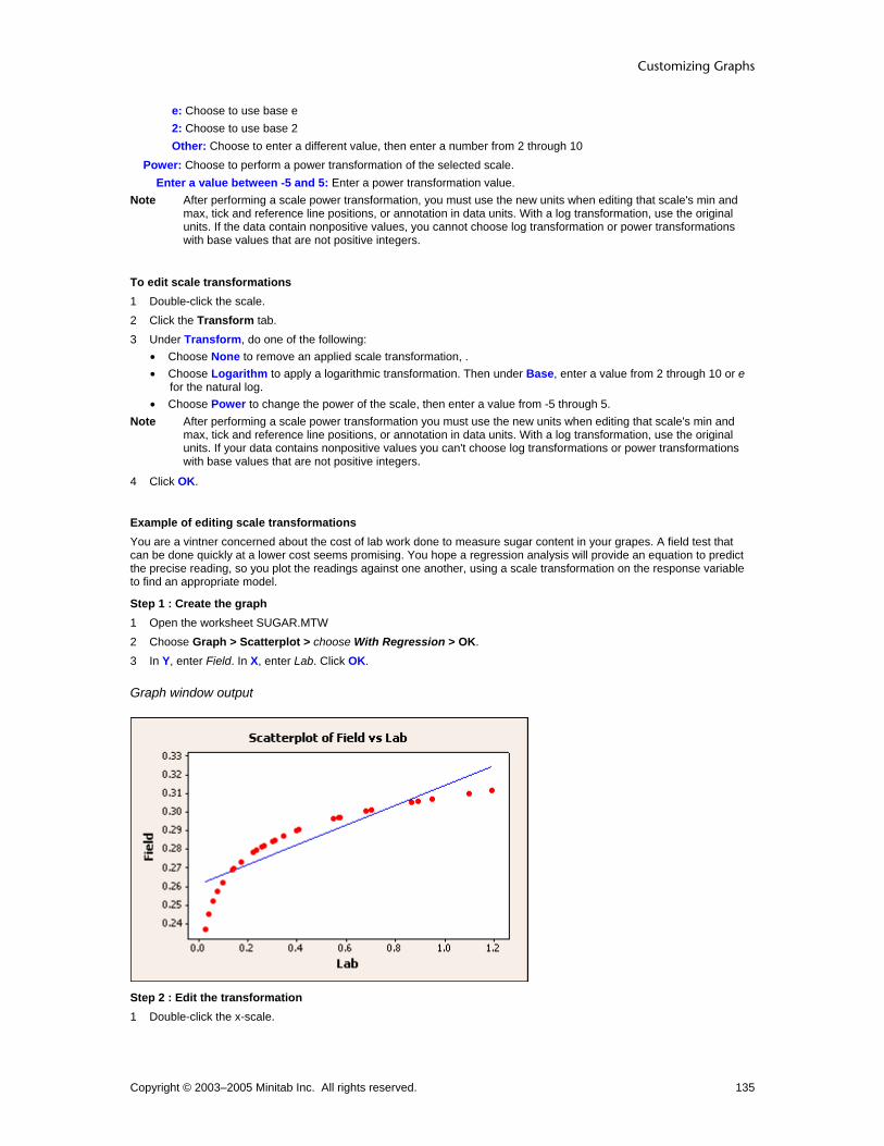
Customizing Graphs
Copyright © 2003–2005 Minitab Inc. All rights reserved. 135
e: Choose to use base e 2: Choose to use base 2 Other: Choose to enter a different value, then enter a number from 2 through 10
Power: Choose to perform a power transformation of the selected scale. Enter a value between -5 and 5: Enter a power transformation value.
Note After performing a scale power transformation, you must use the new units when editing that scale's min and max, tick and reference line positions, or annotation in data units. With a log transformation, use the original units. If the data contain nonpositive values, you cannot choose log transformation or power transformations with base values that are not positive integers.
To edit scale transformations 1 Double-click the scale. 2 Click the Transform tab. 3 Under Transform, do one of the following:
• Choose None to remove an applied scale transformation, . • Choose Logarithm to apply a logarithmic transformation. Then under Base, enter a value from 2 through 10 or e
for the natural log. • Choose Power to change the power of the scale, then enter a value from -5 through 5.
Note After performing a scale power transformation you must use the new units when editing that scale's min and max, tick and reference line positions, or annotation in data units. With a log transformation, use the original units. If your data contains nonpositive values you can't choose log transformations or power transformations with base values that are not positive integers.
4 Click OK.
Example of editing scale transformations You are a vintner concerned about the cost of lab work done to measure sugar content in your grapes. A field test that can be done quickly at a lower cost seems promising. You hope a regression analysis will provide an equation to predict the precise reading, so you plot the readings against one another, using a scale transformation on the response variable to find an appropriate model.
Step 1 : Create the graph 1 Open the worksheet SUGAR.MTW 2 Choose Graph > Scatterplot > choose With Regression > OK. 3 In Y, enter Field. In X, enter Lab. Click OK.
Graph window output
Step 2 : Edit the transformation 1 Double-click the x-scale.

Customizing and Editing Graphs
Copyright © 2003–2005 Minitab Inc. All rights reserved. 136
2 Click the Transform tab. 3 Under Transformation, choose Logarithm. 4 Under Base, choose 10. Click OK.
Graph window output
Interpreting the results In the initial graph, it is clear that a regression fit is not appropriate with the original data. This pattern indicates that a transformation might be useful. A regression plot utilizing a log transformation of the response variable and a linear regression model would be most appropriate to find an equation for predicting lab results from in-field refractometer readings.
Secondary Scales
Edit Scale − Secondary Select scale > Editor > Edit Scale > Secondary You can specify that variables on a given axis are associated with a primary or secondary scale. By default, when overlaying two or more graph models, Minitab creates x- and y-scales that accommodate the full range of all variables on each axis. However, if the ranges of values for two variables are, for example, 0–10 and 500–1000, a scale that includes their collective range may not be appropriate for either. You can then assign these variables to primary and secondary scales to display different scales on the low and high side of the axis. You can only apply secondary scales to the continuous scales of overlaid scatterplots or time series plots, except when paneling is also applied.
Without Secondary Scale With Secondary Scale
The two overlaid graphs share a common y-axis variable, but their y-axis variables have very different ranges. One set of variables in particular is difficult to interpret and is ill-suited to the use of common scales.
Here a secondary scale has been added. Both graphs still share the y-axis, but with independent x-axes the data region is used more effectively.

Customizing Graphs
Copyright © 2003–2005 Minitab Inc. All rights reserved. 137
Dialog box items Variable: Lists each variable represented on the selected axis. Does not take input. Scale
Primary: Choose to associate the variable with the primary scale. Secondary: Choose to associate the variable with the secondary scale.
To assign a secondary scale 1 Double-click the axis. 2 Click the Secondary tab. 3 Under Scale, choose Primary or Secondary for each variable to associate it with the primary or secondary scale. 4 Click OK.
Example of assigning a secondary scale Suppose you have created an overlaid scatterplot displaying the relationships between two different y-axis variables and a common x-axis variable. Although you know the correlation of both pairs is very high, the resulting graph does not reflect this. Because the individual ranges of the y-axis variables are so different, adding a secondary scale may remedy the deceptive appearance.
Step 1: Create the graph 1 Open the worksheet BEARS.MTW. 2 Choose Graph > Scatterplot. 3 Click Simple, and then click OK. 4 In row 1, under Y, enter Length and under X, enter Weight. 5 In row 2, under Y, enter Head.L and under X, enter Weight. 6 Click Multiple Graphs and click the Multiple Variables tab. 7 Under Show Graphs of Different Variables, choose Overlaid on the same page, and click OK in each dialog box.
Graph window output
Step 2: Assign a secondary scale 1 Double-click the y-axis. 2 Click the Secondary tab. 3 Under Scale for Length, select Primary from the drop-down list. 4 Under Scale for Head.L, select Secondary from the drop-down list. Click OK.

Customizing and Editing Graphs
Copyright © 2003–2005 Minitab Inc. All rights reserved. 138
Graph window output
Time Scale
Edit Time Scale − Scale Select scale > Editor > Edit Scale > Scale Specify the range of the scale, as well as the tick increments and categories, on a time series plot or area graph.
Note Use the time scale's index values when setting minimum and maximum range cutoffs. For example, a minimum of 2 starts the scale at the second index point and a maximum of 3.5 ends the scale halfway between the third and fourth index point.
Dialog box items Tick Positions
Automatic: Choose to display default position of ticks on the selected scale. Specify tick start/increment: Choose to enter the tick increment on the selected scale. Specify innermost tick positions: Choose to enter the tick categories on the selected scale.
Scale Range Minimum: Uncheck to enter a minimum scale value. Maximum: Uncheck to enter a maximum scale value.
To edit time series plot and area graph scale range 1 Double-click the scale. 2 Under Tick Positions, do one of the following:
• Choose Automatic to restore default tick positions. • Choose Specify tick increment to enter Tick start and Tick increment values for Day, Month, and Year. • Choose Specify tick categories to enter tick category values.
3 Under Scale Range, check Auto for both Minimum and Maximum to restore the default scale range, or do one or both of the following: • Uncheck Auto for Minimum to enter a custom minimum scale range. • Uncheck Auto for Maximum to enter a custom maximum scale range.
Note Use the time scale's index values when setting minimum and maximum range cutoffs. For example, a minimum of 2 starts the scale at the second index point and a maximum of 3.5 ends the scale halfway between the third and fourth index point.
4 Click OK.
Example of editing time series plot and area graph scale range In the Example of a simple time series plot you graphed a company's quarterly sales over three years. You want to change the range of the graph to run from the first quarter of 2001 through the first quarter of 2002.

Customizing Graphs
Copyright © 2003–2005 Minitab Inc. All rights reserved. 139
Note Use the time scale's index values when setting minimum and maximum range cutoffs. For example, a minimum of 2 starts the scale at the second index point and a maximum of 3.5 ends the scale halfway between the third and fourth index point.
1 Double-click the time scale. 2 Under Scale Range, uncheck Auto for both Minimum and Maximum. 3 In Minimum, enter 4.5. 4 In Maximum, enter 9.5. 5 Click OK.
Graph window output
Edit Scale − Time Select scale > Editor > Edit Scale > Time Use to edit the time scale for the x-axis.
Dialog box items Time Scale
Index: Choose to label the x-axis with integers. Calendar: Choose to label the x-axis with a calendar scale, then choose the calendar units. Clock: Choose to label the x-axis with a clock scale, then choose the clock units. Stamp: Choose to label the x-axis with values from one or more stamp columns.
Stamp columns (1-3): Enter up to three columns containing scale values. Start Values
One set for all variables: Choose to use the same start values for each variable. Type the start value for each component of the time scale. One set for each variable: Choose to use a different set of start values for each variable, if there are overlaid variables. For each variable, type the start values for each component of the time scale you chose.
Increment: Uncheck to enter the data interval between values on the innermost time scale.
Edit Scale − Time with Area Graph Select scale > Editor > Edit > Time Use to edit the time scale for the x-axis.
Dialog box items Time Scale
Index: Choose to label the x-axis with integers. Type the start value. Calendar: Choose to label the x-axis with a calendar scale, then choose the calendar units.

Customizing and Editing Graphs
Copyright © 2003–2005 Minitab Inc. All rights reserved. 140
Clock: Choose to label the x-axis with a clock scale, then choose the clock units. Stamp: Choose to label the x-axis with values from one or more stamp columns.
Stamp columns (1-3): Enter up to three columns containing scale values. Start Values: Type the start value for each component of the time scale.
Increment: Uncheck to enter the data interval between values on the innermost time scale.
To edit the time scale 1 Double-click the time scale. 2 Click the Time tab. 3 Under Time Scale, choose one of the following:
• Index to label the x-axis with integers. • Calendar to label the x-axis with a calendar scale.
− Choose the calendar units. • Clock to label the x-axis with a clock scale.
− Choose the clock units. • Stamp to label the x-axis with values from one or more stamp columns.
− In Stamp columns (1-3), enter up to three columns containing scale values.
4 Under Start Values, choose one of the following (not available with area graph): • One set for all variables to use the same start values for each variable.
− Type the start value for each component of the time scale. • One set for each variable to use a different set of start values for each variable, if there are overlaid variables.
− For each variable, type the start values for each component of the time scale.
5 Uncheck Increment, and type a value to increment the innermost time scale. 6 Click OK.
Example of editing time series plot and area graph time scale Suppose you have created a time scale plot of sales by quarter and year, starting with the first quarter of 2000. You would like to change the time scale to a generic index without reference to year.
Step 1: Create the graph 1 Open the worksheet NEWMARKET.MTW. 2 Choose Graph > Time Series Plot > choose Simple > OK. 3 In Series, enter SalesB. 4 Click Time/Scale, then click the Time tab. 5 Under Time Scale, choose Calendar. From the menu, choose Quarter Year. 6 Under Start Values, choose One set for all variables. 7 Under Quarter, type 1. Under Year, type 2000. 8 Click OK in each dialog box.
Step 2: Edit time 1 Double-click the time scale. 2 Click the Time tab. 3 Under Time Scale, choose Index. 4 Click OK.

Customizing Graphs
Copyright © 2003–2005 Minitab Inc. All rights reserved. 141
Graph window output
Edit Categorical Scale − Show Select scale > Editor > Edit Scale > Show Use to change the display of ticks, axis lines, and axis labels in a categorical scale.
Dialog box items Show
Axis line: Check to display axis lines on the low and high side of the scale. Major ticks: Check to display major ticks on the low and high side of the scale. Major tick labels: Check to display major tick labels on the low and high side of the scale.
Show axis labels: Check or uncheck to show or hide axis labels. (only available with multiple level categorical scales) Show Pareto table: Check or uncheck to show or hide the Pareto table displaying the corresponding count, percent, and cumulative percent for each bar. (only available with some Pareto charts)
Tip To hide a single row of the Pareto table, select the row label and press [Delete].
To edit categorical scale display 1 Double-click the scale. 2 Click the Show tab. 3 Check Low or High to display each item on the low or high side of the scale. 4 With multiple level categorical scales, check or uncheck Show axis labels to show or hide axis labels. 5 Click OK.
Edit Scale − Attributes Select scale > Editor > Edit Scale > Attributes Use to change the type, color, and size of the axis line, as well as the tick orientation and length.
Dialog box items Lines
Automatic: Choose to accept the default line attributes. Custom: Choose to change the line attributes.
Type: Choose a line type. Color: Choose a line color. Size: Choose a line thickness.
Tick Orientation Not available with 3D graphs. Outside: Choose to display tick lines outside the axis line.

Customizing and Editing Graphs
Copyright © 2003–2005 Minitab Inc. All rights reserved. 142
Inside: Choose to display tick lines inside the axis line. Out and In: Choose to display tick lines crossing the axis line.
Length of Major Ticks: Enter a value from 0 to 0.05 to change the tick length. Not available with 3D graphs. Apply same attributes to all scales: Check to change attributes for both y- and x-axes.
To edit line and scale attributes 1 Double-click the scale or gridline. 2 Click the Attributes tab. 3 Under Lines, choose one of the following (When editing gridlines, these items will appear under Major Gridlines and
Minor Gridlines.): • Automatic to accept the default line type and color • Custom to pick your own line type and color
− In Type, choose a line type.
− In Color, choose a color.
− In Size, choose a line thickness.
4 If you are editing scale attributes, under Tick Orientation, choose Outside, Inside, or Out and In. 5 In Length of major ticks, enter a value between 0 and 0.05. 6 Check Apply same attributes to all scales to apply your attribute changes to both the x- and y-axes. 7 Click OK.
Edit Categorical Scale – Labels with Single Level Select scale > Editor > Edit Scale > Labels Use to change tick labels in a single-level categorical scale.
Dialog box items Major Tick Labels
Automatic: Choose to accept automatic tick labels. Specified: Choose to enter custom tick labels.
Tip If an item in this dialog box is grayed, it may be unavailable because the corresponding element has been unchecked in the Show tab. Check the item in Show, then return to this tab.
To edit categorical scale labels 1 Double-click the scale. 2 Click the Labels tab. 3 Under Major Tick Labels, do one of the following:
• Choose Automatic to accept default tick labels. • Choose Specify and enter new tick labels.
3 Click OK.
Example of editing categorical scale labels – single level Suppose you have created a graph with a categorical scale containing only one variable level. You decide to make the default categorical scale labels more descriptive. This example assumes you have created the graph in Example of a boxplot with groups. 1 Double-click the x-scale. 2 Click the Labels tab. 3 Under Major Tick Labels, choose Specified and enter Saxony Shag 'Cut and Loop' Berber. Click OK.

Customizing Graphs
Copyright © 2003–2005 Minitab Inc. All rights reserved. 143
Graph window output
Edit Categorical Scale – Labels with Multiple Levels Select scale > Editor > Edit > Labels Use to change tick and axis labels of a multiple level categorical scale.
Dialog box items Tick Labels
Show: Check or uncheck to show or hide tick labels for each level. Auto: Check to accept default labels. Uncheck to enter custom tick labels for each level.
Axis Label Show: Check or uncheck to show or hide axis labels for each level. Auto: Check to accept default labels. Uncheck to enter custom tick labels for each level.
Tip If an item in this dialog box is grayed, it may be disabled because the corresponding element has been unchecked in the Show tab. Check the item in Show, then return to this tab.
To edit categorical scale labels with multiple levels 1 Double-click the scale. 2 Click the Labels tab. 3 Under Tick Labels, do the following for each level:
• Check or uncheck Show to hide or display tick labels. • Check Auto to accept default labels, or uncheck to enter new labels.
3 Under Axis Label, do the following for each level: • Check or uncheck Show to hide or display the axis label. • Check Auto to accept the default label, or uncheck to enter new labels.
Example of editing categorical scale labels with multiple levels Suppose you have created a graph with a categorical scale with more than one variable level. You decide to make the default categorical scale labels more descriptive. This example assumes you have created the graph in Example of a boxplot with multiple y's and groups. 1 Double-click the x-scale. 2 Click the Labels tab. 3 Under Tick Labels for Level 1, check Show and uncheck Auto. 4 In Custom, erase any existing text and enter One Two Three. 5 Under Tick Labels for Level 1, check Show and uncheck Auto. 6 In Custom, erase any existing text and enter 'Extrudon 311' 'Polydrip KX-4'.

Customizing and Editing Graphs
Copyright © 2003–2005 Minitab Inc. All rights reserved. 144
7 Under Axis Label for Level 1, check Show and uncheck Auto. 8 In Custom, erase any existing text and enter Week. 9 Under Axis Label for Level 2, check Show and uncheck Auto. 10 In Custom, erase any existing text and enter Model. Click OK.
Graph window output
Edit Scale − Font Select scale > Editor > Edit Scale > Font Use to change the tick label font or attributes.
Dialog box items Font: Choose a font. Style
Bold: Check to make the text bold. Italic: Check to italicize the text. Underline: Check to underline the text.
Size: Enter a font size. Color: Choose a text color. Preview: Displays sample text with the selected attributes. This box does not accept input. Apply same font to all tick labels: Check to change the fonts on all scales.
To edit line and scale font 1 Double-click the label. 2 Click the Font tab. 3 To change font attributes, do any of the following:
• Under Font, type a font type or choose it from the list. • Under Style, check Bold, Italic, and/or Underline. • Under Size, type a font size or choose it from the list. • From Color, choose a text color.
4 To apply your font changes to all similar items, check Apply same font to all tick labels if available. 5 Click OK.
Edit Scale − Alignment Select scale > Editor > Edit Scale > Alignment Use to change the angle of the tick labels to improve legibility.

Customizing Graphs
Copyright © 2003–2005 Minitab Inc. All rights reserved. 145
In most cases, Minitab adjusts the size of the tick labels and/or tilts them so they do not overlap; however you may need to further adjust the labels.
Dialog box items Text angle: Choose a value from -360° to 360° to rotate the selected text.
To edit line and scale label alignment 1 Double-click the label. 2 Click the Alignment tab. 3 In Text angle, enter a value from -360° to 360° to rotate the selected text. 4 Under Position, do the following (not available with tick labels):
• Choose Automatic to accept the default label position. • Choose Custom to change the default label position; then choose a position from the list.
5 Under Offset, do the following (not available with tick labels): • Choose Automatic to accept the default label placement. • Choose Custom to change the default label placement.
− In Horizontal, enter the figure units to move the label to the left (−) or right (+).
− In Vertical, enter the figure units to move the label up (+) or down (−).
6 Click OK.
Example of editing scale display, attributes, labels, font, and alignment Suppose you have created a simple scatterplot for a presentation. You want to edit the scale's display, scale attributes, labels, font, and alignment.
Creation 1 Open the worksheet PULSE.MTW. 2 Choose Graph > Scatterplot 3 Choose Simple and click OK. 4 In Y, enter Pulse1. In X, enter Weight. 5 Click OK.
Display 1 Double-click the y-scale. 2 Click the Show tab. 3 Check every item in the Low column, and check
Axis line in the High column. 4 Click OK.

Customizing and Editing Graphs
Copyright © 2003–2005 Minitab Inc. All rights reserved. 146
Attributes 1 Double-click the y-scale. 2 Click the Attributes tab. 3 Under Tick Orientation, choose Inside. 4 In Length of Major Ticks, enter 0.02. 5 Click OK.
Labels 1 Double-click the y-scale. 2 Click the Labels tab. 3 Under Major Tick Labels, choose Specified
and enter 'Very Low' Low Average Average 'Higher than Average' 'Very High'.
5 Click OK.
Font 1 Double-click the y-scale. 2 Click the Font tab. 3 From Color, choose 4 Check Apply same font to all tick labels. 5 Click OK.
Alignment 1 Double-click the y-scale. 2 Click the Alignment tab. 3 In Angle, enter 25. 4 Click OK.

Customizing Graphs
Copyright © 2003–2005 Minitab Inc. All rights reserved. 147
Categorical Scale Edit Categorical Scale – Scale Select scale > Editor > Edit Scale > Scale You can alter the placement of ticks and the space between categories in a categorical scale.
Dialog box items Ticks for Innermost Displayed Category Labels
Tick start: Uncheck to enter a custom tick start point that denotes which categorical position has the first tick. The default is one. Tick increment: Uncheck to enter a custom increment between ticks. The default is one.
Space Between Scale Categories Gap within clusters: Uncheck to enter a value from -1 to 1 to adjust the space between items in a cluster. Multiple level scales only. Gap between clusters: Uncheck to enter a value from 0 to 5 to adjust the space between clusters.
Include empty cells: Check or uncheck to include or exclude empty cells from the graph. You cannot undo changes made to this item. Multiple level scales only. Transpose value and category scales Check to switch the variables that are plotted on each axis.
To edit categorical scale range 1 Double-click the scale. 2 Click the Scale tab. 3 Under Ticks for Innermost Displayed Category Labels, do one or more of the following:
• Check Auto for Tick start to accept the default tick start point. • Uncheck Auto for Tick start to change the tick start point, then enter a value. • Check Auto for Tick increment to accept the default tick increment. • Uncheck Auto for Tick increment to change the tick increment, then enter a value.
4 Under Space Between Scale Categories, do one or more of the following: • Check Auto for Gap within clusters to accept the default cluster gap. • Uncheck Auto for Gap within clusters to change the cluster gap, then enter a value. • Check Auto for Gap between clusters to accept the default gap between clusters. • Uncheck Auto for Gap between clusters to change the gap between clusters, then enter a value.
5 Check Include empty cells to include empty cells in the graph. 6 Check Transpose value and category scales to transpose the variables that are plotted on each axis. 6 Check OK.
Example of editing categorical scale – Scale Suppose you have created a graph with a categorical scale. You decide to increase the space between both the scale clusters (Gap between clusters) and the items within the clusters (Gap within clusters).
Step 1: Create the graph 1 Open the worksheet PULSE.MTW. 2 Choose Graph > Bar Chart. 3 Under Bars represent, choose Counts of unique values. 4 Choose Cluster and click OK. 5 In Categorical variables, enter Ran. 6 In Additional categorical variables, enter Sex. Click OK.
Step 2: Edit the scale 1 Double-click the x-scale and click Scale. 2 Under Space between scale categories, in Gap within clusters, enter 1. 3 In Gap between clusters, enter 5. 4 Click OK.

Customizing and Editing Graphs
Copyright © 2003–2005 Minitab Inc. All rights reserved. 148
Graph window output
Edit Categorical Scale − Show Select scale > Editor > Edit Scale > Show Use to change the display of ticks, axis lines, and axis labels in a categorical scale.
Dialog box items Show
Axis line: Check to display axis lines on the low and high side of the scale. Major ticks: Check to display major ticks on the low and high side of the scale. Major tick labels: Check to display major tick labels on the low and high side of the scale.
Show axis labels: Check or uncheck to show or hide axis labels. (only available with multiple level categorical scales) Show Pareto table: Check or uncheck to show or hide the Pareto table displaying the corresponding count, percent, and cumulative percent for each bar. (only available with some Pareto charts)
Tip To hide a single row of the Pareto table, select the row label and press [Delete].
To edit categorical scale display 1 Double-click the scale. 2 Click the Show tab. 3 Check Low or High to display each item on the low or high side of the scale. 4 With multiple level categorical scales, check or uncheck Show axis labels to show or hide axis labels. 5 Click OK.
Edit Scale − Attributes Select scale > Editor > Edit Scale > Attributes Use to change the type, color, and size of the axis line, as well as the tick orientation and length.
Dialog box items Lines
Automatic: Choose to accept the default line attributes. Custom: Choose to change the line attributes.
Type: Choose a line type. Color: Choose a line color. Size: Choose a line thickness.
Tick Orientation Not available with 3D graphs. Outside: Choose to display tick lines outside the axis line.

Customizing Graphs
Copyright © 2003–2005 Minitab Inc. All rights reserved. 149
Inside: Choose to display tick lines inside the axis line. Out and In: Choose to display tick lines crossing the axis line.
Length of Major Ticks: Enter a value from 0 to 0.05 to change the tick length. Not available with 3D graphs. Apply same attributes to all scales: Check to change attributes for both y- and x-axes.
To edit line and scale attributes 1 Double-click the scale or gridline. 2 Click the Attributes tab. 3 Under Lines, choose one of the following (When editing gridlines, these items will appear under Major Gridlines and
Minor Gridlines.): • Automatic to accept the default line type and color • Custom to pick your own line type and color
− In Type, choose a line type.
− In Color, choose a color.
− In Size, choose a line thickness.
4 If you are editing scale attributes, under Tick Orientation, choose Outside, Inside, or Out and In. 5 In Length of major ticks, enter a value between 0 and 0.05. 6 Check Apply same attributes to all scales to apply your attribute changes to both the x- and y-axes. 7 Click OK.
Edit Categorical Scale – Labels with Single Level Select scale > Editor > Edit Scale > Labels Use to change tick labels in a single-level categorical scale.
Dialog box items Major Tick Labels
Automatic: Choose to accept automatic tick labels. Specified: Choose to enter custom tick labels.
Tip If an item in this dialog box is grayed, it may be unavailable because the corresponding element has been unchecked in the Show tab. Check the item in Show, then return to this tab.
To edit categorical scale labels 1 Double-click the scale. 2 Click the Labels tab. 3 Under Major Tick Labels, do one of the following:
• Choose Automatic to accept default tick labels. • Choose Specify and enter new tick labels.
3 Click OK.
Example of editing categorical scale labels – single level Suppose you have created a graph with a categorical scale containing only one variable level. You decide to make the default categorical scale labels more descriptive. This example assumes you have created the graph in Example of a boxplot with groups. 1 Double-click the x-scale. 2 Click the Labels tab. 3 Under Major Tick Labels, choose Specified and enter Saxony Shag 'Cut and Loop' Berber. Click OK.

Customizing and Editing Graphs
Copyright © 2003–2005 Minitab Inc. All rights reserved. 150
Graph window output
Edit Categorical Scale – Labels with Multiple Levels Select scale > Editor > Edit > Labels Use to change tick and axis labels of a multiple level categorical scale.
Dialog box items Tick Labels
Show: Check or uncheck to show or hide tick labels for each level. Auto: Check to accept default labels. Uncheck to enter custom tick labels for each level.
Axis Label Show: Check or uncheck to show or hide axis labels for each level. Auto: Check to accept default labels. Uncheck to enter custom tick labels for each level.
Tip If an item in this dialog box is grayed, it may be disabled because the corresponding element has been unchecked in the Show tab. Check the item in Show, then return to this tab.
To edit categorical scale labels with multiple levels 1 Double-click the scale. 2 Click the Labels tab. 3 Under Tick Labels, do the following for each level:
• Check or uncheck Show to hide or display tick labels. • Check Auto to accept default labels, or uncheck to enter new labels.
3 Under Axis Label, do the following for each level: • Check or uncheck Show to hide or display the axis label. • Check Auto to accept the default label, or uncheck to enter new labels.
Example of editing categorical scale labels with multiple levels Suppose you have created a graph with a categorical scale with more than one variable level. You decide to make the default categorical scale labels more descriptive. This example assumes you have created the graph in Example of a boxplot with multiple y's and groups. 1 Double-click the x-scale. 2 Click the Labels tab. 3 Under Tick Labels for Level 1, check Show and uncheck Auto. 4 In Custom, erase any existing text and enter One Two Three. 5 Under Tick Labels for Level 1, check Show and uncheck Auto. 6 In Custom, erase any existing text and enter 'Extrudon 311' 'Polydrip KX-4'.

Customizing Graphs
Copyright © 2003–2005 Minitab Inc. All rights reserved. 151
7 Under Axis Label for Level 1, check Show and uncheck Auto. 8 In Custom, erase any existing text and enter Week. 9 Under Axis Label for Level 2, check Show and uncheck Auto. 10 In Custom, erase any existing text and enter Model. Click OK.
Graph window output
Edit Scale − Font Select scale > Editor > Edit Scale > Font Use to change the tick label font or attributes.
Dialog box items Font: Choose a font. Style
Bold: Check to make the text bold. Italic: Check to italicize the text. Underline: Check to underline the text.
Size: Enter a font size. Color: Choose a text color. Preview: Displays sample text with the selected attributes. This box does not accept input. Apply same font to all tick labels: Check to change the fonts on all scales.
To edit line and scale font 1 Double-click the label. 2 Click the Font tab. 3 To change font attributes, do any of the following:
• Under Font, type a font type or choose it from the list. • Under Style, check Bold, Italic, and/or Underline. • Under Size, type a font size or choose it from the list. • From Color, choose a text color.
4 To apply your font changes to all similar items, check Apply same font to all tick labels if available. 5 Click OK.
Edit Scale − Alignment Select scale > Editor > Edit Scale > Alignment Use to change the angle of the tick labels to improve legibility.
Customizing and Editing Graphs
Copyright © 2003–2005 Minitab Inc. All rights reserved. 152
In most cases, Minitab adjusts the size of the tick labels and/or tilts them so they do not overlap; however you may need to further adjust the labels.
Dialog box items Text angle: Choose a value from -360° to 360° to rotate the selected text.
To edit line and scale label alignment 1 Double-click the label. 2 Click the Alignment tab. 3 In Text angle, enter a value from -360° to 360° to rotate the selected text. 4 Under Position, do the following (not available with tick labels):
• Choose Automatic to accept the default label position. • Choose Custom to change the default label position; then choose a position from the list.
5 Under Offset, do the following (not available with tick labels): • Choose Automatic to accept the default label placement. • Choose Custom to change the default label placement.
− In Horizontal, enter the figure units to move the label to the left (−) or right (+).
− In Vertical, enter the figure units to move the label up (+) or down (−).
6 Click OK.

Customizing Graphs
Copyright © 2003–2005 Minitab Inc. All rights reserved. 153
Titles, Footnotes, and Data Labels Labels Overview When creating a graph, you can display labels to identify and explain your graph or your data points. After creating a graph, you can:
• Change the label characteristics, such as size, color, and location (see Editing Labels Overview).
• Add labels (see Adding Graph Elements).
Note Axis, tick, reference line, and percentile line labels are associated with the graph scale (see Scale Overview). Panel labels are associated with their panels (see Paneling Graphs).
Label type Example
Titles and Footnotes
Add up to three titles and two footnotes to all graphs. By default, titles appear centered over the graph; footnotes appear at the lower left.
Data Labels
Label individual data points, medians, means, outliers, and endpoints.
Histogram Labels (Marginal Plot)
Display the frequency for each bar of the histogram.

Customizing and Editing Graphs
Copyright © 2003–2005 Minitab Inc. All rights reserved. 154
Slice Labels (Pie Chart)
Label slices in a pie chart with category names, frequencies, or percents.
Labels
Graphs Titles and Footnotes
Data Labels
HistogramLabels
Slice Labels
Scatterplot Matrix Plot Marginal Plot Histogram Dotplot Stem-and-Leaf Probability Plot ECDF Boxplot Interval Plot Individual Value Plot
Bar Chart Pie Chart Time Series Plot
Area Graph Contour Plot 3D Scatterplot 3D Surface Plot
Creation Titles and Footnotes
Labels − Titles / Footnotes ... > Labels > Titles/Footnotes Use to display titles and footnotes. After creating a graph, you can:
• Change the title/footnote attributes and alignment (see Editing Labels Overview).
• Add titles and footnotes (see Adding Graph Elements).
Dialog box items Title: Type a title, which replaces the default title and is centered above the graph.
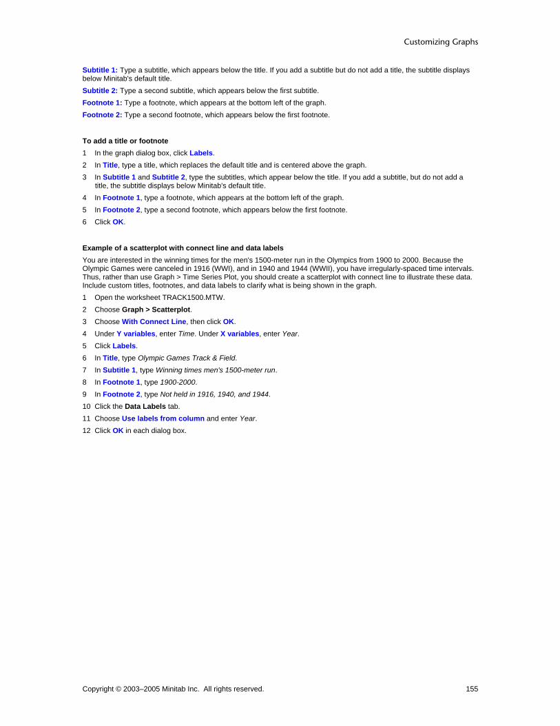
Customizing Graphs
Copyright © 2003–2005 Minitab Inc. All rights reserved. 155
Subtitle 1: Type a subtitle, which appears below the title. If you add a subtitle but do not add a title, the subtitle displays below Minitab's default title. Subtitle 2: Type a second subtitle, which appears below the first subtitle. Footnote 1: Type a footnote, which appears at the bottom left of the graph. Footnote 2: Type a second footnote, which appears below the first footnote.
To add a title or footnote 1 In the graph dialog box, click Labels. 2 In Title, type a title, which replaces the default title and is centered above the graph. 3 In Subtitle 1 and Subtitle 2, type the subtitles, which appear below the title. If you add a subtitle, but do not add a
title, the subtitle displays below Minitab's default title. 4 In Footnote 1, type a footnote, which appears at the bottom left of the graph. 5 In Footnote 2, type a second footnote, which appears below the first footnote. 6 Click OK.
Example of a scatterplot with connect line and data labels You are interested in the winning times for the men's 1500-meter run in the Olympics from 1900 to 2000. Because the Olympic Games were canceled in 1916 (WWI), and in 1940 and 1944 (WWII), you have irregularly-spaced time intervals. Thus, rather than use Graph > Time Series Plot, you should create a scatterplot with connect line to illustrate these data. Include custom titles, footnotes, and data labels to clarify what is being shown in the graph. 1 Open the worksheet TRACK1500.MTW. 2 Choose Graph > Scatterplot. 3 Choose With Connect Line, then click OK. 4 Under Y variables, enter Time. Under X variables, enter Year. 5 Click Labels. 6 In Title, type Olympic Games Track & Field. 7 In Subtitle 1, type Winning times men's 1500-meter run. 8 In Footnote 1, type 1900-2000. 9 In Footnote 2, type Not held in 1916, 1940, and 1944. 10 Click the Data Labels tab. 11 Choose Use labels from column and enter Year. 12 Click OK in each dialog box.

Customizing and Editing Graphs
Copyright © 2003–2005 Minitab Inc. All rights reserved. 156
Graph window output
Interpreting the results From 1900 to 1960, winning times generally decreased. The data labels help show that during this period there were only two games, 1920 and 1948, in which the winning time did not decrease from the previous games. After 1960, the winning times changed very little. In the early half of the century, improvements such as training methods, nutrition, track composition, and track shoes removed many barriers to faster times. After 1960, the limitations of the athletes may have had a greater impact on the improvement in times.
Example of a pie chart As an engineer at a tire company, you want to identify the most common causes of air loss in tires. You collect field data from a select group of service stations over a three-month period. Using your summarized data, create a pie chart of the causes of air loss. 1 Open the worksheet TIRES.MTW. 2 Choose Graph > Pie Chart. 3 Choose Chart values from a table. 4 In Categorical variable, enter CausesA. In Summary variables, enter Counts. 5 Click Pie Chart Options. Under Order slices by, choose Decreasing volume. Click OK. 6 Click Labels. Click the Slice Labels tab. 7 Under Label pie slices with, check Percent. 8 Click OK in each dialog box.

Customizing Graphs
Copyright © 2003–2005 Minitab Inc. All rights reserved. 157
Graph window output
Interpreting the results The pie chart shows the relative frequency of each cause of air loss in the tires, ordered from most to least frequent. The first category begins at the top of the pie and the categories are arranged clockwise. The most frequent cause of air loss is Puncture, followed by Valve Stem Leak. The least frequent cause is Leak From Seating.
Tip To see the category and percent value for a slice, value, hover your cursor over it.
Data Labels
Labels − Data Labels ... > Labels > Data Labels Use to label each data point. After creating a graph, you can:
• Change the data labels or their attributes (see Editing Labels Overview).
• Add data labels (see Adding Graph Elements).
Dialog box items Label Type
None: Choose to suppress data labels. Use y-value labels: Choose to label each point with its y-axis value. Use row numbers: Choose to label each point with its worksheet row number. You cannot label histograms or bar charts with row numbers. Use labels from column: Choose to label points with values stored in a column. Enter a text, numeric, or date/time column that contains the data labels. If graph data match worksheet rows, as for scatterplot, Minitab matches the label column to the data column by worksheet row number. If graph data are summaries of worksheet values, as for histogram and bar chart, the label column order is left-to-right on the graph. If the label column contains more values than are needed, Minitab ignores the extra labels. If the label column contains less values than are needed, the remaining data values are not labeled.
To add data labels 1 In the graph dialog box, click Labels. 2 Click the Data Labels tab. 3 Choose one of the following:
• Use y-value labels to label each point with its y-axis value. • Use row numbers to label each point with its worksheet row number. You cannot label histograms or bar charts
with row numbers. • Use labels from column to label points with values stored in a column. Then, enter a text, numeric, or date/time
column that contains the data labels. If graph data match worksheet rows, as for scatterplot, Minitab matches the label column to the data column by worksheet row number. If graph data are summaries of worksheet values, as for histogram and bar chart, the label

Customizing and Editing Graphs
Copyright © 2003–2005 Minitab Inc. All rights reserved. 158
column order is left-to-right on the graph. If the label column contains more values than are needed, Minitab ignores the extra labels. If the label column contains less values than are needed, the remaining data values are not labeled.
4 Click OK.
Example of a scatterplot with connect line and data labels You are interested in the winning times for the men's 1500-meter run in the Olympics from 1900 to 2000. Because the Olympic Games were canceled in 1916 (WWI), and in 1940 and 1944 (WWII), you have irregularly-spaced time intervals. Thus, rather than use Graph > Time Series Plot, you should create a scatterplot with connect line to illustrate these data. Include custom titles, footnotes, and data labels to clarify what is being shown in the graph. 1 Open the worksheet TRACK1500.MTW. 2 Choose Graph > Scatterplot. 3 Choose With Connect Line, then click OK. 4 Under Y variables, enter Time. Under X variables, enter Year. 5 Click Labels. 6 In Title, type Olympic Games Track & Field. 7 In Subtitle 1, type Winning times men's 1500-meter run. 8 In Footnote 1, type 1900-2000. 9 In Footnote 2, type Not held in 1916, 1940, and 1944. 10 Click the Data Labels tab. 11 Choose Use labels from column and enter Year. 12 Click OK in each dialog box.
Graph window output
Interpreting the results From 1900 to 1960, winning times generally decreased. The data labels help show that during this period there were only two games, 1920 and 1948, in which the winning time did not decrease from the previous games. After 1960, the winning times changed very little. In the early half of the century, improvements such as training methods, nutrition, track composition, and track shoes removed many barriers to faster times. After 1960, the limitations of the athletes may have had a greater impact on the improvement in times.
Labels − Data Labels − Boxplot ... > Labels > Data Labels Use to label outliers, data points, medians, or means. After creating a graph, you can:
• Change the data labels or their attributes (see Editing Labels Overview).
• Add data labels (see Adding Graph Elements).

Customizing Graphs
Copyright © 2003–2005 Minitab Inc. All rights reserved. 159
Dialog box items Label
None: Choose to suppress data labels. Outliers: Choose to label each outlier. Individual data: Choose to label each data point. Medians: Choose to label each median. Means: Choose to label each mean.
Use y-value labels: Choose to label each point with its y-axis value. Use row numbers: Choose to label each point with its worksheet row number. You cannot label medians or means with row numbers. Use labels from column: Choose to label points with values stored in a column. Enter a text, numeric, or date/time column that contains the data labels. For outliers, Minitab assigns labels from worksheet rows representing the outliers. For individual data labels, Minitab matches the label column to the data column by worksheet row number. For median and mean labels, the label column order is left-to-right on the graph. If the label column contains more values than are needed, Minitab ignores the extra labels. If the label column contains less values than are needed, the remaining data values are not labeled.
To add data labels to a boxplot 1 In the graph dialog box, click Labels. 2 Click the Data Labels tab. 3 Under Label, choose one of the following:
• Outliers to label each outlier. • Individual data to label each data point. • Medians to label each median. • Means to label each mean.
4 Choose one of the following: • Use y-value labels to label each point with its y-axis value. • Use row numbers to label each point with its worksheet row number. You cannot label medians or means with
row numbers. • Use labels from column to label points with values stored in a column. Then, enter a text, numeric, or date/time
column that contains the data labels. For outliers, Minitab assigns labels from worksheet rows representing the outliers. For individual data labels, Minitab matches the label column to the data column by worksheet row number. For median and mean labels, the label column order is left-to-right on the graph. If the label column contains more values than are needed, Minitab ignores the extra labels. If the label column contains less values than are needed, the remaining data values are not labeled.
5 Click OK.
Example of a boxplot with groups You want to assess the durability of four experimental carpet products. Samples of the carpet products are placed in four homes and you measure durability after 60 days. Create a boxplot with median labels and color-coded boxes to examine the distribution of durability for each carpet product. 1 Open the worksheet CARPET.MTW. 2 Choose Graph > Boxplot or Stat > EDA > Boxplot. 3 Under One Y, choose With Groups. Click OK. 4 In Graph variables, enter Durability. 5 In Categorical variables for grouping (1-4, outermost first), enter Carpet. 6 Click Labels, then click the Data Labels tab. 7 From Label, choose Medians. Choose Use y-value labels. Click OK. 8 Click Data View. 9 In Categorical variables for attribute assignment, enter Carpet. Click OK in each dialog box.

Customizing and Editing Graphs
Copyright © 2003–2005 Minitab Inc. All rights reserved. 160
Graph window output
Interpreting the results Median durability is highest for Carpet 4 (19.75). However, this product also demonstrates the greatest variability, with an interquartile range of 9.855. In addition, the distribution is negatively skewed, with at least one durability measurement of about 10. Carpets 1 and 3 have similar median durabilities (13.52 and 12.895, respectively). Carpet 3 also exhibits the least variability, with an interquartile range of only 2.8925. Median durability for Carpet 2 is only 8.625. This distribution and that of Carpet 1 are positively skewed, with interquartile ranges of about 5-6.
Tip To see precise information for Q1, median, Q3, interquartile range, and N, hover your cursor over any part of the boxplot.
Labels − Data Labels − Interval Plot, Individual Value Plot ... > Labels > Data Labels Use to label individual data points, interval endpoints, means, or medians. After creating a graph, you can:
• Change the data labels or their attributes (see Editing Labels Overview).
• Add data labels (see Adding Graph Elements).
Dialog box items Label
None: Choose to suppress data labels. Individual data: Choose to label each data point. Interval endpoints: Choose to label interval endpoints. Means: Choose to label each mean. Medians: Choose to label each median.
Use y-value labels: Choose to label each point with its y-axis value. Use row numbers: Choose to label each point with its worksheet row number. You cannot label interval endpoints, means, or medians with row numbers. Use labels from column: Choose to label points with values stored in a column. Enter a text, numeric, or date/time column that contains the data labels. For individual data labels, Minitab matches the label column to the data column by worksheet row number. For interval endpoint, mean, and median labels, the label column order is left-to-right on the graph. If the label column contains more values than are needed, Minitab ignores the extra labels. If the label column contains less values than are needed, the remaining data values are not labeled.
To add data labels to an interval plot 1 In the graph dialog box, click Labels.

Customizing Graphs
Copyright © 2003–2005 Minitab Inc. All rights reserved. 161
2 Click the Data Labels tab. 3 Under Label, choose one of the following:
• Individual data to label each data point. • Interval endpoints to label interval endpoints. • Means to label each mean. • Medians to label each median.
4 Choose one of the following: • Use y-value labels to label each point with its y-axis value. • Use row numbers to label each point with its worksheet row number. You cannot label interval endpoints, means,
or medians with row numbers. • Use labels from column to label points with values stored in a column. Then, enter a text, numeric, or date/time
column that contains the data labels. For individual data labels, Minitab matches the label column to the data column by worksheet row number. For interval endpoint, mean, and median labels, the label column order is left-to-right on the graph. If the label column contains more values than are needed, Minitab ignores the extra labels. If the label column contains less values than are needed, the remaining data values are not labeled.
5 Click OK.
Example of an interval plot with groups You want to assess the durability of four experimental carpet products. Samples of the carpet products are placed in four homes and you measure durability after 60 days. Create an interval plot to assess the durability. Include data labels for the means. 1 Open the worksheet CARPET.MTW. 2 Choose Graph > Interval Plot or Stat > ANOVA > Interval Plot. 3 Under One Y, choose With Groups. Click OK. 4 In Graph variables, enter Durability. 5 In Categorical variables for grouping (1-4, outermost first), enter Carpet. 6 Click Labels, then click the Data Labels tab. 7 From Label, choose Means. Click OK in each dialog box.
Graph window output
Interpreting the results Labeling the means makes them easier to compare. Carpet 4 has the highest mean value of 18.12, followed by Carpet 1 (14.48), Carpet 3 (12.81), and Carpet 2 (9.74). The intervals all overlap, so you cannot conclude that any of the means are different. The confidence level for each interval is 95% by default. If you want to change the confidence level or assign a confidence level for the family of intervals, you can edit the interval bars or choose a Bonferroni confidence interval. See Select bar > Editor > Edit Interval Bar > Options.

Customizing and Editing Graphs
Copyright © 2003–2005 Minitab Inc. All rights reserved. 162
Note A suite of methods for comparing means is available with ANOVA.
Tip To see confidence interval information (estimate, interval, and N), hover your cursor over the interval bar. To see the mean, hover your cursor over the mean symbol.
Histogram Labels - Marginal Plot
Marginal Plot − Labels − Histogram Labels ... > Labels > Histogram Labels Use to display y-value labels, which are the frequency for each bar of the histogram. After creating a graph, you can change the histogram label attributes (see Editing Labels Overview).
Dialog box items Label histogram bars with y-value: Choose to label each bar of the histogram with its y-axis value (frequency).
To add histogram labels to a marginal plot 1 In the graph dialog box, click Labels. 2 Click the Histogram Labels tab. 3 Check Label histogram bars with y-value to label each bar with its frequency. 4 Click OK.
Examples of a marginal plot As a quality control engineer for a camera battery manufacturer, you want to examine the relationship between flash recovery time (minimum time between flashes) and the voltage remaining in a camera battery. You create the three types of marginal plots to look at the distribution of each measurement.
With histograms 1 Open the worksheet BATTERIES.MTW. 2 Choose Graph > Marginal Plot. 3 Choose With Histograms, then click OK. 4 In Y Variable, enter FlashRecov. 5 In X Variable, enter VoltsAfter. 6 Click Labels, then click the Histogram Labels
tab. 7 Check Label histogram bars with y-value,
then click OK in each dialog box.
With boxplots 1 Open the worksheet BATTERIES.MTW. 2 Choose Graph > Marginal Plot. 3 Choose With Boxplots, then click OK. 4 In Y Variable, enter FlashRecov. 5 In X Variable, enter VoltsAfter. Click OK.

Customizing Graphs
Copyright © 2003–2005 Minitab Inc. All rights reserved. 163
With dotplots 1 Open the worksheet BATTERIES.MTW. 2 Choose Graph > Marginal Plot. 3 Choose With Dotplots, then click OK. 4 In Y Variable, enter FlashRecov. 5 In X Variable, enter VoltsAfter. Click OK.
Interpreting the results You can look at the scatterplot as well as the distributions of both x and y using histograms, boxplots, or dotplots.
• The scatterplots show a possible negative correlation between FlashRecov and VoltsAfter; that is, flash recovery time increases as the voltage decreases.
• The marginal distributions have clusters of points (about 5.0 - 5.5 for FlashRecov and about 1.1 for VoltsAfter), especially obvious with the histograms and dotplots.
Tip To see information for an individual symbol, box, or bar, hover your cursor over it.
Slice Labels - Pie Chart
Pie Chart − Labels − Slice Labels ... > Labels > Slice Labels Use to label slices in a pie chart with category names, frequencies, or percents. After creating a graph, you can change the slice labels and their attributes (see Editing Labels Overview).
Dialog box items Label pie slices with
Category name: Check to label each slice with the category name. Frequency: Check to label each slice with the number of observations. Percent: Check to label each slice with the percentage of the pie.
Draw a line from label to slice: Check to draw a line from each label to the slice.
To add slice labels to a pie chart 1 In the graph dialog box, click Labels. 2 Click the Slice Labels tab. 3 Under Label pie slices with, check one or more of the following:
• Category name to label each slice with the category name. • Frequency to label each slice with the number of observations. • Percent to label each slice with the percentage of the pie.
4 If you like, check Draw a line from label to slice. 5 Click OK.
Example of a pie chart As an engineer at a tire company, you want to identify the most common causes of air loss in tires. You collect field data from a select group of service stations over a three-month period. Using your summarized data, create a pie chart of the causes of air loss. 1 Open the worksheet TIRES.MTW. 2 Choose Graph > Pie Chart. 3 Choose Chart values from a table. 4 In Categorical variable, enter CausesA. In Summary variables, enter Counts.

Customizing and Editing Graphs
Copyright © 2003–2005 Minitab Inc. All rights reserved. 164
5 Click Pie Chart Options. Under Order slices by, choose Decreasing volume. Click OK. 6 Click Labels. Click the Slice Labels tab. 7 Under Label pie slices with, check Percent. 8 Click OK in each dialog box.
Graph window output
Interpreting the results The pie chart shows the relative frequency of each cause of air loss in the tires, ordered from most to least frequent. The first category begins at the top of the pie and the categories are arranged clockwise. The most frequent cause of air loss is Puncture, followed by Valve Stem Leak. The least frequent cause is Leak From Seating.
Tip To see the category and percent value for a slice, value, hover your cursor over it.
Editing Editing Labels Overview After creating a graph, you can change the labels and customize their attributes. To add labels after creating a graph, use Editor > Add.
Label To change...
Titles and Footnotes • Font type, style, size, or color - see Edit Title / Footnote - Font
• Text - see Edit Title / Footnote - Font
• Position - see Edit Title / Footnote - Alignment
Data Labels and Histogram Labels (Marginal Plot)
• Font type, style, size, or color - see Edit Data Labels - Font
• Text - see Edit Data Labels - Font
• Position and angle - see Edit Data Labels - Alignment
• Data label type or remove labels- see Edit Data Labels - Data Labels
Slice Labels (Pie Chart) • Font type, style, size, or color - see Edit Slice Labels - Font
• Category name slice label - see Edit Slice Labels - Font
• Position and angle - see Edit Slice Labels - Alignment
• Slice label type or remove labels- see Edit Slice Labels - Show
• Leader line type, size, or color - see Edit Slice Labels - Leader Lines
Note Axis and tick labels and reference and percentile line labels are associated with the graph scale (see Scale Editing Overview). Panel labels are associated with their panels (see panel editing).

Customizing Graphs
Copyright © 2003–2005 Minitab Inc. All rights reserved. 165
Data Labels
Edit Data Labels − Font Select data or histogram labels > Editor > Edit Data Labels > Font Use to change the label font or its attributes. To add data labels to a graph, choose Editor > Add.
Dialog box items Font: Enter a font name. Style
Bold: Check to make the text bold. Italic: Check to italicize the text. Underline: Check to underline the text.
Size: Enter a font size. Color: Choose a text color. Preview: Displays sample text with the selected attributes. This box does not accept input. Text: Type text to change an existing data label (only available if an individual data label is selected).
To edit the data label font Select and double-click all data labels or a single label. See Selecting groups and single items. 2 Click the Font tab. 3 To change font attributes, do any of the following:
• Under Font, enter a font name. • Under Style, check Bold, Italic, and/or Underline. • Under Size, enter a font size. • From Color, choose a text color.
4 In Text, type text to change an existing data label. (Only available if an individual data label is selected.) 5 Click OK.
Edit Data Labels − Alignment Select data or histogram labels > Editor > Edit Data Labels > Alignment Use to rotate and move the labels. To add data labels or histogram labels to a graph, choose Editor > Add.
Tip You may find it easier to move labels by clicking and dragging them.
Dialog box items Text Angle: Enter a value from − 360° to 360° to rotate the selected text. Position
Automatic: Choose to accept the default label position. Custom: Choose to customize the label position; then choose a position from the list.
Offset Automatic: Choose to accept the default label offset. Custom: Choose to customize the label offset.
Horizontal: Enter the figure units to move the label to the left (−) or right (+) of the placement chosen under Position. Vertical: Enter the figure units to move the label up (+) or down (−) from the placement chosen under Position.
To rotate or move a data label 1 Select and double-click all data labels or a single label. See Selecting groups and single items. 2 Click the Alignment tab.
3 In Text Angle, enter a value from − 360° to 360° to rotate the selected text. 4 Under Position, choose one of the following:
• Automatic to accept the default label position.

Customizing and Editing Graphs
Copyright © 2003–2005 Minitab Inc. All rights reserved. 166
• Custom to change the default label position; then choose a position from the list. 5 Under Offset, choose one of the following:
• Automatic to accept the default label offset. • Custom to customize the label offset.
− From Horizontal, enter the figure units to move the label to the left (−) or right (+) of the placement chosen under Position.
− From Vertical, enter the figure units to move the label up (+) or down (−) from the placement chosen under Position.
Tip You may find it easier to move individual data labels by clicking and dragging them.
6 Click OK.
Edit Data Labels − Data Labels Select data labels > Editor > Edit Data Labels > Data Labels Use to change the data label type. You must select all data labels. To add data labels, choose Editor > Add.
Dialog box items Label Type
None: Choose to suppress data labels. Use y-value labels: Choose to label each point with its y-axis value. Use row numbers: Choose to label each point with its worksheet row number. You cannot label histograms, bar charts, interval endpoints, means, or medians with row numbers. Use labels from column: Choose to label points with values stored in a column. Enter a text, numeric, or date/time column that contains the data labels. Minitab matches the label column to the data column by row number.
Note If the label column is longer than the data column, Minitab ignores the extra labels. If it is shorter, Minitab does not label the remaining points.
To change the data label type 1 Select and double-click all data labels. See Selecting groups and single items. 2 Click the Data Labels tab. 3 Choose one of the following:
• None to hide data labels. • Use y-value labels to label each point with its y-axis value. • Use row numbers to label each point with its worksheet row number. You cannot label histograms or bar charts
with row numbers. • Use labels from column to label points with values stored in a column. Then, enter a text, numeric, or date/time
column that contains the data labels. Minitab matches the label column to the data column by row number.
Note If the label column is longer than the data column, Minitab ignores the extra labels. If it is shorter, Minitab does not label the remaining points.
4 Click OK.
Examples of editing data labels In the Example of a boxplot with groups, you assessed the durability of four experimental carpet products. You want to customize the data labels.
Note Similar editing functions are available for graphs that support data labels.
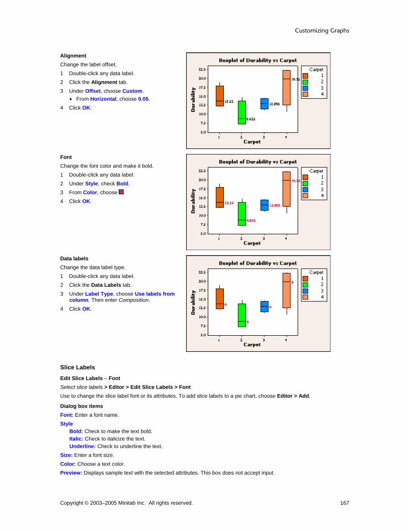
Customizing Graphs
Copyright © 2003–2005 Minitab Inc. All rights reserved. 167
Alignment Change the label offset. 1 Double-click any data label. 2 Click the Alignment tab. 3 Under Offset, choose Custom.
• From Horizontal, choose 0.05. 4 Click OK.
Font Change the font color and make it bold. 1 Double-click any data label. 2 Under Style, check Bold. 3 From Color, choose 4 Click OK.
Data labels Change the data label type. 1 Double-click any data label. 2 Click the Data Labels tab. 3 Under Label Type, choose Use labels from
column. Then enter Composition. 4 Click OK.
Slice Labels
Edit Slice Labels − Font Select slice labels > Editor > Edit Slice Labels > Font Use to change the slice label font or its attributes. To add slice labels to a pie chart, choose Editor > Add.
Dialog box items Font: Enter a font name. Style
Bold: Check to make the text bold. Italic: Check to italicize the text. Underline: Check to underline the text.
Size: Enter a font size. Color: Choose a text color. Preview: Displays sample text with the selected attributes. This box does not accept input.

Customizing and Editing Graphs
Copyright © 2003–2005 Minitab Inc. All rights reserved. 168
Text: Type text to change the category name slice label. (only available if an individual slice label is selected)
To edit the slice label font 1 Select and double-click all slice labels or a single label. See Selecting groups and single items. 2 Click the Font tab. 3 To change font attributes, do any of the following:
• Under Font, enter a font name. • Under Style, check Bold, Italic, and/or Underline. • Under Size, enter a font size. • From Color, choose a text color.
4 In Text, type text to change the category name slice label. (only available if an individual slice label is selected) 5 Click OK.
Edit Slice Labels − Alignment Select slice labels > Editor > Edit Slice Labels > Alignment Use to rotate and move the slice labels. To add slice labels to a pie chart, choose Editor > Add.
Tip You may find it easier to move slice labels by clicking and dragging them.
Dialog box items Text angle: Choose a value from -360° to 360° to rotate the selected text. Offset (only available if an individual slice label is selected)
Automatic: Choose to accept the default label offset. Custom: Choose to customize the label offset.
Horizontal: Enter the figure units to move the label to the left (−) or right (+). Vertical: Enter the figure units to move the label up (+) or down (−).
To rotate or move a slice label 1 Select and double-click all slice labels or a single slice label. See Selecting groups and single items. 2 Click the Alignment tab.
3 In Text Angle, enter a value from − 360° to 360° to rotate the selected text. 4 Under Offset, choose one of the following:
• Automatic to accept the default label offset. • Custom to customize the label offset. (only available if an individual slice label is selected)
− From Horizontal, enter the figure units to move the label to the left (−) or right (+).
− From Vertical, enter the figure units to move the label up (+) or down (−).
Tip You may find it easier to move individual slice labels by clicking and dragging them.
5 Click OK.
Edit Slice Labels − Show Select slice labels > Editor > Edit Slice Labels > Show Use to change the pie chart slice label type.
Dialog box items Label pie slices with
Category name: Check to label each slice with the category name. Frequency: Check to label each slice with the number of observations. Percent: Check to label each slice with the percentage of the pie.
Show leader lines: Check to draw a line from each label to the slice.

Customizing Graphs
Copyright © 2003–2005 Minitab Inc. All rights reserved. 169
To change the slice label type 1 Select and double-click all slice labels. See Selecting groups and single items. 2 Click the Show tab. 3 Under Label pie slices with, check one or more of the following:
• Category name to label each slice with the category name. • Frequency to label each slice with the number of observations. • Percent to label each slice with the percentage of the pie.
4 If you like, check Show leader lines. Click OK.
Edit Slice Labels − Leader Lines Select slice labels > Editor > Edit Slice Labels > Leader Lines Use to change the type, color, and size of your slice label leader lines. To add slice label leader lines to a pie chart, choose Editor > Add > Slice Labels.
Dialog box items Lines
Automatic: Choose to accept the default line attributes. Custom: Choose to change the line attributes.
Type: Choose a line type. Color: Choose a line color. Size: Choose a line thickness.
To edit the slice label leader lines 1 Select and double-click all slice labels. See Selecting groups and single items. 2 Under Lines, choose one of the following:
• Automatic to accept the default line attributes. • Custom to customize the line attributes.
− From Type, choose a line type.
− From Color, choose a line color.
− From Size, choose a line width.
3 Click OK.
Examples of editing slice labels In the Example of a pie chart, you identified the most common causes of air loss in tires. You want to customize the pie slice labels.
Font Change the color and make it bold. 1 Double-click any slice label. 2 Under Style, check Bold. 3 From Color, choose . 4 Click OK.
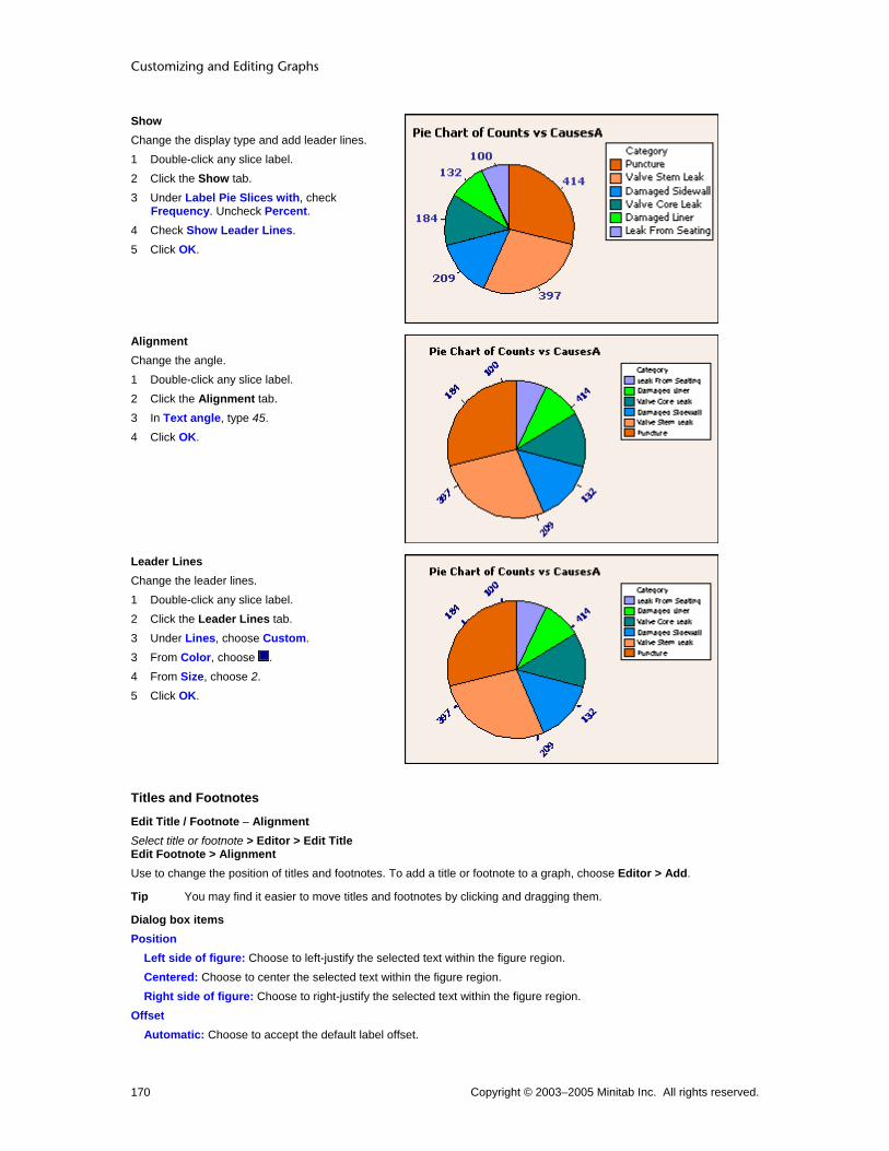
Customizing and Editing Graphs
Copyright © 2003–2005 Minitab Inc. All rights reserved. 170
Show Change the display type and add leader lines. 1 Double-click any slice label. 2 Click the Show tab. 3 Under Label Pie Slices with, check
Frequency. Uncheck Percent. 4 Check Show Leader Lines. 5 Click OK.
Alignment Change the angle. 1 Double-click any slice label. 2 Click the Alignment tab. 3 In Text angle, type 45. 4 Click OK.
Leader Lines Change the leader lines. 1 Double-click any slice label. 2 Click the Leader Lines tab. 3 Under Lines, choose Custom. 3 From Color, choose . 4 From Size, choose 2. 5 Click OK.
Titles and Footnotes
Edit Title / Footnote − Alignment Select title or footnote > Editor > Edit Title Edit Footnote > Alignment Use to change the position of titles and footnotes. To add a title or footnote to a graph, choose Editor > Add.
Tip You may find it easier to move titles and footnotes by clicking and dragging them.
Dialog box items Position
Left side of figure: Choose to left-justify the selected text within the figure region. Centered: Choose to center the selected text within the figure region. Right side of figure: Choose to right-justify the selected text within the figure region.
Offset Automatic: Choose to accept the default label offset.

Customizing Graphs
Copyright © 2003–2005 Minitab Inc. All rights reserved. 171
Custom: Choose to customize the label offset. Horizontal: Enter the figure units to move the title/footnote to the left (−) or right (+) of the placement chosen under Position. Vertical: Choose or type the number of figure units to move the title/footnote up (+) or down (−) from the placement chosen under Position.
To move a title or footnote 1 Double-click the title or footnote. 2 Click the Alignment tab. 3 Under Position, choose one of the following:
• Left side of figure to left-justify the selected text within the figure region. • Centered to center the selected text within the figure region. • Right side of figure to right-justify the selected text within the figure region.
4 Under Offset, choose one of the following: • Automatic to accept the default label offset. • Custom to customize the label offset.
− From Horizontal, enter the figure units to move the label to the left (−) or right (+) of the placement chosen under Position.
− From Vertical, enter the figure units to move the label up (+) or down (−) from the placement chosen under Position.
5 Click OK.
Tip You may find it easier to move titles and footnotes by clicking and dragging them.
Edit Title / Footnote − Font Select title or footnote > Editor > Edit Title Edit Footnote > Font Use to change the title and footnote text or customize its attributes. To add a title or footnote to a graph, choose Editor > Add.
Dialog box items Font: Enter a font name. Style
Bold: Check to make the text bold. Italic: Check to italicize the text. Underline: Check to underline the text.
Size: Enter a font size. Color: Choose a text color. Preview: Displays sample text with the selected attributes. This box does not accept input. Text: Type text to change the existing title or footnote.
To edit the title/footnote font and text 1 Double-click the title or footnote. 2 Click the Font tab. 3 To change font attributes, do any of the following:
• Under Font, enter a font name. • Under Style, check Bold, Italic, and/or Underline. • Under Size, enter a font size. • From Color, choose a text color.
4 In Text, type text to change the existing title or footnote. 5 Click OK.
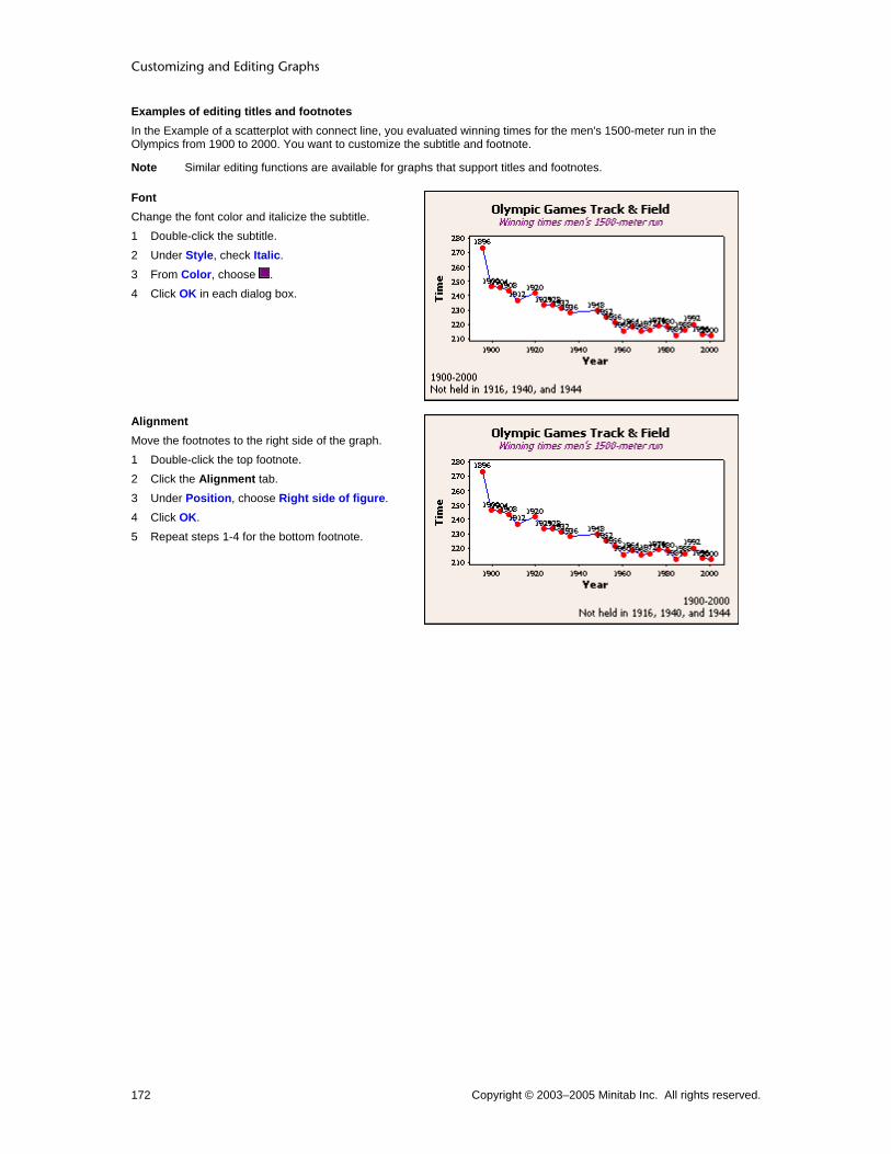
Customizing and Editing Graphs
Copyright © 2003–2005 Minitab Inc. All rights reserved. 172
Examples of editing titles and footnotes In the Example of a scatterplot with connect line, you evaluated winning times for the men's 1500-meter run in the Olympics from 1900 to 2000. You want to customize the subtitle and footnote.
Note Similar editing functions are available for graphs that support titles and footnotes.
Font Change the font color and italicize the subtitle. 1 Double-click the subtitle. 2 Under Style, check Italic. 3 From Color, choose . 4 Click OK in each dialog box.
Alignment Move the footnotes to the right side of the graph. 1 Double-click the top footnote. 2 Click the Alignment tab. 3 Under Position, choose Right side of figure. 4 Click OK. 5 Repeat steps 1-4 for the bottom footnote.

Customizing Graphs
Copyright © 2003–2005 Minitab Inc. All rights reserved. 173
Graph Size, Background, Borders, Legends... Graph Regions Overview All Minitab graphs are divided into regions. After you create a graph, you can resize and relocate each region within the page, and reformat the color, fill patterns, edge line types, and more. See Region Editing Overview.
Region Example Description
Graph
The area just within the graph window, bounded here by a dotted line.
Figure
The area just within the graph region that includes the graph and all labels, bounded here by a dotted line.
Data
The area in which the data are displayed, bounded here by a dotted line.

Customizing and Editing Graphs
Copyright © 2003–2005 Minitab Inc. All rights reserved. 174
Legend
The boxed area in the upper right corner of a graph that keys the different symbols on the graph. Overlaid graphs and graphs with grouping variables display legends by default.
Output Tables
The boxed area below the legend that contains statistical output. Output tables are displayed with histograms, probability plots, Empirical CDF graphs, and some built-in graphs.
Graph Regions Each graph window is a single graph region. When you print a graph, the graph region corresponds to one sheet of paper. While there are several options for placing graphs on a graph window, all of them occupy only one graph region. A graph region uses a coordinate system in placing items relative to the graph. See Region Coordinate Systems.
Placement type
Example Description
Single graph with one variable
One graph per variable per graph window; the most common graphical application

Customizing Graphs
Copyright © 2003–2005 Minitab Inc. All rights reserved. 175
Multiple overlaid graphs
Several variables plotted on the same data region on one graph region
Paneled graphs
Several variables plotted in separate panels on one graph region
Layout
Several graphs of different types arranged on separate figure regions of one graph region
Figure Regions The figure region is where Minitab displays a single graph. The figure region contains items specific to a graph: data, legend, scale elements, titles, and footnotes. A figure region uses a coordinate system in placing items relative to the figure. See Region Coordinate Systems. The figure region usually fills the entire graph region; to place more than one figure region on a page, use a layout.

Customizing and Editing Graphs
Copyright © 2003–2005 Minitab Inc. All rights reserved. 176
A single figure region is transparent and takes up the entire beige-colored page region.
Two figure regions share the same graph region. The normally transparent figure regions are colored red and blue here.
Data Regions The data region of a graph is where Minitab displays the data. You can place additional text, lines, symbols, and polygons in the data region. A data region uses a coordinate system in placing items relative to the points on the graph. See Region Coordinate Systems.
In most cases, graph windows have a single data region.

Customizing Graphs
Copyright © 2003–2005 Minitab Inc. All rights reserved. 177
When you panel a graph, you choose to display the resulting data regions on the same page.
Region Coordinate Systems The graph, figure, and data regions each have their own coordinate systems for placing graph elements. Graph and figure region coordinate systems range from 0.0 to 1.0 in the x- and y-directions. A data region's coordinate system is determined by the scales that border it. In most cases it is easier to position annotation items and regions by dragging them than by specifying coordinates. Graph units are used to place:
• One or more figure regions on a page
• Annotation items for the whole page, rather than for one graph Figure units are used to place:
• The data region
• Annotation items such as titles and footnotes
• Scale elements such as axis labels and tick labels Data units are used to place:
• Annotation items such as text, lines, markers, and polygons
• Scale elements such as tick lines and reference lines
Editing Editing Graph Regions Overview After you create a graph, you can customize the characteristics of each region.
Region To change...
Graph • Color, fill type, border type and size - see Edit Graph and Figure Regions - Graph Attributes
Figure Region • Color, fill type, border type and size - see Edit Graph and Figure Regions - Figure Attributes
• Position - see Edit Graph and Figure Regions - Figure Location
Data Region • Color, fill type, border type and size - see Edit Data Region - Attributes
• Position - see Edit Data Region - Location
Legend • Color, fill type, border type and size - see Edit Legend - Attributes
• Position - see Edit Legend - Location
• Title font - see Edit Legend - Header Font
• Body Font - see Edit Legend - Body Font
• Text - see Edit Text or Hide Cells

Customizing and Editing Graphs
Copyright © 2003–2005 Minitab Inc. All rights reserved. 178
Table • Color, fill type, border type and size - see Edit Table - Attributes
• Position - see Edit Table - Location
• Title Font - see Edit Table - Header Font
• Body Font - see Edit Table - Body Font
• Text - see Edit Text or Hide Cells
Graph and Figure
Edit Graph Region − Graph Attributes Select figure region > Editor > Edit Graph Region > Graph Attributes After creating a graph, you can change the background fill and border attributes of the graph region.
Dialog box items Fill Pattern
Automatic: Choose to accept the default fill pattern. Custom: Choose change the default fill pattern.
Type: Choose a fill type. Background color: Choose a background color.
Borders and Fill Lines Automatic: Choose to accept the default border and fill lines. Custom: Choose to change the default border and fill lines.
Type: Choose a border line type. Color: Choose a border and fill line color. Size: Choose a border line thickness.
To change fill attributes of a graph region 1 Double-click the graph region. 2 Under Fill Pattern, choose one of the following:
• Automatic to accept the default fill pattern. • Custom to change the default fill pattern.
− From Type, choose a fill type.
− From Background color, choose a background color.
3 Under Borders and Fill Lines, choose one of the following: • Automatic to accept the default border and fill lines. • Custom to change the default border and fill lines.
− From Type, choose a border line type.
− From Color, choose a border and fill line color.
− From Size, choose a border line thickness.
4 Click OK.
Edit Graph Region − Graph Size Select figure region > Editor > Edit Figure Region > Graph Size After creating a graph, you can adjust the actual graph size or only the magnification of its displayed size. A graph's "true size" denotes its dimensions as it is printed, appended to the ReportPad, or copied into another application. Changing a graph's "zoomed size" affects none of these.
Dialog box items True Size
Automatic: Choose to accept the default graph size. Custom: Choose to customize the graph size.
Width (in): Type the graph width in inches.

Customizing Graphs
Copyright © 2003–2005 Minitab Inc. All rights reserved. 179
Height (in): Type the graph height in inches. Zoomed Size (Relative to True Size)
200%: Choose to magnify the graph 200%. 150% Choose to magnify the graph 150%. 100%: Choose to return the graph to 100%. 75%: Choose to reduce magnification of the graph to 75%. 50%: Choose to reduce magnification of the graph to 50%. Fit Window: Choose to fit the graph in the graph window. Specify: Enter a magnification between 10 and 500.
Note The default height and width units are inches. To use metric units, adjust the Control Panel regional settings.
Note The settings in File > Page Setup will also affect the printed size of graphs.
To change the actual graph size 1 Double-click the graph region. 2 Click the Graph Size tab. 3 Under True Size, choose Custom. 4 In Width, type a value for the graph width. 5 In Height, type a value for the graph height. Click OK.
Note To change only the displayed graph size, not the printed size, adjust the zoom only. See To change the displayed graph size.
To change the displayed graph size 1 Double-click the graph region. 2 Click the Graph Size tab. 3 Under Zoomed Size, choose a percentage of the actual size to display the graph. Click OK.
Note This only changes the displayed size, not the printed size. See To change the actual graph size.
Edit Figure Region − Figure Attributes Select data region > Editor > Edit Figure Region > Figure Attributes After creating a graph, you can change the background fill and border attributes of the figure region.
Dialog box items Fill Pattern
Automatic: Choose to accept the default fill pattern. Custom: Choose to change the default fill pattern.
Type: Choose a fill type. Background color: Choose a background color.
Borders and Fill Lines Automatic: Choose to accept the default border and fill lines. Custom: Choose to change the default border and fill lines.
Type: Choose a border line type. Color: Choose a border and fill line color. Size: Choose a border line thickness.
To change fill attributes of a figure region 1 Double-click the figure region. 2 Under Fill Pattern, choose one of the following:
• Automatic to accept the default fill pattern. • Custom to change the default fill pattern.

Customizing and Editing Graphs
Copyright © 2003–2005 Minitab Inc. All rights reserved. 180
− From Type, choose a fill type.
− From Background color, choose a background color.
3 Under Borders and Fill Lines, choose one of the following: • Automatic to accept the default border and fill lines. • Custom to change the default border and fill lines.
− From Type, choose a border line type.
− From Color, choose a border and fill line color.
− From Size, choose a border line thickness.
4 Click OK.
Edit Figure Region − Figure Location Select figure region > Editor > Edit Figure Region > Figure Location After creating a graph, you can control the size and placement of your figure region using graph coordinates. To display different types of graphs together, see Layout.
Tip It may be easier to resize or move figure regions by clicking and dragging them.
Dialog box items Position of Figure Region Within a Graph
Automatic: Choose to accept the default region size and location. Custom: Choose to change the default region size and location.
X minimum: Enter a number between 0 and 1 to specify the horizontal minimum position. X maximum: Enter a number between 0 and 1 to specify the horizontal maximum position. Y minimum: Enter a number between 0 and 1 to specify the vertical minimum position. Y maximum: Enter a number between 0 and 1 to specify the vertical maximum position.
To change the size and placement of the figure region 1 Double-click the figure region. 2 Click the Figure Location tab. 3 Under Position of Figure Region Within a Graph, choose Custom. 4 In X minimum, X maximum, Y minimum, and Y maximum, type values between 0 and 1. Click OK.
Tip It may be easier to resize or move figure regions by clicking and dragging them.
Examples of editing the graph and figure region In Example of a simple scatterplot you created a single figured graph. After creating this graph, you can edit its graph and figure region.
Graph Attributes Change the graph region fill pattern. 1 Double-click the graph or figure region. 2 Click the Graph Attributes tab. 3 Under Fill Pattern, choose Custom.
4 From Type, choose . Click OK.

Customizing Graphs
Copyright © 2003–2005 Minitab Inc. All rights reserved. 181
Graph Size Change the graph region size. 1 Double-click the graph or figure region. 2 Click the Graph Size tab. 3 Under True Size, choose Custom. 4 In Height, enter 6. Click OK.
Figure Location Change the location of the figure region. 1 Double-click the graph or figure region. 2 Click the Figure Location tab. 3 Under Position of Figure Region Within a
Graph, choose Custom. 4 In X minimum enter 0.1 and in X maximum
enter 0.9. 5 In Y minimum enter 0.1 and in Y maximum
enter 0.9. Click OK.

Customizing and Editing Graphs
Copyright © 2003–2005 Minitab Inc. All rights reserved. 182
Figure Attributes Change the figure region fill pattern. 1 Double-click the graph or figure region. 2 Click the Figure Attributes tab. 3 Under Fill Pattern, choose Custom.
4 From Type, choose . Click OK.
Data
Edit Data Region − Attributes Select data region > Editor > Edit Data Region > Attributes After creating a graph, you can change the background fill and borders of the data region.
Dialog box items Fill Pattern
Automatic: Choose to accept the default fill pattern. Custom: Choose to change the default fill pattern.
Type: Choose a fill type. Background color: Choose a background color.
Borders and Fill Lines Automatic: Choose to accept the default border and fill lines. Custom: Choose to change the default border and fill lines.
Type: Choose a border line type. Color: Choose a border and fill line color. Size: Choose a border line thickness.
To change fill attributes of a data region 1 Double-click the data region. 2 Under Fill Pattern, choose one of the following:
• Automatic to accept the default fill pattern. • Custom to change the default fill pattern.
− From Type, choose a fill type.
− From Background color, choose a background color.
3 Under Borders and Fill Lines, choose one of the following: • Automatic to accept the default border and fill lines. • Custom to change the default border and fill lines.
− From Type, choose a border line type.
− From Color, choose a border and fill line color.
− From Size, choose a border line thickness.
4 Click OK.
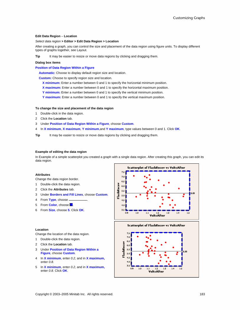
Customizing Graphs
Copyright © 2003–2005 Minitab Inc. All rights reserved. 183
Edit Data Region − Location Select data region > Editor > Edit Data Region > Location After creating a graph, you can control the size and placement of the data region using figure units. To display different types of graphs together, see Layout.
Tip It may be easier to resize or move data regions by clicking and dragging them.
Dialog box items Position of Data Region Within a Figure
Automatic: Choose to display default region size and location. Custom: Choose to specify region size and location.
X minimum: Enter a number between 0 and 1 to specify the horizontal minimum position. X maximum: Enter a number between 0 and 1 to specify the horizontal maximum position. Y minimum: Enter a number between 0 and 1 to specify the vertical minimum position. Y maximum: Enter a number between 0 and 1 to specify the vertical maximum position.
To change the size and placement of the data region 1 Double-click in the data region. 2 Click the Location tab. 3 Under Position of Data Region Within a Figure, choose Custom. 4 In X minimum, X maximum, Y minimum,and Y maximum, type values between 0 and 1. Click OK.
Tip It may be easier to resize or move data regions by clicking and dragging them.
Example of editing the data region In Example of a simple scatterplot you created a graph with a single data region. After creating this graph, you can edit its data region.
Attributes Change the data region border. 1 Double-click the data region. 2 Click the Attributes tab. 3 Under Borders and Fill Lines, choose Custom. 4 From Type, choose . 5 From Color, choose . 6 From Size, choose 5. Click OK.
Location Change the location of the data region. 1 Double-click the data region. 2 Click the Location tab. 3 Under Position of Data Region Within a
Figure, choose Custom. 4 In X minimum, enter 0.2, and in X maximum,
enter 0.8. 5 In X minimum, enter 0.2, and in X maximum,
enter 0.8. Click OK.

Customizing and Editing Graphs
Copyright © 2003–2005 Minitab Inc. All rights reserved. 184
Legend
Edit Legend − Attributes Select legend > Editor > Edit Legend > Attributes After creating a graph, you can change the legend's fill and border attributes.
Dialog box items Fill Pattern
Automatic: Choose to accept the default fill pattern. Custom: Choose to change the default fill pattern.
Type: Choose a fill type. Background color: Choose a background color.
Borders and Fill Lines Automatic: Choose to accept the default border and fill lines. Custom: Choose to change the default border and fill lines.
Type: Choose a border line type. Color: Choose a border and fill line color. Size: Choose a border line thickness.
To edit the legend attributes 1 Double-click the legend. 2 Under Fill Pattern, choose one of the following:
• Automatic to accept the default fill pattern. • Custom to change the default fill pattern.
− From Type, choose a fill type.
− From Background color, choose a background color.
3 Under Borders and Fill Lines, choose one of the following: • Automatic to accept the default border and fill lines. • Custom to change the default border and fill lines.
− From Type, choose a border line type.
− From Color, choose a border and fill line color.
− From Size, choose a border line thickness.
4 Click OK.
Edit Legend − Location Select legend > Editor > Edit Legend > Location After creating a graph, you can resize the legend and place it at precise x- and y-coordinates.
Tip It may be easier to resize or move legends by clicking and dragging them.
Dialog box items Position of Legend Within a Figure
Automatic: Choose to display default legend size and location. Custom: Choose to specify the legend size and location using figure units.
X minimum: Enter a number between 0 and 1 to specify the minimum horizontal position. X maximum: Enter a number between 0 and 1 to specify the maximum horizontal position. Y minimum: Enter a number between 0 and 1 to specify the minimum vertical position. Y maximum: Enter a number between 0 and 1 to specify the maximum vertical position.
To move the legend or table 1 Double-click the legend or table.

Customizing Graphs
Copyright © 2003–2005 Minitab Inc. All rights reserved. 185
2 Click the Location tab. 3 Under Position of a Legend Within a Figure, choose one of the following:
• Automatic to display default size and location. • Custom to specify the size and location using figure units.
− In X minimum, type a number between 0 and 1 to specify the minimum horizontal position.
− In X maximum, type a number between 0 and 1 to specify the maximum horizontal position.
− In Y minimum, type a number between 0 and 1 to specify the minimum vertical position.
− In Y maximum, type a number between 0 and 1 to specify the maximum vertical position.
5 Click OK.
Tip It may be easier to resize or move legends and tables by clicking and dragging them.
Edit Legend − Header Font Select legend > Editor > Edit Legend > Header Font After creating a graph, you can change the legend title font or its attributes.
Dialog box items Font: Enter a font type. Style
Bold: Check to make the text bold. Italic: Check to italicize the text. Underline: Check to underline the text.
Size: Enter a font size. Color: Choose a text color. Preview: Displays sample text with the selected attributes applied. This box does not accept input.
To edit the legend header font 1 Double-click in the legend. 2 Click the Header Font tab. 3 To change font attributes, do any of the following:
• Under Font, type a font or choose it from the list. • Under Style, check Bold, Italic, and/or Underline. • Under Size, type a font size or choose it from the list. • From Color, choose a text color.
4 Click OK.
Edit Legend − Body Font Select legend > Editor > Edit Legend > Body Font After creating a graph, you can change the legend text font or its attributes.
Dialog box items Font: Enter a font type. Style
Bold: Check to make the text bold. Italic: Check to italicize the text. Underline: Check to underline the text.
Size: Enter a font size. Color: Choose a text color. Preview: Displays sample text with the selected attributes applied. This box does not accept input.
To edit the legend body font 1 Double-click in the legend.

Customizing and Editing Graphs
Copyright © 2003–2005 Minitab Inc. All rights reserved. 186
2 Click the Body Font tab. 3 To change font attributes, do any of the following:
• Under Font, type a font or choose it from the list. • Under Style, check Bold, Italic, and/or Underline. • Under Size, type a font size or choose it from the list. • From Color, choose a text color.
4 Click OK.
Edit Text Select text > Editor > Edit Legend Text Select text > Editor > Edit Table Text Use to edit the selected legend or table text.
Note You can't change calculated output.
Dialog box item Text: Type the new text.
To edit legend or table text 1 Click in the legend or table. 2 Double-click the text you wish to edit. 3 In Text, type the new text. 4 Click OK.
Note You can't change calculated output.
Hide Cells Select legend text > [Delete] Select table text > [Delete] After creating a graph, you can hide parts of the legend or table.
Dialog box items Hide
Row: Choose to hide the row containing the selected text. Column: Choose to hide the column containing the selected text.
To hide legend or table text 1 Click in the legend or table. 2 Select the text you wish to hide. 3 Do one of the following:
Right-click on the text and choose Delete.
Click on the graph toolbar. Press [Delete].
4 Under Hide, choose one of the following: • Row to hide the row containing the selected text. • Column to hide the column containing the selected text.
5 Click OK.
Examples of editing the legend In the Example scatterplot with groups, you evaluated the relationship between the voltage remaining in your batteries immediately after a flash and the length of time required for a battery to be ready to support another flash. You want to customize the legend.

Customizing Graphs
Copyright © 2003–2005 Minitab Inc. All rights reserved. 187
Header Font Change the header font type, make it bold, and increase the size. 1 Double-click the legend. 2 Click the Header Font tab. 3 From Type, choose Franklin Gothic Medium. 4 Under Style, check Bold. 5 From Size, choose 12. Click OK.
Body Font Change the body font type and increase the size. 1 Double-click the legend. 2 Click the Body Font tab. 3 From Type, choose Franklin Gothic Medium. 4 From Size, choose 12. Click OK.
Body Text Change the label names. 1 Click the legend. 2 Double-click New. 3 Under Text, type AK-410. Click OK. 4 Double-click Old. 5 Under Text, type AK-210. Click OK.
HeaderText Delete the header. 1 Click the legend. 2 Click Formulation and press [Delete]. 3 Under Hide, choose Row. Click OK.
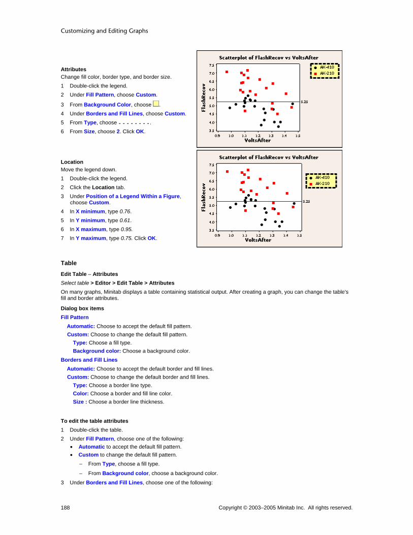
Customizing and Editing Graphs
Copyright © 2003–2005 Minitab Inc. All rights reserved. 188
Attributes Change fill color, border type, and border size. 1 Double-click the legend. 2 Under Fill Pattern, choose Custom.
3 From Background Color, choose . 4 Under Borders and Fill Lines, choose Custom. 5 From Type, choose . 6 From Size, choose 2. Click OK.
Location Move the legend down. 1 Double-click the legend. 2 Click the Location tab. 3 Under Position of a Legend Within a Figure,
choose Custom. 4 In X minimum, type 0.76. 5 In Y minimum, type 0.61. 6 In X maximum, type 0.95. 7 In Y maximum, type 0.75. Click OK.
Table
Edit Table − Attributes Select table > Editor > Edit Table > Attributes On many graphs, Minitab displays a table containing statistical output. After creating a graph, you can change the table's fill and border attributes.
Dialog box items Fill Pattern
Automatic: Choose to accept the default fill pattern. Custom: Choose to change the default fill pattern.
Type: Choose a fill type. Background color: Choose a background color.
Borders and Fill Lines Automatic: Choose to accept the default border and fill lines. Custom: Choose to change the default border and fill lines.
Type: Choose a border line type. Color: Choose a border and fill line color. Size : Choose a border line thickness.
To edit the table attributes 1 Double-click the table. 2 Under Fill Pattern, choose one of the following:
• Automatic to accept the default fill pattern. • Custom to change the default fill pattern.
− From Type, choose a fill type.
− From Background color, choose a background color.
3 Under Borders and Fill Lines, choose one of the following:

Customizing Graphs
Copyright © 2003–2005 Minitab Inc. All rights reserved. 189
• Automatic to accept the default border and fill lines. • Custom to change the default border and fill lines.
− From Type, choose a border line type
− From Color, choose a border and fill line color.
− From Size, choose a border line thickness.
4 Click OK.
Edit Table − Location Select table > Editor > Edit Table > Location On many graphs, Minitab displays a table containing statistical output. After creating a graph, you can resize the table and place it at precise x- and y-coordinates.
Tip It may be easier to resize or move tables by clicking and dragging them.
Dialog box items Position of Output Table Within a Figure
Automatic: Choose to display default output table size and location. Custom: Choose to specify the output table size and location using figure units.
X minimum: Enter a number between 0 and 1 to specify the minimum horizontal position. X maximum: Enter a number between 0 and 1 to specify the maximum horizontal position. Y minimum: Enter a number between 0 and 1 to specify the minimum vertical position. Y maximum: Enter a number between 0 and 1 to specify the maximum vertical position.
To move the legend or table 1 Double-click the legend or table. 2 Click the Location tab. 3 Under Position of a Legend Within a Figure, choose one of the following:
• Automatic to display default size and location. • Custom to specify the size and location using figure units.
− In X minimum, type a number between 0 and 1 to specify the minimum horizontal position.
− In X maximum, type a number between 0 and 1 to specify the maximum horizontal position.
− In Y minimum, type a number between 0 and 1 to specify the minimum vertical position.
− In Y maximum, type a number between 0 and 1 to specify the maximum vertical position.
5 Click OK.
Tip It may be easier to resize or move legends and tables by clicking and dragging them.
Edit Table − Header Font Select table > Editor > Edit Table > Header Font On many graphs, Minitab displays a table containing statistical output. After creating a graph, you can change the font of the table section titles or its attributes.
Dialog box items Font: Enter a font type. Style
Bold: Check to make the text bold. Italic: Check to italicize the text. Underline: Check to underline the text.
Size: Enter a font size. Color: Choose a text color. Preview: Displays sample text with the selected attributes applied. This box does not accept input.

Customizing and Editing Graphs
Copyright © 2003–2005 Minitab Inc. All rights reserved. 190
To edit the table header font 1 Double-click in the table. 2 Click the Header Font tab. 3 To change font attributes, do any of the following:
• Under Font, type a font or choose it from the list. • Under Style, check Bold, Italic, and/or Underline. • Under Size, type a font size or choose it from the list. • From Color, choose a text color.
4 Click OK.
Edit Table − Body Font Select table > Editor > Edit Table > Body Font On many graphs, Minitab displays a table containing statistical output. After creating a graph, you can change font of the table body text or its attributes.
Dialog box items Font: Enter a font type. Style
Bold: Check to make the text bold. Italic: Check to italicize the text. Underline: Check to underline the text.
Size: Enter a font size. Color: Choose a text color. Preview: Displays sample text with the selected attributes applied. This box does not accept input.
To edit the table body font 1 Double-click in the table. 2 Click the Body Font tab. 3 To change font attributes, do any of the following:
• Under Font, type a font or choose it from the list. • Under Style, check Bold, Italic, and/or Underline. • Under Size, type a font size or choose it from the list. • From Color, choose a text color.
4 Click OK.
Edit Text Select text > Editor > Edit Legend Text Select text > Editor > Edit Table Text Use to edit the selected legend or table text.
Note You can't change calculated output.
Dialog box item Text: Type the new text.
To edit legend or table text 1 Click in the legend or table. 2 Double-click the text you wish to edit. 3 In Text, type the new text. 4 Click OK.
Note You can't change calculated output.
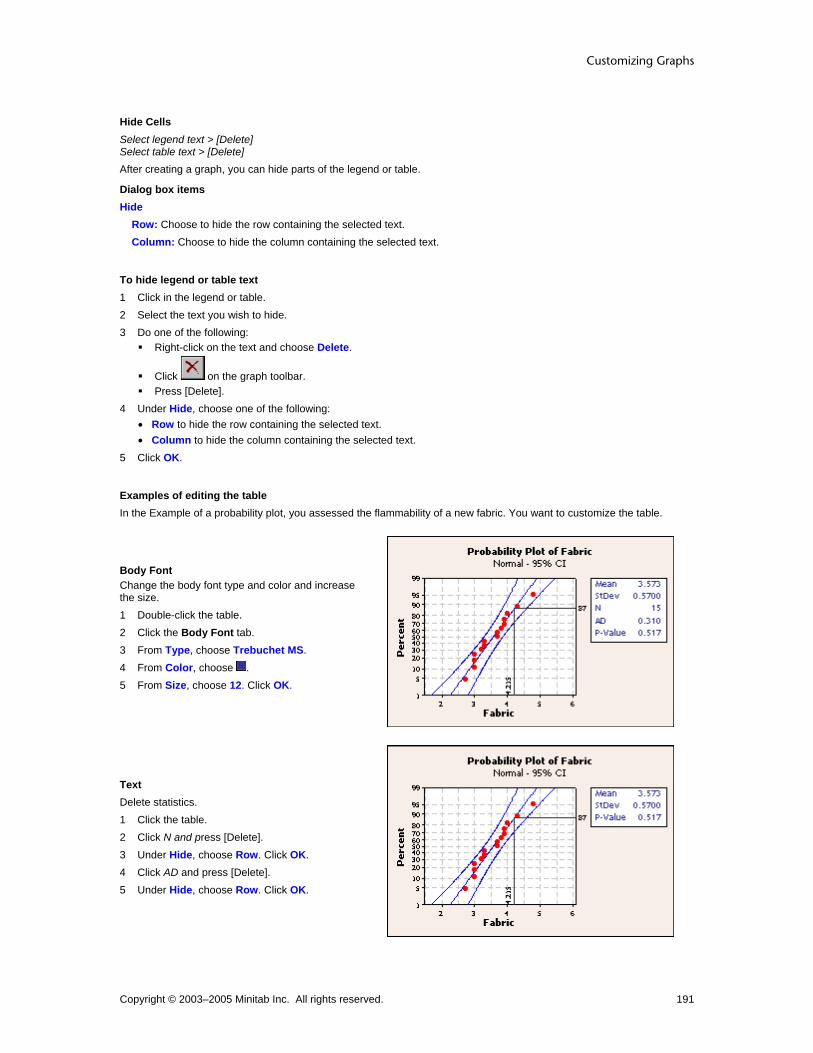
Customizing Graphs
Copyright © 2003–2005 Minitab Inc. All rights reserved. 191
Hide Cells Select legend text > [Delete] Select table text > [Delete] After creating a graph, you can hide parts of the legend or table.
Dialog box items Hide
Row: Choose to hide the row containing the selected text. Column: Choose to hide the column containing the selected text.
To hide legend or table text 1 Click in the legend or table. 2 Select the text you wish to hide. 3 Do one of the following:
Right-click on the text and choose Delete.
Click on the graph toolbar. Press [Delete].
4 Under Hide, choose one of the following: • Row to hide the row containing the selected text. • Column to hide the column containing the selected text.
5 Click OK.
Examples of editing the table In the Example of a probability plot, you assessed the flammability of a new fabric. You want to customize the table.
Body Font Change the body font type and color and increase the size. 1 Double-click the table. 2 Click the Body Font tab. 3 From Type, choose Trebuchet MS. 4 From Color, choose . 5 From Size, choose 12. Click OK.
Text Delete statistics. 1 Click the table. 2 Click N and press [Delete]. 3 Under Hide, choose Row. Click OK. 4 Click AD and press [Delete]. 5 Under Hide, choose Row. Click OK.

Customizing and Editing Graphs
Copyright © 2003–2005 Minitab Inc. All rights reserved. 192
Body Text Change labels. 1 Click the table. 2 Double-click StDev. 3 Under Text, type SD. Click OK. 4 Double-click P-Value. 5 Under Text, type P. Click OK.
Attributes Change fill color, border color, and border size. 1 Double-click the table. 2 Under Fill Pattern, choose Custom. 3 From Background Color, choose . 4 Under Borders and Fill Lines, choose Custom. 5 From Color, choose . 6 From Size, choose 2. Click OK.
Location Move the table down. 1 Double-click the table. 2 Click the Location tab. 3 Under Position of Output Table Within a
Figure, choose Custom. 4 In Y minimum, enter 0.14. 5 In Y maximum, enter 0.33. Click OK.

Customizing Graphs
Copyright © 2003–2005 Minitab Inc. All rights reserved. 193
Multiple Graphs Multiple Graphs Overview You can control the way multiple graphs are displayed when they are created from a single graph dialog box. First, decide how the multiple graphs will be achieved:
• Use the Multiple Variables tab when you have entered multiple variables (or multiple pairs of variables, in the case of a scatterplot) in a single graph dialog box.
• Use the By Variables tab when using a categorical variable to divide graph variables into separate graphs. After choosing the way you will create the multiple graphs, decide how to display the resulting graphs:
• Overlay the graphs in the same data region.
• Place the graphs in separate areas of the same graph window.
• Place the graphs in separate graph windows. All the options above are illustrated below. After creating the graphs you can:
• Edit paneling characteristics and the By Variables used to separate the graphs into panels.
• Make a similar graph using different graph variables or By variables.
• Display different types of graphs on the same page with layout tool.
• Alter attribute assignments for groups and overlaid graphs.
Multiple Variables Options If you have entered two pairs of graphing variables in a scatterplot dialog box, you can choose to display the resulting graphs one of three ways:
On Separate Graphs
In Separate Panels
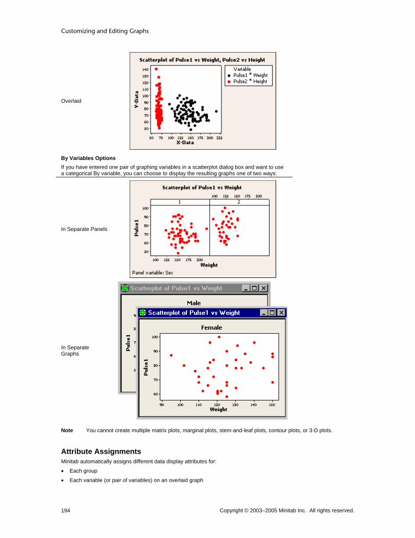
Customizing and Editing Graphs
Copyright © 2003–2005 Minitab Inc. All rights reserved. 194
Overlaid
By Variables Options If you have entered one pair of graphing variables in a scatterplot dialog box and want to use a categorical By variable, you can choose to display the resulting graphs one of two ways:
In Separate Panels
In Separate Graphs
Note You cannot create multiple matrix plots, marginal plots, stem-and-leaf plots, contour plots, or 3-D plots.
Attribute Assignments Minitab automatically assigns different data display attributes for:
• Each group
• Each variable (or pair of variables) on an overlaid graph

Customizing Graphs
Copyright © 2003–2005 Minitab Inc. All rights reserved. 195
If you overlay or panel multiple graphs and use grouping variables, attributes are assigned to the graphs first, then to the groups. After creating a graph, you can edit data display attributes for groups or multiple graphs. See Editing Data Display Overview.
Grouping Variables To distinguish between data belonging to different groups, you can add categorical grouping variables to a graph. The grouping variables you use depend on the organization of the worksheet data. See Organizing Your Data. To specify the groups:
• Choose a With Groups option from a gallery, then enter the grouping variables in the data source dialog box. Minitab assigns different data display attributes for each group, then creates a legend. You can add a grouping variable to a graph by double-clicking its data display (symbols or bars, for example) and choosing the Groups tab.
• Click Multiple Graphs, click the By Variables tab, and enter the grouping variable. Different data displays are not assigned, because each group is displayed in a separate panel or graph. You can add a paneling variable to a graph by choosing Editor > Panel.
Data displays or panel arrangements are assigned according to the order the variables are specified in the dialog box. Compare the group order in these examples:
Grouping by Year, AdAgency, and Quarter
Grouping by Quarter, Year, and AdAgency
Row
Year
AdAgency
Quarter
Group #
Year
AdAgency
Quarter
Group #
1 1991 Omega 1 3 1991 Omega 1 1 2 1991 Omega 2 4 1991 Omega 2 3 3 1991 Alpha 3 1 1991 Alpha 3 5 4 1991 Alpha 4 2 1991 Alpha 4 7 5 1992 Alpha 1 5 1992 Alpha 1 2 6 1992 Alpha 2 6 1992 Alpha 2 4 7 1992 Omega 3 7 1992 Omega 3 6 8 1992 Omega 4 8 1992 Omega 4 8
When grouping by Year, AdAgency, and Quarter (above left):
1 Minitab selects rows with the lowest value in Year, 1991 (rows 1−4). 2 From those four rows, Minitab selects rows that have the earliest alphabetical order in AdAgency, Alpha (rows 3 and
4). 3 From those two rows, Minitab selects the row with the lowest Quarter, 3 (row 3), which makes row 3 the first group. You can see how the order changes (above right) when Minitab selects first by Quarter, then by Year, and finally by AdAgency. Whether you are creating a graph With Groups or using panels, missing groups values and empty cells can effect the look of your graph. See Using Group Options.
Creation Multiple Variables Multiple Variables ... > Multiple Graphs > Multiple Variables Controls the placement and scales of multiple graphs created in the same graph dialog box. After creating a graph, you can:
• Change the variables used to create the graphs. See Make Similar Graph.
• Change the characteristics of the panels. See panel editing.
• Change the scales used on each axis. See Scale Editing Overview.
Dialog box items Show (Pairs of) Graph Variables
Overlaid on the same graph: Choose to overlay graphs on the same data region. See Overlaying Graphs. In separate panels of the same graph: Choose to display each graph in a separate section of the same page. See Paneling Graphs.

Customizing and Editing Graphs
Copyright © 2003–2005 Minitab Inc. All rights reserved. 196
On separate graphs: Choose to display each graph in its own graph window. Same Scales for Graphs: Only available when you choose In separate panels on the same graph or On separate graphs. Available options depend on the graph.
Same Y: Choose to use the same y-axis scales for all graphs. Same X: Choose to use the same x-axis scales for all graphs. Same number of data values per dot: Choose to make dots on separate graphs share data values. Same X, including same bins: Choose to use the same x-axis scales and bins for all graphs.
To panel graphs using multiple variables 1 In the graph dialog box, enter the columns of data for your graphs. 2 Click Multiple Graphs. 3 Under Show (Pairs of) Graph Variables, choose In separate panels on the same graph. 4 Under Same Scales for Graphs, check any available options to apply the same scales to all panels. Click OK in each
dialog box.
To overlay graphs 1 In the graph dialog box, enter the columns of data for your graphs. 2 Click Multiple Graphs. 3 Under Show (Pairs of) Graph Variables, choose Overlaid on the same graph. Click OK in each dialog box.
Multiple Variables – Control Charts ... > Multiple Graphs > Multiple Variables Use to control the placement and scales of multiple control charts created in the graph dialog box.
Dialog box items Scales for Different Variables
Same Y: Check to set the same y-scale for different variables.
To use multiple variables with control charts 1 In the graph dialog box, enter the columns of data for your graphs. 2 Click Multiple Graphs. 3 Under Scales for Different Variables, check or uncheck Same Y. Click OK in each dialog box.
Multiple Variables – Pie Charts Graph > Pie Chart > Multiple Graphs > Multiple Variables Use to control the placement of multiple pie charts created in the same graph dialog box. After creating a graph, you can:
• Change the variables used to create the graphs. See Make Similar Graph.
• Change the arrangement of the panels. See panel editing.
Dialog box items Show Pie Charts from Different Variables
On the same graph: Choose to place all pie charts created in the graph dialog box on the same page. On separate graphs: Choose to place each pie chart on a separate page.
To use multiple variables with pie charts 1 In the graph dialog box, enter the columns of data for your graphs. 2 Click Multiple Graphs. 3 Under Show Pie Charts from Different Variables, choose On the same graph or On separate graphs. Click OK in
each dialog box.

Customizing Graphs
Copyright © 2003–2005 Minitab Inc. All rights reserved. 197
Multiple Variables – Categorical Graphs ... > Multiple Graphs > Multiple Variables Use to control the placement and scales of multiple graphs created in the same graph dialog box. After creating a graph, you can:
• Change the variables used to create the graphs. See Make Similar Graph.
• Change the arrangement of the panels. See panel editing.
• Change the scales used on each axis. See Scale Editing Overview.
Dialog box items Show Graph Variables Not available with all graphs.
In separate panels on the same graph: Choose to display each graph in a separate section of the same page. See Paneling Graphs. On separate graphs: Choose to display each graph in its own graph window.
Same Scales for Graphs Available options depend on the graph. Same Y: Check to set the same y-scale for different variables. Same number of data values per dot: Check to use the same dot value for all graphs. Same X, including same bins: Check to set the same y-scale and bins for different variables.
To use multiple variables with categorical scales 1 In the graph dialog box, enter the columns of data for your graphs. 2 Click Multiple Graphs. 3 Under Show Graph Variables, choose In separate panels on the same graph or On separate graphs. 4 If you like, check any of the options under Same Scales for Graphs. Click OK in each dialog box.
Example of using multiple variables with categorical scales Suppose you have conducted tests on the new and old formulations of a battery. You decide to create boxplots for two variables and, because you will use the same graph dialog box to create them, you panel the graphs to simplify comparison. 1 Open the worksheet BATTERIES.MTW. 2 Choose Graph > Boxplot. 3 Choose One Y – With Groups and click OK. 4 Under Graph variables, enter Cycles FlashRecov. 5 Under Categorical variables for grouping, enter Formulation. 6 Click Multiple Graphs. 7 Under Show Graph Variables, choose In separate panels on the same graph. 8 Click OK in each dialog box.

Customizing and Editing Graphs
Copyright © 2003–2005 Minitab Inc. All rights reserved. 198
Graph window output
By Variables By Variables ... > Multiple Graphs > By Variables Creates multiple graphs based on a type of grouping variable called a By variable, which divides the data into distinct graphs, either in separate panels or on separate pages. Separating a graph into panels is useful when the number of groups would make an overlaid graph difficult to read. After you create a graph, you can:
• Change the By variables used to create the graphs. See Make Similar Graph.
• Change the arrangement of the panels. See panel editing.
Dialog box items By variables with groups in separate panels: Enter columns containing the By variables. Minitab displays a panel for each distinct combination of group values, all on the same graph. By variables with groups on separate graphs: Enter columns containing the By variables. Minitab displays a panel for each distinct combination of group values, each in separate graph windows.
To graph By variables 1 In the graph dialog box, enter the graph variables. 2 Click Multiple Graphs, then click the By Variables tab. 3 Do one or both of the following:
• In By variables with groups in separate panels, enter columns of data used to categorize and separate the graphing variables into separate panels on the same page.
• In By variables with groups on separate graphs, enter columns of data used to categorize and separate the graphing variables into separate graph windows.
4 Click OK in each dialog box.
Example of a scatterplot with connect line Your company manufactures frozen foods and you need to determine the optimal time and temperature for reheating a new frozen entree. You reheat samples at a number of different times and temperatures, then have trained judges rate each for overall quality on a scale of 0 (not enjoyable) − 10 (most enjoyable). Create paneled scatterplots with connect lines to examine the average quality scores for each temperature. 1 Open the worksheet REHEAT.MTW. 2 Choose Graph > Scatterplot. 3 Choose With Connect Line, then click OK. 4 Under Y variables, enter Quality. Under X variables, enter Time. 5 Click Multiple Graphs, then click the By Variables tab.
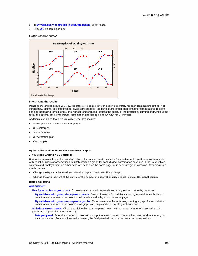
Customizing Graphs
Copyright © 2003–2005 Minitab Inc. All rights reserved. 199
6 In By variables with groups in separate panels, enter Temp. 7 Click OK in each dialog box.
Graph window output
Interpreting the results Paneling the graphs allows you view the effects of cooking time on quality separately for each temperature setting. Not surprisingly, optimal cooking times for lower temperatures (top panels) are longer than for higher temperatures (bottom panels). Reheating for too long at the highest temperatures reduces the quality of the product by burning or drying out the food. The optimal time-temperature combination appears to be about 425° for 34 minutes. Additional examples that help visualize these data include:
• Scatterplot with connect lines and groups
• 3D scatterplot
• 3D surface plot
• 3D wireframe plot
• Contour plot
By Variables – Time Series Plots and Area Graphs ... > Multiple Graphs > By Variables Use to create multiple graphs based on a type of grouping variable called a By variable, or to split the data into panels with equal numbers of observations. Minitab creates a graph for each distinct combination or values in the By variables columns and displays them on either separate panels on the same page, or in separate graph windows. After creating a graph, you can:
• Change the By variables used to create the graphs. See Make Similar Graph.
• Change the arrangement of the panels or the number of observations used to split panels. See panel editing.
Dialog box items Arrangement
Use By variables to group data: Choose to divide data into panels according to one or more By variables. By variables with groups in separate panels: Enter columns of By variables, creating a panel for each distinct combination or values in the columns. All panels are displayed on the same page. By variables with groups on separate graphs: Enter columns of By variables, creating a graph for each distinct combination or values in the columns. All graphs are displayed in separate graph windows.
Split data across panels: Choose to divide the data into panels, each with an equal number of observations. All panels are displayed on the same page.
Data per panel: Enter the number of observations to put into each panel. If the number does not divide evenly into the total number of observations in the column, the final panel will include the remaining observations.

Customizing and Editing Graphs
Copyright © 2003–2005 Minitab Inc. All rights reserved. 200
To split data across panels 1 In the graph dialog box, enter the columns of data for your graph. 2 Click Multiple Graphs, then click the By Variables tab. 3 Under Arrangement, choose Split data across panels. 4 Under Data per panel, type the number of data points to appear in each panel. Click OK in each dialog box.
Example of splitting data across panels Suppose you want to examine trends in employment in the food industry in Wisconsin. You want to compare monthly employment data for five years. 1 Open the worksheet EMPLOY.MTW. 2 Choose Graph > Time Series Plot. 3 Choose Simple and click OK. 4 In Series, enter Food. 5 Click Time/Scale. 6 Under Time Scale, choose Calendar and choose Month Year. 7 Under Start Values, choose One set for all variables. 8 Under Month, enter 1. Under Year, enter 1997. Click OK. 9 Click Multiple Graphs, then click the By Variables tab. 10 Choose Split data across panels. 11 Under Data per panel, enter12. Click OK in each dialog box.
Graph window output
Interpreting the results Splitting the graph across panels makes it easy to compare the yearly trends in employment. Each year, employment in the food industry is slow in the winter months, balloons in the mid- to late-summer and early fall, then falls off again as winter approaches.

Customizing Graphs
Copyright © 2003–2005 Minitab Inc. All rights reserved. 201
Paneling Paneling Graphs There are two ways to panel multiple graphs:
With the Multiple Variables tab, using multiple sets of graph variables, as in the example below. This is similar to using the Layout Tool, except you are limited to graphs created from a single dialog box.
With the By Variables tab, using a single set of graph variables subset by a By variable or paneling variable, as in the example below.
After creating a paneled graph, you can edit its characteristics. See panel editing. When created with the By Variables tab, a paneled graph has a number of default features that make it easier to understand.
Feature Example
With a By variable, panels use the same scales by default, and ticks are displayed on alternating sides of abutting panels for clarity.
A footnote names the paneling variable.

Customizing and Editing Graphs
Copyright © 2003–2005 Minitab Inc. All rights reserved. 202
Labels give the value of the paneling variable in each panel. Here the labels (1 and 2) are enlarged.
To panel graphs using multiple variables 1 In the graph dialog box, enter the columns of data for your graphs. 2 Click Multiple Graphs. 3 Under Show (Pairs of) Graph Variables, choose In separate panels on the same graph. 4 Under Same Scales for Graphs, check any available options to apply the same scales to all panels. Click OK in each
dialog box.
Example of paneling graphs Suppose you want to plot both section and tread width against tire repairs. You want the plots to appear in the same graph, but in separate panels. 1 Open the worksheet TIRES.MTW. 2 Choose Graph > Scatterplot. 3 Choose Simple and click OK. 4 In row 1 of Y, enter Repairs. In row 1 of X, enter SectionW. 5 In row 2 of Y, enter Repairs. In row 2 of X, enter TreadW. 6 Click Multiple Graphs. 7 Under Show Graphs of Different Variables, choose In separate panels on the same page. Click OK in each
dialog box.
Graph window output
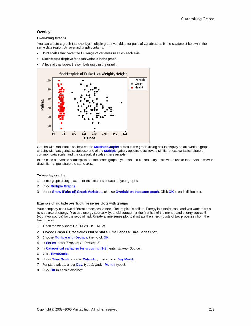
Customizing Graphs
Copyright © 2003–2005 Minitab Inc. All rights reserved. 203
Overlay Overlaying Graphs You can create a graph that overlays multiple graph variables (or pairs of variables, as in the scatterplot below) in the same data region. An overlaid graph contains:
• Joint scales that cover the full range of variables used on each axis.
• Distinct data displays for each variable in the graph.
• A legend that labels the symbols used in the graph.
Graphs with continuous scales use the Multiple Graphs button in the graph dialog box to display as an overlaid graph. Graphs with categorical scales use one of the Multiple gallery options to achieve a similar effect; variables share a common data scale, and the categorical scales share an axis. In the case of overlaid scatterplots or time series graphs, you can add a secondary scale when two or more variables with dissimilar ranges share the same axis.
To overlay graphs 1 In the graph dialog box, enter the columns of data for your graphs. 2 Click Multiple Graphs. 3 Under Show (Pairs of) Graph Variables, choose Overlaid on the same graph. Click OK in each dialog box.
Example of multiple overlaid time series plots with groups Your company uses two different processes to manufacture plastic pellets. Energy is a major cost, and you want to try a new source of energy. You use energy source A (your old source) for the first half of the month, and energy source B (your new source) for the second half. Create a time series plot to illustrate the energy costs of two processes from the two sources.
1 Open the worksheet ENERGYCOST.MTW.
2 Choose Graph > Time Series Plot or Stat > Time Series > Time Series Plot. 3 Choose Multiple with Groups, then click OK. 4 In Series, enter 'Process 1' 'Process 2'. 5 In Categorical variables for grouping (1-3), enter 'Energy Source'. 6 Click Time/Scale. 6 Under Time Scale, choose Calendar, then choose Day Month. 7 For start values, under Day, type 1. Under Month, type 3. 8 Click OK in each dialog box.

Customizing and Editing Graphs
Copyright © 2003–2005 Minitab Inc. All rights reserved. 204
Graph window output
Interpreting the results Energy costs for Process 1 are generally greater than those for Process 2. In addition, costs for both processes were less using source B. Therefore, using Process 2 and energy source B appears to be more cost effective than using Process 1 and energy source A.
Tip To see the y- and x-values for a symbol in a series, hover your cursor over the symbol.
Editing Multiple Variables
Edit Panels − Arrangement Select panel label > Editor > Edit Panels > Arrangement Use to change the default panel arrangement and the margins separating the panels.
Dialog box items Rows and Columns
Automatic: Choose to accept the default panel arrangement. Custom: Choose to change the panel arrangement.
Rows: Enter the number of rows in your custom panel layout. Columns: Enter the number of columns in your custom panel layout.
Margins between panels: Choose to adjust the space between the panels, then enter a value from 0 to 0.25 in figure units.
To edit panel arrangement 1 Select a panel label. 2 Choose Editor > Edit Panels, then click the Arrangement tab. 3 Under Rows and Columns, choose one of the following:
• Automatic to accept the default panel arrangement. • Custom to change the default arrangement.
− In Rows, enter the number of rows.
− In Columns, enter the number of columns.
4 In Margins between panels, enter a value between 0 and 0.25 to adjust the space between the panels. Click OK.

Customizing Graphs
Copyright © 2003–2005 Minitab Inc. All rights reserved. 205
Edit Panels − Options ... > Edit Panels > Options Use to customize the placement of ticks on panels, as well as the source and amount of information included in panel labels.
Dialog box items Alternate Ticks On Panels When Appropriate Not available with pie charts.
Alternate panels: Choose to alternate the side on which ticks appear in adjoining panels. Don't alternate panels: Choose to place ticks on the same side in adjoining panels.
Source of Panel Labels The available items in this section depend on the active graph. Y variable name: Check to label the panels with y-scale variable names. X variable name: Check to label the panels with x-scale variable names. Graph variable name: Check to label the panels with the graph variable name. Group Information
Both variable names and levels: Choose to label the panels with both variable names and levels. Variable levels only: Choose to label the panels with variable levels only. None: Choose to hide variable names and levels in panel labels.
To edit panel options 1 Select a panel label. 2 Choose Editor > Edit Panels, then click the Options tab. 3 Under Alternate Ticks On Panels When Appropriate, choose Alternate panels or Don't alternate panels. 4 Under Sources of Panel Labels, check or uncheck Y variable name, X variable name, or Graph variable name to
specify the source of the panel labels. 5 Under Group Information, choose Both variable names and levels, Variable levels only, or None to display the
respective degree of panel label information. Click OK.
Edit Panels − Font Select panel label > Editor > Edit Panels > Font Use to change the panel label font or attributes.
Dialog box items Font: Choose a font. Style
Bold: Check to make the text bold. Italic: Check to italicize the text. Underline: Check to underline the text.
Size: Enter a font size. Color: Choose a text color. Preview: Displays sample text with the selected attributes. This box does not accept input.
To edit panel font 1 Select a panel label. 2 Choose Editor > Edit Panels, then click the Font tab. 3 To change font attributes, do any of the following:
• Under Font, type a font type or choose it from the list. • Under Style, check Bold, Italic, and/or Underline. • Under Size, type a font size or choose it from the list. • From Color, choose a text color.
4 Click OK.

Customizing and Editing Graphs
Copyright © 2003–2005 Minitab Inc. All rights reserved. 206
Example of editing panel attributes In the Example of paneling graphs, you created a simple paneled graph. You want to edit the paneling attributes of this graph.
Arrangement Change the arrangement of the rows and columns. 1 Double-click a panel label. 2 Click the Arrangement tab. 3 Under Rows and Columns, choose Custom. 4 In Rows, enter 2, and in Columns, enter 1.
Click OK.
Options Alter the tick display and source of panel labels. 1 Double-click a panel label. 2 Click the Options tab. 3 Under Alternate Ticks on Panels When
Appropriate, choose Don't alternate panels. Click OK.
Font Change the panel label font. 1 Double-click a panel label. 2 Click the Font tab. 3 Under Style, choose Bold. 4 Under Size, choose 14. Click OK.
Edit Panels − Panel Select panel label > Editor > Edit Panels > Panels Use to change the categorical variable that defines the panels, and to change the arrangement of panel.
Dialog box items By variables with groups in separate panels: Enter the columns containing the paneling variables, creating a panel for each distinct combination of group values. Graph Variables in Panel Arrangement Only available when a By variable is added to a graph already paneled with Multiple Variables.
Graph variables vary slowest: Choose to arrange panels by graph variables when viewed left to right. Graph variables vary fastest: Choose to arrange panels by paneling variable when viewed left to right.
Paneling Method Only available with time series plots or area graphs.

Customizing Graphs
Copyright © 2003–2005 Minitab Inc. All rights reserved. 207
None: Choose to join the split panels. Use By variables to group data: Choose to panel by variable values.
By variables with groups in separate panels: Enter the columns containing the paneling variables, creating a panel for each distinct combination of group values.
Split data across panels: Choose to change the number of data points per panel. Data per panel: Enter the number of data points per panel.
To edit paneling variables 1 Choose Editor > Panel or Edit Panels. 2 In By variables with groups in separate panels, enter a new paneling variable and click OK.
Example of editing paneling In the Example of a scatterplot with connect line, you created a graph that was paneled with a certain By variable. You want to edit the graph to reflect paneling by a different variable. 1 Choose Editor > Edit Panels. 2 Under By variables with groups in separate panels, enter Operator. Click OK.
Graph window output
By Variables
Edit Panels − Arrangement Select panel label > Editor > Edit Panels > Arrangement Use to change the default panel arrangement and the margins separating the panels.
Dialog box items Rows and Columns
Automatic: Choose to accept the default panel arrangement. Custom: Choose to change the panel arrangement.
Rows: Enter the number of rows in your custom panel layout. Columns: Enter the number of columns in your custom panel layout.
Margins between panels: Choose to adjust the space between the panels, then enter a value from 0 to 0.25 in figure units.
To edit panel arrangement 1 Select a panel label. 2 Choose Editor > Edit Panels, then click the Arrangement tab.

Customizing and Editing Graphs
Copyright © 2003–2005 Minitab Inc. All rights reserved. 208
3 Under Rows and Columns, choose one of the following: • Automatic to accept the default panel arrangement. • Custom to change the default arrangement.
− In Rows, enter the number of rows.
− In Columns, enter the number of columns.
4 In Margins between panels, enter a value between 0 and 0.25 to adjust the space between the panels. Click OK.
Edit Panels − Font Select panel label > Editor > Edit Panels > Font Use to change the panel label font or attributes.
Dialog box items Font: Choose a font. Style
Bold: Check to make the text bold. Italic: Check to italicize the text. Underline: Check to underline the text.
Size: Enter a font size. Color: Choose a text color. Preview: Displays sample text with the selected attributes. This box does not accept input.
To edit panel font 1 Select a panel label. 2 Choose Editor > Edit Panels, then click the Font tab. 3 To change font attributes, do any of the following:
• Under Font, type a font type or choose it from the list. • Under Style, check Bold, Italic, and/or Underline. • Under Size, type a font size or choose it from the list. • From Color, choose a text color.
4 Click OK.
Edit Panels − Options ... > Edit Panels > Options Use to customize the placement of ticks on panels, as well as the source and amount of information included in panel labels.
Dialog box items Alternate Ticks On Panels When Appropriate Not available with pie charts.
Alternate panels: Choose to alternate the side on which ticks appear in adjoining panels. Don't alternate panels: Choose to place ticks on the same side in adjoining panels.
Source of Panel Labels The available items in this section depend on the active graph. Y variable name: Check to label the panels with y-scale variable names. X variable name: Check to label the panels with x-scale variable names. Graph variable name: Check to label the panels with the graph variable name. Group Information
Both variable names and levels: Choose to label the panels with both variable names and levels. Variable levels only: Choose to label the panels with variable levels only. None: Choose to hide variable names and levels in panel labels.
To edit panel options 1 Select a panel label.

Customizing Graphs
Copyright © 2003–2005 Minitab Inc. All rights reserved. 209
2 Choose Editor > Edit Panels, then click the Options tab. 3 Under Alternate Ticks On Panels When Appropriate, choose Alternate panels or Don't alternate panels. 4 Under Sources of Panel Labels, check or uncheck Y variable name, X variable name, or Graph variable name to
specify the source of the panel labels. 5 Under Group Information, choose Both variable names and levels, Variable levels only, or None to display the
respective degree of panel label information. Click OK.
Example of editing panel attributes In the Example of paneling graphs, you created a simple paneled graph. You want to edit the paneling attributes of this graph.
Arrangement Change the arrangement of the rows and columns. 1 Double-click a panel label. 2 Click the Arrangement tab. 3 Under Rows and Columns, choose Custom. 4 In Rows, enter 2, and in Columns, enter 1.
Click OK.
Options Alter the tick display and source of panel labels. 1 Double-click a panel label. 2 Click the Options tab. 3 Under Alternate Ticks on Panels When
Appropriate, choose Don't alternate panels. Click OK.
Font Change the panel label font. 1 Double-click a panel label. 2 Click the Font tab. 3 Under Style, choose Bold. 4 Under Size, choose 14. Click OK.
Edit Panels − Panel Select panel label > Editor > Edit Panels > Panels Use to change the categorical variable that defines the panels, and to change the arrangement of panel.

Customizing and Editing Graphs
Copyright © 2003–2005 Minitab Inc. All rights reserved. 210
Dialog box items By variables with groups in separate panels: Enter the columns containing the paneling variables, creating a panel for each distinct combination of group values. Graph Variables in Panel Arrangement Only available when a By variable is added to a graph already paneled with Multiple Variables.
Graph variables vary slowest: Choose to arrange panels by graph variables when viewed left to right. Graph variables vary fastest: Choose to arrange panels by paneling variable when viewed left to right.
Paneling Method Only available with time series plots or area graphs. None: Choose to join the split panels. Use By variables to group data: Choose to panel by variable values.
By variables with groups in separate panels: Enter the columns containing the paneling variables, creating a panel for each distinct combination of group values.
Split data across panels: Choose to change the number of data points per panel. Data per panel: Enter the number of data points per panel.
To edit paneling variables 1 Choose Editor > Panel or Edit Panels. 2 In By variables with groups in separate panels, enter a new paneling variable and click OK.
Example of editing paneling In the Example of a scatterplot with connect line, you created a graph that was paneled with a certain By variable. You want to edit the graph to reflect paneling by a different variable. 1 Choose Editor > Edit Panels. 2 Under By variables with groups in separate panels, enter Operator. Click OK.
Graph window output
Paneling
Edit Panels − Arrangement Select panel label > Editor > Edit Panels > Arrangement Use to change the default panel arrangement and the margins separating the panels.
Dialog box items Rows and Columns
Automatic: Choose to accept the default panel arrangement. Custom: Choose to change the panel arrangement.

Customizing Graphs
Copyright © 2003–2005 Minitab Inc. All rights reserved. 211
Rows: Enter the number of rows in your custom panel layout. Columns: Enter the number of columns in your custom panel layout.
Margins between panels: Choose to adjust the space between the panels, then enter a value from 0 to 0.25 in figure units.
To edit panel arrangement 1 Select a panel label. 2 Choose Editor > Edit Panels, then click the Arrangement tab. 3 Under Rows and Columns, choose one of the following:
• Automatic to accept the default panel arrangement. • Custom to change the default arrangement.
− In Rows, enter the number of rows.
− In Columns, enter the number of columns.
4 In Margins between panels, enter a value between 0 and 0.25 to adjust the space between the panels. Click OK.
Edit Panels − Options ... > Edit Panels > Options Use to customize the placement of ticks on panels, as well as the source and amount of information included in panel labels.
Dialog box items Alternate Ticks On Panels When Appropriate Not available with pie charts.
Alternate panels: Choose to alternate the side on which ticks appear in adjoining panels. Don't alternate panels: Choose to place ticks on the same side in adjoining panels.
Source of Panel Labels The available items in this section depend on the active graph. Y variable name: Check to label the panels with y-scale variable names. X variable name: Check to label the panels with x-scale variable names. Graph variable name: Check to label the panels with the graph variable name. Group Information
Both variable names and levels: Choose to label the panels with both variable names and levels. Variable levels only: Choose to label the panels with variable levels only. None: Choose to hide variable names and levels in panel labels.
To edit panel options 1 Select a panel label. 2 Choose Editor > Edit Panels, then click the Options tab. 3 Under Alternate Ticks On Panels When Appropriate, choose Alternate panels or Don't alternate panels. 4 Under Sources of Panel Labels, check or uncheck Y variable name, X variable name, or Graph variable name to
specify the source of the panel labels. 5 Under Group Information, choose Both variable names and levels, Variable levels only, or None to display the
respective degree of panel label information. Click OK.
Edit Panels − Font Select panel label > Editor > Edit Panels > Font Use to change the panel label font or attributes.
Dialog box items Font: Choose a font. Style
Bold: Check to make the text bold. Italic: Check to italicize the text. Underline: Check to underline the text.

Customizing and Editing Graphs
Copyright © 2003–2005 Minitab Inc. All rights reserved. 212
Size: Enter a font size. Color: Choose a text color. Preview: Displays sample text with the selected attributes. This box does not accept input.
To edit panel font 1 Select a panel label. 2 Choose Editor > Edit Panels, then click the Font tab. 3 To change font attributes, do any of the following:
• Under Font, type a font type or choose it from the list. • Under Style, check Bold, Italic, and/or Underline. • Under Size, type a font size or choose it from the list. • From Color, choose a text color.
4 Click OK.
Example of editing panel attributes In the Example of paneling graphs, you created a simple paneled graph. You want to edit the paneling attributes of this graph.
Arrangement Change the arrangement of the rows and columns. 1 Double-click a panel label. 2 Click the Arrangement tab. 3 Under Rows and Columns, choose Custom. 4 In Rows, enter 2, and in Columns, enter 1.
Click OK.
Options Alter the tick display and source of panel labels. 1 Double-click a panel label. 2 Click the Options tab. 3 Under Alternate Ticks on Panels When
Appropriate, choose Don't alternate panels. Click OK.

Customizing Graphs
Copyright © 2003–2005 Minitab Inc. All rights reserved. 213
Font Change the panel label font. 1 Double-click a panel label. 2 Click the Font tab. 3 Under Style, choose Bold. 4 Under Size, choose 14. Click OK.
Edit Panels − Panel Select panel label > Editor > Edit Panels > Panels Use to change the categorical variable that defines the panels, and to change the arrangement of panel.
Dialog box items By variables with groups in separate panels: Enter the columns containing the paneling variables, creating a panel for each distinct combination of group values. Graph Variables in Panel Arrangement Only available when a By variable is added to a graph already paneled with Multiple Variables.
Graph variables vary slowest: Choose to arrange panels by graph variables when viewed left to right. Graph variables vary fastest: Choose to arrange panels by paneling variable when viewed left to right.
Paneling Method Only available with time series plots or area graphs. None: Choose to join the split panels. Use By variables to group data: Choose to panel by variable values.
By variables with groups in separate panels: Enter the columns containing the paneling variables, creating a panel for each distinct combination of group values.
Split data across panels: Choose to change the number of data points per panel. Data per panel: Enter the number of data points per panel.
To edit paneling variables 1 Choose Editor > Panel or Edit Panels. 2 In By variables with groups in separate panels, enter a new paneling variable and click OK.
Example of editing paneling In the Example of a scatterplot with connect line, you created a graph that was paneled with a certain By variable. You want to edit the graph to reflect paneling by a different variable. 1 Choose Editor > Edit Panels. 2 Under By variables with groups in separate panels, enter Operator. Click OK.

Customizing and Editing Graphs
Copyright © 2003–2005 Minitab Inc. All rights reserved. 214
Graph window output
Layout Layout Tool Editor > Layout Tool Use to place multiple graphs of the same or different types on the same page. If worksheet data changes after you create a layout, you cannot update the layout to reflect the changes. After you create a layout, you can:
• Edit the individual graphs (see Example of adding annotation to a multigraph layout)
Dialog box items Rows: Enter the number of rows for the layout. Columns: Enter the number of columns for the layout.
: Click to add or move highlighted graph from the list box to the highlighted cell of the layout.
: Click to move highlighted graph from the layout to the list box.
Tip After you have created a layout, use the <Tab> key to cycle through and select each figure region and the graph region.
To create a layout
1 Create multiple graphs to include in the layout.
2 Choose Editor > Layout Tool. 3 In Rows, enter the number of rows for the layout. 4 In Columns, enter the number of columns for the layout. 5 To add graphs to the layout, click the cell where you want to place a graph and do one of the following:
• In the list box, double-click a graph name.
• In the list box, click a graph name and then click . • Double-click the image of the selected item below the list box.
Note You can click and drag the graphs to change their placement in the layout.
6 Click Finish.
Example of a two-graph layout Suppose you want to create a bar chart and time series plot for a presentation. You want both graphs to appear on the same page, so you create the graphs and then use the layout tool.

Customizing Graphs
Copyright © 2003–2005 Minitab Inc. All rights reserved. 215
Step 1: Create the graphs 1 Open the worksheet NEWMARKET.MTW. 2 Choose Graph > Time Series Plot. 3 Choose Simple and then click OK. 4 In Series, enter SalesB. Click OK. 5 Choose Graph > Bar Chart. 6 Under Bars represent, choose Values from a table. 7 Under One column of values, choose Cluster and click OK. 8 In Graph Variables, enter SalesB. 9 In Categorical variable, enter Year. Click OK.
Step 2: Create the layout 1 Choose Editor > Layout Tool. 2 In Rows, enter 2. 3 In Columns, enter 1. 4 In the list box, double-click Time Series Plot of Sales. (Chart of Sales already appears in the layout.) 5 Click Finish.
Graph window output
Example of adding annotation to a multi-graph layout In Example of a two-graph layout you created a layout for a presentation. You want to add a title that describe the entire page in addition to altering one of the individual graphs.
Tip After you have created a layout, press the [Tab] key to cycle through the selected figure regions. When adding items that are meant to annotate the entire layout rather than a specific graph, be sure that no single figure is selected.
1 Choose Editor > Add > Title.
2 In Text, enter Qualco Sales by Year and Quarter: 1991-1992 and click OK.
3 Double click any bar in the bar chart.
4 Under Fill Pattern, choose Custom.
5 From Background color, choose and click OK.

Customizing and Editing Graphs
Copyright © 2003–2005 Minitab Inc. All rights reserved. 216
Graph window output

Customizing Graphs
Copyright © 2003–2005 Minitab Inc. All rights reserved. 217
Fitted Lines and Distributions Data Fits Overview You can add a line or curve to your graph to represent a theoretical distribution or to visualize general trends. Minitab provides three methods to model your data:
• Distribution - Fits a theoretical distribution, such as the normal distribution, to the data. You can provide historical estimates of the distribution parameters, or Minitab can estimate the parameters from the data.
• Regression - Fits a least-squares regression line to the data. You can fit linear, quadratic, or cubic models.
• Smoother - Fits a lowess curve to the data. You can add a fitted line while creating a graph, or after the graph is created (see Adding Graph Elements). After creating a graph, you can change the line attributes and fit parameters (see Editing Data Fits Overview).
Data Fit Example
Distribution
You can fit one of 14 distributions to your data to help you determine whether the data can be adequately modeled by the selected distribution.
Regression
You can use a regression fit to examine the relationship between the response variable (y) and the predictor variable (x).
Lowess Smoother
You can use a lowess smoother to explore the relationship between two variables without fitting a specific model.

Customizing and Editing Graphs
Copyright © 2003–2005 Minitab Inc. All rights reserved. 218
Data Fits
Graphs Distribution Lowess Regression Scatterplot Matrix Plot Histogram Probability Plot Empirical CDF Time Series Plot
Creation Distribution Fit
Distribution − Distribution Graph > Empirical CDF or Probability Plot > Distribution > Distribution Use to fit a distribution to your data to help you determine whether the data can be adequately modeled by the selected distribution. To fit a distribution for a histogram, see Data View - Distribution. After creating a graph, you can:
• Change the fitted distribution, add groups, and change the fitted line attributes (see Editing Data Fits Overview).
• Add a distribution fit (see Adding Graph Elements).
Dialog box items Distribution: Choose a distribution. Historical parameters: Enter historical estimates of the distribution parameters. Minitab displays the necessary parameters, which depend on the chosen distribution. These parameters may include Mean, Standard Deviation, Location, Shape, Scale, or Threshold. If you do not enter historical estimates, Minitab estimates the parameters from the data. You can enter some historical estimates and have Minitab estimate the other parameters. See Distribution parameters for restrictions.
To fit a distribution 1 Choose Graph > Probability Plot or Empirical CDF > OK. 2 Click Distribution. 3 From Distribution, choose a distribution. 4 In Historical parameters, enter historical estimates of the distribution parameters. Minitab displays the necessary
parameters, which depend on the chosen distribution. These parameters may include Mean, Standard Deviation, Location, Shape, Scale, or Threshold. If you do not enter historical estimates, Minitab estimates the parameters from the data. You can enter some historical estimates and have Minitab estimate the other parameters. See Distribution parameters for restrictions.
5 Click OK in each dialog box.
Data View − Distribution Graph > Histogram > Data View > Distribution Use to fit a distribution to your histogram data to help you determine whether the data can be adequately modeled by the selected distribution. To fit a distribution for a probability plot or empirical cdf, see Distribution - Distribution. After creating a graph, you can:
• Change the fitted distribution, add groups, and change the fitted line attributes (see Editing Data Fits Overview).
• Add a distribution fit (see Adding Graph Elements).
Dialog box items Fit Distribution: Check to fit a distribution. Distribution: Choose a distribution. Historical parameters: Enter historical estimates of the distribution parameters. Minitab displays the necessary parameters, which depend on the chosen distribution. These parameters may include Mean, Standard Deviation,

Customizing Graphs
Copyright © 2003–2005 Minitab Inc. All rights reserved. 219
Location, Shape, Scale, or Threshold. If you do not enter historical estimates, Minitab estimates the parameters from the data. You can enter some historical estimates and have Minitab estimate the other parameters. See Distribution parameters for restrictions.
To fit a distribution (histogram) 1 In the graph dialog box, click Data View. 2 Click the Distribution tab. 3 Check Fit distribution. 4 From Distribution, choose a distribution. 5 In Historical parameters, enter historical estimates of the distribution parameters. Minitab displays the necessary
parameters, which depend on the chosen distribution. These parameters may include Mean, Standard Deviation, Location, Shape, Scale, or Threshold. If you do not enter historical estimates, Minitab estimates the parameters from the data. You can enter some historical estimates and have Minitab estimate the other parameters. See Distribution parameters for restrictions.
6 Click OK in each dialog box.
Distribution parameters To define a distribution, you need to enter the necessary parameters or have Minitab estimate them from the parameters. Use the table below to determine the necessary parameters and restrictions.
Distribution Parameters Minitab can estimate
Normal Mean and standard deviation
• mean and standard deviation
• mean, given standard deviation Lognormal Smallest extreme value Largest extreme value Logistic Loglogistic
Location and scale • location and scale
• location, given scale
Gamma Weibull Shape and scale
• shape and scale
• scale, given shape
Exponential Mean • mean
2-parameter exponential Scale and threshold
• scale and threshold
• scale, given threshold
3-parameter Weibull 3-parameter gamma
Shape, scale, and threshold
• shape, scale, and threshold
• shape and scale, given threshold
• scale and threshold, given shape
• scale, given shape and threshold
3-parameter lognormal 3-parameter loglogistic
Location, scale, and threshold
• location, scale, and threshold
• location and scale, given threshold
• location and threshold, given scale
• location, given scale and threshold
Example of a probability plot You work for a textile manufacturer and want to assess the flammability of a new fabric. Testers hold randomly selected pieces of the fabric over an open flame for a fixed amount of time, and measure the length of the burned portion. You typically use the 87th percentile as a benchmark for such tests. Create a probability plot to determine if a normal distribution fits your data and to estimate the 87th percentile for the population. 1 Open the worksheet FLAMERTD.MTW. 2 Choose Graph > Probability Plot. 3 Choose Single, then click OK. 4 In Graph variables, enter Fabric. 5 Click Scale, then click the Percentile Lines tab.

Customizing and Editing Graphs
Copyright © 2003–2005 Minitab Inc. All rights reserved. 220
6 Under Percentile Lines, choose At Y values, and enter 87. Click OK in each dialog box.
Graph window output
Interpreting the results A normal distribution with a mean of 3.573 and a standard deviation of 0.57 appears to fit your sample data fairly well:
• The plotted points form a reasonably straight line.
• The plotted points follow the fitted line fairly closely.
• The p-value for the Anderson-Darling test is above 0.10. Because the distribution fits your data, you can use the fitted line to estimate percentiles for the population. The estimated 87th percentile for burn length is 4.215. If you hover your mouse over the fitted line or confidence intervals, Minitab displays the fitted percentiles and associated confidence bounds for several points:
You can be 95% confident that the 87th percentile for the population is between 3.84295 and 4.58790.
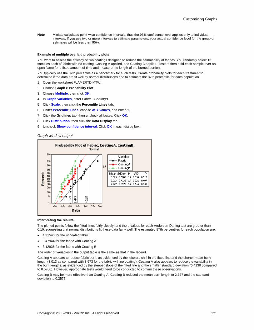
Customizing Graphs
Copyright © 2003–2005 Minitab Inc. All rights reserved. 221
Note Minitab calculates point-wise confidence intervals, thus the 95% confidence level applies only to individual intervals. If you use two or more intervals to estimate parameters, your actual confidence level for the group of estimates will be less than 95%.
Example of multiple overlaid probability plots You want to assess the efficacy of two coatings designed to reduce the flammability of fabrics. You randomly select 15 samples each of fabric with no coating, Coating A applied, and Coating B applied. Testers then hold each sample over an open flame for a fixed amount of time and measure the length of the burned portion. You typically use the 87th percentile as a benchmark for such tests. Create probability plots for each treatment to determine if the data are fit well by normal distributions and to estimate the 87th percentile for each population. 1 Open the worksheet FLAMERTD.MTW. 2 Choose Graph > Probability Plot. 3 Choose Multiple, then click OK. 4 In Graph variables, enter Fabric - CoatingB. 5 Click Scale, then click the Percentile Lines tab. 6 Under Percentile Lines, choose At Y values, and enter 87. 7 Click the Gridlines tab, then uncheck all boxes. Click OK. 8 Click Distribution, then click the Data Display tab. 9 Uncheck Show confidence interval. Click OK in each dialog box.
Graph window output
Interpreting the results The plotted points follow the fitted lines fairly closely, and the p-values for each Anderson-Darling test are greater than 0.10, suggesting that normal distributions fit these data fairly well. The estimated 87th percentiles for each population are:
• 4.21543 for the uncoated fabric
• 3.47944 for the fabric with Coating A
• 3.12936 for the fabric with Coating B The order of variables in the output table is the same as that in the legend. Coating A appears to reduce fabric burn, as evidenced by the leftward shift in the fitted line and the shorter mean burn length (3.013 as compared with 3.573 for the fabric with no coating). Coating A also appears to reduce the variability in the burn lengths, as evidenced by the steeper slope of the fitted line and the smaller standard deviation (0.4138 compared to 0.5700). However, appropriate tests would need to be conducted to confirm these observations. Coating B may be more effective than Coating A. Coating B reduced the mean burn length to 2.727 and the standard deviation to 0.3575.

Customizing and Editing Graphs
Copyright © 2003–2005 Minitab Inc. All rights reserved. 222
Example of an empirical cdf graph You work for a textile manufacturer and want to assess the flammability of a new fabric. Testers hold randomly selected pieces of the fabric over an open flame for a fixed amount of time and measure the length of the burned portion. You typically use the 87th percentile as a benchmark for such tests. Create an empirical cdf graph to determine if a normal distribution fits your data and to estimate the 87th percentile for the population. 1 Open the worksheet FLAMERTD.MTW. 2 Choose Graph > Empirical CDF. 3 Choose Single, then click OK. 4 In Graph variables, enter Fabric. 5 Click Scale, then click the Percentile Lines tab. 6 Under Percentile Lines, choose At Y values, and enter 87. Click OK in each dialog box.
Graph window output
Interpreting the results A normal distribution with a mean of 3.573 and a standard deviation of 0.57 appears to fit your sample data fairly well. Because the distribution fits your data, you can use the fitted line to estimate percentiles for the population. The estimated 87th percentile for burn length is 4.215. You may want to further evaluate the estimate by creating a probability plot, which includes:
• An Anderson-Darling statistic and p-value to help you verify whether the normal distribution fits your data
• Confidence intervals for estimated percentiles
Tip If you hover your mouse over the top corner of a step, Minitab displays the row number and x- and y-values for the point. If you hover over the fitted line, the estimated percentiles for several points are displayed.
Example of multiple overlaid empirical cdf graphs You want to assess the efficacy of two coatings designed to reduce the flammability of fabrics. You randomly select 15 samples each of fabric with no coating, Coating A applied, and Coating B applied. Testers then hold each sample over an open flame for a fixed amount of time and measure the length of the burned portion. You typically use the 87th percentile as a benchmark for such tests. Create an empirical cdf graph to compare the fitted distributions for each treatment and estimate the 87th percentile for each population. 1 Open the worksheet FLAMERTD.MTW. 2 Choose Graph > Empirical CDF. 3 Choose Multiple, then click OK. 4 In Graph variables, enter Fabric - CoatingB. 5 Click Scale, then click the Percentile Lines tab. 6 Under Percentile Lines, choose At Y values, and enter 87. Click OK. 7 Click OK in each dialog box.

Customizing Graphs
Copyright © 2003–2005 Minitab Inc. All rights reserved. 223
Graph window output
Interpreting the results The stepped empirical cdf's follow the fitted lines fairly closely, suggesting that normal distributions fit these data fairly well. The estimated 87th percentiles for each population are:
• 4.215 for the uncoated fabric
• 3.479 for the fabric with Coating A
• 3.129 for the fabric with Coating B The order of variables in the output table is the same as that in the legend. Coating A appears to reduce fabric burn, as evidenced by the leftward shift in the fitted line and the shorter mean burn length (3.013 as compared with 3.573 for the fabric with no coating). Coating A also appears to reduce the variability in the burn lengths, as evidenced by the steeper slope of the fitted line and the smaller standard deviation (0.4138 compared to 0.5700). However, appropriate tests would need to be conducted to confirm these observations. Coating B may be more effective than Coating A. Coating B reduced the mean burn length to 2.727 and the standard deviation to 0.3575.
Example of distribution fit (histogram) In the Example of a simple histogram, you determine the amount of torque required to remove shampoo bottle caps. You want to fit a normal distribution to the data.
Note You can also fit a distribution by choosing a With Fit option from the histogram gallery.
Distribution 1 Open the worksheet CAP.MTW. 2 Choose Graph > Histogram. 3 Choose Simple, then click OK. 4 In Variables, enter Torque. 5 Click Data View. 6 Click the Distribution tab. 7 Check Fit Distribution. 8 Click OK in each dialog box.

Customizing and Editing Graphs
Copyright © 2003–2005 Minitab Inc. All rights reserved. 224
Lowess Fit
Data View − Smoother ... > Data View > Smoother Use to fit a lowess smoother to a scatterplot, matrix plot, histogram, or time series plot. You can use a lowess smoother to explore the relationship between two variables without fitting a specific model. After creating a graph, you can:
• Change the lowess smoothing parameters, add groups, and change the fitted line attributes (see Editing Data Fits Overview).
• Add a lowess smoother (see Adding Graph Elements).
Dialog box items Smoother
None: Choose to suppress the lowess smoother. Lowess: Choose to display the lowess smoother.
Degree of smoothing: Enter a number between 0 and 1 for the fraction (f) of the total number of points used to calculate the fitted values at each x-value. The default is 0.5. See Specifying lowess smoothing parameters. Number of steps: Enter a number from 0 to 10 to specify the number of iterations of smoothing to use to limit the influence of outliers. Each step reduces the weight given to outliers in the next iteration. The default is 2. See Specifying lowess smoothing parameters.
To fit a lowess smoother 1 In the graph dialog box, click Data View. 2 Click the Smoother tab. 3 Under Lowess Smoothing Parameters, choose Lowess. If you like, do one or both of the following:
• In Degree of smoothing, enter a number between 0 and 1 for the fraction (f) of the total number of points to use to calculate the fitted values at each x-value. The default is 0.5. See Specifying lowess smoothing parameters.
• In Number of steps, enter a number from 0 to 10 to specify the number of iterations of smoothing used to limit the influence of outliers. Each step reduces the weight given to outliers in the next iteration. The default is 2.
See Specifying Lowess Smoothing Parameters for details. 4 Click OK in each dialog box.
Method − Lowess The lowess routine calculates a new, smoothed y-value for each x-value. 1 The routine selects a fraction (default f = 0.5) of all points, using the data closest in x-value on either side of the (x,y)
point. The selection often results in more points selected from one side of the x-value than the other. The example below shows the fraction of data selected for a given point:
The shaded area holds the 0.5 fraction closest to the solid red data point.
Y-Values
X-Values
2 Minitab calculates weights using the x-distance between each point in the selected fraction and the point to be smoothed:
weight = [1 − ( distance from the selected point
max distance between selected point and the (f•n) points )3]3
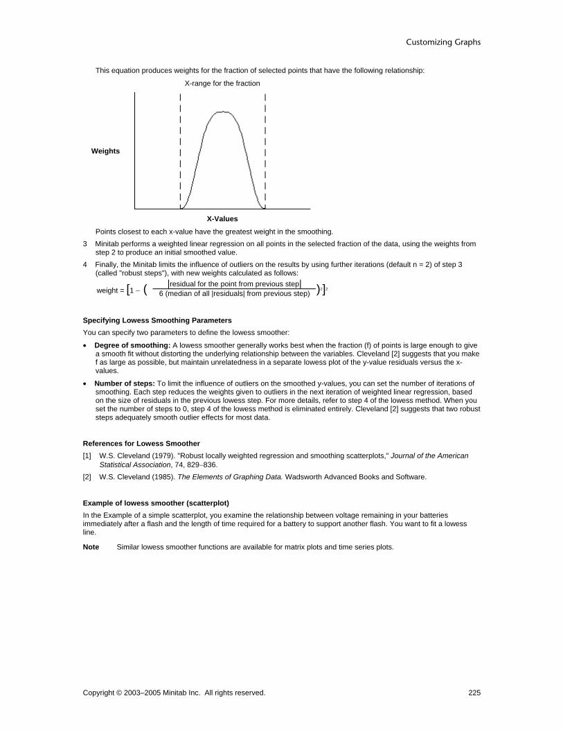
Customizing Graphs
Copyright © 2003–2005 Minitab Inc. All rights reserved. 225
This equation produces weights for the fraction of selected points that have the following relationship:
X-range for the fraction
Weights
X-Values
Points closest to each x-value have the greatest weight in the smoothing. 3 Minitab performs a weighted linear regression on all points in the selected fraction of the data, using the weights from
step 2 to produce an initial smoothed value. 4 Finally, the Minitab limits the influence of outliers on the results by using further iterations (default n = 2) of step 3
(called "robust steps"), with new weights calculated as follows:
weight = [1 − ( |residual for the point from previous step|
6 (median of all |residuals| from previous step) )2]2
Specifying Lowess Smoothing Parameters You can specify two parameters to define the lowess smoother:
• Degree of smoothing: A lowess smoother generally works best when the fraction (f) of points is large enough to give a smooth fit without distorting the underlying relationship between the variables. Cleveland [2] suggests that you make f as large as possible, but maintain unrelatedness in a separate lowess plot of the y-value residuals versus the x-values.
• Number of steps: To limit the influence of outliers on the smoothed y-values, you can set the number of iterations of smoothing. Each step reduces the weights given to outliers in the next iteration of weighted linear regression, based on the size of residuals in the previous lowess step. For more details, refer to step 4 of the lowess method. When you set the number of steps to 0, step 4 of the lowess method is eliminated entirely. Cleveland [2] suggests that two robust steps adequately smooth outlier effects for most data.
References for Lowess Smoother [1] W.S. Cleveland (1979). "Robust locally weighted regression and smoothing scatterplots," Journal of the American
Statistical Association, 74, 829−836. [2] W.S. Cleveland (1985). The Elements of Graphing Data. Wadsworth Advanced Books and Software.
Example of lowess smoother (scatterplot) In the Example of a simple scatterplot, you examine the relationship between voltage remaining in your batteries immediately after a flash and the length of time required for a battery to support another flash. You want to fit a lowess line.
Note Similar lowess smoother functions are available for matrix plots and time series plots.

Customizing and Editing Graphs
Copyright © 2003–2005 Minitab Inc. All rights reserved. 226
1 Open the worksheet BATTERIES.MTW. 2 Choose Graph > Scatterplot. 3 Choose Simple, then click OK. 4 Under Y variables, enter FlashRecov. Under X
variables, enter VoltsAfter. 5 Click Data View. 6 Click the Smoother tab. 7 Under Smoother, choose Lowess. 8 Click OK in each dialog box.
Example of lowess smoother (histogram) In the Example of a simple histogram, you determine the amount of torque required to remove shampoo bottle caps. You want to fit a lowess smoother to the data.
Lowess smoother 1 Open the worksheet CAP.MTW. 2 Choose Graph > Histogram. 3 Choose Simple, then click OK. 4 In Graph variables, enter Torque. 5 Click Scale. 6 Under Y Scale Low and X Scale Low, check
Minor ticks. Click OK. 7 Click Data View. 8 Click the Smoother tab. 9 Under Smoother, choose Lowess. 10 Click OK in each dialog box.
Regression Line
Data View − Regression Graph > Scatterplot or Matrix Plot > Data View > Regression Use to fit a least squares regression line to a scatterplot or matrix plot. Use the regression fit to examine the relationship between the response variable (y) and the predictor variable (x). If you hover the mouse pointer over the fitted line, Minitab displays the fitted regression equation. After creating a graph, you can:
• Change the model order for the regression fit, add groups, or change the fitted line attributes (see Editing Data Fits Overview).
• Add a regression fit (see Adding Graph Elements).
Dialog box items Model Order
None: Choose to suppress the regression fit. Linear: Choose to fit a linear model. Quadratic: Choose to fit a quadratic model. Cubic: Choose to fit a cubic model.
Fit intercept: Check to fit a constant term (the y-intercept of the regression line). Uncheck to fit the model without a constant term.
To fit a regression line 1 In the graph dialog box, click Data View. 2 Click the Regression tab.

Customizing Graphs
Copyright © 2003–2005 Minitab Inc. All rights reserved. 227
3 Under Model Order, choose Linear, Quadratic, or Cubic, based on the model you want to fit. 4 Check or uncheck Fit intercept, to include or exclude the intercept (constant) in the model. If you uncheck Fit
intercept, the regression line passes through the origin (x = 0, y = 0) 5 Click OK in each dialog box.
Example of regression fit In the Example of a simple scatterplot, you examine the relationship between voltage remaining in your batteries immediately after a flash and the length of time required for a battery to be ready to support another flash. You want to fit a regression line.
Note You can also fit a regression line by choosing a With Fit option from the histogram gallery.
1 Open the worksheet BATTERIES.MTW. 2 Choose Graph > Scatterplot. 3 Choose Simple, then click OK. 4 Under Y variables, enter FlashRecov. Under X
variables, enter VoltsAfter. 5 Click Data View. 6 Click the Regression tab. 7 Choose Linear. 8 Click OK in each dialog box.
Editing Editing Data Fits Overview You can add a line or curve to your graph to represent a theoretical distribution or to visualize general trends. Minitab provides three methods to model your data:
• Distribution − Fits a theoretical distribution, such as the normal distribution, to the data. You can provide historical estimates of the distribution parameters, or Minitab can estimate the parameters from the data.
• Regression − Fits a least-squares regression line to the data. You can fit linear, quadratic, or cubic models.
• Smoother − Fits a lowess curve to the data. You can add a fitted line while creating a graph, or after the graph is created (see Adding Graph Elements). After creating a graph, you can change the line attributes and fit parameters (see Editing Data Fits Overview).
Data fit To change...
Distribution • Line type, color, or size - see Edit Distribution Fit - Attributes
• Grouping variables - see Edit Distribution Fit - Groups
• Distribution type or historical parameters - see Edit Distribution Fit - Options
Regression • Line type, color, or size - see Edit Regress Fit - Attributes
• Grouping variable - see Edit Regression Fit - Groups
• Model order or fit of the intercept - see Edit Regression Fit - Options
Lowess • Line type, color, or size - see Edit Lowess Smoother - Attributes
• Grouping variable - see Edit Lowess Smoother - Groups
• Smoothing parameters - see Edit Lowess Smoother - Options

Customizing and Editing Graphs
Copyright © 2003–2005 Minitab Inc. All rights reserved. 228
Edit Distribution Fit
Edit Distribution Fit − Attributes Select distribution fit > Editor > Edit Distribution Fit > Attributes Use to change the attributes of the fitted line on a probability plot, empirical cdf, or histogram. To add a distribution fit to a histogram, choose Editor > Add > Distribution Fit.
Dialog box items Lines
Automatic: Choose to accept the default line attributes. Custom: Choose to customize the line attributes.
Type: Choose a line type. Color: Choose a line color. Size: Choose a line width.
To change the line attributes 1 Select and double-click one or more fitted lines. See Selecting groups and single items. 2 Under Lines, choose one of the following:
• Automatic to accept the default line attributes. • Custom to customize the line attributes.
− From Type, choose a line type.
− From Color, choose a line color.
− From Size, choose a line width.
3 Click OK.
Edit Distribution Fit − Groups Select distribution fit > Editor > Edit Distribution Fit > Groups Use to add, remove, or change the grouping variables on a probability plot, empirical cdf, or histogram. To add a distribution fit to a histogram, choose Editor > Add > Distribution Fit.
Dialog box items Categorical variables for grouping: Enter up to three columns of grouping variables to fit a separate distribution for each group and display a legend.
To add or change the grouping variables 1 Select and double-click all fitted lines. See Selecting groups and single items. 2 Click the Groups tab. 3 In Categorical variables for grouping, enter up to three columns containing grouping variables to fit a line for each
group and display a legend. 4 To update all data displays to use the same grouping variables, check Apply same grouping to other data displays.
(Not available with distribution fits.) 5 Click OK.
Edit Distribution Fit − Options Select distribution fit > Editor > Edit Distribution Fit > Options Use to change the distribution and the historical parameter estimates used to fit your data on a probability plot, empirical cdf, or histogram. To add a distribution fit to a histogram, choose Editor > Add > Distribution Fit.
Dialog box items Distribution: Choose a distribution. Historical parameters: Enter the parameters for the chosen distribution. Minitab displays the necessary parameters, which depend on the chosen distribution. These parameters may include Mean, Standard Deviation, Location, Shape, Scale, or Threshold. If you do not enter historical estimates, Minitab estimates the parameters from the data. You can enter some historical estimates and have Minitab estimate the other parameters. See Distribution parameters for restrictions.
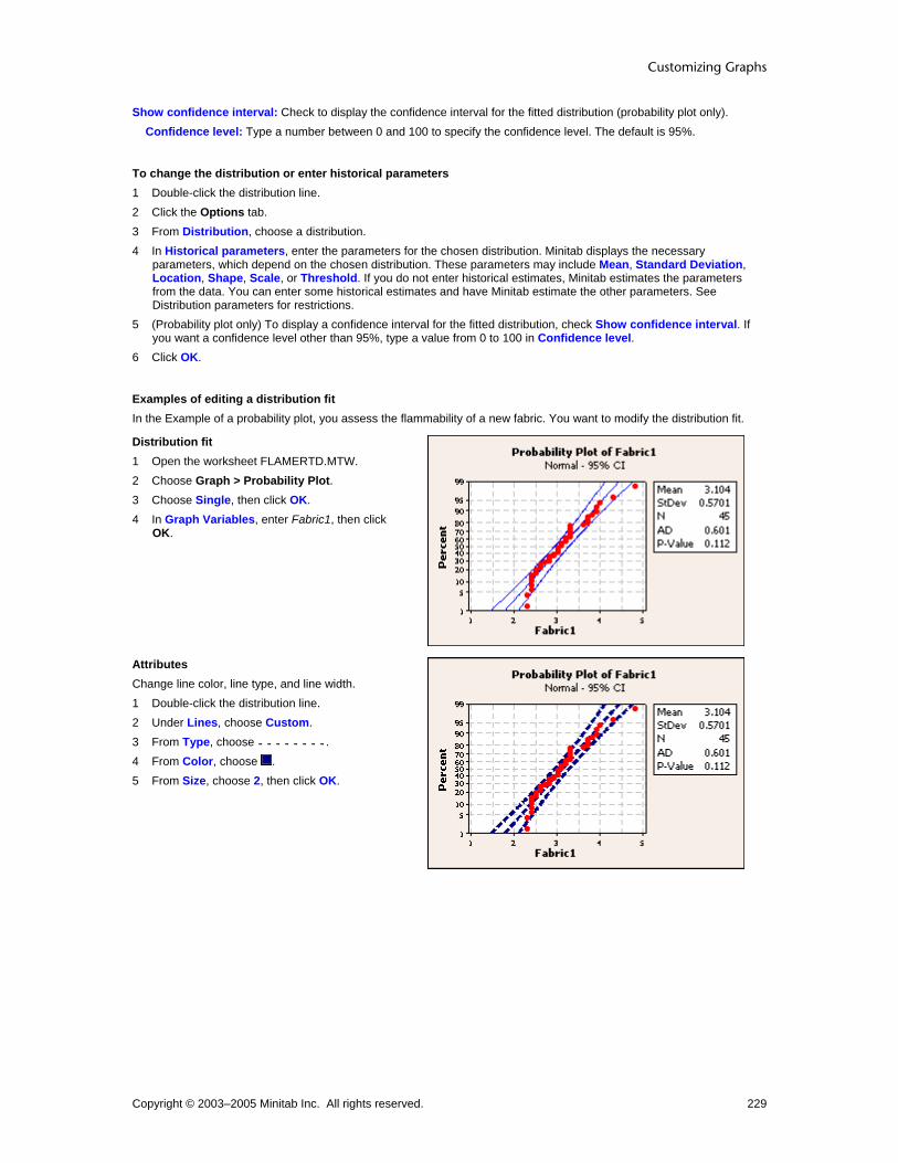
Customizing Graphs
Copyright © 2003–2005 Minitab Inc. All rights reserved. 229
Show confidence interval: Check to display the confidence interval for the fitted distribution (probability plot only). Confidence level: Type a number between 0 and 100 to specify the confidence level. The default is 95%.
To change the distribution or enter historical parameters 1 Double-click the distribution line. 2 Click the Options tab. 3 From Distribution, choose a distribution. 4 In Historical parameters, enter the parameters for the chosen distribution. Minitab displays the necessary
parameters, which depend on the chosen distribution. These parameters may include Mean, Standard Deviation, Location, Shape, Scale, or Threshold. If you do not enter historical estimates, Minitab estimates the parameters from the data. You can enter some historical estimates and have Minitab estimate the other parameters. See Distribution parameters for restrictions.
5 (Probability plot only) To display a confidence interval for the fitted distribution, check Show confidence interval. If you want a confidence level other than 95%, type a value from 0 to 100 in Confidence level.
6 Click OK.
Examples of editing a distribution fit In the Example of a probability plot, you assess the flammability of a new fabric. You want to modify the distribution fit.
Distribution fit 1 Open the worksheet FLAMERTD.MTW. 2 Choose Graph > Probability Plot. 3 Choose Single, then click OK. 4 In Graph Variables, enter Fabric1, then click
OK.
Attributes Change line color, line type, and line width. 1 Double-click the distribution line. 2 Under Lines, choose Custom. 3 From Type, choose . 4 From Color, choose . 5 From Size, choose 2, then click OK.

Customizing and Editing Graphs
Copyright © 2003–2005 Minitab Inc. All rights reserved. 230
Options and groups Hide the confidence intervals and add a grouping variable. 1 Double-click the distribution line. 2 Under Lines, choose Automatic. 3 Click the Options tab. 4 Uncheck Show confidence interval. 5 Click the Groups tab. 6 In Categorical variables for grouping
variables, enter Coating. 7 Click OK.
Edit Lowess Fit
Edit Lowess Smoother − Attributes Select lowess smoother > Editor > Edit Lowess Smoother > Attributes Use to change the attributes of the fitted line on a scatterplot, matrix plot, histogram, or time series plot. To add a lowess smoother to a graph, choose Editor > Add > Smoother.
Dialog box items Lines
Automatic: Choose to accept the default line attributes. Custom: Choose to customize the line attributes.
Type: Choose a line type. Color: Choose a line color. Size: Choose a line width.
To change the line attributes 1 Select and double-click one or more fitted lines. See Selecting groups and single items. 2 Under Lines, choose one of the following:
• Automatic to accept the default line attributes. • Custom to customize the line attributes.
− From Type, choose a line type.
− From Color, choose a line color.
− From Size, choose a line width.
3 Click OK.
Edit Lowess Smoother − Groups Select lowess smoother > Editor > Edit Lowess Smoother > Groups Use to add, remove, or change the grouping variables on a scatterplot, matrix plot, histogram, or time series plot. To add a lowess smoother to a graph, choose Editor > Add > Smoother.
Dialog box items Categorical variables for grouping: Enter up to three columns of grouping variables to fit a separate lowess line for each group and display a legend. Apply same grouping to other data displays: Check to update all data displays to use the same grouping variables as the fitted line. (Available for scatterplots, matrix plots, and time series plots. For histograms, Minitab automatically assigns the grouping variable to all data displays.)
To add or change the grouping variables 1 Select and double-click all fitted lines. See Selecting groups and single items. 2 Click the Groups tab.

Customizing Graphs
Copyright © 2003–2005 Minitab Inc. All rights reserved. 231
3 In Categorical variables for grouping, enter up to three columns containing grouping variables to fit a line for each group and display a legend.
4 To update all data displays to use the same grouping variables, check Apply same grouping to other data displays. (Not available with distribution fits.)
5 Click OK.
Edit Lowess Smoother − Options Select lowess smoother > Editor > Edit Lowess Smoother > Options Use to change the smoothing parameters on a scatterplot, matrix plot, histogram, or time series plot. To add a lowess smoother to a graph, choose Editor > Add > Smoother.
Dialog box items Lowess Smoothing Parameters
Degree of smoothing: Enter a number between 0 and 1 for the fraction (f) of the total number of points to use to calculate the fitted values at each x-value. The default is 0.5. See Specifying lowess smoothing parameters. Number of steps: Enter a number from 0 to 10 to specify the number of iterations of smoothing used to limit the influence of outliers. Each step reduces the weight given to outliers in the next iteration. The default is 2. See Specifying lowess smoother parameters.
To change the lowess smoothing parameters 1 Double-click the lowess smoother. 2 Click the Options tab. 3 Under Lowess Smoothing Parameters, do one or more of the following:
• In Degree of smoothing, enter a number between 0 and 1 for the fraction (f) of the total number of points to use to calculate the fitted values at each x-value. The default is 0.5. See Specifying lowess smoothing parameters.
• In Number of steps, enter a number from 0 to 10 to specify the number of iterations of smoothing used to limit the influence of outliers. Each step reduces the weight given to outliers in the next iteration. The default is 2.
See Specifying Lowess Smoothing Parameters for details. 4 Click OK.
Examples of editing a lowess smoother In the Example of a simple scatterplot, you examine the relationship between voltage remaining in your batteries immediately after a flash and the length of time required for a battery to support another flash. You want to modify the lowess smoother.
Lowess smoother 1 Open the worksheet BATTERIES.MTW. 2 Choose Graph > Scatterplot. 3 Choose Simple, then click OK. 4 Under Y variables, enter FlashRecov. Under X
variables, enter VoltsAfter. 5 Click Data View. 6 Click the Smoother tab. 7 Under Smoother, choose Lowess. 8 Click OK in each dialog box.

Customizing and Editing Graphs
Copyright © 2003–2005 Minitab Inc. All rights reserved. 232
Attributes Change line type, line color, and line width. 1 Double-click the lowess smoother. 2 Under Lines, choose Custom.
• From Type, choose . • From Color, choose . • From Size, choose 3.
3 Click OK.
Options and groups Change the smoothing parameters and add a grouping variable. 1 Double-click the lowess smoother. 2 Under Lines, choose Automatic. 3 Click the Options tab. 4 In Degree of smoothing, enter 0.75. 5 Click the Groups tab. 6 In Categorical variables for grouping, enter
Formulation. 7 Check Apply same grouping to other data
displays. 8 Click OK.
Edit Regression Line
Edit Regression Fit − Attributes Select regression fit > Editor > Edit Regression Fit > Attributes Use to change the attributes of the fitted line on a scatterplot or matrix plot. To add a regression fit to a graph, choose Editor > Add > Regression Fit.
Dialog box items Lines
Automatic: Choose to accept the default line attributes. Custom: Choose to customize the line attributes.
Type: Choose a line type. Color: Choose a line color. Size: Choose a line width.
To change the line attributes 1 Select and double-click one or more fitted lines. See Selecting groups and single items. 2 Under Lines, choose one of the following:
• Automatic to accept the default line attributes. • Custom to customize the line attributes.
− From Type, choose a line type.
− From Color, choose a line color.
− From Size, choose a line width.
3 Click OK.

Customizing Graphs
Copyright © 2003–2005 Minitab Inc. All rights reserved. 233
Edit Regression Fit − Groups Select regression fit > Editor > Edit Regression Fit > Groups Use to add, remove, or change the grouping variables on a scatterplot or matrix plot. To add a regression line to a graph, choose Editor > Add > Regression Fit.
Dialog box items Categorical variables for grouping: Enter up to three columns of grouping variables to fit a separate regression line for each group and display a legend. Apply same grouping to other data displays: Check to update all data displays to use the same grouping variables as the fitted line.
To add or change the grouping variables 1 Select and double-click all fitted lines. See Selecting groups and single items. 2 Click the Groups tab. 3 In Categorical variables for grouping, enter up to three columns containing grouping variables to fit a line for each
group and display a legend. 4 To update all data displays to use the same grouping variables, check Apply same grouping to other data displays.
(Not available with distribution fits.) 5 Click OK.
Edit Regression Fit − Options Select regression line > Editor > Edit Regression Fit > Options Use to change the regression model on a scatterplot or matrix plot. To add a regression fit to a graph, choose Editor > Add > Regression Fit.
Dialog box items Model Order
Linear: Choose to fit a linear model. Quadratic: Choose to fit a quadratic model. Cubic: Choose to fit a cubic model.
Fit intercept: Check to fit a constant term (the y-intercept of the regression line). Uncheck to fit the model without a constant term.
To change the regression model 1 Double-click the regression fit. 2 Click the Options tab. 3 Choose Linear, Quadratic, or Cubic, based on the model you want to fit. 4 Check or uncheck Fit intercept to include or exclude the intercept (also called the constant) in the model. 5 Click OK.
Examples of editing a regression fit In the Example of a simple scatterplot, you examine the relationship between voltage remaining in your batteries immediately after a flash and the length of time required for a battery to support another flash. You want to modify the regression fit.
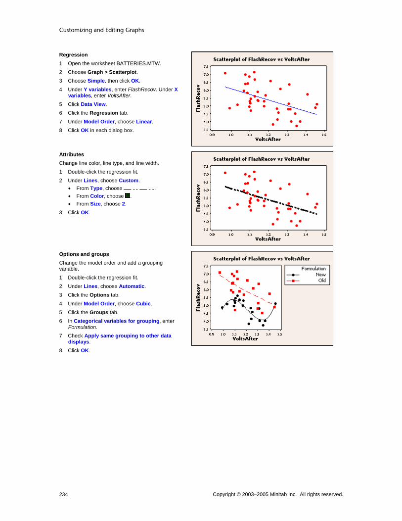
Customizing and Editing Graphs
Copyright © 2003–2005 Minitab Inc. All rights reserved. 234
Regression 1 Open the worksheet BATTERIES.MTW. 2 Choose Graph > Scatterplot. 3 Choose Simple, then click OK. 4 Under Y variables, enter FlashRecov. Under X
variables, enter VoltsAfter. 5 Click Data View. 6 Click the Regression tab. 7 Under Model Order, choose Linear. 8 Click OK in each dialog box.
Attributes Change line color, line type, and line width. 1 Double-click the regression fit. 2 Under Lines, choose Custom.
• From Type, choose . • From Color, choose . • From Size, choose 2.
3 Click OK.
Options and groups Change the model order and add a grouping variable. 1 Double-click the regression fit. 2 Under Lines, choose Automatic. 3 Click the Options tab. 4 Under Model Order, choose Cubic. 5 Click the Groups tab. 6 In Categorical variables for grouping, enter
Formulation. 7 Check Apply same grouping to other data
displays. 8 Click OK.

Customizing Graphs
Copyright © 2003–2005 Minitab Inc. All rights reserved. 235
Subset Data, Missing Values, and Frequency Data Data Options Overview Use data options to focus the scope and handling of the data when creating a graph. You can:
Subset the data to focus your analysis. See Subset. Include or exclude empty cells or groups in your analysis. See Group Options. Use a frequency column when creating most graphs. See Frequency.
How you organize worksheet data can affect the ease with which you use these options. See Organizing Your Data.
Data Options
Graph Subset Group Options Frequency
Scatterplot Matrix Plot Marginal Plot Histogram Dotplot Boxplot Stem-and-Leaf
Probability Plot
Empirical CDF
Interval Plot Individual Value Plot
Bar Chart Pie Chart Time Series Plot
Area Graph
Contour Plot
3D Scatterplot
3D Surface Plot
Subset ... > Data Options > Subset Use to include or exclude rows when creating a graph.
Dialog box items Include or Exclude
Specify which rows to include: Choose to set conditions for including rows. Specify which rows to exclude: Choose to set conditions for excluding rows.
Specify Which Rows to Include/Exclude All rows: Choose to include/exclude all rows. Rows that match: Choose to include/exclude rows matching specified conditions. Click Condition to enter the conditional expression. Brushed rows: Choose to include/exclude all brushed rows.

Customizing and Editing Graphs
Copyright © 2003–2005 Minitab Inc. All rights reserved. 236
Row numbers: Choose to include/exclude based on row numbers. Enter the row numbers in the text box. Use a colon (:) to denote an inclusive range. For example, enter 1 4 6:10 to signify the rows 1,4,6,7,8,9,10.
To subset graph data 1 In the data source dialog box, click Data Options. 2 Click the Subset tab. 2 Under Include or Exclude, choose one of the following:
Specify which rows to include to base your subset on included rows. Specify which rows to exclude to base your subset on excluded rows.
3 Under Specify Which Rows To Include/Exclude, choose one of the following: All rows to include or exclude all rows. Rows that match and click Condition to enter a condition to be met by included or excluded rows. Brushed rows to include or exclude brushed rows. Row numbers and enter specific rows numbers to be included or excluded. Use a colon (:) to denote an inclusive
range. For example, enter 1 4 6:10 to signify the rows 1,4,6,7,8,9,10. 4 Click OK.
Subset – Area Graphs, Time Series Plots, and Control Charts ... > Data Options > Subset Use to include or exclude rows when creating a graph.
Dialog box items Include or Exclude
Specify which rows to include: Choose to set conditions for including rows. Specify which rows to exclude: Choose to set conditions for excluding rows.
Specify Which Rows to Include/Exclude All rows: Choose to include/exclude all rows. Rows that match: Choose to include/exclude rows matching specified conditions. Click Condition to enter the conditional expression. Brushed rows: Choose to include/exclude all brushed rows. Row numbers: Choose to include/exclude based on row numbers. Enter the row numbers in the text box. Use a colon (:) to denote an inclusive range. For example, enter 1 4 6:10 to signify the rows 1,4,6,7,8,9,10.
Leave gaps for excluded points: Check to leave a space in the graph for the points you exclude.
To leave a gap for excluded points 1 In the data source dialog box, click Data Options. 2 Click the Subset tab. 3 Under Include or Exclude, choose Specify which rows to exclude. 4 Under Specify Which Rows To Exclude, choose one of the following:
No rows to exclude all rows. Rows that match and click Condition to enter a condition to be met by excluded rows. Brushed rows to exclude brushed rows. Row numbers and enter specific rows numbers to be excluded. Use a colon (:) to denote an inclusive range. For
example, enter 1 4 6:10 to signify the rows 1,4,6,7,8,9,10. 5 Check Leave gaps for excluded points. 6 Click OK.
Example of leaving gaps for excluded points You have been monitoring camshaft lengths to meet engineering specifications. The operator taking measurements indicated that "something was wrong" with the gage for the 8th subgroup (subgroup size is 5). You decide to investigate and exclude this subgroup from the control chart. You want to show a gap on the chart, so the chart is not misleading. 1 Open the worksheet CAMSHAFT.MTW.

Customizing Graphs
Copyright © 2003–2005 Minitab Inc. All rights reserved. 237
2 Choose Stat > Control Charts > Variables Charts for Subgroups > Xbar. 3 Choose All observations for a chart are in one column, then enter Length. 4 In Subgroup sizes, type 5. 5 Click Data Options. 6 Under Include or Exclude, choose Specify which rows to exclude. 7 Under Specify Which Rows To Exclude, choose Row numbers. 8 Type 36:40 to signify the rows 36-40. 9 Check Leave gaps for excluded points. 10 Click OK in each dialog box.
Graph window output
Interpreting the results Leaving a gap for the excluded points makes it easy to indicate that the data in subgroup 8 could be suspect.
Group Options ... > Data Options > Group Options Use to include or exclude unrepresented groups and observations with missing group values when creating a graph. See Using Group Options.
Dialog box items Include missing as a group: Uncheck to exclude observations with missing group values. Include empty cells: Uncheck to exclude a group level not represented by the combination of two or more grouping variables.
To use group options 1 In the data source dialog box, click Data Options. 2 Click the Group Options tab. 3 Check Include missing as a group to include observations with missing group values. Resulting graphs include the
observations and leave the missing grouping variable label blank. 4 Check Include empty cells to include group level not represented by the combination of two or more grouping
variables. Resulting graphs include empty placeholders for these levels. 5 Click OK.
Using Group Options You might find it helpful to use group options to show or hide missing groups or empty cells when creating a graph.

Customizing and Editing Graphs
Copyright © 2003–2005 Minitab Inc. All rights reserved. 238
In the worksheet at right, the two grouping variables Style and Size each cycle through three values. However, not all logical combinations are represented. The group Hooded/Large does not appear here. This combination is considered an "empty cell." Also, one row pairs a missing value in the column Style with "Small" in the Size column. This pairing is considered a "missing group." Use the Group Options tab in Data Options to control how these items are graphed.
If you uncheck both Include missing as a group and Include empty cells, Minitab excludes the group Hooded/Large and the group created by a missing value and "Small." You might exclude "empty cells" simply to save space on your graph, or to show that the group does not exist. You might exclude "missing groups" if you do not want to graph items with indeterminate group values.
If you check only Include missing as a group, Minitab includes a bar for the "missing group" formed by an empty cell and the value "Small."
If you check only Include empty cells, Minitab includes an empty placeholder for the group Hooded/Large.
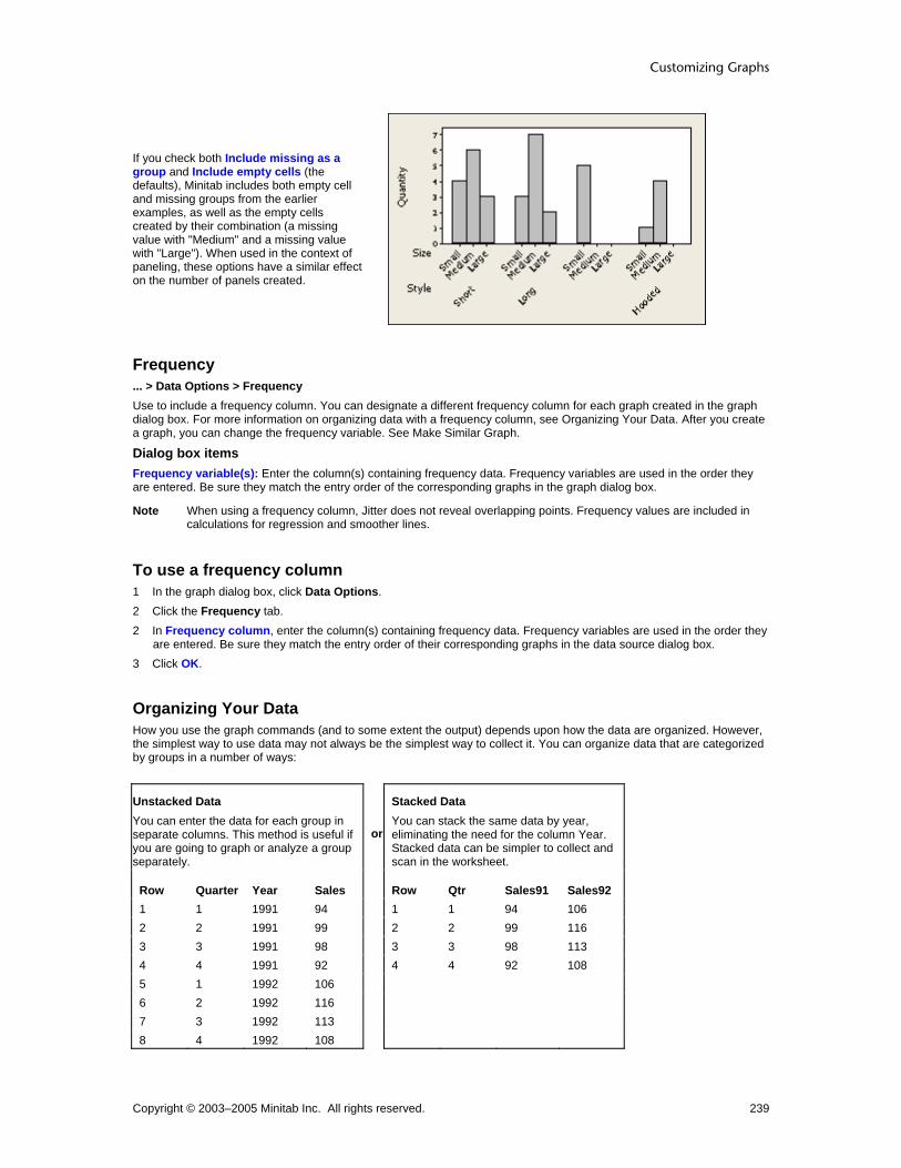
Customizing Graphs
Copyright © 2003–2005 Minitab Inc. All rights reserved. 239
If you check both Include missing as a group and Include empty cells (the defaults), Minitab includes both empty cell and missing groups from the earlier examples, as well as the empty cells created by their combination (a missing value with "Medium" and a missing value with "Large"). When used in the context of paneling, these options have a similar effect on the number of panels created.
Frequency ... > Data Options > Frequency Use to include a frequency column. You can designate a different frequency column for each graph created in the graph dialog box. For more information on organizing data with a frequency column, see Organizing Your Data. After you create a graph, you can change the frequency variable. See Make Similar Graph.
Dialog box items Frequency variable(s): Enter the column(s) containing frequency data. Frequency variables are used in the order they are entered. Be sure they match the entry order of the corresponding graphs in the graph dialog box.
Note When using a frequency column, Jitter does not reveal overlapping points. Frequency values are included in calculations for regression and smoother lines.
To use a frequency column 1 In the graph dialog box, click Data Options. 2 Click the Frequency tab. 2 In Frequency column, enter the column(s) containing frequency data. Frequency variables are used in the order they
are entered. Be sure they match the entry order of their corresponding graphs in the data source dialog box. 3 Click OK.
Organizing Your Data How you use the graph commands (and to some extent the output) depends upon how the data are organized. However, the simplest way to use data may not always be the simplest way to collect it. You can organize data that are categorized by groups in a number of ways:
Unstacked Data You can enter the data for each group in separate columns. This method is useful if you are going to graph or analyze a group separately.
or
Stacked Data You can stack the same data by year, eliminating the need for the column Year. Stacked data can be simpler to collect and scan in the worksheet.
Row Quarter Year Sales Row Qtr Sales91 Sales92 1 1 1991 94 1 1 94 106 2 2 1991 99 2 2 99 116 3 3 1991 98 3 3 98 113 4 4 1991 92 4 4 92 108 5 1 1992 106 6 2 1992 116 7 3 1992 113 8 4 1992 108

Customizing and Editing Graphs
Copyright © 2003–2005 Minitab Inc. All rights reserved. 240
Raw Data You can enter an observation each time it occurs. This method might be necessary if you have several grouping variables related to each observation.
or
Frequency Data You can list each observation once and use a frequency column to record the number of instances of each. Most Minitab graphs accept frequency columns. Frequency data can be simpler to collect and scan in the worksheet.
Repair Mechanic Repair RepFreq Mechanic MechFreqExhaust Steve Exhaust 15 Steve 20 Exhaust Steve Body 22 Roger 14 Body Roger Trans 8 Debbie 16 Trans Debbie Engine 5 Body Debbie Engine Roger
Example of changing data organization 1 Open the worksheet MARKET.MTW.
2 Choose Data > Unstack Columns.
3 In Unstack the data in, enter Sales.
4 In Using subscripts in, enter Year.
5 Under Store unstacked data, choose After last column in use.
6 Check Name the columns containing the unstacked data. Click OK. Minitab places Sales values with the lowest Year number in the first storage column and values for the next lowest Year number in the second storage column.
Data window output
More You could also turn the unstacked columns into stacked. See Stack.

Graph Editing Tools
Copyright © 2003–2005 Minitab Inc. All rights reserved. 241
Graph Editing Tools Graph Editing Overview Use graph editing to alter:
• Attributes of graph elements
• View or layout of graphs
• Added graph elements and information
• The graph itself, by updating its data or changing the variables used Graph editing affects only the current graph. To change graphics defaults, choose Tools > Options. After you finish editing, you can leave the graph in the current project or save it to a separate file using File > Save Graph As. If you save the graph in a Minitab Graphics Format (MGF) file, you can reopen the graph later in Minitab using File > Open Graph, then re-edit the graph. See Saving and Printing Graphs. To enter edit mode, do one of the following:
• Double-click the graph item to edit.
• Select the graph item and choose Editor > Edit.
• Select the graph item, right-click, and choose Edit.
• Choose the graph item from the drop-down menu on the graph toolbar and click
Graph Editing Topics
Scale Editing Editor Menu (When Graph Window is Active)
Labels Editing Editor Menu (When Brushing a Graph)
Data Fits Editing Embedded Graph Editor − Editing in Another Application
Data Display Editing Graph Tools Toolbar
Regions Editing 3-D Graph Toolbar
Panel Editing Graph Drawing Toolbar
Brushing Graph options for matrix plot, marginal plot, bar chart, pie chart, contour plot, and 3-D surface plot.
Editor Menu (When Graph Window is Active) The following commands are available when you are working in a Graph window. Choose a command for more information:
Puts the active graph in select mode.
Puts the active graph in brushing mode.
Puts the active graph in crosshairs mode.
Puts the active contour graph in planting flag mode.
Edits the selected graph item.
Choose from the list of items to select them for editing.
Choose from the list of items to add to your graph.
Edits the paneling attributes of your graph.
Edits the graph options of a matrix plot, marginal plot, bar chart, pie chart, contour plot, or 3-D surface plot.

Customizing and Editing Graphs
Copyright © 2003–2005 Minitab Inc. All rights reserved. 242
Creates a multiple graph layout.
Copies a selected text item (titles, annotation, footnotes) or the tool tip text of a selected item to the clipboard.
Copies command language used to create the active graph to the clipboard.
Duplicates the active graph.
Creates a graph with characteristics identical to the active graph but with different variables (Make Similar Graph).
Choose Duplicate Annotation, Bring to Front, Send to Back, Rotate Left, or Rotate Right. Also use to show or hide the Graph Annotation Tools toolbar.
Choose Update Graph Now, Update Graph Automatically, or Update All Graphs Now.
Zooms in or out.
Brush Graphs Brushing Overview Graphs allow you to visualize the relationships between points. After you make a graph, you often want to learn more about a point or a group of points. Brushing allows you to do this. Initially you may find brushing useful to:
• Show the characteristics of outliers
• Tell whether points that lie in a brushing region share other characteristics You may come away with a much greater understanding of the data after brushing, but you may also spot critical areas in a process that need immediate attention. See Brushing Features, Description, and Summary for more information. You may find it useful to recreate your graph without the brushed points or, conversely, with only the brushed points. See Example of subsetting based on brushed points.
Brushing Item Example
Brushing Tool
A special cursor that creates a brushing region.
Brushing Region
Bound by a dotted line, all points that fall within this region are considered brushed.

Graph Editing Tools
Copyright © 2003–2005 Minitab Inc. All rights reserved. 243
Brushing Palette
A floating window that shows the Data window row number for each brushed point as well as up to ten other column values for that row.
Brushing Markers
Symbols in the Data window next to the row numbers indicate which rows are currently brushed. These markers are removed if the data are changed.
Editor Menu (While Brushing the Active Graph) The following commands are available when you are working in a Graph window. Choose a command for more information:
Puts the active graph in select mode.
Puts the active graph in brushing mode.
Puts the active graph in crosshairs mode.
Select to show or hide the brushing palette.
Select to set ID variables.
Select to create indicator variables.
Brushing Features Description and Summary To... Do this...
Enter brushing mode Choose Editor > Brush.
Brush points (form a new brushing region)
1 Move the mouse until the brushing tool appears. 2 Drag the cursor to enclose the new brushing region.
Add identifier (ID) variables to the brushing palette
1 Choose Editor > Set ID Variables. 2 In Variables, enter the columns you want to use as identifiers. 3 Choose Use as default for all graphs or Use for this graph only.
Move an existing brushing region 1 Place the cursor in the brushing region.
2 When appears, drag the brushing region to a different position.
Add additional points to the brushing palette
Do one of the following:
• To add points individually, [Shift]+click them.
• To add points that the brushing region passes over, while keeping the original brushed points, press [Shift] as you drag the brushing region.
Brush a single point Click the point.

Customizing and Editing Graphs
Copyright © 2003–2005 Minitab Inc. All rights reserved. 244
Brush across Graph windows Brush points in one graph; the points derived from the same row are highlighted automatically in other graphs.
Select a graph point from the brushing palette
Click the row in the brushing palette.
Highlight many graph points from the brushing palette
Do one of the following:
• Drag the cursor over the rows you want to highlight.
• [Shift]+click to highlight contiguous rows.
• [Ctrl]+click to add a noncontiguous row to the current selection.
Display/hide row numbers on the brushing palette
1 Choose Editor > Set ID Variables. 2 Enter a column to serve as an ID variable. 3 Check or uncheck Include row numbers.
Move the brushing palette Drag the palette by the title bar.
Resize the brushing palette vertically Drag the lower-right corner of the brushing palette as desired.
Subset based on brushed data 1 Brush the data. 2 In the data source dialog, choose Data Options. 3 Click the Subset tab. 4 Choose the appropriate options to include or exclude the brushed points.
Display/hide the brushing palette Choose Editor > Show/Hide the Brushing Palette.
Brush Editor > Brush Available only when a Graph window is active. Choosing Editor > Brush puts the graph in brushing mode. Changing worksheet data pertinent to the graph and choosing any of the Editor > Update options takes the graph out of brushing mode. You cannot brush graphs in which:
• Data are not represented with symbols
• A symbol represents a single value in the worksheet
• Points are based on a calculation involving more than one row, as in histograms, bar charts, boxplots, or pie charts
• Worksheet data have changed and the graph has not been updated. Conversely, a brushing region is removed if worksheet data change.
When you brush points in one graph, Minitab automatically brushes points from the same row that appear in other graphs. This is true whether the graphs appear in the same Graph window or in other Graph windows. Brushing across graphs can help you quickly see visual relationships across many variables.
Example of exploring data with brushing Suppose you want to look at the effects of several variables on blood pressure. After making three scatterplots, you brush points of interest to examine them in the context of each graph and set ID variables to learn more about these points.
Step 1: Create the Graphs 1 Open the worksheet PERU.MTW. 2 Choose Graph > Scatterplot > Simple > OK. 3 In the first row of Y variables, enter Pulse; in X variables, enter Years. 4 In the second row of Y variables, enter Systol; in X variables, enter Diastol. Click OK. 5 Choose Graph > Scatterplot > With Regression > OK. 6 In Y variables, enter Pulse; in X variables, enter Height. Click OK.
Step 2: Brush the outliers In the first graph, two points are much higher on the Years scale than the rest. You want to see whether these two points are outliers in different graphs. 1 Choose Editor > Brush. 2 Drag the cursor to create a brushing region around those two points.

Graph Editing Tools
Copyright © 2003–2005 Minitab Inc. All rights reserved. 245
The brushing palette shows that rows 38 and 39 are associated with those points. Look at rows 38 and 39 in the Data window to see the values of other variables for these individuals.
Points in the other graphs that have the same row number are also brushed, allowing you to compare different characteristics visually. In the second graph, you see that neither of the brushed points appear to be outliers.
Step 3: Set ID variables In the first two graphs, two points are much higher on the Years scale than the rest. You want to get more information on these two points. 1 Choose Editor > Set ID Variables. 2 Enter Age, Weight, Height, and Systol. Click OK.

Customizing and Editing Graphs
Copyright © 2003–2005 Minitab Inc. All rights reserved. 246
With the added ID variables in the brushing window you can see information related to the brushed points not otherwise expressed in the graph. In the third graph,the brushed point near the regression line shows a subject with a height and weight that are very close to the general relationship between height and weight. Another subject (the second brushed point) is quite overweight which may contribute to his high pulse rate. Further exploration may reveal more about the cause of this subject's high pulse rate.
To start brushing 1 Make the graph window active. 2 Choose Editor > Brush.
3 Drag the cursor over the points in the graph.
Show/Hide Brushing Palette Editor > Show/Hide Brushing Palette Displays or hides the brushing palette when an active Graph window is in Graph Brushing mode. You can enter the brushing mode when a Graph window is active by choosing Editor > Brush.
Create Indicator Variable Editor > Create Indicator Variable Use to create a column in the Data window called an indicator variable that identifies brushed rows with a column of data. If a row is currently brushed, the cell in that row of the indicator variable column has a value of 1. If a row is not brushed, the cell has a value of 0. The contents of the column change dynamically as you move the brushing region on the graph. You can choose to update this indicator column automatically or manually.

Graph Editing Tools
Copyright © 2003–2005 Minitab Inc. All rights reserved. 247
You can use the indicator variable to explore the data in different ways. For example, you can: • Subset the data based on brushed points. • Calculate descriptive statistics separately for the brushed and unbrushed points. • Perform a regression analysis, omitting the brushed points.
Dialog Box Items Column: Enter the column where the indicator values will be stored. Code brushed points as zero: Check this box to set brushed rows to 0, and nonbrushed rows to 1. If unchecked, brushed rows are set to 1 and nonbrushed rows are set to 0.
Update now: Select this option to change the values in the indicator variable to reflect the currently brushed set. Update now and whenever the brushed set changes: Select this option to change the values in the indicator variable every time you move or change the brushing region.
To create an indicator variable based on brushed points 1 Brush points of interest on the graph. 2 Choose Editor > Create Indicator Variable. 3 In Column, enter a column to hold the indicator values. 4 Check Code brushed points as zero to set brushed rows to 0, and non-brushed rows to 1. If unchecked, brushed
rows are set to 1 and non-brushed rows are set to 0. 5 Do one of the following:
• Choose Update now to update the indicator column to reflect the points that are currently brushed and then freeze these values.
• Choose Update now and whenever the brushed set changes to change the values in the indicator variable every time you move or change the brushing region.
6 Click OK.
Set ID Variables Editor > Set ID Variables This dialog box allows you to add more information to the brushing palette for each brushed point, and to use the added ID variables for all graphs or just the active graph.
Dialog Box Items : Variables: Enter columns that will serve as ID variables. The brushing palette shows the added columns for each brushed point. Use as default for all graphs using this worksheet: Choose to display the ID variables entered in Variables when brushing any graph created with the current worksheet.. Use for this graph only: Choose to display the ID variables entered in Variables when brushing the active graph only. The active graph will not be affected if you check Use as the default for all graphs using this worksheet later in the session. Include row numbers: Check to show the row number of the brushed point, which is useful for locating the point in the Data window.
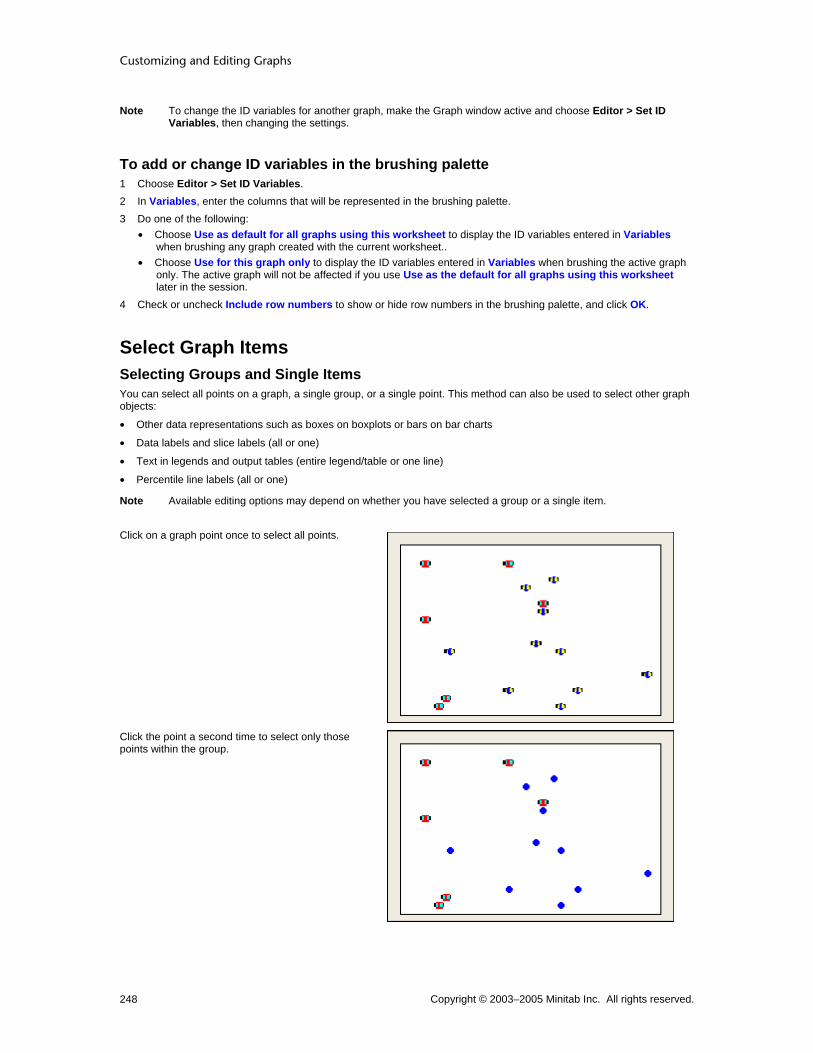
Customizing and Editing Graphs
Copyright © 2003–2005 Minitab Inc. All rights reserved. 248
Note To change the ID variables for another graph, make the Graph window active and choose Editor > Set ID Variables, then changing the settings.
To add or change ID variables in the brushing palette 1 Choose Editor > Set ID Variables. 2 In Variables, enter the columns that will be represented in the brushing palette. 3 Do one of the following:
• Choose Use as default for all graphs using this worksheet to display the ID variables entered in Variables when brushing any graph created with the current worksheet..
• Choose Use for this graph only to display the ID variables entered in Variables when brushing the active graph only. The active graph will not be affected if you use Use as the default for all graphs using this worksheet later in the session.
4 Check or uncheck Include row numbers to show or hide row numbers in the brushing palette, and click OK.
Select Graph Items Selecting Groups and Single Items You can select all points on a graph, a single group, or a single point. This method can also be used to select other graph objects:
• Other data representations such as boxes on boxplots or bars on bar charts
• Data labels and slice labels (all or one)
• Text in legends and output tables (entire legend/table or one line)
• Percentile line labels (all or one)
Note Available editing options may depend on whether you have selected a group or a single item.
Click on a graph point once to select all points.
Click the point a second time to select only those points within the group.

Graph Editing Tools
Copyright © 2003–2005 Minitab Inc. All rights reserved. 249
Click a third time to select the individual point.
To select objects and text There are three methods for selecting graph elements. Depending on the item, you may find one easier than another.
Manual selection
1 Click , the selection tool on the Graph Editing toolbar. 2 Click the object on the graph.
Menu selection 1 Choose Editor > Select Item, and then choose from the list.
Toolbar selection 1 Choose the object from the Graph Editing toolbar drop-down list of editable items. Selected objects have handles:
When you select symbols, they display two handles. See Selecting groups and single items.
Text strings have handles at vertices (corners) and at line midpoints of a rectangle that surrounds them. See Selecting groups and single items.
Unrotated rectangles, squares, ellipses, and circles have handles at vertices (corners) and at line midpoints. For circles and ellipses, the vertices and endpoints are located on a rectangle that surrounds the object.
Selected polygons have handles at each vertex.
Tip If you cannot select an object, it may be because a second object is in front of it. Select the object in front, choose Editor > Send to Back, then select the first object. See Bring to Front and Send to Back.
Edit Editor > Edit This menu item appears only when a Graph window is active. An editing dialog box appropriate for the selected item appears. To produce this dialog box you can: Double-click the graph item. Choose the graph item, right-click, and select Edit.

Customizing and Editing Graphs
Copyright © 2003–2005 Minitab Inc. All rights reserved. 250
Choose the graph item and choose Editor > Edit.
Choose the graph item from the drop-down menu on the graph editing toolbar and click .
Crosshairs Crosshairs Editor > Crosshairs Allows you to place crosshairs anywhere on the data region of a graph and shows you the x,y coordinates of that point. Useful in exploring data without gridlines or reference lines, and in placing annotation items.
To use crosshairs 1 Create a graph with a two-variable data region.
2 Choose Editor > Crosshairs, or click in the Graph Editing toolbar. 3 Position the crosshairs on the data region of the graph.
Example of crosshairs Suppose you create a large scatterplot of weight and height data. Creating enough reference lines to identify the coordinates of each point would clutter the graph, so you opt to use crosshairs. 1 Open the worksheet PERU.MTW. 2 Choose Graph > Scatterplot. 3 Choose Simple, then click OK. 4 In Y variables, enter Height; in X variables, enter Weight. Click OK.
5 Choose Editor > Crosshairs, or click on the Graph Editing toolbar. 6 Place the crosshairs over a point of interest. The coordinates of the crosshairs appear in the upper left corner of the
graph.
Graph window output
Interpreting the results You now know the precise coordinates of the point in question. The crosshairs also help you visualize the number of points above and below the selected point on both axes. After exploring the data in this manner, you may choose to add reference lines.

Graph Editing Tools
Copyright © 2003–2005 Minitab Inc. All rights reserved. 251
Plant Flag Planting Flags Editor > Plant Flag Allows you to display the x and y values as well as the exact z value of any point on a factorial, response surface, or mixture contour plot.
To plant flags 1 Create a factorial, response surface, or mixture contour plot. 2 Choose Editor > Plant Flag. 3 Position the crosshairs on the point of interest in the data region. Click and drag the mouse to the location for the flag
label to appear.
Example of planting flags Suppose you have created a response surface contour plot of yield data from a recent soybean crop. You want to know the exact z-values of certain points.
Step 1: Create the graph 1 Open the worksheet CCD_EX1.MTW. 2 Choose Stat > DOE > Response Surface > Contour/Surface (Wireframe) Plots. 3 Check Contour plot and click Setup. 4 Click OK in each dialog box.
Step 2: Plant the flag 1 Choose Editor > Plant Flag. 2 Position the crosshairs on the point of interest in the data region. Click and drag the mouse to the location for the flag
label to appear.

Customizing and Editing Graphs
Copyright © 2003–2005 Minitab Inc. All rights reserved. 252
Graph window output
Edit Planted Flag – Attributes Select flag > Editor > Edit > Attributes Use to control the background fill and border attributes of the flag label.
Dialog box items Fill Pattern
Automatic: Choose to accept the default fill pattern. Custom: Choose change the default fill pattern.
Type: Choose a fill type. Background color: Choose a background color.
Borders and Fill Lines Automatic: Choose to accept the default border and fill lines. Custom: Choose to change the default border and fill lines.
Type: Choose a border line type. Color: Choose a border and fill line color. Size: Choose a border line thickness.
To edit planted flag attributes 1 Double-click the flag. 2 Click the Attributes tab. 3 Under Fill Pattern, choose one of the following:
• Automatic to accept the default fill pattern. • Custom to change the default fill pattern.
− From Type, choose a fill type.
− From Background color, choose a background color.
4 Under Borders and Fill Lines, choose one of the following:
Graph Editing Tools
Copyright © 2003–2005 Minitab Inc. All rights reserved. 253
• Automatic to accept the default border and fill lines. • Custom to change the default border and fill lines.
− From Type, choose a border line type
− From Color, choose a border and fill line color.
− From Size, choose a border line thickness.
5 Click OK.
Edit Planted Flag – Font Select flag > Editor > Edit Flag > Font Specify the font, style, size, and color of flag labels.
Dialog box items Font: Choose a font. Style
Bold: Check to make the text bold. Italic: Check to italicize the text. Underline: Check to underline the text.
Size: Enter a font size. Color: Choose a text color. Preview: Displays sample text with the selected attributes. This box does not accept input.
To edit planted flag font 1 Double-click the flag. 2 Click the Font tab. 3 To change font attributes, do any of the following:
• Under Font, type a font name or choose one from the list. • Under Style, check Bold, Italic, and/or Underline. • Under Size, type a font size or choose one from the list. • Under Color, choose a text color.
4 Click OK.
Example of editing a planted flag Suppose you have planted a flag on a contour plot and decide to change its appearance. This example assumes you have created the contour plot and flag in Example of planting flags. 1 Double-click the flag. 2 Click Attributes. 3 Under Borders and Fill Lines, choose Custom. 4 Under Color, choose . 5 Under Size, choose 2. 6 Click Font. 7 Under Font, choose Times New Roman. 8 Under Size, choose 10. 9 Under Color, choose . Click OK.

Customizing and Editing Graphs
Copyright © 2003–2005 Minitab Inc. All rights reserved. 254
Graph window output
Add Items to Graph Adding Graph Elements Editor > Add You can add graph elements to the active graph. The elements that can be added are determined by the graph. To remove graph items, see Deleting a Graph Element. You can add the following elements:
Scale Labels Data fits Data display Frame
Scale Gridline Reference Lines Percentile Lines Axis Labels
Title Subtitle Footnote Data Labels Slice Labels Default Title Default Subtitle Default Footnote
Distribution Fit Regression Fit Smoother Calculated Line
Scatterplot, Matrix Plot Histogram Boxplot Probability Plot Empirical CDF Interval Plot, Individual Value Plot Bar Chart Time Series Plot Contour Plot 3D Scatterplot 3D Surface Plot
Legend Table
To add a graph element With the menu bar : 1 Choose Editor > Add. 2 Choose the item you wish to add.

Graph Editing Tools
Copyright © 2003–2005 Minitab Inc. All rights reserved. 255
3 Depending on the item, you may be prompted to provide more information. Do so and click OK.
With the right-click menu : 1 Right-click the graph. 2 Choose Add and select the item you wish to add. 3 Depending on the item, you may be prompted to provide more information. Do so and click OK.
With the graph editing toolbar : 1 Select an item from the drop down list of addable elements. 2 Depending on the item, you may be prompted to provide more information. Do so and click OK.
Data Display Add Data Display – 3D Scatterplot Editor > Add > Data Display Use to add or remove data display types from the active graph.
Dialog box items Data Display
Symbols: Check to represent each data point with a symbol. Project lines: Check to display lines that project from each data point to its base.
Apply same groups of current displays to added displays: Check to use the same attribute grouping variables for the added displays as are used for the current displays.
Add Data Display – 3D Surface Plot Editor > Add > Data Display Use to add or remove data display types from the active graph.
Dialog box items Data Display
Surface: Check to display a continuous surface of z-values (surface plot) or a grid of z-values (wireframe plot) that is fit to your data. Symbols: Check to represent each data point with a symbol. Project lines: Check to display lines that project from each data point to its base.
Add Data Display – Bar Chart Editor > Add > Data Display Use to add or remove data display types from the active graph.
Dialog box items Data Display
Bars: Check to display bars that join each data value to its base. Symbols: Check to represent each data value with a symbol. Connect line: Check to connect the data values. Project lines: Check to display lines that project from each data point to its base.
Apply attribute assignment variables of current displays to added displays: Check to use the same attribute grouping variables for the added displays as are used for the current displays.
Add Data Display – Boxplot Editor > Add > Data Display Use to add or remove data display types from the active graph.

Customizing and Editing Graphs
Copyright © 2003–2005 Minitab Inc. All rights reserved. 256
Dialog box items Data Display
Median confidence interval box: Check to display a confidence interval box, which shows the 95% (default) confidence interval for the median. Interquartile range box: Check to display an interquartile range box (default). The box bottom is at the 25th percentile and box top at the 75th percentile. Range box: Check to display a box that extends from the minimum data value to the maximum data value. Outlier symbols: Check to represent each outlier with a symbol. Individual symbols: Check to represent each data point with a symbol. Median symbol: Check to represent each median with a symbol. Median connect line: Check to connect the medians of grouped plots (only visible if you have categorical variables in the boxplot). Mean symbol: Check to represent each mean with a symbol. Mean connect line: Check to connect the means of grouped plots (only visible if you have categorical variables in the boxplot).
Apply attribute assignment variables of current displays to added displays: Check to use the same attribute grouping variables for the added displays as are used for the current displays.
Add Data Display – Contour Plot Editor > Add > Data Display Use to add or remove data display types from the active graph.
Dialog box items Data Display
Area: Check to shade the areas between contours. Contour lines: Check to draw contour lines. Symbols: Check to represent each x-y data point with a symbol.
Add Data Display – Empirical CDF Editor > Add > Data Display Use to add or remove data display types from the active graph.
Dialog box items Data Display
Connect line: Choose to connect the data points. Distribution fit: Choose to fit a distribution to the data.
Add Data Display – Histogram Editor > Add > Data Display Use to add or remove data display types from the active graph.
Dialog box items Data Display
Bars: Check to display bars that join each data value to its base. By default, the height of each bar is equal to the frequency of the interval it represents. Symbols: Check to represent each data value with a symbol. Project lines: Check to display lines that project from each data point to its base. Area: Check to draw a histogram with an outline of the bars (only visible if you uncheck Bars).
Add Data Display – Interval Plot, Individual Value Plot Editor > Add > Data Display Use to add or remove data display types from the active graph.

Graph Editing Tools
Copyright © 2003–2005 Minitab Inc. All rights reserved. 257
Dialog box items Data Display
Interval bar: Check to display a confidence interval bar. The default confidence level is 95%. Bar: Check to display bars that join each mean to its base. Individual symbols: Check to represent each data point with a symbol. Mean symbol: Check to represent each mean with a symbol. Mean connect line: Check to connect the means of grouped plots (only visible if you have categorical variables in the plot). Median symbol: Check to represent each median with a symbol. Median connect line: Check to connect the medians of grouped plots (only visible if you have categorical variables in the plot).
Apply attribute assignment variables of current displays to added displays: Check to use the same attribute grouping variables for the added displays as are used for the current displays.
Add Data Display – Probability Plot Editor > Add > Data Display Use to add or remove data display types from the active graph.
Dialog box items Data Display
Symbols only: Check to represent each data value with a symbol. Distribution fit: Choose to fit a distribution to the data.
Add Data Display – Scatterplot, Matrix Plot Editor > Add > Data Display Use to add or remove data display types from the active graph.
Dialog box items Data Display
Symbols: Check to represent each data point with a symbol. Connect line: Check to connect the data points. Project lines: Check to display lines that project from each data point to its base. Area: Check to shade the area below the data points to their base.
Apply same groups of current displays to added displays: Check to use the same attribute grouping variables for the added displays as are used for the current displays.
Add Data Display – Time Series Plot Editor > Add > Data Display Use to add or remove data display types from the active graph.
Dialog box items Data Display
Symbols: Check to represent each data point with a symbol. Connect line: Check to connect the data points. Project lines: Check to display lines that project from each data point to its base.
Apply same groups of current displays to added displays: Check to use the same attribute grouping variables for the added displays as are used for the current displays.
To add data display items 1 Choose Editor > Add > Data Display. 2 In Data Display, check the items you wish to add, then click OK.

Customizing and Editing Graphs
Copyright © 2003–2005 Minitab Inc. All rights reserved. 258
Data Fits Add Distribution Fit Editor > Add > Distribution Fit Use to fit a distribution to your data to help you determine whether the data can be adequately modeled by the selected distribution. After creating a graph, you can change the fitted distribution, add groups, and change the fitted line attributes (see Editing Data Fits Overview).
Dialog box items Distribution: Choose a distribution. Historical parameters: Enter historical estimates of the distribution parameters. Minitab displays the necessary parameters, which depend on the chosen distribution. These parameters may include Mean, Standard Deviation, Location, Shape, Scale, or Threshold. If you do not enter historical estimates, Minitab estimates the parameters from the data. You can enter some historical estimates and have Minitab estimate the other parameters. See Distribution parameters for restrictions.
To add a distribution fit 1 Do one of the following:
• Click on the graph editing toolbar and choose Distribution Fit from the Add List. • Right-click the active graph and choose Add > Distribution Fit. • Choose Editor > Add > Distribution Fit.
2 From Distribution, choose a distribution. 3 In Historical parameters, enter historical estimates of the distribution parameters. Minitab displays the necessary
parameters, which depend on the chosen distribution. These parameters may include Mean, Standard Deviation, Location, Shape, Scale, or Threshold. If you do not enter historical estimates, Minitab estimates the parameters from the data. You can enter some historical estimates and have Minitab estimate the other parameters. See Distribution parameters for restrictions.
4 Click OK.
Add Lowess Smoother Editor > Add > Smoother Use to add a lowess smoother to an active scatterplot, matrix plot, histogram, or time series plot. You can use a lowess smoother to explore the relationship between two variables without fitting a specific model. After creating a graph, you can change the lowess smoothing parameters, add groups, and change the fitted line attributes (see Editing Data Fits Overview).
Dialog box items Lowess Smoothing Parameters
Degree of smoothing: Enter a number between 0 and 1 for the fraction (f) of the total number of points to use to calculate the fitted values at each x-value. The default is 0.5. See Specifying lowess smoothing parameters. Number of steps: Enter a number from 0 to 10 to specify the number of iterations of smoothing to use to limit the influence of outliers. Each step reduces the weight given to outliers in the next iteration. The default is 2. See Specifying lowess smoothing parameters.
Apply same groups of current displays to lowess smoother: Check to use the same grouping variables for the fitted line as are used for all other data displays.
To add a lowess smoother 1 Do one of the following:
• Click on the graph editing toolbar and choose Smoother from the Add List. • Right-click the active graph and choose Add > Smoother. • Choose Editor > Add > Smoother.
2 Under Lowess Smoothing Parameters, if you like, do one or both of the following: • In Degree of smoothing, enter a number between 0 and 1 for the fraction (f) of the total number of points to use
to calculate the fitted values at each x-value. The default is 0.5. See Specifying lowess smoothing parameters. • In Number of steps, enter a number from 0 to 10 to specify the number of iterations of smoothing used to limit the
influence of outliers. Each step reduces the weight given to outliers in the next iteration. The default is 2.
Graph Editing Tools
Copyright © 2003–2005 Minitab Inc. All rights reserved. 259
See Specifying Lowess Smoothing Parameters for details. 3 To use the same grouping variables for the fitted line as is used for all other data displays, check Apply same groups
of current displays to lowess smoother. 4 Click OK.
Add Regression Fit Editor > Add > Regression Fit Use to add a least squares regression line to an active scatterplot or matrix plot. Use the regression fit to examine the relationship between the response variable (y) and the predictor variable (x). If you hover the mouse pointer over the fitted line, Minitab displays the fitted regression equation. After creating a graph, you can change the model order for the regression fit, add groups, or change the fitted line attributes (see Editing Data Fits Overview).
Dialog box items Model Order
Linear: Choose to fit a linear model. Quadratic: Choose to fit a quadratic model. Cubic: Choose to fit a cubic model.
Fit intercept: Check to fit a constant term (the y-intercept of the regression line). Uncheck to fit the model without a constant term. Apply same groups of current displays to regression fit: Check to use the same grouping variables for the fitted line as are used for all other data displays.
To add a regression fit 1 Do one of the following:
• Click on the graph editing toolbar and choose Regression fit from the Add List. • Right-click the active graph and choose Add > Regression Fit. • Choose Editor > Add > Regression Fit.
2 Under Model Order, choose Linear, Quadratic, or Cubic, based on the model you want to fit. 3 Check or uncheck Fit intercept, to include or exclude the intercept (constant) in the model. If you uncheck Fit
intercept, the regression line passes through the origin (x = 0, y = 0) 4 To use the same grouping variables for the fitted line as is used for all other data displays, check Apply same groups
of current displays to regression fit. 5 Click OK.
Labels Add Title Editor > Add > Title Use to add a title to the active graph. After adding a title, you can change its attributes and alignment (see Editing Labels Overview).
Dialog box item Title: Type a title, which appears below Minitab's default title.
To add a title 1 Choose Editor > Add > Title. (You can also use the graph editing toolbar or the right-click menu.)
• Click on the graph editing toolbar and choose Title from the Add list. • Right-click the active graph and choose Add > Title. • Choose Editor > Add > Title.
2 In Title, type a title, which appears below Minitab's default title. 3 Click OK.

Customizing and Editing Graphs
Copyright © 2003–2005 Minitab Inc. All rights reserved. 260
Add Subtitle Editor > Add > Subtitle Use to add a subtitle to the active graph. After adding a subtitle, you can change its attributes and alignment (see Editing Labels Overview).
Dialog box item Subtitle: Type a subtitle, which appears below any default titles and default subtitles.
To add a subtitle 1 Do one of the following:
• Click on the graph editing toolbar and choose Subtitle from the Add List. • Right-click the active graph and choose Add > Subtitle. • Choose Editor > Add > Subtitle.
2 In Subtitle, type a subtitle, which appears below any default titles and default subtitles. 3 Click OK.
Add Footnote Editor > Add > Footnote Use to add a footnote to the active graph. After adding a footnote, you can change its attributes and alignment (see Editing Labels Overview).
Dialog box item Footnote: Type a footnote, which appears at the bottom left of the graph. Each additional footnote goes below the preceding footnote.
To add a footnote 1 Do one of the following:
• Click on the graph editing toolbar and choose Footnote from the Add List. • Right-click the active graph and choose Add > Footnote. • Choose Editor > Add > Footnote.
2 In Footnote, type a footnote, which appears at the bottom left of the graph. Each additional footnote goes below the preceding footnote.
3 Click OK.
Add Text Use to add text to the active graph.
Dialog box item Text: Enter the text.
To add text
1 In the Graph Annotation Tools toolbar, click . 2 Place the crosshairs at the point on the graph where you want one corner of the text box. 3 Click and drag the crosshairs to the opposite corner of the text box and release the mouse. 4 In Text, type the text. Click OK.
Add Data Labels Editor > Add > Data Labels Use to label each data point on the active graph. After adding data labels, you can change their attributes, alignment, and type (see Editing Labels Overview).

Graph Editing Tools
Copyright © 2003–2005 Minitab Inc. All rights reserved. 261
Dialog box items Label Type
Use y-value labels: Choose to label each point with its y-axis value. Use row numbers: Choose to label each point with its worksheet row number. You cannot label histograms or bar charts with row numbers. Use labels from column: Choose to label points with values stored in a column. Enter a text, numeric, or date/time column that contains the data labels. If graph data match worksheet rows, as for scatterplot, Minitab matches the label column to the data column by worksheet row number. If graph data are summaries of worksheet values, as for histogram and bar chart, the label column order is left-to-right on the graph. If the label column contains more values than are needed, Minitab ignores the extra labels. If the label column contains less values than are needed, the remaining data values are not labeled.
To add data labels 1 Do one of the following:
• Click on the graph editing toolbar and choose Data Labels from the Add List. • Right-click the active graph and choose Add > Data Labels. • Choose Editor > Add > Data Labels.
2 Choose one of the following: • Use y-value labels to label each point with its y-axis value. • Use row numbers to label each point with its worksheet row number. You cannot label histograms or bar charts
with row numbers. • Use labels from column to label points with values stored in a column. Then, enter a text, numeric, or date/time
column that contains the data labels. If graph data match worksheet rows, as for scatterplot, Minitab matches the label column to the data column by worksheet row number. If graph data are summaries of worksheet values, as for histogram and bar chart, the label column order is left-to-right on the graph. If the label column contains more values than are needed, Minitab ignores the extra labels. If the label column contains less values than are needed, the remaining data values are not labeled.
3 Click OK.
Add Data Labels − Boxplot Editor > Add > Data Labels > Outliers, Individual Data, Medians, or Means Use to label outliers, individual data points, medians, or means on the active graph. After adding data labels, you can change their attributes, alignment, and type (see Editing Labels Overview).
Dialog box items Label Type
None: Choose to suppress data labels. Use y-value labels: Choose to label each point with its y-axis value. Use row numbers: Choose to label each point with its worksheet row number. You cannot label medians or means with row numbers. Use labels from column: Choose to label points with values stored in a column. Enter a text, numeric, or date/time column that contains the data labels. For outliers, Minitab assigns labels from worksheet rows representing the outliers. For individual data labels, Minitab matches the label column to the data column by worksheet row number. For median and mean labels, the label column order is left-to-right on the graph. If the label column contains more values than are needed, Minitab ignores the extra labels. If the label column contains less values than are needed, the remaining data values are not labeled.
To add data labels to a boxplot 1 Do one of the following:
• Click on the graph editing toolbar and choose Data Labels from the Add List. • Right-click the active graph and choose Add > Data Labels. • Choose Editor > Add > Data Labels.
2 Click the Outliers, Individual Data, Medians, or Means tab.
Customizing and Editing Graphs
Copyright © 2003–2005 Minitab Inc. All rights reserved. 262
3 Choose one of the following: • Use y-value labels to label each point with its y-axis value. • Use row numbers to label each point with its worksheet row number. You cannot label medians or means with
row numbers. • Use labels from column to label points with values stored in a column. Then, enter a text, numeric, or date/time
column that contains the data labels. For outliers, Minitab assigns labels from worksheet rows representing the outliers. For individual data labels, Minitab matches the label column to the data column by worksheet row number. For median and mean labels, the label column order is left-to-right on the graph. If the label column contains more values than are needed, Minitab ignores the extra labels. If the label column contains less values than are needed, the remaining data values are not labeled.
4 Click OK.
Add Data Labels − Interval Plot, Individual Value Plot Editor > Add > Data Labels > Individual Data, Interval Endpoints, Means, or Medians Use to label individual data points, interval endpoints, means, or medians on an active interval plot or individual value plot. After adding data labels, you can change their attributes, alignment, and type (see Editing Labels Overview).
Dialog box items Label Type
None: Choose to suppress data labels. Use y-value labels: Choose to label each point with its y-axis value. Use row numbers: Choose to label each point with its worksheet row number. You cannot label interval endpoints, means, or medians with row numbers. Use labels from column: Choose to label points with values stored in a column. Enter a text, numeric, or date/time column that contains the data labels. For individual data labels, Minitab matches the label column to the data column by worksheet row number. For interval endpoint, mean, and median labels, the label column order is left-to-right on the graph. If the label column contains more values than are needed, Minitab ignores the extra labels. If the label column contains less values than are needed, the remaining data values are not labeled.
To add data labels to an interval plot 1 Do one of the following:
• Click on the graph editing toolbar and choose Data Labels from the Add List. • Right-click the active graph and choose Add > Data Labels. • Choose Editor > Add > Data Labels.
2 Click the Individual Data, Interval Endpoints, Means, or Medians tab. 3 Choose one of the following:
• Use y-value labels to label each point with its y-axis value. • Use row numbers to label each point with its worksheet row number. You cannot label interval endpoints, means,
or medians with row numbers. • Use labels from column to label points with values stored in a column. Enter a text, numeric, or date/time
column that contains the data labels. For individual data labels, Minitab matches the label column to the data column by worksheet row number. For interval endpoint, mean, and median labels, the label column order is left-to-right on the graph. If the label column contains more values than are needed, Minitab ignores the extra labels. If the label column contains less values than are needed, the remaining data values are not labeled.
4 Click OK.
Add Slice Labels Editor > Add > Slice Labels Use to label slices in a pie chart with category names, frequencies, or percents. After creating a graph, you can change the slice label type, font, attributes, and alignment (see Editing Labels Overview).

Graph Editing Tools
Copyright © 2003–2005 Minitab Inc. All rights reserved. 263
Dialog box items Label pie slices with
Category name: Check to label each slice with the group name. Frequency: Check to label each slice with the number of observations. Percent: Check to label each slice with the percentage of the pie.
Draw a line from label to slice: Check to draw a line from each label to the slice.
To add slice labels to a pie chart 1 Do one of the following:
• Click on the graph editing toolbar and choose Slice Labels from the Add List. • Right-click the active graph and choose Add > Slice Labels. • Choose Editor > Add > Slice Labels.
2 Under Label pie slices with, check one or more of the following: • Category name to label each slice with the category name. • Frequency to label each slice with the number of observations. • Percent to label each slice with the percentage of the pie.
3 If you like, check Draw a line from label to slice. 4 Click OK.
Scale Add Reference Lines Editor > Add > Reference Lines Choose to display reference lines. By default, Minitab displays labels for each reference line drawn. Customize reference lines using scale editing.
Dialog box items Show reference lines for Z positions: Enter the position for z-scale reference lines to be drawn. Only available with 3D graphs. Show reference lines for Y positions: Enter the position for y-scale reference lines to be drawn. Show reference lines at Y (value scale) positions: Enter the position for value-scale reference lines to be drawn. Only available with categorical graphs. Show reference lines for X positions: Enter the position for x-scale reference lines to be drawn. Show reference lines at X (category scale positions): Enter the position for categorical-scale reference lines to be drawn. Values that do not correspond with a categorical value will not be labeled. Only available with categorical graphs.
To add reference lines 1 Choose Editor > Add > Reference Lines. 2 In Show reference lines for Y positions, enter the y-scale positions where you want to display reference lines. 3 In Show reference lines for X positions, enter the x-scale positions where you want to display reference lines. 4 Click OK.
Add Percentile Lines Editor > Add > Percentile Lines Choose to display percentile lines. By default, Minitab displays labels for each percentile line drawn. Customize a percentile line using scale editing.
Dialog box items Percentile Lines
At Y values: Enter the y-values, either in percent, probability, or score, where you want the line to be drawn. When entering multiple percentiles, leave a space between each entry.

Customizing and Editing Graphs
Copyright © 2003–2005 Minitab Inc. All rights reserved. 264
At data values: Enter the data value where you want the line to be drawn. When entering multiple values, leave a space between each entry.
To display percentile lines 1 Choose Editor > Add > Percentile Lines. 2 Under Percentile Lines, choose At Y values or At data values and enter the y-values (percentiles, probabilities, or
scores) or data values where you want lines drawn. When entering multiple percentiles, leave a space between each entry.
3 If you like, use any dialog box options, then click OK.
Add gridlines Editor > Add > Gridlines Use to add gridlines to the active graph. Not all items are available with all graphs.
Dialog box item Show gridlines for: Check to add gridlines at the specified locations.
Z major ticks Z minor ticks Y major ticks Y minor ticks X major ticks X minor ticks
Note If the active graph has both primary and secondary scales, this dialog allows you to add gridlines by scale as well as axis.
To add gridlines 1 Choose Editor > Add > Gridlines. 2 In Show gridlines for, check the items you wish to add, then click OK.
Add Calculated Line Editor > Add > Calculated Line After you create a graph, you can add a line that is produced by the connection of calculated y- and x-coordinates. Do this to see how the experimental points match with a theory based on a function or some other formula.
Dialog box items Coordinates
Y column: Enter the column containing the calculated y-coordinates of theoretical values. X column: Enter the column containing the calculated x-coordinates of theoretical values.
To add a calculated line 1 Choose Editor > Add > Calculated Line. 2 In Y column, enter the column that contains the y-coordinates for the line. 3 In X column, enter the column that contains the x-coordinates for the line. Click OK.
Panel Graphs Edit Panels − Panel Select panel label > Editor > Edit Panels > Panels Use to change the categorical variable that defines the panels, and to change the arrangement of panel.

Graph Editing Tools
Copyright © 2003–2005 Minitab Inc. All rights reserved. 265
Dialog box items By variables with groups in separate panels: Enter the columns containing the paneling variables, creating a panel for each distinct combination of group values. Graph Variables in Panel Arrangement Only available when a By variable is added to a graph already paneled with Multiple Variables.
Graph variables vary slowest: Choose to arrange panels by graph variables when viewed left to right. Graph variables vary fastest: Choose to arrange panels by paneling variable when viewed left to right.
Paneling Method Only available with time series plots or area graphs. None: Choose to join the split panels. Use By variables to group data: Choose to panel by variable values.
By variables with groups in separate panels: Enter the columns containing the paneling variables, creating a panel for each distinct combination of group values.
Split data across panels: Choose to change the number of data points per panel. Data per panel: Enter the number of data points per panel.
Example of editing paneling In the Example of a scatterplot with connect line, you created a graph that was paneled with a certain By variable. You want to edit the graph to reflect paneling by a different variable. 1 Choose Editor > Edit Panels. 2 Under By variables with groups in separate panels, enter Operator. Click OK.
Graph window output
Edit Panels − Arrangement Select panel label > Editor > Edit Panels > Arrangement Use to change the default panel arrangement and the margins separating the panels.
Dialog box items Rows and Columns
Automatic: Choose to accept the default panel arrangement. Custom: Choose to change the panel arrangement.
Rows: Enter the number of rows in your custom panel layout. Columns: Enter the number of columns in your custom panel layout.
Margins between panels: Choose to adjust the space between the panels, then enter a value from 0 to 0.25 in figure units.

Customizing and Editing Graphs
Copyright © 2003–2005 Minitab Inc. All rights reserved. 266
To edit panel arrangement 1 Select a panel label. 2 Choose Editor > Edit Panels, then click the Arrangement tab. 3 Under Rows and Columns, choose one of the following:
• Automatic to accept the default panel arrangement. • Custom to change the default arrangement.
− In Rows, enter the number of rows.
− In Columns, enter the number of columns.
4 In Margins between panels, enter a value between 0 and 0.25 to adjust the space between the panels. Click OK.
Edit Panels − Options ... > Edit Panels > Options Use to customize the placement of ticks on panels, as well as the source and amount of information included in panel labels.
Dialog box items Alternate Ticks On Panels When Appropriate Not available with pie charts.
Alternate panels: Choose to alternate the side on which ticks appear in adjoining panels. Don't alternate panels: Choose to place ticks on the same side in adjoining panels.
Source of Panel Labels The available items in this section depend on the active graph. Y variable name: Check to label the panels with y-scale variable names. X variable name: Check to label the panels with x-scale variable names. Graph variable name: Check to label the panels with the graph variable name. Group Information
Both variable names and levels: Choose to label the panels with both variable names and levels. Variable levels only: Choose to label the panels with variable levels only. None: Choose to hide variable names and levels in panel labels.
To edit panel options 1 Select a panel label. 2 Choose Editor > Edit Panels, then click the Options tab. 3 Under Alternate Ticks On Panels When Appropriate, choose Alternate panels or Don't alternate panels. 4 Under Sources of Panel Labels, check or uncheck Y variable name, X variable name, or Graph variable name to
specify the source of the panel labels. 5 Under Group Information, choose Both variable names and levels, Variable levels only, or None to display the
respective degree of panel label information. Click OK.
Edit Panels − Font Select panel label > Editor > Edit Panels > Font Use to change the panel label font or attributes.
Dialog box items Font: Choose a font. Style
Bold: Check to make the text bold. Italic: Check to italicize the text. Underline: Check to underline the text.
Size: Enter a font size. Color: Choose a text color. Preview: Displays sample text with the selected attributes. This box does not accept input.
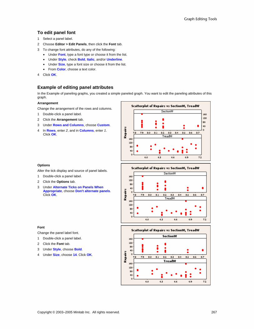
Graph Editing Tools
Copyright © 2003–2005 Minitab Inc. All rights reserved. 267
To edit panel font 1 Select a panel label. 2 Choose Editor > Edit Panels, then click the Font tab. 3 To change font attributes, do any of the following:
• Under Font, type a font type or choose it from the list. • Under Style, check Bold, Italic, and/or Underline. • Under Size, type a font size or choose it from the list. • From Color, choose a text color.
4 Click OK.
Example of editing panel attributes In the Example of paneling graphs, you created a simple paneled graph. You want to edit the paneling attributes of this graph.
Arrangement Change the arrangement of the rows and columns. 1 Double-click a panel label. 2 Click the Arrangement tab. 3 Under Rows and Columns, choose Custom. 4 In Rows, enter 2, and in Columns, enter 1.
Click OK.
Options Alter the tick display and source of panel labels. 1 Double-click a panel label. 2 Click the Options tab. 3 Under Alternate Ticks on Panels When
Appropriate, choose Don't alternate panels. Click OK.
Font Change the panel label font. 1 Double-click a panel label. 2 Click the Font tab. 3 Under Style, choose Bold. 4 Under Size, choose 14. Click OK.
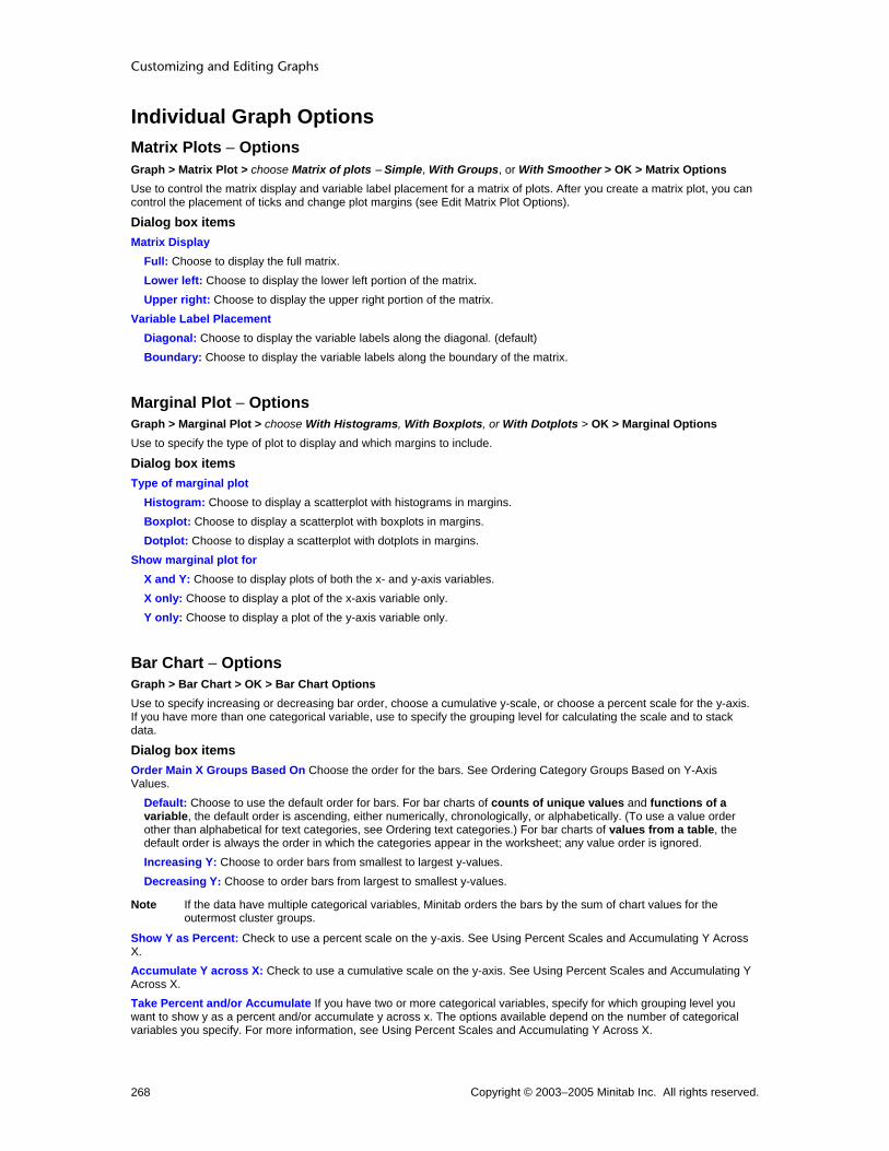
Customizing and Editing Graphs
Copyright © 2003–2005 Minitab Inc. All rights reserved. 268
Individual Graph Options Matrix Plots − Options Graph > Matrix Plot > choose Matrix of plots − Simple, With Groups, or With Smoother > OK > Matrix Options Use to control the matrix display and variable label placement for a matrix of plots. After you create a matrix plot, you can control the placement of ticks and change plot margins (see Edit Matrix Plot Options).
Dialog box items Matrix Display
Full: Choose to display the full matrix. Lower left: Choose to display the lower left portion of the matrix. Upper right: Choose to display the upper right portion of the matrix.
Variable Label Placement Diagonal: Choose to display the variable labels along the diagonal. (default) Boundary: Choose to display the variable labels along the boundary of the matrix.
Marginal Plot − Options Graph > Marginal Plot > choose With Histograms, With Boxplots, or With Dotplots > OK > Marginal Options Use to specify the type of plot to display and which margins to include.
Dialog box items Type of marginal plot
Histogram: Choose to display a scatterplot with histograms in margins. Boxplot: Choose to display a scatterplot with boxplots in margins. Dotplot: Choose to display a scatterplot with dotplots in margins.
Show marginal plot for X and Y: Choose to display plots of both the x- and y-axis variables. X only: Choose to display a plot of the x-axis variable only. Y only: Choose to display a plot of the y-axis variable only.
Bar Chart − Options Graph > Bar Chart > OK > Bar Chart Options Use to specify increasing or decreasing bar order, choose a cumulative y-scale, or choose a percent scale for the y-axis. If you have more than one categorical variable, use to specify the grouping level for calculating the scale and to stack data.
Dialog box items Order Main X Groups Based On Choose the order for the bars. See Ordering Category Groups Based on Y-Axis Values.
Default: Choose to use the default order for bars. For bar charts of counts of unique values and functions of a variable, the default order is ascending, either numerically, chronologically, or alphabetically. (To use a value order other than alphabetical for text categories, see Ordering text categories.) For bar charts of values from a table, the default order is always the order in which the categories appear in the worksheet; any value order is ignored. Increasing Y: Choose to order bars from smallest to largest y-values. Decreasing Y: Choose to order bars from largest to smallest y-values.
Note If the data have multiple categorical variables, Minitab orders the bars by the sum of chart values for the outermost cluster groups.
Show Y as Percent: Check to use a percent scale on the y-axis. See Using Percent Scales and Accumulating Y Across X. Accumulate Y across X: Check to use a cumulative scale on the y-axis. See Using Percent Scales and Accumulating Y Across X. Take Percent and/or Accumulate If you have two or more categorical variables, specify for which grouping level you want to show y as a percent and/or accumulate y across x. The options available depend on the number of categorical variables you specify. For more information, see Using Percent Scales and Accumulating Y Across X.

Graph Editing Tools
Copyright © 2003–2005 Minitab Inc. All rights reserved. 269
Across all categories: Choose to apply a percent scale and/or cumulative scale across all categories. Within categories at level 1 (outermost): Choose to apply a percent scale and/or cumulative scale within categories at the outermost scale level only. Within categories at level 2: Choose to apply a percent scale and/or cumulative scale within categories at the second scale level from the bottom only. Within categories at level 3: Choose to apply a percent scale and/or cumulative scale within categories at the third scale level from the bottom only.
Stack values for last categorical variable: Check to stack the categories for the last categorical variable. Each category is represented by a separate segment of a bar. (Only available when editing a bar chart with two or more categorical variables.)
Pie Chart − Options Graph > Pie Chart > Pie Chart Options Use to specify the slice order, slice starting angle, and the minimum category size for separate slices. After creating a pie chart, you can also:
• Change the slice order, start angle, and pie diameter (see Edit Pie - Options).
• Explode slices (see Edit Pie - Explode).
• Change the slice attributes (see Edit Pie - Attributes).
Dialog box items Order slices by
Default: Choose to accept the default slice order. For raw data, the slice order is increasing value for numeric and date/time data; or alphabetical for text data. (To use a value order other than alphabetical for text categories, see Ordering text categories.) For summarized data, the default slice order is always the order in which the categories appear in the worksheet; any value order is ignored. Increasing volume: Choose to order slices from smallest to largest. Decreasing volume: Choose to order slices from largest to smallest.
Start angle: Type the starting angle in degrees for the slices. By default, slices start at 90° (12 o'clock) and go clockwise. Combine slices of this percent or less: Type a minimum percentage for separate slices. Categories less than this percentage are grouped into a slice named Other, which is always placed last.
Contour Plot − Contour Options Graph > Contour Plot > Contour Options Use to control the number and placement of contour levels, as well as the resolution of the mesh. Minitab establishes a series of regular x- and y-values, called a mesh, then estimates where the different contour levels will cross each rectangle of the mesh.
5 by 5 mesh 15 by 15 mesh
Note Gridlines were added for reference, but do not necessarily indicate the exact layout of the mesh used to plot the contours.
By default, if your data form a regular x-y mesh, Minitab uses this mesh to estimate the contours. Otherwise, Minitab interpolates values for a regular 15 by 15 mesh. Alternatively, you can specify the number of x- and y-values to include:
• For higher resolution, use more values.
• For lower resolution, use fewer values.

Customizing and Editing Graphs
Copyright © 2003–2005 Minitab Inc. All rights reserved. 270
Note Using a mesh with more and smaller intervals than exist between data points may appear to add more resolution to the image, but the added detail may not be meaningful.
Dialog box items Contour Levels
Automatic: Choose to accept the default number of contour levels. Number: Choose to specify the number of contour levels, then enter a number between 2 and 11. Values: Choose to specify the z-values to plot as contours, then enter from 2 to 11 values.
Mesh for Interpolating Surface Automatic: Choose to accept the default mesh. Custom: Choose to customize the mesh.
X-Mesh Number: Enter the number of x-values to include in the mesh. Y-Mesh Number: Enter the number of y-values to include in the mesh.
Boundary z-value: Enter a z-value to be used at the boundaries (corners and edges) of the plot if your data do not form a regular mesh. By default, Minitab uses the minimum z-value. (If your data follow a regular mesh, this value is ignored.)
Area Graph − Options Graph > Area Graph > Area Options Use to switch stacking order between column order and variation order.
Dialog box items Variable Order
Column order (first on top): Choose to stack the variables in the order they are entered in the dialog box, with the first variable you enter on top of the stack. Variation order (largest on top): Choose to stack the variables by the degree of variation, with the variable demonstrating the largest variation on top of the stack.
3D Surface Plot − Surface Options Graph > 3D Surface Plot > choose Surface or Wireframe > OK > Surface Options Use to customize the grid of regular x- and y-values (mesh) that Minitab uses to calculate the surface.
3 by 3 mesh 4 by 5 mesh
By default, if your data form a regular x-y mesh, Minitab uses this mesh and creates the plot based on the actual z-values. Otherwise, Minitab interpolates values for a regular 15 by 15 mesh. Alternatively, you can specify the number of x- and y-values to include:
• For higher resolution, use more values.
• For lower resolution, use fewer values.
Note Using a mesh with more and smaller intervals than exist between data points may appear to add more resolution to the image, but the added detail may not be meaningful.
Dialog box items Mesh for Interpolating Surface
Automatic: Choose to accept the default mesh.

Graph Editing Tools
Copyright © 2003–2005 Minitab Inc. All rights reserved. 271
Custom: Choose to customize the mesh. X-Mesh Number: Enter the number of x-values to include in the mesh. Y-Mesh Number: Enter the number of y-values to include in the mesh.
Boundary z-value: Enter a z-value to be used at the boundaries (corners and edges) of the plot if your data do not form a regular mesh. By default, Minitab uses the minimum z-value. (If your data follow a regular mesh, this value is ignored.)
Layout Tool Layout Tool Editor > Layout Tool Use to place multiple graphs of the same or different types on the same page. If worksheet data changes after you create a layout, you cannot update the layout to reflect the changes. After you create a layout, you can:
• Edit the individual graphs (see Example of adding annotation to a multigraph layout)
Dialog box items Rows: Enter the number of rows for the layout. Columns: Enter the number of columns for the layout.
: Click to add or move highlighted graph from the list box to the highlighted cell of the layout.
: Click to move highlighted graph from the layout to the list box.
Tip After you have created a layout, use the <Tab> key to cycle through and select each figure region and the graph region.
To create a layout 1 Create multiple graphs to include in the layout.
2 Choose Editor > Layout Tool. 3 In Rows, enter the number of rows for the layout. 4 In Columns, enter the number of columns for the layout. 5 To add graphs to the layout, click the cell where you want to place a graph and do one of the following:
• In the list box, double-click a graph name.
• In the list box, click a graph name and then click . • Double-click the image of the selected item below the list box.
Note You can click and drag the graphs to change their placement in the layout.
6 Click Finish.
Example of a two-graph layout Suppose you want to create a bar chart and time series plot for a presentation. You want both graphs to appear on the same page, so you create the graphs and then use the layout tool.
Step 1: Create the graphs 1 Open the worksheet NEWMARKET.MTW. 2 Choose Graph > Time Series Plot. 3 Choose Simple and then click OK. 4 In Series, enter SalesB. Click OK. 5 Choose Graph > Bar Chart. 6 Under Bars represent, choose Values from a table. 7 Under One column of values, choose Cluster and click OK. 8 In Graph Variables, enter SalesB. 9 In Categorical variable, enter Year. Click OK.

Customizing and Editing Graphs
Copyright © 2003–2005 Minitab Inc. All rights reserved. 272
Step 2: Create the layout 1 Choose Editor > Layout Tool. 2 In Rows, enter 2. 3 In Columns, enter 1. 4 In the list box, double-click Time Series Plot of Sales. (Chart of Sales already appears in the layout.) 5 Click Finish.
Graph window output
Copy Command Language Creating Duplicate Graphs To replicate a selected graph or control chart, use either:
Editor > Copy Command Language − Copies the commands to the clipboard for use in a macro or in the Command Line Editor.
Editor > Duplicate − Creates an identical copy.
Editor > Make Similar Graph − Replaces the data in the graph; other graph characteristics are unchanged. You might want to create duplicate graphs if you: Need to create several similarly annotated graphs. Want to keep the original copy of a graph while updating or editing a duplicate. Want to examine command language to create a macro.
To copy graph command language 1 Create the original graph. 2 Choose Editor > Copy Command Language. 3 The session commands used to create the graph are now copied to the clipboard. You can use the command
language to create duplicate graphs in any of the following ways: Choose Edit > Command Line Editor and paste from the clipboard. Activate the Session window and, with command language enabled, paste from the clipboard. Paste the commands into a word processing application and edit the commands to create a macro.
Example of using command language to duplicate a graph Suppose you create a graph, then recreate it to add a grouping variable.

Graph Editing Tools
Copyright © 2003–2005 Minitab Inc. All rights reserved. 273
Step 1: Create the initial graph 1 Open the worksheet BATTERIES.MTW. 2 Choose Graph > Scatterplot. 3 Click Simple, then click OK. 4 Under Y, enter FlashRecov. Under X, enter VoltsAfter. 5 Click Scale, then click the Reference Lines tab. 6 In Show references lines for Y positions, type 5.25. Click OK in each dialog box. 7 Choose Editor > Copy Command Language.
Note If you copy additional information to the clipboard after step 7, you cannot perform the second part of this example. An alternative is to save the command language as a macro. For more information, see 'Macro Terms and Overview' in Macro Help.
Graph window output
Step 2: Recreate the graph with alterations 1 Choose Edit > Command Line Editor. 2 Delete any text in the Data window and press [Control]+[V]. 3 Edit the text to match the following:
Plot 'FlashRecov'*'VoltsAfter';
Reference 2 5.25;
Symbol 'Formulation'.
4 Click Submit Commands.
Customizing and Editing Graphs
Copyright © 2003–2005 Minitab Inc. All rights reserved. 274
Graph window output
Duplicate Graph Creating Duplicate Graphs To replicate a selected graph or control chart, use either:
Editor > Copy Command Language − Copies the commands to the clipboard for use in a macro or in the Command Line Editor.
Editor > Duplicate − Creates an identical copy.
Editor > Make Similar Graph − Replaces the data in the graph; other graph characteristics are unchanged. You might want to create duplicate graphs if you: Need to create several similarly annotated graphs. Want to keep the original copy of a graph while updating or editing a duplicate. Want to examine command language to create a macro.
To duplicate a graph 1 Create the graph to be duplicated. 2 Choose Editor > Duplicate Graph.
Example of creating a duplicate graph You have just created a graph and want to edit its appearance for a presentation. You decide to create and edit a duplicate of the graph so that you can continuously compare its attributes with those of the original. 1 Open the worksheet TIREWEAR.MTW. 2 Choose Graph > Scatterplot. 3 Choose Simple and click OK. 4 Under Y, enter Freq. Under X, enter Start. 5 Click Data View, then click the Data Display tab. 6 Under Data Display, check Symbol and Project lines. Click OK in each dialog box. 7 Choose Editor > Duplicate Graph.

Graph Editing Tools
Copyright © 2003–2005 Minitab Inc. All rights reserved. 275
Graph window output
Make Similar Graph Make Similar Graph You can replace any of the variables used to create a graph without changing any of its other characteristics.
Dialog box items Role: Describes the manner in which each variable was used to create the graph. Original Variable: Identifies the variable used originally in the given role. New Variable: Enter a variable to replace the one used originally in the given role.
To make a similar graph 1 Open the original graph. 2 Choose Editor > Make Similar Graph. 3 Under New Variable, enter the columns that will replace the originals in the new graph. Click OK.
Example of duplicating a graph with different variables You have created a scatterplot using pulse rates recorded prior to implementing a workout regimen. You later decide to create another graph that uses pulse rates taken after implementation. You want all attributes to be identical to the original for ease of comparison.
Step 1: Create the graph 1 Open the worksheet PULSE.MTW. 2 Choose Graph > Scatterplot. 3 Choose With Regression and click OK. 4 Under Y, enter Pulse1. Under X, enter Weight. Click OK.

Customizing and Editing Graphs
Copyright © 2003–2005 Minitab Inc. All rights reserved. 276
Graph window output
Step 2: Duplicate the graph with new data 1 Choose Editor > Make Similar Graph. 2 In row 1 under New Variable, enter Pulse2. Click OK.
Graph window output
Graph Annotation Duplicate Annotation Editor > Annotation > Duplicate Annotation Duplicating is copying and pasting in one step. You can only duplicate annotation items within a Graph window. Duplicated items are placed 20 pixels down and 20 pixels to the right of the current item. In the graph below, an arrow was created using graph annotation tools.

Graph Editing Tools
Copyright © 2003–2005 Minitab Inc. All rights reserved. 277
Rather than recreate the arrow manually for three other points, use the Duplicate Annotation function, then rotate and move the arrows into place.
To duplicate annotation
1 Using , the selection tool, select the annotation you want to duplicate. 2 Choose Editor > Annotation > Duplicate Annotation.
Bring to Front Editor > Annotation > Bring to Front Places the selected annotation object in a graph in front of all other overlapping annotation objects. Annotation objects that use this command are: data labels; titles, footnotes, axis labels, tick and reference labels; markers, lines, polygons, or text created by subcommands to a graph or a layout.

Customizing and Editing Graphs
Copyright © 2003–2005 Minitab Inc. All rights reserved. 278
To bring to front
1 Using , the selection tool, select the object you want to affect. 2 Choose Editor > Annotation > Bring to Front.
Send to Back Editor > Annotation > Send to Back Places the selected annotation object in a graph behind all other overlapping annotation objects. Annotation objects that use this command are: data labels; titles, footnotes, axis labels, tick and reference labels; markers, lines, polygons, or text created by subcommands to a graph or a layout.
To send to back
1 Using , the selection tool, select the object you want to affect. 2 Choose Editor > Annotation > Send to Back.
Example of Bring to Front / Send to Back You can see the effect of these commands on a selected object in the following illustrations:
Before After choosing Editor > Annotation > Send to Back
On the left, the rectangle obscures the text string. On the right, the text is in front. Choose Editor > Annotation > Bring to Front to restore the polygon to the way it was at left.
Tip If you cannot select an object because another is in front, select the object in front, send it to the back, then select the first object. You can also choose the item from the list of selectable items on the graph tools toolbar.
Rotate Left Editor > Annotation > Rotate Left Rotates selected annotation objects counterclockwise. Objects rotate around their individual centers, not the center of the selection.
Note With 3D graphs, you cannot rotate text.
To rotate left
1 Using , the selection tool, select the objects you want to affect. 2 Choose Editor >Annotation > Rotate Left, and choose the angle you want from the submenu: 15, 30, 45, 60, or 90
degrees.
If you want to specify an angle not on the menu, choose Other, enter a value, and click OK. See Rotate − Other.
Rotate Right Editor > Annotation > Rotate Right Rotates selected annotation objects clockwise. Objects rotate around their individual centers, not the center of the selection.
Note With 3D graphs, you cannot rotate text.

Graph Editing Tools
Copyright © 2003–2005 Minitab Inc. All rights reserved. 279
To rotate right
1 Using , the selection tool, select the objects you want to affect. 2 Choose Editor > Annotation > Rotate Right, and choose the angle you want from the submenu: 15, 30, 45, 60, or
90 degrees.
If you want to specify an angle not on the menu, choose Other, enter a value, and click OK. See Rotate − Other
Rotate − Other Editor > Annotation > Rotate Left > Other Editor > Annotation > Rotate Right > Other
Dialog box items Angle: Enter a value between 0 and 360.
Note With 3D graphs, you cannot rotate text.
Examples of rotating Here are examples of ways to rotate an object:
Initial position Rotated left 60°
Rotated right 60° Rotated left 36° (Other)
Update Graphs Updating Graphs Editor > Update > Update Graph Now Editor > Update > Update Graph Automatically Window > Update All Graphs Now To update graphs when the data change, use either:
• Update Graph Now − Updates an individual graph for current data changes
• Update Graph Automatically − Updates the selected graph and all other graphs created with the same dialog or command whenever the worksheet changes

Customizing and Editing Graphs
Copyright © 2003–2005 Minitab Inc. All rights reserved. 280
• Update All Graphs Now − Updates all open graphs for current data changes Graph updating is available for all graphs in the Graph menu (except Stem-and-Leaf) and all control charts. You cannot update a layout. When you change a worksheet's data and choose an updating option, Minitab updates open graphs, but not the stored results. To update stored results, rerun the analysis. Each graph displays an icon indicating its update status. To make a similar graph but not change the current graph, see Creating duplicate graphs.
Note Minitab only updates open graphs when automatic updating is activated. To update a saved graph or a graph created from a macro, you must resave the graph or rerun the macro. Multiple graphs created from the same command are considered a unit when using automatic updates. If one graph is deleted, the other graphs will no long be updated automatically.
Note Any default text items (titles, tick labels, etc.) you may have edited will not be updated to reflect the updated graph.
Update Status of a Graph Each graph has an icon on the graph-window title bar indicating its update status.
Icon color Indicates the graph is... Because... Green Current You manually updated the graph, have
specified Minitab to automatically update, or haven't changed the graph data.
Yellow Not current; but data have changed
Minitab is waiting for you to manually update the graph (see To manually update graphs).
Red On hold (only available when graph is set to update automatically)
You are changing the data and some condition exists that prevents the update; you may have unequal column lengths or unacceptable data values. Minitab waits until the condition is resolved.
White Not current, and is Ineligible for updating
It is part of a layout, not a core graph, or cannot otherwise be updated.
To continuously update graphs 1 Right-click the green square icon in the upper left corner of the graph. 2 Choose Automatic Updates.
Note To set a global preference to continuously update all your graphs, choose Tools > Options > Graphics > Other Options, and check On creation, set graph to update automatically when data change.
To manually update graphs To update the active graph : 1 Choose Editor > Update > Update Graph Now.
To update all open graphs : 1 Choose Window > Update All Graphs Now.
Example of updating graphs Suppose you created a pie chart displaying the distribution of the most common causes of air loss in tires. After creating the graph, you find more data that should have been included. This example assumes you have created the pie chart found in Example of a pie chart.
Step 1: Update the worksheet 1 In the column Counts, change the value in row 1 to 500. In row 6, change the value to 324. 2 Click outside the cell or click [Enter].
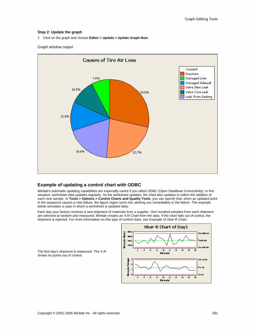
Graph Editing Tools
Copyright © 2003–2005 Minitab Inc. All rights reserved. 281
Step 2: Update the graph 1 Click on the graph and choose Editor > Update > Update Graph Now.
Graph window output
Example of updating a control chart with ODBC Minitab's automatic updating capabilities are especially useful if you utilize ODBC (Open DataBase Connectivity). In this situation, worksheet data updates regularly. As the worksheet updates, the chart also updates to reflect the addition of each new sample. In Tools > Options > Control Charts and Quality Tools, you can specify that, when an updated point in the sequence causes a new failure, the figure region turns red, alerting you immediately to the failure. The example below simulates a case in which a worksheet is updated daily. Each day your factory receives a new shipment of materials from a supplier. One hundred samples from each shipment are selected at random and measured. Minitab creates an X-R Chart from the data. If the chart falls out of control, the shipment is rejected. For more information on this type of control chart, see Example of Xbar-R Chart.
The first day's shipment is measured. The X-R shows no points out of control.

Customizing and Editing Graphs
Copyright © 2003–2005 Minitab Inc. All rights reserved. 282
Because the chart will be updated regularly, it is appropriate to set the chart to update automatically. Choose Editor > Update > Update Graph Automatically. The following day, the worksheet data reflect the new shipment and the chart in turn updates. The chart shows no points out of control.
The third day, as the worksheet and chart are updated, the chart becomes out of control and the figure region turns red. You reject the day's shipment.
Zoom Zoom Editor > Zoom Use to zoom in or out on the active graph.
Note The zoom function does not increase the true graph size; it only simulates a closer or more distant view of the active graph. If you copy or print the graph, it will reflect the graph size setting. To change the default size of the graph, see Options − Graph Size.
Dialog box items Zoom to
200%: Choose to view the graph at 200% its default size. 150%: Choose to view the graph at 150% its default size. 100%: Choose to view the graph at 100% its default size. 75%: Choose to view the graph at 75% its default size. 50%: Choose to view the graph at 50% its default size. Fit window: Choose to view the graph at a size that fits the graph window. Specify: Choose to enter a custom size (as a percentage of the original).
Graph Toolbars Graph Editing Toolbar Graph Editing Toolbar Tools > Toolbars > Graph Editing By default, this toolbar only appears when the graph window is active. To hide this toolbar, choose Tools > Toolbars > Graph Tools.

Graph Editing Tools
Copyright © 2003–2005 Minitab Inc. All rights reserved. 283
Toolbar item Use to...
Select a graph item for editing.
Bring up editing dialogs for the selected item.
Put the active graph in select mode.
Put the active graph in brush mode.
Put the active graph in crosshairs mode.
Put the active DOE contour plot in plant flag mode.
Select a graph item to add. Depending on the item, Minitab may prompt you for more information.
Delete the selected item.
Make the graph appear larger or smaller with the zoom option.
Edit Edit Editor > Edit This menu item appears only when a Graph window is active. An editing dialog box appropriate for the selected item appears. To produce this dialog box you can: Double-click the graph item. Choose the graph item, right-click, and select Edit. Choose the graph item and choose Editor > Edit.
Choose the graph item from the drop-down menu on the graph editing toolbar and click .
Select Selecting Groups and Single Items You can select all points on a graph, a single group, or a single point. This method can also be used to select other graph objects:
• Other data representations such as boxes on boxplots or bars on bar charts
• Data labels and slice labels (all or one)
• Text in legends and output tables (entire legend/table or one line)
• Percentile line labels (all or one)
Note Available editing options may depend on whether you have selected a group or a single item.
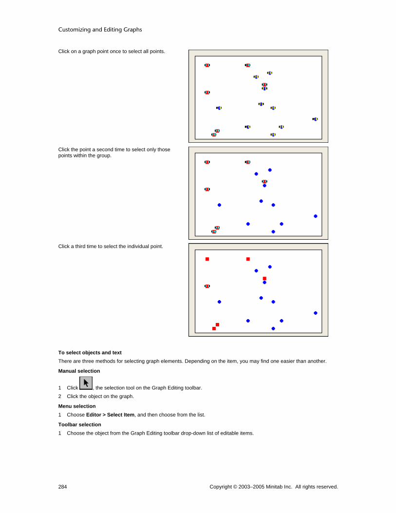
Customizing and Editing Graphs
Copyright © 2003–2005 Minitab Inc. All rights reserved. 284
Click on a graph point once to select all points.
Click the point a second time to select only those points within the group.
Click a third time to select the individual point.
To select objects and text There are three methods for selecting graph elements. Depending on the item, you may find one easier than another.
Manual selection
1 Click , the selection tool on the Graph Editing toolbar. 2 Click the object on the graph.
Menu selection 1 Choose Editor > Select Item, and then choose from the list.
Toolbar selection 1 Choose the object from the Graph Editing toolbar drop-down list of editable items.

Graph Editing Tools
Copyright © 2003–2005 Minitab Inc. All rights reserved. 285
Selected objects have handles:
When you select symbols, they display two handles. See Selecting groups and single items.
Text strings have handles at vertices (corners) and at line midpoints of a rectangle that surrounds them. See Selecting groups and single items.
Unrotated rectangles, squares, ellipses, and circles have handles at vertices (corners) and at line midpoints. For circles and ellipses, the vertices and endpoints are located on a rectangle that surrounds the object.
Selected polygons have handles at each vertex.
Tip If you cannot select an object, it may be because a second object is in front of it. Select the object in front, choose Editor > Send to Back, then select the first object. See Bring to Front and Send to Back.
Brush Brushing Overview Graphs allow you to visualize the relationships between points. After you make a graph, you often want to learn more about a point or a group of points. Brushing allows you to do this. Initially you may find brushing useful to:
• Show the characteristics of outliers
• Tell whether points that lie in a brushing region share other characteristics You may come away with a much greater understanding of the data after brushing, but you may also spot critical areas in a process that need immediate attention. See Brushing Features, Description, and Summary for more information. You may find it useful to recreate your graph without the brushed points or, conversely, with only the brushed points. See Example of subsetting based on brushed points.
Brushing Item Example
Brushing Tool
A special cursor that creates a brushing region.
Brushing Region
Bound by a dotted line, all points that fall within this region are considered brushed.

Customizing and Editing Graphs
Copyright © 2003–2005 Minitab Inc. All rights reserved. 286
Brushing Palette
A floating window that shows the Data window row number for each brushed point as well as up to ten other column values for that row.
Brushing Markers
Symbols in the Data window next to the row numbers indicate which rows are currently brushed. These markers are removed if the data are changed.
Brushing Features Description and Summary
To... Do this...
Enter brushing mode Choose Editor > Brush.
Brush points (form a new brushing region)
1 Move the mouse until the brushing tool appears. 2 Drag the cursor to enclose the new brushing region.
Add identifier (ID) variables to the brushing palette
1 Choose Editor > Set ID Variables. 2 In Variables, enter the columns you want to use as identifiers. 3 Choose Use as default for all graphs or Use for this graph only.
Move an existing brushing region 1 Place the cursor in the brushing region.
2 When appears, drag the brushing region to a different position.
Add additional points to the brushing palette
Do one of the following:
• To add points individually, [Shift]+click them.
• To add points that the brushing region passes over, while keeping the original brushed points, press [Shift] as you drag the brushing region.
Brush a single point Click the point.
Brush across Graph windows Brush points in one graph; the points derived from the same row are highlighted automatically in other graphs.
Select a graph point from the brushing palette
Click the row in the brushing palette.
Highlight many graph points from the brushing palette
Do one of the following:
• Drag the cursor over the rows you want to highlight.
• [Shift]+click to highlight contiguous rows.
• [Ctrl]+click to add a noncontiguous row to the current selection.
Display/hide row numbers on the brushing palette
1 Choose Editor > Set ID Variables. 2 Enter a column to serve as an ID variable. 3 Check or uncheck Include row numbers.
Move the brushing palette Drag the palette by the title bar.
Resize the brushing palette vertically Drag the lower-right corner of the brushing palette as desired.

Graph Editing Tools
Copyright © 2003–2005 Minitab Inc. All rights reserved. 287
Subset based on brushed data 1 Brush the data. 2 In the data source dialog, choose Data Options. 3 Click the Subset tab. 4 Choose the appropriate options to include or exclude the brushed points.
Display/hide the brushing palette Choose Editor > Show/Hide the Brushing Palette.
Brush Editor > Brush Available only when a Graph window is active. Choosing Editor > Brush puts the graph in brushing mode. Changing worksheet data pertinent to the graph and choosing any of the Editor > Update options takes the graph out of brushing mode. You cannot brush graphs in which:
• Data are not represented with symbols
• A symbol represents a single value in the worksheet
• Points are based on a calculation involving more than one row, as in histograms, bar charts, boxplots, or pie charts
• Worksheet data have changed and the graph has not been updated. Conversely, a brushing region is removed if worksheet data change.
When you brush points in one graph, Minitab automatically brushes points from the same row that appear in other graphs. This is true whether the graphs appear in the same Graph window or in other Graph windows. Brushing across graphs can help you quickly see visual relationships across many variables.
Example of exploring data with brushing Suppose you want to look at the effects of several variables on blood pressure. After making three scatterplots, you brush points of interest to examine them in the context of each graph and set ID variables to learn more about these points.
Step 1: Create the Graphs 1 Open the worksheet PERU.MTW. 2 Choose Graph > Scatterplot > Simple > OK. 3 In the first row of Y variables, enter Pulse; in X variables, enter Years. 4 In the second row of Y variables, enter Systol; in X variables, enter Diastol. Click OK. 5 Choose Graph > Scatterplot > With Regression > OK. 6 In Y variables, enter Pulse; in X variables, enter Height. Click OK.
Step 2: Brush the outliers In the first graph, two points are much higher on the Years scale than the rest. You want to see whether these two points are outliers in different graphs. 1 Choose Editor > Brush. 2 Drag the cursor to create a brushing region around those two points.

Customizing and Editing Graphs
Copyright © 2003–2005 Minitab Inc. All rights reserved. 288
The brushing palette shows that rows 38 and 39 are associated with those points. Look at rows 38 and 39 in the Data window to see the values of other variables for these individuals.
Points in the other graphs that have the same row number are also brushed, allowing you to compare different characteristics visually. In the second graph, you see that neither of the brushed points appear to be outliers.
Step 3: Set ID variables In the first two graphs, two points are much higher on the Years scale than the rest. You want to get more information on these two points. 1 Choose Editor > Set ID Variables. 2 Enter Age, Weight, Height, and Systol. Click OK.

Graph Editing Tools
Copyright © 2003–2005 Minitab Inc. All rights reserved. 289
With the added ID variables in the brushing window you can see information related to the brushed points not otherwise expressed in the graph. In the third graph,the brushed point near the regression line shows a subject with a height and weight that are very close to the general relationship between height and weight. Another subject (the second brushed point) is quite overweight which may contribute to his high pulse rate. Further exploration may reveal more about the cause of this subject's high pulse rate.
To start brushing 1 Make the graph window active. 2 Choose Editor > Brush.
3 Drag the cursor over the points in the graph.
Show/Hide Brushing Palette Editor > Show/Hide Brushing Palette Displays or hides the brushing palette when an active Graph window is in Graph Brushing mode. You can enter the brushing mode when a Graph window is active by choosing Editor > Brush.
Set Brushing Color Tools > Options > Graphics > Data View > Symbol When points are highlighted in the brushing region, they use the brushing color. The brushing color is kept from session to session and can only be changed as a default preference. See Options - Symbol Data View.
Note The original brushing color is dissimilar to the default colors used in representing different grouping variables. If you choose a new brushing color, be sure that it is easily distinguished from others in the graph.
Create Indicator Variable Editor > Create Indicator Variable Use to create a column in the Data window called an indicator variable that identifies brushed rows with a column of data. If a row is currently brushed, the cell in that row of the indicator variable column has a value of 1. If a row is not
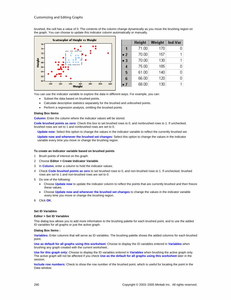
Customizing and Editing Graphs
Copyright © 2003–2005 Minitab Inc. All rights reserved. 290
brushed, the cell has a value of 0. The contents of the column change dynamically as you move the brushing region on the graph. You can choose to update this indicator column automatically or manually.
You can use the indicator variable to explore the data in different ways. For example, you can: • Subset the data based on brushed points. • Calculate descriptive statistics separately for the brushed and unbrushed points. • Perform a regression analysis, omitting the brushed points.
Dialog Box Items Column: Enter the column where the indicator values will be stored. Code brushed points as zero: Check this box to set brushed rows to 0, and nonbrushed rows to 1. If unchecked, brushed rows are set to 1 and nonbrushed rows are set to 0.
Update now: Select this option to change the values in the indicator variable to reflect the currently brushed set. Update now and whenever the brushed set changes: Select this option to change the values in the indicator variable every time you move or change the brushing region.
To create an indicator variable based on brushed points 1 Brush points of interest on the graph. 2 Choose Editor > Create Indicator Variable. 3 In Column, enter a column to hold the indicator values. 4 Check Code brushed points as zero to set brushed rows to 0, and non-brushed rows to 1. If unchecked, brushed
rows are set to 1 and non-brushed rows are set to 0. 5 Do one of the following:
• Choose Update now to update the indicator column to reflect the points that are currently brushed and then freeze these values.
• Choose Update now and whenever the brushed set changes to change the values in the indicator variable every time you move or change the brushing region.
6 Click OK.
Set ID Variables Editor > Set ID Variables This dialog box allows you to add more information to the brushing palette for each brushed point, and to use the added ID variables for all graphs or just the active graph.
Dialog Box Items : Variables: Enter columns that will serve as ID variables. The brushing palette shows the added columns for each brushed point. Use as default for all graphs using this worksheet: Choose to display the ID variables entered in Variables when brushing any graph created with the current worksheet.. Use for this graph only: Choose to display the ID variables entered in Variables when brushing the active graph only. The active graph will not be affected if you check Use as the default for all graphs using this worksheet later in the session. Include row numbers: Check to show the row number of the brushed point, which is useful for locating the point in the Data window.

Graph Editing Tools
Copyright © 2003–2005 Minitab Inc. All rights reserved. 291
Note To change the ID variables for another graph, make the Graph window active and choose Editor > Set ID Variables, then changing the settings.
To add or change ID variables in the brushing palette 1 Choose Editor > Set ID Variables. 2 In Variables, enter the columns that will be represented in the brushing palette. 3 Do one of the following:
• Choose Use as default for all graphs using this worksheet to display the ID variables entered in Variables when brushing any graph created with the current worksheet..
• Choose Use for this graph only to display the ID variables entered in Variables when brushing the active graph only. The active graph will not be affected if you use Use as the default for all graphs using this worksheet later in the session.
4 Check or uncheck Include row numbers to show or hide row numbers in the brushing palette, and click OK.
Crosshairs Crosshairs Editor > Crosshairs Allows you to place crosshairs anywhere on the data region of a graph and shows you the x,y coordinates of that point. Useful in exploring data without gridlines or reference lines, and in placing annotation items.
To use crosshairs 1 Create a graph with a two-variable data region.
2 Choose Editor > Crosshairs, or click in the Graph Editing toolbar. 3 Position the crosshairs on the data region of the graph.
Example of crosshairs Suppose you create a large scatterplot of weight and height data. Creating enough reference lines to identify the coordinates of each point would clutter the graph, so you opt to use crosshairs. 1 Open the worksheet PERU.MTW. 2 Choose Graph > Scatterplot. 3 Choose Simple, then click OK. 4 In Y variables, enter Height; in X variables, enter Weight. Click OK.
5 Choose Editor > Crosshairs, or click on the Graph Editing toolbar. 6 Place the crosshairs over a point of interest. The coordinates of the crosshairs appear in the upper left corner of the
graph.

Customizing and Editing Graphs
Copyright © 2003–2005 Minitab Inc. All rights reserved. 292
Graph window output
Interpreting the results You now know the precise coordinates of the point in question. The crosshairs also help you visualize the number of points above and below the selected point on both axes. After exploring the data in this manner, you may choose to add reference lines.
Plant Flag Planting Flags Editor > Plant Flag Allows you to display the x and y values as well as the exact z value of any point on a factorial, response surface, or mixture contour plot.
To plant flags 1 Create a factorial, response surface, or mixture contour plot. 2 Choose Editor > Plant Flag. 3 Position the crosshairs on the point of interest in the data region. Click and drag the mouse to the location for the flag
label to appear.
Example of planting flags Suppose you have created a response surface contour plot of yield data from a recent soybean crop. You want to know the exact z-values of certain points.
Step 1: Create the graph 1 Open the worksheet CCD_EX1.MTW. 2 Choose Stat > DOE > Response Surface > Contour/Surface (Wireframe) Plots. 3 Check Contour plot and click Setup. 4 Click OK in each dialog box.
Step 2: Plant the flag 1 Choose Editor > Plant Flag. 2 Position the crosshairs on the point of interest in the data region. Click and drag the mouse to the location for the flag
label to appear.

Graph Editing Tools
Copyright © 2003–2005 Minitab Inc. All rights reserved. 293
Graph window output
Edit Planted Flag – Attributes Select flag > Editor > Edit > Attributes Use to control the background fill and border attributes of the flag label.
Dialog box items Fill Pattern
Automatic: Choose to accept the default fill pattern. Custom: Choose change the default fill pattern.
Type: Choose a fill type. Background color: Choose a background color.
Borders and Fill Lines Automatic: Choose to accept the default border and fill lines. Custom: Choose to change the default border and fill lines.
Type: Choose a border line type. Color: Choose a border and fill line color. Size: Choose a border line thickness.
To edit planted flag attributes 1 Double-click the flag. 2 Click the Attributes tab. 3 Under Fill Pattern, choose one of the following:
• Automatic to accept the default fill pattern. • Custom to change the default fill pattern.
− From Type, choose a fill type.
− From Background color, choose a background color.
4 Under Borders and Fill Lines, choose one of the following: • Automatic to accept the default border and fill lines.
Customizing and Editing Graphs
Copyright © 2003–2005 Minitab Inc. All rights reserved. 294
• Custom to change the default border and fill lines.
− From Type, choose a border line type
− From Color, choose a border and fill line color.
− From Size, choose a border line thickness.
5 Click OK.
Edit Planted Flag – Font Select flag > Editor > Edit Flag > Font Specify the font, style, size, and color of flag labels.
Dialog box items Font: Choose a font. Style
Bold: Check to make the text bold. Italic: Check to italicize the text. Underline: Check to underline the text.
Size: Enter a font size. Color: Choose a text color. Preview: Displays sample text with the selected attributes. This box does not accept input.
To edit planted flag font 1 Double-click the flag. 2 Click the Font tab. 3 To change font attributes, do any of the following:
• Under Font, type a font name or choose one from the list. • Under Style, check Bold, Italic, and/or Underline. • Under Size, type a font size or choose one from the list. • Under Color, choose a text color.
4 Click OK.
Example of editing a planted flag Suppose you have planted a flag on a contour plot and decide to change its appearance. This example assumes you have created the contour plot and flag in Example of planting flags. 1 Double-click the flag. 2 Click Attributes. 3 Under Borders and Fill Lines, choose Custom. 4 Under Color, choose . 5 Under Size, choose 2. 6 Click Font. 7 Under Font, choose Times New Roman. 8 Under Size, choose 10. 9 Under Color, choose . Click OK.

Graph Editing Tools
Copyright © 2003–2005 Minitab Inc. All rights reserved. 295
Graph window output
Add Adding Graph Elements Editor > Add You can add graph elements to the active graph. The elements that can be added are determined by the graph. To remove graph items, see Deleting a Graph Element. You can add the following elements:
Scale Labels Data fits Data display Frame
Scale Gridline Reference Lines Percentile Lines Axis Labels
Title Subtitle Footnote Data Labels Slice Labels Default Title Default Subtitle Default Footnote
Distribution Fit Regression Fit Smoother Calculated Line
Scatterplot, Matrix Plot Histogram Boxplot Probability Plot Empirical CDF Interval Plot, Individual Value Plot Bar Chart Time Series Plot Contour Plot 3D Scatterplot 3D Surface Plot
Legend Table
To add a graph element
With the menu bar : 1 Choose Editor > Add. 2 Choose the item you wish to add. 3 Depending on the item, you may be prompted to provide more information. Do so and click OK.
Customizing and Editing Graphs
Copyright © 2003–2005 Minitab Inc. All rights reserved. 296
With the right-click menu : 1 Right-click the graph. 2 Choose Add and select the item you wish to add. 3 Depending on the item, you may be prompted to provide more information. Do so and click OK.
With the graph editing toolbar : 1 Select an item from the drop down list of addable elements. 2 Depending on the item, you may be prompted to provide more information. Do so and click OK.
Data Display
Add Data Display – 3D Scatterplot Editor > Add > Data Display Use to add or remove data display types from the active graph.
Dialog box items Data Display
Symbols: Check to represent each data point with a symbol. Project lines: Check to display lines that project from each data point to its base.
Apply same groups of current displays to added displays: Check to use the same attribute grouping variables for the added displays as are used for the current displays.
Add Data Display – 3D Surface Plot Editor > Add > Data Display Use to add or remove data display types from the active graph.
Dialog box items Data Display
Surface: Check to display a continuous surface of z-values (surface plot) or a grid of z-values (wireframe plot) that is fit to your data. Symbols: Check to represent each data point with a symbol. Project lines: Check to display lines that project from each data point to its base.
Add Data Display – Bar Chart Editor > Add > Data Display Use to add or remove data display types from the active graph.
Dialog box items Data Display
Bars: Check to display bars that join each data value to its base. Symbols: Check to represent each data value with a symbol. Connect line: Check to connect the data values. Project lines: Check to display lines that project from each data point to its base.
Apply attribute assignment variables of current displays to added displays: Check to use the same attribute grouping variables for the added displays as are used for the current displays.
Add Data Display – Boxplot Editor > Add > Data Display Use to add or remove data display types from the active graph.
Dialog box items Data Display
Median confidence interval box: Check to display a confidence interval box, which shows the 95% (default) confidence interval for the median.
Graph Editing Tools
Copyright © 2003–2005 Minitab Inc. All rights reserved. 297
Interquartile range box: Check to display an interquartile range box (default). The box bottom is at the 25th percentile and box top at the 75th percentile. Range box: Check to display a box that extends from the minimum data value to the maximum data value. Outlier symbols: Check to represent each outlier with a symbol. Individual symbols: Check to represent each data point with a symbol. Median symbol: Check to represent each median with a symbol. Median connect line: Check to connect the medians of grouped plots (only visible if you have categorical variables in the boxplot). Mean symbol: Check to represent each mean with a symbol. Mean connect line: Check to connect the means of grouped plots (only visible if you have categorical variables in the boxplot).
Apply attribute assignment variables of current displays to added displays: Check to use the same attribute grouping variables for the added displays as are used for the current displays.
Add Data Display – Contour Plot Editor > Add > Data Display Use to add or remove data display types from the active graph.
Dialog box items Data Display
Area: Check to shade the areas between contours. Contour lines: Check to draw contour lines. Symbols: Check to represent each x-y data point with a symbol.
Add Data Display – Empirical CDF Editor > Add > Data Display Use to add or remove data display types from the active graph.
Dialog box items Data Display
Connect line: Choose to connect the data points. Distribution fit: Choose to fit a distribution to the data.
Add Data Display – Histogram Editor > Add > Data Display Use to add or remove data display types from the active graph.
Dialog box items Data Display
Bars: Check to display bars that join each data value to its base. By default, the height of each bar is equal to the frequency of the interval it represents. Symbols: Check to represent each data value with a symbol. Project lines: Check to display lines that project from each data point to its base. Area: Check to draw a histogram with an outline of the bars (only visible if you uncheck Bars).
Add Data Display – Interval Plot, Individual Value Plot Editor > Add > Data Display Use to add or remove data display types from the active graph.
Dialog box items Data Display
Interval bar: Check to display a confidence interval bar. The default confidence level is 95%. Bar: Check to display bars that join each mean to its base.

Customizing and Editing Graphs
Copyright © 2003–2005 Minitab Inc. All rights reserved. 298
Individual symbols: Check to represent each data point with a symbol. Mean symbol: Check to represent each mean with a symbol. Mean connect line: Check to connect the means of grouped plots (only visible if you have categorical variables in the plot). Median symbol: Check to represent each median with a symbol. Median connect line: Check to connect the medians of grouped plots (only visible if you have categorical variables in the plot).
Apply attribute assignment variables of current displays to added displays: Check to use the same attribute grouping variables for the added displays as are used for the current displays.
Add Data Display – Probability Plot Editor > Add > Data Display Use to add or remove data display types from the active graph.
Dialog box items Data Display
Symbols only: Check to represent each data value with a symbol. Distribution fit: Choose to fit a distribution to the data.
Add Data Display – Scatterplot, Matrix Plot Editor > Add > Data Display Use to add or remove data display types from the active graph.
Dialog box items Data Display
Symbols: Check to represent each data point with a symbol. Connect line: Check to connect the data points. Project lines: Check to display lines that project from each data point to its base. Area: Check to shade the area below the data points to their base.
Apply same groups of current displays to added displays: Check to use the same attribute grouping variables for the added displays as are used for the current displays.
Add Data Display – Time Series Plot Editor > Add > Data Display Use to add or remove data display types from the active graph.
Dialog box items Data Display
Symbols: Check to represent each data point with a symbol. Connect line: Check to connect the data points. Project lines: Check to display lines that project from each data point to its base.
Apply same groups of current displays to added displays: Check to use the same attribute grouping variables for the added displays as are used for the current displays.
To add data display items 1 Choose Editor > Add > Data Display. 2 In Data Display, check the items you wish to add, then click OK.
Graph Editing Tools
Copyright © 2003–2005 Minitab Inc. All rights reserved. 299
Data Fits
Add Distribution Fit Editor > Add > Distribution Fit Use to fit a distribution to your data to help you determine whether the data can be adequately modeled by the selected distribution. After creating a graph, you can change the fitted distribution, add groups, and change the fitted line attributes (see Editing Data Fits Overview).
Dialog box items Distribution: Choose a distribution. Historical parameters: Enter historical estimates of the distribution parameters. Minitab displays the necessary parameters, which depend on the chosen distribution. These parameters may include Mean, Standard Deviation, Location, Shape, Scale, or Threshold. If you do not enter historical estimates, Minitab estimates the parameters from the data. You can enter some historical estimates and have Minitab estimate the other parameters. See Distribution parameters for restrictions.
To add a distribution fit 1 Do one of the following:
• Click on the graph editing toolbar and choose Distribution Fit from the Add List. • Right-click the active graph and choose Add > Distribution Fit. • Choose Editor > Add > Distribution Fit.
2 From Distribution, choose a distribution. 3 In Historical parameters, enter historical estimates of the distribution parameters. Minitab displays the necessary
parameters, which depend on the chosen distribution. These parameters may include Mean, Standard Deviation, Location, Shape, Scale, or Threshold. If you do not enter historical estimates, Minitab estimates the parameters from the data. You can enter some historical estimates and have Minitab estimate the other parameters. See Distribution parameters for restrictions.
4 Click OK.
Add Lowess Smoother Editor > Add > Smoother Use to add a lowess smoother to an active scatterplot, matrix plot, histogram, or time series plot. You can use a lowess smoother to explore the relationship between two variables without fitting a specific model. After creating a graph, you can change the lowess smoothing parameters, add groups, and change the fitted line attributes (see Editing Data Fits Overview).
Dialog box items Lowess Smoothing Parameters
Degree of smoothing: Enter a number between 0 and 1 for the fraction (f) of the total number of points to use to calculate the fitted values at each x-value. The default is 0.5. See Specifying lowess smoothing parameters. Number of steps: Enter a number from 0 to 10 to specify the number of iterations of smoothing to use to limit the influence of outliers. Each step reduces the weight given to outliers in the next iteration. The default is 2. See Specifying lowess smoothing parameters.
Apply same groups of current displays to lowess smoother: Check to use the same grouping variables for the fitted line as are used for all other data displays.
To add a lowess smoother 1 Do one of the following:
• Click on the graph editing toolbar and choose Smoother from the Add List. • Right-click the active graph and choose Add > Smoother. • Choose Editor > Add > Smoother.
2 Under Lowess Smoothing Parameters, if you like, do one or both of the following: • In Degree of smoothing, enter a number between 0 and 1 for the fraction (f) of the total number of points to use
to calculate the fitted values at each x-value. The default is 0.5. See Specifying lowess smoothing parameters. • In Number of steps, enter a number from 0 to 10 to specify the number of iterations of smoothing used to limit the
influence of outliers. Each step reduces the weight given to outliers in the next iteration. The default is 2.
Customizing and Editing Graphs
Copyright © 2003–2005 Minitab Inc. All rights reserved. 300
See Specifying Lowess Smoothing Parameters for details. 3 To use the same grouping variables for the fitted line as is used for all other data displays, check Apply same groups
of current displays to lowess smoother. 4 Click OK.
Add Regression Fit Editor > Add > Regression Fit Use to add a least squares regression line to an active scatterplot or matrix plot. Use the regression fit to examine the relationship between the response variable (y) and the predictor variable (x). If you hover the mouse pointer over the fitted line, Minitab displays the fitted regression equation. After creating a graph, you can change the model order for the regression fit, add groups, or change the fitted line attributes (see Editing Data Fits Overview).
Dialog box items Model Order
Linear: Choose to fit a linear model. Quadratic: Choose to fit a quadratic model. Cubic: Choose to fit a cubic model.
Fit intercept: Check to fit a constant term (the y-intercept of the regression line). Uncheck to fit the model without a constant term. Apply same groups of current displays to regression fit: Check to use the same grouping variables for the fitted line as are used for all other data displays.
To add a regression fit 1 Do one of the following:
• Click on the graph editing toolbar and choose Regression fit from the Add List. • Right-click the active graph and choose Add > Regression Fit. • Choose Editor > Add > Regression Fit.
2 Under Model Order, choose Linear, Quadratic, or Cubic, based on the model you want to fit. 3 Check or uncheck Fit intercept, to include or exclude the intercept (constant) in the model. If you uncheck Fit
intercept, the regression line passes through the origin (x = 0, y = 0) 4 To use the same grouping variables for the fitted line as is used for all other data displays, check Apply same groups
of current displays to regression fit. 5 Click OK.
Labels
Add Title Editor > Add > Title Use to add a title to the active graph. After adding a title, you can change its attributes and alignment (see Editing Labels Overview).
Dialog box item Title: Type a title, which appears below Minitab's default title.
To add a title 1 Choose Editor > Add > Title. (You can also use the graph editing toolbar or the right-click menu.)
• Click on the graph editing toolbar and choose Title from the Add list. • Right-click the active graph and choose Add > Title. • Choose Editor > Add > Title.
2 In Title, type a title, which appears below Minitab's default title. 3 Click OK.

Graph Editing Tools
Copyright © 2003–2005 Minitab Inc. All rights reserved. 301
Add Subtitle Editor > Add > Subtitle Use to add a subtitle to the active graph. After adding a subtitle, you can change its attributes and alignment (see Editing Labels Overview).
Dialog box item Subtitle: Type a subtitle, which appears below any default titles and default subtitles.
To add a subtitle 1 Do one of the following:
• Click on the graph editing toolbar and choose Subtitle from the Add List. • Right-click the active graph and choose Add > Subtitle. • Choose Editor > Add > Subtitle.
2 In Subtitle, type a subtitle, which appears below any default titles and default subtitles. 3 Click OK.
Add Footnote Editor > Add > Footnote Use to add a footnote to the active graph. After adding a footnote, you can change its attributes and alignment (see Editing Labels Overview).
Dialog box item Footnote: Type a footnote, which appears at the bottom left of the graph. Each additional footnote goes below the preceding footnote.
To add a footnote 1 Do one of the following:
• Click on the graph editing toolbar and choose Footnote from the Add List. • Right-click the active graph and choose Add > Footnote. • Choose Editor > Add > Footnote.
2 In Footnote, type a footnote, which appears at the bottom left of the graph. Each additional footnote goes below the preceding footnote.
3 Click OK.
Add Text Use to add text to the active graph.
Dialog box item Text: Enter the text.
To add text
1 In the Graph Annotation Tools toolbar, click . 2 Place the crosshairs at the point on the graph where you want one corner of the text box. 3 Click and drag the crosshairs to the opposite corner of the text box and release the mouse. 4 In Text, type the text. Click OK.
Add Data Labels Editor > Add > Data Labels Use to label each data point on the active graph. After adding data labels, you can change their attributes, alignment, and type (see Editing Labels Overview).

Customizing and Editing Graphs
Copyright © 2003–2005 Minitab Inc. All rights reserved. 302
Dialog box items Label Type
Use y-value labels: Choose to label each point with its y-axis value. Use row numbers: Choose to label each point with its worksheet row number. You cannot label histograms or bar charts with row numbers. Use labels from column: Choose to label points with values stored in a column. Enter a text, numeric, or date/time column that contains the data labels. If graph data match worksheet rows, as for scatterplot, Minitab matches the label column to the data column by worksheet row number. If graph data are summaries of worksheet values, as for histogram and bar chart, the label column order is left-to-right on the graph. If the label column contains more values than are needed, Minitab ignores the extra labels. If the label column contains less values than are needed, the remaining data values are not labeled.
To add data labels 1 Do one of the following:
• Click on the graph editing toolbar and choose Data Labels from the Add List. • Right-click the active graph and choose Add > Data Labels. • Choose Editor > Add > Data Labels.
2 Choose one of the following: • Use y-value labels to label each point with its y-axis value. • Use row numbers to label each point with its worksheet row number. You cannot label histograms or bar charts
with row numbers. • Use labels from column to label points with values stored in a column. Then, enter a text, numeric, or date/time
column that contains the data labels. If graph data match worksheet rows, as for scatterplot, Minitab matches the label column to the data column by worksheet row number. If graph data are summaries of worksheet values, as for histogram and bar chart, the label column order is left-to-right on the graph. If the label column contains more values than are needed, Minitab ignores the extra labels. If the label column contains less values than are needed, the remaining data values are not labeled.
3 Click OK.
Add Data Labels − Boxplot Editor > Add > Data Labels > Outliers, Individual Data, Medians, or Means Use to label outliers, individual data points, medians, or means on the active graph. After adding data labels, you can change their attributes, alignment, and type (see Editing Labels Overview).
Dialog box items Label Type
None: Choose to suppress data labels. Use y-value labels: Choose to label each point with its y-axis value. Use row numbers: Choose to label each point with its worksheet row number. You cannot label medians or means with row numbers. Use labels from column: Choose to label points with values stored in a column. Enter a text, numeric, or date/time column that contains the data labels. For outliers, Minitab assigns labels from worksheet rows representing the outliers. For individual data labels, Minitab matches the label column to the data column by worksheet row number. For median and mean labels, the label column order is left-to-right on the graph. If the label column contains more values than are needed, Minitab ignores the extra labels. If the label column contains less values than are needed, the remaining data values are not labeled.
To add data labels to a boxplot 1 Do one of the following:
• Click on the graph editing toolbar and choose Data Labels from the Add List. • Right-click the active graph and choose Add > Data Labels. • Choose Editor > Add > Data Labels.
2 Click the Outliers, Individual Data, Medians, or Means tab. 3 Choose one of the following:

Graph Editing Tools
Copyright © 2003–2005 Minitab Inc. All rights reserved. 303
• Use y-value labels to label each point with its y-axis value. • Use row numbers to label each point with its worksheet row number. You cannot label medians or means with
row numbers. • Use labels from column to label points with values stored in a column. Then, enter a text, numeric, or date/time
column that contains the data labels. For outliers, Minitab assigns labels from worksheet rows representing the outliers. For individual data labels, Minitab matches the label column to the data column by worksheet row number. For median and mean labels, the label column order is left-to-right on the graph. If the label column contains more values than are needed, Minitab ignores the extra labels. If the label column contains less values than are needed, the remaining data values are not labeled.
4 Click OK.
Add Data Labels − Interval Plot, Individual Value Plot Editor > Add > Data Labels > Individual Data, Interval Endpoints, Means, or Medians Use to label individual data points, interval endpoints, means, or medians on an active interval plot or individual value plot. After adding data labels, you can change their attributes, alignment, and type (see Editing Labels Overview).
Dialog box items Label Type
None: Choose to suppress data labels. Use y-value labels: Choose to label each point with its y-axis value. Use row numbers: Choose to label each point with its worksheet row number. You cannot label interval endpoints, means, or medians with row numbers. Use labels from column: Choose to label points with values stored in a column. Enter a text, numeric, or date/time column that contains the data labels. For individual data labels, Minitab matches the label column to the data column by worksheet row number. For interval endpoint, mean, and median labels, the label column order is left-to-right on the graph. If the label column contains more values than are needed, Minitab ignores the extra labels. If the label column contains less values than are needed, the remaining data values are not labeled.
To add data labels to an interval plot 1 Do one of the following:
• Click on the graph editing toolbar and choose Data Labels from the Add List. • Right-click the active graph and choose Add > Data Labels. • Choose Editor > Add > Data Labels.
2 Click the Individual Data, Interval Endpoints, Means, or Medians tab. 3 Choose one of the following:
• Use y-value labels to label each point with its y-axis value. • Use row numbers to label each point with its worksheet row number. You cannot label interval endpoints, means,
or medians with row numbers. • Use labels from column to label points with values stored in a column. Enter a text, numeric, or date/time
column that contains the data labels. For individual data labels, Minitab matches the label column to the data column by worksheet row number. For interval endpoint, mean, and median labels, the label column order is left-to-right on the graph. If the label column contains more values than are needed, Minitab ignores the extra labels. If the label column contains less values than are needed, the remaining data values are not labeled.
4 Click OK.
Scale
Add Reference Lines Editor > Add > Reference Lines Choose to display reference lines. By default, Minitab displays labels for each reference line drawn. Customize reference lines using scale editing.

Customizing and Editing Graphs
Copyright © 2003–2005 Minitab Inc. All rights reserved. 304
Dialog box items Show reference lines for Z positions: Enter the position for z-scale reference lines to be drawn. Only available with 3D graphs. Show reference lines for Y positions: Enter the position for y-scale reference lines to be drawn. Show reference lines at Y (value scale) positions: Enter the position for value-scale reference lines to be drawn. Only available with categorical graphs. Show reference lines for X positions: Enter the position for x-scale reference lines to be drawn. Show reference lines at X (category scale positions): Enter the position for categorical-scale reference lines to be drawn. Values that do not correspond with a categorical value will not be labeled. Only available with categorical graphs.
To add reference lines 1 Choose Editor > Add > Reference Lines. 2 In Show reference lines for Y positions, enter the y-scale positions where you want to display reference lines. 3 In Show reference lines for X positions, enter the x-scale positions where you want to display reference lines. 4 Click OK.
Add Percentile Lines Editor > Add > Percentile Lines Choose to display percentile lines. By default, Minitab displays labels for each percentile line drawn. Customize a percentile line using scale editing.
Dialog box items Percentile Lines
At Y values: Enter the y-values, either in percent, probability, or score, where you want the line to be drawn. When entering multiple percentiles, leave a space between each entry. At data values: Enter the data value where you want the line to be drawn. When entering multiple values, leave a space between each entry.
To display percentile lines 1 Choose Editor > Add > Percentile Lines. 2 Under Percentile Lines, choose At Y values or At data values and enter the y-values (percentiles, probabilities, or
scores) or data values where you want lines drawn. When entering multiple percentiles, leave a space between each entry.
3 If you like, use any dialog box options, then click OK.
Add gridlines Editor > Add > Gridlines Use to add gridlines to the active graph. Not all items are available with all graphs.
Dialog box item Show gridlines for: Check to add gridlines at the specified locations.
Z major ticks Z minor ticks Y major ticks Y minor ticks X major ticks X minor ticks
Note If the active graph has both primary and secondary scales, this dialog allows you to add gridlines by scale as well as axis.
To add gridlines 1 Choose Editor > Add > Gridlines.

Graph Editing Tools
Copyright © 2003–2005 Minitab Inc. All rights reserved. 305
2 In Show gridlines for, check the items you wish to add, then click OK.
Add Calculated Line Editor > Add > Calculated Line After you create a graph, you can add a line that is produced by the connection of calculated y- and x-coordinates. Do this to see how the experimental points match with a theory based on a function or some other formula.
Dialog box items Coordinates
Y column: Enter the column containing the calculated y-coordinates of theoretical values. X column: Enter the column containing the calculated x-coordinates of theoretical values.
To add a calculated line 1 Choose Editor > Add > Calculated Line. 2 In Y column, enter the column that contains the y-coordinates for the line. 3 In X column, enter the column that contains the x-coordinates for the line. Click OK.
Delete Deleting a Graph Element Use one of the following methods to delete items from your graphs:
• Right-click the graph item and choose Delete.
• Select the item and click on the graph toolbar. • Select the item and press [Delete].
To add graph items, see Adding a Graph Element.
To delete a graph element 1 Select the item you wish to delete. 2 Do one of the following:
Right-click on the graph item and choose Delete.
Click on the graph toolbar. Press [Delete].
Zoom Zoom Editor > Zoom Use to zoom in or out on the active graph.
Note The zoom function does not increase the true graph size; it only simulates a closer or more distant view of the active graph. If you copy or print the graph, it will reflect the graph size setting. To change the default size of the graph, see Options − Graph Size.
Dialog box items Zoom to
200%: Choose to view the graph at 200% its default size. 150%: Choose to view the graph at 150% its default size. 100%: Choose to view the graph at 100% its default size. 75%: Choose to view the graph at 75% its default size. 50%: Choose to view the graph at 50% its default size. Fit window: Choose to view the graph at a size that fits the graph window. Specify: Choose to enter a custom size (as a percentage of the original).

Customizing and Editing Graphs
Copyright © 2003–2005 Minitab Inc. All rights reserved. 306
3D Graph Tools Toolbar 3D Graph Tools Toolbar Tools > Toolbars > 3D Graph Tools Use this toolbar to rotate 3D graphs and 3D surface plot lighting and to resize the data region. By default, this toolbar only appears when a 3D scatterplot, 3D surface plot, or 3D wireframe plot is active. To hide this toolbar, choose Tools > Toolbars > 3D Graph Tools.
Toolbar item Use to...
Rotate the graph clockwise or counterclockwise about the x-axis.
Rotate the graph clockwise or counterclockwise about the y-axis.
Rotate the graph clockwise or counterclockwise about the z-axis.
Rotate all 3D surface plot lighting clockwise or counterclockwise about the x-axis. For additional lighting controls, see Edit Surface − Lights.
Rotate all 3D surface plot lighting clockwise or counterclockwise about the y-axis.
Rotate all 3D surface plot lighting clockwise or counterclockwise about the z-axis.
Increase or decrease the size of the 3D box. (To zoom the graph window in or out, choose Editor > Zoom.)
Return the graph to its original position and zoom.
Return all lights to their original positions. Also returns other surface lighting options, except brightness, to their original settings.
Tip When rotating a graph or graph lighting, click to rotate in small increments; click and hold for continuous rotation.
To rotate a 3D graph 1 Activate the window containing the graph you want to rotate. 2 Click the appropriate axis rotation buttons (circled below) on the 3D Graph Tools toolbar to rotate the graph in small
increments. Click and hold for continuous rotation. (To show or hide this toolbar, choose Tools > Toolbars > 3D
Graph Tools.) To reset the graph to its original position, press .
To rotate 3D surface plot lighting 1 Activate the window containing the 3d surface plot. 2 Click the lighting rotation buttons (circled below) on the 3D Graph Tools toolbar to rotate the lights a few degrees
about the indicated axis. Click and hold to rotate more quickly. (To show or hide this toolbar, choose Tools > Toolbars > 3D Graph Tools.)
While the lights are rotating, their position and color are indicated by large dots, as illustrated below. If the lights are not
visible when rotating, try zooming out by clicking . To reset lights to their original positions, press .

Graph Editing Tools
Copyright © 2003–2005 Minitab Inc. All rights reserved. 307
More To control the number and brightness of the lights, or to control the position and color of individual lights, see Edit Surface − Lights.
Graph Annotation Tools Toolbar Graph Annotation Tools Toolbar Tools > Toolbars > Graph Annotation Tools Use the graph annotation tools to add objects such as lines, rectangles, and text to a graph. By default, this toolbar only appears when the Graph window is active. To hide this toolbar, choose Tools > Toolbars > Graph Annotation Tools.
Toolbar item Use to...
Put the graph in select mode or deselect a selected object.
Add text to a graph.
Draw rectangles and squares on a graph.
Draw ellipses and circles on a graph.
Draw lines on a graph.
Add marker symbols on a graph.
Draw a polyline (a series of connected lines) on a graph.
Draw polygons on a graph.
Example of using lines, text, markers, and rectangles in a graph Suppose you create a graph for a presentation and want to highlight points of interest. This example assumes you have already created the graph found in Example of a simple time series plot.
Step 1: Draw the markers
1 Select the Marker tool, , from the Graph Annotation Tools toolbar. 2 Place the crosshairs at the juncture of 140 on the SalesB scale and 2000 Q4 on the time scale and click the mouse. 3 Repeat the first two steps to place markers at 160, 2001 Q4 and at 200, 2002 Q4.
Step 2: Draw the rectangle
1 Select the Rectangle tool, , from the Graph Annotation Tools toolbar.

Customizing and Editing Graphs
Copyright © 2003–2005 Minitab Inc. All rights reserved. 308
2 Place the crosshairs in the lower right corner of the data region. 3 Click and drag the crosshairs up and to the left to create a small rectangle, then release the mouse. Be sure not to
obscure any of the data points.
Step 3: Insert text
1 Select the Text tool, , from the Graph Annotation Tools toolbar. 2 Place the crosshairs at any corner of the rectangle you just created. 3 Click and drag the crosshairs to the opposite corner to create a text box the same dimensions as the rectangle, then
release the mouse. 4 In Text, enter Expected Fourth Quarter Sales. Click OK.
Step 4: Draw lines from markers to rectangle
1 Select the Line tool, , from the Graph Annotation Tools toolbar. 2 Place the crosshairs at the upper left corner of the rectangle. 3 Click and drag the crosshairs to the first marker and release the mouse. 4 Repeat the last three steps to draw lines from the corner of the rectangle to each of the remaining markers.
Graph window output
Example of editing lines, text, markers, and rectangles in a graph You want to edit the appearance of the annotation items in Example of using lines, text, markers, and rectangles in a graph.
Step 1: Edit the markers 1 Double-click a marker. 2 Choose the Attributes tab. 3 Under Symbols, click Custom.
4 From Type, choose the solid square, . 5 From Color, choose . 6 From Size, enter 2. Click OK. 7 Repeat the first six steps for the other two markers.

Graph Editing Tools
Copyright © 2003–2005 Minitab Inc. All rights reserved. 309
Step 2: Edit the lines 1 Double-click a line. 2 Choose the Attributes tab. 3 Under Lines, choose Custom. 4 From Size, choose 2.
5 Under Arrow Style, in End, choose the thin arrow, . Click OK. 6 Repeat the last five steps for the other two lines.
Step 3: Edit the text and rectangle 1 Double-click the rectangle. 2 Choose the Attributes tab. 3 Under Fill Pattern, choose Custom. 4 From Background color, choose . 5 Under Borders and Fill Lines, choose Custom. 6 From Size, choose 2 and click OK. 7 Double-click the text Expected Fourth Quarter Sales. 8 Choose the Font tab. 9 Under Style, check Bold. Click OK.
Graph window output
Example of using polylines, polygons, ellipses, and text in a graph Suppose you create a graph for a presentation to stockholders in your company and you want to highlight points of interest. Investors are interested in the effect a new CEO has had on sales. This example assumes you have already created the graph found in Example of a simple time series plot.
Step 1: Create a triangle
1 Select the Polygon tool, , from the Graph Annotation Tools toolbar. 2 Place the crosshairs at 100 on the SalesB scale and 2001 Q3 on the time scale and click. 3 Place the crosshairs at 100 on the SalesB scale and 2002 Q4 on the time scale and click. 4 Place the crosshairs at 130 on the SalesB scale and between the time-scale coordinates of the first two points, and
double-click.

Customizing and Editing Graphs
Copyright © 2003–2005 Minitab Inc. All rights reserved. 310
Step 2: Add text to the triangle
1 Select the Text tool, , from the Graph Annotation Tools toolbar. 2 Place the crosshairs at the midpoint of the left side of the triangle. 3 Click and drag the crosshairs down and to the right to create a text box that is contained by the triangle, then release
the mouse. 4 In the Add Text dialog box, enter Sales Under Beverly Dell, and click OK.
Step 3: Create an ellipse
1 Select the Ellipse tool, , from the Graph Annotation Tools toolbar. 2 Place the crosshairs in the upper left corner of the data region. 3 Click and drag the crosshairs to create an ellipse that extends right to 2001 Q2 on the time scale and down to 200 on
the SalesB scale, then release the mouse. Be sure not to obscure any of the data points.
Step 4: Add text to the ellipse
1 Select the Text tool, , from the Graph Annotation Tools toolbar. 2 Place the crosshairs over the upper left of the ellipse. 3 Click and drag the crosshairs down and to the right to create a text box that is circumscribed by the ellipse, then
release the mouse. 4 In the Add Text dialog box, enter Sales Under Myron Richards, and click OK.
Step 5: Draw a polyline around the first six points
1 Select the Polyline tool, , from the Graph Annotation Tools toolbar. 2 Place the crosshairs at 190, 2000 Q1 and click. 3 Place the crosshairs at 190, 2001 Q2 and click. 4 Place the crosshairs at 100, 2001 Q2 and click. 5 Place the crosshairs at 100, 2000 Q1 and click. 6 Place the crosshairs at 200, 2000 Q1 and double-click.
Step 6: Draw a polyline around the last six points Repeat the six steps above, using these points:
140, 2002 Q4
140, 2001 Q3
240, 2001 Q3
240, 2002 Q4
120, 2002 Q4
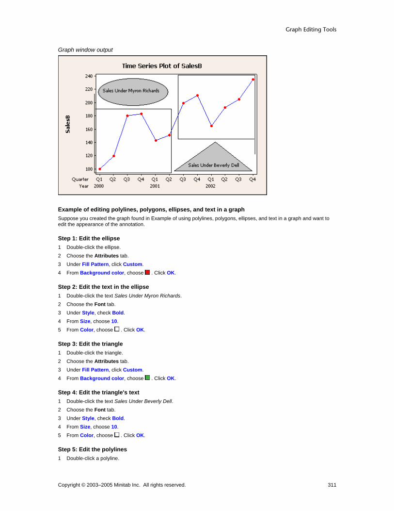
Graph Editing Tools
Copyright © 2003–2005 Minitab Inc. All rights reserved. 311
Graph window output
Example of editing polylines, polygons, ellipses, and text in a graph Suppose you created the graph found in Example of using polylines, polygons, ellipses, and text in a graph and want to edit the appearance of the annotation.
Step 1: Edit the ellipse 1 Double-click the ellipse. 2 Choose the Attributes tab. 3 Under Fill Pattern, click Custom. 4 From Background color, choose . Click OK.
Step 2: Edit the text in the ellipse 1 Double-click the text Sales Under Myron Richards. 2 Choose the Font tab. 3 Under Style, check Bold. 4 From Size, choose 10. 5 From Color, choose . Click OK.
Step 3: Edit the triangle 1 Double-click the triangle. 2 Choose the Attributes tab. 3 Under Fill Pattern, click Custom. 4 From Background color, choose . Click OK.
Step 4: Edit the triangle's text 1 Double-click the text Sales Under Beverly Dell. 2 Choose the Font tab. 3 Under Style, check Bold. 4 From Size, choose 10. 5 From Color, choose . Click OK.
Step 5: Edit the polylines 1 Double-click a polyline.

Customizing and Editing Graphs
Copyright © 2003–2005 Minitab Inc. All rights reserved. 312
2 Choose the Attributes tab. 3 Under Lines, choose Custom. 4 From Type, choose . 5 From Size, choose 2.
6 Under Arrow Style, in End, choose the thin arrow, . Click OK. 7 Repeat the last six steps for the other polyline.
Graph window output
Select Selecting Groups and Single Items You can select all points on a graph, a single group, or a single point. This method can also be used to select other graph objects:
• Other data representations such as boxes on boxplots or bars on bar charts
• Data labels and slice labels (all or one)
• Text in legends and output tables (entire legend/table or one line)
• Percentile line labels (all or one)
Note Available editing options may depend on whether you have selected a group or a single item.
Click on a graph point once to select all points.

Graph Editing Tools
Copyright © 2003–2005 Minitab Inc. All rights reserved. 313
Click the point a second time to select only those points within the group.
Click a third time to select the individual point.
To select objects and text There are three methods for selecting graph elements. Depending on the item, you may find one easier than another.
Manual selection
1 Click , the selection tool on the Graph Editing toolbar. 2 Click the object on the graph.
Menu selection 1 Choose Editor > Select Item, and then choose from the list.
Toolbar selection 1 Choose the object from the Graph Editing toolbar drop-down list of editable items. Selected objects have handles:
When you select symbols, they display two handles. See Selecting groups and single items.
Text strings have handles at vertices (corners) and at line midpoints of a rectangle that surrounds them. See Selecting groups and single items.
Unrotated rectangles, squares, ellipses, and circles have handles at vertices (corners) and at line midpoints. For circles and ellipses, the vertices and endpoints are located on a rectangle that surrounds the object.
Selected polygons have handles at each vertex.

Customizing and Editing Graphs
Copyright © 2003–2005 Minitab Inc. All rights reserved. 314
Tip If you cannot select an object, it may be because a second object is in front of it. Select the object in front, choose Editor > Send to Back, then select the first object. See Bring to Front and Send to Back.
Text Creation
To add text
1 In the Graph Annotation Tools toolbar, click . 2 Place the crosshairs at the point on the graph where you want one corner of the text box. 3 Click and drag the crosshairs to the opposite corner of the text box and release the mouse. 4 In Text, type the text. Click OK.
Example of using lines, text, markers, and rectangles in a graph Suppose you create a graph for a presentation and want to highlight points of interest. This example assumes you have already created the graph found in Example of a simple time series plot.
Step 1: Draw the markers
1 Select the Marker tool, , from the Graph Annotation Tools toolbar. 2 Place the crosshairs at the juncture of 140 on the SalesB scale and 2000 Q4 on the time scale and click the mouse. 3 Repeat the first two steps to place markers at 160, 2001 Q4 and at 200, 2002 Q4.
Step 2: Draw the rectangle
1 Select the Rectangle tool, , from the Graph Annotation Tools toolbar. 2 Place the crosshairs in the lower right corner of the data region. 3 Click and drag the crosshairs up and to the left to create a small rectangle, then release the mouse. Be sure not to
obscure any of the data points.
Step 3: Insert text
1 Select the Text tool, , from the Graph Annotation Tools toolbar. 2 Place the crosshairs at any corner of the rectangle you just created. 3 Click and drag the crosshairs to the opposite corner to create a text box the same dimensions as the rectangle, then
release the mouse. 4 In Text, enter Expected Fourth Quarter Sales. Click OK.
Step 4: Draw lines from markers to rectangle
1 Select the Line tool, , from the Graph Annotation Tools toolbar. 2 Place the crosshairs at the upper left corner of the rectangle. 3 Click and drag the crosshairs to the first marker and release the mouse. 4 Repeat the last three steps to draw lines from the corner of the rectangle to each of the remaining markers.

Graph Editing Tools
Copyright © 2003–2005 Minitab Inc. All rights reserved. 315
Graph window output
Example of using polylines, polygons, ellipses, and text in a graph Suppose you create a graph for a presentation to stockholders in your company and you want to highlight points of interest. Investors are interested in the effect a new CEO has had on sales. This example assumes you have already created the graph found in Example of a simple time series plot.
Step 1: Create a triangle
1 Select the Polygon tool, , from the Graph Annotation Tools toolbar. 2 Place the crosshairs at 100 on the SalesB scale and 2001 Q3 on the time scale and click. 3 Place the crosshairs at 100 on the SalesB scale and 2002 Q4 on the time scale and click. 4 Place the crosshairs at 130 on the SalesB scale and between the time-scale coordinates of the first two points, and
double-click.
Step 2: Add text to the triangle
1 Select the Text tool, , from the Graph Annotation Tools toolbar. 2 Place the crosshairs at the midpoint of the left side of the triangle. 3 Click and drag the crosshairs down and to the right to create a text box that is contained by the triangle, then release
the mouse. 4 In the Add Text dialog box, enter Sales Under Beverly Dell, and click OK.
Step 3: Create an ellipse
1 Select the Ellipse tool, , from the Graph Annotation Tools toolbar. 2 Place the crosshairs in the upper left corner of the data region. 3 Click and drag the crosshairs to create an ellipse that extends right to 2001 Q2 on the time scale and down to 200 on
the SalesB scale, then release the mouse. Be sure not to obscure any of the data points.
Step 4: Add text to the ellipse
1 Select the Text tool, , from the Graph Annotation Tools toolbar. 2 Place the crosshairs over the upper left of the ellipse. 3 Click and drag the crosshairs down and to the right to create a text box that is circumscribed by the ellipse, then
release the mouse.

Customizing and Editing Graphs
Copyright © 2003–2005 Minitab Inc. All rights reserved. 316
4 In the Add Text dialog box, enter Sales Under Myron Richards, and click OK.
Step 5: Draw a polyline around the first six points
1 Select the Polyline tool, , from the Graph Annotation Tools toolbar. 2 Place the crosshairs at 190, 2000 Q1 and click. 3 Place the crosshairs at 190, 2001 Q2 and click. 4 Place the crosshairs at 100, 2001 Q2 and click. 5 Place the crosshairs at 100, 2000 Q1 and click. 6 Place the crosshairs at 200, 2000 Q1 and double-click.
Step 6: Draw a polyline around the last six points Repeat the six steps above, using these points:
140, 2002 Q4
140, 2001 Q3
240, 2001 Q3
240, 2002 Q4
120, 2002 Q4
Graph window output
Editing
Edit Text − Alignment Select text > Editor > Edit Text > Alignment Use to edit the angle of the text.
Dialog box items Text angle: Enter a value from -360° to 360° to rotate the selected text.
To edit text alignment 1 Double-click the text. 2 Click the Alignment tab. 3 In Text angle, enter the value in degrees to rotate the text counterclockwise from the horizontal and click OK.

Graph Editing Tools
Copyright © 2003–2005 Minitab Inc. All rights reserved. 317
Edit Text − Font Select text > Editor > Edit Text Use to change the text font or its attributes.
Dialog box items Font: Choose a font. Style
Bold: Check to make the text bold. Italic: Check to italicize the text. Underline: Check to underline the text.
Size: Enter a font size. Color: Choose a text color. Preview: Displays sample text with the selected attributes. This box does not accept input.
To edit text font 1 Double-click the text. 2 To change font attributes, do any of the following:
• Under Font, type a font type or choose it from the list. • Under Style, check Bold, Italic, and/or Underline. • Under Size, type a font size or choose it from the list. • From Color, choose a text color.
3 Click OK.
Edit Text – Text Select text > Editor > Edit Text Use to edit text added to the active graph.
Dialog box item Text: Enter the text.
To edit text 1 Double-click the text box. 2 Choose the Text tab and in Text, type the text. Click OK.
Edit Annotation Item − Units Select annotation item > Editor > Edit By default, the command language generated by the Graph Annotation Tools Toolbar uses data units when specifying the coordinates of annotation items. You can change the units to figure units. You cannot change back to data units through this editing dialog box.
Dialog box items Switch coordinate system from data units to figure units: Check this box to change the coordinate system used to place the annotation items on the current graph from data units to figure units. After changing the coordinate system units, the annotation item will not be tied to the data as the data or scale changes.
To change units 1 Double-click the object created with the graph drawing toolbar. 2 Click the Units tab. 3 Check Switch coordinate system from data units to figure units. Click OK.

Customizing and Editing Graphs
Copyright © 2003–2005 Minitab Inc. All rights reserved. 318
Example of editing lines, text, markers, and rectangles in a graph You want to edit the appearance of the annotation items in Example of using lines, text, markers, and rectangles in a graph.
Step 1: Edit the markers 1 Double-click a marker. 2 Choose the Attributes tab. 3 Under Symbols, click Custom.
4 From Type, choose the solid square, . 5 From Color, choose . 6 From Size, enter 2. Click OK. 7 Repeat the first six steps for the other two markers.
Step 2: Edit the lines 1 Double-click a line. 2 Choose the Attributes tab. 3 Under Lines, choose Custom. 4 From Size, choose 2.
5 Under Arrow Style, in End, choose the thin arrow, . Click OK. 6 Repeat the last five steps for the other two lines.
Step 3: Edit the text and rectangle 1 Double-click the rectangle. 2 Choose the Attributes tab. 3 Under Fill Pattern, choose Custom. 4 From Background color, choose . 5 Under Borders and Fill Lines, choose Custom. 6 From Size, choose 2 and click OK. 7 Double-click the text Expected Fourth Quarter Sales. 8 Choose the Font tab. 9 Under Style, check Bold. Click OK.
Graph window output

Graph Editing Tools
Copyright © 2003–2005 Minitab Inc. All rights reserved. 319
Example of editing polylines, polygons, ellipses, and text in a graph Suppose you created the graph found in Example of using polylines, polygons, ellipses, and text in a graph and want to edit the appearance of the annotation.
Step 1: Edit the ellipse 1 Double-click the ellipse. 2 Choose the Attributes tab. 3 Under Fill Pattern, click Custom. 4 From Background color, choose . Click OK.
Step 2: Edit the text in the ellipse 1 Double-click the text Sales Under Myron Richards. 2 Choose the Font tab. 3 Under Style, check Bold. 4 From Size, choose 10. 5 From Color, choose . Click OK.
Step 3: Edit the triangle 1 Double-click the triangle. 2 Choose the Attributes tab. 3 Under Fill Pattern, click Custom. 4 From Background color, choose . Click OK.
Step 4: Edit the triangle's text 1 Double-click the text Sales Under Beverly Dell. 2 Choose the Font tab. 3 Under Style, check Bold. 4 From Size, choose 10. 5 From Color, choose . Click OK.
Step 5: Edit the polylines 1 Double-click a polyline. 2 Choose the Attributes tab. 3 Under Lines, choose Custom. 4 From Type, choose . 5 From Size, choose 2.
6 Under Arrow Style, in End, choose the thin arrow, . Click OK. 7 Repeat the last six steps for the other polyline.

Customizing and Editing Graphs
Copyright © 2003–2005 Minitab Inc. All rights reserved. 320
Graph window output
Rectangles Creation
To create a rectangle
1 In the Graph Annotation Tools toolbar, click 2 Place the crosshairs at the point on the graph where you want one corner of the rectangle. 3 Click and drag the crosshairs to the opposite corner of the rectangle and release the mouse.
Tip To create a square, press and hold [Shift] after step 2.
Example of using lines, text, markers, and rectangles in a graph Suppose you create a graph for a presentation and want to highlight points of interest. This example assumes you have already created the graph found in Example of a simple time series plot.
Step 1: Draw the markers
1 Select the Marker tool, , from the Graph Annotation Tools toolbar. 2 Place the crosshairs at the juncture of 140 on the SalesB scale and 2000 Q4 on the time scale and click the mouse. 3 Repeat the first two steps to place markers at 160, 2001 Q4 and at 200, 2002 Q4.
Step 2: Draw the rectangle
1 Select the Rectangle tool, , from the Graph Annotation Tools toolbar. 2 Place the crosshairs in the lower right corner of the data region. 3 Click and drag the crosshairs up and to the left to create a small rectangle, then release the mouse. Be sure not to
obscure any of the data points.
Step 3: Insert text
1 Select the Text tool, , from the Graph Annotation Tools toolbar. 2 Place the crosshairs at any corner of the rectangle you just created. 3 Click and drag the crosshairs to the opposite corner to create a text box the same dimensions as the rectangle, then
release the mouse.

Graph Editing Tools
Copyright © 2003–2005 Minitab Inc. All rights reserved. 321
4 In Text, enter Expected Fourth Quarter Sales. Click OK.
Step 4: Draw lines from markers to rectangle
1 Select the Line tool, , from the Graph Annotation Tools toolbar. 2 Place the crosshairs at the upper left corner of the rectangle. 3 Click and drag the crosshairs to the first marker and release the mouse. 4 Repeat the last three steps to draw lines from the corner of the rectangle to each of the remaining markers.
Graph window output
Editing
Edit Polygons, Ellipses, or Rectangles− Attributes Select annotation item > Editor > Edit You can edit the attributes of a polygon, circle, or rectangle created with the Graph Annotation Tools toolbar.
Dialog box items Fill Pattern
Automatic: Choose to accept the default fill pattern. Custom: Choose change the default fill pattern.
Type: Choose a fill type. Background color: Choose a background color.
Borders and Fill Lines Automatic: Choose to accept the default border and fill lines. Custom: Choose to change the default border and fill lines.
Type: Choose a border line type. Color: Choose a border and fill line color. Size: Choose a border line thickness.
To edit polygon, ellipse, or rectangle attributes 1 Double-click the item. 2 Under Fill Pattern, choose one of the following:
• Automatic to accept the default fill pattern. • Custom to change the default fill pattern.
Customizing and Editing Graphs
Copyright © 2003–2005 Minitab Inc. All rights reserved. 322
− From Type, choose a fill type.
− From Background color, choose a background color.
3 Under Borders and Fill Lines, choose one of the following: • Automatic to accept the default border and fill lines. • Custom to change the default border and fill lines.
− From Type, choose a border line type.
− From Color, choose a border and fill line color.
− From Size, choose a border line thickness.
4 Click OK.
Edit Annotation Item − Units Select annotation item > Editor > Edit By default, the command language generated by the Graph Annotation Tools Toolbar uses data units when specifying the coordinates of annotation items. You can change the units to figure units. You cannot change back to data units through this editing dialog box.
Dialog box items Switch coordinate system from data units to figure units: Check this box to change the coordinate system used to place the annotation items on the current graph from data units to figure units. After changing the coordinate system units, the annotation item will not be tied to the data as the data or scale changes.
To change units 1 Double-click the object created with the graph drawing toolbar. 2 Click the Units tab. 3 Check Switch coordinate system from data units to figure units. Click OK.
Example of editing lines, text, markers, and rectangles in a graph You want to edit the appearance of the annotation items in Example of using lines, text, markers, and rectangles in a graph.
Step 1: Edit the markers 1 Double-click a marker. 2 Choose the Attributes tab. 3 Under Symbols, click Custom.
4 From Type, choose the solid square, . 5 From Color, choose . 6 From Size, enter 2. Click OK. 7 Repeat the first six steps for the other two markers.
Step 2: Edit the lines 1 Double-click a line. 2 Choose the Attributes tab. 3 Under Lines, choose Custom. 4 From Size, choose 2.
5 Under Arrow Style, in End, choose the thin arrow, . Click OK. 6 Repeat the last five steps for the other two lines.
Step 3: Edit the text and rectangle 1 Double-click the rectangle. 2 Choose the Attributes tab. 3 Under Fill Pattern, choose Custom.

Graph Editing Tools
Copyright © 2003–2005 Minitab Inc. All rights reserved. 323
4 From Background color, choose . 5 Under Borders and Fill Lines, choose Custom. 6 From Size, choose 2 and click OK. 7 Double-click the text Expected Fourth Quarter Sales. 8 Choose the Font tab. 9 Under Style, check Bold. Click OK.
Graph window output
Ellipses Creation
To create an ellipse
1 In the Graph Annotation Tools toolbar, click 2 Place the crosshairs over the point on the open graph where you would like to place the ellipse. 3 Click and drag the crosshairs in any direction to size and shape the ellipse and release the mouse.
Tip To create a circle, press and hold [Shift] after step 2.
Example of using polylines, polygons, ellipses, and text in a graph Suppose you create a graph for a presentation to stockholders in your company and you want to highlight points of interest. Investors are interested in the effect a new CEO has had on sales. This example assumes you have already created the graph found in Example of a simple time series plot.
Step 1: Create a triangle
1 Select the Polygon tool, , from the Graph Annotation Tools toolbar. 2 Place the crosshairs at 100 on the SalesB scale and 2001 Q3 on the time scale and click. 3 Place the crosshairs at 100 on the SalesB scale and 2002 Q4 on the time scale and click. 4 Place the crosshairs at 130 on the SalesB scale and between the time-scale coordinates of the first two points, and
double-click.
Step 2: Add text to the triangle
1 Select the Text tool, , from the Graph Annotation Tools toolbar.

Customizing and Editing Graphs
Copyright © 2003–2005 Minitab Inc. All rights reserved. 324
2 Place the crosshairs at the midpoint of the left side of the triangle. 3 Click and drag the crosshairs down and to the right to create a text box that is contained by the triangle, then release
the mouse. 4 In the Add Text dialog box, enter Sales Under Beverly Dell, and click OK.
Step 3: Create an ellipse
1 Select the Ellipse tool, , from the Graph Annotation Tools toolbar. 2 Place the crosshairs in the upper left corner of the data region. 3 Click and drag the crosshairs to create an ellipse that extends right to 2001 Q2 on the time scale and down to 200 on
the SalesB scale, then release the mouse. Be sure not to obscure any of the data points.
Step 4: Add text to the ellipse
1 Select the Text tool, , from the Graph Annotation Tools toolbar. 2 Place the crosshairs over the upper left of the ellipse. 3 Click and drag the crosshairs down and to the right to create a text box that is circumscribed by the ellipse, then
release the mouse. 4 In the Add Text dialog box, enter Sales Under Myron Richards, and click OK.
Step 5: Draw a polyline around the first six points
1 Select the Polyline tool, , from the Graph Annotation Tools toolbar. 2 Place the crosshairs at 190, 2000 Q1 and click. 3 Place the crosshairs at 190, 2001 Q2 and click. 4 Place the crosshairs at 100, 2001 Q2 and click. 5 Place the crosshairs at 100, 2000 Q1 and click. 6 Place the crosshairs at 200, 2000 Q1 and double-click.
Step 6: Draw a polyline around the last six points Repeat the six steps above, using these points:
140, 2002 Q4
140, 2001 Q3
240, 2001 Q3
240, 2002 Q4
120, 2002 Q4
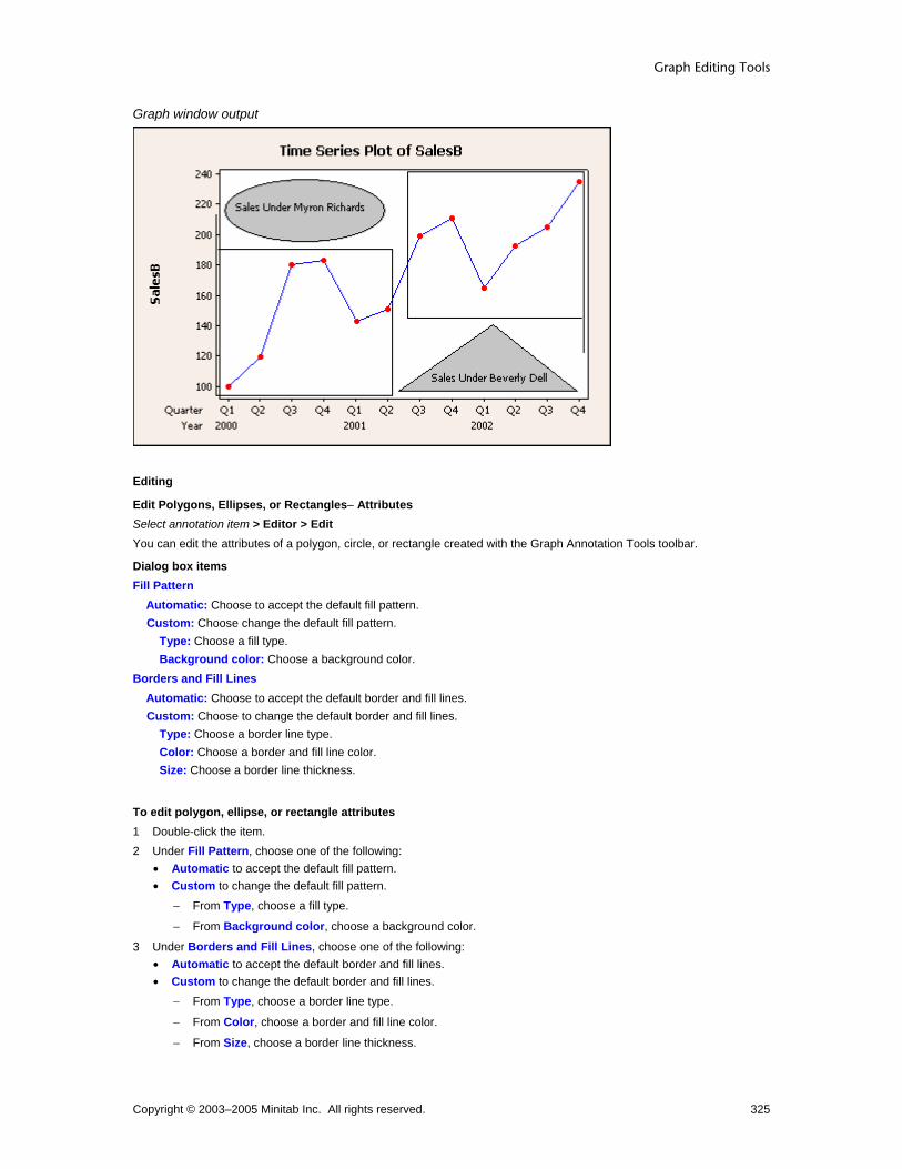
Graph Editing Tools
Copyright © 2003–2005 Minitab Inc. All rights reserved. 325
Graph window output
Editing
Edit Polygons, Ellipses, or Rectangles− Attributes Select annotation item > Editor > Edit You can edit the attributes of a polygon, circle, or rectangle created with the Graph Annotation Tools toolbar.
Dialog box items Fill Pattern
Automatic: Choose to accept the default fill pattern. Custom: Choose change the default fill pattern.
Type: Choose a fill type. Background color: Choose a background color.
Borders and Fill Lines Automatic: Choose to accept the default border and fill lines. Custom: Choose to change the default border and fill lines.
Type: Choose a border line type. Color: Choose a border and fill line color. Size: Choose a border line thickness.
To edit polygon, ellipse, or rectangle attributes 1 Double-click the item. 2 Under Fill Pattern, choose one of the following:
• Automatic to accept the default fill pattern. • Custom to change the default fill pattern.
− From Type, choose a fill type.
− From Background color, choose a background color.
3 Under Borders and Fill Lines, choose one of the following: • Automatic to accept the default border and fill lines. • Custom to change the default border and fill lines.
− From Type, choose a border line type.
− From Color, choose a border and fill line color.
− From Size, choose a border line thickness.

Customizing and Editing Graphs
Copyright © 2003–2005 Minitab Inc. All rights reserved. 326
4 Click OK.
Edit Annotation Item − Units Select annotation item > Editor > Edit By default, the command language generated by the Graph Annotation Tools Toolbar uses data units when specifying the coordinates of annotation items. You can change the units to figure units. You cannot change back to data units through this editing dialog box.
Dialog box items Switch coordinate system from data units to figure units: Check this box to change the coordinate system used to place the annotation items on the current graph from data units to figure units. After changing the coordinate system units, the annotation item will not be tied to the data as the data or scale changes.
To change units 1 Double-click the object created with the graph drawing toolbar. 2 Click the Units tab. 3 Check Switch coordinate system from data units to figure units. Click OK.
Example of editing polylines, polygons, ellipses, and text in a graph Suppose you created the graph found in Example of using polylines, polygons, ellipses, and text in a graph and want to edit the appearance of the annotation.
Step 1: Edit the ellipse 1 Double-click the ellipse. 2 Choose the Attributes tab. 3 Under Fill Pattern, click Custom. 4 From Background color, choose . Click OK.
Step 2: Edit the text in the ellipse 1 Double-click the text Sales Under Myron Richards. 2 Choose the Font tab. 3 Under Style, check Bold. 4 From Size, choose 10. 5 From Color, choose . Click OK.
Step 3: Edit the triangle 1 Double-click the triangle. 2 Choose the Attributes tab. 3 Under Fill Pattern, click Custom. 4 From Background color, choose . Click OK.
Step 4: Edit the triangle's text 1 Double-click the text Sales Under Beverly Dell. 2 Choose the Font tab. 3 Under Style, check Bold. 4 From Size, choose 10. 5 From Color, choose . Click OK.
Step 5: Edit the polylines 1 Double-click a polyline. 2 Choose the Attributes tab. 3 Under Lines, choose Custom.

Graph Editing Tools
Copyright © 2003–2005 Minitab Inc. All rights reserved. 327
4 From Type, choose . 5 From Size, choose 2.
6 Under Arrow Style, in End, choose the thin arrow, . Click OK. 7 Repeat the last six steps for the other polyline.
Graph window output
Lines Creation
To create a line
1 In the Graph Annotation Tools toolbar, click 2 Place the crosshairs at the point on the graph where you want to begin the line. 3 Click and drag the crosshairs to the point where you want to end the line and release the mouse.
Tip To draw a line along the nearest 45 degree angle, press and hold [Shift] while dragging the crosshairs.
Example of using lines, text, markers, and rectangles in a graph Suppose you create a graph for a presentation and want to highlight points of interest. This example assumes you have already created the graph found in Example of a simple time series plot.
Step 1: Draw the markers
1 Select the Marker tool, , from the Graph Annotation Tools toolbar. 2 Place the crosshairs at the juncture of 140 on the SalesB scale and 2000 Q4 on the time scale and click the mouse. 3 Repeat the first two steps to place markers at 160, 2001 Q4 and at 200, 2002 Q4.
Step 2: Draw the rectangle
1 Select the Rectangle tool, , from the Graph Annotation Tools toolbar. 2 Place the crosshairs in the lower right corner of the data region. 3 Click and drag the crosshairs up and to the left to create a small rectangle, then release the mouse. Be sure not to
obscure any of the data points.
Step 3: Insert text

Customizing and Editing Graphs
Copyright © 2003–2005 Minitab Inc. All rights reserved. 328
1 Select the Text tool, , from the Graph Annotation Tools toolbar. 2 Place the crosshairs at any corner of the rectangle you just created. 3 Click and drag the crosshairs to the opposite corner to create a text box the same dimensions as the rectangle, then
release the mouse. 4 In Text, enter Expected Fourth Quarter Sales. Click OK.
Step 4: Draw lines from markers to rectangle
1 Select the Line tool, , from the Graph Annotation Tools toolbar. 2 Place the crosshairs at the upper left corner of the rectangle. 3 Click and drag the crosshairs to the first marker and release the mouse. 4 Repeat the last three steps to draw lines from the corner of the rectangle to each of the remaining markers.
Graph window output
Editing
Edit Lines or Polylines − Attributes Select annotation item > Editor > Edit You can edit the attributes of a line created with the Graph annotation Tools toolbar.
Dialog box items Lines
Automatic: Choose to accept the default line attributes. Custom: Choose to change the line attributes.
Type: Choose a line type. Color: Choose a line color. Size: Choose a line thickness.
Arrow Style Begin: Choose an arrow style from the drop-down list to begin the line. End: Choose an arrow style from the drop-down list to end the line.
To edit line or polyline attributes 1 Double-click the line or polyline.

Graph Editing Tools
Copyright © 2003–2005 Minitab Inc. All rights reserved. 329
2 Click the Attributes tab. 3 Under Lines, choose one of the following:
• Automatic to accept the default line type and color. • Custom to change the line type and color.
− In Type, choose a line type.
− In Color, choose a color.
− In Size, choose a line thickness.
4 Under Arrow Style, do the following:
– In Begin, choose an arrow style.
– In End, choose an arrow style.
5 Click OK.
Edit Annotation Item − Units Select annotation item > Editor > Edit By default, the command language generated by the Graph Annotation Tools Toolbar uses data units when specifying the coordinates of annotation items. You can change the units to figure units. You cannot change back to data units through this editing dialog box.
Dialog box items Switch coordinate system from data units to figure units: Check this box to change the coordinate system used to place the annotation items on the current graph from data units to figure units. After changing the coordinate system units, the annotation item will not be tied to the data as the data or scale changes.
To change units 1 Double-click the object created with the graph drawing toolbar. 2 Click the Units tab. 3 Check Switch coordinate system from data units to figure units. Click OK.
Example of editing lines, text, markers, and rectangles in a graph You want to edit the appearance of the annotation items in Example of using lines, text, markers, and rectangles in a graph.
Step 1: Edit the markers 1 Double-click a marker. 2 Choose the Attributes tab. 3 Under Symbols, click Custom.
4 From Type, choose the solid square, . 5 From Color, choose . 6 From Size, enter 2. Click OK. 7 Repeat the first six steps for the other two markers.
Step 2: Edit the lines 1 Double-click a line. 2 Choose the Attributes tab. 3 Under Lines, choose Custom. 4 From Size, choose 2.
5 Under Arrow Style, in End, choose the thin arrow, . Click OK. 6 Repeat the last five steps for the other two lines.
Step 3: Edit the text and rectangle 1 Double-click the rectangle.

Customizing and Editing Graphs
Copyright © 2003–2005 Minitab Inc. All rights reserved. 330
2 Choose the Attributes tab. 3 Under Fill Pattern, choose Custom. 4 From Background color, choose . 5 Under Borders and Fill Lines, choose Custom. 6 From Size, choose 2 and click OK. 7 Double-click the text Expected Fourth Quarter Sales. 8 Choose the Font tab. 9 Under Style, check Bold. Click OK.
Graph window output
Marker Creation
To create markers
1 In the Graph Annotation Tools toolbar, click . 2 Place the crosshairs at the point on the graph where you want to place the marker and click.
Example of using lines, text, markers, and rectangles in a graph Suppose you create a graph for a presentation and want to highlight points of interest. This example assumes you have already created the graph found in Example of a simple time series plot.
Step 1: Draw the markers
1 Select the Marker tool, , from the Graph Annotation Tools toolbar. 2 Place the crosshairs at the juncture of 140 on the SalesB scale and 2000 Q4 on the time scale and click the mouse. 3 Repeat the first two steps to place markers at 160, 2001 Q4 and at 200, 2002 Q4.
Step 2: Draw the rectangle
1 Select the Rectangle tool, , from the Graph Annotation Tools toolbar. 2 Place the crosshairs in the lower right corner of the data region. 3 Click and drag the crosshairs up and to the left to create a small rectangle, then release the mouse. Be sure not to
obscure any of the data points.
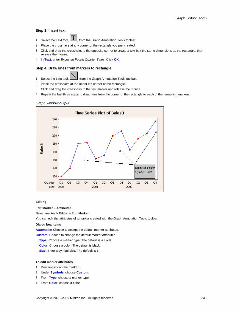
Graph Editing Tools
Copyright © 2003–2005 Minitab Inc. All rights reserved. 331
Step 3: Insert text
1 Select the Text tool, , from the Graph Annotation Tools toolbar. 2 Place the crosshairs at any corner of the rectangle you just created. 3 Click and drag the crosshairs to the opposite corner to create a text box the same dimensions as the rectangle, then
release the mouse. 4 In Text, enter Expected Fourth Quarter Sales. Click OK.
Step 4: Draw lines from markers to rectangle
1 Select the Line tool, , from the Graph Annotation Tools toolbar. 2 Place the crosshairs at the upper left corner of the rectangle. 3 Click and drag the crosshairs to the first marker and release the mouse. 4 Repeat the last three steps to draw lines from the corner of the rectangle to each of the remaining markers.
Graph window output
Editing
Edit Marker − Attributes Select marker > Editor > Edit Marker You can edit the attributes of a marker created with the Graph Annotation Tools toolbar.
Dialog box items Automatic: Choose to accept the default marker attributes. Custom: Choose to change the default marker attributes.
Type: Choose a marker type. The default is a circle. Color: Choose a color. The default is black. Size: Enter a symbol size. The default is 1.
To edit marker attributes 1 Double-click on the marker. 2 Under Symbols, choose Custom. 3 From Type, choose a marker type. 4 From Color, choose a color.

Customizing and Editing Graphs
Copyright © 2003–2005 Minitab Inc. All rights reserved. 332
5 In Size, enter a symbol size. Click OK.
Edit Annotation Item − Units Select annotation item > Editor > Edit By default, the command language generated by the Graph Annotation Tools Toolbar uses data units when specifying the coordinates of annotation items. You can change the units to figure units. You cannot change back to data units through this editing dialog box.
Dialog box items Switch coordinate system from data units to figure units: Check this box to change the coordinate system used to place the annotation items on the current graph from data units to figure units. After changing the coordinate system units, the annotation item will not be tied to the data as the data or scale changes.
To change units 1 Double-click the object created with the graph drawing toolbar. 2 Click the Units tab. 3 Check Switch coordinate system from data units to figure units. Click OK.
Example of editing lines, text, markers, and rectangles in a graph You want to edit the appearance of the annotation items in Example of using lines, text, markers, and rectangles in a graph.
Step 1: Edit the markers 1 Double-click a marker. 2 Choose the Attributes tab. 3 Under Symbols, click Custom.
4 From Type, choose the solid square, . 5 From Color, choose . 6 From Size, enter 2. Click OK. 7 Repeat the first six steps for the other two markers.
Step 2: Edit the lines 1 Double-click a line. 2 Choose the Attributes tab. 3 Under Lines, choose Custom. 4 From Size, choose 2.
5 Under Arrow Style, in End, choose the thin arrow, . Click OK. 6 Repeat the last five steps for the other two lines.
Step 3: Edit the text and rectangle 1 Double-click the rectangle. 2 Choose the Attributes tab. 3 Under Fill Pattern, choose Custom. 4 From Background color, choose . 5 Under Borders and Fill Lines, choose Custom. 6 From Size, choose 2 and click OK. 7 Double-click the text Expected Fourth Quarter Sales. 8 Choose the Font tab. 9 Under Style, check Bold. Click OK.

Graph Editing Tools
Copyright © 2003–2005 Minitab Inc. All rights reserved. 333
Graph window output
Polyline Creation
To create a polyline
1 In the Graph Annotation Tools toolbar, click . 2 Place the crosshairs at the point on the graph where you want to begin the polyline and click. 3 Place the crosshairs at the point where you want the first vertex of the polyline and click. 4 Repeat step 3 for each vertex in your polyline. 5 Place the crosshairs at the end-point of your polyline. To complete the polyline, do one of the following:
• Double-click. • Click and select a different tool from the toolbar.
Tip To draw a side along the nearest 45 degree angle, press and hold [Shift] while placing the vertex.
Example of using polylines, polygons, ellipses, and text in a graph Suppose you create a graph for a presentation to stockholders in your company and you want to highlight points of interest. Investors are interested in the effect a new CEO has had on sales. This example assumes you have already created the graph found in Example of a simple time series plot.
Step 1: Create a triangle
1 Select the Polygon tool, , from the Graph Annotation Tools toolbar. 2 Place the crosshairs at 100 on the SalesB scale and 2001 Q3 on the time scale and click. 3 Place the crosshairs at 100 on the SalesB scale and 2002 Q4 on the time scale and click. 4 Place the crosshairs at 130 on the SalesB scale and between the time-scale coordinates of the first two points, and
double-click.
Step 2: Add text to the triangle
1 Select the Text tool, , from the Graph Annotation Tools toolbar. 2 Place the crosshairs at the midpoint of the left side of the triangle. 3 Click and drag the crosshairs down and to the right to create a text box that is contained by the triangle, then release
the mouse.

Customizing and Editing Graphs
Copyright © 2003–2005 Minitab Inc. All rights reserved. 334
4 In the Add Text dialog box, enter Sales Under Beverly Dell, and click OK.
Step 3: Create an ellipse
1 Select the Ellipse tool, , from the Graph Annotation Tools toolbar. 2 Place the crosshairs in the upper left corner of the data region. 3 Click and drag the crosshairs to create an ellipse that extends right to 2001 Q2 on the time scale and down to 200 on
the SalesB scale, then release the mouse. Be sure not to obscure any of the data points.
Step 4: Add text to the ellipse
1 Select the Text tool, , from the Graph Annotation Tools toolbar. 2 Place the crosshairs over the upper left of the ellipse. 3 Click and drag the crosshairs down and to the right to create a text box that is circumscribed by the ellipse, then
release the mouse. 4 In the Add Text dialog box, enter Sales Under Myron Richards, and click OK.
Step 5: Draw a polyline around the first six points
1 Select the Polyline tool, , from the Graph Annotation Tools toolbar. 2 Place the crosshairs at 190, 2000 Q1 and click. 3 Place the crosshairs at 190, 2001 Q2 and click. 4 Place the crosshairs at 100, 2001 Q2 and click. 5 Place the crosshairs at 100, 2000 Q1 and click. 6 Place the crosshairs at 200, 2000 Q1 and double-click.
Step 6: Draw a polyline around the last six points Repeat the six steps above, using these points:
140, 2002 Q4
140, 2001 Q3
240, 2001 Q3
240, 2002 Q4
120, 2002 Q4
Graph window output
Graph Editing Tools
Copyright © 2003–2005 Minitab Inc. All rights reserved. 335
Editing
Edit Lines or Polylines − Attributes Select annotation item > Editor > Edit You can edit the attributes of a line created with the Graph annotation Tools toolbar.
Dialog box items Lines
Automatic: Choose to accept the default line attributes. Custom: Choose to change the line attributes.
Type: Choose a line type. Color: Choose a line color. Size: Choose a line thickness.
Arrow Style Begin: Choose an arrow style from the drop-down list to begin the line. End: Choose an arrow style from the drop-down list to end the line.
To edit line or polyline attributes 1 Double-click the line or polyline. 2 Click the Attributes tab. 3 Under Lines, choose one of the following:
• Automatic to accept the default line type and color. • Custom to change the line type and color.
− In Type, choose a line type.
− In Color, choose a color.
− In Size, choose a line thickness.
4 Under Arrow Style, do the following:
– In Begin, choose an arrow style.
– In End, choose an arrow style.
5 Click OK.
Edit Annotation Item − Units Select annotation item > Editor > Edit By default, the command language generated by the Graph Annotation Tools Toolbar uses data units when specifying the coordinates of annotation items. You can change the units to figure units. You cannot change back to data units through this editing dialog box.
Dialog box items Switch coordinate system from data units to figure units: Check this box to change the coordinate system used to place the annotation items on the current graph from data units to figure units. After changing the coordinate system units, the annotation item will not be tied to the data as the data or scale changes.
To change units 1 Double-click the object created with the graph drawing toolbar. 2 Click the Units tab. 3 Check Switch coordinate system from data units to figure units. Click OK.
Example of editing polylines, polygons, ellipses, and text in a graph Suppose you created the graph found in Example of using polylines, polygons, ellipses, and text in a graph and want to edit the appearance of the annotation.

Customizing and Editing Graphs
Copyright © 2003–2005 Minitab Inc. All rights reserved. 336
Step 1: Edit the ellipse 1 Double-click the ellipse. 2 Choose the Attributes tab. 3 Under Fill Pattern, click Custom. 4 From Background color, choose . Click OK.
Step 2: Edit the text in the ellipse 1 Double-click the text Sales Under Myron Richards. 2 Choose the Font tab. 3 Under Style, check Bold. 4 From Size, choose 10. 5 From Color, choose . Click OK.
Step 3: Edit the triangle 1 Double-click the triangle. 2 Choose the Attributes tab. 3 Under Fill Pattern, click Custom. 4 From Background color, choose . Click OK.
Step 4: Edit the triangle's text 1 Double-click the text Sales Under Beverly Dell. 2 Choose the Font tab. 3 Under Style, check Bold. 4 From Size, choose 10. 5 From Color, choose . Click OK.
Step 5: Edit the polylines 1 Double-click a polyline. 2 Choose the Attributes tab. 3 Under Lines, choose Custom. 4 From Type, choose . 5 From Size, choose 2.
6 Under Arrow Style, in End, choose the thin arrow, . Click OK. 7 Repeat the last six steps for the other polyline.

Graph Editing Tools
Copyright © 2003–2005 Minitab Inc. All rights reserved. 337
Graph window output
Polygon Creation
To create a polygon
1 In the Graph Annotation Tools toolbar, click . 2 Place the crosshairs over the point on the open graph where you would like to begin the polygon and click. 3 Place the crosshairs over the point where you would like to place the first vertex of the polygon and click. 4 Repeat step 3 for each vertex in the polygon. 5 Place the crosshairs over the end point of the polygon. To complete the polygon, do one of the following:
Double-click. Click and select a different tool from the toolbar.
Tip To draw a side along the nearest 45 degree angle, press and hold [Shift] while placing the vertex.
Example of using polylines, polygons, ellipses, and text in a graph Suppose you create a graph for a presentation to stockholders in your company and you want to highlight points of interest. Investors are interested in the effect a new CEO has had on sales. This example assumes you have already created the graph found in Example of a simple time series plot.
Step 1: Create a triangle
1 Select the Polygon tool, , from the Graph Annotation Tools toolbar. 2 Place the crosshairs at 100 on the SalesB scale and 2001 Q3 on the time scale and click. 3 Place the crosshairs at 100 on the SalesB scale and 2002 Q4 on the time scale and click. 4 Place the crosshairs at 130 on the SalesB scale and between the time-scale coordinates of the first two points, and
double-click.
Step 2: Add text to the triangle
1 Select the Text tool, , from the Graph Annotation Tools toolbar. 2 Place the crosshairs at the midpoint of the left side of the triangle. 3 Click and drag the crosshairs down and to the right to create a text box that is contained by the triangle, then release
the mouse.

Customizing and Editing Graphs
Copyright © 2003–2005 Minitab Inc. All rights reserved. 338
4 In the Add Text dialog box, enter Sales Under Beverly Dell, and click OK.
Step 3: Create an ellipse
1 Select the Ellipse tool, , from the Graph Annotation Tools toolbar. 2 Place the crosshairs in the upper left corner of the data region. 3 Click and drag the crosshairs to create an ellipse that extends right to 2001 Q2 on the time scale and down to 200 on
the SalesB scale, then release the mouse. Be sure not to obscure any of the data points.
Step 4: Add text to the ellipse
1 Select the Text tool, , from the Graph Annotation Tools toolbar. 2 Place the crosshairs over the upper left of the ellipse. 3 Click and drag the crosshairs down and to the right to create a text box that is circumscribed by the ellipse, then
release the mouse. 4 In the Add Text dialog box, enter Sales Under Myron Richards, and click OK.
Step 5: Draw a polyline around the first six points
1 Select the Polyline tool, , from the Graph Annotation Tools toolbar. 2 Place the crosshairs at 190, 2000 Q1 and click. 3 Place the crosshairs at 190, 2001 Q2 and click. 4 Place the crosshairs at 100, 2001 Q2 and click. 5 Place the crosshairs at 100, 2000 Q1 and click. 6 Place the crosshairs at 200, 2000 Q1 and double-click.
Step 6: Draw a polyline around the last six points Repeat the six steps above, using these points:
140, 2002 Q4
140, 2001 Q3
240, 2001 Q3
240, 2002 Q4
120, 2002 Q4
Graph window output

Graph Editing Tools
Copyright © 2003–2005 Minitab Inc. All rights reserved. 339
Editing
Edit Polygons, Ellipses, or Rectangles− Attributes Select annotation item > Editor > Edit You can edit the attributes of a polygon, circle, or rectangle created with the Graph Annotation Tools toolbar.
Dialog box items Fill Pattern
Automatic: Choose to accept the default fill pattern. Custom: Choose change the default fill pattern.
Type: Choose a fill type. Background color: Choose a background color.
Borders and Fill Lines Automatic: Choose to accept the default border and fill lines. Custom: Choose to change the default border and fill lines.
Type: Choose a border line type. Color: Choose a border and fill line color. Size: Choose a border line thickness.
To edit polygon, ellipse, or rectangle attributes 1 Double-click the item. 2 Under Fill Pattern, choose one of the following:
• Automatic to accept the default fill pattern. • Custom to change the default fill pattern.
− From Type, choose a fill type.
− From Background color, choose a background color.
3 Under Borders and Fill Lines, choose one of the following: • Automatic to accept the default border and fill lines. • Custom to change the default border and fill lines.
− From Type, choose a border line type.
− From Color, choose a border and fill line color.
− From Size, choose a border line thickness.
4 Click OK.
Edit Annotation Item − Units Select annotation item > Editor > Edit By default, the command language generated by the Graph Annotation Tools Toolbar uses data units when specifying the coordinates of annotation items. You can change the units to figure units. You cannot change back to data units through this editing dialog box.
Dialog box items Switch coordinate system from data units to figure units: Check this box to change the coordinate system used to place the annotation items on the current graph from data units to figure units. After changing the coordinate system units, the annotation item will not be tied to the data as the data or scale changes.
To change units 1 Double-click the object created with the graph drawing toolbar. 2 Click the Units tab. 3 Check Switch coordinate system from data units to figure units. Click OK.

Customizing and Editing Graphs
Copyright © 2003–2005 Minitab Inc. All rights reserved. 340
Example of editing polylines, polygons, ellipses, and text in a graph Suppose you created the graph found in Example of using polylines, polygons, ellipses, and text in a graph and want to edit the appearance of the annotation.
Step 1: Edit the ellipse 1 Double-click the ellipse. 2 Choose the Attributes tab. 3 Under Fill Pattern, click Custom. 4 From Background color, choose . Click OK.
Step 2: Edit the text in the ellipse 1 Double-click the text Sales Under Myron Richards. 2 Choose the Font tab. 3 Under Style, check Bold. 4 From Size, choose 10. 5 From Color, choose . Click OK.
Step 3: Edit the triangle 1 Double-click the triangle. 2 Choose the Attributes tab. 3 Under Fill Pattern, click Custom. 4 From Background color, choose . Click OK.
Step 4: Edit the triangle's text 1 Double-click the text Sales Under Beverly Dell. 2 Choose the Font tab. 3 Under Style, check Bold. 4 From Size, choose 10. 5 From Color, choose . Click OK.
Step 5: Edit the polylines 1 Double-click a polyline. 2 Choose the Attributes tab. 3 Under Lines, choose Custom. 4 From Type, choose . 5 From Size, choose 2.
6 Under Arrow Style, in End, choose the thin arrow, . Click OK. 7 Repeat the last six steps for the other polyline.

Graph Editing Tools
Copyright © 2003–2005 Minitab Inc. All rights reserved. 341
Graph window output
Resizing and Reshaping Graph Objects Resizing and Reshaping Graph Objects You can perform many actions on graphical objects. Rectangles rotated to angles other than 0, 90, 180, or 270 become polygons, which do not have midpoint handles. If you want to reshape a rotated rectangle, first rotate it to an angle of 0, 90, 180, or 270, then reshape the rectangle and rotate it again. Choose any of the following: To resize squares or circles To reshape rectangles or ellipses To reshape polygons, polylines, and lines To reshape text areas on graphs To rotate a graph object left To rotate a graph object right To rotate a graph object to a custom angle To move annotation
To resize squares or circles 1 Select one of the corner handles. 2 While holding down [Shift], click and drag the handle until the object reaches the size you want.
Tip If you do not hold down [Shift], the square or circle turns into a rectangle or ellipse, respectively. Turn it back into a square or circle by holding down [Shift] and dragging a corner handle.
To reshape rectangles or ellipses 1 Do one of the following:
• To adjust either width or height, but not both at once, drag a handle at a midpoint. • To adjust width and height at the same time, drag a corner handle.
Tip Press [Shift] before reshaping a rectangle or ellipse to convert the object to a square or circle, respectively.
Note Rectangles or ellipses rotated to angles other than 0, 90, 180, or 270 cannot be reshaped in rotated form. First unrotate the object, reshape it, then rotate it again.
To reshape polygons, polylines, and lines 1 Select the polygon, polyline, or line.

Customizing and Editing Graphs
Copyright © 2003–2005 Minitab Inc. All rights reserved. 342
2 Click and drag one of the handles to the desired location.
Note If you press [Shift] after you click the mouse button, you can draw or move objects along the nearest 45-degree line. This is especially helpful when you want to draw or move an object only horizontally, only vertically, or an equal distance horizontally and vertically.
To reshape text areas 1 Select the text box. 2 Click and drag a handle to where you want the text box to end. When you resize a text box, you really only resize its width, not the font size. The text fills as many lines as necessary in the given width.
To move annotation
1 Click the selection tool, . 2 Do one of the following:
• Using the mouse, click and drag the object or text string to its new location. Do not drag a handle, which would resize the object.
• Using the keyboard, do the following:
To move... Press... One pixel in any direction Any arrow key Five pixels in any direction [Shift] + any arrow key Ten pixels in any direction [Control] + any arrow key Fifty pixels in any direction [Shift] + [Control] + any arrow key

Embedded Graph Editor
Copyright © 2003–2005 Minitab Inc. All rights reserved. 343
Embedded Graph Editor Embedded Graph Editor Overview A Minitab graph that has been copied into another OLE application retains most of its editing properties.
Methods for copying a Minitab graph to an outside application The way you copy a graph into an outside application determines how you edit it. You can create a:
Editable copy that is identical to the original graph at the time it was copied. Picture, bitmap, or enhanced metafile picture copy that cannot be edited with the embedded graph editor.
If you choose to edit the copied graph within the outside application, the Embedded Graph Editor Toolbar appears and the application's menu items change to include Minitab graph editing functions.
Embedded Graph Editor Toolbar The Embedded Graph Editor toolbar is a combination of menu items from other Minitab toolbars. These items work the same way they do within Minitab. To show this toolbar, double click the graph. To return to the application's standard menus and leave embedded graph editing, click outside the graph.
Toolbar item Use to... Toolbar
item Use to...
Cut an object
Add a square or rectangle
Copy an object
Add a circle or ellipse
Paste an object
Add a line
Undo an action
Add a marker
Redo an action
Add a polyline
Put the graph in select mode
Add a polygon
Add text
Edit the selected item
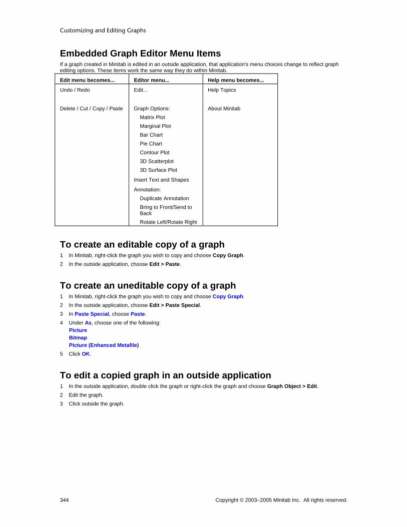
Customizing and Editing Graphs
Copyright © 2003–2005 Minitab Inc. All rights reserved. 344
Embedded Graph Editor Menu Items If a graph created in Minitab is edited in an outside application, that application's menu choices change to reflect graph editing options. These items work the same way they do within Minitab.
Edit menu becomes... Editor menu... Help menu becomes...
Undo / Redo Edit...
Help Topics
Delete / Cut / Copy / Paste Graph Options: Matrix Plot Marginal Plot Bar Chart Pie Chart Contour Plot 3D Scatterplot 3D Surface Plot
About Minitab
Insert Text and Shapes
Annotation: Duplicate Annotation Bring to Front/Send to Back Rotate Left/Rotate Right
To create an editable copy of a graph 1 In Minitab, right-click the graph you wish to copy and choose Copy Graph. 2 In the outside application, choose Edit > Paste.
To create an uneditable copy of a graph 1 In Minitab, right-click the graph you wish to copy and choose Copy Graph. 2 In the outside application, choose Edit > Paste Special. 3 In Paste Special, choose Paste. 4 Under As, choose one of the following:
Picture Bitmap Picture (Enhanced Metafile)
5 Click OK.
To edit a copied graph in an outside application 1 In the outside application, double click the graph or right-click the graph and choose Graph Object > Edit. 2 Edit the graph. 3 Click outside the graph.

Index
Copyright © 2003–2005 Minitab Inc. All rights reserved. 345
Index A
Add (Editor menu)............................................. 254, 295 Annotation (Editor menu) .................. 276, 277, 278, 279 Area (graph data display)...... 7, 8, 19, 25, 26, 27, 28, 30
Area (dialog box option) ................................ 7, 8, 19 Editing............................................ 25, 26, 27, 28, 30
Axes and Ticks............................................................ 95 Creation ..................................................... 95, 97, 98 Editing..121, 123, 124, 141, 142, 143, 148, 149, 150
Axis Labels........................................ 121, 122, 123, 124 Editing.................................................. 121, 122, 124
B
Bar (graph data display).................. 8, 15, 17, 34, 35, 36 Bar (dialog box item) ................................... 8, 15, 17 Editing........................................................ 34, 35, 36
Binning .............................................. 26, 35, 63, 85, 113 Boundary................................................................... 269
Positions for contour plot ..................................... 269 Box (graph data display) ........................... 13, 41, 42, 43
Box (dialog box item)............................................. 13 Editing........................................................ 41, 42, 43
Brush (Editor menu).242, 243, 244, 246, 247, 248, 285, 286, 287, 289, 290, 291 Color .................................................................... 289 Creating indicator variables......................... 246, 289 Features ...................................................... 243, 286 Identifier variables ....................................... 247, 290 Palette - showing and hiding ....................... 246, 289 Setting ID variables ..................................... 247, 290
By Variables...................................................... 198, 199 C
Calendar units................................................... 106, 107 Categorical scales
Editing..................141, 142, 143, 147, 148, 149, 150 Circle......................................................................... 323 Clock units ........................................................ 106, 107 Connect Line (graph data display) .7, 12, 13, 15, 17, 18,
50, 51, 52, 53 Connect Line (dialog box option).... 7, 12, 13, 15, 17,
18 Editing.................................................. 50, 51, 52, 53
Contour levels ........................................................... 269 Contour Lines (graph data display)........... 19, 58, 59, 60
Contour Lines (dialog box item)............................. 19 Editing........................................................ 58, 59, 60
Coordinates............................................................... 177 Copy Command Language (Editor menu) ........ 272, 274 Copying..................................................................... 276
Copying and pasting Graph objects...................................................... 276
Create Indicator Variable (Editor menu)........... 246, 289 Crosshairs (Editor menu).................................. 250, 291 D
Data Display ........................................................... 5, 24 Data Display (dialog box option) ............................. 5 Editing ................................................................... 24
Data Fits (graphs)............................................. 217, 227 Displaying............................................................ 217 Editing ................................................................. 227
Data Labels .............................. 157, 158, 160, 165, 166 Data Labels (dialog box option) .......... 157, 158, 160 Editing ......................................................... 165, 166
Data Options (dialog box option) .............. 235, 237, 239 Frequency ........................................................... 239 Group Options..................................................... 237 Subset ................................................................. 235
Data Region...................................................... 176, 177 Editing ......................................................... 182, 183
Data units ................................................................. 177 Date/time data .................................................. 106, 110 Date/time stamp ....................................... 106, 108, 110 Deleting .................................................................... 305 Dendrogram scales .................................................. 126 Distribution Fit (graphs) .................................... 218, 228
Distribution Fit (dialog box option) ...................... 218 Editing ................................................................. 228
Dots (graph data display) ........................... 9, 62, 63, 64 Editing ....................................................... 62, 63, 64
Drawing objects on graphs....................................... 307 Duplicate Graph (Editor menu)......................... 272, 274 E
Edit (Editor menu)............................................. 249, 283 Editing............................................................... 249, 283
Graphs ........................................................ 249, 283 Text on graphs ... 260, 301, 307, 309, 314, 315, 320,
323, 327, 330, 333, 337 Editor menu .............................................................. 241 Ellipse....................................................................... 323 Embedded Graph Editor........................................... 343 Excluding data in a graph......................................... 236 F
Figure Region ........................................................... 175 Editing ......................................................... 179, 180
Footnote ................................................... 154, 170, 171 Editing ......................................................... 170, 171

Customizing and Editing Graphs
Copyright © 2003–2005 Minitab Inc. All rights reserved. 346
Titles and Footnotes (dialog box option) ............. 154 Frequency................................................................. 239 G
Graph Annotation Tools Toolbar...... 260, 301, 307, 314, 320, 323, 327, 330, 333, 337
Graph brushing ................................................. 242, 285 Graph editing ...110, 164, 165, 166, 167, 168, 170, 171,
177, 241 Graph Editing Toolbar............................................... 282 Graph Options (Editor menu)..... 36, 51, 69, 73, 87, 269,
270 Graph Region............................................................ 174
Editing.................................................................. 178 Graph toolbars .......................................... 282, 306, 307 Graphs folder
High-resolution ............................................ 214, 271 Gridlines
Editing.......................................................... 127, 128 Group Options........................................................... 237 H
Histogram Labels (Marginal Plot) ..................... 162, 165 Editing.................................................................. 165 Histogram Labels (dialog box option).................. 162
I ID variables in brushing .................................... 247, 290 Identifier variables............................................. 247, 290 Indicator variables............................................. 246, 289 Interval Bar (graph data display)..................... 15, 65, 66
Editing.............................................................. 65, 66 Interval Bar (dialog box item) ................................ 15
L
Labels (graphs) ................................................. 153, 164 Layout Tool ............................................... 214, 215, 271
Layout Tool (Editor menu) ........................... 214, 271 Legend Region.................. 173, 184, 185, 186, 190, 191 Levels........................................................................ 269
Contour plots ....................................................... 269 Line ........................................................................... 327 Live linking graphs .................................................... 279 Lowess Smoother (graphs)....................... 224, 230, 231
Editing.......................................................... 230, 231 Lowess Smoother (dialog box option) ................. 224
M
Make Similar Graph (Editor menu) ........................... 275 Marker....................................................................... 330 Multiple Graphs (dialog box option) .193, 195, 196, 197,
198, 199 By Variables ................................................ 198, 199 Multiple Variables ................................ 195, 196, 197
Multiple variables ...................................... 195, 196, 197
O
Objects on graphs .................................................... 341 Selecting ..................... 248, 249, 283, 284, 312, 313
ODBC ....................................................................... 281 Output tables .................... 173, 186, 188, 189, 190, 191 Overlapping points.................................................... 268 Overlay ..................................................................... 203 Overview
Brushing ...................................................... 242, 285 Editing graphs ..................................................... 241
P
Panel (Editor menu). 204, 205, 206, 207, 208, 209, 210, 211, 213, 264, 265, 266
Paneling.................................................................... 201 Percentile lines
Creation....................................................... 104, 219 Editing ......................................................... 132, 133
Pie (graph data display)........................................ 68, 69 Editing ............................................................. 68, 69
Plant Flag (Editor menu)................................... 251, 292 Polygon..................................................................... 337 Polyline ..................................................................... 333 Primary scale............................................................ 136 Project Lines (graph data display) ... 7, 8, 17, 18, 20, 22,
71, 72, 73, 74 Editing ................................................. 71, 72, 73, 74 Project Lines (dialog box option). 7, 8, 17, 18, 20, 22
R
Rectangle ................................................................. 320 Reference lines
Creation............................................................... 102 Editing ................................................. 128, 129, 130
Region coordinate system........................................ 177 Regions .................................................................... 173 Regression Fit (graphs) .................................... 232, 233
Editing ......................................................... 232, 233 Regression Fit (dialog box option) ...................... 226
Reshaping and resizing graph objects ..................... 341 Resizing and reshaping graph objects ..................... 341 Rotate 3D Graph ...................................................... 306 Rotate Left (Editor menu) ......................................... 278 Rotate Right (Editor menu)....................................... 278 S
Scale (dialog box option) ............................................ 94 Axes and Ticks.......................................... 95, 97, 98 Editing ................................................................. 110 Gridlines .............................................................. 101 Percentile lines.................................................... 104 Reference lines ................................................... 102 Time ............................................................ 107, 110

Index
Copyright © 2003–2005 Minitab Inc. All rights reserved. 347
Y-Scale type ........................................................ 100 Scale editing ............................................................. 110
Axis labels ........................................... 121, 123, 124 Binning................................................................. 113 Dendrograms....................................................... 126 Gridlines ...................................................... 127, 128 Percentile lines ............................................ 132, 133 Reference lines.................................... 128, 129, 130 Scale...111, 113, 117, 118, 119, 141, 142, 143, 144,
147, 148, 149, 150, 151 Scale overview ...................................................... 94 Secondary scale .................................................. 136 Time..................................................................... 138 Transformations........................................... 114, 134 Y-Scale type ................................................ 116, 125
Secondary scale ....................................................... 136 Select (Editor menu) ......... 248, 249, 283, 284, 312, 313 Select Item (Editor menu) .248, 249, 283, 284, 312, 313 Send to Back (Editor menu)...................................... 278 Set ID Variables (Editor menu) ......................... 247, 290 Shape........................................................................ 341
Graph objects ...................................................... 341 Shapes on graphs (polygons) ................................... 307 Show/Hide Brushing Palette (Editor menu) ...... 246, 289 Size ........................................................................... 341
Graph objects ...................................................... 341 Slice Labels............................................................... 163
Editing.................................................. 167, 168, 169 Slice Labels (dialog box option) .......................... 163
Smoother - lowess (graphs)...................... 224, 230, 231 Square ...................................................................... 320 Stamp................................................................ 106, 107
Area graph........................................... 106, 107, 108 Subset............................................................... 235, 236 Surface (graph data display)................................. 80, 83
Editing ............................................................. 80, 83 Surface (dialog box item) ...................................... 22
Symbol (graph data display).. 7, 8, 9, 10, 13, 15, 17, 18, 19, 20, 22, 84, 85, 86, 87 Editing ................................................. 84, 85, 86, 87 Symbol (dialog box item).. 7, 8, 9, 10, 13, 15, 17, 18,
19, 20, 22 T
Table Region .................... 173, 186, 188, 189, 190, 191 Text........................................................... 260, 301, 314 Ticks ........................................................................... 95 Time units ................................................. 106, 107, 110 Time/Scale................ 106, 107, 108, 109, 110, 139, 140
Axes and Ticks...................................................... 97 Gridlines .............................................................. 101 Reference Lines .................................................. 102 Time .................................................... 107, 108, 110
Title........................................................... 154, 170, 171 Editing ......................................................... 170, 171 Titles and Footnotes (dialog box option)............. 154
Transformation ................................................. 114, 134 U
Units ......................... 317, 322, 326, 329, 332, 335, 339 Update (Editor menu) ............................................... 279 Updating graphs ....................................................... 279 V
Variables........................................................... 246, 289 Indicator for brushed points......................... 246, 289
Y
Y-Scale type ............................................................. 100 Creation............................................................... 100 Editing ......................................................... 116, 125
Z
Zoom (Editor menu).......................................... 282, 305