
Copyright by Tobin Knowles McKearin 2015
205
Copyright by Tobin Knowles McKearin 2015
Transcript of Copyright by Tobin Knowles McKearin 2015

Copyright
by
Tobin Knowles McKearin
2015

The Dissertation Committee for Tobin Knowles McKearin Certifies that this is the
approved version of the following dissertation:
ESSAYS ON THE EFFECTS OF GOVERNMENT INTERVENTION
IN TEXAS’ ELECTRICITY MARKET AND THE HEALTH
INSURANCE MARKETS IN MISSOURI AND OKLAHOMA
Committee:
Michael Geruso, Supervisor
Jason Abrevaya
Gerald S. Oettinger
Jay Zarnikau
Nathan N. Wozny

ESSAYS ON THE EFFECTS OF GOVERNMENT INTERVENTION
IN TEXAS’ ELECTRICITY MARKET AND THE HEALTH
INSURANCE MARKETS IN MISSOURI AND OKLAHOMA
by
Tobin Knowles McKearin, B.S.; M.A.; M.S. Inf. Tech. Mgt.; M.S. Econ
Dissertation
Presented to the Faculty of the Graduate School of
The University of Texas at Austin
in Partial Fulfillment
of the Requirements
for the Degree of
DOCTOR OF PHILOSOPHY
The University of Texas at Austin
December 2015

iv
Acknowledgements
I want to acknowledge the aid and supervision of my Adviser, Michael Geruso.
He has spent countless hours selflessly helping me ensure I complete a dissertation
worthy of a Ph.D. from the University of Texas. I also want to acknowledge my entire
dissertation committee. Without their help and guidance, I know I would not be where I
am today. I hope to bring respect to the University of Texas’ Department of Economics
through future work and hope to be counted as one of the department’s success stories.
Most importantly, I want to acknowledge my wife, Angie McKearin, who has
taken on all the duties of the home and sacrificed probably more than I have in the past
three plus years in order to give me the best chance of succeeding. Without her support
and dedication to our children and my studies, to our home and our friends, and ability to
put up with my lack of presence at the house to help raise our two boys, especially during
the first year but really in all three years, I would not have succeeded. Thank you, Angie,
I realize how much I owe you for this and hope I can somehow balance this debt in the
coming years. I also want to apologize to our oldest son, Linden. I am sorry I spent
almost a year and a half away from you. I hope to make that up to you in our future!
Lastly, I’d like to acknowledge the help and friendship from some of my
classmates. Without Carlos Herrera’s advice and help, I could not have completed this
dissertation—thank you for everything. Without your skills, demeanor, and willingness
to help at any time throughout the three plus years I know I would not have made it to
this point. Additionally, Randeep Kaur, Luke Rodgers, Collin Hansen, Mario Vega, and
Hassan Khosroshahi were always there to lend an ear and offer advice on how to
proceed—thanks to all of you.

v
ESSAYS ON THE EFFECTS OF GOVERNMENT INTERVENTION
IN TEXAS’ ELECTRICITY MARKET AND THE HEALTH
INSURANCE MARKETS IN MISSOURI AND OKLAHOMA
Tobin Knowles McKearin, Ph.D.
The University of Texas at Austin, 2015
Supervisor: Michael Geruso
This public economics dissertation examines the effects resulting from
government intervention in the electricity and health insurance markets. The first chapter
analyzes the impact on residential electricity prices by studying a once regulated market
in which government regulators withdrew from in hopes of allowing a free and
competitive market to flourish. The second chapter analyzes the resulting effects on
employment and other forms of health insurance that occur when the government tightens
the income limits to qualify for Medicaid. The third and final chapter studies
employment, health insurance, health, and emergency room usage effects when the
government gives subsidies to employers providing health insurance to their employees.

vi
Table of Contents
List of Tables ......................................................................................................... ix
List of Figures ........................................................................................................ xi
Chapter 1: The Effect on Prices of Deregulation in Texas’ Electricity Market .......1
1. Introduction .................................................................................................1
2. Background .................................................................................................6
3. Relevant Literature....................................................................................11
4. Data ...........................................................................................................16
5. Main Empirical Strategy and Main Results ..............................................19
5.1. Main Empirical Strategy ...............................................................19
5.2. Main Empirical Results .................................................................21
6. Model ........................................................................................................24
6.1. Pricing Based on Marginal versus Average Costs ........................24
6.2. Bilateral Contracts, Day-Ahead Market, Real-Time Market ........28
7. Empirical Strategy and Results Evaluating the Role of Natural Gas........30
7.1. Empirical Strategy ........................................................................30
7.2. Empirical Results Evaluating the Role of Natural Gas .................33
8. Robustness Checks....................................................................................35
9. Conclusion ................................................................................................40
Chapter 2: Labor Market and Health Insurance Effects of Missouri’s Medicaid
Contraction ....................................................................................................54
1. Introduction ..............................................................................................54
2. Missouri’s Health Care Reform ...............................................................59
3. Model .......................................................................................................63
4. Data and Empirical Strategy ....................................................................65
4.1. Data ...............................................................................................65
4.2. Empirical Strategy ........................................................................68
5. Empirical Results .....................................................................................73
5.1. Effects on Health Insurance ..........................................................73

vii
5.2. Effects on Labor Supply ...............................................................75
6. Robustness Checks and Falsification Tests .............................................81
6.1. Robustness Check Using Border States ........................................81
6.2. Robustness Check Using Different Education Levels ..................82
6.3. Robustness Check Using Different Income Levels ......................84
6.4. Additional Crowd-out Estimates...................................................87
6.5. State Falsification Tests ................................................................88
7. Conclusion ...............................................................................................92
Chapter 3: Effects of OK Subsidies to Employers Offering Health Insurance ....111
1. Introduction ............................................................................................111
2. Related Literature...................................................................................116
3. Insure Oklahoma ....................................................................................120
4. Model .....................................................................................................126
5. Data and Empirical Strategy ..................................................................128
5.1 Data ..............................................................................................128
5.2 Empirical Strategy .......................................................................130
6. Preliminary Results ................................................................................132
6.1. Effects on Health Insurance ........................................................132
6.2. Effects on Self-Reported Health, Emergency Room Usage, and
Employment ..............................................................................137
7. Plans for Future Implementation (after dissertation is complete) ..........140
Appendix to Chapter 1 .........................................................................................155
A.1. Background (Detailed) ........................................................................155
A.2. Economic Theory for Regulation and Deregulation ...........................158
A.3. Why the Price of Natural Gas Affects the Controls Differently .........162
A.4. Non-Weighted Results, Support for Quantity being Exogenous, Balanced
Panel Set.............................................................................................166
A.4.1. Non-Weighted Regression Results .........................................166
A.4.2. Quantity is Arguably Exogenous ............................................169
A.4.3. Using a Balanced Panel Data Set ............................................170

viii
A.5. Allowing the Effect of Deregulation to Vary by Year .......................171
References ............................................................................................................183
For Chapter 1 ..............................................................................................183
For Chapter 2 ..............................................................................................187
For Chapter 3 ..............................................................................................190

ix
List of Tables
Table 1.1: Summary Statistics ............................................................................49
Table 1.2: Dependent Variable: Average Price ($/1,000 kWh) .......................50
Table 1.3: Dependent Variable: Average Price ($/1,000 kWh) .......................51
Table 1.4: Dependent Variable: Average Price ($/1,000 kWh) .......................52
Table 1.5: Dependent Variable: Average Price ($/1,000 kWh) .......................53
Table 2.1: Missouri’s Medicaid Income Changes ...........................................101
Table 2.2: 2005 Federal Poverty Levels ...........................................................101
Table 2.3: Summary Statistics Using CPS Data ..............................................102
Table 2.4: Summary Statistics Using ACS Data .............................................103
Table 2.5: CPS DDD Results – Adults with a High School Diploma or Less103
Table 2.6: ACS DDD Results – Adults with a High School Diploma or Less104
Table 2.7: Crowd-out Estimate .........................................................................104
Table 2.8: CPS and ACS Regressions Results Using Border States..............105
Table 2.9: Robustness Check Using CPS Data: Different Education Levels106
Table 2.10: Robustness Check Using ACS Data: Different Education Levels106
Table 2.11: Robustness Check Narrowing In On Income Using the CPS ....107
Table 2.12: Robustness Check Narrowing In On Income Using the ACS ....108
Table 2.13: Checking If Missouri Had an Income Distribution Change ......109
Table 2.14: Additional Crowd-out Estimates ..................................................110
Table 3.1: Summary Statistics ..........................................................................153
Table 3.2: CPS DD Regressions Results ..........................................................154
Table A.1: Dependent Variable: Average Price ($/1,000 kWh).....................177
Table A.2: Dependent Variable: Average Price ($/1,000 kWh).....................178

x
Table A.3: Dependent Variable: ln (total sales) ..............................................179
Table A.4: Dependent Variable: Average Price ($/1,000 kWh).....................180
Table A.5: Dependent Variable: Average Price ($/1,000 kWh).....................181
Table A.6: Dependent Variable: Average Price ($/1,000 kWh).....................182

xi
List of Figures
Figure 1.1: Firm and Region Relationship ........................................................43
Figure 1.2: Deregulated Regions in Texas .........................................................43
Figure 1.3: Average Price of Deregulated and Controls Regions ....................44
Figure 1.4: Average Cost vs. Marginal Cost in the Electricity Market ..........45
Figure 1.5: Price of Fuels used to Generate Electricity ....................................45
Figure 1.6: Percentage of Fuel Used to Generate Electricity in Texas ...........46
Figure 1.7: Price of (Deregulated – Control Firms) and the Price of Natural Gas
...........................................................................................................46
Figure 1.8: Average Price of Deregulated Firms, Municipalities, and Investor
Owned Utilities ................................................................................47
Figure 1.9: Average Price of 5 Incumbents vs. 4 Regulated Investor Owned
Utilities .............................................................................................47
Figure 1.10: Average Price of 5 Incumbents, 5 Biggest Municipalities, 5 Biggest
Controls ............................................................................................48
Figure 1.11: Average Price of 5 Incumbents and 3 Largest Cooperatives .....48
Figure 1.12: Average Price of 5 Incumbents, 4 Regulated Investor Owned
Utilities, and the Price of Natural Gas ..........................................49
Figure 2.1: Medicaid Enrollment in Missouri ...................................................95
Figure 2.2: Model for Medicaid Contraction ....................................................95
Figure 2.3: Public Health Insurance ..................................................................96
Figure 2.4: Employer Sponsored Health Insurance .........................................96
Figure 2.5: Employed...........................................................................................97
Figure 2.6: CPS State Falsifications ...................................................................98

xii
Figure 2.7: ACS State Falsifications.................................................................100
Figure 3.1: Annual Enrollment in SoonerCare and Insure Oklahoma ........148
Figure 3.2: Monthly Enrollment in Insure Oklahoma ...................................148
Figure 3.3: Labor Demand and Supply ...........................................................149
Figure 3.4: Employer Sponsored Health Insurance .......................................149
Figure 3.5: Private Health Insurance ...............................................................150
Figure 3.6: Public Health Insurance ................................................................150
Figure 3.7: Employed.........................................................................................151
Figure 3.8: Self-Reported Health Status ..........................................................151
Figure 3.9: Emergency Room Visits .................................................................152
Figure A.1: NERC Regions in North America ................................................173
Figure A.2: Independent System Operators in Texas ....................................173
Figure A.3: FERC division of power markets .................................................174
Figure A.4: Monopoly vs Competitive Market ...............................................174
Figure A.5: Average Price of Deregulated Regions vs Controls ....................175
Figure A.6: Price of (Deregulated– Controls Firms) and the Price of Natural Gas
.........................................................................................................175
Figure A.7: Quantity Sold in the Deregulated and Control Regions ............176

1
Chapter 1: The Effect on Prices of Deregulation in Texas’ Electricity
Market
1. INTRODUCTION
Does deregulation decrease prices? Specifically, does deregulation of the
electricity market decrease electricity prices to residential consumers? In the past two
decades, deregulation has become a popular topic among policy makers in cities, states,
and countries. Proponents of deregulation argue lower prices, better service, increased
options, more jobs, more investment, and increased generation from alternative fuels are
advantages to deregulating the electricity market.1 Critics argue these advantages will
not occur, that consumers in deregulated regions do not benefit, that deregulated areas
should re-regulate their electricity markets, and regulated markets should remain
regulated.2
Economic theory provides no definitive answer concerning deregulation‘s effect
on prices. The final price consumers pay is affected by the number of firms entering the
market, the market power possessed by one or a group of firms, effects caused by
removing a price ceiling, and the differential impact that input costs have on deregulated
markets. Due to the ambiguity of price changes following deregulation, an empirical
analysis can help determine deregulation‘s effect on prices. Supporting the ambiguity
from the theoretical perspective, prior literature studying deregulation‘s effect on prices
1 See Woo and Zarnikau (2009), TCAP (2012), Roe et al. (2001). 2 TCAP (2012)

2
offers no consensus as to whether the critics or proponents are correct.3 This paper
informs that debate.
Electricity markets in the United States have historically been regulated
monopolies controlling all four aspects of electricity: generation, transmission,
distribution, and retail customer service. Some electricity markets in Texas followed this
same basic design, but had the retail customer service portion of their market deregulated
in 2002.4 The electricity market in Texas provides a unique opportunity to examine
deregulation‘s effect on the prices residential consumers pay, to determine if critics or
proponents are correct, and to educate policy makers in their decision to deregulate or
not.
This paper investigates the question by studying the prices charged to residential
consumers before and after deregulation. In 2002, the electricity markets in some regions
of the state became deregulated while other regions experienced no changes. Taking
advantage of this within-state variation that occurred at the regional level by using a
difference-in-difference regression, this paper provides the first econometric analysis of
deregulation‘s effect on residential prices in Texas‘ electricity market.
The estimates in this paper lead to a causal interpretation that deregulation of the
electricity market leads to higher prices in this context.5 The average residential
3 See: Swadley and Yucel (2011), Rose (2004), Whitworth and Zarnikau (2006), Joskow (2006), and
Axelrod et al. (2006) for differing conclusions. 4 While Texas followed the same basic design, it has some differences explained in the background section. 5 As will be explained later, this increase is likely related to the increasing price of natural gas. If the price
of natural gas had decreased instead of increasing at the same time as deregulation occurred, results might
be opposite to what I report here.

3
customer in the deregulated regions paid approximately $850 more from 2002 to 2006
and $1,700 more from 2007-2012 due to deregulation. A 95% confidence interval shows
the average customer paid $741 to $993 extra for the first 5 years. Difference-in-
difference plots that allow the effect of the 2002 deregulation to vary by year show no
impacts prior to 2002, providing evidence supporting the parallel trends identifying
assumption. This paper confirms the robustness of these findings by estimating multiple
difference-in-difference specifications that isolate subsets of the identifying variation. I
obtain similar estimates when isolating variation by using subsets of similar size regions
and similar business model makeup, reducing concerns that size or business structure are
biasing my results.
The second part of this paper investigates how an important determinant of the
higher prices following deregulation is due to how input costs pass through differentially
in the deregulated and regulated markets. It addresses the question: What is the
differential impact resulting from input costs on the price residential consumers face in
the deregulated regions versus the other regions? By using the same difference-in-
difference methodology described above but interacting the cost of natural gas with the
independent variables, this paper shows that, due to deregulation, a $1 increase per
million British Thermal Units (MBTU) in the cost of natural gas leads to a $4.84 increase
per month to the average residential customer in the deregulated regions.6,7,8 In Texas,
6 The mean of the price of natural gas from 2002 to 2012 was $5.43/MBTU and the mean monthly price to
the average residential consumer was $96.43. 7 1kwh = 3,412 BTUs. Therefore, a $1/MBTU increase equates to a $3.41/1,000 kwh increase ($1/MBTU
x 1MBTU/293.08 kwh x 1,000). Steam driven systems (accounting for 72% of US electricity production)

4
natural gas is the primary fuel used to produce electricity, accounting for 45%-51% of the
state‘s electricity generation (EIA, 2015). This, along with the fact that it is the most
costly of the fuels used to produce electricity, makes the price of it the key input making
up the marginal cost of electricity.
Electricity market deregulation throughout the country has had mixed success.9
Texas is often touted as the most successfully restructured electricity market in North
America (DEFG, 2012 and Klump, 2015). Countries, states, and regions are trying to
determine if they should deregulate their electricity markets or keep them regulated.
They are primarily basing their final decision on their observations, evaluations, and
outcomes of deregulated states. Even some states that deregulated their electricity
markets are analyzing theirs and others‘ electricity markets and are considering re-
regulating or changing some of the rules of their deregulated electricity market. To date,
27 states have not attempted deregulation and 7 have suspended their deregulation of the
electricity market and re-regulated it.10 Not only are states trying to determine if they
should deregulate, but regions in Texas unaffected by the 2002 deregulation are also
trying to determine how they should proceed. By studying the ―successful‖ deregulation
are 30%-40% efficient; gas turbines have roughly the same efficiency; combined cycle are 40%-60%
efficient; combined heat and power are 70%-85% efficient; and transmission lines are 90% efficient
(Webber, 2015). Assuming 40% efficiency at the source of electricity generation, by the time the
household receives the electricity it has been reduced by 36% of what the generation company started with
(40% * 90% for the transmission lines). $3.41 divided by 0.36 = $9.48. Thus, almost half of the price
increase of natural gas is passed on to the consumer. 8 As shown in Appendix Section A.4.2, there is no quantity response to a change in price; therefore, I
cannot reject a price elasticity of zero. Such an inelastic response is supported by prior studies (see
Nakajima and Hamori, 2010, and their references). 9 See Swadley and Yucel (2011) and Su (2015). 10 See http://www.eia.gov/electricity/policies/restructuring/restructure_elect.html.

5
of Texas and determining deregulation‘s effect on prices, I can show how one of the more
successfully deregulated markets has fared to help policy makers make an educated
decision moving forward.
The findings in this paper do not support deregulation for entities (be it countries,
states, regions, or others) who place a high value on the price residential consumers
pay.11 The findings further show that the input fuel costs must be below levels not
observed throughout most of the studied interval in order for deregulation to have had the
negative effect on prices proponents argued would happen. The results from this paper
show electricity markets in Texas do not follow popular intuition that moving to a
deregulated market necessarily results in lower prices.
The way a state deregulates their electricity market affects the success or failure
of the deregulation. Many papers provide research, analysis, and proposals for different
ways to deregulate the electricity market of a state.12 While the way a state deregulates is
clearly important, this paper does not attempt to study how a state should go about
deregulating their electricity market. I study Texas to determine if deregulation affects
prices and to see if consumers benefited in a state that is mainly considered to have
successfully deregulated in hopes of providing policy makers with more information
when deciding on whether to proceed with deregulation.
11 I specify this because I want to clarify that I am not directly evaluating the economic efficiency (is
deadweight loss minimized), though I do discuss this in the appendix. 12 See Griffin and Puller (2005), Hortacsu et al (2014), Puller and West (2013), and their references for
examples.

6
The paper proceeds as follows. Section 2 gives the relevant background. Section
3 summarizes the most relevant literature. Section 4 explains the data used. Section 5
presents the main empirical strategy and results detailing deregulation‘s effect on prices.
Section 6 provides a model and explanation of how input costs affect the deregulated and
control regions differently. Section 7 empirically evaluates the differential impact of
input costs. Section 8 provides robustness checks. Section 9 concludes.
2. BACKGROUND
In this section, I provide the minimum necessary background information to
understand the paper. For a more detailed background and granular explanation of
deregulation in the United States and in Texas please refer to Appendix Section A.1. For
the interested reader, Appendix Section A.2. provides a synopsis of the economic theory
for regulation and deregulation.
The deregulation studied in this paper occurred on January 1, 2002. Senate Bill 7,
passed in 1999, required five regions in Texas, which account for approximately 60% of
Texas‘ residential customers, to open the retail portion of their electricity market to
competition by 2002 (EIA, 2015 and AECT, 2014). Retail customer service entails the
interface with the end-user and providing hookup, metering, and billing services (PUC,
1997). Prior to 2002, nine regions, each served by a vertically integrated investor owned
utility, were regulated by the Public Utility Commission of Texas (hereafter referred to as
the state regulator). Prior to and after 2002, approximately 150 other regions, either
municipalities or cooperatives, were not regulated by the state regulator but were
7
overseen by some type of governing board (e.g. city council). The governing board of
these regions was/is not a typical regulatory authority like the state regulator. Rather,
they acted much like a board of directors does for a typical competitive firm—they set
goals and objectives for the electric company to satisfy. Prior to 2002, every firm, be it
an investor owned utility, municipality, or a cooperative was the only company providing
electricity service in their region and thus each firm also represented a region in Texas.
Senate Bill 7 allowed new firms (as well as the incumbent firm) to buy electricity
from electric generating facilities or owners of electricity and sell it to industrial,
commercial, and residential customers in the deregulated regions (TCAP, 2012).
Therefore, the January 2002 deregulation refers to deregulating the electricity retail
customer service by opening it to competition and it happened in five regions in Texas
served by five investor owned utilities. The 150 (approximately) municipalities and
cooperatives and the other 4 investor owned utilities not deregulated by Senate Bill 7
maintained their same status and makeup after 2002. Following 2002, these firms
were/are still the only providers of electricity in their regions; therefore, each of these
firms still represented/represent specific geographic regions. The five investor owned
utilities deregulated by Senate Bill 7 now had multiple firms operating in their regions
and also expanded their businesses into other regions; therefore, the five incumbents no
longer represented/represent specific geographic regions.
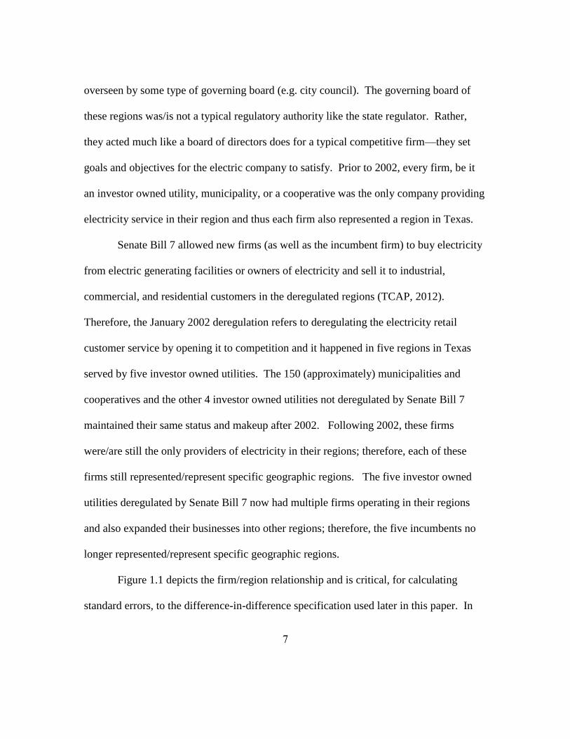
Figure 1.1 depicts the firm/region relationship and is critical, for calculating
standard errors, to the difference-in-difference specification used later in this paper. In

8
this figure, each shape (ovals and rectangles) represents a region. The information to the
left of the vertical line labeled 2002 depicts the market prior to 2002. The information to
the right of this line depicts the market from 2002 on. Prior to 2002, there is one firm in
each of the five regions that will be deregulated. There is also one firm in each of the
regions that were not deregulated by Senate Bill 7. Four regions are shown but in
actuality there are almost 155 regions not deregulated. After 2002, the firms not affected
by Senate Bill 7 maintain their same status--each region is still operated by the same firm.
After 2002, the regions deregulated by Senate Bill 7 now have multiple firms--they have
their incumbent firm, existing firms from the other deregulated regions, and new firms
who were not in Texas‘ market prior to 2002.
From now on, I refer to the five regions Senate Bill 7 deregulated as the
deregulated group and the others (approximately 155 regions) as the control group. The
municipalities and cooperatives that were not affected have the choice to ―opt-in‖ to
competition but must remain competitive once making this choice. To date, only one
region, Nueces Electric Cooperative, has opted-in (PUC, 2014). Due to this endogeneity
issue with Nueces Electric Cooperative, I eliminate them from the data in my main
regressions.13 Further, a cooperative, municipality, or regulated investor owned utility is
able to compete and offer electrical service in a deregulated region. However, if they do
this, they must deregulate their region and allow competitors to enter their region. With
the exception of Nueces, no one has proceeded down this road.
13 Regression results with Nueces included are very similar and can be provided upon request.

9
After the passing of Senate Bill 7, in 1999, the firm in the region that would
become deregulated in 2002 began restructuring (there was a different firm in each region
for a total of five firms in five regions). They separated their vertically integrated utility
into three sections to allow for a smoother transition in 2002; generation, transmission
and distribution, and retail customer service. Electric generation in Texas was
deregulated in 1995 has not significantly changed its structure since the 1995
deregulation and is thus unaffected by the 2002 deregulation.
I do not study the deregulation of electricity generation in this paper. I study only
the separable retail market. The transmission and distribution portion remained regulated
and became the regulated Transmission and Distribution Service Provider for their
region. The retail customer service portion, the portion deregulated in 2002, became the
affiliated retail electric provider (hereafter referred to as the incumbent). Initially, all
customers in the area that became deregulated were assigned to the incumbent in their
respective region (Horatscu et al., 2012). Figure 1.2 depicts the five service areas of the
transmission and distribution service provider that became deregulated in 2002. The
shaded regions represent the regions that were deregulated by Senate Bill 7.
It is plausible that the choice of the deregulated regions is exogenous to the price
residential consumers pay for their electricity. One plausible reason is that the policy was
set in 1999 to deregulate the regions in 2002, thus the Texas legislators were likely not
reacting to some event that would affect demand or supply in 2002. Another reason is
that only five of the nine regions regulated by the state regulator were within the

10
jurisdiction of the Texas state legislature to deregulate. These five regions were
completely engulfed within the state of Texas and thus the Texas legislation had
complete authority over them. In contrast, the four regions regulated by the state
regulator but not deregulated by Senate Bill 7 were part of Texas‘ market and other
bordering states‘ markets; therefore, Texas did not have the authority to deregulate those
markets. While these two reasons help support the assumption that deregulation was
exogenous with respect to unobservable determinants of consumer pricing, the best
evidence I can offer is to verify that there was no difference in the pricing trends of the
treated and control groups during the period before deregulation. In the empirical
analysis section, I present evidence showing that the prices of the deregulated firms and
control firms followed the same trend prior to deregulation.
From 2002-2006, Texas went through a transitional period. Importantly, Texas
set a ―price-to-beat‖ (which acts as a price floor and is referred to as a price floor
hereafter) that the incumbent had to keep through 2006 (approximately $0.08/ kilowatt
hour (kWh) in 2002 and $0.15/kWh in 2006) (PUC, 2014 and Payless, 2014). Thus, at
the same time Senate Bill 7 deregulated the retail portion in the 5 regions, it placed a
temporary price floor on the incumbents in those regions. The initial price floor in 2002
was set 6% less than the regulated rates in January 1999 to provide immediate customer
savings (TCAP, 2012). After the initial time period, price floors on incumbent firms
were set high enough to attract new firms into the market by providing them a price they
could undercut and thereby draw customers away from the incumbent (PUC, 2014 and

11
TCAP, 2012). The price floor could be adjusted by the incumbent twice a year to better
align prices with the wholesale cost of natural gas, subject to the state regulator‘s
approval (PUC, 2014). The fact that the price could be adjusted based on the wholesale
cost of natural gas plays an important role in justifying the econometric specification I
propose in section 7.
3. RELEVANT LITERATURE
Many energy and policy papers have tried to determine deregulation‘s effect on
prices. However, most focus only on whether or not residential consumers paid lower
prices following deregulation instead of determining the causal effect of deregulation on
prices.14 Other papers compare the prices observed in states that have deregulated to
those in still regulated states.15 Comparing between states not only complicates the study
because states may have other factors unaccounted for in such an analysis but it also
creates problems when papers use states like Texas as a deregulated state, when in fact
much of the electricity market in Texas is not deregulated. Many papers also focus on
deregulation‘s effect on industrial or commercial prices rather than residential prices.16
Further, the findings are disparate as many find residential consumers pay higher prices
while others find residential consumers pay lower prices. Every paper reviewed shows
correlation, not causation.
14 e.g. Swadley and Yucel (2011), Kang and Zarnikau (2009), TCAP (2012) 15 e.g. Swadley and Yucel (2011) and Zummo (2015) 16 e.g. Rose (2004), Joskow (2006), and Apt (2005)

12
In line with the above explanation, there is no consensus among earlier studies on
how deregulation affects prices. Swadley and Yucel (2011) and Su (2015) find
competition led to lower prices for some states (including Texas) but not for others.
Zummo (2015) shows that retail electricity prices in deregulated states increased
significantly more than they did in regulated states. Basheda et al. (2007) find no
difference in the increasing retail rates between deregulated and non-deregulated states
following deregulation. Rose (2004) and Joskow (2006) find prices decreased for
commercial and industrial consumers, opposite to what Woo and Zarnikau (2009) find.
Zarnikau, Fox, and Smolen (2007) also find commercial prices increased. Apt (2005)
finds prices did not change for industrial consumers. Joskow (2006) credits legislation
and regulated default service for the decrease in residential and industrial prices, not
competition. Fagan (2006) shows the difference between actual and predicted electricity
prices for industrial customers in deregulated states is much smaller than for customers in
non-deregulated states. He determines the smaller change is due to high pre-restructuring
prices, not whether or not a state restructured. Whitworth and Zarnikau (2006) show
prices in Texas rose faster in deregulated areas while Swadley and Yucel (2011) find the
opposite. Axelrod et al. (2006) and Swadley and Yucel (2011) find prices increase when
price caps are removed in the deregulated areas while Kang and Zarnikau (2009) find the
opposite. Woo and Zarnikau (2009) conclude prices increased in deregulated areas by
inspecting graphs and visually comparing the residential price trends of the average of the

13
larger competitive firms, regulated utilities, and two largest municipalities. The three
papers most similar to mine are explained in the next three paragraphs.
My research is most closely related to a paper dealing with prices in Texas‘
electricity market by Whitworth and Zarnikau (2006). They compare prices in a small
subset of the regions in Texas following deregulation and look at what happened to prices
over time. They analyze graphs that plot the price trends of the different regions to
visually determine prices in deregulated areas increased more following deregulation than
prices in non-deregulated areas. In order to see if the cost of natural gas has a different
effect in deregulated regions compared to non-deregulated ones, they regress, for each
company individually, the electricity price to residential consumers on a dummy for
whether the company they used was in a restructured market, the cost of natural gas
interacted with this dummy, and the cost of natural gas interacted with one minus this
dummy (to obtain coefficient estimates on the interaction terms for both deregulated and
non-deregulated firms). They compare the regression coefficients from each company
and determine that the price decreased immediately following deregulation and that the
cost of natural gas effects deregulated regions much more than non-deregulated ones.
Relative to my study, Whitworth and Zarnikau do not formalize deregulation‘s price
effect in a regression using a set of controls, are unable to determine the price effect to
the customer resulting from the cost of natural gas, and they cannot separate out the effect
of deregulation from that of the price floor since their data ends before the floor‘s
removal.

14
Swadley and Yucel (2011) also try to analyze prices in deregulated regions and
the differing effect of input costs. Using state level data, they study the effect of
participation rates, price controls, market size, and different methods of electricity
generation on retail prices in the states that have deregulated their electricity markets.
Using monthly data, they examine the differences in effects using a first difference
model. They find that following deregulation some states have lower prices and others do
not. They determine natural gas costs have a larger and more statistically significant
impact on retail prices than coal costs in deregulated markets and that prices are not
affected by temperature. Unlike my paper, they fail to use a control in their analysis and
thus assume the prices experienced in the state would have trended in the same manner
absent the restructuring in order to make conclusive remarks. Also differing from their
paper, I use both deregulated and regulated regions within one state to analyze the
differing effect on prices and from the cost of natural gas, avoiding complications that
arise when trying to compare electricity markets between states.
Besides contributing to the literature on deregulation‘s effect on prices and on the
differing impact from input costs (i.e. the cost of natural gas), my paper also contributes
to the effect after removing the temporary price floor that was introduced to stimulate
entry and customer switching. Kang and Zarnikau (2009) find prices in a competitive
market decrease in Texas following the price floor removal. Using monthly data from
January 2002 to December 2007, they compare prices in deregulated regions from the
time of deregulation to one year following the removal of the price floor after controlling

15
for the cost of natural gas and the share of the market not served by the incumbent firm.
They conclude a price floor is not necessary once a competitive and mature electricity
market exists. Unlike their paper, I use deregulated and non-deregulated regions to
establish a valid control and give credible estimates of the effect from the price floor.
Further, I am able to study the effect of the removal of the price floor much further out
than the year in which it was removed.
My paper improves on past ones in many ways. Importantly, I establish a
credible control. Using within state variation of exposure to the deregulation, I estimate
the effect on prices from deregulation using a difference-in-difference regression, which
has not been done in past papers and allows a causal interpretation under more plausible
assumptions. Additionally, I determine the differential impact that the wholesale cost of
natural gas has in deregulated and control group markets. I find that the wholesale cost
of natural gas must be below $3.15/MBTU for deregulation to decrease residential prices
relative to the control regions. Further, I use a different data set than prior papers. The
data set spans a much broader time period, from 1994-2012, and encompasses all firms in
Texas. Having 8 years of data before the treatment helps to establish that the parallel
trends assumption is satisfied, which gives credibility to the control group in the pre
period. Having 11 years of data after the treatment allows me to estimate short and long
term effects of deregulation and determine the effects of the price floor imposed on the
incumbents. By only looking at markets in the state of Texas, I can be sure my results are
not biased by state effects. Further, by incorporating the wholesale cost of natural gas,

16
actual number of customers, region fixed effects, dummy variables to capture post 2001
and post 2006, or year fixed effects, I am able to control for and analyze details that other
papers did not.
4. DATA
The main data source I use comes from the Energy Information Administration
(EIA) and is augmented and verified using data from the state regulator and Texas‘
electricity independent system operator. Within the EIA‘s database, one can obtain
information monthly or annually. While monthly data has its advantages, for the purpose
of this paper the annual data is more useful. The annual, panel level data gives each
electric company‘s name, total sales revenue in dollars, total sales quantity in kilowatt
hours (kWhs), number of customers served, class of ownership, and average revenue per
kWh from 1994 to 2012.17 The dependent variable used throughout this paper, the
average revenue per kWh, is the total sales revenue divided by the total sales quantity
(kWh usage).
The EIA also provides data on the average electric power sector price (price it
costs the generation companies to buy the fuels) each year for coal, natural gas, nuclear,
and others. I also gather the energy production broken down by year and by sector for
coal, natural gas, nuclear, wind, and others. All production is given in megawatt hours so
it is straightforward to calculate the percent generation mix for each year for each of
these sectors. I obtain data on these values from 1994 to 2012, which gives me 8 years of
17 Many papers use the percent of eligible residential customers taking up competition. My data is richer
since I have actual customer counts for each company.

17
observations before and 11 years after deregulation and results in a total of 3,196
observations, 1,246 of them before deregulation. Some of the cooperatives combine or
join with other cooperatives and some regulated investor owned utilities come in and out
of the data throughout the studied time period.18 This change results in an unbalanced
panel containing a total of 163 regions throughout 1994 and 2012.19
The dependent variable is average revenue per kWh for residential customers,
hereafter referred to as average price. I scale it in all graphs and regressions to $/1,000
kWh, what a typical household uses in a month.20 Municipalities, cooperatives, and
regulated independently owned investor utilities only have one plan for their customers,
and it is often a step function increasing as usage increases. Through 2006, most firms in
the deregulated regions also only offered one plan (Green Mountain Energy, Reliant, and
Amigo the main exceptions), but their plans were often a step function decreasing as
usage increased. The three already mentioned and many other firms in the deregulated
regions started offering multiple plans, from which customers could choose, after 2006.
Some companies even offered bonuses when customers signed up. While these different
pricing schemes are clearly not the same as average price, the average price is the average
of what the entire customer population in the company paid. Therefore, this average
price represents the average price consumers paid per kWh—which allows me to avoid
18 The cooperatives and investor owned utilities appear to change in a random manner. Their combining to
or joining of another larger cooperative does not appear to be related to deregulation as it happens
throughout the entire timeframe instead of just around the years deregulation occurred. 19 Appendix Section A.4.3 and Tables A.4 and A.5 present results using a balanced panel data set. Results
are almost identical to using the unbalanced panel data set. 20 The EIA reports that, in 2012, the average residential consumption was 903 kWh per month.

18
problems that might arise since companies go about charging their customers and earning
revenue in different ways. In line with earlier work mentioned in previous sections, I
accept the limitation of using average price when companies in fact offered various
pricing schemes.21
Table 1.1 presents some summary statistics for the years 1999 and 2008. Each
year has two subsets: regions that are deregulated/treated and ones that are not (the
controls). The average price charged by firms in the deregulated regions and the cost of
natural gas increases greatly from 1999 to 2008. The average price charged by firms in
the control regions also increases, but by a smaller magnitude than the average price of
the firms in the deregulated regions. The number of customers and the quantity of
electricity sold both increase at a similar rate between the deregulated and control firms.
In the main analysis of my paper, I present weighted regressions. To come up
with the weighting, I separate the companies into two groups, deregulated and controls.
To calculate the weight each company gets, I divide the company‘s total customers by the
total customers of the group they fall into each year (deregulated or controls). Therefore,
my weight is at the annual-group level. I weight my regressions in order to determine the
average price the consumer paid, as opposed to the average price the producer charged.
Weighting allows me to capture the fact that the company with more customers has a
21 I do not control for temperature since previous papers have found it is not a significant determinant of
electricity prices (Swadley and Yucel, 2011). I also do not use lags of temperature since my data is annual
and most of the lags take two to six months to have any effect (Swadley and Yucel, 2011 or EIA, 2015).

19
greater impact on the price paid in their group than the company with fewer customers. I
present results using non-weighted regressions in the appendix.22
5. MAIN EMPIRICAL STRATEGY AND MAIN RESULTS
5.1. Main Empirical Strategy
I take advantage of the variation in deregulation within Texas to establish a valid
control group and estimate a difference-in-difference regression that provides a stronger
causal interpretation than prior papers. In order to answer the primary question of this
paper--Does deregulation of the electricity market decrease electricity prices to
residential consumers?--I ran difference-in-difference regressions that take the following
form:
( )
is the price charged by firm j in year t in region r; are region fixed effects; are
year fixed effects.23 equals 1 if the year is ≥ 2002 and 0 otherwise.
equals 1 if the year is ≥ 2007 and 0 otherwise (to capture the effect from the removal of
the price floor). is a dummy variable equal to 1 if the firm is in a deregulated region
and 0 otherwise. accounts for the effect of all unobserved variables which vary over
the company level, region level, and time. The coefficients of interest are β and which
identify, respectively, the impact on price of deregulation and removal of the price
22 As a reminder, I eliminate Nueces from the data when running my primary regressions presented in the
next section. Regression results with Nueces are available upon request. Results are very similar. 23 Figure 1.3 suggests that the treatment effect from deregulation may vary by year in a relatively
nonparametric way. Appendix Section 5 uses deregulation-by-year interactions as opposed to a post 2002
and post 2007 interaction to analyze this possibility.

20
floor. A causal interpretation resulting from the difference-in-difference regression rests
on the fact that prices for the deregulated regions would have continued in the same
manner as the control regions absent deregulation.
The variation occurs at the region level; therefore, I follow standard methodology
and cluster all standard errors at the region level. As mentioned in the Background
section, prior to 2002, each firm represents a region. Following 2002, the municipalities,
cooperatives, and regulated investor owned utilities still represent a region but the
deregulated firm no longer represents a region as it can now enter into four additional
regions (reference Figure 1.1). Since my data is at the firm level, I cannot differentiate
the price a competitive firm charges in the Dallas region versus what they charge in the
Houston region. Therefore, I cannot differentiate between the five deregulated regions
following 2002. By combining all five regions into one region, the deregulated region, I
can differentiate between the regions represented by all the controls and the deregulated
one. This method results in almost 165 regions, with one of them being the treated one.
The treated region is the deregulated region which entails the five regions deregulated
and is, therefore, treated as only one region before and after the 2002 deregulation in the
regression analysis.
One drawback to this is that I cannot tell how the average customer in Dallas or
Houston was affected. However, an advantage is that I can tell how the average customer
in the deregulated region was affected—which is the answer to the primary question of
this paper. Another drawback, and one of more concern from an econometric

21
perspective, is that I only have one treated region. While there were actually five treated
regions, I cannot distinguish them in my data and, therefore, group all five regions into
one single cluster when calculating standard errors. This is in spite of the fact that the
level of variation is finer than the cluster I can create in my dataset. For this reason, I
report p-values based on the methods outlined in Conley and Taber (2011) in my main
empirical results in brackets. 24 Also, I follow conventional methodology in my analysis
using confidence intervals and p-values based on using conventional standard robust
clustered errors. Therefore, the reported standard errors in parentheses and asterisks next
to the coefficients in the main tables are based on standard robust clustered errors.
To demonstrate robustness of these results, I run regressions after limiting my
treated group to the five incumbents and comparing them to different subsets of the
controls. When focusing in on the incumbents, I use company instead of region fixed
effects and calculate clustered standard errors at the company level in addition to the
methods suggested in Donald and Lang (2007) and Bertrand, Duflo, and Mullainathan
(2004). Results and details are given in the robustness section.
5.2. Main Empirical Results
One important condition for the credibility of a difference-in-difference
estimation strategy is that the treated and control groups should have parallel trends prior
to the treatment. Figure 1.3 shows the weighted average prices to residential customers
24 Conley and Taber’s method uses the residuals of the estimating equation run without the variable of
interest included in the regression in order to obtain the empirical distribution. The p-value is obtained by
comparing the actual estimate to this empirical distribution.

22
in the deregulated and control regions in Texas from 1994 to 2012.25 The scale on the
vertical axis is the average price paid in $/1,000 kWh. Year is on the horizontal axis.
The blue, X-marked line represents the average price paid by consumers in the
deregulated regions. The red, diamond-marked line represents the average price paid by
consumers in the control regions. The red vertical line at 2001.5 denotes just prior to the
2002 deregulation. The red vertical line at 2006.5 denotes just prior to the removal of the
price floor.
Inspecting Figure 1.3 reveals important points. Importantly, the trends before
2002 are parallel, establishing validity of the control group. Following 2002, there is a
clear separation in prices between the deregulated and control regions. The decrease in
average price for the deregulated regions from 2001 to 2002 immediately following
deregulation is expected since, as described in the Background section, the price on the
incumbent was set 6% less than the regulated rates in January 1999 to provide immediate
customer savings. After 2002, the prices in the deregulated regions increase at a much
greater rate than the prices of the controls, suggesting deregulation causes an increase in
prices. In the deregulated regions there is a slight decrease in prices after 2006, when the
price floor was removed, and there is a sharp decrease in prices after 2009. Prices in the
control regions trend up from 2002 to 2006, which makes sense since the cost of natural
gas increased so much during this timeframe (this effect will be explored in the second
half of the paper). Prices in the controls regions remain relatively stable from 2006 on.
25 The weighting is performed from here on using the method described in the Data section. Results of
regressions without weighting are presented in the Appendix.

23
Table 1.2 provides the empirical results for equation (1). Each of the regressions
in this table are run at the individual level and are weighted. The left hand column of the
table lists the independent variables of interest and each subsequent column represents a
different regression corresponding to equation (1). The coefficients in this table answer
the primary question of this paper: how did deregulation affect the prices to residential
consumers? Column (1) depicts equation (1) without time or region fixed effects, but
instead indicators for the deregulated region, post 2001, and post 2006. Column (2) uses
year fixed effects instead of the post 2001 and post 2006 indicators. In addition to year
fixed effects, column (3) uses region fixed effects instead of the deregulated indicator.
Column (4) adds in a control—quantity. Regardless of the specification used, results are
robust across specifications. Column (3) is my preferred specification. Empirical
justification and discussion of quantity in the electricity market being exogenous is
provided in the appendix.
Column (3) shows that the average customer in the deregulated region paid over
$14 per month more than regulated customers due to deregulation from 2002 to 2006.
From 2007 on, this value increases to almost $24 ($14.46+$9.30). Clustering standard
errors in the standard fashion, at the level of variation which is at the region level here,
gives significance at better than the 1% level.26 Further, is significant at better
than the 1% level.27 Compared to the mean of the dependent variable, the average
26 The values are significant at better than the 5% level using the Conley-Taber method for β but lose
significance for δ. However, β + δ is significant at the 5% level using the Conley-Taber method. 27 The standard error of β + δ = 1.686 when clustering standard errors at the region level, resulting in a p-
value = 0.000. The Conley-Taber p-value = 0.031

24
customer in the deregulated regions paid almost 15% higher from 2002 to 2006 and 25%
more from 2007 on, compared to the average customer in the control regions; due to
deregulation and the price floor.28
6. MODEL
Proponents of deregulation argue we would see results opposite of those
presented in the prior section. They argue deregulation would bring about lower prices,
not higher ones. In this section, I present two plausible reasons why this did not happen.
One reason is that electricity prices to residential consumers in regulated regions are
based on average cost (AC) pricing while prices in deregulated regions are based on
marginal cost (MC) pricing. The other is that firms in deregulated regions are more
exposed to current natural gas prices, due to the way they purchase electricity for their
customers, than the firms in the regulated/control regions.
6.1. Pricing Based on Marginal versus Average Costs
Regulated firms have their prices set by a state regulator who applies a common
rate of return pricing formula regulated firms can charge their customers (PUC, 2015).
The state regulator‘s basic rule making formula is as follows: multiply the firm‘s costs of
utilities and useful assets or rate base by a reasonable rate of return (often close to 10%);
add in the fuel costs, purchased power costs, and the operations and maintenance costs;
and then divide this summation by the number of customers or quantity of electricity sold
(Zarnikau, 2015). Thus, the formula takes average costs and gives the company a
28 Appendix Section A4.c and Tables 4a and 5a present results using a balanced panel data set. Results are
almost identical to using the unbalanced panel data set.

25
nominal profit. These average costs include many different costs but are mainly affected
by the costs of the fuels used to produce electricity and the purchased power, both of
which are not marked up.
The retail portion of the deregulated electricity market is accurately represented
by Bertrand competition, where firms compete on price (Borenstein and Holland, 2005).
In Borenstein and Holland‘s electricity market model, the retailers are price takers
because they are selling a homogeneous product and face no real capacity constraints.
Thus, once they are open to retail competition, prices in the retail market trend towards
marginal costs as long as two firms exist in the market.29 The standard economic
argument justifies why only two firms are necessary in the electricity market for it to
become a perfectly competitive one. 30 If a firm offers a higher price than its competitor,
they will find themselves without customers. A firm will capture the entire market if it
offers a lower price than its competitor. Due to these two pricing situations, prices will
trend to MC. If a firm offers a price lower than where MC = AC, the firm will not cover
costs and will eventually go out of business. Even if competition is not perfect, prices
will still be related to MC, not AC.31 Below, I empirically test whether retail prices track
MC.
As explained above, in deregulated regions prices are tightly linked to marginal
costs, whereas, in regulated regions prices are based on average costs. The driver of the
29 Borenstein and Holland (2005) provide a more detailed overview for the interested reader. 30 Puller (2007) uses empirical evidence to refute that a small number of firms in the electricity market
yield market power and withhold quantity to increase prices. 31 For example, see Mahoney and Weyl (2014).

26
average costs is average fuel costs. Average fuel costs represent a mix of fuel choices
and, with the exception of natural gas, have been relatively stable in the past 20 years
(EIA, 2015). Therefore, the retail price in the regulated regions is a function including
the average costs of electricity which is primarily made up of natural gas, coal, and
nuclear fuel. In contrast, the retail price in deregulated regions is a function of the MC of
electricity.32 In Texas, the cost of natural gas almost always determines the marginal cost
of electricity and is thus considered the marginal fuel.33 Equations (2) and (3) show this
in functional form. Equation (2) shows that the price charged by firm j in deregulated
region d is based on the marginal cost of electricity and the demand for electricity in the
deregulated region. The marginal cost of electricity is based on the cost of natural gas.
Equation (3) and (3b) show that the price charged by firm j in regulated region r is based
on the average total costs to the firm, which are based on the average costs of electricity
and other inputs.
(
) ( ) ( )
( ) ( )
( ) ( ) ( )
( ) represents a weighted average of the cost of all
possible fuel inputs. Assume f(.)', f1(.)' h(.)', h1(.)' and h2(.)' > 0.
32 See Woo and Zarnikau, 2009; Whitworth and Zarnikau, 2006; or Swadley and Yucel, 2011. 33 See references in footnote above and Appendix Section A3 for a detailed explanation of this sentence.
The basic reason is that coal and nuclear are often used at maximum capacity while natural gas
supplements demand and, in the studied time interval, was more expensive than coal and nuclear.

27
Figure 1.4 illustrates why prices may not decrease when we deregulate the
electricity market and shift to marginal cost pricing, and what we expect to see after the
price floor is removed.34 If the market faces demand DL it will move from point A to B
when it is deregulated, increasing quantity from SL to QL, and decreasing price from RL
to PL. However, if the market faces demand DH then when it becomes deregulated it will
move from point D to point C, decreasing quantity from SH to QH, and increasing price
from RH to PH. While lower prices are touted as the primary reason to allow deregulation,
the theory shows that deregulation may in fact increase prices.
In either demand situation, the price floor is binding. Since the incumbent cannot
price below the price floor, incoming firms can enter the market and price below the
incumbent to attract customers but still make profits. We expect to see prices decrease
when the price floor is removed as the incumbent could then compete against firms on
price. This, of course, assumes the market experiences some type of consumer inertia
problem.35 If there was no inertia problem, then all customers would leave the
incumbent since other firms offer essentially the same product for a lower price. The
residential price effects seen in Texas following deregulation and removal of the price
floor suggest demand DH, a binding price floor (as depicted in the figure), and consumer
inertia all described Texas‘ electricity market from 2002 through the removal of the price
floor.
34 The model builds upon Woo and Zarnikau (2009). 35 The consumer inertia problem is discussed at length in Giulietti et al. 2005 and Horatcsu et al., 2012.

28
6.2. Bilateral Contracts, Day-Ahead Market, Real-Time Market
The second reason prices may have increased more in the deregulated regions
follows from how firms in Texas purchase electricity for their customers. In Texas, there
are three ways to buy electricity: bilateral contracts, the day-ahead market, and the real-
time market. The percentages and amounts purchased in these three markets are closely
protected by businesses, and are not publicly available.36 80%-95% of electricity in
Texas is purchased through bilateral contracts, with municipalities and cooperatives
making up the majority of the purchases (ERCOT, 2015 and PUC, 2015). Bilateral
contracts agree upon prices for a specific duration. When purchasing electricity in the
day-ahead and real-time markets in Texas, a company pays the cost of the most
expensive generator that must be used to satisfy demand. This cost is determined by the
marginal cost of producing the last unit of electricity quantity. In these two markets,
Texas‘ electricity operator determines how much electricity will be needed to satisfy
demand and accepts the bids, from lowest to highest, of all the generators needed. All
generators are paid the highest price bid of the generator that must be turned on. Anyone
buying electricity in this market, i.e. the retailer, pays this price. From 2002 to 2012, the
cost of natural gas almost always determined the price of the most expensive generator
(ERCOT, 2015).
Due to the consistency of their customer base, knowledge of how and when their
customers use electricity, and relative ease of predicting future electricity consumption,
36 The information in the rest of this section is through many interviews (some confidential) with
employees at the state regulator; employees at Texas’ independent system operator, employees of different
deregulated companies, municipalities, cooperatives, and faculty members at the University of Texas.

29
the regulated investor owned utilities, municipalities and cooperatives enter into 10, 15,
and 30-year bilateral contracts that cover the majority of the electricity demanded by their
customers (PUC, 2015; ERCOT, 2015; Webber, 2015). Due to the ambiguity of their
customer base, uncertainty of the customer‘s demand for electricity, and difficulty with
predicting future electricity consumption, the majority of the firms in the deregulated
regions enter into 1-3 year bilateral contracts that cover a small portion of their
customers‘ demand. These firms rely on the day-ahead and real-time market to purchase
the majority of electricity for their customers. Having a large percentage of the
electricity they need negotiated and paid for in bilateral contracts as well as having
contracts that span such long durations, regulated utilities, municipalities, and
cooperatives are greatly hedged against rising fuel costs. Having more electricity bought
in the day-ahead and real-time markets, firms in the deregulated regions are more
exposed to current day prices, which, as explained earlier, are normally based on the cost
of natural gas.
As explained above, short duration contracts and more exposure to the day-ahead
and real-time markets are typical for firms in the deregulated regions. Long duration
contracts and less exposure to the day-ahead and real-time markets are typical for the
control firms/regions. Further, the firms in the deregulated regions use marginal cost
pricing while the firms in the regulated regions use average cost pricing. These
differences all lead to the same two predictions. First, the retail price in deregulated
regions should be more sensitive to the cost of natural gas than the control regions.

30
Second, the retail price in the control regions should move in the same direction but with
less magnitude than the retail price in the deregulated regions. I cannot distinguish the
effect on prices from contract length, market exposure, and type of pricing used due to
the correlation between them and the type of region in which they occur (deregulated or
control). Therefore, the coefficients in my regression equation to follow capture the
combined effects of all these factors.37
7. EMPIRICAL STRATEGY AND RESULTS EVALUATING THE ROLE OF NATURAL GAS
7.1. Empirical Strategy
Due to the differences explained in detail above, the price charged to residential
consumers in the deregulated markets is more closely tied to the cost of natural gas than
is the price charged to residential consumers in the control markets. Figure 1.5 depicts
the cost of the three main fuels used in Texas to produce electricity: natural gas, coal, and
nuclear. It also depicts the weighted average cost of all three.38 As explained, these costs
are the key variable explaining the final price generators charge for electricity produced
(Webber, 2015). Due to the high costs of natural gas during the studied timeframe, the
figure helps depict why natural gas most often determines the most expensive generator
that must be turned on and thus the marginal cost of electricity. The horizontal axis
depicts the year and the vertical axis depicts the average cost of the fuel in $/MBTU. As
37 Less important and more subtle reasons that the cost of natural gas affects the deregulated regions
differently than the control regions are provided in the appendix. 38 The weighted average price takes into account the percent used to produce electricity and the price of the
fuel.

31
there is a national market for these fuels, the price in Texas is representative of the price
in other states (Zarnikau, 2015).
Figure 1.5 illustrates that the price of natural gas experienced an upward trend
after deregulation occurred and a downward trend following removal of the price floor.
It also shows the price of nuclear and coal remained very stable throughout the studied
time interval. It demonstrates that companies that also use coal and/or nuclear will have
more stable and lower prices on average than companies that primarily or only use
natural gas. It also illustrates that the price of natural gas is highly correlated with the
weighted average price of the three fuels. The figure helps depict why price changes will
be greater in magnitude for the deregulated regions whose prices are based on marginal
costs than the control regions that price based on average costs.
Figures 1.3 and 1.5 are consistent with the model described in the Models section.
Comparing the price of natural gas and the weighted average price of the three fuels,
illustrated in Figure 1.5, with the weighted average price charged by firms in the
deregulated regions and the weighted average price charged by firms in the control
regions, illustrated in Figure 1.3, one can see the correlations. Electricity prices in the
deregulated regions follow a similar trajectory to the price of natural gas, which
determines the marginal cost of electricity. Electricity prices in the control regions
follow a similar trajectory to the weighted average price of the three fuels, which make
up a large part of the firms‘ average costs.

32
In Texas, natural gas is the main fuel used to generate electricity. Figure 1.6
illustrates that approximately 50% of the electricity in Texas is generated using natural
gas, 38% is generated using coal, 10% is generated using nuclear, and the remaining
amount comes from wind and other sources. The horizontal axis of Figure 1.6 depicts the
year. The vertical axis depicts the percent of the fuel used to generate electricity. Since
2007, wind has gained a greater share and is responsible for just shy of 10% of the
electricity generated by 2012. This figure supports why the cost of natural gas has such a
heavy influence on the weighted cost of the fuels used to produce electricity.
Decoupling the effects from the cost of natural gas becomes more important after
deregulation because, as explained above, natural gas prices affect the deregulated
regions much differently than the control regions. It is important from a policy
perspective to know the effect of deregulation, without it being confounded by other
variables. Due to this possibility, the last set of regressions run are the same as equation
(1) with one major difference—they allow more flexibility by interacting the price of
natural gas (depicted as PNG in equation (4)) with the key variables. To clarify, this
difference-in-difference equation takes the following form:
Equation (4) is the same as equation (1) plus it interacts the price of natural gas with
everything except and (but it does interact with the two appropriate time and
(4)

33
deregulated region indicators). This equation allows one to see how the price of natural
gas affects prices to residential consumers following deregulation and allows it to have
different effects in the deregulated and control regions. It helps answer the follow-up
question in this paper: what is the differential impact resulting from input costs on the
price that residential consumers face in the deregulated regions versus the other regions?
The coefficients of interest from equation (4) are and from 2002 to 2006.
They include from 2007 on. In isolation, ( ) estimates the
change in prices from 2002-2006 (2007-2012) to the average consumer in the deregulated
regions relative to the average consumer in the control regions given the price of natural
gas increases by $1/MBTU. For 2002 to 2006, solving for the
provides an estimate for what the price of natural gas must be for deregulation to
lead to decreasing prices to consumers in deregulated regions relative to control regions.
This happens whenever:
( ).
For 2007 on, using the same methodology, deregulation leads to decreasing prices to
consumers in deregulated regions relative to control regions whenever:
( )
( ) ( )
7.2. Empirical Results Evaluating the Role of Natural Gas
Figure 1.7 depicts the difference in the weighted average prices between the
deregulated and control regions and the price of natural gas. The blue, solid-diamond

34
marked line is the weighted difference between the firms in the deregulated regions and
the controls. The red, open-diamond line is the price of natural gas. The average price
difference, in $/1,000 kWh (this is the average paid per month), is on the left hand
vertical scale and the price of natural gas, in $/MBTU, is on the right hand vertical scale.
Year is on the horizontal axis. This graph is shown so the reader can visually see the
difference between the deregulated and control firms‘ prices and the price of natural gas
on one graph. It depicts a pictorial representation of the difference-in-difference
regression and shows the trends were very similar prior to 2002--as the difference is quite
stable from 1994 to 2001, at around $9, and then greatly increases following 2002. It
also shows a correlation between these values and the price of natural gas which, along
with the explanation in the Model section, demands further inspection.
Table 1.3 provides the empirical results for equation (4). The table and
specifications are structured similarly to Table 1.2.
Column (3) shows that, from 2002-2006, for every $1/MBTU increase in the price
of natural gas, the average consumer in the deregulated region paid an extra $4.84/1,000
kWh due to deregulation. This value decreases to $2.30/1,000 kWh from 2007-2012
( = $2.30 is significant at better than the 1% level). Clearly, the price of natural
gas impacts the deregulated and control regions differently.
As expressed earlier, equation (4) allows for a calculation to determine what the
price of natural gas must be in order for deregulation to cause retail prices to decrease
relative to retail prices in control regions. Solving equation (4) for equations (5) and (6)

35
gives this value. Using the results from Table 1.3, column (3) and solving equation (5),
one can calculate that, from 2002 to 2006, the price of natural gas would have needed to
be less than $3.15/MBTU for deregulation to have caused the price producers charge to
decrease, relative to retail prices in control regions. The red, horizontal line in Figure 1.5
depicts the price of $3.15/MBTU. As shown, the price of natural gas was not below this
value from 2000 to 2011. This value shows that deregulation could lead to lower retail
prices in the short run, relative to retail prices in control regions, if the price of natural
gas is low enough.
Using the results from Table 1.3, column (3) and solving equation (6), one can
calculate that from 2007 on, the price of natural gas must be negative for deregulation to
lead to decreasing retail prices relative to the control regions. A negative price,
obviously, cannot happen. This result is likely not applicable since the price of natural
gas has decreased below a certain threshold that precludes it from determining the
marginal cost of electricity. The price of coal, or another fuel, would eventually take
over as the input responsible for the marginal cost of electricity which would determine
the final prices to consumers in the deregulated regions.
8. ROBUSTNESS CHECKS
In this section, I present figures and regression results that focus on subsets of the
controls that are more like the deregulated firms in some specific way. I also present
results focusing in on subsets of the deregulated firms and controls to provide robustness
to the main results.

36
Figures 1.8-1.11 present a graphical depiction of the weighted average prices after
focusing on a subset of controls and/or deregulated firms. Each graph is of the same
format with average price/1,000 kWh on the vertical axis and year on the horizontal axis.
The blue, solid-diamond marked line represents the weighted average price of the
deregulated firms in Figure 1.8 and the weighted average price of the five incumbents in
Figures 1.9-1.11 (a subset of the deregulated firms). The other lines represent a specific
set of controls labeled in the legend at the bottom of each figure. All four figures have
the same important characteristics. In all of these figures there is a parallel trend prior to
2002; a clear break after 2002 in the parallel trend with the residential prices of the
deregulated or incumbent group increasing at a much greater rate than the controls, and a
stagnation and eventual decrease after 2007 for the deregulated region or incumbent firms
while the control regions‘ residential prices, in general, stay relatively flat. The parallel
trends prior to deregulation lends credibility to these groups being valid controls; the
break after 2002 lends validity to deregulation‘s causal effect on prices; and the break
after 2007 lends credibility to the price floor affecting prices.
Table 1.4 presents regression estimates when focusing in on the subsets
represented by Figures 1.8-1.11. Each column corresponds to a subset of the population
represented in a figure or multiple figures. Column 1 corresponds to Figure 1.8, column
2 corresponds to Figure 1.9, columns 3 and 4 correspond to Figure 1.10, and column 5
corresponds to combinations of Figures 1.9-1.11. The first column of Table 1.4 depicts
results running regression equation (1). The final 4 columns follow the same form as

37
equation (1), but since they use the 5 incumbents instead of all firms in the deregulated
regions, I use company fixed effects as opposed to regional fixed effects. 39
Standard errors are calculated slightly different in this table (and in Table 1.5).
The standard errors reported are clustered at the region-level for column 1 and company-
level for columns 2-5. Asterisks signifying significance next to the coefficients are
denoted using these robust standard errors. In column 1, since there are 74 control
clusters and only 1 treated cluster, I report Conley-Taber p-values in brackets. Following
Donald and Lang (2007) and Bertrand et al. (2005), I report weighted bootstrap (1,000
times with replacement) p-values in brackets for columns 2-5 due to the small number of
total clusters but larger number of treated clusters (five as opposed to one).
The five subsets are chosen to show results when focusing in on groups very
similar in some measure above and beyond the general results using all firms. Since each
of the subsets chosen existed from 1994 to 2012, results presented in this table are taken
from a balanced panel. Column 1 uses all firms in the deregulated regions but only the
municipalities as controls because, unlike any cooperatives or regulated investor owned
utilities, some municipalities base the prices they charge off marginal costs following
deregulation (some municipalities based prices off marginal costs prior to 2002 also).
Since some municipalities base prices off average costs while others use marginal costs,
the results in this column lend support that using the day-ahead and real-time market as
opposed to long term bilateral contracts has a large effect on the residential prices to
39 Using company fixed effects has the added benefit of their being 5 treated groups, instead of just 1.

38
consumers. However, since many municipalities base prices off average costs, the effect
of average versus marginal costs and type of contracts used to purchase electricity still
cannot be separated focusing in on this set of controls.
Column 2 uses only the four regulated investor owned utility companies as the
controls and narrows down the deregulated firms to only the incumbents. This is done in
order to have firms most similar in structure and similar in size before deregulation and
consequently similar in size following deregulation. Column 3 uses the 5 incumbents and
the 5 biggest municipalities so I can compare firms similar in size and similar in what
electricity prices to residential consumers are based on following deregulation, that is,
marginal costs. Column 4 uses the 5 incumbents and the 5 biggest controls – which
include 2 municipalities, 2 cooperatives, and 1 investor owned utility. These 5 controls
are used because, out of all possible control firms, they are the most similar in size to the
5 incumbents. Column 5 increases the prior subset of controls by using the biggest firms
most similar in size to the incumbents – which consists of the 5 largest municipalities, 3
largest cooperatives, and the 4 investor owned utilities. This is done to increase the
number of the controls while still providing firms similar in size.
As can be seen from Table 1.4‘s coefficients, regardless of the subset used,
coefficients are strikingly similar in magnitude and significance. In every case, when
using clustered robust or weighted bootstrap standard errors, β+δ is significant at the 1%
level (5% level when using Conley-Taber in column 1). Further, the coefficients are
similar in magnitude and significance to the main regression results presented in Table

39
1.2 column 3, with the only difference being that they are larger ( is about 20% larger,
is about 50% larger, and is about 30% larger). The fact that these subsets of
controls, arguably more similar to the firms in the deregulated regions than using all
possible firms, produce coefficients similar in magnitude and significance to the results in
the main empirical analysis provides robustness to the main results in Tables 1.2 and
1.3.40
Figure 1.12 and Table 1.5 follow the same process described above but use
equation (4) to show robustness for the results presented in Table 1.3. Figure 1.12
depicts the weighted average price of the five incumbents, the four regulated investor
owned utilities, and the price of natural gas. The weighted average price is depicted on
the left hand side vertical axis and the price of natural gas is depicted on the right hand
side vertical axis. Year is on the horizontal axis. The conclusions and analysis are the
same as described above. Table 1.5 provides robustness supporting Table 1.3. Results,
both in magnitude and significance, in Table 1.5 are very similar to each other. The
results are similar to or greater than those in Table 1.3, column 3 (magnitude wise).
and range from the same to almost 70% larger (in magnitude) and and range
from the same to about twice as large (in magnitude).41,42
40 Non-weighted regressions support these findings and are available upon request. 41 Standard errors are calculated and depicted the same as detailed for Table 4. Conley-Taber p-values are
depicted in [] in column 1 and weighted bootstrap p-values are depicted in [] in columns 2-5. 42 Non-weighted regressions support these findings and are available upon request.

40
9. CONCLUSION
Due to electricity deregulation in Texas and the rising price of the marginal fuel
used to produce electricity (the cost of natural gas) without a corresponding increase in
the cost of the other fuels, customers in the deregulated regions paid higher prices than
customers in the municipalities, cooperatives, and regulated investor owned utilities.
Compared to the average customer in the control regions, the average customer in the
deregulated regions paid an extra $867 from 2002 to 2006 ($14/month * 12 months * 5
years) and an extra $1,710 from 2007 to 2012 ($23.75/month * 12 months * 6 years) due
to deregulation. This obviously runs counter to the main benefit touted by proponents of
deregulation—that deregulation will lead to lower prices. Municipalities and
cooperatives within Texas, policy makers in Texas and other states, and policy makers in
other countries should consider these results when deciding to deregulate or re-regulate
their areas. This price differential due to deregulation is especially disheartening for
proponents of deregulation, as Texas is touted as the ―success‖ story in North America.
The method used in this paper finds the price of natural gas must be low for
deregulation to lead to lower prices.43 Since the price of natural gas rarely dips below
these low levels found in section 7.b, deregulation in an area where the predominant fuel
used is natural gas will rarely result in decreased prices to consumers. These results
suggest that deregulation will not decrease prices to the average consumer and thus
should not be implemented by policy makers who aim to decrease prices to their
43 It should be noted that the data used in this paper only includes the electricity markets in Texas.
Extrapolation of these results to other electricity markets in other states should be taken with caution.

41
constituency. Unless a policy maker expects the cost of natural gas to drastically fall,
deregulation will lead to results suggested in this paper--customers will pay higher prices
if the market becomes deregulated (at least in Texas‘s market, where natural gas is the
dominant fuel and the cost of it greatly exceeded the costs of the average fuel costs). My
results show that, roughly, a 20% increase in the price of natural gas leads to a 5%
increase in the price of electricity to residential customers in deregulated regions
compared to regulated regions.
Once taking into account the cost of the marginal input fuel, we see deregulation
can help electricity markets decrease prices, but only if the cost of the marginal input fuel
stays very low. As explained above, the deregulated market is tied closely to the cost of
the marginal input fuel while the regulated one is tied closely to average prices of all the
fuels. As prices approach the marginal cost, the economy may become more efficient
from an economic perspective if deadweight loss decreases (this was not studied in this
paper), but this need not result in lower consumer prices. If the cost of the marginal input
fuel decreases below a certain threshold (in Texas, this means the price of natural gas
needed to decrease below $3.15/MBTU) then the deregulated markets may observe lower
prices. If the cost of the marginal input fuel stays stagnant, increases, or does not decease
below this value, then the deregulated markets may observe higher prices—as they did in
Texas.
While other states may and probably do use a different mix of fuels, the
relationship between MC and AC remains when moving from regulated to deregulated.

42
If there is not a drastic change in any fuel prices, but rather a steady or no change, then
the market that observes lower prices will depend on the relationship between the
marginal and average cost of the fuels at the time. If the marginal cost is greater than the
average cost, deregulating the electricity markets will lead to higher prices. If the
opposite is true, deregulated markets implemented similarly to how they were in Texas
would lead to lower prices.
This paper shows that consumers paid higher prices in deregulated electricity
markets in Texas. It also shows that deregulated markets can lead to higher prices.
Deregulated electricity market‘s relationship with MC and the corresponding link within
Texas between MC and the cost of natural gas led to higher prices. As described, these
same inputs could lead to lower prices, given the right circumstances. Unfortunately, for
the residential customers in the deregulated regions in the state of Texas, this is not what
happened, and they paid a hefty price for their electricity due to this policy change.

43
Figure 1.1: Firm and Region Relationship
Figure 1.2: Deregulated Regions in Texas
Notes: Shaded regions represent regions deregulated by Senate Bill 7. Each color
corresponds to the deregulated region identified in the legend. Source: PUC, 2015.

44
Figure 1.3: Average Price of Deregulated and Controls Regions
Notes: The figure above shows the weighted average price of the deregulated regions and the control
regions each year. Average price, in $/1,000 kWh, is on the y-axis and year is on the x-axis. The prices
depicted are weighted by a firm’s number of customers. The first vertical red line is just prior to the 2002
deregulation and the second vertical red line is just prior to the removal of the temporary price floor placed
on the incumbents.

45
Figure 1.4: Average Cost vs. Marginal Cost in the Electricity Market
Notes: The figure above depicts the price of electricity ($/MWH) on the y-axis and quantity of
electricity (MWH) on the x-axis. Average cost (AC) and marginal cost (MC) curves are drawn
to depict the hypothetical electricity market. Demand DL and demand DH depict two different
possible demand scenarios. The hypothetical price floor, which is based on the price of natural
gas, is depicted as a blue-dashed horizontal line.
Figure 1.5: Price of Fuels used to Generate Electricity
Notes: The figure above depicts the average price of natural gas, coal, nuclear, and the average
weighted price of all the fuels used to produce electricity. The average weighted price is
calculated using the price of the fuel and proportion of the fuel used for electricity production.
See Figure 1.3’s notes for more details.

46
Figure 1.6: Percentage of Fuel Used to Generate Electricity in Texas
Notes: The figure above shows the proportion used of each fuel used to produce electricity.
Percentage of fuel used is on the y-axis and year is on the x-axis. Each line represents a
different fuel as labeled in the legend. See Figure 1.3’s notes for more details.
Figure 1.7: Price of (Deregulated – Control Firms) and the Price of Natural Gas
Notes: The figure above depicts the weighted average price difference between the deregulated
and control regions and the average price of natural gas. The average price of natural gas, in
$/MBTU, is on the right hand vertical axis. See Figure 1.3’s notes for more details.

47
Figure 1.8: Average Price of Deregulated Firms, Municipalities, and Investor
Owned Utilities
Notes: The figure above depicts, each year, the weighted average price of the
deregulated regions, all the municipalities, and the four regulated investor owned
utilities not deregulated by Senate Bill 7. See Figure 1.3’s notes for more details.
Figure 1.9: Average Price of 5 Incumbents vs. 4 Regulated Investor Owned Utilities
Notes: The figure above depicts, each year, the weighted average price of the five
incumbents of the deregulated regions and the four regulated investor owned utilities
not deregulated by Senate Bill 7. See Figure 1.3’s notes for more details.

48
Figure 1.10: Average Price of 5 Incumbents, 5 Biggest Municipalities, 5 Biggest
Controls
Notes: The figure above depicts, each year, the weighted average price of the five incumbents of the
deregulated regions, the five biggest municipalities, and the five biggest controls (which includes 2
municipalities, 2 investor owned utilities, and 1 cooperative). See Figure 1.3’s notes for more details.
Figure 1.11: Average Price of 5 Incumbents and 3 Largest Cooperatives
Notes: The figure above depicts, each year, the weighted average price of the five incumbents of the
deregulated regions and the three biggest cooperatives. These 3 cooperatives are used in the final
regression where results are depicted in column 6 of Tables 1.3 and 1.4. See Figure 1.3’s notes for more
details.

49
Figure 1.12: Average Price of 5 Incumbents, 4 Regulated Investor Owned Utilities,
and the Price of Natural Gas
Notes: The figure above depicts, each year, the weighted average price of the five incumbents
of the deregulated regions, the four regulated investor owned utilities not deregulated by
Senate Bill 7, and the average price of natural gas. The price of natural gas is depicted on the
right hand vertical axis. See Figure 1.3’s notes for more details.
Table 1.1: Summary Statistics
Notes: The table above provides summary statistics from the primary data used in this paper, data from the
Energy Information Administration, 2015. The statistic of interest is on the left hand side and the values in
the corresponding years in the corresponding regions fill the next four columns.

50
Table 1.2: Dependent Variable: Average Price ($/1,000 kWh)
Notes: Robust standard errors in () are clustered at the region level
(163 regions, 1 treated). Asterisks next to the coefficients are for p-
values calculated using robust clustered standard errors. Conley-
Taber p-values are expressed in [] for the variables of interest. This
table uses all the deregulated firms and all the controls from 1994 to
2012.

51
Table 1.3: Dependent Variable: Average Price ($/1,000 kWh)
Notes: Robust standard errors in () are clustered at the region level (163 regions, 1 treated). Asterisks next
to the coefficients are for p-values calculated using robust clustered standard errors. Conley-Taber p-values
are expressed in [] for the variables of interest. This table uses all the deregulated firms and all the controls
from 1994 to 2012.

52
Table 1.4: Dependent Variable: Average Price ($/1,000 kWh)
Notes: Standard errors are in (). Column 1 reports robust standard errors clustered at the region-
level. Columns 2-5 report robust standard errors clustered at the company-level. Asterisks
denoting significance are based on these standard errors. Conly-Taber p-values are reported in []
for column 1. Weighted bootstrap standard errors are reported in [] for columns 2-5 (1,000 times
with replacement). Column 1 produces results from equation (1) using all firms in the deregulated
regions and all municipalities. Columns 2-5 also produce results using equation (1) but use
company, instead of region, fixed effects. In each of these regressions, the treated clusters are the
five incumbents in the deregulated regions and all other firms in the deregulated regions are
discarded. Column 2 uses the four regulated investor owned utilities as the controls. Column 3
uses the five biggest municipalities as the controls. Column 4 uses the five biggest controls.
Column 5 uses the five biggest municipalities, four investor owned utilities, and three biggest
cooperatives. This table uses all the years, from 1994 to 2012. All variables, but the variables of
interest, are excluded for ease of readability.

53
Table 1.5: Dependent Variable: Average Price ($/1,000 kWh)
Notes: This table follows the same format and structure as Table 1.4. See the notes for Table 1.4 for more details. All variables, but the variables of interest, are excluded for ease of readability.

54
Chapter 2: Labor Market and Health Insurance Effects of Missouri’s
Medicaid Contraction
1. INTRODUCTION
Does a contraction in public health insurance increase the labor supply? If so, is
the increase focused among people seeking jobs offering employer-sponsored health
insurance? The importance and implications resulting from changes in public health
insurance has become an important topic as the Affordable Care Act evolves and
expands. Taking advantage of a severe and sudden contraction in Missouri‘s Medicaid
program, I estimate the effects on both labor supply and employer-sponsored health
insurance and calculate a crowd-out estimate that occurs between public health insurance
and employer-sponsored health insurance.
The labor supply effects of health insurance are of great importance to U.S. policy
makers due to the implementation of the Affordable Care Act. Under the Act, many new
families have access to public health insurance (PUHI). Understanding the effects of the
implementation of a national health care plan is crucial to be able to prepare and plan for
side-effects that might occur. While the Affordable Care Act is an expansion and
Missouri's policy is a contraction, my estimates of crowd-out are similar to previous
studies on both contractions and expansions, providing evidence that my labor supply and
employer-sponsored health insurance (ESHI) estimates may apply, in opposite signs, to
similar expansions.44
44 Three similar estimates come from: Dubay/Kenney (1997), Yazici/Kaestner (2000), and Ham/Shore-Sheppard
(2005).

55
In 2005, Missouri changed a few requirements to qualify for the state‘s Medicaid
program. The key change studied in this paper is that parents who made more than 20%
of the federal poverty level (FPL) no longer qualified for Medicaid (previously, the cutoff
was more than 75%). This change led to over 90,000 parents losing Medicaid.45 This
paper investigates the questions proposed above by comparing the changes of parents in
Missouri to a group of controls before and after the contraction.
Expectations of the sign and magnitude of the effects of PUHI on labor force
participation and ESHI are ambiguous. Assuming people value PUHI, then adults who
lose it might seek employment either by finding a job or increasing the number of hours
they work. They might seek employment to gain ESHI or increase their working hours to
earn more money to be able to pay for future medical expenses out of pocket. Losing
PUHI could also result in decreased employment or number of hours worked. People
might work less so they earn less money and meet the income thresholds to re-qualify for
PUHI. People who lose PUHI might also experience deterioration in their health or an
increase in disruptive health emergencies that might decrease their employment or
number of hours worked. Since people could react by decreasing or increasing their
earnings, which can be accomplished by increasing or decreasing one‘s labor supply, and
there is conflicting evidence available to gauge which effect dominates, there is not one
way we expect labor supply and ESHI to change. Finally, modeling the labor supply
effects from a contraction in PUHI gives inconclusive results; therefore, empirical
45 This value is calculated using data provided by the Missouri Foundation for Health.

56
strategies and estimations are necessary to arm policy makers with the proper knowledge
for future actions. This paper does not test for the heterogeneous effects of the
contraction but sheds light on the aggregate labor supply effects.
Taking advantage of both across- and within-state variation to the disenrollment, I
use state-by-year-by-child status difference-in-difference-in-difference (DDD) analysis to
compare the adults in Missouri with children before and after the contraction to adults in
Missouri without children and to the adults in other states with and without children.
This methodology allows me to identify the causal effect of the disenrollment on PUHI
coverage, labor supply, and ESHI. I find that following Missouri‘s PUHI contraction and
among parents with a high school diploma or less, there is a 5.4 percentage point
decrease in PUHI, a 2.3 percentage point increase in employment, a 1.1 percentage point
increase in parents seeking part time work, and a statistically insignificant 3.7 percentage
point increase in ESHI. This paper confirms the robustness of these results by using
different sets of controls, using adults with different levels of education, narrowing in on
adults with lower income levels, and performing state falsification tests. These
robustness and falsification tests support large and significant effects from the PUHI
contraction on parents seeking employment and seeking it in part time work.
My results build on a large body of literature studying labor supply and ESHI
effects resulting from Medicaid policies. The results from this body of literature have
some common and some mixed results. Gruber (2000) and Gruber and Madrian (2002)
provide an overview of the empirical studies on the effects of health insurance on labor

57
supply in the US. They explain that many of the studies they review have problematic
identification strategies. The identification problems in the papers they review arise
because of the collinearity of Medicaid and Aid to Families with Dependent Children; the
independent relationship between health status on welfare and labor supply; the noisy
measure of the underlying value of Medicaid to potential recipients resulting in
attenuation bias; the probable reverse causality between labor force participation
decisions and variation in state Medicaid expenditures; and/or to assuming that a
husband's ESHI is exogenous. Ignoring these identification problems, the papers they
review generally agree that health insurance has no labor supply effect on low income
mothers, but does affect labor force participation and job choice for possible retirees and
secondary earners. In contrast to these conclusions, Yellowitz (1995) finds that
increasing Medicaid's income limit increases the labor force participation of divorced and
separated, but not never-married, women. The identification strategy I use, across- and
within-state variation, improves on these earlier papers.
In more recent studies, Decker and Selck (2012) and Strumpf (2011), both using
datasets from the 1960's and 1970's, find no impact from Medicaid on the labor force
participation of women. Baicker et al. (2013), using OLS and 2SLS examine the
employment effects of Oregon‘s PUHI lottery and find small and statistically
insignificant changes in labor market outcomes (employment, earnings, or earnings above
the FPL). Azuara and Marinescu (2011), Barros (2008), and Campos-Vazquez and Knox
(2013), using a difference-in-difference approach, study the employment effects of

58
Mexico's Seguro Popular program--a national free or subsidized health insurance
program. All three find no impact of Seguro Popular on employment outcomes.
Garthwaite, Gross, and Notowidigdo (2014) (GGN), using the same causal identification
strategy I use, study the effects of a PUHI contraction in Tennessee on labor supply and
ESHI. They find labor supply increases in response to a loss in PUHI and that the
increase is concentrated among individuals working more than 20 hours each week and
seeking ESHI.
This paper contributes to the health insurance employment literature in many
ways. First, I study Missouri, a state previously unstudied which includes a different
group of adults than prior literature has focused on (my paper focuses on all low income
parents rather than just single mothers or more affluent parents). Second, I utilize the
American Community Survey, which provides a larger sample than many previous
papers and, therefore, more precise results on employment information, adding to the
validity of my conclusions and estimates. Third, using data from a contraction that
occurred in 2005, I provide more recent estimates of Medicaid's effect on labor supply
and ESHI than most papers. Additionally, due to the nature of Missouri's contraction, I
can focus on the effects of all low income parents rather than just single mothers (like
many previous studies). Due to focusing on all low income parents, my study provides
the most accurate estimates of employment effects we can expect to see from the
Medicaid expansion portion of the Affordable Care Act. Finally, I perform additional
robustness checks and falsification tests not done in previous papers that lend validity to

59
the causal interpretation given in this paper. Combining the above, I am able to provide
more recent and precise estimates of PUHI effects on labor supply, hours worked, and
ESHI than many previous studies. My paper provides support for GGN's results and
counters those found by Baicker, et al. (2013) and the economists mentioned above who
studied Seguro Popular.46
This paper proceeds as follows. Section 2 gives the relevant background on
Missouri‘s health care reform. Section 3 builds a basic labor supply model and shows
theoretical predictions. Section 4 explains the primary data sets used, details how I
narrow in on the observations used in the study, and gives the empirical strategy. Section
5 provides the empirical analysis and results. Section 6 provides robustness checks and
falsification tests. Section 7 concludes.
2. MISSOURI’S HEALTH CARE REFORM
In 2005, the Missouri Legislature enacted Missouri Senate Bill 539 (MFH, 2008).
The bill was introduced on March 1, 2005 and signed by the Governor on April 26, 2005
(Missouri Senate, 2015).47 This bill decreased the income level required to qualify for
the state‘s Medicaid program. Letters were sent to families starting in late April 2005
and actual disenrollment began in July 2005, continuing through the middle of 2006
46 The difference might be because the latter two study expansions of PUHI while mine studies a contraction, which is
also what GGN study. People's reaction to an expansion might not be symmetric to a contraction.
47 The bill was an exogenous shock to the Medicaid recipients. The first mention of the tightening of the Medicaid
income limit came about on January 20, 2005 when Governor Blunt talked about the need to reform Medicaid in his
State of the State address (Barker, 2015). Prior to the address, there was no media attention or any other reason to
believe that Medicaid was going to be contracted. Following the address, discussion of the contraction was limited to
advocates of Medicaid and health care personnel. Ryan Barker, Vice President of Health Policy, Missouri Foundation
for Health, stated that the vast majority of people who were going to lose Medicaid were unaware of the change until
they got the letter in the mail.

60
(Barker, 2014). The contraction led to almost 180,000 people losing Medicaid coverage,
with the majority having lost it by the end of 2005. Table 2.1 depicts the income
guideline changes that took place after the contraction in Missouri‘s PUHI program.
Column 1 gives the covered population, column 2 gives the income guidelines prior to
the contraction, and column 3 gives the new/current income guidelines to qualify for
Medicaid. As shown in Table 2.1, parents no longer qualify for Medicaid unless they
made ≤ 20% of the FPL (previously it was < 75% of the FPL). Children, pregnant
women, and blind individuals had no changes to their income guidelines. 48
Table 2.2 puts the percentage changes into context of actual dollars. The first
column lists the number of members in a household. The next 6 columns give the dollar
amounts equal to the corresponding percentage of the FPL labeled at the top of the
column. In 2005, a family of four who made 75% of the FPL earned $14,513 (USDHHS,
2015). A family of four at 20% of the FPL earned $3,870. Clearly, this change affects
many of the lowest earning income families.
Figure 2.1 shows a graphical depiction of the effect of the disenrollment. The
graph is created using data provided by The Missouri Foundation of Health, the state‘s
public health care provider. Year is on the horizontal axis. The total enrolled in Medicaid
is on the left vertical axis and the enrolled adults/custodial parents are on the right
vertical axis. The blue, plus marked line depicts the total number of people on Medicaid.
48 Disabled and Elderly Adults (age 65+) were also impacted. The income guideline changes for them went from <
100% FPL to < 85% FPL in order to qualify for Medicaid. Thus, any disabled or elderly adults on Medicaid making
between 85% and 100% of the FPL lost it. They were omitted from the table to avoid distracting the reader with other
changes not applicable to this paper. These changes offer a possible area for future research.

61
The red, triangle marked like depicts the adults on Medicaid. The green, square marked
line depicts the custodial parents on Medicaid. The red, vertical line depicts the
implementation of the Medicaid contraction, in July of 2005. The figure shows that
approximately 170,000 people (90,000 adults/custodial parents) lost insurance following
the contraction.49 Adults were reclassified as custodial parents in April 2005 to
distinguish that only adults with children receive Medicaid. Prior to 2005, they were
labeled adults but really should have been labeled parents since, in Missouri, only adults
with children have ever been able to qualify for Medicaid. When the adults were
reclassified as custodial parents, pregnant women were added to this category. Thus, the
absolute drop in magnitude of these two categories is nearly identical since pregnant
women did not have any change to their income requirements following the 2005
contraction (as shown in Table 2.1). I take advantage of this exogenous shock to
Missouri's Medicaid program to study the effects on labor supply and ESHI among
parents. I use the fact that parents in Missouri were the only adults impacted as two of
the three parts of my identification strategy (time is the final part).
The astute reader may wonder why the decrease seems to begin right before July
of 2005 instead of right after it. Employees of Missouri‘s Medicaid program were well
aware of the changes that were going to take place in July 2005 and the time it would
49 For a complete description about the disenrollment, please refer to Ferber et al. (2005), Chase et al. (2008), and
Zuckerman et al. (2009). 180,000 total people lost Medicaid but pregnant women experienced an increase of 10,000
enrollees during this timeframe, resulting in the figure’s depiction of 170,000 losing Medicaid. The other 90,000
people who lost Medicaid during the contraction includes approximately 67,000 children moved from Medicaid to
other public health insurance programs, 4,000 elderly, and 19,000 disabled people. More detailed information is
available upon request.

62
require them to disenroll all the parents who no longer qualified for Medicaid. Thus, in
April 2005, they began going through the records and disenrolling any adults who were
still on Medicaid but making ≥ 75% of the FPL (and thus should not be on Medicaid
according to Missouri‘s standards even prior to the contraction) (Barker, 2014).
The setting and variation I take advantage of in this paper is very similar to
GGN‘s paper. Like GGN, I study the effects of a PUHI contraction using a DDD
approach. While similar in many ways to their paper, there are a few major differences.
One is that they study a policy that took place in Tennessee while I study a policy in
Missouri. In contrast to their study focusing on childless adults making ≤ 400% of the
FPL, the people affected in Missouri are very poor parents making between 20% and
75% of the FPL. My study is, arguably, the most applicable estimate to understanding
the effects of the Medicaid expansion portion we will see from the Affordable Care Act.
With the Affordable Care Act, all adults making ≤ 133% of the FPL will be able to enroll
in Medicaid (Medicaid.gov, 2015). The policy I study affects a subset of this group
(parents making 20% to 75% of the FPL); therefore, it is more representative of the
effects we will see from this group than GGN‘s paper. Another difference is that I use a
newer and larger data set for employment information, the American Community Survey.
Finally, I perform some additional robustness checks and falsification tests that support
the causal interpretation resulting from a contraction in PUHI.50
50 It would be interesting to perform these robustness and falsification tests on GGN's results.

63
While the dependent variables of interest are similar, this study is very different
from Baicker et al.‘s (2013) in two important ways. First, they study an expansion while
I study a contraction. Second, they study the effects in Oregon, while I study effects in
Missouri. This difference gives my study more credibility in effects we might see from
the Affordable Care Act. When looking at age, race, education levels for people with a
high school degree or less, and population below poverty level, the state of Missouri is
much more representative of the United States than the state of Oregon.51
3. MODEL
To align expectations on the effects from Missouri's Medicaid contraction on
labor supply, I modify and combine the model given in Yellowitz (1995) and Bitler et al.
(2006) to develop a basic labor supply model of a household, defined as having 2 adults
capable of working. The model I use depicts values using Missouri‘s Medicaid
contraction. I use a variant of the static labor supply model by incorporating taxes and
make conventional economic assumptions--the household maximizes their concave
utility, U = u(c,l), and consumption and leisure are normal goods. The household faces a
constant pretax wage ω0 and after tax wage ω
1 = (1-τ
0)*ω
0.
Figure 2.2 shows a stylized budget constraint in the income-leisure space faced by
all households in Missouri. Prior to the contraction, the budget constraint faced by a
household was the line connecting AEGBD. Line AE represents the consumer's value of
Medicaid. The discontinuous drop in benefits, line BG, is known as the "Medicaid
51 Basic demographic data from the U.S. Census Bureau (2015) for Oregon and Missouri was compared to the United
States overall to make this claim.

64
notch" and creates a dominated part of the budget set represented by line BC (point C is
perpendicular to point G). In such a situation, as was the case prior to Missouri‘s 2005
contraction, households will locate on line EG or CD since AC is strictly dominated by
EG. We expect bunching to occur at point G.
After the contraction, all households now face the budget constraint AEJHD.
Using the same logic as above, all households now locate on line EJ or KD since AK is
strictly dominated by EJ (point K is perpendicular to point J). The labor response is
ambiguous. Households who originally located between points [E, J] and [C, D] will stay
at the same position (since options have not improved) but households who located
between (J, G] will be forced to move. Depending on their preferences (represented by
an indifference curve), the households between (J, G] will either move to a new bunching
point J or move to somewhere on [K,D]. If they move to point J, they will have
decreased their employment, either by a member of the household quitting or decreasing
the number of hours they work. If the new location puts them on line KD then they will
have increased their employment (intensively or extensively). Since the labor response is
ambiguous, we need to turn to empirics to determine the results.
The table in Figure 2.2 summarizes the above paragraph and the different
movements that could happen. The left column depicts a point where the household
might have located prior to the contraction. The right column depicts where that
household would move to, given they started on the corresponding row in the left
column.

65
The indifference curves depicted in Figure 2.2 represent one way a household
might have reacted, and are drawn to illustrate what I find in the Missouri data. Given
that people in Missouri lost PUHI and that employment increased, households might have
moved from point G to point L, as depicted. The indifference curve depicted, Curve1,
depicts a household who originally located at point G before the contraction in Missouri
(where we expected to see bunching). After the contraction, Curve2 represents the
optimal tangency point where this household maximizes their utility--by locating at point
L. This type of move has the household increasing their labor supply since they are
decreasing their leisure.
4. DATA AND EMPIRICAL STRATEGY
4.1. Data
For this research, I use the Integrated Public Use Microdata Series (IPUMS) to
gather data from the Current Population Survey (CPS). Specifically, I use the CPS
March supplemental surveys from the years 2000 to 2008 as they contain additional
information on income, poverty, and health insurance. Since the state of Missouri
provides Medicaid for qualified children under the age of 19, I classify adults as those
who are ≥ 19 years old and remove anyone who is not an adult from the dataset.52 To
prevent confounding my results with evidence from Medicare or Tricare (the military's
health insurance plan) and to mitigate the survey response errors, I remove anyone over
52 In principle, I should also eliminate pregnant women, blind individuals, and retired veterans who may be eligible for
Tricare. I do not see that information in my data and I also assume those groups that are interviewed are very small.
By not eliminating them from the data, I am biasing my results to finding no effect.

66
the age of 64 and anyone serving in the military. To keep most of the observations but
narrow my focus on the affected group, I restrict the sample to adults with a high school
diploma or less.53 Restricting on income probably focuses on the group of interest more
accurately than restricting by education, but potentially selects on the outcome. Since my
data is cross sectional and not panel and I want to avoid this endogeneity issue, I instead
restrict the sample by education.54 In order to avoid the effects of the 2008 recession, I
run regressions using the years 2000 to 2007, giving me 6 years of data before the
contraction and 2 years after it.
The health insurance questions that pertain to the years 2000 to 2007 come from
the 2001 to 2008 March CPS surveys because health insurance questions ask about
coverage in the previous year. I use the health insurance sample weights from the CPS for
the health insurance variables in all but the non-weighted regressions.55 I classify
individuals as having PUHI if they claim to have any type of public health insurance.56 I
classify individuals as having employer sponsored health insurance if they claim to have
insurance through their employer.
53 Robustness checks with adults having different levels of education are performed and discussed in the robustness
section.
54 Approximately 65% (4%) of the people who make between 20% and 75% of the FPL have a high school diploma or
less (bachelor’s degree). More detailed numbers and data focusing in on these income groups and education levels are
available upon request. Robustness checks using income level restrictions are displayed and discussed in the
robustness section.
55 While not shown, regressions not weighted are available upon request. Results are similar to the weighted
regressions.
56 I classify PUHI in this way as opposed to those on Medicaid because many states have names for their Medicaid
program. For example, Missouri calls their program MOHealthNet, Tennessee calls theirs TennCare, and Oklahoma
calls theirs SoonerCare. Thus, in a survey, someone might claim to have PUHI but not Medicaid, even though they do.
Since I have eliminated all military personnel and people 65 or older, I have effectively eliminated anyone with Tricare
or Medicare – except those who are disabled. The few people I am picking up under these two programs or other PUHI
programs by classifying as I have creates a trivial, if any, amount of noise.

67
The employment information comes from the 2000 to 2007 March CPS surveys
and pertains to the survey reference week. I classify someone as working if they are at
work during the survey reference week and use the number of hours they report being at
work during that week for my hours calculations. Thus, all hours calculations are
conditional on being employed and pertain to the survey reference week. For all non-
health insurance outcomes, I use the person-level weights from the CPS supplement.
Table 2.3 presents summary statistics for the group that is left in MO from 2000-
2007. The second column, labeled ―Missouri,‖ includes the sample in Missouri before the
education restriction is enforced. ―45‖ includes DC and the other 44 states that did not
have a contraction in their public health insurance at the same time as Missouri (the 5
states omitted include Tennessee, Oregon, Utah, Ohio, and Connecticut). While all 45
regions are not truly states (one is DC), I will refer to this control group as the 45 states
from now on. The third column, labeled ―45‖, includes the sample in the 45 states no
matter the level of education of the adults. The fourth column, labeled ―Diff‖, represents
the difference between the average percentage in Missouri and the average percentage in
the 45 states. Columns 5-7 follow the same format as above but represent the group that
is left after removing anyone with more than a high school diploma. Within this group,
Missouri, when compared to the 45 states, appears to have a greater percentage of people
with private health insurance, a greater percentage of white adults, and a greater
percentage of high school graduates (and thus smaller percentage of high school
dropouts). All other values are very similar.

68
I also use the IPUMS to gather data from the American Community Survey
(ACS). I perform the same restrictions described above with the CPS to focus in on my
population of interest. The ACS has many more observations but does not provide health
insurance information until 2008 and thus only helps my study for employment
information. The employment variables in the ACS are slightly different than in the CPS.
Instead of all employment information being related to the reference survey week, it
pertains to the past calendar year from the day of the survey. The survey can be given
anytime throughout the year. I use the years 2000 to 2007 to match up with the CPS
years used.57 In the ACS data, I also gather the weeks worked and can condition it on
being employed (and thus obtain an intensive response) or not condition it at all (and thus
obtain an intensive + extensive response). This proves helpful when trying to determine
and provide support for extensive and/or intensive employment responses.
Table 2.4 follows the same format as Table 2.3 but uses the ACS data instead of
the CPS data; therefore, it uses the surveys from 2001 to 2008 to capture the information
from 2000 to 2007. In this data set, the only notable differences are the race percentages.
Missouri appears to have more white adults and fewer ―other‖ adults, compared to the
other 45 states. Comparing the ACS to the CPS, percentages are roughly equal.
4.2. Empirical Strategy
I take advantage of the across- and within-state variation that occurred from an
exogenous shock in Missouri's Medicaid contraction in 2005 when 180,000 people,
57 I also run regressions using through 2008 or changing the year of implementation to be 2005 and 2007. Results are
similar to what is shown in the next section and are available upon request.

69
90,000 parents, were disenrolled from Medicaid. I use a DDD regression to make my
causal conclusion--a contraction of PUHI leads to an increase in labor supply and among
people seeking part time work. The results are suggestive in nature that individuals seek
out employment among jobs offering ESHI and that a large crowd-out between PUHI and
ESHI exists. Further, the increase in labor supply appears to be predominantly along the
extensive margin.
I perform many DDD regressions after aggregating at the state-year-child level
without any control variables to highlight that the statistical significance of my results do
not depend on including individual-level covariates.58 I exploit the fact that Missouri had
a contraction in the middle of 2005 that affected poor adults who had children. My
aggregate DDD regression takes the following form:
( )
is the outcome of interest in state s at year t with child status k (which is equal to 1 if
the adults have a child and 0 if the adults do not). are state fixed effects, are year
fixed effects, and are child fixed effects. are all the state-time pairwise
interactions, are all the state-child pairwise interactions, and are all the child-time
pairwise interactions. The indicator variable takes on a value of 1 if the state is
Missouri (which is the treatment group) and 0 otherwise. The indicator variable
takes on a value of 1 if the year is 2006 or greater and 0 otherwise (to capture post
implementation). The indicator variable takes on a value of 1 if the adults have
58 Results with covariates included in the regressions are very similar to without. Results are available upon request.

70
children and 0 otherwise. The error term accounts for the effect of all unobserved
variables which vary over state, time, and child status and is assumed to be uncorrelated
with all observables. The parameter of interest is . identifies the impact of the
contraction on the outcome variable. A value of would be interpreted as
follows: a 5 percentage point change for adults in Missouri with children relative to
adults in Missouri without children as well as adults in other states with and without
children.59
This DDD regression controls for any unobservable common shocks that affected
all parents across the country in a given year as well as all unobservable shocks that
affected all adults in Missouri in a given year. The key identifying assumption for the
DDD is that outcomes for adults with children in Missouri would have evolved in a
similar fashion to the outcomes of other adults without children in Missouri relative to
adults with and without children in other states, absent Missouri‘s contraction. Using the
DDD specification allows me to address the concern that Missouri would have evolved
differently than other states even in the absence of the disenrollment and that parents
would have evolved different than childless adults, absent the contraction. Finally, it
allows me to address the concern that outcomes for adults with and without children
might have varied across states, absent the contraction.
The main 3 outcomes of interest (dependent variables) are share of people with
public health insurance (PUHI), employed, and employed with employer-sponsored
59 For ease of reading, I will not refer to this interpretation every time but will instead just state the percentage point
change. However, I always mean relative to the interpretation just described.

71
private health insurance (ESHI). In order to add support for people seeking out ESHI, the
other 4 outcomes of interest are share of people working < 20 hours/week (to see if
people transition to working part-time), working ≥ 20 hours/week (to see if people
transition to working more than part time), working 20-35 hours/week, and working ≥ 35
hours/week (to see if people transition to full time jobs). If people seek out more than
part-time work then they are more likely to obtain ESHI, though some part-time jobs do
provide ESHI. Due to the contraction, I expect to be negative for PUHI but, as
explained in the introduction and model section, do not have expectations for its sign or
magnitude when the dependent variable is employment or ESHI.
One might prefer the use of the exact people the contraction targeted, parents with
incomes in the range of 20-75% of the FPL, or making less than or equal to a certain
level of income. Both data sets I use are cross-sectional, not panel. Thus, I am not
following people through time. Targeting the exact income group affected might have an
endogeneity problem due to a selection issue as many of the treated people who lose
PUHI might gain employment and move above the 75% income level or might move
below the 20% level to re-qualify for PUHI and would thus drop out of my data. There
might be reverse causality if I condition on an income level since this is arguably like
conditioning on the outcome variable. As robustness checks, I perform the DDD after
conditioning on income levels instead of education levels. Results are discussed in the
robustness section and follow the pattern we would expect (larger effects as I narrow in
on the income level).

72
One challenge in estimating equation (1) concerns statistical inference. My
baseline sample includes DC and 45 states observed over an 8 year period and the main
regressions are run on state-year-child means computed from individual-level data.
Therefore, I need to compute standard errors that account for serial correlation within
states over time and sampling error in cell means. A common approach is to use cluster-
robust or block-bootstrap standard errors (Bertrand, Duflo, and Mullainathan, 2004).
However, when these procedures are carried out on aggregate data, they do not explicitly
account for sampling error in cell means and may therefore not be accurate in small
samples (GGN, 2014). For this reason, I estimate standard errors using a modified two-
stage block bootstrap procedure that is commonly used in statistics literature in the
analysis of survey data (Rao and Wu, 1988).
The modified two-stage block bootstrap procedure entails two parts. First, I re-
sample the states, with replacement. If the sample does not include Missouri, I discard
the draw. If the sample includes Missouri, I sample the individual level data within each
state (with independent re-sampling for each state cluster chosen more than once). I then
calculate the cell means for each state-year-child status for this bootstrap sample and
estimate equation (1). I repeat this procedure 800 times and then compute the standard
error of the point estimates across these replications and use this as the two-stage block
bootstrap standard error estimate reported in the tables.

73
5. EMPIRICAL RESULTS
In this section I present the main empirical results. Using the CPS data, I first
show how the Missouri disenrollment affected PUHI coverage and is suggestive of an
employment increase and increase amongst those employed with ESHI. I then examine
the changes in the labor supply that occur using the ACS data for more precise results,
which provides conclusive evidence that employment increases and most of the increase
is amongst laborers finding part time employment. Finally, I present estimates of the
crowd-out of ESHI resulting from PUHI based on my findings.
5.1. Effects on Health Insurance
Figure 2.3 presents the share of residents who report having PUHI. Share covered
by PUHI is on the vertical axis and two-year binned means are on the horizontal axis
(given the small cell sizes, I group the respondents into two-year bins in the figures but
run all regressions with years individually). The green, big X marked line displays the
adult population in Missouri with children (the treated group). The blue, big square
marked line depicts the adult population in Missouri without children. The red, small
square marked line displays the adults in the 45 states without children. The orange, small
x marked line displays the adults with children in the 45 states. As expected, there is a
noticeable negative break in the trend of PUHI following the 2005 contraction for parents
in Missouri. While the line displaying parents with children in Missouri is not parallel to
the other 3 lines, there is a steady increase in two of the other three lines, and a clear

74
break and reversal of this trend for Missouri. The drastic change is not noticeable in the
other 3 groups; in fact, they remain relatively stable through the break.60
Table 2.5 presents regression estimates of equation (1) using data from the CPS.
Each column in the table represents a different regression according to equation (1), with
the different dependent variables listed in the top row of each column. Each row gives
the statistics listed on the left hand side of the table for the dependent variable labeled at
the top of the column.61 As described earlier, two-stage block bootstrapped standard
errors are reported.
Column 1 of Table 2.5 presents the estimates for share covered by PUHI. Parents
in Missouri experience a 5.37 percentage point decrease in PUHI, relative to the other
groups. Statistically significant at the 5% level and taking into account the mean of the
share with public health insurance, this change translates into more than a 32% decrease
in public health insurance; which roughly lines up with Figures 2.1 and 2.3.
Figure 2.4 presents the share of residents who report being employed with
employer sponsored health insurance. Except for the change of the variable on the
vertical axis (now it is the share employed with ESHI) the format is the same as Figure
2.3. There is a clear downward trend with all 4 groups prior to the contraction but, again,
the line displaying the parents in Missouri breaks this trend and reverses sign following
60 The sharp increase in Missouri adults without children from the 2002-2003 period to the 2004-2005 period is a
concern. While my main analysis uses the years from 2000 to 2007, analysis was also done changing the years to only
include 2004 to 2007. The results using the shorter pre period support my main results presented in this paper and the
choice of a longer time period. Additional information and details are available upon request.
61 All variables but the variable of interest are excluded for ease of readability.

75
the contraction. The other three groups all continue the same trend through the
contraction. Only parents in Missouri see the drastic increase in ESHI following 2005.
Table 2.5, column 7 depicts regression estimates of equation (1) for the share
employed with ESHI. The equation estimates there to be a 3.71 percentage point increase
among parents in Missouri with ESHI. This value is statistically insignificant though and
it cannot be rejected that the value equals 0. Therefore, the value is merely suggestive
and interpretation of the coefficient should be done with caution. Taking into account the
mean of the dependent variable, a 3.71 percentage point increase equates into almost a
6.4% increase among parents in Missouri with a high school diploma or less obtaining
ESHI.62
5.2. Effects on Labor Supply
Figure 2.5 uses the CPS data to display the share of residents employed. The
format is the same as Figures 2.3 and 2.4. The only difference is that the vertical axis
now represents the share employed. As in the other two figures, there is a noticeable
break following the contraction among parents in Missouri. The four groups follow the
same basic trend prior to the contraction. All four increase employment following 2005
but Missouri increases employment at a greater rate than the other three groups.
Table 2.5, column 2 depicts regression estimates of equation (1) for the share
employed. While the coefficient is an economically significant 1.9 percentage point
62 It might be a concern that some other event may have happened around the same time as the contraction that led to
parents in Missouri gaining ESHI, such as marrying someone for this purpose. Running regression equation (1) with
―being married‖ as the dependent variable reveals that people were not marrying to gain ESHI. Using the ACS data
and ―being married‖ as the dependent variable results in a β = 0.006 with a standard error of 0.009.

76
increase, it is imprecisely estimated and not statistically significant. Thus, it is merely
suggestive of employment increases but by no means conclusive. The coefficients for
working ≥ 20 hours/week (column 4) and 20-35 hours /week (column 5) suggest an
increase towards more than part time employment and, therefore, jobs with ESHI but are
not statistically significant.63
To improve the precision of the estimates, I now turn to regression results using
the ACS data.64 Table 2.6 displays these results and follows the same format as Table
2.5. The coefficient in column 1, share employed, shows there to be a 2.3 percentage
point increase in employment amongst the parents in Missouri, relative to the controls.
Comparing this to the mean, we see employment increased over 3% for parents in
Missouri. Of this group, it appears almost half of them began working < 20 hours/week.
A statistically significant 1.1 percentage point increase equates to a 43% increase in
working < 20 hrs/week, conditional on being employed. While employed and working ≥
20 hours/week is similar in magnitude on a percentage point basis as working < 20
hours/week, it is much smaller on a percentage basis. Taking into account the mean of
the dependent variable, a 1.21 percentage point change equates to approximately a 1.8%
change in employed and working ≥ 20 hours/week. Such a low percent change, along
with the fact that it is not statistically significant, prevents any conclusive statements
from being made about more than part time work. While these results using the ACS
63 Pictures depicting the trends for the other 4 dependent variables in this table are available upon request.
64 Pictures depicting the trends for the 7 dependent variables studied using the ACS data are available upon request.

77
data are suggestive that people are seeking part time and full time work, only part time
work is statistically significant.
Of the coefficients in columns 3-7, only the one in column 7 is both economically
and statistically significant. The coefficients in columns 6 and 7 are not percentage point
changes like the other coefficients in the table. The coefficients in these two columns
represent the change in weeks worked. Column 6 displays results for weeks worked
along the intensive margin (i.e. weeks worked conditional on being employed). Column
7 displays the results for weeks worked, without any conditioning. Therefore, it
represents the extensive plus intensive weeks worked. Analyzing the extensive plus
intensive weeks worked coefficient in column 7 reveals a significant change, at the 5%
level. The extensive plus intensive weeks worked increases 0.89 weeks for parents in
Missouri, relative to the controls, which equates to more than a 2.5% increase in weeks
worked. This is in stark contrast to the coefficient for intensive weeks worked (shown in
column 6). The economically and statistically significant coefficients for employment
and extensive plus intensive weeks worked, combined with the economically and
statistically insignificant value of intensive weeks worked suggest that people who lost
their PUHI sought out employment along the extensive margin, not the intensive one.
The fact that we see an increase in employment and those employed and working < 20
hours/week, combined with the economically small and/or statistically insignificant
values for employed and working ≥ 20 hours/week, employed and working 20-35

78
hours/week, and employed and working ≥ 35 hours/week all suggest that people are
entering the labor force and finding part time jobs.
While some part time jobs do offer health insurance, it seems that many people
are entering the labor force to earn money, but not necessarily to gain ESHI. While the
CPS data shows employed with ESHI to be economically significant but statistically
insignificant, the results using the ACS data indicate that, in contrast to those results,
people may in fact be seeking employment but not employment with ESHI. Providing
further support for the suggestive CPS results that people are seeking out employment
with ESHI is that the 95% confidence intervals for employed with ESHI (table 2.5,
column 7) and employed and working ≥ 35 hours/week (table 2.6, column 5) are not
inconsistent with each other. Since the confidence intervals overlap, I cannot reject that
the numbers are not statistically the same.
Analyzing Tables 2.5 and 2.6 simultaneously, and utilizing information from the
U.S. Census Bureau reveals greater insight. In 2005, approximately 5,800,000 people
lived in Missouri, of which 4,420,000 were 18 years or older (U.S. Census Bureau,
2015). Using the summary statistics from the ACS in Table 2.4, almost 46% of those
people have children and almost 49% of the people have better than a high school
diploma. Assuming these characteristics are evenly dispersed, this equates to almost
1,000,000 people in Missouri being 18 years or older, having a child, and having a high
school diploma or less (the only difference between this group and the group studied in
this paper is that I do not include 18 year olds in the adult population). Column 1 of

79
Table 2.6 depicts the mean employment rate amongst this group to be 68.11%. The
increase of 2.31 percentage points translates into approximately a 3.3% increase in
employment and in 23,100 parents in Missouri with a high school diploma or less finding
employment during the two years following Missouri‘s contraction. The estimate from
Table 2.5, column 7 suggests an increase of approximately 3.71 percentage points
amongst those employed with ESHI. This equates to approximately a 6.4% increase in
the mean employed with ESHI rate and suggests that 37,100 parents in this group gained
employment with ESHI. The fact that more parents in this group gained employment
with ESHI than simply gained employment leads to the suggestive conclusion that people
may not only enter into employment to find ESHI but may also increase their hours in
their current job to gain ESHI or switch from their job without ESHI to one that offers
ESHI. These estimates and empirical methodology all lead to the causal interpretation
that people who lose PUHI seek out employment and some may seek out ESHI.
These results are similar in sign and significance to GGN‘s results but smaller in
magnitude. The magnitude differences are likely due to the fact that the two contractions
affected different groups of people (Tennessee‘s affected wealthier childless adults who
made ≤ 400% of the FPL while Missouri‘s affected poorer parents in Missouri who made
20%-75% of the FPL). Since the effected group in Missouri makes less money in
general, it is possible a greater percentage of the Missourian adults who lose PUHI lack
the necessary qualifications to gain full time employment and employment with ESHI.
The similarity in sign and significance are likely because we both study contractions.

80
The similarity also supports both papers‘ results -- the people who lose PUHI seem to
react by seeking employment and some seek employment with ESHI.
Table 2.7 depicts the crowd-out estimate and the parameters used to calculate it.
With the exception of the last column, the format of this table is the same as the prior two
tables. Columns 1 to 3 are values pulled from the previous two tables and are presented
again here for ease of reading. Column 4 presents the crowd-out estimate of ESHI
resulting from PUHI. The crowd-out of ESHI resulting from public health insurance is
apparent. Dividing the coefficient of employed with ESHI by the coefficient for having
PUHI,
, results in a crowd-out of 69%. However, the value is extremely
imprecise; therefore, it is only suggestive in nature and clearly it cannot be rejected that
the coefficient is equal to 0. My estimate of the crowd-out is close to GGN‘s estimate
(they calculate a crowd-out of 57%). This could be because the estimate is actually 0
(and thus it is smaller than GGN‘s estimate, which then lines up with the above
discussion about the differences between our two populations) or because many of the
people in my study increased their hours in the same job to gain ESHI or switched from a
job that did not offer ESHI to one that did.
The statistical insignificance of my crowd-out estimate lines up with many prior
studies that study PUHI expansions effecting people who make below the poverty level,
which is the group of people affected in Missouri‘s contraction. Specifically, the
imprecision of the results that prevents me from being able to reject that the value may
equal 0 lines up with Aizer and Grogger (2003), Card and Shore-Sheppard (2004), Shore-

81
Sheppard (2005), and Ham and Shore-Sheppard (2005). The symmetry I find in my
contraction to these studies analyzing expansions is interesting and provides suggestive
evidence that my labor supply estimates may also imply a similar symmetrical response
to similar expansions.
6. ROBUSTNESS CHECKS AND FALSIFICATION TESTS
In this section, I present multiple robustness checks and falsification tests that
provide support to my estimates. I first perform the same DDD analysis as done in the
previous section on the states that border Missouri as opposed to the 45 states. I then test
the heterogeneity of the results on adults with different levels of education. Following
this, I test each data set without any education restrictions but instead condition on adults
by income level. Additionally, I calculate crowd-out estimates when performing all of
the robustness tests mentioned above to create a range of possible crowd-out estimates.
Finally, I perform state falsification tests on the variables that are statistically significant
in the main analysis to see if other states would give similar results that would cast doubt
on the estimates presented in the previous section. Performing these state falsification
tests allow for an alternative approach to inference.
6.1. Robustness Check Using Border States
Table 2.8 presents regression results of equation (1) using the states that border
Missouri instead of the 45 states.65 Panel A depicts regression results using the CPS data
and follows the same format as Table 2.5. Panel B depicts results using the ACS data
65 I do not include Tennessee since they had a major contraction at the same time. I include Indiana, despite her not
actually touching Missouri, because she is very close in proximity to Missouri.

82
and follows the same format as Table 2.6. Overall, results are very similar in magnitude
and significance to the main results presented in Tables 2.5 and 2.6. In panel A, the sign
and magnitude of the coefficients for having PUHI, being employed, and being employed
with ESHI are almost identical to the main results. However, the significance for having
PUHI decreases (the p-value is < 0.1). The three variables that were significant in the
main analysis using the ACS data: employed, employed and working < 20 hours/week,
and the extensive plus intensive weeks worked are still significant in the regression using
only the states bordering Missouri, though slightly less significant. The signs and
magnitudes of these coefficients are almost identical to the main results. The similarity
in these estimates provides robustness to the main results presented in Tables 2.5 and 2.6.
6.2. Robustness Check Using Different Education Levels
Table 2.9 follows the same format as Table 2.5 but includes only adults who are
high school dropouts (in panel A) and only adults with more than a high school diploma
(in panel B). In regards to losing PUHI, we expect parents who are high school dropouts
to be affected more by the 2005 PUHI contraction than adults with more education.
While it is statistically insignificant, the coefficient supports this expectation in
magnitude and sign as it is larger in absolute terms than the coefficient for high school
graduates or less in Table 2.5, column 1. For high school dropouts: employment, all
values associated with hours of employment except working 20-35 hours/week, and
employed with ESHI also decrease. While the decrease in employment is puzzling and
possibly inconsistent with earlier findings, it is also statistically insignificant and thus we

83
cannot reject that the coefficient equals zero. Further, when we use the ACS data
(discussed in two paragraphs) the main results are supported. However, the high negative
value of employment might not be inconsistent. Recall from the introduction and model
section that people who lose PUHI might choose to work less to re-qualify for PUHI, or
might have health problems once losing PUHI that causes them to miss work. The
coefficients in panel A suggest that one or both of these situations occurred to those less
educated adults.
Analyzing panel B, we expect adults with education levels of college or more to
be in higher wage paying jobs and, therefore, not on PUHI. We expect adults in this
group to be minimally affected by the 2005 contraction. Looking at the results displayed
in panel B, we see all the coefficients are insignificant, economically and statistically,
supporting our expectations. Panels A and B of Table 2.9 reveal heterogeneous effects
from the contraction once conditioning on education.
Table 2.10 follows the same format as Table 2.9 except that it uses the ACS data
instead of the CPS data. Expectations are the same as before—we expect high school
dropouts to be affected but adults with more than a high school diploma to be minimally
affected, if affected at all. Panel A‘s results stand in stark contrast to Table 2.9 panel A‘s
employment results and line up better with the main results. Using the less noisy ACS
data set, we now find that, for the parents in Missouri who are high school dropouts, the
coefficients for employed and employed and working < 20 hours/week are positive and

84
statistically significant.66 Further, it appears this group seeks employment along the
extensive margin as extensive plus intensive weeks worked is positive and significant
while the intensive weeks worked is insignificant. These results match up with the main
results – high school dropouts seek out employment and seem to seek it out in part time
jobs and along the extensive margin. Turning to panel B of Table 2.10, adults with more
than a high school diploma seem not to be affected at all. All coefficients, both
economically and statistically, are insignificant. The results in Tables 2.9 and 2.10 match
up almost exactly as we expect, provide robustness to the main results presented in
Tables 2.5 and 2.6, and display the heterogeneous effects of the contraction on different
education levels of people.
6.3. Robustness Check Using Different Income Levels
The results presented in Tables 2.11 and 2.12 strongly support the main findings
of this paper. These two tables do not condition on education but instead condition on
income. The tables follow a similar format to prior tables. Table 2.11 displays results
using the CPS data while Table 2.12 displays results using the ACS data. In both tables,
panel A depicts results using all adults in the data set between the ages of 19 and 64 and
not in the armed forces. The results in panel A are not conditioned on education or
income level. Panel B displays results after removing all adults who make more than 4x
the FPL. Panel C displays results after removing all adults who make more than 3x the
FPL. Panel D displays results after removing all adults who make more than 2x the FPL.
66 In Missouri, there are 6,719 parents who are high school dropouts in the ACS data set during the years 2006 and
2007. In the CPS, there are only 311.

85
As we move from panel A to panel D we are moving from wealthier to poorer adults;
therefore, we expect the results to becoming increasingly greater in absolute magnitude
and statistical significance since the contraction affected a very poor group of adults.
In Table 2.11, the coefficients of the three main variables in the CPS data follow
the expected trend. As we move from panel A to panel D: PUHI, employed, and
employed with ESHI all increase in absolute value (and in the expected direction) as we
narrow in on income levels. Further, all three variables become more statistically
significant as we narrow in on income (though the coefficient on employed is never
statistically significant). Table 2.12, displaying results using the ACS data, also follows
expected trends. As we narrow in on a poorer group of adults, employed and employed
and working < 20 hours/week increase in magnitude. In all four panels, statistical
significance of these two variables is between the 1% and 5% levels. The coefficients
associated with employed and working ≥ 20 hours/week increase in magnitude but, like
the main results, are basically statistically insignificant. In general, the coefficient
associated with the extensive plus intensive weeks worked also increases in magnitude
but statistical significance is not consistent.
The results presented in Tables 2.11 and 2.12 follow common intuition that as we
concentrate more on the group that should be affected it appears they are more affected.
The results displayed in Table 2.11 and 2.12 support the main results presented in section
5. One important caveat to this set of results is that as the data is conditioned on income
to narrow in on a group of people I could be biasing my results since a selection problem

86
might arise. Conditioning on income is arguably conditioning on an outcome. In other
words, I might have reverse causality between income and the dependent variable (my
main analysis that conditions by education level clearly avoids this reverse causality
problem).
In order to address the above concern, I present results in Table 2.13 that use
equation (1) with the dependent variable being a range of incomes, listed at the top of
each column. Panel A presents results using the CPS data and panel B presents results
using the ACS data. In both panels, there does not appear to be any consistent pattern in
the results as no income levels appear to be significantly affected by the 2005 contraction
in both data sets other than the income level including parents making 300% to 400% of
the FPL. Within this income group, the ACS coefficient is economically insignificant
and only statistically significant at the 10% level (table 2.13, panel B, column 4). The
CPS data set shows there to be an increase amongst the percentage of parents making less
than the FPL, but this is not supported by the larger ACS data set. Additionally, the ACS
data set shows there to be an increase in the percentage of parents making 100% to 200%
of the FPL. This increase lines up with the results presented in this paper since it appears
people are working more in part time jobs; therefore, we should expect their incomes to
increase. Moving from 20% to 75% of the FPL to 100% to 200% of the FPL seems like a
realistic increase in their income. The coefficient is supported in magnitude by the
results using the CPS data set but is not statistically significant. Overall, the values of the

87
coefficients in this table support the idea that the income distribution in Missouri does not
seem to be changing due to the 2005 contraction.
6.4. Additional Crowd-out Estimates
Table 2.14 provides additional crowd-out estimates by calculating them for every
robustness check performed in this section. The format of the table follows the same
format as Table 2.7 except that it has multiple panels. Each panel displays results using
one of the robustness checks previously discussed in this section. Since all of the crowd-
out estimates displayed are insignificant, it cannot be rejected that the crowd-out resulting
from the contraction is 0. The statistical insignificance of all the estimates greatly
supports the main findings‘ statistical insignificance discussed in the previous section.
The crowd-out values estimated on employment with ESHI from PUHI range from 0% to
58% and the ―crowd-in‖ estimates range from 0% to 163%. The crowd-out estimates line
up with GGN‘s estimates and the values surveyed by Gruber and Simon (2008), who find
a range of 0% to 59%, depending on the group studied. This similarity provides more
support to my main findings and to others who study people earning below the poverty
level. The crowd-in estimates do not line up with any of the papers reviewed.
The results in panel A, using only the states that border Missouri, strongly support
my main estimates as their magnitude, sign, and significance are very similar. The
results in panel B show that as adults who are high school dropouts lose PUHI they also
lose ESHI. This does not line up with expectations unless these people are in fact trying
to earn less money to re-qualify for PUHI or have health problems occurring once they

88
lose their PUHI that prevent them from working (which might very well be the case).
Panels C and E also suggest a crowd-in estimate while panels D, F and G suggest a
crowd-out estimate. Due to the consistent statistical insignificance of employed with
ESHI and crowd-out displayed throughout this table, no real causal crowd-out
conclusions can be made.
6.5. State Falsification Tests
State falsification tests are performed as an alternative approach to statistical
inference. Figure 2.6 displays results after performing state falsification tests using the
CPS data. For these tests, I treat each of the 45 states used as controls as the treated state
and run regression equation (1) using the other 44 states and Missouri as the controls,
resulting in 45 additional regressions for each dependent variable with a different treated
state each time.67 Each panel in Figure 2.6 displays the respective state‘s resulting
coefficient of the triple interaction term in equation (1) for the respective dependent
variable, as labeled on the vertical axis. The horizontal axis simply depicts the number in
the data corresponding to a state. The state postal code identifier is labeled for each state
next to its corresponding data point. The orange-dashed line is placed at the value
corresponding to Missouri‘s coefficient‘s value for the respective dependent variable.
Only panel E is different in that it depicts two dependent variables on the graph and thus
has an extra dashed line corresponding to Missouri‘s coefficient‘s value of the second
67 I also performed the state falsification tests excluding Missouri as one of the controls. Results are almost identical
and are available upon request. Further discussion is at the end of this section.

89
dependent variable. In panel E, the share having public health insurance is on the
horizontal axis and the share employed with ESHI is on the vertical axis.
Panel A establishes a credible first stage. No other state has a coefficient that is
more negative than Missouri‘s coefficient. Panel B shows that many states have greater
changes in employment during the 2 years following the contraction than Missouri. This
is not surprising though as the CPS value for this coefficient was insignificant (reference
Table 2.5, column 2). Panel C shows that only two states have a greater change than
Missouri for employed parents working 20-35 hours/week. Panel D shows that only four
states have a greater change than Missouri for employed parents with ESHI. Oklahoma
is one of the four states with a greater increase in ESHI during this timeframe. It is very
possible that this is due to the fact that, in November of 2005, Oklahoma started offering
subsidies to employers who provided health insurance to employees, and in March of
2007 they began offering subsidies for the self-employed and other individuals
(Oklahoma Health Care Authority, 2015).68
The main two variables of interest using the CPS data are the share having public
health insurance and the share employed with ESHI. Both of these state falsification tests
support the results seen in Missouri as being an isolated event that only happened in
Missouri. Panel E displays just how different the combined results are for Missouri
compared to the rest of the states. Oklahoma is the only other state with as negative a
change in PUHI as Missouri and also as positive a change in employed with ESHI.
68 This offers a possible avenue for future research.

90
Given the information explained above concerning Oklahoma, this value is actually not
surprising and does not cast doubt on the effects seen in Missouri. Figure 2.6 strongly
supports the effects shown in this paper resulting from the Medicaid contraction in
Missouri. No other state, except Oklahoma, experienced similar effects in the two years
following the contraction.
Figure 2.7 displays results after performing state falsification tests using the ACS
data and follows the same format as Figure 2.6. Panel A shows that only one other state
had a larger increase in employment than Missouri following the contraction.69 Panel B
shows that only one other state had a larger increase in employed and working < 20
hours/week. Panel C shows that seven other states had a greater increase in their
intensive plus extensive weeks worked. While problematic, this result does not take
away from the belief that people are gaining employment and gaining it in part time jobs
following the 2005 contraction. Figure 2.7 only casts doubt if the change in weeks
worked in Missouri is along the extensive margin, as concluded earlier. Panel D
combines employment and employed and working < 20 hours/week on one graph to
display how different the results in Missouri are from the other states. No other state has
as great an increase in employment and in employed and working < 20 hours/week as
Missouri. Overall, the state falsification tests studied in this subsection support the main
conclusions made in this paper--parents in Missouri lost PUHI and reacted by seeking out
69 Studying what was going on in Rhode Island following 2005 might prove fruitful. Discussion follows in the next
paragraph.

91
employment, mainly in part time jobs. Further, some of these parents likely sought out
employment offering ESHI.
Figure 2.7 depicts that the percentage point increase of employment in Rhode
Island is clearly much greater than the other 45 states. While the reason for such a
disparity is not the focus of this paper, one possible explanation might be in the industry
makeup of Rhode Island. In 2005, the top 3 industries contributing to the Gross
Domestic Product of Rhode Island were: real estate, rental, and leasing which accounted
for 14.4%; finance and insurance which accounted for 11.9%; and manufacturing which
accounted for 10.1% of the state‘s GDP (Wong et al. 2008). The U.S. averages for
these three categories in 2005 were 14.5%, 8.8%, and 13.9%, respectively. The
difference in percentages between the finance and insurance industries may explain the
apparent Rhode Island boom.
2006 and 2007 were the last 2 years before the housing bubble burst. During this
same timeframe, the finance and insurance industries were in expansionary periods.
Having more of the state depend on finance and insurance than does the U.S. on average,
helps explain some of the apparent expansionary time in Rhode Island during the years
2006 and 2007. This also helps explain why Rhode Island experienced a more severe
recession than any other New England state and experienced the worst ranked
employment growth in the years 2008 and 2009 (Burke, 2014). The finance sector alone
accounts for almost 40% of the increased unemployment numbers in Rhode Island
compared to the second worst affected New England state – Connecticut (Burke, 2014).

92
As mentioned in a prior footnote, these state falsification tests were also done
excluding Missouri from the set of controls. The only change to Figure 2.6 (which uses
the CPS data) when eliminating Missouri as a control is that New York now has a greater
positive value for employed with ESHI (0.0375 vs. 0.0371 for Missouri) and thus is just
above the orange line in Figure 2.6, panels D and E, instead of just below it. No states
change their position relative to Missouri in Figure 2.7 when using the ACS data and
excluding Missouri from the controls.
7. CONCLUSION
Understanding the effects from PUHI contractions and expansions is extremely
important. The estimates provided in this paper add to the health insurance employment
literature. As the group affected by Missouri‘s contraction is a subset of the group that
the Affordable Care Act will increase the Medicaid limit for (those making ≤ 133% of the
FPL), this study provides important reactions which might soon be seen due to the
Affordable Care Act.
The contraction of public health insurance in Missouri affected many people. The
CPS data reveals an economically and statistically significant 5.37 percentage point drop
in PUHI amongst parents in Missouri with a high school diploma or less. The PUHI
contraction also greatly affected employment. Using the ACS data set, I estimate a
statistically significant employment increase of 2.3 percentage points the two years
following the contraction amongst this same group of parents. While the coefficient of
employment using the CPS data set is insignificant, it is similar in size and sign to the

93
significant one when using the ACS data set. Robustness checks and falsification tests
greatly support this employment increase amongst this group of parents.
Results using the two data sets are mixed on whether employment is occurring in
part time or full time jobs; therefore, the results cast doubt on whether these people losing
PUHI are taking on employment with ESHI. The CPS data set reveals an economically
significant, though statistically insignificant shift amongst parents in Missouri with a high
school education or less into jobs with ESHI. This suggests that the majority of these
parents are gaining employment in full time jobs. The ACS data set reveals that most of
the jobs being gained are in part time ones and that they are along the extensive margin.
While part time jobs may include ESHI, it is less common than for full time jobs to
include it. As most people are changing along the extensive margin, it seems more
plausible that they would transition from no work to part time work than to full time
work.
In light of the Affordable Care Act, these results are important for policy makers
to understand. If these contraction estimates apply in opposite sign to expansion
estimates, then we should expect to see individuals quit their jobs due to the Affordable
Care Act. Further, the ACS data shows that the individuals quitting their jobs would
likely be those who had part time employment. In this situation, individuals would be
removing themselves from the employment statistics since they would remove
themselves from the labor force, which would tend to increase the unemployment
percentage released by the Bureau of Labor Statistics since they were employed and are

94
no longer in the labor force.70 This might make people think the Affordable Care Act had
a negative impact on unemployment, when it really just encouraged people to leave their
jobs and vacate the labor force.
70 As is well known, the unemployment rate is calculated as the number of people unemployed divided by the number
of people in the labor force. The number of people in the labor force equals the number of people employed plus the
number of people unemployed. Therefore, anyone who leaves the labor force does not count in these values. Since
employed people would leave the labor force, the unemployment percentage would increase.

95
Figure 2.1: Medicaid Enrollment in Missouri
Notes: The figure above presents aggregate enrollment in Medicaid for the entire population of Missouri
and for adults, who were reclassified in April 2005 as custodial parents. Data for this figure comes from
The Missouri Foundation of Health.
Figure 2.2: Model for Medicaid Contraction
Notes: The figure above and on the left depicts the tradeoff between leisure and income for a household with two
adults capable of working. It presents the Medicaid notch that occurs after changing from 75% to 20% of the
federal poverty level. The grey, dotted or dashed lines represent the notch when at 75%. The black, solid or
dashed lines represent the notch when reduced to 20%. The table on the right depicts possible locations of a
household before and after the contraction. The left column gives a possible location of a household prior to the
contraction. The right column gives where that household might move to afterwards, given they started in the
corresponding row’s point before the contraction.

96
Figure 2.3: Public Health Insurance
Notes: The figure above represents the share of CPS March respondents ages 19-64, not in the
armed forces, and with no more than a high school diploma who report being covered by public
health insurance. The figure presents means by 2-year cells, using the appropriate CPS
provided weights. The line labeled 44+DC represents DC and the 44 states that did not have a
contraction at the same time as Missouri and is labeled 45 in the legend.
Figure 2.4: Employer Sponsored Health Insurance
Notes: The figure above represents the share of CPS March respondents who report having
employer sponsored health insurance. See Figure 2.3’s notes for more details.

97
Figure 2.5: Employed
Notes: The figure above represents the share of CPS March respondents who report being
employed. See Figure 2.3’s notes for more details.

98
Figure 2.6: CPS State Falsifications
Panel A
Panel C
Panel B
Panel D
Panel E

99
Figure 2.6 continued
Notes: Figure 2.6 presents the coefficients of interest when running equation (1) and treating each of the 45 states used as
controls as the treated one (e.g. Arkansas is used as the treated state while the other 44 states and Missouri are used as the
controls). Panels A, B, C, and D display each state’s β value for having any PUHI, being employed, being employed and
working 20-35 hours/week, and being employed with ESHI, respectively. In these 4 panels, the horizontal axis identifies the
state and the vertical axis identifies the dependent variable of interest. Panel E displays Any PUHI on the horizontal axis and
employed with ESHI on the vertical axis. The orange (and red for panel E) dashed line designates the value of the coefficient
when using Missouri as the treated state.

100
Figure 2.7: ACS State Falsifications
Panel A
Panel B
Panel C
Panel D
Notes: The figure above follows the same format as Figure 2.6 but uses the ACS data instead of the CPS
data. Please see Figure 2.6’s notes for more details.

101
Table 2.1: Missouri’s Medicaid Income Changes
Notes: The table above shows the changes to income limits to qualify for
Medicaid when Missouri contracted their Medicaid program. The first column
depicts the covered population, the second column depicts the income guidelines
prior to 2005, and the third column depicts the income guidelines after the change
in 2005.
Table 2.2: 2005 Federal Poverty Levels
Notes: The table above depicts the federal poverty levels in 2005. These levels are for the
lower 48 states and DC. Alaska and Hawaii are higher. The first column gives the number
of people in the household. The next six columns depict the dollar amount of the federal
poverty level corresponding to the income percentages labeled in the top of the column.

102
Table 2.3: Summary Statistics Using CPS Data
Notes: This table reports summary statistics using the CPS data after using the person-level
sample weights (health weights are used for health insurance variables). The sample is
restricted to the years 2000 to 2007, adults ages 19-64, and adults not in the armed forces. 45
includes DC and all states except those that had a contraction at the same time as Missouri
(Tennessee, Oregon, Utah, Ohio, and Connecticut are omitted). The first 3 columns depict
averages using all the adults in the CPS. The final three columns depict averages using only
adults with a high school diploma or less (the data that is used for the main results of this
paper). The columns labeled ―Diff‖ gives the absolute value of the difference between
Missouri’s percentage and the corresponding controls’ percentage.

103
Table 2.4: Summary Statistics Using ACS Data
Notes: This table reports summary statistics using the ACS data after using the
person-level sample weights. The table follows Table 2.3’s same format. See
Table 2.3’s notes for more details.
Table 2.5: CPS DDD Results – Adults with a High School Diploma or Less
Notes: The sample uses CPS data and includes Missouri and the 45 states between 2000 and 2007 using
the health insurance weights for the health insurance variables and person-level sample weights for the
employment variables. Each column depicts results running the difference-in-difference-in-difference
equation with the dependent variable as shown in the top row. The individual level data is collapsed to the
state-by-year-by-child status aggregate level to run the regressions after eliminating everyone with better
than a high school diploma. The sample consists of means for each state, year, and whether the
respondents had children or not (resulting in 736 observations: 46 states over 8 years with children or not).
State fixed effects, year fixed effects, a dummy variable = 1 if the group has children, and all possible
pairwise interactions between these three effects are included but not shown. Standard errors are calculated
using the two-stage block bootstrap method described in the text. This method is repeated 800 times with
replacement.

104
Table 2.6: ACS DDD Results – Adults with a High School Diploma or Less
Notes: This table differs from Table 2.4 in that it uses ACS data as opposed to CPS data. Column (6)
depicts the change in weeks worked conditional on working. Column (7) depicts the change in weeks
worked unconditionally. Other than these differences, Table 2.6 follows the same format as Table 2.5.
Please refer to Table 2.5’s notes for more details.
Table 2.7: Crowd-out Estimate
Notes: This table presents crowd-out estimates using the CPS data for both
health insurance estimates and the ACS data for the employment estimate as
detailed in Tables 2.5 and 2.6. Columns 1, 2, and 3 are pulled from the
appropriate columns in Tables 2.5 and 2.6. The crowd-out estimate from PUHI
on employed with ESHI is presented in column 4. Two-stage block
bootstrapped standard errors are reported.

105
Table 2.8: CPS and ACS Regressions Results Using Border States
Notes: The table above uses the states that border Missouri (minus Tennessee since they had a major
contraction at the same time and plus Indiana since they are very close but not actually touching
Missouri). Panel A depicts results using the CPS data while panel B uses ACS data. See Table 2.5
for panel A details and Table 2.6 for panel B details. The number of observations decreases to 144
due to only using 9 states in the regression. Both panels use the DDD specification discussed in the
paper. Each column depicts results running the DDD equation with the dependent variable as shown
in the top row. State fixed effects, year fixed effects, a dummy variable = 1 if the group has children,
and all possible pairwise interactions between these three effects are included but not shown.
Standard errors are calculated using the two-stage block bootstrap method described in the text. The
two-stage block bootstrap is repeated 800 times with replacement.

106
Table 2.9: Robustness Check Using CPS Data: Different Education Levels
Notes: The table above uses CPS data on the 45 states used as controls and Missouri. Panel A
depicts results using adults who did not graduate from high school. Panel B depicts results using
adults with some college or more. Standard errors are calculated using the two-stage block bootstrap
method described in the text. The two-stage block bootstrap is repeated 800 times with replacement.
Other than the two panels, the format is the same as Table 2.5. Please see Table 2.5’s notes for more
details.
Table 2.10: Robustness Check Using ACS Data: Different Education Levels
Notes: The table above uses ACS data on the 45 states used as controls and Missouri. Panel A
depicts results using adults who did not graduate from high school. Panel B depicts results using
adults with some college or more. Standard errors are calculated using the two-stage block bootstrap
method described in the text. The two-stage block bootstrap is repeated 800 times with replacement.
Other than the two panels, the format is the same as Table 2.6. Please see Table 2.6’s notes for
details.

107
Table 2.11: Robustness Check Narrowing In On Income Using the CPS
Notes: The table above uses CPS data and the 45 states and Missouri from 2000 to 2007. Panel A, B, C, and
D depict, respectively, results using all people, and those people making ≤ 4x, ≤ 3x, and ≤ 2x the federal
poverty level. Each column depicts results running the DDD equation (1) with the dependent variable as
shown in the top row. State fixed effects, year fixed effects, a dummy variable = 1 if the group has children,
and all possible pairwise interactions between these three effects are included but not shown. Standard errors
are calculated using the two-stage block bootstrap method described in the text. The two-stage block
bootstrap is repeated 800 times with replacement.

108
Table 2.12: Robustness Check Narrowing In On Income Using the ACS
Notes: The table above uses ACS data and the 45 states from 2000 to 2007. The format is the same
as Table 2.11. See Table 2.11’s notes for more details.

109
Table 2.13: Checking If Missouri Had an Income Distribution Change
Notes: The table above uses the 45 states as the controls. Panel A depicts results using the CPS data
while panel B uses ACS data. Both panels use the same DDD specification that is discussed in the
paper but change the dependent variables in order to concentrate on the income levels to see if the
income distribution is changing in Missouri. Each column depicts results running DDD equation (1)
with the dependent variable as shown in the top row. State fixed effects, year fixed effects, a dummy
variable = 1 if the group has children, and the all pairwise interactions between these three effects are
included but not shown. Standard errors are calculated using the two-stage block bootstrap method
described in the text. The two-stage block bootstrap is repeated 800 times with replacement.

110
Table 2.14: Additional Crowd-out Estimates
Notes: This table presents crowd-out estimates for all the robustness checks in Section 6 of the paper
with results displayed in Tables 2.8-2.13. The format is the same as Table 2.7 except that we now
have multiple panels. Panel A displays regressions results using the states that border Missouri.
Panels B and C display regression results using adults who are high school dropouts and adults with
more than a high school diploma, respectively. Panel D displays all adults, no matter their income or
education level. Panels E, F, and G display regression results using adults who make ≤ 4x the FPL, ≤
3x the FPL, and ≤ 2x the FPL, respectively. See Table 2.7’s notes for more details. Standard errors
are calculated using the two-stage block bootstrap method described in the text. The two-stage block
bootstrap is repeated 800 times with replacement.

111
Chapter 3: Effects of OK Subsidies to Employers Offering Health
Insurance
1. INTRODUCTION
In this research proposal, I describe plans for a project examining the impacts of
subsidies to employer sponsored health insurance plans. Beginning in 2006, the
Oklahoma Health Care Authority began offering subsidies to firms offering private health
insurance to their employees (firms and employees had to satisfy certain conditions that
will be detailed later). Does offering such a subsidy result in an increase in employer
sponsored health insurance, improvement in health, and decrease in emergency room
visits? If there is an increase in employer sponsored health insurance, is it crowding-out
private and/or public health insurance? Finally, since the subsidy effectively decreases
the wage firms pay to workers while also increasing the total compensation workers
receive, is there a corresponding increase in employment along the extensive (workers
entering the market) and/or intensive (workers working more hours) margin? Taking
advantage of a sudden change in legislation that resulted in Oklahoma offering subsidies
to firms offering health insurance to employees, I am able to estimate the effects on
employer sponsored health insurance, health, and emergency room visits; calculate
crowd-out estimates that occur on both private and public health insurance; and analyze
labor supply effects on both the extensive and intensive margin.
The effects of health care are of great importance to U.S. policy makers due to the
implementation of the Affordable Care Act.71 The Act requires most US citizens and
71 For more detailed information about the Affordable Care Act, please reference the US Department of
Health and Human Services website at http://www.hhs.gov/healthcare/rights/.

112
legal residents to have health insurance coverage and creates state-based exchanges
through which individuals and small businesses can purchase coverage. Among many
parts to the Act, firms with 50 or more full-time employees that do not offer health
insurance coverage are assessed fees based on the year and their total number of
employees. Understanding the effects from the implementation of the Affordable Care
Act is crucial to be able to prepare and plan for side-effects that might occur. While
Oklahoma‘s legislative changes do not impose penalties on firms who fail to offer health
insurance or on individuals who do not have health insurance, it is similar to the
Affordable Care Act in that it creates a financial incentive for firms to purchase health
insurance for their employees. Offering subsidies to employers, as is done in Oklahoma,
and imposing penalties on employers, as is done in the Affordable Care Act, both
encourage firms to offer health insurance and suggests that the effects found in this
proposal may also apply to the ones we might see resulting from the Affordable Care Act
(though the Act should have a greater effect since it also has an individual mandate that
should increase health insurance demand as it incentivizes individuals to obtain health
insurance).
In late 2005, Oklahoma implemented legislation that provided subsidies to certain
firms for certain employees.72 The key changes studied in this proposal are that
Oklahoma‘s Department of Health Services began offering subsidies ranging between
65% and 85% of premium health insurance costs to firms with a small number of
72 All information in this paragraph and in concern with Oklahoma’s health insurance changes are found at
Oklahoma Health Care Authority’s website after examining archived annual reports located at:
http://www.okhca.org/research.aspx?id=9662&parts=7447.

113
employees (ranging between 25 and 99 employees from 2005 to 2009). Employees
eligible for the subsidy of health insurance had to be in households making less than
certain income thresholds (ranging between 185% and 200% of the FPL from 2005 and
2009). Further, in 2007, the subsidies expanded to include some adults who were self-
employed, unemployed, or working disabled and met the income thresholds as specified
above. The subsidies and health insurance expansion led to approximately 21,500 adults
receiving health insurance by June of 2009. This proposal investigates the questions
proposed in the first paragraph of this proposal by comparing the changes of adults in
Oklahoma to adults in other states before and after the subsidies began.
Assuming adults value health insurance and insurance companies do not adjust
prices due to a subsidy on the service they provide (e.g. they raise their rates because they
know the government is now providing a subsidy), we expect a government sponsored
subsidy for employer sponsored health insurance (ESHI) to induce adults and businesses
to obtain ESHI. If people gain ESHI, health should improve. Health might improve
since people are now covered by health insurance and can, therefore, take more
preventative actions. However, health might decline because people may take more risks
since they now have health insurance coverage (popularly known as moral hazard). In
general, we expect the former to outweigh the latter. In this proposal, self-reported health
is used as a proxy for health. In addition to having well known measurement problems,
self-reported health has the added complication that it might worsen after receiving health
care insurance simply because people become more aware of their poor health status.
Emergency room visits might increase or decrease for the same reasons that health might

114
improve or degrade. We expect emergency room visits to negatively correlate with
health changes as healthier people would need to go to the emergency room less, all else
equal. While also serving as a proxy to health, a decrease in emergency room visits
might help offset the subsidies given to employers.73 Since the possible effects are
ambiguous, empirical strategies and estimations are necessary to arm policy makers with
the proper knowledge for future actions.
We know that any adults who gain ESHI due to this subsidy were, prior to gaining
ESHI, in one of three categories: those with no health insurance, those who had some
form of public health insurance, or those who had some other type of private insurance
not through their employer. Since the adults gaining ESHI come from one of these three
categories, we expect to either see no effect or some crowd-out of public and/or other
forms of private health insurance resulting from the increase in ESHI and therefore, the
subsidy offered by the government. We do not expect to see any crowd-in; that is, an
increase in public or some other form of private health insurance resulting from the
subsidy on ESHI. As will be shown in the model section, a subsidy from the government
to employers offering ESHI effectively decreases the nominal wage the firm is paying for
their employees while also increasing the total compensation employees are receiving.
Due to total compensation increasing at little to no expense to the firm, we expect firms
to employ more labor on the extensive or intensive margin.
73 While not the focus of this proposal, future research could perform a cost/benefit analysis using the
subsidies and change in emergency rooms visits (a decrease would be a benefit while an increase would be
an additional cost).

115
Taking advantage of the across-state variation of the subsidy, I use state-by-year
difference-in-difference (DD) analysis to compare adults in Oklahoma to adults in other
similar states before and after the subsidy was offered. This methodology allows me to
identify the causal effect of the subsidy on: ESHI, self-reported health, emergency room
visits, crowd-out of public and other private health insurance coverage, and employment.
In preliminary results, I find that following the introduction of the subsidy, adults in
Oklahoma experienced a 3.72 percentage point increase in ESHI, experienced a slight
decline in self-perceived health status, and used the emergency room more. Further,
there was no crowd-out from public health insurance.74 There was a crowding-out of
other forms of private health insurance resulting from ESHI of approximately 4% (though
this value is statistically insignificant), and employment effects were negligible.75 This
proposal confirms the robustness of these results by testing different sets of controls and
using different lengths of year intervals for the pre and post time periods. More robust
and falsification tests are planned and described in the last section.
This proposal proceeds as follows. Section 2 reviews the related literature and
details how my proposal adds to and improves on past research. Section 3 gives the
relevant background on Oklahoma‘s health care reform. Section 4 builds a basic labor
74 The fact that there is no change in public health insurance may suggest that the program did in fact
crowd-out public health insurance. Further discussion and explanation is given in the Effects on Health
Insurance subsection. 75 At the same time that ESHI subsidies were offered, many changes were made that increased the number
of people enrolled in the state’s Medicaid program. The increase in public health insurance due to
legislative changes occurring at the same time the subsidies were offered undoubtedly affects the calculated
crowd-out estimates and possibly all outcomes. Further research is needed to untangle the two effects and
determine the effects resulting from the introduction of the subsidies. Discussion of this topic is continued
in the final section.

116
supply and demand model and shows how the subsidy should theoretically affect
employment and total compensation. Section 5 explains the primary data used, details
how I narrow in on the observations used in the study, and gives the empirical strategy.
Section 6 provides preliminary results. Section 7 provides plans for further
implementation.
2. RELATED LITERATURE
My results build on a large body of literature studying the effects from health
insurance programs on the labor market, health, emergency room visits, and the crowd-
out on other forms of health insurance. Most of the studies focus on public health
insurance programs (e.g. Medicaid) and how expansions or contractions led to certain
effects. The results from this body of literature have some common and some mixed
results.
The literature on labor market effects from health insurance programs is vast.
Gruber (2000) and Gruber and Madrian (2002) provide an overview of the empirical
studies on the effects of health insurance on labor supply in the US. They explain that
many of the studies they review have problematic identification strategies. The
identification problems in the papers they review arise because of the collinearity of
Medicaid and Aid to Families with Dependent Children; the independent relationship
between health status on welfare and labor supply; the noisy measure of the underlying
value of Medicaid to potential recipients resulting in attenuation bias; the probable
reverse causality between labor force participation decisions and variation in state
Medicaid expenditures; and/or to assuming that a husband's ESHI is exogenous. Ignoring

117
these identification problems, the papers they review generally agree that health
insurance has no labor supply effect on low income mothers, but does affect labor force
participation and job choice for possible retirees and secondary earners. In contrast to
these conclusions, Yelowitz (1995) finds that increasing Medicaid's income limit
increases the labor force participation of divorced and separated, but not never-married,
women. The identification strategy I use, across-state variation, improves on these earlier
papers.
In more recent studies, Decker and Selck (2012) and Strumpf (2011), both using
datasets from the 1960's and 1970's, find no impact from Medicaid on the labor force
participation of women. Baicker et al. (2013), using OLS and 2SLS, examine the
employment effects of Oregon‘s public health insurance lottery and find small and
statistically insignificant changes in labor market outcomes (employment, earnings, or
earnings above the FPL). Azuara and Marinescu (2011), Barros (2008), and Campos-
Vazquez and Knox (2013), using a difference-in-difference approach, study the
employment effects of Mexico's Seguro Popular program--a national free or subsidized
health insurance program. All three find no impact of Seguro Popular on employment
outcomes. Garthwaite, Gross, and Notowidigdo (2014), study the effects of a public
health insurance contraction in Tennessee on labor supply and ESHI. They find labor
supply increases in response to a loss in public health insurance and that the increase is
concentrated among individuals working more than 20 hours each week and seeking
ESHI. McKearin (2015), studies the effect of a contraction in Missouri and finds

118
employment increases on the extensive margin for part time workers and some parents
are seeking out ESHI.
Many papers also try to determine the effects from public health insurance
expansions on health and emergency room visits. Using the 2008 Oregon Medicaid
Lottery, Taubman et. al. (2014) find expansions cause an increase in emergency room
visits. Using the same lottery, Baiker et. al. (2013) find that while people reported
feeling healthier, there were no significant improvements on measured physical health
outcomes in the first two years. There was, however, a large and expensive increase in
the use of health care services, increase in diabetes detection, and lower rates of
depression amongst those who received Medicaid. Anderson et. al. (2014) find that as
young adults lose health insurance, emergency room visits and hospital stays decrease.
Coey (2015) finds a significant decrease in visits to health care providers as people lose
Medicaid. Baldwin (1998) finds Medicaid expansion results in a decrease in the rate of
low weight births.
Finally, many studies have focused on crowd-out estimates. Gruber and Simon
(2008), survey the literature and find a range between 0% and 59% of crowd-out of
private health insurance resulting from public health insurance. Garthwaite et. al. (2014)
find a crowd-out of 59% amongst adults earning between 0% and 400% of the FPL.
McKearin (2015) finds a range of crowd-out between 58% and 69% (though both values
are statistically insignificant) for parents with a high school diploma or less. He finds a
statistically insignificant crowd-out of 13% amongst all parents in Missouri.

119
This proposal contributes to the health insurance literature in many ways. First, I
study Oklahoma, a state previously unstudied which includes a different group of adults
than prior literature has focused on (my proposal focuses on adults making up to 200% of
the FPL rather than just very poor adults, single mothers, childless adults, parents, or the
elderly). Second, I study an expansion in ESHI. All studies reviewed focus on public
health insurance expansions (e.g. Medicaid) and contractions. Since my study includes a
state offering a subsidy for ESHI, it is, arguably, the most applicable estimate to
understanding the effects of the private health insurance expansion we will see from the
Affordable Care Act, that is, the portion of the Affordable Care Act that subsidizes
individuals purchasing private insurance and penalizes employers who do not provide
ESHI. Using data for the expansion that occurred from 2006 to 2009, I provide very
recent estimates of what might happen to multiple important outcomes when the health
insurance market is manipulated by the government.
My proposal provides support to many prior studies. Like Baicker et. al (2013),
Decker and Selck (2012), Strumpf (2011), and the economists mentioned above who
studied Seguro Popular, I find no significant employment changes due to the health
insurance expansion. My proposal also provides support for Baicker, et al. (2013),
Anderson et. al. (2014), and Taubman et. al. (2014) who find no significant health effects
from the health insurance expansions but do find emergency room usage increases as
health insurance coverage expands. My crowd-out estimates support the prior literature
reviewed by Gruber and Simon (2008), though I study the crowd-out resulting from ESHI
rather than the crowd-out resulting from public health insurance.

120
3. INSURE OKLAHOMA
In response to a 2004 legislative directive, the Oklahoma Health Care Authority
implemented Insure Oklahoma in November 2005.76 Insure Oklahoma provided
assistance to small firms to purchase health insurance on the private market for certain
employees. Beginning in November of 2005, firms with 25 or fewer employees were
provided with 65% to 85% of the premium costs for employees in household‘s earning
less than 185% of the FPL and who did not qualify for Medicare or SoonerCare (the
state‘s Medicaid program). Insure Oklahoma was and is financed by the state‘s tobacco
tax.77 Oklahoma‘s tobacco tax has been around since 1917 but was increased by 400% in
2004 to $1.03/pack. The funds were raised with the intention of funding several health
care projects—one of them being Insure Oklahoma.78
Other requirements for firms to qualify for the subsidy included that they must
also be located in Oklahoma, contribute at least 25% of the enrolled employees‘ premium
costs, and offer a qualified health care plan. Employees must also be an Oklahoma
resident, US citizen or legal alien, age 19-64, contribute up to 15% of the premium costs,
and enroll in a qualified health plan offered by their employer. The premium assistance
also covers spouses of the employees who meet the above restrictions (children would be
covered by SoonerCare if parents met these requirements). Employees are also
76 All information in this section and in concern with Oklahoma’s health insurance changes are found at
Oklahoma Health Care Authority’s website after scouring through archived annual reports located at:
http://www.okhca.org/research.aspx?id=9662&parts=7447. 77 Information on the tobacco tax was pulled from the Oklahoma Policy Institute website at okpolicy.org. 78 Children with developmental disabilities were targeted to receive 40% of the funds. Insure Oklahoma
was targeted to receive 33.5% of the funds. For more information, please see:
okpolicy.org/files/tobacco_2010.pdf?635234.

121
responsible for deductibles and co-payments. By the end of fiscal year 2006, Insure
Oklahoma had enrolled over 750 employees into an ESHI.
At the same time the subsidy for ESHI was implemented, SoonerCare
(Oklahoma‘s Medicaid program) was expanded and heavily advertised. A family
planning category, started in early 2005, was aggressively marketed throughout 2005 and
resulted in an increase of 27,000 enrollees (from 3,000 to 30,000) by 2006. Also
implemented in 2005 and heavily advertised throughout the year was a new category for
women needing further diagnosis or treatment for breast and/or cervical cancer. This
new category resulted in an increase from 1,600 to over 6,000 enrollees. Additionally, in
late 2005, Oklahoma began enrollment for the Tax Equity and Fiscal Responsibility Act
of 1982 as a means to further address the needs of disabled Oklahomans who would not
otherwise qualify for SoonerCare benefits. Around this same timeframe, Oklahoma also
worked with the Tobacco Settlement Endowment Trust to increase the use of the
Oklahoma Tobacco Helpline services (a phone-based support and coaching program) by
the SoonerCare population. A direct mailing to adults was successful in increasing
utilization by almost 2,000 members. Not only did SoonerCare expand in enrollees
during fiscal year 2006, but the reimbursement rate for providers was also increased.
Overall, the SoonerCare expansions included approximately 45,000 new enrollees
in the state‘s Medicaid program; an increase of 6.5% from 2005 to 2006, much higher
than any other years. This expansion of the public health insurance might hide (will
definitely mute) the effects we might see on the crowd-out of public health insurance
resulting from ESHI. Disentangling the effect of the expansion of SoonerCare on public

122
health insurance from the effect of the expansion of ESHI that might cause a crowd-out
in public health insurance will be one major task I accomplish in order to publish this
proposal. I discuss this in further detail in the final section.
In fiscal year 2007, Insure Oklahoma made no major changes to the requirements
firms and employees must satisfy to receive the subsidies for ESHI. However, an
Individual Plan emerged in March 2007. The Individual Plan extended coverage to
qualified individuals and groups by giving the same subsidy towards premium costs. The
individuals and groups covered included uninsured self-employed individuals, employees
whose firms did not provide health plans or who were not qualified to participate in their
firm‘s health plan, sole proprietors not qualified for small group health plans,
unemployed, and the disabled who were working. Specifically, the qualified individuals
included self-employed people in households earning less than 185% of the FPL;
employees working in a firm with 25 or fewer employees, in households earning less than
185% of the FPL, and who were ineligible for ESHI; temporarily unemployed individuals
eligible for unemployment benefits; and working disabled people working for any size
firm. Further, these individuals had to be ineligible for Medicare or SoonerCare. By the
end of fiscal year 2007, more than 2,800 employees, spouses, and individuals had been
enrolled in Insure Oklahoma and 1,030 businesses were participating in the plan. Unlike
fiscal year 2006, SoonerCare did not have any significant changes among adult care.
More expansions occurred in fiscal year 2008 and 2009. In November of 2007,
the number of employees a firm could have and still qualify for the subsidy increased as
did the income threshold. Firms with 50 or fewer employees and employees in

123
households earning less than 200% of the FPL could now qualify for Insure Oklahoma.
The Individual Plan had the same two changes at the end of 2007 (in firms with 50 or
fewer employees and in households earning less than 200% of the FPL). No other
changes were made in fiscal year 2008. The main change in fiscal year 2009 applicable
to this proposal was that firms could have up to 99 employees to qualify.79
By the end of fiscal year 2008, Insure Oklahoma enrolled over 11,600 employees,
spouses, and individuals and had 2,742 businesses participating. By the end of fiscal year
2009, Insure Oklahoma had enrolled almost 21,600 individuals and had 4,752 businesses
participating. The reason for such a large increase in enrollment in fiscal years 2008 and
2009 is credited to a media blitz the state launched in October 2007. Due to such drastic
increases in 2008 and 2009, future versions of the analysis below may analyze the data
treating 2008 as the initial post year. I may also extend the post years further out than
2009 since the program‘s initial start time and actual enrollment seem to be off by a few
years. If extending past 2009, I will address possible concerns and admit to possible
weaknesses since I might be allowing other factors to influence my results that I would
be crediting to the subsidy.
Figure 3.1 depicts the enrollment in SoonerCare (the state‘s Medicaid program)
and Insure Oklahoma. The data is aggregated at the annual level and comes from the
historical annual report archives of the Oklahoma Health Care Authority (2015). Year is
on the horizontal axis, the scale for total enrolled in SoonerCare is on the left hand side
79 In 2009, Insure Oklahoma also began subsidizing private health insurance for full-time college students
ages 19-22 in households making ≤ 200% of the FPL. 30 students were enrolled in fiscal year 2009.

124
vertical axis. This scale is used for the two lines labeled ―Children ...‖ and the line
labeled ―SoonerCare …‖. The scale for total enrolled in Insure Oklahoma is on the right
hand side vertical axis and applies to the other four lines. Due to the way the data is
reported in the archives, either total enrolled during the year or a value specific to
enrollment in June only is reported in Figure 3.1. While the total enrolled in June is
similar to the total enrolled throughout the year, it is slightly less. The total number of
individuals enrolled in SoonerCare throughout the year is represented by the blue, big X
marked line. The total number of children enrolled in SoonerCare in the month of June is
represented by the red, small X marked line while the total number of children enrolled in
SoonerCare throughout the year is represented by the green, small X marked line. In
2004, the annual report included both of these values but only reported total in June
before 2004 and total for the year after 2004. The total enrolled in SoonerCare and the
total number of children enrolled in SoonerCare follows a positive trend with no clear
periods of increasing or decreasing enrollment. As described above, SoonerCare greatly
expanded in 2006. While the slope from 2005 to 2006 for total enrolled in SoonerCare is
a greater than the slope for the other years, the slope‘s difference is statistically
insignificant; therefore, it cannot be distinguished as being a greater increase from 2005
to 2006 than from any other pair of years.
Figure 3.1 also depicts the annual enrollment in Insure Oklahoma. Each of the
values representing different groups of people for Insure Oklahoma is for the total
enrollment in the month of June in the corresponding year. The total number of
individuals enrolled in Insure Oklahoma in the month of June is represented by the

125
yellow, square marked line. The total number of firms participating in Insure Oklahoma
in the month of June is represented by the green, diamond marked line. The total number
of individuals in Insure Oklahoma through their employer plan in the month of June (the
initial one that came out) is represented by the red, triangle marked line. The total
number of individuals in Insure Oklahoma through the Individual Plan in the month of
June is represented by the purple, circle marked line. This figure supports the
background discussed earlier. All the values are low in the initial years of 2006 and
2007. After 2007, there is a large increase in enrollment every year. Further, those
enrolled in the Individual Plan follow a very similar trend to those enrolled in the
employer sponsored plan, but almost 2 years delayed. Given that the individual plan
started 1 year and 11 months later, this figure makes it appear that the individual plan
enrolls about the same number of people as the employer plan, just 2 years delayed,
probably due to the timing of the two programs.
Figure 3.2 focuses just on enrollment in Insure Oklahoma. The data, which
comes from the Oklahoma Health Care Authority‘s Insure Oklahoma 2014 summary, is
given monthly for the total number of enrolled individuals in and the total number of
firms participating in Insure Oklahoma. Year is on the horizontal axis and total enrolled
is on the vertical axis. Individuals enrolled in Insure Oklahoma are represented by the
blue, open, circle marked line. Firms participating in Insure Oklahoma are represented
by the red, filled, diamond marked line. The first red vertical line depicts the program‘s
implementation, in November of 2005. The second red vertical line depicts the
Individual Plan‘s implementation, in March of 2007. The third vertical line depicts the

126
start of the media blitz (October 2007) that is credited with the large increase in
enrollment in 2008 and 2009. Again the trends of the two lines follow the discussion in
the prior paragraph. There is a slight increase in enrollment from the start of Insure
Oklahoma through the start of the Individual Plan. Following the Individual Plan‘s
implementation, enrollment for individuals begins to increase at a greater rate. Following
the media blitz in October 2007, there is a drastic increase through the middle of 2010
where there seems to be a leveling off. Figures 3.1 and 3.2 establish the credibility of a
first stage--that the subsidy did in fact lead to many people enrolling in ESHI. Figures
3.1 and 3.2 support using 2008 as the first post year in future implementations of this
proposal.
4. MODEL
To align expectations of employment effects resulting from Oklahoma
subsidizing employers offering ESHI to qualified individuals, I present a simple labor
supply and demand model with one change in Figure 3.3. Labor demand represents the
firm‘s demand of workers given they have to pay a certain wage and labor supply depicts
the number of people willing to work at a certain wage. Total compensation, the one
change I make to the normal labor model, is on the vertical axis (normally it is wage) and
quantity of labor is on the horizontal axis. Labor demand, D1, and supply, S1, represent
the demand and supply of labor prior to the subsidy and intersect to create equilibrium
total compensation w* and employment N*. Assuming the market is in equilibrium prior
to the subsidy, w* and N* are the total compensation and quantity of labor experienced in
Oklahoma.

127
A government subsidy for firms providing ESHI has an effect on the firms and the
workers. Firms have to pay a small portion (about 25%) of the ESHI and thus decrease
the wage they are willing to pay the worker to compensate for this increase. However,
the worker receives this slightly reduced wage plus ESHI and thus receives a net increase
from his prior wage equal to this wage decrease plus the value of the subsidy to him.
Assuming the value of the subsidy to the worker is greater than the decrease in the wage
the firm pays, the resulting effect is that the total compensation to the worker increases.
This positive net effect is represented by the shift in labor demand from D1 to D2 and
results in an increase in the quantity of labor, from N* to Nσ. Firms are able to
compensate the employee more than before despite actually paying a lower wage. Firms
pay less to the employee, wf instead of w*, but the worker receives more in total
compensation, ww instead of w*. ww – wf equals the net value of the subsidy to the
worker, that is, the excess of workers‘ valuation of ESHI over the employers‘ cost (net of
subsidy) of ESHI, and is designated as σ. This graph shows a deadweight loss in the
labor market. However, the overall gains to society may be greater than this loss;
therefore, there may not be a deadweight loss to society overall because this subsidy
deals with well-known problems in health insurance markets (e.g. adverse selection and
imperfect competition) that lead to suboptimal take-up of insurance.80 The model shows
that, with the subsidy offered by Oklahoma to firms offering ESHI and assuming the
value of the subsidy to employees is greater than the wage decrease from firms,
employment should increase and total compensation should increase. The increase in
80 This offers a ripe opportunity for future research.

128
employment could be along the extensive or intensive margin. Empirical strategies and
estimations allow us to determine the exact effects.
5. DATA AND EMPIRICAL STRATEGY
5.1 Data
For this research, I use the Integrated Public Use Microdata Series (IPUMS) to
gather data from the Current Population Survey (CPS). Specifically, I use the CPS
March supplemental surveys from the years 2000 to 2010 as they contain additional
information on income, poverty, and health insurance. Since the state of Oklahoma
provided subsidies to firms providing ESHI to employees who were ages 19 to 64
(among other requirements), I classify adults as those who are ≥ 19 years old and remove
anyone who is not an adult from the dataset. To prevent confounding my results with
evidence from Medicare or Tricare (the military's health insurance plan) and to mitigate
the survey response errors, I remove anyone over the age of 65 and anyone serving in the
military. 81
The health insurance questions that pertain to the years 2000 to 2009 come from
the 2001 to 2010 March CPS surveys because health insurance questions ask about
coverage in the previous year. I use the health insurance sample weights from the CPS for
the health insurance variables in all but the non-weighted regressions.82 I classify
81 In principle, I should also eliminate pregnant women, blind individuals, and retired veterans who may be
eligible for Tricare. I do not see that information in my data and I also assume those groups that are
interviewed are very small. By not eliminating them from the data, I am biasing my results to finding no
effect. 82 While not shown, regressions not weighted are available upon request. Results are similar to the
weighted regressions.

129
individuals as having PUHI if they claim to have any type of public health insurance.83 I
classify individuals as having employer sponsored health insurance if they claim to have
insurance through their employer. I classify individuals as having private health
insurance if they claim any type of private health insurance.
The employment information and self-reported health status for the years 2000 to
2009 comes from the 2000 to 2009 March CPS surveys and pertains to the survey
reference week. I classify someone as working if they are at work during the survey
reference week. The reported health status is on a scale of 1 to 5 with 1 being excellent
and 5 being poor. For employment and health status, I use the person-level weights from
the CPS supplement in all but the non-weighted regressions.
The emergency room visits per 1,000 people comes from the Kaiser Family
Foundation website, located at: http://kff.org/other/state-indicator/emergency-room-
visits-by-ownership/. The data is given in aggregate each year for each state from 1999
on. This data set is merged with the CPS data after aggregating at the state level and
applying the appropriate CPS weights. Unlike the CPS data, the Kaiser data includes all
individuals in the state. Therefore, it includes children under the age of 19, adults from
19-64, elders over age 64, and individuals in the armed forces.
83 I classify PUHI in this way as opposed to those on Medicaid because many states have names for their
Medicaid program. For example, Oklahoma calls hers SoonerCare, Missouri calls hers MOHealthNet, and
Tennessee calls hers TennCare. Thus, in a survey, someone might claim to have public health insurance
but not Medicaid, even though they actually do have Medicaid. Since I have eliminated all military
personnel and people 65 or older, I have effectively eliminated anyone with Tricare or Medicare – except
those who are disabled or retired military. The few people I am picking up under these two programs or
other public health insurance programs by classifying as I have creates a trivial, if any, amount of noise.

130
Table 3.1 presents summary statistics for the group that is left in Oklahoma from
2000-2005 (adults age 19-64 and not in the military). The second column, labeled
Oklahoma, includes the sample in Oklahoma. The South Region includes the states that
IPUMs defines to be in the southern region and are used as the controls throughout the
study.84 The final column, labeled Difference, displays the absolute value of the
difference between the average percentage in Oklahoma and the average percentage in
the states in the South Region. Within this group, Oklahoma, when compared to the
South Region, only really appears to be different in race composition. Oklahoma has
fewer blacks and more adults of other races. All other values are very similar.
5.2 Empirical Strategy
I take advantage of the across-state variation that occurred when Oklahoma began
offering a subsidy to employers offering ESHI which resulted in over 21,000 people
gaining ESHI by June of 2009. I perform many DD regressions after aggregating at the
state-year level without any control variables to highlight that the statistical significance
of my results do not depend on including individual-level covariates.85 I exploit the fact
that Oklahoma had a subsidy offered in November of 2005 that affected adults in
Oklahoma. My aggregate DD regression takes the following form:
( )
84 The IPUMs defined ―South Region‖ includes the following states: Maryland , North Carolina, South
Carolina, Virginia, West Virginia, Delaware, Florida, Georgia, Alabama, Kentucky, Mississippi,
Tennessee, Arkansas, Louisiana, Oklahoma, and Texas. 85 Results with covariates included in the regressions are very similar to without. Results are available
upon request.

131
is the outcome of interest in state s at year t. are state fixed effects and are year
fixed effects. The indicator variable takes on a value of 1 if the state is Oklahoma
(which is the treatment group) and 0 otherwise. The indicator variable takes on a
value of 1 if the year is 2006 or greater and 0 otherwise (to capture post implementation).
The error term accounts for the effect of all unobserved variables which vary over
state and time and is assumed to be uncorrelated with all observables. The parameter of
interest is . identifies the impact of the subsidy on the outcome variable. A value of
would be interpreted as follows: a 3 percentage point change for adults in
Oklahoma relative to adults in the control group. For ease of reading, I will not refer to
this interpretation every time but will instead just state the percentage point change.
However, I always mean relative to the interpretation just described. This DD regression
controls for any unobservable common shocks that affected all adults across the country
in a given year. The key identifying assumption for the DD is that outcomes for adults in
Oklahoma would have evolved in a similar fashion to the outcomes of other adults in the
control states, absent Insure Oklahoma.
The main outcomes of interest (dependent variables) are share of people with
employer sponsored health insurance (ESHI), with private health insurance, with public
health insurance, and employed. Additionally, self-perceived health status and
emergency room visits per 1000 people are analyzed. Due to the subsidy, I expect to
be positive for ESHI, private health insurance, and employment. As explained in the
introduction, I expect public health insurance to be weakly negative and do not have
expectations for self-reported health status or emergency room visits. For this proposal, I

132
report standard errors after clustering at the state level. Should I pursue publication, I
will perform the modified two-stage block bootstrap described in McKearin (2015).
6. PRELIMINARY RESULTS
In this section, I present my preliminary results. I first report results from the
subsidy on health insurance. Second, I calculate crowd-out estimates from these results.
Finally, I analyze effects on health, emergency room usage, and employment.
6.1. Effects on Health Insurance
Figure 3.4 presents the share of residents who report being employed with ESHI.
Share employed with ESHI is on the vertical axis and two-year binned means are on the
horizontal axis (given the small cell sizes, I group the respondents into two-year bins in
the figures but run all regressions with years individually). The blue, X marked line
displays the adult population in Oklahoma (the treated group). The red, diamond marked
line depicts the adult population in the South Region. Importantly for the DD regression,
the two lines follow the same trend prior to the subsidy being offered. There is a clear
break and reversal of this trend between Oklahoma and the South Region after the
subsidy is offered. Oklahoma has a large increase in share employed with ESHI
immediately following the subsidy offering, and then maintains a slight increase into the
2008-2009 year bin. The South Region experiences a slight decrease immediately
following the subsidy, and a sharp decrease into the last year bin.
The figure lines up with expectations. We expect adults in Oklahoma to
experience an increase in ESHI following implementation of the subsidy. Due to the
2008 recession, we know many people became unemployed between 2008 and 2009.

133
Therefore, we expect to see a decrease overall in employed with ESHI due to this event
but, in Oklahoma, we see an increase. It appears the recession did halt the increase of
ESHI but Insure Oklahoma may have been the reason there is still a slight increase. The
picture for the southern states satisfies expectations once realizing the recession probably
led to much of the decrease in ESHI in the southern states. In light of the 2008
recession, Insure Oklahoma appears to have allowed many Oklahomans to maintain
health insurance.
Table 3.2 presents regression estimates of equation (1) using data from the CPS.
Each column in the table represents a different regression according to equation (1), with
the different dependent variables listed in the top row of each column. Each row gives
the statistics listed on the left hand side of the table for the dependent variable labeled at
the top of the column.86 As described earlier, standard errors are calculated by clustering
at the state level.
Column 1 of Table 3.2 presents the estimates for share employed with ESHI.
Adults in Oklahoma experience a 3.72 percentage point increase in ESHI, relative to
adults in the South Region. Statistically significant at the 1% level and taking into
account the mean of the share employed with ESHI, this change translates into more than
a 7% increase in Oklahoma residents employed with ESHI, which roughly lines up with
Figure 3.4.
Figure 3.5 presents the share of residents who report having any private health
insurance. ESHI is a subset of the people having any private health insurance and thus
86 All variables but the variable of interest are excluded for ease of readability.

134
we expect Figures 3.4 and 3.5 to be similar. Except for the vertical axis now representing
the share reporting any private health insurance, the format is the same as Figure 3.4.
The trend is roughly the same before the subsidy is offered but, again, the two lines break
this trend following the subsidy. Oklahoma has a slight decrease immediately following
the subsidy but a large increase into the last two years. The southern states see a very
small decrease followed by a large decrease in the years 2008 and 2009. The prior
discussion about the 2008 recession only strengthens this figure‘s support that Insure
Oklahoma had a positive effect on adults gaining private health insurance.
Table 3.2, column 2 depicts regression estimates of equation (1) for the share who
have any private health insurance. Again significant at the 1% level, the equation
estimates there to be a 3.1 percentage point increase among adults in Oklahoma with any
private health insurance. Taking into account the mean of the dependent variable, a 3.1
percentage point increase equates into approximately a 4.9% increase among adults in
Oklahoma. According to the U.S. Census Bureau, Oklahoma had approximately
2,177,193 people ages 19-65 in 2005.87 A 3.10 percentage point increase equates to
almost 67,400 people gaining any private health insurance. By March of 2009 (when the
CPS survey is given), the Oklahoma Health Care Authority reports that 17,486 people
were enrolled in Insure Oklahoma. The difference in magnitude between the two
numbers is almost four-fold. Such a disparity warrants further investigation as I move
87 The US Census Bureau reported 3,547,884 people with 24.1% of them being under age 18 and 13.2%
being age 65 or older. Splitting each age bin between ages 18 and 65 uniformly eliminates an additional
1/47 of the remaining group resulting in the 2,177,193 number. Realize, this value includes people in the
military; therefore, it is higher than my actual base number as Oklahoma has quite a few Air Force bases
and Army posts.

135
forward with the analysis. Here, I note that the clustered standard errors are probably not
conservative enough because of the aggregation at the state level that I use for inference.
Clustering with aggregate level data does not account for sampling error in cell means
and may therefore not be accurate in small samples (Garthwaite, Gross, and
Notowidigdo, 2014). Performing the two-stage block bootstrap as specified in McKearin
(2015) addresses this concern and will be performed in future iterations of this proposal.
Figure 3.6 presents the share of residents who report having any public health
insurance. Except for the change of the variable on the vertical axis (now it is the share
reporting any public health insurance) the format is the same as Figures 3.4 and 3.5. The
trend is almost exactly the same before the subsidy is offered but, again, the two lines
break this trend following the subsidy. Oklahoma experiences a significant increase
immediately following the subsidy but a slight decrease in the last two years. This is
opposite to what we expect to occur if we expect a crowd-out of public health insurance
from a subsidy offered on ESHI. However, the increase in the 2006-2007 year bin lines
up with expectations given the information in the background section about the expansion
of SoonerCare (the state‘s Medicaid program) that occurred in fiscal year 2006.
Disentangling the effects on SoonerCare resulting from the public policies that expanded
public health insurance from the ones that implemented a subsidy for ESHI is a major
improvement I hope to make in future iterations of this proposal. Since the net effect
from 2006 to 2009 is an increase in SoonerCare, it appears the policies expanding health
care have a greater impact than the subsidies that might decrease health care; determining
the effect of each individually will greatly enhance a future paper.

136
Figure 3.6 also suggests that using 2008 and 2009 as post years (as mentioned
earlier) might show a greater impact from the subsidies on health care. The southern
states experience no change immediately following the subsidy and a drastic increase into
the last two years (probably due to the recession). Table 3.2, column 3 depicts regression
estimates of equation (1) for the share who have any public health insurance. The results
are not surprising given Figure 3.6 and the discussion about the expansion of SoonerCare
in the background section. The coefficient is insignificant, economically and statistically.
While a magnitude cannot be estimated at this point, the results do lend support that
Insure Oklahoma caused a decrease in Oklahomans covered by public health insurance.
As explained in the Insure Oklahoma section, we know Oklahoma experienced a large
increase in Medicaid enrollment in 2006, almost 45,000 new enrollees and a 6.5%
increase from 2005. Given this information, it seems we should find an increase in
people having public health insurance. The fact that this coefficient is statistically
insignificant and appears to equal zero could mean that Insure Oklahoma actually moved
people out of SoonerCare. At this point I cannot separate the two effects; therefore, my
estimates undoubtedly show the combined effect resulting from the expansion of
SoonerCare and implementation of Insure Oklahoma.
Crowd-out estimates of private and public health insurance resulting from ESHI
can be calculated using the coefficients from regression equation (1) for these three
variables. It does not appear there is any crowd-out of public health insurance by ESHI.88
The value is statistically insignificant but does suggest a crowd-out of approximately
88 The same discussion about a possible effect described in the preceding paragraph applies here too.

137
14.5% (βpublic/βESHI). This is unsurprising since one of the rules for receiving the subsidy
included that the adult qualifying for the subsidy of ESHI had to be ineligible for
SoonerCare or Medicare. Since these are the two largest public health insurance
programs in the state, it makes sense that we might not see any (or would only see
minimal) crowd-out of PUHI.89
We also see a small and statistically insignificant crowd-out of other forms of
private health insurance from ESHI. ESHI is a subset of private health insurance. It is
possible that some people went from having some type of private health insurance to
having ESHI and thus dropped their original private health insurance. I calculate a
statistically insignificant crowd-out of approximately 4%.90 That is, approximately 4% of
the people who gained ESHI dropped another form of private insurance (4% is merely
suggestive). Since there was at most a 14.5% crowd-out of public health insurance (and a
statistical insignificance that prevents me from rejecting the value is equal to 0) then
somewhere between 81% and 100% of the people who gained ESHI had no insurance
beforehand. The switch of these people who had no health insurance to now having
health insurance may benefit society.
6.2. Effects on Self-Reported Health, Emergency Room Usage, and Employment
Figure 3.7 presents the share of residents who report being employed. Except for
the vertical axis now representing the share employed, the format is the same as Figure
89 Two examples of people who might pick up ESHI due to the subsidy but had SoonerCare or Medicare
prior to it include children who turned 19 and thus lost SoonerCare but met the qualifications to receive
ESHI and disabled adults who disqualified themselves from Medicare by working. 90 I calculate this value by regressing equation (1) with the dependent variable being the share who report
having private health insurance that is not ESHI (βprivate_no_ESHI ). The corresponding value is a statistically
insignificant -0.00151. Dividing βprivate_no_ESHI by βESHI results in the reported value.

138
3.4. The trend of the two lines in the pre period is not similar. This breaks one of the
necessary conditions when performing a difference-in-difference regression of needing
trends the same before the treatment so that the two groups can be compared after the
treatment. With trends being different in the pre period, there is no reason to believe that
the two would have behaved the same after the subsidy was offered. Even more puzzling
is that it appears employment decreases in Oklahoma after the subsidy is offered.91
Theory shows that we should see an increase in employment, but the empirics clearly do
not support the theory in this case.
Table 3.2, column 4 depicts regression estimates of equation (1) for the share
employed. The value is both statistically and economically insignificant; therefore, we
fail to reject that the coefficient is equal to 0. Realize though, the coefficient should be
interpreted with caution since the figure does not support the use of a DD regression.
While theory shows an increase in employment will occur due to the subsidy on ESHI,
prior studies analyzing health insurance expansions found no labor market effects
resulting from such an expansion.92 The results using the CPS data support those
authors‘ findings. In future iterations of this paper, I will use the ACS instead of the CPS
for the employment information. Since the ACS has many more observations, the results
are more reliable and will either confirm the CPS findings or perhaps support the theory
and show employment in fact increased for parents in Oklahoma.
91 This could be happening due to the expansion in Medicaid and possible resulting decrease in labor
supply (as found in McKearin (2015) and Garthwaite et al (2014). 92 See Baicker et. al (2013), Decker and Selck (2012), Strumpf (2011), and the economists mentioned in
the Insure Oklahoma section who studied Seguro Popular.

139
Figure 3.8 presents the average of the self-reported health status of the CPS
respondents. Except for the change of the variable on the vertical axis (it is now the
average of self-reported health status) the format is the same as Figure 3.4. A scale of 1
to 5 is used for self-reported health status with 1 being excellent health and 5 being very
poor health. The trend of the two lines in the pre period is not similar and thus the same
problem arises as with the employment figure and the use of a DD regression. Also
interesting, the figure shows that the self-reported health status following the subsidy
increased in Oklahoma, which means the self-reported health status of Oklahoma adults
worsened after the subsidy. The coefficient in Table 3.2, column 5, indicates a
statistically significant decrease in health status (positive coefficient) for adults in
Oklahoma. As before, the coefficient is not reliable since the figure does not support
using a DD regression and thus it is only suggestive in nature. As mentioned in the
introduction, a decrease in self-reported health status may indicate that people have
become more aware of their poor health status since gaining health insurance or that
moral hazard has occurred.
Figure 3.9 depicts the number of emergency room visits per 1,000 people. Except
for the vertical axis now representing emergency room visits per 1,000 people, the format
is the same as Figure 3.4. Unlike the previous two figures, the two lines follow the same
trend prior to the subsidy being offered. After the subsidy, the number of emergency
room visits increases drastically for the adults in Oklahoma but only slightly for the
adults in the southern states. Recall, the data for this figure comes from the Kaiser
Family Foundation and is representative of the entire population of Oklahoma and the

140
southern states. It does not focus in on adults ages 19 to 64 who are not in the armed
forces.
Remember, at the same time Insure Oklahoma was introduced, SoonerCare was
also expanded. Taubman et. al. (2014) find that emergency rooms visits increase as
Medicaid expands. While the coefficient for self-reported health status may equal 0, it is
suggestive that adults in Oklahoma experienced a decrease in health status. Taubman et.
al.‘s (2014) findings along with the suggestive decrease in health status of adults in
Oklahoma both support emergency room visits increasing in Oklahoma around the same
time the subsidy was offered (and SoonerCare was expanded). Again, in future iterations
of this paper I hope to try and disentangle the effects of policies that expanded
SoonerCare at the same time an ESHI subsidy was offered.
Table 3.2, column 6, depicts regression estimates of equation (1) for the number
of emergency room visits per 1,000 people. Significant at the 1% level, the equation
estimates there to be an increase of almost 55 visits per 1,000 people in Oklahoma.
Another possible explanation for such a large increase not mentioned in the Insure
Oklahoma section was that, in 2007, Oklahoma increased the income limit to qualify for
SoonerCare for children ages 0 to 19 to include children in families earning less than
300% of the FPL (previously it had been 185%). Such a change could also lead to an
increase in emergency room visits, given Taubman et. al.‘s (2014) findings.
7. PLANS FOR FUTURE IMPLEMENTATION (AFTER DISSERTATION IS COMPLETE)
In this section I outline my plans for future implementation of the paper to work
on after my dissertation is complete and before trying to publish it.

141
One main result I want to explore is the result on the employment effects and
hopefully come up with estimates of the firm‘s payroll elasticity of hiring workers. In
this proposal, I have used the CPS to determine employment effects. In future iterations,
I will use the American Community Survey (ACS) in order to see the effects. The ACS
has many more observations each year and thus has more precise results. Using the ACS,
I hope to find employment in fact increased around this same timeframe. If I still find no
change in employment, I will not be able to calculate a payroll elasticity but will confirm
the robustness of the results presented earlier. However, if I find a change in
employment then I can calculate the payroll elasticity of hiring workers.
The elasticity equation that would be simplest to estimate will be to run a
regression with natural logs and then calculate the payroll elasticity of hiring workers as:
∆ ln (employment increase) / ∆ ln (wage) (2)
I will have the employment increase and wage change the employee reports from the
ACS data (and CPS data). As shown in the model section and assuming the employee
values the subsidy, the worker‘s total compensation would be higher than this wage
change. Since I know the initial equilibrium point (in actuality I assumed it to be the
value in the pre period), then I can calculate the payroll elasticity of hiring workers using
the demand side of the equation but will be unable to calculate the labor supply elasticity
using the supply side since I do not know the value of the subsidy to the employees.
Another major advancement I hope to make in the future is one I have mentioned
a few times throughout this proposal. I need to disentangle two effects. Public policies
that expanded many facets of SoonerCare (Medicaid) were implemented in fiscal year

142
2006 (and were explained in the Insure Oklahoma section). These policies should have
the effect of expanding enrollment in SoonerCare and possibly effecting employment
outcomes. Also in fiscal year 2006, a subsidy was offered to employers offering ESHI
(the main policy studied and explained throughout this proposal). As explained in the
introduction, this subsidy should either have no effect on public health insurance or cause
a crowd-out of public health insurance (i.e. a decrease in enrollment in SoonerCare). As
explained in the model section, the subsidy should also increase employment. Separating
these two effects, the increase in enrollment of public health insurance resulting from the
policies expanding SoonerCare and the decrease we might see in public health insurance
resulting from the subsidy to employers for ESHI is of prime importance. Equally
important is disentangling these two effects on their labor market outcomes. Calculating
the effect from the subsidy and relating it to the effects we can expect to see from the
Affordable Care Act provides policy makers with accurate information to use to prepare
for side effects from the Act.
Currently, I see two ways to try to disentangle the two effects. One way is to
avoid using 2006 as the initial post year. Instead, I could use 2007 or 2008 as the initial
post year. This will allow SoonerCare‘s 2005 and 2006 expansion to run its course and
also allow Insure Oklahoma to establish credible enrollment rates. As discussed in the
Insure Oklahoma section, Insure Oklahoma saw an enrollment increase of 750, 2,800,
and 11,600 in fiscal years 2006, 2007, and 2008 respectively. While the subsidy program
was implemented in November of 2005 and expanded in March and November of 2007,
the actual take up of the subsidies did not begin to occur in mass until the beginning of

143
2008 (refer to Figure 3.2). Since the SoonerCare expansion was complete by the end of
2006, the effects using 2007 or 2008 as post years would be solely from Insure Oklahoma
(but might be complicated by the recession). Moving the post years further out than 2006
provides one way to try and disentangle the effects of SoonerCare from Insure Oklahoma.
A second way that may enable me to disentangle the two effects takes advantage
of enrollment criteria in SoonerCare (the state‘s Medicaid program). Medicaid in
Oklahoma (and most states) covers pregnant women and children who make up to 185%
of the FPL. Additionally, it covers non-pregnant adults with children who make below
37% or 57% of the FPL (depending on the year). In 2005, amongst other things, it added
in a family planning category that was responsible for most of the increase in 2005 and
2006 (27,000 extra enrollees). Anyone who does not have a child has probably never
taken advantage of Medicaid (two examples of possible exceptions include a pregnant
lady who miscarried or a woman with breast cancer). People with children are more
likely than people without children to have been enrolled at some point in SoonerCare.
Since people without children are highly unlikely to ever have been in SoonerCare, using
this group to try and tease out the effects of Insure Oklahoma may prove fruitful. In
future work on this proposal, I will eliminate all people with children from my data and
perform a DD regression using only people without children. In the same vein,
difference-in-difference-in-difference regressions with the third variable on the
interaction term being adults with children could also be run. Taking advantage of the
fact that childless adults have likely never been on SoonerCare, these regression
estimates might avoid effects from the state‘s Medicaid program.

144
The last major advancement I may pursue is to explore further the people who
switch from having no health insurance to having employer sponsored health insurance in
order to calculate the net benefit society gains from this policy. Exploring this further
will reveal important effects the Affordable Care Act might have. In this proposal, I
determine a large number of people who gained ESHI had no insurance beforehand. One
main reason the Affordable Care Act was implemented was because of a belief that
benefits from having everyone in the nation on some form of health insurance. The
benefit of people having health insurance probably has a monetary value associated with
it. I will review the literature to see if I can determine the value society obtains from
someone acquiring health insurance who previously did not have it. The subsidy
Oklahoma provided clearly has a cost associated with it – a monetary one I should be
able to find, calculate, or come up with using a ―back-of-the-envelope‖ calculation.
Since I know the number of people who enrolled in Insure Oklahoma by the end of fiscal
year 2009, I can use the benefit and the total costs I find/calculate to calculate the net
social benefit from the program. Providing such estimates will greatly support (or refute)
implementation of Insure Oklahoma and the Affordable Care Act.
I hope to make some smaller changes to the proposal. Similar to McKearin
(2015), I will calculate the standard errors using the two-stage block bootstrap method
(which I avoided due to the time required to calculate such standard errors). I will also
see if I can find a better proxy for health than self-reported health status and emergency
room visits. I am confident other proxies exist but I know I cannot use the most
commonly used health status indicator of low birth weight since the Oklahoma subsidy

145
did not impact pregnant women. I also cannot use another very common one, life
expectancy, since Insure Oklahoma did not affect elders. I hope to find values for blood
pressure, cholesterol, diabetes, obesity, or other indicators that might help determine if
the health status of adults in Oklahoma improved following the offering of the subsidy. I
will also look for other sources of emergency room visits since I am perplexed by the
findings reported by the Kaiser Family Foundation. As seen in Table 3.2, column 6, the
mean for emergency room visits according to the Kaiser Family Foundation for the south
region from 2000 to 2009 is 450 visits per 1,000 people. This value seems very high and
I hope to validate its reporting with another data source. Further, I will add standard error
bands to Figures 3.4 to 3.9, the ones that depict the means of the dependent variable of
interest for the southern states and Oklahoma, in order to see if pre trends are
significantly different.
I will perform state and year robustness checks in future iterations. While not
reported in the proposal, I already have checked the results using three other sets of
controls: using all 50 states, only using the states that did not have a public health
insurance contraction, and only using the states that border Oklahoma. The results are
very similar using these other controls. In order to provide more robustness to my
results, I will vary the years of implementation to see if I get the supporting results. I will
also perform state falsification tests. The state falsification tests I will perform will be to
re-run regression equation (1) but change out the treated state to be one of the control
states instead of Oklahoma. I will do this for each state that is a control while keeping
the other control states as the controls. This will result in a coefficient for each control

146
state for each dependent variable of interest. I will then compare these coefficients to the
coefficients for Oklahoma to see if other states give me the same or similar results.
Hopefully, other states do not have such large effects and the coefficients for Oklahoma
are much different than the coefficients for the other states. If other states give similar
results to Oklahoma, then the causal interpretation of the subsidies‘ effect become less
valid.
Finally, I will run a few other robustness checks. I will estimate results after
narrowing in on the income levels of the people who should be affected (those in
households earning less than 200% of the FPL). Specifically, I will remove everyone
making greater than 200% of the FPL and run regression equation (1). I should see larger
results of ESHI changes when I do this and will check to see if the income distribution
changed in order to help mitigate endogeneity concerns when using income as a way to
narrow in on my observations. I will also run triple difference regressions that take the
following form:
( )
is the outcome of interest in state s at year t with income level p (which is equal to 1
if the adults live in a household making less than 200% of the FPL and 0 otherwise).
are state fixed effects, are year fixed effects, and are income level fixed effects.
are all the state-time pairwise interactions, are all the state-income pairwise
interactions, and are all the income-time pairwise interactions. The indicator variable
takes on a value of 1 if the state is Oklahoma (which is the treatment group) and 0

147
otherwise. The indicator variable takes on a value of 1 if the year is 2006 or
greater and 0 otherwise (to capture post implementation). The indicator variable
takes on a value of 1 if the adults live in a household making less than 200% of the FPL
and 0 otherwise. The error term accounts for the effect of all unobserved variables
which vary over state, time, and income status and is assumed to be uncorrelated with all
observables. The parameter of interest is . identifies the impact of the subsidy on the
outcome variable. A triple difference equation like equation (3) is often used as a robust
check to the DD equation (1). It provides support to my regression estimates as long as
the absolute value of δ is greater than the absolute value of β.

148
Figure 3.1: Annual Enrollment in SoonerCare and Insure Oklahoma
Notes: The figure above represents the total number of individuals enrolled in SoonerCare and Insure
Oklahoma. The aggregate data is provided by the Oklahoma Health Care Authority (2015). Year is on the
horizontal axis. The scale for total enrolled in SoonerCare is on the left hand side vertical axis and total
enrolled in Insure Oklahoma is on the right hand side vertical axis. The lines labeled ―… Entire Year‖
represent the total enrollment for the entire year. The lines labeled ―… in June‖ represent the total enrolled
in the month of June (which is slightly less than the total enrolled in the entire year).
Figure 3.2: Monthly Enrollment in Insure Oklahoma
Notes: The figure above depicts the enrollment in Insure Oklahoma. The monthly level data is provided
by the Oklahoma Health Care Authority (2015). Year is on the horizontal axis. The total enrolled in Insure
Oklahoma is on the vertical axis. The first red vertical line depicts the program’s implementation
(November 2005). The second red vertical line depicts the Individual Plan’s implementation (March
2007). The third vertical line depicts the start of the media blitz (October 2007) that is credited with the
large increase in enrollment in 2008 and 2009.

149
Figure 3.3: Labor Demand and Supply
Notes: The figure above depicts a basic labor market. Total compensation is on the vertical axis and
quantity of labor is on the horizontal axis. The value of the subsidy to the employees offered by the state of
Oklahoma is represented by σ. The red lines, D1 and D2, represent the labor demand before and after
Oklahoma offered the subsidy. The blue line, S1, represents the labor supply.
Figure 3.4: Employer Sponsored Health Insurance
Notes: The figure above represents the share of CPS March respondents ages 19-64 and not in the armed
forces who report being employed with employer sponsored health insurance. The figure presents means
by 2-year cells, using the appropriate CPS provided weights. The red line, labeled SS, represents the
average of the Southern States/South Region as defined by IPUMS.

150
Figure 3.5: Private Health Insurance
Notes: The figure above represents the share of CPS March respondents ages 19-64 and not in the armed
forces who report having any private health insurance. See Figure 3.4’s notes for more details.
Figure 3.6: Public Health Insurance
Notes: The figure above represents the share of CPS March respondents ages 19-64 and not in the armed
forces who report having any public health insurance. See Figure 3.4’s notes for more details.

151
Figure 3.7: Employed
Notes: The figure above represents the share of CPS March respondents ages 19-64 and not in the armed
forces who report being employed. See Figure 3.4’s notes for more details.
Figure 3.8: Self-Reported Health Status
Notes: The figure above represents the average of the self-reported health status by the CPS March
respondents ages 19-64 and not in the armed forces. The range reported is between 1 and 5 with 1 being
excellent and 5 being very poor. See Figure 3.4’s notes for more details.

152
Figure 3.9: Emergency Room Visits
Notes: The figure above represents the number of Emergency Room visits per 1,000
people according to the Kaiser Family Foundation. Unlike the prior figures, this figure
does not eliminate anyone from the data. The figure presents means by 2-year cells.
Like the prior figures, the red line, labeled SS, represents the average of the Southern
States/South Region as defined by IPUMS.

153
Table 3.1: Summary Statistics
Notes: The table reports summary statistics using the CPS data after using the person-level sample weights
(health weights are used for the health insurance variables). The sample is restricted to adults in Oklahoma
and the South Region from 2000 to 2005, ages 19-64, and not in the armed forces. The IPUMS defined
South Region includes Maryland , North Carolina, South Carolina, Virginia, West Virginia, Delaware,
Florida, Georgia, Alabama, Kentucky, Mississippi, Tennessee, Arkansas, Louisiana, Oklahoma, and Texas.
The first column lists the variable of interest. The second column includes the percent in Oklahoma. The
third column includes the percent in the South Region. The final column, Difference, displays the absolute
value of the percent difference between Oklahoma and the South Region.

154
Table 3.2: CPS DD Regressions Results
Notes: The sample uses the CPS data and includes Oklahoma and the states in the South Region as defined
by IPUMS between 2000 and 2009 using the health insurance weights for the health insurance variables
and person-level sample weights for the other three variables. Each column depicts results running the
difference-in-difference regression equation (1) with the dependent variable as shown in the top row. The
individual level data is collapsed to the state-by-year aggregate level to run the regressions after eliminating
everyone in the armed forces and outside of the ages [19, 64). The sample consists of means for each state
(resulting in 160 observations: 16 states over 10 years). State fixed effects and year fixed effects are
included but not shown. Standard errors are calculated by clustering at the state level.

155
Appendix to Chapter 1
Electricity Abbreviations
AECT Association of Electric Companies in Texas
COOP Cooperative
ERCOT Electric Reliability Council of Texas
FERC Federal Energy Regulatory Commission
IOU Investor Owned Utility
ISO Independent System Operator
kWh kilowatt-hour
MOU Municipally Owned Utility
NERC North American Electric Reliability Corporation
PUC Public Utility Commission
SERC Southeastern Electric Reliability Council
SPP Southwest Power Pool
TCAP Texas Coalition for Affordable Power
TRE Texas Reliability Entity
WECC Western Electric Coordinating Council
A.1. BACKGROUND (DETAILED)
Beginning in the 1890‘s, electric utilities took advantage of economies of scale
and emerged in urban areas (Centerpoint, 2014). In 1907, the first state regulated
electricity markets began, and by 1920 two-thirds of the states regulated their electricity
markets (Centerpoint, 2014). In 1935, after the Great Depression revealed that the
companies in the electricity market were over hedged and state regulation had proven
incapable of controlling the actions of interstate holding companies headquartered out of
state, Congress passed the Federal Power Act and Public Utility Holding Company Act
(Centerpoint, 2014). 93 The former controls interstate sales of electricity while the latter
enables federal regulation of the corporate structure of the utility (Centerpoint, 2014).
Over the next 40 years, federal regulation strengthened.
93 See http://www.purdue.edu/discoverypark/energy/assets/pdfs/History.pdf for more information.

156
The electricity market in the United States began changing in the late 1970‘s as
the desirability of using regulated vertically integrated units to control all aspects of
electricity came into question. In 1978, with the passage of the Public Utility Regulatory
Act, deregulation began. It strengthened in 1992 when the Federal Energy Regulatory
Commission (FERC), responsible for interstate electricity trading, unbundled sales and
transportation services.94 In 1995, Texas‘ Senate Bill 373 created wholesale competition
within the Electric Reliability Council of Texas (ERCOT) as, among many things, it
required utilities to provide independent generators with nondiscriminatory open access
to their transmission lines to support wholesale competition in ERCOT (PUC, 2104). In
1996, FERC issued Order 888 which effectively did the same thing as Senate Bill 373 for
the United States (TCAP, 2012). These events set states into motion deregulating their
electricity market.
In the United States, the electricity markets are under the jurisdiction of the North
American Electric Reliability Corporation (NERC) which is subject to the FERC (which
regulates interstate trading). FERC and NERC overlap when the entire region is within
the United States. The electric systems in Texas fall under four separate reliability
regions of the NERC, the: Western Electric Coordinating Council (WECC), Texas
Reliability Entity (TRE), Southwest Power Pool (SPP), and Southeastern Electric
Reliability Council (SERC) (AECT, 2014). ERCOT, which makes up the entire TRE
region, is an independent system operator (ISO) that manages about 90% of the state‘s
electric load, 43,000 miles of transmission lines, and 550 generation units (ERCOT,
94 See http://www.energyilluminated.com/history_of_energy_deregulation for more information.

157
2014). In general, ERCOT does not fall under FERC jurisdiction since ERCOT is
entirely within Texas. The other 10% of the state‘s load falls under the following ISOs;
the WECC, SPP, and Midcontinent ISO. Further, these ISOs fall under jurisdiction of the
FERC since they also encompass other states. Finally, each of the ISOs in Texas falls
under jurisdiction of the state regulator, which has oversight from the Texas Legislature
(PUC, 2014). See Figure A.1 for a depiction of the NERC regions, Figure A.2 for the
ISO‘s in Texas, and Figure A.3 for FERC‘s division of power markets. See AECT,
ERCOT, FERC, or PUC (2014) for more information.
Prior to 1995, regulated utility markets were typically vertically integrated entities
controlling all four areas of electricity: generation, transmission, distribution, and retail.
Generation entails producing the electricity. Transmission moves the electricity from the
generating facility to local communities and connects regions. Distribution disperses it
within the local community to the house or business. Finally, retail involves the utility‘s
interface with the end-user, providing hookup, metering, and billing services.
Three types of companies operate electricity markets in Texas; Municipally
Owned Utilities (MOUs), Cooperatives (COOPs), and Investor Owned Utilities (IOUs).
MOUs and COOPs were regulated by the state regulator up until the early 1990‘s when
they became deregulated. However, they kept their status of having only one supplier of
electricity to the region they operated in. The bigger MOUs and COOPs (e.g. Austin,
San Antonio, and Pedernales) are vertically integrated utility companies controlling all
four areas of electricity but not regulated by the state regulator. Smaller MOUs and
COOPs do not own generation, transmission, or distribution and thus only buy electricity

158
from generators or electricity providers. The majority of the electricity in Texas is
monitored and controlled by ERCOT and thus many MOUs and COOPs fall under
ERCOT‘s jurisdiction. Those that do not (about 10% of them) are controlled by the
WECC, SPP, and SERC. No matter their size, electricity market they own, or
jurisdiction they fall under, all MOUs and COOPs within Texas have one firm providing
electricity to the people in the region in which they operate and are not regulated by the
state regulator.
Prior to 2002, all IOUs in Texas were regulated by the state regulator. Senate Bill
7, passed in 1999, required the retail electricity market for all the IOUs within ERCOT to
open to competition by 2002—it allowed retail electric providers to buy electricity from
generators or owners of electricity and sell it to industrial, commercial, and residential
customers in the deregulated IOU regions (TCAP, 2012). Therefore, after January 2002,
all IOUs within ERCOT were deregulated. All MOUs and COOPs, and other IOUs in
Texas but outside of ERCOT, were not directly affected by Senate Bill 7. The MOUs or
COOPs have kept their same status since the early 1990s. The IOUs outside of ERCOT
have kept their same status even longer.
A.2. ECONOMIC THEORY FOR REGULATION AND DEREGULATION
The main reason for regulating electricity markets has been to take advantage of
economies of scale. Transmission and Distribution requires power lines (large capital
investments) to move electricity from the power plant to the end users. Once in place, the
marginal costs of getting power to the customer are trivial, but the upfront costs are very
high--similar to a modern cable company. In these settings, average total cost decreases

159
as output increases. It has generally been accepted that one company providing this
entire service enables lower costs because they can take advantage of the economies of
scale by purchasing and providing the network required to move the electricity from
generation to household. Since capitalist economies do not promote monopoly existence
as they allow the producer to supply lower quantities at higher prices compared to
competitive markets (which increases producer surplus, decreases consumer surplus, and
creates deadweight loss) we either regulate them or allow the government to operate
them. The regulation or actual ownership by the government of this natural monopoly
prevents private companies from taking advantage of its market power (a market failure)
and charging exorbitant prices.
Figure A.4 helps explain why markets are regulated and what proponents hoped
to achieve through deregulation. Markets produce where marginal revenue = marginal
costs (MR=MC). In a competitive market, firms are price takers. They can produce any
quantity they want and earn the MR equal to the market price. They produce where MR
is equal to their MC, which at an aggregate level happens at point C. In the competitive
market, firms produce Qc at price Pc. Consumer surplus equals the area of triangle CDE,
producer surplus equals the area above the MC curve and below line CE, and there is no
deadweight loss. For a monopolist, MR = MC at point B (in contrast to firms in a
competitive market, monopolists determine the price). A monopolist produces Qm at
price Pm. Consumer surplus equals the area of triangle MFD, producer surplus equals the
area above the MC curve and below line FM, and deadweight loss equals the area of
triangle CBM. The monopolist produces a lower quantity at a higher price than a

160
competitive market, takes some of the consumer surplus, and also creates a deadweight
loss (which is the source of the inefficiency in the market).
The monopolist is regulated in order to try and move his quantity closer to Qc and
prices closer to Pc to minimize the deadweight loss. For many reasons beyond the scope
of this paper, the regulator aims to make the regulated price between Pm and Pc, typically
a little markup above what the regulator determines Pc is. Thus, in many markets,
moving from an unregulated monopolist to a regulated one decreases prices as does
moving from a regulated monopolist to a deregulated, competitive market. In theory this
is what should happen, but in practice it does not always happen, as explained and shown
in this paper. As the price decreases from Pm, the quantity increases and the deadweight
loss decreases.
Regulation has potential drawbacks. Regulating a monopoly reduces their
incentives to keep costs down and to pursue efficiencies in operations. Under
traditionally regulated systems, utilities have a financial incentive to build out their
systems to the largest extent possible (without regard to efficiency) and then request
repayment of these costs through increased tariffs (known as advance cost recovery) to
increase their overall profits (TCAP, 2012).95 The end consumer bears the burden of
these large, risky capital investments, investments a private company are less likely to
make.
95 See http://www.scpolicycouncil.org/research/taxes/energy-deregulation for an explanation of advanced
cost recovery.

161
Due to the economy of scale issue, the electricity market has a clear place where
private markets and government regulated or controlled markets can co-exist. In
electricity markets, generation and retail customer service can be competitive while the
wire business (transmission and distribution) can remain a natural monopoly (Newbury,
1999). Opening up the generation and retail customer service to private markets while
keeping the transmission and distribution regulated enables electricity market‘s to enjoy
the fruits of competition and the economies of scale gained from transporting the
electricity.
Many economists think opening the market to competition has many advantages.
In general, the thought is that competition fosters efficiency and lowers prices. Newbury
gives many benefits (1999). He describes how ―competition is more effective than
regulation at cutting costs to improve efficiency, and aligning prices with costs to
improve allocative efficiency.‖ Regulators are caught between the inevitable tension that
comes from keeping prices low between incentives improving efficiency and the
credibility of the commitment not to steal those efficiency gains from the company as
they share the responsibility for protecting both consumers and the utility. Further, as
Newbury writes, ―competition provides stronger and less manipulable incentives to
efficiency than regulation.‖ Additionally, moving from regulation to competition avoids
a main problem noted in Stigler‘s paper that regulation is acquired by the industry and is
designed and operated primarily for its benefit (1971). This section demonstrates that
many economists prefer a deregulated, competitive industry – which is exactly what
Senate Bill 7 mandated.

162
A.3. WHY THE PRICE OF NATURAL GAS AFFECTS THE CONTROLS DIFFERENTLY
Four investor owned utility companies were not deregulated by Senate Bill 7.
These four include: El Paso Electric, Entergy, Southwestern Electric Power, and
Southwestern Public Service. These companies were not forced to deregulate because
they were not contained entirely within Texas and thus the Texas state legislature did not
have the authority to deregulate them. Since they are not entirely contained within Texas,
these four companies use a different electricity operator than the deregulated regions.
They procure the bulk of the electricity for their customers from their electricity operator.
Due to using a different electricity operator, they use a different mix of fuels (which may
include less natural gas) to produce electricity than companies that operate entirely within
Texas. Therefore, when the price of natural gas changes, since they use less natural gas
for electricity production than the five regions deregulated, the effects from it have a
smaller impact. Further, the total costs to these regulated companies entails more than
just fuels which dampens the impact from the price of natural gas even further.
El Paso Electric falls under FERC‘s Southwest Electric Region and NERC‘s
WECC Region. Entergy falls under FERC‘s SERC and Midcontinent region and
NERC‘s SERC Region. Southwestern Electric Power and Southwestern Public Service
fall under FERC‘s SPP Region which corresponds to NERC‘s SPP Region.96 The
primary fuel used in the Southwest, TRE, and SPP region is natural gas while it is coal in
the SERC and MISO region (FERC, 2015). All of these regions use coal for their
96 See Figure A3 for a pictorial representation.

163
baseload fuel (EIA, 2015). Southwest, TRE, and SPP use natural gas to supplement
anything over baseload. SPP, SERC, and MISO mainly supplement with coal.
Cooperatives also follow average cost pricing. These entities are not-for-profit.
Thus, they need to cover costs but do not want to earn profits. By charging based on
average costs, they ensure they cover their costs without earning profits. If they were to
charge based on marginal costs and marginal costs were higher (lower) than average
costs they would earn positive (negative) profits. Marginal cost pricing can lead to the
commonly referred to ―missing money‖ problem detailed in William Hogan, 2005.
Earning profits and not covering costs both entail their own problems. To avoid these
problems, cooperatives charge based on average costs.
Many municipalities, like the companies in the deregulated regions, maximize
profits. They use the electricity market profits for other municipal expenses (Austin
Energy and City of San Antonio, 2015). For example, Austin Energy hopes to make a
large enough profit to cover about $150 million that the city takes for municipal expenses
from their profits (Duncan, 2015). Since there are no direct competitors though, they do
not follow the standard Bertrand model. They do, indirectly, have many competitors.
Since municipalities (and cooperatives) can opt-in to competition at any time, they have
to ensure their prices are competitive enough that their voting base does not vote to opt-
in. Thus, they keep a close watch on the prices of electricity in the deregulated markets
and ensure they are competitive with those. Like firms in deregulated regions, the
municipalities maximizing profits base prices off marginal cost pricing and at the same
time they stay competitive with deregulated rates to avoid being ―opted-in.‖ Specifically,

164
Austin Energy has a goal of being in the bottom 50% of the electricity prices of
companies in Texas (Guermouche, 2015). Further, they set mandates on the amount of
renewables that must be used to produce electricity for their customers. These goals and
mandates are set by its city council who acts like a board of directors for a competitive
firm. All municipalities are overseen by a similar type of board, though it may not be a
city council. The few municipalities that operate as non-profits follow average cost
pricing as described in the prior paragraph explaining cooperative‘s pricing methods.
To understand the way Texas charges for electricity in the state, an example may
help. A typical day in Texas might entail a max demand of 37.5 GW (Webber, 2015). In
2012, the max demand in Texas was 66.8 GW which occurred on Aug 7 (a very hot day
when air conditioning is vital) and the minimum demand was 23.3 GW which occurred
on April 1 (middle of the night when little electricity is used and a household does not
need to heat or cool their house) (Webber, 2015). With a price of $0.68/MBTU for
nuclear, $1.88/MBTU for coal (the most expensive seen from 1994 to 2012 for both of
these), and $3.35/MBTU for natural gas (by far the cheapest seen from 2002 to 2011), the
highest bid that will be accepted/needed is the natural gas power plant that bids
$28.70/MWh (Webber, 2015). Therefore, the wind and solar generators that bid less than
$1/MWh, the nuclear plants that bid close to $12.29/MWh, the coal plants that bid close
to $26.07/MWh, and the cheaper natural gas plants that bid close to $27.93/MBTU are all
used and receive the market clearing price of $28.70/MWh. Any firm buying electricity
in the day-ahead or real-time market pays $28.70/MWh. Since the deregulated firms use
these two markets more, they are more at the mercy of the price of natural gas. For

165
natural gas not to be the primary driver of the generation plants to be used the demand of
electricity or the price of natural gas must be very low. The demand would need to be
below 30 GW (seen about 10% of the time) or the price would need to be lower than
prices seen between 2000 to 2011 (Webber, 2015).
Companies entering into longer bilateral contracts will not have their costs
fluctuate as much as companies entering into 1 to 3 year contracts. Given that 5-20% of
the electricity purchased is in the day-ahead or real-time market, while current fuel costs
will affect a firm‘s total costs and thus prices charged to residential customers, it will
affect a firm‘s costs much less if most of their electricity is already fixed. The biggest
difference from the different durations will be that a company with a fixed contract for 1
year will have to renegotiate their costs and update their prices annually while the
company with a 10, 15, or even 30-year contracts will renegotiate and update much less
frequently, possibly missing the entire time period over which the price of natural gas
fluctuated so drastically.
One other point concerning one COOP/IOU should be disclosed.97 Cap Rock
Electric Cooperative changed to Cap Rock Energy Corporation on Sept 1, 2003. By
making this change, they changed their status from a cooperative to an independently
owned investor utility. Despite being entirely within Texas‘ boundaries (within NERC‘s
and FERC‘s TRE region), the state regulator regulated them after determining they were
97 The information in this paragraph comes from reading the historic files on the PUC website located at:
http://interchange.puc.texas.gov/WebApp/Interchange/application/dbapps/filings/pgSearch.asp

166
not large enough to foster adequate competition.98 They planned to deregulate this region
after competition sufficiently built up in the five deregulated regions. On July 13, 2010,
Sharyland Utilities bought Cap Rock Energy Corporation and the state regulator
continued to regulate them. In 2014, past the date of my data, this region was
deregulated. The regression results presented in this paper categorized Cap Rock as the
EIA reported them – as a COOP to 2003 and then as a regulated IOU. Regression results
without Cap Rock in the data are available upon request. Results are almost identical to
the results presented in the paper.
A.4. NON-WEIGHTED RESULTS, SUPPORT FOR QUANTITY BEING EXOGENOUS,
BALANCED PANEL SET
In section A.4.1, I provide non-weighted graphs and non-weighted estimates for
the two main figures and tables presented in the main analysis. Due to not weighting the
regressions, the figures and coefficients in these tables actually represent: How did
deregulation affect the average price producers charge? In section A.4.2, I provide
justification for why quantity can be considered exogenous in the electricity market. In
section A.4.3, I present results using equations (1) and (4) on a balanced panel data set.
A.4.1. Non-Weighted Regression Results
Figure A.5 depicts a parallel trend prior to 2002 and a break in prices after 2002
between the deregulated and control regions. Figure A.5 is very similar to Figure 1.3, the
weighted version, with the one exception that the break does not happen until 2005,
almost three years following deregulation. Upon further reflection, this makes sense. In
98 This region had 22,000 customers in 2002 and 26,000 in 2012 (almost 0.22% of total customers).

167
the initial years following deregulation, many firms entered the market and charged low
prices to try and attract new customers. Many of these firms charged such low prices and
could not attract enough customers that they eventually went out of business. After two
or three years of many failed attempts, entering firms learned how to price in the market
and how to better attract customers. Due to the initial low prices charged by firms who
went out of business, the price producers charged in the deregulated regions are lower
than the prices customers were actually paying. Figure A.2 captures this difference.
Table A.1 presents non-weighted regression estimates of equation (1). It is
identical in structure and format to Table 1.2. For the same reason as specified in the
Empirical Analysis section, column (3) is the preferred specification. is similar to the
weighted regression estimate – though it is smaller. From 2002-2006, deregulation
caused the price producers charged to increase by $9/month. is quite different. It is
smaller in magnitude, negative, and only significant at the 10% level. + is significant
at better than the 1% level and is about 25% the size of + in the weighted regression.
From 2007-2012, deregulation caused the price producers charged to increase by
$7/month. The average price charged by producers is still greater in the deregulated
regions compared to the controls, but it is much less than the price the average consumer
paid. This difference suggests that customers in deregulated regions were staying with
higher priced firms.
Figure A.6 follows the same format as Figure 1.7. It depicts the difference in the
average prices (as opposed to Figure 1.7 which depicts the weighted average prices)
between the deregulated and control regions and the price of natural gas. It is similar to

168
Figure 1.7 with the one exception being the same one noted and explained when
describing Figure A.1—the break in prices does not seem to happen until 2005.
Table A.2 presents non-weighted regression estimates of equation (4). It is
identical in structure and format to Table 1.3. For the same reasons as before, column 3
is the preferred specification. Inspecting the triple interaction terms, one can see that
from 2002 to 2006, a $1/MBTU in the price of natural gas leads to a $3.26/month
increase in the price producers charge. From 2007 on, this increases to $5.28/month (and
is statistically significant at greater than the 1% level). While is similar, is
almost twice as much in the non-weighted regression compared to the weighted one.
Using the same logic as explained earlier, one can calculate that, from 2002 to 2006,
deregulation leads to producers charging lower prices if the price of natural gas creeps
below $2.46/MBTU. From 2007 on, this value changes to $3.40/MBTU. Figure 5 shows
that, while the price of natural gas was not below $2.46/MBTU from 2002 to 2006, it was
below $3.40/MBTU in 2012. In 2012, the price of natural gas was $2.93/MBTU.
Therefore, while deregulation led to producers charging more money overall, in 2012, it
actually led to producers charging less money. The phenomenon is demonstrated in
Figures A.5 and A.6 in 2012, where the average price charged by producers in
deregulated regions is less than the average price charged by producers in the control
regions.
Due to the consumer inertia problem, this difference between weighted and non-
weighted graphs and regressions makes sense. The weighted ones take into account that
most people stay with the more expensive incumbent instead of switching to lower cost

169
options. Thus, the results in the weighted regressions will be higher compared to the
non-weighted ones as the non-weighted ones treat every producer the same and do not
take into account how many people they actually had paying their prices. Clearly,
customers could have made themselves better off, from a financial perspective, switching
from the incumbent to lower cost alternatives. Further analysis using some of the
cheaper priced firms might reveal that customers could in fact have saved money
following deregulation—had they chosen to take the time and effort to search out cheaper
options and make the switch.
A.4.2. Quantity is Arguably Exogenous
Figure A.7 depicts average quantity sold for the deregulated and control regions.
Quantity sold is on the vertical axis and year is on the horizontal axis. Following 2002
and 2007, there do not appear to be any clear breaks between the trends for the
deregulated and control regions.
Table A.3 depicts regression results from equation (1a).
( ) ( )
( ) equals the natural log of the quantity of electricity sold by firm j at time t in
region r. The table and specifications are structured similar to Table 1.2. Regression
results show there do not appear to be any significant impacts from deregulation. No
matter the specification used, is insignificant, both economically and statistically.
While is statistically significant at the 5% or 1% level, the values are always
economically insignificant. The largest value of shows a 0.075% decrease. Removal

170
of a price floor should have either no effect or allow firms to charge lower prices which
would cause an increase in quantity. The negative value of , combined with its low
economic significance and statistical insignificance of , support that quantity is arguably
exogenous to prices. Further, is statistically and economically insignificant in
every specification. This analysis shows that, over the 11 years following deregulation,
people do not alter their use of electricity based on prices (usage is highly inelastic).
While column (4) in Tables 1.2 and 1.3 were not used as the main specification, this
analysis supports quantity is exogenous and demonstrates column (4) from those tables
could have been used as the preferred specification (though results between columns 3
and 4 in Tables 1.2 and 1.3 are nearly identical in size and significance).
A.4.3. Using a Balanced Panel Data Set
Tables A.4 and A.5 recreate Tables 1.2 and 1.3 but use a balanced panel data set.
In order to balance the panel, I eliminated 2 municipalities, 22 cooperatives, and 4
investor owned utilities. These 28 companies either exited the data before 2012 or did
not enter until after 1994. They created the unbalanced panel that I used for my main
analysis. Importantly, there is no predictable pattern of an entering or exiting strategy
and only 1 of these 28 companies exited in 2001, just prior to deregulation. Therefore,
the entry and exit decisions of these firms do not seem to relate to deregulation.
After eliminating the 28 companies, the number of regions decreases from 163 to
135. The number of observations decreases from 3,196 to 2,950. Table A.4 presents
resulting running equation (1) with this balanced panel. Table A.5 presents results

171
running equation (4) with this balanced panel. Coefficients and significance in both
tables are almost exactly as they are in the main analysis presented in the paper.
A.5. ALLOWING THE EFFECT OF DEREGULATION TO VARY BY YEAR
The second half of the paper dealt with the cost of natural gas having a
differential effect on the residential electricity prices in deregulated regions versus
control regions. As shown above, as the cost of natural gas increased, the difference the
customers in the deregulated regions paid increased. Another hypothesis might be that
each year has a different effect. Perhaps, as time evolves prices between the treated and
control regions separate or converge. In order to test the effect by year, I run a
difference-in-difference regression that takes the following form:
∑
( )
All subscripts, variables, and parameters have the same meaning as they did in equation
(1). The difference between (1a) and (1) is that instead of the interaction of deregulation
with a post 2002 and post 2007 dummy, deregulation is interacted with an indicator for
every year. Results are displayed in appendix Table A.6.
The format of Table A.6 follows the same format as prior tables, with the variable
of interest listed on the far left hand side and each column corresponding to some form of
equation (1a) being run (the columns follow the same format as Table 1.2). Although the
estimate includes all deregulation-by-year interactions for all years in my sample (1994 to
2012), I only display the coefficients for the post-deregulation years (2002 to 2012) for
brevity. Looking at column (3), the preferred specification, one can see that there is a

172
gradual increase on the monthly amount the average customer in the deregulated region
pays relative to the average customer in the control regions through 2006. From 2007 on,
the coefficients are all significant at the 1% level, are always positive, and, in general,
begin to decrease (with the one exception being 2009 is greater than 2008). The decrease
starting in 2007 lines up with the removal of the price floor in which incumbents were no
longer restricted to a price they could not charge below.
All point estimates show the customers in deregulated regions paid a greater price
than customers in the control regions except for in 2002. This anomaly makes sense
considering the information given in the Background section that prices were initially set
in the deregulated regions at 6% less than 1999 levels. Clearly, the years 2006 through
2009 had the greatest difference in what customers in control versus deregulated regions
were paying. While it might be that deregulation took time to actually make an impact,
these years roughly line up with the years that the cost of natural gas was at its highest
(from 2005 to 2008, refer to Figure 1.5). The magnitude of all the coefficients line up
closely with the pattern we see in the cost of natural gas. Given all the above
information, the effect from deregulation when looking at it by year follows the exact
same pattern we expect to see. Running the regression in this manner supports this
paper‘s conclusion that the cost of natural gas affects the deregulated and control regions
differently and that the deregulated regions will pay a higher price when the cost of
natural gas increases.

173
Figure A.1: NERC Regions in North America
Notes: The shaded areas in the figure above depict the different regions of the North
American Electric Reliability Corporation. Source: AECT, 2014.
Figure A.2: Independent System Operators in Texas
Notes: The shaded areas in the figure above depict the different independent system
operators in Texas. Source: AECT, 2014.

174
Figure A.3: FERC division of power markets
Notes: The shaded areas in the figure above depict the Federal Energy Regulatory Commission’s
division of market powers in the United States. Source: www.ferc.gov.
Figure A.4: Monopoly vs Competitive Market
Notes: The figure above illustrates a standard model to show price and quantity
effects when being in a competitive market, monopoly market, and a regulated
one. Price is on the y-axis and quantity is on the x-axis. See text for details.

175
Figure A.5: Average Price of Deregulated Regions vs Controls
Notes: The figure above depicts, each year, the average price of the deregulated
and control firms. See Figure 1.3 notes for more details.
Figure A.6: Price of (Deregulated– Controls Firms) and the Price of Natural Gas
Notes: This figure depicts the average price difference between the deregulated
and control regions (on the left hand side vertical axis) and the average price of
natural gas (on the right hand side vertical axis). See Figure 1.3 notes for more
details.

176
Figure A.7: Quantity Sold in the Deregulated and Control Regions
Notes: The figure above depicts, each year, the quantity of electricity sold in the
deregulated regions and the control regions. Quantity sold, in 10 million kWh, is on
the y-axis and year is on the x-axis. See Figure 1.3 notes for more details.

177
Table A.1: Dependent Variable: Average Price ($/1,000 kWh)
Notes: Standard errors in () are clustered at the region level (163 regions, 1
treated). Format is identical to Table 1.2. The controls in column (4) are
quantity of electricity sold and the number of customers. This table uses all
the deregulated firms and all the controls from 1994 to 2012.

178
Table A.2: Dependent Variable: Average Price ($/1,000 kWh)
Notes: Standard errors in () are clustered at the region level (163 regions, 1 treated). Format is
identical to Table 1.3. The controls in column (4) are quantity of electricity sold and the number
of customers. This table uses all the deregulated firms and all the controls from 1994 to 2012.

179
Table A.3: Dependent Variable: ln (total sales)
Notes: Standard errors in () are clustered at the region level (163 regions, 5
treated). By combining data sets I am able to obtain quantity per firm per region for
the deregulated firms and thus can keep the five deregulated regions separate in the
pre and post time periods. Each column provides more independent variables as
indicated in the bottom of the table. This table uses all the deregulated firms and all
the controls from 1994 to 2010.

180
Table A.4: Dependent Variable: Average Price ($/1,000 kWh)
Notes: Robust standard errors in () are clustered at the region level
(135 regions, 1 treated). Asterisks next to the coefficients are for p-
values calculated using robust clustered standard errors. This table
uses the years 1994 to 2012 and eliminates the control companies as
necessary to create a balanced panel of data. The table follows the
same format as Table 1.2. See text for more details.

181
Table A.5: Dependent Variable: Average Price ($/1,000 kWh)
Notes: Robust standard errors in () are clustered at the region level (135 regions, 1 treated). Asterisks next
to the coefficients are for p-values calculated using robust clustered standard errors. This table follows the
same format as Table 1.3. See Table 1.3 and appendix Table A.4 for more details.

182
Table A.6: Dependent Variable: Average Price ($/1,000 kWh)
Notes: Robust standard errors in () are clustered at the region level (163 regions, 1 treated). Asterisks next
to the coefficients are for p-values calculated using robust clustered standard errors. Although the estimate
includes all deregulation-by-year interactions for all the years in my sample, I display coefficients for the
post-deregulation years (2002-2012) above for brevity. The table follows the same format as Table 1.2 and
A.4 except that it uses equation (1a) which interacts the year with deregulation to allow for the treatment
effect of deregulation to vary by year in a nonparametric way.

183
References
FOR CHAPTER 1
(AECT). Association of Electric Companies in Texas, 2014. ―Electricity 101:
Operations and Recent Statistics.‖ Accessed 15 Sept to 5 Dec 2014 at:
www.aect.net/library/electricity-101.
Apt, J., 2005. ―Competition Has Not Lowered U.S. Industrial Electricity Prices.‖ The
Electricity Journal 18 (2), 52–61.
Austin Energy. Interviews with Employees in the Generation, Estimation, and Retail
Sections of the Company. Jan-Apr 2015.
Axelrod, H., DeRamus, D., Cain, C., 2006. ―The Fallacy of High Prices.‖ Public Utilities
Fortnightly 144 (11), 55–60.
Basheda, G.N., J.P. Pfeifenberger, A.C. Schumacher, 2007. ―Restructuring Revisited.‖
Public Utilities Fortnightly. Accessed 22 Sept 2015 at: www.fortnightly.com
Bertrand, Marianne, Esther Duflo, and Sendhil Mullainathan. 2004. ―How Much Should
We Trust Differences-in-Differences Estimates?‖ The Quarterly Journal of
Economics, 119 (1): 249-275.
Borenstein, S. and Holland, S. ―On the Efficiency of Competitive Electricity Markets
With Time-Invariant Retail Prices.‖ RAND Journal of Economics, Vol. 36 (2005), pp.
469–493.
Centerpoint Electric, 2014. ―Electricity 101.‖ Edison Electric Institute. Accessed 20
Nov 2014 at:
http://www.centerpointelectric.com/staticfiles/CNP/Common/SiteAssets/doc/EEI%20
Electricity_101.pdf.
City of San Antonio. Interviews with employees in the Generation, Estimation, and
Retail sections of the company. Jan-Apr 2015.
Conley Timothy G. and Christopher Taber, 2011. ―Inference with ‗Difference in
Differences‘ with a Small Number of Policy Changes.‖ The Review of Economics and
Statistics, 93 (1): 113-125.

184
Davis, Lucas W. and Erich Muehlegger, 2010. ―Do Americans Consume Too Little
Natural Gas? An Empirical Test of Marginal Cost Pricing.‖ RAND Journal of
Economics, 41 (4): 791–810.
DEFG, 2012. ―Texas Electricity Market Design Most Successful in North America.‖
News and Media Press Releases, December 2012. Accessed 22 Sept 2015 at:
http://defgllc.com/news/article/texas-electricity-market-design-most-successful-in-
north-america/
Klump, 2015. ―Texas Garners Top Spot in Residential Choice as 8 States Decline.‖
DEFG, News and Media Press Releases, July 2015. Accessed 2 Oct 2015 at:
http://defgllc.com/news/article/texas-garners-top-spot-in-residential-choice-as-8-
states-see-decline/
Donald, Stephen G. nd Kevin Lang. 2007. ―Inference with Difference-in-Differences
and Other Panel Data.‖ The Review of Economics and Statistics. 89 (2): 221-233.
Duncan, Robert. Personal Interview. Former President of Austin Energy. 2015.
(EIA). Energy Information Administration. Data sources obtained from 15 Sept to 15
Dec 2014 at: http://www.eia.gov/electricity/sales_revenue_price/index.cfm for sales,
revenue, average price, and number of customers;
http://www.eia.gov/electricity/state/texas/ for generation and price information;
http://www.eia.gov/tools/faqs/faq.cfm?id=97&t=3 for household use per month
(ERCOT). ―About ERCOT.‖ Accessed 15 Sept to 5 Dec 2014 at http://www.ercot.com.
(FERC). Federal Energy Regulatory Commission. Accessed 27 March 2015 at
http://www.ferc.gov/market-oversight/mkt-electric/overview.asp.
Fagan, Mark L. 2006. ―Measuring and Explaining Electricity Price Changes in
Restructured States.‖ Harvard University JFK School of Government, RPP-2006-02.
Giulietti, Monica, Catherine Price, and Michael Waterson, 2005. ―Consumer Choice and
Competition Policy: A Study of UK Energy Markets.‖ Economic Journal 115 (506):
949–68.
Griffin, James M. and Steven L. Puller, 2005. Electricity Deregulation: Choices and
Challenges. “A Primer on Electricity and the Economics of Deregulation,‖
Chicago: University of Chicago Press, Draft.
Guermouche, Sid. Current employer Austin Energy. 2015

185
Hogan, William. 2013. ―Electricity Scarcity Pricing Through Operating Reserves.‖
Economics of Energy and Environmental Policy. V2, Number 2.
Hogan, William. September 23, 2005. ―On an ‗Energy Only‘ Electricity Market Design
for Resource Adequacy.‖ Unpublished.
Hortaçsu, Ali, Seyed Ali Madanizadeh, and Steven L. Puller, 2012. ―Power to Choose?
An Analysis of Choice Frictions in the Residential Electricity Market.‖ Unpublished.
Ito, Koichiro, 2012. ―Do Consumers Respond to Marginal or Average Price? Evidence
from Nonlinear Electricity Pricing.‖ Unpublished.
Joskow, P.L., 2006. ―Markets for Power in the United States: an Interim Assessment.‖
The Energy Journal 27 (1), 1–36.
Joskow, Paul, and Jean Tirole, 2006. ―Retail Electricity Competition.‖ RAND.
Joskow, Paul L., and Catherine D. Wolfram, 2012. ―Dynamic Pricing of Electricity.‖
American Economic Review 102 (3): 381–85.
Kang, L. and Zarnikau, J., 2009. ―Did the expiration of retail price caps affect prices in
the restructured Texas electricity market?‖ Energy Policy 37, 1713–1717.
Mahoney, Neale, and E. Glen Weyl. 2014. ―Imperfect Competition in Selection
Markets.‖ NBER Working Paper.
Nakajima, T. and Hamori, S., 2010. ―Change in consumer sensitivity to electricity prices
in response to retail deregulation: A panel empirical analysis of the residential
demand for electricity in the United States.‖ Energy Policy 38, 2470–2476.
Newbury, David, 1999. Privatization. Restructuring, and Regulation of Network Utilities.
Chapter 5: ―Introducing Competition into Network Utilities.‖
Puller, Steven L., and Jeremy West, 2013. "Efficient Retail Pricing in Electricity and
Natural Gas Markets." American Economic Review, 103(3): 350-55.
Puller, Steven L., 2007. "Pricing and Firm Conduct in California's Deregulated
Electricity Market," Review of Economics and Statistics, February 89(1): 75-87.
(PUC). Public Utility Commission of Texas. http://www.puc.texas.gov accessed 15 Sept
to 5 Dec 2014. Specific sights accessed follow:
http://www.puc.texas.gov/industry/electric/reports/scope/2003/2003scope_elec.pdf,
https://www.puc.texas.gov/agency/topic_files/101/PUC-History_Dereg_ERCOT.pdf,

186
https://www.puc.texas.gov/industry/maps/maps/tdumap.pdf,
For 4 parts of electricity and information on generation deregulation:
http://www.puc.texas.gov/industry/electric/reports/scope/1997/1997vlscop_elect.pdf
Roe, B., Teisl, M., Levy, A., Russel, M., 2001. ―U.S. consumers‘ willingness to pay for
green electricity.‖ Energy Policy 29, 917–925.
Rose, K., 2004. ―The state of retail electricity markets in the U.S.‖ The Electricity Journal
17 (1), 26–36.
Stigler, George J, 1971. ―The Theory of Economic Regulation,‖ The Bell Journal of
Economics and Management Science, Vol. 2 (1), pp. 3-21.
Swadley, Adam and Yucel, M., 2011. ―Did residential electricity rates fall after retail
competition? A dynamic panel analysis.‖ Energy Policy 39, 7702–7711.
Su, Xuejuan. 2015. ―Have Customers Benefited From Electricity Retail Competition?‖
Journal of Regulatory Economics 47, 146-182.
(TCAP). Texas Coalition for Affordable Power, 2012. ―Deregulated Electricity in
Texas: A History of Retail Competition.‖
Webber, Michael, 2015. Energy 101: Energy Technology and Policy, UT Austin,
accessed online 4 March 2015 at www.enegy101.com.
Webber, Michael, 2015. Lecture Notes. Electricity Sector I and II.
Whitworth, D. and Zarnikau, J., 2006. ―Has electric utility restructuring led to lower
electricity prices for residential consumers in Texas?‖ Energy Policy 34 (15), 2191–
2200.
Woo, C.K., Zarnikau, J., 2009. ―Will electricity market reform likely reduce retail rates?‖
The Electricity Journal 22 2, 40–45.
Zarnikau, J., et al., Trends in Prices to Commercial Energy Consumers in the Competitive
Texas Electricity Market. Energy Policy (2007), doi:10.1016/j.enpol.2007.02.024
Zummo, Paul, 2015. ―2014 Retail Electric Rates in Deregulated and Regulated States,‖
American Public Power Association. Accessed 22 September 2015 at:
https://www.publicpower.org/files/PDFs/2015RetailRatesReportFinal.pdf

187
FOR CHAPTER 2
Aizer, Anna and Jeffrey Grogger, 2003. ―Parental Medicaid Expansions and Health
Insurance Coverage.‖ NBER Working Paper # 9907, August.
Azuara, Oliver. and Ioana Marinescu, 2011. ―Informality and the Expansion of Social
Protection Programs,‖ Working Paper, MPRA Paper 35073, Munich, University
Library of Munich.
Baicker, K, A. Finkelstein, J. Song, S. Taubman, 2013. ―The Impact of Medicaid on
Labor Force Activity And Program Participation: Evidence from the Oregon Health
Insurance Experiment,‖ NBER Working Paper 19547.
Baicker, Katherine, Sarah Taubman, Heidi Allen, Mira Bernstein, Jonathan Gruber,
Joseph Newhouse, Eric Schneider, Bill Wright, Alan Zaslavsky and Amy Finkelstein,
2013. ―The Oregon Experiment – The Effect of Medicaid on Clinical Outcomes,‖
New England Journal of Medicine, 368: 1713-1722.
Barker, Ryan. Vice President of Health Policy, Missouri Foundation for Health, Personal
Interviews: 2013 and 2014.
Barros, Rodrigo. 2008. ―Wealthier but Not Much Healthier: Effects of a Health Insurance
Program for the Poor in Mexico‖, mimeo, Standford University.
Bertrand, Marianne, Esther Duflo, and Sendhil Mullainathan, 2004. ―How Much Should
We Trust Differences-in-Differences Estimates?‖ The Quarterly Journal of
Economics, 119(1): 249-275.
Bitler, Marianne. Jonah Gelbach, and Hilary Hoynes, 2006. ―What Mean Impacts Miss:
Distributional Effects of Welfare Reform Experiments.‖ The American Economic
Review, 96(4): 988-1012.
Burke, Mary A, 2014. ―Rhode Island in the Great Recession: Factors Contributing to its
Sharp Downturn and Slow Recovery,‖ Current Policy Perspectives, Federal Reserve
Bank of Boston; 14-9.
Campos-Vazquez R. and M. Knox, 2013. ―Social Protection Programs and Employment:
The Case of Mexico's Seguro Popular Program,‖ Economia Mexicana, V XXII,
num.2.
Card, David and Lara Shore-Sheppard, 2004. ―Using Discontinuous Eligibility Rules to
Identify the Effects of the Federal Medicaid Expansions on Low Income Children.‖
Review of Economics and Statistics 86 (3), 752–766.

188
Chase, Deborah, L. Kemper, W. Peck, 2008. ―Effects of the 2005 Missouri Medicaid
Legislation on Recipients: Measuring Changes in Coverage, Care, and Health Status,‖
Health Policy Publication, Missouri Foundation for Health.
Currie, Janet and Brigitte Madrian, 1999. ―Health, Health Insurance and the Labor
Market,‖ in O. Ashenfelter and D. Card (ed.), Handbook of Labor Economics, 1(3):
3309-3416.
Dhaval, Dave, Sandra Decker, Robert Kaestner, Kosali Simon, 2013. ―The Effect of
Medicaid Expansions in the Late 1980s and Early 1990s on the Labor Supply of
Pregnant Women,‖ NBER Working Paper 19161.
Decker, S. L. and F. W. Selck, 2012. ―The Effect of the Original Introduction of
Medicaid on Welfare Participation and Female Labor Supply.‖ Review of Economics
of the Household, 10(4): 541-556.
Dubay, Lisa and Genevieve Kenney, 1996. ―Effects of Medicaid Expansions on
Coverage of Children.‖ Future of Children 6 (1), 152–161.
Dubay, Lisa and Genevieve Kenney, 1997. ―Did Medicaid Expansions for Pregnant
Women Crowd-out Private Insurance?‖ Health Affairs 16 (1), 185–193
Ferber, J, J Frost, C. Goldstein, A. Smoucha, and K. Warren, 2005. ―The 2005 Missouri
Medicaid Cuts: A Guide for Consumers, Families, and Advocates.‖
Finkelstein, Amy, Sarah Taubman, Bill Wright, Mira Bernstein, Jonathan Gruber, Joseph
P. Newhouse, Heidi Allen, Katherine Baicker, and the Oregon Health Study Group,
2012. ―The Oregon Health Insurance Experiment: Evidence from the First Year.‖
Quarterly Journal of Economics, 127(3).
Gruber, Jonathan, 2000. ―Health Insurance and the Labor Market.‖ In Culyer, A. J. and
Newhouse, J. P., editors, Handbook of Health Economics, pages 645–706. Elsevier
Science.
Gruber, Jonathan and Brigitte Madrian, 2004. ―Health Insurance, Labor Supply, and Job
Mobility: A Critical Review,‖ in Catherine McLaughlin ed. Health Policy and the
Uninsured, Washington, D.C.: Urban University Press: 97-178.
Gruber, Jonathan and Kosali Simon, 2008. ―Crowd Out 10 Years Later: Have Recent
Public Insurance Expansions Crowded Out Private Health Insurance?‖ Journal of
Health Economics, 27: 201:217.

189
Garthwaite, C. and T. Gross, M. Notowidigdo, 2014. ―Public Health Insurance, Labor
Supply, and Employment Lock,‖ The Quarterly Journal of Economics, 129(2): 653-
696.
Ham, Jon and Lara Shore-Sheppard, 2005. ―The Effect of Medicaid Expansions for
Low-income Children on Medicaid Participation and Private Insurance Coverage:
Evidence from the SIPP.‖ Journal of Public Economics 89, 57–83.
LoSasso, Anthony T. and Thomas Buchmueller, 2004. ―The Effect of the State Children's
Health Insurance Program on Health Insurance Coverage.‖ Journal of Health
Economics 23, 1059–1082.
Medicaid.gov. Accessed online on 11 June, 2015 at:
http://medicaid.gov/affordablecareact/provisions/eligibility.html
Miriam King, Steven Ruggles, J. Trent Alexander, Sarah Flood, Katie Genadek, Matthew
B. Schroeder, Brandon Trampe, and Rebecca Vick. Integrated Public Use Microdata
Series, Current Population Survey: Version 3.0. [Machine-readable database].
Minneapolis, MN: Minnesota Population Center [producer and distributor], 2010.
Missouri Foundation for Health (MFH). Personal Interviews: 2013 and 2014 with Ryan
Barker.
Missouri Senate. Accessed online on 26 June, 2015 at:
http://www.senate.mo.gov/05info/BTS_Web/Actions.aspx?SessionType=R&BillID=
22520.
Notowidigdo, Matthew J. Neubauer Family Assistant Professor of Economics, Personal
Interviews: 5 Dec 2013 and multiple in 2014.
Oklahoma Health Care Authority, Annual Reports ―Then & Now.‖ Accessed online on 5
February, 2015 at http://www.okhca.org.
Rao J.N.K. and Jeff Wu, 1988. ―Resampling Inference with Complex Survey Data,‖
Journal of American Statistical Association, 83 (401): 231-241.
Shore-Sheppard, Lara D., 2005. ―Stemming the Tide? The Effect of Expanding
Medicaid Eligibility on Health Insurance.‖ NBER Working Paper 11091.
Steven Ruggles, J. Trent Alexander, Katie Genadek, Ronald Goeken, Matthew B.
Schroeder, and Matthew Sobek. Integrated Public Use Microdata Series: Version 5.0
[Machine-readable database]. Minneapolis, MN: Minnesota Population Center
[producer and distributor], 2010.

190
Strumpf, E., 2011. ―Medicaid's Effect on Single Women's Labor Supply: Evidence From
the Introduction of Medicaid.‖ Journal of Health Economics, 30 (3): 531–548.
Thorpe, K., Florence, C., 1998. ―Health Insurance Coverage Among Children: the Role
of Expanded Medicaid Coverage.‖ Inquiry 35 (4), 369–379.
U.S. Census Bureau. Accessed online on 8 June, 2015 at:
http://www.infoplease.com/us/census/data/missouri/ and
http://quickfacts.census.gov/qfd/ and choose Oregon or Missouri for demographic
information.
U.S. Department of Health and Human Services (USDHHS). Accessed online on 8 June,
2015 at: http://aspe.hhs.gov/poverty/05poverty.shtml.
Wong, Michelle, Tay McNamara, Sandee Shulkin, Chelsea Lettieri, and Vanessa Careiro,
2008. ―Rhode Island Indicators: Aging and Work,‖ The Center on Aging and Work,
State Perspectives, Boston College, State Profile Series; accessed 16 September 2015
at: www.bc.edu/agingandwork
Yazici, Esel and Robert Kaestner, 2000. ―Medicaid Expansions and the Crowding Out of
Private Health Insurance Among Children.‖ Inquiry 37 (1) (Spring), 23–32.
Yelowitz, Aaron, 1995. ―The Medicaid Notch, Labor Supply, and Welfare Participation:
Evidence from Eligibility Expansions,‖ The Quarterly Journal of Economics, 110(4):
909-39.
Zuckerman, Stephen, Dawn Miller and Emily Shelton Paper, 2009. ―Missouri's 2005
Medicaid Cuts: How Did They Affect Enrollees and Providers,‖ Health Affairs,
28(2): w335-w345.
FOR CHAPTER 3
Affordable Care Act: Accessed 1 July 2015 at: http://kff.org/health-reform/fact-
sheet/summary-of-the-affordable-care-act/.
Anderson, Michael, Carlos Dobkin, and Tal Gross, 2014. ―The Effect of Health
Insurance on Emergency Department Visits: Evidence from an Age-Based Eligibility
Threshold,‖ Review of Economics and Statistics, 96(1): 189-195.
Azuara, Oliver. and Ioana Marinescu, 2011. ―Informality and the Expansion of Social
Protection Programs,‖ Working Paper, MPRA Paper 35073, Munich, University
Library of Munich.

191
Baicker, K, A. Finkelstein, J. Song, S. Taubman, 2013. ―The Impact of Medicaid on
Labor Force Activity And Program Participation: Evidence from the Oregon Health
Insurance Experiment,‖ NBER Working Paper 19547.
Baicker, Katherine, Sarah Taubman, Heidi Allen, Mira Bernstein, Jonathan Gruber,
Joseph Newhouse, Eric Schneider, Bill Wright, Alan Zaslavsky and Amy Finkelstein,
2013. ―The Oregon Experiment – The Effect of Medicaid on Clinical Outcomes,‖
New England Journal of Medicine, 368: 1713-1722.
Baldwin, L. M, E. H. Larson, F. A. Connell, D. Nordlund, K. C. Cain, M. L. Cawthon, P.
Byrns, R. A. Rosenblatt, 1998. ―The Effect of Expanding Medicaid Prenatal Services
on Birth Outcomes.‖ American Journal of Public Health, 88(11)): 1623–1629. Print.
Barros, Rodrigo. 2008. ―Wealthier but Not Much Healthier: Effects of a Health Insurance
Program for the Poor in Mexico‖, mimeo, Standford University.
Campos-Vazquez R. and M. Knox, 2013. ―Social Protection Programs and Employment:
The Case of Mexico's Seguro Popular Program,‖ Economia Mexicana, V XXII,
num.2.
Coey, Dominic, 2015. ―The Effect of Medicaid on Health Care Consumption of Young
Adults.‖ Health Economics, 24(5): 558–565.
Decker, S. L. and F. W. Selck, 2012. ―The Effect of the Original Introduction of
Medicaid on Welfare Participation and Female Labor Supply.‖ Review of Economics
of the Household, 10(4): 541-556.
Dubay, Lisa and Genevieve Kenney, 1997. ―Did Medicaid Expansions for Pregnant
Women Crowd-out Private Insurance?‖ Health Affairs 16 (1), 185–193
Finkelstein, Amy, Sarah Taubman, Bill Wright, Mira Bernstein, Jonathan Gruber, Joseph
P. Newhouse, Heidi Allen, Katherine Baicker, and the Oregon Health Study Group,
2012. ―The Oregon Health Insurance Experiment: Evidence from the First Year.‖
Quarterly Journal of Economics, 127(3).
Gruber, Jonathan, 2000. ―Health Insurance and the Labor Market.‖ In Culyer, A. J. and
Newhouse, J. P., editors, Handbook of Health Economics, pages 645–706. Elsevier
Science.
Gruber, Jonathan and Brigitte Madrian, 2004. ―Health Insurance, Labor Supply, and Job
Mobility: A Critical Review,‖ in Catherine McLaughlin ed. Health Policy and the
Uninsured, Washington, D.C.: Urban University Press: 97-178.

192
Gruber, Jonathan and Kosali Simon, 2008. ―Crowd Out 10 Years Later: Have Recent
Public Insurance Expansions Crowded Out Private Health Insurance?‖ Journal of
Health Economics, 27: 201:217.
Garthwaite, C. and T. Gross, M. Notowidigdo, 2014. ―Public Health Insurance, Labor
Supply, and Employment Lock,‖ The Quarterly Journal of Economics, 129(2): 653-
696.
Ham, Jon and Lara Shore-Sheppard, 2005. ―The Effect of Medicaid Expansions for
Low-income Children on Medicaid Participation and Private Insurance Coverage:
Evidence from the SIPP.‖ Journal of Public Economics 89, 57–83.
Miriam King, Steven Ruggles, J. Trent Alexander, Sarah Flood, Katie Genadek, Matthew
B. Schroeder, Brandon Trampe, and Rebecca Vick. Integrated Public Use Microdata
Series, Current Population Survey: Version 3.0. [Machine-readable database].
Minneapolis, MN: Minnesota Population Center [producer and distributor], 2010.
Notowidigdo, Matthew J. Neubauer Family Assistant Professor of Economics, Personal
Interviews: 5 Dec 2013 and multiple in 2014.
Oklahoma Health Care Authority, Annual Reports ―Then & Now.‖ Accessed online on 5
February, 2015 at http://www.okhca.org.
Oklahoma Health Care Authority. Accessed 1 July 2015 at:
http://www.okhca.org/research.aspx?id=9662&parts=7447.
Oklahoma Policy Institute (2010). ―Tobacco Taxes.‖ OKPolicy.org. Accessed 16
September 2015 at: okpolicy.org/files/tobacco_2010.pdf?635234.
Shore-Sheppard, Lara D., 2005. ―Stemming the Tide? The Effect of Expanding
Medicaid Eligibility on Health Insurance.‖ NBER Working Paper 11091.
Steven Ruggles, J. Trent Alexander, Katie Genadek, Ronald Goeken, Matthew B.
Schroeder, and Matthew Sobek. Integrated Public Use Microdata Series: Version 5.0
[Machine-readable database]. Minneapolis, MN: Minnesota Population Center
[producer and distributor], 2010.
Strumpf, E., 2011. ―Medicaid's Effect on Single Women's Labor Supply: Evidence From
the Introduction of Medicaid.‖ Journal of Health Economics, 30 (3): 531–548.
Taubman, Sara, Heidi Allen, Bill Wright, Katherine Baicker, Amy Finkelstein, 2014.
―Medicaid Increases Emergency-Department Use: Evidence from Oregon‘s Health

193
Insurance Experiment,‖ Science, 343: 263-268.The American Economic Review,
96(4): 988-1012.
U.S. Census Bureau. Accessed online on 8 June, 2015 at:
http://www.infoplease.com/us/census/data/oklahoma/.
Yelowitz, Aaron, 1995. ―The Medicaid Notch, Labor Supply, and Welfare Participation:
Evidence from Eligibility Expansions,‖ The Quarterly Journal of Economics, 110(4):
909-39.